For all photos, you can click to enlarge
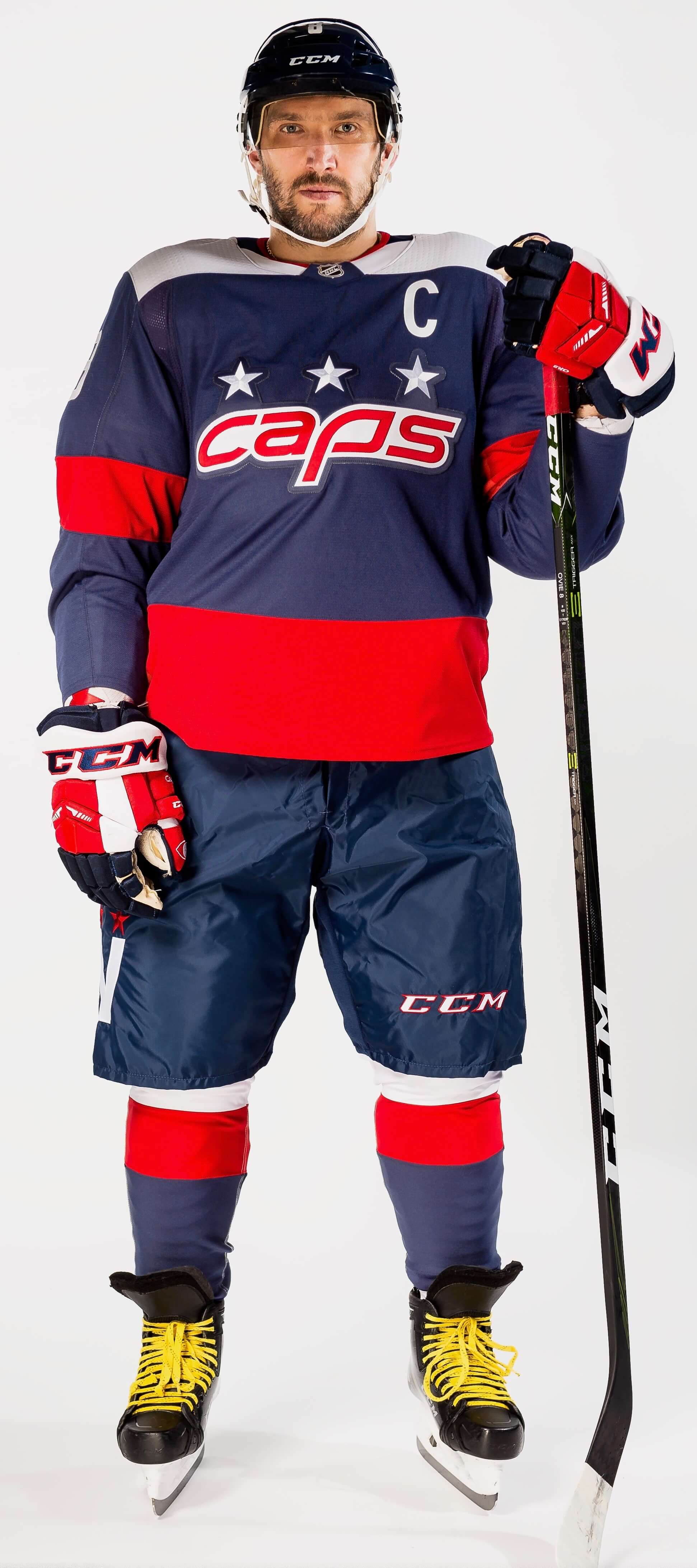
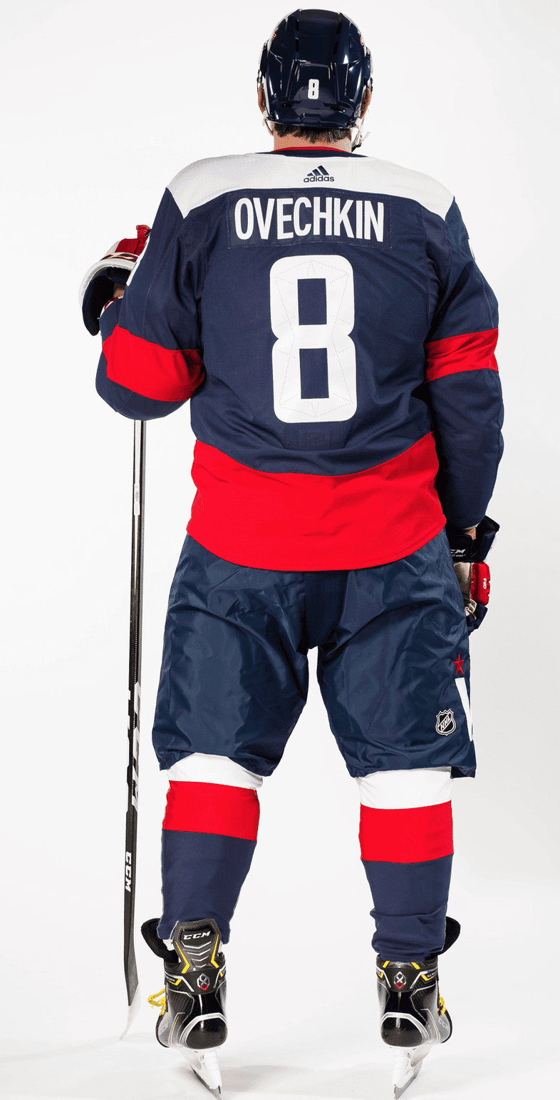
The NHL season, which has been almost completely bereft of alternate uniforms, got a bit more uni-interesting yesterday, as the Capitals unveiled the design that they’ll be wearing for their Stadium Series game against the Maple Leafs on March 3.
The uniform is navy blue because the game will be played at Navy-Marine Corps Memorial Stadium in Annapolis, Md.
In addition to the “Caps” nickname on the front (which I like), there’s also a big “W” on the side of the pants, with a hint of the Washington Monument at its peak:
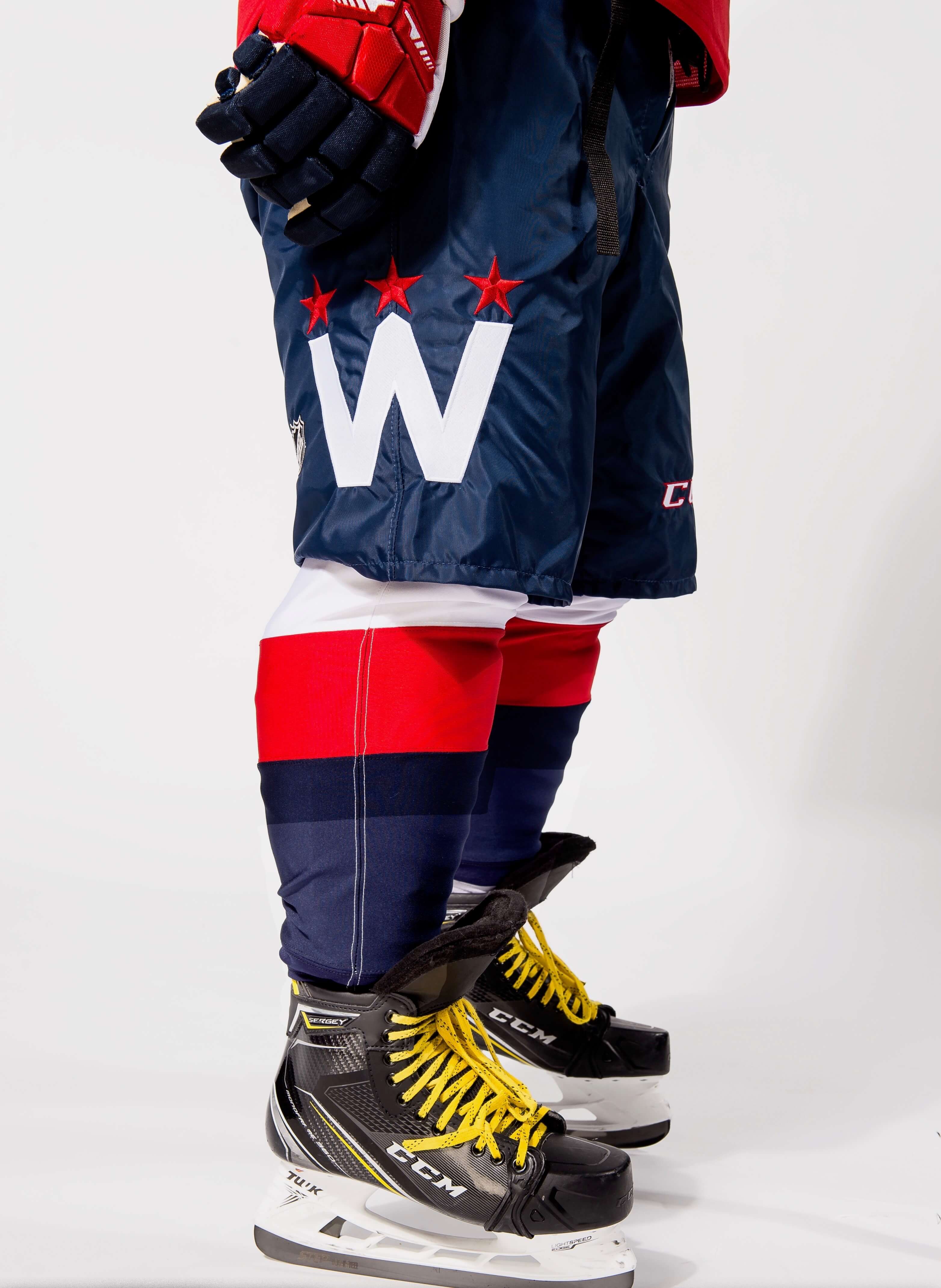
That “W” sure looks big, right? But the press release explains that “each element of the Capitals’ visual identity has been emphasized to create bolder, more visually pronounced uniforms that are meant to make a statement and be more recognizable in the larger outdoor stadium setting.” Fair enough — but they’ve also included a really subtle detail that nobody will be able to see: a little perforation pattern on the rear numerals that’s “based on Pierre L’Enfant’s original grid plan for the city of Washington D.C.”:
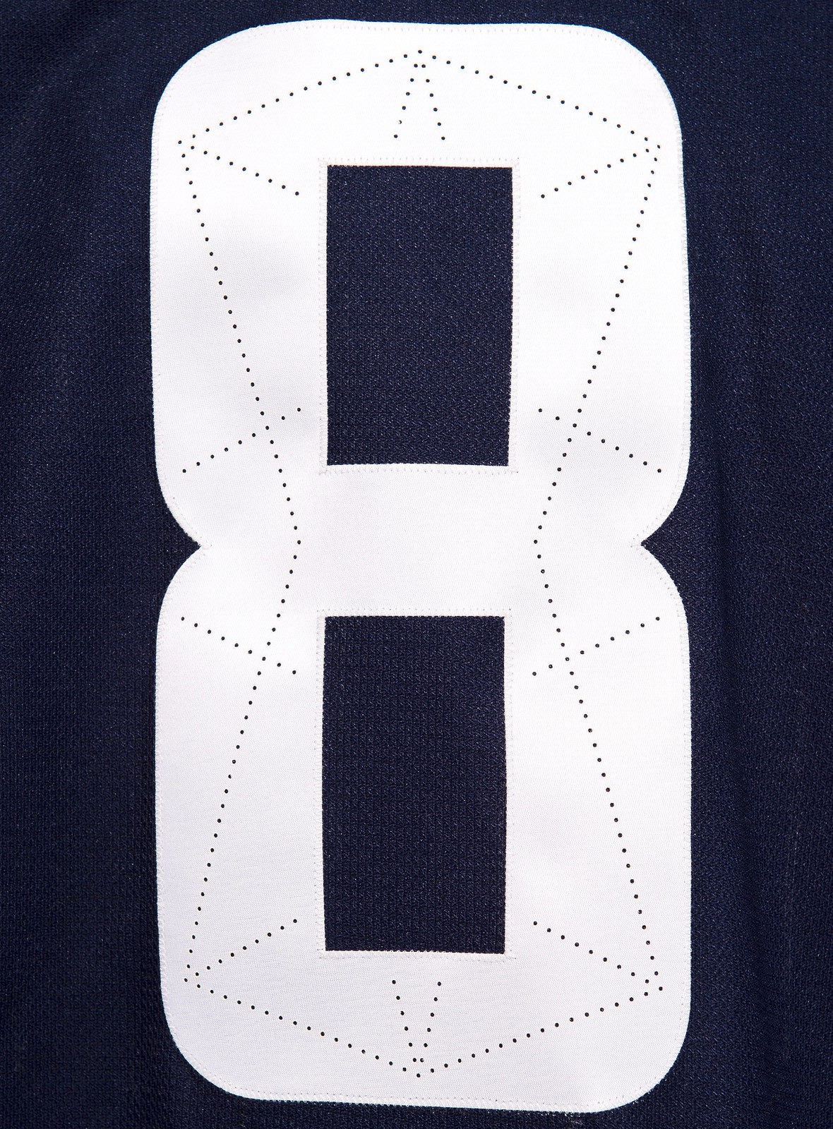
Nobody’s going to be able to see that (except fans buying the jersey, which is obviously the whole point). Also, while the perforation pattern looks pretty nifty on an “8,” it won’t work as well on most other numerals. In short: another “storytelling” gimmick that should probably have been left on the cutting room floor. On the other hand, since it will be largely invisible anyway, it doesn’t do much harm.
Overall: Not bad at all.
While we’re at it: In yesterday’s comments, reader/commenter Rob S. said that what Caps fans really want is a jersey featuring the “weagle.” For those who don’t know, that’s this logo:
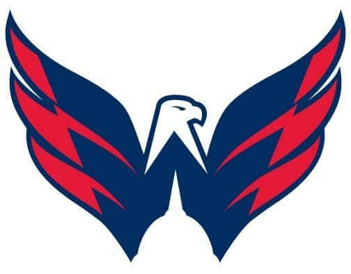
Personally, I’ve never liked that logo, mainly because I think it looks like a bird being impaled on one of those old oil cans.
Oh, and this might be a good time to mention that I think it’s funny that the Capitals’ marketing slogan this season is “ALL CAPS,” when their chest insignia — even on this new nickname-crested alternate jersey — features lowercase letters. But maybe I’m being too literalist, or insufficiently ironic, or something like that.
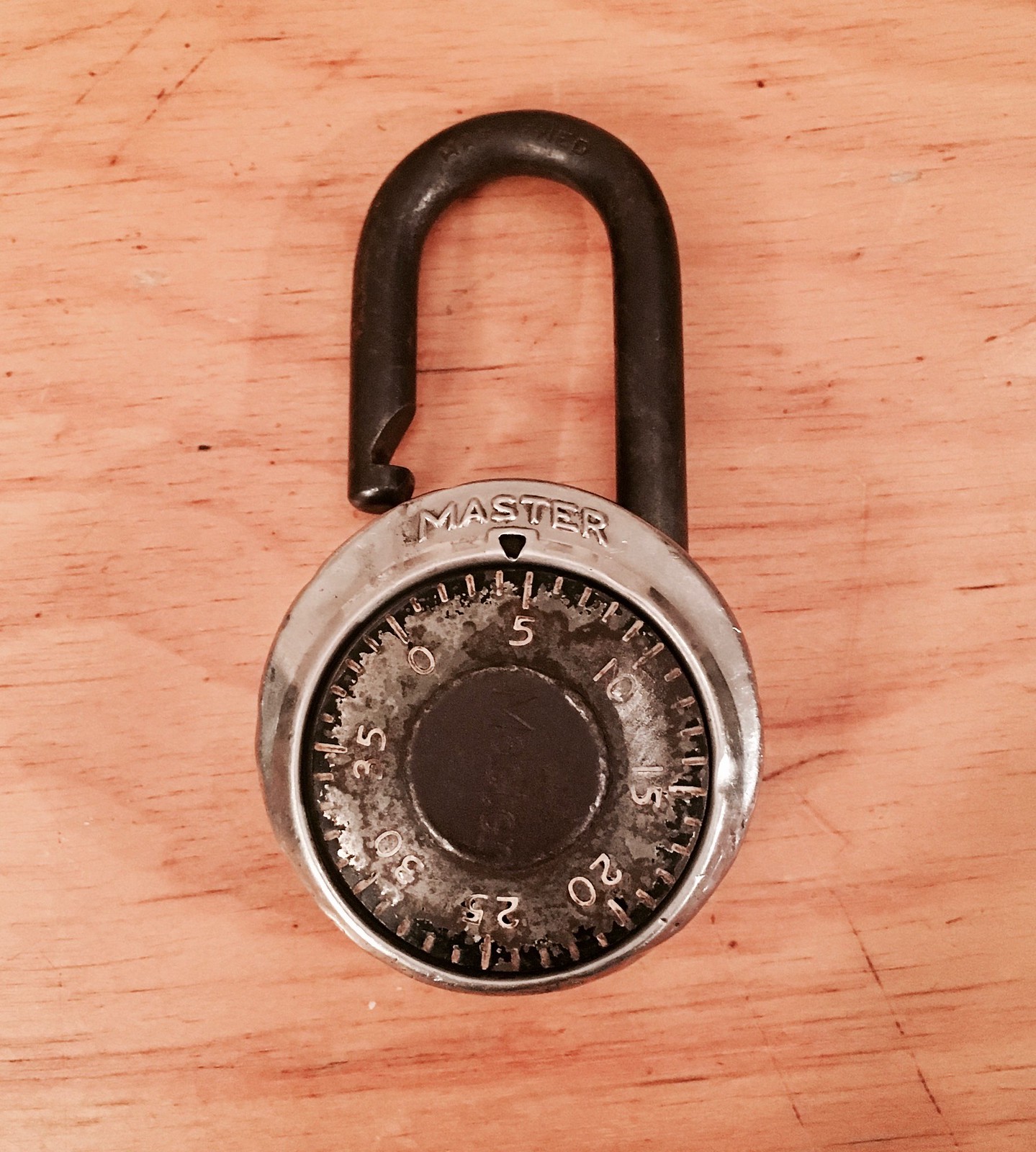
Masterful: I have owned only one combination padlock in my life — this one. I got it in fourth grade — that’s 43 years ago — to lock up my bicycle, and then over the years it followed me to high school (where I used it for my gym locker), college (ditto), and adulthood. It’s all beat up, with most of the paint on the dial chipped off and the shank, which was once shiny, now oxidized to a deep brown. But it still works fine, and I kinda like the chipped paint and the brown shank. (I also like the word “shank.”)
These days I tend to go through long periods of not using the lock, but at the moment I’m in the midst of a two-month gym membership, so it was pressed back into service for the first time in a few years. Had no trouble remembering the combination. Dialing it up felt instantly familiar, like muscle memory.
I won’t tell you what the combination is, but I will say that the three-number sequence has always “made sense” to me in some intuitive way. I’ve felt the same way about most of the phone numbers and zip codes I’ve had over the years — they just feel right. Once we commit these number sequences to memory, we tend to find some internal logic or pattern in them, so that they seem almost obvious or self-evident.
The lock has a serial number on the back. Does that number match an index card or ledger entry somewhere deep in the dusty archives of the Master Lock offices, where they have the combination on file? I hope so. (And if that’s not how it works, please don’t shatter my illusion. Thanks.)
The dial has 40 numbers — 0 to 39. For a three-number combination sequence, that allows for 64,000 different combos, which isn’t really that many in the grand scheme of things. Master probably cranks out that many locks in a good weekend. That means there are lots of other locks out there with the same combination as mine. For some reason this disappoints me. I like to think that my lock is the only one. Hmmmm.
I can’t explain why I’m suddenly feeling sentimental about the lock, except that sometimes you just form an attachment to an object that’s been part of your life for so long, even something (or maybe especially something) as utilitarian as a padlock. Here’s hoping for another few decades together.
The Ticker
By Paul

’Skins Watch: The University of Utah gymnastics team has a new leotard design inspired by the Ute Indian tribe. Utah is among the handful of schools that have permission from local tribes to use Native imagery (from Ryan McDonald).

Baseball News: New 3-D helmet logos for Pitt baseball and softball (from @MikePanther247). … New 3-D helmet logos for Marshall, too (from Joseph Asserly). … New Marlins owner Derek Jeter wants to get rid of the team’s home run sculpture (thanks, Brinke). … Really good article on how the Lehigh Valley IronPigs are the only MiLB team oufitted by Majestic. Lots of good info (from Rob Klingenberger). … Here’s how newly acquired Astros P Gerrit Cole looks in an unbuttoned Astros jersey. He did eventually button it, at least partially, toward the end of his introductory press conference (from @igTXSalazar). … The Charleston RiverDogs will mark the 25th anniversary of the movie Cool Runnings by wearing Jamaican bobsled team-themed jerseys on May 3. … Congrats to Richmond resident and longtime Uni Watch pal/collaborator Rob Ullman, who was hired by the Richmond Flying Squirrels to design their new “Funnville”-themed Sunday alternate uniforms. You can see the results here and here. … This is interesting: In the late 1950s, the Indianapolis Indians wore a “6672” sleeve patch, representing the number of public investors who had purchased stock in the team, thereby saving it from going under (from Michael Grace). … Japanese news: New alternate uniform for the Yomiuri Giants and new road cap for the Yokohama DeNA BayStars.

NFL News: Reader Mark McLean notes that the Patriots’ TV numbers often overlap onto the shoulder striping. “This seems to affect only smaller jerseys, usually worn by wide receivers, cornerbacks and running backs,” he says. … Good article on the company that launders the Eagles’ uniforms (from Patrick Bourque). … Whoa — check out this model of the Vikings’ stadium made out of 6,400 toothpicks! (Rare non-UNC-related item from James Gilbert.) … Gotta like this: a vintage cookbook, entitled Gridiron Gourmet, featuring recipes from “the American Football League Women’s Association” (great find by Jon Solomonson). … Diego Yanez did some mock-ups showing what it might look like if Pro Bowl jerseys used the custom number fonts from the players’ regular teams. … Lots of classic stuff in this seven-minute video report on the old WFL, including the yellow football, the position-specific pants, the crazy officials’ jerseys, and the Dickerod. Uni-related trivia bits that I hadn’t known: When one team couldn’t pay its laundry bills, the laundry company simply kept the jerseys, so the team couldn’t play. Another team had its gear repossessed to help pay off debts (from Dan Tarrant).
College Football News: Akron’s equipment staff has created a facemask shaped like the Zips’ “Z” logo. It’s just for display, not for on-field use.

Hockey News: The Toledo Walleye will wear Toledo Goaldiggers throwbacks for two games next month (from @The_Real_Kub). … Someone created a series of flag designs based on NHL team logos and uniforms (from Tony Caliguiri). … Mike Scott, who plays for the NBA’s Washington Wizards, has a big NHL jersey collection (WaPo link) (from Tommy Turner). … Here’s a weird one: Due to nasty weather, the AHL’s Charlotte Checkers decided to close their arena to fans and instead played yeterday’s game against the Bridgeport Sound Tigers in an empty arena with a skeleton staff. As that article explains, they did something similar two years ago. Really interesting — recommended reading (from John Muir). … Zombie-themed jerseys this Saturday for the Eugene Generals (from Alex Stimson). … We often see team logos carved into pumpkins, but how often do you see a team logo — the Bruins’ logo, in this case — drawn in the snow? … Speaking of the Bruins: Today is the 60th anniversary of when Willie O’Ree became the NHL’s first black player, and the Bruins honored him last night with a jersey patch and a pregame ceremony. Check out the jersey he wore. … The Greenville Swamp Rabbits will have pink “Stick It to Cancer” jerseys on Friday and Captain America-ish jerseys on Sunday (from Scott Trembly).

NBA News: Cross-listed from the hockey section: Wizards F Mike Scott has a big NHL jersey collection (WaPo link) (from Tommy Turner). … Looks like those NBA All-Star jersey designs that leaked last week were probably legit. Still no official release date, although I have reason to believe it’ll be late next week. … As had been hinted at earlier, the Raptors have a new alternate court design to go with their recently unveiled alternate uniforms (from Mike Styczen). … Dominique-era Hawks-style throwbacks on Feb. 3 for the D-League’s Erie BayHawks.

College and High School Hoops News: The uni-verse has now reached the point where even Fordham’s student managers are posting photos of their uniforms (from Andy Ross). … Pretty unusual road uniforms for the Lafayette Jefferson High School (Indiana) girls’ team (from Jeff Dem). … UNLV and New Mexico went black vs. turquoise last night (from Jeffrey Seals). … With Texas G Andrew Jones fighting leukemia, his teammates all wore his number No. 1 — during pregame warmups last night. Even radio announcer Craig Way got involved, wearing a No. 1 button (from Griffin Smith).

Soccer News: The LA Galaxy’s new home kit has leaked (from Ed Żelaski). … Also from Ed: The USL’s expansion team in Birmingham will be called Birmingham Legion FC. … One more from Ed: Handsome new home jersey, and new outfitter as well, for Universitario. … Gotta love this sensational Pittsburgh Spirit (MISL) promo video from 1982. “It shows the once-famous MISL orange game ball,” says Jeff Flynn. “Plus burned-out Civic Arena scoreboard lights where it spells ‘Spirit.’ Even shows the Civic Arena with the roof completely open!” … New ball for the NWSL (thanks, Jamie).

Grab Bag: North and South Korea will form a joint Olympic team for next month’s Winter Games in Pyeongchang. They will march and compete under one flag and wear one uniform. … This is pretty great: a website devoted to 45-rpm record adaptors — you know, those little plastic thingies (big thanks to Jeff Ash). … I only write about one check per month, for my rent, which means the box of checks in my desk drawer probably constitutes a near-lifetime supply. Still, these super-cool curling-themed checks are mighty tempting (from Steve Silverstein). … Slate.com, where I’ve written on and off over the years, has a new logo and site design. … Good story on how the Starbucks logo has an interesting asymmetry (from long-lost reader and onetime comments section stalwart Teebz — good to hear from you, buddy!). … Police in the UK are reportedly trying to raise some extra cash by selling off old uniforms, which has led some criminals to impersonate police officers. … Traffic police officers in the Indian city of Kolkata have begun wearing uniforms studded with LEDs, which are intended to make the officers more visible to drivers. … Pro golfer Rickie Fowler recently debuted a new Puma shoe design (from Zach Loesl).
The Funville jersey is a refreshing change of pace compared to all the fierce looks out there. I’d buy and wear one, were they available in extra-mega-jumbo.
Those Funville uniforms were previously posted in the ticker by Anthony Emerson on Saturday, along with some derogatory comments about how ugly they were. Someone in the comments also ripped on them. Interesting to see them posted again in a much more positive light.
If he thought these were bad, he should see some of the designs I DIDN’T use!
And thanks, Gregg!
About the Willie O’Ree jersey patch, the Habs played along too, for the color barrier breaking game was Habs/Bruins.
link
Caps jersey looks unfortunately Russian.
Well, there is a big ol’ Muscovite wearing it…
The large, single red stripe at the hem gives a strange look to this jersey. May have been better if they added in a white stripe in there with a smaller red stripe instead of having one huge red stripe.
I concur. It would have been better to match the hem stripe with the sleeve and sock striping.
I like the big red stripe but would like it more if it were the same width as the white shoulder yoke at the top.
Also, while I love shoulder yokes, they look much better if the player’s name is put inside them, like the link, rather than having nothing in the yoke (or worse yet, a manufacturer logo) and then shoving the name and number downward.
Well a lot of things in Washington are under Russian influence these days lol
Weird seeing me mentioned in the lede… but, from what I’ve seen, there are indeed a significant number of Caps fans who do want that logo to be used in a prominent manner. The feeling I get from them is that they’re not big fans of the wordmarks. Though there are fans out there who actually want to see the return of the “screaming eagle” (as I’ve seen one describe it) from the 1995-2007 era (just in modern colors).
The original Caps’ logo was rendered in left-leaning italics, perhaps so the hockey stick made out of the “t” would look natural. The new wordmark comprises right-leaning italics which makes the hockey stick look weird.
Oh my God, you’re right! The right-leaning italics look really odd.
No wonder the Weagle is such a popular logo.
I’ve always felt the same way with this “new version of the old version” logo.
No sir, i don’t like it.
Add me to the list of people who want to see the return of the Screaming Eagle!
I was wondering the significance of the 3 stars…found the answer in the Capital Gazette article (nod to the 3 stars of the DC Flag). Then looked up the origins of the DC Flag and it’s an homage/tribute to George Washington’s Coat of Arms. However on Washington’s COA, they’re not stars, they’re mullets (5 pointed spurs).
The lowercase “capitals” has bugged me for 10 years. Fix it and maybe the get past the second round.
Though a Weagle jersey could be sweet.
Around the time of the team’s inception, there was an intended family resemblance between the wordmarks of the Bullets, the Capitals, and the Capital Centre. It would be enlightening to know which came first.
the Bullets had that logo and font when they were the Baltimore Bullets, so i think the Cap Centre and Caps based their on the Bullets.
I have always liked the CAPITALS’ logo being in all lowercase, in a ceci n’est pas une pipe meta-humor kind of way.
It’s Texas G Andrew Jones, not Texas Tech.
Right. Fixed.
Utah gymnastics team leotards…
Reminds me of that Glenn Campbell song, “Rhinestone Indian”.
Do you remember Redbone, the guys who sang “Come and Get Your Love”? They had glitzy costumes, too.
Prominently featured in this documentary, which I can’t recommend highly enough:
link
“Once we commit these number sequences to memory, we tend to find some internal logic or pattern in them, so that they seem almost obvious or self-evident.”
And sometimes, if removed from an item/place, our brains can fail us on something we have remembered a million times. Ever tried to log into some software program from a different computer? Or even while standing up? The muscle memory can be linked to spacial memory too.
Jeter & Co wanting to ditch that abomination of a home run thing in center field is a positive sign. A local article I read about it says they think it’s “emblematic of the old ownership”. I hope that means they aren’t too fond of the literal emblem of the old ownership and are considering bringing back some teal-and-black pinstriped goodness ASAP. Jeter should appreciate pinstripes and the look of the team that won the final World Series game in the original Yankee Stadium right? Haha. I’ll take a joke roster as long as it doesn’t look like a joke.
I didn’t mind the home run sculpture, but the only game I saw at the venue Cole Hamels shut the Marlins out, so it didn’t get activated. To me, it’s no different than the home run apple the Mets use. Heck, even the Yankees now have schtick, with the Judge’s chamber being introduced last year.
I like the Pro Bowl custom number font idea!
I like the masterlock piece, my lock turns 20 years old this year, got it freshmen year in Sept 98. In use again at the gym as well.
the softball helmets for “Pitt” > the baseball helmets for “P”
I like the BIG OLD PUMA SWOOSH on shoes. Rickie Fowler’s golf kicks remind me of the ‘Roos from the 80s.
link
#CrappyLook
The weagle looks like the screaming chicken on the old Trans Ams from the late 70’s
When the NfL switched to Nike didn’t they get rid of position specific jerseys? I remember under Reebok that had five or six differ jersey cuts for quarterback, wide receiver, lineman etc. I wonder if having everyone having the same cut jersey and numbers are affecting the Patriots.
I know that’s not quite the case in Carolina, where Cam Newton and a couple other players (kickers/punters, maybe another player?) have the full shoulder loops, while the majority of players have stripes that start and end at the armhole. link.
Carolina still uses the old Reebok tailoring and fabric. (So does Green Bay.)
I know that the Nike jerseys still offer the loose, QB sleeves in several forms.
Just compare Glennon and Trubisky in this photo:
link
Something else to note, as observed here on Uni Watch in the preseason, is that the Pats’ unis have had varying widths in the shoulder stripes this year.
link
link
One NHL item I saw last night (and I didn’t send it in properly – though it was late and I was tired):
Back in November, the Ducks wore throwback jerseys for the pre-game skate honoring Teemu Selanne and Paul Kariya being inducted into the Hockey Hall of Fame. On NHL Tonight (NHL Network’s flagship show), Kevin Weekes (an ex-NHL goalie himself) raved about the original Mighty Ducks jerseys. So, link, with the number 80 he wore for most of his career.
He’s certainly not wrong about those unis, anyway.
Also, I just went back through the UW archives, and I’m surprised that the throwbacks didn’t get mentioned in November!
The Toledo Walleye wearing Goaldiggers throwbacks is awesome news! That was a great uniform:
link
I’ve registered my locks at the Master Lock website in case of a lost or forgotten combo. But if you forget your password…
In middle school, on one of my first few days of school, I accidentally unlocked the locker that was 10 lockers down from mine using my combination. (It was in the same placement relative to the classroom door as mine, just one classroom down). It always blew my mind that the school would reuse the same combinations and at what looked to be a 10 locker interval. I never tested the theory completely that every 10 lockers were the same beyond that.
“The Charleston RiverDogs will mark the 25th anniversary of the movie Cool Runnings”
y tho
For the same reason that teams wear Star Wars or SpongeBob uniforms or any of the hundred other wacky minor league promotions. It’s a promotion, trying to attract attention, get people to come out to the games and buy merchandise.
It just seems incredibly poorly timed and tone deaf. The Winter Olympics are coming next month and the United States will be in direct competition with a Jamaican bobsled team. What are they thinking?
They are not trying to show support for the bobsled team. They are appreciating an amazing movie. This isn’t anything about the 2018 Olympics. Their guest is an actor from the movie, not an actual bobsledder. To be critizicing a promotion like this is absolutely ridiculous.
That Caps “8” looks like some sort of billiards (or air hockey) trick shot diagram!!
After my freshmen year in high school (17 years ago), my good friend somehow obtained a some type of Masterlock manual that had thousands and thousands of lock combos. He asked the janitorial staff not to cut the locks left behind in the gym lockers over the summer and went to work. He ended up with a box of about 25-30 locks with little stickers with the combinations written on the back.
Fast forward to the beginning of the Sophomore year, he made a decent amount of money selling the locks to new batch of freshmen at a discounted price. The school administration caught wind of his little hustle and actually called in his parents and demanded they give the school the Masterlock manual. They of course pretty much laughed it off and said no. Needless to say, the janitorial staff were under orders to not allow him to unlock the abandoned locks after the Fall semester. Why? Because the school administration obtained their OWN Masterlock manual and come the Spring semester, guess what the school was selling to new gym students at a discounted rate? We always joked the staff probably made these transactions under the table to fund a kegger for the teachers.
When I was in Jr high we used school issued Master locks. The lockers where we kept our pe clothes were more of a drawer and when you dressed there were taller lockers to put your street clothes. One day I opened my locker and started to get dressed. I put my pe shirt on and as it went over my head I smelled an unfamiliar adolescent boy stink. Turns out I had opened the locker below mine that happened to have the same combination.
The Hurricanes must not care abut eating that kind of scratch for an empty arena game. Of course safety comes first, but living in CT, 2-4 inches to me is nothing LOL
They just don’t have the infrastructure for snow removal down there.
It’s interesting that Ovi has his sock over the back of his skate on the right leg but not the left. A quick look through Google Images shows that he has used both looks, but mostly goes with socks inside the skate.
While watching that WFL video that I submitted, it occurred to me that the Charlotte Hornets city/nickname combo describes teams at the professional level (at one time or another) for football, basketball, and baseball (the Hornets were a minor league team here roughly from 1937-1972).
I know a number of early NFL teams shared names with baseball teams in their city (Yankees, Pirates, Dodgers, etc) but is anybody aware of any city/nickname combos for three or more sports?
Pittsburgh Pirates – baseball first, then hockey (1925-1930), then football (1933-1939 before being renamed the Steelers in 1940).
Incidentally, the NHL Pirates were the first Pittsburgh major league team to use the familiar city colors of black and gold (although they changed to Harding blue and gold in 1928, and black and orange in 1929). The baseball Pirates had used red and blue until 1948, when they switched to the now-familiar black and gold. The Steelers have always had those colors.
Did not know that, thanks.
1. Ottawa Senators NHL hockey.
2. Ottawa Senators minor league baseball before the 1950s.
link
3. Ottawa Senators football. A six-season stint from 1925 to 1930 between times they were called the Ottawa Rough Riders.
link
Buffalo Bisons: baseball, basketball, football, hockey
link
“The uni-verse has now reached the point where even Fordham’s student managers are posting photos of their uniforms (from Andy Ross).”
I don’t so much mind the basketball managers tweeting about their uniforms. But whey do all tweets about new uniforms, even ones as mundane and ordinary as polos and khakis worn by student managers, have to be accompanied by multiple “fire” emojis?
“Lots of classic stuff in this seven-minute video report on the old WFL”
Not the least of which is Jimmy “King” Corcoran dropping back for a passing attempt at the 4:18 mark.
I still have the blue jersey he wore in that game. The Bell sold their equipment to Penn after the WFL folded. In the summer of 1976 we were walking on the boardwalk in Ocean City MD, and some guys recognized my father. They played football at Penn and they told him one of their friends got his white Bell game jersey to practice in. My father said great, does anybody want the King’s autograph? They said no thanks
Love it. Hope you’re well, Jimmy.
On the caps (all lowercase) jersey:
Classic coverup saying its Navy bc theyre playing at Navy Stadium. Its navy bc they dont have a navy jersey for merchandising. That being said i like it a lot. It could do without the white shoulder but eh, il get over it.
On the lock:
Kick ass you kept that thing for so long. I always thought the same thing about keys to cars. Its super cool a key works in general but its wild to think there are keys out there that open your car.
On the Toledo walleye throwbacks:
Rock solid eggplant emoji
On the Pro Bowl font idea:
Implement immeadiately
On the Akron Z mask:
Double Woof
“In the late 1950s, the Indianapolis Indians wore a “6672” sleeve patch, representing the number of public investors who had purchased stock in the team, thereby saving it from going under”
The Rochester Red Wings did something similar around 1956/7:
Story here:
link
Jersey sleeve patch here:
link
Fun fact: They started using that winged baseball logo circa 1929, before the Detroit Red Wings started using their winged wheel logo (1932).
At least according to the team uniform history:
link
Caps jersey gets an -A. Like the color blocking and simplicity. The whole look reminds me of a Polo Sport rugby from 1995.
Am I the only one who thought “Cubs” immediately upon seeing the giant W on the breezers? Chamernik? Anyone?
Mike Scott, who plays for the NBA’s Washington Wizards, has a big NHL jersey collection (WaPo link).
This was fantastic.
Surprised Paul did not give them a smidge of credit for unveiling the whole uniform and not just the sweater, since I know that is a common complaint of his with this announcements.
In other words, you want me to give them credit for meeting the most simple, basic aspect of a uniform unveiling (i.e., unveiling the entire uniform)?
Just because we criticize teams that fall short of that basic standard doesn’t mean anyone deserves a gold star for doing something so simple and basic. It would be the uni-verse equivalent of a participation medal.
Paul,
Loved the lock piece. Brought back memories from high school & college. My old Dudley is almost 50 years old! I can’t ‘remember’ the combo, but muscle memory lets me unlock it when I need to.. :)
The combination lock has slightly less than 64000 combinations because you cannot have the same number for all 3 positions (e.g. 25-25-25). To the best of my knowledge, all 3 positions have to be different, which means there are actually 59,280 possible combos.
Yeah, I figured there’d be exceptions that whittled down the total number of possibilities. But I just went with 40 cubed, the highest possible number of *mathematical* possibilities, if not necessarily the highest number of *logistical* possibilities.
I coach high school football, and at one of my previous schools we had a book that listed all of the combinations for the locks that had been sent to our school. Looking at the list of combinations, it was amazing how simple some of them were, such as 4 – 4 – 8. I could never understand how players could forget them. I remember that most of the numbers used were even, but that might be a generalization.
Regarding memorizing combinations, I still remember the combination for the lock I was given in PE over 25 years ago.
“I could never understand how players could forget them.”
After many years in schools and having different lockers for different purposes over and over, wouldn’t it be easy to get your current combination confused with some older one?
It’s worse now, with employers today making workers create new passwords every 30-60 days for all the devices they use at work. Nobody can keep track of that many passwords.
My combo lock story actually ties in uniforms. Because it has always been easier to remember names than numbers, I always converted my combination lock number sequences into uniform numbers of players I knew. Since I am of a certain age and locale, a lock combination of 25-37-11 was McDonald – Woodeshick – Van Brocklin. Later, 32-15-25 was Cunningham – Greer – Walker. Never forgot a combination.
That “W” sure looks big