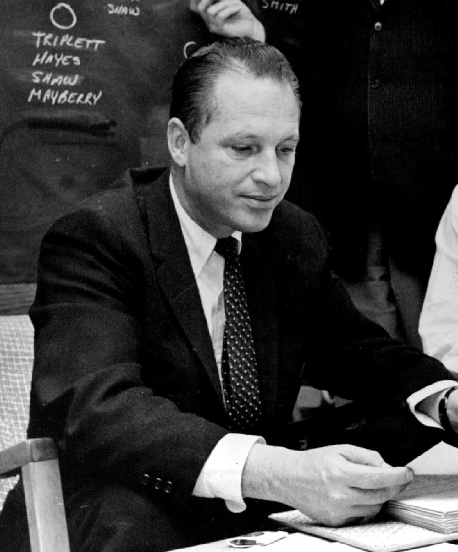
During the reporting for my follow-up piece on the origins of the Vikings’ uniforms, I interviewed the two surviving sons of Bert Rose, the Vikes’ original general manager (that’s him shown at right). One the sons, Scott Rose, told me a story about the team’s name that I hadn’t heard before. Here’s a transcript:
Coming up with the idea of calling them the Vikings was easy, with all of the Scandinavian background up there. So they were gonna be the Minneapolis-St. Paul Vikings.
And then somebody says to my dad — and you know, our family is not familiar with the Midwest at this point [the Roses had been living in L.A., where Bert Rose had worked for the Rams — PL] — they say, “Bert, I don’t know if you know this, but Minneapolis and St. Paul don’t really like each other. And the first time that the announcer says, ‘It’s Minneapolis’s ball on the 20,’ the people of St. Paul are gonna be on the telephone, and they’re gonna be saying, ‘You mean it’s St. Paul’s ball.'”
So my dad is sitting there thinking, “You know, I’m gonna do something that’s never been done before. I’m gonna name the team after the entire state.” He says not only will it put that to rest [regarding the rivalry between the two cities], but from a season ticket standpoint, maybe it’ll bring in people from North Dakota, South Dakota, and Iowa — not Wisconsin, because they’re Packers fans and they’re gonna hate us anyway. Maybe I can get people to identify with the team, even though they don’t live anywhere near the Twin Cities, as long as they’re close to Minnesota.
And lo and behold, it worked like you wouldn’t believe. He got unbelievable amounts of season ticketholders from those three states. Of course, the Boston Patriots took it to the next level when they renamed themselves the New England Patriots.
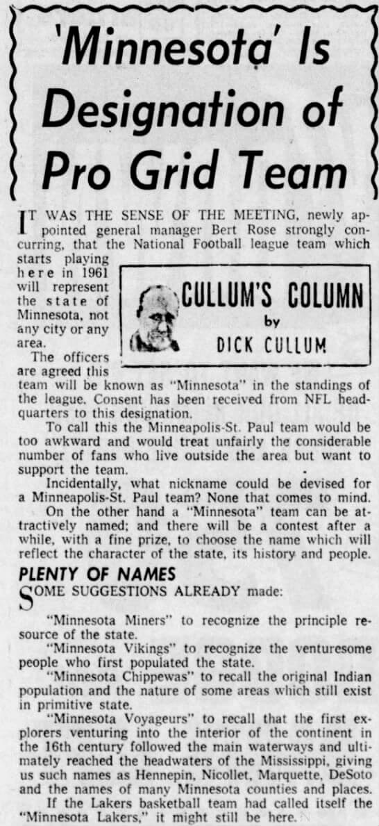
This appears to check out. According to this Wikipedia page, Rose was hired on Aug. 5, 1960. The Wiki entry then says, “In an article on August 6, 1960, in The Minneapolis Tribune, it was reported that the team would use the name ‘Minnesota’ instead of ‘Minneapolis–St. Paul.’ The article also stated that several nicknames were suggested for the team, including ‘Chippewas,’ ‘Miners,’ ‘Vikings,’ and ‘Voyageurs.'”
I went to the Star-Tribune’s archives and found that article:
But had this really “never been done before”? After all, MLB’s Minnesota Twins, who had been the Washington Senators until relocating to Minnesota for the 1961 season, made their Minnesota debut about half a year before the Vikings did in ’61.
Ah, but did the Twins come up with their name before the Vikings did? According to this Wiki page, the Twins made the decision to go with the state name on Nov. 26, 1960 (no citation, unfortunately, and I’ve so far been unable to verify the date) — nearly four months after the Vikings had settled on the state name. So while the Twins were the first to play under the state banner, the Vikings were apparently the first ones to come up with the idea.
Ever since then, of course, all of the state’s Big Four pro teams — the North Stars, Wild, and Timberwolves — have likewise been named for the state, not for the Twin Cities.
A few other items of note:
• I also interviewed Scott Rose’s brother, Stephen Rose. He had this to say about the Vikings’ purple pants:
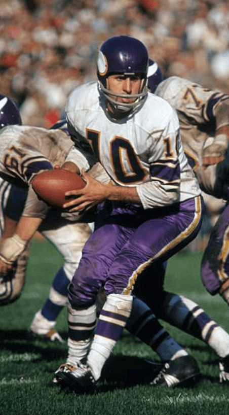
[My father] wanted purple pants on the road in 1961. He said that to [Vikings coach Norm] Van Brocklin, and Van Brocklin said, “For Christ’s sake, they’d look like Dreamsicles!” That’s a quote. So they wore white pants on the road. But Bert kept after him, and they eventually did wear the purple road pants the next year, and for the next few years after that. He got that idea from the Cardinals, who in the late ’40s and ’50s had worn red pants. Nobody else in the league was doing it. I thought it looked great!
• Remember how Karl Hubenthal’s uniform renderings included V-shaped sleeve striping? Stephen Rose said it was his father, Bert Rose, who nixed that. So instead the Vikes went with Northwestern striping — which is exactly what the Rams were wearing at the time. Bert Rose, of course, had worked for the Rams prior to joining the Vikings.
Stephen Rose also said his father loved the “leggings” on Hubenthal’s original sock design, but he confirmed that Van Brocklin had put the kibosh on that, as I had reported in my original ESPN piece.
• Meanwhile, if you’re interested in Hubenthal, here’s a good feature on him from the December 1976 issue of Cartoonist PROfiles.
Okay, I think I’ve now emptied the notebook on the Vikings stories. And all without once saying anything nasty about a certain color!
Membership update: Several new designs have been added to the membership card gallery (including Matt Nachamkin’s excellent Manitoba Moose treatment, shown at right). The printed and laminated versions of these cards should ship out this weekend.
If you want a membership card in time for Christmas, I strongly urge you to sign up now. Remember, a Uni Watch membership card entitles you to a 15% discount on any of the merchandise in our Teespring shop. (If you’re an existing member and would like to have the discount code, email me.) As always, you can sign up for your own custom-designed card here, you can see all the cards we’ve designed so far here, and you can see how we produce the cards here. Thanks.
The Ticker
By Alex Hider

Baseball News: No photos yet, but it looks like the Brewers will be giving away a mini bullpen cart at some pont this season (from John Okray). … Just in time for Hanukkah: a baseball-themed menorah (from BSmile).

NFL/CFL News: Last Sunday’s blizzard in Buffalo combined with the Colts’ all-white unis is giving coaches problems when watching film (from Phil). … Lots of uni oddities on the cover of this week’s Sports Illustrated, including some Eagles players in throwback unis (from Ignacio). … The Broncos will be wearing their Color Rash uniforms and throwback helmet logos tomorrow night, but players on the practice squad are wearing the standard helmet logos (from Michael Starbuck). … The Colts now have a uniform history page on their website (from Phil). … Which Cowboys uniform combination is your favorite? Vote here (also from Phil). … There are some uni-related tidbits in this listicle on 150 reasons to love the CFL (from Miles Filbert). … A fan is suing the Saints over the team’s national anthem protests.
College Football News: Iowa State has added the Liberty Bowl patch to its uniforms (from Sean Jankowski). … Reader and Florida State fan Dave Show is not a fan of the Seminoles’ new logo and uniforms, so much so that he made a whole video about it.

Hockey News: Monday was the 35th anniversary of the first all-Cooperalls game between the Flyers and Whalers (from Benjamin Hochman). … Fox Sports Ohio used an old photo of Blue Jackets C Alexander Wennberg yesterday (from Anthony Yutzy). … Russ Levine spotted a center ice hexagon, instead of the standard circle, in a Champions Hockey League game between HC Kometa Brno and JYP Jyväskylä. … The Roanoke Rail Yard Dawgs of the Southern Professional Hockey League will wear Christmas sweater uniforms for their teddy bear toss game on Saturday (from Al Jones). … This is a good uni history of the various minor league teams from Indianapolis (from Mark Grainda). … The club team at the University of Vermont wants to use the athletic department’s logo but is prevented from doing so because that logo can only be used by varsity sports (from @VulpineVanguard).

NBA News: Not only are NBA teams selling ads on their jerseys, but some teams are now selling new ads on their virtual jerseys in NBA 2K18. Per ESPN’s Darren Rovell, the Cavs unis in the game will now feature a Hot Pockets ad (from Jim Brunetti). … The Cavs have posted a uni schedule on their website (from Tom Valentino). … According to the Hornets’ equipment managers, the team will wear the white version of their pinstriped throwbacks for some games during the 2018-2019 season (from Phil). … The Lakers wore gold at Madison Square Garden for perhaps the first time ever last night (from Kenny Kaplan). … 17 NBA organizations will be fielding affiliated eSports teams, and they all unveiled team names and logos yesterday (from Jason Hillyer). … Here’s a good Q&A with Steph Curry about his polarizing shoe line (from Brinke). … The Hawks still haven’t unveiled their throwback for this season, but it’s apparently available for sale in Europe.

Soccer News: It appears the Philadelphia Union will be using a lighter shade of gold in its crest moving forward (from Ian D.). … Louisville City FC of the USL has unveiled a new third kit (from Josh Hinton). … A number of soccer clubs from around the world have stolen — or at least were inspired by — crests from other teams (also from Josh Hinton).
By the time most of you read this, I’ll be in the car and heading up to Connecticut for some ESPN meetings. Back late. Play nice while I’m away, yes? Yes!
“Minnesota Vikings to represent the venturesome people who first populated the state.”
That’s bad enough as is, but then to follow it with the Chippewas suggestion is ridiculous. We’ve come a long way, I guess. Have we?
The Kensington Runestone, and similar hoax artifacts, were still well known and widely believed at the time. Your average Minnesotan, particularly of Scandinavian ancestry, would honestly have believed that Vikings reached Minnesota by way of the Great Lakes long before Columbus reached the Caribbean.
I think the point is that regardless of Vikings vs Columbus, neither were the “First” people to populate the state, that’d be the Native Americans
Yup. Apparently crossing the Bering strait and populating two continents isn’t “venturesome” enough to qualify.
I hope not. The people of Scandinavian ancestry that settled further north (mostly Finnish and Icelandic) were completely aware that they settled the area in the 1800s.
And even if you believe that Vikings explored the Great Lakes (which everybody knows they didn’t) there were still indigenous people living in Minnesota. Columbus doesn’t matter.
Right, but many (probably most) would have believed that earlier Scandinavians had reached and to some extent settled in Minnesota centuries before their own families arrived. At the same time, Italian-Americans bought into a lot of flimflammery about Columbus. Yet they knew perfectly well that their own families had immigrated in the 1890s, not the 1490s.
As to the thing with Europeans “populating” an area with existing indigenous populations, well duh. But not so duh to white Americans in most of the twentieth century.
Yes, and certain protestant nativist elements were opposed to the designation of Columbus Day as national holiday in the 1930s, feeling that a Nordic non-Catholic should get the credit for “discovering” the “New” World.
The Colts seem to have forgotten they wore white facemasks for a while (among other things missing from their uni history).
I’m just going to stick with the GUD, thank you very much.
“Okay, I think I’ve now emptied the notebook on the Vikings stories.”
I hope not! This Vikings wormhole is fascinating! Keep it coming!
I agree, especially if there are more stories involving Norm Van Brocklin. “The Dutchman” was a real piece of work.
Great job with the continued Vikings investigation! I’ve been loving the journey down the rabbit hole on this topic.
Great work on the Minnesota article Paul. Thank you for sticking with it.
Any plans of other, as detailed, articles regarding NFL Uniform beginnings?
“A fan is suing the Saints over the team’s national anthem protests.”
He ought to be suing them for wearing mono black!
The guy should’ve sold his tickets on the exchange. If he just gave them away or threw them out, that’s on him.
it just me or does the CAVS jersey schedule not load up
Computer or mobile device? It loaded up on my computer just fine.
computer in chrome, ie and FF, maybe it’s my work’s network blocking it
Interesting that the Vikings considered Voyageurs as a nickname. Both the Timberwolves and Wild also had Voyageurs among reported nickname finalists. On the one hand, it’s an awesome team nickname, probably my favorite that’s not in use anywhere. On the other hand, the Twin Cities don’t really have any connection to the northwest fur trade. I hope that when baseball returns to Montreal, they consider the Voyageurs nickname, what with Montreal being the center of the colonial fur trade and home base to the southern, or “pork-eating,” voyageurs.
Paul – I’ve enjoyed the Vikings origin stories of late. Nobody makes purple look as good as the Vikes.
Voyageurs is a great name. Would the shorthand be Voys or Geurs?
I think Juggernauts is my favorite nickname not in use. Griffins is used by minor league teams, I think.
It seems like every November or so, there is something about the Griffith franchise choosing the Minnesota Twins name.
As for the Cowboys, the Danny White era bad luck blues with the numbers on the pants are my favorite.
Centuries ago, the fur trade was huge in the Great Lakes region. Many French voyageurs visited trading outposts across Minnesota, Wisconsin, etc. It is definitely a thing.
Voyageurs was one of the options for the team name of the Expos.
Montreal had an AHL team names Voyageurs that moved to Nova Scotia.
link
SI Cover: My favorite oddity is Texans OLB Whitney Mercilus with the backward “9” in his “59”. Upper left corner. That said, it is still some cool artwork.
Carson Wentz in green jersey and black pants. JJ Watt with full beard.
How did Oubre’s leg sleeve not make the ticker!?
Maybe I’ve missed this on other bowl patches, but is the Iowa State Liberty Bowl patch the first to feature two advertisers – Auto Zone and St. Jude’s? I realize that as a children’s hospital, St. Jude’s may not be an advertiser in the same sense as Auto Zone, but whatever the case, are there examples of other bowl patches with more than one sponsor/advertiser?
From the Star-Tribune column:
“Incidentally, what nickname could be devised for a Minneapolis-St. Paul team? None that comes to mind.”
The baseball team found one.
And I remain unhappy, as we approach a quarter-century later, that the Colts’ 1994 throwbacks were just their 1994 unis.
Especially since they did have some actual pre-shoulder loop throwbacks in 2003 and 2010.
Although, thinking about it, the 1994 Colts were likely honoring their championship teams from between 1958 and 1970, which would probably carry more emotional weight than paying homage to a recent expansion team with a borrowed identity still struggling to find its way in the league.
The article about the Colts coaches film also includes this quote about the Broncos uniforms:
The Broncos will be wearing their throwback “D” helmet with all-orange uniforms, which quarterback Trevor Siemian said makes the players look like “human traffic cones.”
The Rams connection to the Vikings is really interesting to me. Not only the Northwestern stripes but also the horned helmet.
Interestingly, most early helmet logos in the NFL were graphic references to the mascot rather than a logo on the side of the helmet. The Rams had the first helmet design and were followed by the Eagles’ wings and Colts’ horseshoes on the *back* of the helmet.
In 1958, the Redskins came up with the feather on the back design as the next team to use a helmet design.
In 1960, the NFL finally saw teams lean towards slapping a logo on the side with the Cowboys’ star and the Cardinals’ bird. At which point the flood gates opened and quickly the Lions, Packers, Giants, Bears, Niners, and Steelers went with the logo on the side concept.
So the Vikings were kind of the last gasp of that helmet style of design in totality rather than logo-centric.
Interestingly the Giants also used the “whole helmet” approach early on and had Michigan style wing helmet in blue and red. I had no clue they had anything but the “ny” and “Giants” wordsmarks until I was randomly browsing the GUD.
I’d slightly separate that since it was the leather helmet era and teams like the Bears and Eagles used different colors along the stitches of the helmet.
Is it just me, or does the photo on the Cowboys vote not have the Navy Jersey with the actual silver, not green-blue-silver pants?
If you’re referring to the picture of the mannequins, then yes, they’re missing the proper plain silver pants with navy jersey combo. The one non-star-on-shoulders uni they do have in that pic – which has a 25th season patch on it, indicating it’s meant to be from 1984 – just looks bad all around, with those poor-looking numbers, the wrong pants, and the wrong socks. The pants should be plain silver, and the socks should be the same as on the 1976 Staubach uni mannequin.
Oh, yeah, and that 76 Staubach jersey isn’t even right, since the number font is wrong. The top left corner of the 2 should have a serif.
Actually, just swap the pants and socks on those two mannequins, and they’d be more accurate. Still a bit off, but closer anyway.
Didn’t get a comment yesterday so will mention this again — did anyone notice on the Bill North A’s jersey from the auction – how the N and H on his nameplate were smaller and the ORT got gradually larger with the R being bigger than all the other letters?
-Jet
I think it’s just the odd way the jersey is draped over whatever it’s on (a dress form? Looks like it’s only an upper torso…). Though the N may indeed be short on the bottom side. We’d really need to see the jersey laid flat to really tell.
Speaking of Cooperalls, it’s weird that that online NHL Uniform showdown has the Flyers Cooperalls uniforms as one of the choices, but not the Whalers. Actually I think neither should be included in the showdown since they were worn so briefly.
Some of the photo choices in that showdown are really poor, probably hurt some teams’ ratings. Some photos don’t show the full uniform, some have key elements obscured, some have bad color resolution that doesn’t represent the true uni colors, etc.
-Jet
The Flyers were also transitioning their sweaters during the time they had the long pants. In the 1981-82 season, they removed the waistline stripes from their jerseys, marking the end of their first-generation uniforms. For 1982-83, they introduced the first version of their second-generation uniforms, which would be refined to their “final” configuration in 1983-84.
And I agree on the lack of quality pics for some of the unis on the showdown site. I also question some of the choices, using multiple uniform “eras” that are virtually identical (e.g. Canadiens) while lumping in multiple styles into one era even if there are some significant differences (e.g. Blues, Penguins).
The 1981-82 and 1982-83 Flyers jerseys notable as well for being not as long as a standard hockey jersey in the torso. They transitioned to the shorter style of jersey designed to go with Cooperalls.
link
I seem to recall back in the day that the Pittsburg Penguins were supposed to wear Cooperalls as well. Wonder why they backed out? Maybe they came to their senses.
I wish someone would bring back Cooper style gloves; those things were the bomb.
If that logo is accurate, perhaps the Union are changing their color from gold to buff, which would be in line with a Revolutionary War theme (also, think of the Buff and Blue of George Washington University)
The Minnesota story reminds me of how/why the Tampa-area pro teams started going by “Tampa Bay.” The idea, obviously, was to be seen as more regional and inclusive. But, the people in St. Pete didn’t like it because it still had “Tampa” in the name and many just shorten the name to the Tampa Bucs or Tampa Rays (a huge pet peeve for fans of the Rays in St. Pete to this day since the team doesn’t even play in Tampa).
Anyway, for many years after the Bucs were first formed, people on the west side of the Bay called them “The Bay Bucs” hoping it would catch on. Non-Tampa newspapers used that moniker as late as 1984, nearly a decade after the team was born.
link
I could see dropping the “Bay” if you’re just saying “Tampa”, but it just doesn’t sound right to me dropping it when using both the location and nickname.
I am guessing I am not the only sports fan who learned some geography growing up through the locations of pro sports teams. That seemed to be how I learned what the “big cities” in America were. And really because of that I never came to consider Minneapolis a major city. I knew all the Minnesota teams were located there, and around the time I grew up in the 80s it was 4 sports city (prior to the North Stars leaving), so Minnesota registered as big time, but for some reason I never associated Minneapolis itself as a big city. Meanwhile I still consider Tampa the major city, and wrongly think of St Pete as just some small suburb. I wonder had the teams been called Minneapolis if I’d have the same association with the Minneapolis-St Paul metro area.
link
Cool article today. After reading the Vikings originally were named after the twin cities, I couldn’t help but wonder if the Twins ever considered the name Minneapolis-St. Paul Twins? I wonder because ive seen an old secondary logo that mentions both cities right on it.
Also the Vikings purple pants look like the Ravens current Color Rash pants.
It was also announced yesterday that Maryland Basketball would honor its 1958 ACC Championship team on January 7th 2018 vs Iowa. I am curious to see if a special uniform will accompany that event. Maryland Basketball is known for simplified throwback style alternates over more modernized styles so this would be an ideal oppurtunity to pull one out.
Apparently when the relocation first occurred the Twins were going to be called the Twin Cities Twins, and that is why they had the “TC” on their caps at first.
Regarding this: “maybe it’ll bring in people from North Dakota, South Dakota, and Iowa”… I recall that as a Vikings fan who lived in Iowa when I was a boy (1970ish-1979), at the time the NFL considered Iowa (really Omaha) as Vikings territory, and I was able to watch every one of their games for a few seasons on CBS. Kansas City was the AFC/NBC team in the territory, btw.
Being able to watch Tarkenton & Foreman every week certainly solidified my love affair with the team as a boy, which I still carry (altho I am not quite so comfortable calling it a “love affair” anymore).
Anyways… Thanks Paul for the Viking-centric reporting!
Lee
I find it funny that in the comment he made about using “Minnesota” he states that it would create state wide and even bordering state appeal, but not Wisconsin since they are Packer fans. But by his very own logic, Packer fans should only be found in Green Bay, not the entire state of Wisconsin.
The Lakers have worn gold jerseys at least twice in the Garden. Both throwbacks, but they’ve worn gold …
2007 >>> link
2011 >>> link
I like the Showtime throwbacks from 2007 better than the West-era throwbacks from 2011. The purple numbers just stand out better than the white ones.
Voyageurs was one of the options for the team name of the Expos.
Montreal had an AHL team names Voyageurs that moved to Nova Scotia.
link
These new NBA 2K logos are unbelievable.
The Utah Jazz with the U in the shape of the state with the J as the shadow? Brilliant!
link
link
I saw the press release for the Pistons GT (gaming team) logo, and I am massively disappointed with how they described it, sounding more like a bunch of marketing lingo, and with absolutely no reference to the “Bad Boys” Pistons that the logo is paying homage to.
What are these again?
Video game leagues.
“Matt Nachamkin’s excellent Manitoba Moose treatment, shown at right”
Without the Moose mention I’d have guessed the numbers were swans.
Okay Uniwatchers, here’s one I haven’t seen before:
link
The Vancouver Canuck in the background has the logo for the home whites on his dark jersey! And he has some patch on his shoulders which the other Canucks don’t have!
This is either from the 70-71 or 71-72 season because of the “V” design on the sleeves. Possibly a pre-season game with patch-up uniforms for scrub players???
-Jet
Hey Jet,
The player in the background is Ryan Kesler. It was a photoshop. A series of those photos were done for a Canucks-related story I’ve seen. Will try to find link when I have a moment.
The clearly visible visor, the NHL shield on the Edge collar, and the shorter gloves are also significant giveaways. That, and it looks like he was shrunk down from a much higher-resolution source – he looks just a little bit more in-focus than #7 Andre Boudrias, who’s much closer to the foreground.
The two Canucks in the foreground are using Aquanet and sideburns as their helmet…
1964 Milwaukee Braves uniform ‘Woodward’…
link
The Twins handshake logo was always one of my favorites.
Re: The Minnesota Vikings:
Jerry Richardson, when pitching a new NFL expansion team for Charlotte, used a similar strategy by deciding to call the proposed team the Carolina Panthers, since Charlotte at the time was a relatively small city by NFL standards yet has a decent sized population within a couple hours’ drive.
So Richardson promoted the idea of of regional team (Charlotte is positioned very close to the South Carolina state line, and the first season the Panthers played in Clemson, SC) hoping to draw support from the entire two-state area.
The Panthers continue to use the slogan “Two States. One Team.”
Technically, however, there is no such geographic entity as “Carolina”.
Perhaps the proper name should be “The Carolinas’ Panthers”
At least they didn’t go with “The Carolina Panthers of Charlotte”.
So there are teams that use just a part of one city for their name (Brooklyn Nets), a city (Chicago Bears), a body of water abutting several cities (Tampa Bay Buccaneers), a state (Minnesota Vikings), two states (Carolina Panthers), and a six state region (New England Patriots). How much larger or smaller could a team go? A neighborhood? How about a team called Midwest or West Coast something?
A lot of people are unaware that in 1943, due to player shortages during WWII, the Steelers and Eagles temporarily merged to form what was officially known as “Phil-Pitt Combined” in the record books but informally known as the Steagles. So that’s a least one case of an NFL team being named after two cities.
Also the World Football League had the Raleigh/Durham Skyhawks and the XFL had the New York/New Jersey Hitmen, which could be an example of a team named after a city and a neighboring state.
Don’t forget the team that uses the nickname instead of the name of its home state: the Golden State Warriors.
If they had been named after the Chippewas, the Vikings would be in the same boat today as the redskins, chiefs, braves, etc.
Fortunate choice.
Norm Van Brocklin was right. The purple pants, then and now are AWFUL.