Greetings from Virginia, where I’m on a mini-vacation. I’ll have more to say about that next week.
Meanwhile: Although I’m not a designer myself, I periodically run uniform-redesign contests over on ESPN. As a result, I’m exposed to all sorts of design presentations and templates that people come up with, ranging from crude crayon designs to fancy YouTube videos. And as I’ve said many times, presentation counts. That’s not to say that a good presentation will save a bad design, but a bad presentation can sometimes ruin a good design. And when there are two designs of roughly equal merit, the presentation style or template can sometimes be the tiebreaker.
With that in mind, I’m going to surrender the floor to Ali Rahmoun. He runs the Sports Templates site, which has sometimes advertised here on Uni Watch. His templates aren’t free, but they offer something extra, which I’ll let him explain.
The Advantage of 3-D Templates
By Ali Rahmoun
The 3-D revolution can be seen everywhere — sports, cartoons, even in magazines. That Ikea catalogue that you flipped through is filled with computer-generated photos. In fact, up to 75% of its content is digitally reimaged.
Similarly, 80% of the car ads you see on TV are computer-generated 3-D graphics. They’re so advanced that companies don’t even need a physical car anymore.
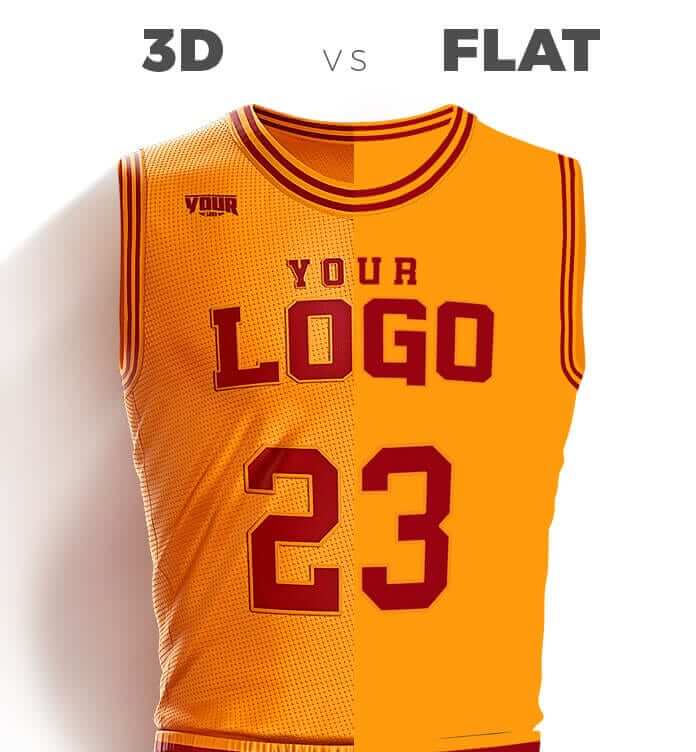
Three-dimensional graphics can help your uniform concepts, too. Just look at the difference between 2-D and 3-D:
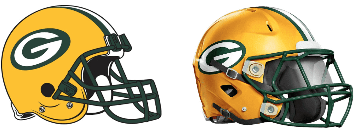
The helmet on the right may look like a photo, but it’s not. It’s a 3-D digital image. The 2-D helmet only shows you the basic design and the colors. The 3-D version, on the other hand, adds an entire new dimension — literally.
Now let’s say you’re doing a full uniform concept. Look at the difference between the 2-D and 3-D versions of the same design:
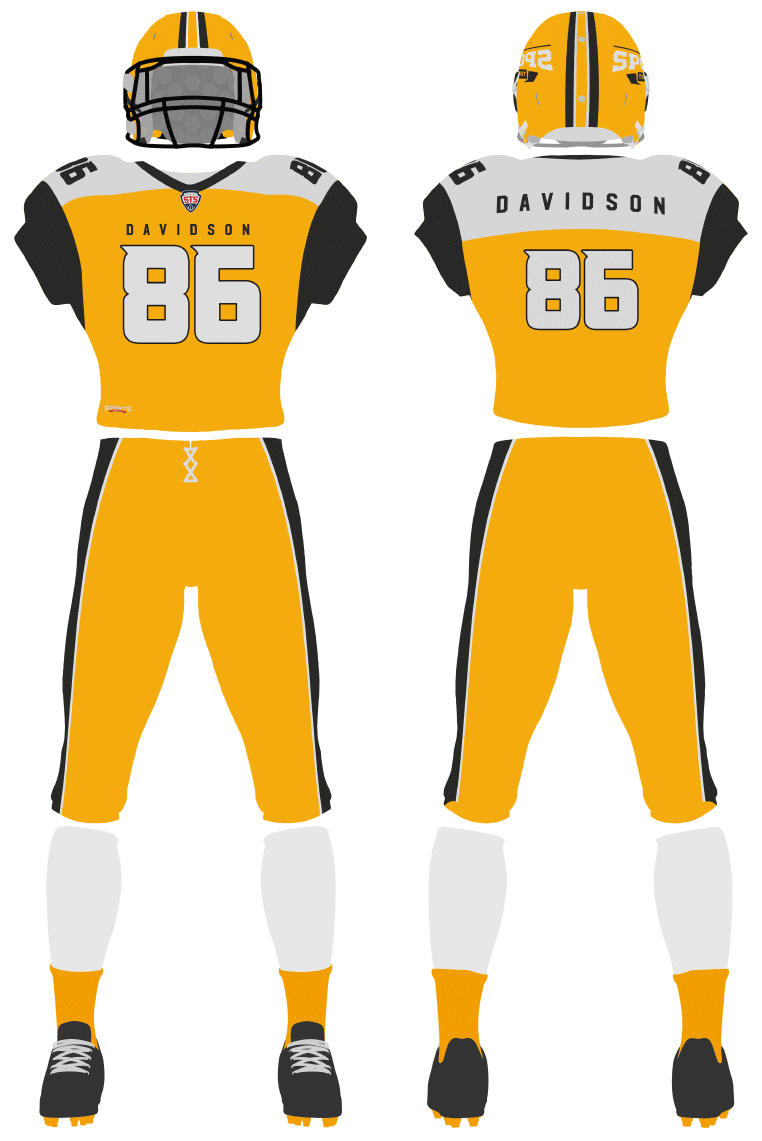
With 3-D, you can see texture, depth, and style. And you can manipulate the model any way you want, to show any angle, any perspective.
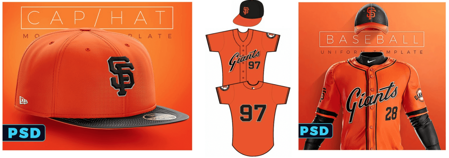
Similarly, let’s say you’re designing a San Francisco Giants concept. Compare the 2-D and 3-D versions shown below — it’s a no brainer (click to enlarge):
But 3-D designs aren’t just for amateurs or hobbyists. The NBA’s Minnesota Timberwolves recently used 3-D images to create these images of their new uniforms. The images looked as good as the real thing.
Another sports team, minor league baseball’s Toledo Mud Hens, used 3-D imagery — in this case, using a template that they had purchased from my website — to unveil one of their theme jerseys last season:
If you don’t know how to do 3-D designs, there’s a variety of ready-made 3-D templates available on my website. All you have to do is paste your logo or design onto the template, which can turn any 2-D sketch into a clean, realistic-looking 3-D image. (If you want to take things a step further and go beyond templates, Lynda.com and Skillshare.com have courses about creating 3-D designs, and there are plenty of free tutorials on YouTube as well.)
In short: Whether you’re an aspiring professional, an enthusiast who enters contests like the ones Paul and Phil run on Uni Watch, or just someone who likes to see designs reach their fullest potential, 3-D is the way to go.
———
Paul here. While Ali’s recommendation of his own templates may seem self-serving, his stuff really is good. I invited him to guest-write this piece because I truly believe in the product. Definitely worth considering if you’re into making uni design concepts.
The Ticker
By Kris Gross

Baseball News: Did we almost have a minor league team named the “Scrambled Dogs”? Yep. Head towards the bottom of this article to learn more (from Marc Viquez). … The Saitama Seibu Lions of the Japanese Pacific League unveiled their 40th-anniversary logo (from Jeremy Brahm).

NFL News: Here is your Color Rash matchup from last night between the Titans and Steelers. … Some more nuggets from last night: Steelers WR Darrius Hayward-Bey wore striped socks (from Cole P). … Some Titans players hated last night’s uniforms, because it makes them look like Smurfs (thanks Phil). … Drew Litton of GoComics sums up the Color Rash situation perfectly (from Kevin Weir). … Former Panthers WR Rae Carruth, who is in prison for conspiracy to commit murder, has his inmate number listed among his uniform numbers on his Wikipedia page (from Aaron). … Say hello to the National Arena League’s newest franchise, the Massachusetts Pirates.
College Football News: This makes me much happier than it will Paul — Clemson will wear purple on Saturday (from Brad Darby). … Get more detail on Notre Dame’s Rockne Heritage uniform (thanks Phil). … Here’s what Miami, TCU, FAU, and Syracuse will wear tomorrow (from Adam Apatoff, Ayden Pierce Maher). … UAB will wear white helmets with a green chrome facemask this weekend. … Chad points out the weird spacing between the numbers and NOB on Southeast Louisiana QB Lorenzo Nunez. … Virginia Tech LB Andrew Motuapuaka will wear the No. 25 jersey in honor of Frank Beamer tomorrow (from Andrew Cosentino). … Following up on a Ticker item from yesterday about QBs with unusual numbers, Heath Hendricks passes along this image of North Alabama QB Tyler Jeffreys, who wears No. 33. … Old Dominion will wear jersey patches honoring the 100th anniversary of Naval Station Norfolk (from Jason Rhodes). … Now how about these pant stripes! Anyone know who they might belong to? (From Bill Kellick.)

Hockey News: Injuries to goalies caused the Golden Knights to call up Dylan Ferguson from Kamloops to play earlier this week. Ferguson wore his WHL mask and pads for Vegas (good spot by Wade Heidt). … Another Golden Knights goalie, Malcolm Subban, unveiled a new mask (thanks Phil). … One name you never thought you’d see here: Justin Bieber was spotted in a Tyler Toffoli Kings jersey (from Dylan B). … The Florida Everblades and Jacksonville Icemen of the ECHL will wear superhero jerseys tomorrow night (from Adam Childs).

Basketball News: Warriors F Kevin Durant wasn’t happy that the Thunder gave his No. 35 to rookie PJ Dozier. Head a couple grafs down here (from Ryan Maquinana). … Celtics G Kyrie Irving wore Celtics-themed shoes last night (from Chowder & Champions). … Nebraska and Saint Louis went BFBS last night (from Joe Ryan, Brian Kunderman). … Clemson debuted their orange unis. … Here are the uniforms for the PK80, Phil Knight’s basketball tournament (from Mike Lefko). … Squint to see the NOBs on Samford’s jerseys (from Andrew Lopez). … New unis for Lees-McRae College. … Chris Perrenot noticed that the Texas/New Hampshire game broadcast used school colors on the telestrator.

Grab Bag: The Rochester Rattlers of Major League Lacrosse are relocating to Frisco, Texas and will be be called the Dallas Rattlers. … Bishop England High School in Charleston, South Carolina has an an awesome logo for their Battling Bishop nickname (from @Gillis44). … Are you or someone you know struggling with how to pluralize your last name? Benji King passes along this article to help you out.
Under Armour did an excellent job on those Knute Rockne uniforms from head to toe. Great video package.
I agree 100%, very classy.
Honestly, I think the bones are there (nice helmet, shoes, typography), but the modern touches really muddle the heritage message. Why graphic gloves with a plain leather helmet and plain brown shoes? Why, of all uniforms, does this 1930s-inspired look get a slick blue facemask instead of the traditional grey? The triangular array of patches on the front is too much, and the sleeves absolutely do not belong with the rest of this uniform. Those look straight out of the early 2000s.
I thought it was a great way of merging the past with present uniform conventions. There weren’t any face masks back then, so I have no problem with the blue face masks since they wouldn’t look out of place with the jerseys. I think the heritage message is clear.
I think so too. That was good. I prefer teams simply go with the throwback look instead of adding modern touches. I dont think they had numbers on front like the guy wearing # 8. But overall I like what ND and Under Armour are doing.
I found this Notre Dame uniform history site a while back.
link
I like the leatherhead helmet. I think it would be nice if NFL teams added that look when throwing back to that era. Yes, it would be in the current color, but it’s still better than simply stripping the decals off.
One extra detail about Dylan Ferguson wearing his WHL Kamloops Blazers mask. He replaced the cage of the mask with a cat eye version for his time in the NHL. Cat eye cages are no longer allowed in junior hockey.
All of a sudden I’m wondering… has any goalie in the modern mask era ever worn goggles underneath their mask?
They have removed the inmate number on the Carruth entry
Guessing it was just someone trying to be cute. Like on the order of changing the owner of the Washington Capitals to “Pittsburgh Penguins”.
Or saying Aaron Judge “owned” the Baltimore Orioles.
“Chad points out the weird spacing between the numbers and NOB on Southeast Louisiana QB Lorenzo Nunez”
It’s “Southeastern Louisiana”.
Please fix.
Paul’s On vacation, I think we can live.
Hate to break it to Ali, but the 3D templates still look like graphics and not actual uniforms.
I suppose it is personal preference, but if I was looking at a uniform design / template, I’d rather see “flat” basic graphics than the 3D design that is supposed to stand in for an actual photo.
I imagine many concepts that look good in the 2D world are realized to not work quite as well once put into the 3D template. I always wondered where this hockey template was hiding that so many people are using. Now I know.
I think the reason they still look like graphics is that they’re missing the human element. To get the truest effect of how they’d look in real life, we need to see them being worn by a human.
Love how it says you may think the helmet on the right is a picture. Except it does not look that real. The angle of the face mask and some other things give that away fairly quickly.
Yeah, I laughed at that and maybe it clouded my view of the the rest of his point. Fairly obvious it is a 3D rendered design and not an actual helmet.
I couldn’t agree more. In the helmet example above, I much prefer the 2-D version. I just want to see the colors and logos.
And 95% of the time, the 3-D versions (including all examples above) still look like graphics, just fancier.
I am not saying that I hate 3-D or don’t appreciate the effort, but when teams unveil new uniforms/helmets/etc, I’d like to have the 2-D version included at the same time. Half the time with their crazy 3-D and the lighting they apply, its sometimes hard to determine colors and other details.
Lee
Agreed. Those are not good templates
RE: Scrambled Dogs
Killer team name, that is. Might not have played in Peoria, but it’s a dish served in Columbus and would have made merchandise/licensing gold.
I live in Gwinnett County, GA. We’re about to have our new Triple-A Braves affiliate renamed to something of local flair. Almost all of the names are cringe-worthy. We’ll see if the new name has the flair of “Baby Cakes” or “Fire Frogs.”
I’m surprised Scrambled Dogs hasn’t yet been used as a nickname in some minor league somewhere.
My wife and I both thought the Steelers all black uniforms last night looked much better than the Cardinals’ black uniforms from a week ago. For starters, the black helmet works much better than a white helmet with mono black. Also, the Steelers had lots of yellow on their uniforms, between the large block numbers, wide stripe on the pants, and shoulder caps. Plus many of the players wore yellow shoes. It helped brighten and break up the black better than the thin red piping of the Cardinals.
I’d like seeing those black britches just once with the Steelers’ road uniform. Everybody likes a new twist on an old favorite.
I will never be in favor of Color Rash as a concept, but if you’re going to do it, at least the Steelers actually designed a Color Rash uniform. Too many teams (like the Titans last night) seem to just throw existing uniform elements together, or worse, go all white.
Lee
To Walter. No!
The severe disadvantage of these templates is the cost factor. Many of us only do our mock-ups strictly for fun, and many of that group just don’t have sufficient disposable income to spend on those programs and templates.
I concur.
I do all of my uni-design contest entries using flat 2D templates, the freebie online Pixlr site and Paint – that’s it. It does limit what can be done, but that’s the bucket I’m in. Could I use the fancier stuff and present a detailed, more elaborate design, yes but I don’t have access to those programs or templates so I simply can’t.
Now “IF” I did have access to those tools, I would definitely use them because I’ve yet to see a contest winner done on anything less than a more polished template platform.
Proofreading: there’s an extraneous “j” at the end of the link for the Clemson football item that’s causing a problem with the link.
With deference to Ali’s research, I would rather play to my strength, which is drawing, than use the desktop publishing environment, where my skills are just so-so. Initiative is the main driver of my uniform designs, and if I couldn’t draw them, I think I would just pass. Mesh perforations, collar and sleeve ribbing, stitching on tackle twill; that stuff is just clutter to me. It might convince me my brilliant idea wasn’t so hot after all.
I prefer 2D uniform concepts. The 3D ones just look phony, too done up. Like that Packers helmet, there’s something just “off” about it, considering all the elements. It’s a little like the uncanny valley idea, only for uniforms.
Yeah, I would have to agree with it looking off. The football helmet and uni template have a chunky, bloated look to them IMO.
This is true. Warping graphics convincingly in digital medium is just as much a skill as it is in drawing, painting, etc. When its not done well, it exacerbates the “unrealism” of the whole thing.
How much would I have to donate to Paul’s favorite charity to stop showing Syracuse football uniforms until they fix that mess they currently force on us?
Syracuse’s use of quick cut video makes it difficult to see the actual uniform. Thank you, Syracue!
Get them to put an ad patch on them.
Those “3D” templates are actually some of the worst in the design community. They look like graphics straight out of a Madden 13 video game.
No modern uniform release done by a professional team, league, or apparel company uses templates that look like these — they use actual photography that they then photoshop, which gives them a 100% realistic look, compared to this video game “3D” look.
If you’re looking for the best free template resource, you’d be better off checking out the work done by Doug Houvener of Mockup Arena.
And Paul — save the ads for the sidebar next time.
Big +1 on the ad. Are we supposed to use Ali’s site? It wasn’t clear.
PLEASE dont take this wrong Paul or anyone else involved with Uniwatch.. just feels odd to see an editorial advert on the page..
I couldn’t agree more.
However I do recognize that Paul was very transparent about it. It seems like more and more blogs and YouTubers are going this route and not being as transparent.
Maybe that’s what we should expect from Uni-watch from now on. More and more Paul has made this site about advertising and sales, than talking about design. He’s increased traffic and searches for uniform patches since he doesn’t tell us the advertiser. As such I’ve decided to refinance my mortgage with lending tree BECAUSE of that. Same thing happens during FBS bowl season, by not saying the proper name of the bowl, it increases traffic to those advertisers. Saying “chicken sandwich bowl” makes me want Chick Fil A more than if he just said Chick Fil A bowl.
RE: Mass. Pirates arena football helmet….
So will the plume on the sword/P be going forward on the other side of the helmet??
Another “3D” template vendor is Yellow Images. If you’re looking into creating artwork in this format, it’s worth checking out both as there are pros and cons to each.
I’m a uni-designer with pretty basic skills. That said, I prefer 2D over 3D for a few reasons.
1. Sometimes the proportions of the 3D template can look a little off. Getting the right look means getting the placket width and button position right.
2. I prefer the look of a uniform laid flat (like its been put out by the equipment manager) rather than suspended in mid air (like on a mannequin).
As someone who visits every day, I have to say; that’s the worst featured article Uni-Watch has ever published.
Please, never again.
Smurfs wear white pants. Just sayin’
I’m no Smurf expert (and not looking to become one!) but aren’t Smurfs much blue-er, like royal blue?
I had thoughts about the Titans uniforms last night, but “Smurfs” wasn’t one of them.
Lee
Indeed, Smurfs are more of a Royal blue. Personally, I thought the Titans uni looked like pajamas.
Actually, link is a lot closer to link than you think.
What’s next after Battling Bishops? Pugilistic Popes?
Rowdy Rabbis
You truely believe in this product? And use it as the lede
I enjoyed the color rush last night. I was expecting a black and White game, but was surprised with the sky blue Titans. The Steelers big yellow stripes on the pants and shoulder were enough to. enjoyable on the eyes. IMO
It’s definitely the best-looking of the color-on-color Color Rash games we’ve had thus far – the other two non-white games we’ve had this year each had one team in black with red numbers and trim, and at least one of those teams should never have been in black to begin with. In fact, I’d say it was probably the best-looking color-on-color match-up since the program was initiated, with the only other one coming close being last year’s Denver-San Diego matchup, with the Chargers in their c.1974-87 deep royal blue.
Regarding Kevin Durant: I was not among the people who blasted him for leaving OKC for the Warriors. I figured he had fulfilled his contract with the Thunder and like most of us would do, then took the next job offered that he felt was best for him.
However, you can’t really choose to leave a team for a rival and then complain when your old team doesn’t instantly decide to honor you by retiring your number.
Haha how much did they pay for this lede?
Nothing.
Insert green sour-faced emoji here.
On that new arena league team: I still call it The Centrum.
(And, no, I’m not looking for a shirt of that. My only connection to it was I went to a couple concerts there in the early 90s.)