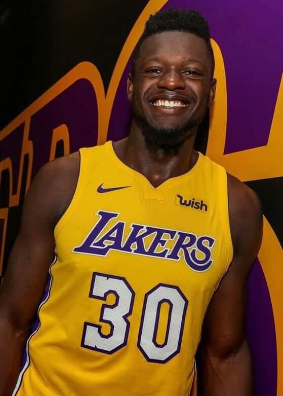
Two more NBA teams announced jersey advertising patches yesterday. Let’s start in L.A., where the Lakers have struck a deal with the e-commerce site Wish (which I had never heard of until yesterday, although I’m sure that says more about me than it does about Wish). Here’s how the patch will look on their other jerseys (click to enlarge):
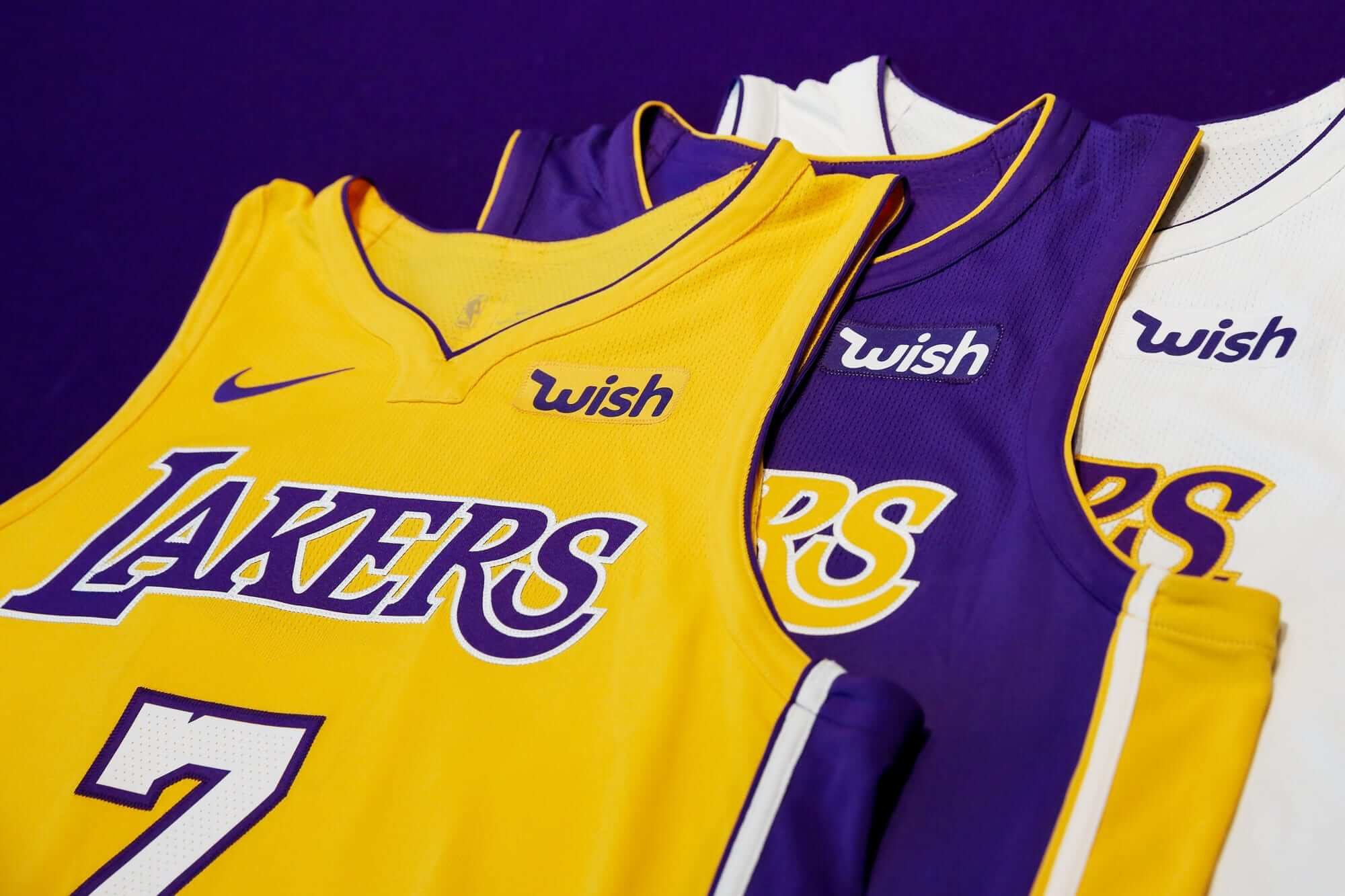
This one feels significant, because the Lakers are a legacy team playing in the league’s biggest market. It’s also worth noting that Wish is a company that combines lifestyle (which is what I mistakenly thought would be the dominant category for the NBA’s uni advertisers) and tech (which has turned out to be the dominant category). Additional info and lots of additional photos here.
Meanwhile, The Miami Herald broke the news yesterday that the Heat will wear an Ultimate Software advertising patch (never heard of them either). Here’s how that one will look (click to enlarge):
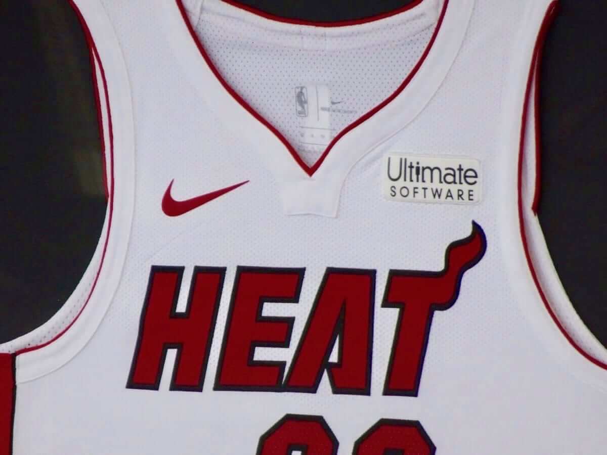
Ultimate Software is based in South Florida, so there’s a local connection. And, obviously, they’re another tech company. Additional info here.
These two moves mean there are now 16 ad-clad teams, with 14 teams remaining ad-free — for now.
Click to enlarge
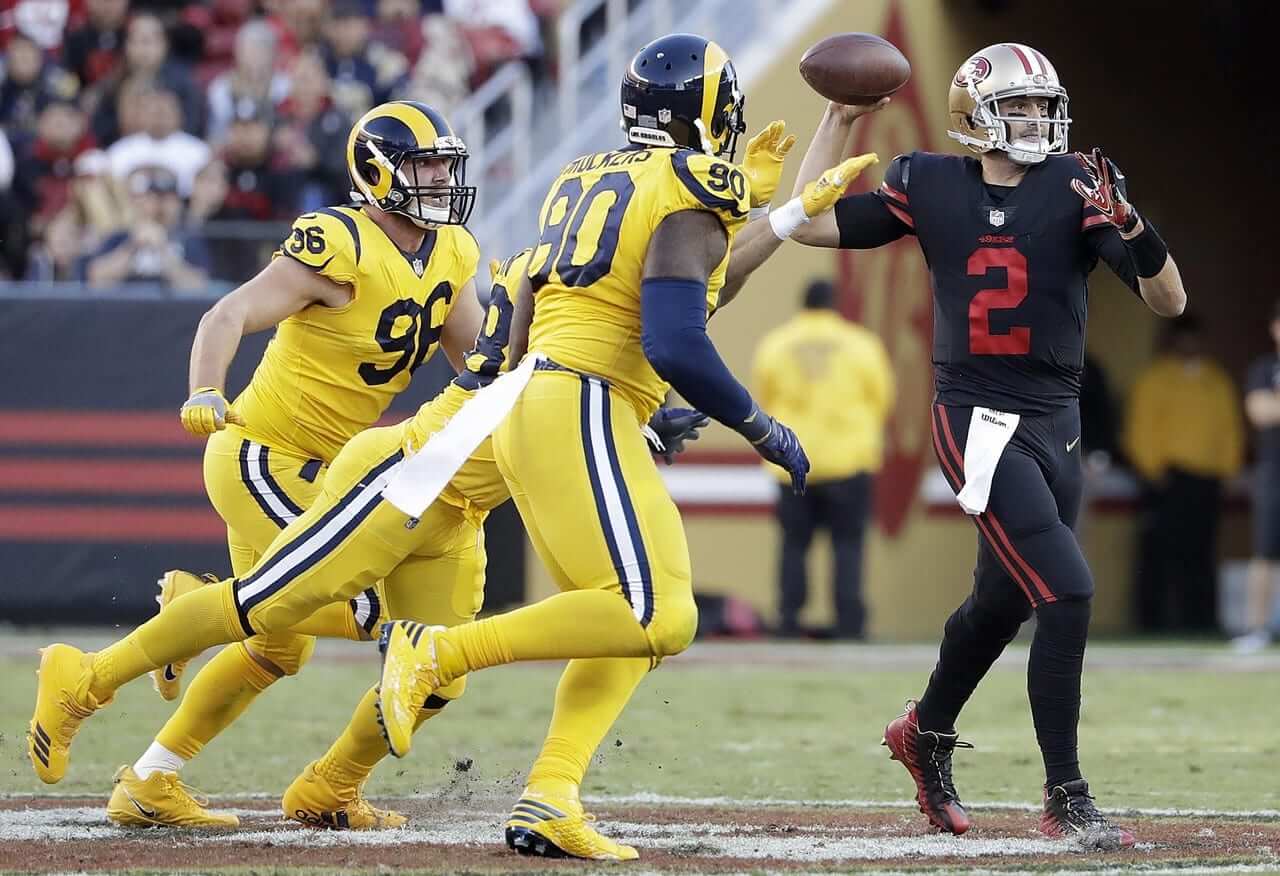
The weekly slop: Last night was the appointed date for my favorite NFL team to dress like clowns. Also, my favorite NFL team sucks (all the time, not just last night). Also-also, the other team dressed like clowns as well.
In other words, I did not watch the game and instead cleaned the house. This was good, because it meant I was home and could respond to all the people who emailed and tweeted to ask, “How come the Rams get away with wearing a different helmet? I thought there was a rule!” That never gets old, lemme tell ya.
Additional photos here.
The Ticker
By Kris Gross

Baseball News: The Brewers and Cubs went blue vs. blue last night (from @Zanerzas). … The Reds will add additional safety netting in response to that girl getting hit by a foul ball at Yankee Stadium. … Speaking of, here’s an illustration of the original Yankee Stadium, including the names of every player who ever played there (artwork by Daniel Duffy, sent our way by Mike Chamernik).

NFL News: If last night’s Rams/Niners game got you down, check out how the Rams used to look (from Alex Cheremeteff). … Speaking of last night’s game, 49ers QB Brian Hoyer suffered a torn jersey. … Injured 49ers LB Reuben Foster was on the sidelines wearing a jersey with a ”5AVA6E” NOB. The 5 and 6 matched his No. 56 (from Brinke). … A fan convinced Patriots owner Robert Kraft to change mascot Patriot Pat’s number from No. 0 to No. 1 (thanks Anthony). … Pretty cool steelworker illustration on this Steelers schedule poster (from Robert Hayes). … As we prepare for the Colts and Browns matchup this weekend, let’s take a look at some classic film from the 1964 NFL Championship Game between those two teams (from Robert Hayes).
College Football News: Colorado State will wear Colorado flag-themed jerseys on Nov. 11 against Boise State. … Here is some more info on the “Dallas Razorbacks” uniforms Arkansas will wear on Saturday. … Houston will wear a Texas flag-themed helmet logo (from Ignacio). … We have the jersey matchup for North Carolina vs. Duke (from James Gilbert). … Also from James: UNC’s costumed mascots, Rameses and Rameses Jr., will wear memorial patches following the death of a former student who wore the Rameses costume for three years. The patches will be worn at all UNC sports events that the mascots attend (from James Gilbert). …Syracuse will wear chrome facemasks with orange jerseys this weekend (from Bryan Prouse). … Virginia Tech safety Deon Newsome will wear the No. 25 jersey on Saturday to honor Frank Beamer (from Andrew Cosentino). … Here is more info on the “Medal of Honor” uniforms Wayne State wore last weekend. … BYU developed helmet foam for real-time concussion detection (thanks Phil). … This Florida recruiting image uses the wrong number color. It should look like this (from Brian).

Hockey News: The Lighting and Hurricanes went color-on-color on Wednesday night (thanks Paul). … The Flyers wore Reebok warmups before the game, but Adidas jerseys during the game on Wednesday (from Kevin Kurz). … Golden Knights players delivered jerseys to season ticket holders (from Maximiliano). … Sauli Niinstö, the President of Finland, dropped the puck in Minnesota last night. Check out the umlaut on his NOB (from Steven Schapansky). … The Predators teamed up with a local developer to build a youth sports complex, and the developer uses the old Predators logo (from Ernad Selimagic). … The Boston Pride of the National Women’s Hockey League have a new logo (thanks Paul). … The Colorado Eagles of the ECHL unveiled new jerseys, with an anniversary patch to celebrate the team’s 15th season (from Zeke Perez Jr.). … More new looks from the ECHL, as the Idaho Steelheads debuted new logos (from Nik Streng).

Basketball News: The Celtics shared some of the ideas behind their new black alternates (from Joe Giza). … Big Baller Brand has completely redesigned Lonzo Ball’s shoe before its November release. … Luke Adland passes along what looks like new Iowa State uniforms for this season. … Be on the lookout for Celtics guard Kyrie Irving on the hood of the GameStop/NBA2K18 car at New Hampshire this weekend (from Robert Hayes). … New yellow uniforms for North Dakota State (from @moserdustind).

Soccer News: It appears Nike is getting away from their generic kits for the 2018 World Cup (from Ed Żelaski). … Montpellier Hérault, a professional soccer club in France, will send a batch of misspelled jerseys to Montpelier High School in Vermont (from Jack Swagnon).

Grab Bag: We continue our daily update on nose piercings, here’s F1 driver Lewis Hamilton, who wears a nose stud while racing (from Matthew Walthert). … East Grand Rapids High School in Michigan will be hosting a vintage field hockey game to re-create the first women’s field hockey game in the U.S. More info here (thanks Jamie). … Here’s an article about really small versions of everyday items, which is becoming a collecting niche.
Shame on me for not wishing everyone a happy autumnal equinox yesterday, and also a happy Rosh Hashanah for those who are observing. Plus yesterday was my half-birthday and I forgot to eat half a cake! Will try to make up for it today. Everyone have a great weekend and I’ll see you on Monday. — Paul
Paul there’s a coding issue in the Baseball ticker section re:Yankee Stadium
Fixed.
The LA Rams could put the sleeves from Color Rash uni on a white jersey torso, replace yellow socks with blue, and there you have it. A great looking light colour uniform for them.
You mean… like link
For sure! Just needed some small changes to that Color Rash uni as described and would have been excellent.
I love what both CU and CSU wear currently from the colors to the style. But those Colorado flag-themed uniforms are SWEET. The Colorado flag is one of a select few US state flags that lends itself to incorporation into a sports uniform.
Some of these aren’t horrible:
link
I’ll always take the Bucking Bronco Logo of Wyoming over anything else, including the state flag.
Changing the Rams horns has to be the hardest helmet job to retro-ize.
Lots of snaps and brackets and holes and such to maneuver and cut around.
case in point…..
link
I was a ram in high school and putting on our own horns suuuuuucked. A lot of bubbles.
Interestingly they horns were not smooth. Like this:
link
Erik Jones ran the Gamestop/NBA 2K18/Kyrie Irving scheme last Saturday at Chicagoland Speedway.
The 20 cars will have a hurricane relief fund scheme Saturday in Kentucky and a SirusXM scheme in New Hampshire on Sunday.
BYU developed helmet foam for real-time concussion detection
So they can close the barn door the instant after the horse has fled.
Not saying early detection isn’t important. Of course it is. But the sport needs more than detection. Major changes need to be made to how the game is played. Unlike other sports where you *can* get a concussion, in most football positions you *will* get a concussion. And another, etc.
So…maybe play with no helmets then? Ya know, so no one uses their heads to tackle?
Like the A7FL!
link
On that video, the “kickoff” was a throw. I can’t get behind a league that takes the foot out of football. Kickers are people, too!
Also on that video were an assortment of really bad unis, including one guy with “#” as his jersey number.
Aussie football has no helmets and far fewer concussions. Might be an idea.
In this day and age, we tend to forget that helmets were first used simply to protect the hair and ears from, let’s call it “extra-curricular” damage. I’ve said for years and years, if you don’t want the head and helmet used as a missile, eliminate the over-protective helmets; the best way to avoid long-term damage is to avoid short-term pain.
Not a bad suggestion. I could see a rugby/football hybrid being the replacement for what we have now in the future.
I’m 35, remember playing youth and high school football, always being taught to tackle shoulder into their midsection and wrap up, only thing that your helmet should hit is the ball, which might cause a fumble. It always has me scratching my head when I watch the game, were these guys never taught the fundamentals? I guess when you a freakishly skilled athlete your coaches let poor technique slide if you are that fast/strong.
Use your head. Don’t use your head.
Greg,
Solid fundamental tackling doesn’t make ‘SportsCenter’; they want the massive collision where the receiver is on the ground, and the defender is standing over them. With far too many players in the higher levels of play, they’re more interested in making the highlight reel than fundamental football.
Then you’ve got kids at lower levels that emulate what they see on the tube, tackling head first. Mix in a few pathetic coaches that are teaching kids to hurt the other players, and you’ve got an epidemic.
Another approach that i have heard is to acknowledge that there is no way to make football “safe” and have it remain the same sport. So this line of reasoning says that we should stop trying, and just accept that it is a violent sport that involves large strong men ramming into each other, sacrificing their life and health for the entertainment of us. Players should be made aware of the dangers and play at their own risk.
Proofreading:
“response to thqt girl”
“check out the Rams used to look”
“Frannk Beamer”
“really small versions of everyday item”
Fixed.
Those 49ers black uniform is one of the worst in sports. Not only does it not fit the overall history and aesthetic of the 49ers, the numbers are nigh illegible from any kind of distance.
This is, in my opinion, a case of the primary purpose of the uniform being merchandise sales rather than function on the field. I was always taught that form follows function, and in this case the function appears to be appealing to people with an early 1990s BFBS sense of style.
I actually liked the Rams, primarily because it feel like a call back to the days of Norm van Brocklin
link
I liked the Rams’ jerseys, and I liked their pants. Together, though, especially with the matching socks and shoes, it was way too much. Like you, I found the 49ers irredeemable.
I’m with you, the Rams color rash is not the worst. I mean the all yellow is bad, but the components are all pretty nice. Heck, even just go to blue socks and that would help a lot. It is pretty obvious they need to go back to blue and yellow full time. I just hope when the do go back to that, that they actually have a royal blue helmet that matches the rest of the uniform, instead of navy helmet and royal blue jersey.
For sure about the 49ers. They should not wear Color Rash. Another damning thing about that Color Rash uniform is the helmet does not match at all with the uniform. Looks like a black and red team that had to borrow another team’s helmet.
And it looks like the 49ers borrowed the pants of the CFL’s old Ottawa Renegades:
link
Color rush has produced some great jerseys and uni sets, but all with the asterisk that they would look great if not for the unitard look. Pretty much all of the white CR sets have been great. Cowboys, Giants, Saints, Bengals all are great jerseys, they just need contrasting socks. Several other teams like the Rams, Texans, Patriots, Broncos, Chargers, Jets, Falcons, Cardinals, all have better looking color rush JERSEYS than their standard set. This would have been a pretty cool idea if they hadn’t mandated the mono look. Though I know we’d all prefer throwback Thursdays over all.
Agree. If they want to keep up the marketing gimmick to sell more merchandise just go with throwback Thursday games to market throwback uniforms.
I really don’t get the appeal of the mono color look with pants and socks, that even extends outside of the color rash program. Who thinks that looks good? The contrasting socks really help make the uniform work.
Re Color Rush – I don’t mind the matching socks when there is a contrasting pant stripe, like with Rams/Niners here. Actually, scratch that – I actually actively like it. Not for everyday look, but for a one off. (I dislike when there is no contrast at all, like with the Saints black pants – mostly bc it looks unfinished to me, like black leggings for practice, and you’re planning to put the uni pants on later.)
I would actually like the Niners Color Rush – BUT I can’t get past the mismatched helmet. That to me makes it probably my least fav uni in sports. With a matching helmet, I would like like it.
A 49ers official said, when they rolled out the black set, ‘black has been a part of our official color scheme for years.’
He was referring to the little outline around the SF decal.
Honest.
As a St. Louisan, I’m all for hating on the Rams every chance I get. But, confession time, I kinda actually like their school bus look. Much better than the navy and gold we saw too much of for 3/4 of their stay here.
And the Niner’s all-black is bad, but I don’t know how I’d react to an all-red set for them. I don’t care for the Chiefs when they’ve worn red pants with red jerseys, but theirs is more fire engine-y, so perhaps SF in all red wouldn’t be so awful.
More proofreading:
“Cavs guard Kyrie Irving” needs to be fixed.
Fixed.
Oh that Yankee Stadium illo with the players’ names is sweet. I would love one of those of Fenway (I’d buy it as a gift in a hot minute).
Isn’t today the Autumn equinox?
CBS news made a big deal about this morning that it occurs at 4:02 PM
I took that picture from “The Weekly Slop” and, initially, I wanted to see how that Color Rash looked like in black and white. But then I figured, that wasn’t enough; how would it have actually looked in the black-and-white television era? So I decided to tweak it to create an approximation of that effect, complete with cropping and framing that image in a 1950s-style frame, and threw in a version that would approximate a circa-1970s color TV as well. The results… link.
Lakers going with uniform ads is pretty much the nail in the coffin. Though the Celtics already did it, so there you go, probably the two biggest legacy franchises have sold out. If they are doing it no reason for anyone else to withhold. Not to mention the Lakers, as one of highest revenue teams (if not the highest) is going to sully their brand for a few bucks, you can be sure the less profitable teams are jumping on the bandwagon.
That Celtics uniform vid is the most unintentionally hilarious thing I’ve seen in a long time. Just your everyday occurrence of some guy painted silver walking around holding a ball.
Looks like the Colorado Eagles are calling back to the old NHL Colorado Rockies with those new unis.
Dig that old Rams-49ers photo. Great looks for both teams; note the colors of the stripes on the Niners’ sleeves.
If there’s one redeeming thing about the advertiser on the Lakers’ uniforms, it’s that they at least respect the Lakers’ colors. The advertising in other colors looks infinitely worse. This advertiser also uses a single gneeric word which could conceivably be a slogan for the team. It’s probably the least-bad uniform ad we’ve seen so far.
-1 for normalizing ads on uniforms. :-)
Is there a reason why these NBA advertising patches are not patches and say, text. Like how the Nike swoosh and Lakers wordmark are applied?
The patch does look cheap and/or temporary to my eyes. Like it’s velcro. Rip off this week’s ad, stick on the next one!
I suspect the NBA leaned hard on the “patch” look and concept to smooth the whole transition for fans. So there might be some small feeling that they’re not actually sullying the beloved uniforms, just affixing something to it for the games to come up with a little extra revenue. Not hard to imagine that this will pass.
Last nights game was like watching a Rorsatch test. My eyes still hurt. Good game but maybe the worst uniform matchup in NFL history.
From now on the Rams Color Rush jerseys will be known as their Colonel Mustard alternates. Thank you and please drive through.
Real mustard is brown and spicy… not yellow. Don’t be yella ’bout your mustard!
Oh, that is not a supporting statement for the Jaguars to go full brown/spicy mustard again!
The Rams did have a past uniform, I think in the 1950s before my time, that were yellow jerseys. This was a really good look, but had white pants with yellow & royal blue stripes. It actually wouldn’t be a bad look for their upcoming new uniforms when they move into their new stadium. One advantage would be the ability to have the same uniform against both colored and white jerseys. I know it’s now all about jersey sales and multiple looks, but there is something to be said about having a consistent look, like LSU with their white jerseys, or in the past Dallas wearing white almost exclusively.
That Rams look of blue jerseys with yellow numbers, yellow horns, and white pants is criminally underrated. They even used UCLA stripes on their road uniforms. I actually prefer it to the classic 70’s-90’s look.
Here’s the road look from those years. Pretty sharp.
link
I have commented on it before, but I think this look with the white pants would be my favourite choice if the Rams change uniforms. Modern retro.
There recently was a modern rendering of the road uniform in Canadian university football. Gives an idea of what the road uniform may look like. The UBC Thunderbirds in Vancouver wore close to the same white jersey and pants in uniforms from a couple years back:
link
Spurs are kind of the Barcelona of the NBA. Wouldn’t at all be surprised to see SAS go without an ad patch this season or go with a charity. Eventually they’ll probably cave like Barca but I anticipate at least a little fight.
I had only heard about wish last year from my brother in law, I guess he got some cheap gopro clone from there. they do a lot of direct from china stuff, apparently. Rakuten was interesting too, because I have seen on deal sites that people have been put off by unauthorized transactions, it’s odd that the NBA is hitching their wagon to these retailers. The almighty dollar at play
I was home and could respond to all the people who emailed and tweeted to ask, “How come the Rams get away with wearing a different helmet? I thought there was a rule!” That never gets old, lemme tell ya.
I get that the repeated questions are annoying on some level, but geez…why complain about it? Doesn’t it mean that Uni Watch is a successful brand?
Yeah, as anyone who’s been reading me for any length of time is well aware, there’s nothing I want more than to have “a successful brand”….
Well you didn’t answer the question. Why complain about it.
Also ‘successful brand’ is probably a poor choice of words on my part. I mean that you should be proud that Uni Watch is popular. It started out so small and now it’s big enough that you have fans that annoy you.
I think you answered it yourself at the end there.
;)
I’m with ya, Peanut Gallary.
If there was ever a book on first world problems, this would be in chapter one.
That game (from a uni perspective) was horrid last night. The game itself? Not so bad.
No pictures of the UNC mascot memorial patch, which will be unveiled at tomorrow’s football game against Duke.
link
Perhaps they will use the foundation’s logo.
link
I’m admittedly the target-audience age wise, but I’ve come around on the monolith jerseys. There are a few exceptions (the Jaguars being the worst offender), but I appreciate the sleekness of the single color dominating; the best ones (Titans, Rams, Chargers, Texans, Bills) pop on the field, while the worst (except for the Jaguars) are mostly just forgettable. (In that category I’d include teams that inexplicably used white or black as their primary color: Cardinals, Cowboys, 49ers, Packers, Eagles).
I can’t wait for the Color Rash between the Seahawks and the Cardinals next month. Awful BFBS with Red Highlights versus highlighter green.
I”m with you 100%. I actually like the Bengals all-white (like White Tigers, if they could have a white helmet it would be way better). I think the color rush unis are pointless when they use colors the team doesn’t traditionally use (the 49ers the chief offender).
BtW, I was agreeing with Daniel. And I don’t understand why people don’t like the Seahawks lime green. Different strokes I guess.
Look closely at those new Colorado Eagles sweaters; you’ve seen them before. They’re the old Rockies’ sweaters, as updated to the new cut and material.
The Gators recruiting graphic also uses the wrong font on the number. Just photo-shopped a picture in his HS uni?
My personal fight against uni ads:
I will chose not to do business with any company who utilizes Uni ads, and just as importantly, I WILL NOT Google the companies that I’ve never heard of.
Anyone who saw Wish, or the other Stupid Thing, and went directly to the Interwebs to find out about those companies are the reason for the ads. Don’t buy in!
I will remain Proudly Ignorant!
Yes! This has been my point from day one that is totally falling on deaf ears it seems. If you are covering the ads, mentioning the name of the advertisers in stories, googling the companies, etc. – you are supporting and encouraging more ads. If I’m a company that bought one of these ads, and I’m seeing how much coverage the ad is getting…I’m patting myself on the back for a good decision and planning to reup next year. If I’m a company who is considering buying an ad patch, each blog/story mention of the advertiser name/image is just increasing how much I’m willing to pay. Ads are about eyeballs. Period. More eyeballs/mentions = success.
Cole, I have made my opposition to uniform ads very clear for years now. It is nonetheless my job to cover news. Including unpleasant news.
I’m not excited for ad patches, but I’ve been watching soccer for years and it usually doesn’t affect the viewing experience (there are some horrid ad clash exceptions). Be glad these are small and tertiary instead of front and center. I’m kinda over the complaining. We are just gonna have to deal. Also, the 49ers’ Color Rush uni is trash, but I’m actually a huge fan of the Rams’ uni. I feel like most of them are at least ok. But the 49ers and Jags unis are horrid. Do you think the 49ers’ could pull off all gold?
I think the issue is “only one helmet shell, same color.” Therefore, take the white horns off and put the yellow horns on. 49ers are stuck with the one helmet shell.
For example, the Bears just take the decal off for their throwback and are wearing the same helmet for color rush – I think.