
Click to enlarge
[Editor’s Note: Paul is on his annual August break from site. Deputy editor Phil Hecken is in charge from now through Aug. 25, although Paul is still on the clock over at ESPN and may be popping up here occasionally.]
By Phil Hecken
Follow @PhilHecken
“All Rise”
“Don’t You Know”
“Thor”
“Bringer Of Rain”
If you didn’t know these NickNOBs (or even that the players associated with these nicknames had those nicknames), that’s all going to change on games played between August 25-27, which MLB has designated as “Players Weekend.” We knew this one was coming for a few months, but yesterday, MLB officially introduced the caps and jerseys (all of which will feature player nicknames on back — although not everyone has a nickname) for the promotion. This includes the Yankees, who have NEVER before worn any kind of NOB. The ghosts of Ruth, Gehrig and Steinbrenner are surely all rolling over in their graves.
What you see above in the splash is the backs of the jerseys — you’d be forgiven if you don’t recognize some (many?) of the names, or even can tell which teams they are for. MLB has given all teams new pullover jerseys with contrasting sleeves and new caps (one assumes they will pair these with their regular pants or the special pants they were all given for earlier promotions like Mothers Day, Fathers Day or Memorial Day).
Nicknames. Custom gear. And the sickest jerseys you’ll ever see.#PlayersWeekend is coming: Aug. 25-27. https://t.co/yHdg1ehoig pic.twitter.com/i9BEbcfaX1
— MLB (@MLB) August 9, 2017
The jerseys themselves are brightly colored, and in most cases will take colors from the team’s color palette.


Those jerseys will also contain a patch on the right sleeve where each player can write the name of a person or organization that “helped them on their journey to the majors.”

The pullovers (I have some extra tissues for Jimmer Vilk and Phantom Dreamer) are designed to look like “youth” baseball jerseys, and the vibe MLB is trying to give off is that baseball is fun and a kid’s game.
Excited to participate in #PlayersWeekend Aug. 25-27!
Players will wear youth league-inspired unis, w/nicknames! https://t.co/yeE4vNjb9C pic.twitter.com/0GsOLZMchS
— Cleveland Indians (@Indians) August 9, 2017
(You will note in the above tweet and photo that the Cleveland team is getting the “Block C” cap)
Speaking of caps, they’re all very bright (some would say “vibrant”) as well, liberally using colors from a team’s palate.

In some cases, the caps contain colors that do not come from the official team color list.

In keeping with the spirit of the unis/caps, the aforementioned patch on the players’ right sleeves features a new logo, showing a player’s progress from from Little League and to the majors.
MLB Players Weekend jerseys, to be worn 8/25-27, include patch for player to write in name of mentor/inspiration (photo by @sportslogosnet) pic.twitter.com/mMrg8JXVsb
— Paul Lukas (@UniWatch) August 9, 2017
All teams have now shown off their jerseys showing player NickNOBs, some stacking them widthwise across the screen, while others went for the more upright approach. In all cases, they showed the team’s special cap and the front of the jersey, along with the backs of all NickNOB’ed players.


Of course, the players will get special socks to wear as well:

.
You can see more of the caps and jerseys here (in some cases, the caps have logos the teams have never worn before):
Two (lucky?) teams will also get to wear these uniforms on August 20th, as the Pirates and Cardinals will play a game in Williamsport, PA (home of the Little League World Series — but not on that field). They’ll pair off on a diamond which is home of the Class A Williamsport Crosscutters of the NY-Penn League. More info on that here.
.@MLB announced the jerseys we'll wear for the 8/20 Little League Classic AND during Player's Weekend (8/25-27)! https://t.co/u2IYnZNf52 pic.twitter.com/ZEsiY2nm1v
— Pirates (@Pirates) August 9, 2017
Of course, aside from MLB cramming another weekend-long merchandise selling campaign promotion down everyone’s throats (no matter how “bright” and “fun” these jerseys and caps are), we will be witnessing MLB history (and probably not in the way the team envisioned it), when the Bronx Bombers take the field wearing jerseys with NOBs. Here’s a look at Aaron Judge’s being created:
Not only will MLB be “relaxing” the dress code for the jerseys and pants, players will also be permitted to style — so the shoes, batting gloves, sleeves, and other protective gear will also be, should the player want, as loud or crazy as can be imagined. Basically it’s going to be an everything goes, color bonanza. Jimmer Vilk may enjoy this, but I will likely be avoiding the TV for these three days.
There were far too many reaction tweets, but a couple caught my eye here:
Oh yeah, just imagine it… 😑😑 @UniWatch @PhilHecken #Yankees pic.twitter.com/zGqspIuR82
— B-Dilly (@Titan4Ever2488) August 9, 2017
Mets P Noah Syndergaard to wear "Thor" nickname for MLB Players Weekend. But Twins P Paul Thormodsgard already wore that back in late ’70s! pic.twitter.com/mm8FjsxBDe
— Paul Lukas (@UniWatch) August 9, 2017
@UniWatch @PhilHecken one would think with the release of the jerseys today, @MLB wouldn't have included players no longer on the roster pic.twitter.com/sEkhKavYI9
— dennis werley (@denniswerley) August 9, 2017
so @AaronHicks31 has the best jersey for Players Weekend hands down. absolutely amazing @PhilHecken @KeeganMKey @KeyAndPeele @Yankees pic.twitter.com/3ZG5I6yKsE
— Deploraphil 👌🼠(@deploraphil) August 9, 2017
Our pal Chris Creamer over at Sports Logos dot net appeared to have been given an exclusive, so he has a tremendous rundown of everything going on and lots of photos as well. And of course, a certain ESPN scribe had a column on these as well. If you haven’t seen your team NickNOB’s I know Paul’s Twitter Stream has a lot of them covered.
While the new jerseys and caps are purely a greedy money-grab designed to encourage fan purchases, game-worn jerseys will be auctioned off at MLB.com after they are worn. According to MLB, “The league will donate 100 percent of the proceeds to the MLB-MLBPA Youth Development Foundation.”
It’s all a little too much fun for my tastes, but I can at least see where MLB is trying to raise fan interest (and drain fan pockets) with all this colorful stuff. I’d be much more OK with this if they just had one or two of the elements. But the special caps, jerseys, socks, NickNOBS, plus allowing the players to basically wear whatever accoutrements they please feels like overkill. God only knows what kind of mish-mash the “teams” will look like on the field. I’m all for making baseball “fun” again, but this seems like more forced fun than anything else, with a healthy dose of marketing thrown in. And, like the Mothers Day, Memorial Day, Fathers Day and Independence Day uniforms that were all worn two or three days too many — having this take place over three days is waaaaay too much fun.
YMMV. Discuss.

.
Jazz Unveil New Uniforms

The Utah Jazz unveiled two new uniforms yesterday (a white and a navy, with those funny names Nike has given them). They are essentially unchanged from previous unis, but still there are some differences.

The Note x The Swoosh
It’s in the details: âž¡ï¸ https://t.co/N7gYFsC0Mj pic.twitter.com/yCqkkGrgwr
— Utah Jazz (@utahjazz) August 9, 2017
As mentioned above, the differences between these two new uniforms and their previous ones are slight. The white uniform has thicker trim around the arm holes and neckline than before. On the white jersey, the number is green. That uniform features (of course) the Nike swoosh on the right side of the chest, with a slightly different wrinkle: The “ad” patch is an ad for “5 for the Fight” — a campaign to fight cancer by asking people to donate $5 to “fight cancer.”
.@Qualtrics x #5ForTheFight ✋
Join the fight against cancer: https://t.co/72tB4i4J9Z pic.twitter.com/RuHRNmnMyd
— Utah Jazz (@utahjazz) August 9, 2017
The rest of the uniform looks pretty much like the old uniform (with the exception of the collar and sleeve striping). The “Jazz” wordmark is unchanged, featuring a note made up of a basketball in blue, green and gold colors. The number on the jersey is now green. The pants are white with side stripes mirroring those on the jersey. A large Jazz logo is on the left side of the pants, and a waist logo remains.


The back of the jersey features the NBA logo atop a radially arched player NOB (rendered in solid blue lettering), with the uniform number in green.

How do these stack up compared to the previous uni?
Side-by-side comparison of Jazz's old and new white uniforms. pic.twitter.com/jhD2b8sQlq
— Paul Lukas (@UniWatch) August 9, 2017
The blue uniform is also almost unchanged from the past uniform, but it too contains the thicker striping and a one-color collar.


The back of the blue uniform basically mirrors the white, with the NBA logo atop the player NOB, and a gold number. Player name is in solid white radially arched lettering. Like every new Nike jersey, all stripes are truncated in the back of the jersey. Pants have a Jazz note logo on the left front leg.


And how do the blue unis compare to the prior set?
Side-by-side comparison of Jazz's old and new blue uniforms. pic.twitter.com/971nDG2UBn
— Paul Lukas (@UniWatch) August 9, 2017
So there you have it — almost no change from last year (of course, these are but two of the four uniforms the team will get).

Stay Tuned… pic.twitter.com/YXP1tNiRdX
— Utah Jazz (@utahjazz) August 9, 2017
Stay tuned…
.
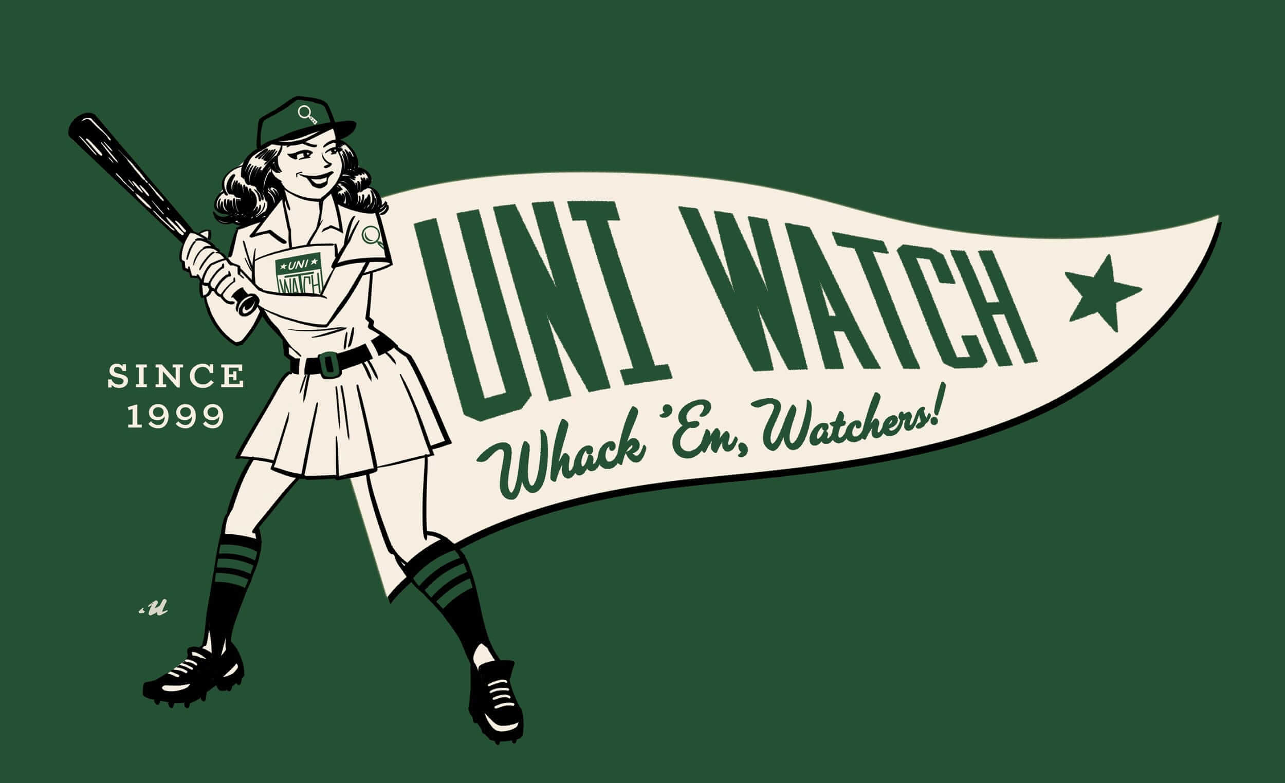
Going, going…: Paul here, reminding you that today is the next-to-last day to order our latest limited-edition Uni Watch Artist’s Series T-shirt, designed by the great Rob Ullman. Here’s the base design, followed by a few of the many color options we’re offering (click to enlarge):
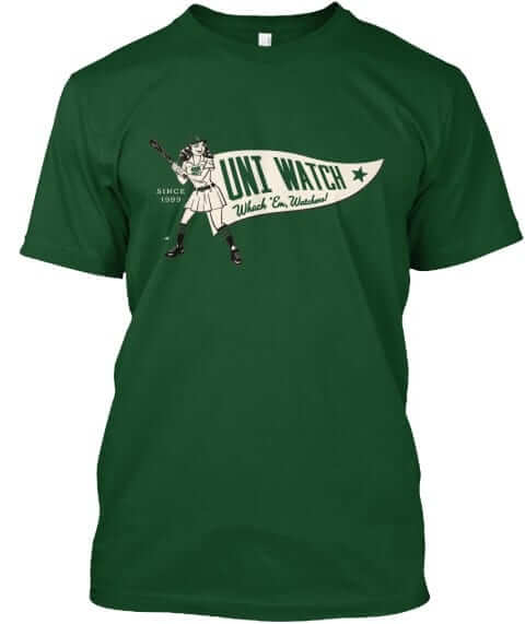
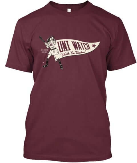
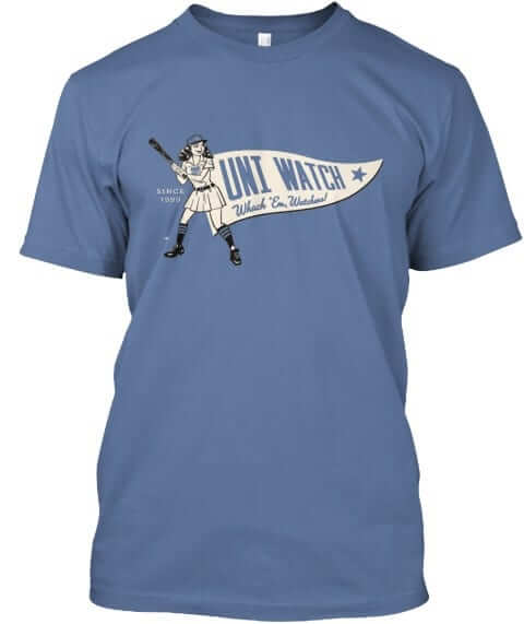
It’s available through the end of tomorrow. Full details here, or just go straight to the ordering page. It’s also available in women’s sizes. My thanks, as always, for your consideration.
Naming Wrongs update: Paul here (again). We’ve just added a slew of new Naming Wrongs designs. One at a time:
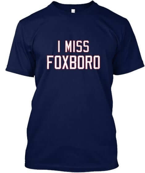
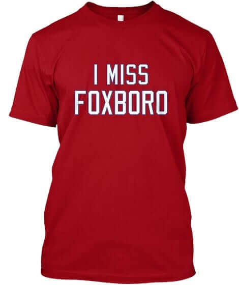
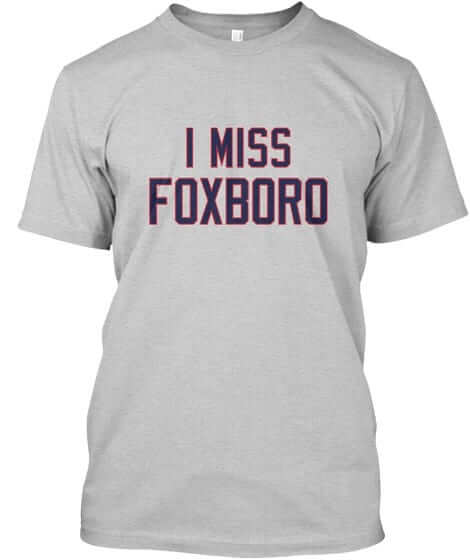
Foxboro: Gotten a surprising number of requests for this one, which we’re offering in royal, navy, red, and grey (for all photos, you can click to enlarge):

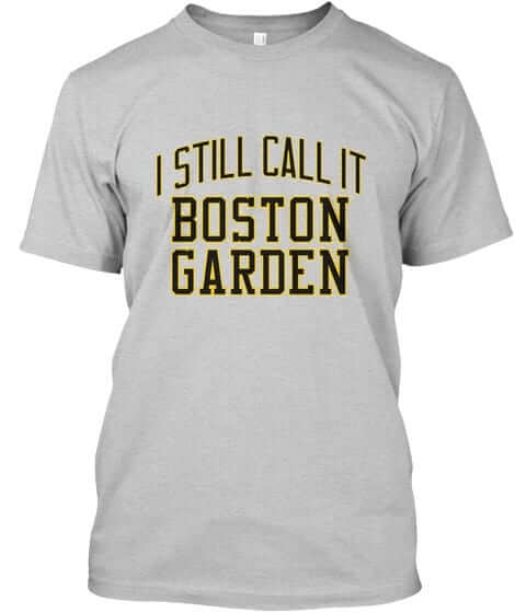
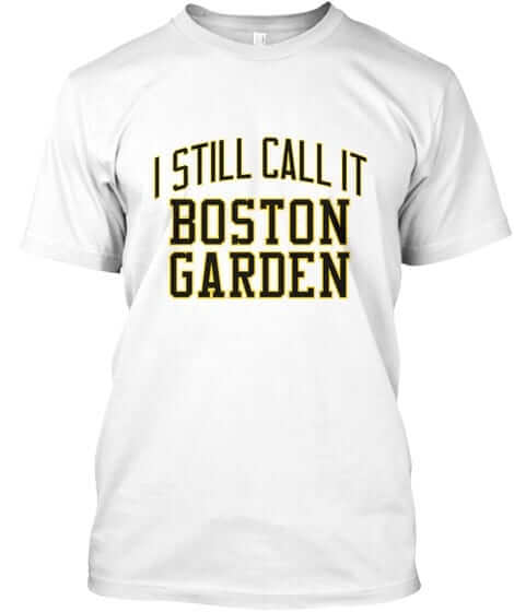
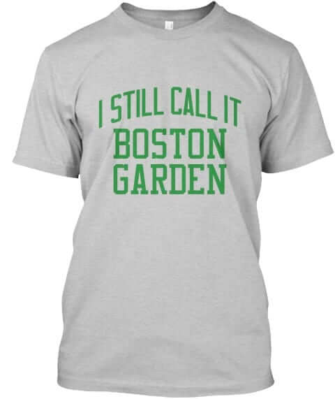
Boston Garden: Sticking with the Massachusetts theme here. We wrestled over the proper wording for this one, but lots of fans told me they really do refer to the new building as Boston Garden, so we went with “I Still Call It” (instead of “I Miss”). This one is available in black with gold/white lettering, black with gold lettering, grey with black lettering, white with black lettering, green, grey with green lettering, and white with green lettering:


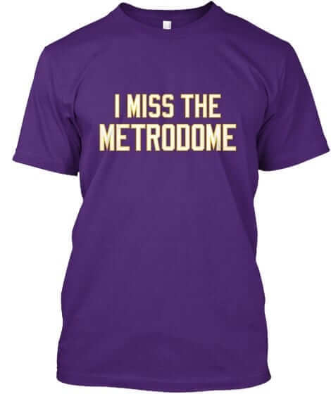
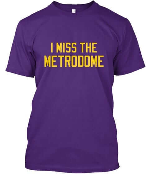
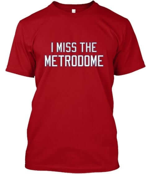
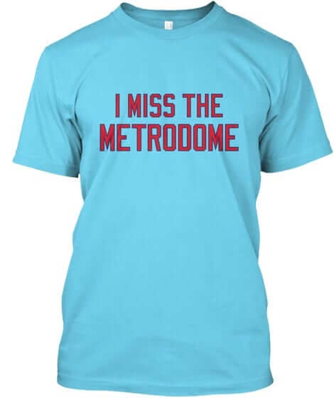
Metrodome: We’ve done shirts for the Astrodome, the Kingdome, and now this — we appear to be in our dome phase. We’re offering this one in a wide variety of colors: purple with white lettering, purple with gold lettering, grey with purple lettering, navy, red, grey with red lettering, and powder blue (and in case you’re wondering, I don’t mind having purple on these shirts because they don’t include the Uni Watch name):


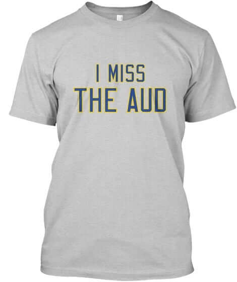
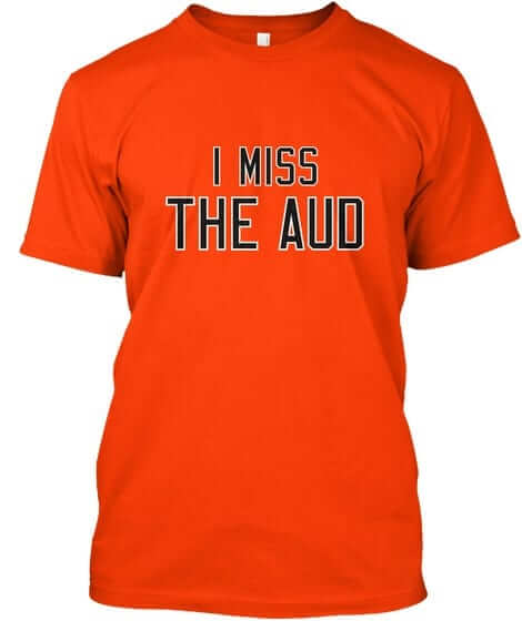
Aud: Buffalo fans have been pushing hard for this one. It’s available in blue, white, grey, and orange:


All of these designs are now available in the Naming Wrongs shop. They’re also cross-listed in the Uni Watch shop, where card-carrying members can get 15% off. (If you’re a member and need the discount code, send me a note and I’ll hook you up.) Major, major thanks to my collaborator, Scott M.X. Turner, who’s been working really hard on these. So hard, in fact, that we’ll have more new designs very soon — possibly tomorrow. Stay tuned.
And yet another item from Paul: Please remember that I’m currently accepting submissions for an ESPN contest to redesign the Tennessee Titans. Details here.

KRC update: Yes, it’s still me. The latest installment of Key Ring Chronicles is about a wedding band with an Irish inscription — “Go Deo,” which means “Forever.” Powerful stuff. Check it out here.
Okay, that’s it for me today. I return you to the capable hands of Phil, and the rest of the Uni Watch team.
.
Griffins Jersey Contest Reminder

In case you missed it, I’m again hosting a jersey design contest in conjunction with the Grand Rapids Griffins (an AHL affiliate of the Detroit Red Wings). All the details are contained in this post.
The deadline for getting your submission in to me is August 15 (at 6:00 pm Eastern Time), and we’ll have reader voting on the concept jerseys beginning on August 17th! Last year we had 85 entries and I’d expect we’ll equal or surpass that this year. Prizes include a custom jersey based on your design and tickets to the game that the Griffins will be playing in the jerseys you designed!
.

Too Good…
for the Ticker
He’s back!
A couple days ago Gene Sanny shared with us some amazing electronic football figurines he had customized for the 1920 Duluth Eskimos; today he returns with a glimpse at another team from more recent vintage. (you can click the images below to enlarge).
Here’s Gene:
“Ron Mix, 1960 Los Angeles Chargers.
“Sculpted sleeves, but the big experiment I tried on this one is in the 2nd picture…. on helmets without stripes, throwback helmets always look incomplete to me without the “ridge”, and painting it never really looks real, so I printed a decal with really thin lines.”


Thanks Gene! Another stellar job!
OK. Now, on to the ticker…
.
The Ticker
By Mike Chamernik

Baseball News: Angels players wore full NBA uniforms around the clubhouse before yesterday’s game. Here’s the entire team (from Kristopher Sharpe). … Pawtucket Red Sox utility man Tzu-Wei Lin has the flag of his native Taiwan on the knob of his bat (from @bucky1382). … How about this: An old-time team in throwbacks! The 1950 Terre Haute Phillies celebrated a half-century of the Illinois”“Indiana”“Iowa League by wearing uniforms from 1901 (from Marc Viquez). … Michael Raymer spotted a photo of Eddie Mathews wearing a flocked helmet with a hand-drawn “M” at the Braves’ new ballpark. … Someone stole a framed Carlton Fisk jersey from a pub in New Hampshire (from Tris Wykes). … Oops! There was a baseball cap continuity error in Straight Outta Compton (from Leon Frager).

NFL News: The Chargers released their uniform schedule. Once again, they will wear white for the first month of the year, plus they won’t wear their standard navy jerseys until late November (from Kenny Saidah). … Newly-acquired WR Anquan Boldin will wear No. 81 with the Bills. Boldin had worn the number throughout his career except for the last two years when he was with Detroit, where Calvin Johnson wore 81 (from Andrew Cosentino). … A few barbers were on hand at Bills camp to shave logos in the back of customers’ heads. … The Panthers will not have a new uniform template this season (from Nick Lineback). … New Dolphins QB Jay Cutler swung a deal with backup QB Brandon Doughty to get back No. 6, which Cutler wore in Denver and Chicago (from Brinke, via Phil).
College Football News: Arizona State will host a “Stripe Out” game in late October where fans will wear gold or maroon based on the section where they are seated. Here are the rest of ASU’s themed games this season (from Patrick Sesty).

Hockey News: After initially denying a trademark request in December, the U.S. Trademark Office has approved for the Vegas Golden Knights to continue to use its name for identification and competition purposes. The trademark to protect the Knights’ logo on merchandise and sportswear is still pending. … After a few decades with white helmets, Team USA’s U18 squad has switched to blue (from Harvey Lee).

NBA News: Unclear if this was intentional, but Andrew Wiggins leaked the Timberwolves new shorts design. … The T-Wolves asked people who work in their office to name their favorite basketball uniform. … Ryan Beth found a Scottie Pippen throwback jersey that has a Dennis Rodman tag on it. … The home of the Wizards, Capitals, and Georgetown hoops has a new corporate name (from JohnMark Fisher). … The NBA tweaked its logo last month, but the home office has yet to reflect that change. … New uniforms for the Argentina basketball team (from Moe Khan). … Also from the baseball section: Angels players wore full NBA uniforms around the clubhouse before yesterday’s game. Here’s the entire team (from Kristopher Sharpe). … The LA Clippers will be unveiling their new unis on Friday. The two middle columns spell out “BLUE BACK” (from ouÉlossÇd”).

Soccer News: Puma will outfit five EPL clubs this season, the highest share among the eight manufacturers who have deals with teams (from Josh Hinton). … New dark green jersey for SE Palmeiras, a Brazilian club (from @griffinward). … “Lamar Neagle, who’s from suburban Seattle, got traded back to the Seattle Sounders earlier this week,” says Kenny Ocker. “He wanted back his former jersey number, 27. New teammate Bryan Meredith convinced Neagle he was giving up 27 and managed to extort a free breakfast for it. But Meredith has worn 35 all year.”

Grab Bag: New kits for Edinburgh Rugby (from Adam Ingle). … A friend of Robert Brashear created a nifty Pittsburgh sports cornhole set. … Alan Peckolick, the graphic designer who created logos and typefaces for GM, Revlon, and Mercedes-Benz, has died.
.
The “I’m calling it Cap Centre” shirts are coming, right?
Different building in a different state, c’mon. Should have been a shirt during the USAir/Airways Arena days.
ed
A few Phillies have their real last names on the back of those “new” jerseys. How many other players are saying “enough is enough” and doing the same?
Click on the second link in the first paragraph.
Maybe because I’m on the very old end of the millenial scale and am therefore ruining literally everything, but hey, I like them. It’s fun, and sometimes MLB is sorely lacking in the fun category.
Also I’m a Red Sox fan, so I’m having fun imagining Steinbrenner rolling in his grave over the Yankees finally wearing NOBs.
I’m with you – I prefer these to the Mother’s Day/ Father’s Day/ flag desecration uniforms, since these are all within the team’s colors. Some of them look cool, some look kind of stupid, but it’s mostly harmless.
And forget about Steinbrenner, look at what these unis are doing to Yankees fans right here in the comment section!
sometimes MLB is sorely lacking in the fun category
Honest question – what does this mean, exactly?
How about overly sensitive players who fight each other for looking at a home run for too long?
How about the code of omerta for the sin of (gasp) stealing signals?
I think the best examples I can cite are Adrian Beltre’s recent ejection, or Hunter Strickland holding a grudge for three freaking years.
Oh yes! Umpires walking around like rent-a-cops are definitely on the list.
I am at the end of the pre-millennial scale (why must these demographers divide us like this?) and I too think these uniforms are great. I really miss the colors of the ’80s and think the wholesale move to dull gray in the ’90s was a terrible idea.
And I love the two shades of blue that my Cubs are using. The darker blue is even a throwback to the pre-1930s era when that was their main color. I would love to see them ditch the NOBs, use the regular Cubs number font, maybe add a white border around the numbers, and make this their regular road jersey.
I agree! I love these.
(I will also say – I love uniwatch but I get annoyed sometimes by the “group think” that anything new and fun and flashy is an abomination, Nike is the root of all evil, anything other than exactly the same as 1950 is a marketing ploy and a money making scheme, etc. I love fun and new and different!)
Has it occurred to you that maybe some people sincerely like what they like and sincerely dislike what they dislike, and that there is no “groupthink” involved?
I would be more inclined to think that if there were a variety of opinions.
(I would also be more inclined to think that if I didn’t just get called out for speaking out of turn.)
Well played, Cole.
The MLB players weekend is so bush league. I feel for anyone who is going to Yankee Stadium for the first time and instead of seeing pinstripes, they get those jerseys.
They’ll feel the vibration of generations of Yankee fans and players spinning in their graves.
On the one hand, I’m a rock-ribbed traditionalist. On the other hand, desecrating the Yankees simply CAN’T be wrong. What’s a moral human being to do?
The idea that the jerseys themselves are meant to look like LL unis didn’t come across when I first saw these yesterday, so with that new information, it makes a little more sense. The execution is still a bit iffy with regard to the color choices with certain teams, though. Who really thought orange-on-gray would look good at all, much less for three teams?
And I don’t know what the hell is going on with those Stance socks, but they are hideous AF.
I do like the LL-to-MLB logo, though.
Orange on grey is terrible. As a Tigers fan, add in the teal, orange and grey, and its a pure mess. The Yankees NOB is a joke as well.
Here’s how I’d fix it:
Navy on orange for the Tigers
Black on orange for the Orioles
Orange on black for the Giants, and put their opponent, the Diamondbacks, in red on teal so both teams aren’t in black.
Couldn’t agree more with Rob S. Nothing about these unis says “Little League” to me. When I was a player in the 1980s and a coach in the 2000s, everyone wanted to look like actual big-league teams, not like discount-store knockoffs. So all but my first year as a player, my teams wore the actual cap logo of the pro team whose name we used, and our shirts and jerseys were either a solid color in the team’s dominant color or reproductions of the team’s uniform in its primary color with its actual primary jersey logo. (As a player, I spent five years wearing either Astros rainbow guts or Padres dark brown jerseys.) If a coach or league official had given me any of these caps or jerseys, I’d have been mightily disappointed.
But knowing what MLB was going for here, I guess I don’t mind quite as much.
Agreed that they make more sense when you know they are intended to resemble Little League/youth unis. Which makes me wonder why they didn’t call it “Little League Weekend” or “Youth Baseball Weekend” or something. It comes off as really stupid when they brand it as the players’ choice, but all the players basically “chose” the same thing (which just happens to coincide with the special event game that weekend). Dumb.
On an unrelated note, that throwback game from 1950 is absolutely amazing!
This money-grab abomination from MLB proves “my” theory that sometime in the late 1980’s the scale in pro sports tilted heavily toward entertainment and away from competition.
There were always holdouts who stood against the tide… including the team my family has followed since the early 1920’s, the Yankees. Through all the nonsense of polyester pullovers to sans-belts to turn-ahead the clock nonsense, the Yankees stood firm.
This break from tradition, wearing these abominations, means the end of tradition in pro sports has ended.
What insulted even more was reading in this morning’s NY Post that this ‘promotion’ was OPTIONAL!!!! Meaning, the Yankees gladly went along with it when they could have chosen not to! Why not just wear them for BP before all 3 games and then play the games dressed like men??
Unforgivable.
After this radical change it is logical to ask: “why don’t the Yankees just put names on their jerseys already?” Fans already wear “authentic” jerseys with names ridiculously on the back now, so why not??
So, this is what the stoic, button-up Yankees have come to: $200 softball top pullovers with silly nicknames on the back.
I’m not going to overreact and throw all my stuff out… nor will I burn anything like so many do.. One thing is for sure though, I will NEVER look at, respect, or defend the Yankee history/tradition like I always have.
BAM! Couldn’t have said it better.
Pro sports has always been entertainment.
I respectfully/somewhat disagree Tim… While I concede that pro sport has always leaned heavily on entertaining, I still believe that the competition was much more fierce decades ago..
The balance was tilted toward competition, while they entertained crowds.
Being a Pro sports fan beginning in the late ’70’s I have witnessed the change. So many aspects of all pro sports have changed to cater to the entertainment dollar.
One could argue that the event that marked this shift was the advent of the pre-All Star Game Home Run Derby.
…isn’t competition entertainment?
Well said, I agree 100%! As a Yankee fan, I am incredibly disappointed by the Yankees. I complained to them on social media via Twitter and Facebook, and I hope countless others have too.
I find it interesting that at least as of late last night, the Yankees official twitter and Facebook accounts haven’t posted about the players jerseys. Do they fear the fan feedback?
The fact that the Yankees apparently never tried to fight back against the MLB-wide pandering jerseys of recent years suggests to me that that ship sailed a long time ago.
Correct. All the other “special” uniform programs — Ma’s Day, Pa’s Day, Memorial Day, Independence Day — are also optional. Yanks could have opted out of any of those.
Compare that to the 1999 TATC program, which the Yanks and several other teams *did* opt out of. Times have changed.
Compare that to the 1999 TATC program, which the Yanks and several other teams *did* opt out of. Times have changed.
Ownership has changed.
Some of us thought the Yankees actually did do the TTAC…..by stayogn exactly the same!
George may not have been around for the start of the pandering jersey shenanigans, but he was there for the start of the cap shenanigans in 2008.
2008 George doesn’t count. He was a shell of himself by then.
Excellent point RobS..
I was not aware that the ma/pa day as well as Independence Day were optional…
About as “optional” as sitting for the National Anthem is…
“Why not just wear them for BP before all 3 games and then play the games dressed like men??”
Have whatever opinion you want, but this is unnecessary.
Agreed.
I don’t hate that idea as much.
I believe AdamJK was referring to the caveman remark of “dress like a man.”
I took it as dressed like men, as opposed to little leaguers.
Jeez Kevin B…
Keeping away from your Neanderthal sensitivities..
I was indeed (thanks Jon Rose) referring to the ‘little league vs. pro’ aspect of the advertised MLB promotion…
Good grief.
My sensitivities? Read your post again and ask yourself who’s being sensitive, guy who’s mad online about some silly uniforms his team is going to wear for a weekend.
It still doesn’t make sense as a criticism. Men will be wearing the jerseys. However they are dressed, they will be dressed like men.
I know it’s a long shot, but any chance Yankees fans and baseball fans in general can sway the Yankees from wearing these in a game? I’m sure most would accept it being worn for BP, but that’s it. Maybe if fans contact them to complain.
Twitter: @Yankees
Facebook: New York Yankees
Instagram: @yankees
Customer service: 1-718-293-4300
Email page:
link
If King George were still with us, this wouldn’t be happening. Say what you will about George Steinbrenner, but the man understood tradition.
Turns out sometimes you do play for the name on the back of the jersey, not the name on the front.
Actually, they’re playing for the name on the front of the jersey, and the name handwritten on the sleeve. Is that really so bad?
I was really talking about the teams that don’t normally have NOB, who will. If the name on the sleeve is really so important to recognize, then adding a NOB where one wouldn’t otherwise be detracts from that name on the sleeve.
No, as far as these things go, it’s not so bad. But the unthinking uniformity of the whole exercise is bad, in that in some cases it actually undermines the positive gesture the league claims to be making. Let the Yankees be the Yankees, plus a sleeve patch.
I’m sure I’m not the first to ask for some ode to Nassau Coliseum?
Actually, yes, you are.
Technically the Mausoleum is still there. Sure, they gutted the inside, but the outside shell remains (an eyesore). Not sure it warrants a tee
Well, there were at least some good sports memories to be had there – two ABA championships and four straight Stanley Cups. But those were a long time ago.
Don’t forget the first four MISL championships. Arrows fans should be begging for a t-shirt.
They’ve actually given it a new outside shell, which is, meh. I haven’t seen the inside yet.
It definitely does for Isles fans. People are obsessed with that building. (Note: different Brian than the one who posted he initial comment)
It’s not new. All they did was to throw up some aluminium “design” over the old concrete. It looks like shit.
I know the original building wasn’t all that interesting-looking, but damn! That thing looks like a mutant Jiffy-Pop!
It looks like a heat sink, or the guts of a baseboard radiator. But I’d be down with a corporate name of “Nifty Pop Center”.
Jiffy. Not nifty. Stupid autocorrect. I really need to start proofreading my own shit.
@Phil, yes, that’s what I meant; the aluminum business was added to the exterior, but not to the actual structure, hence, a “new outside shell”.
Puma outfitting five EPL clubs, not EFL. EFL refers to the EPL, The Championship (England’s second tier of soccer), Leagie One (third tier), and League Two (fourth tier).
I don’t consider these “playing like a kid” shirts and hats to be authentic jerseys/uniforms. They are, as Paul would write, costumes. And I am treating them as such. The military and patriotic pandering is bad enough, now it’s Romper-Room time. Kids game? Then start charging little league prices at games. Nothing more than another means for MLB to separate cash from the dopes, I mean fans, who would go for this rubbish.
I dunno, they appear to be selling like hotcakes on MLB Shop.
Which only proves Hank’s point.
P.T. Barnum would be proud of MLB
Hank-SJ,
Kerrect Hank and Paul, it’s a costume made for a Pee Arrrgh stunt, and since we are talking about it here – good or bad (mostly) that part of it is working. As for the jerseys… well, they make me long for the 1980’s when the only way to wear a big league jersey was to be a big league player.
You can call the Jazz dark colored jerseys blue. I’m calling them purple.
Well, link, you’d be wrong, then.
Would have been great if the Jazz brought back the purple. Should have brought back their complete classic colour scheme. Purple belongs better as their primary trimmed with yellow and green compared to having the navy blue with these colours.
Sort of a reverse Jack Kent Cooke thing, eh?
I prefer to spell it Foxboro
… which is… exactly how it’s spelled on the shirts? I don’t understand your comment here.
They’re referring to how some spell it Foxborough instead of Foxboro.
I understand that much, but nobody had even brought up the Foxborough spelling. Hence why I’m confused by Harvey Lee’s post to begin with.
A day late, but I suggest a shirt for the old spelling of Foxboro. At some point the spelling changed.
I really don’t understand some of these color choices in the Players Weekend stuff, but one in particular just has me befuddled.
– The Astros – what?
I kind of like something about almost all the caps, but also kind of hate something about almost all the caps. Brewers, for example: Navy M on a yellow cap: Brilliant! But royal blue drop shadow and barley underline? Terrible!
They should’ve used the ball-in-glove logo.
Absolutely not! I am a Brewers fan and wish they would leave that logo in the past where it belongs. I cringe every home Friday game they play and put on those damn uniforms. I start a fire and listen to the radio to avoid seeing them. The reason this team can’t seem to move forward is because they can’t seem to get over the past. I mean seriously, they have a special weekend to honor a losing WS team.
I’d have done different shades of orange.
MLB is getting closer and closer to what I call the 162 mark — 162 games…162 different uniforms.
So in addition to the traditional grey and white uniforms, MLB has added mother’s day, father’s day, memorial day (up to 2), independence day (up to 2), and players weekend. That makes up to 9 different uniforms that a team would have to wear based on MLB initiatives. Yep, almost up to 162 now. Just 153 more uniforms to go!
Sure, many teams have their own alternate uniforms, but that is not MLB wide, and even the worst offenders are still probably less than 16 different uniforms, which isn’t even 10% of the way to 162.
You’re so literal, Special K. I once drove across the United States with a literal-minded individual like yourself and became an abstract expressionist by the time we reached St.Louis.
I could say that you are so exaggerating, hyperbolic, over-the-top, etc. And where would that get us? I like numbers and statistics; is that so wrong?
If I drive from Chicago about 100 miles east to South Bend, IN, would you say “You’re getting closer and closer to Boston!” when I’m still 900 miles away from Boston?
Maybe I should have just said, “Don’t be ridiculous, we are nowhere near the 162 mark, and never will be. This is just one weekend, what’s the big deal?” Is the fact that I used numbers to support my point what makes me so literal, or is it the fact that I had the nerve to disagree with your point at all?
My simply point was I think that there are too many uniforms these days. But saying it that plainly is boring, so I exaggerate a bit. Unfortunately, there’s always a stickler in the group. You’re always the fun guy at parties, right?
“still probably less than 16 different uniforms” he says.
Ugh.
Lee
Re: white Utah Jazz jersey differences.
“The number on the jersey is now green”.
The number on the jersey was green before this year:
link
My bad — I was rushing this one yesterday and simply basing it off Paul’s OLD/NEW tweet in which it appeared blue. Will adjust text.
Thanks.
Horror!!! Why do institutions like MLB get away from their own unique identity that makes them great? What makes MLB great? The pastoral, historic, old fashion and timelessness of it. It is something you could talk about with you great grandfather. It is the same game as it was in 1900. Embrace that, no need for this trendy, special jersey nonsense in the bigs.
So much outrage and consternation over uniforms that will be worn for 3/162 = 1.9% of the games this season. Yes, of course I agree they are silly and strange and probably driven partly by a desire to get fans to buy more jerseys and caps. But if you really want to see the Yankees in pinstripes with no NOB, there are plenty of other games this year when you can see just that.
Toss in Ma’s Day (2 games), Pa’s Day (2 games), Memorial Day (3 games), and Independence Day (4 games) and now you have 14 games with gimmicky costumes – 8.6% of the schedule.
Is that a huge amount? No. But it’s approximately 8.6% more than is necessary.
And we all know that number is going to head in only one direction.
It’ll eventually swing back the other direction, just like the NFL is (finally) scrapping Pinktober.
The ratchet only turns one way…
I wouldn’t say it’s outrage — for me, at least, it doesn’t rise to that level of importance. More like annoyance.
Boldin only played one season in Detroit and was never a teammate of Johnson. However, he he chose not to wear #81 out of respect for him
I’ve said this before, when it was announced a while ago that they’d be using it as the cap logo for the Players’ Weekend, but the Dodgers using their script D just seems wrong, especially since, as far as I know, they’ve never used the D by itself ever before. It’s always been the interlocked LA or the full script Dodgers.
The D, by itself, just reminds me of Dynamo Moscow.
Speaking of logos that feel wrong, that Reds script just doesn’t feel right at all on a white jersey. Either go with the wishbone-C logo, or put the script on a red jersey.
the Dodgers using their script D just seems wrong, especially since, as far as I know, they’ve never used the D by itself ever before. It’s always been the interlocked LA or the full script Dodgers.
It does look wrong, but the Dodgers have already been link.
The D, by itself, just reminds me of Dynamo Moscow.
link But it has a link in my mind.
I completely forgot about that! And I do like that movie. XD
I’ll be the devil’s advocate on this one. A “D” on the Dodgers’ hat makes a nice switch-up, certainly in light of the fact one of their road uniforms has two “LA’s” and a “Los Angeles” without a solitary “Dodgers” indication. Everybody loves a new spin on an old favorite, if you ask me. I could even be kinder to an additional insignia which has the “shooting baseball” flying through a big D.
Where will the Jazz put their corporate advertiser logo???
It’s on there.
Is “5 for the Fight” the advertiser?
Yes, it is. link
Missed that.
I thought that was “cool slogan”.
The Compton Sox cap thing is WAY old news. The date on that story is 2015 (same year the movie was released)!!
For someone who is supposed to be on a their annual break, I believe Paul hasn’t actually had a day off from this site or ESPN at all!
Well, actually, Saturday’s and Sunday’s reminders were copy-pasted from Friday’s, and there were similar short reminders the last two days. Plus, this is the first time I’ve noticed him being active in the comments in a number of days.
He really hasn’t. Every day I get new reminders, he’s VERY active over on the Twitter, and he’s penned like 3 or 4 ESPN columns (plus had an Op-Ed in the Daily News).
Some vacation!
The awesome cornhole set was made by David Stamper of New Lebanon, Ohio for hsi brother in law (my brother) John Brashear of Sylvania, Ohio…..
I know where Sylvania is, having passed by or through the interchange of US-23/223 and SR-51/184 enough times over the years. Part of the Toledo area, and right on the border with Michigan. Kind of an odd place for Pittsburgh fans, but then again, I’m a Detroiter who likes the Penguins.
Just as an aside, bringing up my roadgeek side… I find it odd that US-223 still even goes into Ohio anymore, considering they truncated it to end at that interchange some three decades ago. Since it only exists in Ohio co-signed with US-23 for less than a mile, you’d think Ohio would’ve just cut it completely, and have Michigan just move US-223’s terminus to its interchange with US-23. But whatever. End of off-topic rant.
Little League weekend jerseys for MLB. I don’t have anything to add about the nicknames or any names on the Yankees.
The blue numbers on the slightly darker blue jerseys are terrible.
Everybody is wearing one-color Wilson numbers. If you take the MLB corporate speak at face value, then maybe it looks like Little League because they wouldn’t have all the fonts–just one. But honestly it really looks like a cheap everybody-on-a-template money grab.
Whatever.
The jerseys are garbage. All of them. If the aesthetic they were going for is a fake pullover made of mailer bag material that you sent away for with a bunch of soup labels in 1981, then they hit the mark perfectly.
Some of the caps look pretty good on their own. The Marlins, Twins, Orioles, and Giants all look good. Some would look good if they used the regular blue rather than teal, like the Mets, Phillies, and Tigers. That Cubs cap is the worst thing I’ve ever seen.
To not use kelly green for the A’s is a crime against humanity.
The Yankees cap COULD look ok. AS A ROAD CAP. Why are the Yankees wearing gray at home? Did these Fulbright scholars even LOOK at the schedule? Gray is NOT a “Yankees color” any more than it is for any other team (except the Diamondbacks I guess), geniuses!
I have to go lie down now.
So, since MLB is apparently all about the kids, I’m sure they’ll be starting World Series games at a time where kids (and adults) on the east coast will be awake to see the end of them.
Oh, my sides.
Jon Rose is winning the Internet today. Gets my vote for COTD x10 today!
Second
There are those who like them, there are those who don’t like them, and there are those who “YANKEETRADITIONBLAHBLAHBLAHBLAHBLAHBLAHBLAH” them. In my opinion, whilst they aren’t the greatest things since sliced bread, anything that angers Yankee fans this much can’t be bad.
I’m with you. The jerseys are fine. Some are better than others. I’m mostly just enjoying imagining how my buddy who frequently refers to Jeter as “Oh Captain My Captain” is reacting to this.
Don’t like the Nationals jersey with the ‘W’, looks too busy. Either have on or the other.
And I doubt we’ll see the special socks, with all the pajama pants out there.
It really is amazing how great contrasting sleeves look on a football jersey, and how terrible they look on a baseball jersey.
Or, to put it another way, and perhaps more accurately, it’s amazing how much I like contrasting sleeves on football jerseys, and how much I dislike them on baseball jerseys.
Is there any other design element like that, on which readers have similar assessments?
I would prefer my contrasting sleeves on baseball jerseys to be raglan sleeves.
Softball shirts look great in softball, but not baseball.
Is the talented Gene Sanny on twitter?? @wthelmets badly wants to connect with him. Need to introduce him to our band of merry #helmetnerds!
I’m not…. I’m on instagram and facebook though… you guys have something there I can look for to join or follow?
Hey Gene. Your stuff is remarkable. I only use FB for personal stuff, so no helmets/equipment. Not on IG.
Even if you don’t create a twitter profile, do head over and check out what you see on some of these guys’ pages. We’re constantly sharing ideas, building/converting helmets, posting unique memorabilia, etc. Your stuff would fit in marvelously.
Aside from @wthelmets, check these out:
@helmetaddict
@gridiron00 (Michael Princip, who’s often here on UW)
@stevebcreations
@drpauldurkee
@steeler2032
@fitnessfreakguy
@elmaestroguapo1
@montehorton
Ok I will toss this grenade, I guess but would love to see the “I Miss Foxboro” done as
“I Miss Schaefer Stadium” or some variation.
I know will never happen but I can always hope, and trust me hope was needed in that stadium for years.
The embarrassment of riches that is the New England Patriots makes the years of suffering through substandard football all the more meaningful. I regret the blue Robert Kraft makeover and wish the Pats could play some meaningful games in their old threads. Sadly, the day someone puts that change into effect, Belichick, Brady, Edelman, et al will likely be ancient history.
1. As a longtime daily Uni-Waych reader going back a decade to my freshman year of college, I’m acruakly kind of honored that a screen-shot of my tweet in an article on this page (I’m B-Dilly). Of course the fact that it has to do with the Yankees wearing names on the backs of their jerseys would have my dad spinning in his grave, but I digress.
2. Despite my feelings on the Yankees and names (seriously, couldn’t have just left them name-less?!?) I don’t *hate* this as a baseball-wide promotion. I don’t love it, I don’t even really like it, but it bothers me much less than the Mother’s Day/Father’s Day/Mercia uniforms. Also, of the two options, I actually prefer having one off uniforms like this as opposed to taking a team’s normal uniform and jacking wth the colors/logos ala’ those other holidays I mentioned. Again, I don’t like it, I wish it wasn’t happening, but I’m not repulsed by it the way I am by say GI Joke uniforms… just wish the Yankees had no names.
3. Not defending the Yankees here, at all, but I think participating in this uniform program is about as optional as standing for the National Anthem will be in the NFL next season. I.E.: Not very.
I want to see a naming wrongs shirt for the old Yankee sSadium. But what would it say?
I miss the old stadium
I miss the original stadium
I miss the House That Ruth Built
I miss the real stadium
“I miss the gorgeous field surrounded by infrastructure that was falling apart.”
“I miss the 1976 refit that was essentially a totally different building.”
;)
In all seriousness, no one loves Yankees history and tradition more than me, and that includes the music meaning of Yankee Stadium, but by the end the place was not in good shape. The infrastructure was tight to begin with, and especially up in the upper deck (my dad and I had a mini-plan in the upper deck in 2008) it was a mess by the end. Frankly, and I know this is the unpopular opinion, I love the new Stadium design and layout wise. A great place to watch a game. Prices are another matter entirely of course, and that it was 100% a shame on the Yankees organization.
Engineering reports said that Yankee Stadium (1976 remodeled version) had many years left as a structurally sound building. Obviously if the building was not able to house a MLB team the Yankees wouldn’t have been playing there. The problems with the stadium such as tight corridors, lack of bathrooms, lack of luxury boxes, small clubhouse, small workout room, lack of multiple concession and shopping areas etc. were all factors that drove the Yankees to build a new stadium. I’m not here to debate the issue of whether or not the Yankees should have built a new stadium. I’m merely pointing out the fact that there was nothing structurally wrong with the old one. They could have conceivably played another fifty years there or more providing standard maintenance and upkeep was done annually or as needed.
Yeah, it wasn’t the building itself as much as the lack of amenities. The Red Sox and Cubs even more so seem to be able to figure out how to address these issues in an older building. The Yankees weren’t even interested in trying.
My potential shirt slogans were meant in jest. Obviously the building wasn’t going to collapse. But the experience of going to a game there was a nightmare in every way except what was happening on the field itself. Not just from a standpoint of amenities, but layout as well. Again, I’m not lambasting the old stadium, I just think that nostalgia for the “Old Stadium” blinds people to the practical reasons why a new one was needed. Of course, that could be said about *almost* any stadium or arena that’s been replaced.
I miss the Walled City of Kowloon.
Some of those longer names/nicknames look BRUTAL radially arched on those MLB jerseys…
I’d be willing to bet that “hand-drawn M” on that Eddie Matthews pic was adhesive left behind after a patch came off. I imagine those flocked helmets got the Cubs treatment and would make sense that the glue would stick to the flocking and not the patch.
We’ve jumped the shark in uniform design, marketing, branding, exploitation and whatever other sad adjectives I can’t think of right now. The MLB Players Weekend jerseys are ridiculous and sad. Yes, I’m a generation X member so I’m old now. That said I have teenage children and they agree that the unofrms are silly not “cool”. So much for marketing to millennials.
I’d argue they aren’t for teenagers, they’re for the 12 and under crowd.
Since I’m a numbers/statistics nerd, here’s my tally of the hat and shirt colors.
Red hats: 12
Blue hats: 7
Yellow hats: 5
Orange hats: 4
Purple hats: 1
Gray hats: 1
Dark Blue shirts (varying shades): 13
Black shirts: 5
Gray shirts: 4
Light Blue shirts: 3
White/Cream shirts: 2
Green/Turquoise shirts: 2
Orange shirts: 1
Only two teams have contrasting colored brims: the A’s and the Giants.
Only the Dodgers have a contrasting colored squatchee.
Only the Marlins match the hat to the shirt body instead of the shirt sleeves.
It’s a shame that they were restricted to only the 6 hat colors. It looks really bad when the hat color doesn’t match the same shade as the sleeves.
No one who was ever at Foxboro Stadium misses Foxboro Stadium.
Especially if they were wearing Jets gear.
The Timberwolves unveiled there new unis quitely on there website a couple hours ago link they look basically like the leaks we’ve seen.
Jerseys are nice – but the “fitbit” ad looks worse than most, for some reason.
The two-toned shorts are awful, in my opinion.
I love it. Baseball is a kids game, that we all know and love. I always kind of find it odd that people who love jerseys get so upset and uptight when new jerseys are unveiled. If they raise 1 cent for charity I am all for it.
I’m a die hard Yankee fan and I dig the nicknames and personality from the Kraken to Brett Gardner just going by Gardner, A-A-Ron, and my personal fav I want to buy Sir Didi.
The only MLB “nickname” jersey which I like is for Hyun Soo Kim on the Phillies:
link
But of course, it’s not really a nickname.
ed
So will Cowboys vs. Chargers on Thanksgiving be color v. color? I know the Cowboys said they’d be wearing navy at home for Thanksgiving but Chargers said they are wearing powder blue in Dallas. It would be great to get a non mono color vs. color game. I think the powder is far enough away from navy that it would work.
Question for people getting “I Miss” shirts – does anyone actually miss the building? I don’t love that Target Field and US Bank Stadium have corporate names, but I’ve never met anyone who actually misses the Metrodome. The name, perhaps, but no one would actually prefer the inflatable toilet over those two beautiful stadiums that replaced them, would they?
Even though the X is an improvement, and the multi-colored seats disappeared in the late 80’s. I do miss the Met Center.
The most disappointing thing on Players Weekend is that Bartolo Colon is wearing “Morales” on his jersey, not “Big Sexy”.
Yes!!!
It’s been over 24 hours since MLB announced and released images of the players weekend jerseys, yet the Yankees have not mentioned it once on Twitter or Facebook. What are they waiting for? How will the fans ever know about these so they can buy them? (Sarcasm)
Worried about fan reaction maybe?
Just read Paul’s column on new NBA uniforms. The most underrated downgrade of the Phoenix Suns? The SUNS mark was an ambigram, but the subtle arch ruins it. BOO!
The Cleveland baseball team has a nickname and it’s the Indians. I don’t know why you have issues using it. Isn’t it hypocritical to blast MLB for driving merch sales when that’s one of the things this site does every day? I’m all for Paul making every dime he can. MLB is a business & no one is forcing anyone to buy anything.
Not sure if it’s been posted here before, as it’s an oldie, but saw someone sporting one of these this morning while actually at the station in question. Corporate naming wrongs extend beyond sports palaces!
link