Click to enlarge
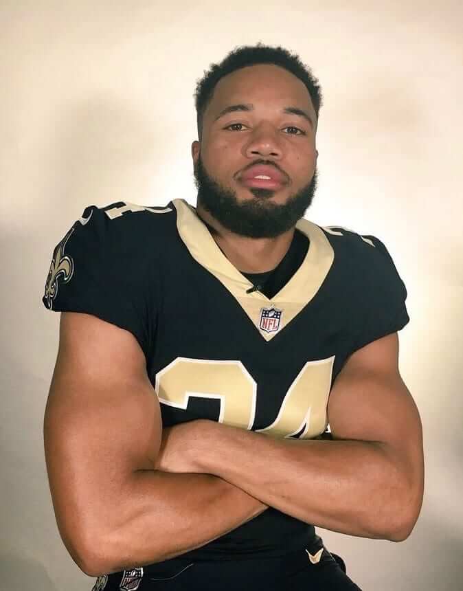
Great news yesterday out of New Orleans, where the Saints posted a bunch of photos showing their rookies wearing jerseys with Nike’s new tailoring template, thereby indicating that they are finally kissing the toilet seat collar good-bye. And not a moment too soon. (At the risk of raining on my own parade, does anyone else think that the new collar is too thick? Still better than the old collar, but not as good as it could be.)
If I’m not mistaken, the only other team that was still wearing the toilet seat last season was the Rams. It’s not yet clear, at least to me, if they’ll be switching over to the new template, although it’s worth noting that their online retail shop currently shows a mix of the new and (mostly) old styles. Here’s hoping they make the transition so we can stamp out this collar style once and for all.
Speaking of NFL collars: We’ve known for over a month now that at least two teams — the Patriots and the Bills — will have truncated collar striping due to the new template (it was first apparent in this photo). Here’s a good look at how that’s going to look for those two teams (click first photo to enlarge):
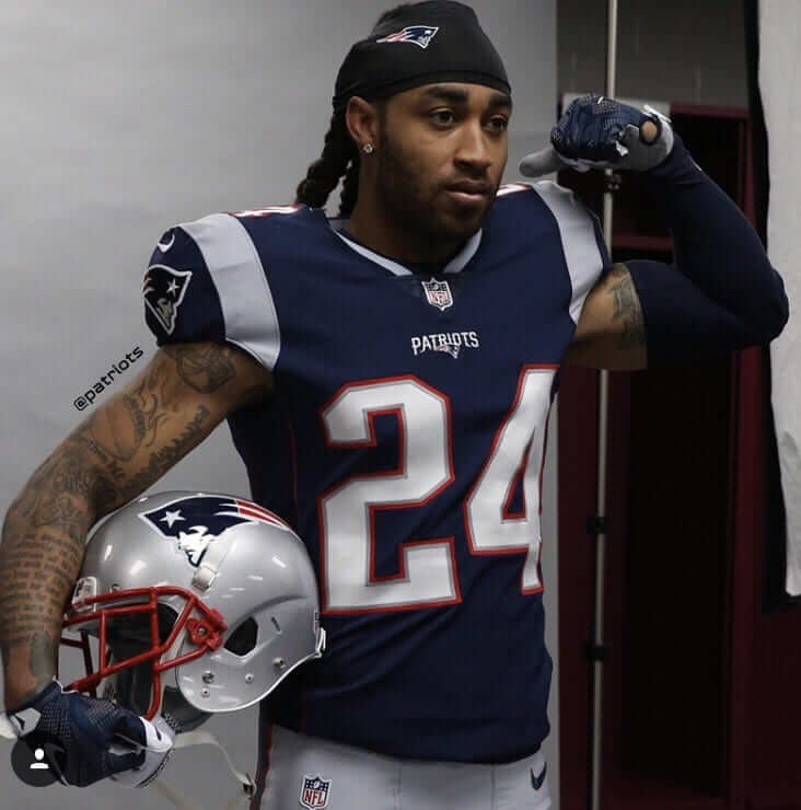
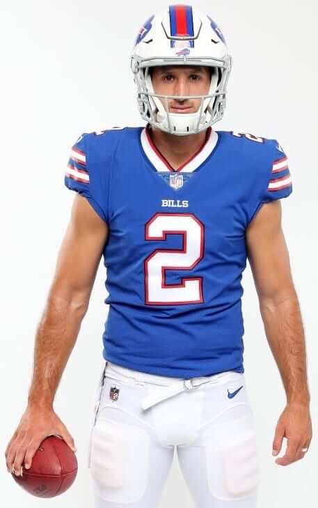
As far as I can tell, those are the only two teams whose collar striping will be affected by the new template. If I’m wrong about that, please speak up.
Update: Longtime reader David Sonny points out that the Bengals also used the toilet seat as of last year.
Click to enlarge
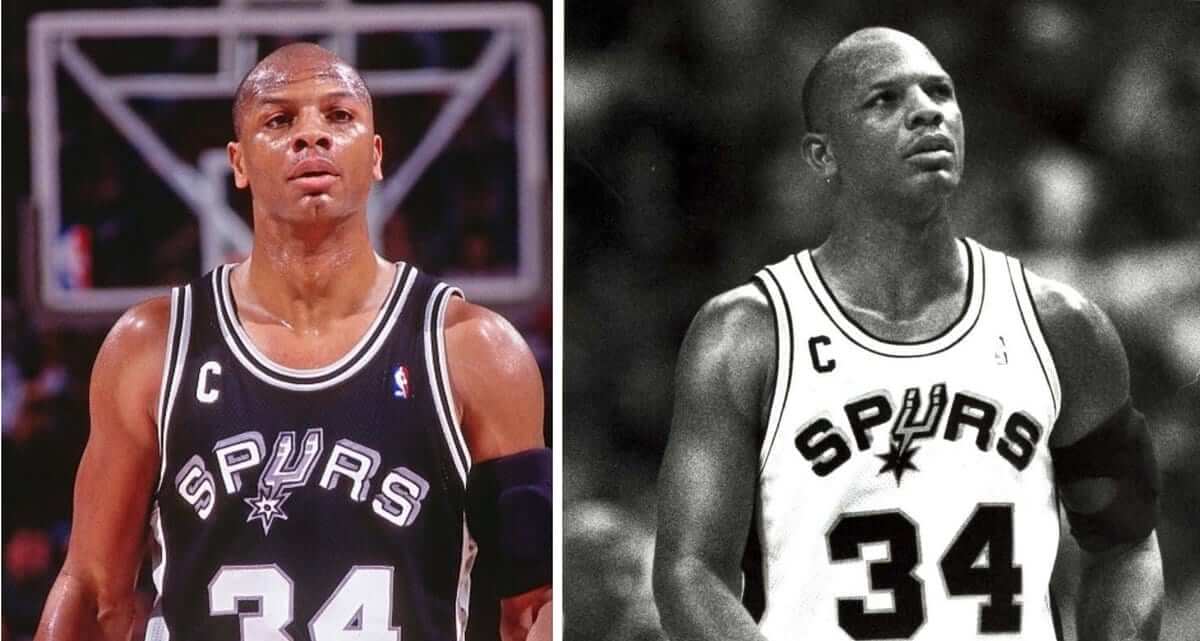
C section, continued: My list of NBA players who’ve worn the captain’s “C” has a new addition: That’s Terry Cummings of the Spurs, who apparently wore the C for a brief time during his stint in San Antonio. I say “brief” because the vast, vast majority of photos that I could find showed him C-less.
(Big thanks to reader Travis York for spotting the black-and-white photo of Cummings, which in turn led me to find the color shot.)
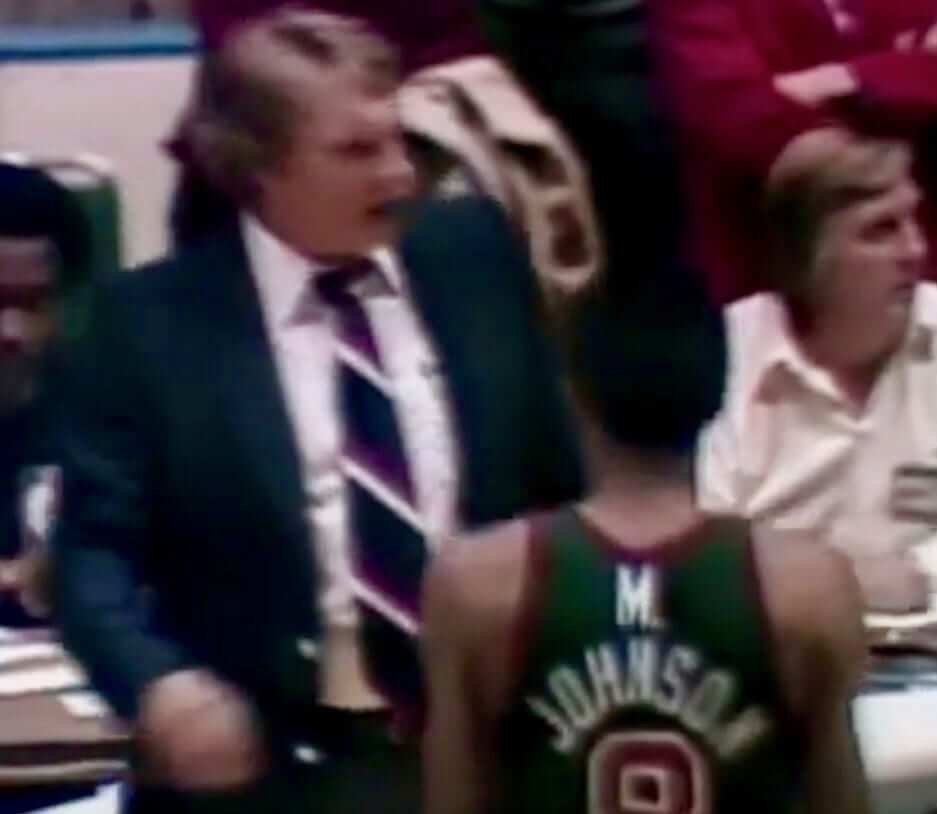
But you doesn’t hasta call me Johnson: I knew Marques Johnson of the Bucks had worn a double-decker FNOB during the early 1980s (teammate Mickey Johnson had done likewise, and we even did a Uni Watch membership card based on that look). Until now, though, I didn’t realize that he’d also worn a double-decker FIOB treatment.
In fact, I’m not sure I’ve ever seen anyone wearing a first initial that’s just standing there, all by its lonesome. Is anyone aware of any similar examples?
(Mega-thanks to Eric Griffith for this one.)
Click to enlarge
Collector’s Corner
By Brinke Guthrie
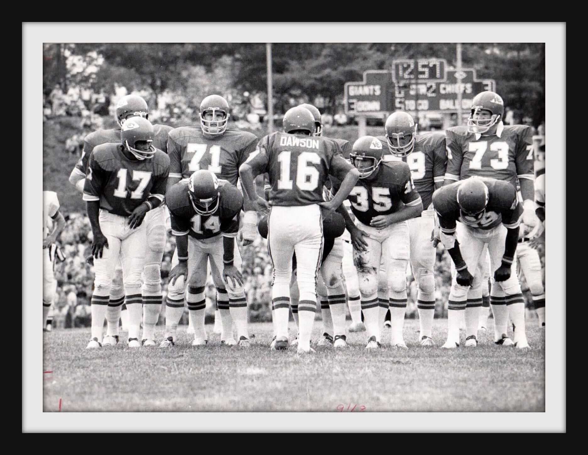
Now, this is as classic an NFL uni photo as you’re likely to see. Len Dawson calling the play in the Chiefs huddle. Ed Podolak (14) and Otis Taylor (89, far right) among the stars in that huddle. Don’t know exactly when this is from, but the scoreboard says they’re playing the Giants, and it looks like some kind of preseason game with fans sitting on the hillside or something. (As an aside: As a kid I was always fascinated by how the Chiefs went with this this huddle style of having the 10 players face the quarterback, as opposed to the more traditional format of huddling in a circle. ”” PL)
Now for the rest of this week’s picks:
• As far as my sports memories go, Chatham, N.J., was the home of Orange Products, which made these wonderful kits for the four major sports. This MLB Mini Sport Caps N Bats Kit is in great shape.
• Last week I featured a New York Mets switchplate, and mentioned that you see NFL versions of these fairly regularly, but not so much for MLB. So of course, I found some MLB designs for this week. We’ve got the San Francisco Giants and the Philadelphia Phillies, and a pair from the NBA, too: the Knicks and the Sixers.
• Ford Country is also Sabres Country, according to this 1970s bumper sticker.
• Classic Fouts/Air Coryell imagery on this 1970s NFL Chargers Damac poster by Chuck Ren.
• Lotsa classic logos on this 1970s NHL beach towel.
• While this 1970 helmet sign is for the Washington Senators, it would work just as well for current Nationals fans. (Or fans of Walgreens, if such people exist.)
• In the 1960s-1970s, the NFL had a licensing deal with a brand of men’s clothing known as Curlee. Here’s a men’s double-breasted size 42 jacket, and you get the NFL shield on the inside pocket.
• Got a set of 1970s Gatorade NFL bottle caps right here — 24 of the 26 teams!
• I don’t think I’d ever seen the Zubaz treatment given to baseball caps until now. Here’s what happened to the basic, classy St. Louis Cardinals cap when Big Z got ahold of it.
• Love the font on this “1984 Eastern Division Champion” Cubs T-shirt. It would still be many years before The Curse would lift, however.
Click to enlarge
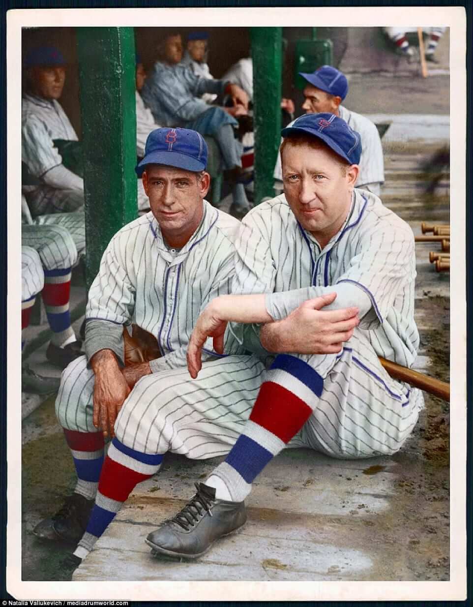
Too good for the Ticker: Colorizations are usually Phil’s domain (he devoted an excellent entry to them this past Sunday), but I love them too. The Daily Mail recently showcased a bunch of spectacular colorizations of old baseball photos (including the shot of Brooklyn Robins players Dolf Luque and Dazzy Vance, shown above). They’re among the best colorized pics I’ve ever seen — not to be missed. Check them out here.
(My thanks to reader Patrick O’Neill for this one.)
The Ticker
By Mike Chamernik

Baseball News: Cubs P Eddie Butler came to bat in the second inning of last night’s game with a blank helmet (from Zack Pearson). … During that same game, former Cubs OF Andre Dawson led the seventh inning stretch while wearing a Cubs jersey that still had a hologram sticker on it (from Mark Wiley). … Reds P Raisel Iglesias inscribed a Jose Fernandez tribute on his cap (from @SteveSnowmn). … The Toledo Mud Hens will wear these cool Dream Team-themed jerseys over Fourth of July weekend. … The Charleston RiverDogs will wear jerseys that celebrate their local area code over the next few days. … MLB is using a “distressed” logo for its social media avatars. It’s not clear why, but it might have to do with the league now selling “heathered” red, white, and blue gear (from Brinke and Nate Morrow). … Someone recently found a box of unopened 1948 Bowman baseball card packs in his attic. The cards, which are expected to fetch nearly $1 million at auction, may include rookie cards of Yogi Berra, Ralph Kiner, and Stan Musial. … MLB’s partnership with Stance has gotten more players to think about their socks (from Brinke). … New Era is sponsoring a contest to choose the best minor league cap (from @iheart_miKA).

![]()
NFL & College Football News: ESPN will bring back Hank Williams Jr. to sing his “Are You Ready For Some Football” intro for Monday Night Football. The song had been shelved in 2011 after Williams made disparaging remarks about President Obama and Vice President Biden. … The Titans updated their wordmark, at least on their website, during this offseason (from Geoff Barrett). … The Colts will wear their all-blue Thursday-night unis in December. The jerseys appear to use the team’s old number font, which is subtly different than their current one (from Brinke). … The context is unknown, but Jets QB Al Woodall once used tape to turn No. 15 into 18 during a photo shoot. Woodall wore No. 18 for all five seasons he played for the Jets from 1969 to 1974 (from Gene Sanny). … New gold alternates for Dakota State (from Paul Vold).

Hockey News: The cover of a 1965 edition of Hockey Illustrated features an illustration of the Maple Leafs’ Eddie Shack battling a Canadiens player. The illustration was based on this photo of Shack and a completely different player — Jean Guy Gendron of the Bruins. Also, the illustration credit is for Jack Davis, better known for his work in Mad magazine. He also did the poster for The Bad News Bears (from Kevin Vautour).

NBA News: The 76ers’ Doug Collins wore red-and-yellow striped socks in the 1977 NBA Finals. My guess is that those are socks from his college days at Illinois State, where he graduated from in 1973 (from Kevin Clark). … The Nuggets hung up some framed retro jerseys at their practice center. That display really speaks to how many different looks the Nuggets have had — and they left out jerseys from the eras of Antonio McDyess, Alex English, Carmelo Anthony and Allen Iverson, and David Thompson. … Draft prospect Lonzo Ball’s father and Big Baller Brand frontman LaVar Ball spoke about how his meetings with Nike, Adidas, and Under Armour fell apart (from Brinke). … When the Cincinnati Royals moved to Kansas City (and Omaha) in 1972, the team held a naming contest so that they didn’t have the same name as the city’s baseball team. Fans could choose from 10 names, which included the Dukes, Plainsmen, Steers, and the eventual winner, the Kings (from Gregory Mays).

Soccer News: New ball for La Liga (from Patrick Thomas). … The Charleston Battery of the USL will wear memorial jerseys on Saturday for the two-year anniversary of the Charleston church shooting (from Ed Å»elaski). … The USA pre-match shirt for this summer’s Gold Cup has leaked (from Brinke). … “To get the English soccer team bonded and ready for an upcoming World Cup qualifier versus Scotland, the coach decided to take players to train with the Royal Marines, dressing them up in real camo while running military drills,” says reader Greg. … New away kit for Flamengo. … The new Palmeiras away kit has leaked.

Grab Bag: New logo for WCIU-TV, the “U”, a Chicago TV station. … Adopting a “uniform,” or a similar style of dress every day, leads to more productivity and confidence at work (from Tommy Turner). … As a follow-up to yesterday’s post on hockey goalie gear, Brice Wallace notes that digitally printed graphics are now quite common on drum kits. … Rugby news from Eric Bangeman, who writes: “The British and Irish Lions began their tour of New Zealand on Saturday with a game against the New Zealand Barbarians, an invitational team made up of players from New Zealand’s provincial sides. As is traditional for barbarians sides in rugby, each member of the Baa-Baas wore socks from his home club.” … New logo for the city of Canton, Ga.. … Major League Lacrosse revealed its All-Star Game uniforms (from Lax Sports Network). … Microsoft has filed a trademark for an “S” logo in advance of the unveiling of the Xbox Project Scorpio console this Sunday. … Eau Claire, Wis., held a contest to design a new flag. A winner has been chosen (from Joel Mathwig). … The University of Washington, whose teams are currently outfitted by Nike, will be able to start negotiating a new apparel deal next February (from Greg, who didn’t give his last name).
The collectors corner Chiefs photo is from the 1972 Hall of Fame game.
I was reading more about that ’72 HOF game. Randy Johnson was the Giants QB. He was the first QB of the expansion Falcons, and took a beating with a poor front line. He went from golden boy to a drunk on the sidewalk. There are two (very sad) articles about him under ‘References’ on his Wikipedia page. Search: Randy Johnson, Quarterback. Thanks, Mr. Costello, for identifying the photo.
Dang, beat me to it. I saw the photo and instantly recognized Fawcett.
Chiefs photo:
Look at them sock stripes! Perfectly aligned.
Always love the Gatorade caps. I had just started playing football around then so I drank a lot of Gatorade. I remember clamoring and clanging around the shelves looking for the caps I didn’t have.
btw there were 4 variations:
Bears–white and orange “C”
‘Skins–yellow/R and burgundy/Native American
Rams–white horn and yellow horn
Oilers–blue helmet and white helmet
I’ve always loved the contrasting socks on Baa-Baas teams. It’s a tradition like lettered jerseys that’s uniquely rugby.
I agree the new Nike template collar is too thick. Better than toilet seat though.
Too thick is still less thick than the previous iteration of the collar, and no neck roll appearance. Still a win.
It is a little too thick, and might look better with a thin white outline to match the numbers.
One thing I’ve realized about the Saints jerseys is that the removal 100% of the gold around the collar would take that jersey from a 6 to a 9.5, in my opinion. Same with the Texans. Those collars are too clunky.
Proofreading:
“That’s Terry Cummings of the Spurs, who apparently wore the C for brief time”
– “a” brief time
“As a kid I was always fascinated by how the Chiefs went this this huddle style”
– “with” this
Fixed.
Info regarding the Charleston jersey is incorrect.
Updated.
The Browns used the same huddle during the Kardiac Kids era:
link
“As an aside: As a kid I was always fascinated by how the Chiefs went this this huddle style of having the 10 players face the quarterback, as opposed to the more traditional format of huddling in a circle.”
It was a Hank Stram thing because the 1976-77 Saints huddled the same way.
My teams huddled that way all through high school.
Jay, did your coach explain why he preferred that formation?
So did we. Our coach said it was so the QB could look all the players in the eye. I think that was equal parts effective communication and inspiration/leadership.
I’m excited to see another beautiful Broncos Color Rush game this season. Last year their orange looked great against San Diego, and it should look just as good versus the Colts.
I’ve always had a soft spot for those Alex English era Nuggets jerseys, and those Sidney Moncrief era Bucks jerseys — which must have overlapped in time period, I would think. I always thought those were some of the best uses of color on sports uniforms.
Pictures the Rams has released of their 2017 uniforms show that they are using the new uniform templates, no more toilet seats for them.
link
I believe that leaves the Bengals as the last team with toilet seat collars.
Those are mock-ups, not photos. I’ll wait for the real thing.
man that gold looks so out of place on the jerseys now with the helmet being all white and the pants ditching gold. I don’t get why they’re hell-bent on doing a transitional jersey / uniform change
The bengals toilet seats aren’t as bad with the white jerseys as it lines up with the shoulder graphics. May work out with the orange too. Not that I like them or defending them, but actually works with the design.
They should get rid of the silly white panel before worrying about their collars though.
Paul, I have a question that you seem uniquely qualified to answer. And I’m not being critical of you when I ask this, because I understand you are a one-man operation and sometimes grammatical mistakes will happen. But why is it that so many online articles that I read (whether from something as reputable as USA Today and CNN or fluff from E! News) have errors in grammar/missing words/words doubled up? Are there no editors in the online world?
Copy editors are increasingly being viewed as a luxury. Just last week, in fact, the NY Times announced that it is eliminating its copy desk. So story editors (i.e., the ones who work with reporters to develop and shape articles) will now be responsible for copyediting. Expect to see a lot more errors — not because the story editors don’t have a command of basic grammar or editorial style, but because the paper is basically asking fewer people to do more work, and that inevitably leads to more mistakes.
Thanks to the internet, the media world’s longtime business model (content being underwritten by retail sales, subscriptions, and advertising) no longer works, and this is one of the many ripple effects. We get what we pay for. Want to help? Turn off your ad blocker, subscribe to paywalled sites, buy a few magazines, support nonprofit journalism like NPR and ProPublica, etc.
I can second this. At Ars Technica, we had to battle long and hard to bring our freelance/contractor copyeditor on as a full-time employee because the position wasn’t as valued as it once was. I get frustrated seeing sites ignoring copyedits–there were 7 or 8 errors in a recent Peter King piece on MMQB that a copyeditor would have easily caught (stuff that’s not going to be caught by a spellchecker).
I wholeheartedly endorse Paul’s call to turn off ad blockers and subscribe to stuff. I pay for the NY Times and The Guardian and I endure ads I hate so I can continue to get good (and hopefully copyedited) reporting.
Good to know. Thank you for the response.
As a former professional writer and current freelance copyeditor, I actually don’t mind some of the shift away from thorough copyediting on all published content. With digital distribution, it’s much easier to fix errors after publication. And, frankly, copyeditors frequently don’t add much value to the end product. We’re pedantic and detail-oriented where pedantry and details often don’t matter.
From my perspective, getting *all* of the details right is essential in only three cases: (1) when readers have spent money on your publication (with a proportional attention of detail to amount of money spent – $300 textbooks have no excuse for sloppiness); (2) when safety is at stake (for example, operation manuals for aircraft); and (3) when public trust is paramount (such as investigative journalism and presidential tweets).
Those are the cases where copyediting matters most. I don’t expect perfection out of personal blogs, entertainment news, etc.
As a former copyeditor and current writer, I strongly disagree with this, for a number of reasons:
1) Saying, “Eh, we can fix it later” is a lazy way of kicking the can.
2) Saying details only matter “when readers have spent money on your publication” doesn’t mean much in a media environment where more and more readers think they’re entitled to content for free. In other words, you’re advocating for a standard that would mean details don’t matter most of the time.
3) Who gets to decide “when public trust is paramount”? I’d say it should *always* be paramount. There’s definitely a level of reader/writer trust, e.g., here on Uni Watch, and I think most of us would agree that that’s a good thing, even though we’re not curing cancer here.
4) Treating grammar, spelling, consistent style, and so on as unaffordable luxuries is a great way to raise a generation that doesn’t know how to communicate effectively — and, worse, a generation that doesn’t *care* about communicating effectively.
5) Anyone who is (or aspires to be) a professional should try to maintain standards of professionalism. Simple.
And so on. Basically, I think of this as a “broken windows” kind of thing: If you’re sloppy with the little stuff, there’s a good chance you’re also sloppy (or will be more likely to BECOME sloppy) about the big stuff.
I agree with Paul. I’ll add that one thing that I think makes Uni Watch a notch above most blogs is that he invites the readers to catch and point out even the most minor typos or factual errors, and then he corrects then and acknowledges the mistake and thanks the reader that noticed it. Some writers would get defensive about this, but I think it helps us readers feel appreciated and assures us that the information presented is as accurate as possible.
I will slightly disagree that the current “generation” doesn’t know or care how to communicate effectively. I think what we’re seeing in the way young people communicate is part of the ongoing evolution of the English language. In some ways, they are making it more concise in fact.
It is true, however, that you’d expect writers to improve their skills with age and few of us are as good at it at age 16 as we are at age 40 or older.
I hear you, Paul. Mistakes happen, but consciously overlooking mistakes shouldn’t happen if you have even a touch of pride in your work. People who make their living with the written word should know the difference in meaning between “tack” and “tact,” “home (in on)” and “hone,” “stanch” and “staunch,” etc. And don’t get me started on apostrophe fails. Some of us are still paying attention to these things.
Lions huddled that way for most of the 90s: link
Sorry that link isn’t working here. The huddle photo is at the end of this piece if you scroll all the way down: link
While I think the Saint’s collar would look better if it was thinner, at least the got the color right again.
The pre-2012 jerseys were a disaster of mismatched golds.
link
Saints’
Are the Packers and Cowboys not changing to the new templates? I would think their striped collars would be truncated too.
Packers appear to be sticking with the old Reebok template, which they’ve been using all along.
Cowboys’ white jerseys don’t have striped collars. For the blue jerseys, scroll down to Texas Bacon’s comment.
The Cowboys blue jersey will have the truncated striped collar in the new template. I actually tweeted the Cowboys pro shop and they confirmed the team will be switching all of their jerseys to the new template on field .I just got myself a new Ezekiel Elliot jersey,and while I know Paul doesn’t give 2 craps, here’s some thoughts:
I’m a pretty avid jersey collector and I was pleasantly surprised with this new vapor template. The material is completely different from the elite 51. It’s actually labeled as Dri-Fit, which is Nike’s Under Armor type material, where the elite 51’s were a combination of mesh and polyester. When you see the stitching on the vapor template the collar triangle thing-y makes alot more sense. The Patriots, Cowboys (blue jersey only) and Bills all went with the Elite 51 template with their original striped collar and no flywire. With the way the vapor jersey is made I do not believe that is an option, as the bottom half of the collar and the neck of the collar are two separate pieces that converge in the triangle thing-y. I was surprised at how much I liked the collar on this jersey. I thought I would hate the truncating but it just works, especially with the striped collars. The chrome NFL shield pops nicely as well and is quite different from the shield Nike used from 2012-2016. Both are also far and away better than the NFL Equipment Reebok collar that would end up being a wrinkled, saggy mess.
Overall the vapor template is just a higher quality and better made jersey than any jersey I’ve seen, and that includes the $300 “elite 51” jerseys Nike was selling and most teams used since 2012. It is a bit refreshing that the $150 jersey they are selling now is what the players are actually wearing on the field and consumers don’t have to spend $300 to get the real deal. Yeah, yeah, I know, it’s still ridiculous to some people to spend that on jerseys. But hey, I work for my money and collecting jerseys makes me happy.
Looks like Cummings was named captain in 92:
link
Not sure if he had the C immediately, or if he kept it through his last season in San Antonio, in 95 – either way, nice little time capsule piece from the Tribune.
The Nuggets hung up some framed retro jerseys at their practice center…they left out jerseys from the eras of…Alex English…and David Thompson.
Actually, English and Thompson wore that fourth one…
link
link
…but I know what you mean.
link
Good grief, could they have possibly made the uniform on that Montreal Canadiens on the NHL beach towel MORE WRONG?!
-Jet
Long-time daily reader and first time on the comment board.
Came across a design contest last evening and I thought some of the uni-watch re-designers might be interested, especially since there is some good prize money involved.
Gander Mountain, as part of a recent bankruptcy sale, got a new owner and new name-Gander Outdoors. They are taking submissions for a new logo with the top winner $100,000 and 99 others get $1000 gift card. Due by June 10th.
Checked their site in early May after the sale/store closings/reopening was announced and there was nothing there regarding the new name or the logo contest. Checked again last night to see if I could still stop by my local store and saw the announcement and entries.
I have always liked looking at the submitted designs for all the contests over the years and thought that surely the talent connected to this site could make a run at the top prize.
That new Eau Claire flag is a real beauty. Clean lines, wonderful colors, uncluttered design, with a bonus “hidden” lower case “e” nestled in the negative space below the “c.” Just a fantastic banner.
Apparently it is not just copyeditors and proofreaders who will soon be joining the dinosaurs, but fact checkers at these papers. ” . . . may include rookie cards of Yogi Berra, Ralph Kiner, and Stan Musial” in the article about the found 1948 baseball cards, and yet not one of those 3 were rookies in 1948.
I assume “rookie” in this sense is referring to their first appearance on a baseball card.
Soft launch: The new Naming Wrongs store is now up and running.
link
Further info tomorrow!
Question about the price points:
Why is there the difference in price for certain shirts, though they are the same color, just different names (example: gray Mile High and Comiskey are $22 and $23).
If you click on any given shirt, you’ll find that just about every one has a Hanes option (which costs a bit less) and a “Premium” option (which costs a bit more).
I meant to have the Hanes options showing for most of the thumbnails, but I guess I messed up on the grey Comiskey and showed the Premium option instead.
For most of the red shirts, I intentionally used the Premium thumbnail, because I personally think it’s a slightly nicer shade of red.
A quick note on the ticker item re: drum kits.
The picture depicts drum heads, not the drums themselves. I’m not an expert, but custom bass heads have become more popular in the past 10 years, with 2009 Carolina Crown being the first group I can recall using them in the corps setting. Groups have been doing color matched shells for a while now, and many groups get custom slips (giant wraps that go around the drums) for each season. There are even some that can swap colors midshow now.
Very correct all around.
=Here’s one great example of custom shells though.
link
Drum slips….
link
Maybe the Saints’ new collar wouldn’t look so big, if they had matching sleeve stripes.
if anyone could humor me, why was the term HEATHER (color) used instead of possibly ant other better term?? I just came across this term; Heather Charcoal Gray, Heather Pink Rush, Navy Blue Heather, etc., while doing a team jackets order. Why Heather? Is she shady?
*any
Hmmm, if only there were a simple mechanism, maybe on the internet, that would allow us to figure out the answer to this sort of question quickly and easily. Ah well, maybe one day in the far-distant future….