Today we’re back with the final volume of Chris Diamond’s “Uniform on 11” Project.
Click here for the AFC & NFC East, click here for the AFC & NFC North, and click here for the AFC & NFC South.
For each Volume of this series I’ll be including Chris’ introduction so you don’t need to check prior posts.
Click on images to enlarge.
Uniform on 11 – Just How Much More Uniform Could it Be? (Vol. 4)
by Chris Diamond
This site is Uni Watch and we are all UWers obsessed with sports uniforms. Currently the NFL’s uniform standards feel like they are in a fairly lamentable state with the “sock shit show” and untucked shirts for individual players and mono-mania, icy-whites, BFBS for teams (to name but the worst) ruining things for a lot of people. Often we hear “why can’t the NFL be stricter over uniform standards?”. I think people are mostly thinking about making existing uniforms more… well, uniform! But what if the NFL had a much stricter set of rules that it enforced on all teams? And here I don’t just mean enforcing uniform deportment, but mandating style in the same way that some soccer leagues enforce a common number and name font or rules on contrast between team uniform elements. Setting Uniform to 11!
Back in the 50s style was much more uniform between teams, with either plain jerseys or a few different stripe styles and college block numbers almost ubiquitous. So I came up with a “What If?” scenario based on a set of uniform rules being devised at that time and enforced ever since. What might that look like for the NFL teams now? These are the rules I have come up with for this project:
- All jerseys, pants and socks must be the same for all players on a team (apart from number digits)
- Teams must have a colour home and a white road jersey
- Jersey and pants must be different colours
- Pants and socks must be different colours
- Helmet must have central stripe in 1-2-1 pattern
- Helmet must have a team logo or wordmark on both sides
- Face mask must be in team colours
- Jersey sleeves must have stripes in Northwestern pattern in a single contrasting colour to the sleeve
- Jersey stripes may be outlined in a different colour
- Uniform must be unique within the league
- Numbers must be college block, 10” front, 12” back and 4” TV numbers on shoulders
- Number must be edged in contrasting colour unless team uniform is two colour only in which case edging can be the same colour
- Pants must have side stripe in 1-2-1 pattern
- Socks must have stripes in Northwestern pattern in a single contrasting colour to the sock
- Sock stripes may be outlined in a different colour
- Jerseys must be tucked into pants
I have created graphics for each team based on these rules using a simplified version of my usual template for the sake of clarity. For some teams I have done more than one version as the rules means the current colourway doesn’t work that well, or the team has several different looks I want to try. Before we crack on, some of you may remember that the WFL had a uniform ethos known as The Corporate Look that was along these lines. But the Birmingham Americans decided to get their uniforms made locally and messed the whole thing up, but still the idea was sound :)
So just how much uniformity is enough? Is this too much? I must admit it tickles my colours+sets OCD (in a good way) to see the NFL uniforms like this. Rather like the satisfaction you get from a good set of pool balls or the London Underground Map! But I can imagine it’s going to drive some UWers crazy, especially fans of teams with long-standing looks that this violates like the Cowboys or Bears.
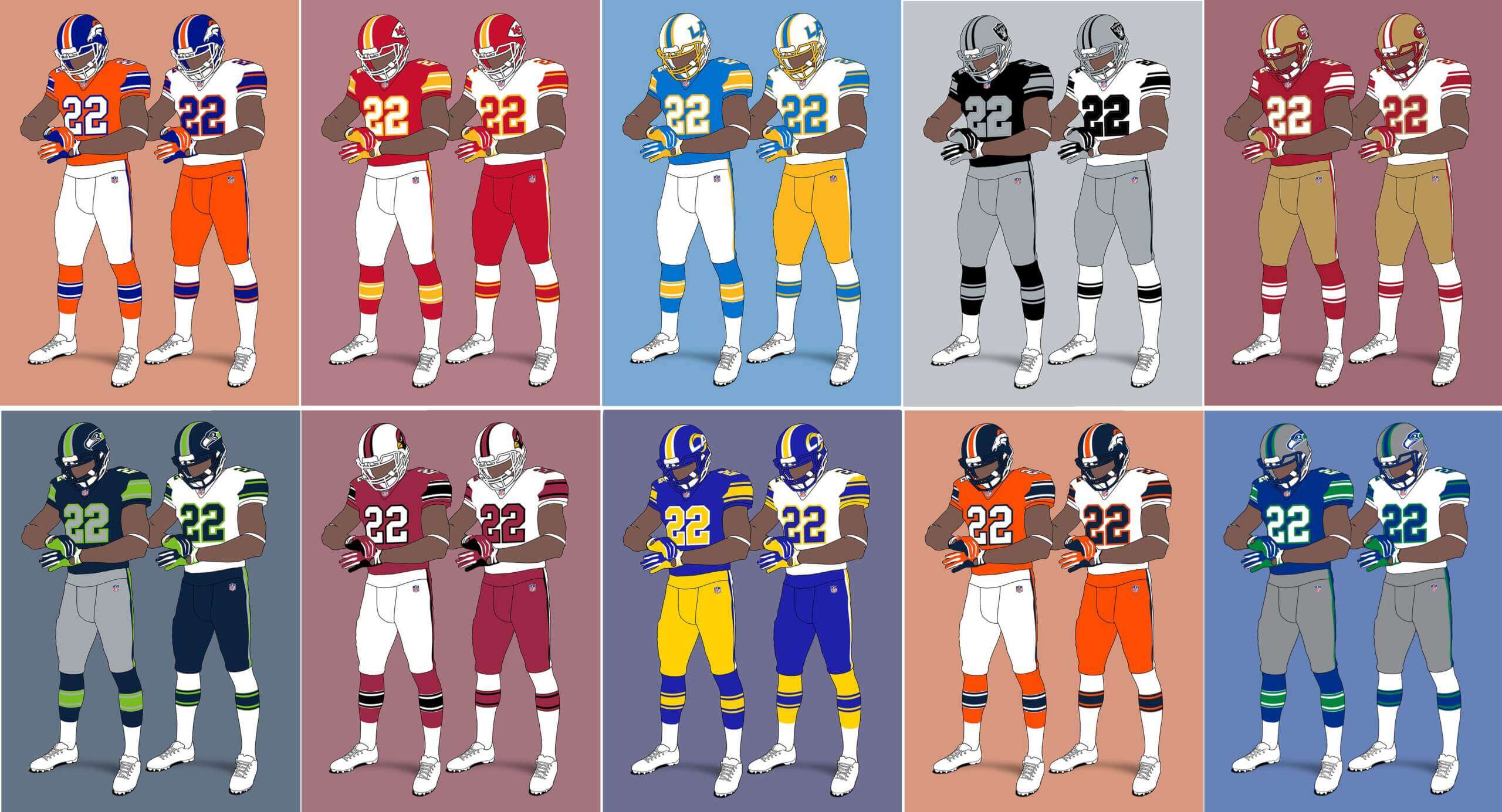
AFC West
Denver Broncos V1
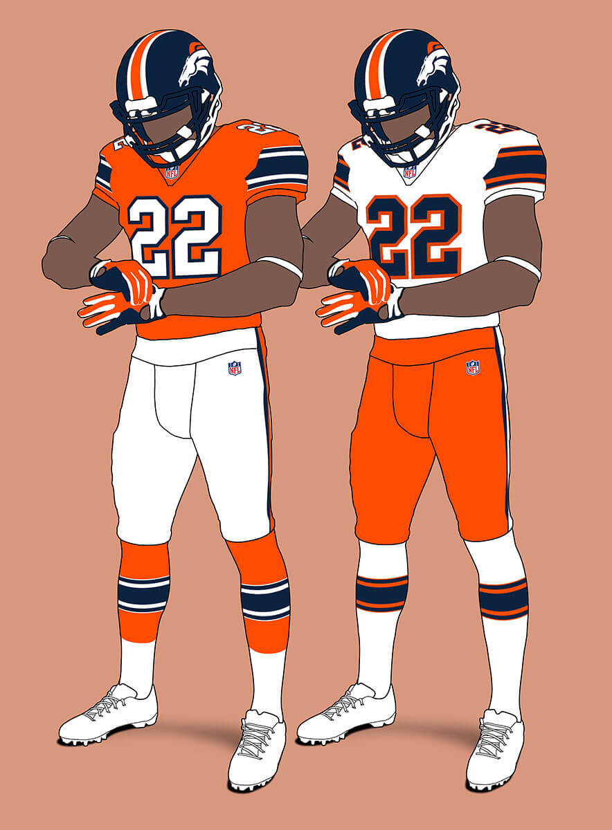
The actual set are due for an update and I think something along these lines would look good.
Denver Broncos V2
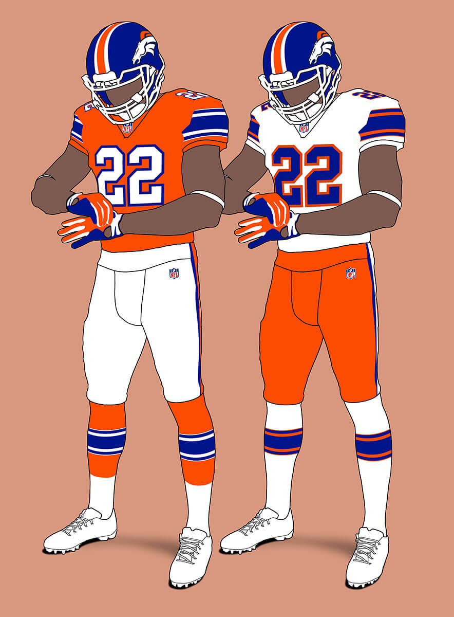
Of course they could go back to the reflex blue instead and these look even better!
Kansas City
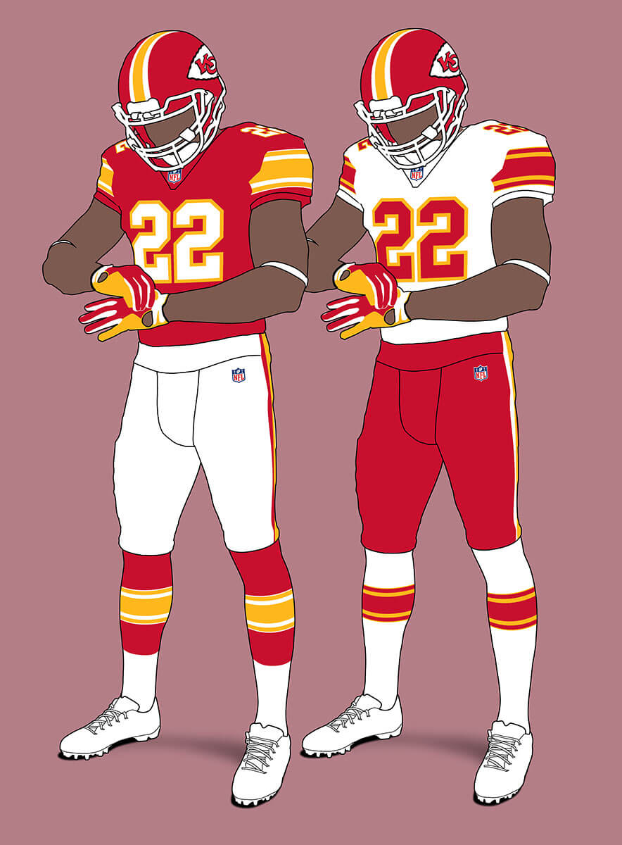
If you squint these are very similar to the current set and so look pretty solid.
Las Vegas Raiders V1
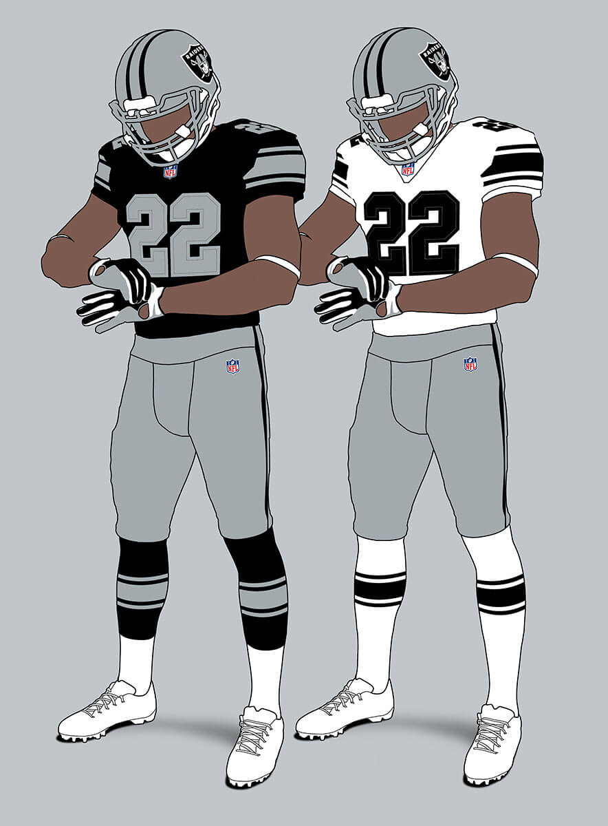
The Raiders are a two-colour team but for some reason unlike the other two colour teams this just doesn’t feel right. Maybe it’s the double stripes?
Las Vegas Raiders V2
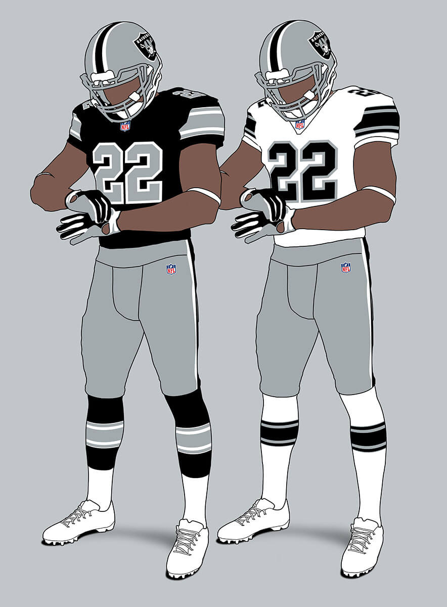
Adding in white makes the unis look a lot better to me, especially since it echoes the shield logo.
Los Angeles Chargers
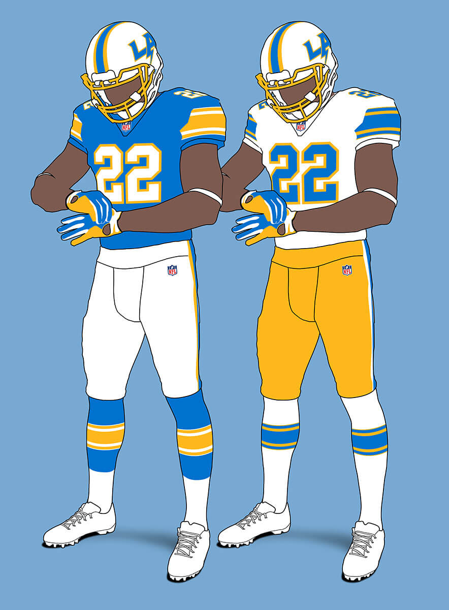
The actual unis are so bolt focussed it’s hard to imagine them without that. But the combination of powder blue and gold means they still feel like Chargers unis to me. I really like the use of the LA+bolt as helmet logo — gives me USFL LA Express vibes (again a good thing).
NFC West
Arizona Cardinals V1
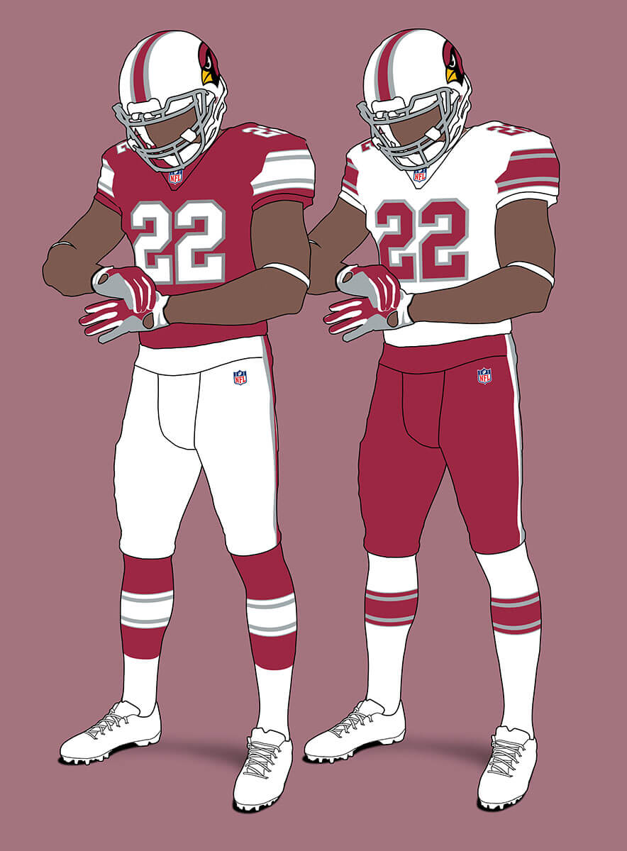
The recent Cardinals re-design brought in silver as a secondary colour. I think with this template it looks quite smart but it doesn’t feel like the Cardinals.
Arizona Cardinals V2
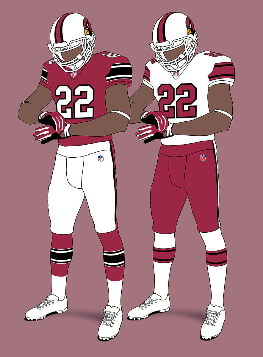
If the Cardinals had stuck with black as the main secondary colour then we could have something like this instead. Feels closer to a Cardinals look to me, but still a bit off.
Los Angeles Rams V1
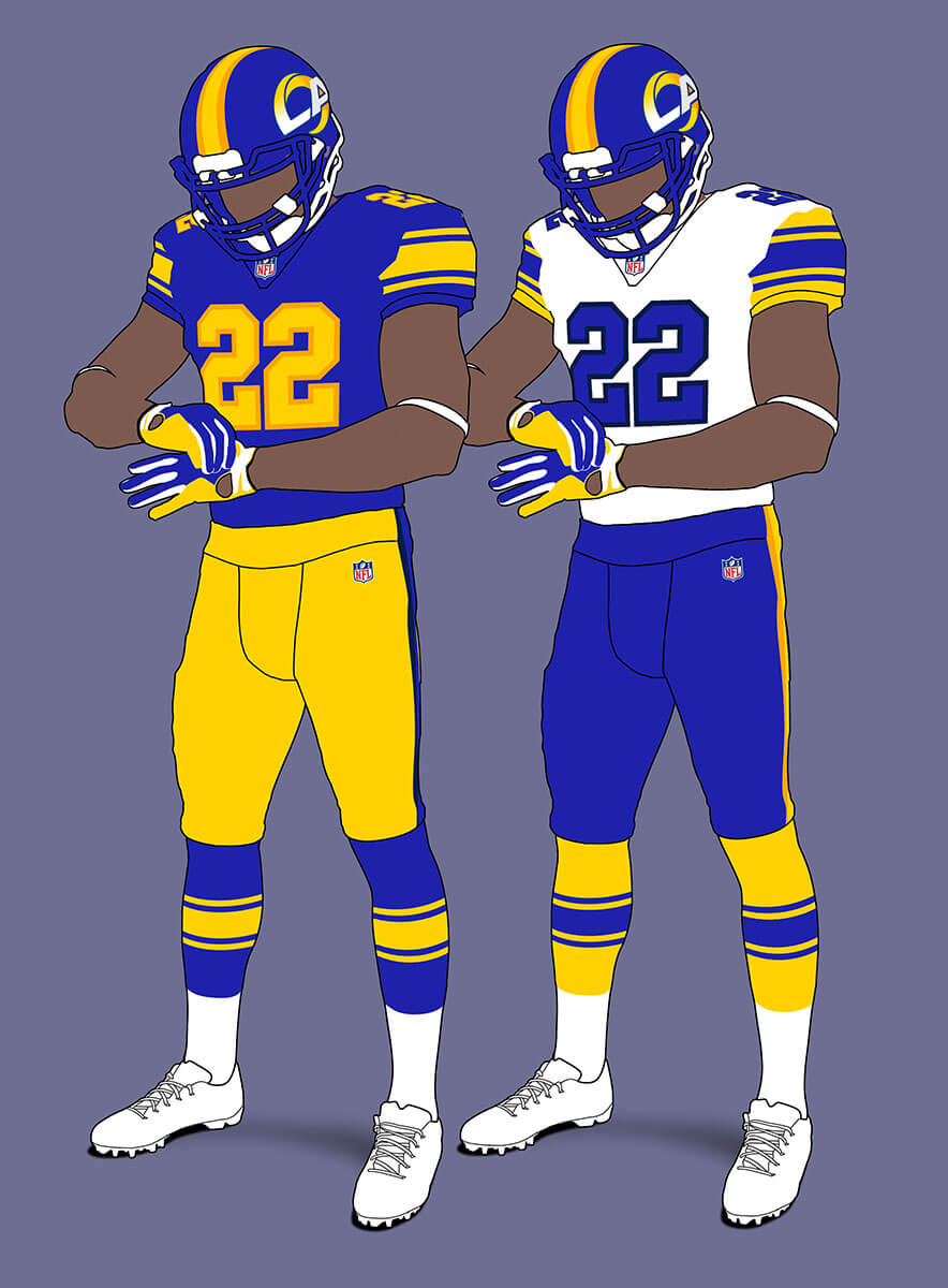
The Rams are the original non-standard side helmet logo team, but like the Chargers that is out here. The LA+Rams horn logo is the obvious choice for the helmet, but I think they would have mirrored logos so that the horn always faced forward. I’ve also incorporated the number trim colours from the 2020 re-design.
Los Angeles Rams V2
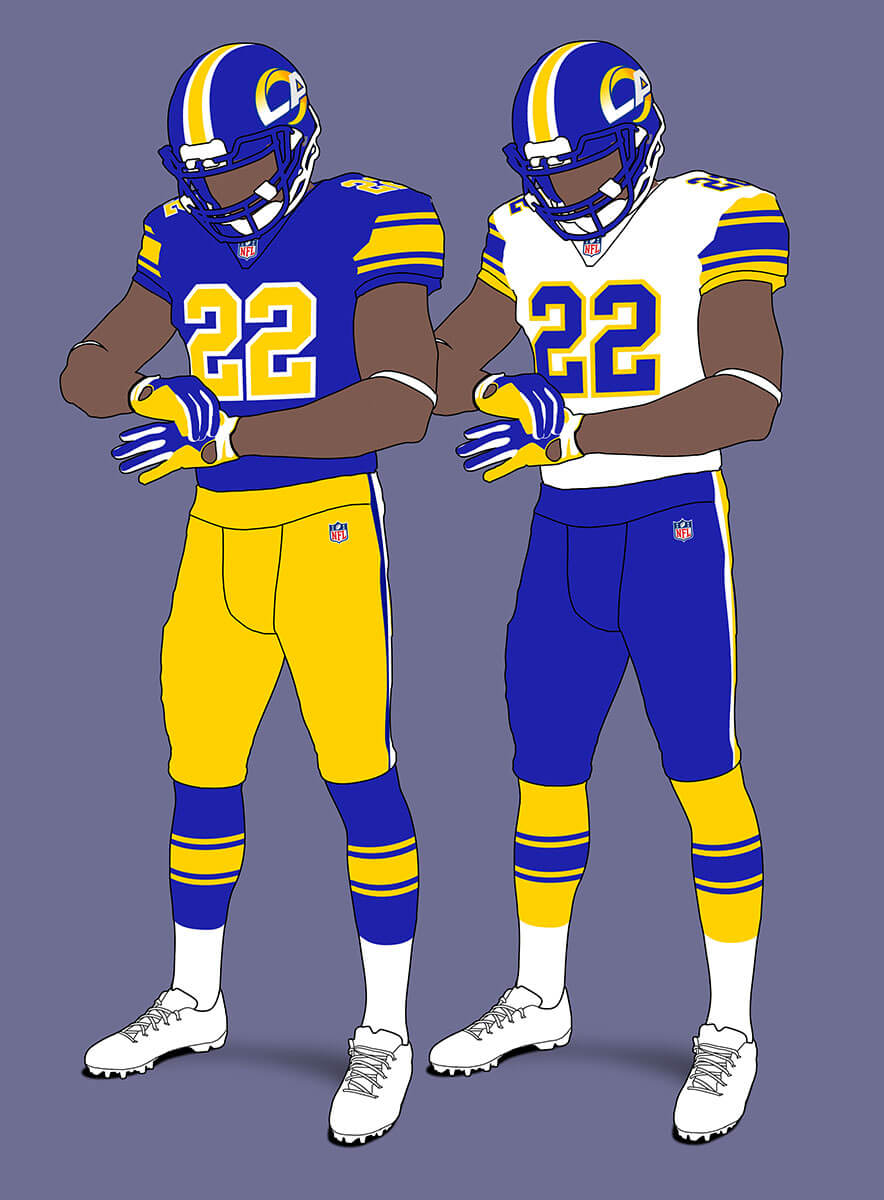
They could also have stuck with just blue/yellow/white and I think this is a cleaner look.
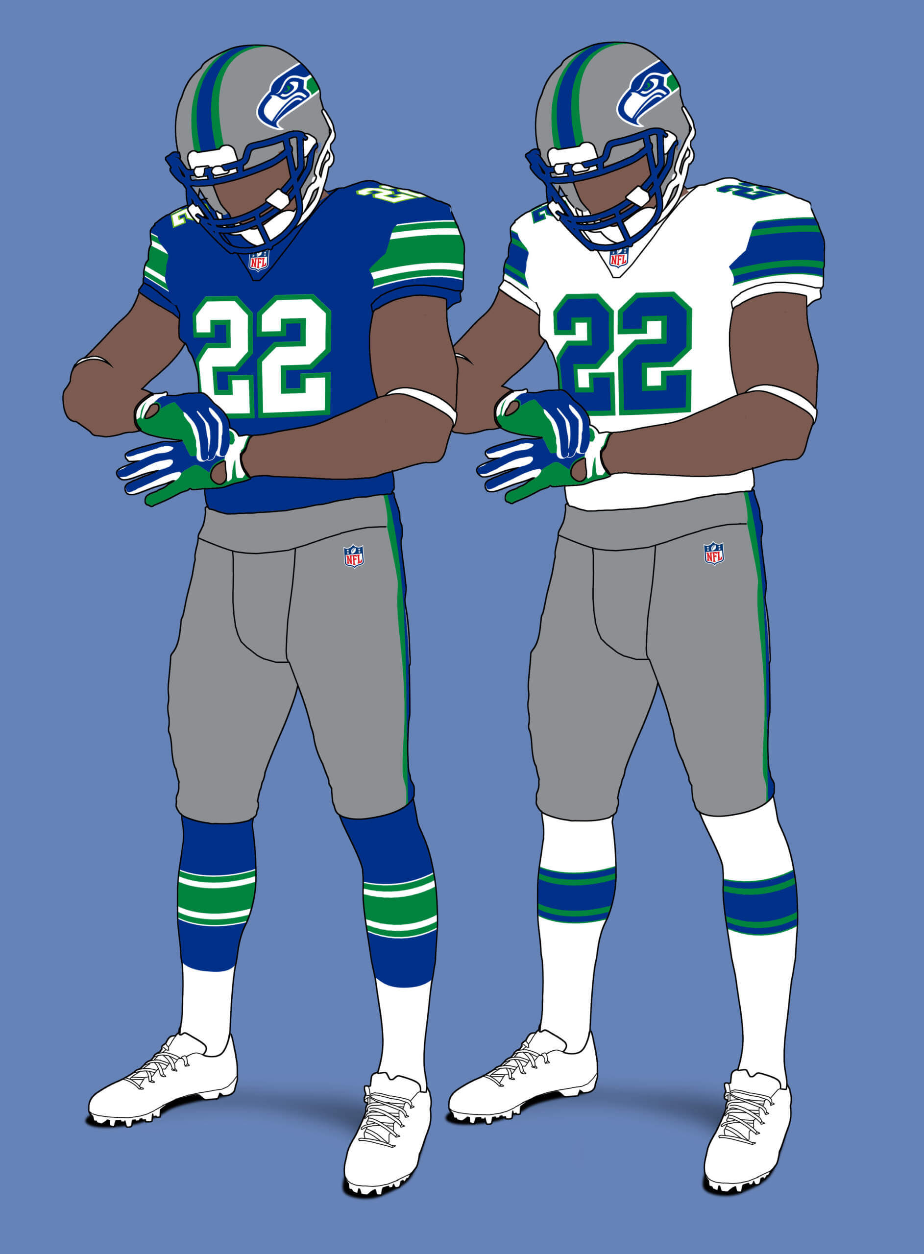
San Francisco 49ers
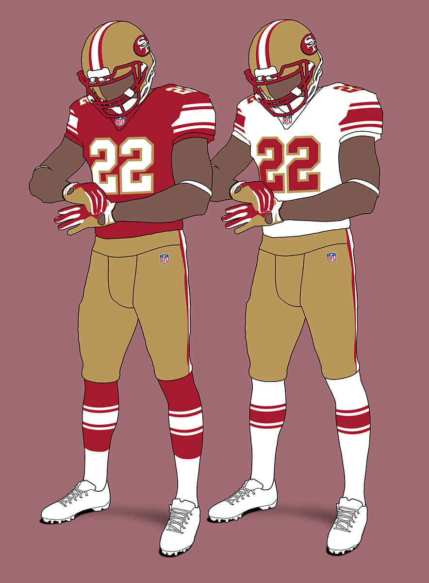
The 49ers already use a very similar template so this looks pretty familiar. I’ve tweaked the helmet logo slightly to make it more like the pre-1996 logo as the current one belongs to the 96 redesign and doesn’t really go with this more classic look. Oh and of course no grey facemask!
Seattle Seahawks V1
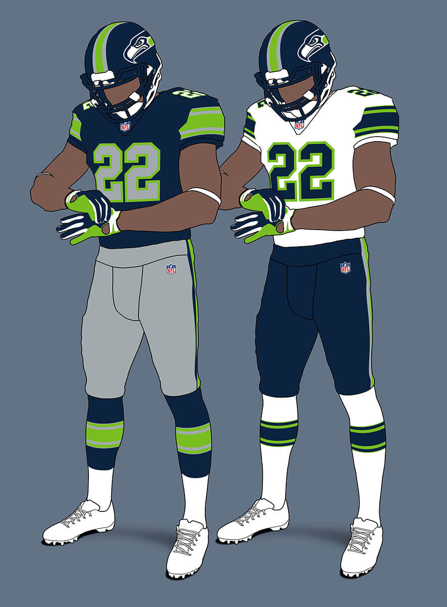
The current Seahawks unis are over fussy but when all that is removed, I feel the colour scheme is pretty solid and makes for a strong look. The only flaw is the lack of contrast betwee the action green and silver. Oh and I swapped out grey for green in the helmet logo stripe as the blue really belongs with the 2002 look.
Seattle Seahawks V2
Of course the Seahawks classic blue/green/silver look is superior and that is true for this template too. It has echoes of their real pre-1983 design for me.
Thanks, Chris! Another wonderful set of concepts — and looking forward to your next creation.
Readers? What say you…
Chris, out of all the groupings, I feel this is weakest. The only teams that cry out for this treatment are the Cardinals (with the black trim) and the Broncos (reflex blue). Ironically, the best looking team of the bunch is the Raiders, perhaps the team least in need of enforced uniformity. I think it just shows the Raiders have the hardest colors to screw up. The Chargers and Chiefs are already in the neighborhood, as you said. The Rams need the big horns; there’s simply no getting around it. What surprised me the most was how poorly the Niners and Seahawks took the treatment. San Francisco looks as if it were demoted to Boston College, and for once I realize how superfluous green outlines are for Seattle. As for fulfilling the parameters of your project, this shows what a solid bunch the Western teams are (on balance) and how the rest of the league could learn from their example.
I think it just shows how hard it is to judge these uniforms in isolation. The Rams and Chargers are good examples. I think their uniforms in this template look excellent, but you can’t look at them and not compare them to the real ones and they suffer because of that.
100% Agree. You’ve ruined the Chargers look entirely. The existing minimalist Raiders look is lost in this scheme. You can’t change the Rams’ helmet, even with the “broken” horn on the current set, the Rams helmet is a direct callback to the first helmet logo in 1946.
Settle down there, Tim — the purpose of this project (much like my 2/3/2/3 project) is to visualize uniforms following a formula — in this case Chris’ design criteria. It’s not to necessarily create new uniforms, or even improve upon old designs. I can’t speak for Chris, but in my case, I admittedly didn’t like a number of the designs I used to fit the 2/3/2/3 project parameters. There are a number of Chris’ designs of which I’m not overly fond, but that’s more a function of the project parameters. It’s a fun “think piece” where he was looking to see how uniforms might look if his design guidelines (or restrictions) were employed league-wide.
Hate the concept, not the concepter ;) Chris didn’t “ruin” anything — he’s simply exploring how a league would look if every team were to adopt a specific design code.
I was amplifying on my comments from last week. Adding stripes to many of the helmets without stripes (Rams, Chargers, Vikings, etc.,) or changing something as classic as the Ram horn or the Steelers with a logo only on one side of the helmet just irks us traditionalists for NFL Uniforms. The one item I do like (as a fan of more traditional designs) is block numerals which are legible/readable.
As projects go, this is a nuanced one, and sometimes it is hard to tell what is being saved/sacrificed. Summary: The Nikeified teams were improved, the traditional teams didn’t fare so well.
Take the stripe off the helmet and I’m all in for the Cardinals, especially the V2. I’d love to also see this done with yellow in place of the silver or black.
The helmet stripe ruins both of Seattles designs.
We could always go with silver stripes, the unexploited loophole in this concept.
With the Broncos, it’s amazing how they could look so bad with navy blue and so good without it.
How would the LA+Horns logo look mirrored? Is there already an existing version?
This is the existing version that would be on the right side of the helmet link
Thanks. Was having a huge brain fart.
I’d be thrilled with v1 for the Broncos tbh
Broncos should go back to the old blue and orange and the horse jumping through the D. The USPS-like horse should be retired and buried in the Nike graveyard of bad logos.
I like the block numbers except on the Bears, but not every team needs the helmet stripe.
I said it last time…yes on 1, 4, and 16. And on 3 yes except for allowing all white.
Broncos v2 (royal > navy) Raiders v1 (outlines don’t look right) Seahawks v2 (again, royal > navy), Cards v1 (I actually like the red/silver more than the red/black). Chiefs and 49ers largely unchanged. Not crazy about the 2 LA teams but it is within the concept’s parameters, so what can you do?
Strong re-works, Chris!
Love the San Fran Flutie-9ers a lot, and the V2 ‘hawks look fantastic.
Don’t miss the “iconic” Ram horns and Charger bolts as much as I thought I would…but the LAR blue bottoms are not something I like IRL or here.
Ahh, There’s the yellow of KC’s helmet that a lot of folks clamor for…I don’t, but it’s ok and fits your template quite well, and I’m amazed that I really like all 4 Broncos concepts (orange pants are usually a deal-breaker for me).
That said- you don’t mess with the (possibly) best road uniform in the NFL, so the Cardinals entries are for the birds
; )
Chris I will say the horn on the La for rams actually works for me I kinda wish you would’ve followed thru on the chargers just to see how the bolt would’ve looked tucked into the La
Something is off for me when I don’t see the Rams in yellow pants.
Ideally, one would think orange numerals would work on Denver’s white jerseys, but you can tell they’d be difficult to read.
The helmet on the Cardinals V2 is exactly what I wore in high school except we had red face masks. I like those
Broncos should adapt this in version 2 right away.
While I appreciate the lean toward more traditional & more standards in general, i think this is maybe just a tad TOO restrictive. I think you need to allow for teams to be unique in their design, but perhaps not too outside the box. Maybe you allow for 3-5 different number font options. Definitely no requirement for a middle helmet stripe (but if you do use one it has be a single stripe,
I appreciate the general lean towards a more traditional framework, but I think you need to allow for more differentiation & creativity the uniforms & be more flexible with some of the rules. Re: the helmet stripe I’d suggest it NOT be required, but if you do use one, it should be the same width from start to end and extend 100% from front to back. Allow for at least a few different number font options.
Add some sort of rule that would outlaw the nightmarish left side of the helmet logo variation of the Ravens (where the the Raven head has wing-like patterns pointed in one direction and the B inside the Ravens head had a similar wing-like pattern pointed in the opposite direction.) It’s mind-boggling to me that no one ever noticed and vetoed that in the beginning. In reality, that entire logo is trash. It should be replaced by something less cartoonish & simpler.