Later this month I’m going to be participating in a panel discussion about uniforms. The organizers who invited me asked if the event could also include a “fashion show,” where they’d bring out some players wearing various uniforms and I’d assess them. I told them I was happy to assess uniforms but that I wouldn’t participate in anything described as a “fashion show.” They agreed not to call it that, so we’re good.
I’ve been having that same basic discussion for years. Almost from day one, people have tried to categorize Uni Watch as being about “fashion.” I myself have often been described as a “fashion writer” or an “arbiter of sports fashion.” Back in 2005, an ESPN headline writer even referred to me as “Mr. Blackwell.”
I’ve always pushed back against this (although it was too late for me to get that headline changed). For one thing, I want Uni Watch and the larger uni-verse to be taken seriously — that’s why I created Uni Watch to begin with, after all — and fashion writing, rightly or wrongly, tends not to be taken seriously. I knew from the start that Uni Watch and I would become marginalized and trivialized if we were associated with fashion, so I’ve always tried to nip that in the bud whenever possible. When newspaper writers ask to interview me, I always ask if they’re writing for the fashion section of the paper. If they are, I politely decline the interview request. If you go to this website’s “About” page, you’ll find that the second sentence begins, “It’s not about fashion,” which I put there as a pre-emptive move.

As I’ve been explaining to people for years, I don’t write about fashion; I write about design. That’s not just a matter of semantics — there’s a real difference. Fashion, by definition, is always changing ”” certain trends come and go, and they’re meant to come and go, because that’s how the fashion industry gets people to keep buying things. A certain color or style is “hot” one day and “soooo last week” the next. Design, on the other hand, is intended to be functional and built to stand the test of time. Some design styles may be associated with certain eras, but good design is still considered good design (and bad design is still bad design), even if it’s no longer contemporary. Design styles may change, but the standards of what constitutes good design generally do not. And when we’re talking about uniforms, we’re generally talking about design.
Or at least that’s what I’ve always said.
Recently, though, I’ve had to re-examine that position. For starters, a hefty percentage of the uniforms currently being released, especially at the college level, are clearly not meant to stand the test of time. They’re meant to be used for one or maybe two seasons, or in some cases for one or two games. The strategy appears to be “Get in, make a splash, get out. Repeat.” Which is exactly how the fashion world works.
You already know why things are working that way: our increasingly short-attention-span society, the degree to which jersey sales now drive what we see on the field, blah-blah-blah. But whatever the reason, the net effect is that we’re seeing more and more uniforms that are clearly geared for the trend of the moment. First every team had to have a black uniform; then every team had to have a grey uniform; now we see more and more teams using neon or fluorescent colors; and so on.
It’s hard to imagine any of these trends resulting in a uniform that goes on to be considered a modern classic. On the contrary, I’m fairly certain we’ll look back at most of them in a few years and say, “Boy, what were they thinking?” Or maybe we won’t bother to look back at them at all, because we’ll be too busy looking at the latest uniforms being released. Again, that’s exactly how the fashion world works: Never mind what we did yesterday ”” check out what we’re doing today!
One result of this is that it’s increasingly difficult for me to apply design standards to today’s uniforms. If I say I don’t like a certain uni, my younger readers ridicule me for being “too old” or “stuck in the past.” I’ve also been told that my tastes are “too white.” This too is very much like the fashion world, which tends to be factionalized by demographic tastes.
Unfortunately, that’s where the comparison breaks down. In the fashion world, different demographic groups (tweens vs. adults, blacks vs. whites, men vs. women etc.) can have their own fashion tastes catered to. But there’s only one sports world, and we’re all stuck with it, which means that what looks fashionable on the field to some fans will look laughable to others.
I’m still going to push back against Uni Watch being associated with the word “fashion.” But if the uni-verse keeps going like it’s been going, I’m going to have a harder time making that case.
Travelogue follow-up: Big thanks to everyone who had such nice things to say about Tuesday’s travelogue entry. I always feel slightly guilty about posting the travelogues, because they seem a bit self-indulgent, but then they’re always well-received, which is very gratifying. Thanks again.
Anyway: One of the photos from the trip showed me getting very close to a very tame gull on the Canadian side of Niagara Falls. Reader Keith Stokes took a few Photoshop liberties with that image, as you can see here (click to enlarge):

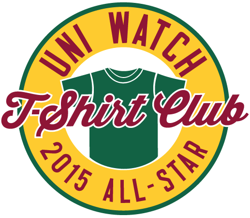
T-Shirt Club prize reminder: Remember, if you ordered all 12 T-Shirt Club designs, you need to send me proof in order to qualify for the “Collect ’Em All” prize, which is an embroidered patch of the logo shown at right. (I was notified yesterday that the patches are done and are now being shipped to me. I’ll share a photo once I receive them.) Here’s what you need to do:
1. Either (a) take a photo of all 12 shirts or (b) take screen shots of the 12 “Your order has been received” emails that you received from Teespring.
2. Send the photo or the screen shots to TshirtClubProof@gmail.com (not to the regular Uni Watch address, please).
3. Be sure to include your shipping address, so I know where to mail your patch.
Meanwhile, many of you have asked about the reprint of the tequila sunrise shirts. I’m told that we should all be receiving emails with tracking numbers today. Thanks for your patience.
Finally, in case you missed it in the lead-up to Thanksgiving, we’ve launched three new shirt designs for the holidays. These are not technically part of the Uni Watch T-Shirt Club (no sleeve patch, no month designation) but are very much in keeping with the spirit of that project. There are three base designs, each of which is available in three colors (black, grey, and white) and three styles (short-sleeved, long-sleeved, and sweatshirt). Here, click to enlarge:
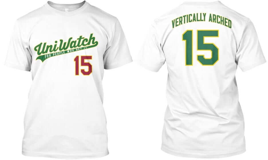
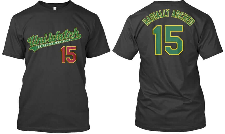
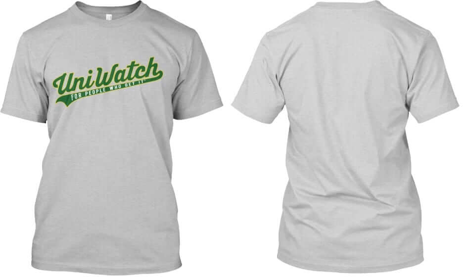
Again, each of these three designs ”” “Vertically Arched,” “Radially Arched,” and the plain script with nothing on the back ”” is available in all three colors shown (white, black, and grey). In addition, each design and color is available in three formats (short-sleeved, long-sleeved, and sweatshirt). Plus the plain script design is also available as a hoodie with pockets.
These shirts are available here only through next Tuesday, Dec. 9, and they’ll deliver in time for Christmas.
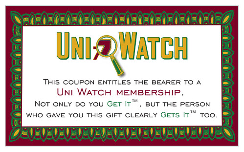
Gift Memberships: Want to get a Uni Watch membership card for someone this holiday season but don’t know which design to get for the lucky recipient? Here’s an easy solution: Purchase a gift membership. We’ll send you a voucher that you can give to your special person, who can then redeem it with me.
You can order a gift membership here. And as always, you of course you can order a custome designed card here, you can see all the cards we’ve designed so far here, and you can see how we produce the cards here.

Mike’s Question of the Week
By Mike Chamernik
As you know, Kobe Bryant has said he’ll retire at the end of the season. That allows him to go on a farewell tour and make final appearances in cities around the league. He did so the other night in Philadelphia, where the Sixers gave him a framed jersey from his high school.
Retirement tours are definitely not new, as athletes have been racking up the applause (and gifts) at each final road game for years. Derek Jeter did a farewell tour in 2014, Mariano Rivera had one the year before, and Chipper Jones had one the year before that. Kareem Abdul-Jabbar even had one back in 1988-89.
What’s your favorite athlete retirement gift? Have you ever attended a player’s last game in your city? Have you ever gotten a friend, family member, or colleague a sports-themed retirement gift? What gifts do you hope your favorite team gives a current athlete when he retires? And for fun, what sports-themed retirement gift would you want when you retire?
The Ticker
By Mike Chamernik

Baseball News: the Diamondbacks will unveil their new uniform set tonight. Expect the tweets to start flying at about 9:30pm Eastern. Paul will have an assessment on ESPN shortly after that. New logos, uniforms and color scheme for the Norfolk Tides. Angry seahorse: That’s a new one (from Geoff Baker). … New hats for the Peoria Chiefs. … Charlie Welling found an odd hybrid Orioles cap at a vintage hat shop. … A few people sent this in: A YouTuber talking about Meat Pies wore one of Paul’s Meats T-shirts. … If you’re the type of fan who counts down the days until pitchers and catchers report and Opening Day, you’ll like this site that keeps track of the days, hours, minutes, and seconds until baseball resumes.
College Football News: Clemson and North Carolina will go orange-vs.-blue in the ACC title game. The Tar Heels proposed the idea and were given permission by the ACC (from James Gilbert). … Also, UNC DL Junior Gnonkonde, a native of the Ivory Coast, wears a Ivory Coast flag decal on his helmet, instead of the USA flag (from Jay Jay Dean). … Bowling Green has worn a different uniform combo for each game this season (from Derek Zyski). … Central Florida’s new coach will add NOBs to the team’s jerseys next season (from Phil). … Colorado State and Under Armour extended their uniform deal (from Phil).

Hockey News: Ontario Reign goalie Peter Budaj has a Ned Flanders-themed mask (from @GKG_77). … The ECHL’s Missouri Mavericks will wear throwbacks on Saturday (from John Muir). … The WHL’s Seattle Thunderbirds will wear these Metropolitans throwbacks. The PCHA team won the 1917 Stanley Cup (from Eric Sanford). … The OHL’s Sarnia Sting will wear Christmas sweater uniforms on Dec. 11 (from Phil). … The AHL’s San Antonio Rampage will also get into the Christmas spirit.

Basketball News: Here’s what it would look like if NBA Western Conference teams were soccer clubs (from Phil). … @sflunaticfringe notes that three of the last four Warriors games have featured the road team wearing white. ”¦ Syracuse women went BFBS last night against Maryland. The school calls that color gray, but come on (from Angelina Capodanno). ”¦ Tulsa and Okalahoma State went color vs. color last night (from @pistolsguy). ”¦ So did BYU and Utah (from Sam Strong).

Soccer News: Both the Crew and the Timbers will wear their home uniforms when playing for the MLS Cup on Sunday (from Kyle Burkholder). … Manchester City is changing its crest. The club is considering paying for laser removals for fans who have tattoos of the current logo (from Thomas Courtman). … Blurry photo, but it looks like the goalkeeper for the California Surf in an old NASL match wore a football helmet (from John Muir).

Grab Bag: The CFL’s Saskatchewan Roughriders unveiled an emblem to commemorate their last season at Mosaic Stadium at Taylor Field next year. Here’s how it looks on the team’s helmet. The Roughriders have played at the field since 1910; New Mosaic Stadium will be ready for the 2017 season (from Moe Khan). … Adidas will become the outfitter of a bunch of college lacrosse programs. … Here are the jockey silks for alpine skier Bode Miller’s new stable. … New unis for South African rugby’s Johannesburg Golden Lions. … Some people got upset yesterday when an image of Rosa Parks was added to presidential candidate Hillary Clinton’s campaign logo. … The logo for the 2016 NATO Warsaw summit was unveiled.
I think you are wise to push back against the fashion label and here’s why. The “fashion” is being pushed upon the uni world by the big sports manufacturers. Indeed, if anything, us uni-watchers tend to make light of most of these costumes. Every once in a while one will be great but most of the time they are laughable. I would say we critique these days Nike, adidas and Under Armour for the nonsense they push out to sell more merchandise. After all, most the costume uniforms we see these days are for nothing else but to sell more stuff in my opinion. I am of the opinion uni-watch does look at the past since some throwback uniforms and old uniforms are highlighted for the sheer awesomeness. Keep pushing back against the fashion label Paul. I don’t think it is accurate really.
What began as a tactic to sell more items morphed into a competition to catch young athletes’ attention. Bad to worse, in terms of visuals.
Twenty or so years ago, I read a quote attributed to some long-forgotten sports poobah. He said, “Fans don’t want brown souvenirs, or anything with Montreal written on it.” It was the earliest suggestion that uniform design was market-driven; it disgusted me. As far as I’m concerned, if your team is good, it makes fans want the brown souvenirs. In any case, soon after I read this quote, a bunch of teams, including the Detroit Pistons, changed to teal uniforms.
Interestingly, the position that team colors are sacrosanct didn’t arise until after the Second World War; it didn’t seem to rise to the level of national colors.
Before WWII, team colors *were* national colors. With the exception of the St. Louis Browns (never saw them play, but I miss them so), just about everybody else wore red,white and blue.
A certain color or style is “hot” one day and “soooo last week” the next.
This has always been a pet peeve of mine. Brown is timeless. Seafoam Green is timeless. They may not be popular, but I still like them, I’d still wear them and I’d still be glad to have them adorning my countertop.
Sea green was always one of my favorite crayons.
QOTW: 1. Best retirement gift any athlete could receive is retirement of their number. 2. Never have been a last game for a player as he was retiring. 3. Got a friend of mine that was a former baseball player a customized Louisville Slugger bat, had his name on it, for a retirement gift. 4. For me, I would want one of those gold plated Ping putters with my name on it but getting one is going to be impossible I believe.
Love the photoshop, put a smile on my face.
In regard to the travel log, I enjoy them, vacations, can have their own pressures, “are we having fun yet?, so reading a well – written log, that’s open on the ups and downs is good reading, especially when your interests are similar to mine.
nice work on the photoshop. Can someone give the gull stirrups?
I didn’t think about that. I figured the hat was that perfect touch, but stirrups would have been a good idea (although, pretty hard on those tiny legs).
It sounds like “fashion” is actually a good way to describe uniforms and phenomena that we expect to be ephemeral. “The Bulls are introducing a camo uniform? Eh, fashion.” “Six NHL teams will add diagonal stripes next season? A fashion move.” “Oregon’s going to wear twelve different new unis this year? Fashion.” There’s still plenty of room to discuss the merits of these uniforms, while acknowledging that we don’t expect them last very long.
I wore my Ugly Sweater long sleeve t-shirt for the first time last night. Fits great. Feels great. Looks great. And even though it’s a t-shirt, I feel like I’m wearing an ugly sweater.
I’m loving the new Norfolk Tides set. The Angry Seahorse is AWESOME
Not too shabby, but that anchor ‘N’ is a hot mess.
Especially next to the trident N. One is effortless and inspired, the other forced and painful.
I prefer to think of the seahorse as mischieviously happy. Too much anger in the world.
Agreed on the anchor N. The trident N blows it away.
Lose the black cap and the camo jersey and you’ve got something there.
Although I’m not big on alliteration, I miss the Tidewater Tides.
Seagull Photoshop is terrific, love it!
I wonder if that NASL goalie is wearing a Pro-Tec helmet as opposed to a football helmet?
Re the soccer goalie wearing the helmet, it’s not a football helmet per se:
link
The comments to that Twitter post link to an interview in which he describes at length how he came to be wearing it:
link
Oops, linked twice to the pic. Here’s the interview:
link
someone pointed this out on reddit.. the ACC Championship game will look like the tuxedo scene from dumb and dumber
link
Retirement tours are bullshit, and if you’re good enough to merit a “tour” you certainly don’t need a whole bunch of free swag thrown your way. But if you are going to be given a gift, only one will do:
link
i agree.. if the team a wants to “honor” team b player, let them do it when they play in team b’s stadium, don’t make a spectacle of it at your stadium. at most all it should warrant is one standing o during the game, but no pregame festivities and special gifts..why honor a guy that all he’s done is bring your team misery
Note about the NOB t-shirts: Shouldn’t the white one be no name on back? Most teams that forego the name on back do so on their white home uniform, but have one on their gray road uniform and their colored alternate uniforms.
One more time: All three shirts are available IN ALL THREE COLORS. There is no “white one.”
I believe what he meant to say is that there is no t-shirt with just a number but no name on the back and that he would have liked such an option.
I went to Willie Stargell Day in 1982. I wasn’t quite 5 yet so I have no memory of it except the Leroy Neiman painting of “Pops” on the cover of the program.
I was there! Still have the program, too.
Here’s the painting:
link
Oof. Looks like incorrect striping at the bottom of the pants/top of the stirrups. Oh well.
Am I missing something or did Bowling Green wear orange/orange/orange twice this season? In the ticker it says they wore a different combo each week. Looks like weeks 3 and 10 were the same.
Looks like they’re counting socks in the combos, so while there was orange helmet, jersey and pants in week three, there were orange socks in week three and white socks (although that’s somewhat debatable) in week 10.
I figured the socks were the difference too and spent 10 minutes examining the pics at length. Then i saw it. In the mono-brown pic, 93 in the foreground has orange socks, 18 in thebackground all white. I live near BGSU and see them live now and then and highlights on TV regularly. I’m fairly certain socks are not a part of the team uni.
In soccer unis are just “Normal” and “Change.” As long as there is no color clash then both teams where their normal unis. Portland’s green is easily distinguished from Columbus’s Yellow, so both teams wear there normal uniform.
MLS abandoned “Home” v. “Away” in the MLS Cup in Oct 2000. That year Chicago Fire lost to Kansas City Wizards (now Sporting KC). The Fire wore red, the Wizards blue and the Earth continued spinning happily away.
That’s the traditional rule, but those lines blurred a long time ago. Some of the bigger clubs now use three or four distinct uniforms, often for no good reason. Manchester City has their “home” kit — sky blue shirts, white shorts — their “road” kit — black shirt and shorts, with bright blue accents — and their “third” kit — pointless, eye straining highlighter yellow shirts and pants. A quick check of about half the Premier League clubs’ websites shows that the “primary kit” and “change kit” have been replaced with “Home Kit”, “Away Kit”, and “Third Kit” (which we might call the “fashion” kit.
it’s complicated somewhat by the different competitions teams play in. Teams like Manchester United and Arsenal, which regularly play in the Champions League, often have a kit designated for that competition, informally or otherwise.
For whatever reason, MLS still designates them as “home” and “away”, although in general the “home” shirts are worn even on the road as long as the contrast is great enough.
Incidentally, Portland I guess is on quite a run wearing their third kit, and some of their fans are upset that MLS is ‘forcing’ the Timbers into wearing the “home” shirt for MLS Cup.
Lee
Last week, arsenal played at norwich and wore their change kit, even though they did not have to do so, since red and yellow/green didnt need a change.
The Premier League requires their clubs to wear change kits at least eight times during the 38-game schedule. Perhaps Arsenal wanted to burn off one of those games
Interesting…I’m a West Brom supporter, and we’ve worn our “Normal” kit for every match so far.
Has West Brom played at Tottenham, Swansea, or Newcastle yet? I’ll bet you’ll see those nice cherry red change jerseys on those days.
Apologies if this has been previously posted, but here is a link to a post on a forum about Australian football (similar to soccer I guess) in which the poster rendered NHL jersey designs onto football unis:
link
-Jet
The Syracuse women did not wear black. It is gray – albeit a darker than usual gray but it is not black by that picture. I’m splitting a fine and irrelevant hair, since the school color is orange and navy is an accepted athletic color. Neither black nor gray belong here.
Great retirement gift? The Twins gave Mariano Rivera a rocking chair made of broken bats.
link
This may have been done elsewhere, but this was the example that popped up when I searched.
QOTW: My favorite retirement gift I’ve seen is the rocking chair made of broken bats that the Twins gave Mariano Rivera. It struck a perfect balance of honoring his years as a player and poking a bit of fun at him being an old man.
Retirement tour gifts where each respective home team welcomes the retiring player for the last time is kind of BS as pandering. Honestly not a fan, but I get that only the best of the best, and generally the one team players at that, get that treatment. So props to them, but boo to the parade charade. And no, never seen one in action. I have however seen a player’s very last game and walk-off (Bobby Abreu), and that was really cool to see.
That being said, favorite gifts. The Texas Rangers gave Derek Jeter custom cowboy boots. They looked impressive, but not impressive enough to be my answer. No offense, but anybody can go to Texas and drop some coin. The Red Sox gave Mariano Rivera a portrait of him waving on Opening Day 2005. Fuck that shit and fuck Boston, man. The Minnesota Twins gave Mo a chair made of broken bats “that he caused.” This one was cute and on my list of favorites, but not my very favorite. The best athlete retirement gift (putting aside the fact I don’t like them) is something unique to both the player and the gifting city. As we know, the Montreal Expos played in a stadium within Jarry Park at inception. There was a swimming pool about 450 feet away if you hit a monster shot down the right field line. Willie Stargell of the Pirates was the only person to hit the pool. So on his retirement tour, the Expos gave him a lifeguard floatie from the Jarry Park pool.
What would I want as a retirement gift? Pretty easy, because I’m easy to please. Two tickets to the nearest NHL game with the Habs coming in, and cover my tab at the nearby tavern I’ll eat and drink at before said game.
QOTW: I don’t think there was a retirement tour, but I was at Nolan Ryan’s last game ever in the Kingdome. My dad and I still talk about how neat it was to see him one last time before his elbow did him in.
OK, I wrote out a huge QOTW answer on my iPad, but when I hit “Submit,” it got lost. So sorry for a double post if it happens, but I’ll try to recreate it here.
Retirement gifts for when a player comes on the road for the last time? Honestly, I don’t like it. It just impresses me as silly. But to the extent that you have to be supremely the best of the best to get that treatment, and on top of that you have to be so singularly identified with one team, I respect careers that trigger retirement gift tours.
Putting aside the fact I don’t love athlete retirement tour gifts, I can still identify good and bad gifts. The worst: the Red Sox gifting Mariano Rivera a portrait of him waving to the Fenway crowd on Opening Day 2005. (I’ll let you whip out the almanac.) Seriously, Boston? Fuck you guys. Get a gift–not a boastful practical joke to make you feel good. Boston sports fans have less class than Mariano’s pinky fingernail on his most ornery day.
Now the best: this one tethers the player’s career to the gifting city. The Expos started out in a stadium in Jarry Park. About 450 feet down the right field line, there was a swimming pool. Only Willie Stargell ever hit a splash shot during the Expos’ Jarry days. So on Stargell’s retirement tour, the Expos gave him a lifeguard floatie from the Jarry Park pool.
What would I want as a retirement gift? Pretty easy. Assuming I’ll always be living in or near an NHL city (fairly safe for me), two tickets to the nearest hockey game where the Habs are coming in as the visitor, cover my dinner tab at a nearby tavern where I would intend to eat and drink beforehand, and hook me up with a “black car” to take me there and back.
This is a test: second time today I’ve submitted a comment and it’s vanished instead of getting published. First on iPad, second on computer.
Re: QOTW
I was at Magic’s last game at the United Center. I was pretty young, but my dad somehow got me to understand the importance of it. I still have the ticket stub.
Provocative column, Paul. As I read it, I harkened back to a note you made in a 2013 “Question Time” column where you said you felt Uni Watch was “closer to its end than to its beginning.” (link). As I read today’s column, I began to get some of a sense as to why.
Uniforms were once a merely functional product. They really only served two purposes: 1. Be as useful and non-hindering as possible for the athlete competing and the sport being contested. 2. Be distinctive enough such that they allow fans to tell competitors (teams, individuals) apart.
That spawned a kind of “accidental art” wherein attempting to serve both functions sometimes resulted in creative and interesting minutiae. Need a placket to close a baseball top? Why not use that space to put the team or city name? No more placket? Move the team name. Need to keep the top of a hat together? Use a squatchee. As long as we’re using one, might as well make it a different color. A guy doesn’t like it? He removes it and it looks different accordingly. Some guys don’t like sleeves? Have the team wear a vest so sleeves, and their length, are optional. So on.
If something was functional, for many, many years, it didn’t change. Teams would wear a single uniform for years then would pass them down to their minor-league franchises. You’d see a patchwork of font styles and stripe spacing for teams that didn’t change much because their manufacturer had run out of the old stock or something, which made it interesting to the detail-minded eye.
I can see how such study is fascinating, especially through history but also in real-time when it’s kind of a game of “I Spy” as to when you see such instances of function creating style. It was fun to play the “what do I see and why?” game when the answer was less obvious.
The thing is, the answer seems very obvious now that the art isn’t very accidental anymore. It’s highly manufactured — not for functionality, but for sales. Not just “overpriced polyester shirt” sales, either. In addition to selling replica and game-used uniform items, the designers are selling a brand (logo creep and templates), selling an attitude (the aggressive promo pictures we get force-fed via social media), selling features (the NFL sweat box), selling a league (logo creep), selling safety (safety features on helmets that may or may not be effective but make the helmet “look cooler”), maybe even selling advertisers (#NoUniAds), etc.
Change now happens for change’s sake, because it can and it helps the bottom line. The practicality of the uniform has gone out the window. Hand-painted helmets for Navy, that will only be used once or twice and won’t be easy to tell apart from distance, are the epitome of impractical sports wear. The “look at me” and style factor have often overtaken the functionality in the design. LeBron James verified this when he reached into his armpits and ripped his sleeves.
In fashion, the functionality of a garment is usually one of the last things to be mentioned. It’s all about the style. Sometimes, functionality is almost seen as a hindrance or a mark of “low fashion,” the kind of thing you find on the rack at Kohl’s because you need something that looks halfway-decent at work but don’t want to spend money and just want to be comfortable. Maybe when uniforms get to that point, and everyone’s OK with it, you’ll know it’s all about fashion and not about the hidden art of functionality. I can see that being when you decide you don’t want to do this anymore. Fortunately, we’re not all the way there yet, but we’re a lot closer than we were when you started.
A lot of your opinions started to make more sense to me with this column, too. I personally really dislike stripes, but I suppose they’re the most functional way to tell two teams apart and create a very distinctive look much of the time. Stirrups served a very functional purpose once, though not so much anymore, yet they represent a certain respect for the old-school nature of the uniform when worn. Same thing with the squatchee. And so on.
Like I said, provocative column in that it made me think a lot about the nature of Uni Watching. Neat stuff, Paul.
Thanks for the thoughtful feedback, Dan — I’m proud to have commentary like this on Uni Watch.
Your tastes are too white??? Classis know no boundaries. I wonder if anyone would describe MLK as too white in his sharp-looking grey suits, white shirts, and dark ties?
As for UNC wearing blue against Clemson’s orange, that’s a mistake. The last time UNC won the ACC football championship was in November 1980 and they did it at Clemson and in all-white.
Meant “classics know no boundaries.”
Nicely put!
Lee
This comment is brilliant. I hope you can be a guest columnist on Uni Watch at some point, because I’d like to see more thinking like this.
Shucks, thanks guys. It’s one of the reasons I read the blog daily — it’s one of the most thoughtful things out there, in a world that, unfortunately, seems increasingly thoughtless.
I’m glad to see I wasn’t alone in appreciating your thoughtfulness.
I thought of the same quote from Question Time while reading today’s lede. Whenever Paul writes a piece about the state of the uni-verse, I brace for the part at the end where he’ll say, “That’s all for me.” Luckily, it hasn’t happened yet.
QOTW
Not a fan of retirement tour gifts. Too corny. Sorry. Respect the careers that merit them, but I don’t like the parade of gifts.
My bias aside, my favorite gift: the Expos gave Willie Stargell a lifeguard floatie from Jarry Park pool. You see, when the Expos played at Jarry Park Stadium, there was a swimming pool about 450 feet down the right field line, and Stargell was the only splash hit in history there. So combining a great career with a highlight unique to the city? There you go, that’s my favorite.
How would I want my own retirement to be gifted? Easy. Get me tickets to the next and nearest game where the Habs are coming in to town, get me a gift certificate to a nearby eatery that I’ll use before the game, and a “black car” to take me there and back.
I always enjoy reading about your travel. Thanks for sharing.
This old sign guy likes them too, if for nothing else than the pictures of some great old hand-lettered signs.
-Jet
That’s a very awkward “N” design for the Tides, but it got me thinking: some capital Roman letters seem more design- and logo-friendly than others. The “N” is particularly unforgiving–note how awkward even the ordinary seriffed capital is to form with a wedged pen (which dictated its modern printed form). It’s particularly hard to make a capital N look like something else, or to intertwine anything with it while keeping it legible. And the lowercase “n” stops looking like a letterform at all if you play with it too much.
Possible fodder for a future QotW: if you were a baseball-uni designer, what capital letter(s) would you most/least like to have on the cap’s front panel, and how would you deal with it?
I can’t speak for others, but I find “N” to be the easiest letter to logo-ize. It’s a square with a triangle nicked out of the top and bottom.
Until maybe the Seventies, sports teams in North America were essentially mom and pop outfits: they were run as family businesses, or in cases like the St. Louis Baseball Cardinals,as promotional arms of the main family business. Uniforms weren’t marketed; colors and designs were chosen because Mom thought they looked nice, or because there was some tradition behind them (the Cardinals losing their bird on bat motif in the late 50s is an interesting example: the club reversed itself, not because nobody was buying the new jersey in the stadium gift shop; fans were upset that a decades-long tradition was being interrupted).
When sports became big business, sports uniforms became a marketable product. That’s what drives every decision today: Will people buy this? It is a world driven by fashion. It’s not fair to say that fashion and design are mutually exclusive: great fashion is always based on solid design. But a lot of things that made sports uniforms so appealing — tradition, recognizability, utility, and stability — are being swallowed up by other concerns.
Personally, I’m at the point where discussions of what Paul’s cooking, where he’s vacationing, and whose concert he’s attending are far more interesting than the neverending battle between the radial and the vertical arch.
Paul,
Regarding the soccer keeper, I can attest that those things were annoying to wear. Back in what would have been 1985, the rule in New York was all freshmen goalkeepers had to wear that helmet and a mouthpiece. The one I wore was white, which always annoyed me as it clashed with my goalkeeper jersey lol. Was thinking of uniforms and stuff even then as a player I suppose.
Frnak
Excellent lede today Paul, I really enjoyed it! I’ll be taking some of the content into my Consumer Behaviour in Recreation and Tourism class this afternoon…we’re talking about cultural diffusion and fashion/style vs. fad. Your comments on good design and its relative timelessness will provide a strong counterpoint to what can be seen as “trendy”.
Once again, the criticism of the Hillary campaign logo is so inane that it almost makes otherwise Hillary-hating me want to vote for her just to spite her idjit critics. Ye gads.
I like the new Norfolk Tides look much more than I want to. I don’t think it’s a good design, and it definitely doesn’t feel Norfolk-y to me at all. But as a matter of, ahem, fashion rather than design, I like the unis.
The Hillary logo seems craven and exploitative to me. Or to say it another way: in-character.
But that’s not what I’m here to post about, it”s that every time I see the word “Norfolk” in print I can’t help but recall the time my (exceedingly eccentric) college philosophy professor asked the class if anyone knew the Norfolk High School cheerleaders’ signature cheer:
We don’t smoke!
We don’t drink!
Nor-folk! Nor-folk!
Rah Rah Rah!
Yeah, ’twas the ’70s. I somehow doubt he’d get tenure today.
Scotts: No electioneering for or against any candidates, please. Thanks.
Sorry, Paul, no electioneering intended. Since especially 2008, presidential campaigns have been embracing corporate or sports-style branding. I find that I have strong aesthetic opinions about campaign branding and design quite independent of my political preferences. Though I’m personally disappointed when candidates I support have inferior logos. Not sure if it’s coincidence, but for the last two cycles in each party, the candidate with the superior logo has won his party, nomination. Anyway, apologies if I crossed the line between aesthetic criticism and political advocacy.
Odd cheers: My high school cheerleaders went to nationals with:
“Oh-la oh-la ay!
The Eagles are funky
They dance like monkeys
Oh-la oh-la ay!
The Eagles are wild
They’ve sure got style
Oh-la oh-la ay!”
Talking about the candidates’ logos, merch, etc., is, and always has been, fine. Saying you loathe (or love) the candidates themselves is something I’d prefer not to have on the site. Thanks.
QOTW: We were at the Milwaukee stop on Kareem Abdul-Jabbar’s farewell tour in December 1988, when the Bucks gave him a Harley-Davidson motorcycle and some other stuff. A $13,000 cream-and-gold Electraglide Classic, for those wondering. I remember taking a picture from the nosebleed seats and getting a tiny Kareem on a tiny bike in a faraway spotlight.
That seems like a special case, since Kareem had a notable (if frustrating) stint in Milwaukee.
I can see honoring athletes with a personal connection to the city, but can’t get behind “Hey, you used to come here a couple times a year, and now you won’t, so here’s a painting of you.”
PS WRT a pic in the Ticker, Peter Budaj has been Ned Flanders all his career. Coming up as a rookie with the Colorado Avalanche, his teammates called him Flanders because he is a devout practicing Christian. It took off from there.
With the Cleveland Browns finding another way to lose on Monday, prompting this type of headline
Same Old Browns: Cleveland’s Ugly MNF Loss Proves It Can’t Get Anything Right (Lucy?)
and another famous Brown celebrating their 50th anniversary that same night, not sure if anyone has suggested the appropriate morphing together and designed this pattern for the Browns helmet, yes the helmet should stay as orange
link
To the guy on Youtube wanting to know why Americans aren’t into meat pies:
I’m not into *those* particular ones. Call me crazy, but I don’t like bones sticking out of my pie. To me a pie isn’t a pie if you can’t ingest all of the contents.
Now, if you’re talking Scottish/Irish meat pies? Yes please, and keep them coming.
Who has meat pies with bones? I’m only used to the British version.
For meat pies, with my somewhat limited culinary experiences, I’m only used to the French Canadian version – tourtière. Wikipedia has these being at least somewhat popular in the New England region of the U.S.
QOTW:
1) My favorite athlete retirement gift was the rocking chair the Lakers gave Kareem. What could be more fitting for a retiree than a giant rocking chair? Here’s a pic: link
2) I attended Cal Ripken’s final game at Camden Yards in 2001. Although Baltimore isn’t “my city,” I was living in DC at the time (this pre-dates the Nats) and Baltimore was the closest MLB city. A friend of a friend is a Red Sox fan so a small group of us got tickets to see the O’s-Sox. The O’s were originally supposed to play the final game of the season at Yankee Stadium, but due to the attacks on 9/11, the series against the Sox was re-scheduled to be at the end of the season. Lo and behold, the game for which we had tickets ended up being the final game of the Ripken’s illustrious career. The O’s put together a heart-felt pre-game ceremony featuring Cal’s family, his teammates from his first season in the bigs, and President Clinton. I recall snipers standing all over the stadium roof above the top deck given those in attendance, and the tensions in the country at the time. Cal didn’t get a hit that night but emotions ran high, and it was one of the most memorable sporting events I’ve attended. I ended up framing my tickets (the actual one with the original game date as well as the commemorative one passed out at the game) along with some other Cal memorabilia.
3) When I retire I’d love to be able to throw out the first pitch at Dodger Stadium (but even a minor league stadium would do).
QOTW: recently, cyclist Ted King retired from Cannondale/Garmin and was given a custom painted bike as his retirement gift. Wish someone would give me a new bike!
This will be the Diamondbacks FOURTH uniform change since coming into existence in 1998. During that span the classic teams have remained the same
Yes, older teams tend to have more stability and newer teams, whose existence has taken place mostly (or in some cases entirely) in the merch/internet era, tend to change things up more (although the Rockies have pretty much stayed the course).
That is not exactly news.
The Rockies are an interesting example. Does their crap sell well? If not, do they not care? Is this a Chargers-like example of the owner liking something so it sticks around?
Yeah but the Rockies have hatched plenty of alternatives and many road unis. In my opinion that home uni they’ve stuck with, could use a refresh, it’s very nondescript, looking like the White Sox from the back.
People mentioned changes after WWII. One of the biggest was major league teams staying in the same place for 50 years. They were considered part of the city’s entertainment options, like an amusement park. As soon as one team moved, it started a “trend” of relocating and asking cities for new facilities. Then, the trend became multi-purpose arenas.
Polyester meant solid-colored uniforms, including baby blues. A few teams looked good in racing stripes, others didn’t. Sublimation meant bad NBA and NHL jerseys. At the time, these ideas were brilliant. Now we look back and shake our heads at mos of those.
And…we get to Norfolk. We’re there others who clicked on the link and hoped, “Let it not be Brandiose. Let it not be Brandiose. Let it not….oh shit.” Talk about fashion. Their work was so unique that they kept repeating it till it becomes common. What really gets me is the TIDES jersey. Either the letters are italicized or arched. You can’t do both and have it look good.
Good rule of thumb with cookie-cutter stadiums, colored polyester and sublimation: just because you finally CAN do it doesn’t mean you should do it. Does anyone use Word Art anymore?
QOTW
Was at Todd Helton’s last game at Coors Field. The Rockies gave him a horse which was brought onto the field. Sadly, it did not leave a landmine.
Kudos to Dan Pfeifer for wonderfully articulating something I’ve been pondering for a while–the evolution toward ‘costumes’ in the Uni World and the life cycle of our beloved Uni Watch.
Paul–wish you took more trips–your travel blogs are far more engaging than the current state of uniform affairs!
Thanks, Mike. Believe me, I wish I took more trips too! It’s hard to do that when you’re covering a 24/7 beat.
Retirement gift. Few years ago I retired at a fairly young age after 25 years in law enforcement. I am extremely proud of my career but had no desire for a party, ceremony or any gifts. I just thought of it as completing one chapter of my life and beginning a new one. One of my friends decided he had to commemorate my retirement. He came over a couple of days after I retired with some beer and two really nice NY Yankee glasses. We drank some beer and I enjoyed his company. I still have the glasses and they’re a neat reminder of a thoughtful gesture from a good friend.
I think you might be projecting your feelings that fashion writing is not taken seriously. I’d challenge that it is an extremely serious bit of business and those involved are huge influencers of society on a global scale. Just look at how powerful the editors of Vogue and Bazaar are.
I see your point, but I trust that you can also see mine: Fashion may have a huge cultural and economic impact on the world, but it is rarely considered a “serious” topic, and coverage of it is generally considered to be a trifle, not serious journalism. That is especially the case for fashion coverage in newspapers, which is usually done by low-level “lifestyle” writers who spend most of their time writing lightweight trend pieces and copying/pasting press releases. Those are not the people I want writing about me or about Uni Watch.
Yes, there are a few exceptions to the above, but they’re just that — exceptions.
I do see your point! That does make sense.
My favorite athlete retirement gift was when Fox gave Mark Martin and Rusty Wallace rocking chairs to mark their final seasons.
I have no idea what the dbacks are showing right now – it looks like 3 different teams
Did I just read 7 different Dbacks jerseys? Half of the graphics I’ve seen look like they were taken in a cave, so it’s hard to really evaluate how bad this is. But 7????
Diamondbacks look like they stole the Little League World Series template!
Teal? Okay, it’s a “desert color” rather like sand and the Crimson color…
The dark gray road uniform is…interesting. I’m not sure they are the team to pull this off. My first thought was that the White Sox might be a better candidate (with white lettering), but with further reflection, the light gray is better — it represents silver. Perhaps the Rockies might be a better candidate…
The diamond patterns on the shoulders and pant legs…overkill. The truncated pants stripe…unnecessary.
Some decent elements, but overall I’m not too keen on these uniforms.
I really want to like the Tides new look, but for now, I give it a thumbs down. I’m partial to their orange and black current alts that they adopted after joining the Orioles; I have two of the black road jerseys. The new seahorse logo just looks too cartoonish and the colors just don’t work together. Maybe without the orange it would look OK, but right now it looks like a hot mess. Plus, I think it will look dated in a few years. The only part I like is the anchor logo on the black lid, which makes me an outlier here.
First impressions of the Diamondbacks’ uniforms: Trendy, not something the team figures to be wearing in five years. I’ll give them credit for working diamonds (parallelograms, really) into the pattern. The sauce would have been stronger had they rendered it white-on-white, a la the cabana stripes the Patriots and Nets used to wear. I’m glad they arched the titles; horizontal print looks bad on a baseball jersey. But I hate the “D-Backs” contraction! The first-year team got an important detail correct: the “Diamond” script with the “Backs” in the underscore. Arizona would do well to resurrect it.
This identity hammers home the points you were making contrasting fashion and sports. It’s hard to make something timeless and there’s certainly no guarantee one will be rewarded for it. Earning our praise and two bucks will get you a cup of coffee.
QotW: Funny you mention Kareem’s, because he was actually scheduled to have his farewell tour several years before he did. He announced a retirement before the season, and the day of his first farewell game–at the Meadowlands vs. the Nets–he announced that he wasn’t retiring, after all. I remember this because my brother, who was a big Laker fan, went to that game, and all fans received a commemorative poster, which they still gave out even though the event it was commemorating didn’t really happen. We had that poster in our basement for years.
My favorite retirement gift I saw was the Knicks gave Patrick Ewing a huge rack of jerseys of various sports icons–all of whom, like him, wore #33. (I’m not sure whether he got this when he played his last game at MSG or when they retired his number.)