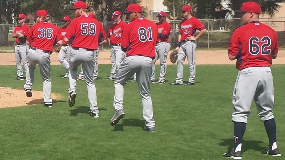
Photo by Tyler Mason; click to enlarge
Which one of these guys is not like the others? The stirrups-clad player at far-right is pitcher J.R. Graham, who’s in Twins camp this spring after spending four years in the Braves’ system. Minnesota picked him up in the Rule 5 draft, which means they have to keep him on their 25-man roster for the entire season or else offer him back to the Braves for nothing, so there’s a good chance Graham will make the Twins’ staff and wear those “TC”-emblazoned stirrups in the majors this year.
As it turns out, Graham is a longtime stirrups devotee, as you can see in these shots from his time in the Braves’ farm system:
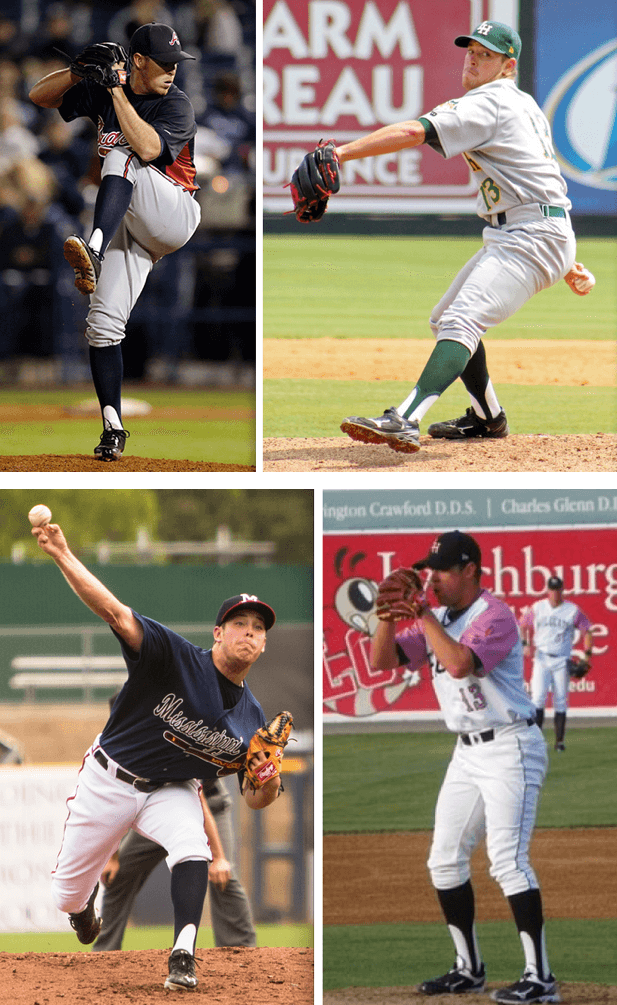
Graham has also worn solid socks, but he prefers to wear stirrups and always goes high-cuffed — and it isn’t just because he likes the look. As Fox Sports North writer Tyler Mason wrote in this sensational story the other day, Graham goes out of his way to have a distinctive look so that his mom, who’s legally blind, can have an easier time spotting him on the field:
Graham … has worn the stirrups since his Little League days. He also used to wear white cleats in high school ”” all so his mother, Julie, could spot him on the field. … She was born with Best Disease, a rare retina disorder that has caused her vision to deteriorate through the years. …
That’s where the stirrups come in. Fewer and fewer players are wearing them these days, with most players opting to let their pant legs stretch all the way to their shoes. Graham has always been a fan of the stirrups for how they look, but even more so because of how they look to his mom. …
[Graham’s] mother has had vision problems all his life, ever since he was a Little League shortstop. Back then, as a position player, it was a bit more important for him to distinguish himself from the rest of his teammates, which is why he wore the white cleats. Now [that he’s] a pitcher, Julie knows it’s him once he’s on the mound.
How great is that? I’ve often referred to Josh Outman and other stirrups-clad players as “hosiery heroes,” but that term really fits for Graham. I strongly recommend reading the entire article, which is sensational. (As it turns out, I Ticker-linked to a similar article about a year ago, but that one was much shorter and didn’t make as much of an impression on me at the time. Maybe it was just a hectic day and I was too busy to fully process how great this storyline is.)
The only problem with all of this is that Graham’s will be harder to pick out in a crowd if other Twins players wear stirrups or go high-cuffed, which creates a conundrum: I’m usually in favor of as much high-cuffery as possible on any given team — but in this case I might make an exception.
(Big thanks to Brinke for sending the link to the Graham article, and to Phil for providing the inspiration for today’s headline.)
Sneaker Report
By Owen Dillon
All-star designs have dominated the sneaker landscape recently. But a less expected powerhouse in the world of shoes have been the Kyrie [Irving] 1. Demarcus Cousins was seen sporting an All-Star PE of the Kyrie 1 in a recent game against the Knicks. The Kyrie 1 has been so popular, in fact, that you can see three different players — Cousins, Langston Galloway, and Ray McCallum — wearing both the Kyrie 1 All-Star and a Nike iD version in this photo from that same game.
The Kyrie 1 is a very interesting, because it was obviously designed for a very quick guard, Kyrie Irving, but many different forwards and centers have been wearing the shoe, such as Cousins and Derrick Williams, suggesting that the shoe is very stable and provides plenty of support for a big man to bang it out in the post.
In other Nike news, J.R. Smith was seen wearing the new Kobe X (10) All-Star edition. Meanwhile, the Kevin Durant 7 has not been very popular, and even Durant himself has been spotted multiple times the KD 6 instead of the 7.
Moving on to Adidas, the splash provided by the releases of Damian Lillard’s and John Wall’s first shoes has dissipated a bit, but some players are still wearing the shoes. We can see Ben McLemore wearing the Lillard 1 here, and Wall, for obvious reasons, has been sporting the simply-named “Away” version of his first signature shoe.
Jeremy Lin was seen recently wearing the Adidas “CrazyQuick 2” low black and yellow edition. The CrazyQuick is not among many Adidas-sponsored athlete’s rotations, but it is a staple for Lin.
Of course, Adidas has been dominating the sneaker world for some time now, and not because of their on-court product. Adidas partnered with Kanye West to create the Yeezy Boost 1, one of the most anticipated shoes to come out recently, after the success of West’s Nike Air Yeezy 2, which was one of the most successful shoes of all time.
Under Armour has not caused many waves in sneaker culture recently, although the Curry 1 “Candy Reign,” “inspired” by Stephen Curry’s love of Sour Patch Kids, was released just over a week ago. Also, Kent Bazemore wore the Clutch Fit Drive, possibly Under Armour’s most successful basketball shoe ever. He frequently wears the low-top version of the shoe and is one of the only players in the NBA who does so.
And we wrap up with my favorite shoe of the past few weeks: the KD 7 “Aunt Pearl,”, which was worn by the University of Kentucky guards and has a feathered mid-sole strap.

Baseball News: What’s even better than a baseball cap? A baseball cap styled like a baseball jersey. Too bad about mismatched placket piping colors, and the blue buttons are an odd choice, but it’s still pretty cool seeing one uni element representing another uni element. The listing says it’s from the 1990s, but I have no memory of that product line. ”¦ Rutgers and New Mexico softball went red vs. red on Saturday. ”¦ Spring training means it’s time for the annual run of articles about players breaking in their gloves. ”¦ In a related item, Mets 1B Lucas Duda is using a slightly larger mitt this spring. ”¦ Oh, for fuck’s sake: Two Alabama high schools went G.I. Joe vs. G.I. Joe. Sigh. ”¦ Oklahoma State went mono-orange yesterday (from Vince Regan). ”¦ The Blue Jays use their inlined jersey font for signage around their spring facility. ”¦ No photo, but Rockies P Jorge Rondon apparently forgot his jersey yesterday and had to wear No. 95. ”¦ Key quote from this article about Texas A&M baseball: “Texas A&M wore its black jerseys on Sunday at Minute Maid Park. The Aggies have been donning the uniforms this season when they’re going for a series sweep.”

NFL News: Here’s a good look at the black memorial armband that the Vikings wore in 1978 for assistant coach Jocko Nelson (from Jeff Flynn). ”¦ Not sure if we covered this at the time, but just in case: When the Jets played the Jags on Dec. 9, 2012, Tim Tebow’s jersey didn’t have the Jets logo patch. The other Jets had it (from Mike Engle).

College Football News: Remember all those crop-top jerseys that were showing up last year? You won’t be seeing them in 2015, because the NCAA has banned them. … Air Force is using helmet sensor technology to track head impacts.

Hockey News: This is kinda bizarre: Looks like the Milwaukee Admirals’ uni numbers are actually giant patches. ”¦ Someone has devoted nearly 700 words to creating a guide to the do’s and don’ts of buying a Canucks jersey. I can give much better in advice in less than 20 words: Don’t conflate being a fan with being a consumer, and especially don’t waste money on overpriced polyester shirts. ”¦ Really good story + slideshow on the Islanders’ ushers, who are preparing for the team’s final games on Long Island. ”¦ The Devils honored their 1995 Stanley Cup championship team by wearing white at home against the Flyers.

NBA News: The Thunder debuted their new sleeved alternates last night. ”¦ The Lakers did the “Los” thing last night. ”¦ How can you put together a gallery of NBA players who’ve worn masks and not even mention Rip Hamilton? ”¦ Flag-desecration unis yesterday for the D-League’s Erie BayHawks.

College and High School Hoops News: Oh baby, check out this amazing warm-up top with a chain-stitched polar bear! A little too big for me or else I’d be all over it. ”¦ Cincinnati wore its red uniforms for the first time this season, creating a very nice color vs. color game against Memphis yesterday. ”¦ Matthew Prigge was looking through UW-Milwaukee photo archives and spotted two interesting items. First, UW-M’s uniforms in 1976-77 looked a lot like Marquette’s untucked unis from that same season. Also, the 1976-77 UW-M women’s team faced a school that wore button-front long-sleeved jerseys. Never seen anything like that before.

Soccer News: The 1971 compilation album Groovy Hits on the Music For Pleasure label featured a female footballer wearing an Arsenal kit (from Graham Clayton). ”¦ A sportswear company that makes the jersey for an Indonesian soccer team apologized after including a tag with laundry instructions that said, “Give this shirt to a woman. It’s her job.” ”¦ Bolton did a one-game sponsor swap yesterday. ”¦ Orlando City and NYC FC went color vs. color yesterday. ”¦ Sporting KC’s home opener included a little shout-out to the NHL’s old Kansasy City Scouts. ”¦ More color vs. color, this time from the MASL playoffs: Monterrey and Dallas. ”¦ These last three items are all from Yusuke Toyoda: Blackburn Rovers manager Gary Bowyer had a pin each lapel yesterday — a prostrate cancer pin on his right and a daffodil for the Marie Curie Fund on the left. ”¦ During a game in Singapore, the officials had to change uniforms at halftime because their black jerseys clashed with the way team’s dark blue tops. ”¦ The latest leak of Liverpool’s 2015-16 jersey looks a little different from what we’ve seen before.

Grab Bag: Uni Watch T-Shirt Club tees for March are starting to arrive in people’s mailboxes. I’ll preview the April design in a day or two, and it will go on sale next Tuesday. ”¦ Oooh, check out this great slideshow of old U.S. Postal Service mail trucks. ”¦ New helmet with extra protection in the back for Sri Lanka cricketer Kumar Sangakkara. ”¦ Interesting story on how the Army green jacket has become a staple of civilian style. ”¦ A Tennessee fan has taken out an ad calling on the university not to scrap the “Lady Vols” moniker for its women’s teams (from Shawn Hairston). ”¦ A woman in Wagga Wagga, Australia, was assaulted and robbed by two men wearing clothing “similar to police uniform.” which I’m including here mainly because it’s fun to say, “Wagga Wagga.” ”¦ Good story about the current state of Reebok’s business (thanks, Brinke).
Wagga Wagga!!
link
While I love Fozzie bear in any incarnation, It’s pronounced “Wog-ga Wog-ga”. It’s just how we Aussies roll.
For example – in Canberra there’s a sports oval spelled ‘Manuka’ but it’s pronounced ‘Mar-nika’.
According to Footy Headlines, the Liverpool top mentioned in the ticker is a fake, fantasy kit design copied from a nike ad.
link
A shame, because I definitely like it a lot better than any of the supposed leaks that have come so far.
Agreed, that fake shirt gave me hope that NB could produce a decent kit for Liverpool, but no surprise that it is fake and the real shirts will look like complete shite.
I prefer NHL teams wearing white at homeike the Devils did last night. I always liked seeing different colors coming into my home teams building instead of a parade of white.
Well of course… but you’re sane, unlike whoever in the NHL decided that teams need to wear their home colors at home.
Lee
at the 17:29 mark, former NFL LB talks about Vince Wilfork having to have his uniform buttoned and/or velcrowed, even having one of those jersey unitards made.. and they mention him having to use to back numbers because the front numbers looked too small
link
Not exactly sure why color on color is even notable in MLS. It happens all the time.
Could have been notable because blue and purple might be considered a clash (as it definitely is in the Monterrey vs. Dallas game mentioned also in the ticker), but it looked fine to me on teevee and I’m usually the first to complain when two teams look even remotely similar. As I’ve said before, if we were to start noting every colour on colour game then the soccer section of the ticker would start to get a little ridiculous.
Scrolled down here to post my agreement with that final sentiment. It’s noteworthy, I suppose, if a team wears its change or 3rd kit when there’s no clash between either primary kit, or if a league or referee demands one side change because of an improperly-perceived clash, but to simply note a regular ol’ color-on-color match up is moderately silly.
That’s what I was thinking too. Though NYC’s blue is light enough to clash with white shirts more than darker blue. In fact, when Man City wore that particular shade of blue, they wore their change kits whenever they played a white-jerseyed team.
Yeah, why mention that particular one when these MLS matches were also color v color:
– Phi v Col
– Hou v Clb
– Dal v SJ
– Por v RSL
– Sea v NE
?
Lee
I remember those jersey hats. Saw a lot of them on sale for hockey especially. Never saw them on anyone’s head but they tried.
Jats? Herseys? Curseys?
Did the Bruins wearing white a home on Saturday afternoon against the Flyers have anything to do with the Devils 1995 celebration and wearing white at home also against the Flyers?
Did the Flyers ask the Bruins to wear white so they would only have to carry one set of unis?
Congrats in advance on the upcoming Digg spike you’re sure to see today!
That KC 96 banner with the old Scouts logo in the Sporting KC end stands has been there a while. I recall seeing it prominently when they had their insane MLS Cup shootout with RSL in that end of the stadium a few years back.
It’s not so much a shout-out to the hockey team, but to this local landmark (which the team used in their logo)
link
Thanks for the link!
“… … Oooh, check out this great slideshow of old U.S. Postal Service mail trucks. …”
I’m interested in that interlocking-U-and-S monogram on the sides of some of the earlier delivery vehicles. The most recent entry in the slideshow of the design was from1907…. Anybody here know about the design’s history? Did it appear on federal properties other than those of the Post Office? When?
“Texas A&M wore its black jerseys on Sunday at Minute Maid Park. The Aggies have been donning the uniforms this season when they’re going for a series sweep.”
Love it. IIRC Clemson was doing this under the radar for years and caught some flak for showing up opponents when it became public (nonsense, IMHO.)
“Really good story + slideshow on the Islanders’ ushers, who are preparing for the team’s final games on Long Island.”
Technically, they’ll still be playing on Long Island…
Andy, I’ve spent 45 of my 50 years living either in Brooklyn or on Long Island. Trust me when I say *nobody* thinks they’re the same thing, even though they’re on the same landmass. (And ditto for Queens.)
But prepositions matter. Brooklyn really is on Long Island. “On” implicitly refers to the landmass, not a political division within the landmass. Note that no matter how deeply held one’s Queens or Brooklyn pride, one would never say that a team plays “on” Brooklyn or Queens. The Islanders will soon play their final games in Long Island; they will thereafter play in Brooklyn.
Sorry, Scott, but you’re out of your depth here.
Nobody — NOBODY — says “in Long Island,” for any reason. You don’t live “in Long Island,” you don’t work “in Long Island,” etc. It’s all “on,” never in. And it doesn’t refer to the landmass; it refers to Nassau and Suffolk Counties, period.
If you go back to my previous comment, you’ll note that I said I’ve lived most of my life “in” Brooklyn and “on” Long Island. That’s just how we do it here.
Likewise with UES/WES/LES.
Geographically speaking, East Harlem is on the upper east side of Manhattan, but there are fewer than zero people who think East Harlem is on Upper East Side.
Speaking of “on”, I could never get used to New Yorkers saying “on line” referring to being in a queue.
So… you’re technically wrong, but you’re stubborn and persistent about it, so therefore it doesn’t matter.
2 things.
1) What Paul said. I live on Long Island. Paul lives in Brooklyn. Case closed. Move along. And yes, if one refers to Long Island (or just “the Island”) s/he is referring to the Counties of Nassau and Suffolk.
2) re: terriblehuman. One gets on line. One may wait in line, but the act of queuing up itself is getting on line.
I feel like I’m watching Simple Men.
“Long Island’s a terminal moraine.”
@Phil
But the logic falls apart when said New Yorkers who get on line decide they don’t want to wait any longer. They don’t get *off* line. They get *out of* line like the rest of the country.
“Sorry, Scott, but you’re out of your depth here” – sounds a little like this
link
Well, there exists a small geek fraternity that does include Brooklyn and Queens when its members talk of “Long Island.” Geologists, map fiends, ecologists and all those, professional and amateur, whose self-identification puts them under the tent of Natural History. I mean, when we’re having a chat with non-members, we certainly know that to them (i.e., 99.3% of New Yorkers) “Long Island” means Nassau County and Suffolk County and we adjust our vocabulary accordingly. You know, to be nice to people like Paul. But it’s a pleasure to chat with somebody for whom “Long Island” is an invitation to chat about the most recent glaciation or who honors the tradition of referring to the disastrous military events in the Brooklyn of 1776 as the Battle of Long Island.
I am a member of that small geek fraternity. I call anything east of the East River and south of the Bronx “way the #@$% out on Long Island”. Drives my wife (who grew up in and around NYC) nuts, which is half the fun.
So, obviously, I was aware of all this and knew it would start one of these debates in which neither side would ever (ever) cave to the other, but here’s where it gets weird:
Since Brooklyn is not a part of Long Island (culturally, semantically, whatever), does it even make sense for the team to be called the Islanders after the move?
Especially since Brooklyn and Queens aren’t even depicted in the island silhouette on the crest.
What Paul says is true about the semantics: Brooklyn and Queens are not part of what is meant by the term “Long Island”. If you mean to include them in any reference to Long Island, then you have to say something like “geographical Long Island”.
This has been true since about the 1940s. Before that, things were a little murkier. Long Island University was founded in Brooklyn in the 1920s. (And the LIU basketball team plays its home games in the Barclays Center, as will the Islanders.) And people routinely wrote Queens addresses as “Jamaica, L.I.” and “Flushing, L.I.”. The Battle of Long Island in the war for independence has alredy been mentioned.
But for several generations, the Queens-Nassau border has been seen as the border between New York City and Long Island.
The Islanders, by playing in Brooklyn, will be bucking this longstanding conception. They really need to modify the logo to include the entire geographical island. On the Creamer board, the user called Discogod created the perfect modification:
link
It makes as much sense as the Jazz being in Utah.
Lee
Dammit, Lee!
It makes about as much sense as the Utah Jazz.
Dammit, The Jeff!
I got it! How about the Brooklyn Lakers?
How ’bout Brooklyn Trolley Dodgers
I vote for a rename/redesign the Islanders contest.
The conflict between a physical map and a political map, if you ask me.
That mail truck slideshow is slightly disappointing. Nothing from the mid-50s to today?
You’re complaining that a historical slideshow doesn’t have enough recent/familiar stuff?
Here’s your sign. . .
I enjoyed the slideshow, but I’m with DarkAudit! Was hoping to see a mail truck from the 1960s or 70s, too.
You can see those in person…they’re still in service ;)
Here’s one of my fave US Mail vehicles.
link
:)
Historical mail truck slideshow was great. If I was disappointed (and I’m not) it would be for not having earlier pics and not for lacking more modern ones.
Pic of one of very earliest ‘mail vehicles’ from my neck of the woods:
link
USPS site at the end of their 24 photos in ‘Photo Gallery: Vehicles’ has a couple vehicles from the 1950s, a few from the 1960s and a bicycle from the 70s:
link
A big blend of the very old (1899 earliest) and futuristic looking (Commuter Vehicles 1980 & Navistar Estar 2013) in their Electric Vehicles:
link
Paul, I’m finding that the link to the ‘similar article’ regarding J.R. Graham is pointing to Tyler Mason’s recent article as well.
Thanks — now fixed.
Here’s the proper link:
link
Got my St. Paddy’s day t-shirt in the mail on Friday. Super soft, and other than the neck being a little snug, it’s a great fit!
It also re-affirmed the fact that my wife just does. not. get. it.
“It also re-affirmed the fact that my wife just does. not. get. it.”
~~~
Well, you better take care of that pronto.
and other than the neck being a little snug, it’s a great fit!
A snug neck is a dealbreaker. There needs to be a v-neck option!
Or you could do what I do with all my t-shirts – cut the collars off *just* above the stitching with some really sharp sewing scissors. Done carefully it looks fine and it’s much more comfy.
Regarding the article on buying a Canucks jersey:
Not the first time I’ve heard people say not to get your own name and number on a jersey, yet for me that’s the only time I take notice of a replica jersey anyone is wearing. If you go to a game you’ll see many people wearing all of the best players from the past or present, and it’s unremarkable. Fun to see what people come up with, especially if it’s somewhat original, and it shows some personality.
There are considerable savings if one puts his/her own name on the back of a jersey as opposed to a current player. The NHLPA and PHPA (Pro Hockey Players Association covering AHL and ECHL players) have fees that all players covered under the two associations get a kickback from having their name displayed on a fan’s jersey.
Personally, it’s your jersey so you put whomever you like on your back. If it’s a pro jersey, though, do the right thing and put a pro on your back (retired is fine, and will save you the above fees).
I should also point out that most numbering/lettering places won’t waive this fee if you put your own name on the back. You need to ask about it.
Otherwise, it’s free money for the shop.
Personally, it’s your jersey so you put whomever you like on your back. If it’s a pro jersey, though, do the right thing and put a pro on your back
I’m confused Teebz, is it just me or does the second sentence there completely contradict the first?
Thinking the same thing.
Do these same rulemakers have a problem with going NNOB on an otherwise NOB jersey? Or will they even sell you one of those?
Considering that I started that paragraph with “personally”, I meant that as my own personal rules, Padday. Definitely not written in stone. ;o)
What I mean is that if it’s a replica jersey, you’re welcome to do what you like mostly because the cost of personalizing it is the same value as the jersey. They don’t wear replicas on the ice. If you’re going to buy an authentic, go authentic and get a player’s name.
Meh. Just put this down as one of those things people get worked up about that I will never understand, nor do I ever intend to.
I think Teebz doesn’t take his logic far enough: If it’s a pro jersey, do the right thing and don’t wear it unless you’re a pro. There’s a way to earn the right to wear that jersey, and it involves a lot of practice and getting drafted by a pro team. That, or just stick with, “You bought the jersey, so whatever you want to do with it is cool.”
If someone is wearing a jersey and he’s not actually a player for the team, then personally I find it less weird to have a custom slogan or one’s own name than to have a player name. It just weirds me out to put another man’s name on my back. But I also get self-conscious about putting my own name on a jersey, so I stick with numbers only.
It’s a royalty. Not a kickback.
It’s a kickback. Do you think that the guys who sell the majority of jerseys are 4th-liners?
The guys who sell the most jerseys aren’t hurting for money, and the NHLPA capitalizes on that. Call it a “royalty” by legal terms, but it’s a kickback to the player for helping the NHLPA make a ton of dough.
The image of Jay Spearing, wearing the Bolton kit with the WIX.COM sponsorship was actually taken back on January 24, for their FA Cup match with Liverpool at Anfield. It wasn’t a one off, as they wore it occasionally in the month of February, besides the FA Cup replay. Mr. Spearing was loaned to Blackburn on January 30th, so the first cup tie was the only possible time he could have worn it……
I shared this over the weekend to the UniWatch FB page, but I’m not seeing it anywhere…..Cubs wore “Let’s Play Two” shirts….
link
This photo shows the front.
Weak. They should have done better by Ernie.
link
A couple of things:
My green UW shirt came on Friday, gonna wear it on my Spring Training trip to Florida next week.
The entire U of Hawaii team wears stirrups. Sadly they lost all three games in the same tournament that A&M wore the black mentioned in the link. But they looked swell!
I always respond to ‘Where did you grow up’ with “In Brooklyn and ON Long Island” (Jericho, btw)
You do know Bolton didn’t play yesterday, I presume?
oops – just seen Jeff’s comment above
At least Bolton is still a palindrome.
?????
Getting far too silly for you Dumb Guy?
link
I have apparently never seen that sketch all the way through! I had a “MP Live at City Center” 8-track back in that day (that I still have memorized) but that sketch is truncated on the album I believe.
Thank you.
It don’t work like that. The palindrome of Bolton would be Notlob.
The plumage don’t enter into it.
“Prostate” cancer, not “Prostrate”. Very common misspelling.
For all those complaining about the semantics, get in line… (Lol)
Or on line if you’re in New York.
Never played baseball at anything but the most basic recreational level, but I would think players would find the pajama pants distracting. High cuffed seems like it would just be neater, less prone to snagging on something, no flapping as you round the bases or run for a ball etc.
:)
Regarding the Milwaukee Admirals having the number on a huge patch, the 1975 Houston Astros’ tequila sunrise jerseys wore their numerals on a big circular patch.
i loved the comments today.
i dont recall ever laughing so often. holy sheet. everything from the long island vs brooklyn to the hammering the old mail trucks slide show.
great work, UniPhiles! keep smoking and drinking whatever you are toking today!
I received my great St Patrick’s Day shirt today. Thank you very much. It looks awesome and I look forward to wearing it well.
J. R. Graham may have really nice socks, but the answer to “Which one of these guys is not like the others?” is clearly #36 at the far left, because he’s the only one wearing a reasonable jersey number!