[Editor’s Note: With the World Cup about to start, Omar Jalife has taken on the truly Herculean task of documenting the history of kit makers’ logos in the tournament. Enjoy. ”” PL]
By Omar Jalife
When Brazil won the won the World Cup in 1970, it marked the end of two eras. First, it was the last time the winning team was awarded the Jules Rimet trophy (which was replaced in 1974 by the FIFA World Cup Trophy). And it was also the last World Cup that was completely free of logo creep. Beginning in 1974, World Cup teams began showing a maker’s mark on their jerseys.
Here’s a Cup-by-Cup look at how maker’s marks have spread through the tournament since then, including breakdowns of which teams wore which brands. In each case, I’ve linked to photos of all the teams and have also prepared pie charts (which can click to enlarge) showing the brand distribution.
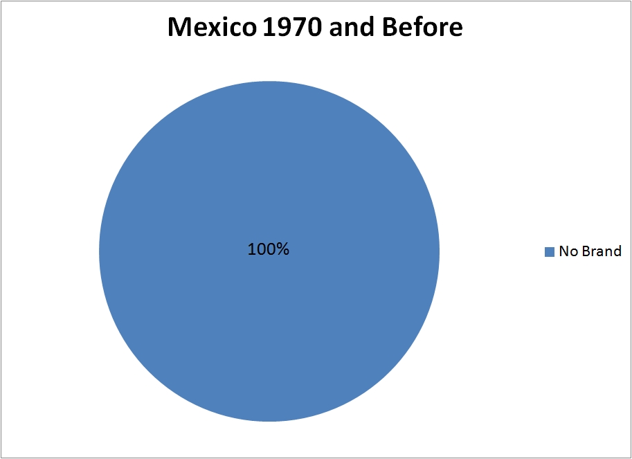
No brand (16): England, Italy, Soviet Union, West Germany, Brazil, Mexico, Peru, Uruguay, Belgium, Bulgaria, Czechoslovakia, Sweden, El Salvador, Israel, Morocco, and Romania
Adidas (10): Chile, Yugoslavia, Zaire, Netherlands, Uruguay, Sweden, Bulgaria, Haiti, Poland, and Argentina
Umbro (2): Australia and Scotland
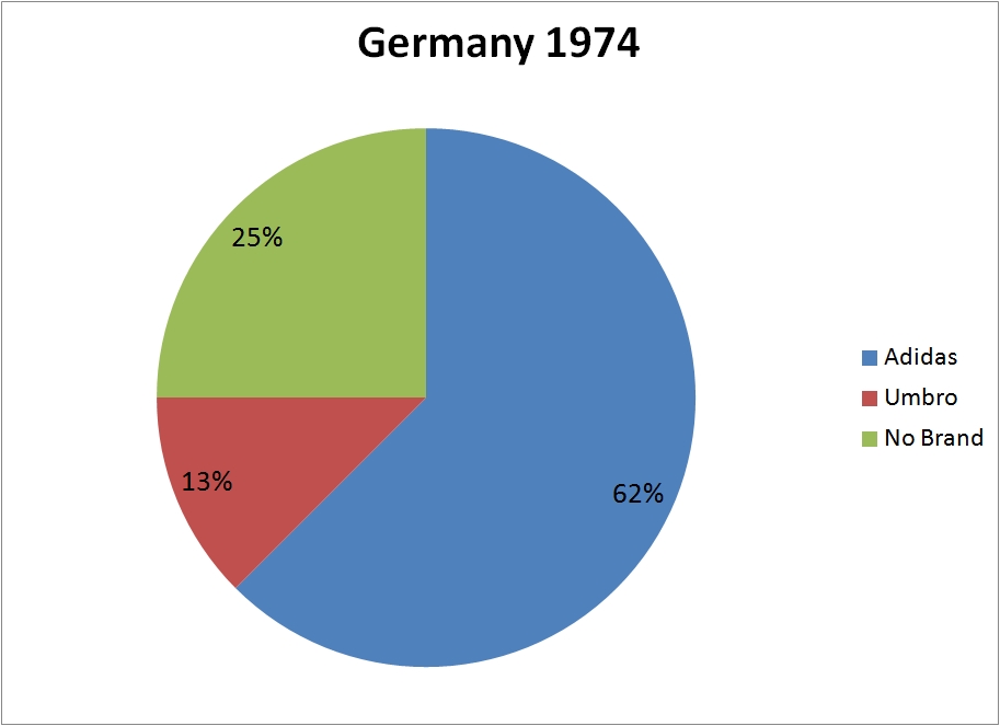
No Brand (4): Italy, East Germany, West Germany, and Brazil

Adidas (10): Argentina, France, Hungary, Poland, Tunisia, Sweden, Peru, Netherlands, Iran and Brazil
Puma (1): Austria
Umbro (1): Scotland
Erima (1): West Germany
Levi’s (1): Mexico
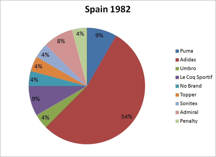
Adidas (13): Soviet Union, New Zealand, West Germany, Chile, Hungary, El Salvador, Czechoslovakia, Spain, Honduras, Yugoslavia, Northern Ireland, France and Poland
Le Coq Sportif (2): Argentina and Cameroon
Admiral (2): England and Belgium
Umbro (1): Scotland
Topper (1): Brazil
Sonitex (1): Algeria
Penalty (1): Peru
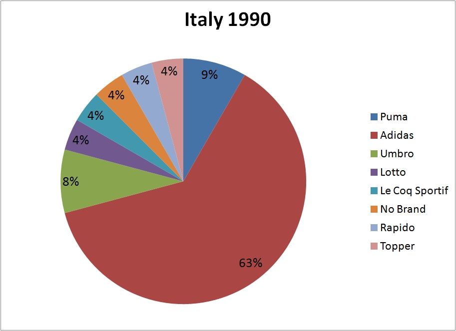
No Brand (1): Italy
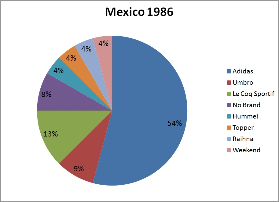
Adidas (13): Soviet Union, Belgium, Northern Ireland, West Germany, France, Canada, Mexico, Iraq, Bulgaria, Hungary, Morocco, Poland and Portugal
Le Coq Sportif (3): Argentina, Uruguay and Spain
Umbro (2): England and Scotland
Hummel (1): Denmark
Topper (1): Brazil
Raihna (1): Paraguay
Weekend (1): South Korea
No Brand (2): Algeria and Italy
Adidas (15): USA, Cameroon, Argentina, Romania, Sweden, Colombia, UAE, West Germany, Yugoslavia, Belgium, Ireland, Netherlands, Egypt, Czechoslovakia and Soviet Union
Umbro (2): England and Scotland
Lotto (1): Costa Rica
Le Coq Sportif (1): Spain
Rapido (1): South Korea
Topper (1): Brazil
No Brand (1): Italy

Adidas (10): Romania, Sweden, Argentina, Bulgaria, Ireland, USA, Norway, Germany, Spain and Nigeria
Umbro (4): Brazil, Mexico, Colombia and Bolivia
Lotto (3): Switzerland, Morocco and Netherlands
Diadora (2): Greece and Belgium
Reebok (1): Russia
Mitre (1): Cameroon
Rapido (1): South Korea
Shamil (1): Saudi Arabia
No Brand (1): Italy

Adidas (7): Romania, Spain, France, Argentina, Saudi Arabia, Yugoslavia and Germany
Nike (5): Brazil, Nigeria, South Korea, Netherlands and USA
Puma (5): Morocco, Cameroon, Austria, Bulgaria and Iran
Reebok (3): Chile, Colombia and Paraguay
Umbro (3): England, Scotland and Norway
Lotto (2): Croatia and Tunisia
Kappa (2) South Africa and Jamaica
Hummel (1): Denmark
Aba Sport (1): Mexico
Diadora (1): Belgium
Asics (1): Japan
No Brand (1): Italy

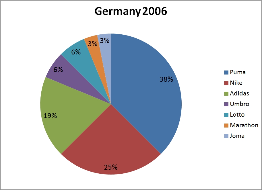
Adidas (10): France, Saudi Arabia, Germany, Turkey, Japan, Argentina, China, South Africa, Sweden and Spain
Nike (8): South Korea, USA, Brazil, Croatia, Belgium, Russia, Nigeria and Portugal
Puma (4): Cameroon, Poland, Paraguay and Tunisia
Umbro (2): England and Ireland
Marathon (1): Ecuador
Joma (1): Costa Rica
Uhlsport (1): Slovenia
Le Coq Sportif (1): Senegal
Hummel (1): Denmark
Kappa (1): Italy
Atletica (1): Mexico
No Brand (1): Uruguay
Puma (12): Italy, Iran, Paraguay, Ghana, Angola, Ivory Coast, Switzerland, Togo, Czech Republic, Poland, Tunisia and Saudi Arabia
Nike (8): Australia, Mexico, Brazil, Portugal, Netherlands, South Korea, USA and Croatia
Adidas (6): Trinidad & Tobago, France, Japan, Spain, Argentina and Germany
Marathon (1): Ecuador
Joma (1): Costa Rica
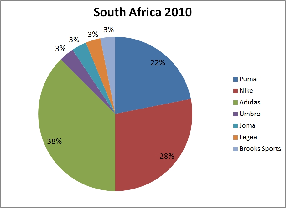
Adidas (12): Argentina, Denmark, France, Germany, Greece, Japan, Mexico, Nigeria, Paraguay, Slovakia, South Africa and Spain
Nike (9): Australia, Brazil, Netherlands, New Zealand, Portugal, Serbia, Slovenia, South Korea and USA
Puma (7): Algeria, Cameroon, Ghana, Italy, Ivory Coast, Switzerland and Uruguay
Umbro (1): England
Joma (1): Honduras
Legea (1): North Korea
Brooks Sports (1): Chile
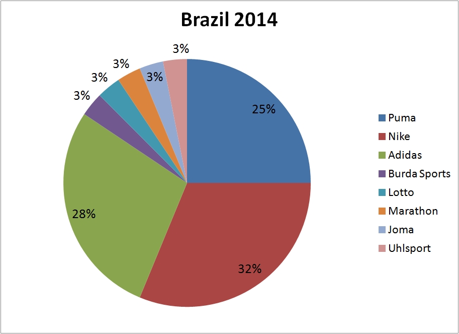
Nike (10): Australia, Brazil, Croatia, England, France, Greece, Netherlands, Portugal, South Korea and USA
Adidas (9): Argentina, Bosnia, Colombia, Germany, Japan, Mexico, Nigeria, Russia and Spain
Puma (8): Algeria, Cameroon, Chile, Ghana, Italy, Ivory Coast, Switzerland and Uruguay
Lotto (1): Costa Rica
Burrda Sport (1): Belgium
Marathon (1): Ecuador
Joma (1): Honduras
Uhlsport (1): Iran
And now some fun facts…
• Seventy-seven nations have participated in the World Cup since 1974. Fifty-two of them have worn an Adidas maker’s mark during the World Cup at some point.
• The two tournaments with the most logo creep variety were France 1998 and Korea/Japan 2002, with 11 different logos in each tournament.
• The Cup with the fewest logos was West Germany 1974, with only two (Adidas and Umbro).
• Since 1978, no tournament has seen fewer than five different maker’s mark on field.
• Germany 2006 was the first time that all teams wore a maker’s mark on their kits.
• Italy had their kits made by Diadora and later by Nike but refused to wear a maker’s mark until 2002, when they switched to Kappa.
• This year’s World Cup marks the first time Nike has had the most teams in the tournament.
• Over the past 11 World Cups (including this year), Mexico has participated in eight of them and worn six different maker’s marks in that time (Levi’s, Adidas, Umbro, Aba Sport, Atletica, and Nike). Belgium is a close second, with five (Admiral, Adidas, Diadora, Nike, and Burda Sport). Next is Brazil, with four (Adidas, Topper, Umbro, and Nike).
• A total of 30 manufacturers’ logos have appeared in World Cups. Adidas is the overall leader, with 115 squads supplied, followed by Puma (41) and Nike (40).
• Bosnia’s new contract with Adidas doesn’t technically start until July 1, but they’ll nonetheless play with Adidas equipment in this year’s tournament, instead of the Legea kits they were using before.
• Brazil’s jersey in 1982 didn’t have a maker’s mark on the chest. That’s because the logo went on the short and left sleeve.
• I read on a forum that Australia’s 1974 kit, which had Umbro branding, was actually made by Adidas. Does anyone know more about this? They sure look like Adidas, although they supposedly used Umbro.
• If you look again at Israel’s 1970 kit, you can see the goalkeeper was wearing an Umbro . I didn’t count this as a whole team wearing the logo, but it might have been the first maker’s mark to appear in a World Cup. Israel has never gone back to a World Cup — might be the logo creep curse.
• If you want to see every kit worn on every World Cup match, you can look here. I used this to cross-reference FIFA’s pictures and other sites’ data in order to do this study.
(My thanks to Paul for readers terriblehuman and Ryan Sheldon for their logo research assistance, and to Paul for running this on the site.)
———
Paul here. Let’s have a big round of applause for Omar, who put some serious work into this one. We both almost plotzed when designer Craig Robinson posted this World Cup kit manufacturer infographic the other day — for a minute we thought we’d have to scrap Omar’s project because Robinson had scooped us. But Omar did team-by-team and breakdowns and had all those fun facts, which Robinson didn’t, so we decided to go ahead. Phew!
This piece involved a lot of coding by Omar and by me. If we messed up any of the links, please speak up and I’ll do my best to fix them. Thanks.
Major historical find: I’ve known for years that big league baseball’s first uni numbers were worn by the Indians, who experimented with sleeve numbers in parts of 1916 and ’17 (number on the back of the jersey wouldn’t come until 1929). But I had never see photos of those early Cleveland numbers until yesterday, when MLB’s official historian, John Thorn, posted this tweet:
Lou Guisto, Cleveland Indians, wears number on right sleeve, 1917. Club tried left sleeve briefly in 1916. pic.twitter.com/mBfd06qkmR
— John Thorn (@thorn_john) June 9, 2014
Interesting! Big thanks to Phil, who spotted this tweet before I did and alerted me to it.
Collector’s Corner
By Brinke Guthrie
Remember the early-1970s Mattel “Instant Replay” discs? You got this little player that looked like a handheld transistor radio and stuck the discs in the side for audio playback. Had one, and they were fantastic. This is the player, and here’s a what the discs looked like in a stand-alone package. Here’s something similiar from the same period: Mattel Talking Football.
You say Mattel doesn’t float your boat? Here are some other goodies for your consideration:
• Not quite sure what to make of this: a men’s denim jumpsuit festooned with the names of ABA and NBA teams. I guess I’ll just say, “It was the Seventies.”
• Ever seen one of these? Little 1970s baseball-card-sized MLB cap plaques, this one for the Giants.
• What an odd little Houston Oilers decal. No “Oilers” reference anywhere!
• Vikes fans, check out this 1970s copper wall plaque.
• Nice NFL shield-based package design on this 1970s L.A., not St. Louis, Rams mini-helmet. And just 29 ¢, too (back in the day, that is — now they want nine bucks).
• Also from the Rams, this NFL Stereo Helmet headset. How did I not have one of these? Was I asleep for the 1970s? (My high school teachers might say yes.)
• This looks promising: a 1969 NFL comic book.
Seen something on eBay or Etsy that you think would make good Collector’s Corner fodder? Send your submissions here.

Design contest reminder: I’m currently taking submissions for my latest ESPN design contest, which is to redesign the World Cup soccer ball. Get the full scoop here.
Party reminder: We’ll be celebrating Uni Watch’s 15th anniversary tonight, 7:30pm, in the back room at Sheep Station. See you there.
And speaking of the Uni Watch anniversary: I’ve gone ahead and placed an order to have our 15th-anniversary logo turned into an embroidered patch. Those of you who expressed interest in purchasing such a patch will be hearing from me shortly. If you’d like to add your name to the list of patch purchasers, shoot me a note.
Meanwhile, wouldn’t you like the anniversary logo as Google Chrome theme? Sure you would! Actually, I didn’t even know what a Chrome theme was (I use Firefox) until our own Brinke Guthrie came up with this for your downloading pleasure.
Finally, the anniversary logo remains available on this T-shirt.
Tick-Tock: Today’s Ticker was compiled and written by Garrett McGrath.

Baseball News: Jayson Werth and Betsy: Not the name of a childhood cow or his wife, but of a baseball player’s favorite glove (from William Yurakso). … It looks like Austin Jackson is wearing a wristband with someone’s face on it (from Clifford Baxter). … “Saturday night was Heroes and Comics night at AT&T Park and the Giants gave away Courageous Catcherman bobbleheads in the likeness of Buster Posey,” says Sean Robbins. “I immediately obsessed on the uni details. The stitch marks and orange squatchee on the hat struck me as awesome details. Other bobbleheads I have are missing that.” … On Sunday, the Charleston RiverDogs wore Homestead Grays throwbacks against the Savannah Sand Gnats who wore Newark Eagle throwbacks (thanks, Phil). … The Brooklyn Cyclones are going to wear this patch for the NY-Penn League’s 75th anniversary. … Paul Wajgel snapped a photo of the Milwaukee Brewers mitt logo in an unusual place. … We have confirmation on what the July 4 stars/stripes caps will look like. Here’s a minor league version, and here’s more info on the MLB designs. All of this backs up the report that was linked in yesterday’s Ticker.”

NFL News: Watching football poolside? EverBank Field, the home of the Jacksonville Jaguars, has undergone renovations by taking at 9,500 seats at the north end zone and replacing them with a two-level party deck with two pools (thanks, Paul). … The Steelers will wear a patch to mark the 40th anniversary of their Super Bowl IX title on Nov. 30 against the Saints (thanks, Phil). … The Vikings were wearing shorts with each player’s number on them during their most recent OTA (from Luke H.).

College Football News: Frito-Lay has ended its 18-year sponsorship of the Fiesta Bowl Tortilla Chip Bowl. No word yet on a new sponsor (thanks, Paul). ”¦ West Virginia could be going BFBS (thanks, Phil). …

Hockey News: No pictures, but the Pittsburgh Tribune-Review expects the Penguins to introduce an alternate jersey to be worn for select games next season. The reporter confirmed that the third jersey is the return of Pittsburgh Gold for the first time since 2001-2002 season. Goalie Marc-Andre Fleury said he has ordered yellow leg pads and gloves to be worn with them (from Mike Engle). … Snoop Dogg/Doggy Dog/Lion wore a Hartford Whalers button-up sweater on Jimmy Kimmel. … This screams “marketing ploy,” but Kareem Abdul-Jabbar posted pictures on his Twitter account while wearing a Kings sweater with Mariano Rivera, who was wearing a Rangers sweater (thanks, Phil).

Soccer News: Useful and interactive chart of historical World Cup kits for all 32 teams in this year’s finals (from Yusuke Toyoda). … Iran’s World Cup jerseys feature Asiatic cheetahs, which are mainly in Iran and are facing extinction (thanks, Phil). … Trevor Williams ranked the 32 World Cup crests into three categories: awful, average, and awesome. … Aston Villa home and away kits have now both been launched. … The New York Times on the widespread lack of the black cleats recently in the sport (from Patrick O’Neill).

Grab Bag: Lego employees have really cool business cards (from Yusuke Toyoda). … Yesterday, was the opening day for the new on-campus pool at the University of Colorado at Boulder in the shape of Ralphie the Buffalo. Matthew Robbins sent in a behind the scenes video on the new natatorium. … The barefoot running trend is out and maximal cushioning running shoes with HUGE soles are in (from Tommy Turner).

Love the Posey bobblehead.I believe Stan Lee was also at that game.It’s different,I dig it.More teams should do it.
He was. He threw out the 1st pitch.
Is the New York Penn League 75th anniversary patch going to be worn by all league teams or just the Cyclones?
I’m assuming that it’ll be all teams, although that tweet only mentioned the Cyclones.
Wonder if it’ll be replacing the Mets patch on their left sleeve, or go on the right.
Looks like Larry Brown (Redskins) on the stereo headset box. Don’t know who the Vike is (nor did I google it).
The comic book says, “Professional Football. This edition features the national football league”.
Wonder what other professional leagues did they do?
Well, it was 1969 — the AFL still existed.
And the CFL.
Fantastic breakdown of WC logo creep. However, there is an error with the photo for Poland’s 1978 kit. That photo is from 1986. Though in soft focus you can easily see the ball pictured is the 1986 Tango Azteca, not the first edition (and iconic) Tango River Plate used in ’78. Here’s a quick history of official WC match balls…link
“… Fantastic breakdown of WC logo creep…”
Absolutely.
Yup. Well done, Omar and contributors.
This will be the very first Uni Watch blog that I will save thanks to the World Cup maker’s mark history.
Way to go, Omar!!
Thanks everyone!
I couldn’t get online earlier. My mistake on that 78 kit, I had to redo many of the links and probably missed that one.
Glad you liked the work
In relation to the Australian jersey from 1974, Rugby League and Rugby Union jerseys of the 1970’s & 80’s also had the three strpes on the shoulders made by various companies. Noticable examples are New South Wales Rugby League team 1980 to 1983, 1982 Australian Rugby League team and the Australian Wallabies Rugby Union team in the first Rugby World Cup in 1987.
Thanks for explaining that Liam. So probably the stripes weren’t really Adidas branding
That’s a mighty fine looking Milwaukee MLB team logo rendering, but isn’t the mitt’s ‘webbing’ supposed to be white?
Officially, yes, but since that is the only real design flaw in the logo, I’m happy to see it done this way.
Meh, shouldn’t that be done with cases of beer, rather than Pepsi products?
But to get the same effect with beer cases, wouldn’t it have to be Labatt’s and Landshark?
Off the top of my head, I think Bud Light and MGD would come close, but I could be wrong. Anyways, they’re the Brewers, so in theory, they make beer. No one ever said it was *good* beer.
Thank you! This drives me crazy every time I see it. The webbing should be white. link
But somewhere along the line, it got marked as “transparent” in the link. So wherever you see it these days, the webbing takes on the color of the background. link, link, link. The only place they still get this right is on the link (although the link carry forward the error).
I really want this to be the next Atlanta Braves batting helmet logo – let’s get on it!
Messed up my HTML – the “gold” example should be link.
Almost looks like Austin Jackson is wearing one of those anti-drug wristbands from the 80s.
link
Paul wrote about them a few months back, IIRC, but I can’t find the link.
I can tell that a lot of effort went into the logo-creep research there, however, the charts are a little unintuitive. I understand that each year is a whole new chart, but for brands to have different corresponding colors from year to year makes it somewhat confusing. Adidas goes: Blue, red, red, blue, red, blue, green, green, green, green, green.
Purely to show diversity of branding, the charts work great. But if the colors tracked from year to year, it would also be much easier to immediately see the “market share” of each brand.
+1 As an Analytics professional, I had the exact same issue when “No Brand” kept changing colors, it’s hard to recognize the level of logo creep.
Great work to compile the data, though.
Excllent critique. I should have thought of that when Omar submitted the charts. Mea culpa.
Seconding the praise for the data collection and analysis, as well as the critique on the pie chart color inconsistency. And not a critique, but a suggestion: a stacked bar chart (of course with consistent colors and orders among the data) would even more powerfully display the evolution over time. Not that the pie charts lack for power, but they work better as snapshots than as trend visualization.
Anyway, loved today’s lead entry. Great stuff – thanks to Omar for the hard work and insightful analysis!
I’m a bit of a Tableau geek… Here are some great sports-themed charts made using Tableau software for inspiration:
link
this one is pure genius:
link
Thanks for the comments. As you could probably see, my Excel is somehow limited and frankly, didn’t think of changing the colors since the bar graph was already set.
I’ll update it for the 2018 World Cup hehe
The 1974 Levi Mexico kits are sweet:
link
anyone know more about Levi’s uniform history? Was this a bizarre one-off?
Re Levi’s: the 1978 Mexico away kit was no less sublime.
link
Levi’s also outfitted – quite gloriously and prototypically American, I might add – the 1984 U.S. Winter Olympics team (scroll to bottom of page):
link
Apparently Levi’s even outfitted the ill-fated 1980 U.S. Summer Olympics team. Resulting in this heartwarming tale of corporate largesse:
link
The 1980 US hockey team wore Levi’s warm-ups when they were presented with their gold medals:
link
The Kareem-Rivera thing was put on by Delta Airlines. link
I don’t think I’ve seen this mentioned anywhere on Uniwatch before. Look at Johan Cruyff in the 1974 Netherlands photo ( he’s the captain with the Dutch flag armband). He has only two stripes, not the Adidas three stripes like the rest of the team. He already had a personal sponsorship with Puma. When Adidas became Netherlands’ jersey maker that year for the first time, Cruyff tore one of the stripes off his jersey to avoid wearing the Adidas logo.
That’s a good story that is now reflected on how players can choose their brand of shoes different from the national team’s apparel. Funny though, some companies want to brand the star player’s shoes of some national team that is not outfitted by them to increase market share in said country.
Wow, Omar. Amazing project. Well done!
Interesting to see how Adidas was early to the game, and has managed to keep a large share of the market as upstarts like Nike came in. And I don’t think of Puma as still being a major brand (possibly because they can’t outfit an NFL team), but they very much have a presence at the World Cup. And I guess I’ll have to get used to seeing their mark on my Gunners.
If I could throw in one word of constructive criticism for the next major project like this, it would be to keep the colors for each manufacturer consistent from year to year. Would be so much easier to process the ebb and flow if I wasn’t constantly looking at the key to see which color Nike was this time. But still, bravo.
Never mind, RyanG beat me to it above….
I do think of Puma as a “major brand” or the third brand for athletic/soccer shoes (leaving aside running-centric brands like New Balance and Saucony), albeit much smaller than Nike/Adidas. I view them as bigger than other European based brands like Kappa, Hummel, Gola, and Joma.
Thanks man. I’m a gunner too! My greatest fact about Puma is how they “beat” Adidas when the WC was held in Germany. Sure Adidas didn’t loved this at all.
About Adidas, I really can’t see a future where they lose the WC rights with FIFA. No matter how much money Nike throws in.
While Italy were non branded from at least 1982 through 1994, they were made by Diadora, just pointing that out
Yep, I still wonder how the managed to resist on not putting the Marker’s Mark.
Speaking of patches…
Any UWer or DIYer ever tried to clean an old patch?
I have a 1970s/80s Little League patch I’d like to add to a jersey, but it’s a bit dirty. Aside from just soap and water anybody have a technique for cleaning that doesn’t involve scrubbing?
I tried to clean up a 1970’s embroidered “SL” on a Salt Lake Gulls cap. Part of the problem was that the red dyed threads had bled into the white threads, making them slightly pink. I scrubbed and scrubbed.
Ruined the hat.
Fudge. I didn’t even think about the red threads bleeding…
Certain that y’all know about this, but it was news to me. And the video is wonderful.
link
Stars & Stripes caps released
Yeah…so we can expect to see the Astros Star-H inside a Star w/ stars and stripes?
Said it yesterday: I actually prefer these to the bastardized designs they’ve been creating the last couple of years.
At least it’s not camo. So they’re at least learning to distinguish among our federal holidays. Silver lining.
I cannot imagine a less thrilling prospect than watching a football game from the confines of a swimming pool populated by several dozen beer swilling Jaguars fans. By the end of the game, that water will be about 40% urine.
So, slightly cleaner than any other public pool.
Yeah, exactly. But in the typical public pool, you don’t have to watch the Jags whilst stewing in other people’s urine.
I was already repulsed by the thought of viewing clients and/or co-workers in swimming suits to even consider the urine factor.
Full disclosure (no pun intended), at six feet and 145 pounds, I am not exactly a great sight in a swimming suit either.
Italy had Le Coque Sportif gear in the World Cup 1982 and 1986 while had Diadora in 1990 and Nike in 1998, even if they didn’t brand the on-field jerseys. The picture of the Italian team shown for Argentina 1978 is not the team in that World Cup but the one in Spain 1982, just to point it out
also in 1994 Italy had Diadora gear, not branded on field
Sorry for the mistake on Argentina 1978.
A few soccer issues:
1. Is there a change-strip version of the Zalando chart?
2. Surprising that Mexico’s early kits were burgundy, which is not on its flag.
3. Le Coq Sportif was ostensibly the sponsor of the Argentina “home” kit in 1986, but the blue jersey with silver numbers (worn in the Hand of God game) were supplied by a “backstreet store in Mexico City” according to FIFA. The logos of AFA and LCS were applied shortly before the England game.
link
Mexico’s law banned any team fromusing the mexican flag’s colors (don’t know why exactly) and that’s why they used burgundy jerseys early. Then someone realized how stupid this was and allowed for mexicans to wear green, white and red.
This Time article on the Disney Mighty Ducks ducks movie offers some great quotes about the design/origin of their team. It’s a ways down but if you ctrl+F search “teal” you’ll get into the good parts.
link
From the movie producer’s account of dealing with Disney CEO Michael Eisner on the NHL team’s uniform design:
“We did a version of the uniforms with all that on it in the District 5 colors: the green, gold and purple. And Michael said, “Oh, no, no. We’re not using those colors.” And I said, “What colors are we using?” And he said, “Oh, we’re using aubergine and teal.” And I said, “Michael, what – I know what teal is. What’s aubergine?” And he said, “Well, it’s kind of purple, kind of a maroon purple.” And I said, “These are such ’90s colors. The Dolphins got away with the sort of Miami Vice colors because it was so attached to that show and the ’80s and all that stuff. They got away with it. And so they’re still like one of the only teams that has colors like that. But these are not hockey colors. Don’t do this.”
The costume department of the movie actually developed the first jerseys of the NHL team. How unique is that?
“The Dolphins got away with the sort of Miami Vice colors because it was so attached to that show and the ’80s and all that stuff. They got away with it. And so they’re still like one of the only teams that has colors like that.”
What? The Dolphins got their colors in 1966, eighteen years before Miami Vice was first broadcast.
Yeah, i had the same thought too. Maybe he was saying it was a reason why they kept it through the 80s.
The logo creep at the World Cup study is excellent. It would be interesting to see a companion qualitative analysis: did diversity of manufacturers result in a difference in the overall aesthetics? Did the World Cup look better when it was dominated by Adidas (or by Adidas and Nike), or when there were eight or ten companies designing kits? Was Korea/Japan 2002 more enjoyable to look at than Italy 1990, or Brazil 2014?
Thanks Cort.
Interesting proposition. I can tell you that there was a point in time (2002 for example) when companies cared more about giving the same templates to every team (That was the Total 90 campaign by Nike) than giving each one an identity.
Companies realized how wrong this was and now you can see Nike teams wearing completely different models. Adidas is trickier since they all have the 3 sleeves on the shoulders and side which somewhat limit option.
Before that, uniforms were quite plain with almost no design (although Zaire’s huge log on the chest is incredible)
I noticed during the AHL Calder Cup Finals that St.John ‘s wears Reebok sweaters while Texas wears CCM sweaters…. For Texas, was this a season-long thing with CCM or only a postseason thing? Moreover, is Texas the only AHL team wearing CCM?
The barefoot running trend is out and maximal cushioning running shoes with HUGE soles are in
I’d try ’em. I have to replace my shoes every six months or so, since breaking my second metatarsal training, because I’m squashing the padding flat with every step. Extra cusioning mightn’t be a bad idea.
Kudos to Omar. Great work on the World Cup story.
Thanks Chris, glad you liked it.
Does Adidas’ three-stripes pattern on sleeves and shorts really count as a manufacturers’ logo? Because on all of the Adidas kits from 1974, those stripes appear to be the only way to identify the manufacturer. Compare them to Adidas’ 1978 kits, which prominently feature Adidas’ old Trefoil logo on the right breast. The 1974 jerseys don’t have the Trefoil.
I realize the three stripes are not only Adidas’ proprietary design signature, but also a link of the company. But there seems to me something fundamentally and aesthetically different about putting a consistent set of stripes on all the kits the company manufactures as compared to putting a logo on a jersey in a place where it is just about as visible as the team crest.
Yes, there is a difference: The stripes are worse than a smaller logo.
But I think it’s possible to recognize that it’s a different approach to a maker’s mark and still count it as a maker’s mark for the purpose of this exercise. What is the point of a maker’s mark? To identify who manufactured the item. When Adidas slaps its trademark three stripes on the shoulders of a jersey, does everyone who sees the jersey know who made it? Yes. Therefore, it counts just as does a Nike swoosh on the breast.
Many of the 1974’s teams had the Adidas logo on the short. That’s what I counted as Marker’s Mark
“We both almost plotzed when designer…”
I love Yiddish because even if I don’t know a word’s definition I understand perfectly just by how the word sounds and some context clues.
Hey Paul,
There’s a photo on the BHoF (Dressed to the Nines) website of the 1916 Tribe NOS.
link
Weird thing about that photo, though:
Okkonen shows that cap as being road, and the rest of the uni as being home for that year. Perhaps they wore that combo at home, too?
link
— Leo
I take that back. The site doesn’t show a dark cap with white piping for that season at all…?!
On which page does that photo appear?
It’s not on link, which is where I’d expect to see it.
Just sent out an email.
Click on the 1916 (green outline) and it will bring up a photo link.
link
Two World Cup-related thoughts:
1) I never would have guessed Levi’s would have made soccer kits at any point in time.
2) I wish the first link in the soccer ticker showed shorts (and socks, too, I suppose). It seems one of the biggest complaints about this year’s unis is the break from tradition for the likes of Colombia (white > blue), Germany (white > black), Spain (red > blue), & Argentina (white > black). I wasn’t aware of Colombia’s historical preference until a couple of months ago, but it would be quite obvious if you saw this year’s kits alongside ones the other 3 countries have worn in prior World Cups (a combined 45 appearances with 6 titles through 2010).
I was shocked to learn about Levis too, though isn’t the bigger surprise not that Levis has outfitted World Cup teams, but that it didn’t outfit link?
Welcome to the club. I was also amazed by that fact.
Absolutely outstanding job by Omar on today’s lede! I lost at least an hour of my morning clicking through all those pics.
I had forgotten how absolutely gorgeous the Netherlands 1994 kits were (I was lucky enough to see these in person in their 3-2 quarterfinal loss to Brazil)…
link
Thanks a lot. I hope it was an enjoyable hour
Not certain if this has been shared already:
From Deadspin: “The Yocha Dehe Wintun Nation has bought airtime in seven major cities during halftime of tonight’s NBA Finals Game 3 for a one-minute spot criticizing the Redskins team name, and calling for it to be changed… The Californian tribe wouldn’t say how much the airtime cost, only that it’s a “significant investment.” The spot will run in Chicago, Dallas, Los Angeles, New York, Sacramento, San Francisco and Washington, and ran in Miami during Game 2.”
link
Many, many people have sent me that link today.
I honestly don’t see what the big deal is, and I don’t plan to include this in tomorrow’s ’Skins Watch. The ad is not new — many of us saw it six months ago. Why is this news?
That Houston Oilers’ patch is from 1966-71, the years they wore the Silver helmets. I love these rocket scientists who offer this merchandise with no idea of its vintage.
One again proving that only white people care about the Redskins .
link
That ad has a fantastic ending!
The ad on Youtube: link
During 3 consecutive World Cups (1974, 1978, and 1982) Argentina numbered the team alphabetically by surname. In consequence, starting goalkeeper Ubaldo Fillol wore the number 5 jersey during the 1978 World Cup and the number 7 in 1982 letting the number 1 to an outfield player. An exception was made in 1982 to let Diego Maradona wore his favored 10 instead of the 12.
I had no idea about that Chris. Great fact.
Actually in 1994 Italy wore Diadora uniforms, although the company may have not been on the jersey.
Although this was in the ticker last week, FC Porto officially released their new kits by Warrior link Lots of corporate speak in the press release lol
I don’t care about the logo creep on the FIFA Golden Ball. Yet couldn’t they have shown restraint on the honorary Platinum Ball awarded to French legend Just Fontaine today!
link
Anyone up for a uni-orgy!
link
Wisconsin Public Radio show “Central Time” had a discussion a couple days ago about which athletes wore their numbers and jerseys best
link
Minor point from tonight’s Minnesota at Toronto Baseball game.
Kendry Morales (recently signed by the Twins) batted in the 9th inning, with his back shirt completely un-tucked (not just baggy, but un-tucked). Sounds relatively innocuous, but I can’t recall seeing a ball player look so disheveled while at bat. It looked very Beer League-ish. (maybe this is a reoccurring issue with him, wonder if this possible sloppy deportment had anything to do with him being unsigned for so long – just kidding)
I did post an email to you guys giving some in-site into the Umbro / Adidas kit for Australia, and the Umbro top for Israel
but also a little fact for you. 1966 world cup. All kits where made buy Umbro, except for USSR who broke there contract agreement with Umbro just before the event.