.
Don’t look now, but it’s Opening Day. Not the real Opening Day — that’s next week. This morning is Opening Day in Japan. The real Opening Day is all bunting, ceremony, and playing hooky; Opening Day in Japan is all morning breath, making coffee, and squinting at the game through your rheum-encrusted eyelids.
As I got into bed last night and thought about waking up to watch this morning’s A’s/Mariners game, the memory of the previous three Opening Days in Japan drifted though my mind:
2000 (Mets/Cubs): Baseball in the morning — sounds fun! I figure I’ll spend the night at my girlfriend Alleen’s place (she’s a big Mets fan, same as me) and we’ll go to bed early-ish so we can wake up at 5:30am for the pregame show on the radio. She has a little TV in her bedroom, so we can lounge around naked in bed and watch the game, maybe fool around a little when the Mets hit a home run — what could be better? Except it turns out that baseball is significantly less charming (not to mention less sexy) at 6am. Despite having a very attractive naked woman next to me and baseball in front of me — arguably my two favorite visual stimuli — I keep nodding off during the game. It doesn’t help that Mike Hampton gives up five walks plus a hit batsman over the first three frames. (He will eventually walk nine over five innings.) At some point Alleen pokes me awake and says, “I have to get ready to go to work now.” I’m a freelancer, so I stay in bed and fall back asleep. I wake up in time to see Piazza park one in the bottom of the 8th, but by that time Alleen is long gone. Sigh.
2004 (Yanks/Rays): Yeah, like I’m really gonna wake up early to watch the Yankees. Fuck that. I sleep extra-late, just out of spite.
2008 (A’s/Bosox): I don’t really give a shit about either team, but I wake up early anyway because my ESPN pal Mike Philbrick — a very funny man — is live-blogging the game. His big theme for the game is “Who’s more scrappy: Dustin Pedroia or Jacoby Ellsbury?” The answer — and my reward for getting up early — comes in the bottom of the 8th, when Ellsbury makes a leaping catch in center, leading Philbrick to dub him “the scrappiest scrapper that ever scrapped a scrap.” I laugh. Then I go back to bed.
That brings us up to today. The cats woke me shortly before 7am (I figured I could miss the first few innings), and now, in an odd bit of jéjà vu, I’m watching the A’s and M’s while lying around naked in bed. Unfortunately, there is no attractive naked woman lying next to me, but I’m feeling more awake and alert than I was on that morning 12 years ago, so I’m better able to enjoy the ballgame. Not having to watch Mike Hampton walk the fucking ballpark helps, too. And since I’m watching the game on my laptop instead of on a TV, it’s super-easy to make screen shots. In fact, I’ve made about five of them just during the course of writing this paragraph.
The main reason I’m making screen shots, of course, is to document the shameful uniform ads that the two teams are wearing (a Boeing sleeve patch for the M’s; the Gloops logo on the A’s sleeves and on both teams’ batting helmets). These ads, which have been a staple of all previous MLB games in Japan, are among the worst blank marks on Bud Selig’s tenure. Here’s how this year’s look:
.
Two other uni notes from this game:
• Both teams are wearing the Japan Series logo (similar to the Opening Day logo) as a cap patch.
• In yesterday’s ESPN column, I predicted that the umps would start wearing some sort of memorial to Marty Springstead and Harry Wendelstedt once the regular season started. Turns out I was half right. Not sure why they’d memorialize Springstead but not Wendelstedt (especially since Wendelstedt’s son Hunter is a current MLB ump). Odd.
But the most uni-notable moment of past 24 hours didn’t happen in Japan. It happened at a Cactus League game between the Rockies and Dbacks, where Rockies outfielder Tyler Colvin botched a fly ball in a truly unique way: He got his glove snagged on a button of his jersey. You’ve gotta see it to disbelieve it:
This incident is just the latest confirmation of something I’ve been saying for years, namely that pullovers make more sense than button-fronts. And that’s precisely why we should stick with button-fronts: They aren’t just more aesthetically pleasing, they’re also far, far more entertaining.
I could say, “I’m going back to bed now,” but I’m already in bed. So I’m just gonna click “Publish,” close the laptop, and try to go back to sleep.
ESPN reminder and more: In case you missed it yesterday, my annual MLB season-preview column is available here. And as a bonus — a bonus I wish I’d been aware of prior to that column being published — a bunch of special MLB caps for the coming season are shown here. As you can see, we’d known about many of these but not all of them. Good stuff.
Contest reminder: Phil is currently running a contest to redesign and rename the Indians and Redskins. Full details here.
Uni Watch News Ticker: Holy freakin’ moly, look at the cover of the current issue of Philadelphia magazine. Very nice. … UNC baseball doesn’t normally wear stirrups. But the whole team wore them the other day (from Blake Pass). … New Era apparently has no problem showcasing its new NFL caps on its UK web site. ”¦ This photo is supposedly from the Raiders/Texans exhibition game on Aug. 1, 1960. Look at the official! Is that a different kind of jersey? A sweater? Anyone ever seen this design before? (Great find by Rocky Lum.) ”¦ “Not sure the trainer should be moving this guy, but it made for a great shot,” says Robert Marshall. “The hats, jacket, mud, socks, puffy pantaloons, and the ref asking the player what year it is. Priceless.” And don’t forget the button cuffs on the zebra’s jersey! ”¦ Brian Codagnone, associate curator at the Sports Museum in Boston, is looking for Buffalo Bisons sweaters from 1943 and/or ’44. Photos from those seasons would also be helpful. If you have the goods, contact Brian here. ”¦ Beach volleyballers can now wear shorts and sleeves at the Olympics. ”¦ New 75th-anniversary mascot for Spam (thanks, RyCo). ”¦ New logo system for NFL Communications. Mostly downgrades, except for the Red Zone, but whatever — if I see any of those logos three times in the next year, it’ll be a lot. … Michael Princip has added a bunch of David Grove illustrations to the artists’ listings on his Illustrated NFL site. ”¦ Love this shot of Mickey Mantle in a Yoo-Hoo T-shirt (from Paul Letlow). ”¦ Some good photos and related graphics from the Washington Capitals’ inaugural game (from John Muir). ”¦ Good spot by Peter Fahey, who spotted one of the linesmen in last night’s Bruins/Lightning game wearing a numberless jersey with the old narrow striping. ”¦ No collar laces for Brian Boyle last night (from Alan Kreit). ”¦ More teasers on Missouri’s new football uniforms (from Leo Thornton). ”¦ Here’s an assessment of those UK Olympics uniforms (from Casey Common). ”¦ This is odd: How did Noah Snydergard of the Blue Jays end up with a BP jersey made by Rawlings? (As noted by Marc Bauche.) ”¦ Just when you thought you’d seen everything, here’s a hockey player skating around with a stick stuck in his jersey (from HHH):
It’s going to be a struggle finishing off the next three and 2/3’s innings with the sudden realization that Paul is watching the same game naked….
On another note, I hardly notice the ads on the unis. The helmets are another story, can’t not notice them.
It’s going to be a struggle EATING MY LUNCH now I know that Paul is lounging round in his birthday suit like some sort of pervert.
It’s 1pm here in London so yes, it’s lunchtime.
Will you be lunching on Spam?
Speaking of which, “Sir Can-a-Lot” seems to resemble and sound like Graham Chapman-a-lot?
Sir Can-a-Lot? That’s the best they could do? How about Hormel Ham or Clarence the Clogged Artery?
(easy joke warning)
Paul may not have had a naked lady in his bed, but he did have some p***y (cats).
/shamed
Just one thing to say, Paul:
link
Fascist. ;P
Disappointed to see a change for the NFL Films logo :(
I never liked the old one, but I like the new one even less.
Is it just me or is the NFL getting increasingly less creative? First they streamline the Super Bowl logos to all look essentially the same from now on, now they make all the communication logos the same…very disappointing to see this
link is what I proposed for an NFL Films Logo last year.
First, let me say that the “new” logo you created is much better than anything I could come up with.
However, the football reminds me of link
The team playing the Texans looks more like the Bears than the Raiders.
The Raiders’ original unis were basically the Bears’ unis in Pittsburgh colors.
(link)
Game appears to be a Kezar Stadium in S.F.
Raiders played their first two seasons at Kezar and Candlestick, not in Oakland.
“… Holy freakin’ moly, look at the cover of the current issue of Philadelphia magazine. Very nice …”
Boy, is it ever.
this uni would look mightee fine on the diamond even today
Phillies should switch back to the maroon. Although, not the powder blue road unis. The Mike Schmidt maroon with gray road unis.
I had to read that comment twice to make sure you weren’t suggesting that they bring back the Saturday Night Special jersey. That jersey should stay lost forever.
Is there a special/complicated procedure to renting an apartment in philly?
Indeed! However, if this is a replica of the Phillies 1900 road uniform, should not the belt be black?
link
The Phillies wore red belts only once(1911 home uniform) before switching to them (and pin stripes BTW) full time in 1950.
Damn, Chris, you’re good. That kind of comment is a great example of why UW can be so much fun.
Meh, Philadelphia Magazine improved on the aesthetic of the uniform with the red belt. Nice catch, but I like the ‘error’ better.
Seeing Pence in that made me think of the 1993 Phillies (mentioned on the cover) in these:
link
The vintage base ball renaissance continues…
I’ve updated my old Bridegeport 1890s uni (simple gray/navy like the Philly one) this year to bring it more in line with my new team in DC.
Three words: yellow striped socks.
Zowie, that’s fine!
-Jet
creative Orlando Magic fan link
On that New Era NFL page there is at least one hat per team except for the Patriots. Do we think there’s a reason behind this? The Pats aren’t getting a redesign, are they?
link
Look there and click on Pats, nope.
There are only 21 NFL teams included, which must be their idea of the most popular teams. (My Bills are always left out.)
Their NHL page only includes four teams: Oilers, Bruins, Kings and… the Whalers! Who new the Whale was popular in the UK? That shows the power of a great logo and the Hartford logo is one of the all-time best.
I’ve had more than a few comments whilst wearing my Whalers jersey in public. Even had some guy on the Tube offer to buy it! I never get that reaction when I wear my other jerseys…
I live in CT and in the past two years Whaler gear has taken off. You can buy it almost anywhere. It’s become very fashionable, so it’s not just Whaler fans buying the stuff.
Whalers gear has been among the best selling NHL merchandise since 2010, not just in CT, but everywhere. You couldn’t find new Whalers gear until two years ago because there was a copyright on it, but the copyright expired in 2010 and that’s when all the stuff hit the market. Since then it’s been selling like crazy.
Even actress Megan Fox was photographed rocking a Whalers t-shirt on the streets of L.A.:
link
I wonder if the umps will wear a memorial for Wendlestedt for National League games only since Wendlestedt was an NL umpire. Springstead worked in the AL.
This is exactly what I was going to say. Springstead wan an AL ump, Wendlestedt an NL ump. Since this was an AL game, we only got to see the Springstead memorial patch.
Yeah, but there are no more league-specific umps. Every ump works both leagues. Are they gonna have separate shirts with separate patches, depending on which game they’re working? What do they do in interleague games?
Other ump memorials in recent years have been worn by all umps for all games, regardless of which league the deceased worked in.
Interesting stuff today. I visited the Boston sports museum last summer. It was pretty neat. It is housed at the Boston garden(no, I wont use the bank name). I think it cost like $5 to get in and it is worth it.
Paul, naked girl and a baseball game and you went to sleep? That could lead to a possible one day suspension of your man card!
Mike & Mike on ESPN2 are talking about ads on NBA unis, quoting Mark Cuban as saying it is “an idea whose time has come.”
That quote comes from this article:
link
Cuban’s been saying this for years, so from his perspective it’s an idea whose time came a long time ago. He’s hoping that if he says it often enough, and for long enough, he will finally be right.
And all that’s needed for that to happen, to paraphrase Edmund Burke, is for good men to do nothing. #NoUniAds
This is proof that Cuban (MY BOY! [Hoosier]) is the dumbest and smartest owner in sports. For every good idea he has (paying college players… going around the NCAA…) he seems to come up with an equally stupid one (uni sponsors… opening his mouth…).
He’s this era’s Bill Veeck or Charlie Finley. He wants to win, but he’ll also do anything at all to market the team. I’m a little surprised he’s never hired a midget.
He’s this era’s Bill Veeck or Charlie Finley.
Uh, no. Those guys were showmen who didn’t have a lot of money (comparatively speaking) and had fun while finding ways to compete with the bigger, richer owners.
Cuban is a gazillionaire who uses his wealth as a license to be a blowhard.
The best part of the Mick and the Yoo-Hoo shirt, is that the start of the slogan on the shirts says, “Yogi Berra says…”
Glad to see Mantle supporting his teammates!
I believe the early/mid-60s Yankees all got freebie Yoo-Hoo stuff – one of the more notorious incidents in Ball Four, was Bouton getting his precious Yoo-Hoo t-shirts ripped up.
Re the glove-button snag. I can’t see that as a problem of button jerseys as much as the current baggy style like the outfielder who tripped on his pants. Someone once asked why some preferred buttons to pullovers. I had no logical reason at the time but later thought that button jerseys are like button down shirts at the office while pullovers are “casual Fri” Alligater shirts or T-shirts. I think teams should present the more formal look on the field.
“I think teams should present the more formal look on the field.”
~~~
as someone (walter?) said yesterday…
the choir — you’re preaching to it
NHL players removing the ties on the top of jerseys is not that uncommon of a practice. There are definitely more than a few who do it especially when teams wear them on on 3rd jerseys. Have yet to figure out why tho since it never bothered me.
Seahawks to Gray?! If you look at logo at the beginning of the Seahawks.com “State of the Franchise” video, plus the Pro Bowl gloves, that lower section of the logo has gone from blue to gray. I keep thinking about the gray Oregon used on their unis. link
link
Nice catch.
I know a few of us saw it on the gloves when they first appeared, but we all sorta figured it was just a lighting thing and not a real change.
I thought the same thing when I saw the gloves, but the video image shows the difference a lot more. I’d be happy to see the gray/silver come back to the ‘Hawks. Can’t wait til Tuesday.
Seems uncharacteristically sloppy of the NFL to publish a logo before they unveil it but I guess that sorta happened with the Panthers.
I would say the gloves are just a color rendering issue but this link seems to support the second-blue-to-gray hypothesis, but again, it could just be a rendering issue with the graphics.
This is Kam Chancellor at the Pro Bowl this year, and that still looks gray in natural lighting. Hmmmm. link
Irony: link
Seems to me less like irony and more like Nick Eaton reads this blog.
I mean he uses colors that are near identical to the image I posted in his theorized version of the logo – link .
I just opened my screen grab and his image in photoshop and the colors are within a margin of error of each other.
Yea, looks like a done deal, because I’m hearing, from multiple sources now, that the logo “feather trim” on the helmet’s decal is actually a color switch from the Pantone 652 C blue, to a gray. Also, that the helmet blue color will change to match up closer with the dark navy blue in the logo?
Love the fact that we’re going back to the gray/silver. Hope it all comes together nicely.
That’s like hoping to find a needle in a haystack when dealing with a sportswear corporation.
1960 Raiders looked a helluva lot like 1960 Bears
Oakland: link
Chicago: link
I’m not one to complain about content but too much naked Paul today. Less naked Paul, more anything else.
Yes, they did (vs. Broncos at Candlestick)…
link
vs. Chargers, also at Candlestick (has to be ’60 cuz Charger helmet bolt is blue)…
link
vs. Patriots at Kezar…
link
First image: What’s that on the back of 55’s helmet?
Second image: 66 and 28 both have only two sock stripes (I can’t tell on 80 in the back) but the graphic says the unis had three, which are seen in the first image.
Third image: Again, inconsistent sock striping, 44 has four stripes.
The ticker image shows both three and two stripes base on where the player has his sanni, but I don’t get the four stripes in the third image. Is it just that players had stripes all the way up the stirrup (those were stirrups back then, right?) and it was their job to raise the white to the correct level?
The 2 stripe image seems to be a clear case of the bottom stripe being covered by white sani, while the 4 stripe shot looks like the top “stripe” is made of tape. It’s wider and brighter – meaning it’s white while the sock stripes were cheddar.
THE is correct
that’s tape not a 4th stripe (although kudos to the player/trainer for positioning it in such an aesthetically pleasing way)
Welcome to the 50s and 60s.
Also, there’s a difference between a sani and a crew sock.
Sanis are very thin and light weight, a flimsy (relatively speaking) cotton tube.
A crew is thicker, has a knit top and in those days always a knit-in heel. Pretty much same thing as a sweat sock.
I’m not nit-picking. If we ask for sanis or sweat socks in a sporting goods store, even today, we’re going to get shown two entirely different products.
A sani also is long enough to go up to the knee.
Stop picking my nits, ricko. haha
Pains me a bit to say it, but the ’60 Raiders looked sharp. Then again, link didn’t arrive until a couple years later, so I guess they hadn’t yet gone to the dark side.
Nude (whether PL or anyone else) ain’t a uniform.
Ricko, you always find the best early AFL images!
-Jet
Apparently the ’60 Raiders (6-8) played a helluva lot like the ’60 Bears (5-6-1) too!
UNC baseball team’s uniforms posted in the ticker are their usual Sunday uniforms (They played Monday instead of Sunday this week for ESPNU tv game). They introduced that set last season and again this year. It’s a great look, and everyone on the team wears the stirrups and cuff their pants.
The collegiate cut is S-O-O-O much better looking than MLB’s. Looks far more professional.
Oooh, this oughta be fun:
link
(link)
So, um, when Cthulhu and Sauron are fighting, who should we be rooting for?
The one with less logo-creep.
So, if it were a coinflip, I’m rooting for the coin to land on it’s side. That’s no good.
Mercy! An H.P. Lovecraft reference on UniWatch.com. Is this a first?
As Phil Mushnick (whose work I don’t generally care for) recently wrote, referring to something else entirely: “I haven’t been this stuck for a rooting interest since the Iran/Iraq war.”
Does anyone know of a website that might have a history of Florida State’s baseball unis?
link
Already tried that. Thanks Captain Obvious! I generally try to search for things before I post a question on any chat or forum just so I can avoid assholes like yourself.
Don’t feed his trolling.
Remember Paul mentioned the grayness (about using a Reebok or Nike jersey) in Manning’s jersey for his Broncos presentation. Well, Reebok was quick on trying to make a couple of bucks before leaving with Tebow jerseys
link
However, Nike is suing.
See: Above two comments.
Sorry Tim, I drifted towards the ends of the comments and didn’t get that
No problem, errybody does it.
That video clip of the hockey player with the stick stuck in the back of his jersey reminded me of the “double skater” from the old Munro Bobby Hull table hockey game.
link
When you wanted to “pull your goalie” in the final minute of a game, you took your goalie out and replaced your center with this double skater!! WILD!!
-Jet
Old school table hockey. Nothing like it!
Hoo-boy.
link
Who do you root for, in a lawsuit of Goliath v. Goliath proportions?
I believe the ref from the Texans/Raiders game is the Frank who Billy Madison stole his sweater from.
link
It could also be a basketball referee. Some hoops officials wore those white shirts with a big V on them, especially during the era of Goose Tatum (saw the documentary on it and wondered about these ref jerseys).
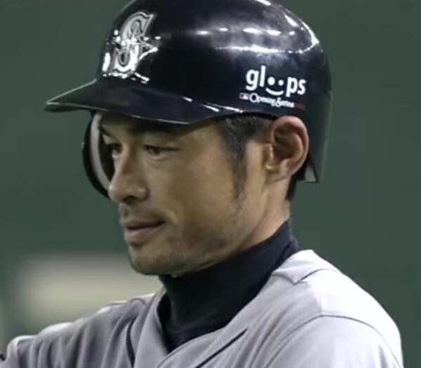
Something doesn’t look right about Ichiro’s helmet.
It looks to me like the “S” is part of a large clear sticker that’s covering most of the front of the helmet.
Reflection of stadium lights.
But does give that illusion, doesn’t it.
Yes – but what I’m looking at is the way that the reflections change as you get away from the centre of the logo.
There’s a vertical line where the reflections stop abruptly, then they start again further back on the helmet.
Looks like he’s standing on first and the head of the first baseman or first base coach is blocking that bit of light…creating the gap in the reflection on the helmet.
As a fan of English football, I can tell you that I love watching games in the morning. Their 1pm kickoffs are at 8am for us me; I envy the West-Coasters who can see this at 5am, and for whom the game is over by 7am.
Naw, the pre-7am games are usually too early for me. 8 or 9am kickoffs are perfect.
Lee
Seen in a Cracked.com article, evidence that Superman is stickler for uni accuracy:
link
From an Action Comics issue in which Superman briefly adopts Jimmy Olson. On Father’s Day, Jimmy gives Supes a DIY bathrobe. “The emblem is crooked and the colors don’t match my costume closely enough!” Superman says, and he destroys it like a Customs agent smashing a palette of Chinese knockoff hockey jerseys.
If only Superman would use his heat vision on Nike unis with crooked emblems and non-matching colors …
Wow. And my kids think I’m an asshole…
Why does he wear the suit around the house? Is he a never-nude and the suit are his cutoffs?
not like he has to go to the bathroom or anything….
There are dozens of us
This is just one moment in a long line of superdickery.
link
I don’t understand why Reebok is suing Nike. Reebok’s contract expires the end of March. My calendar says we haven’t gotten to that date yet.
Can’t they do anything they want til midnight 03/31?
Other than wanting to just kick them around, what’s the point of this suit?
Here, read the lawsuit and see for yourself:
link
I haven’t read the lawsuits, but it appears that in the transition out of Reebok and into Nike, Reebok had the right to manufacture team gear, but not player gear. In other words, a moratorium on player-specific merchandise, with Reebok continuing to make and sell team gear until April 1st, at which point that would be Nike’s job too. (In retrospect, that would enlighten us on why the logo-less Pro Bowl jerseys and the brief run of logo-less retail jerseys existed.) If, and only if, that is the case, then it is easy to see how and why the Jets Tebow jerseys by Reebok would violate the contract.
The NHLPA license for Reebok expired prior to March 1. They are no longer allowed to use players’ names on any licensed merchandise. Nike is allowed as the new licensed manufacturer, and Tebow is a signed Nike property on his own.
Reebok is actually infringing upon two of Nike’s rights.
NFLPA*
sonuva… hockey on the brain.
Nothin’ wrong with that, Teebz.
(Having hockey on the brain, that is.)
Atlanta Falcons Facebook page is teasing pics of the new Nike apparel. Says it will be available Saturday at midnight (Sunday). link
The photo of the UCLA player being carried off the field comes from the 1966 Rose Bowl, where Bob Stiles made a late-game interception that sealed the upset for the Bruins. I don’t recall if Stiles was actually knocked out on the play, but that’s him being carried off.
Opponent, Michigan State (with Bubba Smith), was vying for #1 in the polls, but the unranked Bruins took them out of the picture.
Love the pic from Mr. Marshall. A fine photographic example of being out on your feet. Amazing.
Speaking of umpires, am I the only one who didn’t know that the umps wore link in 1939?
The ads would be way cooler- tolerable, even- if they were written in Japanese.
You never see this. Rod Taylor never used tape on his stick.
link
From yesterday:
Even if that glass was from the late 70’s, the Seahawks were not yet in the NFC.
link
The Seahawks were in the NFC West in 1976, and the Bucs were in the AFC West. They switched conferences in 1977.
I can’t believe I never knew that.
you don’t know jack
I know several.
The Seahawks actually started in the NFC in 1976, before switching to the AFC in 1977.
Could you imagine if the NFL had done something like that with the Jaguars and Panthers? If in 1995, the Jaguars played everybody in the NFC, and the Panthers played everybody in the AFC, plus two games against each other, only to switch in 1996 so that the Jags would play all AFC teams and the Panthers play all NFC teams? But that’s what they did with Seattle and Tampa Bay.
Yeah, I took too long to write that all out. :P
Paul, how come you don’t generally care for Phil Mushnick’s work? It seems like you guys are often on the same wavelength. I mean, you both aren’t Mike Francesa fans right?
I agree with him on a lot of issues (although not all). However:
1) He’s so relentlessly negative about *everything*. I realize some of you think that about me too, but I’m rainbows and sunshine compared to Mushnick, who rarely has anything positive to say.
2) I find his prose style rather leaden.
3) Related to both of the above: He’s been covering his beat for so long that it obviously isn’t teaching him anything new or giving him anything to be enthused about, so he’s just covering the same ground and teaching/learning the same lessons over and over. Which is probably why his prose has become so leaden and his attitude has become so negative. He needs a new beat so he can recharge his creative batteries.
My ability to cover the uniform beat is reaching its expiration date too. There are still new lessons to learn, new things to get excited about (raised helmet squatchees!), but they’re fewer and farther between. When a gig isn’t teaching me new things, it’s time to start thinking about a new project. That’s how I’ve always worked. Don’t worry, I’m not quitting Uni Watch tomorrow, or even the day after tomorrow. But I won’t be doing it forever.
Got ya. And I would never think you’re as negative as Mushnick by the way.
wait…what?
Adding to yesterday’s comments…
For obvious reasons, I’ve always liked this mugshot of Ozzie.
I realize that it isn’t a sweater.
link
link
The dude would rather die before shooting digital. He even had a cat named Koda.
Anyone else find it interesting that one of the patches is the manufacturer of the Enola Gay?
Japan is the first country to operate the new Boeing 787 “Dreamliner”. But yeah, it’s a little ironic. I suppose it would be really weird for Boeing patches to be worn had the game been played in Hiroshima or Nagasaki.
Not sure if this has been posted yet: link.
The Rawlings Blue Jays jersey is a minor league jersey. Teams often use companies other than Majestic to provide minor league camp unis. Some times teams use previous seasons gear, but teams are free to sign uniform deals with any company for minor league camps.
THe minor league teams always wear a version of the MLB team’s uni in spring training, not their own unis.
There is a Giants Rawlings jersey in this photo gallery
link