Many of you have heard of David Boss, who’s probably best known for his NFL paintings and for his work with NFL Properties.
But Boss was also an accomplished photographer, and now US Presswire has put nearly 700 of his photos online. The images are watermarked, but they’re still worth checking out. There are too many notable pics to show in one entry, so we’ll look at one batch today and another batch in the next week or so.
Now then:
• I still call it Joe Robbie. Note that great Dolphins patch on his blazer.
• I remember watching the Mud Bowl on TV. I don’t remember Jim Marshall’s jersey ending up in tatters, however.
• You’ll never see a prettier set of fully wrap-around shoulder stripes than these.
• And speaking of shoulder stripes, it’s a little jarring to see the 49ers wearing them. They wore that style in the late 1950s and early ’60s, but only on the road.
• We all know NFL players used to wear shin-length white crew socks over colored stirrups. But it looks like the Lions wore gray crew socks at least once.
• Speaking of NFL hosiery, look at those striped Vikings socks!
• Mention John Henry Johnson to me and one thing immediately comes to mind: his super-short facemask.
• Gee, ya think maybe Bobby Boyd needed a new helmet?
• Here’s something I’d never seen before: Bart Starr with rear-helmet uni numbers inside and outside the NFL stripe. I tried to find examples of other players with this same format but couldn’t find any close enough views.
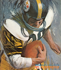
• I’d love to see the Steelers use this design as a throwback. Totally digging the gold-outlined uni numbers and gold helmet numbers.
• That last photo was of Big Daddy Lipscomb. Here’s another shot of him, this time with a rather primitive NOH (that’s name on helmet).
• Meanwhile, the Browns were handwriting their uni numbers on their helmets during that same period, apparently in Magic Marker.
• Boss also took some baseball photos. In addition to the great halo helmet, note the black armband on Fregosi’s left sleeve. But the armband isn’t shown in this shot, supposedly taken the same day. The caption dates could be wrong, but Dressed to the Nine’s listing of uniform memorials makes no mention of an Angels armband at any point during halo-hat era, so it’s not clear why Fregosi was wearing the black band. Anyone..?
That’s enough for this round. More Boss-osity coming soon. Big thanks to Michael Princip for tipping me wise to the Boss archive.
ESPN Reminder: In case you missed it yesterday, my latest ESPN column (which isn’t uni-related but is still fun) is available here.
Stirrup Club Reminder: Robert Marshall is now taking orders for the next round of Uni Watch Stirrup Club finery. Details here.
Uni Watch News Ticker: Here’s a cool time-lapse sequence of the Final Four floor being created in Milwaukee (with thanks to Jason Goede). ”¦ The U.S. Missile Defense Agency has a new logo that’s ruffling some feathers (with thanks to John Muir). ”¦ Here’s a weird one: an old Mets commercial that show Kevin Mitchell flexing in front of a bunch of NFL helmets (good spot by Jeffrey Moulden). ”¦ NOB of the year, or at least of the day, goes to UÄŸur Uçar, who plays for the Turkish club Galatasaray (great screen shot by Jesse Spector). ”¦ Awesome curling sweater here. Yet another one that’s too big for me, grrrrrr. ”¦ This one‘s too big, too. ”¦ This one‘s closer, but still a little too long. Dig the great little design on the buttons! ”¦ These aren’t just any Saints — they’re the New Orleans Saints, in their charity basketball togs. “That’s Archie Manning at far left in the back row,” says Michael Martin. ”¦ Here’s a good video on the DC United’s equipment manager (with thanks to Tom Langan). ”¦ Michael Princip has taken Chuck Ren’s classic Chiefs illustration and transformed it into a Seahawks illo, plus he’s done a little write-up on the helmet. ”¦ Wade Davis of the Rays is now wearing No. 40, possibly in a move to get an endorsement (with thanks to Cork Gaines). ”¦ Oooh, let’s chip in and buy one of these old-school sock machines for Robert Marshall (big thanks to Rob Leavell). ”¦ Remember Chad Greenway and his 3-D-esque horns? Jim Lonetti picked up an old Vikings ski cap with a patch that evokes that same concept. ”¦ Nike unveiled a slew of World Cup kits yesterday (additional photos and info here and here). “Two interesting things,” says Stephen Wong. “First, the jerseys are made from a recycled plastic bottles. And England was also onstage but their jerseys are made by Umbro, which is now owned by Nike. This is leading many to speculate that Nike will soon be making England’s uniforms.” ”¦ Wayne Koehler reports that Winter Haven High in Florida wore some serious sock stripes in the Class 5A State Finals (but, sadly, lost). ”¦ Reprinted from yesterday’s comments: Cubs prospect Chris Robinson is the latest catcher to wear his helmet brim facing forward under his mask. ”¦ Steven Mandich and Eliza Truitt took a day trip to check out the Olympics, where Quatchi liked their DIY pennants. Steve also got some pics of the many NHL and other pins being hawked by collectors and traders.
If look you closely I think Bobby Boyd’s MacGreogor MH100 helmet only needs a paint job : )
Not “the DC United.”
Just “DC United.”
/nitpick
Regarding the balck armband – Angels manager Bill Rigney’s father passed away on July 5, 1962. It’s possible the armband was worn in his memory.
And Wade Davis is???
my guess, even if he gets a WD40 deal, he will still be unknown, b/c of his name, his team, and b/c he wore #58, a SCRUB’s number before
Yup, definitely gray sannies on the Lions in that 1963 game. Also, note how dark the blue is on the stripes/numbers of the white jerseys. Certainly not the Honolulu shade.
I’ve also been told by a contributor to the cause awhile back that the Lions wore a near navy blue jersey when playing a night game in LA on 9/19/64.
Might it be the lighting in the Coliseum that makes the blues look much darker than they actually were??
“Might it be the lighting in the Coliseum that makes the blues look much darker than they actually were??”
That would be my guess.
Love those wraparound shoulder stripes on the Eagles, but why don’t the sleeve stripes go all the way around!?
I’m loving the Netherlands’ white kit in those photos, with the red and blue chevron stripes. I hope the orange version is just as spectacular.
[quote comment]Here’s a weird one: an old Mets commercial that show Kevin Mitchell flexing in front of a bunch of NFL helmets (good spot by Jeffrey Moulden)[/quote]
That looks like Doc Gooden
Need an assist please. A little while back, someone posted about an on-line store, think it was in Cali. that specialzed in New Era low profile caps (the new poly material)/and minor leagues. If anyone can help, most appreciated.
The Allen Americans, a minor league hockey outfit, will be wearing pink jerseys tonight in a Susan G. Komen breast cancer awareness game. The team will be auctioning the jerseys after the game. I plan to snag one if the prices do not get out of hand.
[quote comment=”379526″]Yup, definitely gray sannies on the Lions in that 1963 game. Also, note how dark the blue is on the stripes/numbers of the white jerseys. Certainly not the Honolulu shade.
I’ve also been told by a contributor to the cause awhile back that the Lions wore a near navy blue jersey when playing a night game in LA on 9/19/64.
Might it be the lighting in the Coliseum that makes the blues look much darker than they actually were??[/quote]
I’d bet serious money it was raining that night (can sort of see it the grass; and rain only shows if backlit; was raining during entire filming of night scenes when Shoeless Joe first appears in “Field of Dreams” and they just front lit the scene so it wouldn’t show). Anyway, that would make the blue on the jerseys get darker because it was wet (see belly stains on revolutionary Nike jerseys, 2009).
I’d also wager the gray socks weren’t a uniform decision but more a “keep feet warm” move. Those are thick gray wool hunting socks. So, while they’re indeed gray, they aren’t any more a uni variation (per se) than adding a hand warmer pouch to a QB’s jersey. Worth noting as a visual variation, yes. A design change, no.
I have color photos of the dark jersey you’re talking about (I believe). There was a time the Lions did wear a straight up royal jersey that, compared to the Honolulu Blue looks almost navy.
Blue, as I’m sure you’re picked up in your studies, TimmyB, is a color that very commonly will darken a shade in night games. Especially in black and white photos, but in color, too. That’s one of the reasons so many believe the Bears and Yankees wear black. They’ve seen them only in night games on TV.
—Ricko
[quote comment=”379524″]Regarding the balck armband – Angels manager Bill Rigney’s father passed away on July 5, 1962. It’s possible the armband was worn in his memory.[/quote]
Doubt it. Teams weren’t into memorializing individual losses back then.
link
Don’t believe the Chiefs have EVER worn the red high socks with their red pants. Always the white socks.
TimmyB?
—Ricko
I would love to see one of those Chuck Ren illustrations of the Seahawks from the first season with no logo on the helmet.
In praise of real grass, severe weather, grey facemasks and great photography…
link
That’s amazing.
I’ve got a question/observation for the hockey elite out there. (It’s likely been discussed before but I missed it.)
Are all the Olympic hocket teams wearing the same Nike template uniforms. I haven’t seen every team play, but of those I did catch, I’ve noticed a couple things. First, the fit seems to be tighter, especially around the arms. That is perhaps accentuated by the placing of the common stripes around the bicep area. Second the TV numbers all seem to be placed at the point where the arm and shoulder meet. (There’s probably an official uniform term for that spot that I don’t know.)
Call it personal preference, but I like the look of the Olympic unis, mainly for the reasons I just mentioned. The style seems to be in line with the look and fit of older, traditional sweaters.
Is it just me or are others seeing the same thing?
[quote comment=”379525″]And Wade Davis is???
my guess, even if he gets a WD40 deal, he will still be unknown, b/c of his name, his team, and b/c he wore #58, a SCRUB’s number before[/quote]
A SCRUB?
What number did YOU wear when you played in the Majors?
Political beliefs aside, how stupid was the design team to even have that Missle Defense logo make it past the drawing board? You can’t tell me someone in there didn’t sit back and say ‘Hmmm… Crescent Moon… Star… Obama Logo… This might not be the best idea’
Then again, its the government. They probably took one glance at it, saw it was hip and trendy and rubber-stamped it through.
[quote comment=”379536″]I’ve got a question/observation for the hockey elite out there. (It’s likely been discussed before but I missed it.)
Are all the Olympic hocket teams wearing the same Nike template uniforms. I haven’t seen every team play, but of those I did catch, I’ve noticed a couple things. First, the fit seems to be tighter, especially around the arms. That is perhaps accentuated by the placing of the common stripes around the bicep area. Second the TV numbers all seem to be placed at the point where the arm and shoulder meet. (There’s probably an official uniform term for that spot that I don’t know.)
Call it personal preference, but I like the look of the Olympic unis, mainly for the reasons I just mentioned. The style seems to be in line with the look and fit of older, traditional sweaters.
Is it just me or are others seeing the same thing?[/quote]
pretty much it seems, with different sleeve stripes:
link
those nike jerseys are kind of neat actually. i have an authentic finland jersey from the last olympics. there are a good 4-5 different materials that make up that jersey (in different areas of the jersey). snug fit though
link
[quote comment=”379535″]In praise of real grass, severe weather, grey facemasks and great photography…
link
That’s amazing.[/quote]
Greg Pruitt would be so proud.
[quote comment=”379529″]Need an assist please. A little while back, someone posted about an on-line store, think it was in Cali. that specialzed in New Era low profile caps (the new poly material)/and minor leagues. If anyone can help, most appreciated.[/quote]
Is it The Clink Room/Plan B? Here’s a link to their online store – link
[quote comment=”379541″][quote comment=”379529″]Need an assist please. A little while back, someone posted about an on-line store, think it was in Cali. that specialzed in New Era low profile caps (the new poly material)/and minor leagues. If anyone can help, most appreciated.[/quote]
Is it The Clink Room/Plan B? Here’s a link to their online store – link
i don’t think they deal with low-pro hats. must be someone else. i’d be interested to see who jesse is talking about though!
Plan B also blogs here a little background on the process of working with teams on a new brand/identity. Check out the chart for coming up with a team nickname
link
NY Times article on the Olympic pictograms for each sport. A little goofy but interesting nonetheless
link
Re.: Kevin Mitchell and the NFL helmets.
I think that those helmets belong to the Mets’
equipment manager at the time. I remember reading in
some accounts,possibly Peter Gammons account of Game 6 of the 1986 World Series in the Sports Illustrated 1987 baseball preview issue,that after
Keith Hernandez hit a fly out in the fateful tenth
inning he went back to the clubhouse and grabbed a
beer from the equipment manager’s refrigerator and watched the rest of the game on a TV monitor.
According to the account,a couple of the people
in the clubhouse started taking a couple of the
helmets from the shelf and started to playfully
head butt each other with the helmets.
[quote comment=”379535″]In praise of real grass, severe weather, grey facemasks and great photography…
link
That’s amazing.[/quote]
Remember that game. Important one. Raining like crazy in L.A. Field was giant casserole even before game began.
And Vikings (with Bob Lee at QB) come out PASSING.
And kept the ball in the air until they got well enough ahead, then stayed ahead and won.
Afterward Bud Grant was asked about throwing in such lousy weather. Well, he explained, the weather report said was gonna get worse, so beginning of game would be the best time to throw.
Not a lot of coaches would have been that smart. Or that bold. And, as result, so totally screw up the opponent.
—Ricko
Paul Lukas said:
“I’d love to see the Steelers use this design as a throwback. Totally digging the gold-outlined uni numbers and gold helmet numbers.”
I’d love to see that be the regular uniform. Not only would I wear that, this cheapskate would buy that.
Also, the 49ers with shoulder stripes didn’t seem jarring to me. That’s why that look was one of my favorites in Sunday’s design-a-jersey contest.
[quote comment=”379527″]
I’m loving the Netherlands’ white kit in those photos, with the red and blue chevron stripes. I hope the orange version is just as spectacular.[/quote]
Here’s an EA Sports image of the probable home kits link
[quote comment=”379538″]Political beliefs aside, how stupid was the design team to even have that Missle Defense logo make it past the drawing board? You can’t tell me someone in there didn’t sit back and say ‘Hmmm… Crescent Moon… Star… Obama Logo… This might not be the best idea’
[/quote]
Well, in fairness to the graphics department, their office appears to be under-represented in the “ludicrously paranoid” and “crass political opportunist” categories.
[quote comment=”379542″][quote comment=”379541″][quote comment=”379529″]Need an assist please. A little while back, someone posted about an on-line store, think it was in Cali. that specialzed in New Era low profile caps (the new poly material)/and minor leagues. If anyone can help, most appreciated.[/quote]
Is it The Clink Room/Plan B? Here’s a link to their online store – link
i don’t think they deal with low-pro hats. must be someone else. i’d be interested to see who jesse is talking about though![/quote]
ALCON, help most appreciated, found the link, it’s called minorleagues.com, sorry for not pasting the link. Thanks for the Plan B stuff, looks interesting!Thanks again.
[quote comment=”379533″]http://www.illustratednfl.talktalk.net/images/chiefs_ren.jpg
Don’t believe the Chiefs have EVER worn the red high socks with their red pants. Always the white socks.
TimmyB?
—Ricko[/quote]
To my knowledge, you are correct, Ricko.
[quote comment=”379536″]I’ve got a question/observation for the hockey elite out there. (It’s likely been discussed before but I missed it.)
Are all the Olympic hocket teams wearing the same Nike template uniforms. I haven’t seen every team play, but of those I did catch, I’ve noticed a couple things. First, the fit seems to be tighter, especially around the arms. That is perhaps accentuated by the placing of the common stripes around the bicep area. Second the TV numbers all seem to be placed at the point where the arm and shoulder meet. (There’s probably an official uniform term for that spot that I don’t know.)
Call it personal preference, but I like the look of the Olympic unis, mainly for the reasons I just mentioned. The style seems to be in line with the look and fit of older, traditional sweaters.
Is it just me or are others seeing the same thing?[/quote]
I believe they are all the same template. Nike has some deal with the IIHF who basically runs the Olympic tournament.
The TV numbers are on an area that has traditionally been a part of the shoulder of the jersey. I think it looks good when that area matches the shoulder color yet looks like a goofy wedge if it’s a contrasting color. You can see how Canada looks much better than Russia, in my opinion…
link
It’s why I’m not a fan of the USA whites…
link
Favorite part of the Mets commercial: Joe Piscopo with the bobbleheads. Comrade Marshall needs to do a remake of that next time he makes some Mets bobblers.
This has always bothered me…Why is that countries with other fonts like China and Russia use our letters and numbers?
Also some countries call themselves a different name …Germany = Deutschland, Norway = Norge, and Finland = Suomi
So let’s see… he could paint, put a logo on the Cleveland Browns’ helmet, and shoot film?
David Boss was aptly named.
[quote comment=”379554″]This has always bothered me…Why is that countries with other fonts like China and Russia use our letters and numbers?
Also some countries call themselves a different name …Germany = Deutschland, Norway = Norge, and Finland = Suomi[/quote]
That would be an Olympic rule. For worldwide recognition, countries like Russia, China, Israel, Greece, etc. go with the majority and use the Roman alphabet.
[quote comment=”379523″]Not “the DC United.”
Just “DC United.”
/nitpick[/quote]
You an Insider? Or just an MLS fan?
And in response to whoever it was who asked a couple of days ago, I do follow Rovers, but I’m a die-hard DC United fan.
Most curlers are big and fat and drunk so good luck finding “smaller” versions of their vintage garb.
[quote comment=”379537″][quote comment=”379525″]And Wade Davis is???
my guess, even if he gets a WD40 deal, he will still be unknown, b/c of his name, his team, and b/c he wore #58, a SCRUB’s number before[/quote]
A SCRUB?
What number did YOU wear when you played in the Majors?[/quote]
# 17 for the Blue Jays when I was in Camp in Spring 1995, as a replacement player, aka a SCAB… Thank You BIG MATT for playing…you will be getting some nice parting gifts…
[quote comment=”379556″][quote comment=”379554″]This has always bothered me…Why is that countries with other fonts like China and Russia use our letters and numbers?
Also some countries call themselves a different name …Germany = Deutschland, Norway = Norge, and Finland = Suomi[/quote]
That would be an Olympic rule. For worldwide recognition, countries like Russia, China, Israel, Greece, etc. go with the majority and use the Roman alphabet.[/quote]
I am sure the fans in Beijing werent too happy about that in 2008.
[quote comment=”379558″]Most curlers are big and fat and drunk so good luck finding “smaller” versions of their vintage garb.[/quote]
wow
[quote comment=”379554″]This has always bothered me…Why is that countries with other fonts like China and Russia use our letters and numbers?
Also some countries call themselves a different name …Germany = Deutschland, Norway = Norge, and Finland = Suomi[/quote]
The letters/numbers are by IIHF rule; the “different” country names are the names for those countries in their own language! You wouldn’t expect a USA team to put “Etats-Unite d’Amerique” on the unis if the Olympics were in France, would you?
[quote comment=”379562″][quote comment=”379554″]This has always bothered me…Why is that countries with other fonts like China and Russia use our letters and numbers?
Also some countries call themselves a different name …Germany = Deutschland, Norway = Norge, and Finland = Suomi[/quote]
The letters/numbers are by IIHF rule; the “different” country names are the names for those countries in their own language! You wouldn’t expect a USA team to put “Etats-Unite d’Amerique” on the unis if the Olympics were in France, would you?[/quote]
I get it….but why do we call it Finland and Germany? Not even close to what they call it.
Here’s a slideshow I know most of the puckheads here will enjoy – the Canadian women’s hockey team celebrating their gold medal last night
link
[quote comment=”379562″][quote comment=”379554″]This has always bothered me…Why is that countries with other fonts like China and Russia use our letters and numbers?
Also some countries call themselves a different name …Germany = Deutschland, Norway = Norge, and Finland = Suomi[/quote]
The letters/numbers are by IIHF rule; the “different” country names are the names for those countries in their own language! You wouldn’t expect a USA team to put “Etats-Unite d’Amerique” on the unis if the Olympics were in France, would you?[/quote]
Союз СоветÑких СоциалиÑтичеÑких РеÑпублик (CCCP)
[quote comment=”379563″]
I get it….but why do we call it Finland and Germany? Not even close to what they call it.[/quote]
the interwebs are your friend
frankly, when the usa goes to france…i think we should put “AMERICA: FUCK YEAH” on our sweaters
but that’s just me
That IS Doc Gooden
[quote comment=”379561″][quote comment=”379558″]Most curlers are big and fat and drunk so good luck finding “smaller” versions of their vintage garb.[/quote]
wow[/quote]
Some would say same could be said of many recreational softball players, pool players, bowlers and golfers.
So what, we’re supposed surprised to learn there are different levels of competition in any sport? Or we should be aghast at the insightfulness of such an observation?
Honestly, Kenny, that’s akin to noticing the moon and being proud of your discovery.
—Ricko
[quote comment=”379566″][quote comment=”379563″]
I get it….but why do we call it Finland and Germany? Not even close to what they call it.[/quote]
the link
frankly, when the usa goes to france…i think we should put “AMERICA: FUCK YEAH” on our sweaters
but that’s just me[/quote]
Only if Nike charges a “buck-o-five” for the replica jersey.
[quote comment=”379566″][quote comment=”379563″]
I get it….but why do we call it Finland and Germany? Not even close to what they call it.[/quote]
the link
frankly, when the usa goes to france…i think we should put “AMERICA: FUCK YEAH” on our sweaters
but that’s just me[/quote]
Kinda like the story about the international meeting in Paris where a Frenchman said, “We do we use English as the language for these meetings, we are in France.”
“Well, for one thing,” replied an American Admiral, “because we kept you from speaking German.”
—Rcko
Photo link of Dean Chance indicates a date of 5-19-1965. (Chance is pitching with the black armband. Retrosheet confirms that he pitched 9 inn against Min in a doubleheader that date.)
Photo link shows Tony Oliva at the plate also with a caption date of 5-19-1965. Oliva never played against the Angels in 1962 (was a September call up that year). This picture shows the Angels’ catcher (presumably Buck Rodgers) with the armband.
While Chance and Rodgers both played in the 1962 game v. the Yankees (link), it would seem that the Oliva picture would place the armbands in 1965.
[quote comment=”379571″]Photo link of Dean Chance indicates a date of 5-19-1965. (Chance is pitching with the black armband. Retrosheet confirms that he pitched 9 inn against Min in a doubleheader that date.)
Photo link shows Tony Oliva at the plate also with a caption date of 5-19-1965. Oliva never played against the Angels in 1962 (was a September call up that year). This picture shows the Angels’ catcher (presumably Buck Rodgers) with the armband.
While Chance and Rodgers both played in the 1962 game v. the Yankees (link), it would seem that the Oliva picture would place the armbands in 1965.[/quote]
Found this online:
“…Dick Wantz, who pitched one game for the Los Angeles Angels in 1965 and died a few days later of a brain hemorrhage.”
That the answer, maybe?
—Ricko
Also, from that David Boss collection, these wonderful NFL production shots taken in Puerto Rico, 1966:
link
link
link
link
link
More…
link
—Ricko
great post,
Pete Retzlaff is wearing one of my favorite eagles jerseys. I have the #82 version (tim rossovich) unfortunately it’s a size 60, so i gotta beef up about a hundred pounds to wear it right. Even more unfortunately, it is one of two eagles uniforms that never had a winning season so it’s throwback chances are, unlike the cut of my jersey, slim. Pete’s, of course is durene, and mine, alas is polyesther…his also doesn’t have chicken wing stains on it.
[quote comment=”379574″]More…
link
—Ricko[/quote]
Photo…
link
[quote comment=”379575″]I have the #82 version (tim rossovich) unfortunately it’s a size 60, so i gotta beef up about a hundred pounds to wear it right.[/quote]
perhaps you should take up curling
[quote comment=”379576″][quote comment=”379574″]More…
link
—Ricko[/quote]
Photo…
link
Says here Wantz died May 13, which would sense with the May 19 Oliva photo.
link
[quote comment=”379570″][quote comment=”379566″][quote comment=”379563″]
I get it….but why do we call it Finland and Germany? Not even close to what they call it.[/quote]
the link
frankly, when the usa goes to france…i think we should put “AMERICA: FUCK YEAH” on our sweaters
but that’s just me[/quote]
Kinda like the story about the international meeting in Paris where a Frenchman said, “We do we use English as the language for these meetings, we are in France.”
“Well, for one thing,” replied an American Admiral, “because we kept you from speaking German.”
—Rcko[/quote]
Yeah, but if it weren’t for the French we’d be speaking English.
No, wait…
Did some more checking. Likely the armbands were in memory of Dick Wantz, who died on 5-13-1965 of a brain tumor, a month after his only ML appearance (a relief appearance against the Indians).
[quote comment=”379570″][quote comment=”379566″][quote comment=”379563″]
I get it….but why do we call it Finland and Germany? Not even close to what they call it.[/quote]
the link
frankly, when the usa goes to france…i think we should put “AMERICA: FUCK YEAH” on our sweaters
but that’s just me[/quote]
Kinda like the story about the international meeting in Paris where a Frenchman said, “We do we use English as the language for these meetings, we are in France.”
“Well, for one thing,” replied an American Admiral, “because we kept you from speaking German.”
—Rcko[/quote]
And the French kept us from speaking… English.
[quote comment=”379579″][quote comment=”379570″][quote comment=”379566″][quote comment=”379563″]
I get it….but why do we call it Finland and Germany? Not even close to what they call it.[/quote]
the link
frankly, when the usa goes to france…i think we should put “AMERICA: FUCK YEAH” on our sweaters
but that’s just me[/quote]
Kinda like the story about the international meeting in Paris where a Frenchman said, “We do we use English as the language for these meetings, we are in France.”
“Well, for one thing,” replied an American Admiral, “because we kept you from speaking German.”
—Ricko[/quote]
Yeah, but if it weren’t for the French we’d be speaking English.
No, wait…[/quote]
We’d be South Canada?
i think the armband was for dick wantz
and im reminded of a homer simpson quote: “english? who needs that? i’m never going to england”
[quote comment=”379531″][quote comment=”379526″]Yup, definitely gray sannies on the Lions in that 1963 game. Also, note how dark the blue is on the stripes/numbers of the white jerseys. Certainly not the Honolulu shade.
I’ve also been told by a contributor to the cause awhile back that the Lions wore a near navy blue jersey when playing a night game in LA on 9/19/64.
Might it be the lighting in the Coliseum that makes the blues look much darker than they actually were??[/quote]
I’d bet serious money it was raining that night (can sort of see it the grass; and rain only shows if backlit; was raining during entire filming of night scenes when Shoeless Joe first appears in “Field of Dreams” and they just front lit the scene so it wouldn’t show). Anyway, that would make the blue on the jerseys get darker because it was wet (see belly stains on revolutionary Nike jerseys, 2009).
I’d also wager the gray socks weren’t a uniform decision but more a “keep feet warm” move. Those are thick gray wool hunting socks. So, while they’re indeed gray, they aren’t any more a uni variation (per se) than adding a hand warmer pouch to a QB’s jersey. Worth noting as a visual variation, yes. A design change, no.
I have color photos of the dark jersey you’re talking about (I believe). There was a time the Lions did wear a straight up royal jersey that, compared to the Honolulu Blue looks almost navy.
Blue, as I’m sure you’re picked up in your studies, TimmyB, is a color that very commonly will darken a shade in night games. Especially in black and white photos, but in color, too. That’s one of the reasons so many believe the Bears and Yankees wear black. They’ve seen them only in night games on TV.
—Ricko[/quote]
Ricko
Taking a deeper look at the context, the likelihood of the wool socks being a ‘keep feet warm’ decision seems to rest somewhere between slim and none. I’d be more willing to believe this as plausible if only a few players were wearing them, or maybe if it was Green Bay in, say, November, but this was the first game of the season, September 14, in Los Angeles, and all the players seem to be rocking them. I could be wrong, but it doesn’t add up to me.
[quote comment=”379525″]And Wade Davis is???
my guess, even if he gets a WD40 deal, he will still be unknown, b/c of his name, his team, and b/c he wore #58, a SCRUB’s number before[/quote]
Wade Davis is #34 on Baseball America’s Top 100 Prospects list. I have a pretty good feeling baseball fans will know his name by the end of this season.
[quote comment=”379584″][quote comment=”379531″][quote comment=”379526″]Yup, definitely gray sannies on the Lions in that 1963 game. Also, note how dark the blue is on the stripes/numbers of the white jerseys. Certainly not the Honolulu shade.
I’ve also been told by a contributor to the cause awhile back that the Lions wore a near navy blue jersey when playing a night game in LA on 9/19/64.
Might it be the lighting in the Coliseum that makes the blues look much darker than they actually were??[/quote]
I’d bet serious money it was raining that night (can sort of see it the grass; and rain only shows if backlit; was raining during entire filming of night scenes when Shoeless Joe first appears in “Field of Dreams” and they just front lit the scene so it wouldn’t show). Anyway, that would make the blue on the jerseys get darker because it was wet (see belly stains on revolutionary Nike jerseys, 2009).
I’d also wager the gray socks weren’t a uniform decision but more a “keep feet warm” move. Those are thick gray wool hunting socks. So, while they’re indeed gray, they aren’t any more a uni variation (per se) than adding a hand warmer pouch to a QB’s jersey. Worth noting as a visual variation, yes. A design change, no.
I have color photos of the dark jersey you’re talking about (I believe). There was a time the Lions did wear a straight up royal jersey that, compared to the Honolulu Blue looks almost navy.
Blue, as I’m sure you’re picked up in your studies, TimmyB, is a color that very commonly will darken a shade in night games. Especially in black and white photos, but in color, too. That’s one of the reasons so many believe the Bears and Yankees wear black. They’ve seen them only in night games on TV.
—Ricko[/quote]
Ricko
Taking a deeper look at the context, the likelihood of the wool socks being a ‘keep feet warm’ decision seems to rest somewhere between slim and none. I’d be more willing to believe this as plausible if only a few players were wearing them, or maybe if it was Green Bay in, say, November, but this was the first game of the season, September 14, in Los Angeles, and all the players seem to be rocking them. I could be wrong, but it doesn’t add up to me.[/quote]
You may be right, given that.
Other aspects: From being alive at the time, I will tell you those are butt ugly wool sweat socks, which were hot and available in white and gray.
Now, some equipment guy may have decided the gray would look cool. Or they may have forgotten to pack the white socks and had use what they could find retail in L.A.
Or…and this also is a possibility (unless there are color photos to discount it). If those white socks (probably made by Wigwam) ever got bleached by mistake, they turned a kind of intense cream-color, almost yellow with a hint of copper thrown into darken the shade; almost looked like they’d rusted (we used to do it to them on purpose to wear with khakis and penny loafers). Such a thing might have inadvertently happened in the final washing before game time.
Not advocating anything, just discussing other possibilities. Because it very likely was a one-game thing, or someone would have noticed that season-long peculiarity a long time ago.
—Ricko
anyone watching the suisse v chinese for the bronze?
/carmen schaefer sports a tongue stud…worth a watch if you’re near a tv
“Here’s something I’d never seen before: Bart Starr with rear-helmet uni numbers inside and outside the NFL stripe. I tried to find examples of other players with this same format but couldn’t find any close enough views.”
link
Another interesting thing about this photo is that the caption is wrong. It says the NFL championship game was played in Cleveland, when actually that game was in Green Bay that year.
link
I’m less surprised to hear that pundits are using the new Missile Defense Logo for political fodder than I am that Uni Watch didn’t point out the real nefarious scheme:
It seems to me to be another case of Nike logo creep. Where WON’T they put the swoosh??
[quote comment=”379588″]”Here’s something I’d never seen before: Bart Starr with rear-helmet uni numbers inside and outside the NFL stripe. I tried to find examples of other players with this same format but couldn’t find any close enough views.”
link
Another interesting thing about this photo is that the caption is wrong. It says the NFL championship game was played in Cleveland, when actually that game was in Green Bay that year.
link
Not an uncommon problem – link, but I think we can be reasonably sure it wasn’t taken in Green Bay. Lambeau Field never had an upper deck – that’s Milwaukee County Stadium.
Is anyone following the Norwegian Olympic Curling Pants on link?
488,000+ fans.
Big bonuses at Loudmouth this year?
Sounds like a good explanation of that, Ricko. I’ve got this love affair with heathered grey (Heathered anything really. Love the texture and and variation), so I kind of like those sanitaries, though I actually prefer the look of the Lions’ and Broncos’ throwbacks in which the sock color continues all the way down to the shoe, with no white ‘pseudo-sanitary’ showing. I really like that classic look. Reminds me of 1920s and 1930s football.
On a side note, I love Dave Boss’ paintings, as well as Bart Forbes’ watercolors, both of which can be seen in greater detail via the ‘Illustrated NFL’ link at right.
[quote comment=”379591″]Is anyone following the Norwegian Olympic Curling Pants on link?
488,000+ fans.
Big bonuses at Loudmouth this year?[/quote]
Quick, let’s get low-priced knockoffs into production.
We’ll call ’em…
SCREAMERZ
Really Loud Pants
—Ricko
[quote comment=”379589″]I’m less surprised to hear that pundits are using the new Missile Defense Logo for political fodder than I am that Uni Watch didn’t point out the real nefarious scheme:
It seems to me to be another case of Nike logo creep. Where WON’T they put the swoosh??[/quote]
Actually, yes, that is in fact a rework of a design Nike submitted to the Taliban trying to work out a towel deal.
—Ricko
Disclaimer: Let me preface the comments below by saying I am NOT by any means a photgraphy expert.
Going back to some of the posts on the color blue in B/W pics. Blue can change its appearance on a moment’s notice in b/w.
In pre-mid 1930’s pics, normal blue skews to a very pale hue. When combined with red, which almost always skews darker than normal in b/w, the two have a flip-flop effect.
As the b/w pics come from the mid-30’s onward, blue looks like a more realistic hue of what it should be, but under certain conditions, can appear darker than what it is (poor lighting) or lighter than what it really is.
Even in early color images, blue can play tricks on you. There is an early-era (c.1954-5) Sports Illustrated cover pic of Doak Walker of the Det Lions, and his helmet and jersey almost appear navy. Yet, I’ve seen the same photo and the blue is much closer to the Honolulu shade that we are familiar with.
No doubt, when it comes to photography, blue can be very very fickle.
[quote comment=”379593″][quote comment=”379591″]Is anyone following the Norwegian Olympic Curling Pants on link?
488,000+ fans.
Big bonuses at Loudmouth this year?[/quote]
Quick, let’s get low-priced knockoffs into production.
We’ll call ’em…
SCREAMERZ
Really Loud Pants
—Ricko[/quote]
In related news, Zubaz is back with a vengeance.
[quote comment=”379569″][quote comment=”379566″][quote comment=”379563″]
I get it….but why do we call it Finland and Germany? Not even close to what they call it.[/quote]
the link
frankly, when the usa goes to france…i think we should put “AMERICA: FUCK YEAH” on our sweaters
but that’s just me[/quote]
Only if Nike charges a “buck-o-five” for the replica jersey.[/quote]
Mmmmm, buck-o-five …. freedom costs a buck-o-five.
piscopo idea: jim mothervilker is a hell of a mothervilker, he has a good idea every day…wait for it…and then he gets dressed. ba dum bump, tsssst. seriously though, this is another in a long line of great idears jimbo
sock machines:if i had one of those i would do nothing but make 5″ stirrups all day until i was institutionalized. seriously. i am pretty close to the butterfly net already, if i had a sock machine from 1929, i would go crackers. oh well, dip me in flower and call me saltine, i want one.
[quote comment=”379587″]anyone watching the suisse v chinese for the bronze?
/carmen schaefer sports a tongue stud…worth a watch if you’re near a tv[/quote]
This Carmen Schaefer?
link
[quote comment=”379588″]”Here’s something I’d never seen before: Bart Starr with rear-helmet uni numbers inside and outside the NFL stripe. I tried to find examples of other players with this same format but couldn’t find any close enough views.”
link
Another interesting thing about this photo is that the caption is wrong. It says the NFL championship game was played in Cleveland, when actually that game was in Green Bay that year.
link
Also interesting, Coach Lombardi has on what looks like a gray paper bag hat(cover), that just so happens to match his gray nylon jacket perfectly. Love how the yellow just pops from under the jacket.
[quote comment=”379587″]anyone watching the suisse v chinese for the bronze?
/carmen schaefer sports a tongue stud…worth a watch if you’re near a tv[/quote]
Well, there’s curling, and there’s curling.
[quote comment=”379599″][quote comment=”379587″]anyone watching the suisse v chinese for the bronze?
/carmen schaefer sports a tongue stud…worth a watch if you’re near a tv[/quote]
This Carmen Schaefer?
link
one in the same…unfortunately she and her rink choked against the chinese this afternoon…but it was skip ott’s fault, not carmen’s
and now…time to shift gears to US puck (it’s on NBC, mothervilker and trax)…as the boys take on the finns
[quote comment=”379602″][quote comment=”379599″][quote comment=”379587″]anyone watching the suisse v chinese for the bronze?
/carmen schaefer sports a tongue stud…worth a watch if you’re near a tv[/quote]
This Carmen Schaefer?
link
one in the same…unfortunately she and her rink link against the chinese this afternoon…but it was skip ott’s fault, not carmen’s
and now…time to shift gears to US puck (it’s on NBC, mothervilker and trax)…as the boys take on the finns[/quote]
Yes Phil, that was very unlike Ott, she is usually a great player. Schafer was curling at 93 percent so she was not at fault in any way.
GO USA beat Finland.
finally some hockey on regular tv, and i barely have a miller cracked and the eggs i pickled on a plate, and it’s 2 nuthin’. and now 3~0 before i finish typing.
[quote comment=”379604″]i barely have a miller cracked and the eggs i pickled on a plate[/quote]
the bevvy is in honour of our goalie?
/4-0 now…and it’s aboot time the finns pulled kipper
[quote comment=”379605″][quote comment=”379604″]i barely have a miller cracked and the eggs i pickled on a plate[/quote]
the bevvy is in honour of our goalie?
/4-0 now…and it’s aboot time the finns pulled kipper[/quote]
[quote comment=”379605″][quote comment=”379604″]i barely have a miller cracked and the eggs i pickled on a plate[/quote]
the bevvy is in honour of our goalie?
/4-0 now…and it’s aboot time the finns pulled kipper[/quote]
When they had the close-up of Backstrom getting set to come in, he was putting on a mask that had 32 on the back plate. His jersey is 33. Is he using another goalie’s mask?
save some of those goals for slovakia, boys!
[quote comment=”379607″][quote comment=”379605″][quote comment=”379604″]i barely have a miller cracked and the eggs i pickled on a plate[/quote]
the bevvy is in honour of our goalie?
/4-0 now…and it’s aboot time the finns pulled kipper[/quote]
When they had the close-up of Backstrom getting set to come in, he was putting on a mask that had 32 on the back plate. His jersey is 33. Is he using another goalie’s mask?[/quote]
Probably not. Backstrom is #32 for the Minny Wild, but #33 for Suomi Tasavalta.
[quote comment=”379608″]save some of those goals for slovakia, boys![/quote]
wow…
now, duck & hide from teebz!
never in the history of hockey has any team scored 6 goals before i finish one beer. granted the brew is more ceremonial, but link.
[quote comment=”379609″][quote comment=”379607″][quote comment=”379605″][quote comment=”379604″]i barely have a miller cracked and the eggs i pickled on a plate[/quote]
the bevvy is in honour of our goalie?
/4-0 now…and it’s aboot time the finns pulled kipper[/quote]
When they had the close-up of Backstrom getting set to come in, he was putting on a mask that had 32 on the back plate. His jersey is 33. Is he using another goalie’s mask?[/quote]
Probably not. Backstrom is #32 for the Minny Wild, but #33 for Suomi Tasavalta.[/quote]
You can tell it’s his Wild mask, just by the color scheme. Also, the logo on the front has red tape over it and the Wild word mark on the side has 2 strips over it.
[quote comment=”379611″]never in the history of hockey has any team scored 6 goals before i finish one beer. granted the brew is more ceremonial, but link.[/quote]
or did you really mean “finnish one beer”?
A Golden Seals/white skates reference.
Am I too late to chime in on the NFL Design Contest? I somehow missed to post on Sunday and I was quite taken with the following:
*Eizikowitz’s Giants (even though I love the grey pants and the numbers on the current road jersey)
*Hass’s Cardinals (Arizona has shown that they can’t handle a simple two colour system, this one’s modern but not gaudy)
*Glaze’s Chargers (tasteful use of the two blues, it feels like a good summary of how an SD uni should look)
*Garcia’s Rams (I don’t like how busy STL looks right now, and I really don’t care for the gold/navy pairing. The silver still adds a modern feel while still simplifying things)
[quote comment=”379615″]Am I too late to chime in on the NFL Design Contest?[/quote]
nope…not too late at all
stay tuned for round two tomorrow
Interesting news here. The Pistons are banning a Nike shoe due to injuries
link
[quote comment=”379608″]save some of those goals for slovakia, boys![/quote]
Won’t matter – the red, white and blue will be hanging from the rafters Sunday, just in a slightly different order: link
[quote comment=”379573″]Also, from that David Boss collection, these wonderful NFL production shots taken in Puerto Rico, 1966:
link
link
link
link
link
Great set there for sure.
I’ve heard the argument that if it weren’t for Haiti many of us would be speaking French. This applies to Midwesterners and others who live in the old Louisiana Territory. The logic is that the success of Haiti’s slave rebellion caused Napoleon’s armies to bleed money leading France to decide to sell off their American holdings.
By the way, even in those dowdy gray socks the Lions look infinitely better than they do nowadays.
[quote comment=”379557″][quote comment=”379523″]Not “the DC United.”
Just “DC United.”
/nitpick[/quote]
You an Insider? Or just an MLS fan?
And in response to whoever it was who asked a couple of days ago, I do follow Rovers, but I’m a die-hard DC United fan.[/quote]
Ay…. that’d be me asking if you were a Rover.
Up the Rovers.
In response to someone’s take of the Jim Marshall ripped, muddy shirt as NFL gold i would respond with a picture that ‘s been seared into my mind’s eye but i cannot locate anywhere online…. it was taken during the ’65 title game and it was of the ‘golden boy’ following Thurston and Kramer (IIRC) on a power sweep. Georgeous picture of an awesome game played in dire conditions. Ricko will surely agree w/ me regarding that game, no??
— i’ll continue my search of that picture.
[quote comment=”379621″][quote comment=”379557″][quote comment=”379523″]Not “the DC United.”
Just “DC United.”
/nitpick[/quote]
You an Insider? Or just an MLS fan?
And in response to whoever it was who asked a couple of days ago, I do follow Rovers, but I’m a die-hard DC United fan.[/quote]
Ay…. that’d be me asking if you were a Rover.
Up the Rovers.
In response to someone’s take of the Jim Marshall ripped, muddy shirt as NFL gold i would respond with a picture that ‘s been seared into my mind’s eye but i cannot locate anywhere online…. it was taken during the ’65 title game and it was of the ‘golden boy’ following Thurston and Kramer (IIRC) on a power sweep.
Georgeous picture of an awesome game played in dire conditions.
Ricko will surely agree w/ me regarding that game, no??
— i’ll continue my search of that picture.[/quote]
Lombardi’s approach always reminds of a line I heard later, and really appreciate…
“Amateurs practice until they get it right.
Professionals practice until they can’t get it wrong.”
(and I know the photo you’re thinking of…I think)
—Ricko
[quote comment=”379621″] a picture that ‘s been seared into my mind’s eye but i cannot locate anywhere online…. it was taken during the ’65 title game and it was of the ‘golden boy’ following Thurston and Kramer (IIRC) on a power sweep.
Georgeous picture of an awesome game played in dire conditions.[/quote]
obviously not the shot you’re talking about, but from the mud bowl, yes?
link
That logo is just so perfect. Why’d they have to go and mess it up?
2 more pics from that Packers Browns 65 title game
link
link
another mud bowl shot
[quote comment=”379626″]another link shot[/quote]
Oh, those are the games I hated doing stats for.
fuck
Using the holocaust to sell socks? Brilliant!
link
[quote comment=”379629″]Using the holocaust to sell socks? Brilliant!
link
that is disturbing, but there is a lot to be disturbed about on that site.
[quote comment=”379629″]Using the holocaust to sell socks? Brilliant!
link
They look like nice socks, but really? That’s pretty damn tasteless.
[quote comment=”379621″] a picture that ‘s been seared into my mind’s eye but i cannot locate anywhere online…. it was taken during the ’65 title game and it was of the ‘golden boy’ following Thurston and Kramer (IIRC) on a power sweep.
Georgeous picture of an awesome game played in dire conditions.[/quote]
I’ve seen that. Where I can’t remember.
In the process of looking, I found this:
link
And these older beauties:
link
link
[quote comment=”379632″][quote comment=”379621″] a picture that ‘s been seared into my mind’s eye but i cannot locate anywhere online…. it was taken during the ’65 title game and it was of the ‘golden boy’ following Thurston and Kramer (IIRC) on a power sweep.
Georgeous picture of an awesome game played in dire conditions.[/quote]
I’ve seen that. Where I can’t remember.
In the process of looking, I found this:
link
And these older beauties:
link
link
Aaaah…
Trust me, they all looked nice.
[quote comment=”379633″]
Aaaah…
Trust me, they all looked nice.[/quote]
here jim,
let me
help you
out here
[quote comment=”379634″][quote comment=”379633″]
Aaaah…
Trust me, they all looked nice.[/quote]
here jim,
link
link
link[/quote]
Thank you, sir.
[quote comment=”379634″][quote comment=”379633″]
Aaaah…
Trust me, they all looked nice.[/quote]
here jim,
link
link
link[/quote]
Those are nice and I especially like the older 2
we gots ourselves a hawkey game
Darn it.
But a nice try by Slovakia.
[quote comment=”379638″]Darn it.
But a nice try by Slovakia.[/quote]
Yep.
You can breathe now, Teebz. Congrats.
Heck, a bronze by Slovakia would be great, too.
[quote comment=”379564″]Here’s a slideshow I know most of the puckheads here will enjoy – the Canadian women’s hockey team celebrating their gold medal last night
link
stupid mafuckas.
get a room.