Today we’re going to check out another batch of classic sports-themed ads from the Vintage Ad Browser site. Some real beauties this time, most of them from the 1960s and ’70s (with thanks to Jim Vilk, who contributed the last four ads in the list):
• I confess that I didn’t know who Nick Pietrosante was until I saw this awesome ad. Shame on me.
• Love the ’60s color tones in this fishing reel ad.
• Whoa, look at this check-writing machine! Someone please locate one of those on eBay, pronto!
• Love the jackets on this pit crew. Is the guy in foreground wearing a mask or a helmet or what?
• Weird to see the Steel(ers) logo in a hockey context.
• Chuck Muncie didn’t just wear glasses — he shilled for glasses (and also needed longer pants and higher socks).
• Nice watercolor in this Rawlings glove ad.
• Interesting mix of sports in this CBC ad. I like the black/silver striping on the football player — is that a CFL team, or just a generic gridder?
• Speaking of the CFL, take a look at this ad. Forget the cheerleader the junk in her trunk — take a look at the guy at far-right. Is he supposed to be the ref? If so, were CFL officials wearing beanie-style caps in the late ’70s?
• Can you imagine what a pain in the ass it must have been to create this visual effect in the days before computers?
• I totally remember seeing this ad and this ad in comic books back in the 1970s. Never had any cards from the Hostess series, though. Did any of you?
• Here’s another one I remember from comic books. Note that the inset baseball scene shows an infielder wearing solid orange/red.
• Okay, we all realize that some advertisers can’t come up with the licensing cash to use official pro logos in their ads. But couldn’t Mizuno have done a bit better than this?
• Here’s another case of MLB uniforms without logos, although the team in the field is clearly wearing Reds-style stirrups, even their caps and jerseys don’t have the proper logos.
• Here’s yet another variation on the Tigers’ D logo. Also, is it just me or does that cap look like it’s made out of leather, or maybe vinyl?
• When the Blue Jays were born, they immediately became the centerpiece of a Toronto tourism campaign. Can anyone identify that player?
• Not sure I’ve ever seen a baseball jersey insignia run “uphill” as much as this one.
• Here’s one of my favorite ads on the entire site. You know those little stickers on Chiquita bananas? Back in 1980 they made a series of winter Olympics stickers. I’d love to see a set of those!
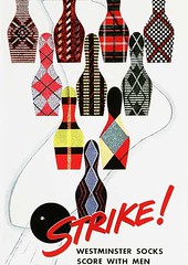
• Bowling and patterned socks: two great tastes that taste great together.
• The Indy 500 and laxatives: two great tastes that, uh, don’t taste so great together.
• Sal Maglie was called “the Barber” because he liked to pitch inside and give hitters “a close shave,” so he was a natural for razor ads.
• And remember, kids, if you can’t be an athlete, be an athletic supporter.
DVD + T-shirt Giveaway: Longtime Uni Watch pal Deb Goldstein (aka T-shirt maven Miss Wit) is the exclusive merch licensee for the excellent Soul Power film, which comes out on DVD today. She’s offered to give a free DVD and T-shirt to a Uni Watch reader.
To enter, send a blank e-mail with your name in the subject line to this address by 10pm eastern this Thursday, January 28th. One entry per person. I’ll announce the winner on Friday.
Remember, Uni Watch Membership Program enrollees are NOT entitled to extra raffle entries anymore — it’s one entry per person for everyone. Thanks.
Uni Watch News Ticker: My report on Minnesota scene will have to wait another day or three, but here are some pond hockey photos from Teebz, along with his blog report on the proceedings. ”¦ The current issue of National Geographic has a page devoted to smashed pennies. Take a closer look at this one — gorgeous, no?… The Toldeo Walleye wore tuxedo jerseys the other day (with thanks to Aaron Whitlow). ”¦ Did Kansas State really wear mis-matched shorts and jerseys in 1975, or was this just a case of lost luggage or something like that? (As noted by Brian Codagnone.) ”¦ Jeremy Brahm reports that Japanese short track speed skater Mika Ozawa has a cool little skate-shaped baggage tag. ”¦ Also from Jeremy: Here’s a look at Japanese speed skating uniforms since 1992. ”¦ An Italian soccer player has caused a bit of a stir by wearing a Silvio Berlusconi mask (with thanks to Mike Edgerley). ”¦ Bryan Moore has envisioned the Carolina Hurricanes using Hartford Whalers colors. ”¦ I’m not a video game guy, but I might have to rethink that now that MLB 10 will be featuring several classic stadiums (with thanks to John Sobotka). ”¦ Not happy about that new Michigan State logo? Coach Tom Izzo thinks you should shut up and drink the Kool Aid already (with thanks to Jeff Cohen). ”¦ Fun little video clip of Nate Robinson discussing NBA uniforms (with thanks to Grant Oldman). ”¦ Steve and Eliza Mandich have started a new blog about the Olympic mascot, Quatchi. ”¦ Here’s something I’m not sure I’ve ever seen on an NFL gridiron before: This 1991 shot shows Bears LB Dante Jones with his jersey tied in a knot (nice find by KW Hunt). ”¦ Are these completely beautiful or what? They’re from a series of paintings done by David Boss in 1965. To see the rest of the series, check out the latest installment of the Fleer Sticker Project. ”¦ Reprinted from last night’s comments: In this blog post, Bengie Molina writes, “Last season, I changed equipment companies and it kind of messed up my legs. I’ll stick with one company all season this year.” ”¦ “Here’s a gallery of bike/equipment customization from the recently completed Tour Down Under,” writes Bryan Redemske. “Once you get past the gold bike, there are some interesting bits.”
Without a doubt, the Blue Jays player in the Toronto tourism ad is Ernie Whitt. He wore #12 with the Jays. Batted left. Very distinctive swing.
I still have some of those Hostess cards. I think the ones I have range from about 1975-1978.
Argh! Bryant, you beat me by one minute! That was an easy call with Ernie Whitt.
I found these from a quick “banana sticker” search:
link
K-State used to wear lavender jerseys and purple shorts. That’s probably what that pic is. They wore them as a throwback a few years ago. Can you say laughingstock?
Oh, and on the same site:
link
“Is the guy in foreground wearing a mask or a helmet or what?”
he looks like the driver checking out his ride before he jumps in. probably a helmet and fire thingy over his face
There is the MLB logo at the top of that Bud/Bud Light All Star ad and is mentioned in the first paragraph.
here’s the kstate throwbacks:
link
and the real things:
link
and apparently another style of throwback:
link
i don’t know if they wore them all the way back to ’75, but the SI cover is from ’81, so its certainly plausible.
Did anyone else notice the CB helmet logo in the David Boss Browns v. Cardinals painting?
Paul, not sure, but the Black and Silver striping on the CFL uni may be faded in the ad copy Navy Blue and Columbia Blue, which would make it a natural as a generic Argos style uniform.
[quote comment=”374096″]Paul, not sure, but the Black and Silver striping on the CFL uni may be faded in the ad copy Navy Blue and Columbia Blue, which would make it a natural as a generic Argos style uniform.[/quote]
I agree.
Fun fact: Glenn Wilson once threw Ernie Whitt out at first base.
From right field.
the knot in the back of the jersey is pre spandex type jerseys that players wear now. Was used to make it tighter.
Paul, none of the links in the main article are workign for me, but it might just be the firewall here at the office.
Also, can someone post the stadium list for MLB 10?
[quote comment=”374100″]can someone post the stadium list for MLB 10?[/quote]
(shown, don’t know if complete):
polo grounds, crosley field, forbes field, griffith stadium, shibe park & sportsman’s park
they’ve been using classic stadiums in video games for years. i remember them having them in the last game i bought, which has probably been 5 years or more. and they were the exact same stadiums, too. their good idea kind of lost steam.
I have some of the Hostess cards — about a dozen I think. Also have a few from Kellogg’s cereal – some sort of 3d card.
[quote comment=”374101″][quote comment=”374100″]can someone post the stadium list for MLB 10?[/quote]
(shown, don’t know if complete):
polo grounds, crosley field, forbes field, griffith stadium, shibe park & sportsman’s park[/quote]
Thanks, Phil! *sigh* One of these years, the Astrodome, or Colts Stadium will be added…
My good pal Pete Morelewicz used to operate a Squished Penny Museum out of is Washington DC home. It’s been closed for a couple years now, but the archived site is link Pete is definitely dedicated to his cause…to the extent that he lost half of one of his fingers to a manual penny squishing machine. OUCH!
[quote comment=”374096″]Paul, not sure, but the Black and Silver striping on the CFL uni may be faded in the ad copy Navy Blue and Columbia Blue, which would make it a natural as a generic Argos style uniform.[/quote]
Actually, that is an Argos uni. Pretty much what they wore before, during and after Joe Theismann’s time with the team. Late ’60s into ’70s.
I could be WAY wrong, but #75 might be Mel Profit, the CFL equivalent of a TE. Or maybe Profit was done by then. As I said, not sure, just a vague recollection of some photos of mine.
—Ricko
ok so i’ve been out of town for 3 days, so I may have missed the boat, but has there been any update on Skeebz’ Giant Balls? Last I heard, he had sent them to Paul.
I have a bunch of the Hostess cards around here. I also have a few of those Kellogg 3-D cards as well.
Oh yeah, I had (and still have) the Twinkie baseball cards. I remember talking my grandmother into buying the product just so that I could get the cards. She was easier to talk into such things than my mom.
Heard on radio this a.m. that tickets aren’t selling big for the Super Bowl. Apparently “South Florida” has never been a great venue for ticket sales. They quoted some ticket expert (whatever the hell that is) as saying that by game time you could possibly be able to buy them for as little as $20 outside the stadium.
Interesting, considering the high-end tickets are going for as much as $7,000.
—Ricko
Ooohhhh flattened pennies! That reminds me that I desperately need to order a couple books for all the strays littering my nightstand drawer.
The Japanese Speed Skating uniforms from 1992 just moved to this page.
link
Theismann in road version of that Argos uni…
link
(scroll down a bit for small shot of homes)
—Ricko
[quote comment=”374106″]
I could be WAY wrong, but #75 might be Mel Profit, the CFL equivalent of a TE. Or maybe Profit was done by then. As I said, not sure, just a vague recollection of some photos of mine.
[/quote]
Profit wore #75 and that face looks like a reasonable facsimile of his. He became a minor celebrity in Canada so it would not be a shock if CBC used him in a national ad. I don’t recognize anyone else in the ad, though the boxer could be a guy named Clyde Gray.
Interesting that CBC used to promote sports. Nowadays here there is ongoing debate over whether they should cover any sports at all. They do far less than they used to, but there are those who think they should be more of a PBS-like network and focus on cultural/educational stuff exclusively.
And, being fully obsessive…
“Mel Profit (born July 30, 1941 in New York, New York) was a football player in the CFL for six years. He was selected originally by the Los Angeles Rams in the 1963 NFL Draft. He starred as a tight end for the Toronto Argonauts.
“Mel authored a book entitled “For Love, Money and Future Considerations” which gave a player’s view of the CFL. The book chronicled the 1971 season in which the Toronto Argonauts played in the Grey Cup, losing to the Calgary Stampeders.”
(from Wiki)
—Ricko
Nevermind the gridder in the CBC ad. Stripping is a sport in Canada? I need to start watching the CBC.
[quote comment]Bryan Moore has envisioned the Carolina Hurricanes using Hartford Whalers colors.
[/quote]
Reminds me of this photoshop I did when the ‘Canes won the Stanley cup: link
Paul,
I’ll have to go dig around in my garage, but if I can find my Chiquita Winter Olympics stickers, they’re all yours.
The MLB.com sign on the outfield wall at Griffith Stadium is a nice bit of verisimilitude.
[quote comment=”374107″]ok so i’ve been out of town for 3 days, so I may have missed the boat, but has there been any update on Skeebz’ Giant Balls? Last I heard, he had sent them to Paul.[/quote]
The balls arrived at my place while I was in Minnesota. I’ll be conducting a giveaway of the balls, and also of that Jaguars jersey box, in the next week or two.
who cares about t-shirts and dvd’s???? Where the contest to giveaway the NFL gameballs…hahaha
[quote comment=”374119″]Paul,
I’ll have to go dig around in my garage, but if I can find my Chiquita Winter Olympics stickers, they’re all yours.[/quote]
Thanks!
I like Nate’s idea for a NYC or NYK jersey. I don’t know about Orange though…maybe they can pull it off..;The knicks could use an alt.
also, I personally don’t like the Knicks current jerseys (I prefer the Ewing Jerseys without the black on the side, although i like the black trim on the collar)
K-State wore those “lavender lovelies” when I was a student there. While I was no fan, they were distinctive and certainly no laughing stock. Jack Hartman’s ‘Cats were awesome back then. link Should the purple ban be lifted, that’s my style, regardless of how I felt back then. Mike Evans, Chuckie Williams, Ro Blackman, Larry Dassie, yes those were the days.
According to lore, Hartman asked a Salina sporting goods supplier to gussy up K=State’s road duds. He did and this was the result. In the baggy style of this era, they don’t translate well as a throwback.
Lon Kruger wore them when he was a player, including purple suede Converses. But when he came back as the coach, he ditched the look and went for a good solid purple look.
[quote comment=”374120″]The MLB.com sign on the outfield wall at Griffith Stadium is a nice bit of verisimilitude.[/quote]
nice catch, kenn
also love the anachronistic majestic ad, the updated state farm billboard, and jerry dior’s MLB logo…those things are so ingrained that i didn’t even realize they were there at first
[quote comment=”374121″][quote comment=”374107″]ok so i’ve been out of town for 3 days, so I may have missed the boat, but has there been any update on Skeebz’ Giant Balls? Last I heard, he had sent them to Paul.[/quote]
The balls arrived at my place while I was in Minnesota. I’ll be conducting a giveaway of the balls, and also of that Jaguars jersey box, in the next week or two.[/quote]
Just remember, I called firstys!! j/k j/k
I know how much you loves the first posts :-)
Thanks Paul and Joe. Oh and I supposed Phil as well.
[quote comment=”374124″]The knicks could use an alt.[/quote]
NO!
and besides, they have one and (granted, st. patty’s day, xmas) it’s awful
I’m bummed the balls will be raffled…. I never win anything!!!! :)
Hostess baseball cards cam 3 to a pack (box) and you had to cut them away from the bottom of the box once you finished the ‘goodies’. ugh. I could never cut in a straight line so the cards were faulty from the get go–for me at least. Dave Cash, 2B, Phillies/Expos is my sole survivor from that series.
The douchebag in the Burlesconi mask (not Silvio himself–another reknown D-bag) is none other that Marco Materazzi, the shithead that provoked Zizou’s(by insulting his Mother and sister) headbutt during the World cup final of ’06.
A class act.
Re: Izzo on MSU logo – I think he makes a good point. I don’t like the tweak to the logo (but only the fact that the crest is simplified, the other changes I’m indifferent to), but Izzo makes a good point that there really is no logo tradition. I’m worried about any change to the color, but I definitely will reserve judgment until the full unveiling in April.
And I don’t just drink the Izzo Kool Aid because I’m an MSU alum and fellow yooper (where apparently we don’t learn big words).
[quote comment=”374099″]the knot in the back of the jersey is pre spandex type jerseys that players wear now. Was used to make it tighter.[/quote]
right… but it ‘s a practice more associated with high school and collegiate football. correct me if i’m wrong, but it’s unusual to see it in the pros– at least as late as ’93.
That Tigers hat, if I’m not mistaken, was made from some sort of synthetic, it was a kind of foam, though a bit thinner, similar to the front panel on a ‘trucker hat’. I either had a card or old Sports Illustrated with (I’m pretty sure), Tom Seaver wearing a Reds hat made of the same material– though I’m fuzzy on the player, I remember thinking how unusual the hat was, clearly different fabric than any of the cotton or wool baseball hats I’d ever seen. My brother came home with one, and I thought it the coolest thing because it was soft and squishy (I was at most 8 or 9), no matter what you did to it, you couldn’t make it lose its shape, and it was basically waterproof and dirt-proof. You could pour water over it and it wouldn’t absorb any, and rub it in the dirt and none would stick. In any event, it also had a kind of sheen to it in a certain kind of light that I think would turn up in a B&W photo. My brother left the hat behind when he went to college, I wore it until the little plastic snaps in back had all fallen off (his was adjustable), but it did, over time, start to get dirty– not dirty like a normal hat, but dirty in a weird all over kind of way. I don’t know if MLB was experimenting with different hat materials at the time, or if the material was ever ‘official,’ but it was a really strange material, and around enough that Tom Seaver was photographed in one and you could buy hats in that material.
no offense to ksu on those unis, or at least the teams that wore them. those were some very good teams. but in regards to just the uniforms, i can’t think of many – in my opinion – that are worse.
Somewhat related to advertising, I found this link about the original products of some well-known companies. Ben&Jerry’s Bagels, anyone? Some of the product mock-ups are well done.
If you didn’t know who Nick Pietrosante was then you must not have ever read George Plimpton’s classic Paper Lion, which I imagine you would enjoy a lot.
An interesting note about Ernie Whitt, the Blue Jays player in the ad: He was the last standing “original” Jay. Was a part of the original expansion franchise in ’76, and was still catching and slugging (well, 11HR) for them in 1989. And, despite his American roots, he obviously has enough love for the maple leaf that he became head coach of Canada’s baseball team (Olympic, WBC, etc.), a position he still holds.
[quote comment=”374134″]Somewhat related to advertising, I found this link about the original products of some well-known companies. Ben&Jerry’s Bagels, anyone? Some of the product mock-ups are well done.[/quote]
ugh, i hate articles that are set up like this one, simply to try to make you click 17 times to get all the information. f*kn stupd! (yes I understand ad revenue)
/rant over
I remember the Hostess 3 card boxes quite well. I also remember the single packs of Twinkies, Suzy-Q’s, etc. also having a single card as their cardboard support in the cellophane. Too bad my bonehead cousin drew clown faces all over the likes of Graig Nettles and such.
The Chiquita Winter Olympic stickers were to be placed on the white vinyl vest worn by the raccoon mascot doll shown in the ad. At least that’s where I put mine.
Many of those Dave Boss posters graced my walls as a kid. Wonderful.
Here’s a depressing lead to a story that appeared in the January 24 Washington Post Magazine:
It is late afternoon on a Friday in September, and Kevin Plank is standing on the edge of the Auburn University football team’s practice field, surrounded by top executives from Under Armour, the sports clothing and footwear company he invented.
While the players drill in near silence for the next day’s game against Mississippi State, all their mental and physical energy bent toward winning, Plank watches them intently. The Under Armour chairman is in his element when he is close to football, the game he worships and the profession that defines his business.
Dressed in brown slacks and a white Under Armour shirt, Plank feverishly pounds away on his cellphone, sending text messages and photos from the practice field back to headquarters in Baltimore. He has spotted a big problem with the Auburn team’s practice shorts: The UA logo is at the top by the hip, obscured by the oversized shirts the players wear untucked.
“You can NOT see any logo — I would move it to the bottom in the future!” he types. Then: “Let’s get out to see this stuff!”
Not nearly so cool as the Pond Hockey Championships, but there’ s a bunch of us here in central VA who play an outdoor inline hockey tourney every January. We call it the Ginger Classic (in honor of our carrot-topped organizer), and you can see link
Lotsa cool jerseys to check out…also, my pal Greg, who insists on wearing his shoulder pads on the outside for some reason, and might be the worst-dressed player in the history of any sport.
Lotsa cool jerseys to check out…also, my pal Greg, who insists on wearing his shoulder pads on the outside for some reason, and might be the worst-dressed player in the history of any sport.
Ugh, I remember those K-State unis as a high school kid. That gold bike is bad ass. Weather in Minneapolis is back to normal. Thanks for bringing the warm weather with you guys even though pond hockey was rained out.
[quote comment=”374131″][quote comment=”374099″]the knot in the back of the jersey is pre spandex type jerseys that players wear now. Was used to make it tighter.[/quote]
right… but it ‘s a practice more associated with high school and collegiate football. correct me if i’m wrong, but it’s unusual to see it in the pros– at least as late as ’93.[/quote]
1991, actually. But same difference.
I do not remember Dante Jones wearing his jersey that way at all.
I do remember that I was actually at that game. It was the NFC wild card game. Bears lost.
Also, it was one of the first dates my now wife and I ever went on. In fact, in addition to that game, the first two weeks we went out we went to: Bulls/Celtics (win), Blackhawks/Jets (tie) and Bulls/Nets (win). Do I know how to show a girl a good time or what?
We have not bee to a sporting event together since then.
(kidding about that last part)
some nice older pics from past winter olympics on SI today
link
Wow, I’m loving Bryan’s “Carolina Canes-in-Hartford Whalers-colors” tweak! Especially the white shoulders on the dark jersey.
Excellent political cartoon from the Atlanta Journal-Constitution, showing a swooshified George Washington.
link
I’m lovin’ those Pond Hockey jerseys too! The Marines team is close to being a Philadelphia/Vancouver Blazers (WHA) color scheme.
I really like the Pond Scum colors of green on ivory with those two thick waist stripes, a shame they couldn’t come up with a decent logo or lettering!! The numbers are great though!
The Lumberjacks should have at least put numbers on the back of their flannels!
-Jet
[quote comment=”374149″]I’m lovin’ those Pond Hockey jerseys too! The Marines team is close to being a Philadelphia/Vancouver Blazers (WHA) color scheme.
I really like the Pond Scum colors of green on ivory with those two thick waist stripes, a shame they couldn’t come up with a decent logo or lettering!! The numbers are great though!
The Lumberjacks should have at least put numbers on the back of their flannels!
-Jet[/quote]
wait till you see paul’s pics/video of the guys in the gray herringbone blazers (forget the team name)…now THAT was a uni!
[quote comment=”374149″]I’m lovin’ those Pond Hockey jerseys too! The Marines team is close to being a Philadelphia/Vancouver Blazers (WHA) color scheme.
I really like the Pond Scum colors of green on ivory with those two thick waist stripes, a shame they couldn’t come up with a decent logo or lettering!! The numbers are great though!
The Lumberjacks should have at least put numbers on the back of their flannels!
-Jet[/quote]
Marines did look very much like the Blazers, though they of course were red and athletic gold, Marine colors. Blazers were orange and athletic gold.
Either way, was a great look, and did make me think of the Philadelphia Blazers. Vancouver version added a little BFBS, mostly in the form of black breezers.
Had same reaction to Pond Scum’s jerseys. Everything but the logo was A+ for such an event.
The Minnetonka tournament, btw, is resuming Wednesday & Saturday (doubt many teams stayed in town, though). No word on when or if play at Nokomis will resume.
—Ricko
[quote comment=”374150″][quote comment=”374149″]I’m lovin’ those Pond Hockey jerseys too! The Marines team is close to being a Philadelphia/Vancouver Blazers (WHA) color scheme.
I really like the Pond Scum colors of green on ivory with those two thick waist stripes, a shame they couldn’t come up with a decent logo or lettering!! The numbers are great though!
The Lumberjacks should have at least put numbers on the back of their flannels!
-Jet[/quote]
wait till you see paul’s pics/video of the guys in the gray herringbone blazers (forget the team name)…now THAT was a uni![/quote]
Had “Academic” in their team name, I think. And they were from Colorado.
—Ricko
[quote comment=”374149″]I’m lovin’ those Pond Hockey jerseys too! The Marines team is close to being a Philadelphia/Vancouver Blazers (WHA) color scheme.
I really like the Pond Scum colors of green on ivory with those two thick waist stripes, a shame they couldn’t come up with a decent logo or lettering!! The numbers are great though!
The Lumberjacks should have at least put numbers on the back of their flannels!
-Jet[/quote]
There’s something Baseball fury-ish about the Lumberjacks. link
For what its worth, that Blue Jays ad is from 1985, which is not quite “when the Blue Jays were born.
link
I was at a couple of the home games listed there, including the Canada Day game against the Yankees when they put over 40,000 people in Exhibition Stadium. I was in a $2 seat nearly 300 feet behind the centrefield fence.
[quote comment=”374154″]For what its worth, that Blue Jays ad is from 1985, which is not quite “when the Blue Jays were born.
link
I was at a couple of the home games listed there, including the Canada Day game against the Yankees when they put over 40,000 people in Exhibition Stadium. I was in a $2 seat nearly 300 feet behind the centrefield fence.[/quote]
some of those “old” ballparks, especially ones that weren’t intended to host baseball, are great, if only for their quirkiness — and not exactly conducive to a good baseball seat
i could see how your seat may have sucked
/”centrefield” (love it)
[quote comment=”374155″][quote comment=”374154″]For what its worth, that Blue Jays ad is from 1985, which is not quite “when the Blue Jays were born.
link
I was at a couple of the home games listed there, including the Canada Day game against the Yankees when they put over 40,000 people in Exhibition Stadium. I was in a $2 seat nearly 300 feet behind the centrefield fence.[/quote]
some of those “old” ballparks, especially ones that weren’t intended to host baseball, are great, if only for their quirkiness — and not exactly conducive to a good baseball seat
i could see how link may have sucked
/”centrefield” (love it)[/quote]
That stadium was worse than the picture shows.
The north grandstand (on the left) was the general admission seating, they were awesome seats if you were near the left field foul pole but got progressively worse the further out you got. You were obviously WAY behind the centrefield fence, but your seats were also pointed at the opposite grandstand, you had to turn just about sideways to see the baseball field.
link
Also, in 1985 they didn’t serve beer, which is ironic for a team owned by Labatt’s. I think beer sales started in about 1987.
[quote comment=”374116″]And, being fully obsessive…
“Mel Profit (born July 30, 1941 in New York, New York) was a football player in the CFL for six years. He was selected originally by the Los Angeles Rams in the 1963 NFL Draft. He starred as a tight end for the Toronto Argonauts.
“Mel authored a book entitled “For Love, Money and Future Considerations” which gave a player’s view of the CFL. The book chronicled the 1971 season in which the Toronto Argonauts played in the Grey Cup, losing to the Calgary Stampeders.”
(from Wiki)
—Ricko[/quote]
Mel Profit? Wasnt he played by Kevin Spacey in “Wiseguy”?
[quote comment=”374156″]
Also, in 1985 they didn’t serve beer, which is ironic for a team owned by Labatt’s. I think beer sales started in about 1987.[/quote]
Wait. What?
The team existed for 11 years link?
Can you imagine what a pain in the ass it must have been to create this visual effect in the days before computers?
Hmmmm… I think its simple. Two copies of a photo, cut in thin vertical lines, then place photo 1, line 1…. photo 2, line 1… photo 1 line 2, etc.
I’m pretty sure we did something like this in 5th grade art class.
I want to blow up some disco records, drink Miller Lite, have a Hebrew National beef hot dog and play a game at Old Comiskey.
At some point, you’d think that an entire hockey team would say enough is enough and refuse to go on the ice with some ridiculous jersey that managment had designed. Why do stupid ideas like the ‘tuxedo jersey’ always come to fruition in minor league hockey?
“Are these completely beautiful or what? They’re from a series of paintings done by David Boss in 1965.”
Except that the Saints didn’t come into existence until 1967. I’m just saying…
[quote comment=”374159″]Can you imagine what a pain in the ass it must have been to create this visual effect in the days before computers?
Hmmmm… I think its simple. Two copies of a photo, cut in thin vertical lines, then place photo 1, line 1…. photo 2, line 1… photo 1 line 2, etc.
I’m pretty sure we did something like this in 5th grade art class.[/quote]
Not gonna go into details, but that would be a lousy and labor intensive way to do it. Just cleaning up all the white edges on the sides of the cut paper before creating the mechanicals, for example, would be a huge pain in the butt.
Easier to do with a master mask, shoot positive and negative gels of it, then shoot photo masked the two different ways, offset the two resulting shots in a composite neg.
Or something like that.
(Stripped negs and burned plates in a offset print shop as a summer job long time ago.)
Although that photo’s new enough to have been created during the early days of new visual effects that previewed where things were headed with computer programs, etc. Mesotints and all that stuff. That era.
—Ricko
[quote comment=”374158″][quote comment=”374156″]
Also, in 1985 they didn’t serve beer, which is ironic for a team owned by Labatt’s. I think beer sales started in about 1987.[/quote]
Wait. What?
The team existed for 11 years link?[/quote]
I did some googling and I was wrong on the date – it was 1982, not 1987, that beer was first sold.
Still, nearly 6 years for a team owned by a brewery and named for a beer is pretty remarkable.
[quote comment=”374164″][quote comment=”374158″][quote comment=”374156″]
Also, in 1985 they didn’t serve beer, which is ironic for a team owned by Labatt’s. I think beer sales started in about 1987.[/quote]
Wait. What?
The team existed for 11 years link?[/quote]
named for a beer [/quote]
Wait. What?
[quote comment=”374104″][quote comment=”374101″][quote comment=”374100″]can someone post the stadium list for MLB 10?[/quote]
(shown, don’t know if complete):
polo grounds, crosley field, forbes field, griffith stadium, shibe park & sportsman’s park[/quote]
Thanks, Phil! *sigh* One of these years, the Astrodome, or Colts Stadium will be added…[/quote]
The last MLB game i bought, MVP 2005, has the exact same parks as well as qualcomm, Astrodome, Veterans, and a couple others. sadly the licensing bullcrap with MLB and 2K sports has prevented a new MVP game til 2012… the MVP series is by far the best baseball game out there. i think copies are going for like $80 on ebay etc
pond hockeyers shameless begging warning alert. i play here at snoopys home ice, santa rosa ca, home of july annual senior tourney. not enough local interest to send a team to next years pond hockey event. who can i contact to get on a team next year?
thanks dave, santa rosa
[quote comment=”374146″]some nice older pics from past winter olympics on SI today
link
on that look at #14 best picture ever for several reasons 1. usa won. 2. jerseys are simple and great! notice the eyeblack on the players 3. the scoreboard in the upper right is so cool looking on the side not hanging over the rink. 4.look at where they played it looks like a muny rink how cool is that it appears to me to be open on the ends hence the eye black to help out from sun and glare. but overall great pic link
[quote comment=”374165″][quote comment=”374164″][quote comment=”374158″][quote comment=”374156″]
Also, in 1985 they didn’t serve beer, which is ironic for a team owned by Labatt’s. I think beer sales started in about 1987.[/quote]
Wait. What?
The team existed for 11 years link?[/quote]
named for a beer [/quote]
Wait. What?[/quote]
Yep. Labatt Brewing Company was the original owning group of the Toronto Blue Jays. Labatt, of course, is famous for Labatt Blue. Giving the team the name “Blue Jays” yielded a 50/50 chance the public would call them the “Blues” for short, which would have resulted in bonus advertising. Didn’t happen.
sorry its pic #14 but number 2 overall moment
[quote comment=”374089″]I found these from a quick “banana sticker” search:
link
Beware of this link. It has the potential to distract you for hours.
[quote comment=”374165″][quote comment=”374164″][quote comment=”374158″][quote comment=”374156″]
Also, in 1985 they didn’t serve beer, which is ironic for a team owned by Labatt’s. I think beer sales started in about 1987.[/quote]
Wait. What?
The team existed for 11 years link?[/quote]
named for a beer [/quote]
Wait. What?[/quote]
From Wiki:
The franchise was originally owned by Labatt Breweries, with Imperial Trust and the Canadian Imperial Bank of Commerce (CIBC) as minority owners. The name “Blue Jays” came about when the team held a “name the team” contest. “Blue Jays” was one of the choices and was chosen by majority owners Labatt Breweries because “Labatt’s Blue” was (and remains) its main brand of beer. Labatt Breweries hoped that the team name would be shortened to “Blues” in popular parlance, thus achieving crossover free advertising.[citation needed] Its hopes were dashed when the fans of Toronto almost immediately started referring to the team as the “Jays”.
[quote comment=”374169″][quote comment=”374165″][quote comment=”374164″][quote comment=”374158″][quote comment=”374156″]
Also, in 1985 they didn’t serve beer, which is ironic for a team owned by Labatt’s. I think beer sales started in about 1987.[/quote]
Wait. What?
The team existed for 11 years link?[/quote]
named for a beer [/quote]
Wait. What?[/quote]
Labatt, of course, is famous for Labatt Blue. [/quote]
Did not know that about the team. The beer either.
[quote comment=”374167″]pond hockeyers shameless begging warning alert. i play here at snoopys home ice, santa rosa ca, home of july annual senior tourney. not enough local interest to send a team to next years pond hockey event. who can i contact to get on a team next year?
thanks dave, santa rosa[/quote]
Ah, the rink built by St. Paul native Charles Schulz (“Peanuts”), correct?
As to finding a team, go here…
link
…click the “Contact”, looking for Fred Haberman (the director) and mention Paul Lukas, espn page two and UniWatch. Paul interviewed him at length.
—Ricko
—Ricko
That football player in the CBC ad is wearing a Toronto Argonauts uni. It’s actually navy and powder blue not black and silver.
Or click the “Haberman modern storytellers” display ad and email him there. That’s his company.
And while we’re at it, Labatt Blue is named for the Winnipeg Blue Bombers.
From Labatt.com
Labatt Blue is the best-selling Canadian beer in the world. Introduced in 1951 as Labatt Pilsener, it was named for the colour of its label by fans of the Winnipeg Blue Bombers football team.
So, the baseball team is named after the beer which is named after the football team.
link
The most exotic of all baseball stadiums to me as a little kid (I was really into baseball parks)- never saw the Jays on t.v. in Braves country. I remember seeing a tiny, grainy black and white shot once in a magazine and studying every detail of the park.
Those Labatt’s guys were really grasping. I can’t think of very many teams where the first half of the nickname is used (“reds” would be an exception). conversely, the 2nd half of names is extensive:
hawks
skins
sox
jackets (jax?)
wings
etc.
About the Hostess cards: They were from a food box, so they had a glossy, almost waxy finish on the front and were just plain white paperboard on the back. If the wrappers inside were compromised, the cards could be stained with food. And, yeah, you had to cut them out.
About the David Boss posters: I have both the Packers poster and the Packers deck of cards.
On a related note: Does anyone know who did the NFL prints given out at Mobil gas stations in the late ’60s?
[quote comment=”374160″]I want to blow up some disco records, drink Miller Lite, have a Hebrew National beef hot dog and play a game at Old Comiskey.
[/quote]
Miller Lite? Don’t you mean link?
Actually, I think Schlitz was the beer of choice for Disco Demolition.
[quote comment=”374128″][quote comment=”374124″]The knicks could use an alt.[/quote]
NO!
and besides, link and (granted, st. patty’s day, xmas) it’s awful[/quote]
Aw, come on…how ’bout an ornage alt? Or maybe a nice throwback: link
Either one would be better than that St. Patty’s uni.
[quote comment=”374181″][quote comment=”374160″]I want to blow up some disco records, drink Miller Lite, have a Hebrew National beef hot dog and play a game at Old Comiskey.
[/quote]
Miller Lite? Don’t you mean link?
Actually, I think Schlitz was the beer of choice for Disco Demolition.[/quote]
here, lemme get that for ya
[quote comment=”374178″]http://mopupduty.com/wp-content/uploads/2006/12/10331_1195756188141_1655559341_522721_1148399_n.jpg
The most exotic of all baseball stadiums to me as a little kid (I was really into baseball parks)- never saw the Jays on t.v. in Braves country. I remember seeing a tiny, grainy black and white shot once in a magazine and studying every detail of the park.[/quote]
Maybe it’s based on spending much of my childhood amongst the bleacher bums, but I, too, am much into the old ballyards – probably more so than the uniforms! (please don’t ban me for that)
Some interesting notes about that park:
1. Even by today’s standards, that’s a pretty futuristic design for a stadium. It almost looks like it’s about to transform into a navy ship or something.
2. While it doesn’t appear to have been designed to be multipurpose, the stands on the close end seem pretty far away from what would be the football sidelines.
3. I like that they didn’t bother taking down the far goalposts, or removing the yard markers outside the outfield wall. Pretty much a “yeah, you can borrow it, but it’s still OUR HOUSE” kind of statement.
4. The light standards – were they placed there specifically for baseball? Seems like it’d be a very shady night-time football game otherwise. Plus, I’d always heard that Wrigley was the only ballpark to go without outfield lights. I guess it’s the only current-day park to do so.
[quote comment=”374183″][quote comment=”374181″][quote comment=”374160″]I want to blow up some disco records, drink Miller Lite, have a Hebrew National beef hot dog and play a game at Old Comiskey.
[/quote]
Miller Lite? Don’t you mean link?
Actually, I think Schlitz was the beer of choice for Disco Demolition.[/quote]
here, lemme link for ya[/quote]
Dammit. I knew I shoulda just linked to the link.
Paul – My wife collects the smashed/elongated/rolled pennies, and has literally hundreds of them. Most are cheaply designed, but the older ones, and many of the newer ones, are tiny works of art. A relatively cheap hobby too.
[quote comment=”374129″]Hostess baseball cards cam 3 to a pack (box) and you had to cut them away from the bottom of the box once you finished the ‘goodies’. ugh. I could never cut in a straight line so the cards were faulty from the get go–for me at least. Dave Cash, 2B, Phillies/Expos is my sole survivor from that series.[/quote]
I had problems cutting straight as well. The only card I have left is a ’79 Willie Stargell. Thanks to my butchering his batting averages are listed as .29, .30, .29, .25, etc.
[quote comment=”374182″][quote comment=”374128″][quote comment=”374124″]The knicks could use an alt.[/quote]
NO!
and besides, link and (granted, st. patty’s day, xmas) it’s awful[/quote]
Aw, come on…how ’bout an ornage alt? Or maybe a nice throwback: link
Either one would be better than that St. Patty’s uni.[/quote]
Those are nice ideas, but you know if they roll out an alt they’ll just follow the example of their link.
In a DIY mood?
Feeling “patch happy”?
562 to browse through…
link
—Ricko
FWIW: Colts have been designated as ‘home team’ for the Super Bowl.
[quote comment=”374184″][quote comment=”374178″]http://mopupduty.com/wp-content/uploads/2006/12/10331_1195756188141_1655559341_522721_1148399_n.jpg
The most exotic of all baseball stadiums to me as a little kid (I was really into baseball parks)- never saw the Jays on t.v. in Braves country. I remember seeing a tiny, grainy black and white shot once in a magazine and studying every detail of the park.[/quote]
Maybe it’s based on spending much of my childhood amongst the bleacher bums, but I, too, am much into the old ballyards – probably more so than the uniforms! (please don’t ban me for that)
Some interesting notes about that park:
1. Even by today’s standards, that’s a pretty futuristic design for a stadium. It almost looks like it’s about to transform into a navy ship or something.
2. While it doesn’t appear to have been designed to be multipurpose, the stands on the close end seem pretty far away from what would be the football sidelines.
3. I like that they didn’t bother taking down the far goalposts, or removing the yard markers outside the outfield wall. Pretty much a “yeah, you can borrow it, but it’s still OUR HOUSE” kind of statement.
4. The light standards – were they placed there specifically for baseball? Seems like it’d be a very shady night-time football game otherwise. Plus, I’d always heard that Wrigley was the only ballpark to go without outfield lights. I guess it’s the only current-day park to do so.[/quote]
The outfield grandstand dates from the 1950s – it was originally built for football. The lights were built into the front edge of the grandstand roof.
link
Finally home after hunkering down for 24 hours while the blizzard blew through North Dakota/Manitoba.
Thanks for the kind words, everyone.
Back to your regular programming. :o)
This is pretty much a “must have” init?
link
—Ricko
[quote comment=”374188″]
Those are nice ideas, but you know if they roll out an alt they’ll just follow the example of their link.[/quote]
actually it’s east and a bit north
for a minute i thought you were talkin’ about philly
[quote comment=”374192″]Finally home after hunkering down for 24 hours while the blizzard blew through North Dakota/Manitoba.
Thanks for the kind words, everyone.
Back to your regular programming. :o)[/quote]
Glad you made it.
Hope they didn’t give you too much shit at the border after all that.
—Ricko
[quote comment=”374195″][quote comment=”374192″]Finally home after hunkering down for 24 hours while the blizzard blew through North Dakota/Manitoba.
Thanks for the kind words, everyone.
Back to your regular programming. :o)[/quote]
Glad you made it.
Hope they didn’t give you too much shit at the border after all that.
—Ricko[/quote]
No, the Canadian side was quick. But since they only had one lane open and there were literally dozens of long-haul drivers sitting and waiting, they were probably told to make it quick. LOL
Everything was pretty easy after driving through the white-out on Sunday night. But it is slightly colder than the weather we had in Minneapolis. :o)
[quote comment=”374190″]FWIW: Colts have been designated as ‘home team’ for the Super Bowl.[/quote]
They switch back and forth every year. The AFC is always the home team in even-numbered Super Bowls.
[quote comment=”374195″][quote comment=”374192″]Finally home after hunkering down for 24 hours while the blizzard blew through North Dakota/Manitoba.
Thanks for the kind words, everyone.
Back to your regular programming. :o)[/quote]
Glad you made it.
Hope they didn’t give you too much shit at the border after all that.
—Ricko[/quote]
or confiscate your shit
[quote comment=”374157″][quote comment=”374116″]And, being fully obsessive…
“Mel Profit (born July 30, 1941 in New York, New York) was a football player in the CFL for six years. He was selected originally by the Los Angeles Rams in the 1963 NFL Draft. He starred as a tight end for the Toronto Argonauts.
“Mel authored a book entitled “For Love, Money and Future Considerations” which gave a player’s view of the CFL. The book chronicled the 1971 season in which the Toronto Argonauts played in the Grey Cup, losing to the Calgary Stampeders.”
(from Wiki)
—Ricko[/quote]
Mel Profit? Wasnt he played by Kevin Spacey in “Wiseguy”?[/quote]
no, it was kurt russell in overboard… oh wait… that was “dean proffitt”
lol
I was looking for pictures of the Tampa Bay Devil Rays’ jerseys just prior to switching to “Rays” and navy blue. I stumbled upon this strange link:
link
It shows Barry Bonds in a “Tampa Bay” jersey that looks like a photoshopped version of the Giants home uniforms (though it’s more white than cream). Also inaccurate because the Devil Rays never wore Tampa Bay on the home whites.
[quote comment=”374194″][quote comment=”374188″]
Those are nice ideas, but you know if they roll out an alt they’ll just follow the example of their link.[/quote]
actually it’s link
for a minute i thought you were talkin’ about philly[/quote]
Good God. I was thinking of the location of link.
*trudges off to corner, head hanging in shame*
[quote comment=”374196″][quote comment=”374195″][quote comment=”374192″]Finally home after hunkering down for 24 hours while the blizzard blew through North Dakota/Manitoba.
Thanks for the kind words, everyone.
Back to your regular programming. :o)[/quote]
Glad you made it.
Hope they didn’t give you too much shit at the border after all that.
—Ricko[/quote]
No, the Canadian side was quick. But since they only had one lane open and there were literally dozens of long-haul drivers sitting and waiting, they were probably told to make it quick. LOL
Everything was pretty easy after driving through the white-out on Sunday night. But it is slightly colder than the weather we had in Minneapolis. :o)[/quote]
glad you had a safe trip! i’ve been off and on HBIC this morning (taking a break from work here and there). lol
i should say, glad you all had a safe trip! cant wait for the post and pics!!!
Clearing up a loose end: CFL officials did not wear beanie-style caps in the ’70s… maybe never. That cartoon draws heavily on artistic license.
What is up with Troy Aikman’s face?
link
[quote comment=”374204″]What is up with Troy Aikman’s face?
link
Exactly what the girl friend asked me on Sunday.
[quote comment=”374205″][quote comment=”374204″]What is up with Troy Aikman’s face?
link
Exactly what the girl friend asked me on Sunday.[/quote]
I think that’s Steve Beuerlein.
Now umpires are starting to wear batting helmets on the bases:
link
So much good stuff today…
Old K-State unis: Pictures of a lavender-clad Ed Nealy in the Kansas City Star were enough to convince me that I wasn’t going to KSU. Scary. But Rolando Blackman was one hell of of player in those things.
Hostess baseball cards: I still have a few of those, probably still in the 3-card strip. It took a lot of begging to get my mom to buy Twinkies or HoHos instead of the always-cheaper products of Little Debbie.
And I had no idea Exhibition Stadium was that weird. But after watching MLS in a baseball stadium for the past two years, I can appreciate the oddly-aligned seats.
[quote comment=”374184″][quote comment=”374178″]http://mopupduty.com/wp-content/uploads/2006/12/10331_1195756188141_1655559341_522721_1148399_n.jpg
The most exotic of all baseball stadiums to me as a little kid (I was really into baseball parks)- never saw the Jays on t.v. in Braves country. I remember seeing a tiny, grainy black and white shot once in a magazine and studying every detail of the park.[/quote]
Maybe it’s based on spending much of my childhood amongst the bleacher bums, but I, too, am much into the old ballyards – probably more so than the uniforms! (please don’t ban me for that)
Some interesting notes about that park:
1. Even by today’s standards, that’s a pretty futuristic design for a stadium. It almost looks like it’s about to transform into a navy ship or something.
2. While it doesn’t appear to have been designed to be multipurpose, the stands on the close end seem pretty far away from what would be the football sidelines.
3. I like that they didn’t bother taking down the far goalposts, or removing the yard markers outside the outfield wall. Pretty much a “yeah, you can borrow it, but it’s still OUR HOUSE” kind of statement.
4. The light standards – were they placed there specifically for baseball? Seems like it’d be a very shady night-time football game otherwise. Plus, I’d always heard that Wrigley was the only ballpark to go without outfield lights. I guess it’s the only current-day park to do so.[/quote]
according to this picture there are lights on the outfield/sideline façade
link
sorry about the watermark
[quote comment=”374199″][quote comment=”374157″][quote comment=”374116″]And, being fully obsessive…
“Mel Profit (born July 30, 1941 in New York, New York) was a football player in the CFL for six years. He was selected originally by the Los Angeles Rams in the 1963 NFL Draft. He starred as a tight end for the Toronto Argonauts.
“Mel authored a book entitled “For Love, Money and Future Considerations” which gave a player’s view of the CFL. The book chronicled the 1971 season in which the Toronto Argonauts played in the Grey Cup, losing to the Calgary Stampeders.”
(from Wiki)
—Ricko[/quote]
Mel Profit? Wasnt he played by Kevin Spacey in “Wiseguy”?[/quote]
no, it was kurt russell in overboard… oh wait… that was “dean proffitt”
lol[/quote]
Step 1 – Collect Underpants
Step 2 – ?
Step 3 – Mel Profit!
[quote comment=”374197″][quote comment=”374190″]FWIW: Colts have been designated as ‘home team’ for the Super Bowl.[/quote]
They switch back and forth every year. The AFC is always the home team in even-numbered Super Bowls.[/quote]
And, fortunately, those who are Roman-numerally challenged can just look at the calendar. Also the even-numbered year (of the Super Bowl, that is, not the season).
—Ricko
link
more Exhibition Stadium
talk about being mezmorized (sp?) as a kid
link
football shots before and after (and one looks like during) the Blue Jays-driven remodel
link
Looks like Ernie Whitt in that Toronto Tourism ad
link
My alma mater wore K-State knock-offs in the early 70s. Because we were orange and black, the home unis were white jersey and orange shorts; on the road it was orange jerseys and white shorts. My favorite part was the script HASTINGS in the front had the I dotted with a star.
My dad’s old school, Wood River, was purple and white, so they wore the true lavender with purple shorts in the mid-70s.
[quote comment=”374206″][quote comment=”374205″][quote comment=”374204″]What is up with Troy Aikman’s face?
link
Exactly what the girl friend asked me on Sunday.[/quote]
I think that’s Steve Beuerlein.[/quote]
NICE CATCH there jimbo
if that’s the 91 playoff game, you’d be entirely correct (aikman had been injured and missed the last four games of the season, being replaced by beuerlein)…leading up to…the december 29, 1991 playoff between da bears and the boys
from wiki:
“Amid making the playoffs for the first time since 1985, there was controversy at the quarterback position. Troy Aikman was considered healthy enough to return for the playoffs. However, Beuerlein hadn’t lost as a starter and there was an argument for “riding the hot hand”. The “hot hand” argument won and Jimmy Johnson made the decision to play Beuerlein in the wildcard playoff game against the Chicago Bears and the Cowboys won a hard fought 17-13 decision at Soldier Field. It was the team’s first playoff win since 1982 and first road playoff win since 1980.”
I don’t think K-State was the only school to experiment with a lighter shade of their traditional color in the 70s. I seem to remember Notre Dame wearing a very subtle light green, almost sage, at home during the same period. I looked for some pics but I couldn’t find any.
[quote comment=”374216″][quote comment=”374206″][quote comment=”374205″][quote comment=”374204″]What is up with Troy Aikman’s face?
link
Exactly what the girl friend asked me on Sunday.[/quote]
I think that’s Steve Beuerlein.[/quote]
NICE CATCH there jimbo
if that’s the 91 playoff game, you’d be entirely correct (aikman had been injured and missed the last four games of the season, being replaced by beuerlein)…leading up to…the december 29, 1991 playoff between da bears and the boys
from wiki:
“Amid making the playoffs for the first time since 1985, there was controversy at the quarterback position. Troy Aikman was considered healthy enough to return for the playoffs. However, Beuerlein hadn’t lost as a starter and there was an argument for “riding the hot hand”. The “hot hand” argument won and Jimmy Johnson made the decision to play Beuerlein in the wildcard playoff game against the Chicago Bears and the Cowboys won a hard fought 17-13 decision at Soldier Field. It was the team’s first playoff win since 1982 and first road playoff win since 1980.”[/quote]
Fox color commentator Moose Johnston also pictured.
[quote comment=”374217″]I don’t think K-State was the only school to experiment with a lighter shade of their traditional color in the 70s. I seem to remember Notre Dame wearing a very subtle light green, almost sage, at home during the same period. I looked for some pics but I couldn’t find any.[/quote]
Blasphemy! Only Heather green or fern allowed here.
:)
link
Exhibition stadium diagram and info over at Clem’s… great site for anything baseball stadium related
[quote comment=”374184″][quote comment=”374178″]http://mopupduty.com/wp-content/uploads/2006/12/10331_1195756188141_1655559341_522721_1148399_n.jpg
The most exotic of all baseball stadiums to me as a little kid (I was really into baseball parks)- never saw the Jays on t.v. in Braves country. I remember seeing a tiny, grainy black and white shot once in a magazine and studying every detail of the park.[/quote]
Maybe it’s based on spending much of my childhood amongst the bleacher bums, but I, too, am much into the old ballyards – probably more so than the uniforms! (please don’t ban me for that)
Some interesting notes about that park:
1. Even by today’s standards, that’s a pretty futuristic design for a stadium. It almost looks like it’s about to transform into a navy ship or something.
2. While it doesn’t appear to have been designed to be multipurpose, the stands on the close end seem pretty far away from what would be the football sidelines.
3. I like that they didn’t bother taking down the far goalposts, or removing the yard markers outside the outfield wall. Pretty much a “yeah, you can borrow it, but it’s still OUR HOUSE” kind of statement.
4. The light standards – were they placed there specifically for baseball? Seems like it’d be a very shady night-time football game otherwise. Plus, I’d always heard that Wrigley was the only ballpark to go without outfield lights. I guess it’s the only current-day park to do so.[/quote]
You’re not alone in enjoying the old stadiums.. I wish there was a site where you could see pics from the old stadia over the years.. I’ve come across Digitalballparks.com but that’s about it.
[quote comment=”374221″]
You’re not alone in enjoying the old stadiums.. I wish there was a site where you could see pics from the old stadia over the years.. I’ve come across Digitalballparks.com but that’s about it.[/quote]
aahhh…but there are (aside from unis, ballparks are another love)
ballparks.com
ballparks of baseball
baseballparks.com
there are probably others, but those are three off the top of my head (haven’t done the stadia thing in a while)
THE SIMPSONS:
link
link
link
Do all radio stations (and TV stations?) in Canada use C for their first call-letter (like we yanks use W and K)?
[quote comment=”374147″]Wow, I’m loving Bryan’s “Carolina Canes-in-Hartford Whalers-colors” tweak! Especially the white shoulders on the dark jersey.[/quote]
Thanks. I was battling insomnia with Windows 7 Paint and decided to mess around. That dark jersey with the white was originally supposed to be green, like the pre-1993 Whalers jerseys. It looked attrocious, so I settled for the dark. I think the sharpest is their alt jersey, but the home darks are actually starting to grow on me.
Just watched the Tom Izzo video clip, and he mentioned Bill Self adding the big Jayhawk logo to the court at Kansas. What was on the court before that?
I actually welled up with tears when I saw Exhibition Stadium mid-demolition. Don’t get me wrong… it was a real P.O.S. ballpark with lousy sightlines, swarming seagulls, bizarre winds, inedible concessions and (especially the early years) bad teams, but it was my *childhood* man, y’know?
[quote comment=”374226″]Just watched the Tom Izzo video clip, and he mentioned Bill Self adding the big Jayhawk logo to the court at Kansas. What was on the court before that?[/quote]
Answered my own question, but no photo evidence:
link
[quote comment=”374228″][quote comment=”374226″]Just watched the Tom Izzo video clip, and he mentioned Bill Self adding the big Jayhawk logo to the court at Kansas. What was on the court before that?[/quote]
Answered my own question, but no photo evidence:
link
Last post on this from me, I promise. I found the old court logo. Had completely forgotten about this, but do remember it now:
link
[quote comment=”374213″]football shots before and after (and one looks like during) the Blue Jays-driven remodel
link
I’ve seen the Argos at Skydome, but never got a chance to at Exhibition Stadium. Great quirky-looking place. I remember seeing it on ESPN when they used to show the CFL. That was back when they had their best unis:
link
link
While we’re talking about ballparks, let me whore myself for a moment:
I am doing a 100-page research paper this term on whether or not stadiums should be publicly funded. (This, incidentally, explains why you never see me around here.)
My actual topic question is “Should cities, counties and states fund the construction of sports stadiums as an economic investment?”
Are there any of you comment-dwellers that happen to have connections that could possibly land me an interview with someone within a sports franchise who knows the economic side? Is there anything any of you have to offer to my paper? Any information would be nice.
Any help I could receive would be absolutely freakin’ awesome.
Thanks,
Kenny
[quote comment=”374230″][quote comment=”374213″]football shots before and after (and one looks like during) the Blue Jays-driven remodel
link
I’ve seen the Argos at Skydome, but never got a chance to at Exhibition Stadium. Great quirky-looking place. I remember seeing it on ESPN when they used to show the CFL. That was back when they had their best unis:
link
link
Stirrups on the chain gang!
[quote comment=”374090″]K-State used to wear lavender jerseys and purple shorts. That’s probably what that pic is. They wore them as a throwback a few years ago. Can you say laughingstock?[/quote]
I remember K-State wearing that combination for road games for many years. It was a unique, signature look – similar to Baylor Football with Gold Helmets, Green jerseys and white pants, or Evansville’s sleeved basketball jerseys.
I liked the look, but moreso, liked the uniqueness of the look as it was singularly unique to the school.
Now, they dress just like 453 other teams …….. WOW!
[quote comment=”374106″][quote comment=”374096″]Paul, not sure, but the Black and Silver striping on the CFL uni may be faded in the ad copy Navy Blue and Columbia Blue, which would make it a natural as a generic Argos style uniform.[/quote]
Actually, that is an Argos uni. Pretty much what they wore before, during and after Joe Theismann’s time with the team. Late ’60s into ’70s.
I could be WAY wrong, but #75 might be Mel Profit, the CFL equivalent of a TE. Or maybe Profit was done by then. As I said, not sure, just a vague recollection of some photos of mine.
—Ricko[/quote]
Definitely an Agos uni. There was a guy that had a couple of dozen of them made about 6-7 years ago and sold them on EBAY. Very cool jerseys.
Navy with light Blue trim, White numerals/stripes
[quote comment=”374228″][quote comment=”374226″]Just watched the Tom Izzo video clip, and he mentioned Bill Self adding the big Jayhawk logo to the court at Kansas. What was on the court before that?[/quote]
Answered my own question, but no photo evidence:
link
Try this: link
And here’s what was probably on the floor before that: link
And sometime before that: link
Also found this interesting expression of fanaticism while searching for KU BB floor info: link
[quote comment=”374236″]Also found this interesting expression of fanaticism while searching for KU BB floor info: link
WOW!! So retarded yet…SO HOT!!
[quote comment=”374233″][quote comment=”374090″]K-State used to wear lavender jerseys and purple shorts. That’s probably what that pic is. They wore them as a throwback a few years ago. Can you say laughingstock?[/quote]
I remember K-State wearing that combination for road games for many years. It was a unique, signature look – similar to Baylor Football with Gold Helmets, Green jerseys and white pants, or Evansville’s sleeved basketball jerseys.
I liked the look, but moreso, liked the uniqueness of the look as it was singularly unique to the school.
Now, they dress just like 453 other teams …….. WOW![/quote]
Kansas State looked unique/interesting/attractive (as in it definately attracts attention). Okay, i’m a bias KSU alum. Although, my favorite getups are always those that are so bad they are good. This holds true here as I’ll never argue with someone accusing them of being bleeech.
Not a fan of the Purple Aces sleeves. One of the few that I don’t like because of how bad they are.
Do you guys think this is real?
link
[quote comment=”374239″]Do you guys think this is real?
link
Is it a “real” jersey? Sure! … BUT …
“jersey was not worn in a game, but was made to Michael Jordan’s exact specifications as indicated by the additional tagging.”
[quote comment=”374239″]Do you guys think this is real?
link
well, it’s not a gamer, if that’s what you mean…
according to the seller:
“This jersey was not worn in a game, but was made to Michael Jordan’s exact specifications as indicated by the additional tagging.”
im neither an eBayer nor collector, so im not quite sure how valuable that makes (or doesn’t make) the jersey…seems kind of open ended (“made to michael jordan’s exact specs” — does that mean it’s in his size?)
caveat emptor
[quote comment=”374241″][quote comment=”374239″]Do you guys think this is real?
link
well, it’s not a gamer, if that’s what you mean…
according to the seller:
“This jersey was not worn in a game, but was made to Michael Jordan’s exact specifications as indicated by the additional tagging.”
im neither an eBayer nor collector, so im not quite sure how valuable that makes (or doesn’t make) the jersey…seems kind of open ended (“made to michael jordan’s exact specs” — does that mean it’s in his size?)
caveat emptor[/quote]
My thoughts exactly. I had this all typed up and ready to go before I hit the reload button.
Real? Maybe. Authentic? Probably not.
If you read the description, at no point is it claimed that it was made specifically for Michael Jordan. It just says it was made to those specifications. For that matter, there’s no claim that it was even made for the Bulls or that it was ever in the team’s possession.
Anyway, did Nike even supply the NBA jerseys in 97-98? I thought it was Champion. Or maybe that was a few years earlier.
Although it appears the K-State mismatched jersey-shorts combo is solved, it’s still a mystery what logos are on the shorts in the picture from today’s post and in this one from 1981:
link
The 1975 photo shorts logo looks like it could be a wildcat head with a hat and bow tie or something. The 1981 SI cover shorts logo looks like a wildcat head looking to the right, with an ear sticking out to the left. Kind of resembles the Lafayette Leopards logo, but less speckled:
link
Regardless, neither shorts logo seems to match anything listed on Chris Creamer or Logoserver:
link
link
(scroll down to K-State)
Ben Sheets signs with the A’s.
On his conference with the media, I noticed a few things.
The A’s gave him an old cap (the one with a grey under the bill).
Also, he will wear #21.
And if you watch this video, he had a mishap buttoning his jersey.
link
I don’t think I still have any of my Little League hats, but when I played, I was on the Tigers. My first season in Little Leauge our hats featured the Tigers logo from above. My second year we were provided with adjustable hats featuring the Tigers’ actual cap logo. My last 2 seasons in Little League we decided as a team to purchase the New Era 5950s. Instead of the Tigers regular cap, we went with the ones featuring the Tigers’ alternate logo (the Tiger stepping through the “D”). Not sure if that was an alternate cap or the Tigers road cap at the time.
found a few pics of the arena from that 1960 pic earlier Blythe Arena link link link
Roaming around the Packers Facebook page, I saw a cool image of the inside of a Packer helmet with the radio transmitter in it. I just thought it was a cool detailed shot you don’t see all the time:
link
I did have some Hostess box cards but mine were from a series of Olympic heros and not baseball players.
Well, damn. That plea was definitely worth a shot.
In other news… UNIFORMS! STIRRUPS!
I had to make this relevant.
So, when do these ads stop being ads and start being art? Are they still advertisements now, or do they become art as soon as they’re irrelevant to their target audience (e.g. the Vince/Rickey ad)?
[quote comment=”374242″][quote comment=”374241″][quote comment=”374239″]Do you guys think this is real?
link
well, it’s not a gamer, if that’s what you mean…
according to the seller:
“This jersey was not worn in a game, but was made to Michael Jordan’s exact specifications as indicated by the additional tagging.”
im neither an eBayer nor collector, so im not quite sure how valuable that makes (or doesn’t make) the jersey…seems kind of open ended (“made to michael jordan’s exact specs” — does that mean it’s in his size?)
caveat emptor[/quote]
My thoughts exactly. I had this all typed up and ready to go before I hit the reload button.
Real? Maybe. Authentic? Probably not.
If you read the description, at no point is it claimed that it was made specifically for Michael Jordan. It just says it was made to those specifications. For that matter, there’s no claim that it was even made for the Bulls or that it was ever in the team’s possession.
Anyway, did Nike even supply the NBA jerseys in 97-98? I thought it was Champion. Or maybe that was a few years earlier.[/quote]
Nice jersey, yes. Made for Michael, no. I have a Dirk Nowitzki Nike replica (purchased online from the Mavs store) that I purchased a few (4 tops) years ago with the same exact Nike tagging on it. Mine is missing the NBA authentics tag, because mine is a replica, but all of the other tagging is the same. Also, the last 3 replicas (sewn on heat pressed lettering) I’ve bought (Tyson Chandler, Bulls (D’oh!), Andres Nocioni, Bulls (D’oh!), and Micahel Finley throwback Mavs (another D’oh!)) all featured a “length +2” tag. I’m sure a basic seach of NBA replicas will show the added length tagging. No way that is a jersey made for Michael Jordan.
Nick Pietrosante graduated from my school, Notre Dame High School – West Haven, CT, way back whenever that was (I think it was 1954). He was our first All-State athlete. He’s regarded as the best player in our school’s history, and we’ve retired his #67 jersey. He went on to go to UND and then the Detroit Lions where he was the NFL Rookie of the year. Small world-ish?
Hey, cool. You mentioned the Bengie Molina post I made. Either that or someone before me beat me to it.
[quote comment=”374224″]http://file.vintageadbrowser.com/r8qfti21nhmtso.jpg
Do all radio stations (and TV stations?) in Canada use C for their first call-letter (like we yanks use W and K)?[/quote]
To my knowledge, yes, with one exception I’m aware of. There is a radio station in Newfoundland called VOCM, which may be a holdover from pre-1949 when they were governed by Great Britain prior to becoming part of Canada.
[quote comment=”374253″][quote comment=”374224″]http://file.vintageadbrowser.com/r8qfti21nhmtso.jpg
Do all radio stations (and TV stations?) in Canada use C for their first call-letter (like we yanks use W and K)?[/quote]
To my knowledge, yes, with one exception I’m aware of. There is a radio station in Newfoundland called VOCM, which may be a holdover from pre-1949 when they were governed by Great Britain prior to becoming part of Canada.[/quote]
V for Victoria, perhaps?
[quote comment=”374254″][quote comment=”374253″][quote comment=”374224″]http://file.vintageadbrowser.com/r8qfti21nhmtso.jpg
Do all radio stations (and TV stations?) in Canada use C for their first call-letter (like we yanks use W and K)?[/quote]
To my knowledge, yes, with one exception I’m aware of. There is a radio station in Newfoundland called VOCM, which may be a holdover from pre-1949 when they were governed by Great Britain prior to becoming part of Canada.[/quote]
V for Victoria, perhaps?[/quote]
Perhaps not…
(From Wiki…)
VOCM (AM)
VOCM
Broadcast area St. John’s, Newfoundland and Labrador
Branding 590 VOCM
Slogan Depend On It
Frequency 590 kHz (AM)
First air date October 19, 1936
Format Full service (News/Talk/Country music)
Callsign meaning Voice of the Common Man
Owner Newcap Broadcasting
Sister stations CJYQ, VOCM-FM, CKIX-FM
Website VOCM Radio Network
VOCM (Voice of the Common Man) is an AM radio station in St. John’s, Newfoundland and Labrador, Canada, broadcasting at 590 kHz. Owned by Newcap Broadcasting, VOCM first went on the air in 1936. Through the “VOCM/CFCB All-Newfoundland and Labrador Radio Network” of AM stations owned by Newcap, VOCM programming is carried throughout the province.
[quote comment=”374096″]Paul, not sure, but the Black and Silver striping on the CFL uni may be faded in the ad copy Navy Blue and Columbia Blue, which would make it a natural as a generic Argos style uniform.[/quote]
In fact, Oxford and Cambridge blue — after all, this is the football team established by the Argonaut Rowing Club!
[quote comment=”374253″][quote comment=”374224″]http://file.vintageadbrowser.com/r8qfti21nhmtso.jpg
Do all radio stations (and TV stations?) in Canada use C for their first call-letter (like we yanks use W and K)?[/quote]
To my knowledge, yes, with one exception I’m aware of. There is a radio station in Newfoundland called VOCM, which may be a holdover from pre-1949 when they were governed by Great Britain prior to becoming part of Canada.[/quote]
Prior to 1949, Newfoundland was, like Canada (and India and others) a Dominion.
VOxx was the range of call letters assigned to radio stations in the Dominion of Newfoundland. There are also a couple of religious radio stations, VOAR (Voice Of Adventist Radio) and VOWR (Voice Of Wesleyan Radio).
[quote comment=”374106″][quote comment=”374096″]Paul, not sure, but the Black and Silver striping on the CFL uni may be faded in the ad copy Navy Blue and Columbia Blue, which would make it a natural as a generic Argos style uniform.[/quote]
Actually, that is an Argos uni. Pretty much what they wore before, during and after Joe Theismann’s time with the team. Late ’60s into ’70s.
I could be WAY wrong, but #75 might be Mel Profit, the CFL equivalent of a TE. Or maybe Profit was done by then. As I said, not sure, just a vague recollection of some photos of mine.
—Ricko[/quote]
I’m pretty sure that IS Mel Profit. Found an eBay auction for some old Argonaut and Hamilton Tiger-Cat cards. Profit and his ‘stache are in the centre square.
link
THIS JUST IN…
For those who don’t believe that, no matter who wins the Super Bowl this year, the Favre Saga (regardless of how it ended) will be the lingerering story from the 2009 season, chew on this:
The Vikings-Saints game Sunday was the highest-rated non-Super Bowl television program since the SEINFELD finale 12 years ago. Yes, in May it will be 12 years (which also should make some of you wince at how quickly you can turn around and realize you’re 12 years older).
Again, I’m not advocating for anything, just looking at what is.
—Ricko
I’ve never seen a basketball court with the maple running from side to side instead of end to end.
link
[quote comment=”374257″][quote comment=”374253″][quote comment=”374224″]http://file.vintageadbrowser.com/r8qfti21nhmtso.jpg
Do all radio stations (and TV stations?) in Canada use C for their first call-letter (like we yanks use W and K)?[/quote]
To my knowledge, yes, with one exception I’m aware of. There is a radio station in Newfoundland called VOCM, which may be a holdover from pre-1949 when they were governed by Great Britain prior to becoming part of Canada.[/quote]
Prior to 1949, Newfoundland was, like Canada (and India and others) a Dominion.
VOxx was the range of call letters assigned to radio stations in the Dominion of Newfoundland. There are also a couple of religious radio stations, VOAR (Voice Of Adventist Radio) and VOWR (Voice Of Wesleyan Radio).[/quote]
Interesting info on Newfoundland. About 10 years ago I met a 27 year old well built and cute girl from Catalina Newfoundland. She flew down here.
Catalina I think is one of the very most eastern points. I even think their time zone may have had an extra half hour? Or maybe wrong about that part.
[quote comment=”374243″]Although it appears the K-State mismatched jersey-shorts combo is solved, it’s still a mystery what logos are on the shorts in the picture from today’s post and in this one from 1981:
link
The 1975 photo shorts logo looks like it could be a wildcat head with a hat and bow tie or something. The 1981 SI cover shorts logo looks like a wildcat head looking to the right, with an ear sticking out to the left. Kind of resembles the Lafayette Leopards logo, but less speckled:
link
Regardless, neither shorts logo seems to match anything listed on Chris Creamer or Logoserver:
link
link
(scroll down to K-State)[/quote]
K-State had a variety of logos on its shorts in the ’70s. For a while it was Willie the Wildcat spinning a basketball; other yearsit was the letters K-S-U. The shorts and jersey had stripes up the side.
In Blackman’s senior year, I believe, they eliminated the side stripes and took the roaring Wildcat from center court and put it on the side of the shorts. Lon Kruger kept ‘Cat, but eliminated all stripes from the shorts.
(Before the big roaring ‘Cat at center court, there was a more modest purple K inside the center jump circle surrounded by purple in the rest of the jump circle.
Ah, the days in Ahearn. EMAW.
watching KY-South Carry bb — and the court logo is beyond HUGE. something has to be done about this. it’s just getting ridiculous.
[quote comment=”374262″][quote comment=”374243″]Although it appears the K-State mismatched jersey-shorts combo is solved, it’s still a mystery what logos are on the shorts in the picture from today’s post and in this one from 1981:
link
The 1975 photo shorts logo looks like it could be a wildcat head with a hat and bow tie or something. The 1981 SI cover shorts logo looks like a wildcat head looking to the right, with an ear sticking out to the left. Kind of resembles the Lafayette Leopards logo, but less speckled:
link
Regardless, neither shorts logo seems to match anything listed on Chris Creamer or Logoserver:
link
link
(scroll down to K-State)[/quote]
K-State had a variety of logos on its shorts in the ’70s. For a while it was Willie the Wildcat spinning a basketball; other yearsit was the letters K-S-U. The shorts and jersey had stripes up the side.
In Blackman’s senior year, I believe, they eliminated the side stripes and took the roaring Wildcat from center court and put it on the side of the shorts. Lon Kruger kept ‘Cat, but eliminated all stripes from the shorts.
(Before the big roaring ‘Cat at center court, there was a more modest purple K inside the center jump circle surrounded by purple in the rest of the jump circle.
Ah, the days in Ahearn. EMAW.[/quote]
Ahearn, Was that a big Santa Fe railroad stop or maye shop
Here’s more info than you need on the court at Allen Fieldhouse:
KU had that Kansas-shaped logo on the court during the Larry Brown and Roy Williams eras at KU (1983-2003). I’ve always considered that an homage to their North Carolina roots, as Carmichael Auditorium and the Dean Dome had a similar treatment.
The Blue-White-Blue with a red K in the middle is from KU’s “game day” flag, which flies on top of Fraser Hall on game days (duh). For a while in the mid-90s, the logo was solid yellow. You’d have to ask Roy Williams why he thought that was a good idea. Before that, it was usually a smaller Jayhawk or a big K in the middle circle.
His first couple of years here, Bill Self did a few things to subtly remind people that KU had a tremendous basketball tradition that had absolutely nothing to do with Roy Williams. I’ve always thought the giant Jayhawk on the court was part of that.
[quote comment=”374229″][quote comment=”374228″][quote comment=”374226″]Just watched the Tom Izzo video clip, and he mentioned Bill Self adding the big Jayhawk logo to the court at Kansas. What was on the court before that?[/quote]
Answered my own question, but no photo evidence:
link
Last post on this from me, I promise. I found the old court logo. Had completely forgotten about this, but do remember it now:
link
Ahearn and Athearn. Athearn was a model RR company that made good locomotives. I was big into HO trains years ago.
old railroads had some good logos. I made a gumball helmet into a Penn Central gumball helmet using the PC from decals. I should have made more
I just put on the hockey game on Versus and saw the Coyotes score 2 quick goals to put game to OT
Wow Coyotes
[quote comment=”374267″]Wow Coyotes[/quote]
Wow Red Wings for the wrong reason (again)
[quote comment=”374268″][quote comment=”374267″]Wow Coyotes[/quote]
Wow Red Wings for the wrong reason (again)[/quote]
Thank goodness it was on versus so I could not see the debacle.
How the mighty have fallen, eh?
RE: Red Wings…..
[quote comment=”374261″][quote comment=”374257″][quote comment=”374253″][quote comment=”374224″]http://file.vintageadbrowser.com/r8qfti21nhmtso.jpg
Do all radio stations (and TV stations?) in Canada use C for their first call-letter (like we yanks use W and K)?[/quote]
To my knowledge, yes, with one exception I’m aware of. There is a radio station in Newfoundland called VOCM, which may be a holdover from pre-1949 when they were governed by Great Britain prior to becoming part of Canada.[/quote]
Prior to 1949, Newfoundland was, like Canada (and India and others) a Dominion.
VOxx was the range of call letters assigned to radio stations in the Dominion of Newfoundland. There are also a couple of religious radio stations, VOAR (Voice Of Adventist Radio) and VOWR (Voice Of Wesleyan Radio).[/quote]
Interesting info on Newfoundland. About 10 years ago I met a 27 year old well built and cute girl from Catalina Newfoundland. She flew down here.
Catalina I think is one of the very most eastern points. I even think their time zone may have had an extra half hour? Or maybe wrong about that part.[/quote]
Newfoundland is a 1/2 hour different.
[quote comment=”374271″][quote comment=”374261″][quote comment=”374257″][quote comment=”374253″][quote comment=”374224″]http://file.vintageadbrowser.com/r8qfti21nhmtso.jpg
Do all radio stations (and TV stations?) in Canada use C for their first call-letter (like we yanks use W and K)?[/quote]
To my knowledge, yes, with one exception I’m aware of. There is a radio station in Newfoundland called VOCM, which may be a holdover from pre-1949 when they were governed by Great Britain prior to becoming part of Canada.[/quote]
Prior to 1949, Newfoundland was, like Canada (and India and others) a Dominion.
VOxx was the range of call letters assigned to radio stations in the Dominion of Newfoundland. There are also a couple of religious radio stations, VOAR (Voice Of Adventist Radio) and VOWR (Voice Of Wesleyan Radio).[/quote]
Interesting info on Newfoundland. About 10 years ago I met a 27 year old well built and cute girl from Catalina Newfoundland. She flew down here.
Catalina I think is one of the very most eastern points. I even think their time zone may have had an extra half hour? Or maybe wrong about that part.[/quote]
Newfoundland is a 1/2 hour different.[/quote]
I had a great aunt from Canada and she use to tell Newfie jokes.
[quote comment=”374264″][quote comment=”374262″][quote comment=”374243″]Although it appears the K-State mismatched jersey-shorts combo is solved, it’s still a mystery what logos are on the shorts in the picture from today’s post and in this one from 1981:
link
The 1975 photo shorts logo looks like it could be a wildcat head with a hat and bow tie or something. The 1981 SI cover shorts logo looks like a wildcat head looking to the right, with an ear sticking out to the left. Kind of resembles the Lafayette Leopards logo, but less speckled:
link
Regardless, neither shorts logo seems to match anything listed on Chris Creamer or Logoserver:
link
link
(scroll down to K-State)[/quote]
K-State had a variety of logos on its shorts in the ’70s. For a while it was Willie the Wildcat spinning a basketball; other yearsit was the letters K-S-U. The shorts and jersey had stripes up the side.
In Blackman’s senior year, I believe, they eliminated the side stripes and took the roaring Wildcat from center court and put it on the side of the shorts. Lon Kruger kept ‘Cat, but eliminated all stripes from the shorts.
(Before the big roaring ‘Cat at center court, there was a more modest purple K inside the center jump circle surrounded by purple in the rest of the jump circle.
Ah, the days in Ahearn. EMAW.[/quote]
Ahearn, Was that a big Santa Fe railroad stop or maye shop[/quote]
And Kansas State pulls out a road win at Baylor by two. Ahearn and the old Memorial Stadium just to the south. I’m not saying they are why I went there but seeing those places certainly helped make up my mind.
link
[quote comment=”374105″]My good pal Pete Morelewicz used to operate a Squished Penny Museum out of is Washington DC home. It’s been closed for a couple years now, but the archived site is link Pete is definitely dedicated to his cause…to the extent that he lost half of one of his fingers to a manual penny squishing machine. OUCH![/quote]
I always wanted to open a pub called the pressed penny where if you brought one we didn’t have you’d get a free drink.
The Washington Huskies are hosting Seattle U, which has broken out its 1950’s Sleeved uniforms for the first game of the new series.
Really strange to see sleeves again.
It does not seem to be helping the Redharka who trail 30-5 10 minutes in.
Huskies break out the black for the first time ever on black out cancer day on Saturday.
er… Redhawks.
Bill G thanks for the Newfoundland half hour difference confirmation. I thought that was the case.
Here is another quiz from sporcle.com about sports team logos up close. You must know the logos pretty well.
link
[quote comment=”374275″]The Washington Huskies are hosting Seattle U, which has broken out its 1950’s Sleeved uniforms for the first game of the new series.
Really strange to see sleeves again.
It does not seem to be helping the Redharka who trail 30-5 10 minutes in.
Huskies break out the black for the first time ever on black out cancer day on Saturday.[/quote]
I would like to see a picture of that.
[quote comment=”374278″]Here is another quiz from sporcle.com about sports team logos up close. You must know the logos pretty well.
link
Ya that seems too hard for me. Just the bits or pieces of the logos. Not what I was thinking.
[quote comment=”374280″][quote comment=”374278″]Here is another quiz from sporcle.com about sports team logos up close. You must know the logos pretty well.
link
Ya that seems too hard for me. Just the bits or pieces of the logos. Not what I was thinking.[/quote]
I got 17 of 24. I think the first one they had I got 15 right.
[quote comment=”374266″]old railroads had some good logos. I made a gumball helmet into a Penn Central gumball helmet using the PC from decals. I should have made more[/quote]
I would like to see that. Make a whole bunch and post them!
[quote comment=”374266″]Ahearn and Athearn. Athearn was a model RR company that made good locomotives. I was big into HO trains years ago.
old railroads had some good logos. I made a gumball helmet into a Penn Central gumball helmet using the PC from decals. I should have made more
I just put on the hockey game on Versus and saw the Coyotes score 2 quick goals to put game to OT[/quote]
As someone who does model railroading today, Athearn is still around, the quality has been surpassed by other companies but they still make a good product. The recently quit making the blue box kits. You are right about the older railroads having great logos.
The keystone of the Pennsylvania, warbonnet scheme of the Santa Fe come to mind right of the bat.
[quote comment=”374278″]Here is another quiz from sporcle.com about sports team logos up close. You must know the logos pretty well.
link
ha! I got ’em all.
The Maple Leafs, Indians & Rockets gave me the most trouble.
[quote comment=”374282″][quote comment=”374266″]old railroads had some good logos. I made a gumball helmet into a Penn Central gumball helmet using the PC from decals. I should have made more[/quote]
I would like to see that. Make a whole bunch and post them![/quote]
I will have to find the Penn Central one. I may have done a few more but I know the PC for sure.
Erie Lackawanna was one of our local railroads before Conrail took it over.
[quote comment=”374261″]
Interesting info on Newfoundland. About 10 years ago I met a 27 year old well built and cute girl from Catalina Newfoundland. She flew down here.
[/quote]
i hope you told her that
[quote comment=\”374275\”]
Huskies break out the black for the first time ever on black out cancer day on Saturday.[/quote]
Huskies vs. Cancer, I\’ll take Cancer and give the points.
[quote comment=”374283″][quote comment=”374266″]Ahearn and Athearn. Athearn was a model RR company that made good locomotives. I was big into HO trains years ago.
old railroads had some good logos. I made a gumball helmet into a Penn Central gumball helmet using the PC from decals. I should have made more
I just put on the hockey game on Versus and saw the Coyotes score 2 quick goals to put game to OT[/quote]
As someone who does model railroading today, Athearn is still around, the quality has been surpassed by other companies but they still make a good product. The recently quit making the blue box kits. You are right about the older railroads having great logos.
The keystone of the Pennsylvania, warbonnet scheme of the Santa Fe come to mind right of the bat.[/quote]
Wow cool to know somebody else here who enjoys model railroads. I have to say for me it has been a long time ago. And yes I remember the blue box kits. I wondered if they still made the locomotives. I still have all my engines and cars. Just have not been used in ages.
Speaking of trains and sports teams I never bought any but I have seen many sports teams sets with engines and cars.
Most are pretty neat. I just prefer the regular railroad logos. Even though now with all these mergers there are few left.
My area had Erie Lackawanna to Conrail and now it is Norfolk Southern.
The area also had Penn Central and Bessemer & Lake Erie and also Pittsburgh & Lake Erie.
Chessie System also was not far away.
I remember all those ads from the ’70s comics. Most of my college education has escaped me, but ads for baseball cards on snack food boxes: burned in there forever.
Clearly my brain held on to the important stuff.
[quote comment=”374286″][quote comment=”374261″]
Interesting info on Newfoundland. About 10 years ago I met a 27 year old well built and cute girl from Catalina Newfoundland. She flew down here.
[/quote]
i hope you told her that[/quote]
She knew it.
God Bless the Internet
Nick Barnett of the Packers just tweeted about some new kicks he got from Reebok:
link
[quote comment=”374274″][quote comment=”374105″]My good pal Pete Morelewicz used to operate a Squished Penny Museum out of is Washington DC home. It’s been closed for a couple years now, but the archived site is link Pete is definitely dedicated to his cause…to the extent that he lost half of one of his fingers to a manual penny squishing machine. OUCH![/quote]
I always wanted to open a pub called the pressed penny where if you brought one we didn’t have you’d get a free drink.[/quote]
well dip me in vinegar and call me a pickle, that’s a really good idear.
[quote comment=”374287″][quote comment=\”374275\”]
“Huskies break out the black for the first time ever on black out cancer day on Saturday.”[/quote]
“Huskies vs. Cancer, I’ll take Cancer and give the points.”[/quote]
We have an early nominee for “Poor Taste Post of the Year” above. Also, another case (although for charity) of an unneeded case of black in your color scheme. It’ll look soooo 1990s.
[quote comment=”374291″]Nick Barnett of the Packers just tweeted about some new kicks he got from Reebok:
link
Well, that’s important. Is he going to wear them when he’s walking his dog?
Not that I wasn’t nerdy enough, but I play Farmville on Facebook. They has added some giftable flags to send to your friends. You think Monday Night Football and news stations get the helmets wrong… check these flags out:
link
minn pondhockey. thanks ricko. done. correct. “sparky” schultz of st paul – son of a barber – that’s the one. the rink his wife had him build in our fair city. hockeyed w/him one night a week for many years. most humble billionaire i’ve ever sat next to on a hockey bench.
[quote comment=”374290″][quote comment=”374286″][quote comment=”374261″]
Interesting info on Newfoundland. About 10 years ago I met a 27 year old well built and cute girl from Catalina Newfoundland. She flew down here.
[/quote]
i hope you told her that[/quote]
She knew it.
God Bless the Internet[/quote]
that’s not where you met her is it?
Ernie Whitt?