New ESPN column today — here’s the link.
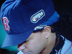
Meanwhile: During Tuesday afternoon’s Red Sox workout, Manny Ramirez’s turban (it no longer qualifies as a snood) did not feature the World Series logo. To nobody’s surprise, they corrected that oversight in time for batting practice yesterday, and the logo was also slapped onto Manny’s dark game turban.
By now it’s routine to see the WS logo on jersey sleeves and caps. But yesterday it was also on umpires’ sleeves and caps, fleece pullovers, and David Ortiz’s headband.
And then there was the matter of the logo’s placement on the Rockies’ vests. There’s a long tradition of vested teams wearing sleeve patches jersey torsos, natch. The problem is that there’s no set protocol for where on the torso they should be worn, as demonstrated by the variety of placements shown here, here, and here. The Rockies’ placement is as good as any — the problem is that the patch is so damn big.
For all the things carrying the WS logo last night, I was surprised to see how many things managed to escape logo-free, including BP caps, ski caps, dugout jackets, and Red Sox hitting coach Dave Magadan.
Batting helmets were logo-less as well. Or were they? Manny’s helmet had a logo decal during his first at-bat, but it was apparently removed after that. I didn’t notice anyone else wearing the helmet decal.
In short: Could’ve been worse. And tonight we should see real stirrups on the mound and, just maybe, real road grays too.
(Special thanks to Bryan Redemske, Michael Romero, Randy Williams, and Ben Nickerson for their contributions to today’s entry.)

Uni Watch News Flash: This just in: According to this item in today’s Boston Herald, Reebok’s new NHL jerseys may be on the way out. Here’s the relevant passage (which was brought to my attention by Doug Mooney):
According to sources in the [Bruins] dressing room, Reebok has been unable to correct problems with the new jerseys introduced this season across the NHL and will replace them at the company’s expense with new uniforms made of the old materials.
Players have complained since training camp that the new jerseys, which are supposed to be lighter and allow sweat to evaporate out through the shirts, have instead trapped water inside and gotten heavier.
I’ve got calls in to the NHL and Reebok as we speak. More details as I get them.
Update, 12:55pm: Just spoke with an NHL spokesperson, who told me that the Boston Herald report is incorrect. As it was explained to me, Reebok has informed each team that players who have “moisture issues” with the new jerseys (i.e., lots of water ending up in their gloves and/or skates) will be given the option to have the option to wear a jersey with a new front panel made of a different high-tech material. The spokesperson maintained that there was no league-wide move to scrap the new jerseys, nor was there any move back to “old materials.”
When I asked if the league had any sense of how many players were requesting this option, I was told to direct that question to Reebok. I’m still waiting to hear back from them.
Uni Watch News Ticker: If you thought this was problematic, wait until you see this (as found by Ella Moran and Pete Bonavita). “What is it about the 49ers and the sweaters they inspire?” asks Scott Turner. “Certainly not the legacy of Dick Nolan.” ”¦ Nice article here on MLB rituals, uni-related and otherwise. ”¦ The Birmingham Barons have new uniforms. ”¦ Chris Laughman has come up with a bunch of cool high school football unis, including Vernon Hills in Illinois (note how the “VH” helmet logo appears to have been swiped from an unlikely source), Heritage High in California (here’s another shot), and my favorite, San Pasqual in California (if not for the side panel on the jersey, they’d be damn near perfect!). ”¦ Early X-Y-Z victim, or just a fold of fabric? (As found by Vince, who also passed along this.) ”¦ This type of story seems to come up like clockwork once or twice a year, but it’s still a good read. ”¦ Brady Quinn lost a bet and had to wear a USC jersey for an interview (with thanks to Greg Riffenburgh). ”¦ According to the first paragraph of this story, Troy Tulowitzki’s name was misspelled on his new bats last night (as forwarded by Joe Ramos). ”¦ Soccer note from Roy Ellingsen, who writes: “Erling Knudtzon (show here behind goal scorer Kim Holmen) managed to wear the wrong socks for a Tippeliga soccer game (Norway’s premier division)!” ”¦ Ray Bergman asked me what LT is wearing here. Apparently, it’s this.
…how ugly can it get?
Hey “some dude” on the Red Sox is batting coach Dave Madagan. C’mon Paul – us Mets fans should know that one! Ha ha.
Those things that Ladanian Tomlinson are wearing heat beads from Jimmy Tangos Fat Busters. When coupled with his patented regimine of crystal meth, you can expect LT to drop about 13 lbs in 2 hours.
We’ll see if Ubaldo Jimenez figures out the proper way to wear stirrups tonight.
I thought that looked like madagan. Love that guy.
I wouldn’t call Mannys headpiece (formorly known as a snood) a turban as it is not a long piece of fabric that has been wrapped but rather it seems to be more of a high tech ‘tam’. Similar to what many people (think Bob Marley, Rastafarians, etc.) wear.
Charlie: Props for the SNL reference. Ride the snake!
Could LDT’s get up be a modified version of link ??
Now these are basketball socks
Not sure, but I think LT’s armor is from Nike, and they act as little shock absorbers.
More link.
[quote comment=”160710″]Hey “some dude” on the Red Sox is batting coach Dave Madagan. C’mon Paul – us Mets fans should know that one! Ha ha.[/quote]
It’s Magadan, not Madagan.
I wonder if Papelbon will be sporting a new cap with the black underbrim now, or if he made them sew a patch onto his old hat.
One of the Red Sox relievers last night was wearing an old stained hat the logo on the side, so they must have the option of having it stitched on.
[quote comment=”160722″]Not sure, but I think LT’s armor is from Nike, and they act as little shock absorbers.[/quote]
Yup, that’s right. Some of my rugby teammates wear them- I never though they’d be very effective by themselves, but I can see how they would help when combined with his other padding.
link
Paul how could you not recognize Dave Magadan???
I thought you were a better Met fan than that haha
Ok, I’ve been trying to figure this one out for a few weeks, but can’t for the life of me. Anyone have any idea what that metal thing is on Manny’s belt. It’s been there for a while now, and I haven’t seen anyone else wear it, and can’t figure out a purpose:
link
Beckett looks like he’s using the same belt with the bigger buckle that Dice-K and Okajima use:
link
Wait a minute! Tek’s got it too:
link
I’ve never played organized baseball, is that just normaly part of the belt that’s hidden under the loops?
LT is wearing a version of this
link
Hey paul they have had ws logos on those fleece tops ever since they debuted in 2004 you can kind of make it out link.
[quote comment=”160734″]Ok, I’ve been trying to figure this one out for a few weeks, but can’t for the life of me. Anyone have any idea what that metal thing is on Manny’s belt. It’s been there for a while now, and I haven’t seen anyone else wear it, and can’t figure out a purpose:
link
Beckett looks like he’s using the same belt with the bigger buckle that Dice-K and Okajima use:
link
It appears to be an elastic belt. The metal piece is so that the belt can be adjusted to fit pretty much any waist size. link I’ve been playing baseball for 15 years and i have always worn this type of belt. Even in college we use this belt
I saw the picture of LT and
This is what I immediately thought of.
Thanks Joe, that’s been bothering me for a few weeks now.
nice film about the Maurice Richard coming out soon. The old timey hockey sweaters look pretty good.
link
Paul,
What year did the NHL start putting fight straps on their jerseys? I want to get a name on a jersey of mine, but I want to make sure he was on the team when they had fight straps, seeing my jersey has one. And yes I am this anal about the authenticity of my jerseys, if this is would be accepted anywhere, it would be here……..
More UEFA quirks for the Light Blues:
Rangers FC have been sporting link link on their link in Champions League matches. They’ve been using link rather gaudy link style in league games this season. Not sure of reason for the numbering switch.
They also have not pulled out the link, supposedly for European away nights. Hoping for an appearance at the Nou Camp for the Barca return tie.
[quote comment=”160733″]Paul how could you not recognize Dave Magadan???
I thought you were a better Met fan than that haha[/quote]
Well, he looks a little different now than link in NY.
They have all sorts of the shock and stineger busters that LT was wearing. I had a friend in high school who also wore one to help protect his back because he had scoliosis when he was younger.
that should be *stinger* busters
who was the hoops player pictured on this blog many months ago that had those “mysterious dots” on his undershirt like lt has? i remember it was discussed pretty heavily one day.
i honestly dont think having that type of padded protective gear under your shorts or jersey is any big deal, nor is it out of the ordinary. people have been wearing link and link for years for the same reasons. to protect areas of the body which were problem areas and had a lot of physical contact.
no different than bagwells batting glove, any player who wears a leg shield because they foul off a lot of balls, or any of the nba guys who wear the padded compression shorts because they consistently drive the lane and initiate contact.
[quote comment=”160745″]Paul,
What year did the NHL start putting fight straps on their jerseys? I want to get a name on a jersey of mine, but I want to make sure he was on the team when they had fight straps, seeing my jersey has one. And yes I am this anal about the authenticity of my jerseys, if this is would be accepted anywhere, it would be here……..[/quote]
What kind of fight strap is it? If it’s the elastic with the metal clasps sewn in with the twill – they’ve been around for quite some time, at least 20, maybe 25 years. If it it’s the loops where you could thread the suspenders through, those have been around since the 50s, if the M&N jerseys are any indication.
Paul how could you not recognize Dave Magadan???
I thought you were a better Met fan than that haha
Hey Paul, don’t feel bad. I’m a Met fan, and I thought it was Ben Affleck. I tried to delete Magadan from my memory after he took over first base from my all time favorite Keith Hernandez.
Full Ticker is now up, along with a VERY significant breaking story — scroll up to see.
[quote comment=”160744″]nice film about the Maurice Richard coming out soon. The old timey hockey sweaters look pretty good.
link
The film’s been out in Canada since last summer. It is available on DVD. The funny thing is that most of the logos on the sweaters were blurred out – I imagine because the NHL didn’t get their licensing fee. Since it was aimed mainly at a Canadian audience, I guess the producers didn’t care since most everyone watching it – particularly in Quebec would know who the Habs were playing.
[quote comment=”160753″][quote comment=”160745″]Paul,
What year did the NHL start putting fight straps on their jerseys? I want to get a name on a jersey of mine, but I want to make sure he was on the team when they had fight straps, seeing my jersey has one. And yes I am this anal about the authenticity of my jerseys, if this is would be accepted anywhere, it would be here……..[/quote]
What kind of fight strap is it? If it’s the elastic with the metal clasps sewn in with the twill – they’ve been around for quite some time, at least 20, maybe 25 years. If it it’s the loops where you could thread the suspenders through, those have been around since the 50s, if the M&N jerseys are any indication.[/quote]
The fight strap is one of my favorite piest of the hockey jersey. Yea the tie up collaer is cool, some teams have great templates, but it’s the fight strap that makes the jersey awsome. Just the name alone makes it great. Maybe if I ever convince my wife to let me get a Uni Watch membership I’ll petition for a fight strap on my card.
So with hockey going back to old materials, do they go back to old designs? Are the apron strings gone? Do the Rangers spread their word mark out (please, please, please)?
freakin’ eaten posts…
had it copied and everything, then i had to send something and accidently ctrl+ c’ed something else!
Regarding the news flash: Can I have my old Flyers uniforms back? Forget the wifebeater/apron one. I just want the old ones back.
[quote comment=”160763″]freakin’ eaten posts…[/quote]
Now rescued.
Is the link standing in his socks? Sorry buddy, but in American Football we wear shoes.
my hs team played vernon hills in the playoffs my junior year and we lost and all i remember was us saying how did we get beat by a van halen team btw they came out to panama
We played Vernon Hills in ’02 and we kicked the holy hell out of them.
[quote comment=”160759″]So with hockey going back to old materials, do they go back to old designs? Are the apron strings gone? Do the Rangers spread their word mark out (please, please, please)?[/quote]
I would guess not. They would probably keep the panels, just replace the water repellent fabric with whatever they used to use.
[quote comment=”160752″]who was the hoops player pictured on this blog many months ago that had those “mysterious dots” on his undershirt like lt has? i remember it was discussed pretty heavily one day..[/quote]
Iverson…
link
[quote comment=”160777″][quote comment=”160752″]who was the hoops player pictured on this blog many months ago that had those “mysterious dots” on his undershirt like lt has? i remember it was discussed pretty heavily one day..[/quote]
Iverson…
link
nah, it was an action shot with the black pads sticking out the side…
[quote comment=”160765″][quote comment=”160763″]freakin’ eaten posts…[/quote]
Now rescued.[/quote]
thanks bro…
[quote comment=”160771″]Is the link standing in his socks? Sorry buddy, but in American Football we wear shoes.[/quote]
And lets not forget the orange laces on the guy in the Giants uni. So close, but yet so far.
Paul-
I think the World Series logo is not on the BP caps because the paneling above the ear piece would interfere with the patch/decal.
Reading the article about the discarded championship jerseys makes me think that this is the way to lift the third world out of poverty. Just imagine what some of that stuff would go for on eBay.
Hey, the English football folk both have sleeves! I’ll cut them a little slack on the footwear issue. Not to mention that neither of them has forty yards of tape on his ankles.
Sounds like we NHL fans get the worst of both worlds… link Reebox designs for no good reason!!! (Sigh…)
getting coffee this morning in our cafeteria, i heard a girl discussing how pathetic intentional walks are, and then, she says “and whats up witht hat guy manny’s pants?? Theyre really really baggy, but still tapered so they all bunch up at the bottom, it looks dumb, why cant he dress like a normal player?” Ah, the everyday uniwatch conversations
I am suprised the batting practice caps didn’t have the WS logo. When the Rockies won the NLCS ages ago, MLB.com was selling the BO caps with the logo. I don’t see it now.
[quote comment=”160777″][quote comment=”160752″]who was the hoops player pictured on this blog many months ago that had those “mysterious dots” on his undershirt like lt has? i remember it was discussed pretty heavily one day..[/quote]
Iverson…
link
It was Mo Williams of the Bucks. I don’t feel like looking up the link though.
[quote comment=”160771″]Is the link standing in his socks? Sorry buddy, but in American Football we wear shoes.[/quote]
and am I the only one who thought that guy was Vinny Testeverde?….
That Breaking News on the NHL is definitely a kick in the nads for Reebok. If it ain’t broke, why fix it??!! You could add embarrassing too.
[quote comment=”160799″][quote comment=”160771″]Is the link standing in his socks? Sorry buddy, but in American Football we wear shoes.[/quote]
and am I the only one who thought that guy was Vinny Testeverde?….[/quote]
LOL
[quote comment=”160747″]More UEFA quirks for the Light Blues:
Rangers FC have been sporting link link on their link in Champions League matches. They’ve been using link rather gaudy link style in league games this season. Not sure of reason for the numbering switch.
They also have not pulled out the link, supposedly for European away nights. Hoping for an appearance at the Nou Camp for the Barca return tie.[/quote]
It’s normal for teams in the UCL to wear different number fonts than their league for UCL matches. As a ManU fan, our numbers are silver for UCL matches, Arsenal’s are gold, and Chelsea uses numbers formed by 3 stripes (clever, as they wear an adidas kit). My guess is there may be a trademark issue preventing them from wearing their league kits for non-league matches.
Who am I kidding? It’s another kit to sell to the fans!!
Re: San Pasqual helmets,
Check out the stripes…check the picture again. #21 appears to have a standard single stripe. The QB seems to have the ugly double stripes that tail off, like Virginia, and #40 may or may not have any at all. Sorry, any team that has helmet stripes that tail off in a point, however it’s done (Denver, Louisville, UNLV, Tenn. Titans, Southern Miss, etc) can NOT qualify as nearly perfect. It’s so Bush League. It reminds me of something the XFL would do.
[quote comment=”160794″][quote comment=”160777″][quote comment=”160752″]who was the hoops player pictured on this blog many months ago that had those “mysterious dots” on his undershirt like lt has? i remember it was discussed pretty heavily one day..[/quote]
Iverson…
link
It was Mo Williams of the Bucks. I don’t feel like looking up the link though.[/quote]
bingo
I did notice Manny kept his helmet on while sliding into second, but also noticed that as he bounced up from the slide, he grabbed it off his head in a manner which looked like he was taking off his cap and taking a bow. Like ‘that’s right, I hit an rbi double and now I shall take a bow.’
The link uniform is incredible. I’d like to see the home uniform. I’m assuming powder blue jersey with white pants. Hey Chargers, this is what your alternate should look like!
[quote comment=”160800″]That Breaking News on the NHL is definitely a kick in the nads for Reebok. If it ain’t broke, why fix it??!! You could add embarrassing too.[/quote]
Wow. The Bruins have the greatest current jerseys in the NHL (what can I say, the design is awesome, and black and yellow is probably my favorite color combination), and now they’re reverting to the traditional material!? That’s the most inspiring event to come out of Boston since the Tea Party.
[quote comment=”160779″][quote comment=”160777″][quote comment=”160752″]who was the hoops player pictured on this blog many months ago that had those “mysterious dots” on his undershirt like lt has? i remember it was discussed pretty heavily one day..[/quote]
Iverson…
link
nah, it was an action shot with the black pads sticking out the side…[/quote]
Todd, I think it was a guy on the Celtics, but I’m at a complete loss right now. It was somebody that was just coming back from an injury. I remember the shot was right in the paint, as the guy was going up for a layup. (I think)
[quote comment=”160806″]I did notice Manny kept his helmet on while sliding into second, but also noticed that as he bounced up from the slide, he grabbed it off his head in a manner which looked like he was taking off his cap and taking a bow. Like ‘that’s right, I hit an rbi double and now I shall take a bow.'[/quote]
This is why Manny took off his helmet after sliding in to second base:
link
Movie of the year: link
Someone did their homework.
[quote comment=”160807″]The link uniform is incredible. I’d like to see the home uniform. I’m assuming powder blue jersey with white pants. Hey Chargers, this is what your alternate should look like![/quote]
Those are sweet.
[quote comment=”160805″][quote comment=”160794″][quote comment=”160777″][quote comment=”160752″]who was the hoops player pictured on this blog many months ago that had those “mysterious dots” on his undershirt like lt has? i remember it was discussed pretty heavily one day..[/quote]
Iverson…
link
It was Mo Williams of the Bucks. I don’t feel like looking up the link though.[/quote]
bingo[/quote]
Here’s the link
[quote comment=”160805″][quote comment=”160794″][quote comment=”160777″][quote comment=”160752″]who was the hoops player pictured on this blog many months ago that had those “mysterious dots” on his undershirt like lt has? i remember it was discussed pretty heavily one day..[/quote]
Iverson…
link
It was Mo Williams of the Bucks. I don’t feel like looking up the link though.[/quote]
bingo[/quote]
as seen here
link
link
Yikes – Byron Ritchie’s shorts falling apart:
link
and what happened to the classy World Series logo?
[quote comment=”160818″][quote comment=”160805″][quote comment=”160794″][quote comment=”160777″][quote comment=”160752″]who was the hoops player pictured on this blog many months ago that had those “mysterious dots” on his undershirt like lt has? i remember it was discussed pretty heavily one day..[/quote]
Iverson…
link
It was Mo Williams of the Bucks. I don’t feel like looking up the link though.[/quote]
bingo[/quote]
as seen here
link
link
Isn’t that what LT2 is wearing?
[quote comment=”160815″]Movie of the year: link
Someone did their homework.[/quote]
Great film too…and yes the unis are true to the era and quite exquisite…thank god about the reebok news altho i will believe it when i see it….but hopefully teams will be allowed to go back to their old unis if they didnt make logo or color changes…i think the rangers, leafs, flyers, oilers and isles, and im sure many more would be very happy with this option…clearly vancouver or washington cannot go back to their old styles
[quote comment=”160815″]Movie of the year: link
Someone did their homework.[/quote]
That movie was incredible! My favourite sport movie in ages, probably since Cool Runnings… for a kid who grew up in the 21-30 team NHL, it was a beautiful film.
Is it just coming out in the USA?
I’d call it a babushka.
NHL going back to the old jerseys, this makes me almost as happy as seeing Van Halen last week.
[quote comment=”160808″][quote comment=”160800″]That Breaking News on the NHL is definitely a kick in the nads for Reebok. If it ain’t broke, why fix it??!! You could add embarrassing too.[/quote]
Wow. The Bruins have the greatest current jerseys in the NHL (what can I say, the design is awesome, and black and yellow is probably my favorite color combination), and now they’re reverting to the traditional material!? That’s the most inspiring event to come out of Boston since the Tea Party.[/quote]
As long as they get rid on that round hem line i’ll be happy….
well no, they’d have to fix a LOT more to make me happy. thin vertical piping looks bad in football, and even worse in hockey
The Lancaster JetHawks of the California League get a new look.
Paul, any news (or photos) on the burlesque show you saw last week? Inquiring minds want to know…
I live by Vernon Hills and when I first saw the helmets I thought wow rock on. The funny thing is that the school isn’t that old so there are probalbly numerous teachers within the classic Van Halen fans demo and realize the similiarity.
Dear Reebok,
Thank you for your interest in trying to reinvent the wheel. Unfortunately, we already had a wheel which worked pretty well that no one really complained about in the first place.
Sincerely,
Tradition.
[quote comment=”160833″]Paul, any news (or photos) on the burlesque show you saw last week? Inquiring minds want to know…[/quote]
It was a hoot, although not as uni-centric as I had hoped. Took some pics, but they’re very NSFW.
[quote comment=”160840″][quote comment=”160833″]Paul, any news (or photos) on the burlesque show you saw last week? Inquiring minds want to know…[/quote]
It was a hoot, although not as uni-centric as I had hoped. Took some pics, but they’re very NSFW.[/quote]
link them and we can all look at home tonight.
[quote comment=”160843″][quote comment=”160840″][quote comment=”160833″]Paul, any news (or photos) on the burlesque show you saw last week? Inquiring minds want to know…[/quote]
It was a hoot, although not as uni-centric as I had hoped. Took some pics, but they’re very NSFW.[/quote]
link them and we can all look at home tonight.[/quote]
Or maybe release them as an Open Thread to be safe. No work on the weekends for most of us.
Better idea: split the album. Instant Open Thread material for the whole weekend.
How F’n big is ManRam’s hat size. It must b in the 9’s. That thing looks like a freaking bucket. That has to be special made.
[quote comment=”160836″]Dear Reebok,
Thank you for your interest in trying to reinvent the wheel. Unfortunately, we already had a wheel which worked pretty well that no one really complained about in the first place.
Sincerely,
Tradition.[/quote]
Ha! This is classic, Dr. Teeth. Thanks for brightening my morning.
You know, because I don’t have cable, last night was the first time I saw the Rockies in action. Now, I love me some black, and I am not opposed to purple the way Paul is, but those vests are hideous. They make the Rockies look so bush-league. No, wait, that was the way they played last night.
Those black vests paired with gray slacks (they certainly look more like slacks than baseball pants) are maybe the worst uniforms in the history of the WS.
When I played football, which wasn’t too long ago, I loved wearing link of girdle. It is a much more comfortable pad than the normal thigh pads. Every quarterback and running back on my team wore link very similar to LTs in order to get the extra protection, and because it was more comfortable than this link.
“>Forgot the link to the Rockies in their gray slacks
Weirdly enough, I found myself thinking the Rockies didn’t look that bad compared to some of the slobs that Boston fields.
By the way, when I was watching link pitch the other day, I kept imagining that he had link on under his jersey.
[quote comment=”160846″][quote comment=”160836″]Dear Reebok,
Thank you for your interest in trying to reinvent the wheel. Unfortunately, we already had a wheel which worked pretty well that no one really complained about in the first place.
Sincerely,
Tradition.[/quote]
Ha! This is classic, Dr. Teeth. Thanks for brightening my morning.
You know, because I don’t have cable, last night was the first time I saw the Rockies in action. Now, I love me some black, and I am not opposed to purple the way Paul is, but those vests are hideous. They make the Rockies look so bush-league. No, wait, that was the way they played last night.[/quote]
I’m not a fan of black the way you are Minna, but you’re right. It’s not the color that makes the vests bad, it’s the overall design. The way the shoulders are designed to jut out instead of tapering in; The silver piping on the armhole; It’s just not well done.
hey anyone know if or what reference is made about Dave Magaden in the movie Little Big League? im pulling my hair out trying to remember
link
When I played we had something similar to link but it was mesh and had pockets for hip pads and the tailbone pad. Then we switched to hip and tailbone pads that just had a belt that looped through them and basically you relied on your pants to keep them in the right spot.
It is funny you brought that up, because when I was looking at the honorary NFL captains picture, I noticed they didn’t have any lower body padding. That got me to thinking about if NFL players even wear hip or tailbone pads anymore. It is interesting to see that they now make padded compression shorts (with built in thigh pads even). No wonder you don’t see the big foam hip pads anymore.
[quote comment=”160857″]link[/quote]
Wow, check out the name/number spacing on #2. I wonder if it is just because of the long name, but it looks weird compared to everyone else in the shot.
With the Rockies losing game 1 badly in those hideous black vests, they can hopefully wear their road gray jerseys.
Great Bruins sweaters that are ACTUALLY sweaters, not glorified UnderArmor? All is right with hockey again.
Is it me or is LaDainian Tomlinson slowly becoming a Cyborg or Bionic being of some sort?
Ugh!…The Red Sox seriously need to impose a hair style rule. Manny’s hair & uniform antics have been making me sick to my stomach! I was fine with baggy uniforms but as of late I’m starting to rethink my stance due to Manny’s size 42W X 36L pants. I don’t think New Era has enough fabric to cover his head! IT WILL EVENTUALLY BECOME A TURBIN!
link
Rockies need to shrink that World Series patch down a bit…their Uni’s are starting to look like Japanese league threads.
Ok people….its got to be LDT not LT….LT was Lawrence Taylor. There can only be one.
Today’s ESPN column link.
Alright. We finally have our first $1000 football helmet.
link
Paul, I believe you are wrong in your ESPN column today. That is not a Dymo tape on the Eagles helmet. I am almost positive that was a little yellow sticker warn during Super Bowl XV to welcome the hostages home from Iran.
Regarding the ESPN column – as I remember, it was Forrest Gregg who put the numbers on the Packers’ pants; obviously, he had brought it from his stint as an assistant coach under Landry. Lindy Infante had them removed because, along with taste reasons, “they made it too easy to identify offensive linemen who committed holding penalties.”
Oh, and the Colts also had numbers on their pants for one season at about the same time – a horseshoe on the hip with a number inside it. Photo, anyone?
[quote comment=”160871″]Alright. We finally have our first $1000 football helmet.
link
At first I was going to joke that it is only $999.00, but did anyone else notice that it [quote]Requires 1 Riddell HITSâ„¢ Desktop Antenna (Item #64225 — sold separately)[\quote]? And if you scroll down the page you will see that the antenna only costs – get this – $299.00!!! That must be one hell of an antenna!
Not really uni-related, more so equipment, but, did anyone notice that when the Rockies intentionally walked Mike Lowell last night, homeplate umpire Ed Montague kept his mask off for the entire at bat? It looked very strange to see the ball in play and the plate umpire not wearing a mask?
[quote comment=”160803″][quote comment=”160747″]More UEFA quirks for the Light Blues:
Rangers FC have been sporting link link on their link in Champions League matches. They’ve been using link rather gaudy link style in league games this season. Not sure of reason for the numbering switch.
They also have not pulled out the link, supposedly for European away nights. Hoping for an appearance at the Nou Camp for the Barca return tie.[/quote]
It’s normal for teams in the UCL to wear different number fonts than their league for UCL matches. As a ManU fan, our numbers are silver for UCL matches, Arsenal’s are gold, and Chelsea uses numbers formed by 3 stripes (clever, as they wear an adidas kit). My guess is there may be a trademark issue preventing them from wearing their league kits for non-league matches.
Who am I kidding? It’s another kit to sell to the fans!![/quote]
usually the league doesn’t let the team wear the normal league font in non-league games. if you look closely on the rangers kit you can see the Scottish Premier League logo near the top of the number. and no, i don’t know why they couldn’t use the same color and just get rid of the logo.
[quote comment=”160875″]Paul, I believe you are wrong in your ESPN column today. That is not a Dymo tape on the Eagles helmet. I am almost positive that was a little yellow sticker warn during Super Bowl XV to welcome the hostages home from Iran.[/quote]
Really? Wow, that’s news to me. I shall investigate!
[quote comment=”160876″]Oh, and the Colts also had numbers on their pants for one season at about the same time – a horseshoe on the hip with a number inside it. Photo, anyone?[/quote]
Shit, totally forgot about that. Thanks for the reminder!
New update on the NHL situation — scroll back up to see.
bobcats 2/3 man derek anderson has changed his number from last years 23 (his college number) to 1 (his number for the majority of his nba career)
[quote comment=”160803″][quote comment=”160747″]More UEFA quirks for the Light Blues:
Rangers FC have been sporting link link on their link in Champions League matches. They’ve been using link rather gaudy link style in league games this season. Not sure of reason for the numbering switch.
They also have not pulled out the link, supposedly for European away nights. Hoping for an appearance at the Nou Camp for the Barca return tie.[/quote]
It’s normal for teams in the UCL to wear different number fonts than their league for UCL matches. As a ManU fan, our numbers are silver for UCL matches, Arsenal’s are gold, and Chelsea uses numbers formed by 3 stripes (clever, as they wear an adidas kit). My guess is there may be a trademark issue preventing them from wearing their league kits for non-league matches.
Who am I kidding? It’s another kit to sell to the fans!![/quote]
Aye, just felt it was a bit odd to resort to the 06-07 set instead of devising something fresh. Made me think at first that they were merely returning to the former kit until I saw a closeup.
Looks like the Dons are sporting the same style for their link as they do for link. I can’t see the Clydesdale Bank/SPL logo on either set of numbers though.
[quote comment=”160883″]New update on the NHL situation — scroll back up to see.[/quote]
Damn.
[quote comment=”160878″]Not really uni-related, more so equipment, but, did anyone notice that when the Rockies intentionally walked Mike Lowell last night, homeplate umpire Ed Montague kept his mask off for the entire at bat? It looked very strange to see the ball in play and the plate umpire not wearing a mask?[/quote]
Just got another interessting side note from a friend of mine who umpires, regarding Montague’s not wearing his mask during Lowell’s IBB. He was doing an extra inning game in the Cape Cod League three years ago and the same thing happened. One team had runners on second and third, so the defensive team was intentionally walking a hitter to load the bases and set up the force. When the pitch went into his leg kick he noticed the umpire was holding his mask. This caused him to stop, which resulted in the maskless umpire calling a walk-off balk. Just thought it was interesting….
[quote comment=”160879″][quote comment=”160803″][quote comment=”160747″]More UEFA quirks for the Light Blues:
Rangers FC have been sporting link link on their link in Champions League matches. They’ve been using link rather gaudy link style in league games this season. Not sure of reason for the numbering switch.
They also have not pulled out the link, supposedly for European away nights. Hoping for an appearance at the Nou Camp for the Barca return tie.[/quote]
It’s normal for teams in the UCL to wear different number fonts than their league for UCL matches. As a ManU fan, our numbers are silver for UCL matches, Arsenal’s are gold, and Chelsea uses numbers formed by 3 stripes (clever, as they wear an adidas kit). My guess is there may be a trademark issue preventing them from wearing their league kits for non-league matches.
Who am I kidding? It’s another kit to sell to the fans!![/quote]
usually the league doesn’t let the team wear the normal league font in non-league games. if you look closely on the rangers kit you can see the Scottish Premier League logo near the top of the number. and no, i don’t know why they couldn’t use the same color and just get rid of the logo.[/quote]
Same font, but yeah, sans the very-out-of-place-looking Clydesdale/SPL logo at the top. See the “1”s on Novo’s and Adam’s shirts, and the “8” on Thommo’s and the “ANY NAME” classic. No change but the colors.
[quote comment=”160886″][quote comment=”160883″]New update on the NHL situation — scroll back up to see.[/quote]
Damn.[/quote]
My feelings exactly. Looks like we’re stuck with the skinny Rangers.
[quote comment=”160855″][quote comment=”160846″]
Ha! This is classic, Dr. Teeth. Thanks for brightening my morning.
You know, because I don’t have cable, last night was the first time I saw the Rockies in action. Now, I love me some black, and I am not opposed to purple the way Paul is, but those vests are hideous. They make the Rockies look so bush-league. No, wait, that was the way they played last night.[/quote]
I’m not a fan of black the way you are Minna, but you’re right. It’s not the color that makes the vests bad, it’s the overall design. The way the shoulders are designed to jut out instead of tapering in; The silver piping on the armhole; It’s just not well done.[/quote]
Shaftman, as you know, I am on a mission so that it’s all black, all the time. However, you are correct in stating it’s the raggedy-taggedy natuure of the vests that absolutely ruins them. Therefore, I must conclude that design even trumps color (marginally).
Hmm, even if it were true, I would expect the league and/or Reebok to downplay it. Have you tried contacting the Bruins or link?
With regards to the cowboys column (which will be enjoyed by anyone who “Gets it”), the multiple shades of blue can also be seen in the SOCKS… royal with the white jersey, and navy witht the blue jersey.
[quote comment=”160880″][quote comment=”160875″]Paul, I believe you are wrong in your ESPN column today. That is not a Dymo tape on the Eagles helmet. I am almost positive that was a little yellow sticker warn during Super Bowl XV to welcome the hostages home from Iran.[/quote]
Really? Wow, that’s news to me. I shall investigate![/quote]
Someone beat me to it. Yea, those yellow strips were worn by both teams in SB XV in lieu of yellow ribbons, with respect to the Iran hostages.
[quote comment=”160883″]New update on the NHL situation — scroll back up to see.[/quote]
“different high-tech material”. This phrase is getting annoying, yeah real high tech Reebok. Why can’t they say something like “boy, did we ever screw this up”..What they didn’t realize when they were testing the new high-tech material was that actual athletic human beings perspiring for hours were going to be using this high-tech material, not robots or mannequins(meaning it looked good on paper). Regardless of what comes of this, it still leaves a black eye for Reebok.
Paul.
Re: link #7 SEPARATED AT BIRTH — NOT
What about the Giants. Didn’t we just talk about how different their link and link jersey’s are?
Hell, they don’t even use the same color scheme. While the Cowboys may use different blues and different silvers, it is still blue and silver. Their sleeves may be different on the link and link but at least they both have stripes. Giants don’t. I’m not saying that they Giants have MORE differences than the Cowboys, but I would say that they are JUST as different.
Otherwise great column.
[quote comment=”160848″]Those black vests paired with gray slacks (they certainly look more like slacks than baseball pants) are maybe the worst uniforms in the history of the WS.
[/quote]
At least they fit properly, unlike a certain Boston team. I agree, though, they’re awful, but since they lost last night, I predict we’ll see road grays tonight. Here’s hoping they win the next four and we never see the Jetsons uni again.
[quote comment=”160876″]Oh, and the Colts also had numbers on their pants for one season at about the same time – a horseshoe on the hip with a number inside it. Photo, anyone?[/quote]
link
[quote comment=”160900″]Paul.
Re: link #7 SEPARATED AT BIRTH — NOT
What about the Giants. Didn’t we just talk about how different their link and link jersey’s are?[/quote]
Yeah, but at least the typography and neckline logos match up.
[quote comment=”160859″][quote comment=”160857″]link[/quote]
Wow, check out the name/number spacing on #2. I wonder if it is just because of the long name, but it looks weird compared to everyone else in the shot.[/quote]
#2? You don’t know Troy Tulowitzki yet? Geez, I guess the Rockies ARE unknown to the rest of the country. Oh well, I guess when he’s a Yankee in six years people will learn about him then (Sob).
Hmm, link, Uni Watch readers?
[quote comment=”160896″][quote comment=”160880″][quote comment=”160875″]Paul, I believe you are wrong in your ESPN column today. That is not a Dymo tape on the Eagles helmet. I am almost positive that was a little yellow sticker warn during Super Bowl XV to welcome the hostages home from Iran.[/quote]
Really? Wow, that’s news to me. I shall investigate![/quote]
Someone beat me to it. Yea, those yellow strips were worn by both teams in SB XV in lieu of yellow ribbons, with respect to the Iran hostages.[/quote]
I will third this … I even remember the Superdome having a huge ribbon on it for the occasion.
[quote comment=”160905″][quote comment=”160900″]Paul.
Re: link #7 SEPARATED AT BIRTH — NOT
What about the Giants. Didn’t we just talk about how different their link and link jersey’s are?[/quote]
Yeah, but at least the typography and neckline logos match up.[/quote]
Agreed, they don’t have the SAME differences, but they are certainly another example of home and away uni’s that are radically different from each other.
I just got my new issue of SI, with its link. You can see a small version of the artwork at the top of the cover, I am trying to find a larger version.
Anyway, It looks like a treasure trove of Uni information, although it looks like they just photoshopped pictures and colorized where needed. My big questions have to do with Wilt Chamberlain. This looks like an early 60’s Phila Warriors Uni. The “PHILA” is in Blue with a red drop-shadow, but the trim looks purple and gold to me. Also he looks like he is wearing pads inside his socks soccer-style but on the outside of his calves. Any reason why?
I didn’t want to try to spell it, the letters weren’t even clear in the photo.
The Edmonton Eskimos in the CFL had number panels sewn on the side of the pants during the 70s and into the 90s. I’ll see if I can dig up some old photos, but it’s something I remember very clearly
I wonder if Reebok is going to team up with World Vision to donate the RBK Egde Uniform system to the kids in Africa…
If the change back to traditional jerseys happens.
Re: #128, the “PHILA” is Red on Blue, my bad…
uniwatch, if indeed that is your real name. just read your rampage on the cowboy uniforms. sir, you are truely a dweeb. there must be better things to do in ny
[quote comment=”160906″][quote comment=”160859″][quote comment=”160857″]link[/quote]
Wow, check out the name/number spacing on #2. I wonder if it is just because of the long name, but it looks weird compared to everyone else in the shot.[/quote]
#2? You don’t know Troy Tulowitzki yet? Geez, I guess the Rockies ARE unknown to the rest of the country. Oh well, I guess when he’s a Yankee in six years people will learn about him then (Sob).[/quote]
Too bad he won’t be able to choose #2 when he goes to the Yankees. haha
[quote comment=”160916″]uniwatch, if indeed that is your real name. just read your rampage on the cowboy uniforms. sir, you are truely a dweeb. there must be better things to do in ny[/quote]
Do people really still say ‘dweeb’? I thought that word went dead with the ’80s.
[quote comment=”160891″][quote comment=”160886″][quote comment=”160883″]New update on the NHL situation — scroll back up to see.[/quote]
Damn.[/quote]
My feelings exactly. Looks like we’re stuck with the skinny Rangers.[/quote]
Skinny, but at least the Rangers are hemming it up so it does not look as stupid.
[quote comment=”160910″]I just got my new issue of SI, with its link. You can see a small version of the artwork at the top of the cover, I am trying to find a larger version.
Anyway, It looks like a treasure trove of Uni information, although it looks like they just photoshopped pictures and colorized where needed. My big questions have to do with Wilt Chamberlain. This looks like an early 60’s Phila Warriors Uni. The “PHILA” is in Blue with a red drop-shadow, but the trim looks purple and gold to me. Also he looks like he is wearing pads inside his socks soccer-style but on the outside of his calves. Any reason why?[/quote]
A few days ago, CNNsi.com had a full gallery of all of the players, starting with 5’3″ Muggsy Bogues and ending with 7’7″ Manute Bol……
I can’t find it right now because they have new photo galleries up though.
If anyone finds a picture of Brady Quinn wearing the USC jersey, please please PLEASE post it here.
Thanks!
you can kind of see it in this pic
link
Paul, you’ve got the links messed up in the espn.com column. It’s from when you added the Colts pants numbers. Look at that section and the “Spirit of 76” section.
[quote comment=”160910″]I just got my new issue of SI, with its link. You can see a small version of the artwork at the top of the cover, I am trying to find a larger version.
Anyway, It looks like a treasure trove of Uni information, although it looks like they just photoshopped pictures and colorized where needed. My big questions have to do with Wilt Chamberlain. This looks like an early 60’s Phila Warriors Uni. The “PHILA” is in Blue with a red drop-shadow, but the trim looks purple and gold to me. Also he looks like he is wearing pads inside his socks soccer-style but on the outside of his calves. Any reason why?[/quote]
Just seeing those three guys in a Celtics uniform on the cover is giving me chills. I can’t wait for this season to actually start. Going this Sunday to their open practice. I’m going to try to get a couple of good pictures. NBA teams have really boring practice sets though.
The Bruins blog said it was a switch back to original materials, I am sure even if that were true it would be Edge templated and marketed as “RBX Super-Ultra-Turbo Performance SpaceKnit (now with advanced Moisture-Lock)” I don’t think the Edge “look” will go away, unless enough teams start doing Rangers-style custom tailoring, then we might see factory straight hems.
Paul,
The links in the Cowboys kit ESPN column are a little messed up. The hip huggers links are repeated in the Spirit of 76 section.
[quote comment=”160856″]hey anyone know if or what reference is made about Dave Magaden in the movie Little Big League? im pulling my hair out trying to remember[/quote]
Dave Magaden is in Little Big League as himself on the Mariners.
[quote comment=”160907″]Hmm, link, Uni Watch readers?
[/quote]
That’s pretty much exactly what she told me. Sounds like she’s been in major damage-control mode since that Boston Globe piece came out.
Paul,
It appears you updated your ESPN article to include the pants numbers on the Colts, but put it under #9 – “Spirit of ’76” topic, not #8 – “Hip Huggers”
[quote comment=”160927″]Paul, you’ve got the links messed up in the espn.com column. It’s from when you added the Colts pants numbers. Look at that section and the “Spirit of 76” section.[/quote]
Getting my editors to fix it now.
[quote comment=”160718″]Charlie: Props for the SNL reference. Ride the snake![/quote]
Thanks Kev!
That Picture of Drogba is not flattering at all . . . it doesn’t help that he’s standing next to the rugby dude.
Too bad for him ’cause he’s a madman on the pitch, this makes him look like a girly kicker.
Also, why not have an ENGLISH Chelsea player in the shot? Drogs is from Ivory Coast . . .
Todd Krevanchi posted this pic a few days ago as an example of an early link football uniform.
I was wondering if anyone knows why Jim Brown (44) has a white helmet stripe while the lineman has a blue stripe? Especially since his link has a blue stripe. Any ideas?
I’m reposting this from late yesterday.
The horridness (is that a word?) of Oregon’s all white uniforms was discussed heavily here over the weekend. And I think it’s pretty universally agreed upon that they were awful, but look at that this guy had to say about them.
link
(look at the end of the article in his answer to “the anry email of the week”)
I know the cowboys column only compares them to other NFL teams, but just wanted to note syracuse used to put numbers on the pants:
link
[quote comment=”160909″][quote comment=”160905″][quote comment=”160900″]Paul.
Re: link #7 SEPARATED AT BIRTH — NOT
What about the Giants. Didn’t we just talk about how different their link and link jersey’s are?[/quote]
Yeah, but at least the typography and neckline logos match up.[/quote]
Agreed, they don’t have the SAME differences, but they are certainly another example of home and away uni’s that are radically different from each other.[/quote]
The Vikings used to have different home and road jerseys; Northwestern (sleeve) stripes at home, UCLA (shoulder) stripes on the road.
Loved the column Paul.
As a Cowboys fan I take your love for them the same way I take your love for purple and nike, with a grain of salt! At least you didn’t run the Romo fumble pic again lol..
[quote comment=”160949″]Loved the column Paul.
As a Cowboys fan I take your love for them the same way I take your love for purple and nike, with a grain of salt! At least you didn’t run the Romo fumble pic again lol..[/quote]
link!!!
Thanks Shaft. What a pal!
[quote comment=”160934″][quote comment=”160907″]Hmm, link, Uni Watch readers?
[/quote]
That’s pretty much exactly what she told me. Sounds like she’s been in major damage-control mode since that Boston Globe piece came out.[/quote]
I love the part about going to a different high performance fabric- airknit. Thats what they were made of before!
[quote comment=”160952″]Thanks Shaft. What a pal![/quote]
No problem. Speaking as a Met’s fan, I would rather F-up IN the playoffs, then F-up and not make them. So I would take that photo, frame it, and remember the good year you had (until that moment).
yeah that was two years ago we F’ed-up and didnt make em, then last year we F’ed-up in round 1. Course we pissed away the division, 2 game lead with 4 to go..
Paul, I’ve been critical of some things you wrote lately but I have to say, that Cowboys piece is one of your best. As a Steeler fan you get a thumbs down for having to remind of O’Donnell though!!!!
If I could, I’d like to briefly comment on your ten points in the article:
1. TAPE JOB: I too, can’t imagine the Cowboys’ helmet without it. It is a timeless, tiny detail, but very noteworthy. Looks as good now as it did on an old single bar.
2. TIE ME UP, TIE ME DOWN: Never noticed this before, but that’s one of the dumbest things I’ve ever seen. Now that’s all I’m going to see when I look at their jersey.
3. SILVER MINE: this doesn’t bother me that much, it makes their uniform set unique in my opinion. Plus, you so rarely see the dark uni, it really doesn’t matter all that much. Plus, the greenish blue would probably clash with the blue jersey and those pants go so well with the whites, I wouldn’t want them to standarize with a plain silver across the board.
4. EVEN THE COWBOYS GET THE BLUES: valid points, but like above, doesn’t really bother me that much.
5. HOME WHITES AREN’T JUST FOR BASEBALL: I’m with you on this one. Other teams may wear white at home (regularly or occasionally) but most look to the ‘boys as the originators of that trend.
6. THE CURSE OF THE BLUE JERSEY: I always loved the teams that purposely wore white at home to force the Cowboys to sport the blue. Too bad Dallas wasn’t the NFC Champs back in SB XL because Cowher went with the white since they advanced to the SB on the road and had a hot streak with those jerseys. It would have been the first time since SB V (which I didn’t know was the birth of the curse) that Dallas would have been forced to do so.
The only downfall to this is that it has took two of my favorite color jerseys out of the mix: the Eagles (Cunningham/White era) and the current Redskins which you rarely see at all anymore.
7. SEPARATED AT BIRTH — NOT: see my response for Nos. 3 & 4.
8. HIP HUGGERS: I remember this because even though I hate the team, i’d watch when they were on because I liked Tony Dorsett. I don’t know why he’s the player that sticks out in my head, but I always remember that #33 on his hip and thinking it was stupid.
9. SPIRIT OF ’76: very lame, just put an American flag patch on your jersey and be done with it. I know that 1976 was the height of popular patriotism (pre-9/11 of course) but that looks awful. The one photo, it looks like the guy just put a piece of red, electrical tape over a preexisting blue stripe. That’s pretty high school-ish if you ask me.
10. COLLAR MY WORLD: agree with what you state, much ado about nothing really.
[quote comment=”160907″]Hmm, link, Uni Watch readers?
[/quote]
Hmm. Air-Knit. The same material they were link*.
[quote comment=”160907″]
[/quote]
The mind reels.
* a jersey tag circa 1988.
The rest of my post on the Page 2 piece:
HON MEN: The fedora memorial patch is without a doubt my favorite all-time memorial honor to appear on any sports uni. Even though I hated the Cowboys, I always had a fondness and respect for Landry. I loved that throwback style of attire. That patch was so much better than a boring helmet sticker.
Here’s another honorable mention: Tex Scramm putting the AJR logo on the back of Dallas’ helmets after Art Rooney’s death when they played the Steelers. This is the only time I can recall an opposing team honoring someone related to their opponent on their uni for just that game. Not only that, but it was a great sticker, they replaced the NFL in the league logo with AJR.
couldn’t find a pic, link.
Anyway, that’s it. Hey, no Nike bashing, purple hating, pink/blue cancer awareness dismissing! Great stuff Paul!!!
[quote comment=”160950″][quote comment=”160949″]Loved the column Paul.
As a Cowboys fan I take your love for them the same way I take your love for purple and nike, with a grain of salt! At least you didn’t run the Romo fumble pic again lol..[/quote]
link!!![/quote]
Did you not find the repeated use of Quicey Carter pics to be able to induce equal pain?
[quote comment=”160945″]I’m reposting this from late yesterday.
The horridness (is that a word?) of Oregon’s all white uniforms was discussed heavily here over the weekend. And I think it’s pretty universally agreed upon that they were awful, but look at that this guy had to say about them.
link
(look at the end of the article in his answer to “the anry email of the week”)[/quote]
I agree. I love Oregon uniforms. All of them. If you want to see ugly green and yellow check out Notre Dame.
Paul,
While the Cowboy inconsistencies are annoying, it must be stated that navy blue and royal blue do not in fact clash!
Actually, they look pretty nice together, as the link link have link for quite some time.
I just noticed, you can vaguely make out the AJR helmet sticker on the Cowboys helmet but you can’t really tell what it is.
I remember my Dad writing Tex Schramm asking for one of them and Tex sending him one with a signed letter.
If I find it when I got through his stuff at my mom’s some year, I’ll scan it and send it in. Really unique tribute.
[quote comment=”160964″]Paul,
While the Cowboy inconsistencies are annoying, it must be stated that navy blue and royal blue do not in fact clash!
Actually, they look pretty nice together, as the link link have link for quite some time.[/quote]
That looks like it’s closer to a baby blue or teal than a royal blue. The Mets (used to) wear royal blue.
[quote comment=”160964″]Paul,
While the Cowboy inconsistencies are annoying, it must be stated that navy blue and royal blue do not in fact clash!
Actually, they look pretty nice together, as the link link have link for quite some time.[/quote]
I wouldn’t call that royal blue. It’s more of a Carolina blue, and the color scheme looks like the Tennessee Titans.
Alright Paul, we all know that you love stripes, but is that really enough of a reason to totally disregaurd the fact that San Pasqual has two totally different colors of gold? Ton’s of teams have the whole old gold vs. yellow gold problem, but very seldom on the same uniform.
Ok stupid question… How do they get World Series patches on all of the dirty old ball caps many of the Red Sox wear?
I’m suprised one of the annoying thing about the Cowboys wasn’t that they added black to their uniforms for no reason. There is a small black stripe bordering each blue stripe on the arms. When did the black get added in anyway?
[quote comment=”160964″]Paul,
While the Cowboy inconsistencies are annoying, it must be stated that navy blue and royal blue do not in fact clash!
Actually, they look pretty nice together, as the link link have link for quite some time.[/quote]
Here’s link together. IMO, that combo doesn’t look good, the blues need more contrast.
Nice article on the Cowboys uni’s. Another quirk/annoyance about the Cowboys is that somehow the club has retained the rights to license its own merchandise and market its logos independent of NFL Properties. If you buy licensed Cowboys merchandise at a sports shop it will have a Cowboys hangtag on it rather than a standard NFL hangtag.
The Blues have used Navy and Royal, albeit dark royal together for almost 10 years now…
[quote comment=”160973″]I’m suprised one of the annoying thing about the Cowboys wasn’t that they added black to their uniforms for no reason. There is a small black stripe bordering each blue stripe on the arms. When did the black get added in anyway?[/quote]
Wow, link. I never noticed that before.
Does anybody watch the TV show Friday night Lights? I just saw all the episodes from season 1 and the 3 so far from season 2 in the last 3 days, so it’s really fresh in my mind.
I noticed a bunch of uniform inconsistencies. In the pilot episode they wear link Then for the rest of the season the home jersey top is a linkwith the link. They are both always paired with blue pants. The team appears to wear link.
For the homecoming game when they roll out the injured quaterback he is in the link What’s stranger is that in the pilot they cut the jersey off of him while they were getting him ready for surgery.
Then for the semifinal game where they can’t play at their homefield because of the train derail and make a whole big stink about homefield advantage so they play on a cow pasture, they come out in their road whites, plus they are now paired with white pants aswell, which we have not seen yet for game action. (sorry no pictures for these)
Now on to season 2. They debut shiny new under link. I believe they are similar to what linkin real life. However when Riggins helps bring Lyla’s drunk dad home his jersey has magically switched from the fancy UA one back to the non-broncos style home jersey from the 1st season (no pics again)
Anyone notice anything else. I apologize if this has already been discussed and I missed it.
[quote comment=”160909″][quote comment=”160905″][quote comment=”160900″]Paul.
Re: link #7 SEPARATED AT BIRTH — NOT
What about the Giants. Didn’t we just talk about how different their link and link jersey’s are?[/quote]
Yeah, but at least the typography and neckline logos match up.[/quote]
Agreed, they don’t have the SAME differences, but they are certainly another example of home and away uni’s that are radically different from each other.[/quote]
link is just a good example of a side by side comparison for the Cowboys uni’s.
link is one for the NY Giants.
[quote comment=”160984″]Does anybody watch the TV show Friday night Lights? I just saw all the episodes from season 1 and the 3 so far from season 2 in the last 3 days, so it’s really fresh in my mind.
I noticed a bunch of uniform inconsistencies. In the pilot episode they wear link Then for the rest of the season the home jersey top is a linkwith the link. They are both always paired with blue pants. The team appears to wear link.
For the homecoming game when they roll out the injured quaterback he is in the link What’s stranger is that in the pilot they cut the jersey off of him while they were getting him ready for surgery.
Then for the semifinal game where they can’t play at their homefield because of the train derail and make a whole big stink about homefield advantage so they play on a cow pasture, they come out in their road whites, plus they are now paired with white pants aswell, which we have not seen yet for game action. (sorry no pictures for these)
Now on to season 2. They debut shiny new under link. I believe they are similar to what linkin real life. However when Riggins helps bring Lyla’s drunk dad home his jersey has magically switched from the fancy UA one back to the non-broncos style home jersey from the 1st season (no pics again)
Anyone notice anything else. I apologize if this has already been discussed and I missed it.[/quote]
Ahhh, most of your links don’t work……
It’s funny, someone mentioned the Riggins slip up on here a few days ago.
[quote comment=”160984″]Does anybody watch the TV show Friday night Lights? I just saw all the episodes from season 1 and the 3 so far from season 2 in the last 3 days, so it’s really fresh in my mind.
I noticed a bunch of uniform inconsistencies. In the pilot episode they wear link Then for the rest of the season the home jersey top is a linkwith the link. They are both always paired with blue pants. The team appears to wear link.
For the homecoming game when they roll out the injured quaterback he is in the link What’s stranger is that in the pilot they cut the jersey off of him while they were getting him ready for surgery.
Then for the semifinal game where they can’t play at their homefield because of the train derail and make a whole big stink about homefield advantage so they play on a cow pasture, they come out in their road whites, plus they are now paired with white pants aswell, which we have not seen yet for game action. (sorry no pictures for these)
Now on to season 2. They debut shiny new under link. I believe they are similar to what linkin real life. However when Riggins helps bring Lyla’s drunk dad home his jersey has magically switched from the fancy UA one back to the non-broncos style home jersey from the 1st season (no pics again)
Anyone notice anything else. I apologize if this has already been discussed and I missed it.[/quote]
damnit, most of those links don’t work, linkto see what i’m talking about
[quote comment=”160948″][quote comment=”160909″][quote comment=”160905″][quote comment=”160900″]Paul.
Re: link #7 SEPARATED AT BIRTH — NOT
What about the Giants. Didn’t we just talk about how different their link and link jersey’s are?[/quote]
Yeah, but at least the typography and neckline logos match up.[/quote]
Agreed, they don’t have the SAME differences, but they are certainly another example of home and away uni’s that are radically different from each other.[/quote]
The Vikings used to have different home and road jerseys; Northwestern (sleeve) stripes at home, UCLA (shoulder) stripes on the road.[/quote]
Old Viking’s Uni’s:
Home: link
Away: link
Paul,
Eric Duhatschek (one of the most respected NHL reporters out there) wrote an article about the whole RBK uniform buzz started by the Boston Herald article:
link
In that article, RBK says they are going to offer air-knit material on certain panels of the jersey if requested by the player. Its on a player-by-player basis.
I’m sure you know air-knit material is the old material they used to use, so basically, for the players who don’t like the new material, they have the option to go back to the air-knit material. This of course, mentions nothing about the cut of the jersey though. I’m hoping the rest of the league adopts the straight horizontal hemline like the Rangers have though. Especially teams with horizontal stripes (like the Habs, Canucks, etc)
Maybe this is a silly question that I should know the answer to as someone who Gets It(TM), but, does Adidas have templates for its college football jerseys like Nike does? As far as I can tell they don’t, but maybe I’m ignorant.
I replaced the links(hopefully)
Does anybody watch the TV show Friday night Lights? I just saw all the episodes from season 1 and the 3 so far from season 2 in the last 3 days, so it’s really fresh in my mind.
I noticed a bunch of uniform inconsistencies. In the pilot episode they wear link Then for the rest of the season the link with the link They are both always paired with blue pants. The team appears to wear only white pants in practice.
For the homecoming game when they roll out the injured quaterback he is in the link What’s stranger is that in the pilot they cut the jersey off of him while they were getting him ready for surgery.
Then for the semifinal game where they can’t play at their homefield because of the train derail and make a whole big stink about homefield advantage so they play on a cow pasture, they come out in their road whites, plus they are now paired with white pants aswell, which we have not seen yet for game action. (sorry no pictures for these)
Now on to season 2. They debut shiny new under link. I believe they are similar to what linkin real life. However when Riggins helps bring Lyla’s drunk dad home his jersey has magically switched from the fancy UA one back to the non-broncos style home jersey from the 1st season (no pics again)
Anyone notice anything else. I apologize if this has already been discussed and I missed it.
[quote comment=”160986″]link is just a good example of a side by side comparison for the Cowboys uni’s.
[/quote]
even that doesn’t do justice to how bad they are. That image shows the white jersey as having navy numbers and stripes when they are actually royal on the real thing.
[quote comment=”160999″][quote comment=”160986″]link is just a good example of a side by side comparison for the Cowboys uni’s.
[/quote]
even that doesn’t do justice to how bad they are. That image shows the white jersey as having navy numbers and stripes when they are actually royal on the real thing.[/quote]
I said it was good not link.
[quote comment=”160999″][quote comment=”160986″]link is just a good example of a side by side comparison for the Cowboys uni’s.
[/quote]
even that doesn’t do justice to how bad they are. That image shows the white jersey as having navy numbers and stripes when they are actually royal on the real thing.[/quote]
I also just noticed that in that uniform diagram the player’s belt is unbuckled. What is the point of that? It seems awfully strange that the artist creating that template would think, “yep, this looks like the kind of guy who doesn’t buckle his belt.”
[quote comment=”161002″][quote comment=”160999″][quote comment=”160986″]link is just a good example of a side by side comparison for the Cowboys uni’s.
[/quote]
even that doesn’t do justice to how bad they are. That image shows the white jersey as having navy numbers and stripes when they are actually royal on the real thing.[/quote]
I said it was good not link.[/quote]
fair enough. And thank you for the tony the tiger pic. I knew it was coming, but I still laughed out loud.
[quote comment=”160882″][quote comment=”160876″]Oh, and the Colts also had numbers on their pants for one season at about the same time – a horseshoe on the hip with a number inside it. Photo, anyone?[/quote]
Shit, totally forgot about that. Thanks for the reminder![/quote]
Good God, I’ve out-unigeeked Paul!
[quote comment=”160973″]I’m suprised one of the annoying thing about the Cowboys wasn’t that they added black to their uniforms for no reason. There is a small black stripe bordering each blue stripe on the arms. When did the black get added in anyway?[/quote]
That has been there forever.
link
[quote comment=”160933″][quote comment=”160856″]hey anyone know if or what reference is made about Dave Magaden in the movie Little Big League? im pulling my hair out trying to remember[/quote]
Dave Magaden is in Little Big League as himself on the Mariners.[/quote]
He incredibly catches a line drive in the final game of the season against the Twins. It’s one or two batters before Lou Collins’ deep fly to Ken Griffey, Jr. to end the game. I still hear Wally Holland exclaim, “That ball had ‘Base Hit’ written all over it.”
Re: The Cowboys article
Mr. Lukas: Jerry Jones is indeed colorblind. Was that a rhetorical question? I’m really not sure whether you were joking or not.
I guess link need the new design next season.
I know this doesn’t have anything to do with anything, but I’d be curious about how many more hits per day or a percent increase in hits UniWatch gets on a day an ESPN column is published vs. an average weekday. We normally only see a handful of new posters, but I’d assume theres many more hits.
[quote comment=”161011″]Re: The Cowboys article
Mr. Lukas: Jerry Jones is indeed colorblind.[/quote]
I know. But the problems predate his ownership.
[quote comment=”160995″]I replaced the links(hopefully)
Does anybody watch the TV show Friday night Lights? I just saw all the episodes from season 1 and the 3 so far from season 2 in the last 3 days, so it’s really fresh in my mind.
I noticed a bunch of uniform inconsistencies. In the pilot episode they wear link Then for the rest of the season the link with the link They are both always paired with blue pants. The team appears to wear only white pants in practice.
For the homecoming game when they roll out the injured quaterback he is in the link What’s stranger is that in the pilot they cut the jersey off of him while they were getting him ready for surgery.
Then for the semifinal game where they can’t play at their homefield because of the train derail and make a whole big stink about homefield advantage so they play on a cow pasture, they come out in their road whites, plus they are now paired with white pants aswell, which we have not seen yet for game action. (sorry no pictures for these)
Now on to season 2. They debut shiny new under link. I believe they are similar to what linkin real life. However when Riggins helps bring Lyla’s drunk dad home his jersey has magically switched from the fancy UA one back to the non-broncos style home jersey from the 1st season (no pics again)
Anyone notice anything else. I apologize if this has already been discussed and I missed it.[/quote]
As far as the inconsistencies with the pilot episode, most pilot episodes for any series are going to have inconsistencies compared with the rest of the life of the show. Some shows have completely different actors then the pilot or major plot changes, like adding or removing siblings. The pilot episode uniforms could have been cheaper or the show’s producers found a sponsor or it test audiences may not have liked the uniforms.
[quote comment=”160973″]I’m suprised one of the annoying thing about the Cowboys wasn’t that they added black to their uniforms for no reason. There is a small black stripe bordering each blue stripe on the arms. When did the black get added in anyway?[/quote]
I could be wrong, but I think it’s just the darker blue that’s lining the stripe, and hopefully not black. But my question is, why did they switch to that lighter blue shade? Look at the old super bowl pictures and the blue on the numbers seems to match the helmet blue…
I have absolutely no facts to back this up, but I think I remember hearing once that the Dolphins wore white at home so that they wouldn’t be hot (presumably the aqua jerseys would absorb more heat)?
They always used to wear the white during the day games, but for Monday night games they would switch to the aqua tops.
Virginia Tech wearing maroon pants at home tonight in the monsoon. Probably for the best . . . white pants get wet and you see way too much, especially in HD.
Pre-emtive strike: yes, we already know Ubaldo “Man-U” Jimenez wears his stirrups backwards.
Apologies if, for some reason, he doesn’t tonight.
Hey Paul.
If my request for my membership card to feature the fashion of Scottish club link tickled your fancy, perhaps so will link picture of Portugal’s Sporting Lisbon in action against Roma. Gotta love those horizontal green stripes, especially on the hosiery.
[quote comment=”161044″]Pre-emtive strike:
yes, we already know Ubaldo “Man-U” Jimenez wears his stirrups backwards.
Apologies if, for some reason, he doesn’t tonight.[/quote]
That wouldn’t be “apologies;” more like, “What a pleasant surprise! He’s wearing his stirrups the right way!”
Seriously, what gives? A backwards baseball cap is not acceptable in the uniform (sorry Griffey), so how are backwards stirrups allowed?
A backwards cap is more noticeable to the everyday fan, in order to see a backwards stirrup you have to a) know what backwards looks like and b) be looking for it. Basically, you have to really Get It(TM) to see it.
Rockies in Gray!!!
Yep, Paul, you called it
I love the caption of link…
“Boston Red Sox’s Manny Ramirez hugs his oldest son Manny along with younger son Manny Jr. during the team’s batting practice before Game 2 of the baseball World Series against the Colorado Rockies Thursday, Oct. 25, 2007, at Fenway Park in Boston.”
That’s just Manny (and Manny and Manny) being Manny.
As someone who grew up in Dallas, I commend Paul’s article, but he did leave out two important uniform points.
11. The original Dallas jerseys featured the contrasting shoulder patches with the star on the shoulder and TV number beneath. I still love that jersey look.
12. The Cowboys wore the great serifed numbers in the ’60s and ’70s — a look that added a Western feel to the team, subtly reinforcing the nickname.
(I really miss the old Cowboys royal blue roadies — which looked fantastic with the metallic blue pants. Jinx? What jinx? The navy and silver just isn’t the same…)
[quote comment=”161046″]Hey Paul.
If my request for my membership card to feature the fashion of Scottish club link tickled your fancy, perhaps so will link picture of Portugal’s Sporting Lisbon in action against Roma. Gotta love those horizontal green stripes, especially on the hosiery.[/quote]
I particularly like the way they handled teh sleeves.
PL logos. I was under th impression that it wasn’t leagues disallowing teams to use the league logo numbers, it was the kit manufacturers who wanted to show off their own numeral stylings i.e, Manchester United use Nike numbers, Everton used Umbro numbers in today’s UEFA cup matchup.
Rangers have worn the Ugly greyish kit in SPL action this year.
SB
As a former Dallas resident and longtime fan, great column. You think they will do a uni-update when moving into the new stadium?
greatest JJ quote ever:
link
If you buy a Cowboys helmet at Helmut Hut, do you get a dymo tag too?
SB
I have to agree with Randy Miller. I’m also a Dallas resident who would LOVE to see the Cowboys run out in those original jerseys with those gorgeous serifed numerals.
I believe the “blue” uniforms that we see in all those templates (with the star and broad stripes + outlined numbers) came around in the ’90s. I seem to recall an older blue set with two gray/silver stripes around the arms and gray/silver numerals, all with a white outlines.
This was left off from my earlier post:
An image of those older blue Cowboys roadies:
link
Additionally, I noticed some Virginia Tech sporting an orange graduation-style-cap sticker on the back of their helmets. I assume it serves the purpose it displays (recognizing players who have graduated)– a sort of sticker onomatopoeia, if you will.
I can’t find a picture, but I’m sure some of you have noticed it.
1. The Cowboys have those tied neck collars for players who play on the line, or linebacker. It’s my guess that this is so the jerseys are just that much closer to the body, and make it harder for the opponent to grab hold. Aikman, Emmitt, Irvin, et al didn’t have this. I don’t like the look, but I believe it’s utilitarian in purpose.
2. UEFA may have some stipulation forcing teams to have a certain type of contrast between shirt color and number color, so that may be why Rangers used last year’s numbers. Milan, who have the vertical stripes in Serie A on the back and a number directly over them, and Celtic with their numbers directly over the horizontal stripes in the SPL, both have solid color backs in the CL. With Celtic especially, it looks like the numbers are on a patch sewn on separately to the shirt.
link
link
link
link
The newest Sports Illustrated (NBA Preview/Celtics cover) has a story on the Seahawks use of the neon green gloves, shoes, etc. I could not find the article on their online version, sorry.
OK, I have seen ad-creep at a new high. They show two kids holding up a sign in the crowd, except the text GO RED SOX or words to that affect…are wiped out and a THE NEW CHEVY MALIBU graphic is supered over the sign.
Made me throw up.
[quote comment=”161081″]I love the caption of link…
“Boston Red Sox’s Manny Ramirez hugs his oldest son Manny along with younger son Manny Jr. during the team’s batting practice before Game 2 of the baseball World Series against the Colorado Rockies Thursday, Oct. 25, 2007, at Fenway Park in Boston.”
That’s just Manny (and Manny and Manny) being Manny.[/quote]
That’s like George Foreman and his sons George, George, George and George. I think Gary Payton has a couple of L’il Garys running around also.
At first glance that photo looks like Manny in the Middle has his pants hiked up to his chest, Urkel style.
[quote comment=”161104″]1. The Cowboys have those tied neck collars for players who play on the line, or linebacker. It’s my guess that this is so the jerseys are just that much closer to the body, and make it harder for the opponent to grab hold. Aikman, Emmitt, Irvin, et al didn’t have this. I don’t like the look, but I believe it’s utilitarian in purpose.
2. UEFA may have some stipulation forcing teams to have a certain type of contrast between shirt color and number color, so that may be why Rangers used last year’s numbers. Milan, who have the vertical stripes in Serie A on the back and a number directly over them, and Celtic with their numbers directly over the horizontal stripes in the SPL, both have solid color backs in the CL. With Celtic especially, it looks like the numbers are on a patch sewn on separately to the shirt.
link
link
link
link[/quote]
UEFA just stipulate that the numbers be on a solid colored backing. thus stripped and hopped teams must alter their kits. however its not done with an extra piece of fabric, its a completely seperate kit. you can see this if you look at fulham’s new nike change kit. their template is inter’s champions league kit from last year. sorry no links.
you can also tell its not a seperate piece of fabric, because, ive been told, that everything that you see on a match issued kit is screen printed. even things that may not be on normal fan kits, ie the three stripes on adidas kits arms, because the belief that any non flat surface may affect the way a ball would bounce off akwardly.
[quote comment=”161115″]OK, I have seen ad-creep at a new high. They show two kids holding up a sign in the crowd, except the text GO RED SOX or words to that affect…are wiped out and a THE NEW CHEVY MALIBU graphic is supered over the sign.
Made me throw up.[/quote]
I thought I was hallucinating. I’m really glad I wasn’t the only one who saw that madness.
Not sure if posted.
link
Jim Youngblood.
Dennis
From the Buffalo News:
“The Buffalo Sabres announced today the players will be wearing their white jerseys during four home games against Northeast Division opponents in November, including three Original Six teams.
Buffalo will wear its road whites at HSBC Arena for games against Boston (Nov. 7) and Toronto (Nov. 9), along with Thanksgiving week visits from Ottawa (Nov. 21) and Montreal (Nov. 23).
The Sabres have asked the NHL “to wear white jerseys at home for the month of November so that fans could differentiate divisional games from non-divisional opponents,” Sabres managing partner Larry Quinn said. “The organization has asked the NHL to consider this for all divisional games in the future. The NHL agreed to let us try this during the month of November to see how it resonates with our fans.”
I know Paul brushed over this in the article but for a little additional information for those who have not had the wonderful opportunity to visit Texas Stadium. Since Texas Stadium was built in the early 70’s, the ‘Boys have always been on a shaded sideline while the opponent has been exposed to the sunlight caused by the hole in the roof. This combination of factors, at least in theory, lets the visitors bake in the warm, humid, Texas sun while the Cowboys are cooler in white and the shade.
[quote comment=”161010″][quote comment=”160933″][quote comment=”160856″]hey anyone know if or what reference is made about Dave Magaden in the movie Little Big League? im pulling my hair out trying to remember[/quote]
Dave Magaden is in Little Big League as himself on the Mariners.[/quote]
He incredibly catches a line drive in the final game of the season against the Twins. It’s one or two batters before Lou Collins’ deep fly to Ken Griffey, Jr. to end the game. I still hear Wally Holland exclaim, “That ball had ‘Base Hit’ written all over it.”[/quote]
Also, in the game just before that…the Twins win their final regular season game, and head into the clubhouse to watch the end of the Mariners’ game on TV. Magadan hits into a double play (“Mags, I know you’re a decent guy…but die like a dog.”), the M’s lose, and that sets up the Twins/Mariners game in the Metrodome for the Wild Card.
[quote comment=”161104″]
2. UEFA may have some stipulation forcing teams to have a certain type of contrast between shirt color and number color, so that may be why Rangers used last year’s numbers. Milan, who have the vertical stripes in Serie A on the back and a number directly over them, and Celtic with their numbers directly over the horizontal stripes in the SPL, both have solid color backs in the CL. With Celtic especially, it looks like the numbers are on a patch sewn on separately to the shirt.
link
link
link
link[/quote]
Good finds. And to clarify on whether that #5 or #15 on Celtic, its actually link, link link. I actually like the Champions League looks better for each team. For me it makes Celtic look more old school and makes the Rossoneri look just plain better.
[quote comment=”161173″][quote comment=”161104″]
2. UEFA may have some stipulation forcing teams to have a certain type of contrast between shirt color and number color, so that may be why Rangers used last year’s numbers. Milan, who have the vertical stripes in Serie A on the back and a number directly over them, and Celtic with their numbers directly over the horizontal stripes in the SPL, both have solid color backs in the CL. With Celtic especially, it looks like the numbers are on a patch sewn on separately to the shirt.
link
link
link
link[/quote]
Good finds. And to clarify on whether that #5 or #15 on Celtic, its actually link, link link. I actually like the Champions League looks better for each team. For me it makes Celtic look more old school and makes the Rossoneri look just plain better.[/quote]
How does it make Celtic look old school when they wear a kit they never wore before? If you want Celtic to lok old School, you need to ditch teh numbers on teh back altogether, and just go with link
SB
[quote comment=”161273″][quote comment=”161173″][quote comment=”161104″]
2. UEFA may have some stipulation forcing teams to have a certain type of contrast between shirt color and number color, so that may be why Rangers used last year’s numbers. Milan, who have the vertical stripes in Serie A on the back and a number directly over them, and Celtic with their numbers directly over the horizontal stripes in the SPL, both have solid color backs in the CL. With Celtic especially, it looks like the numbers are on a patch sewn on separately to the shirt.
link
link
link
link[/quote]
Good finds. And to clarify on whether that #5 or #15 on Celtic, its actually link, link link. I actually like the Champions League looks better for each team. For me it makes Celtic look more old school and makes the Rossoneri look just plain better.[/quote]
How does it make Celtic look old school when they wear a kit they never wore before? If you want Celtic to lok old School, you need to ditch teh numbers on teh back altogether, and just go with link
SB[/quote]
I realize thats not their old school look, I was just saying it gives them a general vintage look, not Celtic specific vintage. Especially when compared to what they wear in Scotland, where it looks too new age for my likings.
From a non-Cowboy, but a Roger Staubach fan.
Regarding the Cowboys bicentennial helmet.
“Truth be known, Uni Watch kinda likes this move, at least when viewed in a vacuum. But in the context of all the “America’s Team” nonsense, it’s just another example of the institutional hubris that makes it so easy — so necessary — to hate the Cowboys.”
The context of the Stripe was NOT as “America’s Team”. That name was invented by NFL Films, not the Cowboys, in 1979. So the context of the red stripe was solely as a celebration of the bicentennial. If you like the move when viewed “in a vacuum”, you should also like it even better in its original context.
Also, Staubach was not part of the “America’s Team” nonsense. He retired in ’79. Don’t taint him with that crap.
In Thursday’s game on ESPN, four Virginia Tech players had to wear Georgia Tech white jerseys with their names scrawled in magic marker on the back after their regular jerseys were stolen from the Visitors locker room at Bobby Dodd Stadium…