Good Saturday morning, Uni Watchers. I hope everyone has had a good week. To my fellow readers from the Carolinas up through Maine, I hope everyone makes it safely though TS Ophelia (whether it’s already hit you or you’re up next). Gonna be a soggy weekend for us.
Anyhoo. I’ve got a couple things to say about today’s post: First…Don’t Shoot The Messenger. Today’s guest author, Walter Helfer, has definitely taken a shot at the elephant in the room: ads on baseball uniforms — but not in the way you’re used to. It is still (and will always be), Uni Watch policy to vigorously oppose ads on uniforms (or anywhere they don’t belong — such as on public buildings or school buses). But ads are here to stay, unfortunately, so Walter has decided to grade this year’s crop of ads besmirching MLB unis. That’s not to say Walter is in favor of uni ads — he’s just got a different perspective than most of us.
We’d love to have your thoughts on this as well — after you’ve read Walter’s bit — so please do that and let’s keep the discussion in the comments civil and polite. Again, we’re certainly NOT advocating in any way for the ads chosen by the MLB clubs who have sold their very souls to the devil solicited them. Nor do we believe they should even appear on those uniforms. But since they’re there already…
I’ll let Walter take it from here (all artwork by Walter Helfer).
Baseball Uni Ads: Threat … or Menace?
by Walter Helfer
I’ve had to endure my share of setbacks in my 60-odd years on this planet: In 1965, it was announced the New York World’s Fair was shutting down. In 1969, Chevrolet stopped making the Corvair. In 1976, Bachman-Turner Overdrive put out their worst album. In 2023, I learned my favorite comic strip was being written by a racist shit-heel … and baseball teams began putting advertiser patches on the sleeves of their uniforms.
It’s not an exaggeration to say the onset of ads rent our world, and signaled a breach of our little sports oasis. We like to think of our favorite hockey/football/basketball/baseball teams as relics of a happier time when franchises were not reduced to “revenue streams.”
But my perspective (as always) was different. I have always appreciated a well-designed logo, not only in the insignias found in sports, but in all media. In fact, it was my love of advertising that opened the door to sports, with its clean graphics and symbols. TV stations, petroleum companies, supermarkets, automakers, furniture builders, et. al. have a record of using crests and wordmarks that are well-designed and pleasing to the eye. You can maintain these trademarks belong in other media, and that is your right. But, bear with me: if you were born in 2010 or later, this is the way baseball appears in your mind’s eye.
The ads went down a little easier for me by being embroidered. In a way that allowed it to dovetail a little better with baseball’s choice of fabrics, and looks so much better than cheap printing. Also, some teams have a face for radio (ahem, Diamondbacks, Marlins) and an ad could scarcely hurt. This isn’t basketball where people are fighting over a tiny strap of real estate; things have room to breathe on a baseball jersey.
I recommend anybody to check out the Logo Lounge books, the books of Yasaburo Kawayama and Peter Wildbur, and to Google Paul Rand, Saul Bass, and Paula Scher. Like many of life’s pleasures, logo design flourished in the 1970s.
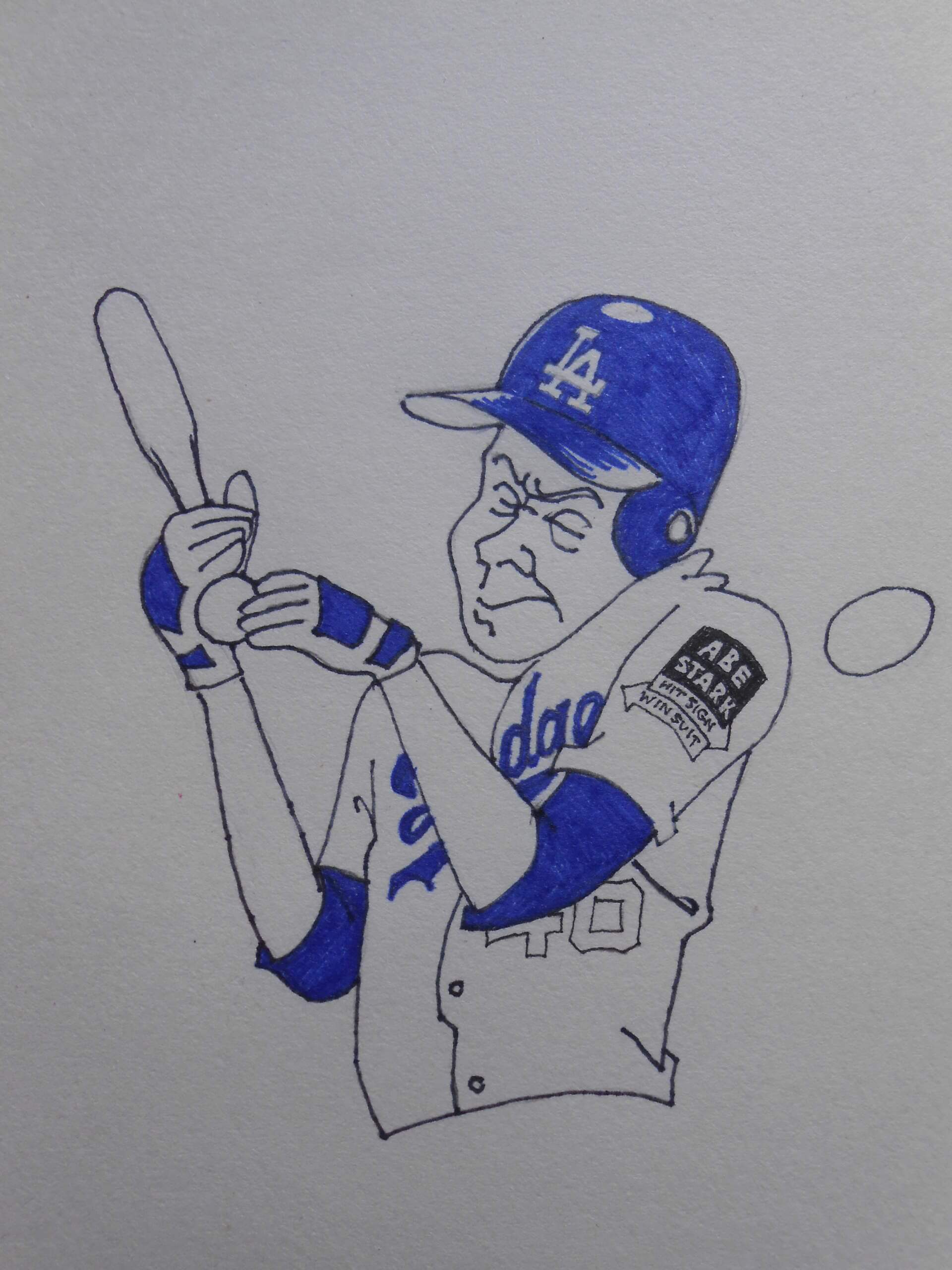
I will judge each ad on its own merits, how well it suits the uniform, and recommend a classier, prettier ad for each team. You will notice some of these advertisers no longer exist, but fondly-remembered ads are the foundation of this piece, and show unexpected joy in a world packed with visual stimuli.
ANGELS

I rather like the FBM insignia for its Cypress Tree … and I like the ad because it removes a superfluous roundel from the uniform. I realize this will be a bone of contention: just because the team designed it DOES NOT mean it belongs there. The extra color makes it look more fun than the original.
Original Logo: C. Presentation on Uniform: B. Preferred Alternative: The amusement park down the street? Maybe you’ve heard of it?
ASTROS

Putting an ad on the tequila sunrise pullovers would have been an act of vandalism, but we’re decades beyond that. Houston’s uniforms are boring and overly dark. The cheerful OXY patch lightens the gloom. I defy anybody to say the Astros’ own uniform patch has anything on the advertisement, and would be better left off.
Original Logo: B. Presentation on Uniform: B. Recommended Alternative: Too many to mention; Gulf, Texaco, Sinclair, NASA, etc.
BLUE JAYS

There are precious few logos as attractive as the Blue Jays’ own. At least TD Banks’ is simple, bold, and adds an attractive shade of green.
Original Logo: B. Presentation on the Uniform: B. Recommended Alternative: The CBC logo, preferably the splashy 1974 version.
ATLANTA

Realizing their corporate logo was lacking in refinement, Quikrete opted for the direct approach, depicting one of its products for its sleeve patch. It’s colorful and surprisingly effective, even if it reminds me of the Monty Python sketch where Ron Obvious attempts to jump the English Channel carrying “half a hundred weight of their bricks because they pay all the bills.”
Original Logo: D. Presentation on Uniform: B. Recommended Alternative: With Coca Cola literally down the street, it’s not even up for debate.
BREWERS

A late addition to this list. It isn’t particularly great, but it’s better than either of the Brewers’ uniform patches. Maybe Northwest Mutual should have limited its contribution to the Corinthian column symbol.
Original Logo: B. Presentation on Uniform: C. Preferred Alternative: Take your pick; the Milwaukee Museum of Art, or their cute summerfest logo.
CARDINALS

Appropriately, the year they besmirched their classic uniform with a crappy ad, they spent a year in the basement. Karma? You bet! St. Louis is known as a city where where famous businesses leave, such as Anheuser-Busch, TWA, McDonnell Douglas, the NFL, et al. Stifel is weak sauce.
Original Logo: F. Presentation on Uniform: D (They added red) Recommended Alternative: The company that didn’t leave: Eveready.
DIAMONDBACKS

Admission: I like practically nothing about Arizona’s uniforms, except for the kiss of turquoise on the home jerseys. The Avnet patch is actually the best-looking thing on the jersey, certainly a cut above the snake-head-&-baseball patch. Advertisers know how to make things punchy and don’t fall for baroque tricks that trip up sports franchises. Arizona pushed back and got Avnet to trim the big black square away.
Original Logo: C. Presentation on uniform: B. Recommended Alternative: Though Avnet is a Phoenix-based firm, I want to see the FedEx/Kinko’s snowflake with its beautiful secondary color scheme, so close to the D-backs’ original colorway of purple, turquoise and copper.
GIANTS

This is a case of familiarity breeding contempt. The year they moved to PacBell (Oracle) Park, they introduced tasty buff-colored uniforms inspired by the Willie Mays era. Over time, they cluttered the suits with extra patches, superfluous piping, black (and orange) alternates, and a naff City Connect outfit. Things have descended so badly, the Cruise patch is the best-looking part of the uniform.
Original Logo: D. Presentation on the uniform: B. Recommended Alternative: Either one of the Transamerica logos; the people who built the pyramid.
GUARDIANS

By the way, I appreciate the presence of local businesses representing their home teams, and only when I see a visual epiphany do I step outside the custom. Marathon is yet another petroleum company with a GREAT logo (Mobil, Getty, Flying A)
Original Logo: B Presentation on Uniform: B. Recommended Alternative: National Museum of the American Indian. Because of the history of this team and its previous identity, I think Cleveland should show some humility and draw attention to the plight of the American Indian. Donating the space on the sleeve would be a good place to start.
MARLINS

I don’t like their uniforms (even though they have bright coral in their palette) and I don’t think their advertising partners, ADT, do either. Their patch completely overwhelms the uniform, and the team should have insisted ADT adopt the Miami color scheme. However, the way it dominates the black jersey says less about ADT than it does about the jersey.
Original Logo: D. Presentation on Uniform: F. Recommended Alternative: Starkist Tuna. Charlie the Tuna was just born for a job like this.
METS

The N.Y.M.B.C. deserves credit for for demanding a pound of flesh from its partner, improving the ad in the process. New York Presbyterian Hospital presented the team with a huge white square that was 80% dead space. Steve Cohen insisted on a patch that wasn’t red & white, the colors of the hated Phillies. The resulting rectangle was more colorful and much trimmer.
Original Logo: D. Presentation on Uniform: B. Recommended Alternative: Unicef. Remember, the UN is a New York Institution. And the Mets should pay THEM for the privilege,
REDS

Krogers’ logo is well-designed, but it looks a little ropy and washed out on the Cincinnati jersey. They would have been better advised to go with the colrful and more-chunky Krogers’ filling stations’ logo.
Original Logo: B. Presentation on uniform: D. Recommended Alternative: I am looking at my Crosley record player as I write this, for those committed to local businesses.
RED SOX

I’ve always been enamored of circles arranged in a honeycomb pattern, an Mass Mutual makes the “M” in this fashion. Their logo ought to be more colorful; red couldn’t hurt. I like the ad patch better than the crossed socks on the grey jersey, which I see as superfluous.
Original Logo: B. Presentation on Uniform: B. Recommended Alternative: Three Good Ones: Mutual Life Assurance, the creators of the happy face; Newbury Comics, whose “toothhead” is a riff on said smily face; and the Citgo triangle.
PADRES

The ad on San Diego’s uniform is a product of the Golden Age of Design. It was designed by Morton Goldsboro; I place it in a pantheon containing the Herman Miller insignia and the Westinghouse “W”. You can question its being on a baseball uniform; you CANNOT deny its beauty.
Original Logo: A. Presentation on Uniform: C. Recommended Alternative: How about Northrup Grumman, a San Diego concern. Motorola is headquartered in Chicago.
TIGERS

Meijer is a chain of Michigan supermarkets having a red wordmark with blue circles dotting the “i” and “j”. Detroit insisted on Meijer adopting the Tiger color scheme, subtracting most of the joy.
Original Logo: C. Presentation on uniform: F. Recommended Alternative: Are you old enough to remember the “Put a Tiger In Your Tank” Esso commercials? The friendly tiger cartoon was a recognizable Esso trademark, having sufficient change from Tony the Frosted Flakes Tiger and the baseball team’s insignia.
YANKEES

Who is Cornelius Vander Starr? Trivia contests from now until forever are going to explain he is the first person to have his surname appear on a (unmemorialed) Yankee uniform. Not Gehrig, Ruth, Mantle, Jeter nor Rivera. At least (and this is a stretch, believe you me) Starr Insurance’s colors are navy and white and require no tweaking. The Yankees threw paint on the Mona Lisa.
Original Logo: D. Presentation on Uniform: Left back. Recommended Alternative: The Metropolitan Museum of Art. A highbrow establishment should stick with highbrow partners.
The takeaway from this year’s experiment with sleeve patches is that legacy franchises have a lot more to lose than teams born of expansion. It says a lot that the Bronx Bombers have determined the name “Yankee Stadium” has more value than, say, “Coca Cola Stadium”. I wish they’d shown the same restraint with their jerseys; a reputation is a hard thing to recover.
Thanks, Walter!
OK readers…what say you?


I looooove the concept behind today’s article, and mostly agree with the opinions expressed. One can oppose the presence of uniform advertising and still apply aesthetic judgment to the execution of particular ads on particular uniforms.
As for the trivia, Jackie Robinson’s surname has previously appeared on Yankees jerseys in the form of 4/15 patches, most recently in 2022.
Actually about the Yankees…Brett Gardner beat the advertiser Starr. It was a Players Weekend and he just put his last name on the back. No nickname, no nonsense. So that’s the trivia answer!
The one thing the ads have done is shown that there are way too many junk patches on uniforms.
THANK YOU! There is no reason for 85% of the patches on today’s uniforms. They had it right in the 1960s.
Losing every patch that simply duplicates the cap logo should happen NOW.
There are but a handful of patches I think essential: The Mets’ roundel, the A’s elephant, Tampa Bay’s manta, the Guardians’ crest, and the Cubs’ bear head.
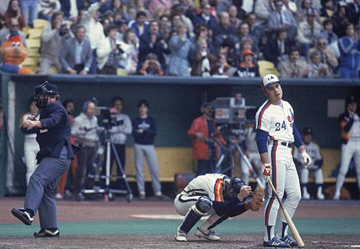
Scoreboard: April 27, 1983; Astros defeat Expos 4-3 at Stade Olympique in Montreal.
Oh no, I made a typo!
Scoreboard: April 27, 1983; Astros defeat Expos 4-2 at Stade Olympique in Montreal.
Mike got it right!
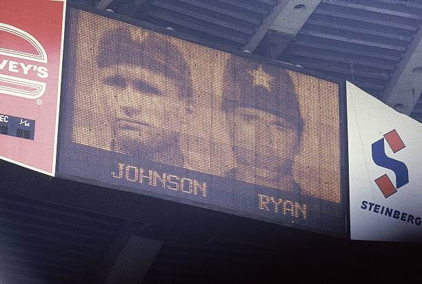
Nolan Ryan becomes the all time MLB K leader!
As an aside, I remember how he and the Phils Steve Carlton went back/forth with this for a while. I hated how Lefty finished up his career (he should have hung it up instead of bouncing around, looking desperate and mostly pitching poorly). I could go on about that, but won’t. Adieu.
Should we play nice while you’re away? ;)
The Uni Tweet of the Day breaks my heart. The trajectory of New England’s uniforms is nothing short of depressing.
Petro logos may come from a golden (silver?) age of design but keep them the heck off my baseball uniforms. Petroleum and gambling ads should be as verboten in baseball as tobacco. Imagine the Marlboro Cincinnati Reds? That’s how I’d feel about the Gulf (or Oxy) astros.
Petroleum conglomerates are Satan incarnate… but they bring an A game to advertising.
Tigers definitely missed the boat not getting Kellogg’s for the ad patch…. and I can’t believe I just wrote that. The Kellogg’s wordmark with Tony the Tiger peeking out from behind? It just fits.
But what would you expect from the organization that has put the wrong Old English D on the jersey for the last few years?
Winnipeg’s reveal is set for 11:45 CT, so about two hours from right as I type this post.
Of course, Minnesota officially unveiled their third, which matches the leaks. Aside from the Reverse Retro-specific references (the orange NHL shield and the inside-collar junk) it’s the exact same, save for a change in the C/A patch treatment. Which also means that, for uniforms themed on the 1978-79 North Stars, it’s keeping the stars on the pants, which were actually from the 1988-91 black pants; they used traditional striping on the green pants worn up to 1988. And Chris Creamer already has a write-up: link
(Also neglected to mention the State of Hockey shoulder patch added to the thirds, but that was also part of the leak…)
Oh, and a question for Walter – regarding the BTO album, I’m assuming you mean “Head On”? (cue “Apply directly to the forehead” joke). Apparently that was released in December 1975, and their next album, “Freeways”, was February 1977, so “Head On” would have been their most current release in 1976.
Admittedly, I am not well-versed in BTO’s discography, so I’m actually not familiar with anything after their early hits, and I don’t think I’ve ever heard any of their songs off either of the two albums I mentioned.
No, “Head On” was actually pretty good. “Freeways” was the turd in the punch bowl, and Randy admitted as much, saying “Looking at it now, we should have taken four, five, six months off … live a little, and then come back together with new ideas. In retrospect, that’s what a lot of great bands do. And we didn’t.”
As nice as that Pats uni-look is, it gets ruined by the modern age. TV numbers reduced to nothing by sleeve caps, shoulder stripes stopping halfway because of Nike tailoring, and don’t get me started on the sorry state of socks in the NFL.
Shoulder hoops are condemned by a “chicken/egg” occurrence: Jersey templates never accommodating a basic feature of about half the teams they serve; and a generation of athletes growing up thinking the truncated stripes are a feature, not a bug.
Finally! Appreciation of the art in advertisements and acknowledgment of the creativeness of the patches.
Embracement of the inevitable is the first step.
Walter has the proper perspective.
While I admit sports uniforms (and franchises) are products of advertisement (and not rebellion against it), I hesitate to concede “embracement of the inevitable.” There are lot of events about to happen that I cannot accept. There’s a world beyond baseball… just not in the purview of this website.
Oh, and they’re getting back together (with Randy’s son, Tal) prompting an internet wag to dub them “Bachman-Turner Do-overdrive”.
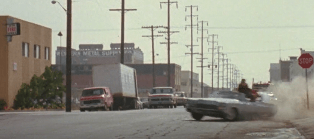
I’m not a San Diegan — though I did visit in 2019 and absolutely LOVED the place — but I find these old location challenges fascinating. I’m not 100% sure that I found it, but through a combination of HistoricAerials.com — a good resource for narrowing down this sort of research — and some Google image searches on the Western Metal Supply Co building and old San Diego aerial photos, it looks like the still image is looking west, at the intersection of K Street and 11th Avenue (then watching the film as that police car speeds by, the camera quick swings around to the south and then looks down K Street to the east). What makes me not 100% sure is that this intersection is completely different now as part of the Petco Park development, so Google Street View doesn’t help in this case. Some of the scenes right after also appear to be in the same part of San Diego, as well.
I’ve mentioned this a few times here, but I just don’t understand why the Yankees are slumming it with Starr Insurance. If a uniform patch is a must, why not a premium brand? Audi, Mercedes, Cadillac, Chase are just a few of the top brands I assume would be interested in appearing on the most famous uniform in sports. It’s not like Starr is paying Shallow Hal a fortune either. Of course, Hal could have scored massive points if he had declared that Yankee uniforms would always be ad-free. Sigh.
Aren’t there some restrictions on teams signing up advertisers for their sleeve patches that compete with official MLB league sponsors? (I could have sworn I read this here on Uni Watch at some point.) Therefore, the Yankees probably couldn’t use Chase (competes with Capital One), couldn’t use Audi (competes with Chevrolet), etc.
MLB does have GEICO as an insurance sponsor, but I assume Starr Insurance is okay because the two companies offer different types of insurance and aren’t really selling to the same consumers.
Most famous uniform in *American sports.
Ah, memories of All in the Family…
STIFEL yourself Edith STIFEL!
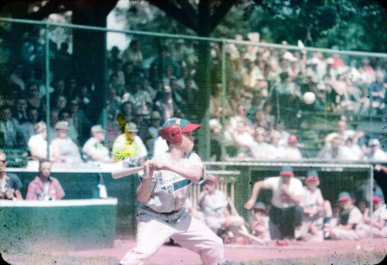
I’ve actually worn those big red headphone-looking things in a Little League game. On the bases.
We wore normal helmets to bat, but they put those huge ear-protection things on us to run the bases. This was in 1972.
For San Diego, I was thinking Qualcomm or maybe even Jack in the Box?
Jack in the Box I like. Goofy and fun, even if the calories are empty.
Technically, none of A-B, TWA or McDonnell Douglas left St. Louis.
They went buyout, buyout, buyout.
A-B is still here and operating and is still a huge presence. They’re just owned by InBev.
McDonnell Douglas is still here with a huge presence, just under Boeing.
TWA was never a “St. Louis” company to begin with. They only moved their HQ here in 1994, before being bought and folded by American Airlines in 2001.
As for the NFL, they similarly left STL like they came—two vagabond teams with bad owners, putting a bad product on the field, constantly shopping for sweetheart deals elsewhere. The Cardinals and Rams were never “St. Louis” teams. Give us our own team, with our own identity, with local ownership and you will see STL support the NFL like they currently do with CITY and the Battlehawks.
Yumpin’ Yoopi
No GTGFTU guesses?
There was no team from Massachusetts in the 1957 Little League World Series, also no team from Massachusetts in 1957 East Regional tournament. I don’t think the photo is from the 1957 LLWS as the background looks nothing like where they played the LLWS from 1947-1958 (what is now known as Carl E. Stotz Field, which is the home of the Original League. It’s located right across the street from Bowman Field, home of the Williamsport Crosscutters [and the annual MLB Little League Classic]). Other than that, I have no idea where this picture was taken.
I take offense to that sleeve patch at the top LOL
I was waiting for someone to notice that!