
[Editor’s Note: With the UFL — that’s the newly merged XFL and USFL — set to begin its inaugural season in a few weeks, deputy editor Phil Hecken and weekend editor-in-waiting Jim Vilk are taking a look at the league’s uniforms. Enjoy! — Paul]
By Phil Hecken and Jim Vilk
Phil here.
Back again today with Part Two of the 2024 UFL uniform unveilings. If you missed yesterday’s Part One, click here.
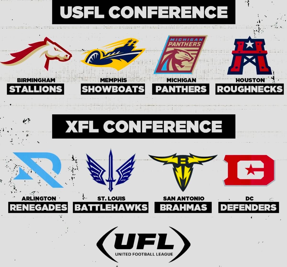
To briefly sum, the new UFL (an amalgam of the former USFL and XFL, which merged following the 2023 seasons for each league) is comprised of eight teams — five from the former XFL and three from the former USFL — and placed into two conferences:
Half of the teams unveiled their 2024 uniforms via video on Wednesday (Birmingham, Memphis, Michigan and DC), and the following four followed suit yesterday: Houston, Arlington, San Antonio and St. Louis. Other than adding the new “(UFL)” logo, it appears as though none of the four teams that released videos of their 2024 uniforms yesterday have any changes. Unlike Wednesday, three of the teams who unveiled yesterday included still photos (of their dark uniforms). So we’ll use those and then screen grabs for the fourth team. Now here’s Jimmer.
Remember the saying “No news is good news”? Well, that was the case for half of yesterday’s UFL photo shoots. I know a lot of you would like to have seen an entire re-do of these four, but it’s not all bad…especially after we get past the first team. Let’s do that quickly and move on from there.
USFL Conference
Houston Roughnecks
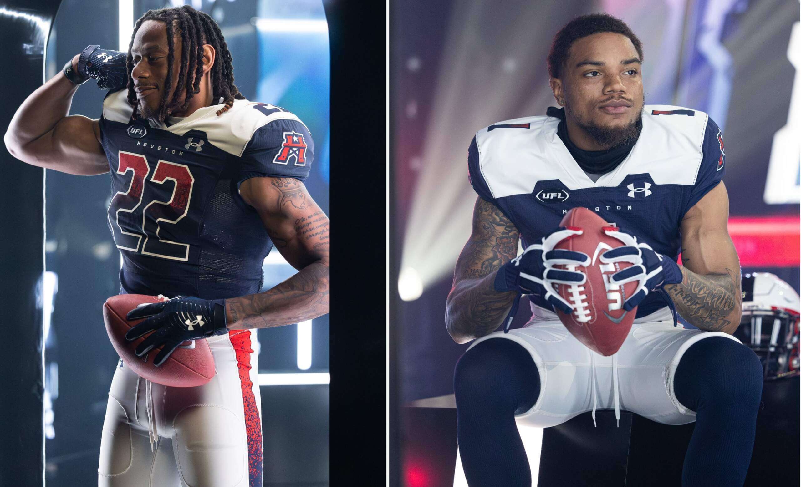
Having way too much fun at media day 😂📸@G7Sewell | @XFLRoughnecks pic.twitter.com/nZjmGemWlB
— UFL (@XFL2023) March 7, 2024
2023 Uniforms
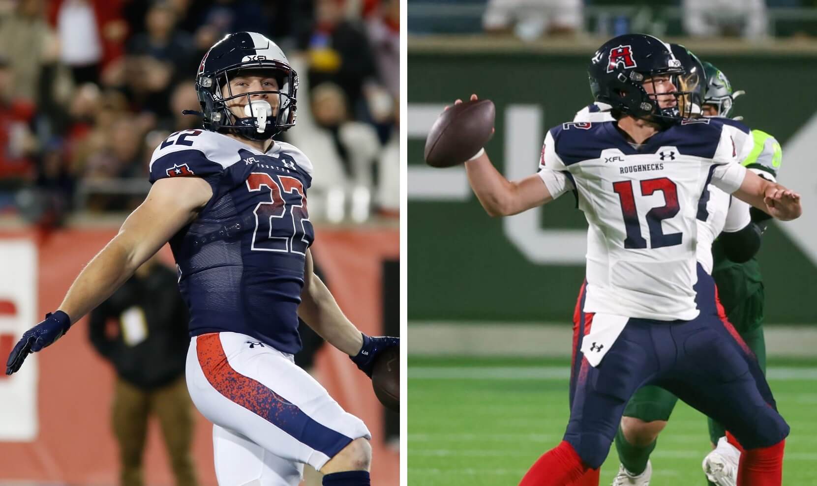
JV: The good news (yes, I found one thing): they’re not mono-blue. The bad news: even without my glasses, I have 20/20 vision when it comes to seeing that Houston downgraded significantly from their inaugural uniforms.
PH: Downgrade from 2020 aside, this uniform has pretty much everything I hate: gradient numbers (with a splatter/gradient for a pants stripe), a poorly-rendered yoke, plus a crazy helmet that’s supposed to mimic the Texas flag. I could go on, but suffice it to say, the worst looking team in the XFL will keep that title in the 2024 UFL.
XFL Conference
Arlington Renegades
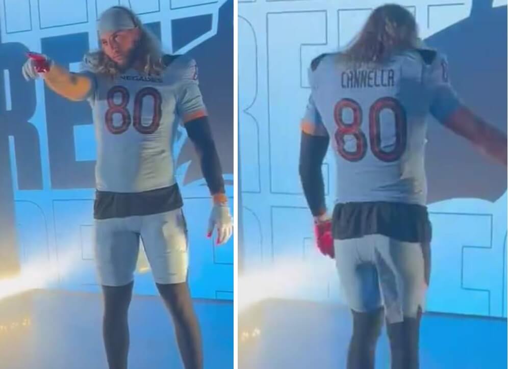
We see you, @salnells 😮💨@XFLRenegades | #UFL2024 pic.twitter.com/jHfRChi2lA
— UFL (@XFL2023) March 7, 2024
2023 Uniforms
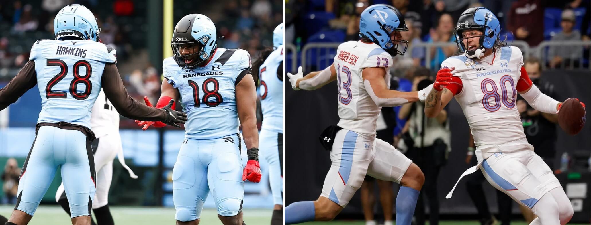
JV: That would make a nice road uniform…better than the one they wore on the road last year. It’s too light to be a home uni.
PH: Other than the oddly designed helmet, the design of which reminds me of a 1960s Ohio State lid, I like the unis — and the white unis kind of give me a Houston Oilers 2009 throwback vibe. About my only complaint would be the odd angular “cuts” on both the home and road pants.
biiiiig season incoming 💪 pic.twitter.com/rf36bybW1O
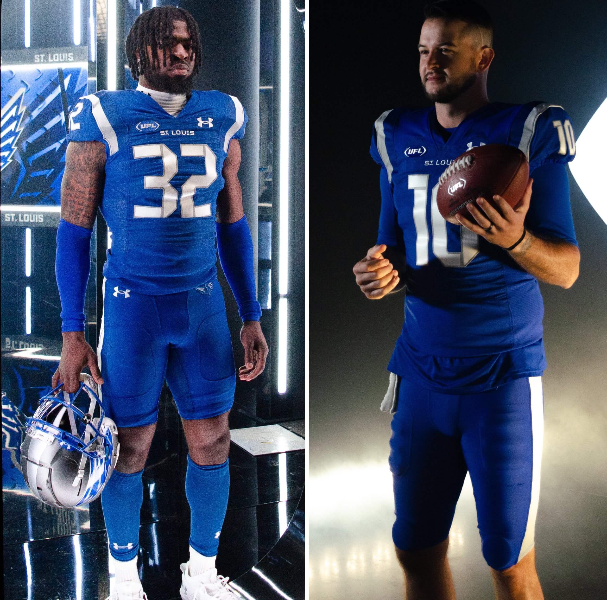
— St. Louis Battlehawks (@XFLBattlehawks) March 7, 2024
2023 Uniforms
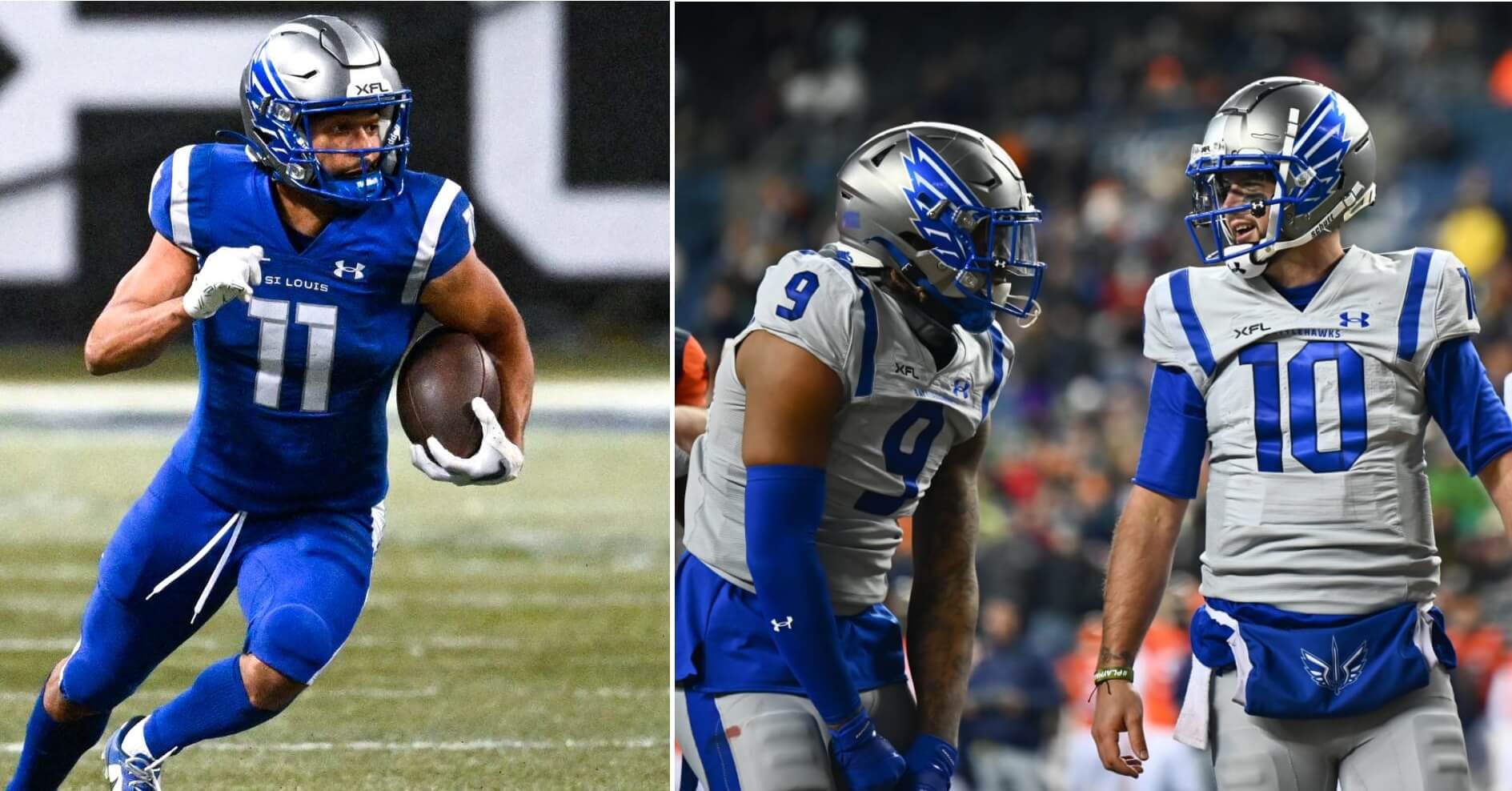
JV: Very solid. I’d prefer silver pants, though, for both home and away.
PH: Agreed. So many of these teams have at least one mono uni, and the Battlehawks have two. Simple solution: wear the silver/gray pants with the blue jersey, and the silver/gray jersey with the blue pants.
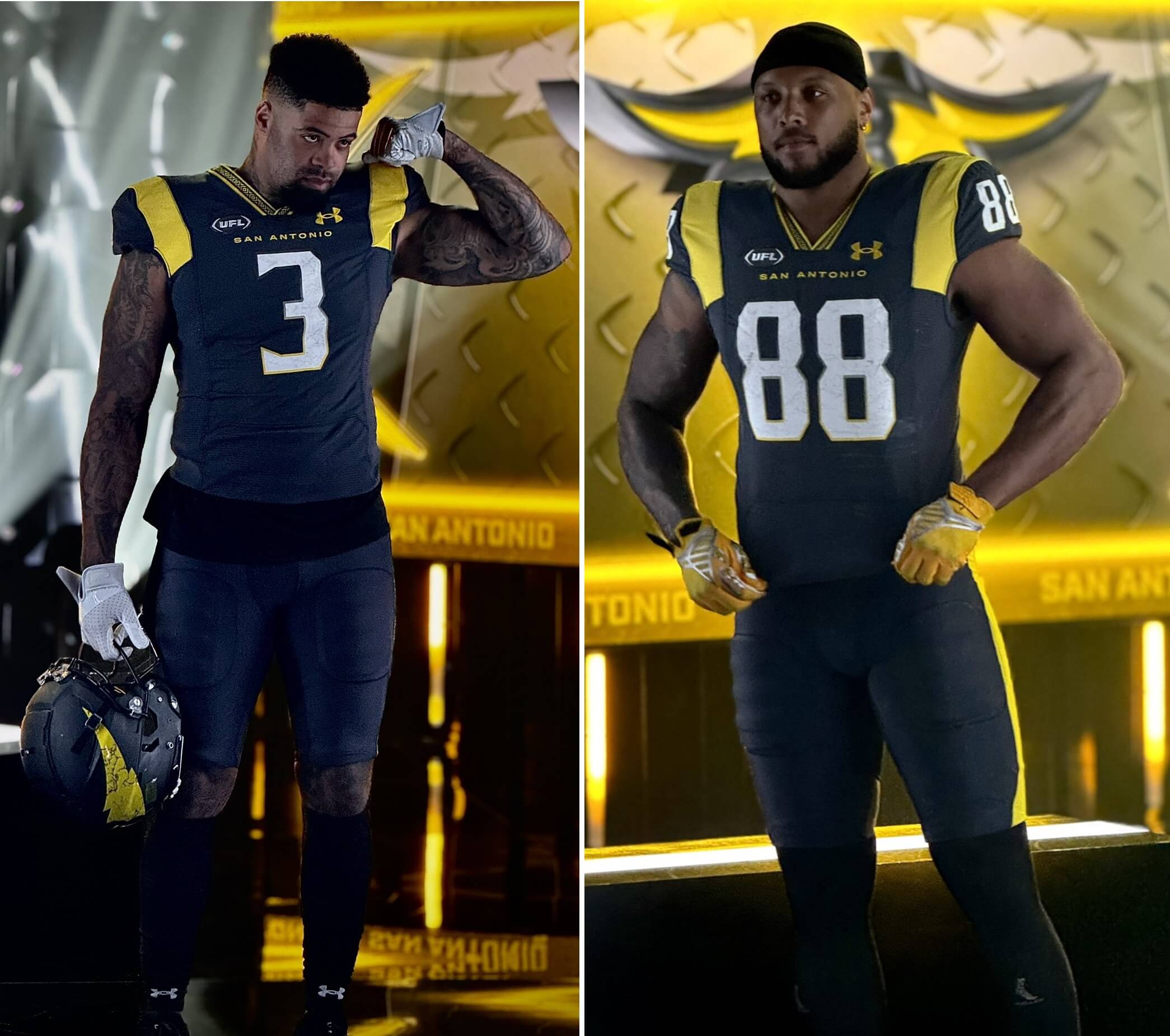
Brahmas in the house ‼️📸🤩@Deestroying | @XFLBrahmas pic.twitter.com/MId2kMDjvr
— UFL (@XFL2023) March 7, 2024
2023 Uniforms
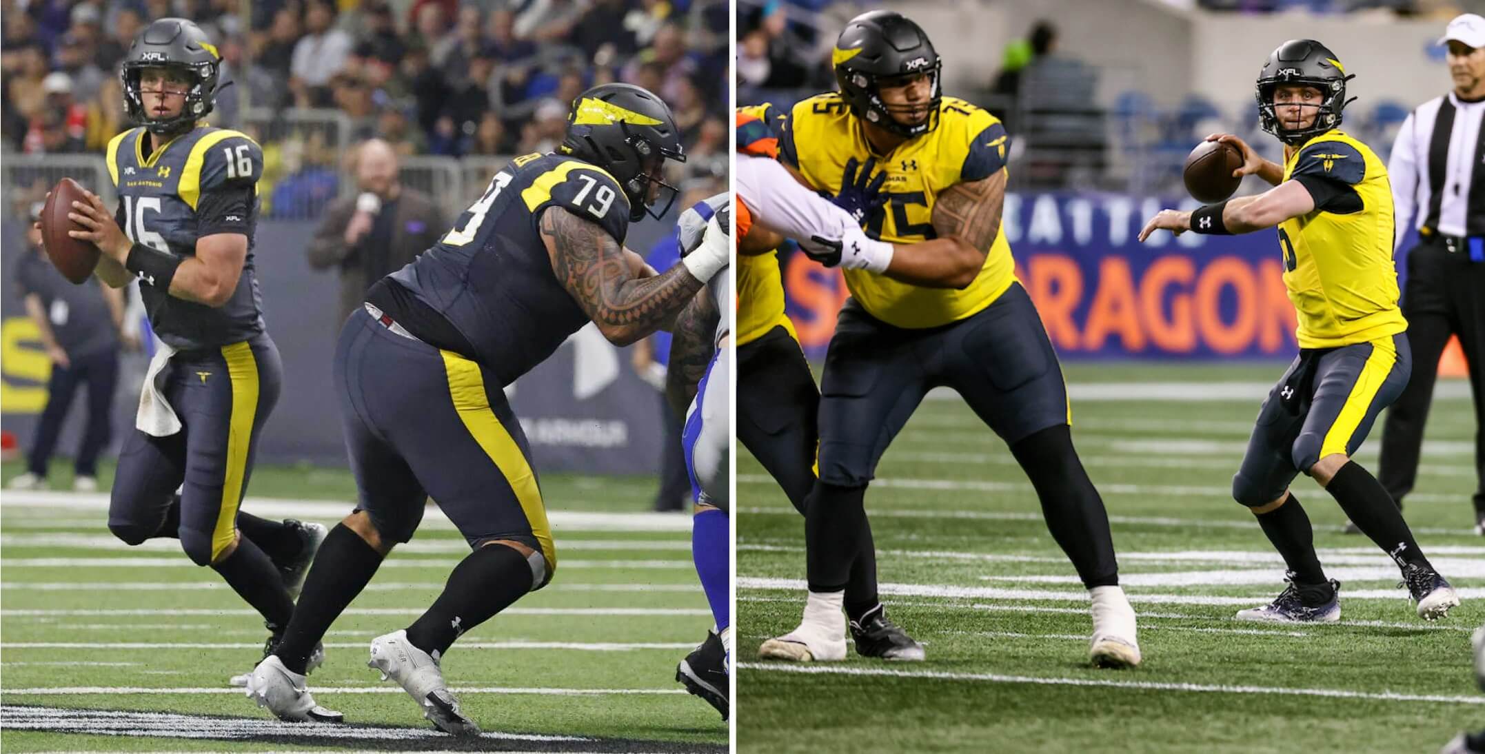
JV: (Channeling Jimmie Walker) Anthracite is my Kryptonite. Paired with a yellow so bright, it’s mono done right and it looks…dy-no-mite!
PH: Good Times aside, this is my favorite of the XFL uniforms — the anthracite and yellow work well together, and they use enough of each to keep even the mono-anthracite uni from being too anthracite heavy (unlike some teams). And the yellow over anthracite is fantastic. My only complaint with these is the stupid wraparound helmet sticker.
JV: While I love shoulder stripes, three out of four teams having them (and going mono below the neck) is a bit much. There’s room for improvement here, but don’t touch San Antonio. I think they share the title of Best UFL Uniform with the Michigan Panthers. Now let’s see how they look on the field!
PH: The former USFL is definitely bringing a stronger uni-game overall to the UFL, but (shockingly perhaps) I’m in total agreement with Jimmer over the two best kits in this new league: Michigan and San Antonio. If this incarnation survives for another season in 2025 (fingers crossed!) I’d like to see a few changes, but overall and for this season, this will be a pretty good looking league.
Isn’t the Houston team the USFL team that decided to change their name to the Houston XFL name?
Sad that even during photo shoots they think it’s OK to have the undershirt hang out.
Yes.
And I agree.
Since these Gamblers never played in Houston, and the Roughnecks already had a fan base, I believe that’s why they made the switch. Makes sense, but certainly not from a uni standpoint.
Battlehawks wore Gray over Blue once last season. It was the March 25 Week 6 game at Vegas.
link
I wish they had done the other way around as Blue over Gray would look really good
Where’s the see-thru pants?
The apparent lack of balance of the league and maker’s logos was bothering me, until I zoomed in put an identical box around each. Turns out while the UFL logo is wide, and the UA logo it tall, they actually live in the same sized space on the uniform:
link
Final season. Yay.
At least some nice color v color games in the pipeline.
San Antonio seems to have a gradient for the border layer on the numbers, which makes them appear thicker at the bottom than at the top. Has any team done that before?
I wholeheartedly disagree with you on the Houston uniforms. I think they look a million times better than the 2020 version, which looked cartoony and boring. All the USFL uniforms are just bland and boring.