
[Editor’s Note: With the UFL — that’s the newly merged XFL and USFL — set to begin its inaugural season in a few weeks, deputy editor Phil Hecken and weekend editor-in-waiting Jim Vilk are taking a look at the league’s uniforms. Enjoy! — Paul]
By Phil Hecken and Jim Vilk
Good Thursday morning, Uni Watchers. As you are probably aware, the two spring football leagues — the XFL and the USFL — have now merged, forming the United Football League, and games are scheduled to kick off at the end of this month.
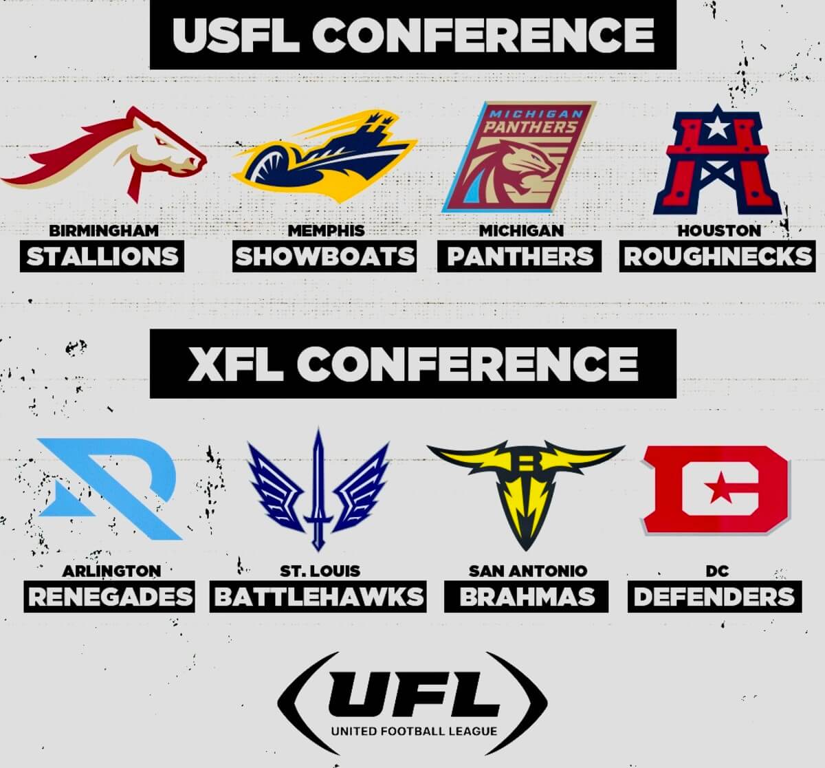
Originally, four teams from each of the predecessor leagues were scheduled to be represented in the new eight-team league: the Birmingham Stallions, Memphis Showboats, Michigan Panthers, and Houston Gamblers from the USFL, and the Arlington Renegades, DC Defenders, San Antonio Brahmas, and St. Louis Battlehawks from the XFL. However, at the last minute, the new league swapped out the USFL’s Houston Gamblers and added in the XFL’s Houston Roughnecks. The original divisions placed the four USFL teams in one division, with the XFL’s teams making up the other division. After the swap, the divisions are as follows:
Yesterday was “Media Day One,” and four teams released videos showing their “new” uniforms for 2024. While there are some changes, most of the teams will look as they did during 2023. We’ll take a look at the four who unveiled yesterday along with some brief comments.
Here’s Jim with his introduction, then we’ll look at the four teams who released Media Day videos yesterday.
Yesterday at UFL Media Day, Part One, the DC Defenders from the old XFL joined the three surviving USFL teams, the Birmingham Stallions, Memphis Showboats and Michigan Panthers. This gave people on Twitter the opportunity to see the new Under Armour treatment for the USFL teams’ uniforms. It might be a safe assumption that the XFL uniforms will remain unchanged, since they already were designed by UA. I reached out to the UFL Communications Department to see if that was the case but have not received a reply. If and when I do, I’ll let you know, but for now it appears we have an idea of what the UFL will look like when the league kicks off on March 30.
The league template features the UA logo on the left chest and right thigh, the UFL logo on the right chest, and the team logo on the left thigh. For the USFL teams, each team name links to last year’s unis. Now, let’s dive in and see what’s in store for 2024.
USFL Conference
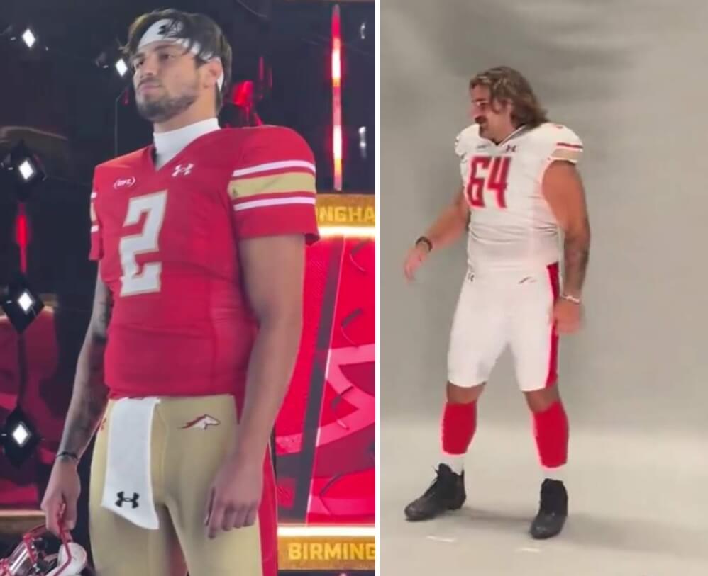
Fear tactic alllllll time low 🥴🤣@_Jstern x @USFLStallions pic.twitter.com/gKOBNFfHSu
— UFL (XFL) (@XFL2023) March 6, 2024
JV: The one team I was hoping would get a tweak remains basically unchanged, right down to the same clunky rectangular number font. I also wanted a return to the 1983 gold road pants, but I’m stuck with white over white.
PH: I really like their home unis, although the squareish font and fat leg stripe could use some tweaking. I’m not sure why they can’t wear the tan pants with the road jersey either.
Year 3 🙏🏾 #blessed pic.twitter.com/gYZ2mYTvM4
— The Shark (@jmcculloch17) March 6, 2024
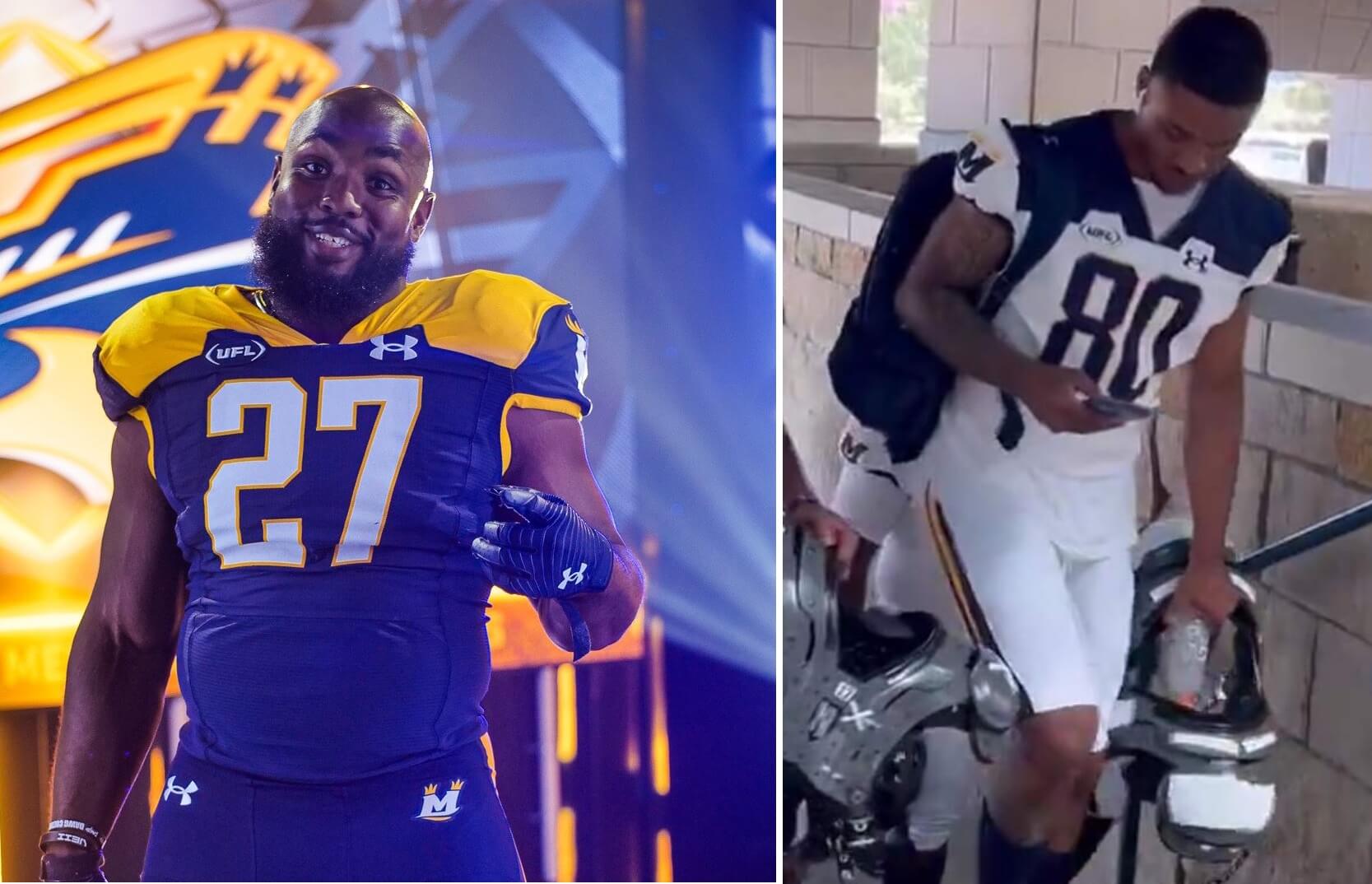
BOATS IN THE HOUSE 🚤🔥#SHOWTIME🤩 pic.twitter.com/6TYgLv6KGH
— UFL (XFL) (@XFL2023) March 6, 2024
JV: The bad news: They’ve gone mono-blue at home. The good news: The contrasting yokes and pants stripes remain!
PH: The yokes are the worst part of this uniform — well, that and going mono blue this year (last year they wore white pants with blue jerseys). But the navy and gold colors are great, even if they remind me a little bit of Toledo.
Uniforms so crisp 😮💨@LaColbyT | @XFL2023 pic.twitter.com/x8ZARAMBJm
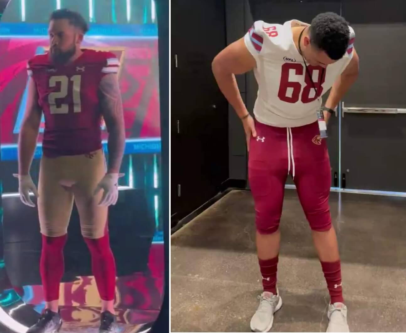
— Michigan Panthers (@USFLPanthers) March 6, 2024
JV: The good news: Plum Pants Alert on the road unis! The even better news: no jersey ad like last year!!
PH: I didn’t so much mind their tan pants — and I hope this doesn’t lead to a mono-royal plum outfit. But this was one of my favorite USFL unis from 2023 so I’m glad the only major changes were the tan-to-plum pants (and the removal of the ad!).
XFL Conference
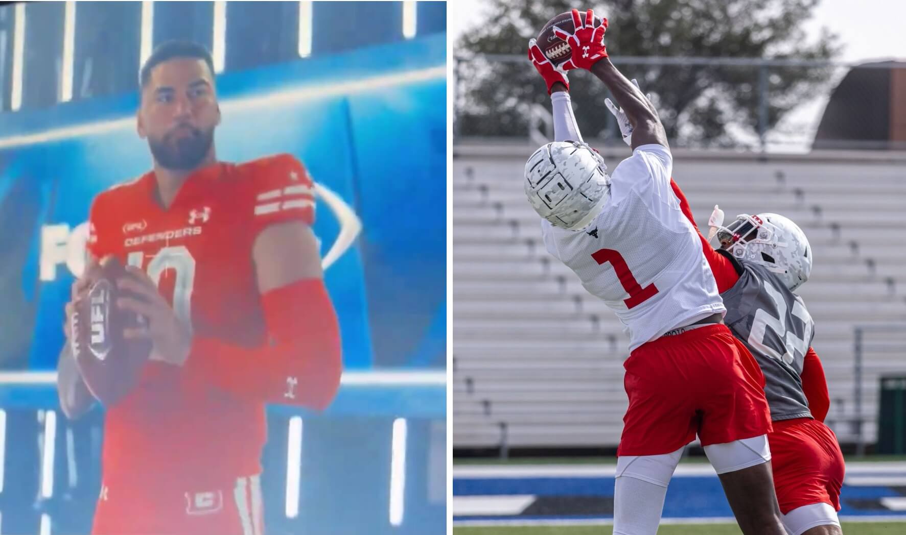
DC Defenders
You heard it from Briley Moore here first !
Grab your season 🎟️ from the link below ‼️#UFL2024 | #DefendDC pic.twitter.com/8PO35815be
— D.C. Defenders (@XFLDefenders) March 6, 2024
JV: Looks like the same red over red from last year (and from seeing training camp photos, they’re keeping the subtle camo on the white helmets), except for the UFL patch. Hoping they keep the white over red on the road, but I only saw the home uni.
PH: I generally prefer the USFL unis to those of the XFL, and that’s true here — I don’t like white helmeted teams going mono-dark, and the camo is also present on the white jersey. But all things considered, this isn’t a terrible uni.
JV: After seeing Day One, I’m as relieved as I was when the USFL released its 2022 unis. Some changes, but nothing drastic. Hopefully, one team will drastically change today (cough, Houston, cough-cough), but we’ll see what happens.
PH: Although some things could change today, I’d expect the four former XFL teams to keep their same basic unis from 2023 — and that’s definitely not a bad thing. I wish more teams would have revealed some still photos, but we’ll have to make do with videos for now. Jim and I will probably take another look at the new, merged league once the full uniforms have been worn on the field.
We’ll be back tomorrow with the Media Day Two unveilings and any updates from Day One.


Ugggghhhhhh. More mono uniforms………
So this is how the USFL dies…. in thunderous monofication! The only team left now without a mono option is the Stallions and I can’t imagine that lasting long. These are dark days indeed for football uniforms.
Maybe I’m just too old to understand the trend. I get it for when it was a thing once a year for big games. But seeing it week in and week out gets old.
Some of those UFL unis look like they were inspired by the Create-A-Team template from Quarterback Club 98 for the N64.
The ad cutouts make the yokes on the Memphis uniforms 100% worse.
Those notches are obnoxious — I’ll grant you that. But technically those aren’t ads; one is the new league logo (UFL) and makers mark.
I *get* the new logo is supposed to evoke a football, but to me it looks like parentheses surrounding “UFL”.
No, technically the UA logo is an ad, there are no “maker’s marks” in the context of clothing. They are paying to put their logo on a place where it can be seen by the public for the pupose of promoting their brand. That’s an ad by any definition. Especially true in the case of Nike now that we all knw they don’t make the uniforms (not sure about UA).
I love that it’s a big, bold, block of a yoke, but yeah, they went and ruined it with those cutouts. If the only reason for them is the logos, they should have moved the logos up and away and rendered them in navy (on the yellow yoke) and white or yellow (on the blue yoke) and not done the cutouts. Again, if that is the reason, I feel again, that at the professional level, customization and quirks on a team by team basis should be policy. It shouldn’t be “this is what we’re making, this and only this. Whatever you want has to fit into this or you have to make changes to what you want.” It should be “well make whatever you want, however we have to do it”.
Woof… those notches are all “ReeBox”‘s fault.
In theory, I should hate the Panthers “Boston College with carolina blue accents” uniforms. But something about it just kinda works?
The original USFL Michigan Panthers unis are a design classic from the era of peak uni design. The USFL2 Panthers are a pastiche but at least they kept some of the spirit of the original design. What is left now is the sad last remnant of a USFL bygone age.
Sorry… I think I’ve been spending too much time doing fantasy land What-Ifs Uniforms and watching old 1980s T”he NFL This Week” on Comrade Dobler’s YT Channel :) link
1000% agreed on this, especially how great the original was, a new classic, right from the start
I agree. I remember seeing their unis when the USFL first came about in the ’80s, and at first I said, “Maroon, Champagne (yes, tan/gold) and that blue? How strange!” But somehow the blue and champagne/tan/gold go together, and the dark maroon works. Had they used a brighter red, I wouldn’t have liked it as much.
The Panthers somehow made champagne, plum and light blue work.
Now, if you want BC Redux, you have the Stallions.
When the ’83 Panthers took the field, my first thought was “Wow!” Loved the unis and the colors.
When the ’22 and ’24 Panthers revealed their unis, my first thought was “Whew!” Glad they kept the colors, and at least the design harkens back to the original.
’23… that ad patch ruined it so much that I gave away my Panthers T-shirt for Vilkmas. If they stay ad-free this year I may have to get another one.
That is a cool historical photo of the women’s baseball team.
Also, I love the cat photo. Pets can bring so much joy.
Agreed, amazing photo. But why are both Ss on the lower left player’s uniform backward? I couldn’t look away…
Birmingham and Michigan look waaay too similar.
In those photos maybe but they really don’t t look similar on TV or in person.
Re the can of the day. My favorite part is the old salty sailor. Being one myself, I suppose. The way the cartoon is drawn, the monocular is piercing him… ouch!
When I bake a soft pretzel and I want to salt it, I will put some salt on the side of my plate in honey mustard to better control salt distribution.
I love that there’s no food on the plate, as well… reminds me of watching the older folks when I was little, poor salt and pepper onto an empty plate and then dip boiled eggs into it, was a thing…
Michigan’s new champagne pants are not as good as last year. The plum looks ok, but not as good as last year.
All of this is relative, considering I haven’t paid all that much attention to the revived USFL.
But, as a native Memphian, I can’t stand the Showboats uniforms. One, their originals 80s USFL colors were red and silver. I suppose with all the other red-dominant teams in their division, they needed to break it up a little, but I hate that they moved away from those completely. Second, this mono-blue set (and mono-white, for that matter) are just ugly. I’ll just never understand how dreck like this makes it off the drawing board.
I understood the color change, but I wish they would have kept the old logo, or moved the new sleeve logo to the helmet.
The current helmet logo looks more like a speedboat than a showboat.
Three of these teams look basically the same. Not super creative.
Thanks. Came here to say that.
I was 14 when the USFL began play, and like many kids that age who begin forming their tastes and interest in music, this league was the genesis for me in a lifelong interest in uniform design.
It also spoke to me loving the underdog (I always wished it could’ve survived).
My membership card is proof. (Go Stars!)
With all that said, the league is dead, and so are my Philly Stars, so I don’t mind saying these uniforms are horrible in just about every way. I can also say that when this iteration of the league goes away, I won’t miss it.
-C.
I miss the Stars as well. And I miss the USFL…both versions.
No, this isn’t the same thing but I’m going to give it a shot anyway. Beats watching Manfred League Baseball, that’s for sure.
I wasn’t really in a position to watch the original iteration of the Stars, but I am absolutely gutted not only that the Stars didn’t survive the merger, but that we were never given a chance to show that the city could support them. The league is dead to me until and unless they come back in a future year.
That said, presuming not many changes for the as yet unrevealed teams, the Battlehawks are going to be the best-dressed this year.
From a uni standpoint, my USFL (original) faves were the Oakland Invaders, Michigan Panthers, Boston Breakers and Denver Gold. I was sorry to see the Breakers (NO, Boston, wherever) not survive as that was a great uni, helmet and color combo. Invaders too, and great nicknames. Sigh.
Always liked the Washington Federals, too. Great coordination of helmet, sleeve (what’s that), pants and sock stripes. Too bad the team blew dog.
It would have been nice if they showed the helmet more.
YES.
It remains stupid that the “Arlington” Renegades haven’t changed their logo. It’s clearly a “D” and “R” and makes no sense.
2 of the teams look exactly the same. 3 teams in a 4 team conference wearing red as primary. Eho were the marketing gemiuses that came up with this?
2 of the teams look exactly the same. 3 teams in a 4 team conference wearing red as primary. Who were the marketing geniuses that came up with this?
DC is in the XFL conference.
Plum is not red..
So, one team in the USFL conference has red as the primary color.
If you say so. Maybe it just doesn’t show up very well in the photos that were posted, but I really don’t see much of a difference in the color of the Birmingham Stallions and Michigan Panthers. The home uniforms look very similar except that Michigan has the light blue accents on the sleeve stripes.
Why did some teams unveil uniforms without the helmet? That’s the most important (and best IMO) part of the uniform.
Agreed!
Birmingham and Michigan’s color scheme is too similar. There’s enough colors in the color palette for that to never happen. Clearly based off of NFL’s Washington and San Francisco. But in all honesty if you don’t have a team in your city or at least your state you have no interest in supporting this. Expecting eight cities to REALISTICALLY support an entire league seems a bit ASSinine. Geographically my state would be closer to Birmingham and I can honestly tell you I don’t care if their bus breaks down on the way to the game.
Why such hate? If you don’t want to watch, don’t!
Apparently they didn’t swap out the Gamblers for the Roughnecks. The Roughnecks organization was shelved, but the name and logo were given to the Gamblers organization, with the original Roughnecks coaching staff being reassigned to San Antonio. Not that there’s a long a storied history, but if one would want to say that the “new USFL” was at least a spiritual descendant of 80’s USFL, then the 2024 Roughnecks share a lineage with the the team that Jim Kelly and Gerald “Ice Cube” McNeil played for in the 80’s.
File this under “things I learned on Wikipedia last week.”
Birmingham – red and light gold/tan
Michigan – royal plum, champagne and light blue
Not hard to tell them apart. Saw these two play two years ago, in person, they are totally different color schemes.
Thank you. Truly puzzled by the amount of comments saying they look the same.
They probably REALLY didn’t like the Bandits, Blitz and Showboats all wearing silver/red/silver back in the original USFL…
I mean…at a quick glance they have some similarities — light (tan vs. gold) hats and pants, red family (red vs. “royal plum”) for jerseys. But c’mon…
link
Thanks for the link, Phil. They look MUCH more different in that side by side than they do in the photos shown in the article above.
For the 1984 and 1985 seasons, the Stallions wore white over white. Might be why they’re doing it now.
Yeah, and I didn’t like it back then either.
The Panthers’ plum color looks lighter now.
What are you talking about? Birmingham was the only USFL uni that didn’t look like trash…