THIS POST HAS BEEN UPDATED: SCROLL TO BOTTOM FOR UPDATE
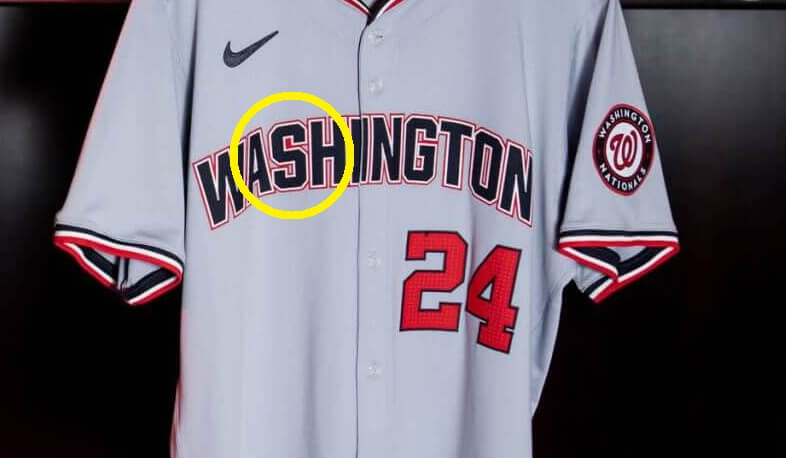
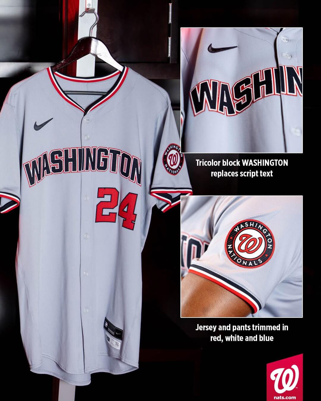
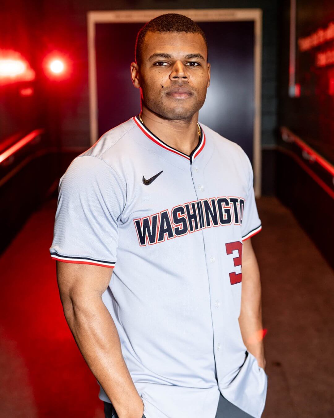
As you’re all likely aware by now, the Washington Nationals unveiled two new jerseys on Friday.
One detail that escaped my attention has to do with what may be a quirk — but also possibly a mistake — in the way the team has rendered the “S” on the road jersey.
Take a look at the above photo.
Now let’s take a closer look:
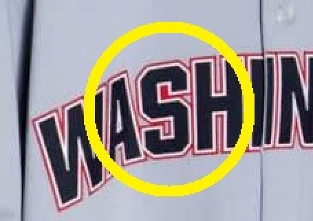
Notice anything amiss? The “S” in “WASHINGTON” appears to have the top part of the “S” with a solid red block, while the bottom part has the appropriate negative space.
I’d write this off as just a simple error on the jersey in question. Except the team showed off several different looks (and likely at least more than one jersey). All of them feature this quirk.
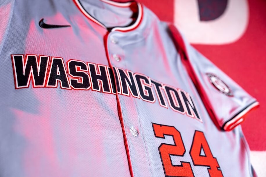
“OK,” you’re saying. “That jersey, and the one at the top of the page, are both No. 24,” (for the year). “That’s the same jersey, so it’s still just a one-off mistake.”
You’d be correct. However, the team also unveiled photos of a jersey’ed player (this time wearing No. 36):
Here’s another shot:
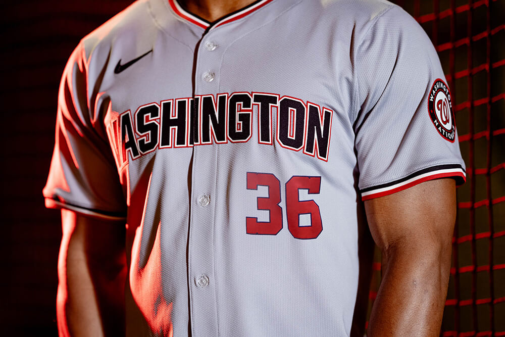
This jersey also features the solid red/negative space within the “S” as the No. 24 jersey. Obviously these are two different jerseys, but the mistake/quirk is still there.
Each angle and enlargement shows the same “feature”:


Unfortunately, these are the only two definitely different new road jerseys I’ve seen. And as of now, the Team Store isn’t showing the new jersey for sale just yet. Additionally, our source with access to the MLB Style Guide indicates that, for some unknown reason, the Nationals are the only team for whom the 2024 Guide isn’t accessible at all. The “Nats section of the style guide is grayed out and links to a 404 page. Says unavailable until team unveiling on Feb 1.”
So, at least for a few days, we can’t see if this “quirk” exists on the style sheet as well.
It is possible there is a bit of gray in the top section that looks solid red in photos, but it’s so miniscule as to appear solid red. We’ll need to see another jersey or the SG to know for sure if it’s solid red or simply contains a space that’s basically impossible to discern.
Whether this is a mistake or simply a design quirk remains unknown at present. Either way, if it is permanent, this is one look we won’t be able to unsee.
UPDATE!
A pair of newly released photos show at least one of the new road jerseys with the “proper” S. It’s the same player, so it’s not two different jerseys — but there is at least one jersey (so far) without the mistake/quirk. Also note the jersey does NOT have front numbers, so I’m not sure if this is an actual on-field authentic.
I will never be able to unsee that. Please don’t let this be real.
Oops, better come up with some post-mistake ‘storytelling’… How about the red in the negative space of the S represents a cherry from Washington’s famous cherry trees? Yeah, that’s it, a cherry.
The whole JERSEY is a mistake. They shouldn’t have gotten rid of the scripted one! This only serves to make it worse.
This reminds me of a jersey someone might sell from a shopping cart outside the stadium on game day, making it sort of like the real jerseys, but generic enough to avoid getting in trouble for trademark violation.
Both of these new unis are a waste of time. The Nats have never had great unis, and they are constantly fiddling with them but these should have hit the cutting room floor and stayed there. One puts me to sleep and the other gives me nightmares. The F—KING wishbone collar?! Kill that design element with the fire of 1000 hells already.
But this “negative space” mismatch just gives me lazy Nike vibes through and through.
I didn’t think I would ever come across anyone else that dislikes wishbone collars as much as I do. They have been prevalent on NBA jerseys for a long time. I don’t know why the manufacturer thought they would look good. Why they need to die once and for all. What is so wrong with a simple and clean rounded collar?
What is so wrong with a simple and clean
roundedv-neck collar?It’s a key there to prevent it from being put in upside down…
As the letters are vertically arched, placing it in upside down would stick out like a sore thumb, even without the red menace.
And how about that triangle to the right of that red square? The top part of the S is connected to the H via that triangle. I can’t wait to see if someone this season wears a jersey with the S flipped over. That’s the way the Natinals roll.
LOL. Strong finish with humor there, Patrick.
Phil, I am totally looking forward to this season to see if that S will ever be applied upside down like S on the Twins home jersey from 87-09 would sometimes be. Btw, i am working on a fan submitted article about that for when you guys have a slow day of no news. Kinda something i hope Paul has never heard about before his retirement.
“i am working on a fan submitted article about that for when you guys have a slow day of no news”
Looking forward to it!
It is clearly how the digital art is rendered and thus ALL jerseys manufactured using that digital art will be the same. These are not cut and sewn individually. They made in bulk by machines. Unless this is something that the team feels is important enough to “correct” it should be on all of their jerseys, on-field, authentic, replica, etc…
Exactly. Unless the letters are individually applied, and they’re almost certainly not given the stupid double outline, this is a feature of the lettering. It also creates for me the illusion that the opening in the top loop of the S is larger than the opening in the bottom, which tends to make the whole letter appear to be upside-down. Mistake or quirk? That’s a clown question, bro. It’s deliberately chosen, intentional bad design. The Natsiest move of all.
When I first looked at it, I thought the quirk WAS that the S was upside-down. It jumped out at me immediately.
I can absolutely believe that they broke the dang word mark in the middle of the I. It’s the skinniest letter there is and it’s straight up and down with no serifs. Let’s all take a moment to imagine how easy it would have been to avoid that issue and instead have the cleanest word break in all of baseball. Rather than breaking it in the middle of the I.
That’s a big ask from Nike, who seems to be going out of their way to screw up even the most basic designs.
This gives me flashbacks to the time some players had “NATINALS” on their jerseys
Not as maddening as the filled in negative space in the University of Houston’s logo.
link
WHY?!
Why do all of my favorite pro teams (all DC) have the worst uniforms outside of the Caps? Even those aren’t great. Like a punch in the gut.
I’m sorry but the Capitals have the worst uniforms in the NHL by a mile. Wordmarks never look good on a hockey jersey and theirs isn’t particularly strong. Add the outdated-by-20-years piping and the pretty strong uniform league that the NHL is and you have easily the worst in the league. The worst part is they’re not terribly branded, they could easily have a great uniform while keeping their logos and colors. All they’d need to do is remove the piping and put the eagle logo as the crest.
I don’t think this is a mistake. A properly written “S” has a slightly smaller loop radius compared to the bottom loop. Most computer/block fonts ignore this, but it is technically correct.
“A properly written “S” has a slightly smaller loop radius compared to the bottom loop. Most computer/block fonts ignore this, but it is technically correct.”
^^^^ This is why^^^^
I’m happy to see that at least one person knows the correct reason for this. That said, I’m surprised they didn’t adjust it just a bit to allow for some background to show through, just for the sake of it not looking so bad/out of place.
“A properly written “S” has a slightly smaller loop radius compared to the bottom loop. “
Not necessarily. It depends on the font family. (Unless you’re referring to a “handwritten” S, in which case, that is how it was taught — slightly smaller loop at the top — in school. Can’t say if that’s still how it’s taught.)
But there are several block-style fonts where the S’ loop is symmetrical top and bottom. I’m not saying that’s the case here, but it’s entirely possible.
I thought that the error was that the S was upside down. The top half seems bulkier to me, more fitting to be S’s base.
Might be how they make sure the “S” is turned the right way??????
Just a terrible jersey all around.
Looks cheap and worse than what a Legion team would wear.
Whatever the reasoning for rendering the S with that solid square at the top was tossed out the window with the rendering for the G. Technically, the 3-part lettering has a solid red base upon which the white, then navy, lettering is stitched. That part of the “S” was left solid, but the “G” has an open. This is definitely intentional, and it could be how the designer left their “signature” on the jersey.
I really do not understand the point of this jersey in general. The previous grey was perfect with the set. All had cursive font. This one looks out of place with the rest. It’s also generally ugly. Mistake or not they just totally missed with this one.
Is someone in the design department calling out for help?
Could be an omage to the Washington Senators? How am I the 1st to think of this? I root for the team the Senators became….
Homage?
In my estimation, the filled in space should not be there. An S in almost every font has the same width top to bottom. I could see the upper loop being less tall than the lower in some fonts, but that would not affect the negative space width.
So while I believe it should not be there in good font design, it still may have been put there on purpose for some reason we don’t know. Font designers today seem clueless.
I took the liberty of removing the extra red and it would look normal. There is plenty of room to have negative space.
link
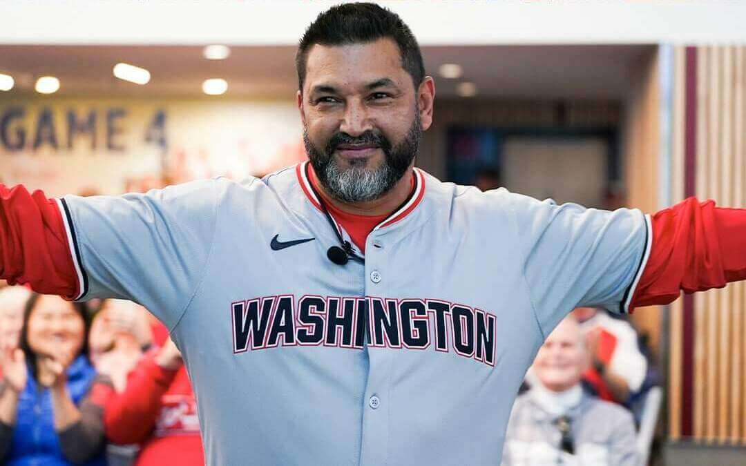
This post has now been updated. A pair of photos now shows a road jersey with the “proper” S (scroll back to the bottom of the writeup to see.
The jersey in question does NOT have a front number — so it’s possible it’s not an authentic, on-field. But the “S” is definitely fixed.
Not a good looking uni in the whole set. Ick. You got senators, you got expos, you got patriotism. And every one of their unis is a whiff.
Wow. Those are seriously underwhelming and uninspired uniforms. Nike gonna Nike.
Could it be paying homage to the Washington senators?
Having a quirk in there would only be an improvement. What an uninspiring downgrade.
The pullover is just terrible, too. Sorry Nats fans, gonna be a long year.
Overall a big downgrade. The Nats had a decent set with the scripted wordmark. Not anymore.
That’s not a current player wearing the new Washington Nationals road jersey, that’s Nationals manager Dave Martinez. However, it appears that none of these jerseys have numbers.
Still going to miss the script “Washington” on the road jerseys.
Was at the event on Saturday. They unveiled them as the on-field jerseys. No current players modeling might be why they went without numbers. I don’t mind the new road grays though I liked the script better. The alt jersey is horrible. Looks like one of those fan shirts you can get on the MLB Shop. Or batting practice at the most. Hope it won’t be around long.
Of note…on the images provided of the new pullover top, the marketing images are of Stone Garrett. The new DC outline patch appears on this left arm. All of the other pullover jersey images show this patch on the right arm. It seems plausible that an Ad Patch is incoming, and the Nats will begin having patches that jump from side to side for ad visibility on TV. Unless of course they had to photoshop the patch in because they choose to use an image of Stone where he wasn’t facing the right direction, but that wasnt a concern on the new road jersey, which shows him patch free on his left arm.
Several of these new Nike templates seem to be splitting letters across both flaps of the jersey. What on earth would they do that? Seems like they could avoid doing that.
Well these are the “Natinals!”
The Nats put significant effort into trying to equally be both red and blue in their first years in DC. Understanding that the blue script “Nationals” jersey will forever be associated with the ’19 WS run, it’s weird for them to not have a red option at all. Maybe they’ll circle back to red when they finally retire the cherry blossom alternate…
Without any red this really is a drab set of uniforms.
I think it was because the S is slanted backwards and it caused that negative space to disappear.