Good morning! I’m not aware of any uni-notable developments from the four just-completed NFL playoff games, so we won’t have our usual Monday Morning Uni Watch report today. But don’t worry — I have some big MLB news to share with you.
So: Earlier this month I reported that the Angels appeared to have a 1970s throwback in the works, based on a throwback cap that was being listed for sale in online shops. Several readers quickly noted that the throwback plans seemed to be confirmed by the team’s 2024 promotional schedule, which designates July 25 through Aug. 1 — a seven-game span — as “Throwback Week.”
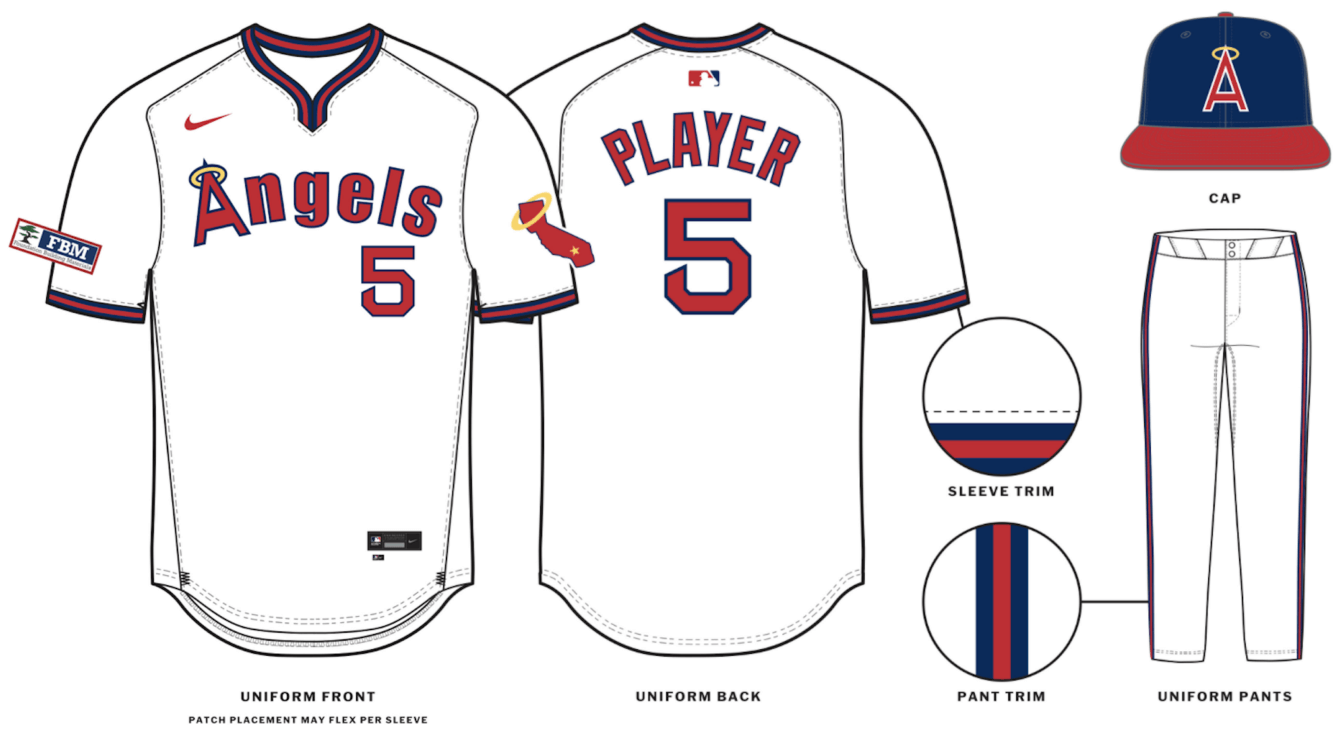
One thing that remained unclear was whether the throwbacks would be pullovers or button-fronts. As of today, I’m prepared to say that they’ll be pullovers, because a source has provided me with this page from the 2024 MLB Style Guide:
Let’s shift into FAQ mode:
Doesn’t the MLB Style Guide usually show the four different views of a generic player?
They used that format from 2001 through last year, but they’ve adopted a new format this year.
Did the old Style Guide show the sleeve ads?
Nope. In fact, the old Style Guide didn’t even show maker’s marks! (One thing that’s stayed the same, however, is the use of No. 5, which has long been the MLB Style Guide default number, much like No. 46 is always used in the NBA.)
Are throwbacks typically shown in the Style Guide?
If a throwback is a full-fledged alternate that’s part of the team’s uni rotation, like the White Sox’s 1980s Sunday throwback, it’s included. If it’s something that’s being worn just as a one-off or for a weekend, like most of the Negro Leagues throwbacks we see each year, then no, it’s not included. It’s not yet clear to me if the inclusion of this Angels design in the Style Guide means (a) that the seven-game “throwback week” promotion was enough to qualify this uniform for Style Guide status, or (b) that the team plans to wear it here and there in addition to that seven-game promotion. Either way, once the throwback cap appeared in the online shop as an “on field” item, it made sense that the rest of the uniform would be in the Style Guide, since those two statuses tend to go together.
That jersey collar looks a little funky.
It does, doesn’t it? The original collar, as you can see in the photo at the top of the page, was a standard V-neck, but the Style Guide mock-up seems to be more of a wishbone design. We’ll have to wait and see how that looks in real life.
Update: Reader/commenter Stanley reports that the Single-A Hillsboro Hops wore this collar style last season:
They’re using the wrong pants!
Indeed, if the Style Guide is to be believed, they’re pairing the pullover jersey with belted pants (including Nike’s new angled belt tunnels), instead of the period-appropriate sansabelt pants. Disappointing, but whaddaya gonna do.
Anything else jump out at you?
A coupla things:
- They’re using the McAuliffe number font and radially arched NOBs. According to Bill Henderson’s jersey guide, that means this throwback is based on the team’s 1973-1978 jerseys. Based on Bill’s photos, it looks to me like the jerseys consistently had set-in sleeves during that period, but the Style Guide mock-up shows raglan sleeves. (Here’s the difference between the two.) Obviously, that’s a very minor historical inaccuracy that most people won’t notice or care about, but it’s still interesting.
- The sleeve trim on those mid-’70s jerseys was slightly above the cuff, leaving a bit of white to peek out at the end of the sleeve. But the Style Guide mock-up shows the trim right at the cuff, with no white peeking out. The Angels did later use that style, but with a different number font and NOB format, so the sleeve trim on the throwbacks appears to be era-inappropriate. I’m pretty sure this is because of Nike’s new template, as we’ve seen with Atlanta’s new jerseys.
Do you have access to the entire Style Guide?
No. My source provided the Angels throwback page because I had written that earlier post about the throwback cap.
Have the source show you the new City Connects!
I’m told that City Connect designs for a given season are not shown in the Style Guide until the end of that season, so we’re out of luck on that front. But don’t worry, I’m pretty sure I’ll have some good non-CC info for you soon. Stay tuned!


The MLB logo looks different for the Angels too, weren’t the red and blue previously reversed? Is that a change the team has in effect for the upcoming season?
That’s a brilliant catch, Brian! You’re right: link
Not sure if this is just a throwback thing or an Angels-wide thing. Will try to find out!
Looks to be an Angels-wide thing link
That’s so interesting. Are the colors of the batterman logo matched with the team colors on every jersey or is this just an Angels oddity?
Been matched to the team’s colors for about 20 years now.
That’s going to take some getting used to, I usually associate the red white blue color order for the Nats.
To answer Luke V’s question, each team does have their own color rendition of the MLB logo on jerseys and hats. I used to think the Yankees had the official MLB logo as the shades pretty much matched the navy blue, white, red. When I saw the White Sox’s black white silver MLB logo on their hats as a child I used to think it was a color error.
MLB shop shows the new colors for the batterman on the Trout home jersey too. Hats oddly enough are the same as they’ve always been.
Coolest thing for me is the McAuliffe font. The 21st century being what it is, I can’t believe the Red Sox haven’t copyrighted it.
Is it theirs to copyright? I don’t know if the Tim McAuliffe brand is still around, but I’m sure someone owns their intellectual property. Which I suppose could be the Red Sox for this font.
It hadn’t occurred to me until today that the Dressed to the Nines uniform database doesn’t record back views. So, does anyone know when the A’s stopped using McAuliffe?
Their last year with that font was 1971.
Source: Bill Henderson’s jersey guide, which I urge everyone to purchase. Available here: link
As a lover of the pullover era, these are disappointing. Two great things from that era were 1) actual collar trim that looked nice, and 2) the sansabelts (which were often striped and worked as a nice “dividing line” between jersey/pants. They’ve messed them both up. On the plus side, I much prefer the sleeve trim right at the cuff. It looks sloppy with a bit of white peeking out, as if someone didn’t quite sew it on correctly.
Love the can striping!
Why is 5 the default display number?
The new v-neck/wishbone design was worn by the Hillsboro Hops this past season:
link
Ah, fascinating! I’ll add that to the post.
Paul – it turns out that the MLB batterman logo matches the team colors for every team under Nike’s new template for 2024. If you scroll down to Nike’s “The Future is Now” add on the MLBShop website, you’ll see 4 different teams’ uniforms reflect this change.
link
Hasn’t this always been the case? I’ve been buying MLB hats and jerseys since the mid 2000s, and every single instance of the batterman logo has matched the respective team’s colours. Or am I missing something?
Not new. Logo has been matched to team colors for about 20 years now. But sometimes the team-specific design changes, which is what appears to have happened this year with the Angels.
I must… kill… the queen.
Awesome Naked Gun reference. Reggie in the California Angels uni.
Look! It’s Enrico Pallazo!
So many button down jerseys look funky; I hate the way they break in the middle of letters. Maybe pullovers should make a comeback.
If they were to return, the (California) Angels would be a good full-time fit…others?
ASTROS!!! Oh, yes, and the A’s.
Not loving the V-neck becoming a Y-neck. The mitering of the collar trim is one of the most distinctive details of the pullover jersey. Nike gotta Nike, I guess. But as for the sleeve trim looking wrong at the cuffs, all teams have to specify is adding a white stripe at the end.
“Nike gotta Nike, I guess.”
Sad, but true. Nike: never miss a chance to miss a chance.
The Hillsboro Hops are in the High-A NorthWEST league, and currently affiliated with the Dbacks. Not the Northwoods League. The Hops, being in the Portland area, have been wearing Nike since their inception in 2013. As MiLB allowed certain teams to be outfitted by other uniform providers as long as they were local. For example, Aberdeen Ironbirds wore UA for most of their years.
Thanks for the correction. Fixed!
I hate when teams throwback to a pullover jersey and pair it with belted pants. Pullover jerseys are supposed to be worn with Sansabelt pants. I think it’s even in the Bible somewhere. Oh, and that color template looks like shite.
In the hey-day of the pullover, Atlanta was a team of heretics.
It wasn’t the belted britches alone that made them look bad through the ’70s.
I never noticed before that Dressed to the Nines evolves their hosiery styles over the years…from no sanitary showing, to a bit, to medium, to long, to extra long and then to pajama pants. They also show when each team first integrated.
Imagine the rube who buys non-laboratory-controlled lithium grease.
The first thing I thought of when I saw those throwback jerseys was mid-90s Nike hockey jerseys. It’s like somebody found a crate of 1998 Team USA wishbone collars in a warehouse and thought it would be a shame for them to go to waste. It was a weird wishbone then, and it’s still a weird wishbone now.
I hated this pullover era, but now I like it. It’s like when I was young and arrogantly didn’t like a band because they weren’t “cool”, but now I like them. I’m still not crazy about the sansabelt pants, but as a throwback it would be better to include them. I would actually like to see some teams going with pullovers for their main uniforms, but I’d pair them with belted pants. Certain teams seem like naturals for these pullovers, with the Angels and A’s being at the top of the list. And the Dodgers, Yankees, and Red Sox, being at the top of the list for buttoned jerseys.
How does this work with limiting on-field jersey restrictions? Angels will have five now:
1) Home
2) Red Alternate
3) Away
4) City Connect
5) Throw back
Teams are allowed “4 + 1” — meaning a home, road and two alts, PLUS the City Connect.
That fits the scheme.
Thanks. I got confused if City Connect counted.
It’s really come to something when we are looking at pullover designs and thinking “that would look better” because of the tragedy to #respectThePlacket that is currently happening with the new Nike template. In fact I wonder if this is a cunning plan to make the semi-button style of top popular in college look like a good option just to stop the stupid logo breaks!
Nice article, Sure would be great to see the NBA style guides you have over the years.