
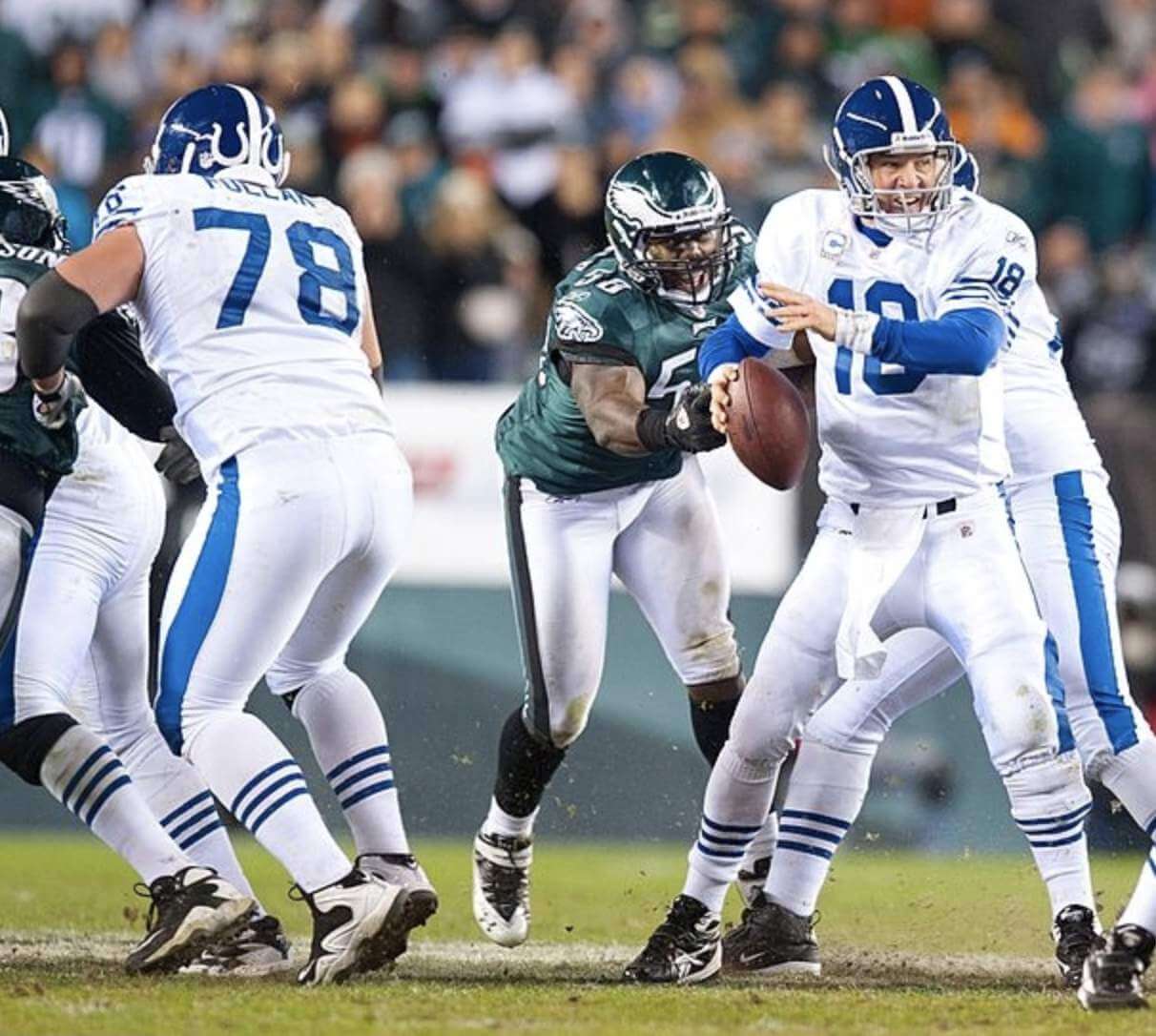
In a surprise move (at least to me), the Colts have announced that they’ll be wearing their 1956 throwbacks for this Sunday’s Saturday’s home game against the Steelers. As you can see above, the throwbacks differ from the team’s primary uniforms in several respects, including the following:
- The horseshoes are on the back of the helmet instead of the sides.
- Instead of the two UCLA-style shoulder stripes, there are three sleeve stripes.
- The TV numbers are on the shoulders instead of the sleeves.
- Instead of two lines of striping down each pant leg, there’s just one stripe.
- The nose bumpers are blank.
- The number font is ever-so-slightly different:

In addition, the socks have three stripes (let’s just hope the players actually wear them):

The Colts have worn this throwback uni on two previous occasions and lost both times. They dropped a 38-31 game to the Bucs in 2021 (photos here), and last year they lost 24-17 to the Steelers (photos here), the same team they’ll be facing this Saturday.
The Colts wore a variation on this throwback design, with a white jersey and blue helmet — but still with the horseshoes on the back — for a 2010 game against the Eagles (you can see video from this game here):
There are also at least two additional teams that wore throwbacks last season but haven’t yet done so this season: the Bears and Raiders. It’s not too late to join the retro party, guys!


The entire different jersey thing is to sell more replica jerseys, is it not? Then why hasn’t the NFL had designated “throwback weekend”, where EVERY team must wear a throwback (or fauxback if you have a uniform that is essentially unchanged since you entered….ahem Panthers)?
For one its something that can be and would be heavily marketable for them, and they can pay someone a ton of money to make a ridiculous graphic for it.
Beats the hell out of Ketchup vs. Mustard.
To that end I really appreciate when there is a throwback uniform like the Colts have here. While noticeably different to the uni-verse, it is still fairly similar in color and general style to the current uniform that most people wouldn’t make a big deal about it. And in that regard, it is less likely to sell a lot of merchandise, compared to throwbacks and alternates that are in different colors or significantly different designs than the standard uniform.
the Panthers just trot out the same jerseys but with the reebok cut
Helmets, sleeves and hips adorned with the old logo…and there ya go.
I admit that I forgot that Milwaukee is the Cream City. But searching online turned up this great deep dive on the name origin:
link
The Colts also wore a white version of this throwback with a white helmet in 2004 on Thanksgiving against the Lions
link
Good one. Thanks!
“Utility Uses.” I’m going to start using that expression when I need to pad my word count.
That can is truly wonderful and I love the Cream City logo. Bucks, take notice. The Colts retro uniform is very cool as well. Forget that Indiana Nightmare and stick to this as an alternative.
Great Can of the Day find! reminds me of my uncle who “retired” at 47 and does all sorts of odd jobs to make ends meet, and he gave all his nephews on their 18th birthday a 5 gallon bucket due to it’s versatility.
Are these using the old jersey chassis?
I think they would look terrific paired with the navy blue helmet…though some might get a bit freaked out that the blues don’t match up.
Lovely COTD from rpm.
I think these Colts throwbacks look better than their current uni, except they should use their current helmet. The shoulder striping and TV number placement is much more visually pleasing.
Raiders need to wear their silver helmet logo when they do silver numbers.
[insert standard rant about how scummy it is when teams sleazily relocate and then bank off history made in the community they bailed on]
The “variation” with the blue helmet was their primary uniform in 1954 and 1955.
link
I love the striped socks!!