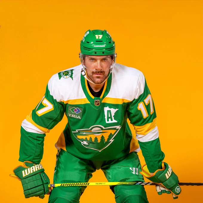
In a somewhat surprising move, the Minnesota Wild unveiled a new third uniform this morning, which you can see above. The team is dubbing the jersey “The 78s” to honor the Minnesota North Stars.
If the jersey looks awfully familiar to last year’s green Reverse Retro jersey, that’s because they’re almost identical.
Let’s start with the team’s hype video:
Time to run it back 🔥 Your 78’s are here to stay.
New threads ➡️ https://t.co/LXxtVseaj2#mnwild pic.twitter.com/xc6PT40swe
— Minnesota Wild (@mnwild) September 23, 2023
And here are some views of the “new” uniform:
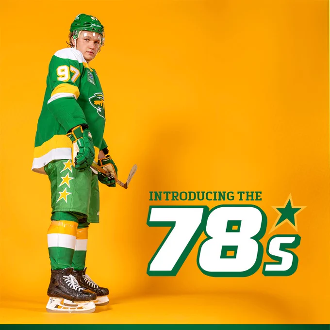
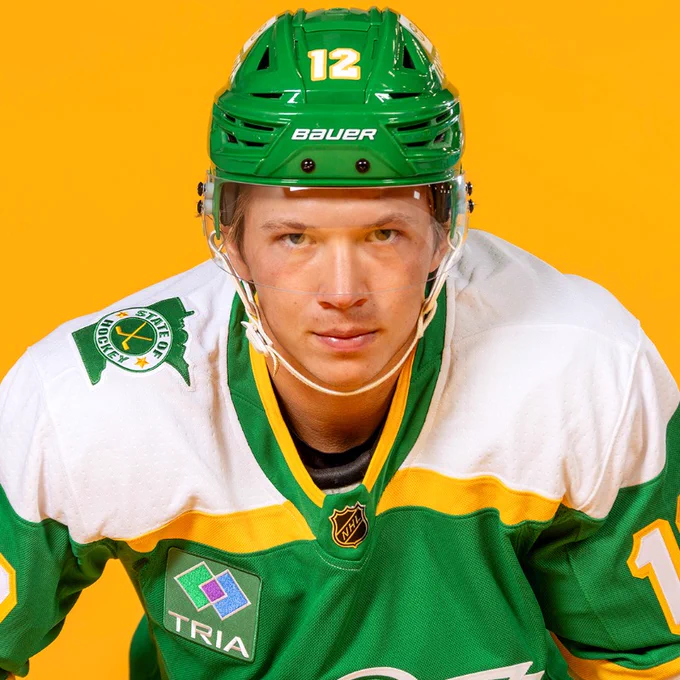
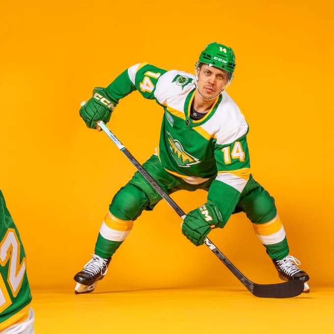
The only variations added were a shoulder patch featuring the “State of Hockey” logo, as well as new treatment for the Captain’s “C” and the “A” on alternate captains’ jersey. The letters are now layered over a patch in the shape of the state of Minnesota.
The Wild are calling these uniforms “The 78’s” in honor of the former Minnesota North Stars, since they mimic the design and colors of the North Stars’ late-1970s uniforms. These uniforms are a Kelly Green base color and gold accents.
The jersey crest is the familiar Wild logo, rendered in North Stars colors, and features a 3D design for depth.
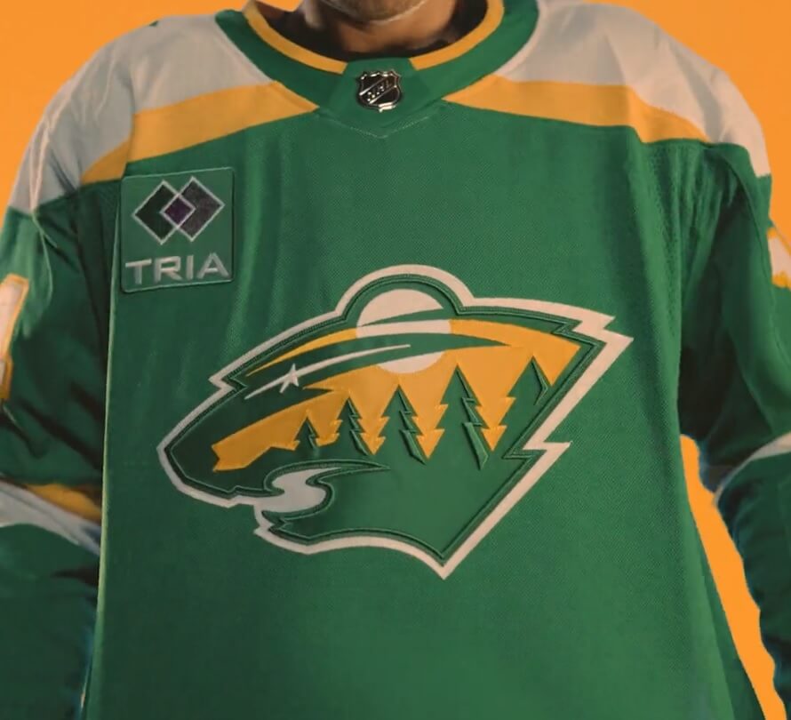
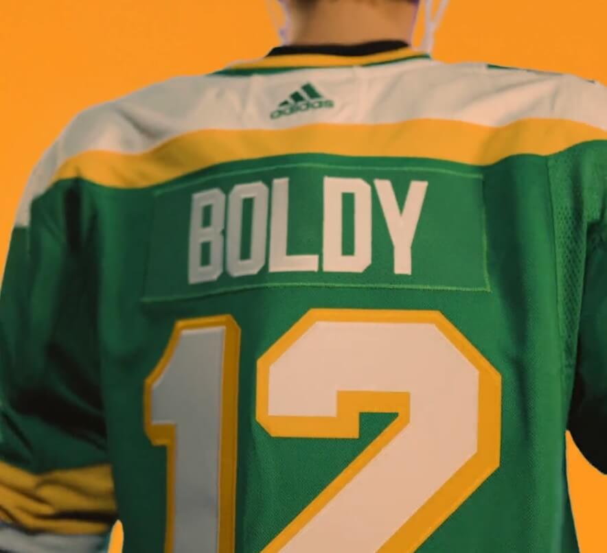
The jerseys feature a white yoke, with a green/gold stripe around the collar. Numbers are white, with a gold blockshadow. NOB are white on a green nameplate.
According to John Maher, Wild Senior Brand Advisor (yes, that’s an actual job title), “Our primary home and road jerseys are as popular as ever with our fans. They also let us know last season that they still loved this legacy look so we decided to keep it in our mix as a new alternate jersey, with some updated ‘State of Hockey’ details.”
Minnesota will wear the new alternate uniform 15 times this season: Oct. 21 vs. the Blue Jackets, Nov. 4 vs. the Rangers, Nov. 24 vs. the Avalanche, Dec. 3 vs. the Blackhawks, Dec. 16 vs. the Canucks, Dec. 23 vs. the Bruins, Dec. 27 vs. the Red Wings, Dec. 31 vs. the Jets, Jan. 13 vs. the Coyotes, Jan. 27 vs. the Ducks, Feb. 17 vs. the Sabres, March 10 vs. the Predators, March 23 vs. the Blues, March 30 vs. the Golden Knights and April 6 vs. the Jets.
Gorgeous!! Well, except for the ad…
Hideous ad for a company (?) that does what? sells what? is what?
Sports medicine
I know, it’s unreal how many ads in uniforms give no clue what it is they do.
Google it and find out! That’s what they want, right?
I do like these…great colors, awesome design. Mighty fine!
I just don’t like the Wild wearing them.
If fans really like your branding so much, pretending the (North)Stars legacy is your own goes against that line-It’s not, never was, and I’m disappointed that Dallas NHL is ok with it.
This latest successful effort to muddy franchise histories serves to embolden others to follow suit (looking at you, Houston Texans!).
Too bad it’s so rainy today- I’d find a cloud to yell at.
Well, the Dallas Stars have not been willing to call attention to their past incarnation, aside from retaining team records and retired numbers. They missed an opportunity to celebrate their franchise’s 50th anniversary alongside the other four surviving 1967 expansion franchises, and opted not to do a 1960s-70s throwback with a D-star variation of the original N-star logo after prototyping it.
Of course, it’s been 30 years and I’m still pissed at Norm Green for ripping the North Stars out of Minnesota in the first place.
If they really wanted to do a tribute just change the name back to North Starsalong with unis… let Dallas sue, what the heck…
and while we’re at it give St Louis a football team called the Cardinals and let Arizona pick a new one…
I’m still pissed at Norm Green too!! A travesty. Not only should Minnesota have an NHL team, but the North Stars name and logo were outstanding. Given that you can’t do anything about s#@+head owners, aesthetically speaking, I always thought Dallas should have rebranded as the Lone Stars with colors matching the state flag. I’ve never liked the green & black combo. Oregon proved it again v. CU.
“The jerseys feature a white hoke”
Yoke?
Ugh. Yes. My bad. Now fixed.
My goodness these are BEAUTIFUL. The C and A embedded within the outline of Minnesota is a particularly great touch. Render these in the Christmas colors (because, of course, the Wild can’t possibly use green, yellow, and white full time !!), and I think that the Wild should adopt these as their full time uniforms.
I agree Ian with embedded C/A looking sharp. I also think the star pants look good also. beauty
Hate to be the one to bring this up but should have been the ‘78s, not the 78’s.
This thought crossed my mind recently: if the Wild wanted, could they go a step further and re-adopt the “N-star” crest on the jersey while still calling themselves the Wild? I could never see the NHL or Dallas allowing the Wild to fully re-brand as the North Stars, but the “N-star” logo might be ambiguous-enough that it could still work (after all, “wild” is a pretty ambiguous term to begin with, so a lot of logos could work).
Not that this is necessarily a good or bad idea, but if the popularity of this alternate uniform accelerates, I do wonder if the Wild consider a way to dive as deep as they can into North Stars nostalgia without actually becoming the North Stars.
They could easily turn the N-star logo into a W-star logo, though whether or not the aforementioned entities would allow something that close to their intellectual property is a valid concern. Also, the N(arrow)-star logo is as close to a pictogram as you could get for “North Star”, whereas a W(arrow)-star logo is simply utilizing the ambiguity of the Wild moniker to incorporate the North Star as a main logo as an homage. It still would work, just not quite as clever as the original. That said, the Wild knocked it out of the park from day one with their logo. I think it belongs (conceptually) in the same conversation as the Whalers logo. The fact that they turned a multi-feature nature scene into a bear head and it looks fantastic either way you look at it is really impressive. But this may be another Oilers/Texans situation where it doesn’t matter how great the new thing is, it will never be the old thing and that’s it’s fatal flaw.
The way I’ve always looked at it is that when a team changes a name, they forfeit the former one and it should be enforced by its respective league…you can’t have two names, right?
The Thunder should not have a problem if a new Seattle NBA team were called The Sonics.
I would argue that Minnesota should be allowed to use North Stars, whether it’s for a one-shot throwback uniform or a full rebranding… I know legalities argue with this concept but if it were implemented we would still have the Houston Oilers, Minnesota North Stars, and, if a team were brought back to Winnipeg, the NHL Jets…
I know, I know, forgot about Jets “Resurrection” a few years ago…my brain was probably thinking of Hartford or Quebec…
…need more Coffee…
Seattle won’t have that problem because the name and colors were forfeited by the franchise when they moved as part of the deal. Every situation is different because there is no hard and fast rule in any league about this type of thing. If we want to be staunch traditionalists, I agree that if you forfeit a name and vacate a location, sorry folks, it’s fair game. But I don’t bemoan the currently glaring situations (Houston, Minnesota, Carolina) because I think Texans, Wild, and Hurricanes are great team names and I think the Texans and the Wild both came up with modern classic looks straight out of the gate. Carolina has yet to look decent on the ice mostly because I don’t like their weather channel icon logo, but there’s no team in Connecticut, so everyone can just chill and enjoy seeing the whale back on the ice until hockey returns to Hartford.
I don’t think this was a somewhat surprising move as it had been rumored for a while. Regardless, it’s a beautiful sweater and one I’d love to add to my collection.
I’m not a big hockey fan, but I think the Wild have the best logo in big 4 professional US sports. But I think I may like it even better in these North Stars colors and the 3-D bonus.
Also, I think I’m going to pursue a job with the team in my chosen profession, just so I can have the job title “Wild Librarian.”
Here, here! Fantastic logo in green and yellow, or the Christmas colors.
My only beef is that they are using the north stars shorts straight up. The uniform may just be a NS jersey with a wild logo on it, but the shorts are using the north stars star. It looks mismatched.
My thoughts exactly. I love everything about this third uniform except the pants. The Wild already have a strong star element in their logo, which I think most fans interpret as a reference both to the celestial North Star and as a reference to the prior franchise North Stars. Run the tail of that shooting star up the side of the pants from the star in the lower third and the uniform would be perfected.
Honoring a team that plays in Dallas now. That is weird.
F Dallas, these unis belong to Minnesota. The Stars should have been forced to change them name. Keep the Wild in these full time.
For those saying Dallas should be the ones with these colors you are absolutely correct. Those saying Dallas ignored this after the move you are incorrect. In 2011 the Stars went to Reebok and created a prototype jersey using such colors, see more here- link
The rumors I’ve heard on why it was abandoned and why the Dallas franchise does not do much of any recognition of the Minnesota years was due to heavy blowback from Minnesota and the Wild fanbase. I interned for the Stars way back in 2014 and recall in a file folder finding the logos that Dallas owned rights to at the time and the classic North Stars N was present. I believe since then the NHL at some point stepped in and acquired the ownership rights, hence how the Wild were able to utilize the colors and even jerseys for the alumni game played at one of the outdoor games the Wild hosted.
As a lifelong Stars fan I always wanted us to do a throwback to the North Stars colors and logos but sadly that dream was smashed by current Wild fans who are hell bent on declaring anything to do with the North Stars as theirs. You have a new franchise, let it go, the Canes have Whalers throwbacks, the Avs wore Nordiques Reverse Retros, the Titans now have Oiler ones. When your team moves the uni history come with them (unless you’re the Ravens lol). Rant over, excited for hockey season (don’t be too upset Wild fans this is just good natured ribbing).