Tired of seeing annoying ads (like this one!) on Uni Watch? There’s a simple solution: Join Uni Watch Plus. You’ll get an ad-free site experience, plus exclusive access to our UW+ discussion forums, push notifications whenever a new blog post has been published, a special UW+ badge accompanying all your comments on the blog, and a 20% discount on our Teespring merchandise.
[Editor’s Note: Paul is on his annual August break from site (although he’s still writing his weekly Substack column). Deputy editor Phil Hecken is in charge from now through the end of the month.]
Good morning Uni Watch! (said in his best Robin Williams ‘voice’). Today is the first day of August, which in addition to being Jerry Garcia’s birthday, also means I’m taking over the UW weekday duties from Paul for the month as he enjoys his annual August sabbatical from the blog.
If you missed it, Paul had a bit to say about that yesterday.
While I can never truly replace Paul, and especially his recent prodigous output, I’ll endeavor to keep bringing you the same top-notch content during the weekdays to which you’re all accustomed. If there’s breaking uni news, I’ll cover it as soon as possible, and I’ll try my level best to bring you outstanding content throughout the month. Some days there may only be one post (there will always be a morning post and a Ticker), but other days there may be three, four or more — it all depends on the amount of uni news out there. Today, for example, there will probably be at least two additional articles, and depending upon when the Phoenix Suns unveil their new uniforms, it could be more than that. Basically, if there is uni news that happens during the morning and afternoon, I’ll post on it the same day; if something breaks in the evening, it may be the next day’s lede.
__________
In previous Augusts, when I’ve pinch hit for Paul on the weekdays, you fine readers often have uni-related subjects that either we don’t explore, or unis and uni-adjacent topics you’d like to cover. I usually try to have readers participate even more than just having your (always welcome) comments.
So if you have an idea for a uni-related story (whether you’d like me to cover it or — even better — you work with me on your own article), please give me a shout (E-mail me: phil.hecken@gmail.com). Over the past decade-plus that I’ve been doing August weekdays, some of the best pieces have been reader-submitted! I’d love to feature some more of your best ideas. If you’ve been featured on UW before or this would be your first foray, let me know what you’d like to read and write about this month!
Uniform Concepters: I’ve worked with many of you before and I’d love to again. So if you’ve got concepts or tweaks — be they full team or league redesigns, or just what we lovingly refer to as “refrigerator” art, now’s the time to get that featured.
__________
In addition to the daily morning article, I’ll usually include some of the features I normally run on the weekends: Guess the Game from the Scoreboard (or Uniform) as well as some reader-submitted concepts. In fact, I’ll have a GTGFTS, GTGFTU and some reader concepts immediately below this article. We likely won’t have all three “extras” run on the same day, but I’ll probably have at least one of those daily. Think of it as my “Can of the Day” section. In fact — if you guys would like to submit photos (and descriptions) of cans during the month, I’ll be happy to feature those as well (all with credit to the submitter, of course).
In his piece yesterday (linked above) Paul mentioned that we won’t have weekend content — and we likely won’t — but if there is some BIG uni news that occurs late Friday or Saturday, I’ll try to publish that over the weekend. There usually isn’t much breaking uni news over the weekend, but it does happen. (For example, this past weekend we had Michigan State football unveil new uniforms, including a BFBS alternate, and of course the Eagles Kelly green throwbacks leaked — so if things of that magnitude do happen to occur late Friday->Sunday, I’ll do my best to cover that in somewhat real time.)
Again, if you guys have anything you’d like covered or explored, give me a shout!
Let’s do this!
Guess the Game from the Uniform
Based on the suggestion of long-time reader/contributor Jimmy Corcoran, we’ve introduced a new “game” on Uni Watch, which is similar to the popular “Guess the Game from the Scoreboard” (GTGFTS), only this one asked readers to identify the game based on the uniforms worn by teams.
Like GTGFTS, readers will be asked to guess the date, location and final score of the game from the clues provided in the photo. Sometimes the game should be somewhat easy to ascertain, while in other instances, it might be quite difficult. There will usually be a visual clue (something odd or unique to one or both of the uniforms) that will make a positive identification of one and only one game possible. Other times, there may be something significant about the game in question, like the last time a particular uniform was ever worn (one of Jimmy’s original suggestions). It’s up to YOU to figure out the game and date.
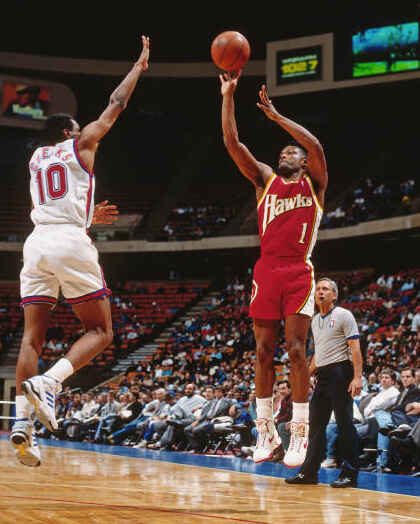
Today’s GTGFTU comes from Chris Hickey.
Good luck and please post your guess/answer in the comments below.
Uniform Concepts and Tweaks
Uni Concepts and Tweaks
Time for more Uni Tweaks from the UW readership.
I hope you guys like this feature and will want to continue to submit your concepts and tweaks to me. If you do, Shoot me an E-mail (Phil (dot) Hecken (at) gmail (dot) com).
• • • • •
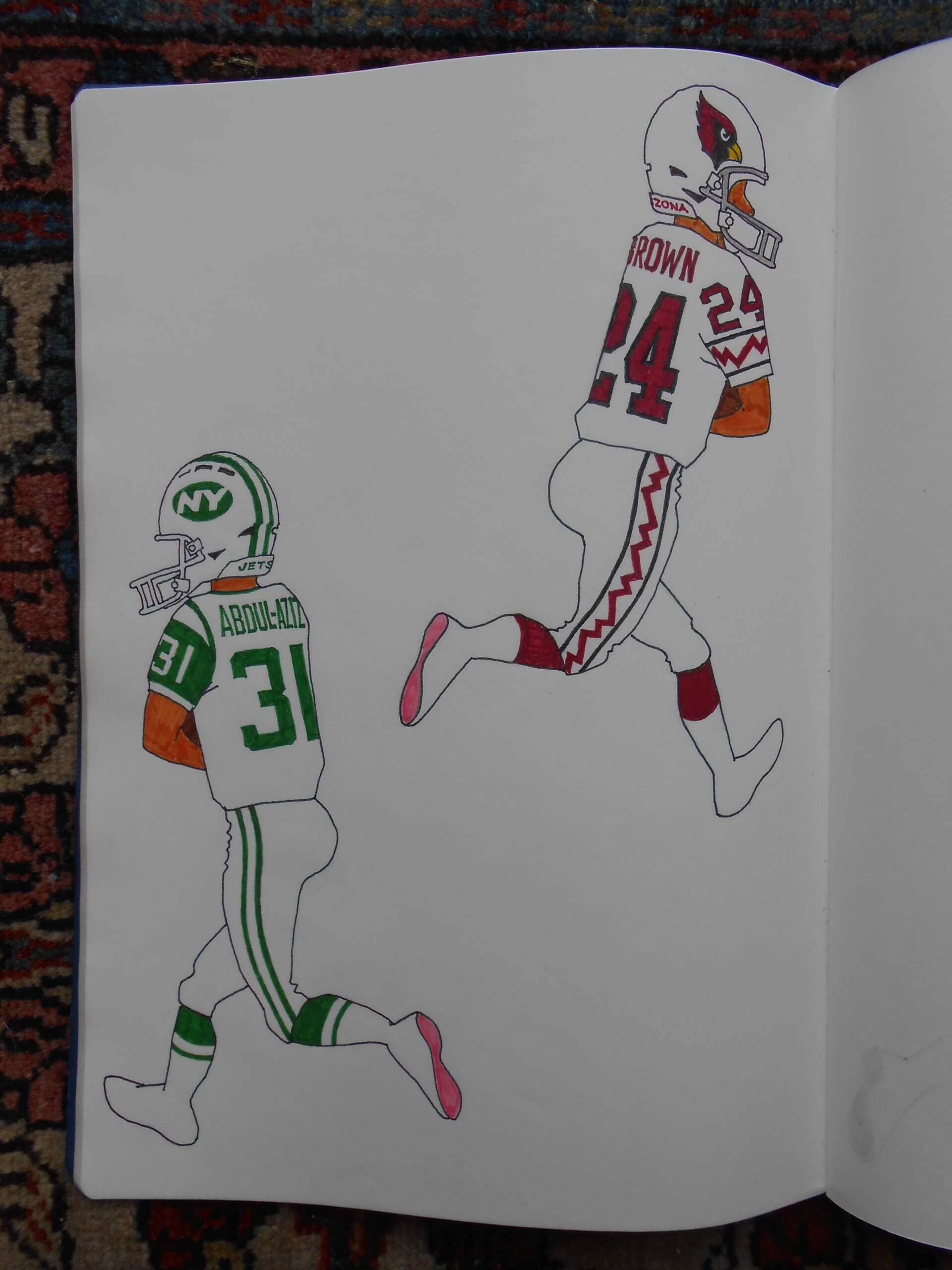
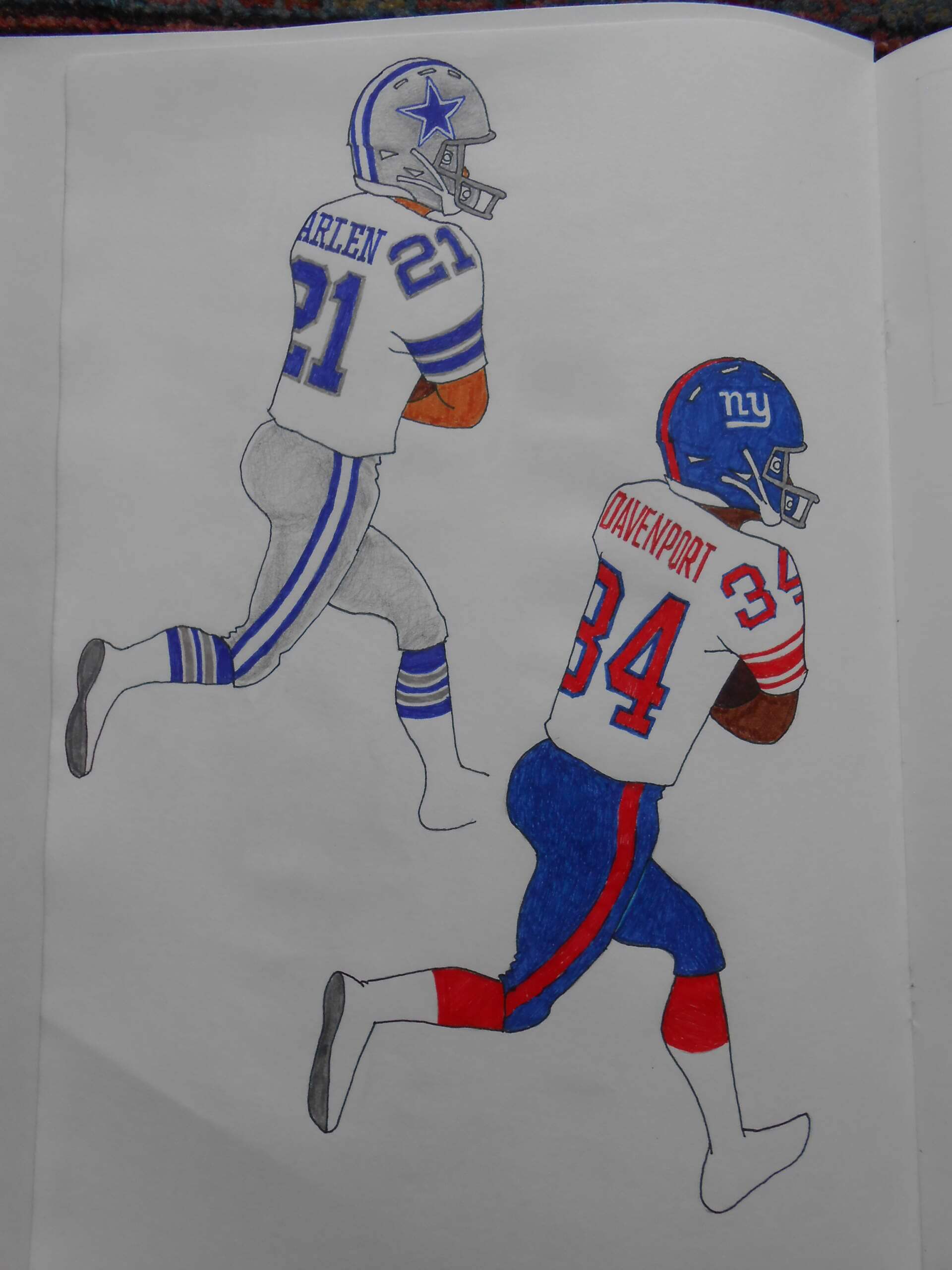
Today’s concepts come from Walter Helfer.
Dear Phil,
See if you can use these for Tweaks and Upgrades: Jets— Inspired by their classic threads, using the current green and numerals. The insignia on the helmet is especially punchy! Cardinals— The jagged stripe is inspired by a motif used by local Indians in their pottery. I wish teams would solicit input from Indian artists when designing their uniforms. It sucks that I’M the guy who had to put the stripe there, but I want to get the ball rolling. Cowboys— At last the color inaccuracies are straightened out, and it gives a crisp formality to the famous white uniforms. I really like the silver outlines. Giants— Some blue returns to the white road uniform, but enough red remains to create visual interest. Blue pants seem like an obvious next step.
Walter Helfer
• • • • •
OK readers (and concepters). If you have some tweaks or concepts, shoot ’em my way with a brief description of your creation and I’ll run ’em here.
Guess the Game from the Scoreboard
Guess The Game…
…From The Scoreboard
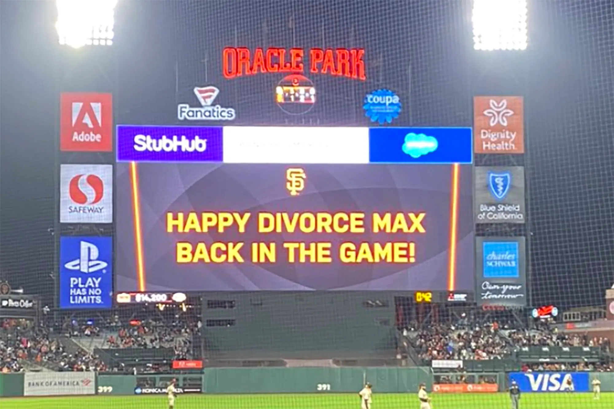
Today’s scoreboard comes from “Mad Max”.
The premise of the game (GTGFTS) is simple: I’ll post a scoreboard and you guys simply identify the game depicted. In the past, I don’t know if I’ve ever completely stumped you (some are easier than others).
Here’s the Scoreboard. In the comments below, try to identify the game (date & location, as well as final score). If anything noteworthy occurred during the game, please add that in (and if you were AT the game, well bonus points for you!):
Please continue sending these in! You’re welcome to send me any scoreboard photos (with answers please), and I’ll keep running them.
And finally...
…that’s all for my opening August salvo. There will definitely be at least a couple more articles today, so be sure to keep checking back in.
Thanks to all you fine readers for helping me to keep the ship afloat during Paul’s annual (much deserved!) break. Don’t hesitate to reach out if you have ideas for an article or other content.
I’d be entirely fine with that Jets concept, viz., “inspired by their classic threads, using the current green and numerals.” Holding out vague hope that they’ll do something like that next year, and keep the ’80s throwbacks as an alternate. The Jets org has to understand that no one likes the current unis.
I’ve stated my belief that the Jets’ current uniforms are actually pretty good, but only on the undertaking they be worn by some other team.
Like, say, the Washington Federals?
If the new USFL brings them back, I could see that.
While I totally agree, what indication is there that the Jets org understands this? The new Colts alt got almost universal love on Facebook, so you couldn’t even say younger or casual Jet fans don’t love the current uni. One thing I would like to see covered during Paul’s sabbatical is how do youth view uniforms that we classicists tend to despise?
Not sure Facebook is where you go to measure the reactions of the youth…
As someone who generally dislikes the current Jets set, they could actually make them pretty nice with just a few changes. Take off the stupid “New York” from the jerseys, trash the black helmet, jersey and pants for eternity, and simply change the helmet logo. I’m not a huge fan of the “sack exchange” logo they are throwing back to, but if you just slapped that on the helmet with these other changes, the uni would be fine (I would prefer a different logo with a more defined “jet” on it, but that doesn’t appear to be in the cards since they didn’t do it when they revamped). I don’t find the sleeve or pant striping an issue, and with the lack of sleeves anymore, they really can’t go back to the classic Namath-era look effectively. I would get rid of the black outlines also, but that’s a minor quibble. I actually really like the shade of green they are using and the sort of gem-like look of the lids.
“As someone who generally dislikes the current Jets set, they could actually make them pretty nice with just a few changes.”
Yes! I’ve been saying this since the new unis were introduced. Obviously they have to ditch all of the BFBS stuff (helmet, jersey, pants, socks) and stick to that shade of green, which is beautiful. I don’t normally like sparkly helmets, but I think the new hat is perfect. Even the new logo on the helmet is fine.
Jersey needs either a smaller “NEW YORK” (or none at all), and simply stop the sleeve cap striping from bleeding onto the front of the jersey (similar to what Seattle has). End the stripe at the sleeve cap and call it a day. For their throwback (“classic”), employ the new Gang Green throwbacks, and for a color rash, if they must, bust out the previous all-green (Namath *era*) unis that were rendered in kelly. link
They could use the new green helmet with the CR — which would look 1000% better than wearing the mono-kelly with the white hat.
Jersey needs a smaller “New Jersey.” ;)
Better yet, your none-at-all option.
Best month of the year
GTGFTU: 03/17/1993: Hawks (93) at Nets (114) Meadowlands Arena.
You got it, Morris!
Mo Cheeks’ uni-cameo with the Nets – the only time he played against Atlanta in his final season. Travis May in his next to last game in that short-lived/particularly peculiar early 90’s Hawks uniform…their late 90’s look only got worse from there.
I never understood why the Hawks strayed from the Wilkins era unis.
Had to do a double take on the drawings for the uniform concepts. I thought they were from Gene Sanny at first.
Very Tom Birbaum-ian in the sense that they are hand-drawn and there’s 2 teams per page.
Always appreciate Walter’s work and template (or is it chassis?).
When I was a young-un, I drew compulsively and all over the place; ever since my thirties I’ve striven be more economical. So yes, I tend to stick with templates, like Marc Okkonen. Saves space and time.
I vote for daily Walter Helfer tweaks.
HAPPILY!!!
I second that!
Thirded.
GTGFTS
15 Sep 2021
Padres 5 Giants 3
Love that Cardinals zigzag stripe a lot, and Giants away in blue pants makes sense!
Yes,…and heck NO!
But I kinda feel that if the Cards modernize/stray from the classics carries over from St. Louis, the facemask needs to change from gray.
I get it…Walter’s pants treatment now match the helmet, but I love (though can’t explain why) the Giants current away look – even if it doesn’t look ‘right’, it looks good – and white over white is my preferred attire for the road team: Surprise, surprise, surprise!
I’m actually with you, Chris. I loved the ’75 Giants uni with the blue pants. However, with the current helmet, I prefer them in white over white.
Or white over gray.
Enjoy vacation time, Paul!
That scoreboard is hilarious.
Also, Phil, I can’t imagine that you have a Robin Williams voice. . . .