Good morning, Uni Watch readers. I hope everyone had a good week. Did anything uni-related happen this week?
I’m back again today with Matthew Drake who has embarked on a project he’s calling the “MLB Multiverse.” If you missed either of the first two posts, you can click here for Volume I and click here for Volume II. As in Volume II, I’ve included Matthew’s introduction from his introductory post below, so you don’t have to click on Volume I or II for an explainer. As in Volumes I and II, for each “what if” I’ve included the new “home” jersey inline, with road and additional alternates in the gallery beneath. Enjoy!
You can follow Matthew @MJD7Design on the Twitter, and check out his progress on this project as well!
Here’s Matthew:
MLB Multiverse, Volume III
by Matthew Drake
I call this series “MLB Multiverse,” it’s essentially collection of “what-ifs”: either relocations of MLB teams that very nearly happened, or what certain teams would possibly look like if they never relocated in the first place.
Obviously referential of Marvel’s recent cinematic dealings with the concept of the “multiverse,” another way of thinking about this is that these teams do in fact exist in an alternate universe, where their respective relocation deals followed through to completion.
The series was heavily inspired by user @SFGiants58’s legendary “MLB: The Defunct Saga” series on the sportslogos.net boards, as well as logo/uniform legend Todd Radom’s “Phantom Franchise” segment on Buster Olney’s podcast.
I created over 60 (!) different alternate-universe teams in this series, my biggest series ever by far. It was fun and exciting to try and flex my creative muscles a bit more beyond simply fixing up the 30 big league teams. I hope you enjoy seeing these designs as much as I enjoyed creating them!
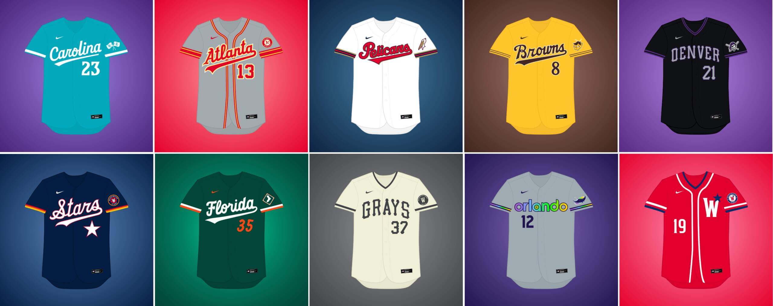
What if… the Athletics relocated to Atlanta?
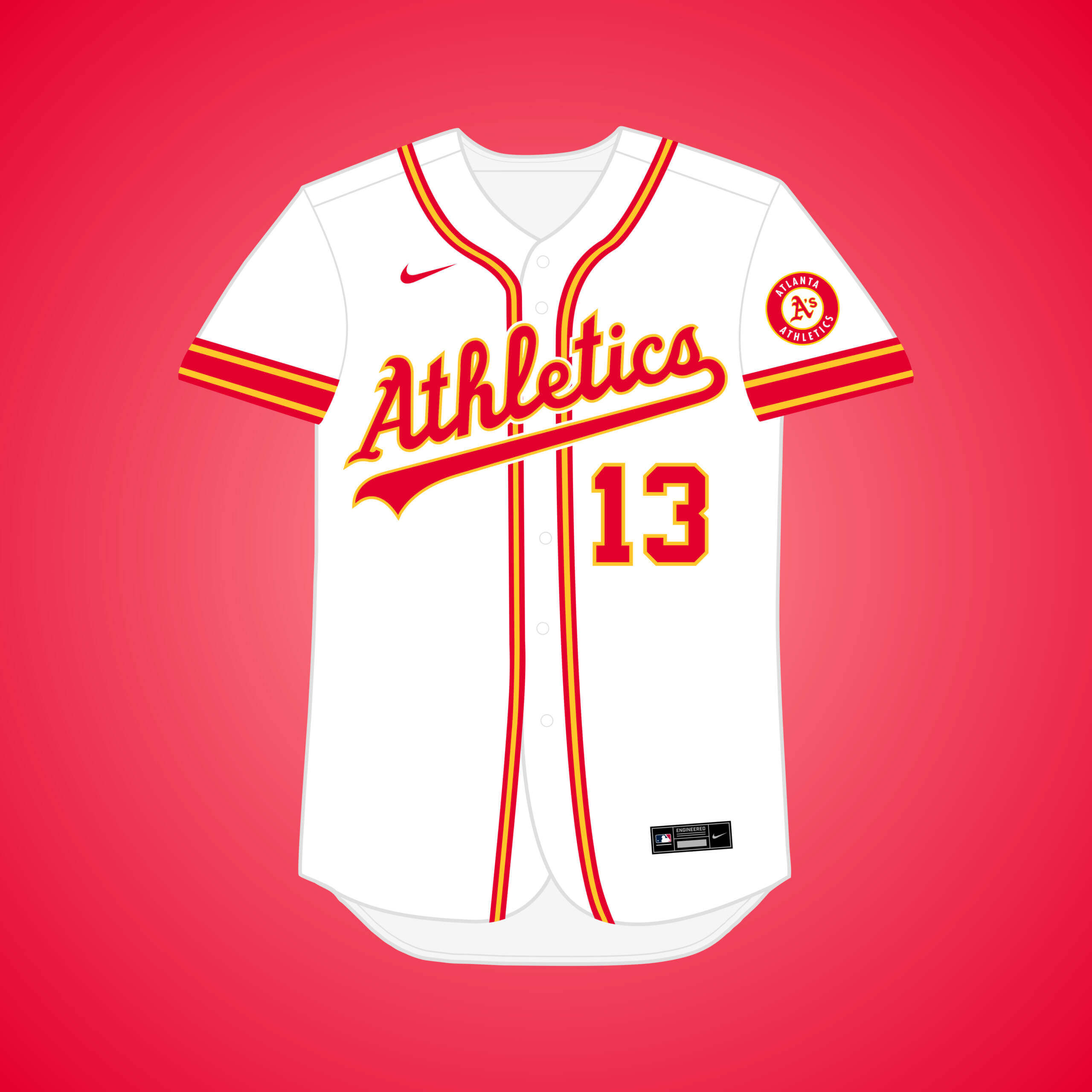
Charlie O. wanted to move the A’s to Atlanta in 1964, but was rejected by AL owners due to fears about travel costs. Inspired by the Hawks, green is replaced by red for a more “Atlanta” color scheme.


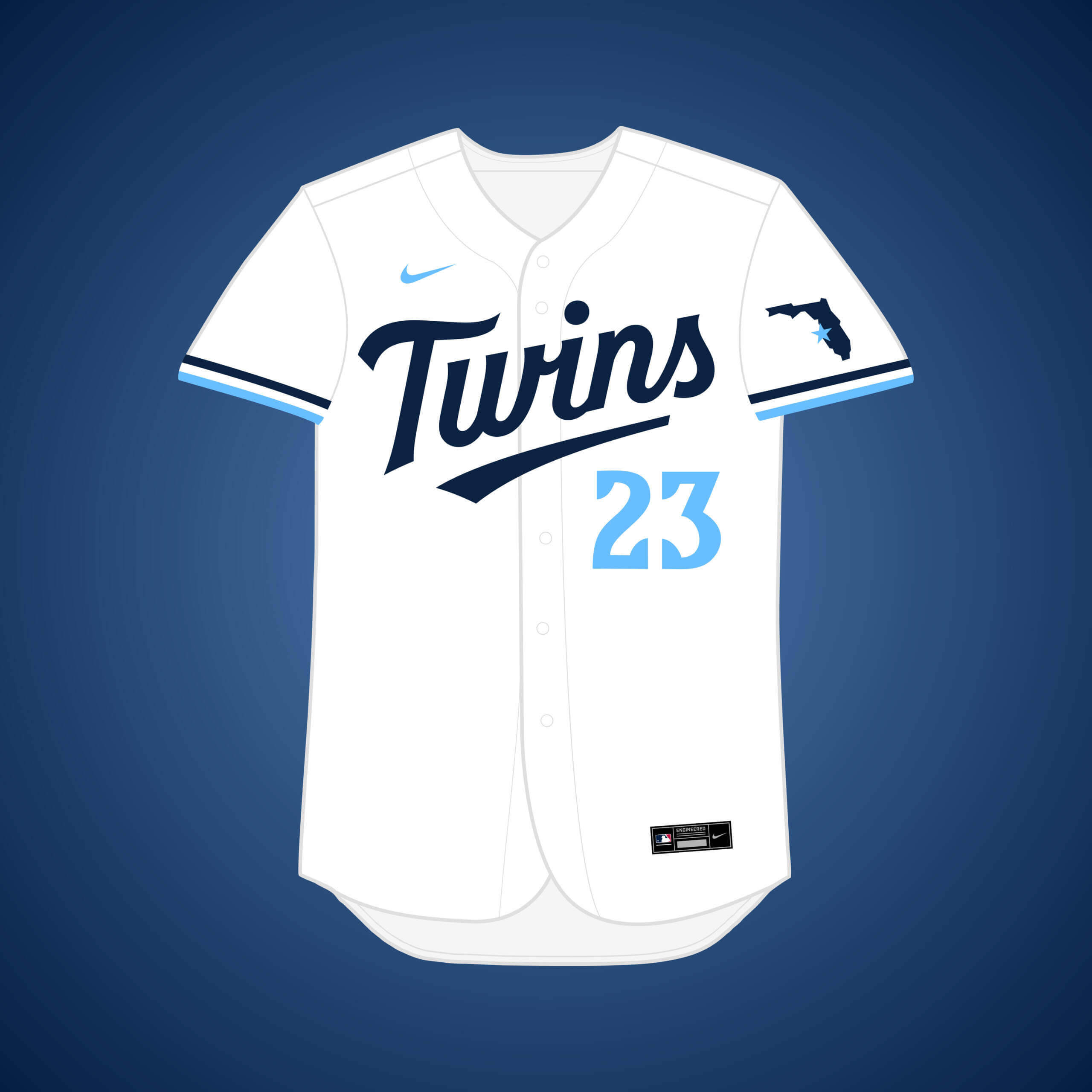
What if… the Twins relocated to Charlotte?
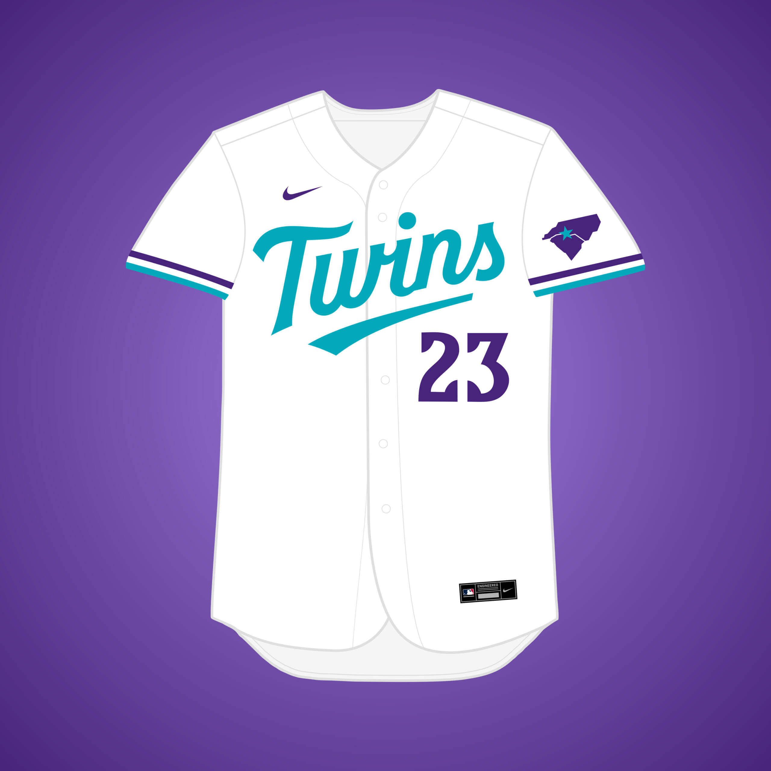
Twins’ owner Carl Pohlad was having issues with getting the struggling team a new stadium in the 90’s, so Carolina businessmen tried to lure them to move. Purple & teal was all the rage at the time, matching the Hornets.


What if… the Pirates relocated to Denver?
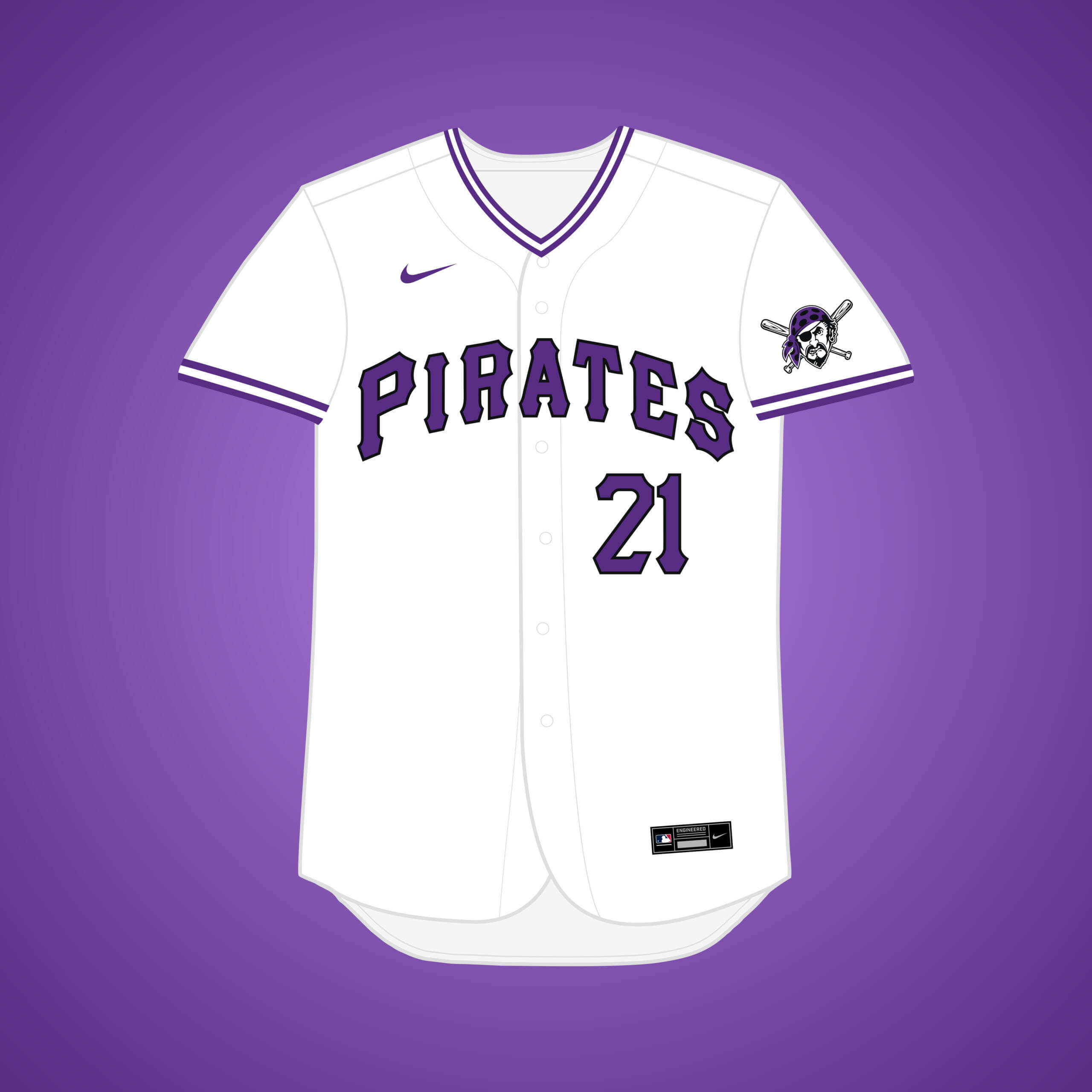
Finances, attendance, and quality of play were all down in 1985, so the Pirates owner expressed that he was interested in selling the team to a Denver group. Black & gold is so entrenched in Pittsburgh, so I replaced gold with purple.


What if… the Athletics relocated to Milwaukee?
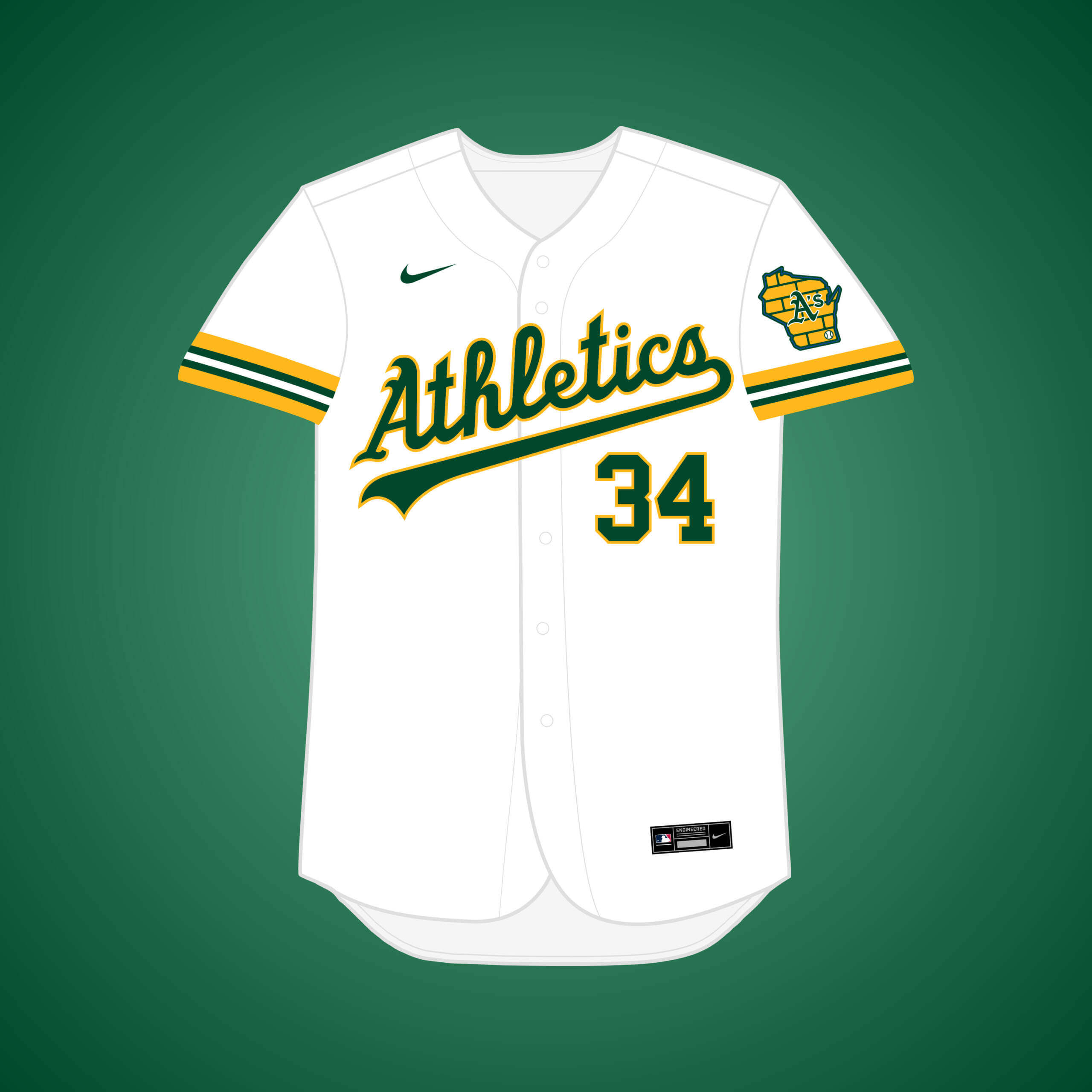
After A’s owner “Charlie O.” was denied moving to Atlanta in 1964, the Schlitz Brewing Company tried to buy the team in a majority stake, but he refused. Football fans will likely recognize the striping pattern on the sleeves.


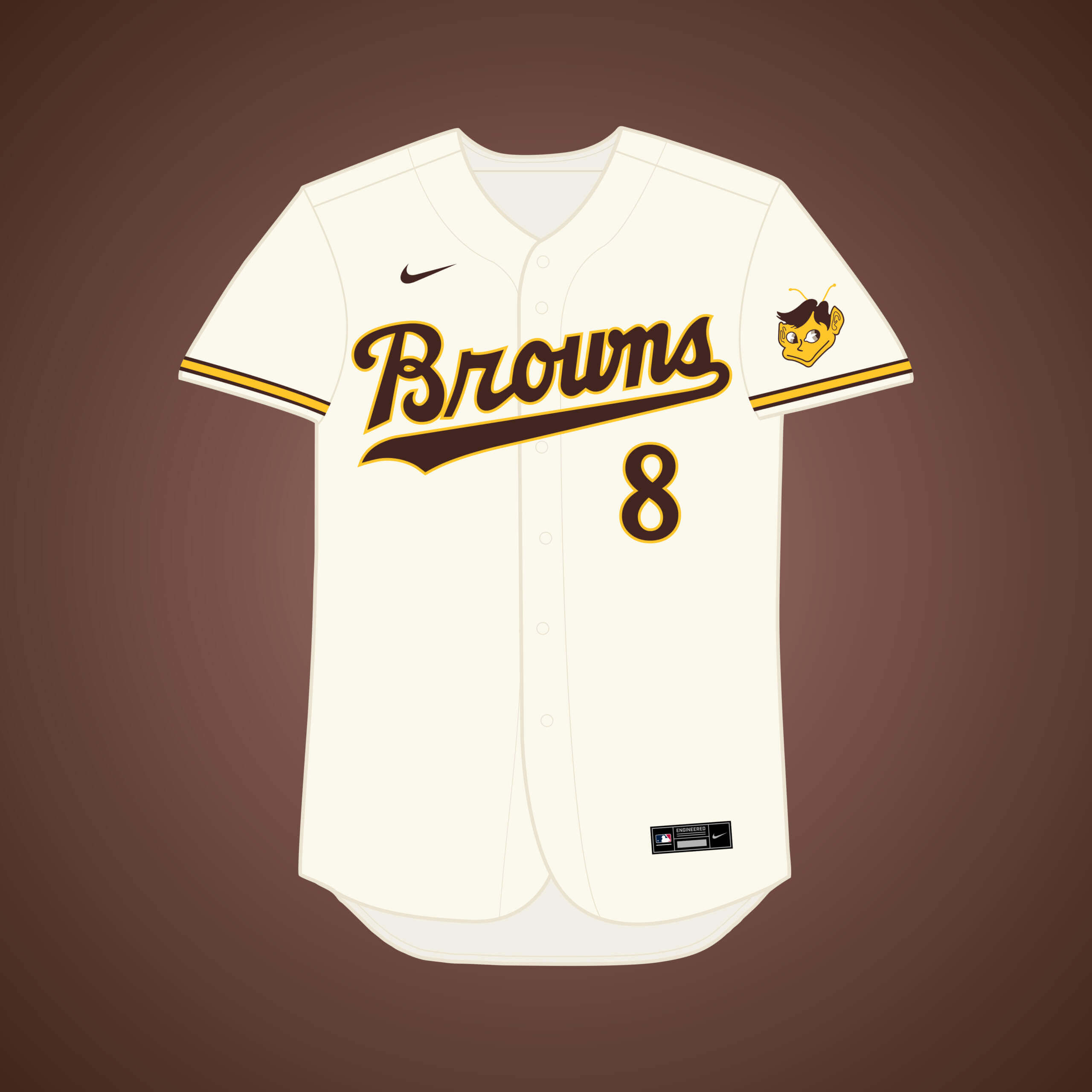
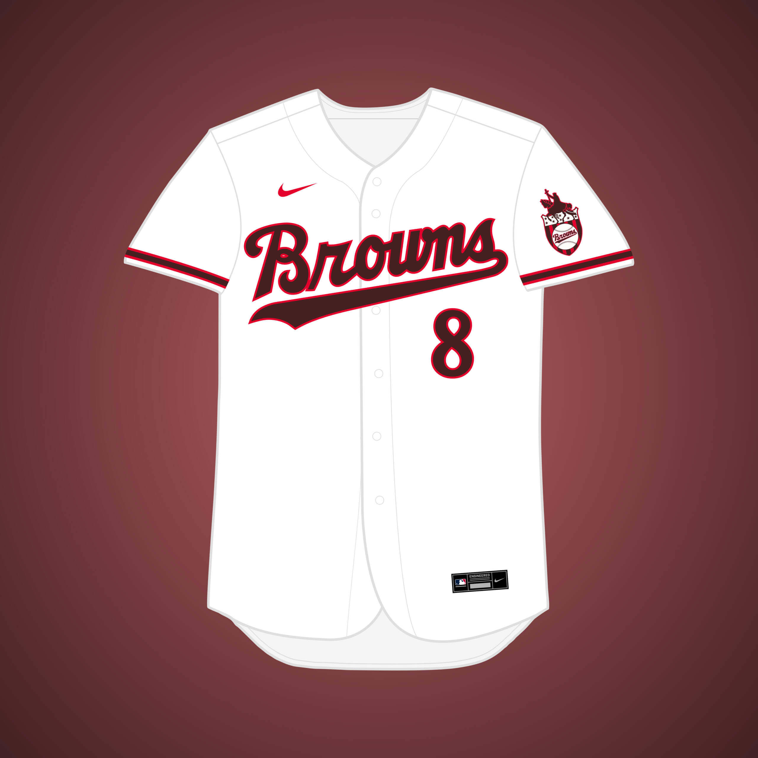
What if… the Browns relocated to Milwaukee (and changed their name)?
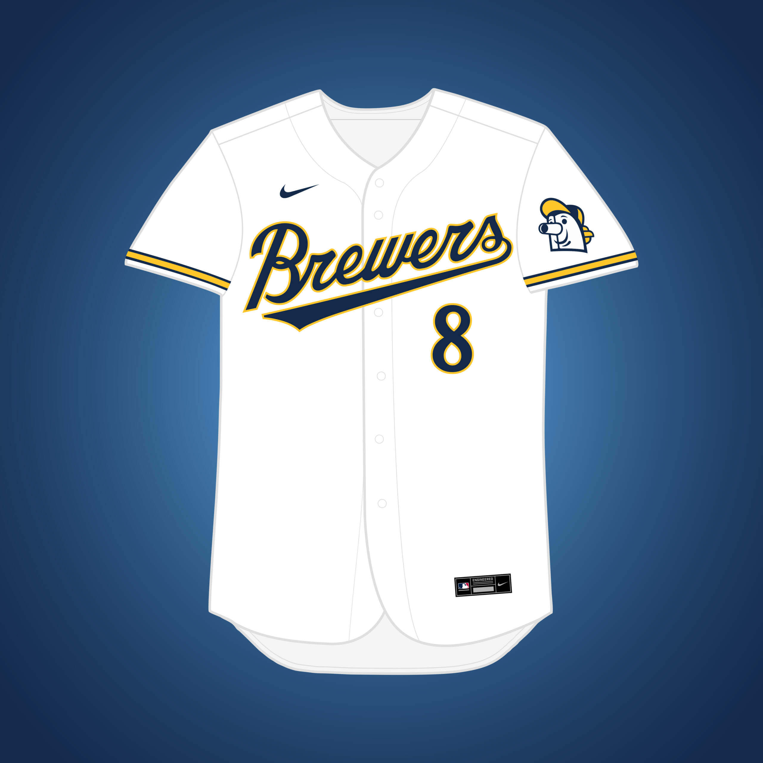
Once the Busch family bought the Cardinals, Browns owner Bill Veeck knew he couldn’t keep his team in St. Louis, so he tried to move to Milwaukee in 1954, but it was blocked by AL owners. The wordmarks have a bit of Orioles flair.


What if… the Browns relocated to Milwaukee?
This is the same premise as my original Browns → Milwaukee design, just if they kept their name. Brown is paired with gold for this version.


What if… Cleveland’s baseball team relocated to New Orleans?
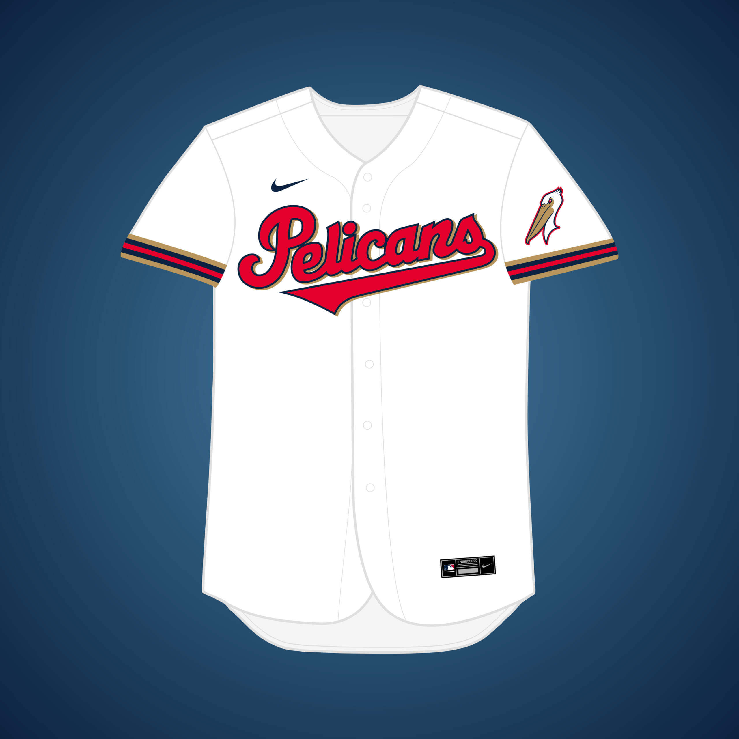
In 1971, a report surfaced that the team agreed to play 30 games a season in NOLA for 20 years (!), starting in 1974. I figured if the team ever moved there full-time, they’d snag the “Pelicans” name before the NBA.


What if… the White Sox relocated to New Orleans?
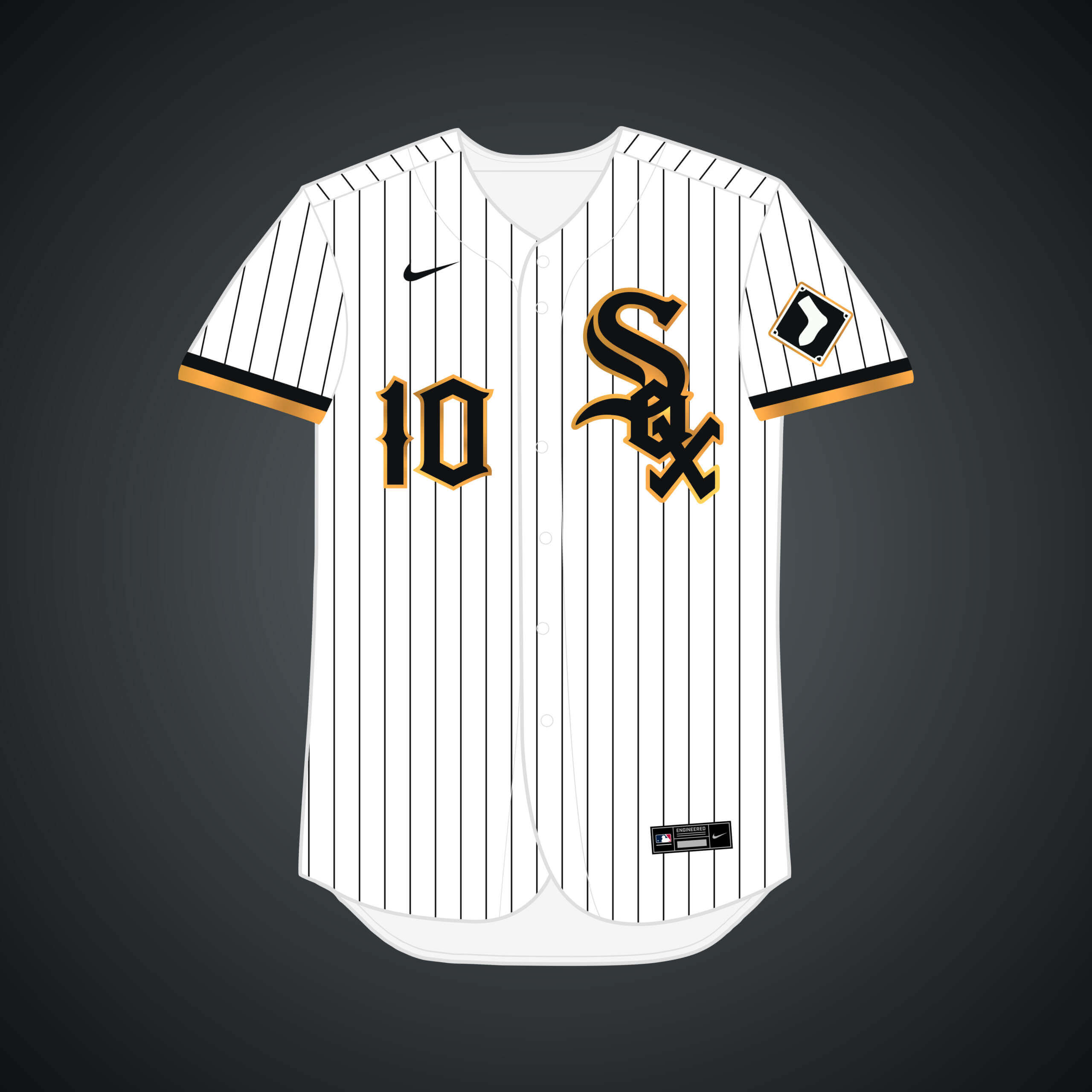
Prospective buyer of the team in 1980, Edward DeBartolo Sr., hinted that he might move the team to New Orleans if he got the chance. Gold accents are added to the team’s black & white palette to align with the Saints.


What if… the Rays relocate to Orlando?
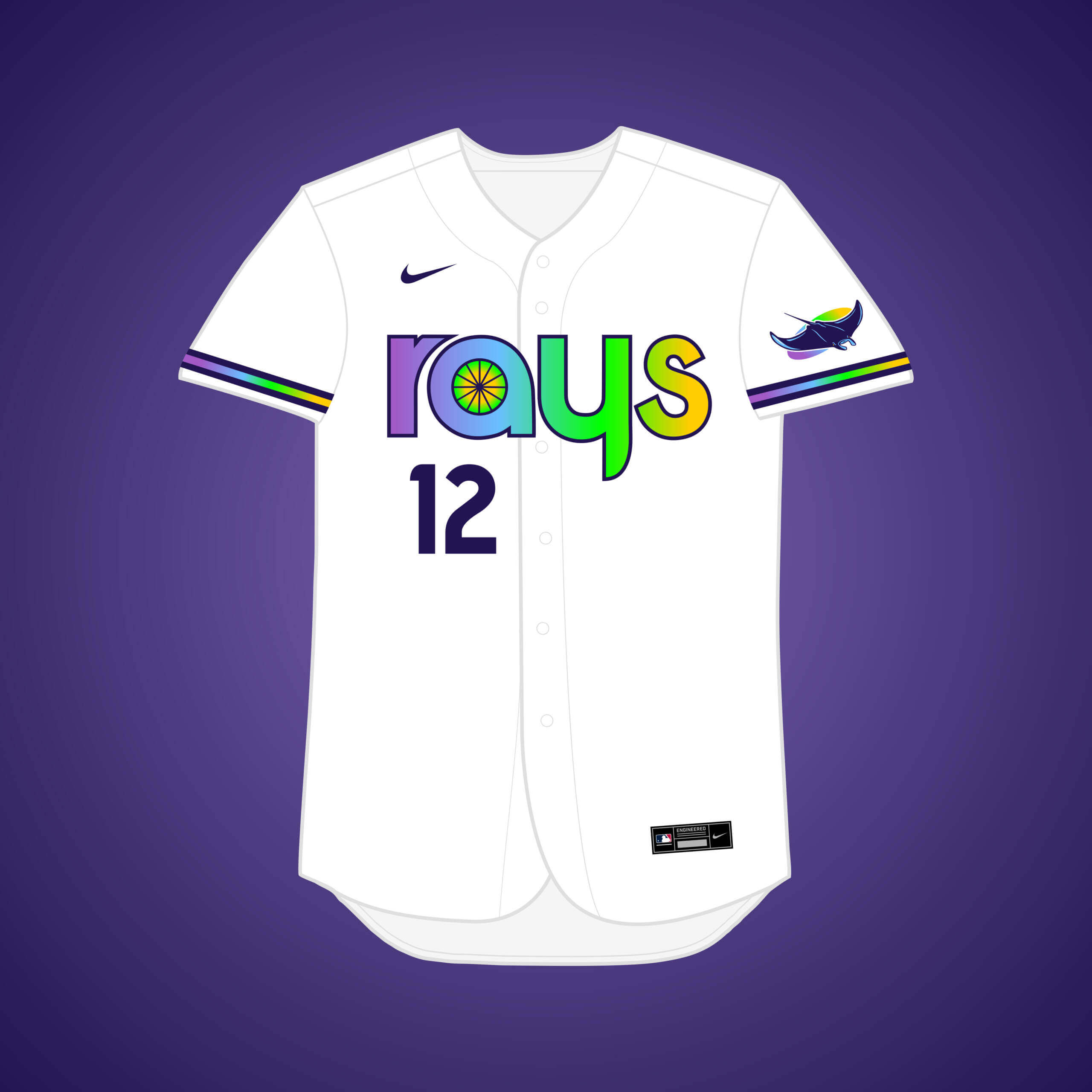
This one is unlikely, but “Orlando City Baseball Dreamers” founder Pat Williams has said he would welcome discussions with the Rays to move there. This set was the perfect opportunity for me to try out the 90’s gradient full-time.


What if… the Browns remained in St. Louis?
The Browns moved to Baltimore in 1954 and became the Orioles, but what if they didn’t? It’d feel weird for a St. Louis team to not have red in their color palette, even in an alternate universe.


What if… the Twins relocated to Tampa Bay?
A TB group bought a minority stake in the Twins, but once word got out, a “ticket buyout” ensued to boost attendance numbers and keep the team in Minnesota. Navy & light blue, colors the Twins have used, are now the primary scheme.


What if… the White Sox relocated to Tampa Bay?
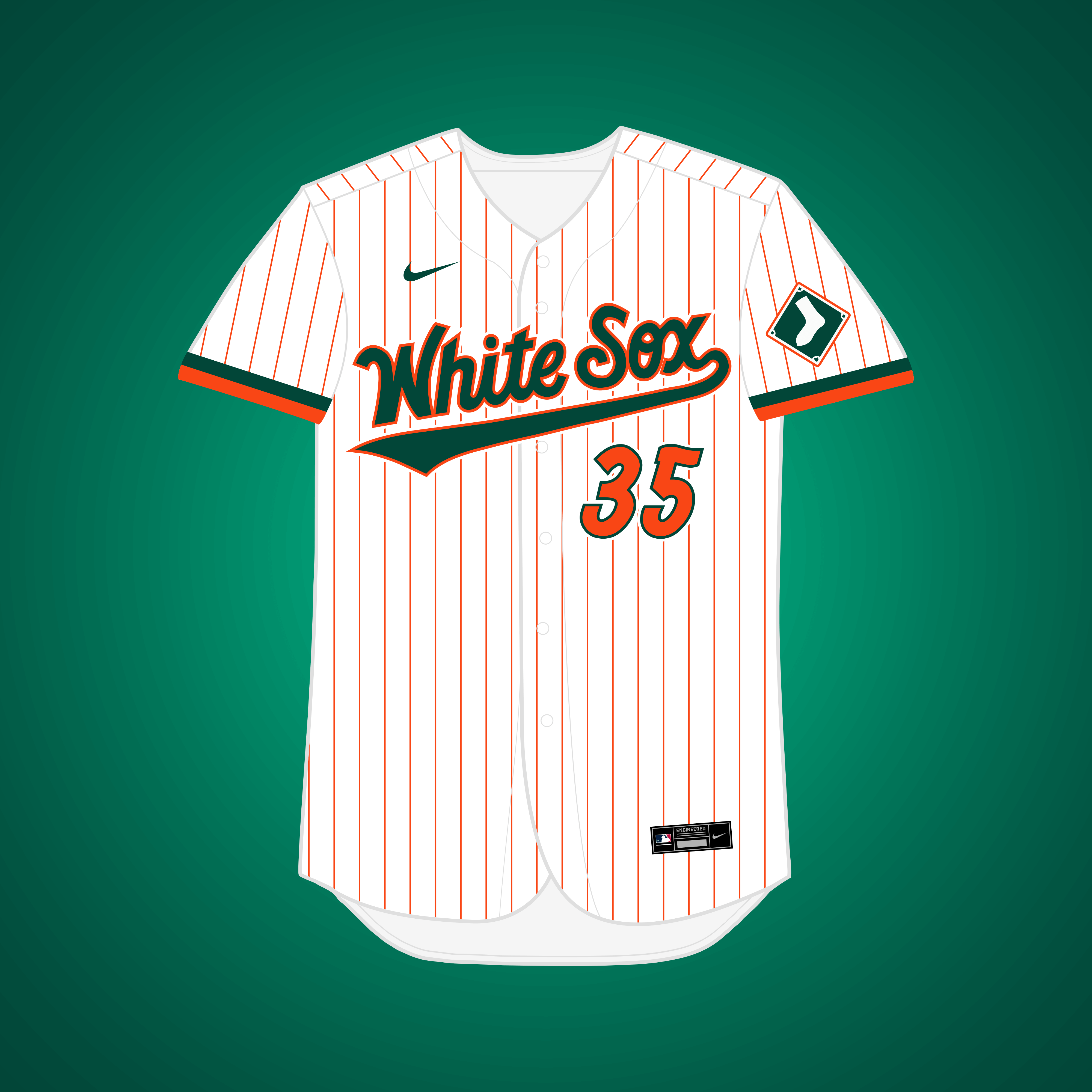
The Sox were minutes away from moving to what is now Tropicana Field, but an after-midnight vote that won by one kept them in Chicago. Leaked t-shirts showed the team considered going with a forest green & orange color palette.


What if… the Pirates relocated to Washington (and changed their name)?
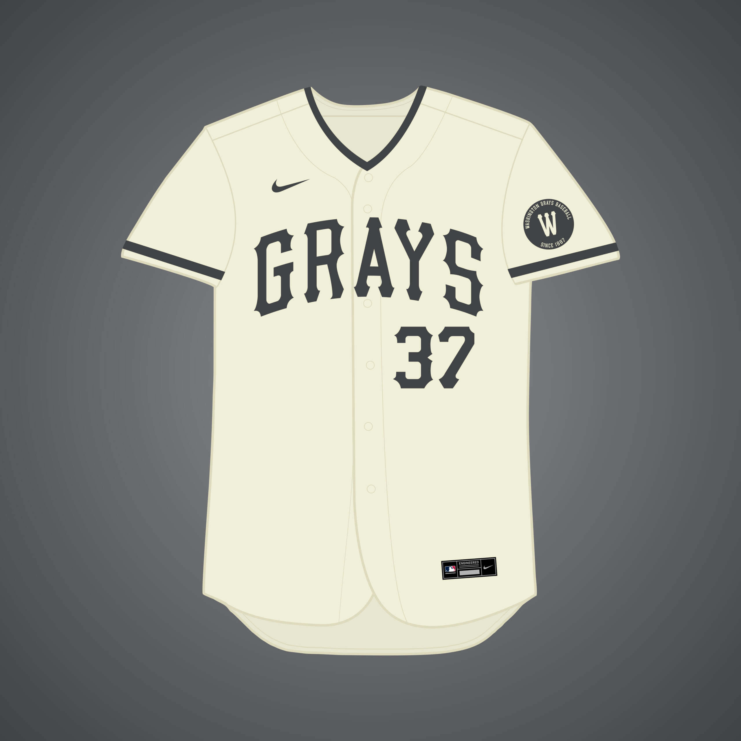
They considered it twice in the 80’s and 90’s. This was the perfect opportunity to honor the Homestead Grays, a Negro League team that played home games in both Pittsburgh and Washington in their history.


What if… the Astros relocated to Washington (and changed their name)?
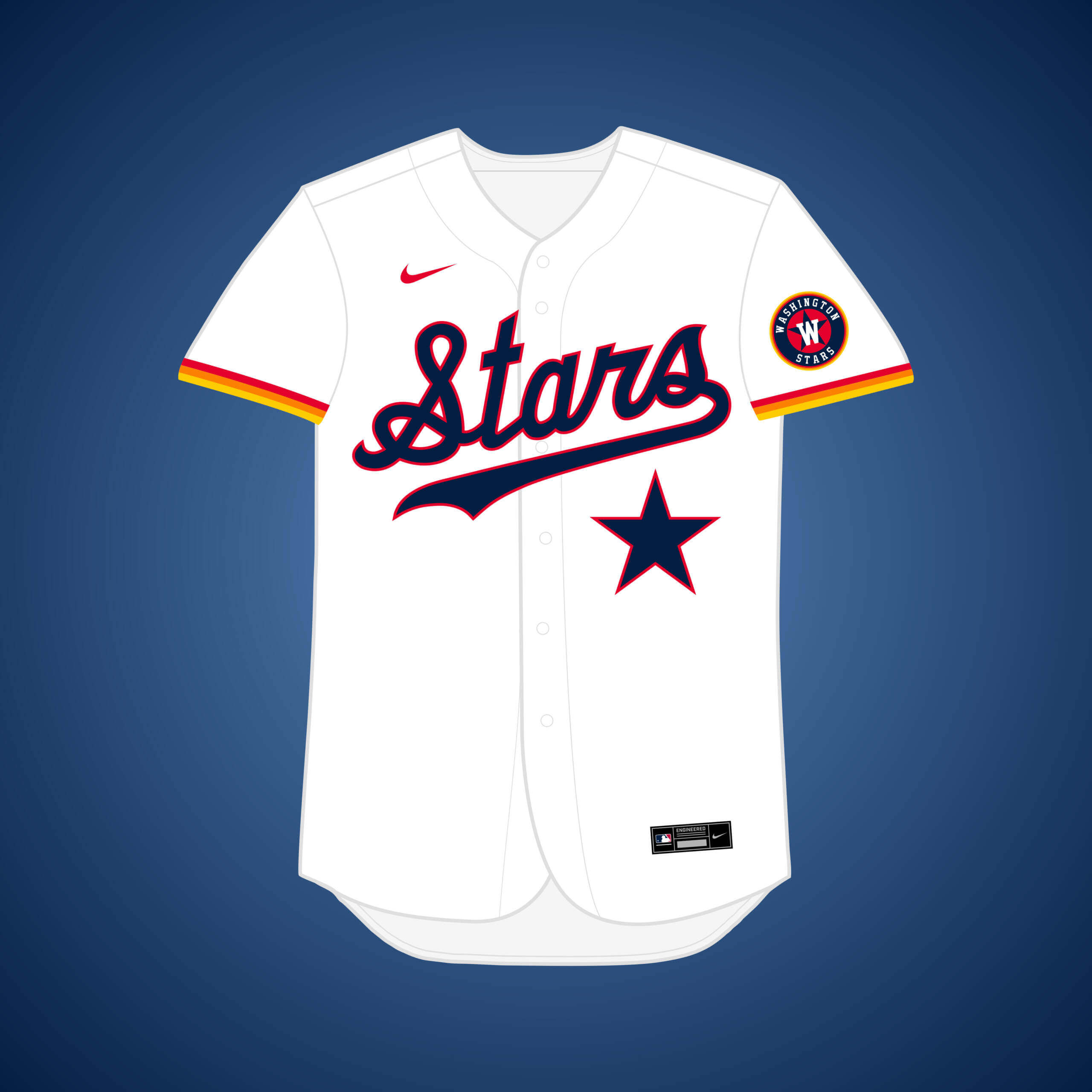
This is me trying to make the best of the previously covered “Virginia Fury” move, where the Astros instead move to DC proper. This allows for the space theme to remain but with a more patriotic twist.


What if… the Padres relocated to Washington (and changed their name)?
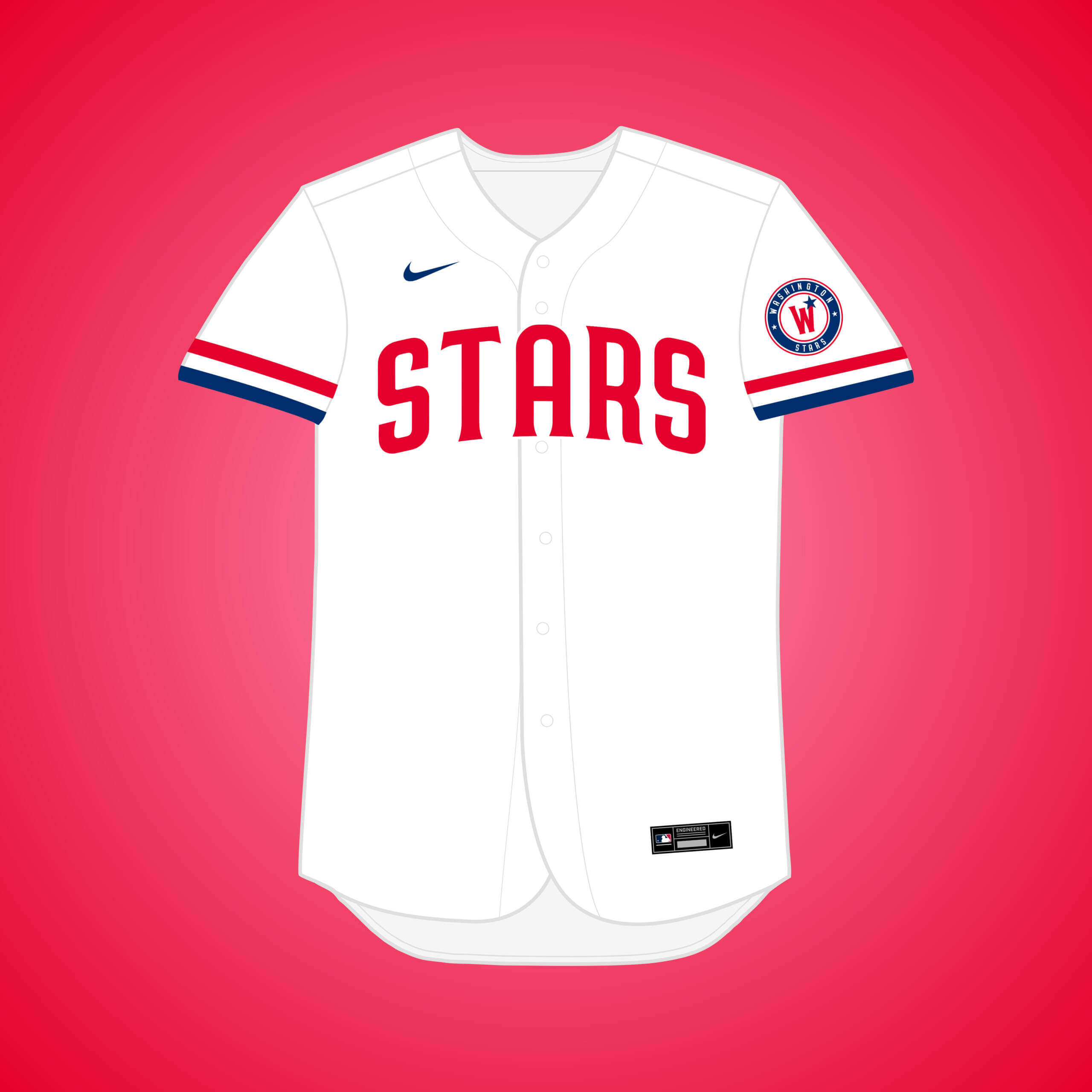
This one is the same premise as my original Padres → DC design, just if they changed their name to another one they considered, the “Stars.”


Once again, thanks Matthew! Really fun series of “what if’s” — I knew some of these proposed relocations, but a bunch of them have been a revelation. Nice job.
Readers? What say you?

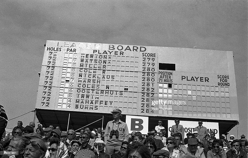

Guess the Game from the Scoreboard:
The 1975 British Open at Carnoustie. After 72 holes, Jack Newton and Tom Watson were tied at -9, but Watson ended up winning in a playoff.
Great job again. The Twins keeping their name in Tampa Bay makes sense, with Tampa and St Petersburg, but why Charlotte? Also, I’m curious why the American League owners blocked the Browns from moving to Milwaukee?
Fraternal twins North and South Carolina. Flags on the sleeve gave it away.
So the hat would have a “TS” instead of “TC”.
Hey Rick, as Walter said, the “Twins” name would be meant to refer to the twin Carolinas. I think the hat could still be a “TC,” but would really be a “CT,” for “Carolina Twins.”
On. browns returning:
link
And more specifically:
link
The American League owners despised Bill Veeck. They wanted to force him to sell; once someone else got the Browns, they had little interest in preventing a move. Which is what happened, resulting in the Baltimore Orioles. It took Veeck seven years and pouncing on the business turmoil in the Comiskey family to get back into baseball by buying the White Sox.
Now, if the Houston group that had bid on the Cardinals was willing to switch its bid to the Browns, that could have worked for everyone. The Cards would gladly dump their territorial rights to the Houston market to get rid of the Browns. The Houston group would have cut its price to get a much worse organization, but at least in a virgin territory the awful Browns would have no competition. The AL would be happy not to have a Baltimore team crowding the Senators, but it would be unhappy with Houston travel costs, if it was unhappy with Atlanta ten years later.
I’d like to see Houston Browns uniforms, but I suspect they’d look like the Padres’ taco uniforms.
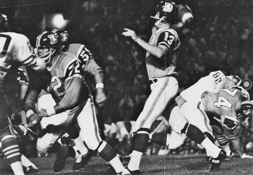
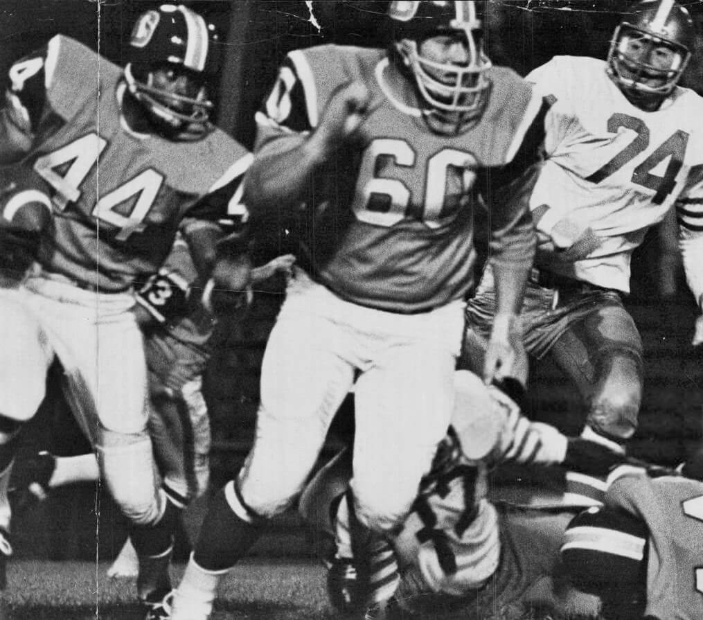
Guess the Game from the Uniform:
8/23/1968 49ers at Broncos preseason game. The Broncos wore their 1965/66 jerseys with their 1967 pants and their newly revised blue helmets with the D logo (in 1967 the blue helmets had no logo and the stripes were reversed)
All right John! yes, the Broncos really mixed it up here, a little bit from the past seasons.
The pre-season patchwork Broncos looked far better than what they came out dressed in at the start of the ‘68 campaign – those orange pants…yuck!
They looked equally awesome!
Actually, the Orlando Rays has already happened as they were the Double A affiliate for Tampa Bay 20+ years ago.
Indeed, Chris! The design was meant to be a Major League extension of that team.
Would have been interesting if Browns went to Milwaukee, since that is where the franchise started in 1901 as the Brewers
Always a fun project to see. Excited to see more if you haven’t run out of “What ifs.”
On the Astro version of the Washington Stars, I’d be curious to see the uni number inside the front star.
Hey there TP, I have not yet run out of designs, there will be at least one more volume, possibly two. Stay tuned!
Florida White Sox t-shirt prototype:
link
Yep, that was it!
Multiverse project is awesome! I wish the Cardinals would put St. Louis on their beautiful road grays already.
Thanks Brent! Me too, for my regular MLB series that was pretty much my only change for them.
Well done again, Matthew!
Thank you, John!
A’s in Atlanta wearing red and orange – Alternate jersey logo inspiration at least?:
link
The white Rays jersey with the gradient is outstanding and the runaway winner.
Thanks! Since posting it, I’m a bit concerned that the colors might be a bit *too* bright, but otherwise I like how it came out.
Thanks for the Multiverse series. Stuff like this is one of the many reasons I love this page!
Thank YOU, Daniel! I enjoyed creating it.
Good stuff, Matthew!
I never really thought about it ‘til now…it’s a shame MLB does not have a teams called the Grays or Stars, no matter where they would call home – these are my 2 favorites of your concepts this time around. The purple Pirates look good too(so glad you didn’t opt to go with the so-over-done state CO flag thing).
Not fond of the addition of red to the gone but not forgotten Browns (another sorely missed baseball branding!), And no to pick nits, but red/yellow didn’t become associated with Atlanta until the Flames came to be in ‘72 (the Hawks followed their lead and switched to those from blue/green) – but hey, whose to say the A’s wouldn’t have done it first if the moved?
Thank you, Chris! I agree that “Grays” and “Stars” would both be great names for MLB to have. I might even prefer “Grays” to “Nationals,” but I’m not sure if I’d want to sacrifice the Pirates for it.
As for the Atlanta A’s, since the designs would be their current iteration, it could be said that they followed suit with the Flames & the Hawks, or they pioneered the way for the scheme. Either way works!
Again: Why isn’t there a red and yellow (gold) MLB team?!?
Agreed, Walter. I think our universe’s Angels would be the best candidate.
After A’s owner “Charlie O.” was denied moving to Atlanta in 1964, the Schlitz Brewing Company tried to buy the team in a majority stake
I’m drinking out of an old Schlitz glass as I type this. Even if I wasn’t, I’d drink to a Schlitz-owned Milwaukee Athletics!
The Sox were minutes away from moving to what is now Tropicana Field, but an after-midnight vote that won by one kept them in Chicago. Leaked t-shirts showed the team considered going with a forest green & orange color palette
But what color were the socks going to be?
Carolina Twins, Tampa Bay Twins… I’d be fine with either, especially if they looked like this!
I’m sure any of the many scenarios where you have the Pirates moving would have “broken” my heart at the time, along with my dad’s. Now… maybe they should have done it. The current owner has sucked out my passion for the team. And if one possibility would be them becoming the Washington Grays? I think I’d be fine with that.
Very nice project!
Thank you Jim!
Ironically, I myself am a Twins fan, so the situations you’d be fine with would have “broken” my heart before I was alive to even experience them!
The Grays and the Browns St Louis prototype are some excellent design choices!
Thank you very much!
What if…Hank Aaron hadn’t said the new 1972 Braves uniforms were too red. Instead of changing the pullover uniforms to royal blue, the Braves had worn red road jerseys with white sleeves, and white home jerseys with red sleeves. Would love to see that in Matthew’s next installment, along with any other proposed MLB uniform changes that never went through.
And what if…MLB jerseys didn’t have the Nike swoosh on the front. I’d like to see as well!
Hey David, since this series only deals in near-relocations or lack thereof, the Hank Aaron scenario wouldn’t really fit the criteria.
As for Nike, although I’m not quite the worshipper of them I used to be, I still like a lot of their designs, and am not too bothered by the “swoosh” on the jerseys.
Great stuff once again, Matthew. Your interpretation of the Carolinas as twins in that sleeve logo is especially brilliant. But like you, I am happy that the Twins are still in Minnesota. I like all incarnations you designed but the Browns in brown and red are really excellent: the look of a delicious chocolate cherry cake!