Good Sunday Morning all. I hope everyone had a good Saturday and you’re staying cool!
I’m back again with Chris Diamond as we finish up “Phase One” of our exploration of monochrome dark unis in baseball. In case you missed it, you can check out Part I and Part II, where everything you need to know is explained. Let’s get started!
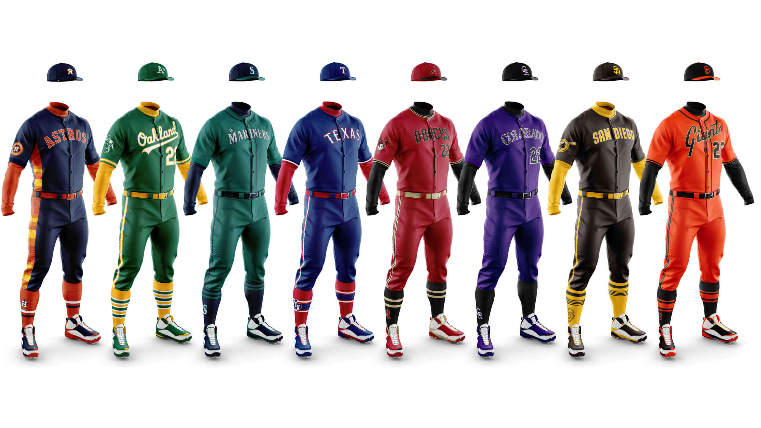
Houston Astros Navy
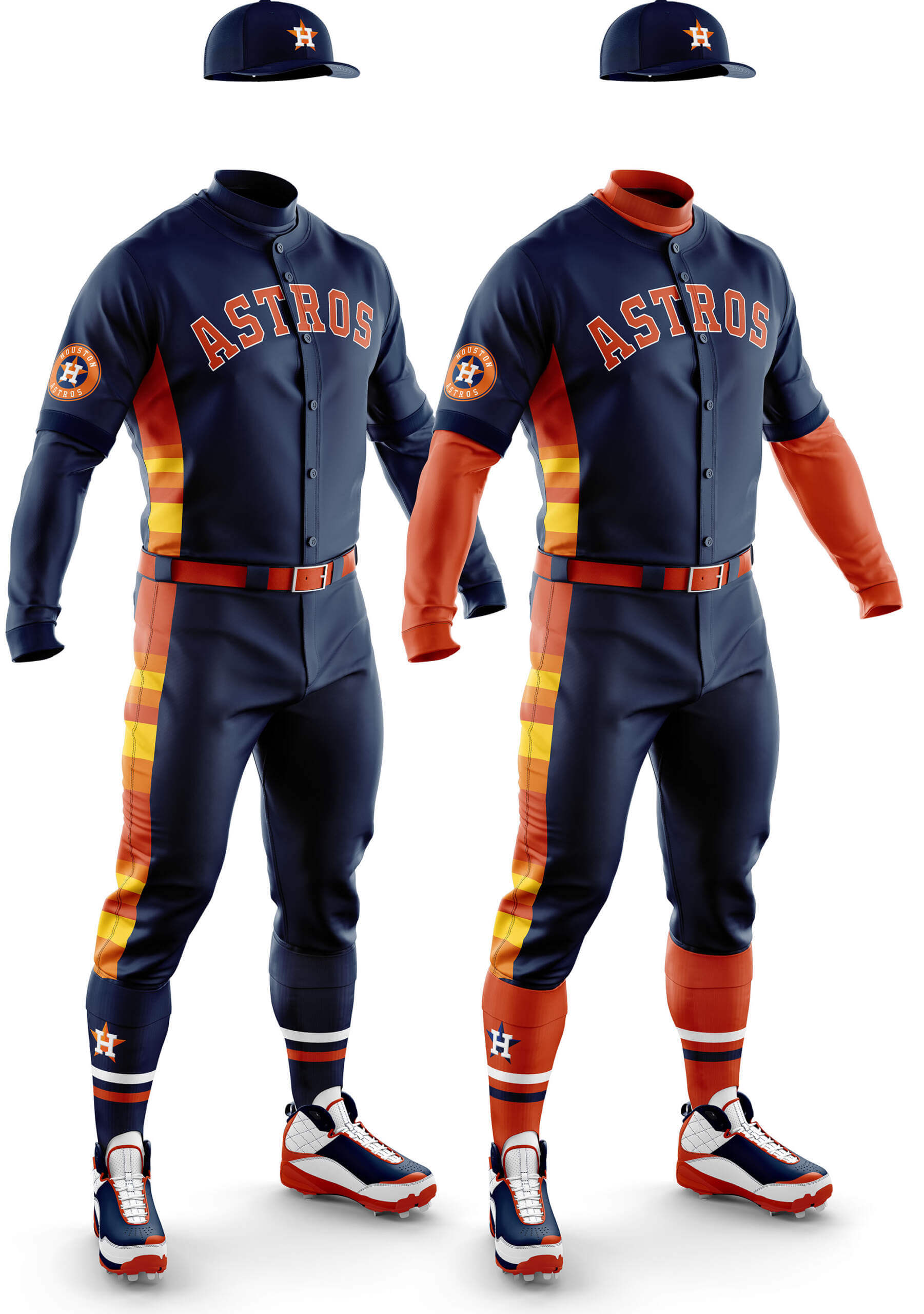
Chris Diamond: I think this shows some of the most exciting possibilities of what you could do with monos –- something we will explore in Phase 2. The extension of the side stripes down the pants somehow sets off the mono-ness of it all, even for the all-navy version. It may be too much for some, but the continuing popularity of the original tequila sunrise jerseys shows you can make that kind of boldness work.
Phil Hecken:
Unlike the East and Central divisions, this navy blue set is one of only two mono-navys in either west division. Unfortunately, IMO, it’s one of the worst looks for any mono-navy. I’ve never liked the alt-navy jersey, even with it’s allusion to the rainbow guts of Astros past. Still, for all its faults, it’s still better than the Astros City Connect uni…and that’s saying something.
Houston Astros Orange
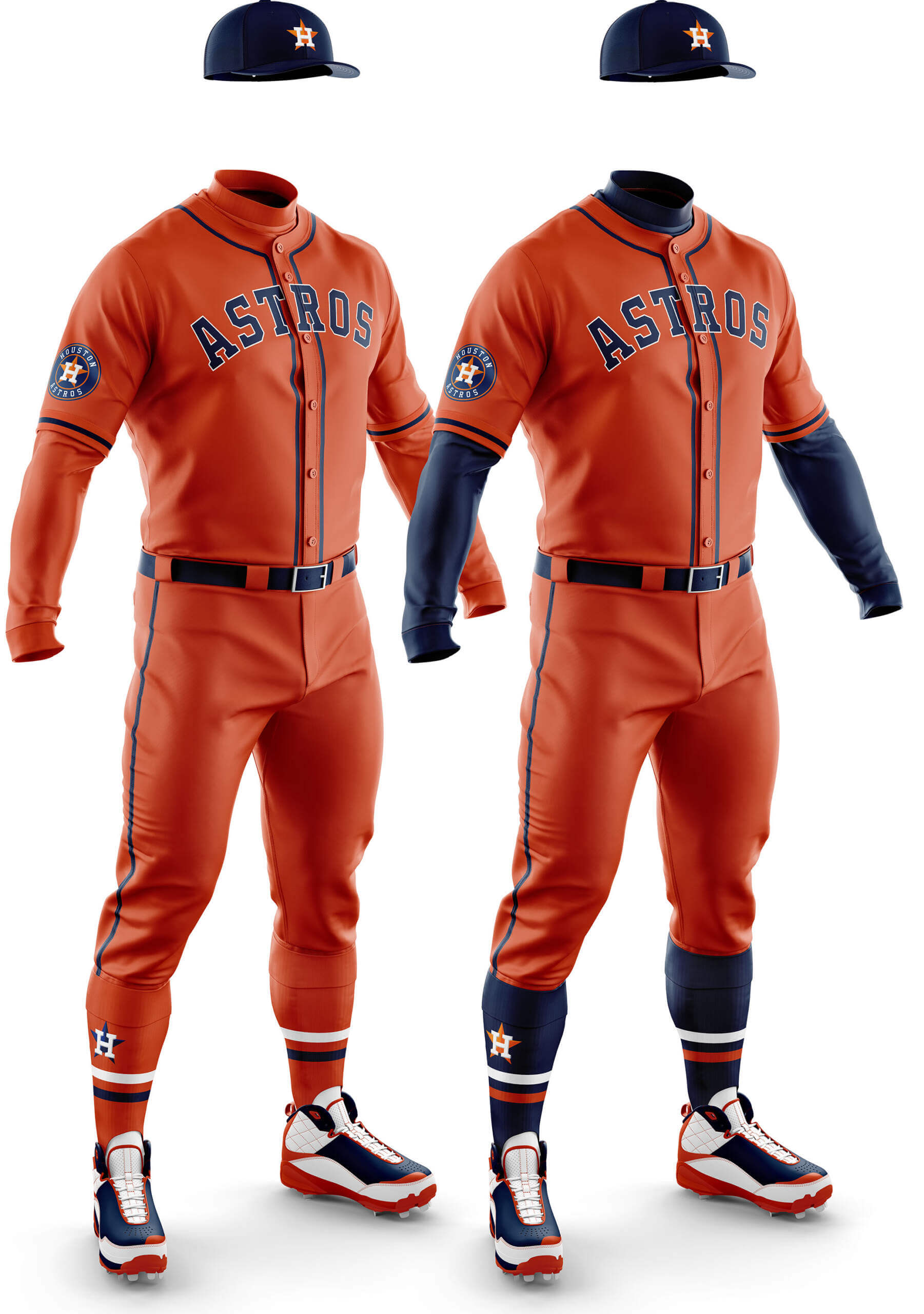
CD: I think the orange uni suffers by comparison with the spectacular navy one. It doesn’t help for me that I feel the wordmark font the Astros use is so college block for team that cries out for something more modern. On the navy uni with the stripes you don’t notice so much, but here the plainness makes it stick out to me.
PH: Unlike the Orioles all-orange, this one does nothing for me. It’s much better than the mono-blue (both Chris’ graphic and the CC), especially with the contrasting navy cap/sleeves/socks, and I’d even prefer it to the orange jersey/gray pants combo. There’s room for one or two mono-orange unis in MLB, but this isn’t one of them.
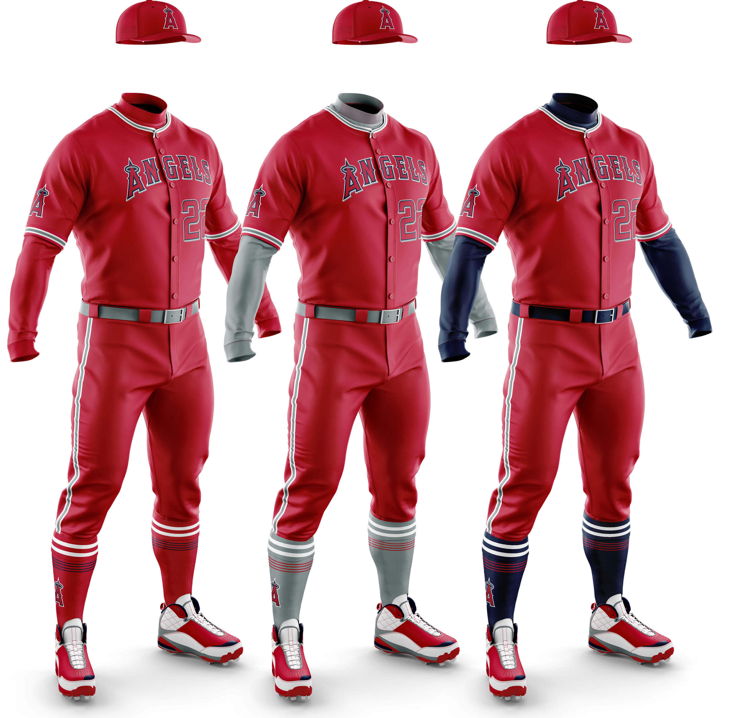
CD: The Angels are one of those rare teams where there are two main secondary colours. Sadly for me this hasn’t helped as all three are a bit meh… Of the three I think the grey undershirt and socks works best, but the Angels are going to be one of those teams that need a bit of work for Phase 2!
PH: With their ghosted wordmark and number, the red jersey already has too much red…adding red pants makes a bad jersey into a bad uniform. The Guardians and Reds might be able to pull off the mono-red look, but not LAA.
CD: I imagine these will be popular in certain quarters 😊. I think they look pretty darn good too – one of the best from Phase 1 for me. If the team move to Vegas it would be a shame to lose this colour combo, but I think they should at least leave the colours in Oakland if they leave, if not the whole identity. Given the country-wandering nature of the Athletics franchise over the years, though, that seems unlikely.
PH: There is definitely a historical precedent for the A’s in mono-green, and I, for one, love the look. The gold sleeves and socks work very well — in Phase One they keep their solid green cap, but a green crown/gold billed cap would do wonders for this one. And since the A’s were uni-innovators in the 60s and 70s, this would be a great fauxback look.
CD: I’m a big fan of the Seattle area blue/green uniforms in general so I like these, even if the overall design is a touch plain. Having a different bill colour on the cap has a bigger effect than you might imagine for me –- something I’ve noticed from Phase 1.
PH: I don’t hate these as much as I thought I would (particularly with the teal…er, Northwest Green … sleeves and socks). But there’s still way too much mono-navy in Phase One. Besides, the team just got a tremendous CC uni which obviates the need for any mono-navy. And until the Mariners fix the kerning issues on their navy alt, this is a NO. The team needs to just ditch this jersey altogether.
Seattle Mariners Green
CD: I like these too, but I feel the green works better as the secondary colour so the navy ones edge it for me.
PH: I honestly thought I’d like the mono-NW green with the blue sleeves and socks (and the two-tone cap works well too), but after seeing them mocked up, I don’t. It’s got potential, but that’s all.
CD: The asymmetrical striping messes this up for me -– I think it’s basically the same blue/white/red striping as on the regular jerseys but it just doesn’t work for me here.
PH: The Rangers have always had problems deciding if they are a “red” team or a “blue” team, and the royal mono with red sleeves and socks actually captures this dichotomy perfectly. Add a red cap and it completes the “we’re both red and blue at the same time” mindset that encapsulates the Rangers uniforms.
Arizona Diamondbacks Black
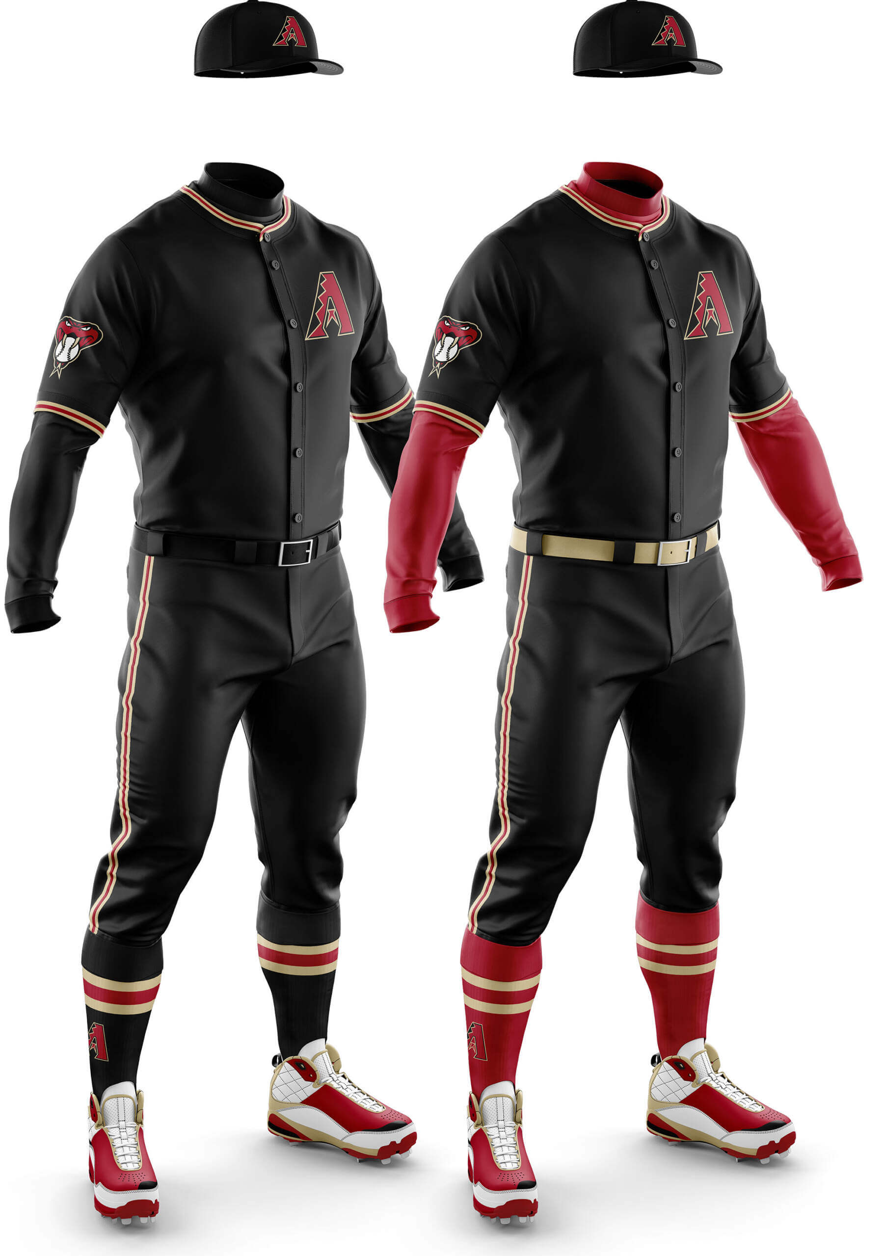
CD: Black is a team colour but this feels a bit BFBS to me even if it isn’t. With the Sedona red sleeves it comes closer to working, but it’s still a miss for me.
PH: The black with red sleeves/socks isn’t horrible, but I’ve always questioned black as a color for a desert-based franchise. It’s not like purple and teal feel particularly southwest-y either (I’ve always felt they should be copper and turquoise). But I will admit the black with the red and the “sonoran sand” (or whatever they call it) kinda works. But as far as mono-black goes — there are more than a couple teams that might pull it off. AZ isn’t one of them.
Arizona Diamondbacks Red
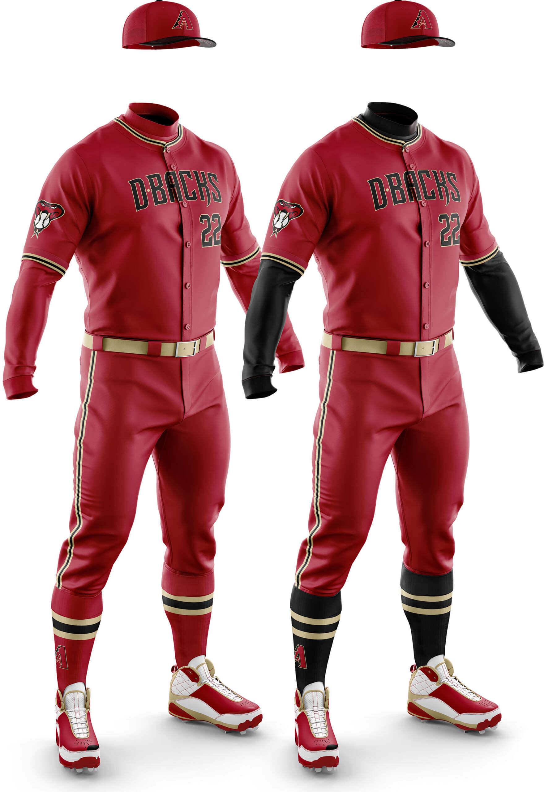
CD: Black as a secondary colour and the way it’s used consistently with the Sonoran sand make these a contender. I did consider doing a third colourway with sand undershirt and socks but it didn’t really work due to the order of sleeve striping and the cap black bill.
PH: Ugh. No.
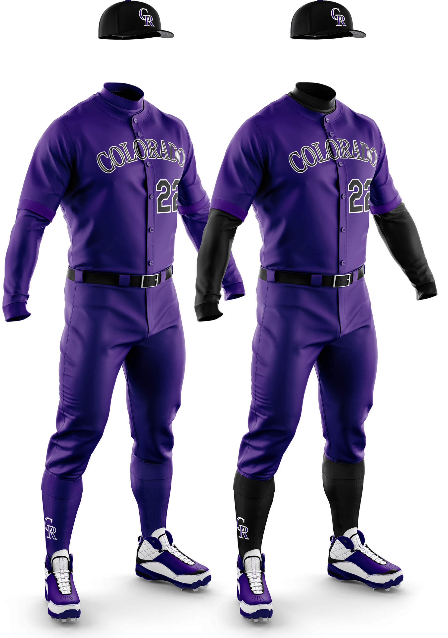
CD: This is pretty much the antithesis of the Oakland green! I do like purple, but the extreme plainness and combination with black can’t save these pyjamas!
PH: Hmmmm. I’m not anti-purple, and I actually prefer this shade to the darker purple they used a few seasons ago, but even I think this mono look is too much. The black sleeves and socks don’t help it either (unlike the Ravens, who can somehow pull off black and purple in a not entirely unattractive way). I wish something could salvage the mono-purp…but I don’t think it can be done.
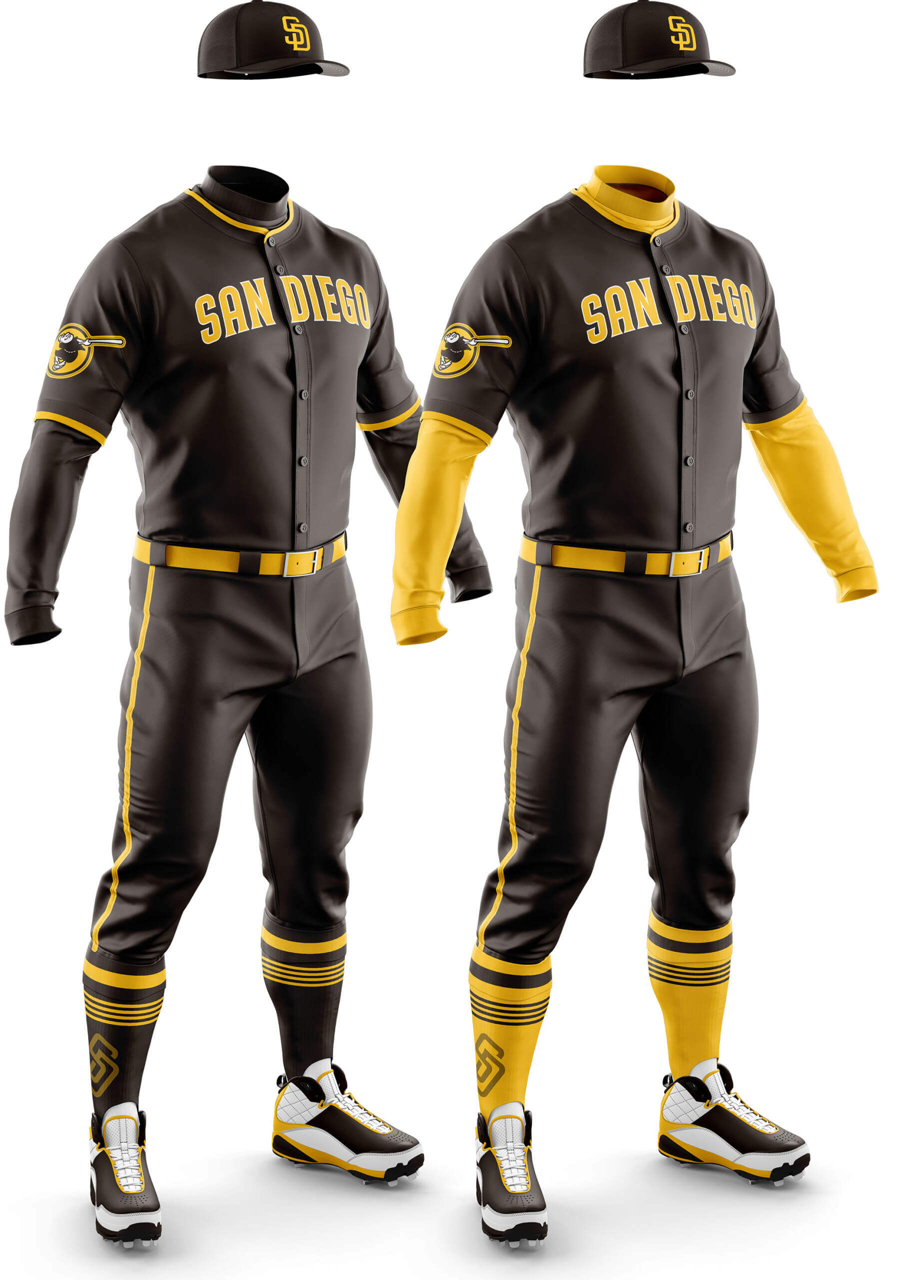
CD: I’m really glad the Padres went back to Brown and Yellow and I like both of these looks. The broad pant striping (see also Houston) makes a big difference for me and I wonder if gold front panels on the cap would have made it even better?
PH: I’m really glad the Padres went back to brown and gold too, but the mono-brown reminds me of this. And I don’t like that. Instead, I wish the Padres had an alternate gold jersey so they could look more like this. And I do like that.
CD: This is pretty much the same as the Pirates home black alt but with orange instead of gold. I didn’t like that and I don’t like this!
PH: I wouldn’t mind seeing that mono-black with orange accoutrements for a few road night games a season.
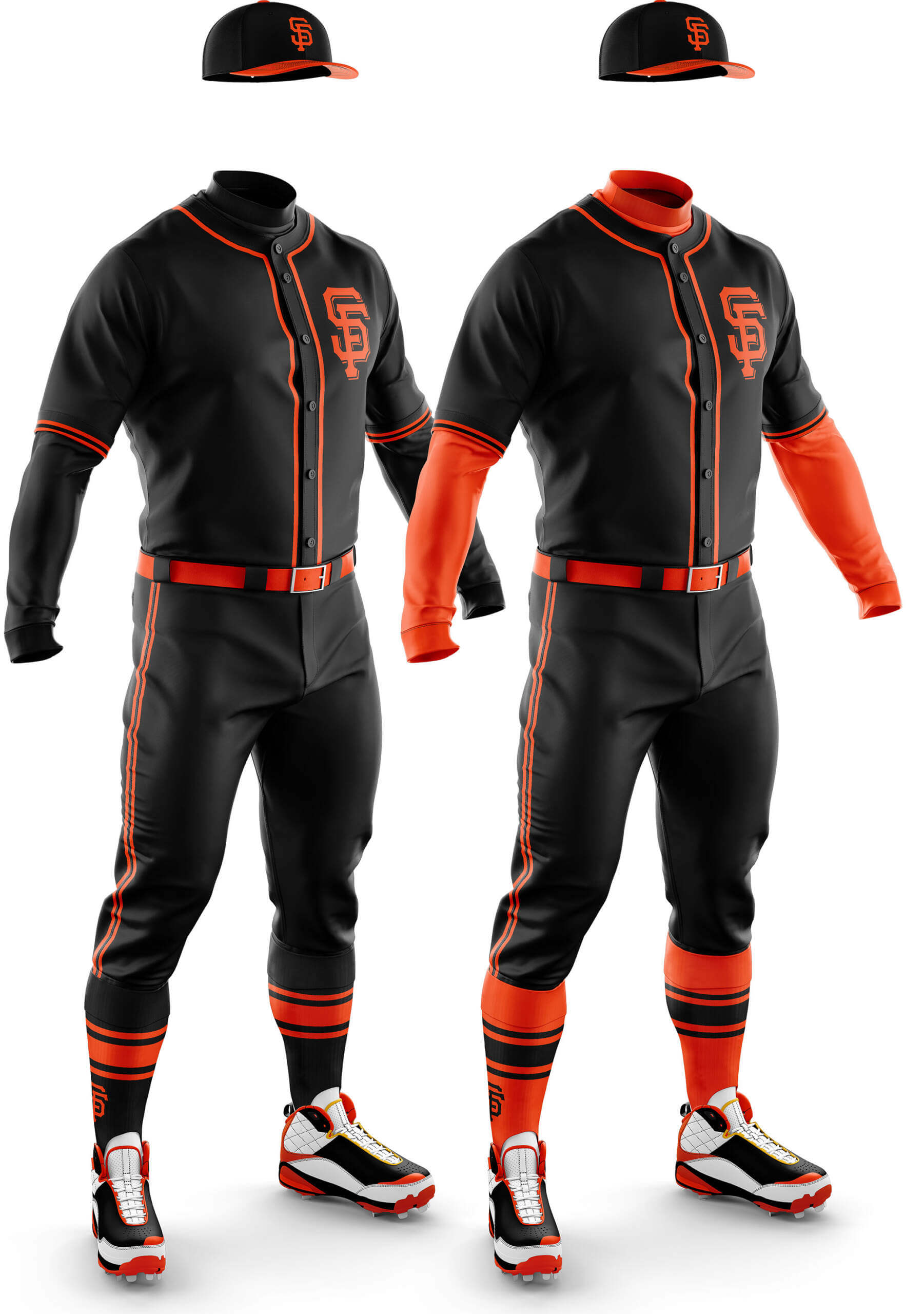
San Francisco Giants Orange
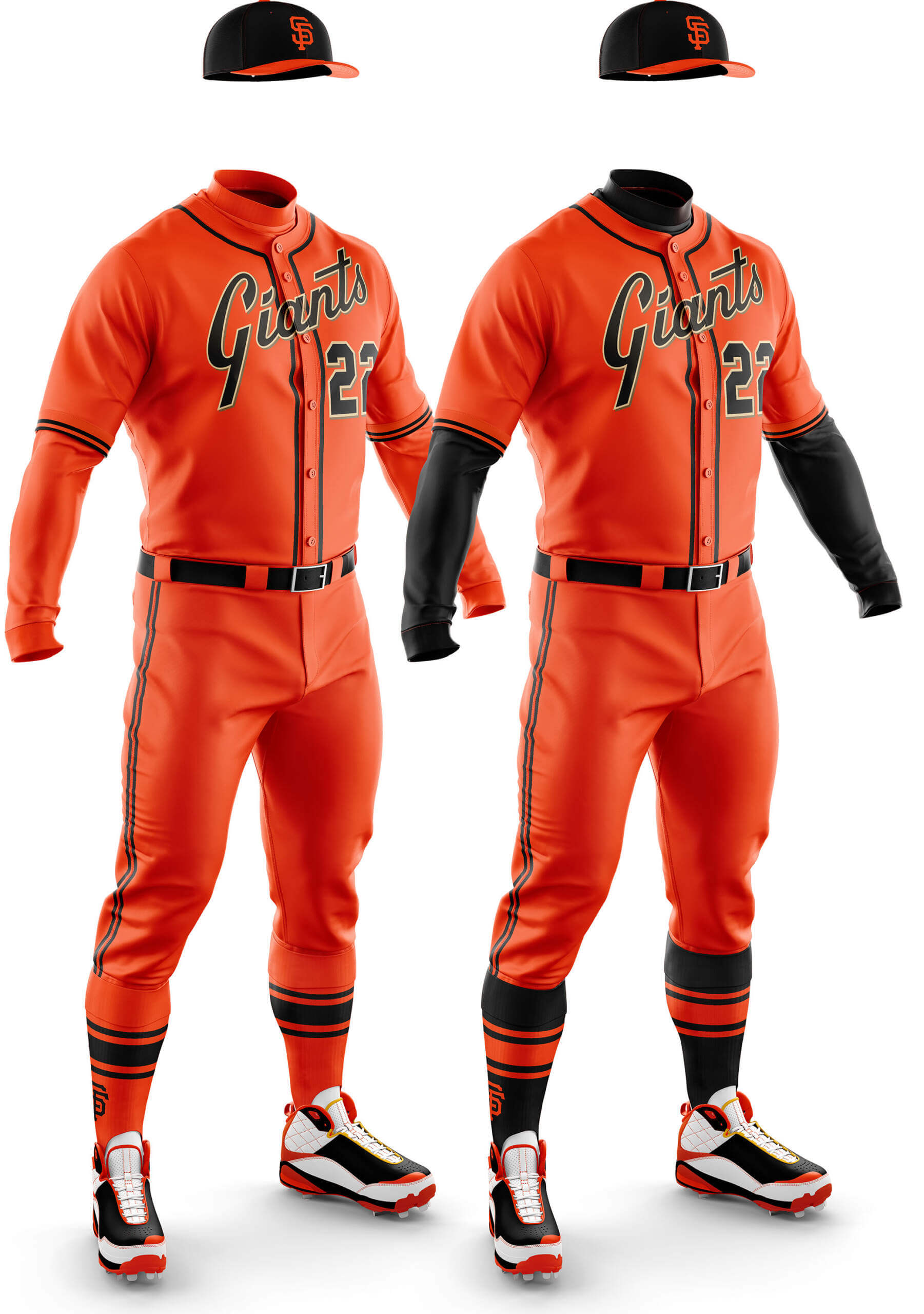
CD: I think the use of the additional cream/gold in the wordmark and numbers but not the stripes was a missed opportunity. With a bit of a tweak along those lines it could work, but as it stands it’s too disjointed for me.
PH: I wouldn’t mind seeing that mono-orange with black accoutrements for a few home night games a season.
I want to again thank Chris for all his assistance (and patience) in creating the mono looks. Being able to visualize the potential full uniforms definitely makes it easier to contemplate how they might look on the field.

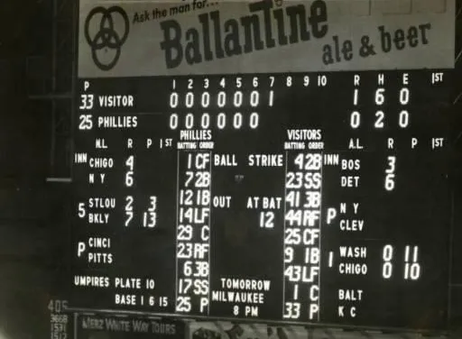

The GTGFTS is the May 15, 1956 night game between the visiting Milwaukee Braves and the home Philadelphia Phillies, which was won by the Phillies 3 – 1.
I’d like to know which team was the last to identify their opponent only as VISITOR on their main scoreboard. I know I’ve seen footage from Dodger Stadium where the field-level auxiliary board says it. And I think Cleveland. I think it was still a thing into the 70s.
The Cubs still do, in one particular location: in the middle of the scoreboard, where they say how many hits each team has.
GTGFTS, May 15, 1966, Phillies 3, Milwaukee Braves 1 @ Connie Mack Stadium
Check that. May 15, 1956
GTGFTS
May 15, 1956
Phillies beat Braves 3-1 in front of 13,141 at Connie Mack Stadium
Marv Blaylock is up and will strikeout against Lew Burdette, but the Phillies rally with 2 outs to take the lead.
Stu Miller gets the win.
Other games pictured:
Giants 6 Cubs 4
Dodgers 7 Cardinals 5
Tigers 6 Red Sox 3
White Sox 5 Senators 1
Orioles 9 Athletics 5
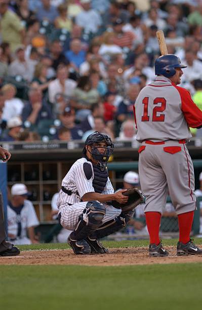
GTGFTU: July 15, 2006, Kansas City Royals at Detroit Tigers
My process getting there
At first I thought it was a yankees uniform until I saw the dugout in the back. I recognized it as the Detroit Stars uniform the tigers have worn frequently. I also recognized the catcher as Ivan Rodriguez, so I knew it had to be between 2004-2008, the years he played for the Tigers. I then consulted my copy of the Game Worn Guide to MLB Jerseys to find the dates this particular throwback was worn these years, and found this game vs. the Royals where they threw back to the Kansas Citcy Monarchs
That’s the ball game – nice work!
I too was initially thrown off by the pinstriped Pudge…thought readers would be too.
While I’m not 100% certain, this may be the last time KC took headwear half measures; they wore matching Monarch helmets for subsequent tribute games.
Few observations after seeing several of these.
I’m on board, with a few conditions.
Socks need to be a different color than the uniform. Same for undershirts, though I’m not sure what sort of undershirt regulations the league actually has. I know with my team the Red Sox, I see different guy wearing navy undershirts or red undershirts within the same game. But complimenting socks rather than matching socks are a must of the monotones.
Piggybacking off that, no more pajama pants. This is something I want to see in baseball period, but it would become even more of a necessity with a monotone uni (due to the enhanced role of the complimentary color socks). Knickers just below the knees, socks fully visible only. I’m indifferent to socks vs stirrups but no more pajamas.
Other than that, I’m in. These have all looked pretty good. The few real life examples we have grew on me too. End of the day I do think MLB/Nike will totally phase out grey away uniforms for all but maybe a few historic teams (Red Sox, Yankees, Dodgers for ex) and I’m coming to accept that. So with grey uniforms gone, the grey pants disappearing and shift to monotone will also probably happen.
Also, for the few who watch both, you can’t deny the ODI cricket kit vibe here.
Hi Alex, as a Brit I got the same vibe when creating these. They change all the time, but I would say all one colour is the preferred ODI uniform at the moment. One thing you never see in cricket (at least at First Class level) is white mixed with colour like in baseball. It’s either all white/cream or all colour.
Yeah, another interesting aspect of white ball cricket kits I find personally, is that while I often like the all color kits in the World Cup, I think most of the all color franchise T20 look ridiculous but that could also be my personal bias against franchise cricket skewing my viewpoint. As far as cricket aesthetics go though nothing beats cricket whites for me. Big Middlesex and England supporter and though I’ll watch the ODI World Cup (don’t even bother with T20 outside a bit of Blast), I only ever buy the County Champ and Test shirts.
For some reason the Giants all-orange set really scratches an itch for me. Maybe because I love that fantastic script. It’s sorely underused.
Seeing the Astros mono sets really reminded me how much I liked their mid 80s to mid 90s look. As popular as the tequila sunrise uniforms are, I liked the toned down look a bit better with basically tequila racing stripes. I think that set was very clean and classic and gets overlooked quite a bit. I’m likely in a tremendous minority there. I’m okay with that.
Thanks a lot, Chris and Phil! I’m starting to warm up to the idea of mono-colored Major League Baseball uniforms, and I blame you!
Thanks, Kary! As you’ve probably ascertained by now, the genesis of this project was to eliminate teams pairing “softball” jerseys with light pants — by creating a mono look for the alternate jerseys. And there is both historical and aesthetic precedent for mono-dark in baseball.
Phase One was simply (or perhaps, not so simply) to judge the possibility of some teams being able to go mono-dark, by adding same-color dark pants to the softball tops, without any other changes. The next phase will alter some elements to build a case for a few mono-dark unis that can look good on the field. The goal wasn’t to get you to like mono, per se, but to first and foremost eliminate the dark jersey/light pants look that — in no small part is due to merch dumping — has become so prevalent in baseball. I’ve always felt mono-dark can and will work, at least for some teams. Stay tuned!
These are all very well done. Kudos! But they also mostly reveal fundamental problems with various teams’s use of colors. As much as I’m an advocate of more colorful uniforms in baseball – I especially want to see the equivalent of powder blue for other team colors – the Padres brown is the only one of these I’d want to see in real life. Astros navy almost makes the cut for me (sorry, Phil, but navy with rainbow highlights is a great look for Houston). The Angels concept in particular illustrates the failings of the team’s red-on-red aesthetic. The concept is very well conceived and executed! But the Angels’ basic visual style makes it all but impossible to create a good uniform for them without either redesigning the team from the ground up or at least adopting the Angels’ CC logos.
Thanks, Scotty! Chris’ design expertise certainly helps to express the idea I’ve had in my head for a long time. And as far as what you like or what I like? I’m glad we disagree — you know what they say about opinions and buttholes.
And your thought about the “equivalent of powder blue for other teams colors” is also one I’ve had for decades (and even broached on here probably 12 years or so ago) — instead of gray roads, how about “powder red” (which actually looks like grayish-pink) for the Reds roads? How about “powder purple” (aka lavender) for the Rockies? Etc. Perhaps that’s something that we’ll further flesh out as this project continues. Stay tuned!
“How about “powder purple” (aka lavender) for the Rockies?”
Ooh! Count me as intrigued! Just don’t, you know, pair it with a darker shade of purple on the same uniform: link. ;^)
Powder purple sounds really cool, with matching pants not so much.
Excellent work by Chris Diamond, even though I am more of a football guy I have always liked baseball jerseys and Chris does such a tremendous job on his designs. The next time the people at Nike redesign another mess for a team, they should first go to Uni Watch and look at the Chris Diamond designs to see how a redesign should look, clean and concise with no clutter. When it comes to jersey designs Chris is in a league by himself, another great job on these uniforms. I would put Chris and Phil against anyone to come up with a uniform players would like to wear, and fans would like to buy the jersey to wear to the game. Thank you, loved the unis.
Thanks Jimmy for the kind words, it really means a lot when people appreciate what you do :)
I enjoyed the mono mock-ups, and some of the stirrups sets were palatable, even for my traditional sensibilities.
But there’s something about the headspoons that is off. The piping around the collar is too narrow – too close to the collar. The placket also, is too narrow. There’s only three designs, but it gives them that low-priced knock-off look! Hehe. Otherwise they look great.
“the country wandering” As have been in Oakland as long as the Braves have been in Atlanta. This is a bullet point the MLB had put out, but I can’t imagine there are very many baseball fans alive who remember the Boston Braves or Philly As.
I like this project but that comment grinds. What’s happening now in Oakland will happen in Tampa Bay, will happen to the Milwaukee Braves (who may get referred to as the Seattle Pilots along the way), and can happen to the LA Angels and near every team in baseball other than the Yanks, Dodgers, Cards, Cubs and BoSox. Let the owners and Manfred spit their talking points, there’s no need fans need to get behind them and repeat them.
Fans take their teams for granted: Remember the guy who wanted to move the Boston Celtics to San Diego? They can be snatched away in a heartbeat.
So true. The height of ridiculous was when the Supersonics got snatched to OKC. I don’t want to denigrate Oklahoma – every community deserves a team. But the idea a large, growing city we with a ten year old arena and less than a decade removed from being annual contenders, and the most popular team in their town – the fact that they could move to a considerably smaller town and nobody with the power to do anything cared enough to stop it – you should be skeptical of any and every argument on relocation or that denigrates a market. LA didn’t have a pro football team for 20 years somehow! Do not trust owners. They frankly don’t deserve to own these teams at all.
I wonder how either of the D-Backs black or red would look with the teal/turquoise trim they use on some of their uniforms? Thinking the back would look better with this.
I think we may explore that in Phase 2, Rick. Although when I was watching them play the Pirates the other day, I got the feeling the teal was added to be more like the AVNet sponsor’s colours! Even though it’s actually a throwback to the original colours. I’m not convinced mixing up the old and new colours works, but it would be interesting to try it out.
Yeah, the teal and red really don’t go together. I wish they didn’t change from their original colors. However, if the new owner really wanted to change, he should have just dropped the purple and go with black and teal. And I do like the current teal, which is more like turquoise, than the past teal that was more of a green.
After seeing the mono purple Rockies unis, I think a purple jersey, black pants combo would be pretty cool.
Stay tuned!
Nice work again, Chris… though the AL and NL Wests didn’t exactly give you much to work with.
The all-brown Padres somehow works…I can’t verbalize how or why. And I wish the Angels were a primarily navy team since I’ve always been partial to this:
link
A few seasons ago it may have been appropo for the Astros to wear orange jumpsuits ; )
Thanks Chris! I think they could make red work better, but that navy/red look is pretty good! The problem is there is sooo much navy/red about. And they are the only red capped team in the AL.
Cheating is a time-honored tradition!
Astros navy:
Very good. Orange caps would make it great.
Angels red:
Those are devils! No way no how.
A’s green:
Fantastic! And they should wear that in Vegas and wherever else they move after that. The Athletics have been in too many places for one city to say they own the name and colors.
Mariners green:
Best of the bunch!
Rangers blue:
I know this is an exercise in mono-ness, but the only way to capture the red/blue dichotomy perfectly is to pair red pants with the blue jersey.
Diamondbacks black:
I used to question a desert team in black. I’ve come around to liking it… for night games only. And I also like it because it doesn’t say D-Backs.
Padres brown:
YES. They finally look like friars! Either the second best of the bunch, or tied with Seattle’s green.
Both Giants:
I like.
“the only way to capture the red/blue dichotomy perfectly is to pair red pants with the blue jersey.”
Stay tuned!
So…something along these lines???
link
YES
I’d like to see the Diamondbacks in monotone “Sedona sand”. Is their Serpientes uniform that color?
Or, if they’re going to do black, have the numbers and other trim in that color.
All these monochrome baseball uniforms look like they belong in the Korean, Japanese or Dutch leagues, plastered with ads including in the team names.
What about the Dodgers?