
Greetings and a good Saturday everyone! I had an enjoyable (if ultimately unsuccessful) time curling down in Philly last weekend. My rink went 1-2 — and since none of us had thrown a stone in many months, it was as much due to rust as to poor play (and there were several realllllly good teams in the bonspiel, so even if we were playing our best, it would have been a difficult tourney).
To all our friends in the Great White North: Happy Canada Day!
Now then.
A few weeks ago, Chris Diamond and I began another series where we are exploring the potential for monochrome dark uniforms in MLB, in several phases. The first phase was simply to add matching dark colored pants to any team that currently wears a dark alternate top (nothing else about the uniform changes in Phase One — caps, undershirts, socks, etc. remain the same). If you click on the link above, it’s all explained there. The goal isn’t necessarily to advocate for or against any particular looks (although we do give our opinions), but rather to simply see how teams would look in monochrome dark if nothing else were to change. The “goal” — as it were — is to see how teams with dark alternate tops look when they’re not paired with light colored bottoms (white, gray, tan, etc). Last time we looked at the NL and AL East, and today we tackle the NL and AL Central teams. If a team doesn’t currently have a dark alternate (Yanks, Dodgers, Cardinals, Tigers, for example), then they will not be given the “mono treatment” as part of this Phase.
And away we go…
Chicago White Sox Black
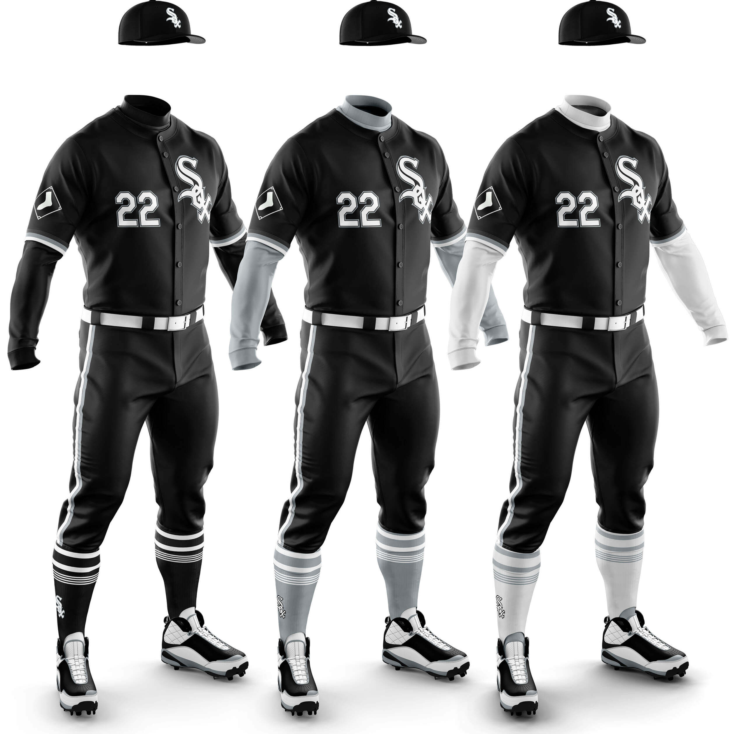
Chris Diamond: Black/silver/white always look good together to me and the popularity of the ChiSox City Connect, which isn’t a million miles away from these concepts, resonates with that. Of the three I actually prefer the all-black look — and I can already hear Jimmer’s howls about white socks for the White Sox!.
Phil Hecken: Yes, the ChiSox kinda-sorta already have a dark-mono uni in their City Connect (which isn’t black, but is a very dark anthracite), so giving them black pants to pair with their black alternate is probably more than overkill. Still, I don’t completely hate the ensemble featuring the white sleeves, belt and socks. Since the jersey has some gray accents, it would actually pair decently with their gray road pants, but we’re looking for mono here! And yes, the White Sox need white socks!
CD: Like the Red Sox Navy, the mono is hampered by the plainness of the jersey and the pants piping and sock stripes can’t save it! The red undershirt/socks is marginally better, but I feel there is definitely a pattern emerging for the non-viability of very plain jerseys in a mono look.
PH: As we saw (several times) in Part I, mono-navy is usually a no-go, and this is no exception. While the red sleeves and socks “help” a bit, it’s still too dark and dreary looking.
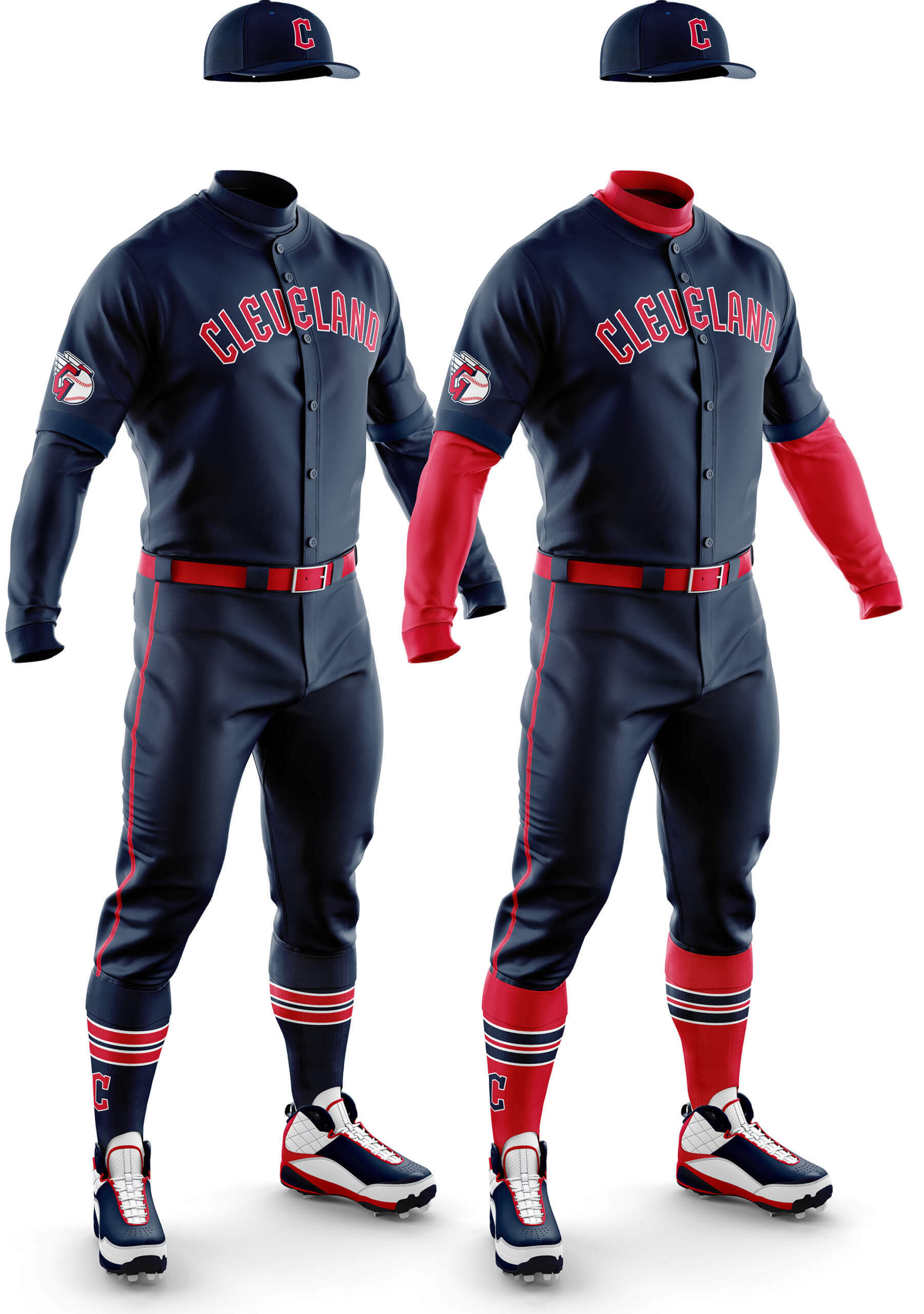
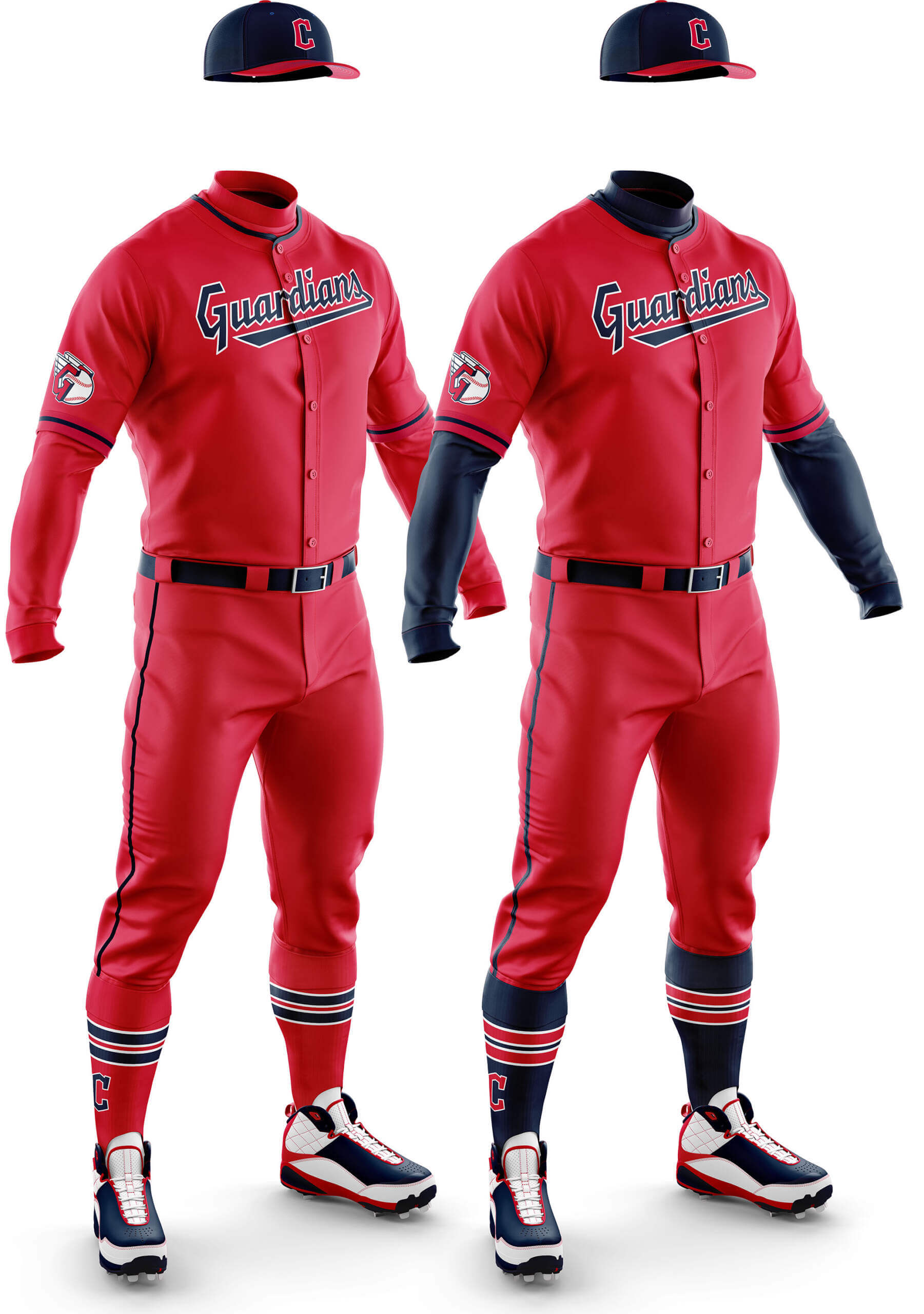
Cleveland Guardians Red
CD: The piping and coordination between the wordmark and sock stripes with the red cap bill make the full red mono one into a contender for me. I actually think the navy sleeves/socks one isn’t as good.
PH: If that look gives you flashbacks to Cleveland’s “Caveman” mono-reds, you’re not alone. This one (with the blue sleeves/belt/socks) has potential! Not because it’s a particularly attractive look (it really isn’t), but because of the history behind it — there might be two MLB teams who could go mono-red. This is one of them.
CD: The two-colour simplicity of the scheme makes this a good looking set to me. Normally plain socks would be a bad thing, but here I feel it works better than something fancy.
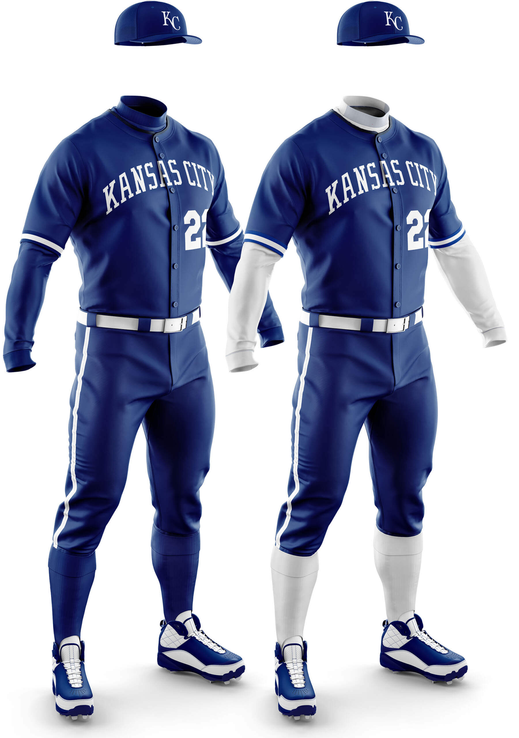
PH: Mono-royal (like most dark-monos) is tough to pull off. Even the Mets, whose mono-royal was complemented nicely by the orange, have a hard time doing so. I don’t think KC (like Toronto) quite pulls it off either. And besides, they’ve now gone full powder blue a couple times this season — time to make that their permanent roadie (again).
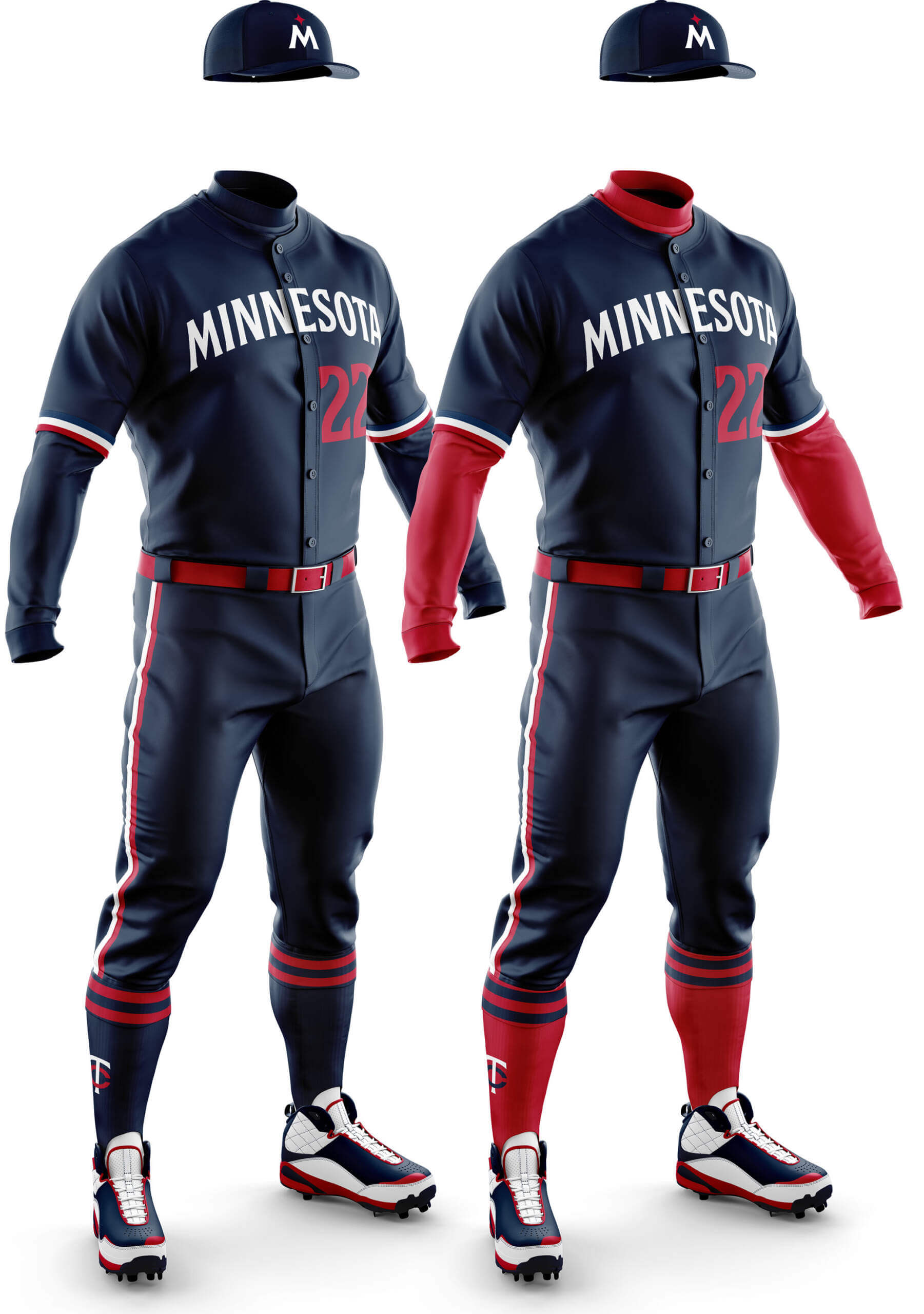
CD: I like the jersey with white/grey pants, but this one doesn’t work for me at all. It just feels a bit too disjointed.
PH: Another mono-navy that looks like all the other mono-navys, and that’s not a compliment. Sorry Minnesota — nothing against you…just against the look.
Chicago Cubs Blue
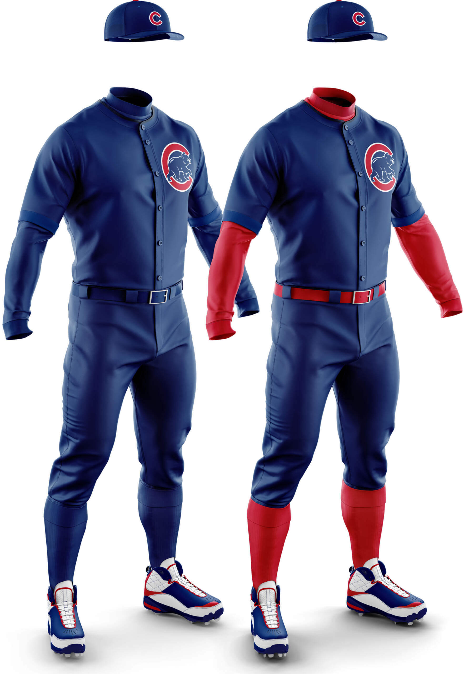
CD: You really can’t get any more mono than this without removing logos entirely! The one with red undershirt/socks has a sort of pleasing simplicity to it though.
PH: See my comments on the Royals (and Toronto Blue Jays). Royal is tough. And since the Cubbies already have a mono-navy CC uni, this one’s a no-go.
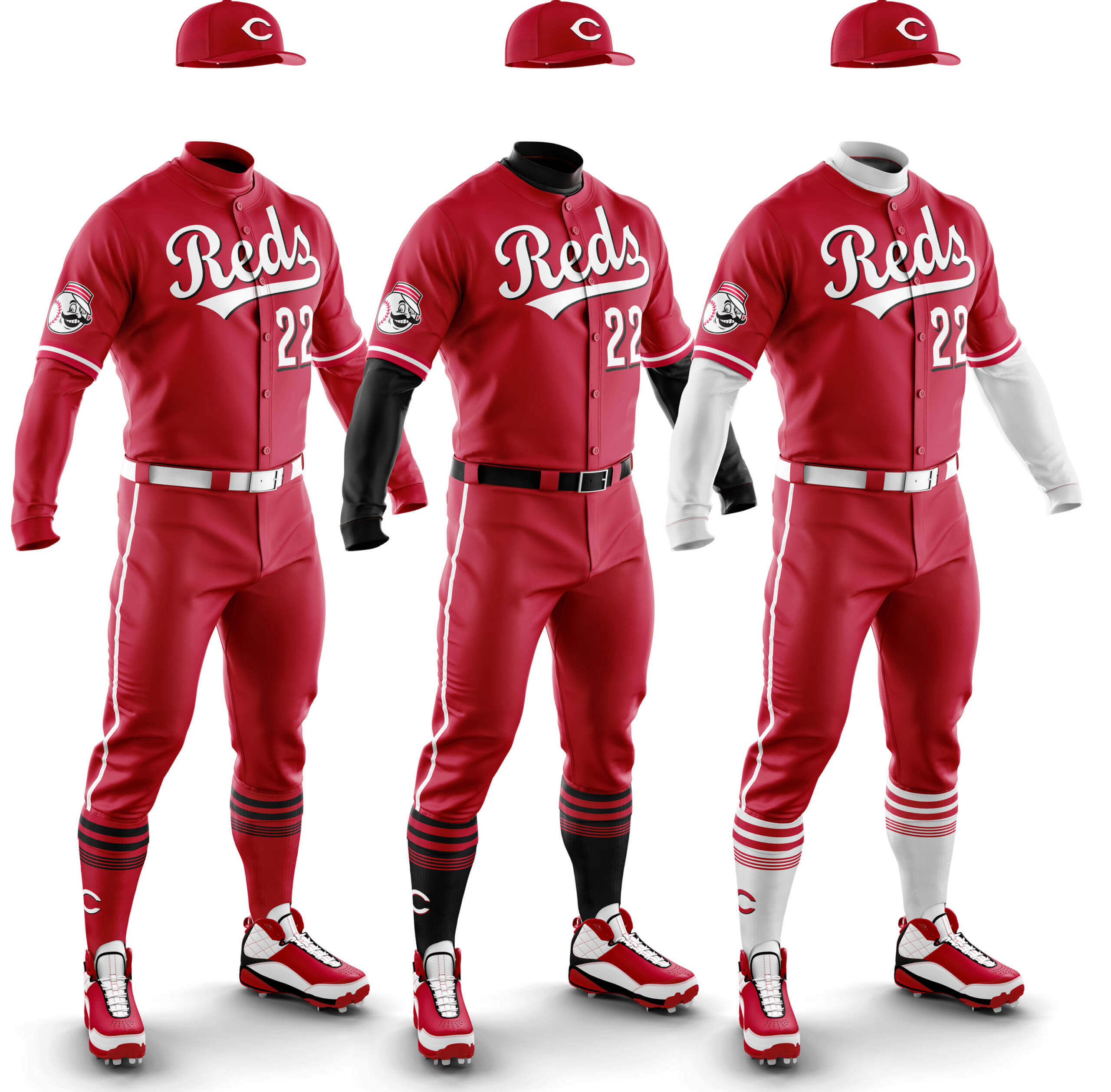
CD: I can’t believe I’m saying this, but I really like the red mono! If the socks had white stripes instead of black it would be perfect. Maybe it’s because they are the Reds? I never thought I’d like a red mono uni but I like this one. It also makes me feel the less black the Reds have on show the better.
PH: The all-red mono-red is too much … BUT … I actually like the look with either the black or white accoutrements. And they’re the REDS! Remember how just a couple concepts ago I said one other team besides Cleveland might look good in mono red? Well, this is the other team. And as much as I am not a fan of the Reds’ mono-black CC unis, I don’t hate the mono-red with the black sleeves/socks. I like the white sleeve/sock concept too, but the mono-red with black kinda works!
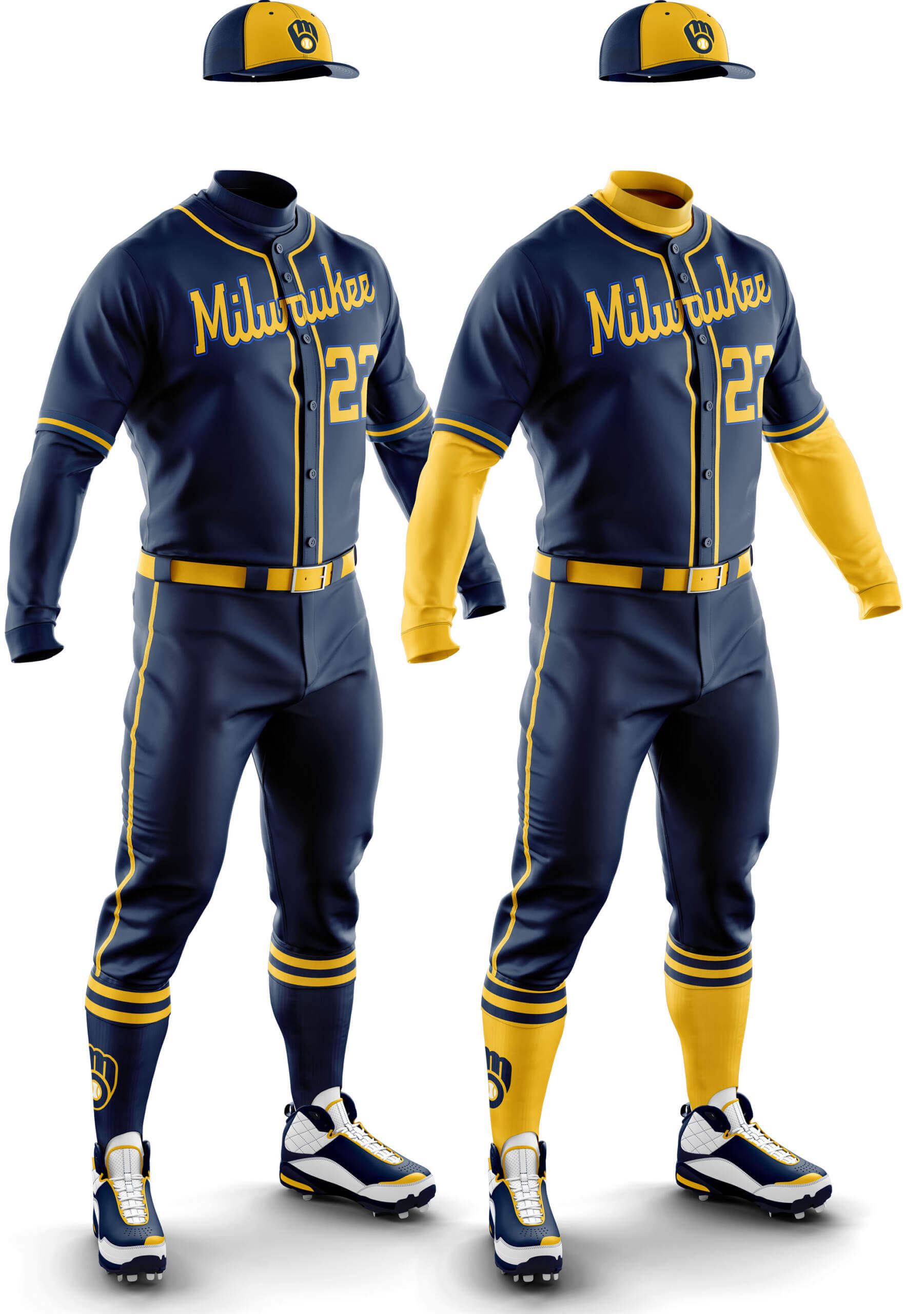
CD: I like both of these -– I think all the piping and stripes plus the cap front panels make for a good look.
PH: Sigh. Another mono-navy. This one meets the same problems as all the other mono-navy teams, but at least the athletic gold pairs very well with it, making it slightly more palatable than some of the other mono-navy concepts. Do you think MLB has a few too many navy alternates? Like, almost all of them are superfluous anyway. Do the alts really sell that well at retail???
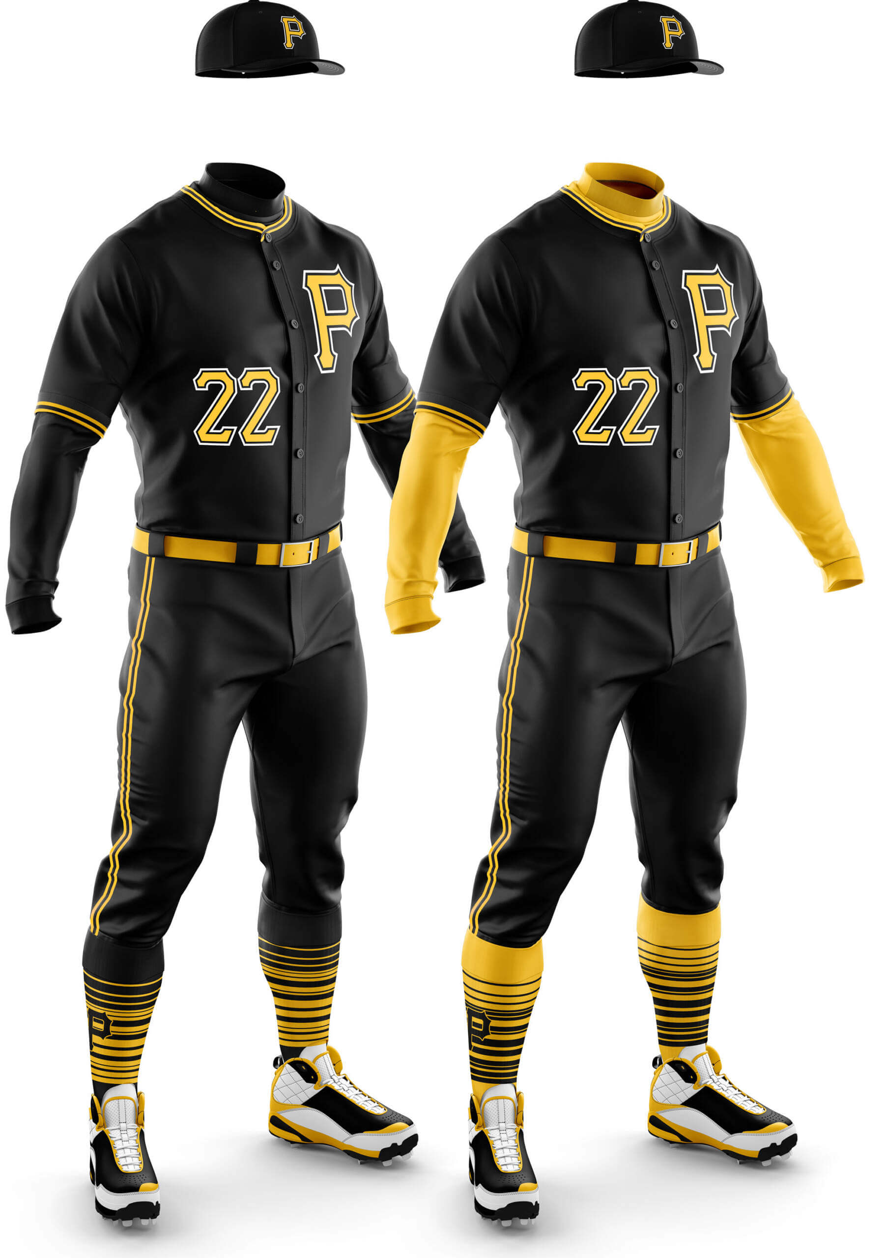
CD: As a Pirates fan I am probably a bit biased but my dislike of their home alt jersey is skewing my opinion here. I just can’t get past the number/logo asymmetry!
PH: I’m not a fan of the “P” black alt (nor the “Pittsburgh” ghost script which follows), so these don’t quite do it for me — but I do have some semi-fond memories of the Bucs in mono-black from their We Are Family days, so an all-black alt is definitely not off the table for me. Just not in Phase One.
Pittsburgh Pirates Black Road
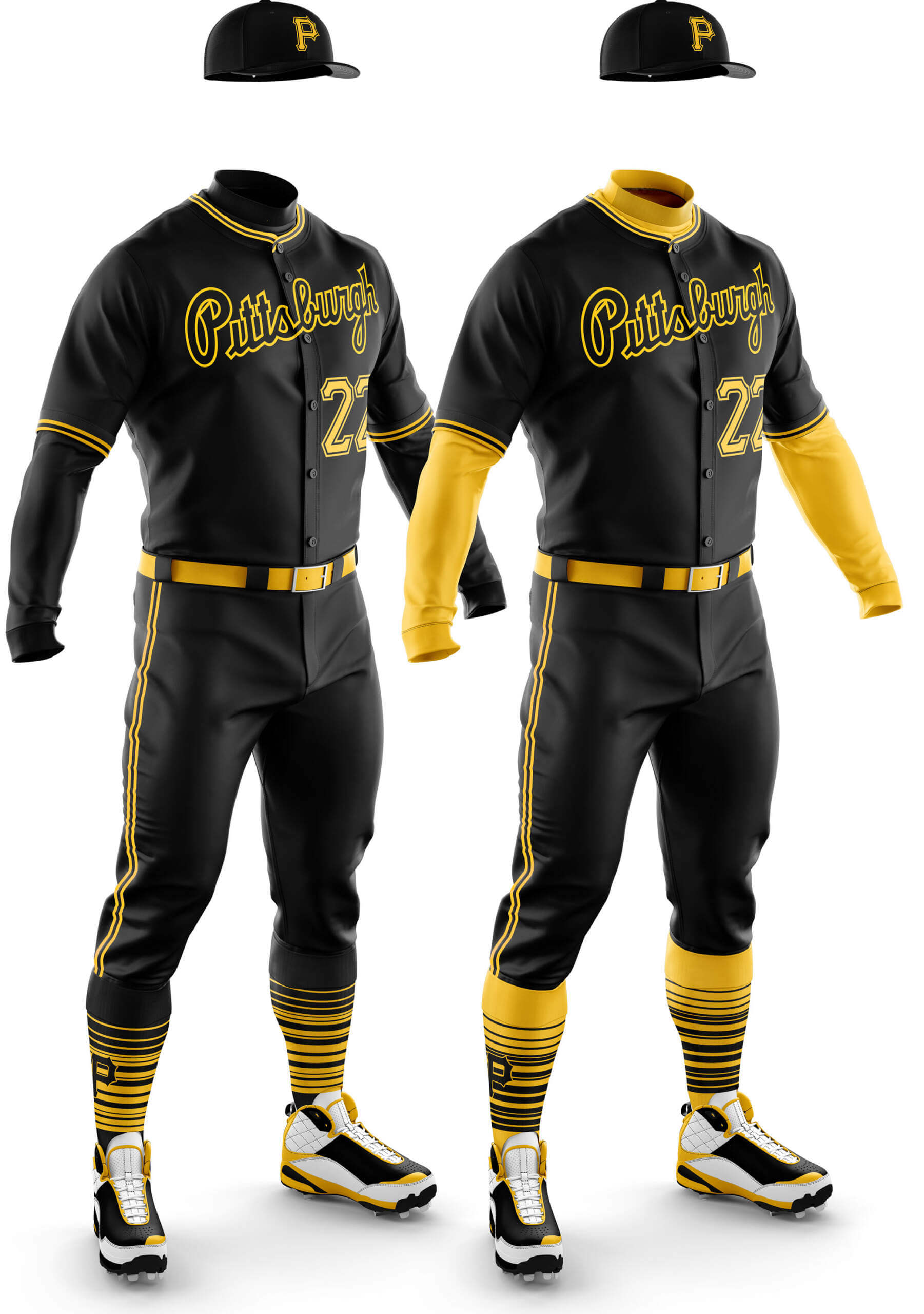
CD: Luckily for me, the Pirates black jersey base is identical for their home and road versions. Like with other two colour schemes I think this one lends itself to the mono look. I like both of these, but I think the mono edges it.
PH: My comments on the Black Home pretty much sum up the Black Road. If they were to return the jersey script to the old days (and with gold caps), I’d be sold. Just no pillboxes please.
I want to again thank Chris for all his assistance (and patience) in creating the mono looks. Being able to visualize the potential full uniforms definitely makes it easier to contemplate how they might look on the field.
Next weekend we’ll tackle the AL & NL West, and complete Phase One.


Regarding, “Exploring Monochrome ‘Dark’ MLB Uniforms,” MLB is sort of an anything goes uni-verse now (e.g., City Connect outfits). However, aren’t white sleeves verboten for pitchers?
That’s a good point Ken, but given the free-for-all there is today with undershirts it would be quite possible for pitchers to wear something else I guess!
Exactly. MLB would forbid the pitcher from wearing white sleeves (just as they forbade pitchers from wearing white caps/sleeves with the ill-fated mono-white vs mono-black 2019 Players’ Weekend unis a few years back) link
Pitchers could either go sleeveless or wear non-white sleeves (not ideal if everyone else has white sleeves, but an accommodation could be made)
I’d have every single one of these replace these teams’ dull gray road uniforms tomorrow.
Maybe I’d do some alternate sleeve colors, though: give the Cubs light blue sleeves like in their City Connect uniforms, or white like they had when they wore all-navy road uniforms in the 1880s-90s and 1900s-’10s.
So much better than gray.
Some? Ok.
All? No way.
Gimme the Cubbies royal-over-white as their road standard!
It’s so odd to see this today: link
and instantly know it was a game in San Diego.
I’m still not a fan of royal over white (especially as a road uni), but any solid dark looks so much better over white pants than gray pants (or tan or cream).
I did enjoy seeing a few 70s/80s teams in dark over white…
For my part, once again, I really like dark mono uniforms, especially due to their tie-in to baseball tradition, having been commonplace through the late 19th century and into the early 20th. My favorite of this batch is the navy Guardians with the red sleeves. Cubs with the red sleeves is likewise excellent. Twins, Royals and White Sox are also worth putting out on the field. To my eye, every one one of these is an upgrade versus the dreaded “softball tops.”
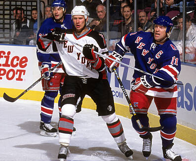
GTGFTU: October 5, 2001 Sabres at Rangers. Rangers home opener and both teams wore special New York uniforms less than a month after 9/11.
Every once in awhile the Rangers like to remind everyone that their 9/19/01 preseason game vs the Devils was the first sporting event in NYC after 9/11 , not the Piazza HR game two days later. Apparently something very important to the organization.
Final score Rangers 5, Sabres 4 (OT)
That set of Rangers’ sweaters is just about my favorite.
The Sabres sweater from that game was their best in the goat-head era…since it was absent!
10/7…I’m sure your guess was a typo ; )
Good sleuthing!
I remember at the time questioning and lamenting the decisions to postpone/reschedule sporting events not in NYC or DC – it was of course the right call.
A lot of space was devoted to the Pirates’ solid black uniforms today, and it bears repeating they were set to use white outlines on the numbers and letters. Ultimately they decided against it. Readability concerns?
All the Brewers need is the kerchief to complete the all-Cub Scout look!
And replace the # with the Bobcat, Wolf, and Bear patches
I know this has been mentioned before, and I was coming here to say the same thing. Go full on Cub Scout, but pair with yellow base undershirt and blue belt / socks. Now if detroit could do matching tiger cub scouts unis you’d have a jamboree game.
Not sure if it’ll be a popular or unpopular opinion, but I think that these look a bit like pajamas, especially the Cubs one with the monochrome belt.
How about a series of white/grey tops and color pants? Like the reverse of the softball/BP top trend?
BTW: does anyone know how many teams (if any) have ever worn white belts? I’m guessing the A’s may/could have worn one?
“How about a series of white/grey tops and color pants? Like the reverse of the softball/BP top trend?”
The point of this series — at least as far as Phase One is concerned — is to eliminate different color tops/pants (and in particular dark tops/light pants).
But… stay tuned over the coming weeks and months ;)
These sets of mono unis look really good, especially those with the contrasting belts/socks. I think the teams missing numbers on the front do look too plain tho.
Happy Bobby Bonilla Day everyone!
As proven with Cleveland’s “caveman” unis of yore, white piping on either side of the blue would do wonders.
Yes Patrick, I agree!! I shall squirrel that suggestion away for consideration for later parts :)
i don’t usually pay attention to the guessing games, but i am going to guess that the guess the game by the unis contest is the first game after 9/11 played between the rangers and sabers.
Looking at the NL Central unis here reminded me that I think uniform designers missed the boat in a couple of instances (well, they’ve missed the boat entirely more than that, but that’s for another day). While I’m not a fan of 1970s double-knit unis, the color scheme the Pirates used (dijon mustard gold) is a much better option for them than bright yellow. It’s gold (Pirates), first of all, and it hearkens back to the era of lumber-and-lightning, an exciting period in Pirates history. And, as to the Cubs, I’m not partial to the strolling bear logo. Now if they went back to the 1960s Cub face they wore on their sleeves, then I’m all in.
Personally I prefer the brighter gold the team wears to the darker shade. For no other reason than those are the city colours and are shared with the other Pittsburgh teams.
If the North American Vexillological Assocation is to be believed, the official yellow of the Pittsburgh flag is #FFCC00, which is much darker than the Pirates’ current yellow (#FFC72C) and even a bit darker than what the Penguins wear (#FFB81C).
link
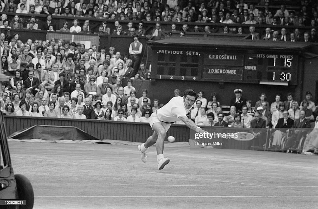
GTGFTS – Wimbledon men’s semifinal from yester-today…7/1/71. Love that numerology!
As always, great artwork on these,Chris!
I can get behind the Reds in blood-clot but I hate that script. Always have. It’s so I’ll-suited for them, yes? It’s gotta be the wishbone C for me.
The White Sox concept with the silver stirrups and well, white socks, is mighty fine for full time. One tweak I’d make: yellow sannies for the all-blue Brew Crew…a move that’s long overdue!
I can already hear Jimmer’s howls about white socks for the White Sox!
HOOOOWWWL!
Be it historically accurate to wear monochrome black, navy or red uniforms I still feel that it looks very amateurish. Charming to a degree but these are professional teams, not participants in a charity tournament or a frat league.
Where are the Tigers?