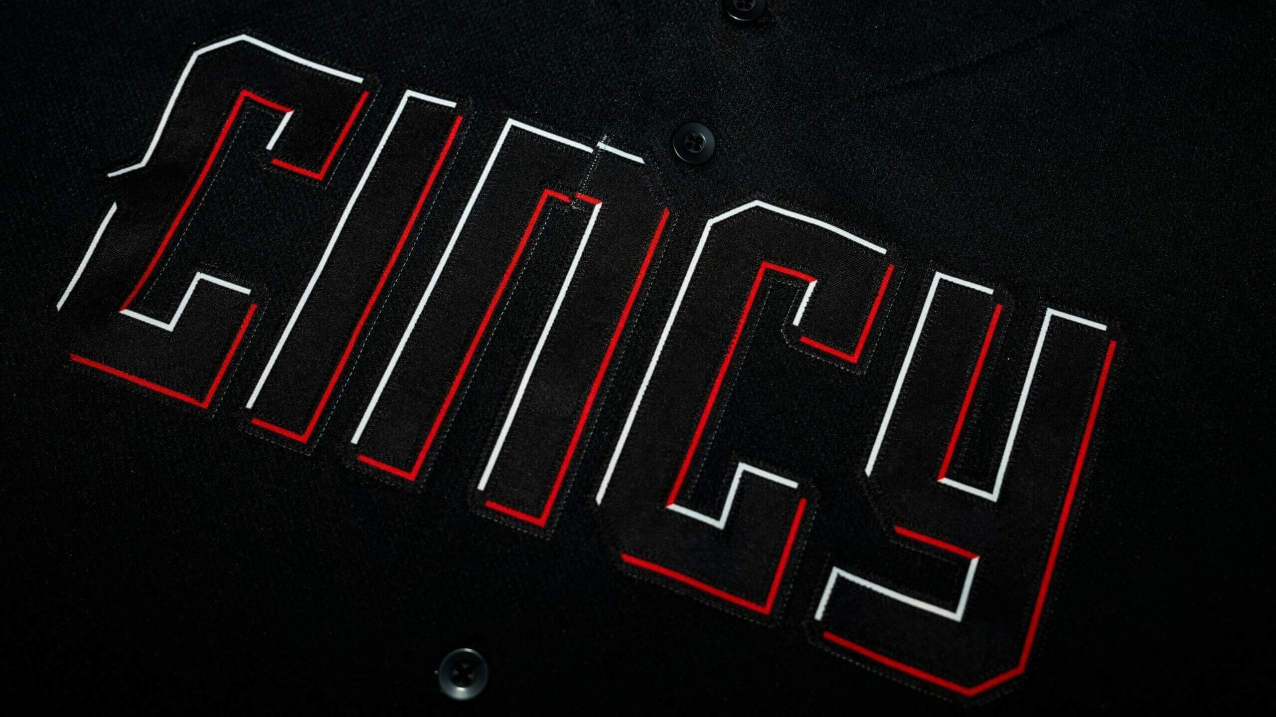
Good Sunday Morning and to all the Mothers out there, Happy Birthday!
Yesterday, the Cincinnati Reds became the fourth team this season to unveil their “City Connect” (CC) uniforms (the Orioles and Pirates are still to come in 2023). Cincinnati is the 18th team to reveal its CC uniforms since the program was introduced in 2021, following Atlanta, the Rangers and Mariners this year.
The Reds are one of the oldest franchises in professional baseball, and were named for the color of their hosiery (Red Stockings). For most of their history, their uniforms have contained only red and white (occasionally adding dark blue or black as an accent). But for the most part, the Reds have been a … well, red team.
That all changed yesterday.
Before I get into any critiques, let’s take a look at the new CC unis. Because these are CCs, there is the obligatory “storytelling” aspect which must be considered — at least to explain the rationale for their existence.
Here’s how the Reds described their uniforms: “Just as Cincinnati, the birthplace of professional baseball, sparked the passion of America’s pastime, the Reds City Connect uniforms were developed to ignite the fire and pride in a NEW generation. Together, fueled by a collective energy, THIS city and THIS team are lighting the way to what comes NEXT.”
Let’s get started:
CAP:
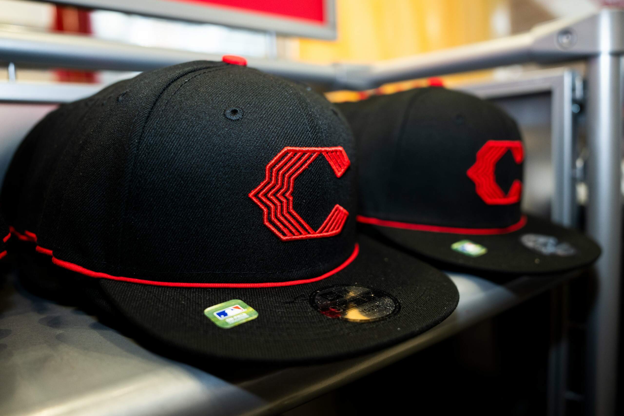
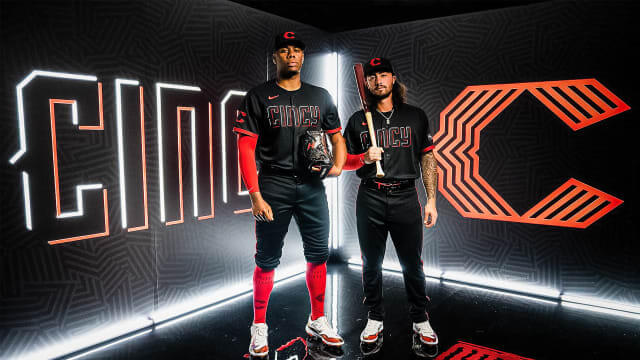
The cap is black with a stylized “C” (somewhat resembling the “wishbone” C the club wears) in red. It’s mostly comprised of five red lines, with a thin soutache around the base of the crown. According to the team, it’s one of the few harkbacks to previous uniforms, and this bears a passing resemblance to the Field of Dreams throwback caps worn last summer. The cap logo also appears on the sleeve (and of course placement on the sleeve depends upon a player’s handedness, since the opposite sleeve contains an ad). The five lines are “wavelength” lines. What are those?
According to the club and Nike, the wavelength lines signify “moving forward and lighting the way to what comes next.”
JERSEY:

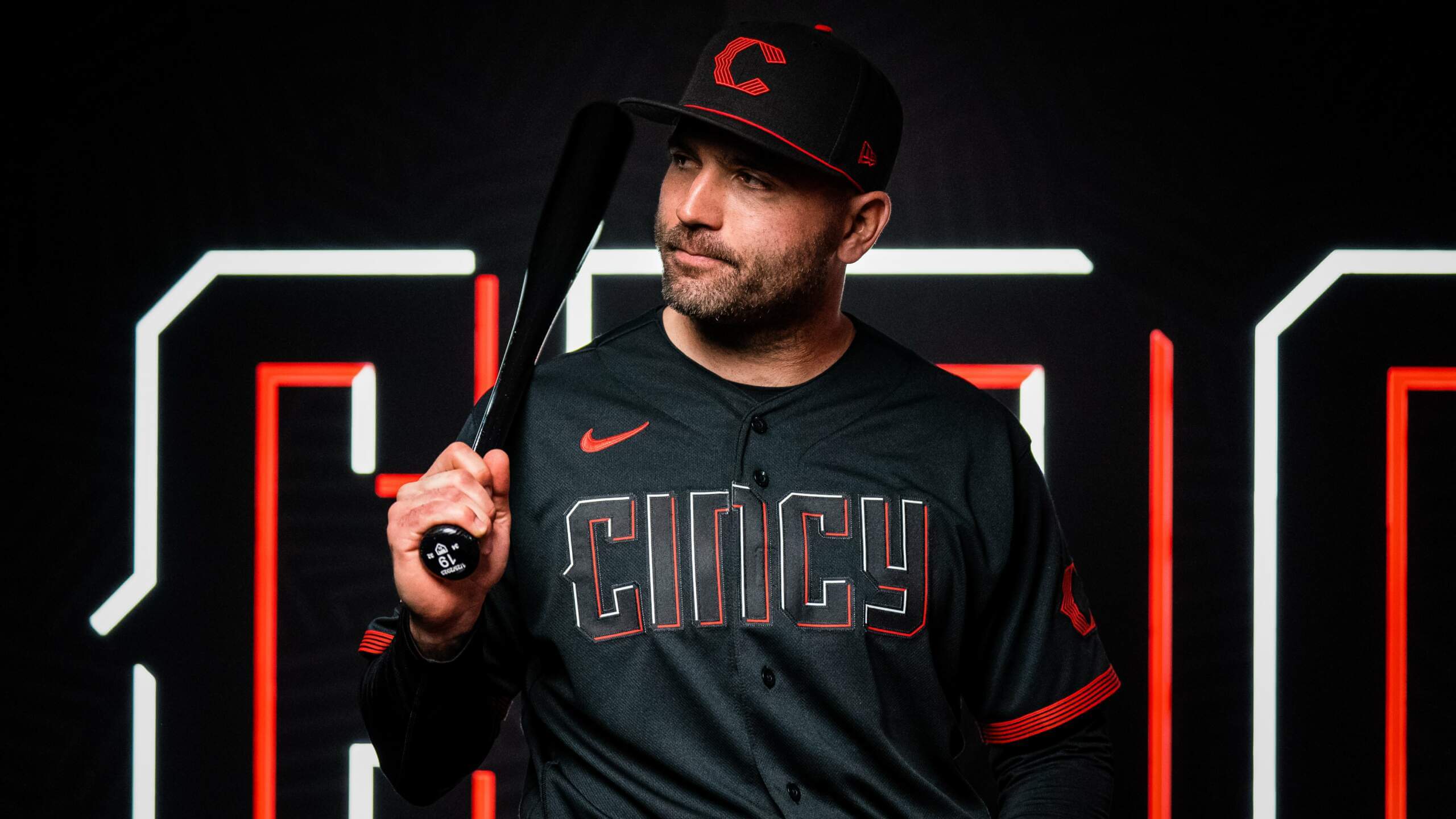
Here are some looks at the back:
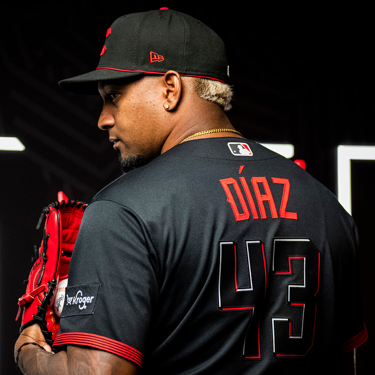
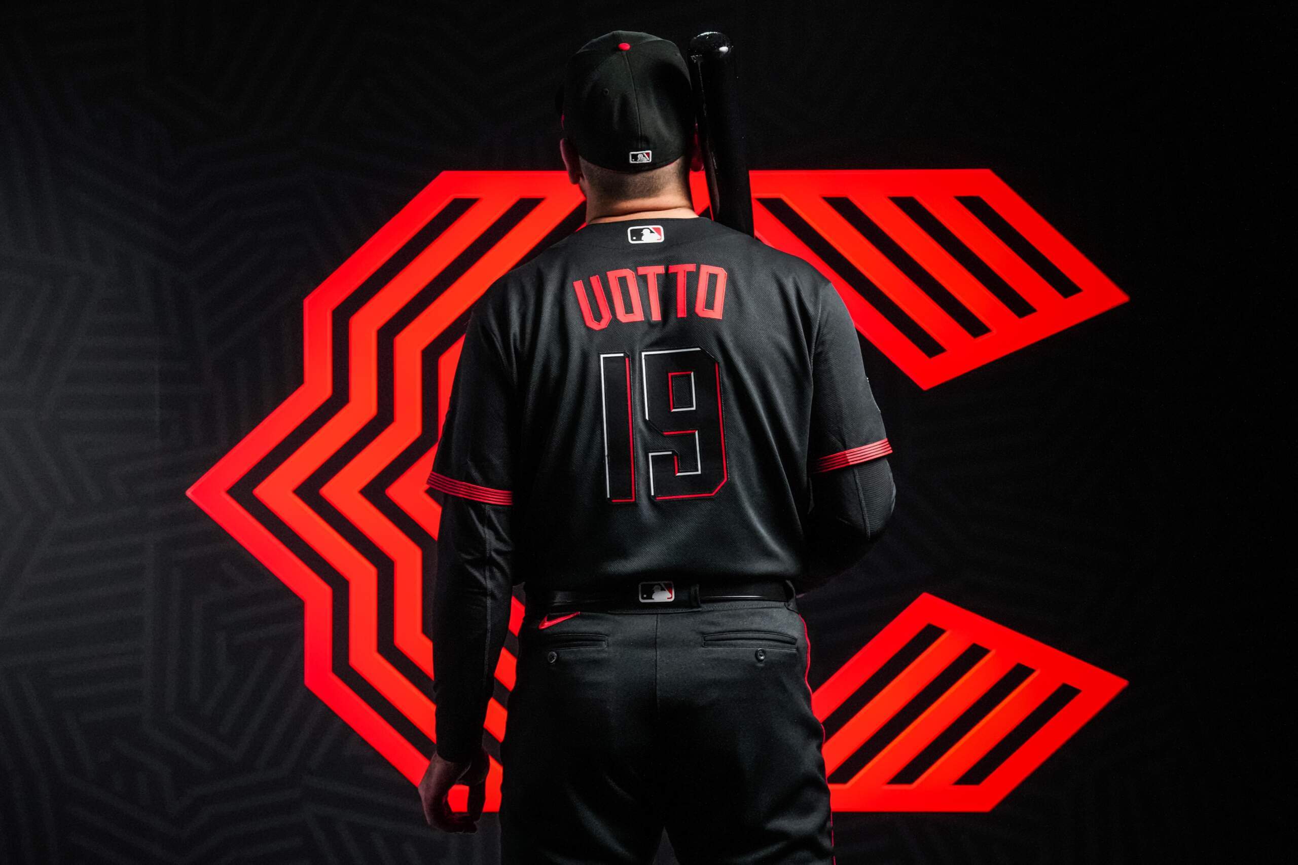
The jerseys are solid black buttonfront, with those same five “wavelength” lines serving as sleeve striping. The word “CInCy” in black mixed case lettering adorns the chest, visible only due to a red and white blockshadowing effect — the upper-left shadow is rendered in white, while there is red shadowing on the lower-right portion of the “ghost” lettering. The rear of the jersey features numbers in the same style as the “CInCy” font, with NOB in solid red.
Up close, both the wordmark and the numbers are difficult to read. At any distance, it might be nigh-on impossible:
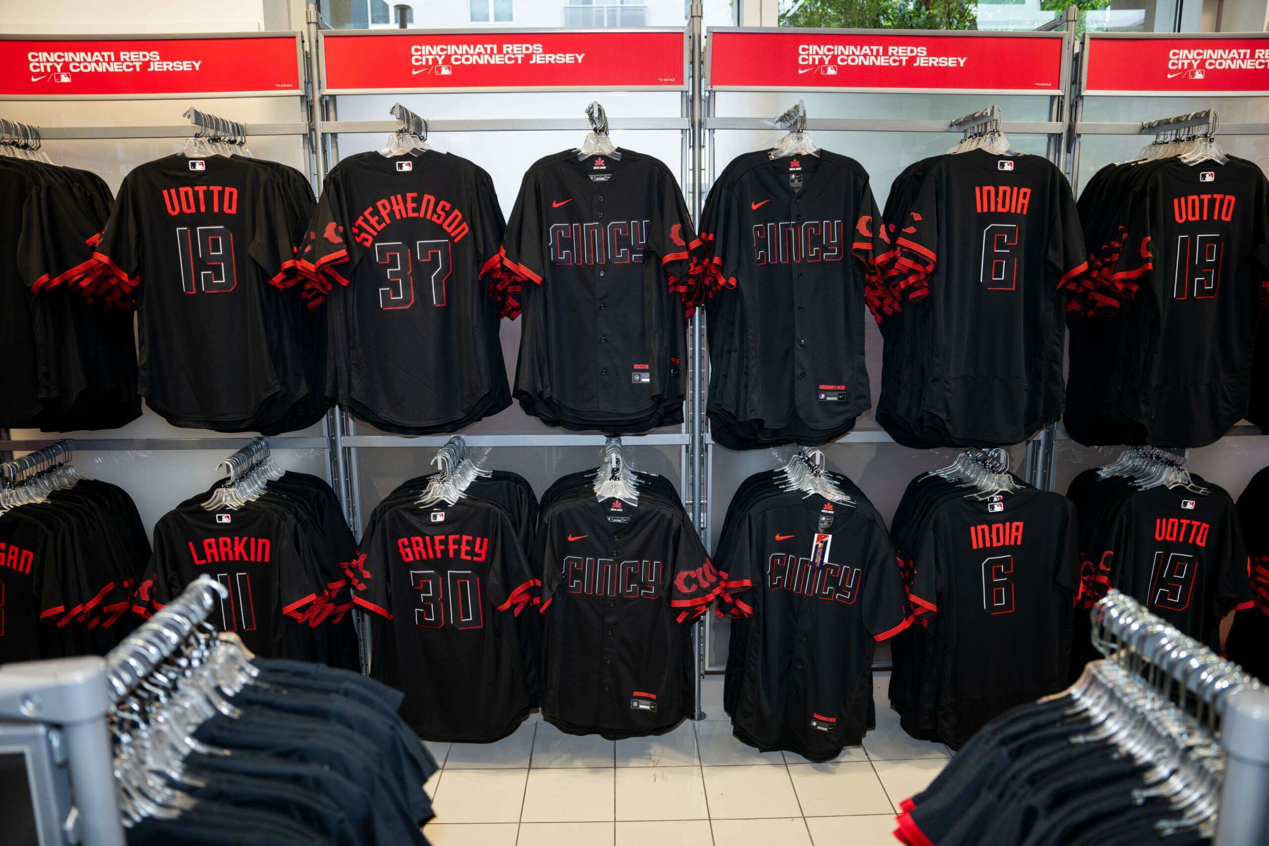
If you look at the NOBs on the jerseys pictured above, you’ll see they also contain upper/lower case lettering style. According to MLB, the jersey lettering is meant to mimic illuminated neon lights, with flashes of “infrared” red color.
PANTS:

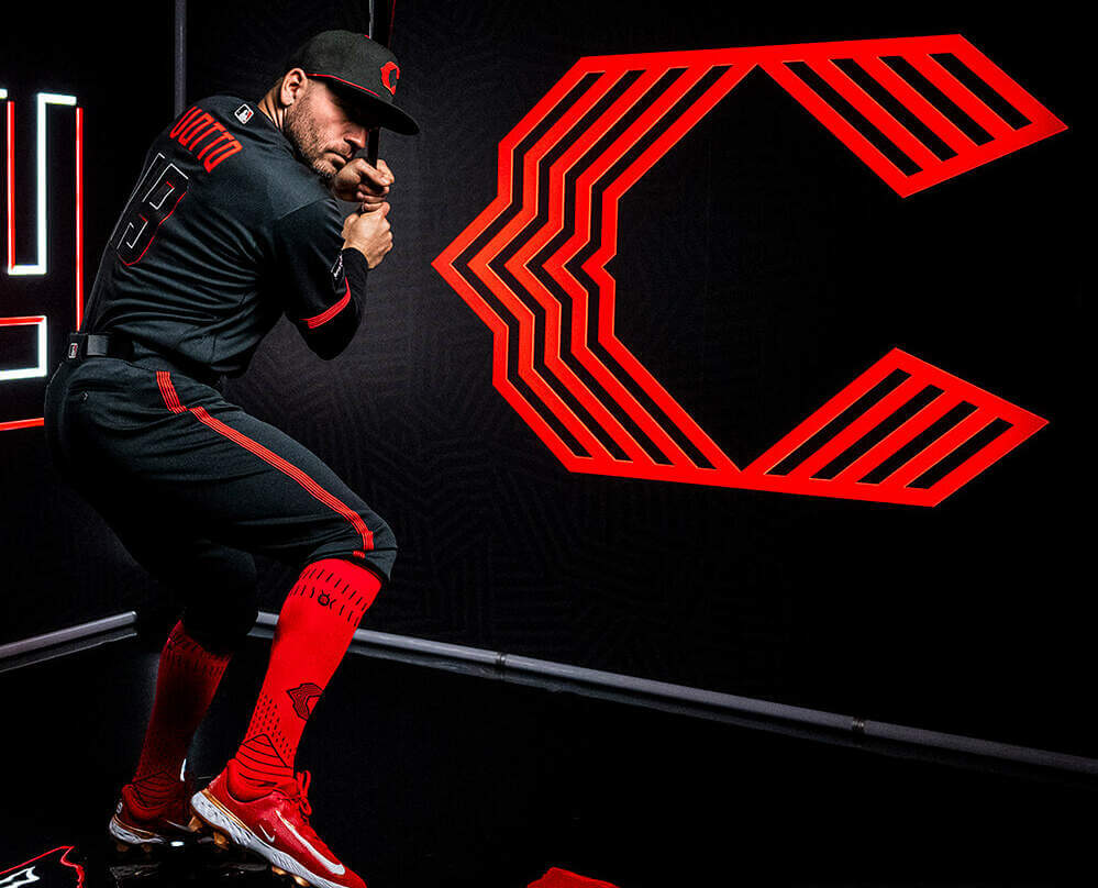
Like the jerseys, the pants are solid black. The only color on the pants (other than the MLB logo on the belt loop and the maker’s mark) are the same five red stripes that appear in the “C” logo and the sleeve hems.
SOCKS:
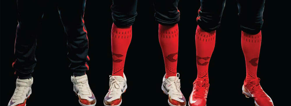
For those who choose to go high cuffed, the uniforms were shown with the red CC socks that were leaked earlier this year. Based on how black the rest of the uniform is, I’m actually surprised they don’t have a black sock option (perhaps they do or will?). For those who wear their pants in pajama style, well, you can see it’s a totally black uni. Let’s hope everyone goes high cuffed on the field.
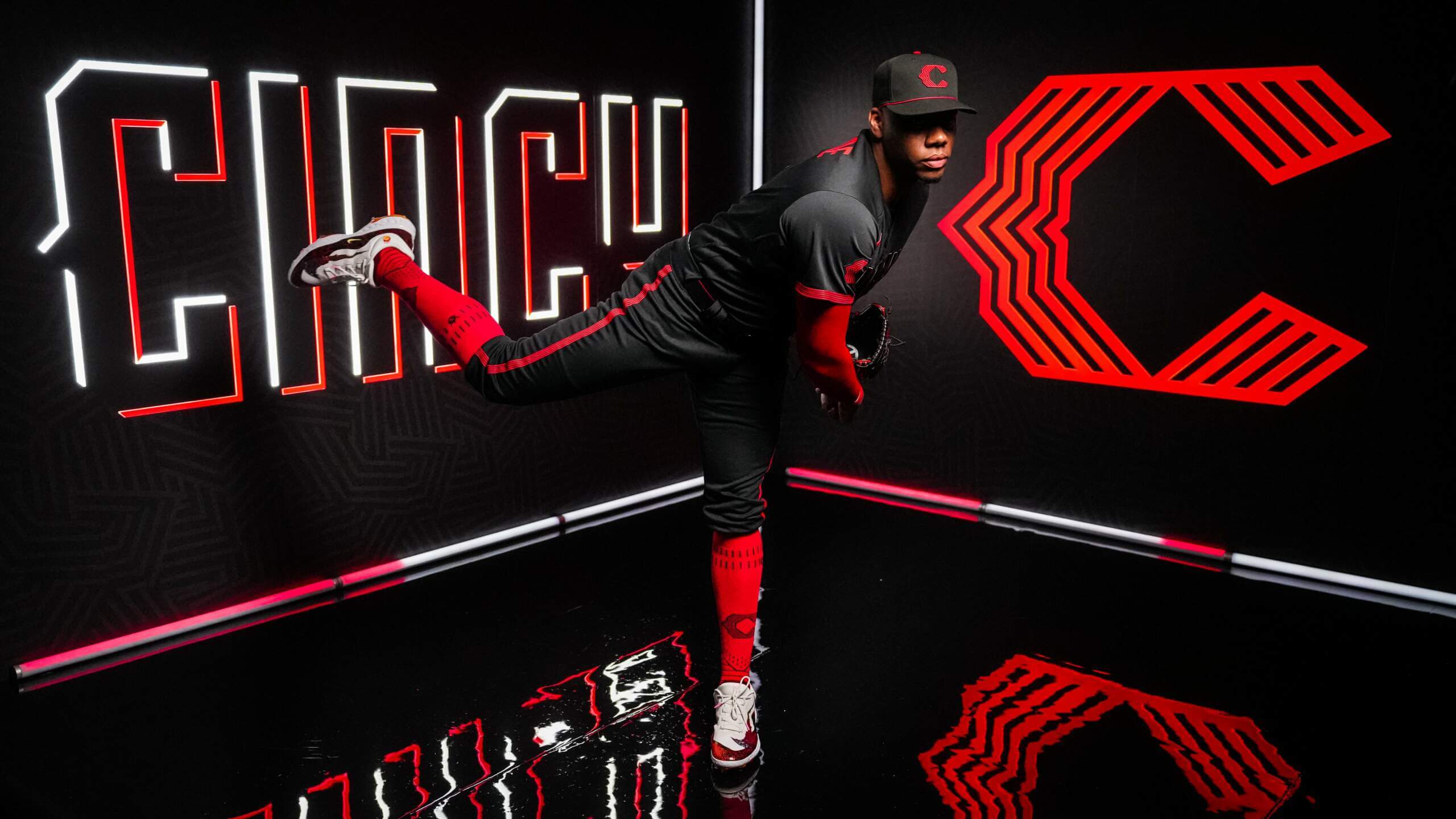
STORYTELLING:
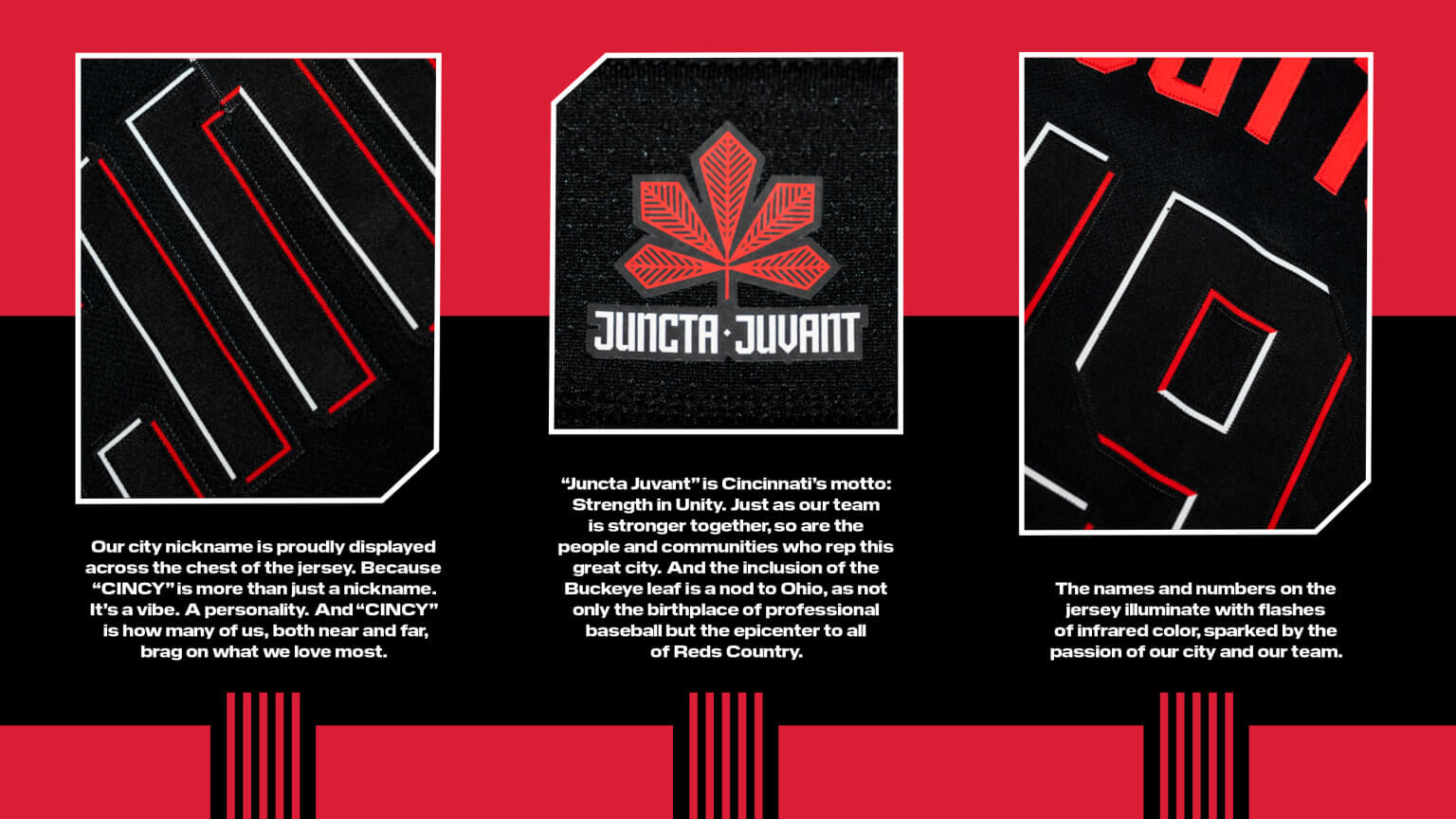
If you’re curious about that middle item, that’s Cincinnati’s Latin motto, “Juncta Juvant,” which means “Strength in unity.” That is a “stylized buckeye leaf,” and visible to no one, as it’s on the inside of the collar.
And much like your average D-1 College Football team every week before a big game, the team released a hype video.
Here’s my first impression upon seeing the new CC unis:
All kidding aside, though. Those are some seriously black uniforms. With my usual caveat that I’ll need to see these on the field before rendering a final verdict, I’m not sure what there is to like about these. I mean, I want to like them … to find one redeeming feature … that I can say something good about these. I may enjoy monochrome baseball uniforms more than most, and that included black jerseys and pants, but at least that Pirates uniform broke up the black a little.
But it’s not even that this all-black uniform doesn’t have enough color (it doesn’t)…it’s that it’s really lacking in color. Sure the cap (which I don’t hate) has at least more than a hint of red, but going for ghost lettering and numbering is really bad design. When you can discern the maker’s mark (especially at distance) more than your primary wordmark, you need to rethink your basic concept of Design 101. Have we learned nothing from the Marlins? But, like those same Marlins, the team doubled-down and went with the same ghost numbering style. Oh, and then there were these things. At least they made the NOB in contrasting color.
Aside from the ghost numbering and lettering, the only other color on the uni besides the NOB are the five pencil-thin red stripes on the sleeve hems and down the pants leg. I actually like this design element, although those five red stripes will appear pretty much as a solid red color block from anything past six feet. That’s not a bad thing. We might be surprised how that little concentration of color on the sleeve and legs actually works with this uni. Fingers crossed.
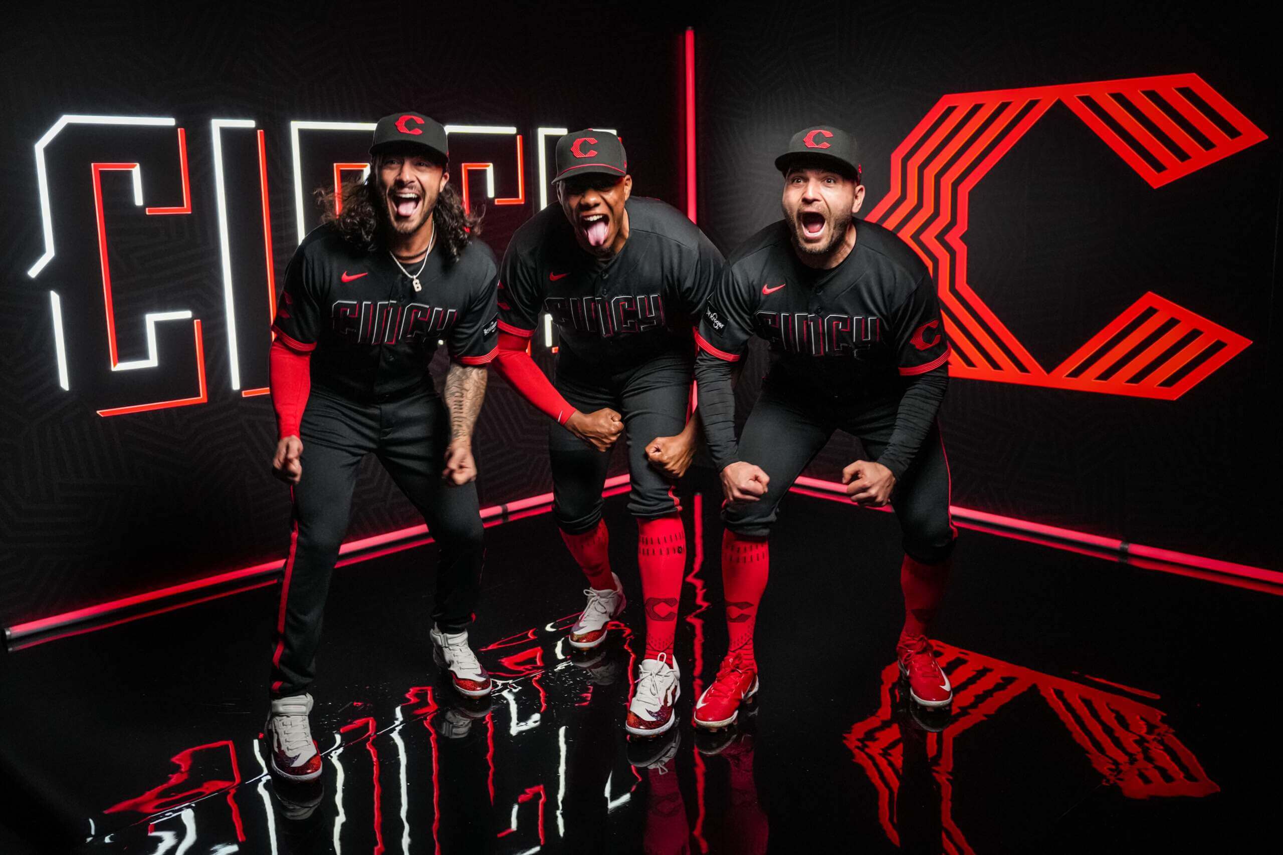
As far as lower-leg stylings go…if there was ever a time for players to go high-cuffed, that time is NOW. I’m not in love with the red socks Stance has provided, but that chunk of red against an otherwise solid black uni will certainly make these better looking on the field. It should be noted that some players are shown wearing long red sleeves (or at least compression sleeves). Let’s hope the players do that during games (here’s hoping it’s never too warm in Cincinnati when the CCs are worn). Black sleeves? No! But the high-cuffery? A must.
I get that I’m not the target audience nor the demographic for these, and I’m sure those caps and jerseys will be big sellers (let’s face it — the whole CC program is basically a merch dump). Still, I think most of you will agree that if you take the storytelling out of it, this is just a poorly designed uniform. At the very least, it should communicate the team’s name (or nickname) as well as player number. I’ll wait till I see them on the field before I declare these worse than the Marlins black alternate jersey, but I’m not getting my hopes up.
You may disagree, but I thought the first three CC unis introduced this year were very good — at least as far as CC uniforms go. But this one may be the worst yet. I’m really hoping it isn’t. And I hope the good folks of the Queen City are at least OK with this as far as the “city celebration” thing goes.
The Reds will debut these new CC unis next Friday night, May 19th, against the New York Yankees.
How much more black could it be?




The Reds CC uniforms and storytelling are AI generated right? Like the bots looked up some random factoids about Cincinnati and regurgitated this design? It’s hard to believe humans could have missed the mark so badly even on purpose. I’d say these are the worst so far, but I really don’t want to look through the others to remember the other forgettable designs.
An historic franchise whose best uniforms have always been its simplest (looking at you, Mr Red). Also, and this not nothing, the Reds have always made Cincinnati an important wordmark. The Braves did a neat thing this year connecting to their history—MLB missed a tremendous opportunity to do that.
Happy Birthday to all moms as you say in your first paragraph Phil
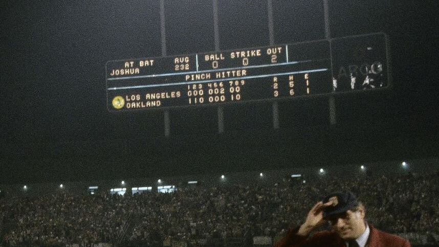
GTGFTS is Game 6 of the 1974 World Series on October 17, 1974. The scoreboard shows the Oakland A’s 2 about to win the Series as there are 2 outs in the top of the ninth and Dodger pinch hitter Avon Joshua is about to bat. He groundout to first to end the Series. First base umpire Ron Luciano is in the photograph.
GTGFTU is the Mercury (New York) Mets versus the Pittsburgh Pirates on July 27, 1999. Pictured is Mets starting pitcher Orel Hershiser. The Pirates won the game 5 – 1.
I can’t believe Nike employees someone to come up with the storytelling. It’s so unbearable and embarrassing to read. I actually can’t get through the entire thing because of how cringeworthy and just down right bad it is.
We get it Nike. Your love black uniforms and you love to say you respect the past while looking towards the future. It’s so embarrassing and predictable at this point.
They love to *say* they respect the past while looking forward to the future, but those are empty words. This quote sums up their real intent:
the Reds City Connect uniforms were developed to ignite the fire and pride in a NEW generation.
Note the emphasis on “new.”
This culture is obsessed with driving wedges between people. The rich are getting super rich and the poor are getting super poor. The left and right wings of the American Eagle are flapping so hard in opposite directions that it’s tearing the old bird apart. There’s hardly any middle class, there’s hardly any moderates, and of course there’s the whole age gap which Nike is exploiting. This trash is strictly for the “Stop yelling at clouds” demographic, giving the “Get off my lawn” set another reason to bemoan the present state of affairs.
It seems the only ones who Get It are the people designing the USFL uniforms. With the exception of the Showboats, every team is an homage to the past with a modern touch. Young and old can appreciate decent unis with clearly visible numbers and identities… together. I’ve had enough of extremes. I want more common ground. And I want less Nike.
Jimmer,
Could not agree more.
Everything about this uni-wretch of a uni is awful. I do not blame NIKE for this cockup, I blame middle aged white executives who pick this slop, thinking there is money to be made by foisting this on their fan base. To be honest, they will make some coin, but nothing like they might have by investing in something that truly reflects what that organization was once, and could be again, with an inspired design.
Shoulda called this team name Porkopolis.
Is there a like button on here Paul? Can we put that comment in a frame somewhere?
Like button
Scoreboard GTG – final at bat of game 5 of the 1974 World Series with the A’s winning the game 3-2. Four of the five games were 3-2 affairs.
October 17 1974. Game 5. World Series LA vs Oakland with A’s winning game 3-2 and Series 4-1.
Vida Blue started and Blue Moon Odom got the win. Dodger Mike Marshall appeared in each game up to then.
GTGFTS – 1974 World Series, Game 5 – the A’s win their third straight World Series. Vida Blue made his last World Series start, but it was Blue Moon Odom who got the win, facing only Davey Lopes to end the 6th inning while tied; Joe Rudi would get the game-winning RBI by taking Mike Marshall out of the park on his first pitch. In the top of the 8th, Bill Buckner tried to stretch a double, but a Reggie Jackson-Dick Green-Sal Bando relay beat him to third. Rollie Fingers got the save and the Series MVP.
As an aside, Fingers and Odom had gotten into a fight prior to the start of the series, among other dysfunctions among the Swingin’ A’s. Still, they managed to be a cohesive unit on the field and completed their threepeat.
I remember Marshall passing up warm up pitches because the game was delayed by the fans throwing stuff onto the field… and the first pitch he throws once the game resumed was the home run.
GTGFTS:
17 October 1974.
Oakland-Alameda County Stadium (pre-Mount Davis, sewage leaks, corporate names and rats).
World Series Game 5.
A’s clinch their 3rd consecutive title, beating the Dodgers 3-2.
REDS CC:
Yick. I was watching the Phillies and Rockies and while I wouldn’t want the Rockies to ditch purple and pinstripes for their CC set, I love the thought that went into them. The license plate, the colors, it’s a great set and you can see the process. The Reds’ CC set is almost the exact opposite. Corporatespeak and gobbledygook about the future (for the oldest team in North America?), city nickname (ugh), excessive black (for a team named for a color?), ghost wordmark AND numbers, illegible NOB font… this is just all bad
GTGFTS: Joe beat me to it. Nice work.
CC REDS: I was watching the Phillies and Rockies last night, and while I wouldn’t want the Rockies to ditch purple and pinstripes for their CC set, it is objectively a brilliant set. You can see the thought that went into it, incorporating the license plate font and all the green. It looks like a reasonable departure from the norm. The Reds did the opposite. This is like Nike’s Greatest Hits compilation in 1 set – contrived corporate gobbledygook about the future (for the oldest team in North America), an overreliance on black (for a team named for a color), ghosted wordmark and numbers, an illegible NOB font, a city nickname across the front. Yuck.
Excellent breakdown of a really bad uni and I love the Ralph Kiner reference at the top. Also must agree with Patrick that the “storytelling” is only getting worse and Nike must look at the fans as if they are bunch of gullible idiots.
It is so apparent that the copywriters (probably AI at this point) know nothing about and have never been to the city in question. As bad as the designs have been, the “inspiration” text is always much worse.
“Also must agree with Patrick that the “storytelling” is only getting worse and Nike must look at the fans as if they are bunch of gullible idiots.”
There must have been more stuff in the press kit about “explosive growth of the city,” because that’s what ESPN led with. Cincinnati, a city that has declined in population every decade since 1950, and blipped up in the last census by adding a whopping 13,000 people. TELL ME A STORY, NIKE.
I’m beginning to think Nike made the thing that dark so that the only thing people can see is their logo.
Exactly.
It’s the exact opposite of their WKU softball uni, which was featured in yesterday’s ticker: whiite on white, with the only discernable thing being the stupid swoosh.
So, so stupid.
Sweet Odin those Reds unis are awful. My hate for BFBS is right up there with Paul and purple.
I like the wordmark. But, I thought it was bad when football uniforms started going “mono”. But, of course, Nike had to start doing it with all the MLB uni’s too?????
Huh? Baseball has a tradition of “mono” uniforms, whereas the “softball” look – colored jersey over white or gray pants – is what is more of an eyesore to traditionalists.
Typical City Disconnect garbage and, as usual with Manfred’s reign as commissioner, trying to appeal to the Twitterverse and the young demographic who will see “fire emoji” in this. I think everything Manfred does, from ghost runner absurdity in extra innings to expanding interplague to ruining the NL with the DH abomination to putting ads on uniforms, is about trying to attract 12-yearolds and hoping that, at the same time, he doesn’t lose the people who are actual fans.
Well yes, that’s his job. I’m not a Manfred fan but his goal should always be to land the next generation of fans without totally alienating the old guard.
There are certainly some young people and/or Twittersphere residents with bad taste but I’m pretty sure even they do not say “oh an ad on the jersey, that’s cool”
I’m nkr
I’m not a fan of the new Cincy uniforms but I saw a post about them from a uni-centric Instagram account and the response was overwhelmingly positive. I realize some of these designs are simply to sell more hats and jerseys, but if 17 year olds love them then Nike and MLB are achieving a major goal as well. My guess is we will look back at some of these like the gaudy 1970’s sansabelt pullovers in 40 years.
I’m 40 and I love this uniform.
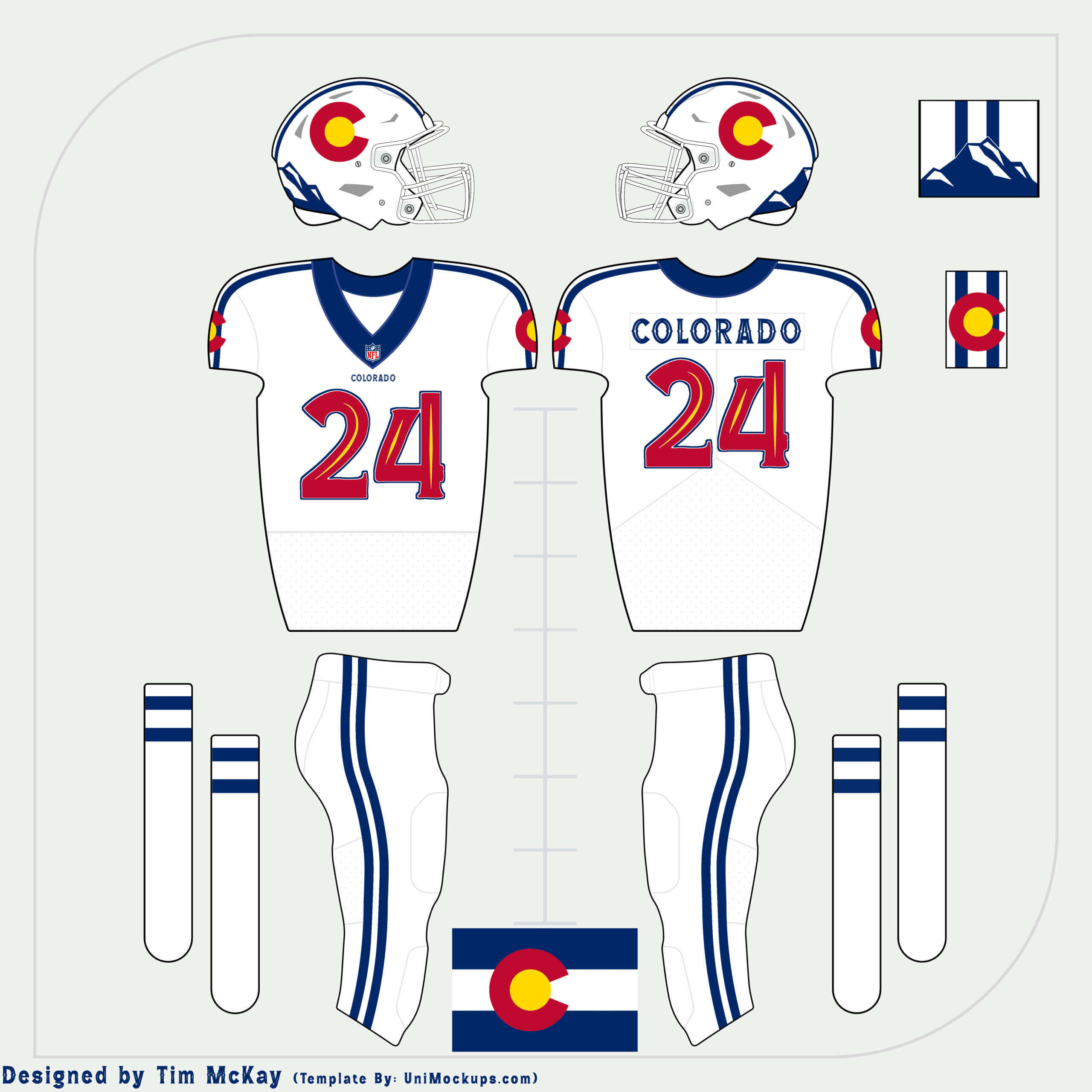
Man, that Broncos jersey sure looks like a hastily creature Colorado State ripoff.
Phil, you made me laugh by poking at silly hype videos. happy mother’s day
I am quite fond of these. I like the all black with the high cuff, allowing the red sto….socks to show. I do understand that the numbers my not show clearly, but there may be enough contact with the outline to make them legible. I bet if the uniform were all white with the same elements, there would generally be support for the uniforms.
I think the Seattle CC is sharp, the Texas CC (with the dark pants) is growing on me, if the Orioles go all black, I believe that CC Uni will grow on me.
I really think some have to dig deep and really evaluate why there is such a disdain for a black uni. I wonder if you separate the “BFBS”/“just trying to sell more”/“selling to the youths” thoughts and just look at some of the all black uniforms for what they are worth, and not in comparison to the traditional white uniform, could to see that an all black uniform actually looks good?
“I really think some have to dig deep and really evaluate why there is such a disdain for a black uni. I wonder if you separate the “BFBS”/“just trying to sell more”/“selling to the youths” thoughts and just”
Wait, why? Because that’s literally all there is to it, marketing to a bunch of edgy teenagers who see BLACK UNIFORMS and go “cooooool”. This look is garbage. Illegible type, black pajama bullshit that will, in a practical sense, usually end up with 6-7 dudes on the field most of the time going low-cuffed and wearing white shoes. Close your eyes and visualize this right now.
If tradition were to have black uniforms, and all of a sudden, manufacturers and teams tried to sell you all white unis, do you think you’d feel the same?
I think you’re looking at this much differently than classicists. White- and gray-base uniforms have traditionally been “color neutral” (at least in baseball design) for over a century. Teams got their colors from their stockings/socks/stirrups, caps, and trim colors. Black, on the other hand — and yes, there is some precedence for an all black uni as a “neutral” uniform, but not since the 1900s (and of course, prior to that, before there was an American League). (also dark blue)
link
link
link
link
link
link
link
But almost all those fall out of favor after the 1900s.
In almost all of those instances, black (or dark blue) was a team color.
You’re treating this (or any black uni/jersey) as a substitute for neutral white or gray. But that was never the case. This (and every instance of black being used as a base color when it’s NOT a team color) is a textbook definition of BFBS. White and gray are and always will be neutral. Black is NOT a neutral color in baseball.
Now, I happen to think a mono-black baseball uni can work (look at the 1970s We Are Family Pirates – link — that works!). But adding black to a color scheme when it’s not a team color (Mets, Royals, Cincy, etc.) is simply BFBS.
If you want to argue it’s a “neutral” color, that’s fine. But I will disagree.
I’d have been FAR FAR FAR happier if the O’s or Bucs went the mono-black route, since those are team colors.
It would be amazing if someone with decent photoshop skills could render the new Reds CC in white…
Phil, here’s a really quick and dirty edit: link
Thanks!!!
No problemo!
I really don’t like the ghost numbering on the Angels or Marlins and I don’t like it here. I think that is my major beef. If they had done something more like the Dallas Stars’ or Edmonton Oilers’ alts, with the black or dark navy and all the stripes, logos, and numbers in a bright vivid color, that might pop. Also, the photo of India with full pant legs- I mean, you were the Redlegs!
Is it so horrible to look at something, and based on it’s aesthetics, think that it looks cool? Sometimes it’s that simple. I see it, I like it. It doesn’t mean that anyone else is obliged to like it or even obliged to pretend, aesthetic enjoyment is entirely subjective, and the metrics on which something is considered aesthetically pleasing or not are irrelevant. Edgy teenagers who think this looks cool are not wrong because there is no right opinion.
Why do I hate the black? Because they’re the Cincinnati fucking REDS!!!
I can understand that response if all they had were red uniforms, but they have white uniforms as well.
The thin stripes in the cap and on the sleeves are like the spaghetti in Skyline chili. :)
Ok that’s the worst of the CC uniforms so far by a country mile, that is an absolute steaming turd.
Honestly removing the wordmark and replacing with a bowl of chili would’ve “told a better story” than a wordmark that no one will be able to see even from the first row.
These Reds uniforms are awesome, they look sick.
I knew there would be a lot of BFBS blowback to the Reds’ CC unis … but, at the risk of getting outright flamed for attempting to defend anything on this front, give them this much: there are still red stockings – from the original Red Stockings moniker. Some might wear red spikes and red undersleeves. That will, at worst, break up some of the black … and make the red stand out that much more.
Understanding that MLB and Uncle Phil have buried the bar 50 feet under ground, these are among the better CC uni sets. Some of them have been worse horror shows.
I thought the Reds were named after the red stockings they wore? It seems these uniforms have pretty much the same amount of red as their white and grey sets. The black just doesn’t provide as much contrast. I really like the cap, and wish they would have used the same 5 stripe font for the Cincy name and numbers on the jersey. I guess the numbers being legible isn’t as important in baseball as in football or other sports? I know I’m in the minority opinion with the traditionalists, but I think these are in the top of the CC sets.
“I guess the numbers being legible isn’t as important in baseball as in football or other sports? … I think these are in the top of the CC sets.”
You’re of course entitled to your opinion, but seriously, having illegible numbers (and wordmark) puts these in the “top of the CC sets”? I’m sorry, but having legible numbers/wordmark is basic design 101. I don’t have a problem with the mono-black (per se), but I do fault the designers for their failure in the most basic of design tenets.
It’s not about having a preponderance of the “color” for which your team is named (I’d hate these if they were rendered in red with the same illegible elements). If you admit the uniform fails there, how can they possibly be in the top of the CC sets?
He didn’t say that having illegible numbers puts them at the top, he said they are at the top but admits that the numbers are are illegible.
“I know I’m in the minority opinion with the traditionalists, but I think these are in the top of the CC sets.”
You must be really impressed with high school football blackout nights.
“Let’s hope everyone goes high cuffed on the field.”
Lol. You already know that ain’t happening.
This is instantly the worst of the City Connects, no mean feat. The only thing that could remotely save it is if they decide to pair the top with white pants down the road, similar to what the Dodgers are doing this year, but you’d still have the problem of the gross hat logo and the impossible to read lettering.
Just an absolute dog. And the language Nike and the team are using about them suggests to me that they want to incorporate a lot of this mess into the next full uni redesign, so good luck with that, Reds fans.
The Red’s CC uniform is the universe getting back at the club for moving away from the Big Red Machine unis.
The Reds CC set looks like some botched reboot of a Cincinnati Bearcats rebrand. The striping on the sleeves and pants are the only callbacks to the oldest surviving professional baseball team in the MLB? Come on. You’d think that a team with nearly 150 years of uniform history would be well suited for some of the callbacks seen in other CC uniforms this year.
I think that if these designs were used for a college rebrand (like UC), they’d be received much better. I like all the parts of the uniform in a vacuum- the nameplate really pops and I think this might be the most legible ‘ghost numbering’ that we’ve seen so far. But when they’re all thrown together they don’t function as a cohesive unit.
Also, the soutache would look better if it was placed juuust a little bit higher than right on the hem. Think it should appear to go all the way around the back of the head rather than just show up above the brim.
I really dislike cap logos being repeated on the sleeve. REALLY dislike it. It’s lazy and consumer-driven on regular uniforms but these are supposed to be some high-falutin’ ingenious conceptual state-of-the-art threads, right?
Better to put ads on both sleeves.
If anyone else needs eye bleach after gazing at this latest CC reveal, here you go:
link
The only black the Reds should ever wear should be the shoes on their feet!
What would it take to convince today’s players that black shoes are cooler than white ones? They just give a more balanced look, since most caps and sleeves are dark, too.
This just in…It gets very hot in CinCy. With the exception of April and perhaps September, I don’t think they will make the players suffer in these for too many day games. One can hope these things will have some sweat wicking features
Looks like the plan is for Friday home games, so it should be mostly evening games.
link
Every single thing surrounding these gawd awful unis is vomit inducing.
“Good Sunday Morning and to all the Mothers out there, Happy Birthday!”
– Maybe it’s just me, but I have never wished a mother happy birthday on Mother’s Day. We’re celebrating their motherhood, not the day they were born.
link
“if you take the storytelling out of it, this is just a poorly designed uniform.”
I disagree! If you leave in the storytelling, these are poorly designed uniforms. The storytelling stuff is by far the weakest of the CC unis so far. Not just thin gruel, but almost entirely lacking in even a pretense of meaningful connection to anything having to do with Cincinnati.
That said, if I were a Reds fan, I would absolutely want the hat. If only the rest of the uniform looked in any way like it belonged with the hat.
Too many all dark unis for the CC sets.
The colorful jerseys (though not the Reds’) are often very good, as per the Rockies, but the all dark has gone overboard. And the Rockies’ use of white pants on some of their CC days shows the value of that mix.
And besides, even considering the merch dump aspect of this, NO ONE BUYS THE PANTS.
Re black uniforms: From threadsofourgame.com’s Boston Nationals 1899 page:
May 1899: “Superstitious people are inclined to attribute Boston’s ill-luck to those hideously somber traveling uniforms. Black uniforms have always been regarded as ‘hoodoos.’” From The Sporting Life, May 20, 1899.
That’s a worthy reminder that all-black unis have a claim to be traditional in spite of a bunch of boomers – like me – who never saw them growing up.
I like Tim’s Colorado design, always thought the state flag was a good starting point for a uniform since the NHL Rockies used those colors and elements back in the day, and think the Nuggets could use them more clearly on their Mile High City uniform.
A ‘happy accident’ ….
The Rockies didn’t adopt the Colorado flag colors; the franchise was born in them when they called Kansas City home and they simply carried over them over when they relocated , and ditched them when they came to Jersey. I liked that the Devils re-empathized their roots with their RR program this season, but wish they’d go back to red and green.
Learn something new everyday, definitely a happy accident…
The lowercase ‘n’ always seems reminiscent of the light up sign seen in cincy at their convention center. It’s become a bit popular the past several years.
link
A red belt would tremendously improve the REDS CC uniform.
Reds fan here. These are very meh to me. (I figured that would be the case before they were leaked/revealed.) I prefer the Reds in just red and white, but the point of the City Connect is to go outside the box a little, so I’m fine with the all-black here. The wordmark and numbers are definitely going to be unreadable though, which is the biggest negative for me. I’m a “hat person,” but this one isn’t something I plan to add to my collection.
Overall, the majority of reaction I’ve seen from Reds fans has been positive though, so I guess at least the target audience is happy with them. ¯\_(ツ)_/¯
The only thing I can think for the 5 “wavelength” lines are World Series Championships.
Probably right. Or that the word Cincy has 5 letters.
The use of lowercase for the “n” in “CInCy” reminds me of 7 Eleven’s logo. Or, rather, 7 ELEVEn. Looks odd when typed, but I honestly don’t think I ever noticed until I saw a Reddit “TIL” that linked to a Reader’s Digest article. It posited that the owner’s wife thought that using a capital N in the updated logo (designed in 1969) looked to harsh. For the record, the logo in use from ’46 – ’69 used all caps.
link
Not hating these, not by a long shot. In person it seems the numbers might be hard to read, but I consume my baseball via hi-def TV. But I sure wish the Marlins would switch to process blue graphics with a red drop shadow.
The fans in the stands don’t have the luxury of hi-def TV.
And not every person in the ballpark is staring at their smartphones.
If you can’t see the numbers from anywhere in the stadium…It. Is. A. Failure.
I was hoping to get Brinkie’s take on the City connect uniforms.
So what would’ve been wrong with the Reds doing this uniform… in red?
Godawful describes this mess well.
For whatever reason, I can’t reply to Phil’s response on my thread, but yes, I do look at black as a “neutral” color, just like white and gray (and even cream). It may not be traditional, but I believe it absolutely operates as a neutral color just as white does.
These days, I am following baseball on satellite radio rather than TV for two reasons:
1. My job has become a hellacious series of 60-hour work weeks in front of a computer, and the last thing I want to do in my free time is stare at a screen some more.
2. It saves me from having to look at a endless stream of Merch Dump holiday caps and crappy City Connect uniforms.
No. 1 has been the primary reason, by far, but these Reds uniforms just closed the gap for No. 2.
As a former Cincinnatian, I am constrained to point out that rarely, if ever, does any local refer to it as Cincy in speech or print. In fact, in the same way San Francisco eschews ‘Frisco,’ Cincinnatians often express mild – or worse – opposition to ‘Cincy.’
Artists drinking coffee sat at drawing tables and easels and gave us flowing scripts and classic logos.
‘Graphic designers’ drinking Red Bull or Mountain Dew sitting at overpowered Macs give us whatever this is. Baseball taking its cues from the NBA is absolutely the wrong way round.
These are among my least favorite. They explicitly have zero connection to the city’s past. It’s unclear whether the designer went there and saw nothing in the city or its baseball heritage worth celebrating or whether he didn’t ever bother setting foot in the city. The explanation about the future is so generic it could apply to any city. Just a weak, lazy conception. As a college football uni for the Cinci Bearcats I could see it. As a baseball uniform it’s a complete failure. The irony is that they had the most to work with baseball’s oldest team and they came up with a uni that without the name would be unrecognizable as a Reds’ uni. Shameful.
Another CC failure, while this is a design for a very old franchise with a long and storied history. Very obvious that this was designed by AI or by a designer with not connection to the Queen City or to baseball. The hat is OK, but all that black in rhe jersey and the pants is really wack. The numbers, wordmark and NOB are impossible to read, the attempt at storytelling is so desparate and uninspired. Paucity (in the amount of thoughtful design) is the word that comes to mind with most of the CC unforms, but especially with this one. PauCity Connect.
Reds fan here. Not a fan of these at all. Another case of the tail wagging the dog. These will sell well, even if they look like dog shit on the field.
“These will sell well, even if they look like dog shit on the field.”
The CC’s entire raison d’etre
I give this City Connect uniform one year.
1) They’re ugly.
2) Cincinnati was one of the last teams in baseball to dispense with wool stirrups; it is a conservative franchise when it comes to looks.
3) These aren’t going to be worn during the summer. Brutal heat. Climate change. Etc.
4) They’re ugly.
So basically Nike took the Arizona Cardinals black uniform and applied it to Cincy
the most laughable part of this description is “infrared” which is not a visible color to the human eye! Ridiculous.
I often wonder if these alternate uniforms proliferating all major pro sports are less about trying to tell a nice story and more about beta testing new designs in real time. The Vice uniforms for the Miami Heat, for example, are amazing. They jumped the shark when they made the gradient version after they already created really nice white, black, blue, and pink ones. I think their Vice jerseys are better than their regular jerseys, and I’m sure others feel that way, too. So, if in five years the Heat decide to adopt them as their regular uniforms, it wouldn’t be much of a surprise, right? There would be a lot less shock from the public about them, and even people who don’t love them will have seen them for years and might just shrug their shoulders at the change. Compare that to when teams unload an entirely new look and how much derision they endure (especially after all the marketing build up and hype). This approach of releasing alternate uniforms that could end up becoming main uniforms then seems to make a lot of sense. The old main uniforms will always be available as throwbacks, new alternates, etc. Anyway, just a thought I had.
RE: Reds’ City Connect unis.
1. It looks like they’re trying to “connect” with the black-and-red UC Bearcats, not the Cincinnati Reds.
2. For fans in the stands, the numbers and lettering will be virtually impossible to read.
3. People in Cincinnati and around the area don’t refer to the city as CINCY. It’s a term used by national media people and others who are outside the state of Ohio.
4. I never thought I’d see something more garish than the big honking script “Reds” on their red shirts, but I was wrong.
I’m born and raised in cincinnati, did undergrad at the university of and most of my family still lives there. With that said, I couldn’t possibly hate these more. The socks are like the only redeeming aspect. Hate ditching the wishbone C, hate monotone black, hate black script on black jersey.
Also, re: Cincy, I’ve always referred to it that way as have a lot of my friends and family.