Click to enlarge
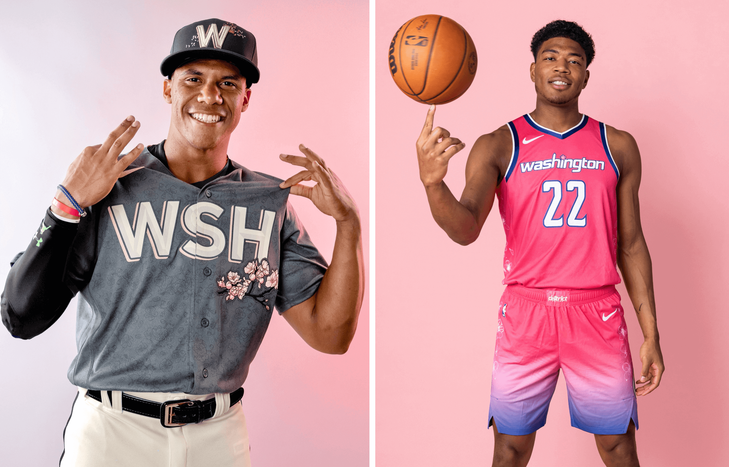
In an unusual cross-sport move, two of Washington’s pro sports teams — the Nationals and the Wizards — took advantage of the city’s annual cherry blossom season, which is currently in full swing, to release blossom-themed alternate uniforms yesterday.
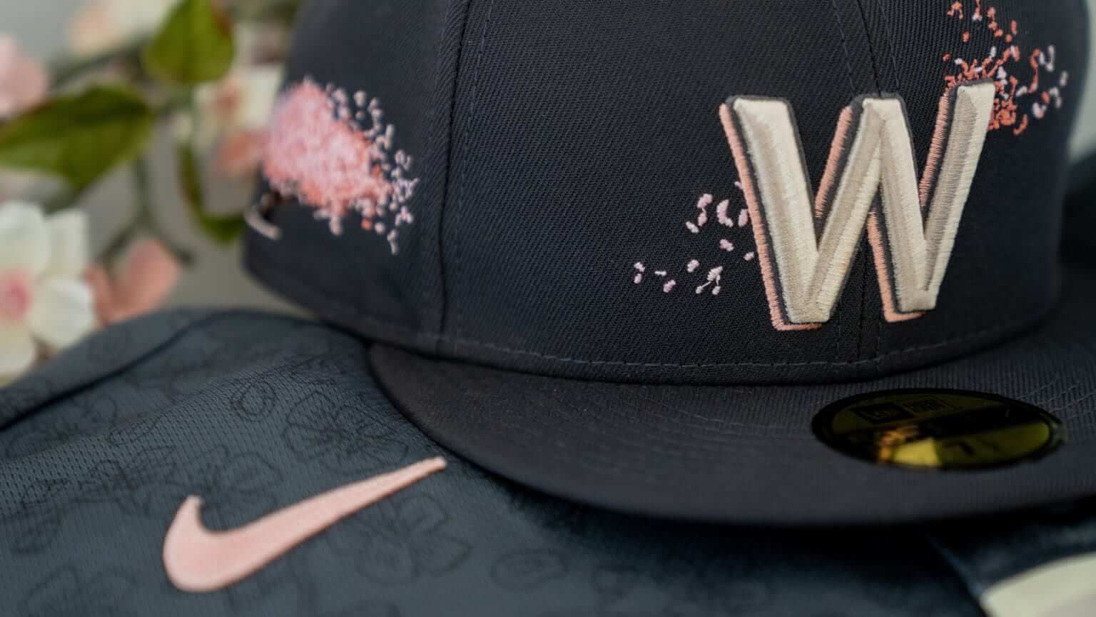
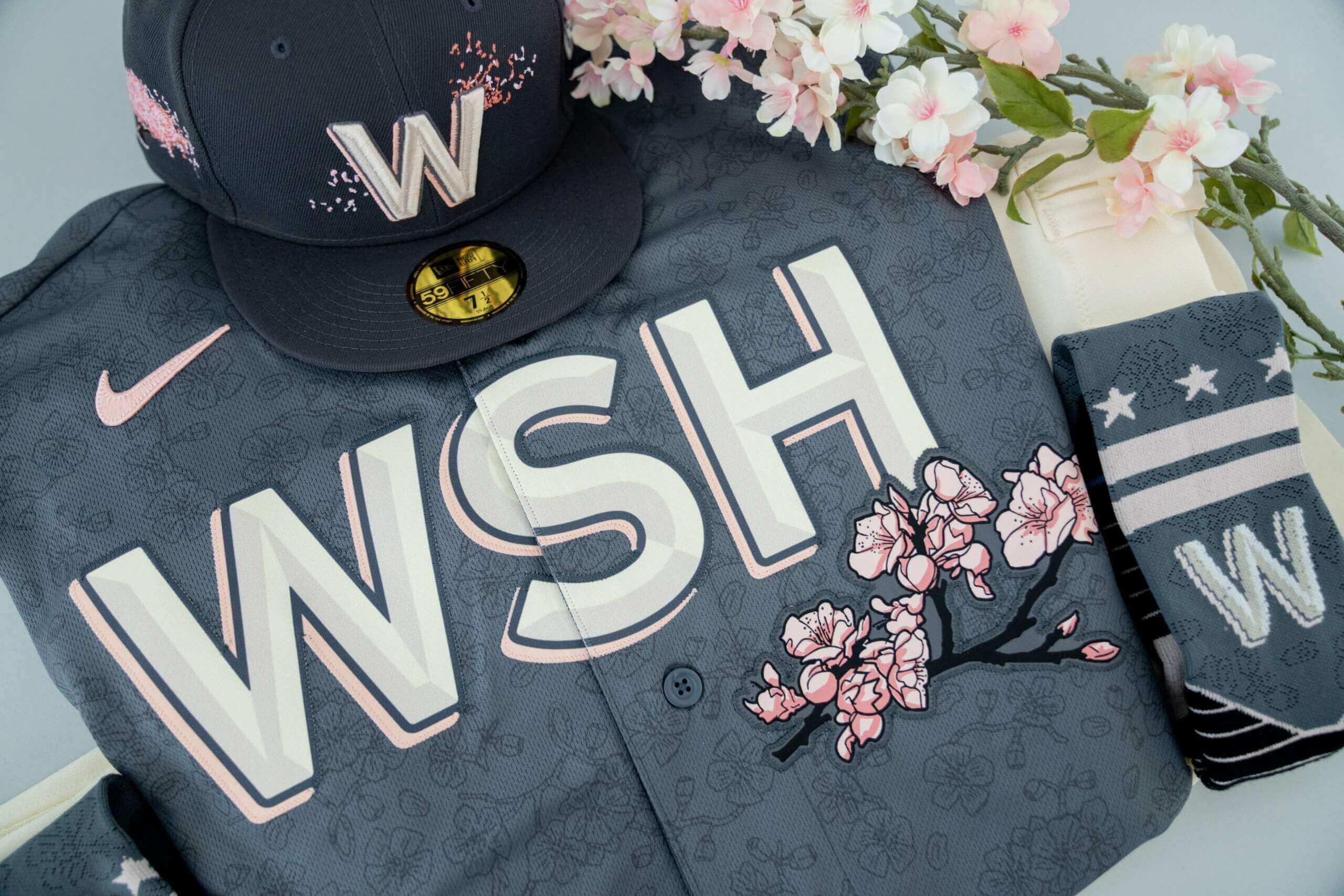
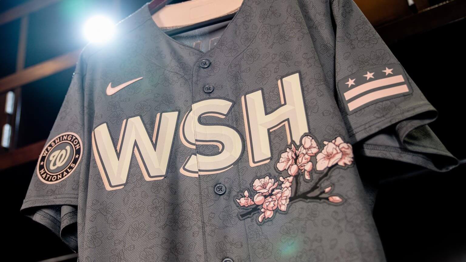
Let’s start with the Nationals. This uni, which is their new City Connect design, will make its on-field debut on April 9 and be worn about twice per month. Here are some pics that provide a better view of the sleeve patches, which feature recolored versions of the team’s logo and the DC flag:
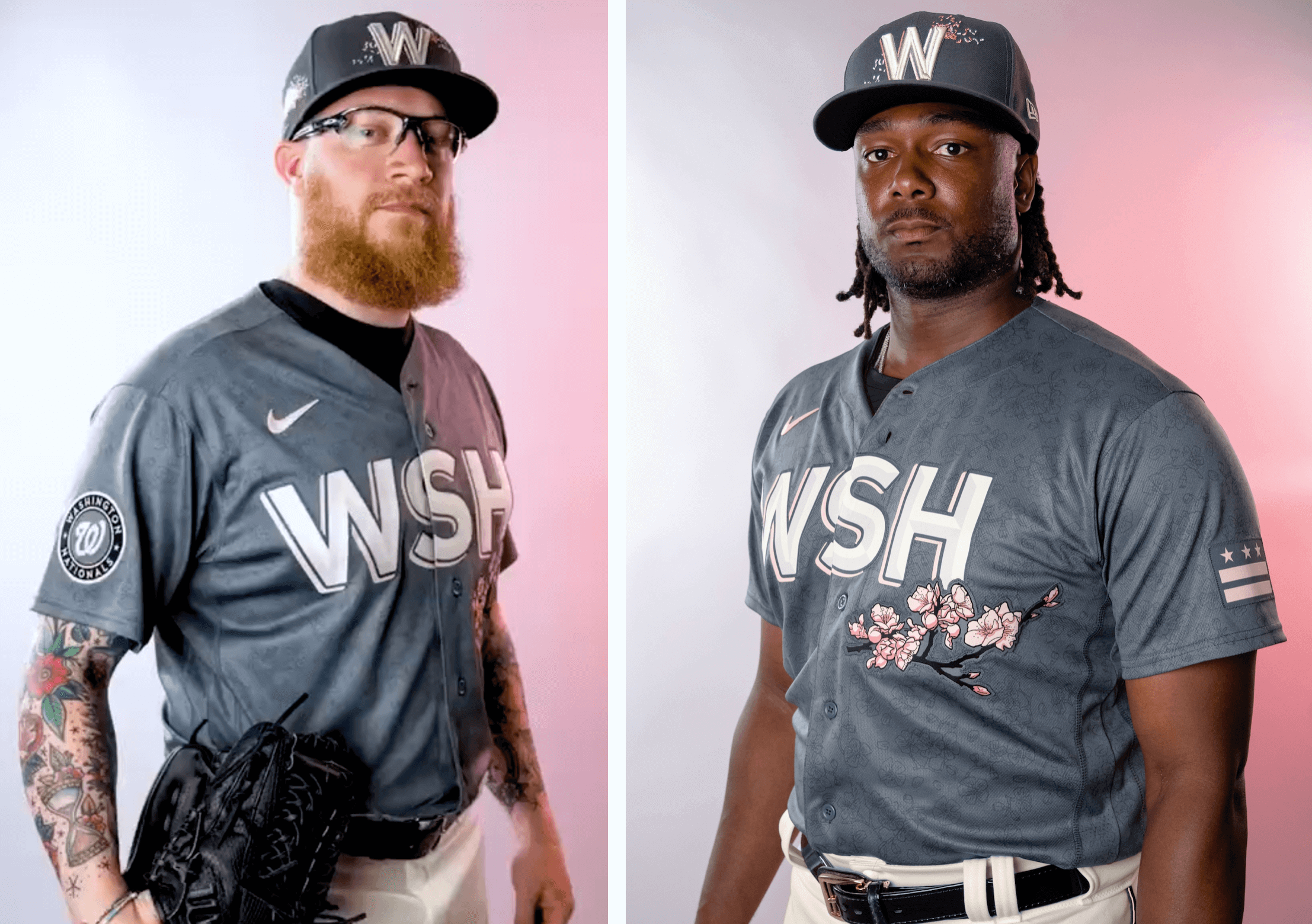
And here are some closer looks at the cap and sock designs, as well as the sublimated floral pattern on the jersey:
Some quick thoughts:
• I like the cherry blossom concept, along with the tree sprig on the jersey and the petals on the cap. Nicely done.
• I hate the dark-grey base color, however. It’s drab, not at all spring-like (they’re not even going through the motions of calling it “bark” or something ridiculous like that) and looks even worse with the pink accents.
• I also hate the sublimated floral pattern. I don’t often refer to colored baseball jerseys as “pajama tops,” but this one really earns that label because of the underlying pattern.
• I’m not a big fan of three-letter city abbreviations, but I do really like that font. Looks particularly good on the cap.
• Cream pants are an interesting choice.
• Not a fan of this trend of recoloring city flags for sleeve patches. Just use the real colors!
Overall: Some good ideas and elements, but the overall effect is ruined by the dark grey. Pfeh.
The unveiling also brought an announcement of this season’s other City Connect teams. Here they are, along with the dates of the uniforms’ on-field debuts (the unveilings will presumably be shortly before the on-field dates):
- • Astros: April 20
• Royals: April 30
• Rockies: June 4
• Angels: June 11
• Brewers: June 24
• Padres: July 8
That list, of course, lends further legitimacy to the recent purported Rockies and Padres sock leaks.
With seven teams participating in the City Connect program last season and another seven this year, that leaves 16 teams that will presumably get on board in 2023: the A’s, Blue Jays, Braves, Cardinals, Guardians, Mariners, Mets, Orioles, Pirates, Phillies, Rangers, Rays, Reds, Tigers, Twins, and Yankees.
As for the Wizards, here’s their cherry blossom uni:
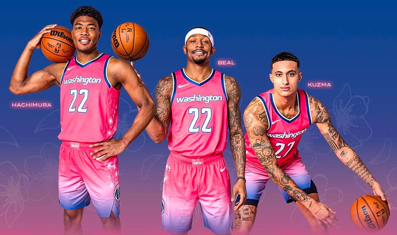
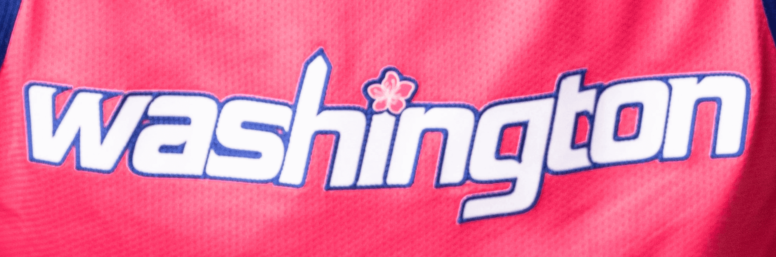
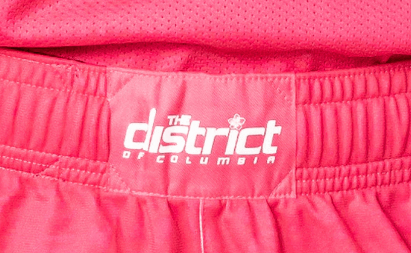
I could live without the gradation on the shorts, but overall it’s fine. It’s a little hard to see in that first photo, but the “i” in the chest lettering is dotted with a cherry blossom. Ditto for the waistband logo, and there are additional blossoms scattered on the side panels:
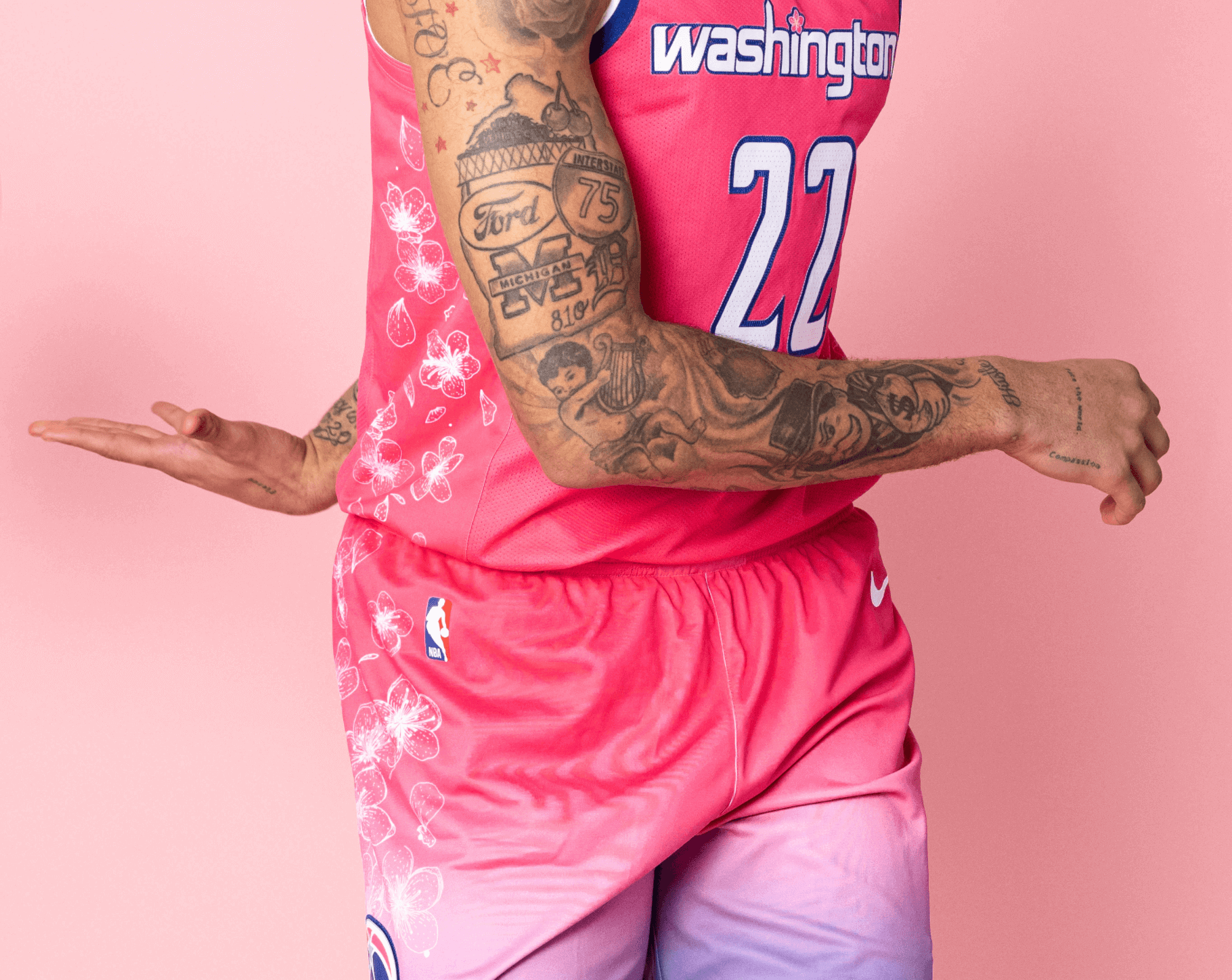
Not bad at all (here are some additional photos and info). But here’s the catch: This is the Wizards’ City uniform for next season, which means they won’t start wearing it until this fall and winter — when the only thing on the cherry tree branches will be snow. Even the merch won’t be available until November! Coordinating the unveiling with the Nats for a spring release makes for a fun season-appropriate announcement, but the design doesn’t make much sense in terms of when it will actually be worn. Still: Could’ve been worse!
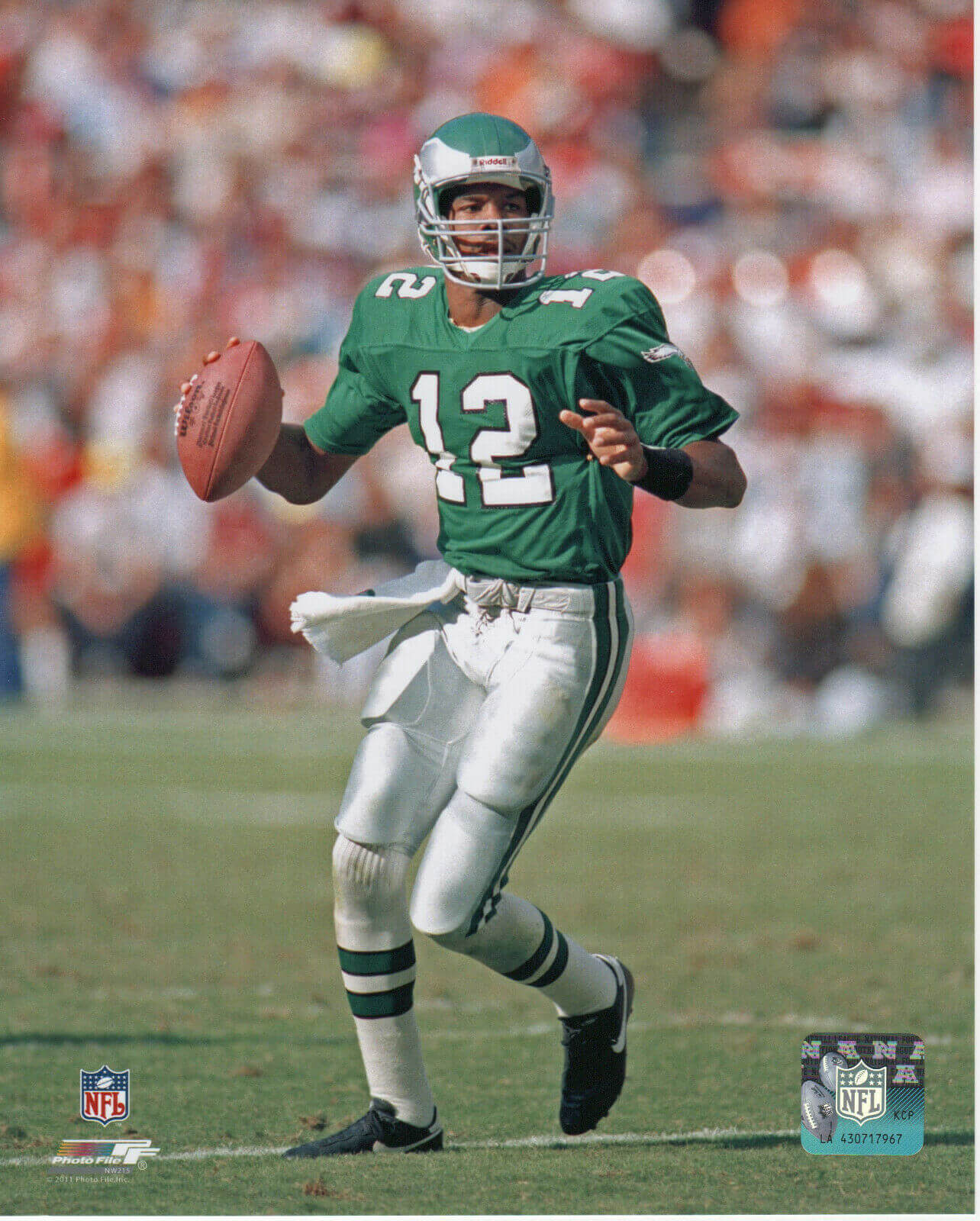
Meanwhile, over on the gridiron: Eagles owner Jeff Lurie announced two major pieces of uni-related news yesterday. First, the team will (finally!) have Kelly green throwbacks — but not until 2023. The Iggles thus join the Seahawks and Bucs in the “eventually, in ’23” throwback category.
Here’s Lurie talking about how the new throwbacks will be based on the Randall Cunningham-era uniforms:
Chairman and CEO Jeffrey Lurie announces that our classic green alternate uniforms will return in 2023! pic.twitter.com/UCHecvzIqx
— Philadelphia Eagles (@Eagles) March 29, 2022
But while we wait for the Kellys, Philly will have a new black helmet this season to go along with the longstanding black jerseys and pants. Here’s Lurie talking about that:
Chairman and CEO Jeffrey Lurie also announces that we will wear a black helmet to match our black uniforms in 2022! pic.twitter.com/AaoQSYvtU2
— Philadelphia Eagles (@Eagles) March 29, 2022
If I’m understanding Lurie properly, the black helmet will be just a one-season thing — a placeholder until the throwbacks can be rolled out in 2023. But here’s the thing: Depending on the lighting, the Eagles’ primary dark-green helmet already looks nearly black anyway when worn with the black uni, so adding a truly black helmet to that combo may not make much of a visual difference.
Membership update: Five new designs have been added to the membership card gallery. That includes Colt Foutz’s card, shown at right, which is based on the 1946 Browns.
Ordering a membership card is a good way to support Uni Watch, and fun to boot. And remember, a Uni Watch membership card entitles you to a 15% discount on any of the merchandise in the Uni Watch, Uni Rock, and Naming Wrongs shops. (If you’re an existing member and would like to have the discount code, email me and I’ll hook you up.)
As always, you can sign up for your own custom-designed card here, you can see all the cards we’ve designed so far here (now more than 3,200 of them!), and you can see how we produce the cards here.
Click to enlarge
Coaster reminder: I have a very limited (and dwindling!) supply of these great Uni Watch coasters — a set of three for $9. Full details here.
The Ticker
By Lloyd Alaban

Baseball News: A Reds employee who’s also a friend of our own Brinke Guthrie received a Louisville Slugger engraved with his name for his 15th anniversary working with the team and a Reds home jersey with his FNOB for the 20th anniversary. … Steve Robinson spotted this unusual circa-1970s Cardinals jacket. Interesting look!

Football News: With Steelers QB Ben Roethlisberger recently announcing his retirement, the NHL’s Pittsburgh Penguins honored him with pregame jerseys last night (from L.J. Sparvero). … The logo for Touchdown Atlantic, the Canadian football League’s annual game in the Maritimes, has been released (from Wade Heidt). … Here’s a brief history of Oklahoma State’s Boone Pickens Stadium (from Kary Klismet).

Hockey News: The Jets and their AHL affiliate, the Manitoba Moose, have released Indigenous-themed “Follow Your Dreams” jerseys — a pregame version for the Jets and a game version for the Moose (from @jayappletree). … Rangers D Braden Schneider still wears an undershirt of the Hartford Wolfpack, his former AHL team (from Chuck Graves). … The Senators added memorial helmet decals last night for owner Eugene Melnyk, whose death was announced on Monday (from Wade Heidt). … Canine collaboration: The Capitals’ live mascot and service dog-in-training, Biscuit, had a photo-op with Georgetown University’s live bulldog mascot, Jack (from Kary Klismet). … Cross-listed from the football section: The Penguins wore warm-ups last night with the NOB and number of Pittsburgh Steelers QB Ben Roethlisberger, who recently announced his retirement (from L.J. Sparvero).

Basketball News: The Cavs announced that they will have a new jersey advertiser next season (from multiple readers). … Players in the McDonald’s All American girls’ game last night wore their jerseys untucked (from Chris Wellbaum).

Soccer News: New kits for the Chattanooga Red Wolves of USL League One (from Ed Zelaski). … Here’s a fun thread of F1 liveries reimagined as soccer shirts (from Ephraim Vorzman). … Here’s a map of Japan showing all the J-League teams by prefecture. “The completely black locations have no team, and the two pop-outs are Kanagawa and Tokyo,” explains Jeremy Brahm. … Here’s the official match ball for the 2022 World Cup (from Ed Zelaski). … The rest of these are from Kary Klismet: Footy Headlines ran a piece on what it considers the disturbing trend of clubs changing their crests and what it says about branding over team tradition. … Here’s a detailed look at Keyworth Stadium, the home grounds of the USL Championship’s Detroit City FC. … New away shirts for Norway’s Valerenga IF. … New home shirts for Brazilian side Ceará. … New away shirts for Argentine side Unión de Santa Fe.

Grab Bag: New on-car ad for the McLaren F1 team (from @noles4kiffin). … The next few items are from Kary Klismet: The State University of New York system [of which I am a proud graduate — Paul] is holding a March Madness-style bracket competition to choose the best mascot from among its schools. … Lynx Air, a new Canadian low-cost carrier, has unveiled its crew uniforms. … Very subtle logo adjustment for Google Chrome (from our own Brinke Guthrie).
Fully agree with Paul’s assessment of both Cherry Blossom sets.
As an Eagles fan so much of Lurie’s comment on “finally” bringing back the kelly green rings hollow. He could have brought it back years ago, but wants to keep the drab green look they have now, while appeasing fans for one or two games a year. There is nothing that was stopping him from color swapping the current set to kelly green and silver (which would look great). And Paul is dead on regarding the black helmet. I can remember being at the first game they wore the black jersey 20 years ago, and given how dark the helmet already is it looked like black on black anyway.
That they are going with a one-year black helmet is concerning, because it gives evidence that the multi helmet rule is really going to open the door for all sorts of shenanigans. A team’s helmet is such a part of their identity, they don’t seem to realize how they are going to water down their brands by swapping helmets on the regular.
Eagles fans should be careful what they wish for. Of course the organization could simply implement a straight throwback, or a simple color swap to the classic green and silver, but look at some teams that went through similar down times in uni/brand design:
astros: return to colors and logos and kept jerseys simple as possible (great)
warriors: returned to colors, revision of logo and classic jersey (awful)
Rams: returned to colors, hyper modern everything else (awful)
Padres: return to colors andbuccs uni template, updated fonts (push)
Buccs: return to colors and unis but not the ones fans wanted (improved but not ideal)
Then looking at teams across the NBA that returned to “classic” looks after more offbeat looks: pistons, hawks, jazz, wizards, sixers. It’s hard to even judge the success because Nike meddles with the brands so much that the only consistent is the logo that broadcasts use in graphics packages.
So yeah, I too hope that they go back to Kelly and silver or white and I think it’s as easy as a straight up palate swap from what they’re currently wearing. But history tells us Nike and eagles brass will find it hard not to try some fancy stuff.
For 1 season (1969), the Eagles swapped out their helmets “on the regular”. Granted, I wasn’t around but I suspect that doing so didn’t water down their brand (seems not even terrible coaching/poor management/less-than-stellar play had an impact with their die-hard fan base either, based on attendance numbers).
While I’m old enough to have actually seen those Kelly Green/Silvers in action…those unis didn’t disappoint, but the teams that wore them often did…and am happy to learn they will return part-time in some form for ’23, I prefer the Lurie-era look much more (minus the BFBS set of course); I’m sure many, if not most, fans like them as well; the fact that a SB was won wearing them probably has a great deal of influence in that regard.
Counterpoint to recoloring flags on uniforms: the Alberta shoulder patch on the old Flames jersey clashed badly. If you made me choose, I’ll go with recoloring.
Agreed. The recoloring works with the Nats uni. The white & red DC flag woulda clashed badly with this design.
I personally love the Nats look. The gray chosen is perfect to allow the pink to pop against it. Bold choices that make me happy as a designer.
Agreed. I don’t like graphite for baseball – any sport, really – but if you went with a lighter base (light gray, white, cream), the pink blossoms would not show up.
That said, home and road is more than enough. I can’t stand turning on a game and not being able to tell immediately who is playing.
Why not just go with a pink base and dark accents then? That woulda really popped.
Agree. If we can have an all pale blue baseball uniforms why not pale pink?
I think pale pink with either some shade of navy or red for the wordmark/numbers would have worked, with the hat matching whatever color was used for the wordmark/numbers. But my biggest gripe with it all is the WSH. That is just awful. Had they just gone with DC instead this would at least be a tolerable uniform.
Agree completely.
I wonder how it would have looked on powder blue – but this is pretty nice.
I was just about to say that I love the colors. They remind me of link.
No desire for the silly three-letter abbreviation on the front, but the color scheme is great and I like the shadows, which the Senators used to have (though theirs were the block kind and not the slide shadow). Hopefully they’re using that font for the number on the back, and when you’ve got shadows like that, NNOB looks best.
Usually I’m all on-board with Paul disliking city and city connect uniforms, and Nike is definitely annoying for doing it all. However, I actually think the soft pink/cream on the grey feels nice, like a cloudy walk through DC. And the sublimated flowers, while gimmicky, also feel nice. I wish I had a better adjective but that’s just how it feels to me. In a sports world where so often uniform design goes for “menacing” style and speak, it’s a different turn, while still paying homage to one of the city’s defining characteristics. A good change of pace. I’m a die-hard Reds fan and if the City Connect jerseys weren’t like 400 bucks I’d consider getting one.
Agreed with everything. My only quibbles are: the standard round elk logo and the flag patch feel out of place as they are blocky and (in the case of the the roundell) clumsy designs compared to the clean and quite lovely flowing flowers and block letters. And I wish the tree on the hat was either right next to the W, or the blossoms flowed consistently from the tree past the W. Broken up as it is it lessens the effect. Originally I thought the floral pattern was actually a slate texture which would also be nice. In contrast, the wizards unis seem lazy and uninspired.
I’m so sick of these nonstop alternate jerseys and “city connect” crap. These teams should wear their colors. Like Greg above said with the helmets, it just waters down the brand.
I don’t think either cherry blossom uniform is “bad.” I think by itself, it’s actually a decent set. But when associated with the Nats and Wizards, it’s just blech. It’s not going to be fun turning on the Mets game, see the opponent wear gray and pink, and I have to figure out who they’re playing.
As for the NFL, they should restrict the “alternate helmet” to 2-3 games a season like they do with the color rash and throwbacks.
I get that people don’t like them but I’ve never understood this comment: “It’s not going to be fun turning on the Mets game, see the opponent wear gray and pink, and I have to figure out who they’re playing.”
EVERY game has a scorebug, it’s not that difficult. I would also say that I always know what opponents my favorite team is playing even if I haven’t watched them in a week or two, I keep tabs on them anyway.
Because the point is, a team should be identifiable immediately. I shouldn’t have to memorize who my team is playing or look at the score bug. For decades, teams have their standard look such that when you look at a TV, you immediately know who is playing. Imagine the casual fan who doesn’t follow this stuff look up at the TV and they won’t know who’s playing b/c they don’t recognize the uniforms or the color scheme that’s not the standard scheme for a team (i.e. yellow and blue for Red Sox). How do you establish recognition to those casual fans you’re trying to reach out to if they think they’re watching a different team b/c they’re wearing something totally unrecognizable?
I want my Mets to have the standard white pinstripe and and road gray with the occasional blue alternate sprinkled in. I don’t want to turn on a game in 2023 and watch them play in red or gray (as an example) because that’s the color of the HR apple and the world’s fair globe or some crap like that.
The cherry blossom crap is “story telling” that we don’t need. I can learn about that and see it when I plan a trip to DC. I don’t need to see it on a sports uniform. I shudder to think what kind of garbage is going to be foisted on the Mets next year.
Agree on casually turning on a game and knowing who is playing. It is important. I mostly bailed on the NBA years ago but every once in a while when I flip by, I am floored and say something like, “That can’t be the Lakers” or “Why are the Celtics wearing black?”.
For the Nats’ jerseys, they are okay. Not great, not good. Just okay. They have maybe one or two too many design elements.
I agree with Paul on the recent overuse of three-letter city abbreviations. That said, they should have used DC or DMV. Residents say they’re from DC or the DMV…no one says they’re from “WSH.”
Finally, I really wanted to see the old “DC” logo make an appearance. Maybe next time…
Well, there’s not a 3 letter airport code that fits for DC. You have options of:
DCA – National Airport
IAD – Dulles Airport
BWI – Baltimore
You wouldn’t use “WAS”, that would lead to way to much criticism.
I’m a big fan of “W” being Washington, “A” being Atlanta, “LA” being Los Angeles “B” being Boston “SOX” being the White Sox, Etc.
I love the WSH on the chest. Mainly because I just like the idea of a team wearing its official(ish?) three-letter schedule/standings abbreviation on its chest. Partly also because Washington doesn’t have a single airport code.
But I have a strong preference for any jersey that refers to Washington to be paired with a DC cap, so that in effect the uniform reads Washington, DC. Like, I want the Nats to wear a DC cap with their regular road uniforms full time. And the WSH jersey is close enough to Washington, so I’d prefer the DC logo on the cap here too.
As to DMV, I lived in the area, mostly in Virginia, for nigh on 25 years, and I swear I never saw or heard DMV as a local nickname until the month after I moved to Wisconsin. Suddenly everyone I know was writing and saying “the DMV” all the time. So, purely because it makes me feel left out, I do not prefer it for a Nats jersey!
Mr. Lurie. Please give us silver pants with the sheen for the new 2023 Eagles uniforms and not grey pants.
This, a thousand times over.
And we can throw the BFBS gear in the Schuylkill after this season and be done with it.
Mr Lurie-
Please go back to the White Helmets with the Kelly Green Wings.
link
The Reds employee’s bat says 15 seasons, not 20.
Sorry, the bat was for 15, the jersey was for 20. Will adjust wording.
I actually really like that Nat’s set. It’s a nice contrast to the rest of the CC programs that are looking to make the most garish, bright, obnoxious unis possible. Maybe because I hate my team’s CC unis so much, it’s nice to see something that doesn’t hurt my eyes to watch. This one goes to 2nd place for me, right behind Miami.
The photo of Al Hrabosky in the oddball Cardinals jacket and without facial hair is almost certainly from spring training 1977. Vern Rapp had replaced Red Schoendienst as manager in the off season and immediately put in place a Yankees/Reds style ban on facial hair. Hrabosky was unhappy, ass one might imagine.
I think the changing of the crests can be a good one, if it’s done properly. My team is Tottenham, and the crest in the 90s was just too busy. Now it’s clean and well in line with the original crest from the 1920s, with a few modern tweaks. The Man City one was done to separate itself from the past, and try to create a whole new image. But Leeds fans really didn’t like the change of theirs, and the club was forced to change it back. So in certain circumstances, the fans can in fact make the change, if they feel strongly enough.
I saw most of the examples as obvious improvements that emphasized the most historically relevant elements of old logos. (And yes, in fact they’re logos.) But I did recently adopt Leeds United on account of Leeds hiring a Wisconsin-native coach, and in the course of learning about the team I rediscovered the logo-change controversy. And, yeah, the proposed new logo wasn’t great. On the other hand, the current logo is pretty terrible. I think the real lesson of recent football logo-change history is not that teams should not attempt to update or refresh their logos; rather, teams should expect initial strongly-worded pushback and be prepared to persist with the change until the outcry blows over. Which it will. Everyone hates change, until the change becomes the status quo. That’s just how public opinion works in these cases. The only thing different about today is that online media gives the audience a more direct opportunity to express opinions in an unmediated way that team execs and owners will hear.
Some of those old crests are as soulessly designed-by-committee as any of the supposedly bad new ones. Like Brentford? Aleves?
We’re also simply more aware of this happening now – back when, we didn’t have sites reporting every time a mid tier Portuguese team changed its logo, and social media to yell at them. Now we do.
I do dislike the “lifestyle brand” attempts though, mostly Juventus (though most professional designers I saw loved that rebrand)
Yeah I thought the article was a little too much new=bad, thinking to my favorite club Porto, they’ve made smaller tweaks through the years
link
mainly to remove all the detail they used in the old crests and make things easily reproducible (and clear) at a variety of sizes and across media. A lot of the old crests don’t hold up well to a lot of modern uses
They do have a point with the roundels, but it’s worth noting that a lot of those teams are lower-league teams, which (like minor league teams here) are going to be in the mood to chase trends. You saw this kind of thing happen in the past, with kit designs, crest designs, and the like – like a bunch of teams introducing modernist crests in the wake of Derby County and Leeds doing so in the late 60s.
As a Wizards fan (yes, we exist, all 15 of us) the cherry blossom uniform is underwhelming. Fans have been asking for this for years, and they finally do it but ruin it with storytelling. Removing the blue trim on the jersey and the silly Tidal Basin gradient at the bottom and maybe replacing them with a darker pink woulda made this a homerun. In fact, a lighter pink base woulda worked better. Instead, Nike had to “tell a story” with the design instead of just creating a dope uniform. This feels like a bootleg version of the Heat’s Vice unis. I grade this a solid B-.
The Nats? They got the shade of pink correct, but buried it as an accent color. Why not go full blossom and make the unis and hats pink? Grade: B
The rollout with the Nats made logical sense. The Festival occurs at the end of the NBA season and at the start of MLB, so I sorta get the joint announcements. But FFS, if you’re gonna do that, have the merch available pronto. Don’t tease a uniform and make it available for retail EIGHT MONTHS LATER.
The drab gray color is not evocative of spring but it is definitely evocative of the predominant color of DC architecture.
Also evocative of DC skies during normal peak cherry-blossom season.
I think the Nat’s font is a nod to the old font used on the Senator’s caps and shirts in the 50’s. While looking up the old Senator’s uni’s I noticed that they pretty much completely stole the Red Sox home and away look in 1961 and 1962, right down to the stirrups.
The Eagles, Bucs, and Seahawks alternates coming in 2023 are all better than their current uniforms. I’m sure if they took a poll, the vast majority would pick these throwback uniforms. So why not just switch to these as their main uniforms?
Does anyone know who the Wizards player with the University of Michigan tattoo is? The Wizards don’t currently have anybody on their roster who attended U of M.
Bradley Beal is number 22 and originally from Detroit. He wears Detroit area tattoos, like Ford and U of M.
It’s actually Kyle Kuzma, who’s from Flint. The I-75 shield stands out in particular. link
Except Beal is #3…?
Is DC only and strictly known for its cherry blossom as both teams picked up on the theme? Was there really not other identity to choose from? I like the Nats hat (the jersey looks too much like a velvet cushion form Versailles Palace) and I like the sakura dotting of the i plus the side panels of the Wizards uniform (the color is too neon/cosplay/anime/harajuku for my taste and that gradient is very unnecessary) but there must be more to DC than a bunch of cherry trees? Be it very beautiful trees?
Cherry blossoms are a big part of the culture in DC. The trees are one of the few non-political or non-Federal government related cultural things we have. Each Spring, the city is decorated in pink in anticipation of the peak bloom. This also usually corresponds with the start of the baseball season. The likeness of the blossoms are used year-around to represent “DC” as well. For example, the logo of the DC lottery is a cherry blossom and our ID cards are pink and feature cherry blossoms. (link).
Wasn’t Atlantic Canada awarded an expansion team in the CFL?
I so wish the Washington football team somehow incorporated the cherry blossoms of that area into their new name and uniforms.
Atlantic Schooners are the conditional CFL team. Things looked promising but pandemic helped push the goalposts back. The proposed stadium that was to be a go in Halifax area stalled.
link
The CFL needed to figure out how to survive as pandemic hit that league hard economically so thinking about adding the expansion team not in the cards yet like it was a few years ago.
The Atlantic Schooners still undefeated! Have been undefeated since the early 1980s.
link
So the Nats will be wearing home grays for a few games! I wonder if there’s a chance the the visitors will wear away whites? Have we ever had gray vs gray matchups?
I hate the dark-grey base color, however. It’s drab, not at all spring-like … and looks even worse with the pink accents. … I also hate the sublimated floral pattern.
Whattaya, blind, Lukas? Yer outta yer dim-danged mind here! [Kidding, to highlight the ridiculousness of expressing too strongly a purely subjective aesthetic opinion, which I am wont to do, and hope I don’t actually do here.]
For me, the jersey base is one of the best things about this uniform. First, gray and pink is an excellent color combo in the abstract, up there almost with green and yellow. But! It’s not as successful here as it could/should be. But that’s not the gray’s fault, it’s the pink. The particular pink the Nats are using is too pale, not saturated enough, and washes out against the gray. But it’s so undersaturated that it would wash out in any pairing, such as white/cream or green or the obvious alternative of sky blue. And there’s not enough of it. Needs to be more saturated, a tad brighter, and somewhat more prominent. Fix the pink, and the dark gray is the perfect pair. Doesn’t have to be as bright or saturated as the beautiful but somewhat retina-searing Wiz unis, but a step or two in that direction would have been an improvement.
As to the floral pattern, I actually kinda agree with Paul, but also I see no objectively defensible grounds on which to condemn a floral print pattern without also condemning pinstripes. As long as we’re OK with pinstripes – literally, the pattern of a banker’s suit cloth – on baseball jerseys, then patterns are fine. Especially more subtle ones like this. There are two moral-aesthetic universes: One in which pinstripes, and therefore also plaid, tattersall, French-sailor hoops, paisley, and other patterns are fine for baseball jerseys; and another in which these fundamentally non-sporting patterns have no place on a sporting field.
But back to the gray. I hope someone, somewhere, in the Nike-MLB industrial complex draws inspiration for darkening the gray of ordinary road uniforms. The road-gray base color seems to get lighter every decade or so. Under most stadium lighting conditions as seen on TV, it’s not a problem, but in daylight games, especially in person, a number of teams have road uniforms that almost read as white. Darken the gray back toward the more saturated heathers of the flannel era, please!
Pinstripes are not even close to being in the same league as the other patterns you mentioned. Even “French-sailor hoops” (I’m assuming you are referring to thinner ones) can hardly be considered “non-sporting”.
These “City Concept” and endless alternates in all sports is nothing more an unabashed money grab. I can’t stand them. When I turn on an NBA game, it takes me five minutes to figure out who’s who and when I go to a Nats game, I want to see them in their home whites, not some poorly contrived gimmick of a uniform. Yes, I’m old.
You also don’t have a scoreboard, TV listings/descriptions, and conveniently close your eyes every time there’s a close-up shot?
As I also mentioned above. Every game has a scorebug. It’s not that difficult to figure out what MIA and PHX mean. Or whatever teams are playing. I’ve never had an issue figuring out who is playing the past 20 or so years.
I’m probably as old as you and don’t care one bit. Some I like, some I don’t. Still watch or go to a game.
The light pink on the dark grey are perfect compliments.
They were all wearing 22 (for 2022), in case you didn’t notice.
DC United will likely join the Cherry Blossom design train next season as well
I agree with the comments above liking the Nats’ alternates. The pink flowers (the best part of the uni) wouldn’t pop as much with lighter colors, even a traditional grey. And to me the grey is actually very evocative of a cherry blossom spring sky (although that may be because most of cherry blossom experience is through the University of Washington: link)
Without context, dark grey with pale pink accents is a decent combination to my eye. But I feel like a cherry blossom-themed jersey should be mostly pink.
As someone who is colorblind, and especially struggles with the contrast between pink & gray, those Nats uniforms don’t work for me. As far as I can tell (with some help from the paint dropper in photoshop), the actual letters are gray, with only the drop shadow highlight in pink, correct? To my eyes, the whole jersey looks like bland shades of gray. And the cream pants are inexpicable. The Wizards unis are much better, because the color is obvious, even if I could do without the dumb blue gradation. Those uniforms look like spring to me, which is why not wearing them now is bizarre.
Can a team keep a “city” look into the following season if they want? I haven’t seen anything to the definitive or contrary.
If you’re referring to MLB, the City Connect uniforms are used for three seasons.
In the NBA, City Edition uniforms are worn for one season (except in a few special cases where they’ve been carried over to the next year).
The Nats CC is better than most but it could have been a home run. The Cherry blossom is a very cool connection with DC & it has a lot of design options so they could have created an iconic set.
The grey is fine & it looks good, but I think they should have used their existing Navy as the base color. A slightly brighter shade of pink w/ cream on navy would have been fantastic. Pink and navy are a classic summer combo (from beach to boating to golf to a summer suit & tie). Also Washington spelled out with a longer branch & blossoms underneath or through it across the entire chest (like the cardinals bat or the Brooklyn Branches design).
Then swap the W for a DC on the hat add a smaller sprig of cherry blossom behind/through it (no petals on the side). Classic stand alone lid that screams DC.
Somebody hire this man!!!
Brooklyn Branches has made the comments section a few times lately!
Was there an explanation for the gray Nationals look? I couldn’t find one in other press releases. Is it supposed to be “Monument Gray” or some such reference?
They called it Silver Slate in one of the teaser tweets:
link
Thanks, Jo! That’s got to be one of the least informative and “tease-y” tweets I’ve read! Haha!
Great work from Paul as always.