By Phil Hecken
Follow @PhilHecken
Every College Football season, I look forward to many games, but three always stand out — THE Game #1 (Harvard/Yale); THE Game #2 (Ohio State/Michigan); and Army/Navy. Unfortunately, COVID-19 (and 2020 in general) have upended our lives in many horrible, awful ways…so missing a few football games, in the overall scheme of things, isn’t really a big deal. Still, the Ivy League canceled its season before it even began, making Harvard/Yale something to look forward to next year. The B1G got its act together in time to play a handful of games, but the coronavirus and subsequent cancellations has taken its toll on that Conference too — Michigan/OSU had been scheduled for today, but that, too, will not be played. In fact, the entire NCAAFB season is limping to a close, and things are looking bleaker and bleaker by the day.
In a “normal” year, Army/Navy, who play today, would have the day to themselves; the game is traditionally played after the FBS season has ended, just before roughly 100 Bowl games take place. Not so in this year from hell. Today, Army/Navy will share the stage with the rest of the nation, but that doesn’t mean it’s still not must-see-TV. It’s at 3:00 pm (Eastern) on CBS. Navy had been on a massive winning streak (winning 15 straight), then Army won three straight, and Navy won last year. Overall Navy leads the contest 61-52, with seven ties.
The sharing of the stage with many other teams is not the only “casualty” of COVID — this game has also been affected. Normally played in Philadelphia, the game has been moved to West Point’s Michie Stadium in New York. Over the 120 years the rivals have competed, about three-quarters of those games were played in Philadelphia, which is about the midpoint between Army’s home of West Point and the Naval Acadamy in Annapolis. Because of COVID, the state of Pennsylvania has placed limits on attendance at outdoor events, which would have meant the entire Brigade of Midshipmen nor Corps of Cadets would be to attend. As such, the game was relocated to federal government property, which is not subject to state or local restrictions. Because Army is the designated “home” team, that means they get to host the game. And the Brigade and Corps will likely be the only attendees.
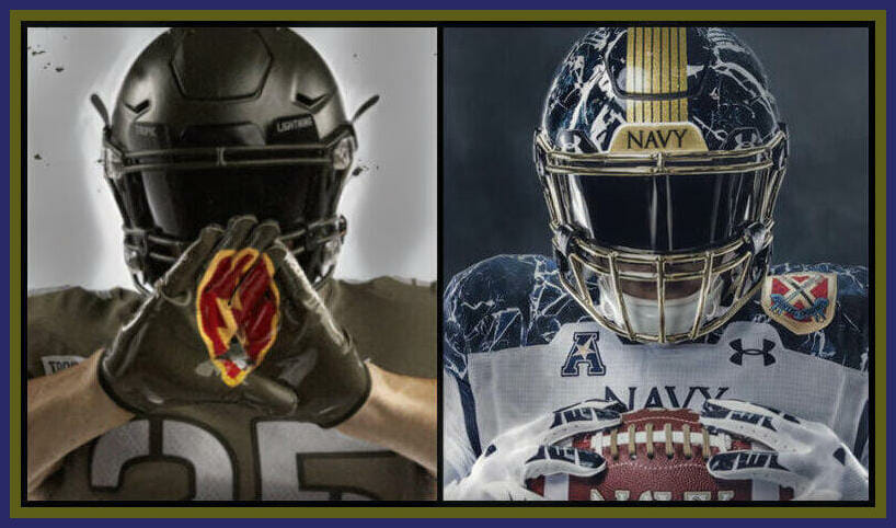
Still, the game will feature special uniforms, as it has for more than a decade. (Here are the uniforms for 2008, 2009, 2010, 2011, 2012, 2013, 2014, 2015, 2016, 2017, 2018 and 2019.) Some of those years produced outstanding sartorial matchups, other years, not so much. This year may fall into the latter category.
And that’s not necessarily a bad thing. Being that we’re under a pretty bad COVID wave at the present time, understated (relatively speaking) uniforms for both squads are the order of the day. Let’s look at Navy first, as they are the visiting team.
NAVY
According to this site,
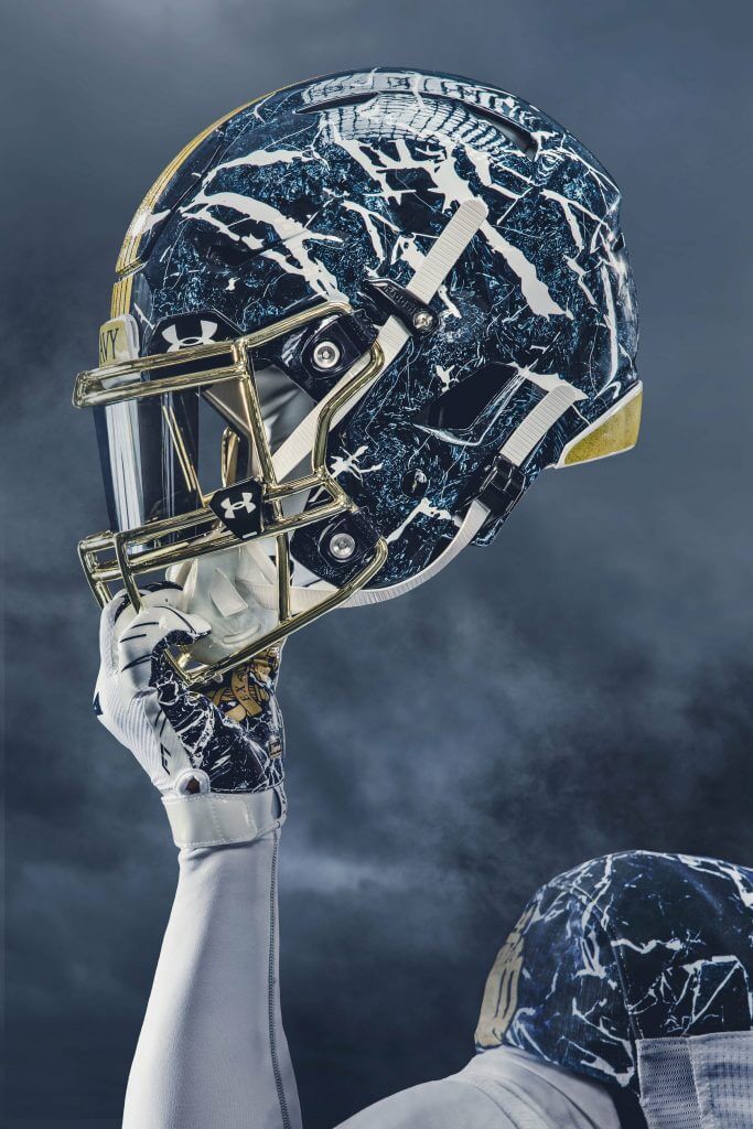
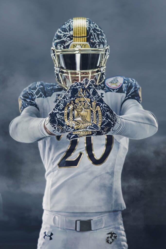
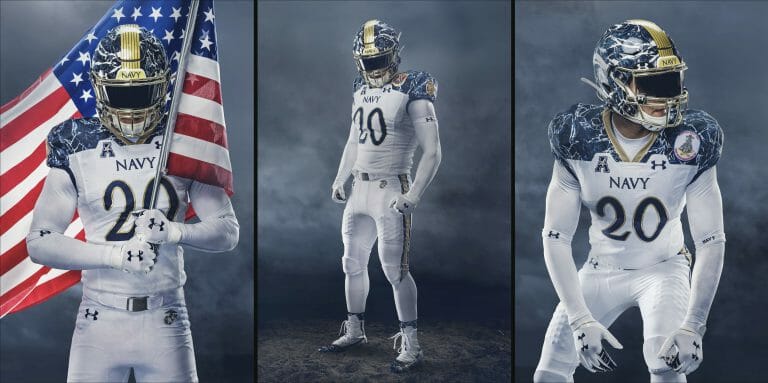
This year’s Midshipmen Army-Navy uniform pays tribute to the naval academy with numerous special features seen around campus, also known as the Yard. The blue and white marble pattern on the helmet and shoulders mimics the stone as a prominent accent on the academy’s grounds, including the crypt of John Paul Jones, the Father of the American Navy, who has been laid to rest in the naval academy chapel. It is also found within Bancroft Hall, the largest dormitory in the country, named after George Bancroft who founded the naval academy during his time as Secretary of the Navy.
Navy football also honors the Marine Corps by sporting its emblem embroidered on the pants of this year’s uniform; and the naval academy seal, established Jan. 25, 1899, takes center stage in gold on the shoulders and gloves. The seal is featured throughout the Yard on buildings, flags and uniforms, and represents the academy’s mission, “To develop midshipmen morally, mentally and physically, and to imbue them with the highest ideals of duty, honor and loyalty in order to graduate leaders who are dedicated to a career of naval service and have potential for future development in mind and character to assume the highest responsibilities of command, citizenship, and government.”
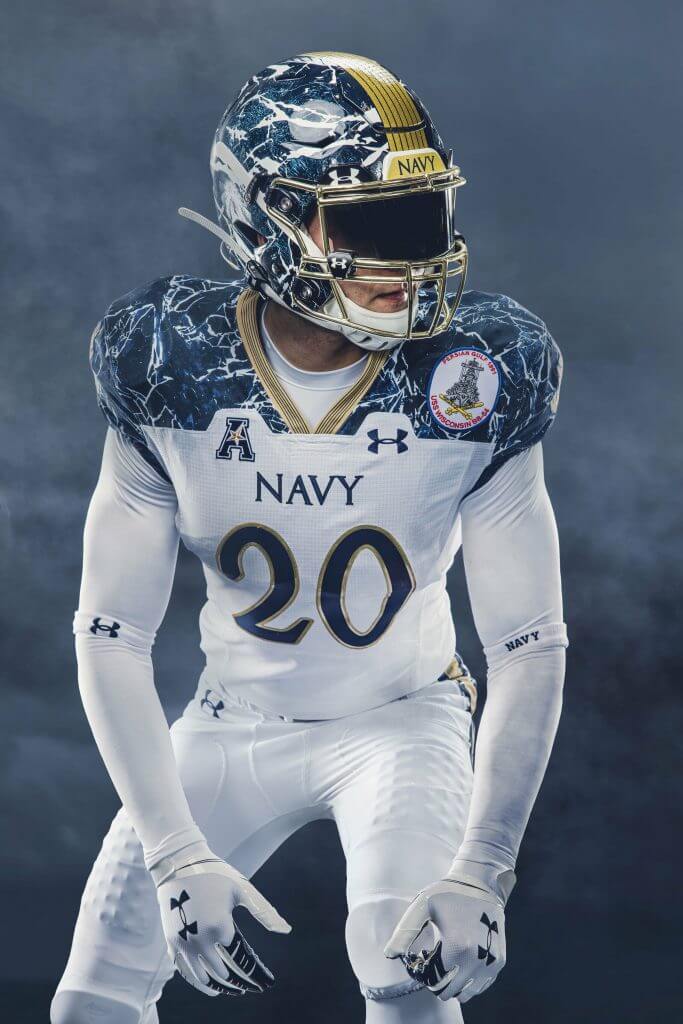
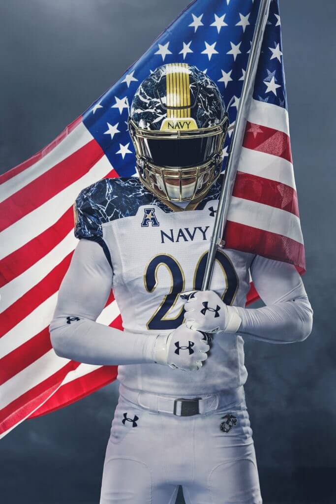
Navy is, as you can see, sporting mostly white uniforms, with the two eye-catching elements being the blue marble affects on the shoulders and the helmets. I particularly like the Navy helmet featuring the seven stripes (these pay homage to the seven seas I believe). The rest of the blue marble look is more storytelling (see above) but it’s a unique look and I like it. The pants feature a blue/gold/blue stripe, but the rest of the uni, save for patches and uni numbers, is white.
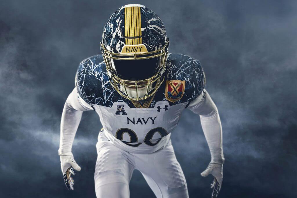
Overall, a very clean look and one that should matchup well with Army’s olive duds, which we’ll look at next.
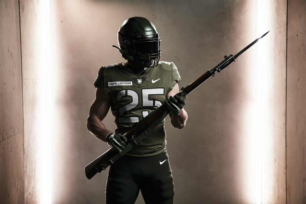
ARMY
Army’s uniform pays homage to the Hawaii-based 25th Infantry Division’s Korean War-era 27th Infantry Regiment, the Wolfhounds, which according to the Army, have more Medal of Honor recipients than any other regiment going back to the Spanish-American War.
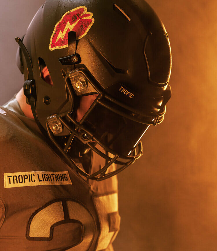
Army’s helmets will sport the division’s distinctive insignia — a golden lightning bolt emblazoned upon a red taro leaf — dubbed by soldiers long ago as the “electric strawberry.” On the shoulder of the uniform is a wolf head, symbol of the Wolfhounds, whose soldiers were deployed from the tranquil Japan occupation to Korea when war broke out in June 1950. The uniform also features insignia from 10 units that have been subsets of the 25th, and each Army player will sport one of the insignia on his helmet.
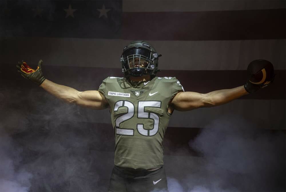
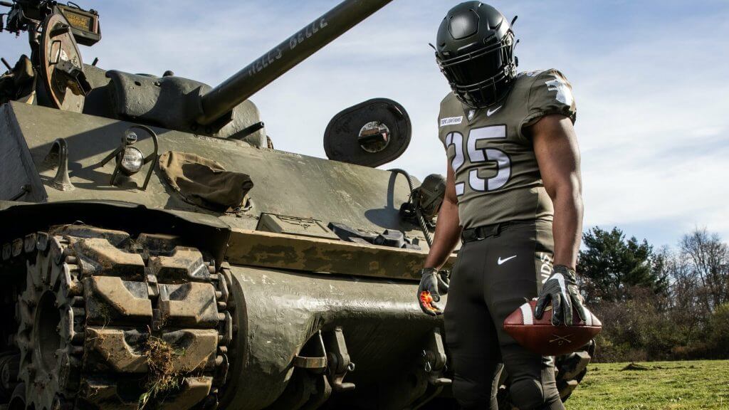
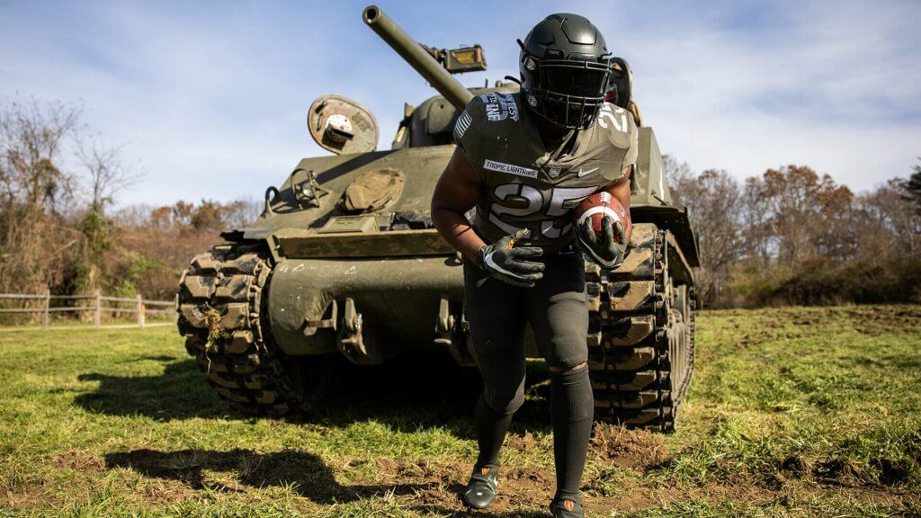
Talk about going mono-olive! Army has traditionally (at least since 2008) been the more subdued of the two teams, and this year is no exception. And while not “camouflage”, it certainly blends in against the backdrop of the tank:
The only real “flair” on the uniform at all is the lightning bolt insignia on the helmets and shoulder — plus the “TROPIC LIGHTNING” tags on the chest:
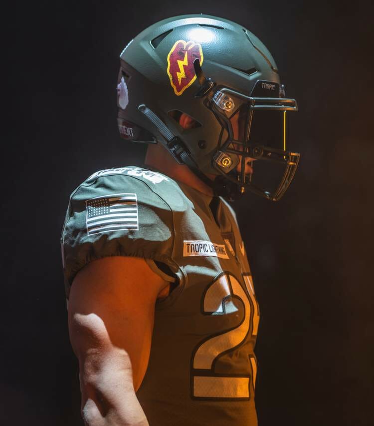
It’s hard to tell from the photographs, but it appears the Army team’s jersey is a slightly lighter shade of olive than the helmet and pants. But the intent is clear — the team will be dressed remarkably like the soldiers of the 27th Infantry Regiment, the Wolfhounds:
It’s not the only game in town today, but it’s a rivalry game that even COVID won’t keep from happening.


Guess The Game…
from the scoreboard
Today’s scoreboard comes from Private Garcia.
The premise of the game (GTGFTS) is simple: I’ll post a scoreboard and you guys simply identify the game depicted. In the past, I don’t know if I’ve ever completely stumped you (some are easier than others).
Here’s the Scoreboard. In the comments below, try to identify the game (date & location, as well as final score). If anything noteworthy occurred during the game, please add that in (and if you were AT the game, well bonus points for you!):
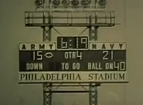
Please continue sending these in! You’re welcome to send me any scoreboard photos (with answers please), and I’ll keep running them.

Uni Concepts & Tweaks
Time for more Uni Tweaks from the UW readership.
I hope you guys like this feature and will want to continue to submit your concepts and tweaks to me. If you do, Shoot me an E-mail (Phil (dot) Hecken (at) gmail (dot) com).
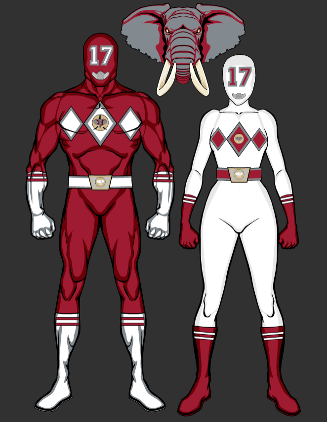
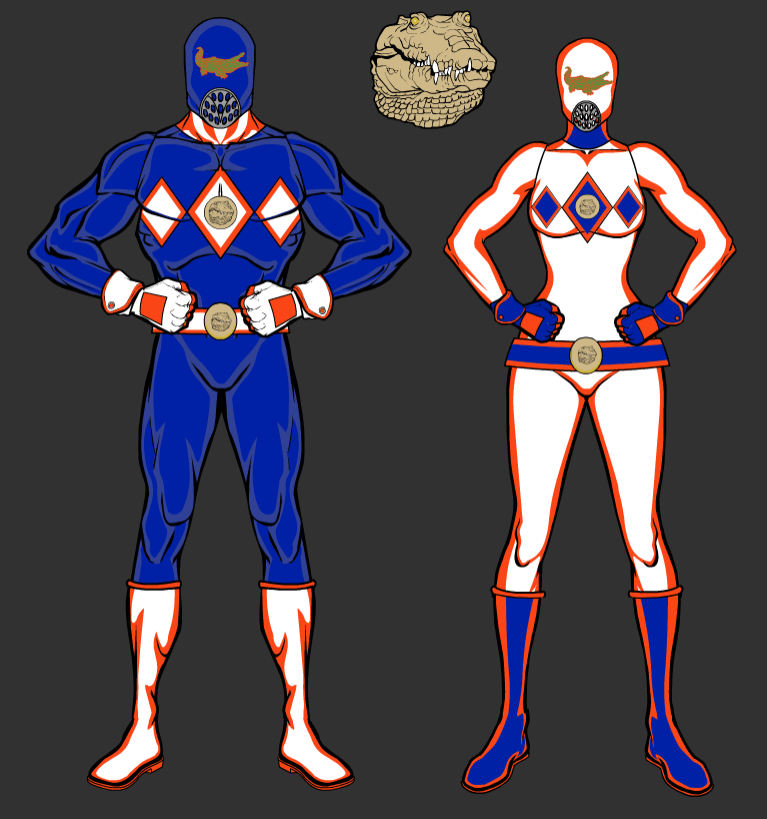
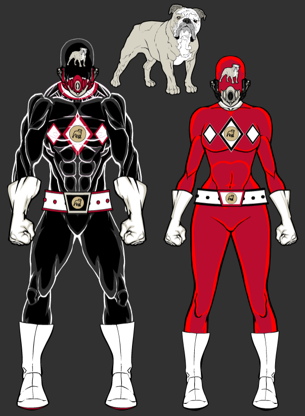
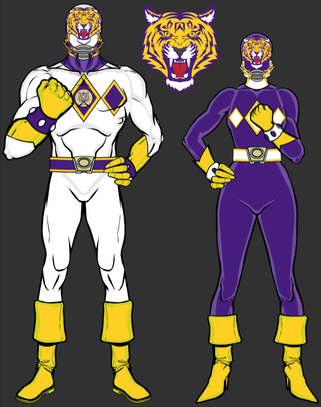
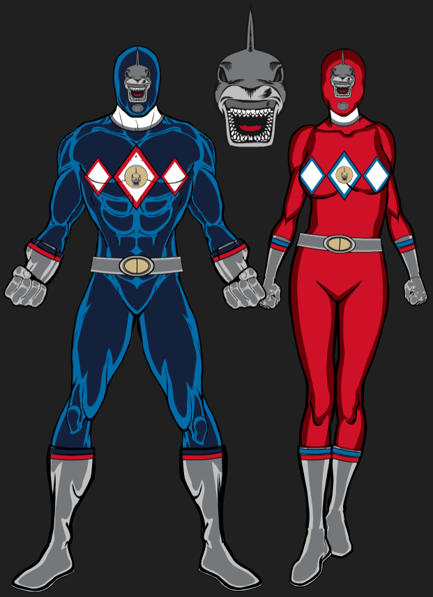
Today’s set of concepts come from Heath Hendricks, and this is kind of a fun set — a combo of the Mighty Morphin Power Rangers and the SEC (click on any image below to enlarge).
He writes,
Hey UniWatch,
Not sure if you’d be interested in this or not. I know you run people’s uniform concepts sometimes. I’m not looking for any kind of feature article or anything, just thought maybe some people would find this interesting / funny.
I created some mashups of Power Rangers and SEC teams. I drew inspiration from the Mighty Morphin and Zeo eras of Power Rangers for the suits along with elements of each teams’ football uniforms.
Heath Hendricks
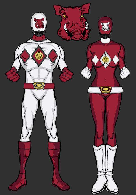
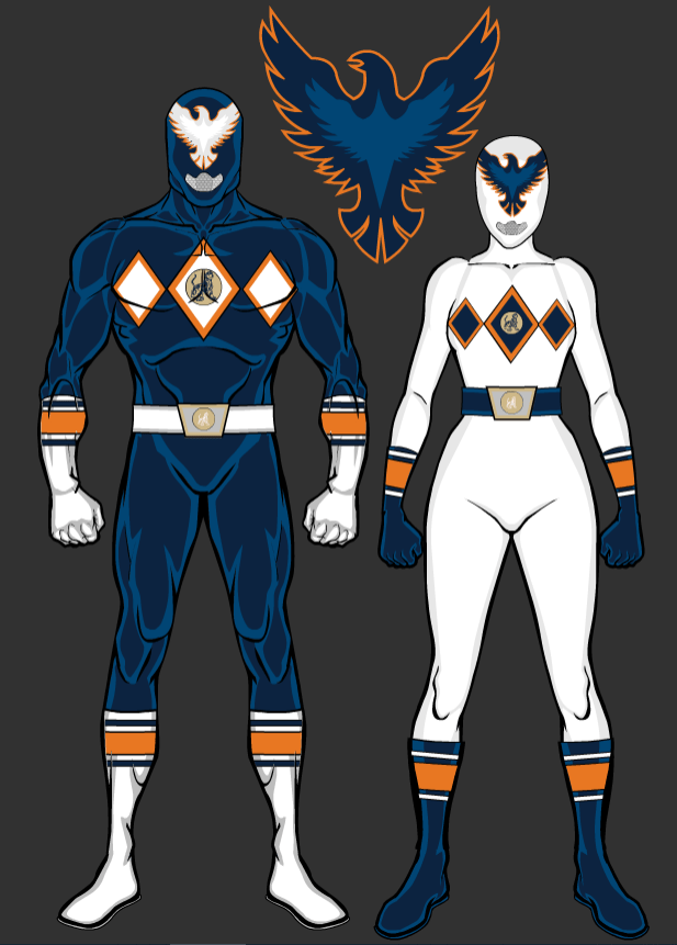
Arkansas . Auburn
Alabama . Florida
Georgia . LSU
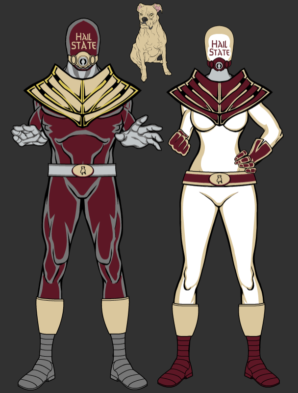
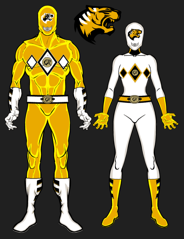
Mississippi State . Missouri
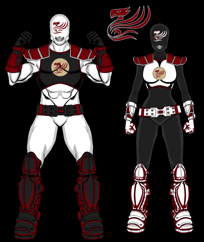
Ole Miss . South Carolina
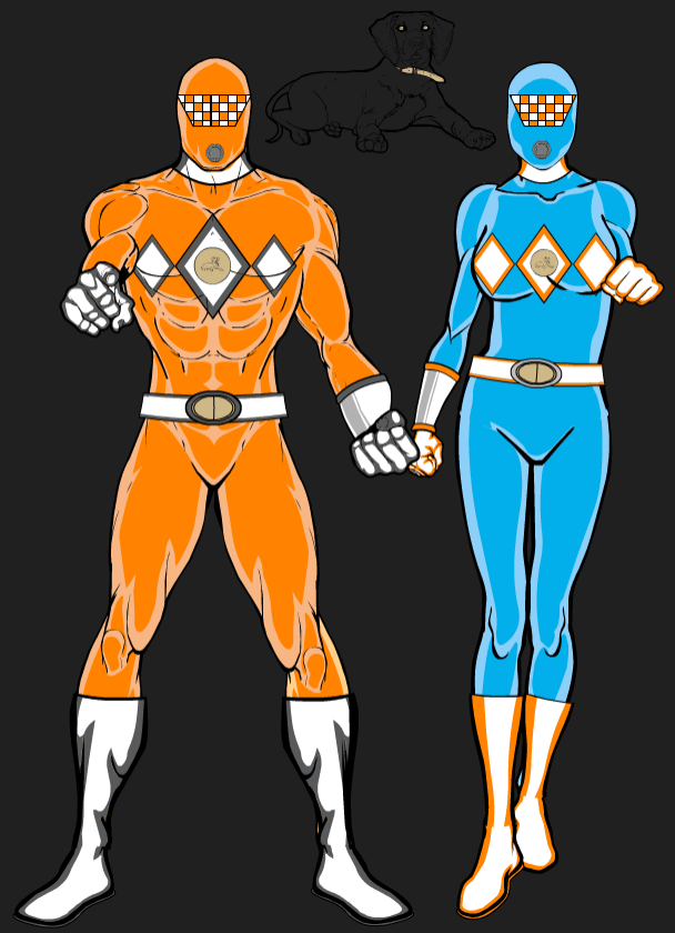
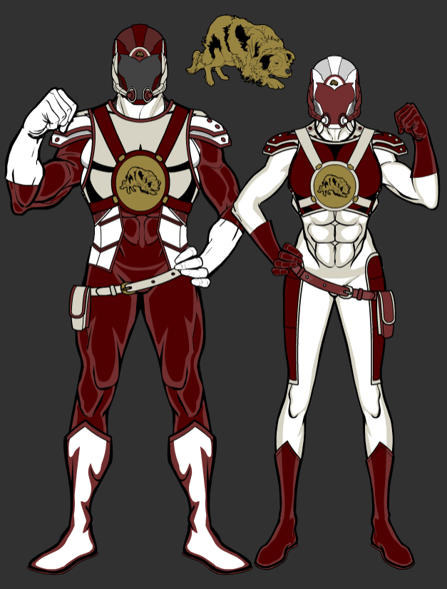
Tennessee . Texas A&M
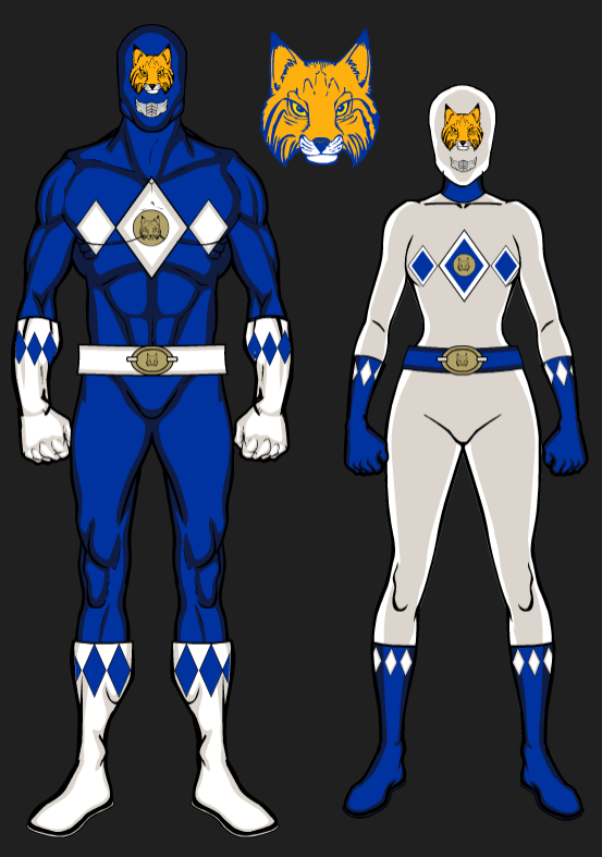
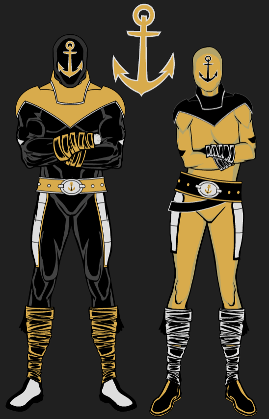
Kentucky . Vanderbilt
Thanks Heath! I confess I’ve never seen an episode of the MMPR (it was a bit after my time), so I don’t quite “get” the characters, but I’m sure there are many on here who will love this!
OK readers (and concepters). If you have some tweaks or concepts, shoot ’em my way with a brief description of your creation and I’ll run ’em here.
Last weekend, as you all know if you read Uni Watch, the Oregon Ducks busted out another new uniform for 2020 — a dishwater gray combo, the color of which Nikegon calls “Wolf Gray.” As was noted, the team doesn’t have a particularly great record when wearing this non-school color. My Duck Tracker, Dennis Bolt, has noted their particularly bad recent history when wearing gray.
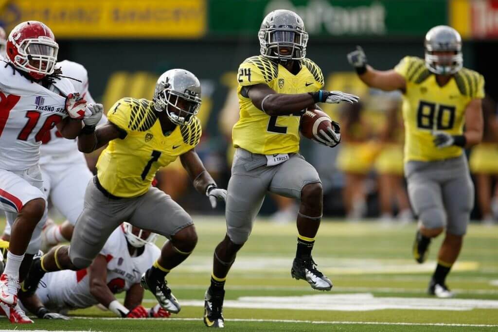
Two of Oregon’s most heartbreaking losses, at least in terms of YUGE games, were the 2015 Natty (the first NCAAFB Playoff), where they were crushed to THE Ohio State University, and in 2011, when they also lost the National Championship Game to Cam Newton and Auburn. Those were the two most recent title losses (in a history without any National Championships) — and both times the Ducks failed to wear school colors. Both times, they wore gray pants.
But have the Ducks actually had a bad record when wearing gray? Is it just a recent phenomenon? Are the gray pants cursed?
This week, Dennis has done his research, and it turns out it’s not as bad (and probably not a curse) as it seems. The team is actually 15-7 when wearing gray pants. However, they have lost their last four games whilst sporting them. As I said last weekend, maybe it’s time to retire this non-school color forever, even if the team actually has a 68% winning percentage when wearing them.
Please check out Dennis’ Blog Post on “The Curse of Grey Pants,” in which he details every game the team has done the GFGS thing. It’s a really good (and pretty short) read!
Thanks Dennis!
Uni Minutiae: The Washington Football Helmet
Got an email earlier in the week from Skott Schoonover regarding a Washington Football Team helmet anomaly. Now I’m not a helmet guy, so I don’t really notice stuff like this. I don’t think we’ve ever broached this particular detail on UW (although for some reason it feels familiar). If in fact it has been covered before then my apologies.
Here’s Skott:
Hi Phil! I hope you’re feeling better.
Tonight I was showing my girlfriend one of my favorite newly discovered bits of uni minutiae, the Washington football helmet. It’s something I wish I’d noticed before writing my article this summer.
Washington uses clear hardware to attach facemasks on the front of the helmet and yellow clips on the sides of the helmet. For example, Alex Smith in his Schutt, has both front and side clips, so he has clear AND yellow.
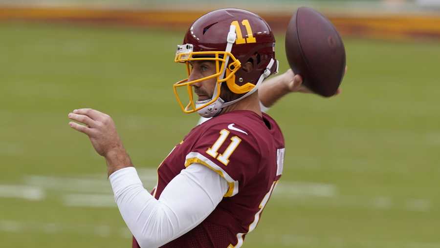
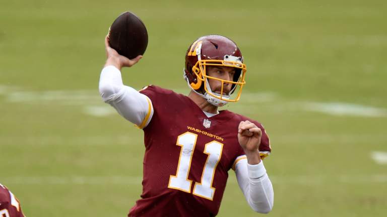
But players who wear the Riddell Speedflex only have clips on the sides, so both sets are yellow. This is awesome enough, but wait, there’s more!
Inexplicably, the team’s chin straps all use white fasteners up top, and silver fasteners on the sides.
I don’t think I’ve ever seen this covered on Uni Watch, so I figured I’d share.
Have a great day!
Skott
Thanks, Skott. Again, since I’m not a helmet guy, I am not particularly cognizant of details like this, but it certainly stands to reason that there are readers out there who are!
Too Good…
…for the Ticker
Got a note and pic earlier this week from Scott Williamson which is simply too good for the ticker:
Well, going through a box of items in my basement, I came across these guys. Not sure if it means anything to you but I thought it was (maybe?) cool-ish. When I was a teenager in 1995, I picked up this Ohio State six pack of Coke bottles celebrating the (as of then) Heisman Trophy (tm of course) winners from THE Ohio State University. (I know, the THE is really annoying, but little did I know at this point that I would attend and graduate from THE five years later). I didn’t disturb this at all. For some reason, I had helmets from the NFC L’east (as it stands this year) on the bottle caps. I apologize for the Skins watch versus WFT. I was but a kid back then. Does the absence of the Eagles mean something? Who knows. I’m a Browns fan. Ok, I’m just happy to share this with you. Maybe you’re interested. Have a great day/week.
Scott Wilkinson
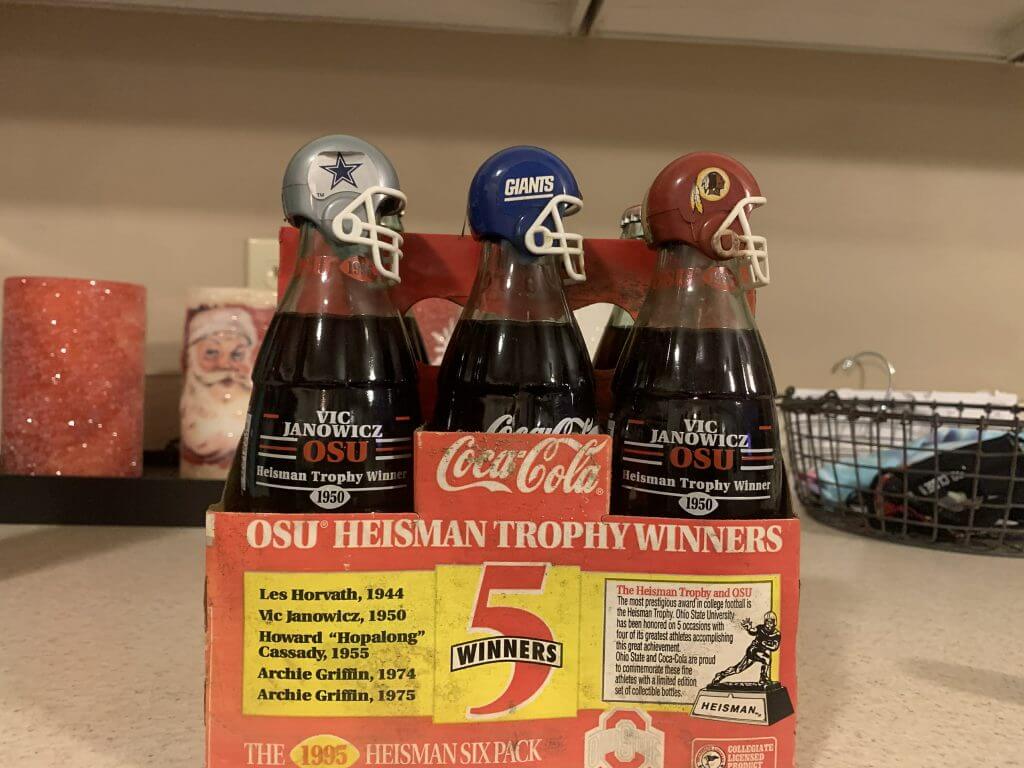
Thanks Scott! Anyone remember these (I don’t) — but I was never a Coke drinker, so maybe I just never noticed them in the stores. Did they do other teams? And how cool would it have been if the coke bottles actually came with bubblegum helmets!
Now…on to the ticker…
The Ticker
By Anthony Emerson

Baseball News: The Finnish baseball and softball federation has unveiled a new logo (from Kary Klismet). … You can catch a fan wearing a tequila sunrise jersey in the just-released video for the Clash’s song ‘The Magnificent Seven‘ (from Brian Clark).

NFL News: The artist behind the amazing @PaperStadiums account has finished a couple of new pieces, including one of Levi’s Stadium (from Kary Klismet). … Here’s a good article about how the forward pass changed the way football helmets were painted (from Timothy P. Brown).
College/High School Football News: Arizona State RB Jackson He, a native of China, played last night’s game against Arizona wearing Hanzi characters on his nameplate (from L.J. Sparvero). That same game featured a very dark color-vs-color matchup (from multiple readers). … Ball State is going with a throwback decal on their helmets this weekend. … Virginia is going mono-white against Virginia Tech (thanks, Jamie).

Hockey News: Canucks G Braden Holtby has a new mask for the new season (from Wade Heidt). … Also from Wade: The OHL’s Hamilton Bulldogs have new unis. … One more from Wade: The ECHL’s Indy Fuel have unveiled three new sweaters, though the tweet annoyingly calls them “uniforms” even though we can’t see the pants, socks, gloves or helmets.

NBA News: On December 11, 1987, in a nationally-televised Celtics/Lakers game, Lakers F James Worthy wore an NNOB, 00 jersey, as Worthy’s regular jersey had been lost in transit from LA to Boston. … Etienne Catalan has all the latest NBA uni number changes over on his Twitter. … The Thunder have a new court design. Old one here (from Josh Callaway and Brandon Rush). … New uni advertiser for the Pelicans.

College/High School Hoops News: ESPN has a good retrospective on Evansville’s 2018 sleeved jerseys (from multiple readers). … Raiders wideout Henry Ruggs III donated new uniforms to his high school’s boy’s basketball team (from Griffin T. Smith).

Soccer News: MLS has once again changed how MLS Cup Winners can honor their achievements on kits, with five-time winners getting a single gold star and one- to four-time winners getting a silver star for each victory. The defending champion will also get a silver league sleeve patch (from John Flory and Kim Kolb). … The Canadian Premier League’s York 9 FC will now be known as York United FC (from Wade Heidt). … The Guardian‘s liveblog of yesterday’s Leeds/West Ham match noted that West Ham unnecessarily went BFBS, as West Ham’s normal claret-and-blue doesn’t clash with Leeds’ home white (from Greg Franklin).

Grab Bag: All teams in the Australian Football League’s women’s division will wear pride-inspired guernseys and indigenous-inspired guernseys in the second and fifth rounds of the competition respectively (thanks, Jamie).
And finally… that will do it for today. Enjoy the game(s), and please stay safe and healthy. I’ll catch you back here tomorrow with the SMUW crew and our second set of guest 5 & 1 pickers!
Peace,
PH
“so they are coming into today’s game with a 3 year win-streak“
Navy won last year. Go Navy, Beat Army.
Shit. Fixed.
GTGFTS: Dec 7, 1963. Game originally scheduled for Nov 30, but delayed to observe a period of mourning for JFK. Navy goes on to play for the national championship against Texas.
Something noteworthy occurred during the game:
link
Not a fan of either academy’s uni-gimmickry, but USNA at least looks like Navy. USMA just looks like any generic SEC school in early November. So this year, Go Navy!
Today’s color vs color USC/UCLA game is the best looking uniform game in all of football. Both teams have fantastic uniforms, both top 5 IMHO. However it’s the beautiful contrast between the cardinal red of the Trojans and the lighter shade of blue of the Bruins that stand out. Also the true gold of UCLA and the athletic gold (bright yellow) of USC contrast nicely. Lastly the gold helmets of UCLA with the cardinal helmets of USC also contrast nicely. Not sure what I like better, the very light blue of the 60s and 70s for UCLA, or their current blue which is more vibrant that reminds me of the Chargers blue.
The US flag on the sleeve of the Army jersey is facing the wrong way. The flag should be shown as if it’s on a flagpole with the person moving forward, with the field of stars at the leading edge. So on the right sleeve, that means it should be backwards from what we are used to seeing. I can’t believe they messed that detail up. Here’s an explainer… link
Came here to say the same thing. Also, the flag has 48 stars.
From goarmywestpoint.com:
Flag: The flag is accurate for the Korean War era featuring 48 stars for the number of states during the time (Alaska and Hawaii were officially added as states in 1959).
I interpreted the sleeve patch as Army admitting defeat and already retreating.
As a general rule, this is simply false. With two exception, the flag should always have the stars on the left. Always. Under the US Flag Code, the top left is the place of highest honor, so the Union – the blue field with white stars – always goes on the top left.
The two exceptions are:
1) On a vehicle, where a printed flag represents a cloth flag in the same place, so the flag has the Union on the forward side of the vehicle as if flying in the wind as the vehicle moves; and
2) On US Army uniforms when worn on the right sleeve after 2003. Prior to 2003, the Army followed the US Flag Code with regard to the display of the flag on uniforms. So any recreation of a pre-2003 Army uniform should have the Union on the top left, regardless of where it’s worn. For most of modern history, the Army got around this by either not wearing the flag on the uniform, or wearing it on the left shoulder. (Note that under the Flag Code, the left side of the body is the place of higher honor, so respect for the flag means wearing it on the left anyway.) In WWII, a few units such as paratroopers wore special armbands or patches with the flag on their left shoulders for logistical reasons, and those flags had the Union on the left, as is proper.
Also, from 1912 to 1959, the flag had 48 stars, because the United States had 48 states.
It’s about time the MLS did something about the champion stars. Nice move!
Now if they would just add some more teams.
The yellow jar stabilizer on some Washington helmets really changes the look. It’s as significant size wise as having a different color nose bumper.
Can’t say I am really crazy about the new Hamilton Bulldogs’ alternate uniform.
One aspect I do like is using their shoulder patch logo as the primary crest on the jersey front. I like that logo. The standing bulldog logo has an old timey feel to it.
“Also from Wade: The OHL’s Hamilton Bulldogs have new unis”
The upright bulldog logo is alright. The blandness of the jersey overshadows the cringeworthyness of the seemingly obligatory “story telling”.
We decided to try something new in this design and bore you.
Rather than being restricted to one colour we’ve got shades of the same basic colour. We will lull the opposition to sleep with the monochromatic dullness … stare into the bulldog’s eyes, you are getting very sleepy … zzz
I don’t watch much football anymore. I have made some exceptions, including the Lions Thanksgiving game when they wear throwbacks, and the Army/Navy game when the uni matchup is a good one. Today, I’ll watch that.
Is it a Top Five matchup? No, but it’s an interesting and easily distinguishable look. Looking forward to it.
Too bad there isn’t snow in the forecast. A little rain, though, so I’ll take that over a sun-drenched field.
The Evansville Purple Aces are one of my favorite teams for the very reason of the sleeved uniforms. But it makes sense that it alters freedom of movement for its players. Remember, that was Chris Sales’ initiative for chopping up the navy blue White Sox’ jerseys. I’m just glad I got to see them.
ESPN’s article about Evansville’s sleeved hoops jerseys includes a link to a 2008 post written by some guy named Paul Lukas –
link
Awesome content today!
Go Army-Beat Navy!
Very small nitpick: “blue marble affects” should be “blue marble effects” in the Navy uniform section.