
For all photos, click to enlarge
It’s been a while since I scored a good vintage uniform catalog. This one — a 1948 edition from Brill Uniforms, a Milwaukee operation I’d never heard of before — is just a single sheet folded in half, but it’s still a doozy. Let’s take a closer look, shall we?
The cover is shown above — a masterpiece of three-color printing (yellow, black, red). As for the jersey, the contrasting raglan sleeves are nice, but what really makes it is the contrasting placket — so good! I also love that they rendered the top-stitching along the raglan seams, side seams, hem, and even the Brill tagging. Very detail-oriented!
As you can see from the seal toward the bottom, Brill was celebrating its 50th anniversary. Let’s take a closer look at that seal:
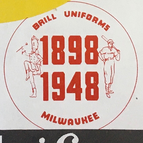
The drum majorette is a nice touch, no?
Now let’s open the catalog. Check out this all-time awesome center spread:

Is that spectacular or what? A few details worth noting:
• Raglan-sleeved jerseys are on the left (their catalog numbers all have a “35” prefix), set-in sleeves on the right (“30” prefix)
• According to the catalog copy, each of these design templates was available in your choice of four different fabric options: twill (presumably cotton), gabardine (presumably wool), flannel (wool), and satin (!).
• Love the reference to the “candy-stripe” rayon inserts for the light-blue jersey at center top and the red jersey at center bottom. More like eye candy stripe!
• The 30 and 35 prefixes notwithstanding, Brill’s catalog-numbering system is a bit confounding: Style 35-UERL, Style 30-AXJL, and so on. The one on the cover is Style 35 CUJLM. It all reads like gobbledygook, but I guess they had their reasons.
You may be thinking to yourself, “Nice jerseys, but what about the pants?” And with that in mind, I direct your attention to the back cover:

Some notes regarding this page:
• Check out the buckle-cuffed softball pants in the center — they’re described as “Ankle Length ‘Sloppy Joe.'” Never seen or heard that before. Seems almost redundant, right? Of course long pants on the diamond look sloppy! That’s what we should call pajama-pantsed players from now on — Sloppy Joes!
• The pants at top right are also interesting — more like slacks. Interesting!
• Naturally, I love the presentation of trim styles at the center of the page. Imagine how great it would be if they’d used fabric swatches instead of illustrations.
• You don’t often see belts listed in old uni catalogs, so I like that Brill included them here. The middle one, with the braid down the center, would definitely be my pick.
Since I’d never heard of Brill before, I poked around eBay to see if I could find any vintage Brill items. Didn’t see any jerseys, but I did find an old pair of those buckle-cuff softball pants. Sloppy Joes!
I also found a letter typed on very nice Brill stationery. It’s from 1948 — the same year as this uni catalog. Interestingly, the 50th-anniversary seal isn’t shown on the letterhead, so maybe they didn’t bother making new letterhead for the occasion:

The great thing there, of course, is the way the second “i” is dotted above the crossbar of the “f” — f-ing brilliant!

That’s a lot of uni-centric entertainment value from a single-sheet catalog, no? An excellent addition to the Uni Watch uniform catalog library!
Click to enlarge
Collector’s Corner
By Brinke Guthrie
Follow @brinkeguthrie
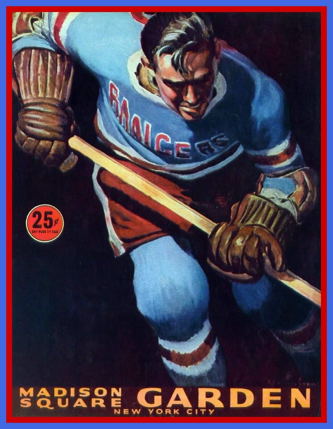
Hockey in July! Leading off today with this absolutely bonkers-great 1959-60 New York Rangers team magazine. Cost was just a quarter! (Well, 24¢ plus 1¢ tax if you want to quibble.) Look at that artwork! The seller also helpfully spotlighted this ad for Chesterfield cigarettes from the magazine’s interior. Smoking and the Cold War — two themes you won’t find in today’s magazine advertising!
Now for the rest of this week’s picks:
• Staying in New York for this one: a late-1960s New York Jets booster pack. You get it all with this one — a bobblehead, mini-football, gumball helmet, and pennant. J-E-T-S Jets Jets Jets!
• Also from the 1960s AFL: this 1967 AFL media guide binder. The seller calls it a Buffalo Bills item and it is done up in Bills colors, but no team logo. It says, “The American Football League” and “Press-Radio-TV Guides.”
• Gatorade was the sponsor for this 1980s San Francisco Giants watch. The seller says it works but I don’t see any display.
• Here’s another 1980s digital watch, this one for Larry Robinson of the Montreal Canadiens, part of the Pro-Sport Autograph Collection. With this one, you also get a Wayne Gretzky “Hockey Dollar” coin — collect them all!
• Here’s a 1950s wooden Philadelphia Phillies baseball bat pen and pencil set. They say “The Fightin’ Phillies” on the side, along with the word “Atlantic,” presumably the sponsor of this item.
• Also from the 1950s: This item is called a Baseball Percentage Solver. It seems you rotate the wheel in such a way as to figure out a batter’s average, or something. [Longtime readers may recognize this item as a volvelle, something we’ve covered before on Uni Watch. — PL]
• Pitch like a real big leaguer with tips shown on these placemats from Oscar Mayer, which “helps kids play ball!”
• This little guy is a 1980s Paint-A Li’l Pro Baltimore Colts figure. This item has to be from the early 1980s, since they snuck out of Baltimore in March of ’84. Paints are included!
• Here we have a 21″ inflatable Boston Bruins hockey bear in great shape.
• And finally, we have a 1990 “Sports Viewer” for one “C. Ripken, Jr.” It has the Orioles logo on one side, and if you peer inside, you’ll see an image of Cal. Collect your favorite players!
Click to enlarge
ITEM! Classic cap update: After a long pandemic-related delay, I’m happy to report that we finally have adjustable Uni Watch Classic Caps back in stock. If you’ve been waiting for an adjustable version, you can order one here.
We also have most fitted sizes in stock. Again, full details here.

Raffle reminder: Today is the last day to enter the raffle for three Uni Watch masks that reader Jon Eidukas is generously giving away.
Please don’t enter if you already have one of these masks. To enter, send an email with your mailing address to the raffle in-box by 8pm Eastern tonight. I’ll announce the three winners tomorrow. Big thanks to Jon for doing this!

Click to enlarge
Four days left: In case you missed it last week, we’re taking orders through the end of this week on a new line of Tour de France-inspired Uni Watch cycling jerseys: yellow (for the overall leader), green (Points Classification leader), and polka dot (King of the Mountains).
Each jersey can be customized with your choice of number (there’s a bib-style panel on the back for that) and/or NOB — or you can skip those elements and leave the back blank. Up to you!
You must get your order in by this Friday, July 24, which should allow us to get the finished jerseys to you by Aug. 29 — the first day of the Tour de France.
Full details, including rear views, a sizing chart, and more, here.
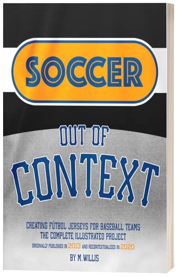
ITEM! New advertiser shout-out: Way back in early 2013, I did an interview with a guy named Mark Willis. At the time, he had recently created a project called Soccer Out of Context, which consisted of taking MLB team jerseys and reimagining them as soccer jerseys.
Nowadays, of course, it’s fairly common to see designers doing projects like of this sort — NHL teams repurposed as NBA teams, rival teams in the same sport with their colors swapped, and so on. But Soccer Out of Context was the first such project of its type (or at least the first serious one that I was aware of), and it still holds up as one of the best.
Now Mark has updated Soccer Out of Context and compiled the project into a very reasonably priced eBook. I was happy to provide a blurb for it, and I’m even happier to have him advertising the book on Uni Watch. Additional info here.
My thanks, as always, for considering our advertisers’ products.
The Ticker
By Alex Hider

Baseball News: Baltimore projected a giant image of a masked Oriole on the Camden Yards warehouse during yesterday’s preseason game (from David Raglin). … In a related item, players who masked up during games yesterday: Orioles OF Anthony Santander (though he wore his below his nose), Phillies SS Didi Gregorius, and Pirates CF Jarrod Dyson (from Max Weintraub and Rob Matuga). … Here’s a good on-field look at the Nats’ World Series champions patch, which they’ll be wearing throughout this season (from John Baker). … Last month, Dr. Anthony Fauci wore a Nationals mask while testifying at a Senate hearing. That mask is now on its way to the Hall of Fame (from William F. Yurasko). … Speaking of Fauci, he’ll throw out the first pitch at Thursday’s season opener between the Nats and Yankees — which could imply that ceremonial first pitches could happen in other stadiums this season (from Scott Rogers). … White Sox P Jimmy Cordero appears to have had some tailoring done to his right jersey sleeve, or maybe he just tucked the sleeve cuff under (from Chris Rhode). … Couple of New York Times links (soft paywall) from Tommy Turner, including a report about the economic struggles of the area surrounding Yankee Stadium, and a piece about baseball resuming in Fargo, N.D., and several other “middle American” cities. … The NHL’s Washington Capitals are celebrating the Nationals’ World Series championship by adding the Nats’ curly W to their locker room nameplates (from William F. Yurasko). … Jason Hillyer’s son played in a baseball tournament near Mansfield, Ohio, and the host ballpark got super-creative with some DIY baseball decorations, including hanging plants potted in baseball helmets. Lots of pics here. … Check it out: In a 1969 episode of the TV sitcom Bewitched, male lead character Darrin Stephens wore a legit Mets uniform. … MLB is adding 12 new camera angles for video reviews this season. … A’s P Sean Manaea wore a yellow belt, instead of the team’s standard green, last night (from @29_sunset). … The Dodgers have a Tommy Lasorda cutout in the seat where he usually sits. … Giants skipper Gabe Kapler, first-base coach Antoan Richardson, and RF Jaylin Davis kneeled during the national anthem prior to last night’s preseason game.

Football News: Panthers RB Christian McCaffrey has been practicing with one of those Oakley full-face shields (from Cole Lehman). … Mississippi State is encouraging their fans to use mobile ticketing during their home games this fall (from @GriffinTSmith). … Texas is limiting their stadium capacity to 50 percent this fall (from Timmy Donahue). … Auburn uni guru Clint Richardson found a bunch of crazy Tigers uniform concepts and compiled them in one place for your viewing pleasure. … High school players wore ad patches during the Kansas Shrine Bowl, a high school all-star game that took place on Saturday (from Timmy Donahue).

Hockey News: ESPN is reporting that the league will install “stages” with large LED screens behind player benches to take visuals away from otherwise empty arenas, and photos from the league’s Twitter account indicate they’re already being installed (from @DanGrimm91). … Hurricanes players, coaches, and staff all wore masks for a team photo (from @CanesUniforms). … Lightning G Andrei Vasilevskiy says he wears No. 88 because it resembles the symbol for infinity (from Mike Engle). … Reposted from the baseball section: The Capitals are celebrating the Washington Nationals’ World Series championship by adding the baseball team’s logo to their locker room nameplates (from William F. Yurasko). … At the 1984 Olympics, Darren Lowe became the first Black man to play in the Olympics for Canada. The jersey he wore during the games was recently enshrined in the Hockey Hall of Fame (from Mike Chamernik and Wade Heidt). … Justin Hicks was watching a replay of the 1978 Stanley Cup Finals and noticed that Bruins G Gerry Cheevers was wearing the team’s road socks at home. … In honor of the squirrel photo Paul shared in yesterday’s post, Will Scheibler sent along this amazing squirrel-themed DIY hockey jersey he made a few years ago. … New logo for Latvian team Dinamo Rīga (from Conan Smeeth).

Basketball News: Reposted from college football: Auburn uni guru Clint Richardson found a bunch of crazy Tigers uniform concepts and compiled them in one place for your viewing pleasure.
.

Soccer News: Two notes from Josh Hinton: The goalkeepers for both Sheffield United and Everton wore ballcaps to shield their eyes from the setting sun yesterday. Also, Inter Milan has unveiled their 2020-2021 away uniform. To see more soccer notes from Josh, check out his Twitter account, Football Kit Watch. … Typically, Philadelphia Union sells advertising to Bimbo on their home shirts and to Artesano on their away shirts. Yesterday, the team wore their home blues against Orlando City FC, but keeper Andre Blake wore a shirt with the away advertisement (from Dallas Reed and @xivhbv). … During Sunday’s game between Seattle Sounders FC and Vancouver Whitecaps FC, Fox Sports accidentally superimposed an ad over play during a critical, goal-scoring stretch of action (from Bridger Deschamps). … Staying in MLS, the league’s expansion franchise in Charlotte has eliminated another potential team name — Charlotte Monarchs FC. The team says they’re currently considering five other team names (from @CLTMLSKits). … Speaking of MLS expansion teams, the new St. Louis franchise will unveil its team name, crest and colors on Aug. 13 (from @mrmichael21 and Jacob Bischoff). … San Diego Loyal of USL wore “Black Lives Matter” NOBs and Pride armbands on Sunday (from @dynamodog2). … Two items from Ed Zelaski: New home uniform for Mexican club Atlas FC, and Polish club Polonia Warszawa has updated its crest.

Grab Bag: King Arthur Flour has rebranded as King Arthur Baking Company, and has a new logo to go with the new name (from David Wittenberg). … Someone added a mask to the Bucky Badger statue at the University of Wisconsin (from Timmy Donahue). … Stores around the world have been installing floor stickers to encourage social distancing. David Cline has been documenting some of the different styles he’s seen. “I guess it’s sort of like ‘I Voted’ stickers— everyone has a different style,” he says. … Michael Rich was trying to pick a bib number for his Uni Watch cycling jersey and came across a piece about bib No. 51 in the Tour de France. It’s commonly accepted that No. 51 grants the rider good luck, but history doen’t exactly bear that out. … Trader Joe’s shoppers probably know that the store changes its branding on ethnic foods to match the country of the food’s origin — Trader José for Spanish or Latin foods, Trader Giotto’s for Italian food, etc. On Monday, the store said it’s ending that practice (from @tierknala). … Berea-Midpark High School in Ohio will change its logo after receiving complaints that the old logo, which features a White fist, has White power overtones (from Ed Zelaski). … As is standard practice in Congress when an elected official dies, black banners have been added to Rep. John Lewis’s office door and nameplate (from our own Anthony Emerson). … The Long Beach Post asked vexillologists to design a new flag for the California city (from Andy Garms). … George Washington University has formed a committee that will review the school’s “Colonials” team name. “As a 1990s alum, the name has always rubbed me wrong,” says R. Scott Rogers. “The whole point of George Washington’s public career was to make Americans not colonial subjects anymore. ‘Continentals’ is the obvious choice.”
Click to enlarge

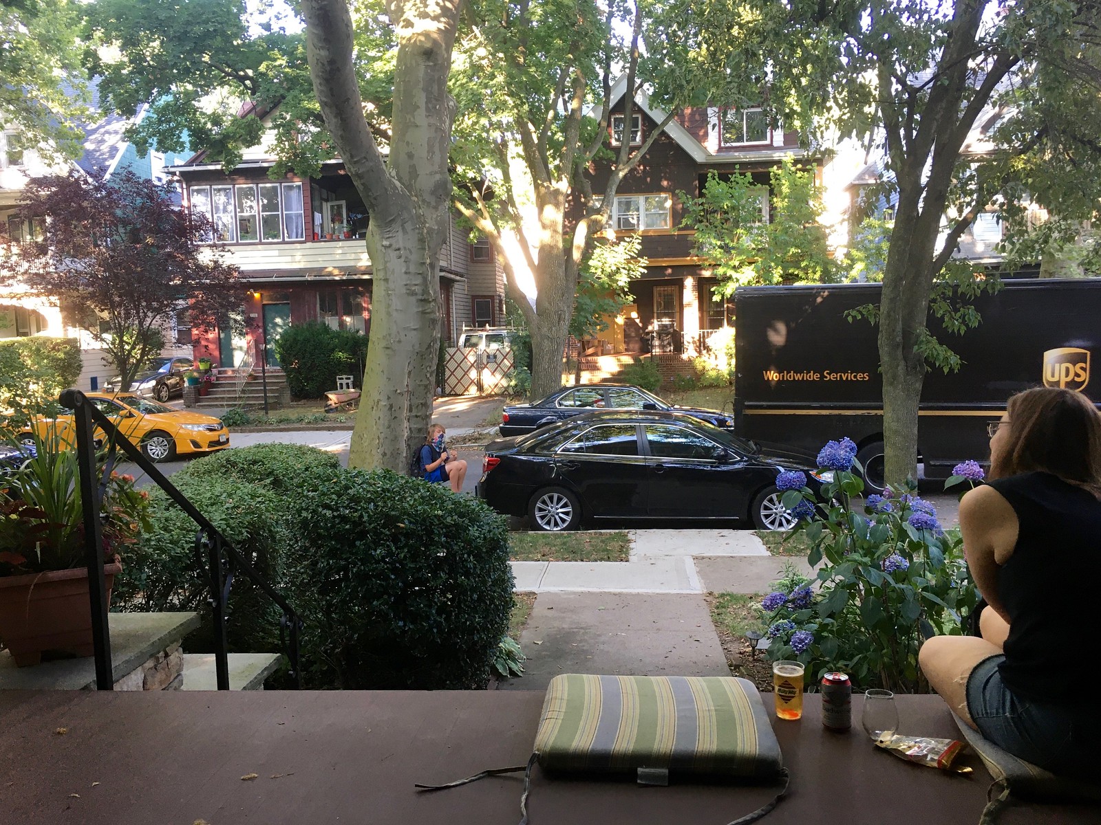
What Paul did last night: That’s our neighbor Owen, who I’ve mentioned once or twice before, perched under the tree. He was telling us about a bunch of things, including the following:
• He has an “army of friends” — as many friends as the leaves on the bush in front of him.
• He’s a little bit afraid of starting sixth grade in the fall, because he thinks older kids might pick on him.
• He doesn’t like catfish — or most fish, for that matter — but he does like oysters.
• He’s never used hair gel, except for that one time when he made his hair stick all the way up in the front. That was fun.
And probably a few other things I’m forgetting. Owen’s a good kid, and his parents are nice too. We might go to the beach with them later this week.
As always, you can see the full set of daily Pandemic Porch Cocktails™ photos — now over 125 of them — here.
It’s a small sample size, but Union goalies have only worn the one shirt ad this season, on two different shirts, including in a preseason friendly against Montreal where the team wore blue ad-less training shirts.
I love old letters written on typewriters, and this one is no exception. The recipient is “U.space bar – spacebarS. Sporting Goods,” and that typo was probably noticed when they finished the letter. But White Out hadn’t been invented, and Correct-O-Type might not have been available, so off it went, the last step before a more terse reminder is sent.
Ko-Rec-Type, not Correct-O-Type!
“This, no doubt, is an oversight on your part…” Love that phrasing.
Yeah, that was my favorite bit as well.
The drum majorette is a nice touch, no?
Wondering if they also supplied band uniforms. Or maybe they were just being celebratory.
Here’s a 1950s wooden Philadelphia Phillies baseball bat pen and pencil set. They say “The Fightin’ Phillies” on the side, along with the word “Atlantic,” presumably the sponsor of this item.
Guessing that’s Atlantic Oil, based out of Philly, which later merged with Richfield to become ARCO.
DIY baseball decorations, including hanging plants potted in baseball helmets.
Excellent idea. I may have to do that with my Pirates and Florida Marlins helmets, since my wiffleball days most likely are over.
It’s commonly accepted that No. 51 grants the rider good luck, but history doen’t exactly bear that out.
Yeah…just like how many teams go BFBS to for luck or to “look tough” and they still get trounced.
Strange that 51 would be considered a lucky number. In cycling, the bib numbers ending in 1 (1, 11, 21, 31, etc) normally get assigned to the team leader. the remaining numbers (2, 3, 4, 5) get assigned alphabetically. Numbers in the 50’s would be assigned to a specific team
Check the start list from last year’s Tour de France, which bears this out.
link
Paul,
You buried the lede on the Brill Uniforms story. Where is “Walkie Talkie Town” located and do they give tours?????
Great write-up on the uniform catalog. Very cool stuff.
Hope you get to take the beach trip with Owen and his family.
The new Atlanta Hawks uniforms are fire! Except for ad patch of course. What a massive improvement. It’s been decades since they had good uniforms. I hope they keep these for 50 years. No more navy blue from the early 2010s, no more neon crap, no more stupid triangles, no more horrible number font. Just straight up red and yellow as they should be.
Amen to all of that!
Probably means Houston won’t go back to full-time red and yellow, but as long as they have Harden and their goofy shoot-three-hundred-threes-a-game, I don’t care. Good job, Hawks!
link
Reminds me a bit of my favorite Atlanta unis, from the early 80s.
link
Full disclosure: I did like the recent unis, but they weren’t classic “let’s wear these for 50 years” unis.
I’ll have full coverage of that tomorrow.
Why can’t Houston go back to red and yellow either? I don’t follow that logic. Both Rockets and Hawks had red/yellow at the same time for decades.
Pistons and Clippers both have red/royal blue color schemes. Heat and Bulls both utilize red and black. Nets and Spurs have the same color schemes with a slight difference in silver/gray. Pelicans and Wizards both use red/navy blue as their dominant color schemes. On and on.
I don’t follow that logic either. But if they contradict me, I will be *extremely* surprised.
Paul, are you able to tell us if there are other teams who are slated to get new uniforms? I know the Raptors are one. Obviously the Hawks are another. I’m talking new home/road jerseys (I’m not calling them statement, association, or whatever nonsense it’s called), not a new second alternate or throwback.
I got nothin’. Haven’t heard, not hiding anything. All the news has been about the Orlando bubble.
Could have done without the ridiculous descriptions of the colors, though.
FWIW, I tuned into the Pirates-Indians game last night – I’d say the majority of players were wearing masks in the dugout, and several wore them in the field or on the basepaths. The umps all wore masks as well.
They’re *all* supposed to wear them in the dugout.
Not exactly correct. Wording from the MLB manual Sates “All Tier 1 individuals should wear an appropriate face covering at all times in Club facilities … players are not required to wear face coverings while on the field or in the bullpen or dugout.”
My bad — I thought they were required in the dugout. Thanks for setting me straight!
Paul, that conversation with Owen is priceless. I remember being that age and it was special when grown ups would have a conversation with me and let me talk, too. It made me feel like I was becoming a grown up, which I was. It may seem like it was nothing to you, but I’m sure it meant more than that to him. Of course, with the pandemic going on, maybe that little conversation meant more to you as well.
Good for both of us, for sure!
I was coming here to post about that as well. Much like the branch (RIP), will you please provide regular updates on Owen?
Munch’s comment reminded me of a gentle giant of a man who lived down the street from my grandmother. Mr. Ray would sit on a bench at the end of his yard and I’d always stop and talk with him when I was riding my bike down the alley. We usually talked baseball and he’d tell me about going to Griffith Stadium as a kid, having grown up in the DC area. He liked Frank Howard and would talk about him a lot. However, Howard wasn’t playing when Mr. Ray was a kid as he was around my grandmother’s age in the mid-80’s, probably older. Now that I think about it, he was likely in his late 60’s-early 70’s then. Anyway, I felt like a grown up when I was talking with him, too. And I appreciate that he took the time to share his baseball memories with a precocious 10 year old me. I’m sure Owen will some day reflect on your kindness as well, Paul.
Thanks, guys.
When I was born, my brothers were 12 and 15 — a big age gap! As I grew up, it was always important to me to be “taken seriously” by them (and by grown-ups in general). Perhaps as a result, I’m not great with kids, but I do understand how important it is to take them seriously. Owen is pretty easy in that regard, because he’s very engaged and engaging! I like him, and I hope he enjoys our interactions as much as I do.
My favorite detail of the Brill catalog was its phone number: MArquette 630#.
Using the local college as the prefix instead of something more generic like MAry. Quite the details in that piece. Thanks for sharing.
So their phone number is 626300? Pretty clever!
The use of a name for the first two digits of a phone exchange instead of numbers was standard in this country until maybe the late 70s. For example, in Brooklyn we had an exchange called DEWEY, and an number DEWEY2-XXXX would also be said and written as DE2-XXXX and dialed as 332-XXXX.
That’s pretty cool! Thanks! I guess I’ve only known about all the letters being used, e.g. 1-800-CABLE-UP to order cable TV or 1-800-COLLECT which got bought by a Canadian company following Verizon’s acquisition of MCI, according to Wikipedia.
I watched the Angels/Padres game on MLB last night. While it was on, my main thought was how good the Padres look, now that they finally look like the Padres again.
If it’s racist (and I think “racist” is quite the right word: “bigoted” is probably better) for Trader Joe’s to label its salsa “Trader Jose’s”, does that mean that it’s equally bigoted for professional sports teams to stick a “Los” on their jerseys, and call it “Hispanic Heritage”? Does this mean we will not longer have to endure “Los Astros” and “Los Suns” and “El Heat”?
Because I really hate those pandering, phony baloney hunks of fabric.
But “Cerveceros” is kinda cool.
Fair question. My best guess as to why there is a difference is as follows: The sports teams have market research that show that the Latinx community actually calls those teams “Los Mets,” “Los Reales,” or “Los Cerveceros;” for one night, a tip of the cap upon good-faith research and outreach. On the other hand, does Trader Joe’s have market research that minority groups call it Trader Jose, Trader Joe-San, or Trader Ming? I highly doubt it. Assuming not, that’s tone-deaf pandering that actually looks bad.
Of course, there is the question about whether Hispanic-Americans refer to themselves as the “Latinx” community.
I think I remember that the term Hispanics (or perhaps it was Latinos, or both) was created by Americans to describe Mexicans and people from Central and maybe even South America. Not sure if they find it offensive but I don’t think it’s completely innocuous.
I received my bobble pin a few days ago, and it is spectacular. Thank you to Paul and Todd. It’s so much fun!
For those worried, it’s packaged in a tiny protective ziploc for protection, then covered in custom sized bubble wrap, then put in a larger bubble mailer, so have no fear regarding packaging. The pin itself is top quality and feels like it will last for many years and many bobbles.
I can’t overstate how addictive it is to give it a few shakes in times of work-based aggravation, pandemic-related anxiety, or just when walking past it down the hall. Has it replaced the stress ball for anyone else?
Thanks, man — enjoy!!
Berea-Midpark High School in Ohio will change its logo after receiving complaints that the old logo, which features a White fist, has White power overtones (from Ed Zelaski).
A hand clutching a thunderbolt is one of my favorite insignias, even after learning the Oakland Invaders got theirs from a clip-art catalog. The vetting process for iconography is getting tougher all the time, isn’t it?
The only thing that would be cooler about the Brill Uniforms letterhead would be if the crossing line of the ‘f’ was a baseball bat hitting the dot (baseball) over the ‘i’.
Paul – Monday night, the Indianola, Iowa, City Council voted to remove Native American imagery from their police department uniforms, cars, etc. at a cost of $28,000. As of Tuesday, the logos were already taken off of cars. Full story below:
link
Already slated for tomorrow’s ’Skins Watch!