For all photos in this section, click to enlarge
Last week I wrote about the vintage mail chute that the Tugboat Captain and I recently acquired and displayed in our apartment after seeing it at a local furniture maker’s studio. But as I mentioned in that piece, the mail chute was a throw-in, a bonus — the real reason we were at that furniture guy’s studio was buy something much bigger for our home.
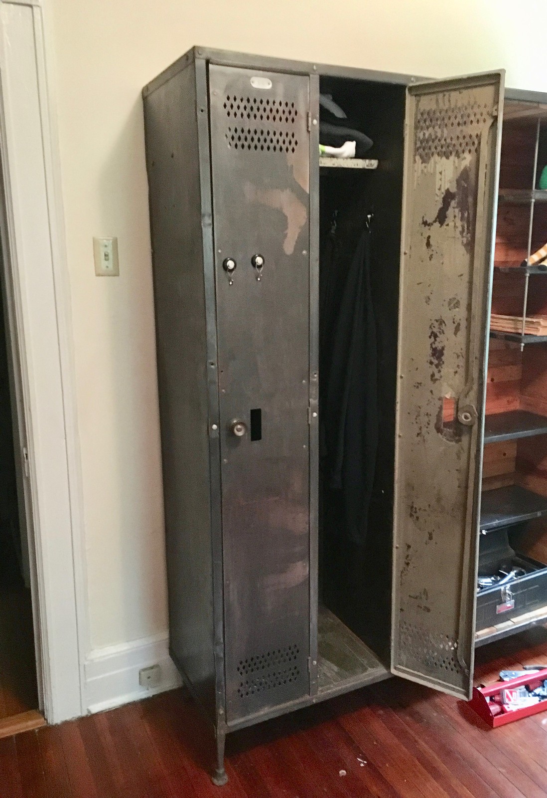
Here’s the deal: The Captain and I both work out on a regular basis — I bike in Prospect Park and she attends a local exercise class — so we both end up with a lot of sweaty workout clothes. Before I moved in with her, we both tended to just hang that sweaty gear somewhat randomly in the bedrooms of our respective apartments. But once I moved in, it became apparent that we needed a better system.
I joked that it would be fun to have a pair of gym lockers — an idea that the Captain liked, and not as a joke. It turns out that vintage lockers show up semi-regularly on Craigslist, so we started keeping an eye out for them. Most of the ones we saw weren’t quite right, or they cost too much, or there was only one locker instead of two, or there were four lockers, or the seller was too far away.
And then we saw a listing for this:
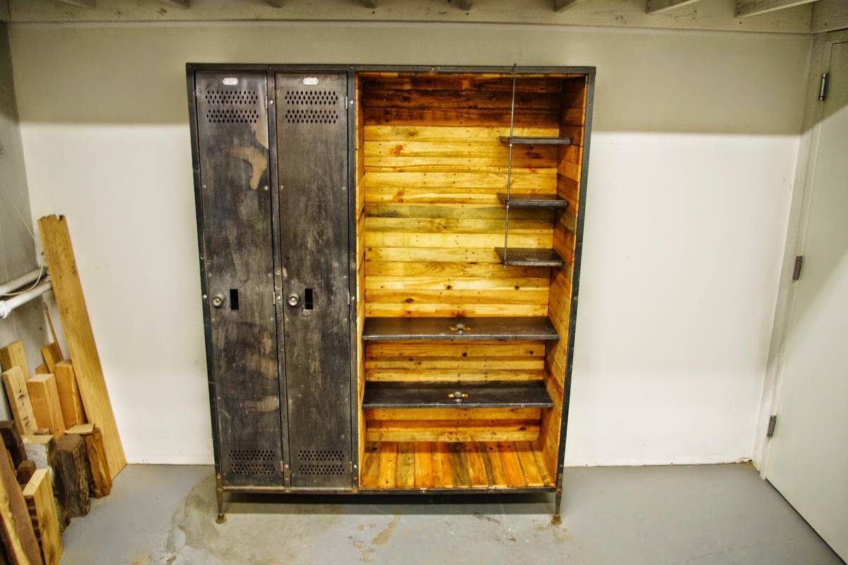
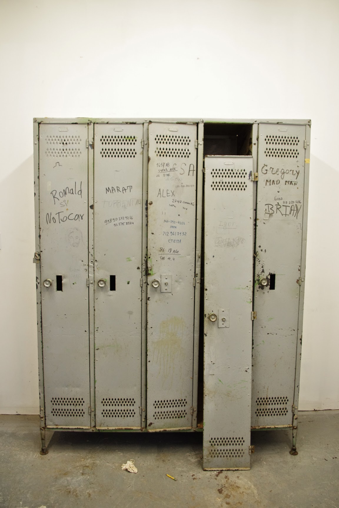
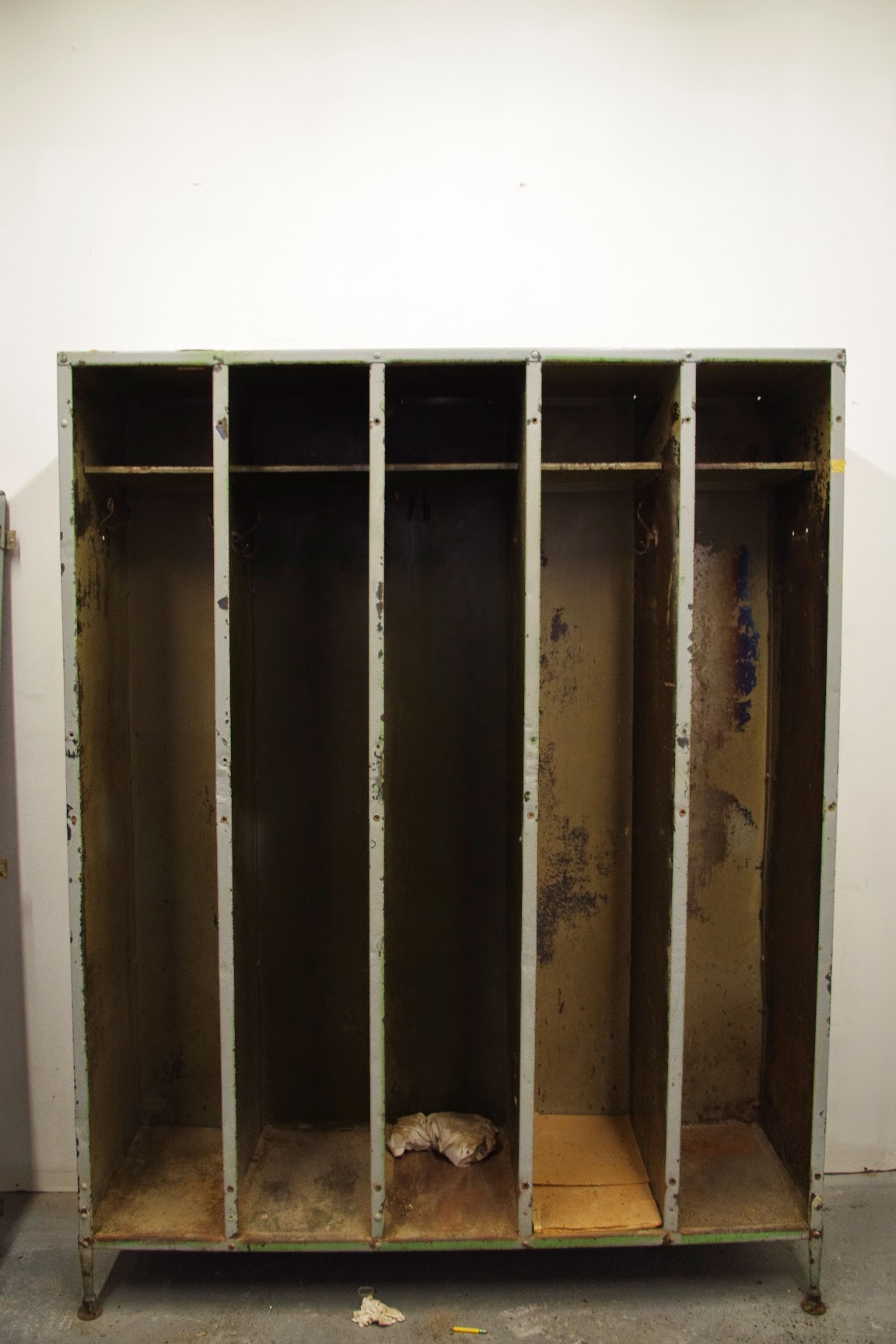
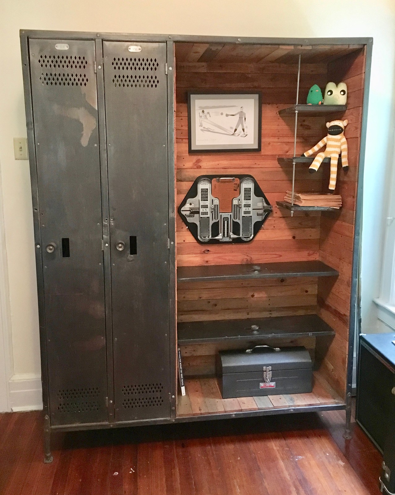
It was really interesting! Two lockers on the left side, just like we wanted, plus a big planked-out display area with two big shelves and three little shelves. And the shelves had been made from locker doors:

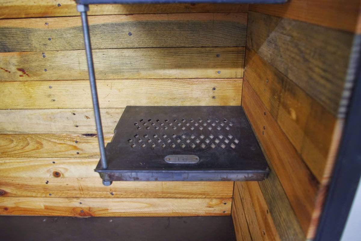
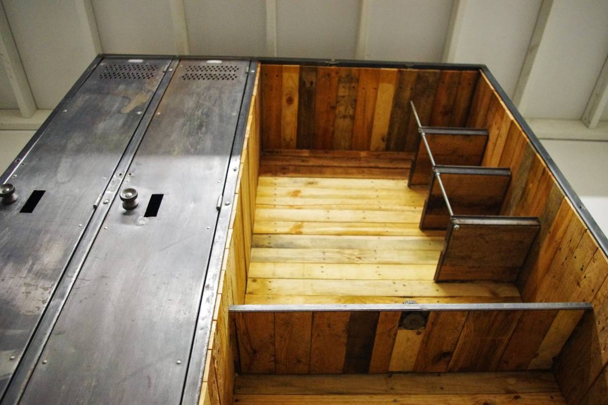
I asked the guy selling it, whose name was Joe, if he had made the piece himself, and he said yes. He explained that he salvaged the lockers from a commercial factory in the same building as his studio. It had originally been a five-locker unit, but he ripped out three of the doors, installed reclaimed wood to create a nice interior for the door-less area, and then repurposed the removed doors to create the shelving. He sent me a few photos that he’d taken during the build:
Joe explained that he’d made the piece for himself a few years ago (he used it for storing tools and such), but now he was moving to a smaller studio and wouldn’t have room for it, so he’d decided to sell it. He didn’t have a set price in mind. “Make me an offer,” he said.
Before we could do that, we wanted to see the unit in person, so we made arrangements to visit Joe in his studio. We really liked the lockers, and Joe turned out to be basically the Nicest Guy Ever (he encouraged us to take the mail chutes for free even before we’d decided to buy the lockers), so we agreed on a fair price and shook hands — done.
Well, almost done. We still had to get the thing transported to our house. It’s a big piece — 61″ wide, 79″ high, 17″ deep — and all that wood makes it plenty heavy, so it would require professional movers. And it had to happen fast, because Joe was about to get kicked out of his studio.
After an abortive attempt that turned out to be an utter fiasco (the movers I called assured me that the piece would fit in their van, but it didn’t), we finally got the piece to our house, where it just barely fit in the door. Joe had removed all the hooks that had originally been in the lockers, so we got ourselves some magnetic hooks — bingo, we’re all set with our gym/workout lockers:
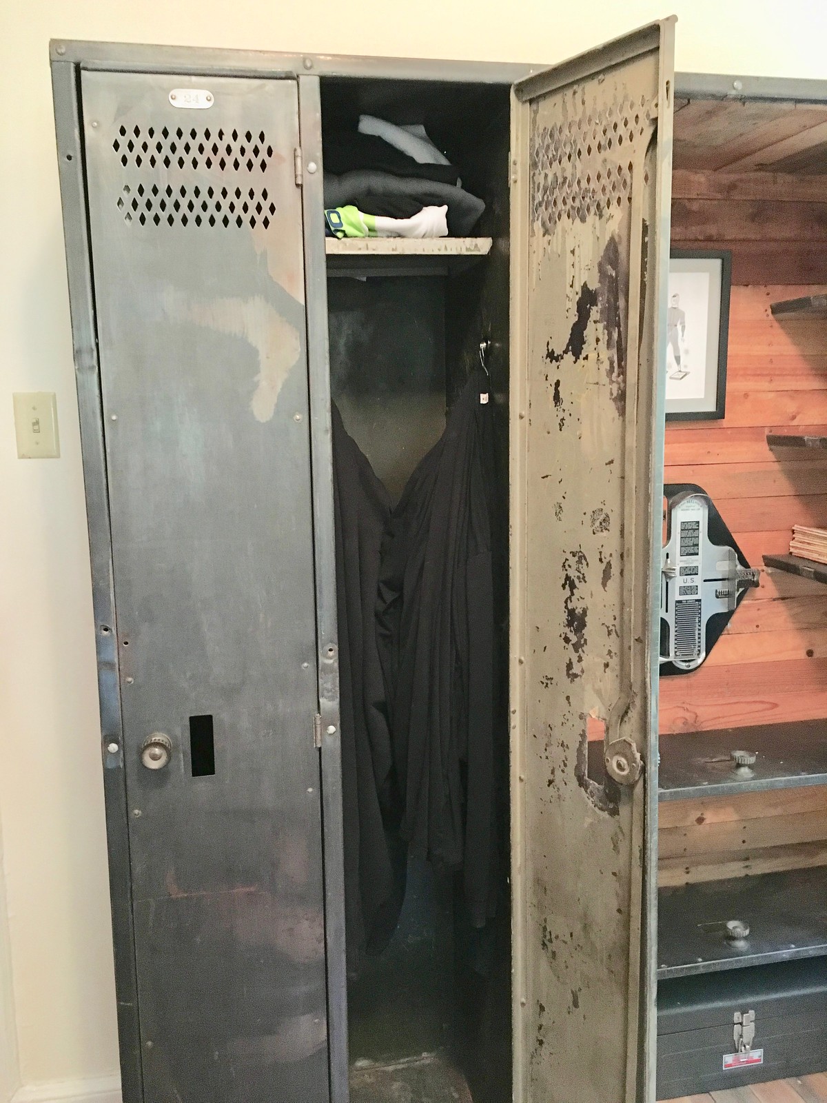
I need to get some vintage pin-up pics and maybe a little mirror to put on the inside of the door, but I haven’t had time for that yet.
As for the display area, that’s still a work in progress. Here’s how it looks at the moment, although most of the displayed items are just placeholders for now:
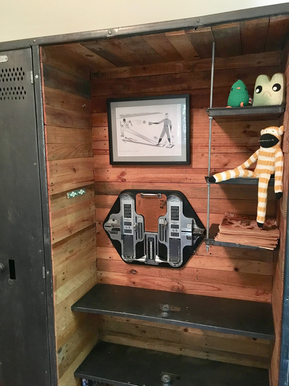
The one thing that will definitely be staying there is the excellent double-Brannock Device thingie that longtime Uni Watch reader/pal Ben Traxel recently picked up for me at an antiques shop in Missouri. I originally had it displayed in the bedroom, but it looks perfect against the wood of the display area:

Above the Brannock device is the original artwork for an illustration that ran with this New York Times piece that I wrote in 2006:
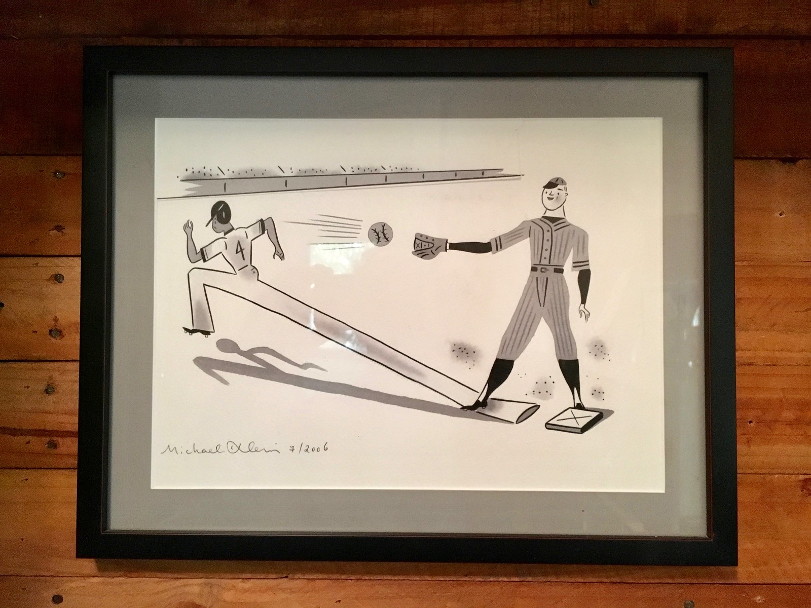
I liked the illo so much that I asked the artist, Michael Klein, if I could buy the original from him. I’m not sure we’ll keep it in the locker display area, but it looks fine there for now.
I also like the sock monkey perched on one of the smaller shelves. That’s actually a catnip toy that the Captain made for Uni Watch mascots Tucker (RIP, sniff) and Caitlin. Caitlin’s kinda lost interest in it, so we might leave it up there on the shelf. I like how it juxtaposes with the industrial feel of the locker elements:

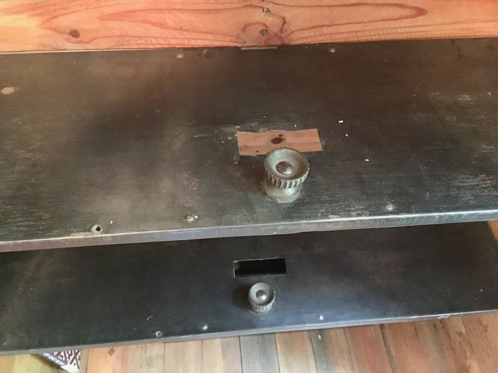
It’s hard to see in that last photo, but the locker number plates are all stamped with the name of the manufacturer — the Narragansett Machine Co. of Providence:
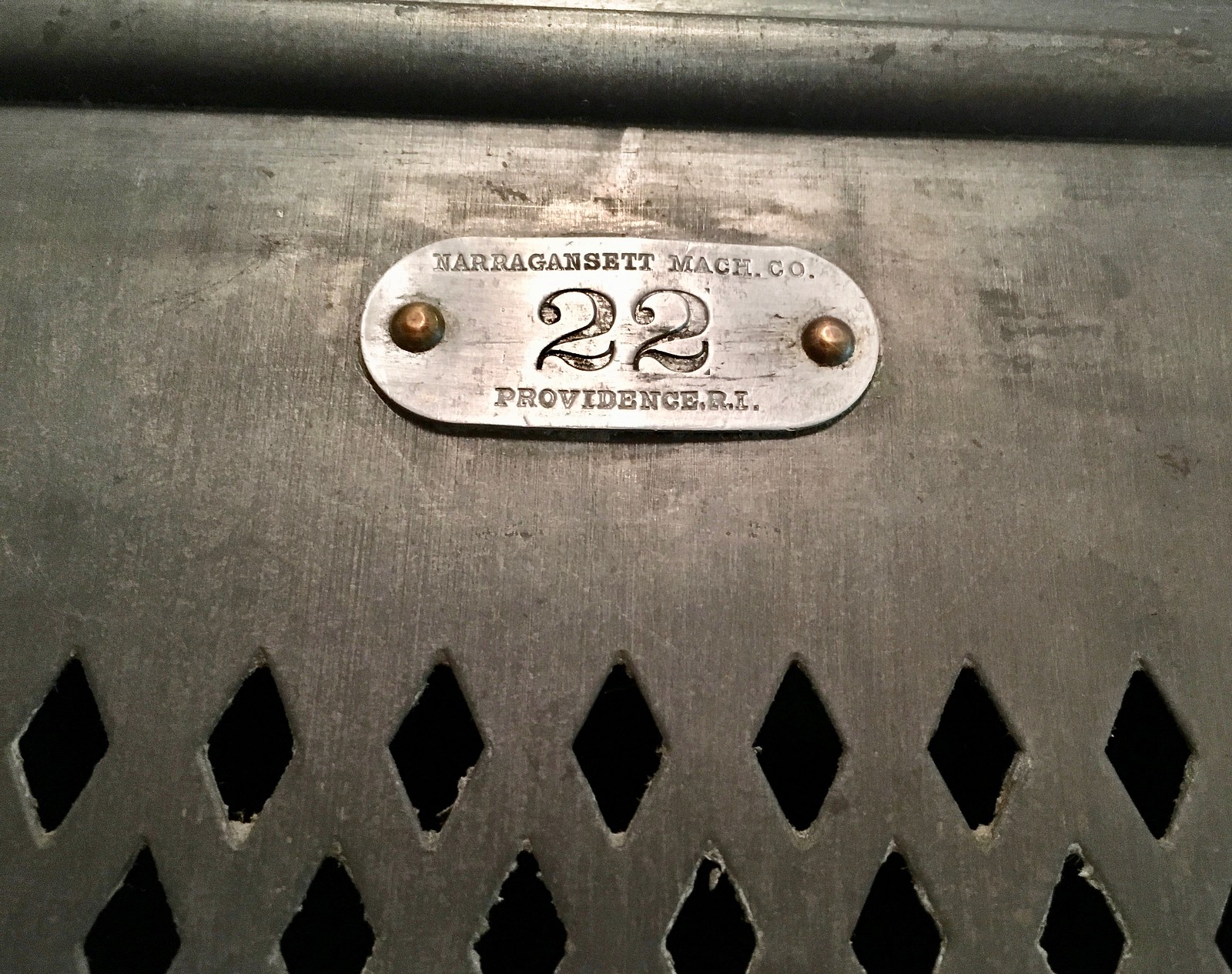
NMCo is no longer in biz, alas (it appears to have gone belly-up in the 1930s or ’40s, so our lockers are at least that old), but there are lots of references to it on the web. According to this short historical account, the company began in 1882 by manufacturing foot-power lathes but later shifted to “light machinery, gymnastic equipment, lockers [!], and bowling alleys [!!].” Sure enough, this 1921 NMCo ad refers to “steel lockers,” and this 1905 NMCo catalog even has a page showing the company’s then-current lockers (although they’re not the same as the ones we just acquired, which presumably don’t date back quite that far). Isn’t it fun when old objects have stories to tell?
Speaking of which: I asked Joe for a bit more info about the mail chutes. He said they were salvaged from a Dumpster after the building where he has his day job was undergoing renovations. The address, he said, is 34 West 27th Street in Manhattan (which does indeed match up with the zip code that’s shown on the little placard on the chute). If you use your cursor to tilt that street-view image, you can see that the building appears to have 12 floors. That’s a lot of chute-age!
And to think we got all of this fun stuff and these good stories (and two Uni Watch entries) by stumbling across Joe’s ad on Craigslist. So lucky!
Finally, speaking of Joe, he makes cool furniture. If you like how the lockers turned out, you might want to check out his other work. Here’s his website.
Another one bites the dust: The Suns yesterday became the latest NBA team to announce a corporate sponsorship advertising patch. In keeping with Uni Watch policy, I will neither show the patch nor name the advertiser, but I will definitely show you that an ad patch on a Suns jersey looks like shit, which is the only thing that really matters here from a Uni Watch perspective (click to enlarge):
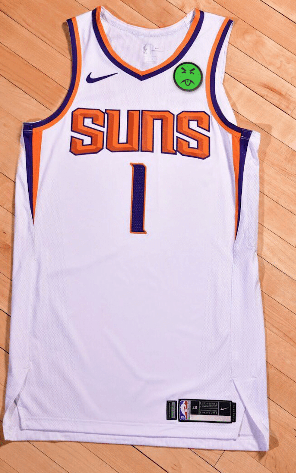
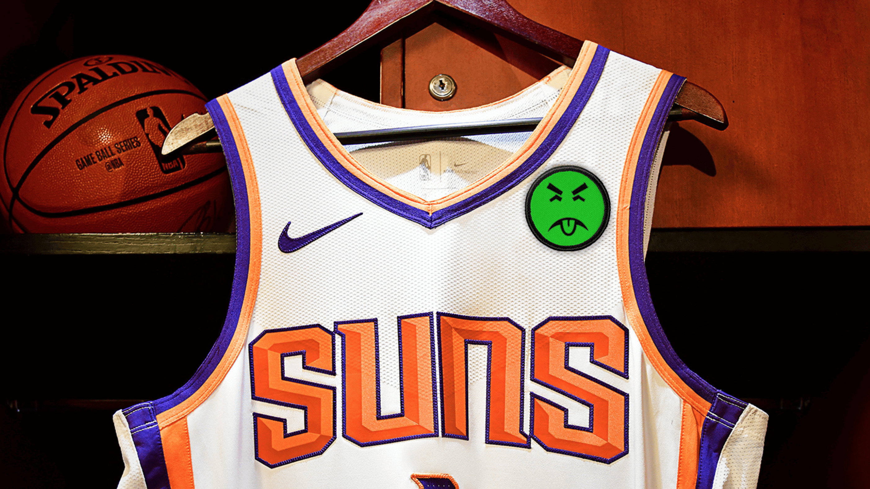
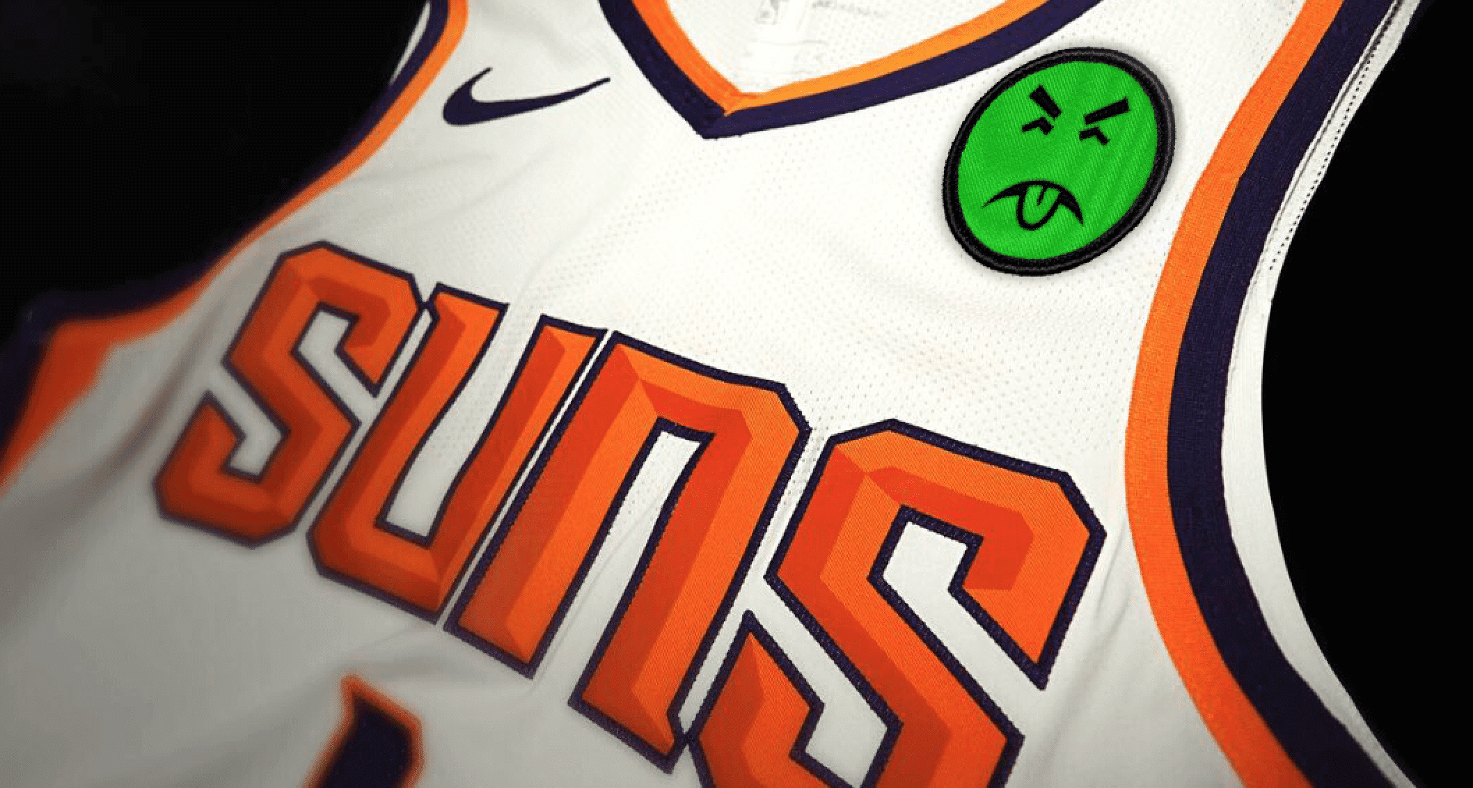
The Suns are the fourth NBA team to announce a new ad patch in the past two months. There are now 25 ad-clad teams and five remaining ad-free teams — the Bulls, Pacers, Rockets, Thunder, and Wizards.
(My continued thanks to Nic Schultz for his Photoshoppery.)
Click to enlarge
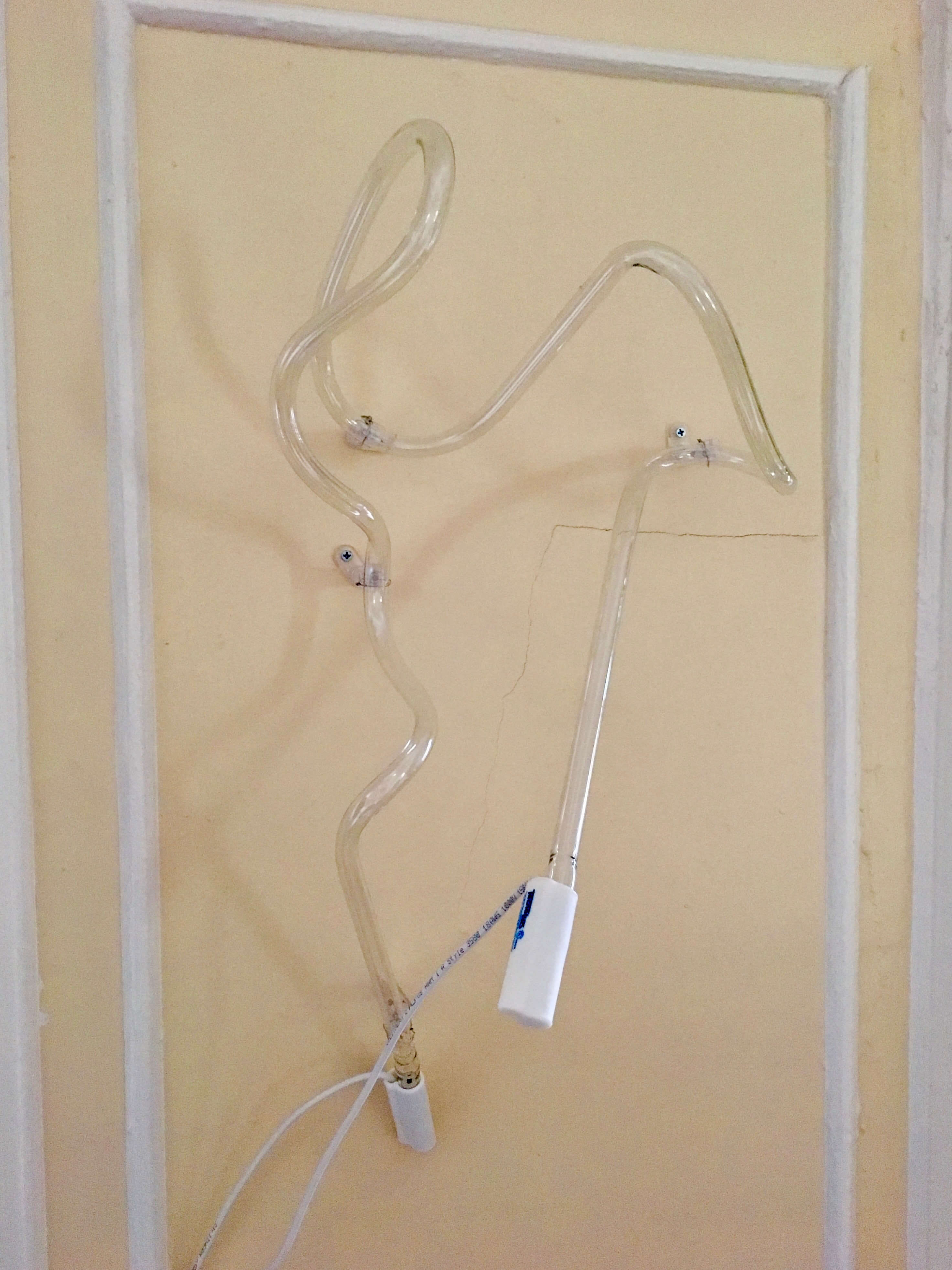
Classes on gases: As most of you have probably discerned from my travelogues, I love neon signs. So does the Tugboat Captain, so a while back I gave her a couple of neon sign-making classes as an Xmas present. After learning how to bend glass tubing and work with various gases, she produced the abstract squiggle that you see above. I loved it from the moment I saw it, but she didn’t get around to mounting it on the wall until a few days ago. Here’s how it looks when it’s illuminated — daytime on the left, nighttime on the right (click to enlarge):
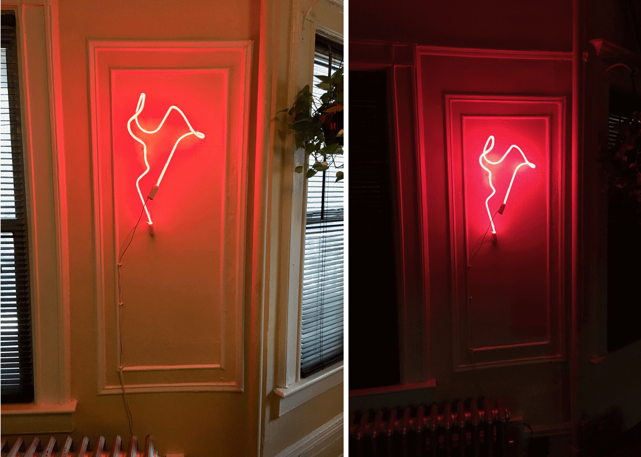
So cool! I’ve never had a neon sign in my house before (or lived with a sign maker, for that matter).
The Ticker
By Lloyd Alaban

Baseball News: The Rockies went with their purple alternates for last night’s NL Wild Card Game against the Cubs. Including last night’s victory, Colorado is now 32-21 this season in purple (from Tyler Kepner). … Speaking of the Rockies: The combination of the MLB postseason patch and the team’s 25th-anniversary patch looked brutal last night. … More Rockies stuff: UW reader Bo Baize went to a Colorado game last week and found catcher’s gear from Mother’s Day and Father’s Day on display. … Cubs 1B Anthony Rizzo appears to have an LSU and an old school Miami Dolphins helmet in his locker (from Paul Quirk). … Here’s a neat infographic from MLB Jersey Numbers showing clubs that issued the same number to at least three players this season. … Looks like Clemson baseball has adopted a new number font for their unis (from Justin Price).

NFL News: Missed this from Sunday: Bears DL Akiem Hicks was ejected during the first half of Sunday’s home game against the Bucs. Hicks tossed his jersey with his shoulder pads into the crowd. According to WGN reporter Adam Hoge, Bears staff got the pads back but allowed the fan to keep the jersey. As for Hicks, he received a $33,000 fine and a possible suspension, according to Chicago Tribune reporter Rich Campbell (from Mike Chamernik). … Also from Mike: Buccaneers QB Ryan Fitzpatrick’s jersey from his record-breaking game in Week Three has arrived at the Pro Football Hall of Fame. On Sept. 16, Fitzpatrick became the first QB in NFL history to throw for 400 yards in three consecutive games. … Patriots QB Tom Brady, who is endorsed by Under Armour, tried to hide the Nike logo on his sweatshirt by turning it inside-out at a Monday presser. It didn’t go very well for him (from our own Brinke Guthrie). … According to the Panthers’ official website, new S Eric Reid will be wearing No. 25 with the club. His previous number, 35, is currently taken by CB Corn Elder (from Daniel Tarrant). … Cross-listed from the baseball section: Cubs 1B Anthony Rizzo appears to have an LSU and an old school Miami Dolphins helmet in his locker (from Paul Quirk). … A Cincinnati-area grocery store created this Bengals logo out of soda boxes (from Brian Spiess). … Reader Adam Foxman created this UW-inspired fantasy football logo. Looks like he Gets It™.
College and High School Football News: Florida State will return to their traditional away uniforms when they suit up against Miami on Saturday (from Phil). … Also from Phil: Colorado is going mono-black against Arizona State, and Texas is going mono-white against Oklahoma. … The University of Houston will wear neon green ribbon decals for Thursday’s game against Tulsa in support of the American Athletic Conference Student Athlete-Advisory Committee’s Pow6rful Minds Campaign and Mental Health Awareness Week. (from @igTexSalazar). … This University of Florida promotional poster show the Jordan logo on the uniform’s pants but not on the jersey (from Moe Khan). … Is Notre Dame going less yellow and more old gold with their pants, or is it just the studio lighting? (From @footballfuntime.) … Dylan Thomas, a high school football player from Pike High School in Zebulon, Ga. died Sunday after taking a hit during a game last Friday. Part of the investigation has focused on how safe his helmet was. Thomas was wearing a Riddell SpeedFlex — a popular choice among NFL and college players — when he took the hit. According to a 2018 study by the NFLPA, the SpeedFlex ranked 18th out of 34 helmets tested.

Hockey News: NHL execs unanimously recommended yesterday that Seattle’s expansion bid go forward to a December vote. The decision to bring the NHL to the Pacific Northwest now lies with the NHL’s board of governors. … Sharks C Joe Thornton said bye to his beard on Tuesday. … A Capitals fan sketched up a concept featuring the club’s “Weagle” logo (from Tim Klapac). … A Coyotes fan proposed that the team’s old crescent moon logo should serve as the captain’s “C” (from @Pappy_Hour). … New sweaters for the University of Minnesota men’s program (from Erik S.).

NBA News: Unconfirmed leak of the Heat’s new Miami Vice-themed court, pink jersey, and black jersey (from multiple readers). … Hornets G Malik Monk forgot to wear his jersey in last night’s preseason matchup against the Heat (from multiple readers). … New baseline design for the Nets (from Raymond Cardenas). … Speaking of the Nets, a reader noticed a strange little black “T” in the middle of the Brooklyn’s away jersey collars on media day. Anyone know what that might be for? (From Luigi M..) … Here’s (according to this sportswriter) a list of 10 alternate NBA jerseys that should make a comeback, and 10 that should stay mothballed (from Phil). … Also from Phil: A Salt Lake writer ranked every era of Jazz uniforms.

College Hoops News: New unis for the Butler men’s team. Reader Jarrod Campbell thinks the jersey numbers look a bit large. Anyone agree? … Arizona men’s basketball is tweaking their neck collar for a more traditional look. Old collar here, and new collar here. … New set for Arkansas men’s basketball (from Tom Dobbins).

Grab Bag: Indiana Athletics recently unveiled its first style guide. It includes 37 uses of the word “story” (from Todd Usher). … If today’s social media and tech companies were born in the 1980s, then they might look like this, according to a Reddit user (from Jon Stiffler). … According to a Cleveland writer, here are the 25 greatest logos in Cleveland sports history (from Jason Hillyer).
Hockey ticker correction. It was Joe Thornton who had his beard shaved.
link
Got it.
To me your neon looks like a cross between these two pics:
link
link
I mean that in a good way.
“Speaking of the Nets, a reader noticed a strange little black “T” in the middle of the Brooklyn’s away jersey collars on media day. Anyone know what that might be for?”
– No idea. Although all I really noticed was a strange black “$” tattoo on the guys neck and wondered who could possibly think that was a good idea.
I am really digging that number font that the Narragansett factory used for the metal locker tags.
Paul, are you going to keep the price you paid a secret? (Same for the baserunner artwork.) As someone who loves these kinds of things but has no idea what the market price might be, I’m always keen to learn about prices so that I will not be taken advantage of when it comes to buying something myself.
Also, way off topic: during the final-week Cubs-Cardinals games, the Cardinals used pitcher Daniel Ponce de Leon. All the letters on his NOB were in capitals, as is usual with the Cardinals (a team that is otherwise aesthetically-sensitive). It got me to wondering: have we ever seen a baseball NOB with small letters in a position other than near the beginning of the name? The near-symmetry of “PONCE de LEON” would be pretty spiffy.
We paid $350 for the lockers (I think I could have negotiated a better price, but Joe was so nice that I didn’t have the heart to play hardball, plus we got the mail chutes as part of the deal), plus another $200 for the movers, plus a $40 tip to the movers.
I don’t remember what I paid for the NYT illo artwork — it was 12 years ago. If I had to guess, I’d say $200-250 — somewhere in that range. And then whatever the framing cost.
And I’m totally with you re: the locker numbers — they look *so* good!
That locker setup looks like it was custom-built around the double-Brannock Device piece. What a sah-weet combination!
I agree, it suits the wall of that space just perfectly.
Great piece! Thank you for sharing Paul!
$350 is a steal. Wow. Honestly, I would have paid up to $750 without a second thought. (And would offer to buy it from you now at that price if I didn’t live cross country!) It’s a beautiful piece, and just really freaking cool.
Thanks for the prices, Paul! The price for the lockers seems reasonable but that of the movers gave me sticker shock!
That’s my favorite number font, too. Every digit looks better in that type than in any other style, particularly the 2, 5, and 7. I associate that font with school buses; every bus from my youth had a number by the door in that type. The Expos wore a similar font, in a narrower style; the Nats ought to wear those numbers today, both as a tribute to the team’s Montreal roots and because the shapes of those numbers would nicely complement the curly W.
That number font would be a huge upgrade for the Brewers
Almost anything would be an upgrade for the Brewers, number-wise. Nats, too. The Brewers just have a bad font for a sports uniform; the Nats have a good font that’s a disaster with the rest of their design.
imo it would fit the Nats better because of the resemblance to the numerals used on currency
Yeah, that 2 looks like Paul Pierce Kansas on the top, Tim Wallach Expos on the bottom:
link
link
I have a date stamper that I use at work which is very similar, though the numbers are a little thinner (but not quite as thin as the Expos’ font). I’m hanging on to it because the newer date stampers that some people have have a super-generic sans-serif font that is boring. link
Man those lockers are a great find and awesome work from Joe!!! I wish he had more to sell. I would buy in a heartbeat for my place. Very nice find!
An additional resource to finding old lockers in addition to the online markets, is schools that are being renovated or rebuilt. One school I worked on a number of years ago had an auction of all the old furniture in the school before it went to the recycler.
More Rockies stuff: The Denver City and County Building was lit up in purple for last night’s Wild Card matchup.
Hey, that’s the photo I took and submitted of the Denver City & County Building! Normally, I would have ecpected proper name attribution in the Ticker (especially for my iown work rather than just a forward of a news article). But it turns out I was incorrect about the purpose of the lights. The purple lights aren’t for the Rockies. They’re for domestic violence awareness:
link
Of course, that raises questions about the choice of timing for that light display. Was it just a coincidence, or was it intentional on the part of the organizers to choose a time when the Rockies might be in the playoffs? If it was intentional, I think it was a serious strategic miscalculation from a publicity standpoint, because everyone in Denver right now assumes those lights are celebrating the Rockies being in the postseason.
Great stuff with the lockers. I would have never thought to re-purpose them in such a way, but it is an awesome little storage / display set.
I tried to watch the wild card game last night but had to turn it off because of those postseason patches. They are so distracting and unnecessary.
Thanks for ruining the postseason, MLB.
With everything else going on (besides the game itself), you could only hyper-focus on the patches, which, barely registered / were noticeable imho.
From the graphics, replays, strike-zones graphic, announcers, tickers, commercials, and side-by-side comparisons…the patches are what ruined it?
I guess you will not be watching the NLDS, potentially NLCS or the WS if Colorado makes it any further…
Kelly, this is Uni Watch — caring about uniforms is what we’re here for. We don’t ridicule people for it.
Last night was a preseason curling night for me, so I listened to the first three innings on the drive up, then innings 10-12 on the drive home, and only watched the final inning on TV. The patches were indeed brutal, but not all that much worse than the Rockies alt jerseys in the first place, and ultimately Alex Rodriguez is an even stronger incentive to switch to the radio broadcast than the ugly patches.
What made no sense to me was that the cap patch was white with pinstripes and the jersey patch was that awful neon blue. Why!?!?!?
Listening to the Rockies Broadcast feed on MLB AtBat last night, the choice of Purple alternates by the Rockies was by starting pitcher Kyle Freeland, a Denver native who likes the purple duds.
Lloyd, the Rockies catcher’s equipment wasn’t for sale, it was part of their memorabilia display. Lots of cool stuff but those stood out from the typical jerseys they had. Sorry for the confusion!
That’s my bad, Bo, not Lloyd’s — I added the “for sale” wording, because I thought that was the case. Will adjust wording now!
I still think the Heat should have the numbers in the Broadway typeface for their Vice jerseys… or, barring that (because of possible legibility issues), use the throwback block shadow numbers. Just not their current set.
I’m confused about Texas making a big deal about the “Storm Trooper” all white uniforms for the Red River Showdown against Oklahoma. Isn’t this what they always wear on the road when wearing white jerseys?
Yes…they have worn white helmets, jerseys and pants when the road team for decades.
I think Texas needs to “tap the brakes” regarding the whole Texas is Back thing.
I’m still calling it The Red River shootout.
But why say they are going stormtrooper, when that’s their regular away uniform?And they aren’t going with anything, it’s just their turn to wear white this year.
So I took a look at the Suns new ad patch
link
Is it just me or is this ad patch REALLY huge. Maybe they did this just for promotional purposes. They also went with both the logo copy (PayPal) and the logo symbol (PP) which seems like overkill. I don’t believe any other advertiser has done this. Has there been a change in the ad patch size restrictions? If the patches are getting this big just after 1 season I fear the European sports unis look will also be overtaking NBA as they did the WNBA.
It does seem a bit larger, but would be helpful to see it in context against other ads. It is fairly obvious that once they moved to the ads, the only direction it would be going is to full euro soccer. They saw a revenue opportunity, took it in spite of it not being popular, but not unpopular enough to hurt their bottom line elsewhere. Now that it is here, they can slowly expand it until the uniforms are in fact the opposite, team advertiser as the main feature, and the team’s logo a small patch. They know soccer jerseys still sell, so people won’t revolt at the thought of buying the goodyear tire jersey that the Cleveland team wears.
True, but a common misconception about soccer kits are that the club’s badge (logo) has traditionally always, or almost always, been in the space where the NBA ads are currently.
Personally, I feel that NBA jersey sales would decline sharply if the franchise’s logo is moved to the corner of the jersey.
Plus, if this were to happen, this calls into question the issue regarding uni numbers; does the NBA still allow numbers on the front and back if an ad across the stomach is also on the front?
I get it that any ad patch is horrible, but I wonder if this looks bigger because the colors don’t match their uniform. Obviously ads should be banned, but since they have them there should be a league rule that the ad patch needs to be in the team colors.
You are laboring under the misconception that the ad patch’s function is to serve the needs of the team. The ad patch’s actual function is to serve the needs of the advertiser.
The TBC’s neon piece is excellent!
If the Seahawks ever get an ad patch, Mr. Yuk is going to look just fine in the photoshop image.
I’m a University of Oregon fan. I disagree that the numbers on Butlers new mens basketball unis look large.
Butler: “Our new basketball uniform numbers are huge!”
Oregon: “Here, hold my beer.”
Can someone please create affordable Mr. Yuk patches that Uni-Watch fans can sew onto their jerseys? This would be a great service to mankind.
link
That’s why I specified “affordable.” Almost eight bucks for a tiny patch makes me want to do the Mr. Yuk face. (Smiling Mr. Yuk Emoji)
Stickers maybe? So if uni ads do get bigger, you’ll have more than enough stickers to cover it up :)
link
Is Notre Dame going less yellow and more old gold with their pants, or is it just the studio lighting?
I wouldn’t ask the question based on that photo. Based on the pants’ stitching (for example, the diagonal patch near where the knee pad would sit) it’s evident that those are pants from previous years. I suspect the player came off the practice field for the photo shoot and was given a game jersey and helmet to wear.
I’m not accusing that Cincinnati grocer of anything untoward. However, that Bengals soda-carton display reminded me that I’ve taken a closer look at similar displays before only to discover that they were actually pre-printed sheets of cardboard made to look like boxes stacked together. Lazy.
I have actually pitched that story idea — i.e., fake soda displays — to several business magazines, because I think it’s both fascinating and utter bullshit, but editors have turned me down.
To paraphrase Jim Vilk, “I’d read that.”
Gotta say Paul the gym locker is a fantastic idea. I have so much sweaty clothing from going to gym, hot yoga, spin class, hot pilates. I live in an apartment building with shared washer/dryer, so things can’t just be thrown in the washer.
I have been just hanging stuff in my bathtub and thinking I need a better solution. Never thought of something like this.
I love the lockers Paul. Those would probably start with a price of about $600 on Flea Market Flip.lol