For all photos, click to enlarge
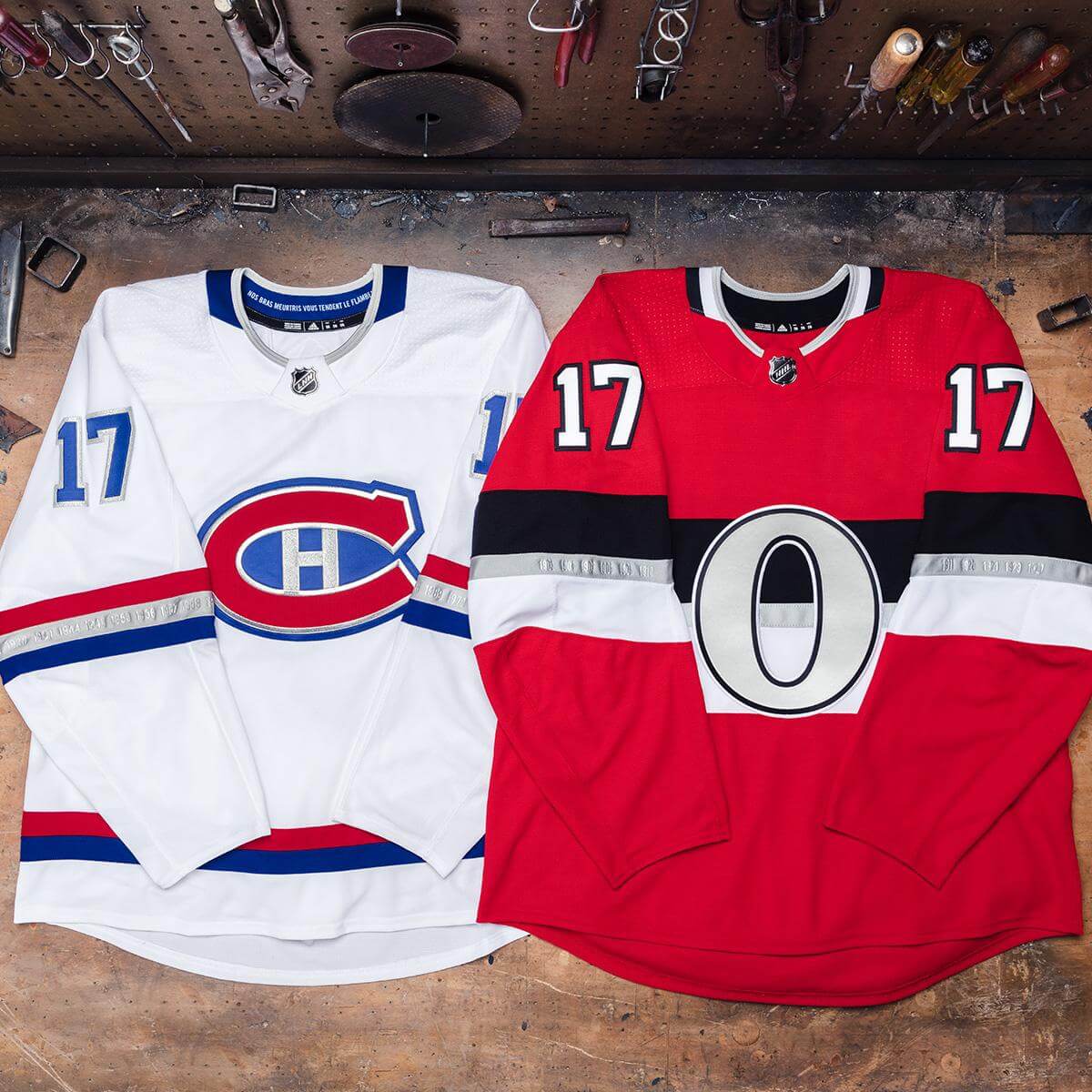
Yesterday the NHL unveiled the jerseys for the NHL 100 Classic, which will be played on Dec. 16 in Lansdowne Park in Ottawa. As you can see above, the jerseys were photographed on a tool bench, which would appear to be the uni-verse’s latest fetishizing of the working class.
As for the designs: The Canadiens’ white jersey features lots of silver trim and has the team’s Stanley Cup championship years denoted on the sleeve stripes (additional info here):
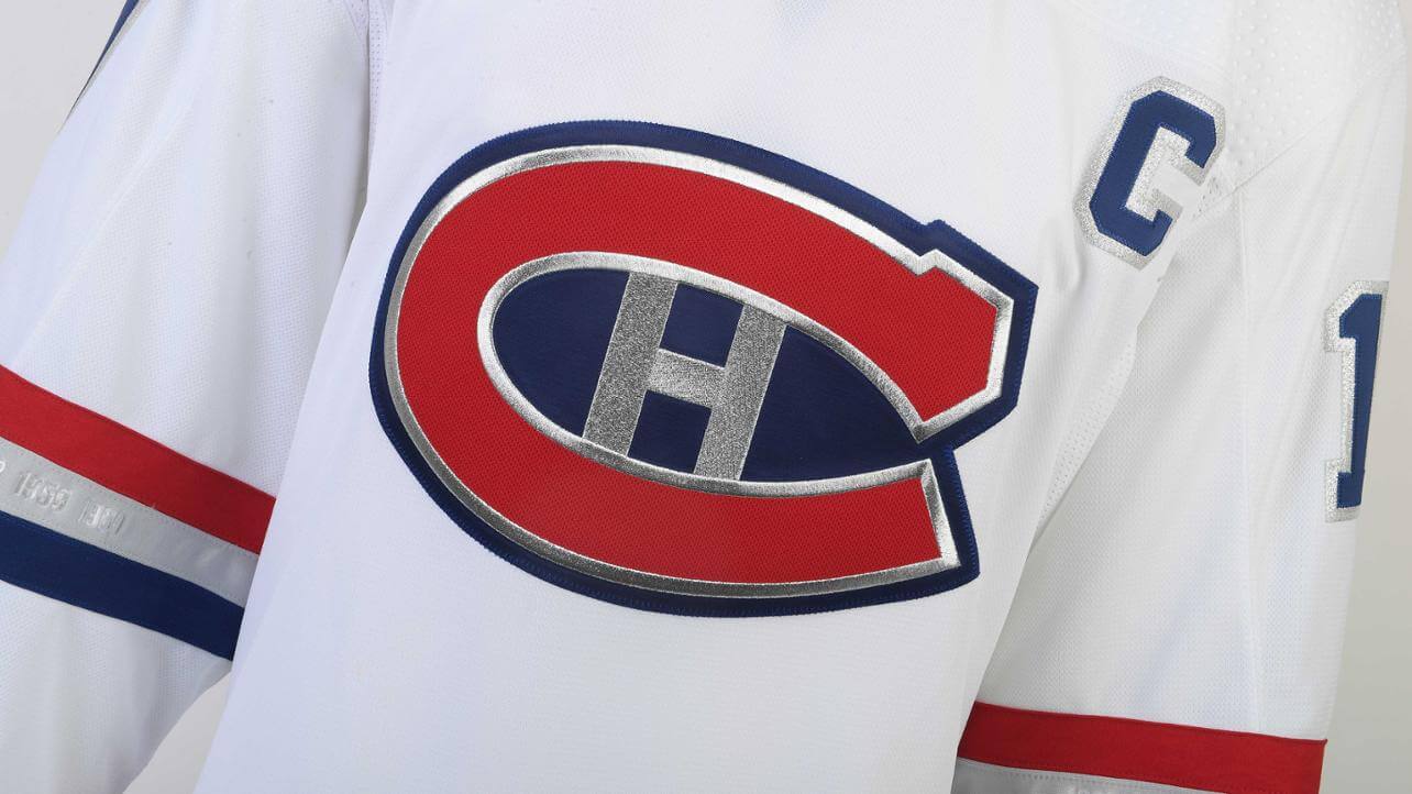

Pretty sharp, although it’s too bad about the polo collar.
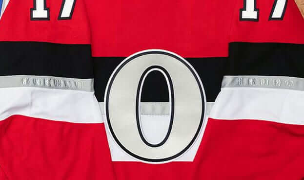
The Senators’ jersey also includes silver. Of course, the current franchise called the Senators has never won the Stanley Cup. But the original Ottawa Senators team, which was a founding NHL club (which in turn is why the Sens are playing in the NHL 100 Classic to begin with), won its share of championships, and they’re denoted on the sleeve stripes:
Disappointing to see that neither team released a photo showing the full uniform, which furthers the notion that this entire exercise is primarily about selling jerseys. Ottawa did release one photo showing a hint of the pants, however:
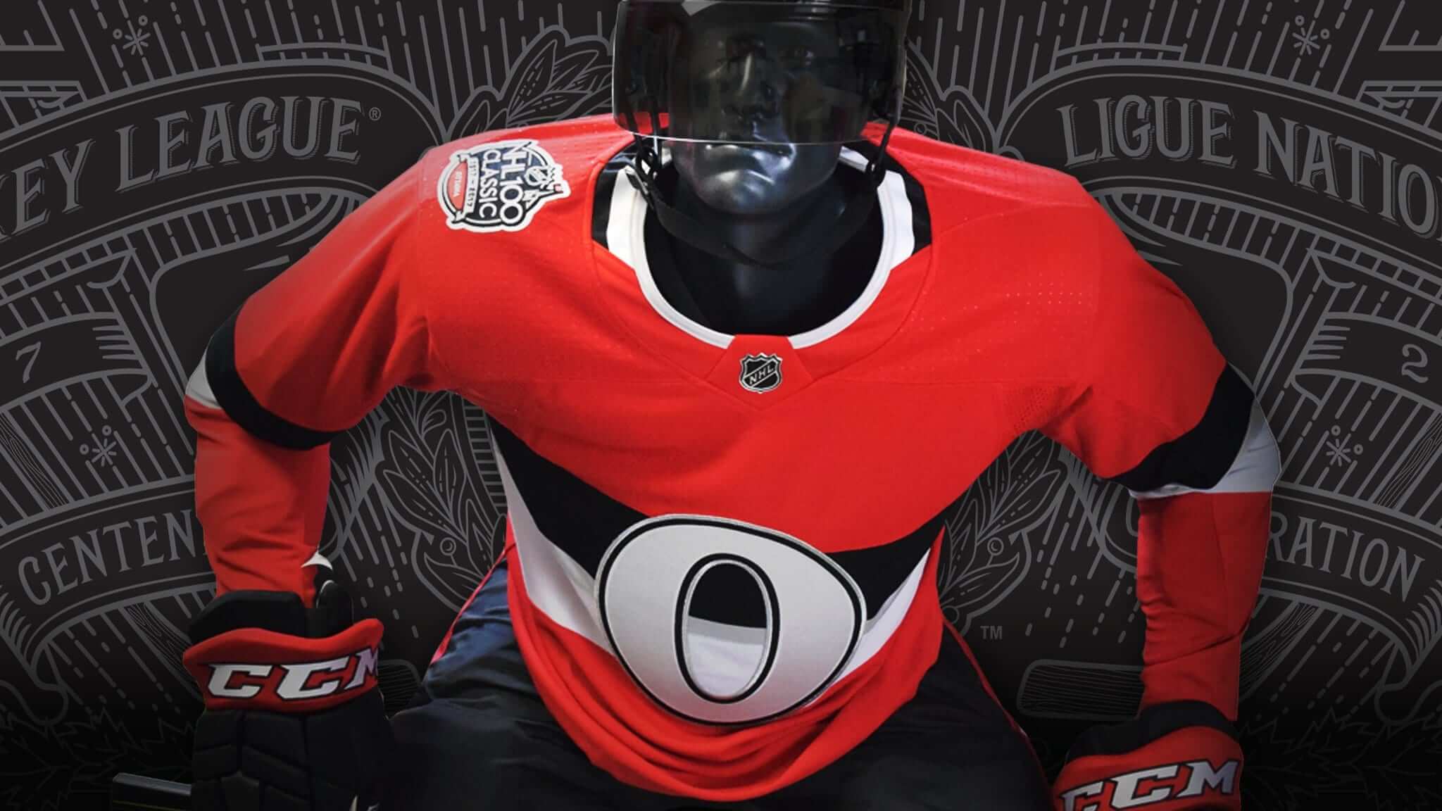
Screen shot by Blake Fox; click to enlarge
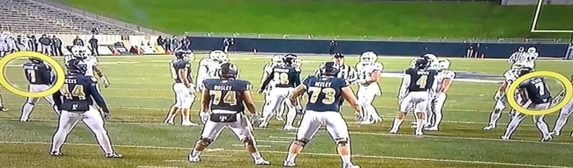
Two of a kind: Because of the large roster sizes and position-numbering guidelines, college football teams often end up with multiple players wearing the same number. It’s kosher as long as the same-numbered players don’t end up on the field at the same time.
That’s what happened during last night’s Akron/Ohio game, as Akron lined up for a punt with two players wearing No. 7. The officials noticed it, and the Zips were flagged for a five-yard penalty.
(This isn’t the first time this has happened this season. Maryland was flagged for a similar infraction back in September.)
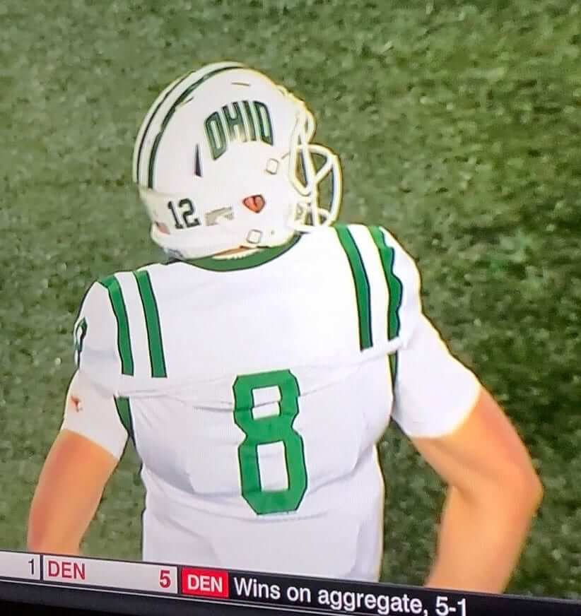
In another uni-numerical development from that Ohio/Akron game, Ohio quarterback Nathan Rourke tore his No. 12 jersey and finished the game wearing an NNOB No. 8 jersey, creating a mismatch between his helmet number and his jersey number:
And in that same game, Akron defensive back Shawn Featherstone lost his helmet decal.

New advertiser shout-out: As you may have noticed in the right-hand sidebar, we have a new advertiser: Rep the Squad. That’s the company that rents jerseys to fans instead of selling them (more info here). You sign up for a monthly subscription and can wear one jersey at a time, and then send it back in return for the next one in your queue. It’s basically the old Netflix DVD system, but for jerseys.
Rep the Squad is now offering a special deal to Uni Watch readers: You can sign up for a free two-week trial. “This allows anyone to come in and try us out. If they cancel their account and return the jersey within 14 days, there is no charge.”
As you all know, I’m generally suspicious of overpriced jersey merchandising. But the rental model is intriguing, and I’ve been impressed with Brian during our interactions. The discount code for the free two-week trial will pre-populate if you use this link, or if you click on the ad. My thanks, as always, for your consideration of our advertisers’ products and services.
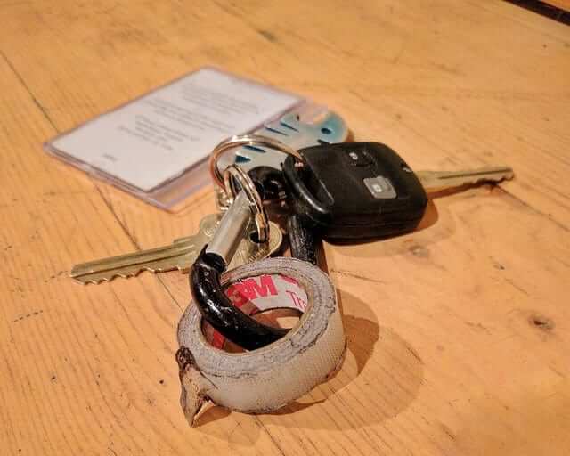
KRC update: The latest installment of Key Ring Chronicles is about a small roll of Scotch tape. It should be available here by 8am Eastern.
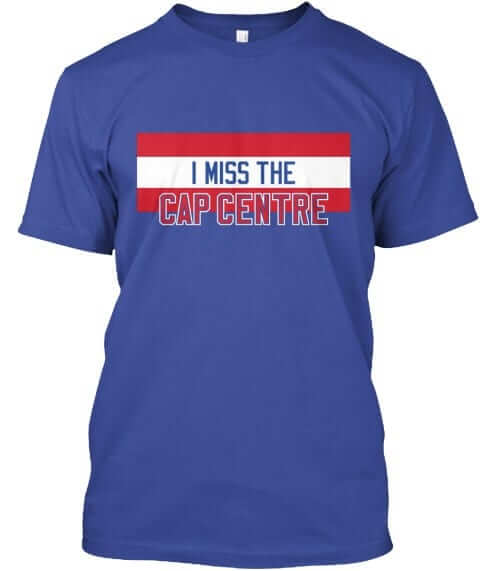
Assorted reminders: In case you missed it yesterday, we have a bunch of new Naming Wrongs shirts (including the very cool Cap Centre design shown at right). Check them out here.
We also have a new Uni Watch T-shirt, designed by Rob Ullman. Full details here, or go straight to the ordering page. The design is also available in a modified version, as a coffee mug.
In addition, the Uni Watch mini-helmet is now available for ordering. Full info here, or just go straight to the ordering page.
The Ticker
By Alex Hider

Pro Football News: Color Rash this week between the Steelers and Titans is going to be a real doozy. … The Packers will wear their throwbacks this Sunday (from Phil). … Former Patriots QB Drew Bledsoe was at a Boston Bruins game with his son the other day. Bledsoe’s son appeared to be wearing one of his dad’s old sideline jackets (from Steve). … Beaufort High School in South Carolina is using the Eagles’ old logo (from Andy Shain). … Eric Bangeman sent along highlights from the 1954 CFL season, which features quarterbacks wearing numbers in the 90s and receivers wearing numbers in the 70s.
College Football News: Notre Dame is currently prepping the leatherhead-style helmets they’ll wear this weekend as part of their Knute Rockne tribute uniforms (from Dave Hancock). … Central Michigan went mono-white with white lids last night against Kent State (from Jimmy). … North Texas will wear stars and stripes decals against Army this weekend (from Tyler Richard). … Until the early 1970s, Texas Tech and TCU played for the Saddle Trophy. This Saturday, the schools are bringing the trophy back (from our own Kris Gross). … Last month, Yale P Alex Galland played trumpet with the band — in uniform! — for the national anthem prior to a game against Holy Cross (from Cassian Wykes). … Nike is selling a shirt that shows Penn State’s Big Blue band in formation inside Beaver Stadium. But according to Darian Somers, the band’s formation is facing the wrong side of the stadium. … The ACC Tracker has been updated for week 11.

Hockey News: The Predators warmed up in purple for Hockey Fights Cancer, and D P.K. Subban added a cowboy hat to boot. … The Penguins wore camo jerseys during warmups last night. The numbers included the emblems of the branches of the military (from Jerry).

Pro Basketball News: Celtics G Kyrie Irving wore a clear mask last night after suffering a minor facial fracture last week. After the game, he said the clear mask was better than the black one he wore in 2012. … Reader Joey Robertson was playing NBA 2K18, and noticed that Knicks F Lance Thomas is photographed wearing an old Adidas jersey with new Nike shorts. … The North American Premier Basketball league’s newest team is the Nevada Desert Dogs (from Jim Hammit). … You’d be hard pressed to find a better intersection of meat and sports uniforms than in Philippines pro basketball (from @gayhooters).

College Hoops News: New uniforms for Mt. St. Mary’s. Here’s what they wore last year (from Ed Kalas). … UNC Wilmington wore BFBS sleeved jerseys last night (from friend of the site Steve Uhlmann and Mike Foster). … Virginia Tech and the Citadel went gray-on-color on Sunday (from Andrew Cosentino). … Eastern Washington warmed up in sleeveless hoodies last night. … New Mexico wore their turquoise N7 alternates last night.

Soccer News: Minneapolis City SC is letting fans pick their home and road kits for the upcoming season. (from Ed Zelaski). … Looks like FC Cincinnati will have new kits next season — though obviously without the MLS crest (from Ben Deetz). … The NOB font on Germany’s kit looks particularly brutal with Zs (from The Swede).

Grab Bag: Marist is changing the name of its fox mascot from “Shooter” to “Frankie,” citing the recent outbreak of mass shootings (from Robert Hayes). … If you’re on Instagram, give @sportpatch a follow. They share photos of patches from old athletic apparel (from Hugh C. McBride). … Auburn has new baseball uniforms for next season (from Clint Richardson). … New uniforms for the Saskatchewan Rush of the National Lacrosse League (from Nelson Hackewich). … Internet browser Firefox has a new logo (from Brinke). … So. Many. Grocer’s apostrophes (from Mad Hatter).
By the time most of you read this, I’ll be on my way to Virginia. Driving down there today with my friend Carrie for a mini-vacation. We’ll be spending the rest of the week hanging out with her dad, attending an oyster festival, other fun stuff. I’ll still be posting content here tomorrow and Friday, and Phil will still have his usual weekend content, but I won’t be reacting to breaking news or participating in the comments. Play nice while I’m away, yes? Yes.
It’s worth noting that Lansdowne Park is also home to the Civic Centre, the current Senators’ original home (and longtime home of the OHL’s Ottawa 67s), which is actually located beneath the north stands of the football stadium.
Ooh! Naming Wrongs ideas – “I Still Call It Lansdowne Park” (or, alternatively, “Frank Clair”) for the football stadium, and “I Still Call It The Civic Centre” for the hockey rink! And maybe the Civic Centre one could reflect the 67’s long-standing link!
How do we feel about the fact that this game is being held at “Lansdowne Park” not because of any sort of civic purity, but because TD isn’t an NHL sponsor?
This also happened last year in Toronto, whose outdoor stadium is also named after a non-sponsor bank.
The renovated Frank Clair Stadium is now called TD Place Stadium. Does not appear that the NHL wants to acknowledge that in their press release due to the league’s relationship with TD’s banking rival Scotiabank.
Probably doesn’t help that the one bank is the “sponsor” advertiser for the game being played at the venue named for the other bank.
Though I blame that on the NHL, for choosing a bank to be their advertising partner for this game in the first place, and not some other prominent Canadian company that’s not in the financial business.
At least the bank name won’t appear in any way on the game uniforms.
Calling it Lansdowne Park makes a little bit of sense as the name Lansdowne Park still refers to the larger park that hosts the exhibition grounds, the pavilion, etc. When the stadium was called Lansdowne Park it was a bit weird because the name could refer either to the grounds or the stadium.
In the New advertiser shout-out, the spaces are missing before the links.
Coding error. Fixed!
Once you go clear mask, you never go black.
On the jerseys themselves, cue Sens fans screaming that their regular uniforms should be more like this one (and they’re not wrong).
As for the Habs, while I get that they appear to be paying homage to link, I personally think they should’ve gone more with one based on link, just so it wouldn’t be quite so plain.
Also, hideous collars. What is it about collars that uni manufacturers just can’t seem to get right these days?
Though, on the plus side (as far as I’m concerned), no collar laces. Of course, they didn’t have them back in 1917 anyway (they were first introduced into the NHL circa 1941).
Functional collars have given way to a need to be proprietary. Certainly a case of the tail wagging the dog.
A tail that didn’t need to be wagged, as far as I’m concerned. I wouldn’t want to wear a jersey with a collar that’s ugly as fuck, even if I were actually playing.
Make sure you wave when you pass northern Virginia later today Paul! Have a great time out here in the Commonwealth.
Beaufort High School shows good taste in their choice of logos.
Maybe I’ve just missed it the past few days (weeks, months, years?) but is the “no guns” logo in the top right corner of the site new?
Has appeared quite a few times over the years, including for the past few weeks. From an advertiser who prefers that the icon speak for itself (i.e., it doesn’t link to anything, at least for now).
That’s awesome… kudos to them (and to you).
“Shooter” to “Frankie”? Really? So now one has to Frank the ball at the hoop to be a Frankie instead of a Shooter? We are doomed as a society.
I get Marist changing the mascot’s name in reaction to the recent shooting events, like the one that happened yesterday. But why change it to Frankie? They could have changed it to Reynard, which goes back to when Marist decided on a nickname for their sports teams:
link
It would have been even better if they just let Shooter keep his name, then retire him as their mascot. I’m sure there are a lot of fox furSUITERs that could take his place.
Noticing that URL, while it’s intended to be parsed as “Go Red Foxes”, it could easily be parsed as “gored foxes”.
That FC Cincinnati jersey is neither a new one for their USL season next year or for if they get into MLS. They said it was for illustrative purposes only to show off the new shirt sponsor. Besides, unless that’s a new Nike or Adidas template design, they wouldn’t be able to have that argyle design anyway. American lower division teams using those two providers simply can’t get fully custom designs from those two (I was the creative director for the Fort Lauderdale Strikers until they folded earlier this year and in 2015 we used Nike at the insistence of then-new minority owner (fat) Ronaldo – mediocre quality and customization options were basically re-coloring old USMNT designs).
Came here to say the same thing.
The shirt sponsor also is dependent on their MLS acceptance. FC Cincinnati has had a Toyota sponsor for its first two years, and is expected to have Toyota for 2018 too. If accepted into MLS, Mercy Health may begin their sponsorship in 2019.
There is a possibility FC Cincinnati could have a “customized” top for their club. Dick’s Sporting Goods says that FCC is the 3rd best-selling soccer merchandise in the US. I think this is hard to really say is accurate, but that’s what FCC announced last week.
Regarding the same number issue for Akron. The rules are nothing like the NFL. It is my understanding there are absolutely no rules for the defensive players. For the offense it is more a “guide” than a hard and fast rule. Basically centering around the offensive line (50s for center, 60s for guards, 70s for tackles, and 80s of tight ends). Aside from that is fair game.
Even with the large roster sizes colleges could probably avoid double numbers, and certainly avoid double numbers for players on the same side of the ball. No excuse for that.
Akron’s roster has a *lot* of multiple numbers (click on the “No.” column header twice to sort by number from lowest to highest):
link
Wow, for a roster with 107 players they have 28 numbers duplicated, and 2 of those multiple issued numbers have been issued 3 times. So there were 23 numbers that were not issued.
Maybe a simple way to prevent this is for the NCAA to mandate all numbers be issued before duplicating numbers?
According to their roster the double 7’s were issued to a WR and a DB. So since it was a special teams play I could see this happening, one of the 7’s was probably a fill in for a punt team starter.
Seeing that great Cap Centre design really hammers home the giant swing and miss by Capital One on the LATEST rename of the home of the Caps/Wizards. When I heard Capital One was set to become the new named advertiser, I thought, “Great! They’ll call it the Capital One Center (or Centre) and the teams can once again play in the Cap Centre!” Instead, “Capital One ARENA.” Oh well, right?
I know. It would’ve been nice if they’d kept the Center part from its previous names.
Love that white Montreal jersey.
You have an “ I’m still calling it the Ralph” but you haven’t got an “I miss the Aud” yet or have I missed that one? Either way a lot of Sabres fans will get misty eyed if you bring up the Aud so I think it would make a great shirt.
link
link
Available in both Sabres colors and a Braves version in orange!
Ugh, both links took me right back to page 1. But yeah, go to pages 8 and 9 and you’ll see them.
Thanks man I can’t believe I missed it!
From that Notre Dame helmet picture – anyone know what the white piece on the ear flap is? I just started noticing those a few weeks ago. Couple dudes on the redskins had yellow ones, so they really stood out. Other guys have had them match the helmet. It looks like it’s screwed on and is removable?
Paul, the FC Cincy jersey isn’t real. Below the image, it states that it is “for illustration purposes only and does not represent an official USL or MLS jersey.”
Anyone else who can’t stand the GB green face masks on the throwbacks?
Another question, why doesn’t GB do exactly like Norte Dame and give them the “leatherhead” look. Yes, it would still be yellow, but it would be a nice nod to the era.
Of course best still would be to wear their proper home uniforms, dark jersey. And white on the road. And all the other teams would also have one dark home jersey and a white road jersey. But I digress.
I missed the local oyster festival here, but just saw this in my newsfeed today. Good luck
link
Where in Virginia, Paul?
Seeing all the cool extra team-centric graphic design on the naming wrongs makes me wish we could revisit “Le Forum me manque” (for Montreal) for a more Habs centric design.
But speaking of the Habs and segueing to the outdoor game unveiling, yes I agree it would be nice to show the breezers and socks for context, but it’s even more heinous not to show the back treatment. I mean, I think due to sneak peeks I know the Habs will have red NOB’s and blue numbers outlined in silver, but why not show the whole jersey if that’s all you’re going to show?
“Beaufort High School in South Carolina is using the Eagles’ old logo”
Somehow I feel like the use of old logos isn’t as bad as the use of current ones. That one bothers me a lot less than another semi-local example I’ve encountered:
link
They use both the logo AND the wordmark – but bastardize the colors. That’s despite having a different eagle logo on their main HS site.
Of course there was also Spring Mills (WV), who uses the Cardinals logo unchanged for their HS, and a version of the Patriots logo for their middle school next door.
Not to mention the Pennsbury (PA) Falcons, who use Atlanta’s logo but swap orange for red.
link
(at least the Penn “P” is generic enough to get away with)
The Michigan State version of that Nike shirt also has the band facing the wrong way.
link
As a side note, the Spartan Marching Band has only been making the helmet formation in the pregame show since 2015. If the shirt is supposed to depict an iconic formation for each school’s band, it would make more sense for it to be the block S or MSU shield, both of which have been in pregame for decades.
The LSU version of the shirt also has the band facing the wrong way.
Regarding the CFL clip – CFL receivers still occasionally numbers in seventies. Generally only Canadian guys since the American receivers want their old college/high school numbers.
Flutie wore numbers in the twenties for most (if not all) of his career in Canada.
Love seeing those old CFL highlights in colour! Technically IRFU (or Big Four) highlights as that was the days when the West and East were still separate leagues and each league champ competed for the Grey Cup.
Love seeing the Hamilton Tiger-Cats in yellow helmets. The way it should be, the way it was intended.
Ticats would benefit from bringing back these throwbacks as their full-time uniform and slapping the modern logo on the side of the helmet:
link
Key Ring Chronicles…
Sooo… is it Scotch tape or first aid tape? I am guessing the latter. A tattered roll of Scotch tape can be infuriating as it splits and tears when trying to unroll a decent sized piece.
link
I like that Rep the Squad idea, particularly since you can get NBA jerseys with OUR without the ad patch. Nifty.
Or, not OUR
Powder blue v. Steelers black for Thursday Color rush, love it! (Do not say that every week)
With the ability these days to do “wraps”, why doesn’t the NFL let teams apply these? The helmets would be the same. But, teams could make their current helmets look like retro helmets with just a little vinyl.
There are wraps out there for helmets.
link
I wonder how much Robert De Niro got paid for the restaurant ad. Has to be the first time an apostrophe was placed between two Zs.
Wow nice shout out to PBA (Philippine Basketball Association). Now I think of it, PBA unis are Uniwatch feature worthy.
I was a waterboy for a Purefoods team back in ’91 when I was 12 yrs old. I wasn’t getting paid, but I’m enjoying the perks of getting to hangout with the players and getting to see the games. PBA games were being played in only one location at that time.