Click to enlarge
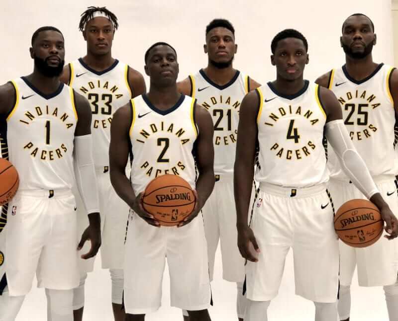
The NBA season tips off next Tuesday. That means it’s time for my annual Uni Watch NBA Season Preview, which covers all the new uniforms (including the Pacers’ new look, shown above). It’s one of the largest columns I’ve ever done, especially for a pro league. Check it out here.
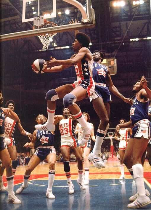
Fifty years ago today: I wouldn’t have known this on my own, but reader Paul Bailey informs me that today is the 50th anniversary of the first ABA game, as the Oakland Oaks beat the Anaheim Amigos, 134-129, on Oct. 13, 1967.
Neither of those franchises retained those identities very long (the Oaks became the Washington Caps and then the Virginia Squires, while the Amigos became the L.A. Stars and then the Utah Stars), but that was part of the fun of the ABA, which always seemed to be in a state of flux. Along the way, the league gave us some of the best and most interesting uniform designs in pro basketball history (like the Nets and Stars unis shown above).
If you want to learn more about ABA uniforms, the excellent Remember the ABA site is always worth a look. And as mentioned in yesterday’s Ticker, longtime Uni Watch pal/ally Todd Radom just did a blog entry about the league’s visual legacy.
The Ticker
By Kris Gross

Baseball News: Astros SS Carlos Correa wore his home white jersey instead of his BP top like all his teammates during yesterday’s practice (from Chris Mycoskie). … Former Mets C Todd Pratt did a Q&A on the Mets Twitter account yesterday. He was asked about his favorite uni combo and said he preferred black jersey, white pants, and no stirrups. Like this (from Guy Fawkes). … David Sonny came across this 1940 Reds World Series ticket (although the term “World Series” doesn’t actually appear on it — it says “World’s Championship” instead). “I love the sales tax breakdown” he adds. … New caps and helmets for South Carolina (from @willchitty4). … Here is a really cool list of all the team names in baseball and how they fit in different categories (from Mike Styczen). … Given the possibility that the Yankees might make it to the World Series, the New York City FC/Columbus Crew SC match on Oct. 22 has been moved from Yankee Stadium to Citi Field. … Nats P Oliver Pérez wears No. 46, but he appeared to be wearing No. 47 cleats last night. Pérez has never worn 47 in his MLB career, but 47 is worn by his teammate Gio Gonzalez. Could he have been borrowing Gonzalez’s cleats? (From Alec Blomquist.)

NFL News: Here is your Color Rash matchup from last night, between the Eagles and Panthers. … As Aaron Pinto pointed out, the Eagles went back to regular captain’s patches, while the Panthers still had Crucial Catch patches. … Titans WR Rishard Matthews said he would quit if forced to stand during national anthem. … With the disaster that is the Rams road unis, Rick Deemer passed along a possible fix from the Highlands Golden Rams (Natrona Heights, PA). … Seguin High School in Texas is celebrating Pinktober.
College Football News: UCF is going with a space-themed uniform this Saturday, including a constellation-packed helmet stripe, moonscape-patterned helmet lettering, and a NASA-style jersey patch. Additional info here. … We have uniform combos for Duke, North Carolina, Eastern Michigan, Middle Tennessee State, and Liberty (from @UniWatchFansAdm). … When we initially saw Florida’s gator-print uniforms earlier this week, we only saw one side of the helmet, with the gator-head logo. Looks the other side will have TV numbers (from Brock Brames). … Speaking of those hideous unis, Florida punter Johnny Townsend wore the new jersey to pass out student tickets. Poor guy (from JJ Sledge). … CIA Director Mike Pompeo spoke at UT yesterday, and received his own Longhorns jersey. As pointed out by Zane Goggans, the jersey is not a Nike template, and “numbers are not the right style either.” … The Syracuse mascot, Otto the Orange, revealed what he (it?) will be wearing on the sidelines tonight (from Nick Impson). … The latest group to kneel during the national anthem: Howard University’s cheerleaders.

Hockey News: Predators defenseman and Switzerland native Roman Josi is the face of the Swiss edition of the NHL 18 video game. As our own Alex Hider adds, he’s wearing an old jersey. … Charles Noerenberg points out the similarities between the Devils’ and Lightning’s 25th-anniversary logo’ are almost identical. … The CHL unveiled their 100th-anniversary national championship logo (from Wade Heidt). … An interesting find from Kyle Martinek, who stumbled upon the movie Ice Guardians on Netflix. “The preview showed a still of two NHL players, minus their logos. But once the movie started, the logos were back.”

NBA News: The NBA store in New York City now sells the new Nike jerseys, minus the ad patch (from Chris Rhode). … The Grizzlies announced they will eventually retire Tony Allen’s No. 9. Allen left Memphis this summer (from Mike Chamernik). … Here’s a look at the new Cavs court design.

College Hoops News: In case you don’t follow Paul on Twitter, he’s been posting lots of new uniforms. For all of these, the old version is on the left, new version on the right: Washington State, Oregon State, Princeton, George Mason, Florida Atlantic, IUPUI, Alcorn State, Bucknell, Belmont, Fort Wayne, Denver, UMass Lowell, Western Illinois, Troy, Nicholls State, Citadel, UT Martin, UMKC, and South Dakota State. … New home and road unis for Chattanooga. … Adding to the list of teams with new uniforms, is Iowa State. Here’s a look at the changes. … Butler is scrapping their alternate greys. … Saint Mary’s College has new uniforms for the upcoming season. Here is the new and the old (from Mark Chiarucci). … New alternates for North Dakota State and Illinois-Chicago. … Purdue will wear a 50th-anniversay patch for Mackey Arena. … New court designs for Creighton, Furman, Chattanooga, and Penn. … Last season, Wisconsin dedicated their court to former player Ab Nicholas. His signature is now part of the court (from Jared Linden). … South Carolina Upstate will wear a 50th-anniversary logo on their shorts this year. … Conference USA unveiled their new conference tournament logo (from Ted Chastain).

Soccer News: Cross-listed from the baseball section: The New York City FC/Columbus Crew SC match on Oct. 22 has been moved to Citi Field in the possibility that the Yankees make the World Series.

Grab Bag: New uniforms for North Carolina track and field (from James Gilbert). … New crosswalks on Youngstown State’s campus feature the school’s logo (from Robert Hayes). … It’s Pinktober for the Los Angeles Police Department too (from Andy Garms).
Howard U cheerleaders are in the Hockey section.
Thanks. Fixed.
I see the SEC patch on the Gators jersey.
I know nothing about college football eligibility rules, so it might not be as weird to some of you, but the Florida Punter is wearing a “SEC Graduate” patch. Graduate? How does that work?
(I know, google it dumb guy)
Interesting that he gets an augmented patch though.
I think they get a year of “post-graduate” eligibility… assuming they enroll in such a program at their school. SEC just likes to “reward” the players that stick it out for all 4-5 years. This is also why you occasionally see players change schools after graduating. For example, one of Florida’s QBs last year, Austin Appleby, played @ Purdue (1 yr redshirt, 3 years played), graduated in ’15, and used his final year of eligibility as a grad transfer. I presume he didn’t have the SEC Graduate patch, though, since he came from elsewhere.
He’s likely a redshirt senior; graduated last year, using his final year of athletic eligibility this year.
I just lost all respect for Todd Pratt…
You had respect for Todd Pratt?
(Actually, I was at Shea for link playoff homer against the D-bax in ’99, so there was that…)
Phil, so cool that you were at that game! I was at a bar in Wisconsin, where my girlfriend and I had to convince the bartender to change the channel from the Badgers game. The second Pratt’s homer cleared the wall, the channel changed back!
I’ve said it before and I’ll say it again: I could have dealt with the BFBS jerseys had they not allowed black to infest and infect the other uniforms, and not made the white alts with the two-tone cap and black accessories the de facto home uniform for twelve freakin’ years.
That said, Seriously, Todd Pratt?
link
-Further to the CHL’s 100th Memorial Cup logo post, the statement from the league itself called the event the “national championship”. Today it is really more accurate to consider it the championship for major junior hockey clubs in North America. Of the 60 teams in the 3 leagues that compete for the Memorial Cup, 8 of the teams are US-based.
-About the Grizzlies’ number retirement, just want to tip my hat to Shareef Abdur-Rahim. We have already retired #3 for you in our hearts up here in your old basketball home, buddy.
link
I haven’t seen ice guardians but that picture as of the islanders ahl team the sound tigers. Notice the patch on upper right chest it’s their drive sober patch. Maybe they didn’t have clearance for ahl logos?
I would LOVE to have the Baseball Team Name Metric as a poster. Found it here:
link
Great other stuff there – sports uniform related!!
Coming soon to my house!!
(FYI: I have no connection to this group otherwise)
Oddly, no teams were called the Bulldogs. But I found a team called the Thunderbolts; nobody was called the Meteors (or Meteorites), a puzzling omission for a good home run synonym.
I’ll be poring over this graphic for a while.
The Los Angeles Dodgers make for a tough designation. The team is listed as a Regional Attribute which maybe makes sense from it’s original point of view, I guess. I first searched at the Concepts/Qualities/Sporty chain for them.
Shouldn’t Dodgers go under the People category? Also, wouldn’t the Knickerbockers be an article of clothing?
Dodgers could go either way I guess, trolley dodgers would be a description of a person, but also a regional attribute specific to Brooklyn circa 1900?
I thought the same for knickerbockers, as that is what I always understood it to be with the basketball team, but a quick search of the dictionary shows it also was used to describe dutch settlers in early New York.
The NBA Season Preview is up:
link
The Nuggets’ navy jerseys are a big downgrade, mainly because of the lettering on the DENVER on the front – they should have the powder blue outline between the yellow and the white, to make the letters pop more. As it is, the white outline around the yellow blurs the letters and makes them harder to look at.
Speaking of hard-to-look-at lettering, I still hate the Bucks’ green jerseys for that reason. Cream outlines on white letters only blend in even more, making the characters extra chunky. Either no outline, a blue outline, or a three-color treatment (with blue or green as the inner outline) would be a vast improvement.
That said, the Bulls made a big upgrade by going with single-color NOBs. Too bad the pics showing those NOBs are from the jerseys of a player who’s no longer with the team, but them’s the breaks.
They did err by going with black names on the white jersey. They should be red.
It might be just my computer (and/or my lack of knowledge), but I freezing up every time I try and read your ESPN NBA preview. My computer increasingly grinds at a slow pace through ESPN in general, something that’s been deteriorating over the last 6 months, but just on ESPN, not on other websites. (and ESPN must be through Chrome, Explorer is hopeless), but in this particular case it’s asking me whether I want to kill my session due to a lack of response.
Ever since they redid their website with an emphasis on mobile design, it’s been rubbish.
Interesting. Not sure what to tell you.
“… Devils’ and Lightning’s 25th-anniversary logo’ are almost identical.”
Ummmm,… not to my eyes.
Yeah, they both have a 25 and a ribbon.
Here are some REAL similar ones:
link
link
And those 25s look very much like the one the Devils are using.
Baseball team metric is awesome. Curious that the Orlando Rays are listed as animals, but the Tampa Bay Rays are natural phenomenon. Pretty sure they still feature the animal on their uniforms.
I thought that when they changed from the Devil Rays to the Rays, that they changed from the animal to rays of the sun, with the sunburst logo.
Honestly, is it that hard to look up a photo before you post?
link
Sorry.
So they didn’t eliminate the animal ray, but they did add the sunburst. When your name has two meanings, and you acknowledge both meanings on your uniforms, then I guess it makes it hard to say they belong in one category or another.
They have both, I still consider the animal to be their mascot, the sunburst works as a secondary mark but makes for an awful logo mascot thing.
I remember thinking the Rays were sui generis in that aspect; that is, adopting two discrete definitions of their name. When we discussed Spanish translations for Latin American night, I wondered whether the Rays would reference the stingray or the sun’s rays.
To say that allowing/selling advertising patches on a professional jersey is “a stain” to a man’s legacy is a harsh statement.
In context, when I hear the phrase “a stain” in sports, I think of Pete Rose, OJ Simpson, Judge Landis, John Calipari etc., these are people that have genuinely tarnished their legacies and have left irreparable stains not just on themselves, but their sports.
What the NBA commissioner has done may not be favorable in your or many others eyes, but it has not done damage to anyone in society. It may even bring awareness or have some charitable causes (like the Jazz have done) that may not have the opportunity to reach beyond it’s local borders.
There are far worse things that an individual could allow to generate revenue than allow advertising on a jersey that could tarnish their legacy.
To say that allowing/selling advertising patches on a professional jersey is “a stain” to a man’s legacy is a harsh statement.
Yes, precisely. It was intended to be a harsh statement. I’m pleased that you interpreted it as such.
What the NBA commissioner has done may not be favorable in your or many others eyes, but it has not done damage to anyone in society.
I strongly disagree. One of the major problems in our culture is our transformation from a market economy to a market society, where everything is for sale and corporate culture infiltrates every nook and cranny of our lives. It’s a descent into Idiocracy. The NBA’s uniform ads are a prime example of this. Silver can and should be held responsible.
If any of the other Big Four pro leagues go ahead with uni ads, that too will be laid at Silver’s door. A stain indeed.
Hear hear.
I feel the same way in re: sales numbers and ratings. Popularity or ubiquity is not the same as quality.
Just because something is popular or sells doesn’t mean it’s any good. Inversely, just because is popular doesn’t mean it’s bad. Things need to be judged on their own merits.
I sometimes feel that if a company isn’t making all the money literally possible then people see them in today’s society as a failure. People are so worried about if they can do something, without considering if they should.
Damn right Paul.
The reason people wear hats, shirts, jerseys, etc of their favorite team is because they strongly identify with them, it is a cultural thing, be that for purely geographic reasons, or any number of other reasons you would be a fan of that team. There is a certain pride involved, civic or otherwise with the fandom.
Some might love Harley Davidson motorcycles, and you see plenty of people taking pride in support of that brand. But now, if you are Bucks fan, your identity is attached to Harley, for no legit reason, but just so the team owners can make a few extra dollars. Sports are more than a simple business, and that is long been the reason billionaires ask for tax dollars to build their stadiums. If that is the case, if the brand is more than a business, then selling it out for a few dollars comes off as greedy and disgusting.
On the Carlos Correa ticker item: Looks like he wasn’t the only one wearing the home jersey. In both of those pictures it appears to be another player wearing one too. I believe it is Marwin Gonzalez though based on the single digit number and name ending in a Z.
Also there aren’t many even wearing a BP top in those photos. Most look to be wearing a base layer shirt or playoff shirt.
Fantastic Nets/Stars top of page pic. All 10 players are in the key. All 10 are in the pic.
Great observation! The three-point shot was supposed to cut down on that sort of crowding near the basket, but clearly it took a while for coaches and players to figure it out.
Is the Jordan brand and Nike connected in some way?
The former is a subsidiary of the latter.
Jordan is/was a Nike guy, and the jumpman was his logo, eventually it went from the Jordan logo to a sub-brand of Nike attire.
I think the only way to fix the Rams’ Millennium blue jerseys is to scale back the New Century gold on them. Seeing it be so prominent makes it stick out like a sore thumb with all that blue and white everywhere else.
I think we should get Knicks fans to chant #boycottsquarespace at games if we want them to drop the ad. Perhaps organize for a particular game.
Maybe you could create a website to gather interest and support.
Do you know any way to do that?
Some questions/thoughts that occurred to me while reading the NBA preview:
1) What’s the function of the triangular notch in the shorts? I’m assuming it originated when shorts were a bit more snug, to allow a little extra flexibility, and it’s just stuck around all these years?
2) The back of the jersey, where the back panel seems to overlap the shoulders… that’s just awful. It’s like they started at the front of the jersey, worked their way to the back, realized their mistake where the armhole trim gets cut off, but didn’t have time to fix it.
3) Hopefully I’m being overly cynical, but Magic -> Disney patch -> more free commercial airtime during highlights shows on ESPN.
4) Whose bright idea was it to add the drop shadow to Philly’s jerseys, and beveling to the Suns’?
Enjoyed the NBA preview today. But reading the Sixers entry made me think: would it have killed them to make a deal with this company for their jersey sponsorship?
link
What’s the signficance?
As in “trust the process”. Their marketing slogan to get easily duped fans into believing all of the losing they did was guaranteed to pay off in the future.
1) It’s not an “sponsorship”; it’s an advertisement. More: link
2) Better question: Would it have killed them to make no deal at all?
Strangely surprised that the Rockets have yet to get a jersey ad. I would think given Houston’s corporate culture (oil companies, hospitals, etc.) Heck, what about Toyota?
Also makes me wonder how flexible the NBA’s policy is on this. If Joel Osteen’s Lakewood Church wanted an ad, would they do that?
In regards to the Joel Osteen’s church, I still call it the Summit.
typo in football section:
Should be “Howard UNIVERSITY cheerleaders”
Thanks. Fixed.
The all blue Ram unis are as disjointed a look as I’ve ever seen.
Hard to tell in the pic shown, but the jersey and pants aren’t even the same shade of blue. Don’t even get me started on the white horned helmet with the blue and gold jersey. Almost looks like a Pro Bowl combo where the helmet doesn’t match the jersey!