By John Ekdahl
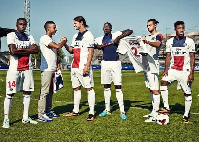
Fox Sports ranked the 2013-2014 kits and French Champions Paris Saint-Germain new Nike uniforms came out the winner.
French Champions Paris Saint-Germain (PSG) next season will play in a new predominantly white away kit that features modern colour-blocking of red, white and blue to celebrate the side’s famous club colours. Young PSG fan Karim, winner of the #ICICESTPARIS contest, travelled to Sweden with Nike and the club on their pre-season tour to help unveil the new away kit.
The shirt has a tri-colour design ”” blue at the top, white in the middle and red at the bottom ”” giving it a youthful and passionate appearance that reflects club’s attachment to Paris.
The colour-blocking evolved from the distinctive vertical stripes that have traditionally appeared on the home shirt, with each colour representing a different club value: blue for grandeur, red to convey passion and white for respect.
Check out the full list here. Thanks to Gill.
Commenter arrScott pointed out this fun article over at Slate about the worst baseball card of all time.
The worst baseball card of all time is not the kind of bad that creeps up on you. Glance at 1996 Pinnacle Foil No. 289 for half a second and you’ll see that two things are very, very wrong. First, Bob Hamelin’s enormous head takes up most of the frame. Second, the small portion of the card that is not consumed by Hamelin’s melon is filled by a placard. That placard, which is being held by Bob Hamelin, reads “BOB HAMELIN.” The Hamelin-held “BOB HAMELIN” sign is in turn partially obscured by a golden triangle with a name embossed on top: “BOB HAMELIN.”
The card’s commitment to badness never wavers. Consider the fact that the “BOB HAMELIN” sign looks like it’s about to slice Bob Hamelin’s chin off. There’s also the defeated look on Hamelin’s face, which””along with the blinding glare on his oversized glasses””makes it look like he’s being interrogated by the baseball police, or perhaps being held against his will by a designated-hitter-collecting maniac. The “Pinnacle 1996” logo in the upper-left-hand corner conceals the Kansas City Royals logo on Hamelin’s cap, part of a recurring pattern of hiding terrible things behind other terrible things. And what’s that written on the underside of Hamelin’s hat bill? Just in case there’s any question that the man on the Bob Hamelin card holding the “BOB HAMELIN” sign is Bob Hamelin, there it is in black marker: “HAMELIN.”
NESN has a good photo gallery on the evolution of NBA uniforms over the years.
That isn’t the worst baseball card. It’s so bad that it’s actually kinda awesome. The worst baseball card is something that just looks so generic as to not stand out at all.
The worst card of all time, without a doubt, is the 1973 Topps Reggie Jackson: link
Good gosh, that’s terrible. What were the A’s thinking, scheduling player colonics on photo day?
Did anyone notice the Jets/Giants game last night?It was the Giants home game but the Jets had their name in one of the endzones. Does anyone why this was? Or was it just the case of the stadium trying to save man hours and money by leaving the Jets name in the endzone since they play home next week? Thoughts?.
Who cares? It’s an exhibition game.
I don’t know if I’d say who cares… but being an exhibition game between 2 teams that share a stadium, shouldn’t they *both* be the home team? It makes perfect sense to use both teams’ logos on the field.
TJ, then *both* teams should have worn their home jerseys, right? (wink, wink)
I would say “who cares?” It’s just a team name painted in the end zone…it’s not like it had any influence on the outcome of the game. There are many on this site who focus on the trees so obsessively they lose sight of the forest.
The serious answer is that the designated home team foists the tickets on its season ticketholders.
Mr. Clark, most of the people who read this site care. It’s one of the reasons we read this site. If you don’t care, good for you. I’m sure you will find much on this site trivial, if not perplexing, and eventually you will move on to other, more important, websites and/or blogs. Good luck to you.
It was the annual ‘Metlife Bowl’. They’ve been doing that with the endzones the last few years.
I have a hockey card blog bookmarked that hasn’t been updated in over 3 years. I occasionally go back and look at it.
Along with those tagged ‘Worst Hockey Cards Ever’ there are some tagged ‘Hockey Card of the Day/Week’ that aren’t tagged ‘Worst Ever’ that would qualify too.
Not the worst ever but one that sticks out when skimming through that section is the Classic brand Manon Rheaume (Hockey Art) card. Mere words can’t describe this one but the blogger comments “The only thing this card is missing is a dolphin jumping in the background.”
[Although I’m certainly not aware of every hockey card set produced, I share the view of the blogger that the 1979-80 O-Pee-Chee set must have one of the best backs of any hockey card set.]
link
if you have a bad enough name, all of your baseball cards are bad…
link
MLG, you spelt “awesome” wrong there.
No mention of the phillies wearing maroon throwbacks two days ago
Actually, the throwbacks were white. The maroon throwbacks (aka “Saturday Night Specials”) would have been beyond awesome.
And whatever the hell it was the Phillies dressed the D-backs in was embarassing.
Swansea’s alts are … uhh … eye-catching.
The fans seem to like it, lots of people in the stands wearing it.
Well, they wouldn’t want to wear white today, as that’s Tottenham’s color.
I’ll never understand why teams wear white socks when there is no white in the jersey or shorts. Swansea should be wearing yellow socks.
Sometimes, like Chelsea, it’s traditional. A way for them to set their look apart. Especially when they’ve only had three elements to play with – solid shirt, solid shorts, solid socks. They could assign one color to each element.
link
A couple of weeks ago when I wrote about “timelessly representing the CFL” the consensus seemed to be that I’d gotten the Argonauts wrong – that their late 1970s – early 1980s version was the best.
For your enjoyment, the Argos threw back to that look Friday night against Calgary.
link
…and then ruined it by slapping a Nissan logo on the jerseys
That’s not the best Argos uniform, but it’s a nice one and certainly the one I’d pick for timelessly representing the team.
My enjoyment was somewhat ruined by that travesty of a road uniform that Calgary still has. Calgary look at your uniform history and randomly pick one pre-Reebok; odds are it will be a vast improvement.
Calgary is a complete disaster. This is what I wrote about them last year at Grey Cup time:
link
Fox Sports ranked the 2013-2014 kits and French Champions Paris Saint-Germain’s new Nike uniforms came out the winner.
The list is all right, but I seriously doubt Fox Sports did much research. Depending on how wide you cast the net, you could be considering anywhere from 100 (the top flights of the “Big Five” European leagues of England, Spain, Italy, Germany, and France) to 2,000 clubs (if you look at the top flight of every European nation).
I mean, how does Roma’s new kit not make the list? And how does the current Inter kit (the blue is much too dark) finish second?
Not that it means anything, but it is a bit more comprehensive than you’d think. With 2 dutch, 2 portuguese, a scottish and a turkish club, it can hardly be accused of being limited to the big 5.
My theory is that an Inter Milan fan working for Fox was told to put together the list to soft-promo Fox’s Champions and Europa League coverage. All but one of the the 20 clubs listed are playing in Europe this year. The loan exception? Inter Milan of course.
The Inter one confused me too. The main outfit is completely by-the-numbers standard, nothing original or new about it. The alt is plain white.
The coolest thing about that fox Sports blog is the story about the artist with Down’s Syndrome designing a number font for a special edition Barca kit. An inspiring story, and if I weren’t saddled with the perpetual disappointment that is supporting Man City, I’d be a Barca fan.
I agree with DJ — not a lot of thought went into that list.
2011 FA Cup
2012 Premier League
You guys are worse than Red Sox fans ;)
Can anyone help me out. Im in a discussion on whether the Cleveland Browns ever wore brown jerseys and brown pants.
My memory tells me they did for a preseason game against the Eagles. I think I even remember Paul the next day mentioning it wouldnt have been so bad if they wore the striped socks instead of the brown topped socks.
Cant find any pics from the game. Anyone able to direct me?
Your memory, unfortunately, is not correct.
The Browns NEVER wore brown over brown. We may have done a mockup or two showing how it could have looked, but I’m 99.98% certain the team never went that route. The brown pants were bad enough, but those were only worn with the white tops.
As to the socks…you are correct. They wore the brown pants (with white jerseys) against the Giants.
We had some “fun” after that game fixing the pants with a stripe, and adding white, striped socks — but what they wore that game was brown pants (unstriped) with brown high socks, for a very, very bad look.
I liked the brown pants. With or without the fixed stripes. It would’ve looked better if they had those fixed socks however.
I think I said it before but I can live with the black facemask and serifs on the Vikings but that awful matte helmet and unbalanced pants striping are really annoying.
I also wish the 49ers would go back to that wordmark in the endzones full time instead of just for the last year of Candlestick and bring back the red facemasks as well. But I have to pick my battles I guess…