What the hell is this?
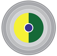
Answer: It’s a listing of all 45 Super Bowl outcomes, as depicted by an infographics system created by reader Christopher Fox, who’s a designer and design professor (you can see more of his work here). Here’s his description of how the system works:
Each stacked pair of orbs represents a Super Bowl — winners on the top row, losers on the bottom. There are 45 pairs, stacked in three rows of 15 Super Bowls each.
For each pair of orbs:
• The colored semicircles are team colors (loosely represented).
• The center bulls eye indicates the team’s conference — red for the AFC/AFL, or blue for the NFC/NFL).
• The radiating gray rings represent the final score. The more rings, the more points that team scored.
• If there’s an colored arc above the orb pair, that means the game was played in a dome. All such arcs are blue, because the only Super Bowl domes so far have been NFC stadiums.
• If there’s a colored bar below the orb pair, that means the game was played in an NFC (blue) or AFC (red) outdoor stadium.
• If there’s no colored arc above the pair or colored bar below, that means the game was played on a non-NFL field, such as the Rose Bowl.
Intriguing, no? A few thoughts:
• It’s amazing how the simple addition of the blue or red bullseye completely changes the color schemes. I had to think hard to make myself realize that this stands for the Jets. Ditto for the Saints, and I barely even recognize my Niners. Maybe there’s a better way to designate the conferences without distorting our perception and recognition of the various teams’ color schemes.
• I think it would be better for outdoor NFL stadium designations — the colored bars — to go on top, like the dome symbols. Then, on the bottom, you could have a separate indicator for natural vs. artificial turf.
• Would it ruin the purity of the exercise to put the appropriate Roman numerals beneath each orb pair? Sure would make the whole thing easier to follow and appreciate.
As some of you are probably thinking already, this whole exercise may be a case of overthinking, because we already have graphic icons to represent football teams: They’re called helmets. Still, infographics are interesting and fun, plus they’re essentially programmatic classification systems, just like uniforms are. If you’re into this kind of stuff, you should definitely check out the baseball-themed charts that are showcased at Flip Flop Fly Ball. If you want to move beyond sports, there’s a guy named Nigel Holmes who’s pretty much the king of this kind of stuff, plus Kirsten recently told me about a good infographics site called Information Is Beautiful.
Anyone else want to try their hand at this? I’ll give a free Uni Watch membership or T-shirt (winner’s choice) to the person who submits the best sports-themed infographics presentation by the end of this month. It can be about a big, official thing, like Super Bowl results, or a small, personal thing, like your cap collection. Bonus points if your subject is uni-related, but that’s not a requirement. Cool? Get crackin’.
My former life as a travel writer: Yesterday I linked to a 1998 travel article I wrote about western Nebraska. Several of you told me you enjoyed the article (thank you), and a few of you asked to see more.
The western Nebraska story was one of the first pieces I produced as the travel columnist for Money magazine, a very incongruous gig that I got sort of by accident (it’s a long story). The column was called “Lost in America” and was all about road-tripping, regionalism, the nooks and crannies of American culture and subculture, and about the nature of place — not really a good fit with the magazine or its readership, which was probably more interested in spas and resorts (which are of zero interest to me). I started with a one-year contract and figured that would be the end of it. I even envisioned what the editor-in-chief would say to me as he gave me the bad news at the end of that first year: “This has been a fun little experiment — and now it’s over.”
Instead, against all odds, they kept me around for six years. I think it was because I was such a cheap date compared to most other travel writers — I actually preferred cheap motels over luxury hotels, I preferred hot dog shacks over fancy restaurants, and so on, so my expense reports were pretty reasonable. In any event, I got to see America on Time-Warner’s dime. It was a great gig.
I’m surprised to find that many of the “Lost in America” pieces are still web-available. Some of them now feel pretty dated, others were edited in ways I’m not thrilled about, and all of them were a lot stronger with their accompanying photos and maps (none of which appear in the web versions), but whaddaya gonna do. Anyway, for those of you who are curious, here’s what I had to say about Death Valley; places that dare you to overeat; halls of fame; state borders (it was an absolute coup to get that one published — it had no business being in a personal-finance magazine); factory tours; utopian communities; small museums; roadside art; historical markers; old-fashioned ice cream parlors; “World’s Biggest [Whatever]” attractions; the amazing all-metal houses called Lustrons; pies; regional bowling subcultures; driving down the length of the Mississippi; storm-chasing; underground mine tours; and America’s least-visited state.
In those days, incidentally, I juggled several different magazine gigs at once. While I was a travel columnist, I was also a marketing columnist (for Fortune), a business-history columnist (for Fortune Small Business), a food writer (for various places), and of course I also wrote a small monthly column about sports uniforms for the Village Voice. One thing I did not have back then was a daily blog, and one measure of how much my life has changed since those days is that I can’t imagine taking on a travel-writing gig now, if only because it would make it impossible to maintain this site. I’m not complaining, mind you — just noticing how things have shifted.
Membership update: A bunch of new cards have been added to the design gallery, including Jonathan Leib’s Tampa Bay Lightning “thunderstorm” card (which follows the now well-established trope of really horrendous jerseys making for really tremendous membership cards). As always, you can make the membership scene yourself by signing up here.
Uni Watch News Ticker: Cross-dressing alert (with thanks to Roger Faso). ”¦ Rob Carabelli notes that Big Ben’s sideline cap on Sunday had a Reebok wordmark patch. “I guess he kept an older-style hat with the vector logo and Reebok had it patched up for the big game,” says Rob. “Kind of like when a player adds a World Series patch to a clearly worn cap for the Fall Classic.” ”¦ There are tattoos, and then there are tattoos. ”¦ For years now, Under Armour founder Kevin Planck has been saying, “Cotton is the enemy” over and over again, like a mantra. But now UA is putting out a cotton product line. It’s sad when a company can’t even stick to its (really, really stupid) principles (with thanks to Josh Neisler). ”¦ If you’re over 18 and live in Delaware, New Jersey, or Pennsylvania, you can enter a contest to design the Phillies’ ballgirl uniforms (with thanks to long-lost Anthony Verna). ”¦ A lot going on in this photo. First, Ole Miss wore gray at home on Wednesday night. Second, that created a color-on-color match-up with LSU. And third, does Daron Populist have the greatest name ever or what? (With thanks to Ethan Allen.) ”¦ Very interesting NHL news from Cork Gaines, who writes: “One of the Lightning radio broadcasters was on a local station in Tampa talking and mentioned that what they unveiled last week may not be exactly what they wear on the ice next season. He mentioned possibly adding a lightning bolt to the shorts and some other unspecified tweaks. This makes me think we got a mid-season unveiling just so the team could gauge reaction and make adjustments — a concept I’m surprised we don’t see more often.” ”¦ Ever hear of the “the Jackie Robinson of hockey”? Here he is — Willie O’Ree. Further details on him here (nice find by Ed McVey). ”¦ Great story about a guy who built a scale model of Ebbets Field (with thanks to Michael Smith). ”¦ The Jumpman logo is coming to NASCAR (with thanks to Kenny Loo). ”¦ Check out this shot. “That’s the legendary Soviet hockey goalie Vladislav Tretyak with a fellow Hall of Famer and the ‘Father of Soviet Hockey’ Anatoly Tarasov, both of them rocking the old CSKA Moscow away jersey,” says Slava Malamud. “The interesting thing, aside from the fact that Tarasov had apparently worn a jersey during practices, is that he wore a big ‘T’ instead of a number. Could stand for Tarasov (wouldn’t put it past him) or could be for ‘Trener,’ which is what Russians call a coach.” ”¦ Always fun to see how corporate logos have evolved (with thanks to Glen Heck). ”¦ Jake Donahue has envisioned what some college basketball courts might look like if they went with an Oregon-style approach. ”¦ Here’s an interesting piece about the proper spelling of Russian surnames on NHL NOBs. The writer of the piece then posted an interesting query on Twitter: “MLB uses accent symbols on jerseys of Hispanic players. Do you think the NHL should do the same for Czechs, Finns, Swedes?” That leads John Muir to wonder if the NHL has ever used diacritical marks on NOBs. I asked Teebz, who sent back this photo but said such examples are very rare: “Alain Coté, who played for both the Canadiens and the Nordiques in the 1980s and 1990s had no accents on his name while playing with either team, and he was a French-Canadian! Jose Théodore (MTL), Jean-Francois Sauvé (QUE), and Jason Lafrenière (QUE) all played in Quebec and none had accents. I’m almost positive that the NHL encourages the anglicized names to used, but will never come out and say that due to political correctness.” Fascinating. ”¦ Hey, speaking of Russians, check out this page of uni photos from Russia High School in Ohio. That must’ve been a weird thing to wear on your chest during the Cold War (great find by Brad Francis). ”¦ “The New York Rangers recently had a bowling party for members of their Blueshirts United fan club,” says A.J. Frey. “Here’s a few of them in custom bowling shirts.” ”¦ Car-branding controversy in Formula 1 (with thanks to Andrew Jobe). ”¦ Latest gumball product: build-your-own mini-jerseys (with thanks to Adrian Rieder). ”¦ Georgia Tech hoops debuted new uniforms last night (as noted by Britton Thomas). ”¦ According to Bills RB Fred Jackson, nobody on the team liked the old uniforms (with thanks to Chad Todd). ”¦ Weird scene last night in Boston, as the Lakers and Celtics both wore home throwbacks. ”¦ Also from that same game: Ray Allen wore two different sneakers with two different shoelace colors during pregame warm-ups. “He had the Air Jordan IX Bin 23 on his left foot and a player-exclusive version of the Air Jordan XI on his right foot,” says Ryan Mandel. But he appeared to switch to matching sneakers once the game started. ”¦ Special Valentine’s Day jerseys for the Alaska Aces (with thanks to Marcelo Cordoba).
NFL teams represented as Pokéballs. Neat.
SB XLV MVP Aaron Rodgers, I choose you!
I’m a graphic designer here north of the 49th which means that for most of my career (15+ years), I’ve had to execute designs in French as well… Re: the French NOB thing — and I may be wrong on this — but I don’t think the accents apply when using capital letters. Perhaps a Francophone Uni Watch reader can confirm, but I was told years ago by our translator that when using all caps, you normally don’t use the accents or at least they are optional, so that could blow a hole in the ‘NHL encourages anglicized names to be used’ theory.
However, by no means would it surprise me to find out that is in fact the case, given the league’s (ok, Gary Bettman’s) history of pandering to U.S. (specifically sunbelt) markets.
Also true for Spanish, Dave, at least it was when I was taught orthography a la Academia during the Paleolithic Era: Upper Case No Accent Marks. Nowadays, though, you see a whole lot of upper case Spanish with accent marks. So a rule that longer seems to matter, at least in the world of commerce. My guess — just a guess — is that the French cling to their rules more tenaciously. Acadamie trumps Academia.
That’s “Academie,” not Acadamie.
When I learned French in school in the US, we were also taught not to use accents on caps. I’ve since learned that this has to do with the technological limitations of physical movable type (and typewriters). Each actual piece of type only goes up to the top of the capital letters, so there’s no place to put an accent. Lower case type can have accents because they can live in the area between the x height and cap height.
The Chicago Manual website has a nice blurb on this topic that speaks to the history of non-accented capitals as well as current moves toward encouraging accented caps: link
I noticed two things on the Super Bowl orbs. In Super Bowl 36, both the Patriots and Rams have red dots, obviously the Rams’ dot should be blue. Also, for Super Bowl 38 the Patriots-Panthers game was played in Houston and the roof was closed for that game. Should there be an arc above those orbs?
not to mention, houston is an AFC team. so wouldn’t it be a red dome?
The game started with the roof open.
The roof was closed for the entire game. It may have been open earlier in the day, but it was closed well before kickoff. I believe only two Super Bowls have been played in retractable roof stadiums (Houston and Dallas) and both times the roof was closed for the game.
What about Super Bowl 42 in Glendale, AZ? IMHO all games played in retractable-roof stadiums (stadia?) should have the arc overhead because the NFL requires that the roof be closed. I hate to contradict the person who said that the Reliant Stadium started with the roof open, I’m 99% sure the NFL wanted it closed.
I have no recollection of the roof being open or closed. I was just rolling with the wikipedia entry for the game, “This was the first Super Bowl to be played in a stadium with a retractable roof (but it was eventually closed during the game).”
Reliant Stadium’s policy is that if the roof starts open it stays open and vise versa, except when extreme weather forces the roof to be closed on short notice. Since the roof was closed at any point in the game it had to be closed for the whole game.
I was there as a particpant of the Pre-game Show and I can guarantee the roof was closed well before the pre-game show even started. link when were bussed in that morning. link as we stand outside with “our” half of the moon.
Nope, it was closed well before kickoff.
I’m pretty sure it is quite an ordeal to close the roof. I don’t think they would (or could) close the roof during a game.
Also, by the time Seattle played in Super Bowl 40, they had removed the gray/silver from the uniforms (unfortunately). I think the color depiction on the ball looks better than what they wore.
On Russian surnames:
I knew a guy who worked for the Penguins and was in charge at one time of the CSKA Moscow experiment (those of you old enough may remember, for everybody else, the Penguins operated the venerable Russian Red Army team for a while). So he knew many of the Russian players (who had not been in the NHL for very long, that whole fall of communism thing).
He told me a story about Sergei Federov, who, you may recall, had his name pronounced by just about everybody as fairly straightforward FED-er-ov. Apparently something like “FYED-er-oave” would have been closer.
My guy asks Federov, “Sergei, why do you let them mispronounce your name all the time?”
And Federov answered, “F*** them. I am rich.”
That’s my only Russian surname hockey story.
Along similar lines, Russian names that end in “-kin” (like Malkin and Ovechkin) should be pronounced closer to “keen” than “kin.” The “И” character that is transliterated into “i” is a long vowel instead of a short one.
Now that I have pegged-out the geek-o-meter I will go back to my colorizing hobby.
KT, that’s a great story; I’d never heard it before!
I think that the one Cyrillic letter that’s causing most of the trouble is the letter Ñ‘ (e with two dots over it). A “plain” e in Russian is pronounced “ye”, but with the dots it’s “yo”. And then a lot of times people will perceive the “e” as a Latin “e” (thus confusion between Sergeyevich/Sergeevich or Mendeleyev/Mendeleev; note that the second e can vary but the first one is always “e” and never “ye” even though they’re both E in Cyrillic).
And then the “yo” sometimes also loses the “y” sound at the beginning and just sounds like an “o”. A good example is Nikita Khrushchev (Ðикита Хрущёв). Spelled with a “yo” in Russian, an “e” in Engilsh, and sounds like an “o”.
And even in Russian they sometimes leave the dots off, so it’s not like it’s all the English speakers’ fault. So when you’re losing the two dots over the “yo”, confusion reigns. Guys with names like Semyon and Artyom and Fyodor will have to tell people how to say and spell their names the right way.
I’d love to see a greater use of diacritical marks in people’s names. It’s not like people can’t understand them once they first learn, and anything that helps people get closer to correct pronunciation is a good thing. Remember when ESPN started putting the accent marks in for the players with Spanish names? Nobody objected to that. Let’s do it for umlauts, haceks, macrons, everything. Players named Matthäus and EliaÅ¡ and JÅjima will thank us!
(And Paul and Phil, just a day ago I was agitating for Miroslav Å atan to have the haÄek in his name correctly rendered. Was it my post that got you thinking about it?
If I’m fortunate enough to call hockey again in the future, I’ll have to look you up.
I heard that story because I did call an IHL game featuring CSKA Moscow, who were touring the league in 1994 and played one game against every team that counted in the league standings. CSKA had Khabibulin and some other guys and I studied their names for weeks beforehand. I thought I had done a fairly decent job on their names, but now I don’t know.
KT, I really envy you, getting to call a CSKA game!
I was a Valeri Kamensky fan as a kid and actually had one of those Penguine-themed sweaters. I got Kamensky’s #13 on the back and asked about getting his name in Cyrillic. The store was willing to do it for me, and they even included the short sound (a “breve”) over one of the letters: КаменÑкий. My first DIY project! (Well, by proxy.)
(I know that they didn’t have the Penguin style when he played for them, but I didn’t mind.)
One more point about the letter “yo”: the stressed syllable is usually the one with the “yo” in it. So it’s FYO-dor and se-MYON (and se-MYON-ov) and ar-TYOM. And the letter Щ is usually romanized as “shch”, but can also be pronounced more like “ssh”. Russian spelling is very phonetic and easy to pronounce once you know the rules — the grammar and the rest of the language, now that’s another story!
Had my last name transliterated ?? into Russian Cyrillic for a jersey. Went to forum for learning russian (may have been masterrussian.net???) and got a few opinions from various people on the closest ones – got a consensus on a ‘traditional’ and ‘modern’ transliteration.
Put the name on a jersey I customized to look like a CCCP jersey from the 1991 Canada Cup era (yes I know they didn’t use cyrillic on the jerseys then).
pic is on my webshots (user name: greyraven8)
KT’s surname story is awesome.
As for accents, etc., there’s no Anglo conspiracy by Gary Bettman or anyone else not to have them. It’s either simple ignorance as to whether they should be there, and simple laziness in not putting them on if they should.
Why not go to the trouble of putting them on? Even if the only person who appreciates it is the player himself/herself, it’d be worth it.
Methinks it’s the merchandise tail wagging the dog. Think of the equipment managers and the jersey customization people–do they REALLY want more little characters to work with? I’d guess that they’d rather not go beyond the core 26 letters.
– Super Bowls I and VII were played in the Coliseum in LA, then home to the Rams.
– Super Bowls IV, VI, and IX were played in Tulane Stadium, then home to the Saints.
– Super Bowl V, X, XIII were played in the Orange Bowl, then home to the Dolphins, who by then were members of the NFL; these bowls would require a red bar underneath.
– For Super Bowl XXIX, that’s technically the wrong shade of blue representing the Chargers. And speaking of wrong color shades, Tampa Bay’s primary colors for Super Bowl XXXVII should really be red and pewter (not orange), and Seattle should have steel blue for their SB XL appearance.
All in all, though, nice job on the Poké-ball graphic interpretation of the Super Bowls. (By the way, if anyone would like to nominate me for the Nobel Prize in Super Bowl analysis, I will not refuse.)
I have to believe this artist never expected the scrutiny that is Uni Watch. I love it. Of course I think most of us will appreciate the time and effort that he put into this project. Cleary he spent some time. But no detail gets by Uni Watch and its Band of Merry Followers.
I think he’s trying to use a single color pattern for each team, without any regard for what was worn in each particular game. Note that the Rams are consistently royal blue and yellow, even though they’ve been to the Super Bowl in the navy & gold too.
Needs a bit of work for sure though. I’d put the Cowboys as gray & white, rather than blue & white, among other things.
About the Super Bowl ring patterns, eh, no big deal. About Kirsten’s recommendation of Information Is Beautiful, excellent big deal.
You mean greenish-bluish-platinumish-silver and white, right, The Jeff?
I noticed the missing icons for the early Super Bowls held at venues that were host to NFL teams at the time of the game (or AFL, in the case of the Dolphins and the Orange Bowl in Super Bowls II and III).
Yeah, that. Bluish-grayish-whateverish. Something resembling their pants from the mid 70’s.
I’m half-tempted to do color disks for all 32 teams (even the ones who haven’t made it to superbowls yet), but I know that no one would care.
as long as the packers & steelers are gold
Something like that.
That Russia High School is pronounced ROO-shuh. That’s how we do it in Ohio. Lima, Ohio Is LYE-muh. Versailles, Ohio is ver-SAILS. Yes, we take your foreign names and make them midwestern.
It took me a long time to figure out that Chauncey (near Athens, OH) is pronounced CHAN-see.
That is actually pretty close to how Russia is supposed to be pronounced.
I’ve always been told that it’s ROO-she
And Craig, we Buckeye Staters hatchet American names too. Nevada, Ohio is pronounced Nuh-VAY-duh
JAson, the best way I can explain it in type is “Rohs-ee-ya.” But “Roo-shuh” and “Roo-she” are considerably closer than “Rush-uh.”
Have you ever been to Bellefontaine (Bell-fountain) or Rio Grande (Ry-o Grawn-day)?
I’ve been to the San Jacinto (not San Hacinto) battlefield.
The worst offender I’ve found is Buena Vista, Virginia. They pronounce it Byoona Vesta. They say it was changed during the Civil War to identify outsiders.
Never been there, but I have been to link (pronounced “FAHN-de-lack”) and link (pronounced “New BER-lin”).
And the birthplace of Thomas Edison is MY-len and its neighbor of berlin heights is close enough, just pronounced like one word instead of Ber-Lin
My girlfriend’s extended family is from Williston (outside of Toledo) and they’ve got their own funny pronunciations. Oak Harbor high school? More like “O’Carber.” Also, it’s pretty “hahht” during the summer. Quite a change from down here in Houston!
Oak Harbor is in my high school’s conference. might just be that we say it so fast it sounds that way. just said it myself a few times and could see where an “outsider” would hear it that way.
Yup. And Bellefontaine is Bell-Fowntin. I grew up in Lancaster, or as we say it, Lankster.
Hm, so Lima, Ohio is like lima beans instead of Jose Lima?
We’ve had oddities in Michigan too, although the only one that comes to mind right now is Lake Orion, which is pronounced “Oh-ree-un” instead of “oh-RYE-un”.
Scratch that, it’s more like “Oar-ee-on”. Brain not working today…
Around the Rochester area we have Lima (Lye-muh), Avon (Av-on), Nunda (None-day), Chili (Chy-lye) and Charlotte (Shar-lot). And if you look at a map of Michigan it has a lot of New York State names. Even the web site for Livonia, Mich. says it was named after Livonia, NY, my hometown.
Don’t forget all the people who live in Cahawga County. Don’t even try to pronounce it like Cuyahoga. It’s not.
I’ve never heard anyone pronounce it ‘Cahawga’ in 20+ of living in C-Town.
I’ve heard both. Growing up in Cuyahoga Falls (not in Cuyahoga County, by the way), I’ve heard people call it “Cahawga” Falls.
There’s also the distinction of “Ki-a-hog-a” vs. “Ki-a-hoag-a.” I fall into the latter category.
Lafayette County in north central Florida is pronounced by the locals as “luh-FAY-ett” County, not “LAFF-ay-ette” County. Meanwhile Gainesville is in Alachua (uh-LATCH-oo-ah) County, but there’s another town in that same county there with the same spelling that is pronounced “uh-LAT-chew-ay.”
And then there’s Houston Street in New York City, pronounced “HOW-ston.”
And, finally, it’s SPELLED “Raymond Luxury Yacht” but it’s pronounced “Throatwobbler Mangrove.”
Oh, and Cairo, Georgia, hometown of Jackie Robinson and to the Cairo High Syrupmakers, is not pronounced like the capital of Egypt, but, instead, like the syrup.
Since we’re on about place names, I’ll just add Milngavie, close to my home town of Clydebank.
Oh, and speaking of Russian/English transliteration: Here’s link link‘s two spellings for Spartak Moscow – UEFA requires Latin/English for continental competitions, domestically its down to the national FA, of course. The Russian transliteration is based on “Makgidi”, apparently
There’s a town named Lafayette about half an hour south of me in northwest Georgia that’s pronounced Luh-FAY-ett. Confused (and frustrated) the heck out of me when I first moved here.
Don’t forget Arab, Alabama, in the northeastern part of the state. Pronounced “AY-rab”.
Of COURSE it would be.
Indiana is quite guilty of this.
Peru, IN = PEE-rue
Brazil, IN = BRAZZ-ill
Valparaiso, IN = VAL-pa-RAYS-oh (or heck, just VAL-po)
Monticello, IN = MONT-uh-CELL-oh
I’ll bet I can count on one hand the number of people that reliably say Valparaiso instead of Valpo.
I thought it was BRAY-zil.
Nebraska:
Cairo-Care-o
Madrid- MAD-rid
Prague-PRAYgue
Beatrice-Bee-AT-rice
Norfolk-Nor-fork (Norfolk used to be called North Fork)
Colorado has
Genoa – ge-KNOW-uh
Arriba – AIR-uh-buh
Buena Vista – bYOU-nuh viss-tuh
and, from some oldtimers,
Pueblo – PEA-ebb-low
Phil, I like this contest, I may have to try my hand at it. I am also digging these articles you wrote, liking the “odd” things in the world helps.
…and, of course, by “Phil” I meant “Paul…”
of course
Every year since my son was 2, I get him a jersey for his birthday. Even years he gets a Yankee jersey, odd years he gets a Giants ( NYG ) jersey. The number is whatever number he is turning, this year he gets a number 13 jersey.
So like usual around this time of year I ask him if he has any preference ( home, road, alternate, practice etc,..).
This morning over breakfast he asked if he could please have a Carolina Panthers jersey. Talk about ruining a day for me!!!!
Most people in my town here in Carolina are from either the northeast ( a lot of NJ and LI ) or the midwest. Most transplants like us, obviously root for their home team, but as a form of rebelling against their fathers, most kids have chosen the Panthers as their team…..so even in a year where they went 2-15 my son would rather have an UGLY kitties jersey than a gorgeous classic Big Blue jersey!!
I pity you. Living in Charlotte I am surrounded by the horrible Panthers jersey…and the horrible Panthers team.
I’m more concerned that you keep buying your kid Yankees jerseys. That’s considered child abuse up here in MA.
And yet there are a lot of Yankees fans even here in Massachusetts.
I actually love the electric blue Panthers jersey. At least its not a Bobcats jersey.
Yeah, like we’re going to confuse an F1 Ferrari with a Ford truck. ‘I heard the F150 was racing in the Bahrain Grand Prix but when I watched the race all I saw were sports cars.’ Arrrrghhhhh!!!!!
I’m not surprised FORD stood up for their trademark. You know there’s never been any love lost between FoMoCo and Ferrari since Henry The Deuce tried to buy that company in the 1960s. Old Enzo wouldn’t sell. Henry II got pissed off and had his engineers build the original GT-40 sports car powered by 427-CID FORD V-8 racing engines tuned by Holman-Moody. The FORDs swept 1-2-3 at LeMans the first time out and won the race four years in a row. Apparently neither side has forgotten those days.
Thanks for the back-story.
Especially when their parent company (FIAT) owns Chrysler now.
I’d love to hear Ricky Bobby debate this with Jean Girard.
Even as a Celtics fan it still bugs me that the Lakers “Walter Brown Era” throwbacks aren’t correct to the era. Trim is from the 1960’s (correct), number font is from the 1980’s (though the white over purple is correct for the era), NOB is from the modern day jerseys… another case of a team and a manufacturer just getting it wrong.
I love those Celtics throwbacks. They should wear them all the time. And they should go back to the dark shoes at home. They don’t look like the Celtics with White shoes!
I love the white at home and dark on the road, though it seems like it isn’t as strongly enforced as it used to be over the last 5 or 10 years.
I agree. The throwbacks look great. I also wish they would ditch the black-trimmed, green alternates. …and I agree about the shoes. …wierd that the Lakers had black shoes and the C’s had white.
Check the photo. Garnett and other Celtics wore Green shoes. As to LALA’s number style. No one EVER gets it right and hasn’t since Barney Tiernan (whose style of number they were) stopped making the Lakers’ unis in the early ’80s when Sand-Knit got the N.B.A. contract. Screw all of today’s mega-mfrs.
@Terry, that’s what I meant about not enforcing the white at home policy as much as it had been in years past. It used to be a uniform policy, now it’s “player’s choice”
I’m sure there must have been other duckpin 300’s since the regional bowling article ran, but for what it’s worth…
link
I’m not positive, but I suspect that that’s rubber band duckpins — a separate variant that has higher scores than regular ducks.
der
Really really like the Miami, LSU, and Colorado court concepts.
I find the Louisville one funny because people always ask why I like living here, and I don’t really have a good answer other than I just do. Kind of fits since there isn’t really anything that defines Louisville worthy of a court I guess.
I like ’em too. Jake Donahue looks cool.
As a Louisiana resident and LSU grad, I beg to differ about LSU’s court design. Cattails, something that looks like bamboo and something else (big leaves) that look like houseplants? Clearly made by someone who’s never seen a bayou or swamp around here… Go with some Spanish moss-draped cypress and live oaks as the large-scale “trees”, some irises as the lower-scale water plants, and you’d be good to go.
Also, Nebraska’s is wrong– they are the CORNhuskers and the plant represented on the floor is (if anything) WHEAT.
I agree regarding the LSU court. It’s a good design, but definitely doesn’t look like a Louisiana swamp. Cypress with Spanish Moss is a great idea and fits in better with the original Oregon design that simulates one laying on the floor on the forest, looking up. Irises are also a good suggestion. I would also suggest some palmettos as a lower-level plant as well.
Now, if there’s corn on the Wichita State court…
The Wheathuskers and Cornshockers?
—Ricko
Maybe Louisville could have had a horse track around the edge of the court, and a bunch of empty whiskey bottles inside of it, with the inscription LOST IN THE INFIELD
I doubt Louisville and Nebraska would appreciate the dredded swoosh as they are Adidas schools.
Most of those concepts are pretty good. With the cattails and ferns, the LSU one definitely looks more like a temperate swamp than a bayou.
The Arizona court just looks like a bunch of pickles to me. They’re good representations of saguaros, but there should be some rocks in there, or maybe he should bring the barrel cacti to the front and put the saguaros in the background. It needs some change to look less silly.
Hey, nobody’s mentioned Paul’s Money columns. They’re really good. Subject matter is exemplary (state lines! Lustrons!) and your man does a fine job of looking at things seriously though not ponderously: no whiff of snarky urban condescension.
I just read yesterday’s edition, btw, and would like to add to the chorus of appreciation that’s greeted the news of the death of the Bills’ unis. Exhume Cookie Gilchrist!
Agree!
Thanks, guys.
Definitely no urban condescension in any of that work — it was meant to celebrate the richness and variety of the American landscape.
So you were tryin’ to capture the spirit of the thing?
Is there any situation in life that can’t be covered with a quote from Slapshot or Bull Durham?
I read a couple of those, too. I particularly enjoyed the one about driving the length of the Mississippi.
That was a great one. I grew up along the Mississippi River. The only entrance to my street was from river road, and we would spend tons of time in the summer behind the levee riding on bike trails, throwing things into the river and having mud fights back there. I took field trips to Oak Alley, a beautiful building. The history surrounding the river is overwhelming.
Enjoyed the travel articles.
So Paul was Man vs. Food before there was “Man Vs. Food”?
That is kind of the vibe I got, or maybe more like “No Reservations”, without being quite as asshole-ish as Anthony Bourdain. :P
quite as asshole-ish
~~~
?
Phil, what’s the question?
Is slamming Anthony Bourdain not permitted here?
Sorry, I was going for some light-hearted humor at Paul’s expense, to some degree. I think he would approve.
“Without being “asshole-ish” at all, like Anthony Bourdain is” means mostly the same thing, but I don’t find it nearly as silly.
I don’t find his articles that way at all, but I do find Bourdain to be quite asshole-ish.
It’s one of his more redeeming qualities, in my opinion.
“Without being “asshole-ish” at all, like Anthony Bourdain is” means mostly the same thing
~~~
it does?
sorry, i was just wondering if your felt paul less assholish than bourdain (which obviously you do), but yet, still assholish
“without being asshole-ish at all” is different
damn these semantics
I’m always up for some antics.
Yeah, I guess if you want to slice and dice it. I was just trying to be a smart ass. Well, I don’t have to try to be a smart ass, but apprently I should try harder at humor.
Either way, the articles are fun to read.
Also, it’s weird, but “Assholish” looks like a person from the country of “Asshole”, or is it just me?
:)
Nope, plain old rubber-bandless, but they do have an interesting pin recovery system where all the pins hang from strings. Maybe that makes it easier…
Thanks again, Paul, for the links to some of your old travel columns. As I’m at work I don’t really have the time to peruse them right now, but the subject matter seems promising. I’ll be sure to pore through some when I get home tonight.
Inaccurate throwbacks notwithstanding, link is something that needs to happen on a regular basis.
I don’t give a rat’s ass about the Lakers, but I’d love to see them wear the gold unis full-time. Keep the whites and purples as alternates — home and road, respectively.
Any idea when the new MLB BP jerseys will be unveiled/available?
If you like Oregon’s basketball court, you’ll love these: link
dude – check the ticker
Love that Ebbets Flannels is getting into hockey and football jerseys. Can’t wait to see what other teams they come up with.
link
Glad you posted that. Was just about to.
Damn, some of those (most of those?) are gorgeous.
Dallas Texans, for one.
(Where’d I put my Christmas list; never too early to add things)
—Ricko
I already told my wife I had to get the Tulsa hockey jersey. I want it at that special price, too. I’ve missed out on the pricing for the other 2 jersey of local interest (the Tulsa Oilers baseball and Joplin Miners baseball). I want that discount!
Ray Allen ended up wearing a PE version of the Air Jordan XIII during the game.
I wonder if the colored orb guy has an extra set of Spock ears?
Absolutely love the graphical representations of the Super Bowls. Seriously thinking of applying that to a couple of my football sim leagues, as the method does a nice job of illustrating dominance (or futility) of certain franchises.
I might also have to take a crack at a version for baseball…
If anyone is interested, here’s a nice site with a rundown of all of the NASCAR Sprint Cup paint schemes for 2011:
link
VERY interested! as much as i hate NASCAR (USED to be a huge fan), i still LOVE the paint-schemes! thanks for sharing! love that site too
my top 10 (in no order):
#5 quaker state
#6 UPS
#14 burger king (orange back) <— #1 in my book
#15 flat black NAPA with a blue hood (love)
#20 home depot, simply beautiful orange
#22 pennzoil
#33 cheerios, real beaut!
#39 army
#21 wood brothers classic!
#43 valvoline: classic paint scheme, with a classic number/number font thrown on top (however, the old #6 fit in MUCH better with that paint job)
link
1. Love the yellow rims
2. Love how it looks like its sitting in a constant puddle of beer
Isn’t that a hammer on Tarasov’s sweater, and not a ‘T’? Looks like it to me. Maybe a sickle on the other arm…
THIS JUST IN…
Mubarek’s plan: Move to Brazil, let hair go natural gray, grow thin mustache, live under name “Sir Laurence Olivier”.
Sounds flawless.
This after a night of pondering, “South America, or hanging upside down like Mussolini? Hmmmm…”
We now return to your regularly scheduled uni conversations.
—Ricko
oops, forgot…
“get really cool old school Pele jersey”
—Ricko
There has to be a better way to represent which conference won the Super Bowl besides the colored center dot. Great concept, though. I’d be interested to see it tweaked a bit after all of today’s feedback.
Oh, and my first thought when I looked at the Ford Field Super Bowl was Steelers…Eagles?
Eliminate the center dot (or make the center dot the team’s 3rd color so the team combinations are a bit easier to recognize) and use red or blue for the outer part of the score ring.
Paul et al – check out today’s Puck Daddy column for a Uniwatch-notable item:
link
Scroll past the jersey fouls to see a shot of Michael Rozival with an incorrect number on his shoulder…
That was covered in the Ticker a week or so ago.
About Willie O’Ree…absolutely know who he is. Met him several times while living in San Diego – before he headed up the NHL diversity program, he was working as director of security for the Hotel Del Coronado.
Willie was also a fixture at San Diego Gulls minor-league games – after his NHL career, he played in the Western Hockey League for the L.A. Blades (as depicted in the photo) and Gulls from the early 60s until 1974. And he played his entire pro career with one good eye – lost the other one to an on-ice injury.
Great man, great ambassador for the sport.
WHA had Alton White.
Played for the New York Raiders, Los Angeles Sharks, Michigan Stags and Baltimore Blades…Second player of African descent, after O’Ree, to play major league hockey…First of African descent to score 20 goals in a season (Sharks, ’72—73)…Same season was first black player to score a hat trick…
link
—Ricko
Dude! Someone used my article! At least I was credited (as HBIC), but I didn’t even know it was used!
Figured you knew.
Links to your blog, too.
Glad to be of service.
—Ricko
Oregon debuted it’s new black uniforms against UCLA last night. Still surprised Oregon didn’t get the new Hyperelite (sweatback) uniforms, considering they usually get Nike’s top-of-the-line uniforms.
link
It’s hard to see in the game photos but on nike.com you can by the Oregon Hyperelite shorts. link
I didn’t realize it was on the shorts, but I haven’t noticed any type of graphic on the green or white jerseys yet. They could be waiting to unveil it next year, but it seems odd they would wait.
Grew up watching Willie O’Ree play for the San Diego Gulls in the old Western Hockey League; man, he was FAST!
And, had an uncle who was a minister in Arab (AY-rab) Alabama.
Only on Uni Watch would these two things come into contact…
Speaking of state borders, read “How the States Got Their Shapes” some time last year–tells how each portion of each state’s borders were created. Pretty interesting.
link
My brother loves that book, although it did inspire him to start a “Take Back the UP by Force if Necessary” movement.
Oh, yes — Cheesehead irredentism! Couldn’t agree more. Never too late to stand up to Michigan imperialism.
New York, Connecticut, and Massachusetts have made some border arrangements over the years (a close inspection of a good map will reveal a number of odd little anomalies). My particular cause is the return to Massachusetts of the triangle of land now containing Boston Corners, NY (home to the field in which was held the heavyweight boxing championship fight of 1853, there being no authorities around to enforce the anti-pugilism laws). Nobody else in Mount Washington, Mass (pop 130) supports the armed struggle needed to wrest that field back into the rightful hands of the Bay State. I’m ready for that UP campaign, though.
Paul,
Not sure if you saw, but the Pens broke out their Winter Classic jerseys again last night against the Kings. Looks like this is the “alternate” jersey of the future for them.
-Peter
I made mention of it last night in the comments. The Pens won in them, too!
Ok I’m bugged by this even though it’s not uni related it’s sports related and I need a place to vent. Article on ESPN says Mark Buehrle, pitcher from the Chi Sox, says that when he watches Michael Vick he hopes he gets injured. This comment is stirred by the fact that he’s an animal lover. Ok I’m an animal lover. I think what Vick did was heinous. However, it seems more people have the back of Roethlisberger or Kobe for rape charges. I love animals but let’s be honest, the rape of a woman is light years more heinous than running a dog fighting ring. We need to take a serious look at ourselves if we’ve let Roethlisberger or Kobe off the hook and are still holding anything against Vick. Personally, I’ve seen more transformation from Vick in his general demeanor towards life than either of the other two. Although I will say both of those guys do seem different. Ok I’m getting off of my soap box.
did they ask Buehrle about Bryant & Roethlisberger in the article?
I, too missed how either Kobe or Ben are relevant to this in any way whatsoever.
The big difference between Kobe and Ben and Vick is that Kobe and Ben were never proven guilty.
Let’s also not forget the fact Roethlisberger was never charged, much less proven guilty of anything. His actions were embarrassing, and showed poor judgment, harming his team and league. It’s quite a stretch to put Ben in the same category as Vick, Ray Lewis, Donte Stallworth, and many others.
are you an eagles fan, pat?
As a Kentuckian it is nice to see a mention of the greatest pie of all time: the Derby Pie.
Also, Paul have you been to the Louisville Slugger Factory/Museum?
Yes. Loved it!
No they didn’t mention either of those two in the article. I was just making a general statement from what I’ve perceived from the media and people in general in their sentiment towards this situation. Secondly, it’s wrong to hope injury on anyone to begin with.
Too bad the Sox don’t play in Philly this year. That could make for some compelling storylines.
And by “compelling storylines” I mean Fox/ESPN… link.
Need a closeup of this sleeve patch:
link
Funny also how they didn’t use the buttons for the dots, but instead sewed on the dots, making for a double dot between each letter.
“Always fun to see how corporate logos have evolved (with thanks to Glen Heck).”
Proof that not everything in the past was worth keeping. What the heck was Pepsi thinking when it started?
link
That first attempt is hideous.
IBM didn’t start out that great either, but Xerox did.
link
Yes. So long, Chuck. Great memories of you and your teams (and your unis, but not those pillboxes).
I interviewed him in 2008 for my story about Dave Parker’s assorted facemasks. Very nice man — a peach. RIP.
I think it would be appropriate for the Pirates to have a “CT” patch on their uniforms this upcoming season.
Almost 4:00 and no one has mentioned how awesome that Ebbets Field scale model is? OK, let me start.
That Ebbets Field scale model is awesome!
Tweeted it this morning. ‘Twas a great way to start the day. I smiled.
flip…what’s your twitter handle?
i wanna follow you (or am i already?)
@philhecken
I can’t be the only one who looks at those orbs with radiating gray rings and thinks link can I?
Paul, did you also write for SPIN?
I was getting rid of a bunch of old magazines a year or so ago and as I was flipping through one of them I saw something you had written where you were reviewing two models of triple-blade razors or somesuch.
I think it was SPIN. Maybe not.
Yes. My “Inconspicuous Consumption” column (a detailed look at consumer culture, much like Uni Watch is a detailed look at sports visuals), which had previously run in NYPress and New York Magazine, was in Spin for a year — mid-’97 thru mid-’98, I believe. Wasn’t a good fit, frankly, and the office was badly dysfunctional — I never felt at home there. I did get to do a few record reviews, however.
Knicks wearing the throwbacks tonight. I assume Lakers will too? Odd to see the ‘Bockers in blue at home
link
Better link: link
Ace look.
funny how sometimes life imitates UW…
so, i’m reading my Broadcast News textbook for journalism…and they’re talking about pronouncers…
and lo and behold…what word do they give as an example of how it’s pronounced differently?
Lima, Peru & Lima, OH
(sorry for the crappy cell phone shot)
Tomorrow we might see a very interesting nameplate development for the Carolina Hurricanes as they have recalled Brett Sutter from Charlotte. What makes this interesting is that his cousin, Brandon Sutter is one of the Alternate Captains. We could see our first Full Names on Back in quite a while.
Never saw a need for full names on back. That’s what numbers are for, to differentiate between players. Same for first initials. Last names only should be on back.
Let’s take that a step further: Never saw a need for NOBs, period. That’s what numbers are for, to differentiate between players.
I don’t really believe that. I mean, I think NOBs are OK (although I wish they weren’t universal). But once you have NOBs, I don’t see how you can argue against first initials or FNOBs. Because once you have numbers, the NOBs are redundant anyway.
You had me at “Never saw a need for NOBs.”
Or would that be NsOB?
No not an eagles fan. Seahawks, Niners or Steelers are the only teams I have a particular affinity for. Although I rooted for the Packers in the Super Bowl because I like Rodgers. Just think that it’s a little ridiculous that Vick’s still being demonized and others are not when their crimes were way worse. Personally, I think they all should get a second chance. I guess I’m more venting about how stupid of a comment it is to wish someone injury.
Mark Buerhle didn’t sound off about Bin Laden either. Does that mean he gave Bin Laden a “free ride”?
Look, for whatever reason, Buerhle voiced an opinion about Michael Vick. You may agree with it or not, but that doesn’t mean Buerhle (or anyone else) is required to voice opinions about every other real or imagined criminal in this world.
Meanwhile, as Can’t Stop the Bleeding Pointed out this week, Buehrle isn’t always such a great friend of the animal kingdom:
link
Bottom line: Buncha millionaires living in a fantasy world, so who really cares what any of them say?
Not surprised about Buehrle being so frank. As an intern for ESPN Radio 1000 in Chicago in 2001 I had the (mis)fortune of having to cut up White Sox highlights and press conferences…let’s just say that it took quite a bit of magic on my part to make him not sound like he had the IQ of a pile of_____________.
it’s a little ridiculous that Vick’s still being demonized and others are not when their crimes were way worse
~~~
excuse me?
vick is a piece of shit, and yes, he did the time for his crime, but what he did was so heinous words can’t even begin to explain it
that being said, he seems remorseful and so far (other than 30th birthday parties) seems to be making amends as best he can…but none of that can ever make up for what he did
roethlisberger, kobe, even sanchez? im sorry, they are guilty of poor judgment at best and possibly other crimes at worst, but to my knowledge they were never convicted for their actions
and they don’t owe you or society a damn thing
now, should buerhle have wished injury on him? that probably wasn’t the smartest thing in the world, but i can understand the sentiment
like others have said before me, not sure what kobe or roethlisberger (or even real criminals like ray lewis) have to do with the argument
Newton: Nike or UA? Choices, choices.
link
Lakers wearing throwbackas again tonight vs the knicks who are sporting 1970 throwbacks — even though they look like 90’s knicks. Amare us sporting the ewing look with high socks and knee pads.
Great fun reading the blog today! Lieb’s membership card is great, those TB alts are one of my all-time guilty pleasures.
Loved Paul’s old travel stories too, especially the one about border towns. I have a queer fascination for such things and I collect maps to fuel my wanderlust, even if it’s only in my mind. Your articles are somewhat Kuralt-esque but only on a smaller scale. For further reading, check out William Least-Heat Moon or today’s equal, Bill Bryson. Wow, I really can’t wait for my summer vacation travels!
Not a bad attempt by the court guy. Too bad, he overlooked the use of non-Nike schools like UNL and UH. Oh well.
Except for the unfortunate shot of Landry Fields’ floppy shorts, the Knicks/Lakers…uh, I mean Lakers/Knicks game looks so good.
link
Wonder if that Boston-L.A. game was the first time the Lakers have ever worn gold on the road (though other teams do). Probably first time they ever wore gold at Boston.
I think the Lakers wore gold on the road last year, but not sure about that.
A better shot of tonight’s game:
link
But, given the score, this shot is more appropriate:
link
The streak…is…well…they’re going to OT in Cleveland.
It’s over!!
All I’m saying is rape is worse than dogfighting in my book. It doesn’t mean dogfighting isn’t bad. When I read the reports of what Vick did I wanted to vomit. I was just drawing my own comparison that people seem to let Big Ben off the hook while still being on Vick’s case. If I was off base I accept that. I agree with Paul a bunch of millionaires living in their own world. Oh by the way just because they were never charged or found guilty doesn’t necessarily make them innocent.
Doesn’t make them guilty either. Plus, I would say Vick is off the hook more than Big Ben. You’re not going to see Ben getting keys to cities any time soon…or endorsement deals.
I found this cool uniform creator page.
link
That Alaska Aces Valentine’s Day jersey beats the Florida Everblades Holidays jersey as the worst ever, in fact its worse than my Stockton Thunder sporting Sharks jerseys the other night. No wait, the Thunder wearing Sharks jerseys was the worst! Stop it Thunder! Go Kings!
Paul,
Thanks for including the links of your past travel writing!