Good Monday morning, Uni Watchers. I hope everyone had a good weekend, and for all those who celebrated, a Happy Easter.
Paul returns from his Hawai’i vacation later today, so I’m manning the ship for one more day. Thanks to everyone who helped/contributed last week (Alex, Anthony, Chris Diamond, Jamie and Jerry, plus Paul who even popped in from the Big Island last Friday). You guys are all aces!
Now then.
As most of you are aware, the UFL (a merger of the USFL and XFL) began play in their Inaugural Season this weekend. Jimmer Vilk and I previewed the uniforms, at least as best we could, when they were unveiled last month, but the eight teams that comprise the league were stingy with still photos, and many of the hype videos didn’t even show full uniforms. But with the league kicking off Saturday, we now have seen four home uniforms and four road uniforms in action.
Jim Vilk, our future Weekend Editor, wanted to give the new league its due by giving a review of the first weekend’s action, so he joins me today as we take a look at the First Four games of the new UFL. I’ll turn it over to Jimmer here, and we’ll both give our assessments of the four games/eight teams.
Here’s Jim with your…
by Jimmer Vilk, with Phil
Not only did I have a very nice Easter Sunday, as a USFL fan I was doubly happy. All three surviving teams won during the new UFL’s Opening Weekend. Alleluia! I also was pleased that two of the four games looked great, one looked okay, and the other game…well, it was there. Let’s take a look at all the games and give it the old Jim/Phil Point/Counterpoint treatment. We begin with the much-hyped matchup of the defending USFL and XFL champions.
Stallions/Renegades
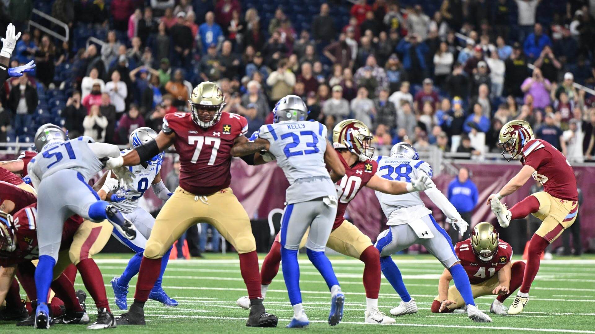
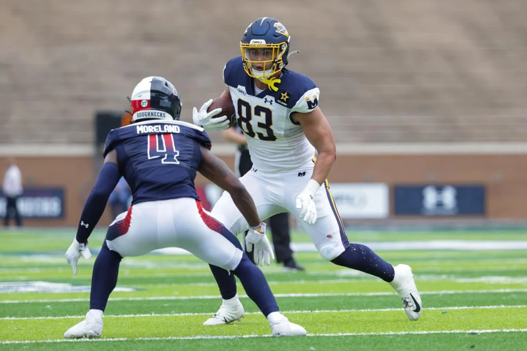
JV: The good guys won, but on the uni front, I’d have to give a slight edge to the Renegades. The only outdoor game of the weekend had periods of bright sun, which washed out the Stallions (go back to wearing gold pants on the road!). Arlington really should consider wearing these all season long. Every other team wears dark home jerseys so they could get away with it. Two more quick takes from this game. This photo shows the green and white “BT” sticker that all eight teams have on the back of their helmets. That is to honor the recently departed Buddy Teevens, former Dartmouth coach and a pioneer in promoting player safety. You also can see league co-owner Dwayne “The Rock” Johnson’s Brahma bull logo on the back of the jerseys.
PH: I’m not a big fan of the Renegades’ uniforms, per se (especially the helmets), nor do I particularly like the “broken” pants stripes. But I am a yuge fan of the light blue uniforms. I’d actually like it if they wore those against dark-jersey’ed teams, instead of against light ones. In fact, I think I prefer the uniforms of the three teams from the old USFL to the five of the XFL — with one exception which I’ll get to shortly.
Battlehawks/Panthers
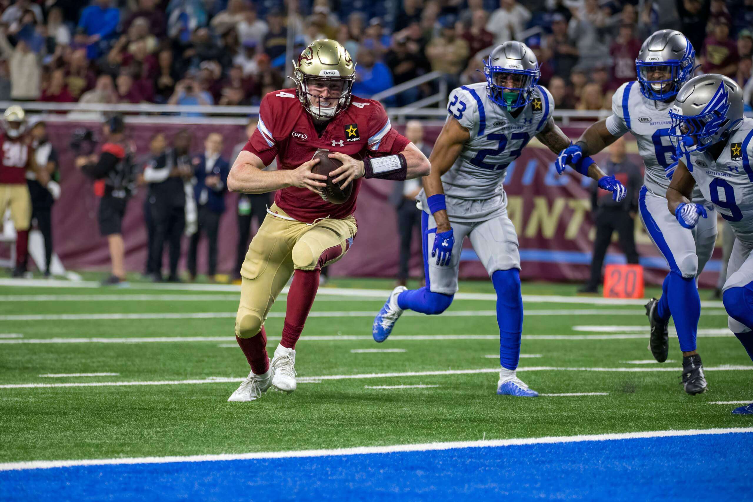
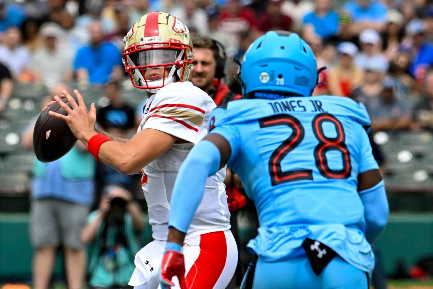
JV: This is the fourth thing I’ve recorded on my new DVR. That’s right, I finally entered the 21st century. This will be the first recording I keep forever. What a great looking game, and I really got a kick out of the ending! Readers of Sunday Morning Uni Watch know I’m a big proponent of light gray road uniforms, so that’s one of the reasons the Battlehawks are my favorite XFL holdover. My favorite USFL uniform still looks fantastic. Unlike Phil, I’m a fan of the new diagonal pants striping. You also can see the Brahma logo on the backs of both jerseys in that photo. And yes, I waited until now to talk about the elephant in the room. Every team is wearing an ad patch this year, unfortunately, courtesy of the US Army. Just like last year, when the Panthers were the only USFL team to wear an ad patch, this was an unannounced surprise. Gee, thanks (he said sarcastically).
PH: I didn’t see but a few minutes of this game, and I did see the Sixty. Four. Yard. field goal with almost no time left on the clock to win it, so that was fun. And the gold/plum/gold Panthers uni is definitely one of the best in the league. Those multi-colored tiled stripes on the pants leave something to be desired, but maybe they’ll grow on me. And unlike Nike/Fanatics’ MLB unis, at least the Battlehawks’ grays match. Every road game the Battlehawks play will be color vs. color (sorta).
Defenders/Brahmas
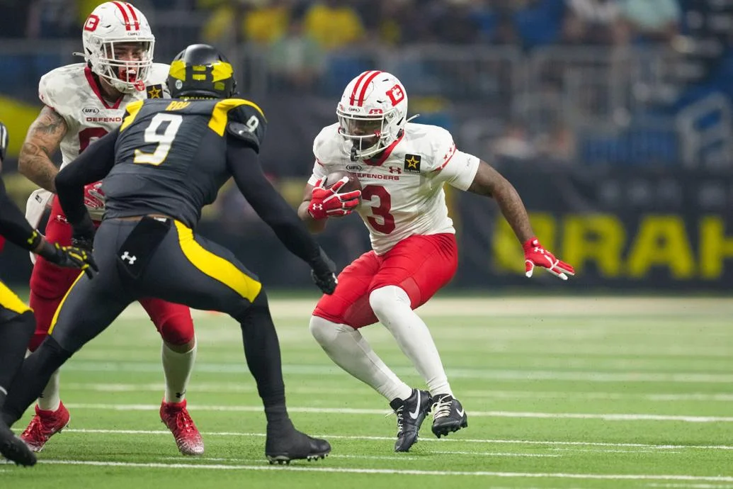
JV: Red Pants Alert! Man, those Cornhuskers…I mean Defenders look great. And so do those Brahmas. The bright yellow really pops on those anthracite unis. One of my favorite mono uniforms ever.
PH: Jimmer stole my line about the Defenders looking like Nebraska, and if there is one white-helmeted B1G team they should emulate, it’s Wisconsin. I’m not a fan of the DC roads, but at least the camo on the shoulders and helmet is almost invisible. Of course, when they play at home, DC will go white over bloodclot, which is arguably worse. The Brahmas, on the other hand, have by far my favorite uniform from the old XFL, although I’ve already said I am not in love with their weird helmet decals.
&1…Showboats/Roughnecks
JV: There’s no tip-toeing around it…if this were a 3&1 list, this would be the hands-down &1. You’re allowed to like Houston’s uniforms, but I don’t know if I can be your really close friend if you do. When it comes to uni numbers, I can’t say this too much: CONTRAST MATTERS. Sublimation is not welcome. As for the ‘Boats, Phil has two comparisons from last year’s uni to share so I won’t steal his thunder. I’ll just say I like last year’s jersey better, and this year’s pants are a lateral move for me.
PH: Because of the feeble uniform unveilings last month, we didn’t really get to see the Showboats uniforms, which have actually changed pretty significantly from their 2023 USFL kits. The pants have a new striping pattern and if you look at that link closely, you’ll see the yoke extended further down the back of the jersey, so that the NOB was in white letters on the blue yoke in 2023, but now NOB is in blue letters below the yoke. I like that the stripe is thinner, but I’m still not sure about the triangular yellow atop the blue on the new pants. But the NOB below the yoke is an upgrade. And all I’ll say about the Roughnecks is that is the WORST. UNIFORM. in the UFL and it isn’t even close.
PH: Yep. I think the merger actually portends a brighter future than if the two leagues had tried to compete simultaneously. I just wish the teams from the old XFL, with the exception of the Brahmas, were of the same high quality of those from the x-USFL. YMMV!
What say you guys?


If we keep trashing the new Nats roadies, perhaps we can
bullyprevail upon the front office to change them back.Ultimate example of “fixing,” something that wasn’t broken. Change these uniforms back, bring back the red “Walgreens logo,” alternate. you have white, grey, navy, red, that’s your uniform set.
As if that generic Nats road uni isn’t bad enough, that pic has to be the worst top/pants grey mismatch I’ve seen so far.
GTGFTS
Game 7 of 1964 World Series
15 October in front of 30,364 in Busch Stadium I.
Hector Lopez facing Bob Gibson to start off the 7th.
Cards win the game 7-5 and the Series 4-3 in a 2:40 affair to end the Yankees 3rd dynasty.
Nats fan here. These roadies make us look like a minor league team. My wife noticed the mismatched grays immediately, and understood it was not good.
They should just make the outgoing CC cherry blossom look our roadies — is a beloved look here and a break from the dreadful direction Nike is taking us.
May have just been my settings on my TV. But, the Cubs solids grays appeared to have a steel blue shade in the game last night. First time we have seen the new gray jersey.
Appreciate the strong pinch hitting, Phil. I know the real life stuff was nowhere near easy last week.
My sister was at the Panthers game and she texted me about the patches. I was a bit surprised to find there was absolutely zero official mentions from the league or teams about the “jersey patch partnership” or whatever. It’s almost as if they don’t want to draw attention to it….
In their 38 years in Montreal, the Expos changed their uniforms twice. Not a good look for the Nationals.
GTGFTU is 1984 – Week 13 – Memphis Showboats at Oakland Invaders. 5/19/84
My first thought was the 1985 Semifinal in Memphis (which turned out to be the last game ever for the original Showboats), but comparing footage from both games, those stands are definitely from the Coliseum, which was a lot emptier than the Liberty Bowl was in the playoff game.
That was my first thought too.
I think the Houston Roughnecks should flip the gradient on their pants stripe and make the socks red, along with making the numbers solid red
There is no polishing this turd.
Could they “improve” the worst uni in the UFL with your suggestions? Absolutely, but it still look crappy with *any* gradient. Fixing the numbers and making them solid is just a start. They really should blow this uniform up and start again.
Or…
They could revert to their 2020 look, which wasn’t great, but miles ahead of their 2024 unis:
link
link
link
Better than the current junk being worn, but not awesome.
Serious question for people, is anyone actually watching the UFL? Like, does America really need a spring football league? Full disclosure I really don’t watch American football, but I have to imagine even ardent fans are a little football’d out after the season? I know for the sports I do like, I enjoy having a break from them.
Being someone who misses the 14-game NFL season, you’d think I’d be football-ed out this time of year. Instead, I’m excited for the UFL. And close to a million people joined me in watching.
Even when I still enjoyed the NBA and MLB in the 80s, I was into the USFL big time.
Obviously the ratings and attendance aren’t as good as the NFL, but no one is suggesting they’re on the same level of play. It’s a developmental league. If they stay in their lane and don’t make the same mistake the original USFL did, they’ll be a solid niche sport for a long time. Hopefully they’ll stay with a 10-game schedule and not expand too much.
Fair enough. I’ve watched a fair amount of Dominican Winter League since it started being included with an MLB.TV sub so I get it in that sense, taking it as a developmental league.
I was an original USFL watcher in the ’80s and I’ve had my ideas about what spring football should be like ever since, so I’ve tried to follow every attempt. Remember that league that folded in 2008 after training camp because it had tried to cover an investment shortfall by gambling on the student debt market? It would have had a team in Rice Stadium, the new temporary home of the Houston Roughnecks. I would have been there for their games; I’m too broke now.
And since I don’t have cable TV, my spring sports options have been two sports I essentially don’t watch day to day, college basketball and MLB. So I need something to watch on Sunday afternoons until the NBA Finals finally appear on broadcast.
Those Oakland Invaders pants were simply superb. -C.
Yes they were.
I preferred the gold pants…home and away.
link
link
That article we had some time back imagining if all NFL helmets had standard team logos instead of designs like the Chargers’ lightning bolts could simply have cut-and-pasted the Invaders’ uniforms for the Chargers.
Thanks for mentioning the Oakland Invaders! I went to several games as a teenager, including the very first home game vs. Birmingham. I’ve still got the first program (Kickoff Magazine). And I preferred the yellow/gold pants home and away. I wish this team had been revived.
As someone who LOVES the original USFL I was also very happy that all three team won!
Just some thoughts…
– the Brahma Bull Patch on all teams uniforms is beyond ridiculous
– The Michigan Panthers are the class of the league (uniform wise…but what else really maters?)
– I really like the new pants from Memphis
– Houston can easily fix their number font debacle by rebranding as the Gamblers (like they should have in the first place)
– I hope the league is successful as a last second 64 yard FG!!!!
All the best,
-Steve
I agree with everything, especially ” the class of the league (uniform wise…but what else really maters?). ”
You, sir, Get It.
This is actually last year’s Gamblers staff rebranded as the Roughnecks, who folded and sent Wade Phillips to San Antonio.
The reason is, the Roughnecks identity was much better regarded than the Gamblers identity. Consider it recency bias. The first Roughnecks were seen by a small core of locals as a protest vote against the mayhem of the 2020-era Texans, whose bizarre self-destruction at the hands of a team pastor was not yet national news but sure as hell was driving locals crazy. The Gamblers, conversely, were a story (and protest vote) from 40 years ago. They were far from the most popular USFL team in their day.
The second Roughnecks team, at least, had Wade Phillips.
So how do we fix the uniforms when the Gamblers, old and new, were clearly superior to the Roughnecks? The Roughnecks could have slapped their logos over the Gambler’s G, but I guess changing to black would have obsoleted the Roughnecks’ merchandise out there even worse than changing from red & royal blue to red & navy blue.
Spring football is a great background soundtrack to outdoor yardwork. Now with the Monday Morning UFL…ill be watching more. Excellent work!
Well, unless Paul picks it up or wants Jimmer/me to have it as a sublede to one of Paul’s Monday posts, this was probably a one and done.
Remember when This Week in Pro Football with Summerall and Brookshier would be on syndicated TV the following Saturday morning?
link
I’d be up for bringing back that vibe. Phil and I just need to get some red blazers and host a Saturday This Week in the UFL.
I hope the Roughnecks revert to their 2020 look next season, if there is one…..Heck, I wish ALL the old XFL teams would return to their 2020 looks….
why is it a “sin” for the pants and jersey to be different hues but for a very long time hats and jerseys haven’t always been the same hues
I agree with several of the comments and also from Steve. As an original (1983-85) USFL fan, I was overjoyed to see the return in 2022, and I was really getting into the new versions (logos, uniforms) of the original teams, with the exception of the new Memphis Showboats. I still think the red/silver of the original Showboats was/is superior to the new navy/yellow-gold of the current iteration. In fact, if you substituted red and silver into the new uniform set, you’d have a very nice looking uniform, even with the yoke (not terribly a fan of that).
I found it disappointing that even though you had 4 teams from each spring league included in the merger, that the Houston franchise (even though taking the coach and players from the Gamblers), choose the XFL Roughnecks instead of Gamblers (essentially having an unbalance of visually 5 XFL and 3 USFL teams). With just a little tweaking, the 2022-23 Gamblers would be far superior to the Roughnecks awfulness of gradient numbers, weird helmet design, etc. I’ve never been a fan of non-mirror helmet design, such as numbers on one side and the logo on the other. From a design standpoint (and yes, I’m a 30+ year graphic designer/illustrator), it is poor design at best.
Love to see, if the league expands 2-4 teams in the near future, a return of some of the USFL franchises that the new USFL/FOX, to my understanding, have secured or have played, including Chicago Blitz, New Jersey Generals, Philadelphia Stars, New Orleans Breakers, etc.
Bring back the Gamblers moniker and logo, Darryl Johnston!
Houston Gamblers with the Black/Silver/Red look is 100% better looking than the Houston Roughnecks ode to Texas! Agree with anyone that says too much gradient going on in Houston
The Roughnecks won out, in my opinion, because their fans rode hard for them. The Gamblers never played in Houston to make this a real debate among paying fans. Fix the numbers and make a one color helmet with the H logo, and the Roughnecks look fine. If enough uniform stock is exhausted, then maybe they fix this ugly set.
I know the original 1980s era Memphis Showboats uniforms aren’t necessarily masterpieces ( link ) but they are so much better than the current blue “shoulder board” ensemble with the manual can-opener logo ( link .) I understand the USFL 2.0 had a problem with too many red uniform teams but they should’ve just taken the original Showboat uniform set and turned it blue rather than overhaul everything. This doesn’t feel like a USFL team at all.
The Houston Roughnecks entire uni set is a mess. And while I love the Arlington Renegades blue there is too much of it for my taste. They ought to invert the pants to black with a bold blue (or red) stripe to create some contrast.