[Deputy Editor’s Note: With family issues still taking up most of my days, and Paul on a much-deserved vacation, our own Anthony Emerson has stepped up to the plate with today’s lede, recapping the big uni news from MLB’s (continental) Opening Day. If there’s anything we missed, our apologies. Feel free to note any Opening Day observations down in the comments. Enjoy! — PH]
MLB’s 2024 Opening Day Uni Watch Recap
by Anthony Emerson
Happy baseball season. After a Spring Training that was more uni-eventful than last season, we have plenty to talk about.
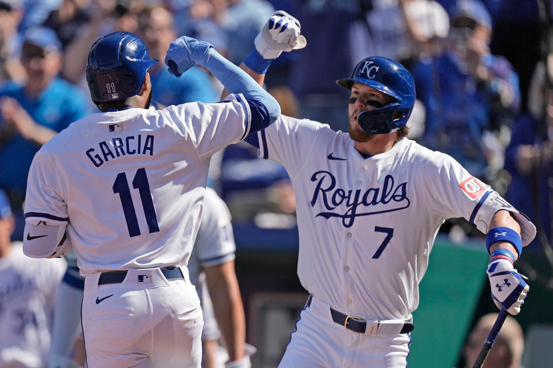
In a surprising and disappointing move, the Royals will be going with Nike’s micro-names after all. As you may recall from Paul’s reporting a month ago, the Royals apparently lobbied Nike and MLB to keep the traditional NOB size. But here we are, Opening Day, and the name size has been reduced. One has to wonder if there was an order from the commissioner’s office mandating that change.
It appears that the smaller NOB lettering has affected Salvador Pérez’s captain’s patch, too.

That C looks pathetic, but not as pathetic as the Nike and MLB suits who foisted this upon an unsuspecting baseball public.

The other big story coming out of Opening Day was the multiple shades of grey teams ended up wearing. Almost uniformly, as you can see above, the grey jerseys did not match, although some teams looked worse than others. We had known about this back in Spring Training, but I don’t think we realized that every team would end up being affected. I think lighting will play a big factor in how obvious this mismatch is, which I suppose is fortunate, but I’d prefer if this wasn’t happening at all. I’m gobsmacked — you’d think with months to plan, they would’ve worked out a kink like this before Opening Day.
It also appears that the new “lighter” jerseys are much more prone to becoming visibly sweat-stained.
THE WAY JUDGE LOOKIN AT SOTO 😭 pic.twitter.com/c8LFcGCNcy
— chris kreider respecter (@jonmoxIeys) March 28, 2024
Our thanks to @sdv231 on Twitter for sending the above video our way.
Other notes from Opening Day:
As you can see from the above tweet, the Yankees debuted their new road uniforms. They appeared to be less affected by the mismatched greys, although you can still kind of tell.

The Nationals debuted their new road unis as well. What a downgrade.

The Diamondbacks wore their new white primary unis with red caps for their opener.

The Rangers debuted their gold-trimmed unis. I’m really not digging the hat — the logo’s just a bit too gold, no?
The team’s championship banner leaves something to be desired, though.
Look, a World Series banner is always better than no World Series banner.
But as far as World Series banners go, just taking MLB's we-made-one-for-everyone championship logo and slapping it on a white field is incredibly lazy.
Anyways, congrats to the Rangers. pic.twitter.com/sSxzPRHhWL
— Chris Creamer | SportsLogos.Net (@sportslogosnet) March 28, 2024
The Padres debuted their Peter Seidler memorial patch. It was absent during the opening series in Seoul. The logo was also mowed into the field.

The Red Sox did not debut their Tim Wakefield patch, in a surprise. The team had announced that the patch would be worn “throughout the 2024 season,” but perhaps they only meant on the home uni.

Reader “DJ” sent in the following: “During the Tigers-White Sox game, Sox radio broadcaster Len Kasper indicated that the Sox would not be wearing their ’83 fauxback uniforms on Sundays this season, and would be wearing their white pinstripes ‘a lot more.'”
Finally, the Orioles did not add a memorial patch for former owner Peter Angelos, who was technically still owner at the time of his death last week. In perhaps less surprising news, the team also didn’t add a patch for the victims of the disaster at the Francis Scott Key Bridge. The team did introduce the new ownership group with the previous NOB style. Perhaps the team was trying to get rid of leftover stock.
— Britt Ghiroli (@Britt_Ghiroli) March 28, 2024


I was watching the Angels-Orioles game yesterday and I noticed that the Angels had a white outline on their front numbers but not on the back numbers. Weird…
The Nats uniforms are so bad, they look like unofficial merchandise from the bargin bin at Marshall’s or TJ Maxx.
I also agree with Chris Creamer about the World Series banners being bad, but the only thing worse is not having one.
link
The new Nats roads are so, so bad. To my eye, they specifically resemble the kind of uniform you’d see on late 1970s/early 80s episodic TV dramas. Like, there’s a plot involving an athlete on The Rockford Files or Magnum PI or The Greatest American Hero. The costume/prop people make maybe two full uniforms with cartoonishly not MLB lettering for an on-field scene, and then scenes with other players than the weekly guest star take place in the locker room without jerseys on or in a hotel lobby in civvies.
You can see from the batterman logo placement that the Orioles owner jerseys are pre-2024 shirts, so using the old lettering makes sense.
And how bad is the overall new Nike jersey design? Not quite bad enough to ruin the excellent new Yankees roads. I’ll have to get off my “But the Yankees have pretty bad uniforms, actually” hobbyhorse. The new road is a quality uniform, almost good enough to overcome the mediocrity of their home. It pains me to say it, but the Yankees are now a top-half uni quality team, maybe top ten.
“To my eye, they specifically resemble the kind of uniform you’d see on late 1970s/early 80s episodic TV dramas. Like, there’s a plot involving an athlete on The Rockford Files or Magnum PI or The Greatest American Hero.”
This is the best analysis, and sums it up perfectly.
The Greatest American Hero
Loved that show, but hands down the worst baseball uniforms I’ve ever seen on a TV show. In the episode “The 200mph fastball,” the red and yellow Oakland Mets have numbers literally peeling off the backs of certain players.
Some day when my DVD player gets fixed, I may do an article on that episode.
Yeah, that might be an all-time worst. And in my imagination, the production folks actually make at least one “hero prop” version of the fake uniform that looks OK for the weekly guest star to wear in close-ups. But GAH skipped that entirely and basically safety-pinned sheets of paper printed with jersey graphics to plain jerseys, as one can see in this episode-concluding closeup of the actual series star:
link
So GAH didn’t even bother to make one good-looking prop uniform; they just had everyone in the episode wear costumes that would embarrass a high-school drama teacher staging “Damn Yankees” on short notice.
Of course, props in general were comically poor on GAH. I loved that show – I still have both the actual theme song and the MAD Magazine parody lyrics more or less permanently stuck in my head – but a high-budget production it was not.
The white Nats alt reminded me of one of the shirts Kirk wpre in ST:TMP – same malaise era time frame you mentioned above
it’s Nats inaugural season bad.
“Hey, let’s remove all the personality and make it as generic as possible.”
They probably forced the Royals to change the names so other teams won’t ask for normal sized names. If I was an owner I would go NNOB rather than micro names.
We’re looking into the Royals NOB situation. If there is any new information about this, I’ll provide an update later today.
In addition to the Royals micro names; what’s with the double digits being so close to each other?
This is another Nike design staple. Klay Thompson’s #11 for the Warriors and Julio Jones with the Falcons (previous uniform set) are especially egregious examples. Along with open 4s, Nike seems to like 1s without serifs, and they smash the 1s together.
Baylor football had a player wearing 11 and from a distance he looked as if he was wearing 1.
Absolutely pathetic.
This is very disturbing to me. The fact that a team has to fight for a font size 9and ultimately loses) is absolutely pathetic. Get some balls, and get this changed somehow. These uniforms all across the board are hideous. That D-backs jersey looks like cheap sears pajamas from the 1970’s.
I really liked when the Royals went back to the thick blue band around the sleeve. They looked similar to their original uniforms. Now it just looks like two toned sweatband cuffs, terrible.
Screw the NOB font
The Nats look terrible
The Diamondbacks look good wish they did that with the gold trim instead of the teal
That Broncos mock up looks TERRIBLE
Do we really need a patch for the Baltimore bridge victims? Come on.
…wow…
What a weird take
Should MLB wear a patch when six people die in a drive-by shooting? When five people die in a house fire? When four people die of covid?
WHAT IS THE POINT?
People died and this also has significant implications for the 15,000+ people that work in the port which is inextricably linked to the city.
I included that note because the Twins wore a patch for one game after the I-35W bridge collapse in 2007: link
The Orioles observed a moment of silence before their national anthem Thursday to acknowledge the tragedy.
Yes. JFC.
The worst team of all with the gray unis were the Angels. The coloring has always been slightly off IMO, but now it looks like garbage. Also as you have already reported slightly, the front of the uni has blue AND white outline, but the back is just blue. Nicely done.
I thought the Royals fought the smaller NOB’s????? Did they get the MLB/Nike back-hand?
As I said above, we’re looking into this, and if there is any new information about the NOB situation, I’ll have an update.
I posted this as a comment on Facebook, but I’ don’t know if it’s monitored so I’ll try here. Im wondering if anyone knows why the sleeves on the Guardians’ jerseys last night weren’t all uniform. Some had the sponsor patch on the right sleeve, and the logo patch on the left sleeve, and vice versa. Seems peculiar.
This is standard protocol (only the Rangers and Blue Jays veer from it). The ad is placed on a player’s “front facing” sleeve — meaning if they’re a right-handed batter, the ad will appear on the player’s left sleeve (and vice versa). For pitcher’s, the ad goes on their glove hand
link
link
The reason for this is to maximize the ad’s exposure when shown on TV. Right handed batters have the ads on their left sleeves, lefties on their right sleeves
link
Switch hitters (like Francisco Lindor) will actually have the ad on different sleeves, depending on the starting pitcher.
link
link
The damn red sleeve patch on the otherwise nice Royals unis is such an eyesore. Ugh-o-rama.
I hesitate to ask this, but what’s so bad about the Nats’ road set? (getting ready to duck under my desk to avoid flying objects)
And finally, we may all “hope” that’s not the Broncos’ new set, but it appears pretty accurate based on what we’ve heard. My God does that uniform blow. The white on white numbers on the pants, with no fing stripes, triggers me in particular. Puke-ation.
I think a lot of us are just partial to the curly W and it seems like the Nats are phasing it out.
Nooo! I love the Curly W. My brother got a curly W tattoo after they won the World Series.
This is just speculation, but based on the above, the Red Sox may be debuting the Wakefield patch at home and wearing it both at home and on the road after that. That’s the way it reads to me anyway.
I’m so glad baseball isn’t my favorite sport. I feel sorry for those of you who love it and have to deal with this mess.
Counting down the days until Manfred retires and Nike’s contract expires. Until then, bring on the UFL and the Indian Premier League.
I watched the Red Sox/Mariners game, and the Sox gray didn’t seem to be that far apart, if at all. I wonder if playing in the sun makes it look worse I also watched part of the Angels/Orioles, and the Angels looked horrendous.
Nats road uniforms look great. What are people so mad about? Yanks removing the white outlines & sleeve trim was a big upgrade too.
Larger note: The kerfuffle about the Nike/Fanatics template seems so silly in hindsight. The narrower piping around the buttons & neck is a nice throwback-ish look. The new belt loops and collar trim look fine (they’re all more for function than form, anyway).
I do wish the sleeve trim wasn’t uniform across the league. Same complaint I have with NFL “sleeves”. I get why Fanatics & Nike push for it: Templating makes manufacturing jerseys quicker and cheaper. I wish the teams and/or leagues would push back on it nonetheless.
These are takes.
I wonder if the Orioles might be waiting a minute on a bridge collapse memorial because the bodies of most of the known victims have not yet been recovered. In a day or three we’ll probably know whether the bodies of the remaining presumed-dead bridge workers will be recovered quickly, or whether that will be a grisly element of the larger channel-clearing salvage operation over the coming months. But right now, on like day four, I would personally be inclined to wait a moment while we’re in a state where most of the surviving families don’t have their loved ones’ bodies to bury.
Mariners pinch hitter Dylan Moore’s “headspoon” stripe was visible through his white pants as he walked up to bat. (He still hit a 2 run bomb.)
Was watching on TV.
It was not a still shot with “extra lighting.”
I know y’all kinda put this issue to bed after it was determined to not be a new thing, but it still looks super tacky.
Thoughts?
Looks like Zac Gallen got a new snakeskin belt for this season:
link
Haven’t seen any other custom belts with a number that large, although it appears to be Nokona, which many other player have also worn.
I’m so upset the Red Sox for rid of the hanging socks sleeve patch!
The visible sweat making the Yankees uniforms darker reminds me of the stomach area on College football uniforms that was visible darker as the game progressed.
Over the years one constant is how much Uni-Watch hates the Rangers. Never a nice word about them.