
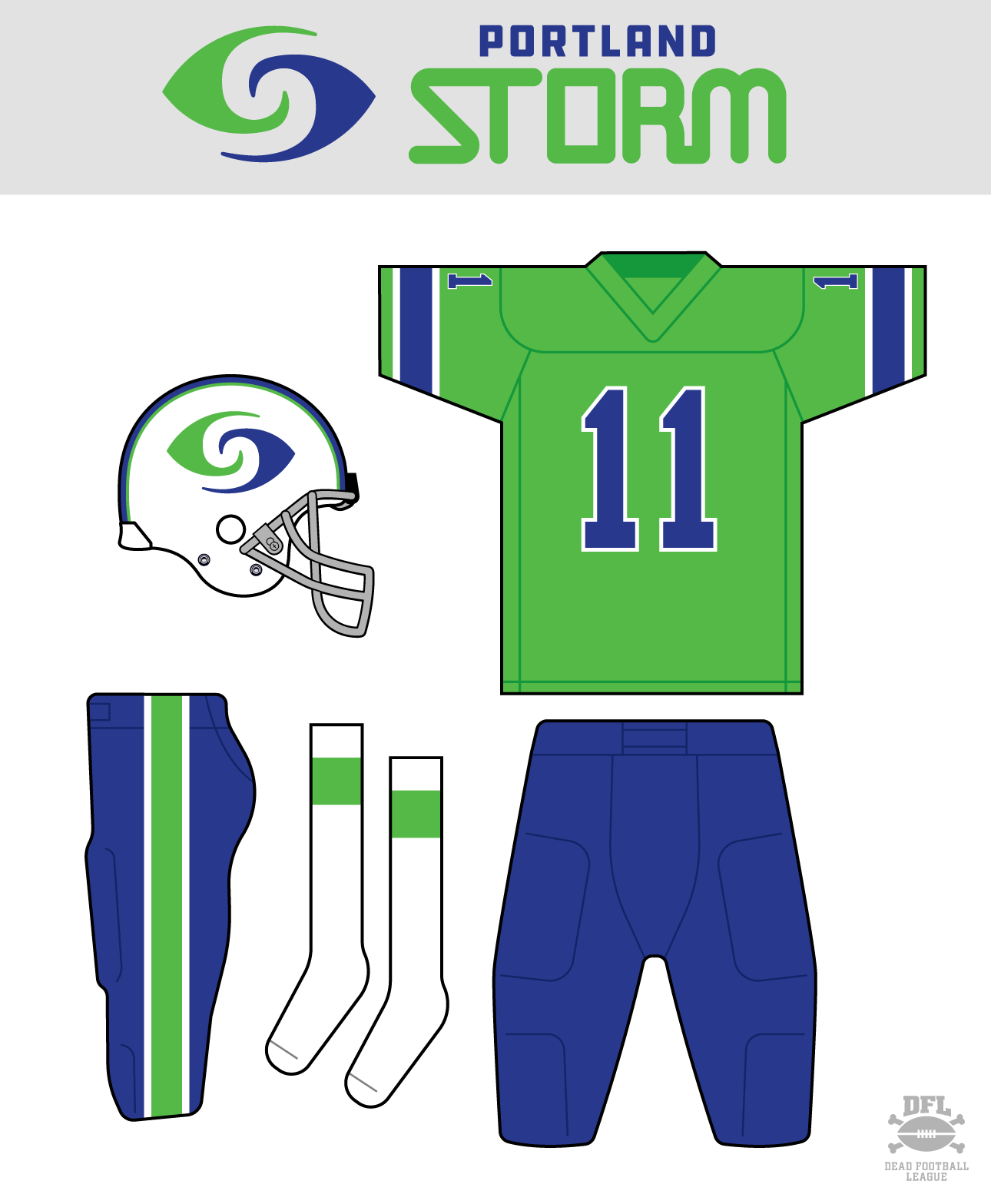
Good Sunday morning Uni Watchers. I hope everyone had a good Saturday.
Last weekend, I resumed my “Gone But Not Forgotten” series, when I took a look back at the 1991-92 Orlando Thunder, a team from the defunct World League of American Football. I’d been wanting to write about that for a while, as I was enamored by the bright shade of green the Thunder used — and as I was researching that, I remembered another team from a defunct league — the WFL — who also took the field wearing a similar shade: the 1974 Portland Storm.
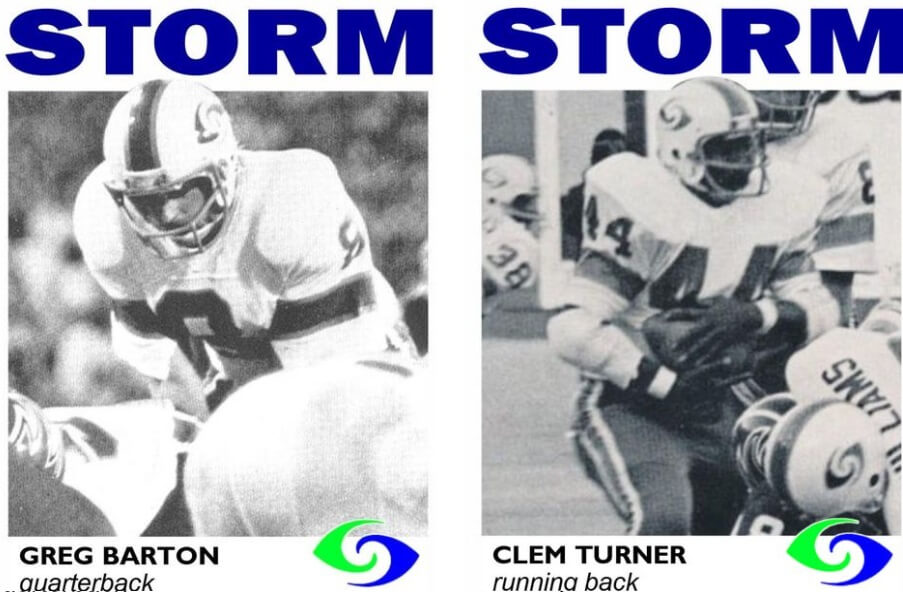
As many of you know, the WFL lasted one and (about) a half seasons, playing a full schedule in 1974, and basically declaring bankruptcy and folding mid-season in 1975. The Portland Storm were considered somewhat of an afterthought for the WFL, and they were the last franchise created (out of 12) for the 1974 season. This left them little time to construct a roster, and as a result there were very few “stars” on that squad.
According to the excellent World Football League website, “The Portland Storm suffered through an identity crisis in their first WFL season. More competitive than the lowly Detroit Wheels, more consistent than the streaking Chicago Fire, the Storm struggled through a season of losses, major upsets and thousands of empty seats at Portland’s Civic Stadium. When the WFL ended their inaugural season the Storm was held together by pride, determination and the will of Coach Dick Coury and General Manager Ron Mix.” That entire article is worth a few minutes of your reading pleasure.
But this being Uni Watch, we’re not concerned with the lack of stars, poor financial condition of the team or the league, or any of the other colorful factoids surrounding the WFL’s rise and fall — we’re concerned with the uniforms. And in this regard, I always thought the Storm had a great one.
The Storm rebranded after the 1974 season to become the Portland Thunder — but that team darkened their green substantially — so this article will focus solely on the 1974 Storm. I’ve also asked pal/contributor Jimmy Corcoran to add his own perspective following the rundown, as he was either on the sidelines or the stands of every Philadelphia Bell home game (Jimmy’s father, as most of you know, was King Corcoran, who QB’ed the Philadelphia Bell in the WFL). And Jimmy of course was present when the Storm visited the Bell in 1974 (which just so happened to be the first WFL regular season game for both teams). Jimmy’s part is awesome, so please do read that after the first half of the article.
Let’s take a look at the Storm’s 1974 uniforms.
Helmet
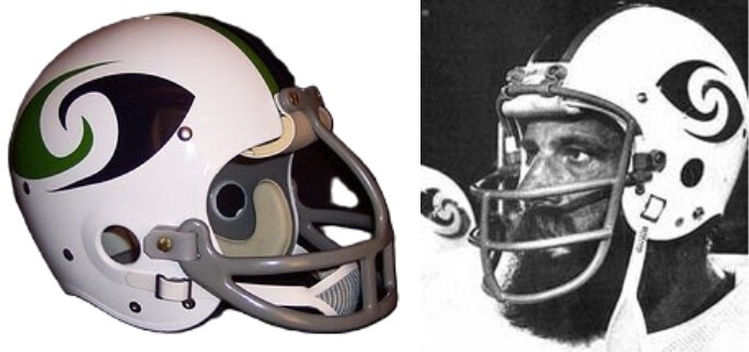
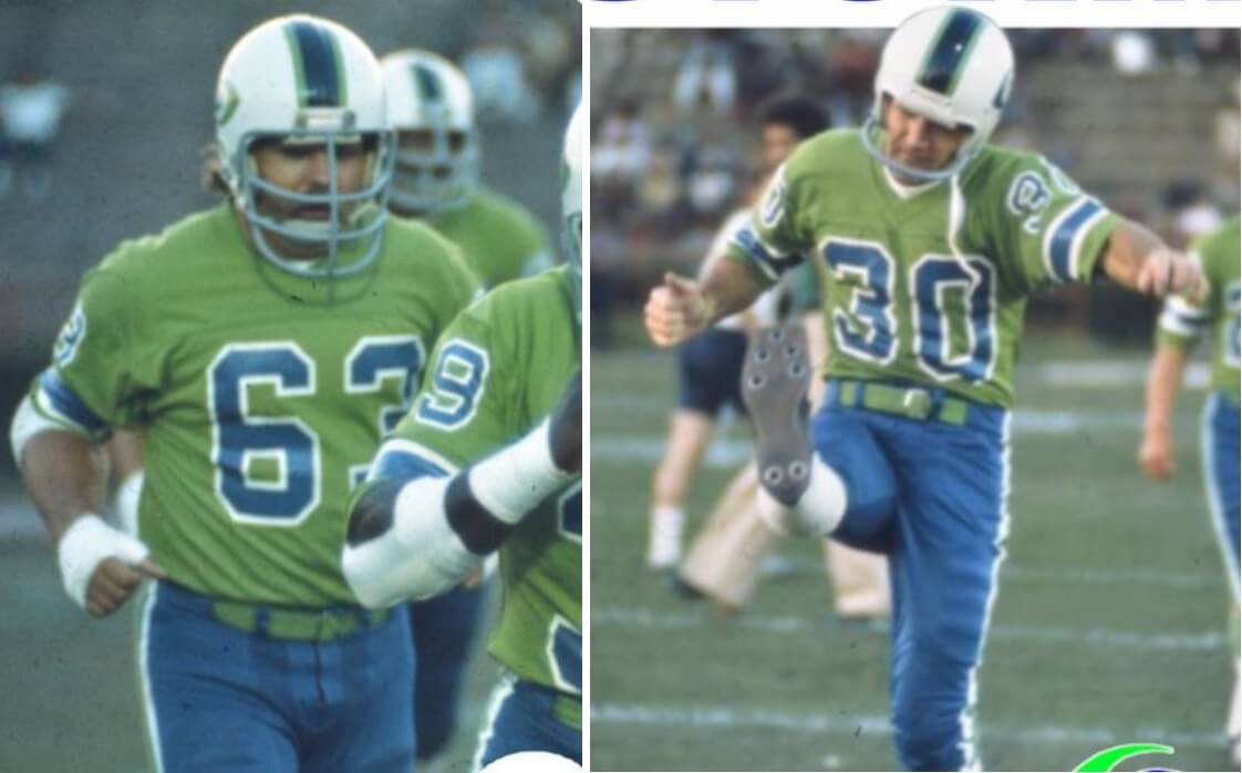
The helmet was white, with a blue/green logo resembling a graphical depiction of a hurricane, with a thick blue stripe surrounded by two thin green stripes running across the top. You can read more about those helmets here. The helmet shown in the graphic above is a reproduction; I’ve yet to find an authentic helmet anywhere — which could be due to the fact that when the team became the Thunder for the 1975 season, they simply repurposed the old Storm helmets.
As a weather buff, I’ve always loved the Storm logo, although I always questioned why the team would use a hurricane-esque logo when they were situated in the Pacific Northwest — an area that pretty much never sees traditional hurricanes (although they certainly do experience some wild weather and occasionally storms with hurricane-force winds). But for those who know weather, the logo perfectly conveys a “storm.”
Jerseys
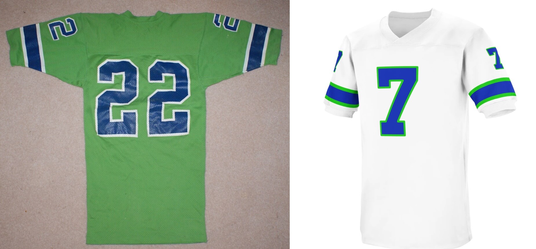
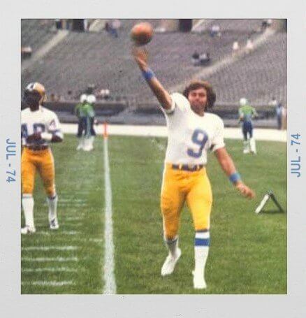
As some of you know, WFL teams wore light colored jerseys at home, so the white jersey on the right was actually the team’s home look. Whether or not the WFL took a cue from Tex Schramm of the Cowboys, who famously declared the team should wear white at home, so fans would see a plethora of opponents color jerseys, is unknown, but that meant if you went to a WFL game, your home team would always be dressed in white (or light). So, the Storm’s home jersey wasn’t spectacular by any means, but the road jersey was something to behold.
Both jerseys were fairly basic, featuring block numerals and sleeve stripes. Road jerseys were a bright green, with blue numbers outlined in white, and with white/blue/white sleeve stripes. The rear of the home jersey contained NOB in blue block lettering. The reverse of the green jersey featured white block NOB. Of course, like many WFL teams, the Storm jerseys didn’t have NOB at the beginning — those would be added as the season progressed.
Pants and Socks
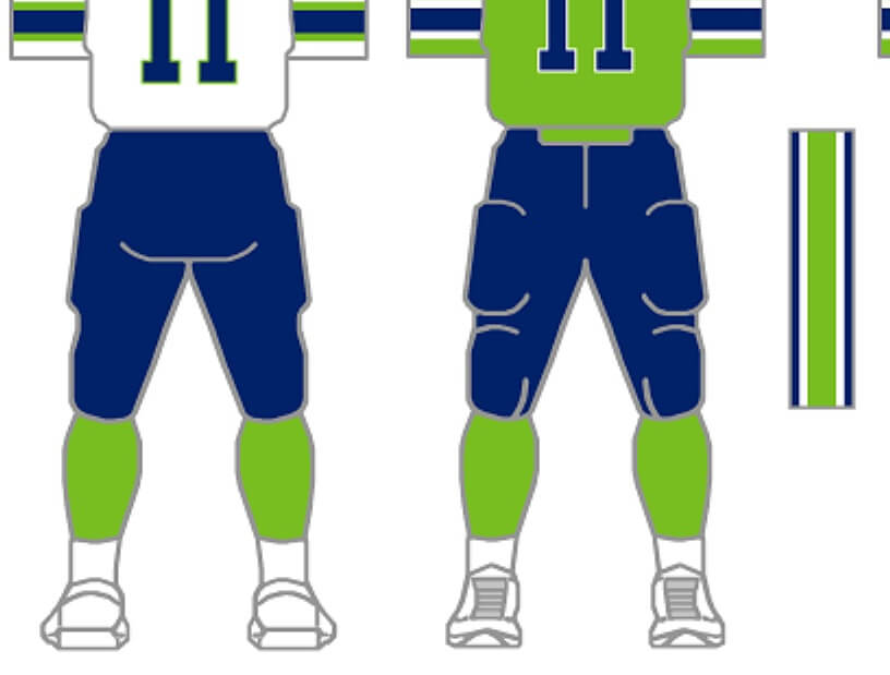
The Storm wore dark blue pants with both home and road jerseys. They had traditional striping, in a white/green/white pattern. Undersocks were bright green, worn with low whites.
Put it all together (especially with the road jersey) and you had quite the striking combination — not unique, but certainly rare in sports, and one of the attempts by the WFL to differentiate itself from the much more traditional color combinations of the NFL/AFL. When you saw this uniform…you knew you were watching the Portland Storm.
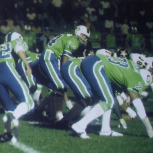
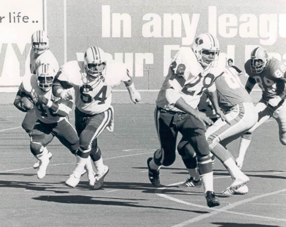
Here are a few more looks at that white/green/blue/green (although many players wore their low whites quite high) combo:
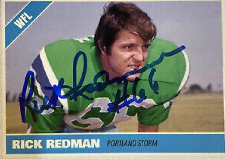
[UPDATE: Jimmy notes the photo above of Rick Redman is actually a ‘photoshop’ of him wearing a San Diego Chargers uniform! Some commenters noticed the discrepancy between jerseys and thought it might have been a prototype.]
Beautiful! I’m actually not normally a fan of green and blue together (especially in almost equal proportions) on a uniform — but I love this look, probably because the green is more of a “neon” shade than a hunter green. In fact, when the team rebranded to become the Thunder, they substantially darkened the green on the uniforms.
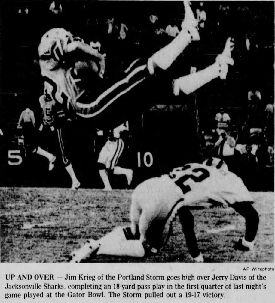
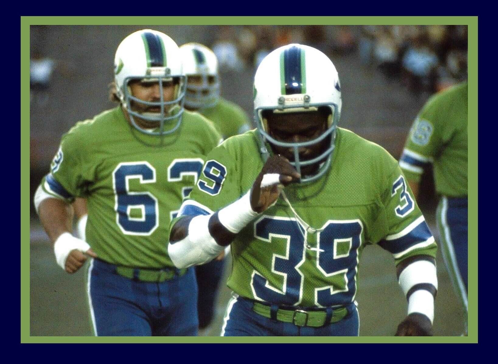
Unfortunately, very few color photographs exist online of the Storm, and I’ve only come across a single color photo of the team wearing white tops (remember, those white tops were only worn in Portland), and it’s very low res.
Here are a few b&w shots of the team in their white jerseys:
Like the rest of the WFL, the Portland Storm are gone, but they’ll never be forgotten.
Portland Storm Uniforms
by Jimmy Corcoran
When Phil told me he would be doing a piece on the Portland Storm and wanted to know if I was interested in adding a few paragraphs of what I remembered about their uniforms, I said sure. I know Phil doesn’t care about what team had star players or what the attendance records were in the WFL, he is only interested in the aesthetic of the uniform and whether the stripes, colors, helmet logo works or not as a uniform. I was interested to see what he thought about the uniforms of the Portland Storm.
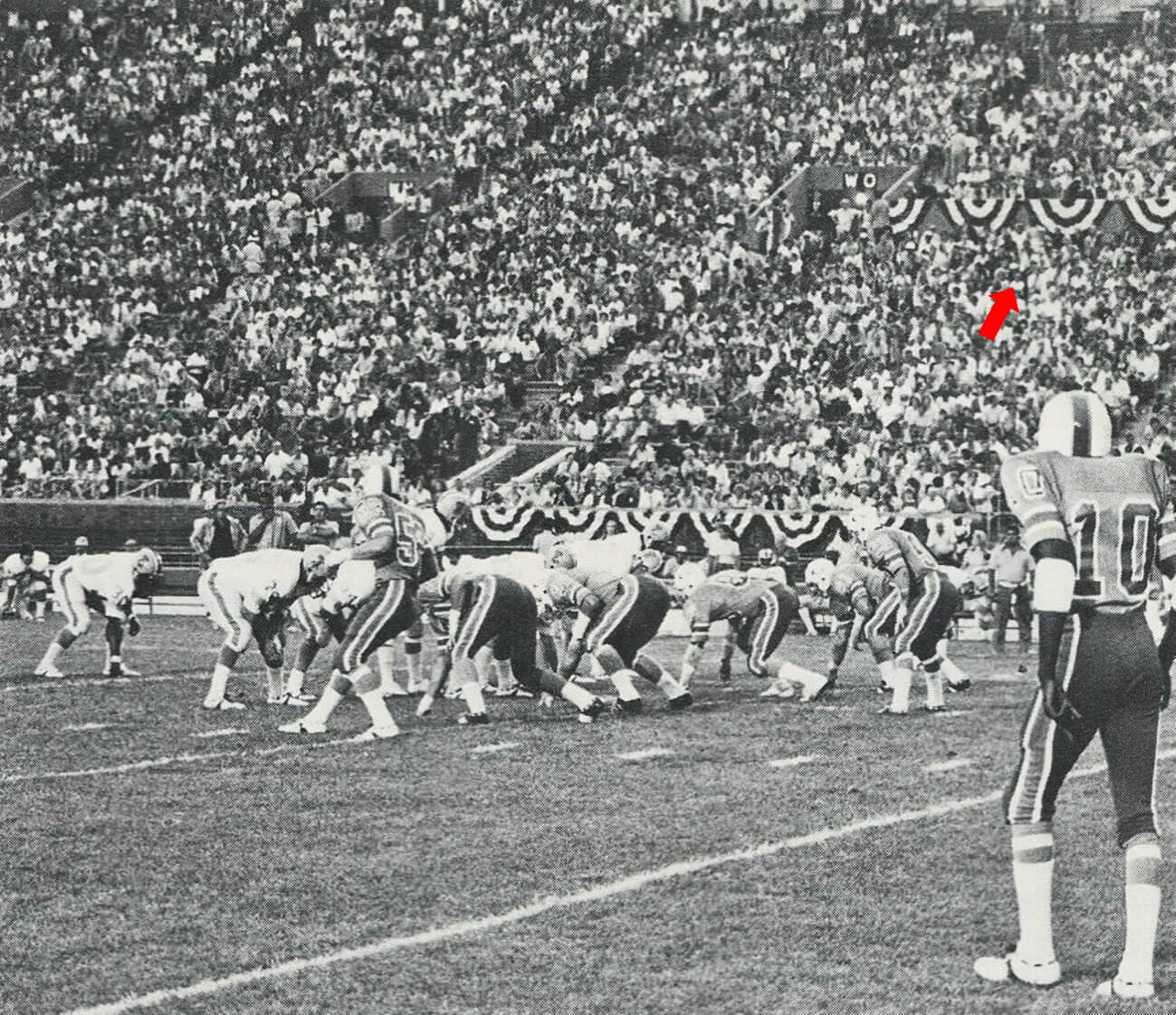
I saw the Storm play on July 10th, 1974. This was the first WFL team I saw in their game uniforms. I saw the Blazers and Stars scrimmage against the Bell but they were in practice uniforms.
The first thing I noticed about the Storm was they were not wearing their team issued t-shirts when they came out, they already had their game jerseys on with no pads. Every WFL team had the exact same t-shirts that were made by Champion and some teams came out early wearing these with their game pants. While my father was warming up without his helmet on, he was loose and talking to me, he asked me, “How many TDs do you think I’m going to throw against the Storm?” I said “Four” — I always said four because I knew he liked to hear that. He said “the King may throw 5 tonight; my arm feels great.”
My father took a good look at every uniform the team against him was wearing in the WFL, some of the Storm players were coming pretty close to my father in the warmups. I don’t know if they were trying to intimidate him or just getting a close up look of this King character, the one they saw in the NFL Films movie talking on his car phone.
My father turned to me and asked me what I thought of the Storm’s uniforms. I said I thought they were kind of dull and he said “Yeah, the King is not digging on these uniforms, Jimbo.” This was the last I talked to him before the game, he goes back into the locker room, Ron Waller gives a pre-game speech where the F word is in every sentence, then my father comes back out very serious and won’t look at me.
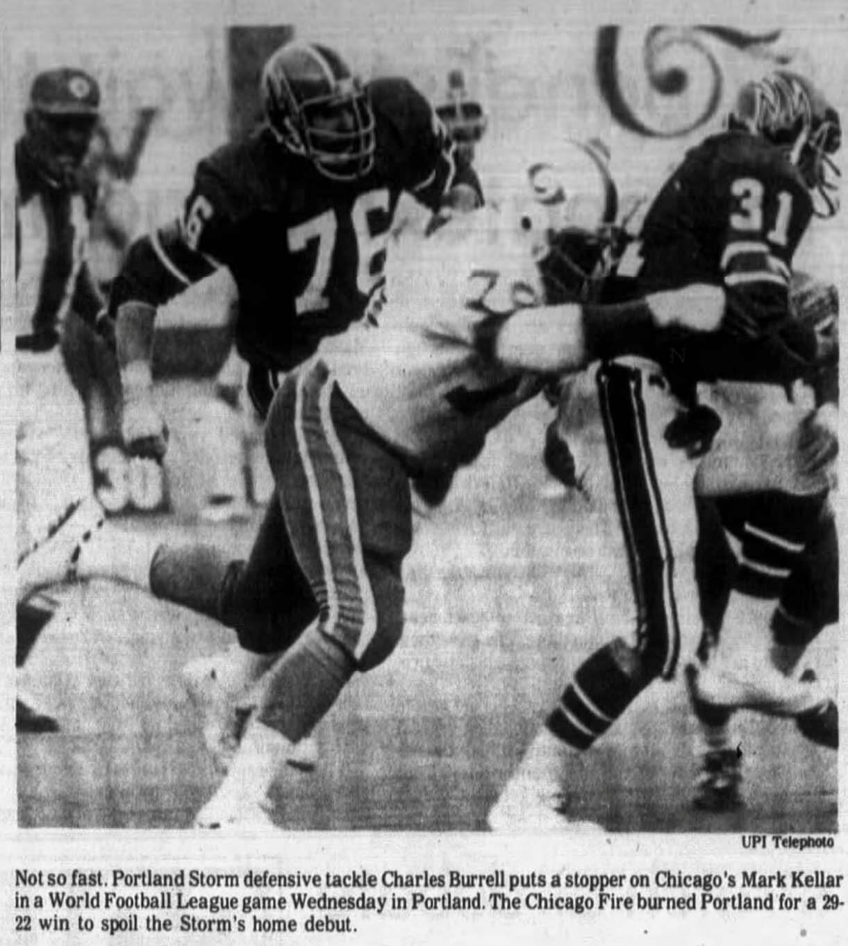
When the game started, I went off on my own and hung around the Bell 40-yard line, I noticed like the Bell, the Storm didn’t have their names on the back of their jerseys yet. If you look at the photo of my father calling signals you will notice #10 Clancy Williams doesn’t have his name on his jersey.
I later found out from Bob Colonna, the equipment manager, that the name plates from Sand Knit were not in yet. When I got a close up look of the Storm helmets, I thought they looked great, very futuristic looking for the time. It looked like it could have been in the 1975 film Rollerball. The Storm changed their uniforms when they became the Thunder in 1975 and though I didn’t like their dark uniforms, I thought the white ones looked good.
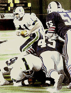
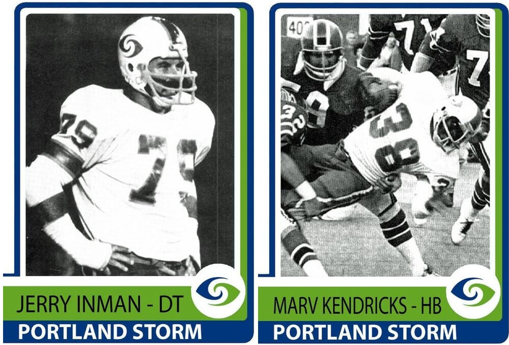
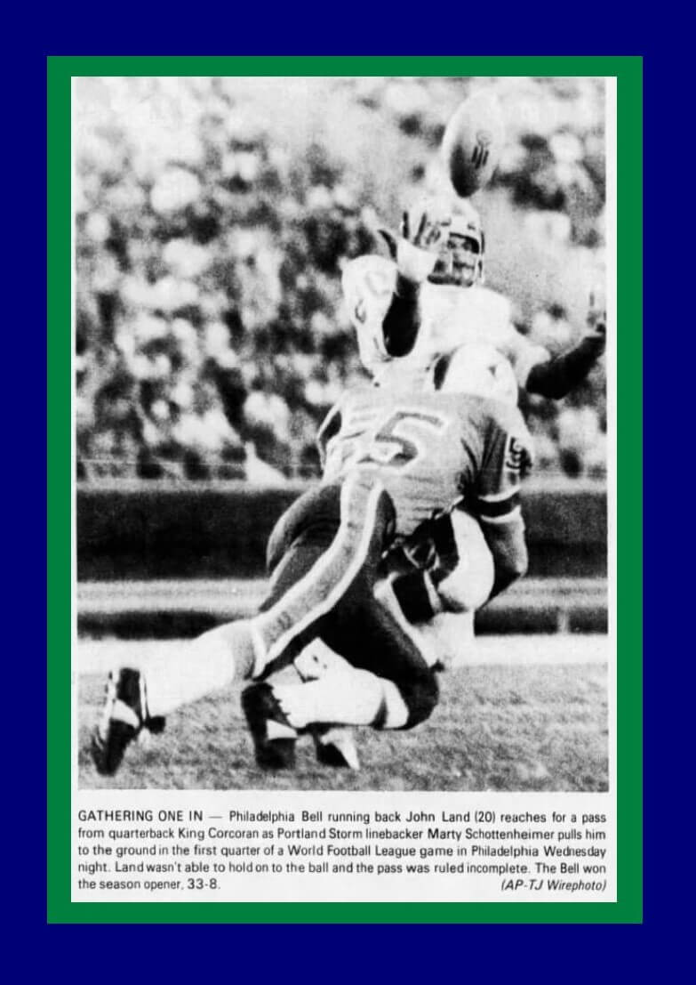
Though the Storm was not glamorous team like the Southern California Sun or loaded with NFL stars like the Memphis Southmen, their LB was Marty Schottenheimer. Here is a photo of John Land attempting to catch a pass from my father, it looks like Marty may have committed pass interference on this play.
Three years later Bell coach Ron Waller was on the Kansas City staff with Marty. Ron told me he was talking about this game with Marty and Marty said “You could have scored 100 points on us if you wanted to, we had no film of your multiple offense and had no idea how to defend it, we were always out of position.” After the game while some of the Bell players were already showered and out of the locker room, my father was still in his full uniform standing up on a bench in front of his locker holding court with the press. I went down the steps and saw my Mother and sister outside, and some of the players came over to say hi to her: she knew a lot from the Pottstown Firebirds. My Mother said “Where is he? I’m starving,” I told her he is still wearing his uniform, she told me tell him “If he’s not out here in 15 minutes we are going back to the hotel without him.” I went over to him, grabbed his jersey and said “Mom is mad.” He told the press, “The King has to split, I forgot my wife was outside.”
Though there were no big stars on the Storm (Ben Davidson at the very end of his career), they do have a connection to Hollywood: two of their players have a connection to the movie LA Confidential: OL Allan Graf played the wife beater who Russell Crowe beats up at the beginning of the film and RB Russ Smith is the father of model Amber Smith who played the Rita Hayworth lookalike in the film.
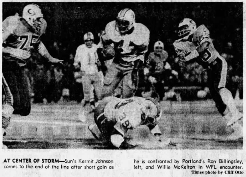
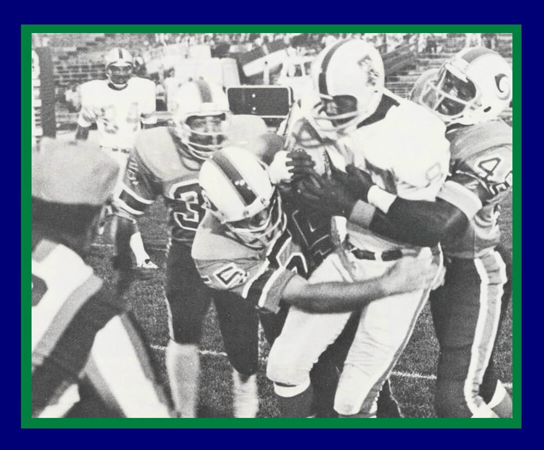
Here are some photos from the Bell/Storm game:
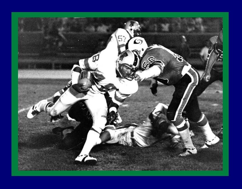
Here is Allan Graf against the Bell with the Thunder, he wore 64 in 1975 and they have him listed as 62 in ’74 but in the color photo I sent you he is wearing 63, you can see it’s his face in the color photo even though the number doesn’t match up, but they may have lost his jersey?
[As an aside, Jimmy found himself in the crowd of the Bell/Storm game — pretty amazing he remembered where he was sitting at the time, almost 50 years later! — PH]
Phil that is me with the white turtle neck on and next to me is my Mother, this is where her tickets were for every game, sometimes I would get bored because you don’t have a very good view from the sidelines, and I would go up to hang out with my Mother for a while. I had a laminated sideline pass so I could walk through that gate. After this game, the one that no one paid for, the crowds went down to nothing, I could literally yell something to my Mother and she could hear me since the section was almost empty.
Well readers? What do you think of the Storm uniforms? Bold and beautiful or dull? And do you agree or disagree with Jimmy’s


Love the S in the negative space on that helmet logo!
Yes, the “S” formed by the middle of the hurricane was really the logo’s show stopper. I am surprised I didn’t see it mentioned anywhere in the story.
I honestly didn’t see the “S” until it was pointed out! (And I love negative space logos too) — I was so focused on the hurricane (and one could also argue two waves) aspect, that S didn’t pop out.
It’s almost like those ambiguous art images (ex: link).
Like, I totally see the duck, but not the bunny. Same thing here.
Hey, it’s happened to me too. For years I never saw the negative space arrow in the FedEx logo!
Exactly what I wanted to say!
The problem with the large logo at the top is the artist focused on the blue and green elements and not the consistent thickness of the S (as you see in the photos).
Great story on the Portland Storm! As an 8 year old, the Storm games were my first taste of professional football. Rufus Ferguson was their star running back and I remember his high stepping into the end zone. I was crushed the day I read in The Oregonian that they were folding. At that age I didn’t understand the business side. I still have a Storm sticker on my bedroom door in my childhood home.
Rufus the roadrunner Ferguson!
Note that the helmet stripes in the game photos were the reverse of what was described early in the article.
Ugh. Yes — I noticed that when I was proofing, but forgot to change it. Now fixed (thanks)
Rick Redman is wearing a jersey with hoop stripes instead of the cuff stripes worn by the rest of the team. Is this a prototype uniform?
The bright “Grass Green” color of the Storm is evocative of the shade worn by the Hartford Whalers. A little warmer than Kelly Green.
I noticed that too. Also, the jersey numbers are white instead of blue. I may like Redman’s jersey better.
Good spot — I kinda like the UCLA-esque striping better. It had to be a prototype, because (thanks to Jimmy’s previous research), all (or virtually all) of the WFL teams used the same Sand Knit template for their jerseys (link)
So this must have been a prototype. Interesting!
Wheaton!
link
The Rick Redman football card is a San Diego Chargers jersey that was photo shopped into a Portland Storm jersey. I think the Storm would have looked good with white numbers, but they would have needed some blue trim.
Great pull Jimmy.
The article has now been updated with your photo of him in SD Chargers uni.
Here’s a link so folks don’t need to scroll up:
link
Great detective work!
Hey Phil,
Take care of your family first. Don’t worry about the blog. We can wait.
Totally agree with this.
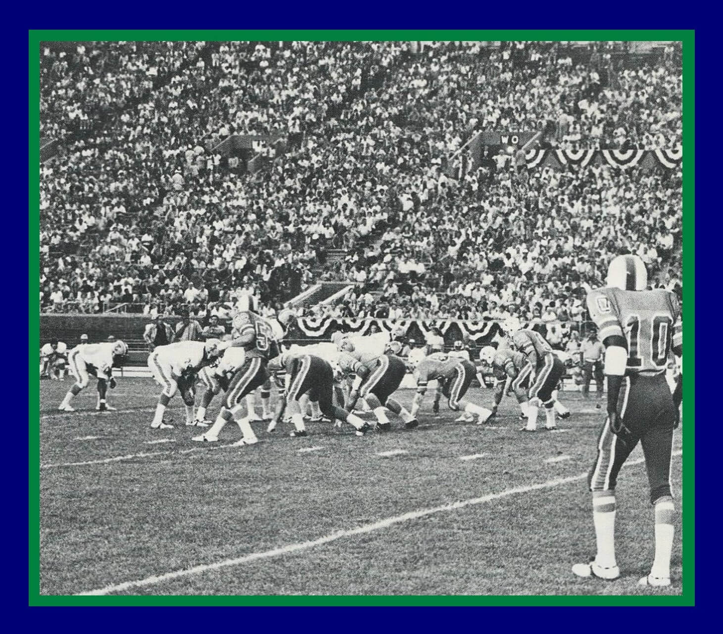
Nice WFL picture, we have Danny White and #44 Richmond Flowers in the same photo. Flowers was expected to compete for a gold medal in the 1968 Olympics but was injured and didn’t qualify at the trials.
Great looking team, that Portland Storm was.
Love the Jimmy C. stories as well!
My favorite WFL uni was the Chicago Fire, but the Storm and the Florida Blazers were second.
I’m sure Phil will have a feature on the Chicago Fire sometime this year, the 50th anniversary of the WFL.
King Corcoran sure loved him some third person references!
It drove my mother crazy, thank God you never had to eat dinner with him Patrick, kids would eat over and he would say pass the salt to the King. The King needs some more soda etc. They would ask why does he talk so weird? Add to that he spoke in 1970’s slang well into the late 80’s
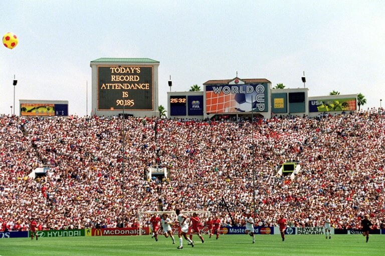
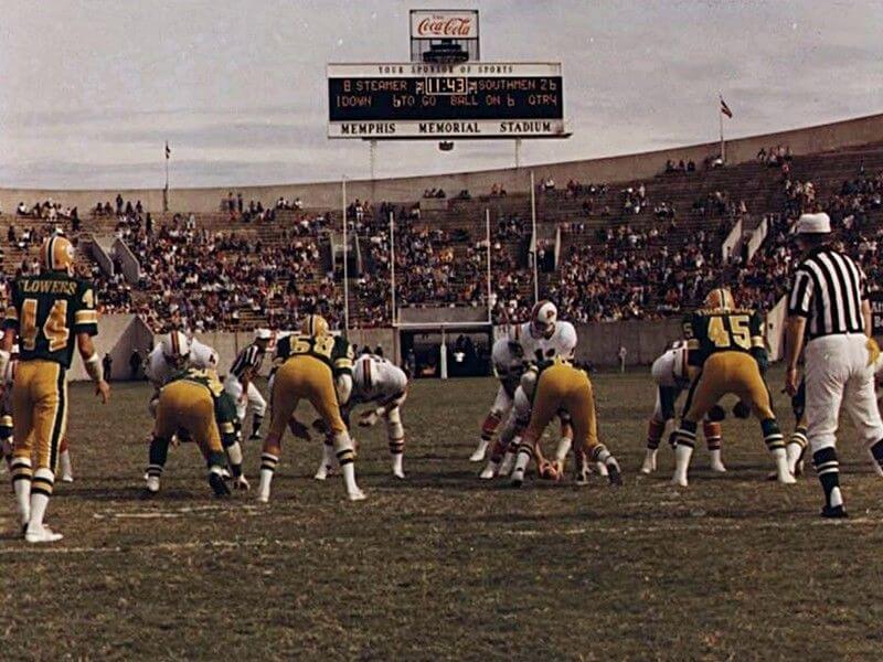
I have a couple of partial guesses here – on GTGFTS, it looks like a 1994 FIFA World Cup match (is it USA vs. Colombia at the Rose Bowl?). GTGFTU, in keeping with theme here, I think it’s 1975 WFL game at the Liberty Bowl between the host Memphis Southmen & the Shreveport Steamer.
50% correct.
GTGFTS is the 1999 World Cup Final which the USA won in a shootout against China. link
GTGFTU is correct!