Good Saturday morning, Uni Watchers. I hope you all have had a good week.
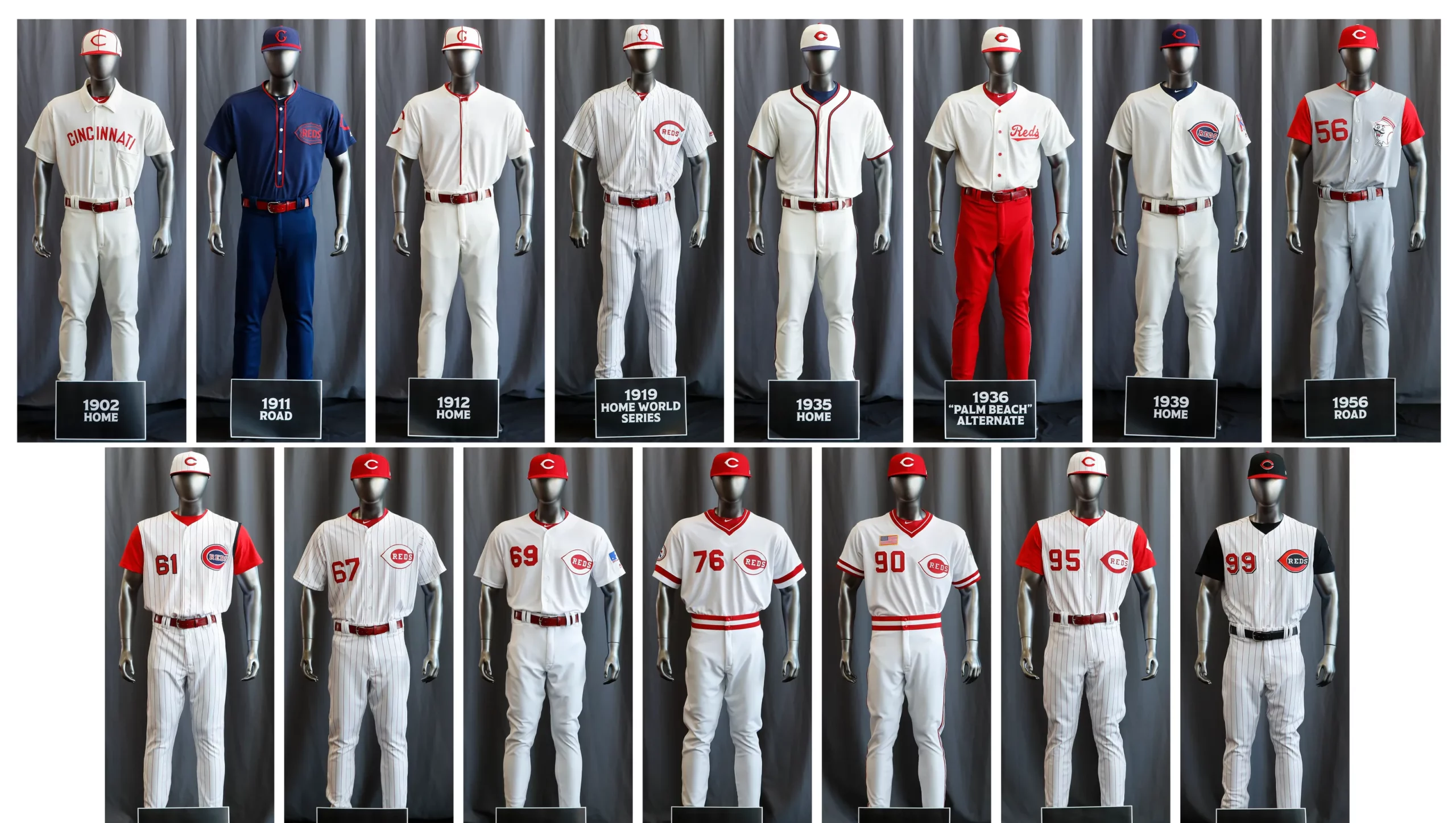
Five seasons ago, the Cincinnati Reds undertook one of the most ambitious throwback promotions when they celebrated the 150th anniversary of the Cincinnati Red Stockings — and busted out a whopping fifteen throwback uniforms thoughout the course of the 2019 season. Only the Chicago Cubs, who wore nine throwbacks in 2014 (celebrating the 100th Anniversary of Wrigley Field), have even come close.
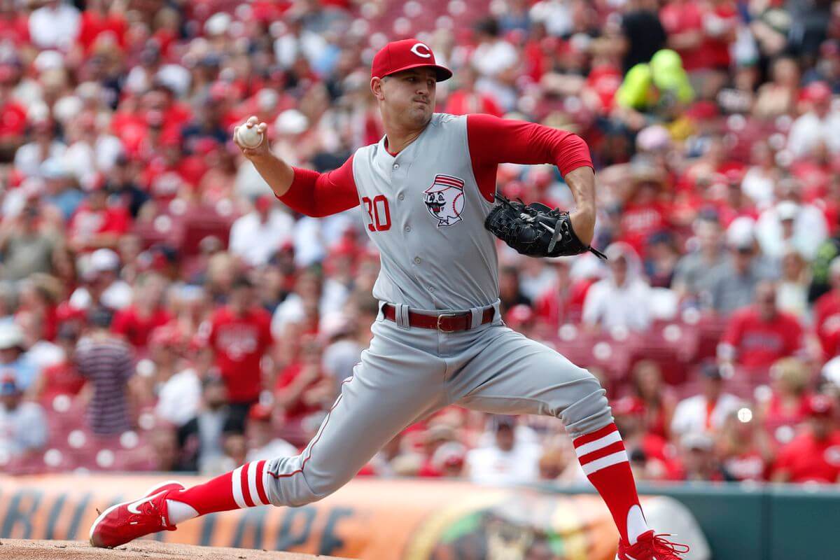
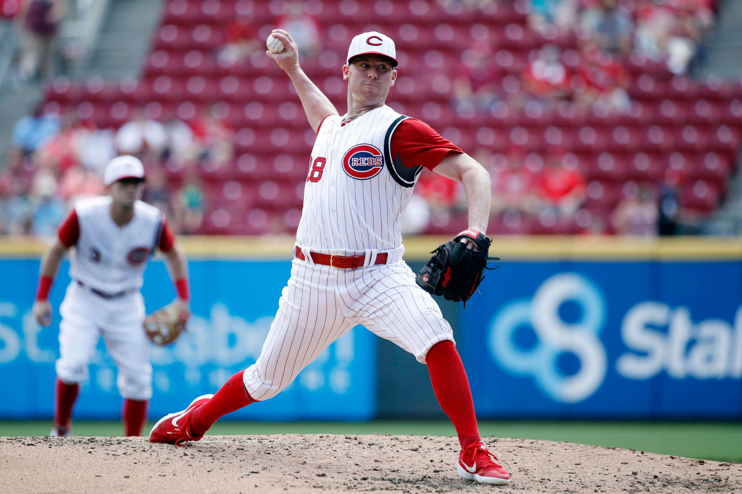
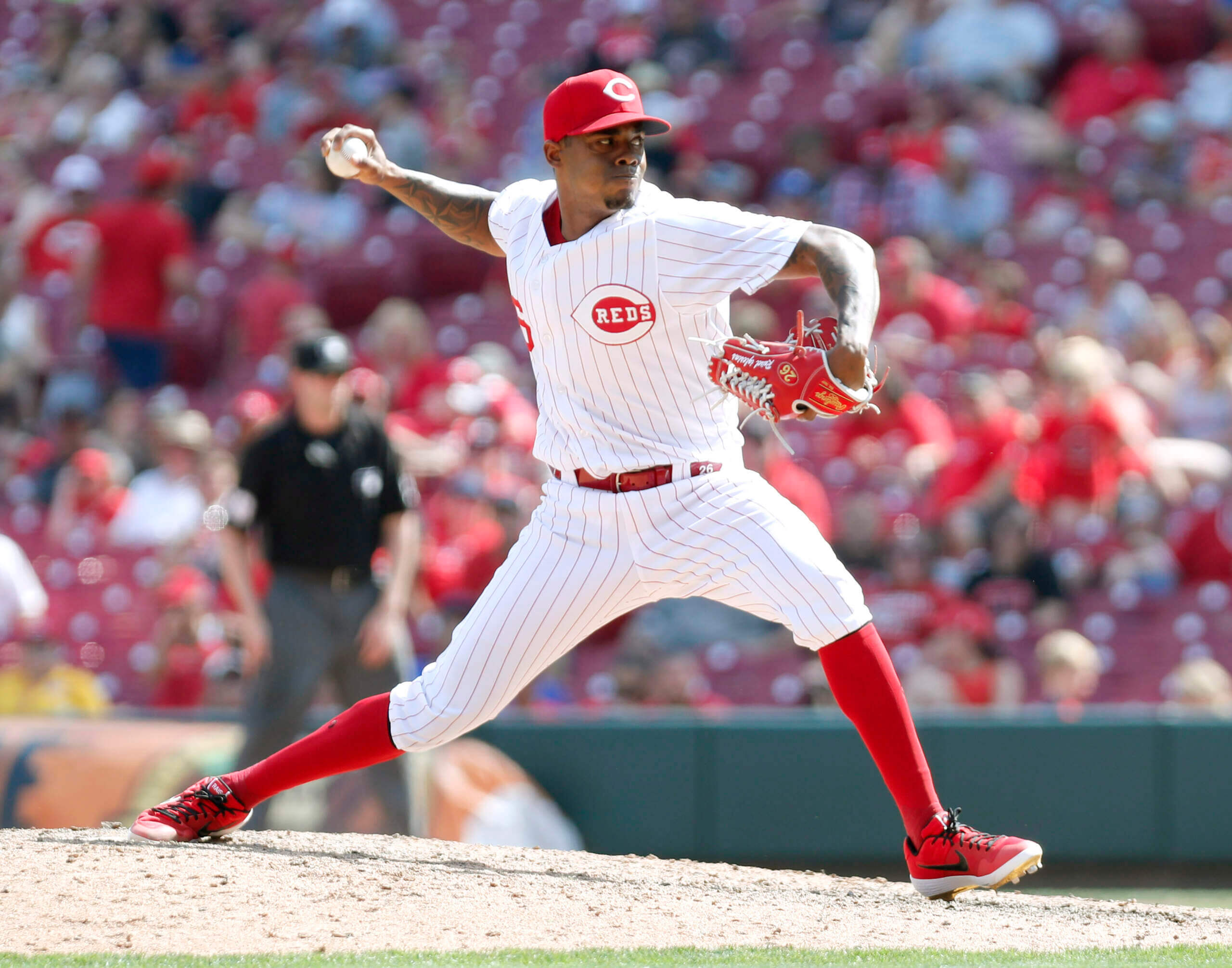
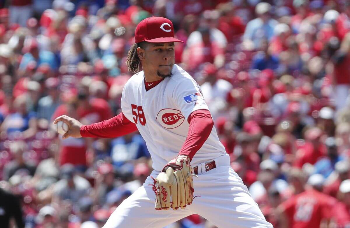
With the 2024 MLB Season underway (if you count the games between the Dodgers and Padres in Korea), and set to begin in the states this Thursday, today we’ll take a look back at those 2019 throwbacks. You can click on the year above each photo for an additional graphical look at the uniforms.
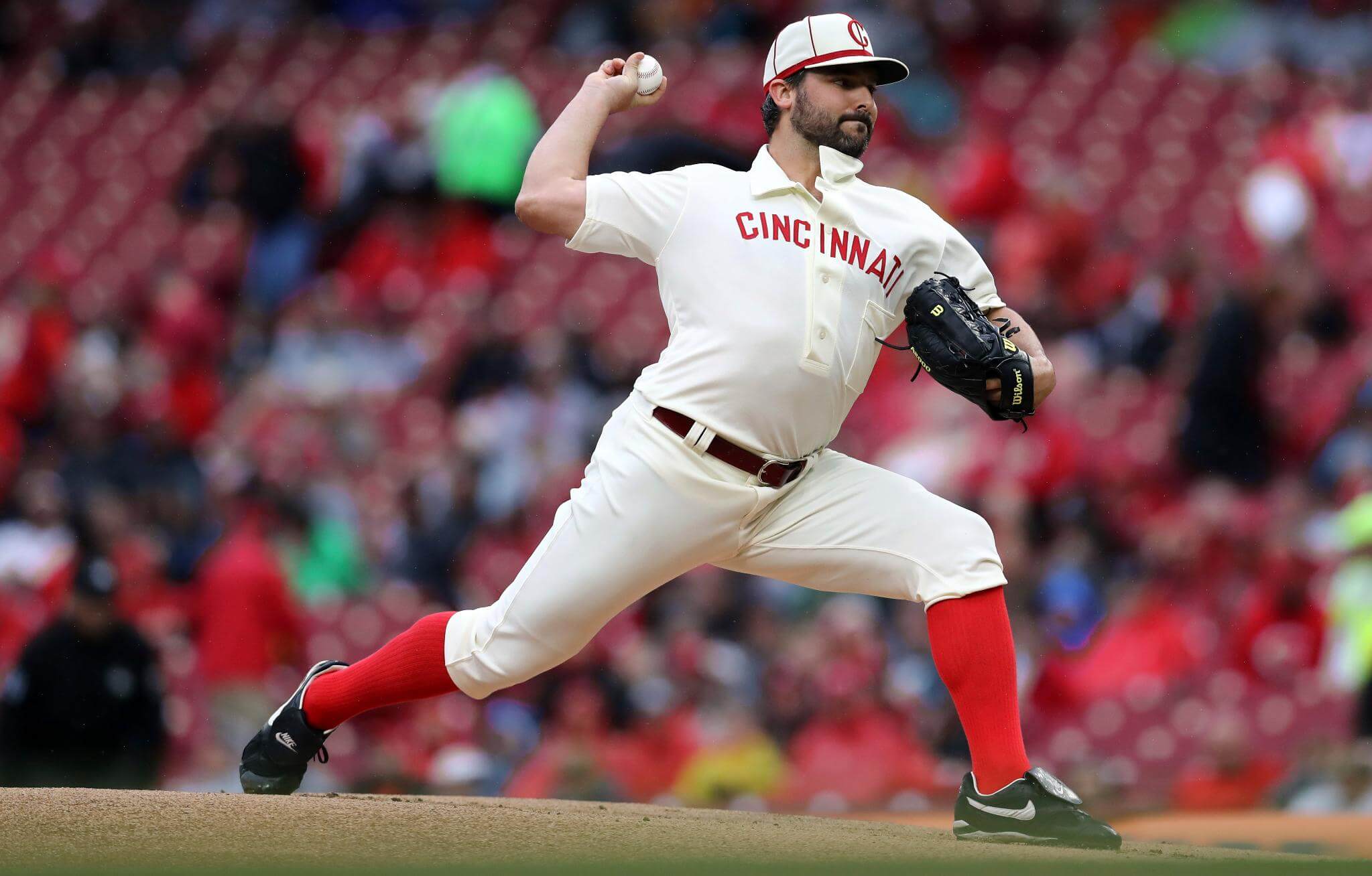
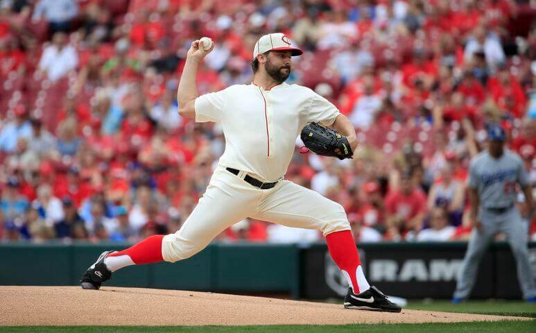
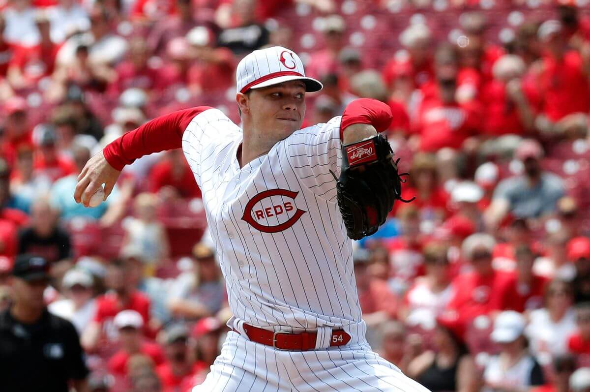
The first of 15 throwbacks sought to recreate the uniforms worn by the 1902 team. You can read more about these uniforms here. Obviously, concessions had to be made to modern tailoring, but the team did a fantastic job with these, including a full tab collar and half-button jersey. The Reds wore this uniform style during home games in the inaugural year of the ballpark that was christened the “Palace of the Fans.” I also love the front pocket on the jersey! As seems typical of throwback uniforms, they were rendered in a shade of off-white. Of course, back in 1902 uniforms did not have numbers, and obviously the cut is more modern, but overall the team did a terrific job on these. More photos here.
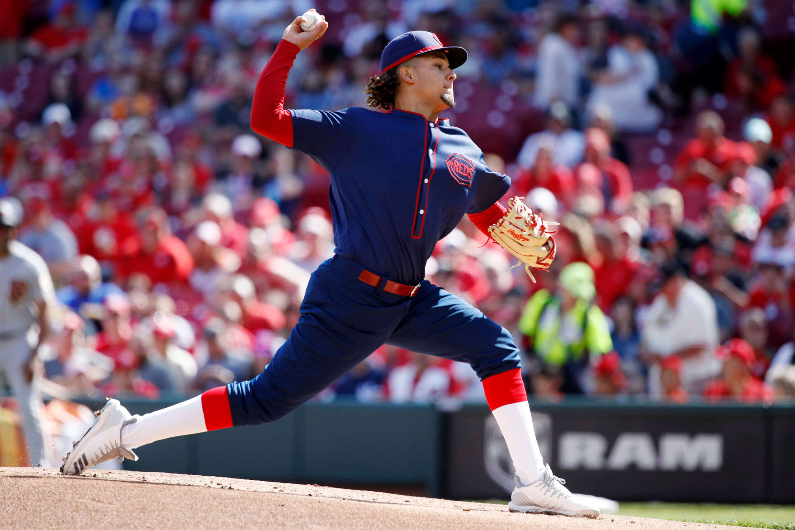
This look features a mono-navy uniform which again captured the retro feel: instead of a point-collared pullover with a pocket, this jersey featured a cadet collar. Rather than wear their home uniform, for their 1911 throwback, the Reds opted for their road look. Again, modern concessions such as batting helmets and uniform numbers took away some of the authenticity, but it still managed to successfully capture the feel of the 1911 uniform. More photos here.
This throwback was quite minimalist, and was chosen as the Reds moved into a new ballpark that season (it was eventually christened Redland Field). This featured two matching sleeve logos and little else — but of course had uniform numbers (an anachronism), rendered in what appears to be a Tiffany font — an odd choice, since the original uniforms were numberless. I’m generally one who likes plain uniforms, but these were a little too plain, even for my tastes. More photos here.
This was a recreation of the uniform worn by the Reds in the 1919 World Series, which was similar to their regular unis that season, but added pinstripes for the Fall Classic. You may recall that series. The Reds uniforms featured a great pinstriped cap, as well as a wishbone C with the word “REDS” contained within. Players wore regular red helmets for this game, but interestingly, the team reprised this same uniform for their Field of Dreams game against the Cubs in 2022, and for that game they created pinstriped helmets. More photos here.
If you thought the 1912 uniform was plain, the Reds said “hold my beer” with their 1935 throwbacks. This uniform was chosen as it was worn when the Reds hosted the first night game in the history of Major League Baseball. Whether or not this uniform was so plain due to being in the depths of the Great Depression, it would be the last time the Reds would take the field at home without the word “Reds” or a wishbone-C appearing on their uniform. More photos here.
Of all the 2019 throwbacks, this one was probably my favorite — and one of the rare instances in which a team would wear dark color pants below a white top. Dubbed the “Palm Beach” alternate, this uniform “was an attempt to offer players a lighter weight alternative to the heavily flannel jerseys that were the norm at the time. The open-weave fabric construct of the Palm Beach was designed to make the uniforms more breathable during the hot Cincinnati summers. The uniqueness of the uniform was not limited to its fabric, as it also incorporated red pants for the first and only time in club history.” The jersey also featured a small script “Reds” wordmark, which the team would reincorporate decades later on their red alternate jersey. More photos here.
For a team named “Reds,” this uniform went fairly heavily with navy blue, including a blue cap, and logo base, plus navy/red stirrups. That 1939 team — which sported the Centennial Patch — would lose the World Series to the Yankees, but were otherwise very successful on the field. The 1939 unis also featured McAuliffe number fonts. More photos here.
I had higher hopes for this 1956 roadie — a one year wonder featuring Mr. Redlegs on a gray jersey. While some players wore period-appropriate red undersleeves, a significant number opted to turn the gray vests into sleeveless muscle shirts. At least Joey Votto chose to somewhat emulate Ted Kluszewski who famously rocked a gun show look. Not everyone went completely sleeveless…but a lot of players did. More photos here.
The Reds would follow up that 1956 vest look with another vested jersey, this time the 1961 home uniform. The team began the 1961 season mourning the death of longtime owner Powel Crosley, Jr. who passed away shortly before the regular season, and ended it losing to the Yankees in the World Series. To honor Crosley, the club added a black band to the left side of their vests, which was faithfully replicated on the throwbacks. Like the 1956 throwbacks, several players decided once again to go completely sleeveless, which was rather off-putting. More photos here.
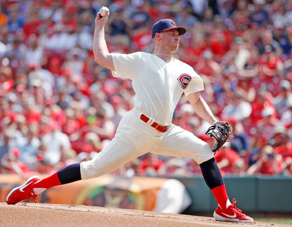
This one-year uniform was the last Reds uniform to incorporate pinstripes until the club brought them back in 1993. Despite being more than 50 years old, they don’t look out of place in 2019 (or 2024). There’s nothing particularly special about these, although they did feature gigantic NOB lettering (appearing for the first time). These were also the uniforms in which Johnny Bench made his Reds debut. More photos here.
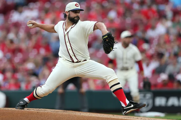
While this may not be my favorite throwback, it’s up there — and (as I’ve identified before) 1969 was a fantastic year for uniforms league-wide. The Big Red Machine was really getting going in 1969, and this button-front beauty is pretty much the perfect uniform. Really the only ornamentation is the Jerry Dior sleeve patch worn by almost all teams that season. In a rather meta moment, the Reds (in 2019) were celebrating their 150th Anniversary by throwing back 50 years to MLB’s 100th Anniversary, which was also the Reds 100th Anniversary season. More photos here.
This is probably what I would consider the Reds “Signature” uniform — and in 1976 the Reds became back-to-back World Series Champions, proudly sporting their pullovers and sansabelts. These unis still sported huge NOBs, and also featured National League centennial patches on their right sleeve. More photos here.
The 1990 throwbacks were an ode to the 1990 World Series Champions, and were basically the same as their 1976 throwbacks. The 1990 uniforms did feature a large American flag patch over the front uniform number, in addition to the 1990 World Series logo patch on their left sleeve (here’s a closeup of that patch). According to the team, “As that Series was being played, an alliance of military forces led by the United States was massing in the Middle East in response to Iraq’s invasion of Kuwait in Operation Desert Shield. To show support for the military during the Series, uniforms of both the Reds and A’s were affixed with American flag patches in addition to the 1990 World Series logo patch.” More photos here.
In 1993, the Reds introduced new pinstriped uniforms, abandoning the pullover, double-knit uniform style the club had worn since 1972. 1995 was chosen because that marked the first time since the team won the 1990 World Series that the Reds would return to the post-season. I never particularly liked this uniform, although it still featured oversized NOBs, as it seemed to try to cram several uni-eras into one uniform. More photos here.
Unfortunately, during that wonderful 2019 throwback season, the Reds saved their worst throwback for last. Both the cap and sleeves were BFBS, and both NOB and numbers had black dropshadow effects (an unfortunate element that still persists today). I’m sure some of the fans still pine for this look, but I’m not one of them. More photos here.
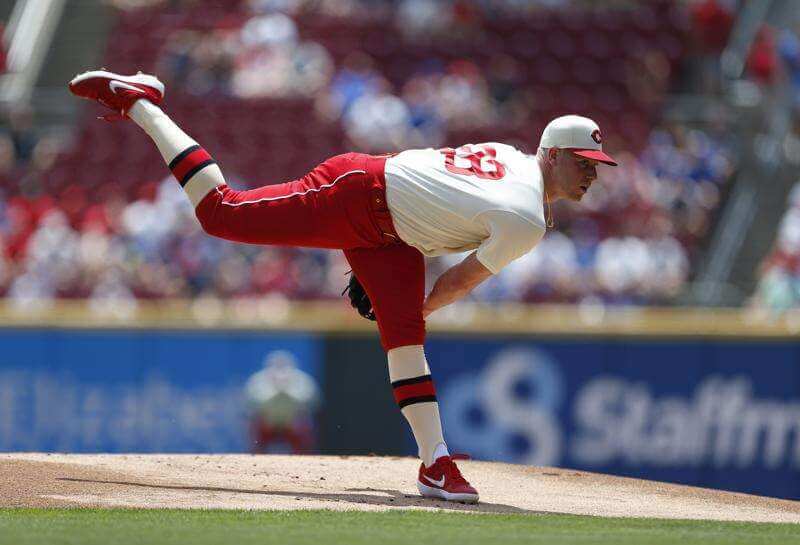
And there you have it. A look back at one of the most epic throwback seasons ever (if not the most epic), and the Reds did a very good job of showcasing some 100 (nothing pre-1900) years of uniform history — some of their early looks were different, for sure, and it was nice they attempted to give fans a wide variety of eras and styles. The choices included some absolute classics, as well as a couple of one-year wonders.
Will any team ever attempt to do as massive a throwback set as the 2019 Reds? Never say never, but it is probably doubtful with Nike/Fanatics current uniform production problems; maybe we are better off without them attempting to replicate that many prior uniform looks and styles.


They could dust off ‘67 or ‘69 and switch back full time starting tomorrow and would fit right in. Thanks for this run down after we mentioned them yesterdat
Yeah the 1967s would be great if they made it their primary uniform today.
1936s at home.
1956s on the road.
That’s all I need.
1999 was not a BFBS uniform, fo
It took its cue from the 1961 trim color. I think it was the sharpest look they wore since 1971.
I don’t mind the late 90s Reds look either, but I think black worked better on the road vests.
So wait…You’re saying black is a legitimate team color because they used it first as a black memorial stripe around the left arm hole of each jersey in 1961 for Crosley’s death? Even though they never used black before. They may incorporate it, and it’s an “official” color since it’s still used as for block shadow today, and their CC unis are obviously basically solid black (link). But I’d argue the 1999 set was most definitely BFBS.
I’ll admit I thought the color used to fill in the ‘wishbone c’ was black, not navy blue. But that’s what they copied. BFBS to me is a fully black jersey.
I long considered black a de facto team color for the Reds since they held fast to wearing black non-branded cleats (with properly proportioned stirrups) for a good part of their history…something I miss more than the vest, Mr. Redlegs, etc.
While I agree with you that the black shoes and properly-worn stirrups were a fantastic “quirk”, I cannot agree that black shoes makes black a “team color.” By that logic, every team (with the possible exception of the mid-60’s Athletics) that existed before the 70s could count black as a team color.
We can disagree on whether black is a team color (it is now, clearly), but not on whether the 1999 (and onward) black elements was BFBS. The team started allowing players to wear red shoes starting in 1986 — long before the 1999 BFBS unis began — so for 20+ years black would *not* have been considered a team color (by extension)?
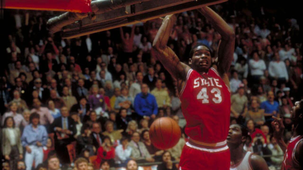
That’s the late Lorenzo Charles scoring the game winner for NC State in the 1983 NCAA finale. (Lorenzo attended Brooklyn Technical HS, my alma mater.)
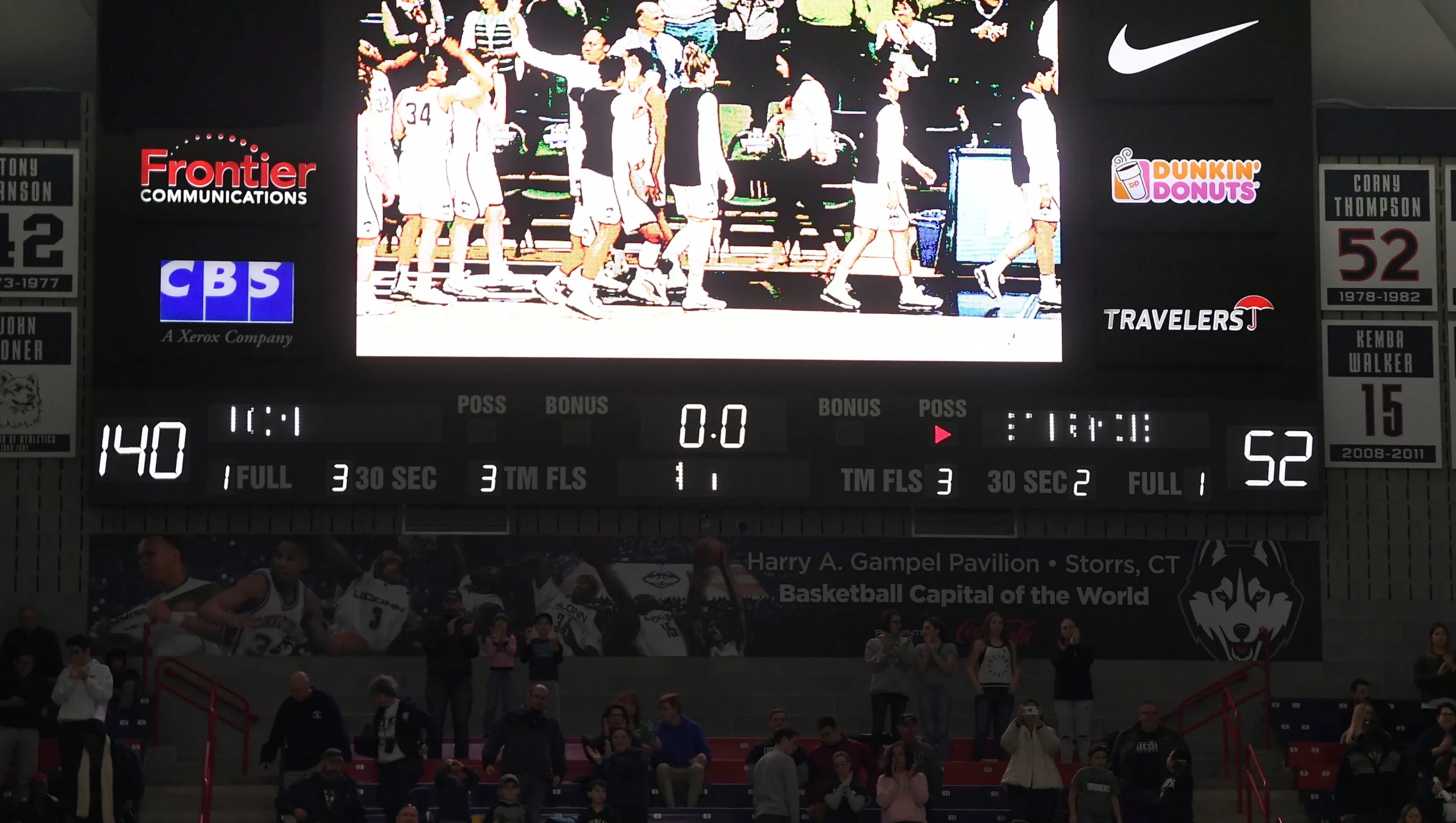
Today’s scoreboard is from March 17, 2018 UConn vs St. Francis (PA)- 2nd largest women’s march madness blowout.
I know sleeveless unis are currently non-existent in the majors, but if any team should have a “vest” in their regular rotation it’s the Reds.
How ’bout a zippered vest? Go Cubs Go!
Full-Time?
FLORIDA Marlins – high time they TBTC and tout the teal.
Part-Time?
Its the Rays and the A’s.
YMMV.
Big Red Machine Era road uni was a disappointing omission from that season’s offerings. Beautiful uni and rich history of dominating in it!
I know Ted Kluszewski set the precedent as a one off sleeveless look, but I think when a team wears a vest style jersey, the colored sleeve undershirt should be a required part of the uniform. The players should have the option of wearing long or short sleeve, but not no sleeve.
Brewers had plans to do a throwback for each decade for their 50th in 2020 but covid wiped it out.
The Reds have an excellent visual tradition. Even the Big Red Machine pullovers (which I admit I never liked) had the vertically-arched “CINCINNATI” spanning the front. You’re correct to say the 1990 uniforms are basically the same as worn in 1975, the most important differences being 3 stripes on the sleeve instead of two, and a vertical stripe on the pants.
After seeing the Reds throwbacks I can say only one thing: Bring back “Old Red” to the unis!
Love the Big Klu.
The 1936 togs were designed to be lighter… where have I heard about that sort of thing lately?
Great review of the Reds throwbacks Phil. The Reds did an amazing job of capturing the feel of each jersey, including the number fonts and giant NOBs. They nailed the 1976 block number font and the different varsity font of 1990, so those jerseys were not identical in my book. The sleeve stripes were different as well.
I loved this as a Reds fan. I may own the cap from the ’95 model. I bought one like it for $20 at Redsfest ’22 and it has one of those MLB authenticated stickers that you can scan. When scanned it says it was part of a display. I should try to pinstripe match it to the photo!
As someone who thinks the reds CC uniform is excellent, but knows I am in the minority on that, I am surprised to see that the 1911 set is so similar, yet the CC got so much hate. It’s even has a ghosted logo on the front that’s hard to read
The Reds did a fantastic job with this and I doubt it if any team will repeat this feat. Ofcourse, you need to have a big vault with different uniforms to choose from but more teams do have that luxury.