Recently reader Greg Seher sent me a big batch of NHL uniform concepts he had created a few years back.
He writes, “For your weekend content, here a set of uniforms I did for the NHL. The idea behind it is bringing back lost / relocated franchises, such that all 36 cities/regions that had franchises still have their original franchises. Good uniforms stay the same, teams in need of minor adjustments have them, and when needed teams get full overhauls. Good luck taking over full time this spring!”
Since there are 36 of these, I’ll break them down into four sets of nine. While Greg has created these by realigning old conferences and divisions, I’ll run them alphabetically. With each part I’ll include the introduction below.
This is Part Two. If you missed Part I, click here. Click on any image to enlarge.
Doing some minor realignment and relocation. Firstly going back to old alignment names, Wales and Campbell conferences rather than Eastern and Western. Likewise going with updated version of Adams, Patrick, Norris, and Smythe divisions. Moving to 36 teams to bring back the cities that lost franchises, and also relocating franchises back to their original cities. I’ve divided these up into 3 groups, the first is essentially no changes to the uniforms, be it existing or making an alternate or throwback design the primary. The second is some slight modifications to existing or past uniform designs, be it color swaps, combining a logo and uniform from different periods, etc. The third group is for the most part original designs, or significant enough mashups of elements from various designs to count as new. All teams going with the same lace up jersey template.
DALLAS TEXANS
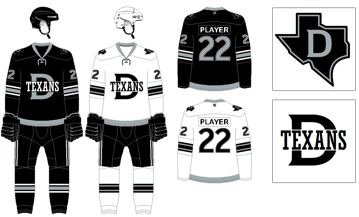
I love what Dallas did with their Winter Classic uniforms as a nod to the old minor league USHL franchise, so going with that here. A combo of red and blue makes the most sense for a team called the Texans, but that combo is too common, for some reason black and silver feels right. I thought a pretty reserved stripe design this team.
DETROIT RED WINGS
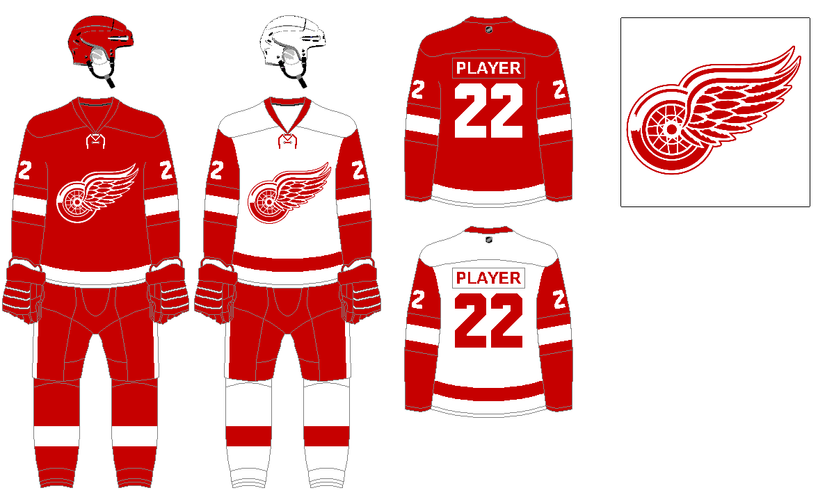
Classic with no need for changes.
EDMONTON OILERS
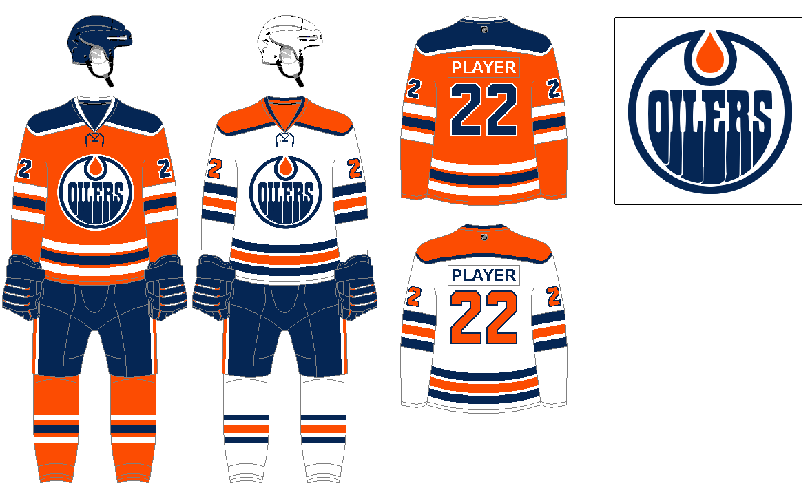
My preference is having orange as their primary, with navy, instead of royal blue. The 2017 design is nearly perfect, just adjusting the white jersey to have orange number and shoulder yoke.
HARTFORD WHALERS
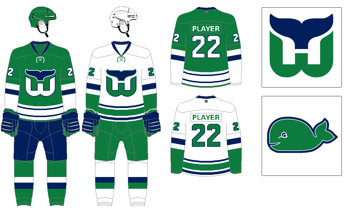
This is mostly the uniform they wore in 1991, the blue is a bit darker, and on the green jersey the logo has both white and blue elements, instead of just white with the blue outline.
KANSAS CITY SCOUTS
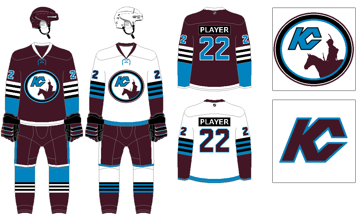
Modifying the old Scouts logo to show a different perspective of the scout statue. As with other teams, the blue with red and yellow trim is a bit too common, so changing up the colors. Since the Avs aren’t around now, the maroon and bright blue (form the KC flag) is an available combo that looks great. Also adding in some black trim that works for a sort of old school stripe design.
LAS VEGAS KNIGHTS
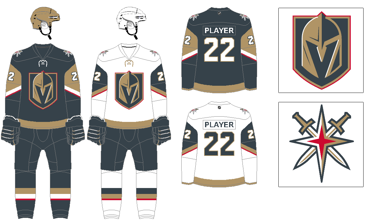
Naming wise I prefer more classic convention, so Las Vegas Knights over Vegas Golden Knights. I think the use of gray as the primary color is unique, and works well with the gold and red trim, but the black is sort of pointless mixed with the gray, so removing that. As far as the uniforms. I think their original gray look works well after you remove the black, then recolor accordingly. I also thought a pointed sleeve color block would match the points of the star and swords in the logo. A metallic gold helmet would be great also.
LOS ANGELES KINGS
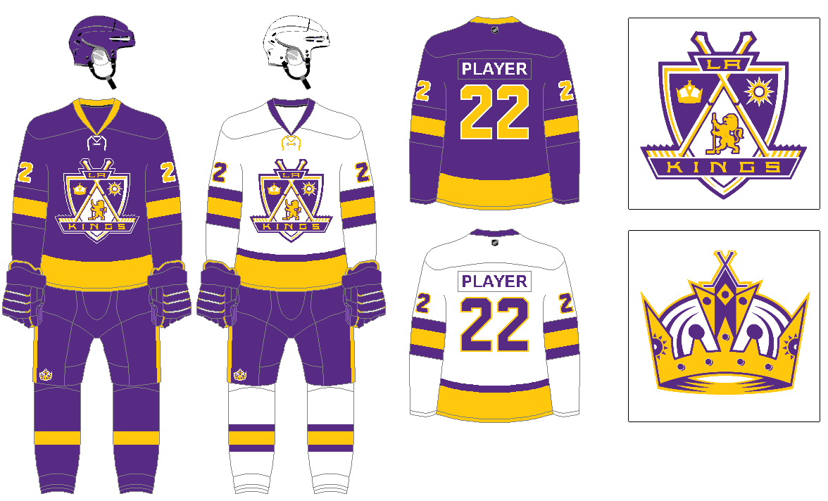
I can’t say I love purple uniforms, but for the sake of some diversity among all the blue, navy, red, and black teams that dominate sports, I’m good for one or two purple teams in each league. And when using purple, yellow compliments it so well. So going back to the Kings’ original look, but with a color updated version of their late 1990’s crest design rather than just the crown logo. The white uniforms replacing the yellow from that period.
MIAMI SHARKS
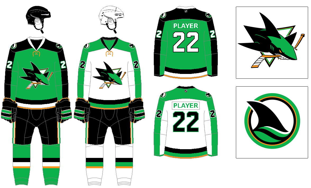
Not a fan of naming teams for the state when there are other franchises already in the state. Plus, Panthers sounds kind of generic and not very South Florida. With the Sharks identity now available I think it works great in Miami, and using the city flag colors of bright green, plus the orange for trim. Green and black work great together for the Sharks, and keeping the sleeve length stripes from the Panthers’ designs.
MINNESOTA NORTH STARS
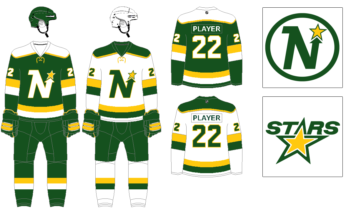
A classic identity returning. The uniform is based around their 1978 design. Changing up the green to be half way between the Wild’s dark green and the Stars’ original bright green.
Thanks, Greg. We’ll be back with more of his concepts next weekend!
Loving these concepts. One thing though – I am seeing a lot of generic name/number font. You went unique for the Dallas Texans but then went generic for everything else in this concept. Every team doesn’t need a bespoke font but this isn’t LaLiga or EPL either.
I think all in all it is something like 8 teams with custom number fonts in the set, so a little less than a quarter of the league. That felt like the right percentage of teams to have a custom number vs standard block.
I’m not a font guy, so while I appreciate a decent and simple custom number font, feels like lately the are more often than not custom for the sake of being custom, and not particularly good.
Absolutely agree, many of the custom fonts are overdesigned to be distinctive at the expense of legibility or aesthetics. And I love the old CCM standard block. But even within the basics is some variability.
I will defend the Florida Panthers name because they were named for the endangered Florida panther, the state’s official animal.
And that’s one of the few things I’ll defend regarding the Panthers franchise.
The Florida Panther is our state animal, for whatever that is worth. Its habitat is the Everglades, which is literally next door to the Panthers’ arena.
Side note: Huizenga bought the trademark for “Florida Panthers” from an ownership group in Tampa that was pursuing Major League Baseball. When “Florida Panthers”was trademarked there were no NHL or MLB teams in Florida so it was the first of its kind. Huizenga bought it and chose to use it for the hockey team. Furthermore Florida Panther is a specific type of Panther, not your every day run or the mill High School team Panther
Yeah, I understand why they were called that. I’m just not a big fan due to using the state name vs city name, and also Panthers itself feels a bit college / high school mascot to me.
Since they San Jose Sharks don’t exist in this scenario, felt like a wasted opportunity not to use their name and logo in Miami. I can understand Panthers fans being appalled by this.
Also using the name “Florida” turned out to be very important in terms of connecting with the local fanbase, as since 1998 the team have played quite far from Miami. Much of the fanbase that supported and stuck with what was largely a terrible team for many years has come from Broward County and Palm Beach.
Nothing is more annoying in SFL than a team nowhere near Miami calling itself “Miami”. (Looking at you, MLS’s Miami Fusion and Inter Miami, as well as the new pro rugby Miami Sharks).
And unlike pretty much every other instance of that type of naming wrong happening (a team named for a city while not actually playing in it), these big league teams have all played in or near Fort Lauderdale which is a major city/area in its own right. It’s not like Foxboro or East Rutherford or something like that.
Why is the Sharks name now available?
Since they’re going alphabetically, presumably because he’s reviving the Seals name with the San Jose franchise.
I think I don’t understand the point of reviving long-dead franchises and ignoring current real ones.
Yeah, that is the case. Seals never relocated/folded in this hypothetical, so the San Jose Sharks wouldn’t have been created to fill the void in the bay area. The Seals was one of my favorite to do, hoping everyone likes it once Phil publishes it next week.
I love that you have the North Stars back and even though i don’t like when green teams have a classic brighter shade of green and then go a darker shade, (NY Jets & Athletics for example) i like this darker shade concept.
Generally agree regarding the shades of green. Perhaps it is just unconscious bias from how great the Packers look in their darker shade of green with yellow that caused me to veer in that direction.
Stars fan here. I don’t see why the Stars and the North Stars can’t both exist. I am glad South Stars or Lone Stars wasnt used. People that don’t live here usually go that route when wanting to incorrectly change the team name.
I guess I just went on the assumption that if the North Stars didn’t move to Dallas, an expansion team there wouldn’t have taken the Stars name.
I know fans of existing teams who are changing aren’t going to be happy, obviously this is just a pretend exercise on what if with NHL franchises, I’m not suggesting the Dallas Stars abandon that name in reality.
There was a team called the Memphis South Stars around the time of the first NHL expansion. I think they were a Minnesota North Stars affiliate and played in the AHL.
Lone Stars vs. North Stars has a cool ring to it … -C.
I dig your concepts but what did royal blue ever do to you?
Ha. I actually do really like royal blue, was excited when the Rams and other teams started moving back from darker shades to royal blue. I just like the idea of using a wide range of colors rather than so many teams being combos royal blue, red, or navy.
Phil hasn’t gotten there yet, but there are royal blue teams coming, I think royal blue pairs great with yellow, orange, red, or green. They’ll show up next weekend.
Don’t overthink the Kings. The purple/gold with the classic crown is the best uniform they’ve ever worn. No need to mix it up with the overcomplicated 90s crest, which is from quite possibly the _worst_ uniform they ever wore.
Yes, I was really hoping to see yellow sweaters in place of white!
I’m a strict color and white guy, no dark color and light color uniforms. I’d even prefer it if the Lakers went just yellow and white uniforms and ditched the purples.
That said I am working on a yellow alternate for them.
I always found their original crown logo a little goofy looking. The modern style crown isn’t bad, but I’m a sucker for crest logos, even if they aren’t the best designed crests. I can definitely understand why people don’t like the crest.
Agree but the purple (OK, “Forum blue”) and gold (OK, “yellow”) are back!
Does your graphics program not allow you to do vertically-arched player names? That’s a definite downgrade to the Red Wings.
Yeah, just using regular old MS Paint for all of this. Though part of me likes the idea of a standard template with simple nameplates. So I went that route for every team. Probably blasphemous on here but I am anti-vertical arching, definitely team radial arching, in spite of the problems created by longer names.
As an old MS Paint designer, there is a way to make radial and vertical arching. Use the Stretch and Skew function to either rotate the letter slightly or skew them into rhomboid shapes. Make sure that the letter rotates/skews equally in the opposite direction of the letter’s mirror image in positioning in the last name, adjust 1 degree for thick (W, M) or thin (I) letters and enjoy. Each letter should be 1 degree more skewed than its neighbor. The middle letter (odd number of letters) or letters (even number of letters) should be flat/0 degrees of slant or skew.
Greg, the fact you’ve created all this with MS paint is unfathomable. Incredible job! I thought I was good with that program, but my talent pales in comparison to what you’ve done here. Thank you for working on this and thank you, Phil, for sharing it with us.
Greg, I was glad to see blue pants for the Whalers’ uniform and also think “Las Vegas Knights” is better than “Vegas Golden Knights”. AFAIC, “Golden” is the sports equivalent of shrink wrapping, something to be torn off and thrown away.
I wouldn’t be surprised if they are called that eventually. Originally it was The Mighty Ducks of Anaheim, reason prevailed and they are just the Anaheim Ducks now. So hopefully the Knights follow the same trajectory.
Unlikely until ownership changes. Bill Foley is a West Point grad. His financial company is named Black Knight. He couldn’t use that name for his hockey team so he went Golden Knights, a nod to the Army parachute team.
Good installment, Greg!
It’s too easy to outfit a team based in Dallas in Cowboys hues…but sometimes easy works, especially when black as primary is on the table – full disclosure: I’m not a Cowboys fan, though my dad sure did try!
Re: IC, err…KC – always had a soft spot for that team. Glad the Devils finally channeled their history with those RR’s. The new perspective logo takes on helmeted soldier look to me…I like it and that many who find the use of Native American Indian imagery in branding problematic might too. Love the use of powder/Columbia Blue of course…but not a fan of the maroon. Scarlet would really nice(unless you’re saving that pairing for the Nordiques!).
The Kings had a great jersey. A crown. In uniforms with “Forum Blue” (that’s what Chick Hearn called the Purple because Jack Kent Cooke referred to it as “Blue”) and Gold. That’s it.
link
No need for a shield. No black or silver…a change because (likely) the felon Bruce McNall didn’t like “Forum Blue”.
The KC makes me wish there was a NHL team with the claret-and-sky combo.
North Stars is great of course. That dingy green seems more 70s than their actual 70s color.
I like the white Whale set, but the striping on the green set throws me off. If you told me this was a new Vancouver uniform, I’d call it an upgrade.
I assume it was a conscious decision to avoid putting a star on Dallas, but I think it would improve the black/white.
Great concepts once again but the Sharks look a lot better in teal or aqua (if you want to mimic the Dolphins colors). This shade of green dulls them.
Agreed. Sharks look perfect in teal. Aqua would be interesting but that shade of green doesn’t do it for me. Looks like a beer league jersey
Here’s the thing about the Oilers’ crest logo that has always irked me: the lettered “oozes” that form the pool of oil are partially curled to the left. It would look better if the oozing letters just dropped vertically. -C.
PS: Love the look of the Scouts revival.
What is with the goofy infatuation with unnecessary laces? Someone please make it stop. They serve no purpose. They belong on skates. Not jerseys.