Tired of seeing annoying ads (like this one!) on Uni Watch? There’s a simple solution: Join Uni Watch Plus. You’ll get an ad-free site experience, plus exclusive access to our UW+ discussion forums, push notifications whenever a new blog post has been published, a special UW+ badge accompanying all your comments on the blog, and a 20% discount on our Teespring merchandise.
Good morning, and happy Presidents’ Day! I’m done with jury duty (I served on a civil case involving a car accident; we found for the plaintiff) and ready to dive back into the uni-verse.
So: The Rangers and Islanders trekked over to the New Jersey Meadowlands yesterday to play in the NHL’s latest Stadium Series game.
As you can see in the photo above, Rangers players arrived at the stadium accompanied by New York City police officers and firefighters, and the players wore the jerseys of the two departments’ respective hockey teams — blue for the NYPD, red for FDNY. Here are some additional pics:
The next uni-notable moment came during the ceremonial pregame puck drop, which was conducted by former Isles and Rangers stars Bryan Trottier and Mark Messier. Trottier had his usual “A” designation on his jersey, but Messier didn’t have a “C” — shocking!
Even worse, Messier’s NOB wasn’t vertically arched:
As for the game, I mostly liked the Rangers’ uniforms quite a bit, and would even be fine with them using this design as an occasional alternate. But I hated the Isles’ uniforms.
When I say that I “mostly” liked the Rangers’ uniforms, the one thing I could’ve lived without was the giant “NYR” on the left side of the helmets:
The Islanders had a similarly oversized helmet graphic, which worked a lot better (but the rest of their uniform was still a mess):
I was hoping Rangers goalie Jonathan Quick would get into the game, because he had gotten into the Stadium Series spirit by ordering up a mask featuring former New York Football Giants stars Lawrence Taylor and Michael Strahan, both of whom had lots of magical Meadowlands moments:
Unfortunately, Quick didn’t get into the game, and fellow Rangers goalie Igor Shesterkin didn’t have anything site-specific on his mask (at least not that I could tell).
As usual for an NHL outdoor game, the two coaches — Patrick Roy for the Isles and Peter Laviolette for the Rangers — wore baseball-style jackets:
You can see lots and lots of additional game photos here.
(My thanks to Jon Kramer for catching the glitches in Messier’s pregame jersey.)
Membership Update
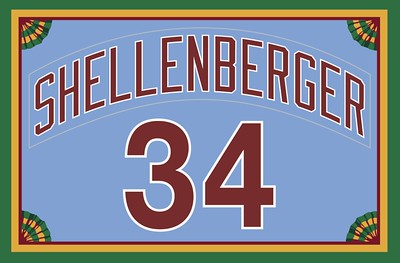
There are few things that look better than a loooong surname executed as a vertically arched NOB. That’s what we have here with reader M. Shellenberger’s new Uni Watch membership card (based on the old Phillies treatment, obviously), which is part of a new batch of designs that’s been added to the membership card gallery.
The membership program will end when I step away from Uni Watch at the end of May, so move fast, or at least fast-ish, if you want to get on board. As always, you can sign up for your own custom-designed card here, you can see all the cards we’ve designed so far here (now more than 3,300 of them!), and you can see how we produce the cards here.
Blast from the Uni Watch Past
Back in 2019, the great Wafflebored DIY’d this Uni Watch hockey jersey, which we then auctioned off. The winner was reader Matt Brevet. Matt recently sent me a note, as follows:
It’s a beautiful sweater, but I’ve been collecting for years and it’s time for me to let some things go. I currently have it listed on eBay, and I hope a Uni Watch reader ends up with it — it’s too awesome for someone not to have and appreciate.
In keeping with the original spirit, I’m going to donate half of the proceeds to causes I love — the Maryland Food Bank and the Ronald McDonald House.
So there you go, folks. I have no stake in this, but I too am hoping some Uni Watch readers will be interested in this. Let the bidding begin!
What Paul Did on Saturday
On Saturday, E and I and one of E’s kids went to what is essentially a tiny zoo in New Jersey. They had a lot of fruit bats, and we got to feed them grapes on the ends of sticks, which was fun. (That evening, I asked E if she’d feed me dinner on the end of a stick while I hung upside-down, but she declined.)
The bats were a trip, but what really blew me away were these Gouldian finches, which had such amazing colors! Nature is so fucking cool:
I know you’re gonna say, “But they have purple!” But as I’ve been saying for many, many years now, I’m fine with purple in nature; it’s purple as a human-imposed design element that I dislike.
The other highlight was this wallaby (in part, let’s face it, because “wallaby” is such a great word):
There were also some turtles, tortoises, snakes, a very cool sloth, two armadillos, chinchillas (!), and two completely adorable ferrets, all of which I enjoyed seeing — mostly. But I have to say, as I’ve grown older, seeing animals in cages makes me more and more uneasy. I love getting to see interesting creatures, but what kind of life are they having in a crate or a pen? I realize it’s complicated, and I’m not really trying to come down on either side of the argument. I just think it may take a while before I’m ready to visit a place like this again.
Can of the Day
I’m such a sucker for that diagonal two-tone effect. Really great design, built from such simple elements.
• • • • •
Sorry, no Ticker today or tomorrow, because of the holiday weekend. But I’ll have a couple of more posts today, so stay tuned. — Paul
Love it. The NHL is now the standard-bearer for uniforms and coaches’ attire. The NBA is a lost cause. Endless, uninspired uniform combos and coaches who dress like they’re playing 18 holes.
The NFL has dropped like a rock. Horrible uniforms. Sleeveless monotards with mismatched socks and cleats, and coaches dressed like they’re cleaning out the garage.
MLB? Once the best, but Nike and Fanatics took care of that.
Hear, hear, totally agree.
Give the NHL credit, they’ve actually considered the in-person viewing experience when designing these jerseys: Large letters and numbers, and basic color blocking. Contrast with the invisible minutiae on the new MLB jerseys, and it’s clear which league is getting uni design more right.
That said, this occasion screamed for an oversize Gorton’s fisherman and no wordmark for the Isles.
Devil’s advocate: Does it make really sense to prioritize the design for the 80,000ish people who’ll be watching in person, when there are many times that many who’ll be watching on TV?
As already stated, I liked the Rangers uniforms. I’m just saying I’m not sure oversized graphics constitute “successful design” if they’re geared toward a fairly small percentage of your audience.
Properly sized graphics.
And they should be used in the arena as well. People there or watching on TV should easily be able to see the numbers without having to squint.
The Islanders didn’t consider the in-person viewing experience (or even the TV viewers’ experience) because from a distance their numbers didn’t contrast well enough to see. Kudos to the Rangers for doing it right.
And those 80,000 people paid a nice chunk of money to be there. So yes, the unis should accommodate them.
Reminds me of a pet peeve of mine. I miss when arenas and football fields weren’t so TV-centric. I liked it when they’d show some logos facing the “wrong” way to throw a bone to the people sitting on the “wrong” side of the stadium. At least they still get a set of yard numbers facing their way… for now.
Agreed; the primary complaint about the Rangers’ sweaters would be the name on the back; why go to the trouble of oversized numbers on the back and sleeves, then put the name on in a font that’s smaller than your standard sweaters?
For the Islanders, have to agree that they were uninspired and – like the Devils’ sweaters on Saturday – not well thought out. What’s the purpose of having oversized numbers on the back if they’re in the same color as the rest of the sweater, with only a (semi-) contrasting color to outline it? Any case, after giving up a three-goal lead, a couple of two-goal leads, and gift-wrapping the game-winner in OT, they might want to throw them into the incinerator.
I’m so glad to read someone else wanted to see the fisherman yesterday too. I thought both designs were just fine, nothing I could imagine spending money on, but that’s how a lot of these designs have looked lately for the Stadium Series. I don’t know if I’d rather see more of a Winter Classic type design rather than bland, big elements, but I have to credit the NHL too for creating an identity for this event.
It looked pretty good to me from up in the 300’s!
The next uniform I want to see on the Isles is the current, classic striping with the 1990s colors: dark blue, turquoise, orange, silver, and white.
Saw this Tweet for an alleged Islander Reverse Retro prototype. Think this would make a great regular alternate. Though the Islanders are royal blue, no reason they couldn’t use navy blue for the trim colour for an alternate.
I’m 72 and been a Rangers fan for more than 60 years so I know there is a degree of ‘old man yelling at clouds’ to this but anything other than their diagonal letter wordmark sweaters look weird to me. Like it’s not really them. I don’t hate stuff like this, or the Lady Liberty or crest sweaters, I just look at them like my dog looks at me when I try to discuss the left wing lock with him.
Not shown: the other side of Jonathan Quick’s awesome mask had Phil Simms and Eli Manning.
That Rangers sweater is a keeper, the Isles one should be forgotten.
I like both of these more than I feel like I should. There are several individual elements in the Rangers uniform that I would normally hate (including the gigantic NYR). But as a cohesive whole, it actually works pretty well.
Similarly, I was ranting yesterday about uniforms with no white in them, but the Islanders SS uni doesn’t bother me as much as the Devils. To my eye at least, blue and orange don’t create that sort of shimmery effect that I get from red and black. And I like the primary logo on the shoulder.
Having said all that, I feel like Stadium Series uniforms are slowly becoming a bit boring over time. I used to look forward to the crazy bizarre SS designs, and they just aren’t really bizarre anymore.
If you’re going to put great football moments from the Meadowlands on a goalie mask, you need Herman Edwards recovering a fumble, Bryant Westbrook running away for a last-second TD and DeSean Jackson muffing a punt and then backpedaling into the end zone as the final gun sounds. All 3 Miracle at the Meadowlands involved the Giants botching sure wins against the Eagles. Go Birds.
The pics confirm that the Rangers got the best unis out of the 4 teams, by a wide margin.
I like that the sweaters for Trottier and Messier had fight straps; even if they aren’t going to throw down, and the NYR radial arching on the NOB is a glarig oversight, the authenticity is nice.
How long until someone gets a membership card based on Nike’s new baseball jersey template? You can be the first on your block!
Any stops for food while in NJ? Garfield & the surrounding area has several nice spots + there’s always Hot Grill or Rutt’s.
Yesterday’s Rangers jersey had a bit of old Toronto Toros look to it, IMO – not terrible, but not will be quickly forgotten.
I sometimes wonder if the NHL played only once a week – a 18 game schedule – all out-doors, whether it would be more successful? Now before laughing that off, think the other way around. If the NFL was stuck with a tedious 82 game schedule that lasted to March, and its play-offs dragged into early May, would it be as successful as it is today?
I love those NY Rangers jerseys and helmets, even with the overly large NYR on them. Shrink them by a 1/3rd and you have a winner.
Also, those FDNY jerseys are outstanding. NYPD needs to step up!
Next Uni Watch design contest?
Fix the NYPD hockey uniforms!
That, my friend, could be just what is needed!
Nice beard, Paul. PS: I’ve just added “wallaby” to my long list of favorite words: link
Islanders numbers were hard to read
I have a feeling based on past precedent and Sunday’s result (I’m still buzzing a little from the comeback and the sound, even from the broadcast, from much of the 80k crowd singing(?) along to the Rangers goal song), we’ll see the Rangers’ Stadium Series set again. (Though I presume it would be with normal white helmets, rather than the outdoor bells and whistles.)
I liked the FDNY/NYPD sweater walk-in — it showed that these sorts of themed things can still have class, civic pride, and a modicum of whimsy, especially compared to Lamiorello’s Isles coming in in their normal suits. Though something peeved me about the use of fire trucks for the entry (especially the same weekend as a pretty devastating fire at a senior housing complex in Plainview). Seemed like both a case for the “blue collar” chronicles and a misuse of public emergency resources. But I concede I might be off-base here.


Love it. The NHL is now the standard-bearer for uniforms and coaches’ attire. The NBA is a lost cause. Endless, uninspired uniform combos and coaches who dress like they’re playing 18 holes.
The NFL has dropped like a rock. Horrible uniforms. Sleeveless monotards with mismatched socks and cleats, and coaches dressed like they’re cleaning out the garage.
MLB? Once the best, but Nike and Fanatics took care of that.
Hear, hear, totally agree.
Give the NHL credit, they’ve actually considered the in-person viewing experience when designing these jerseys: Large letters and numbers, and basic color blocking. Contrast with the invisible minutiae on the new MLB jerseys, and it’s clear which league is getting uni design more right.
That said, this occasion screamed for an oversize Gorton’s fisherman and no wordmark for the Isles.
Devil’s advocate: Does it make really sense to prioritize the design for the 80,000ish people who’ll be watching in person, when there are many times that many who’ll be watching on TV?
As already stated, I liked the Rangers uniforms. I’m just saying I’m not sure oversized graphics constitute “successful design” if they’re geared toward a fairly small percentage of your audience.
Properly sized graphics.
And they should be used in the arena as well. People there or watching on TV should easily be able to see the numbers without having to squint.
The Islanders didn’t consider the in-person viewing experience (or even the TV viewers’ experience) because from a distance their numbers didn’t contrast well enough to see. Kudos to the Rangers for doing it right.
And those 80,000 people paid a nice chunk of money to be there. So yes, the unis should accommodate them.
Reminds me of a pet peeve of mine. I miss when arenas and football fields weren’t so TV-centric. I liked it when they’d show some logos facing the “wrong” way to throw a bone to the people sitting on the “wrong” side of the stadium. At least they still get a set of yard numbers facing their way… for now.
Agreed; the primary complaint about the Rangers’ sweaters would be the name on the back; why go to the trouble of oversized numbers on the back and sleeves, then put the name on in a font that’s smaller than your standard sweaters?
For the Islanders, have to agree that they were uninspired and – like the Devils’ sweaters on Saturday – not well thought out. What’s the purpose of having oversized numbers on the back if they’re in the same color as the rest of the sweater, with only a (semi-) contrasting color to outline it? Any case, after giving up a three-goal lead, a couple of two-goal leads, and gift-wrapping the game-winner in OT, they might want to throw them into the incinerator.
I’m so glad to read someone else wanted to see the fisherman yesterday too. I thought both designs were just fine, nothing I could imagine spending money on, but that’s how a lot of these designs have looked lately for the Stadium Series. I don’t know if I’d rather see more of a Winter Classic type design rather than bland, big elements, but I have to credit the NHL too for creating an identity for this event.
It looked pretty good to me from up in the 300’s!
The next uniform I want to see on the Isles is the current, classic striping with the 1990s colors: dark blue, turquoise, orange, silver, and white.
Saw this Tweet for an alleged Islander Reverse Retro prototype. Think this would make a great regular alternate. Though the Islanders are royal blue, no reason they couldn’t use navy blue for the trim colour for an alternate.
link
I’m 72 and been a Rangers fan for more than 60 years so I know there is a degree of ‘old man yelling at clouds’ to this but anything other than their diagonal letter wordmark sweaters look weird to me. Like it’s not really them. I don’t hate stuff like this, or the Lady Liberty or crest sweaters, I just look at them like my dog looks at me when I try to discuss the left wing lock with him.
Not shown: the other side of Jonathan Quick’s awesome mask had Phil Simms and Eli Manning.
That Rangers sweater is a keeper, the Isles one should be forgotten.
I like both of these more than I feel like I should. There are several individual elements in the Rangers uniform that I would normally hate (including the gigantic NYR). But as a cohesive whole, it actually works pretty well.
Similarly, I was ranting yesterday about uniforms with no white in them, but the Islanders SS uni doesn’t bother me as much as the Devils. To my eye at least, blue and orange don’t create that sort of shimmery effect that I get from red and black. And I like the primary logo on the shoulder.
Having said all that, I feel like Stadium Series uniforms are slowly becoming a bit boring over time. I used to look forward to the crazy bizarre SS designs, and they just aren’t really bizarre anymore.
If you’re going to put great football moments from the Meadowlands on a goalie mask, you need Herman Edwards recovering a fumble, Bryant Westbrook running away for a last-second TD and DeSean Jackson muffing a punt and then backpedaling into the end zone as the final gun sounds. All 3 Miracle at the Meadowlands involved the Giants botching sure wins against the Eagles. Go Birds.
The pics confirm that the Rangers got the best unis out of the 4 teams, by a wide margin.
I like that the sweaters for Trottier and Messier had fight straps; even if they aren’t going to throw down, and the NYR radial arching on the NOB is a glarig oversight, the authenticity is nice.
How long until someone gets a membership card based on Nike’s new baseball jersey template? You can be the first on your block!
Any stops for food while in NJ? Garfield & the surrounding area has several nice spots + there’s always Hot Grill or Rutt’s.
Yesterday’s Rangers jersey had a bit of old Toronto Toros look to it, IMO – not terrible, but not will be quickly forgotten.
I sometimes wonder if the NHL played only once a week – a 18 game schedule – all out-doors, whether it would be more successful? Now before laughing that off, think the other way around. If the NFL was stuck with a tedious 82 game schedule that lasted to March, and its play-offs dragged into early May, would it be as successful as it is today?
I love those NY Rangers jerseys and helmets, even with the overly large NYR on them. Shrink them by a 1/3rd and you have a winner.
Also, those FDNY jerseys are outstanding. NYPD needs to step up!
Next Uni Watch design contest?
Fix the NYPD hockey uniforms!
That, my friend, could be just what is needed!
Nice beard, Paul. PS: I’ve just added “wallaby” to my long list of favorite words:
link
Islanders numbers were hard to read
I have a feeling based on past precedent and Sunday’s result (I’m still buzzing a little from the comeback and the sound, even from the broadcast, from much of the 80k crowd singing(?) along to the Rangers goal song), we’ll see the Rangers’ Stadium Series set again. (Though I presume it would be with normal white helmets, rather than the outdoor bells and whistles.)
I liked the FDNY/NYPD sweater walk-in — it showed that these sorts of themed things can still have class, civic pride, and a modicum of whimsy, especially compared to Lamiorello’s Isles coming in in their normal suits. Though something peeved me about the use of fire trucks for the entry (especially the same weekend as a pretty devastating fire at a senior housing complex in Plainview). Seemed like both a case for the “blue collar” chronicles and a misuse of public emergency resources. But I concede I might be off-base here.