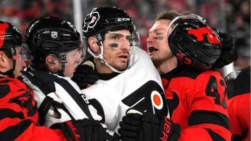
The New Jersey Devils and Philadelphia Flyers met last evening for the first of two Stadium Series (SS) games being held in the Meadowlands (the second game is this afternoon, featuring the New York Islanders vs. the New York Rangers). And as is always the case for outdoor games such as these, the teams had special uniforms for the occasion.
While the traditional New Year’s Day “Winter Classic” generally has teams wearing throw/fauxback uniforms, SS uniforms tend to be a bit more…adventurous. When all four teams involved with the SS unveiled jerseys just under a month ago, I mentioned I’d need to see full uniforms (only the Flyers released a full kit) and how they looked on ice before rendering a final judgment. I’m glad I did.
Let’s take a look at both teams’ full SS uniforms.
New Jersey Devils
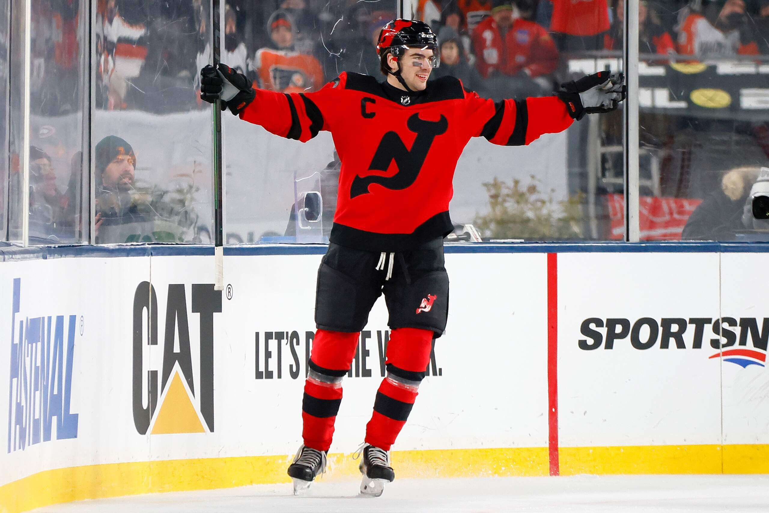
The Devils wore black helmets, red sweaters and black breezers, with socks matching the striping pattern on the jersey. The team ditched their traditional crest for an oversized “NJ” logo on the chest, and the red jersey featured a black yoke, with two thick black stripes on each sleeve. Red socks followed this pattern.
As is typical of any outdoor game, TV numbers were huge. For the Devs, they wore the TV numbers on their sleeves.
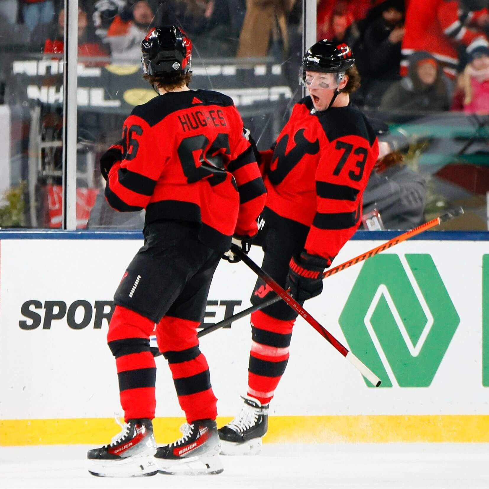
Each team had a SS patch, and the Devils wore theirs on top of the right shoulder.
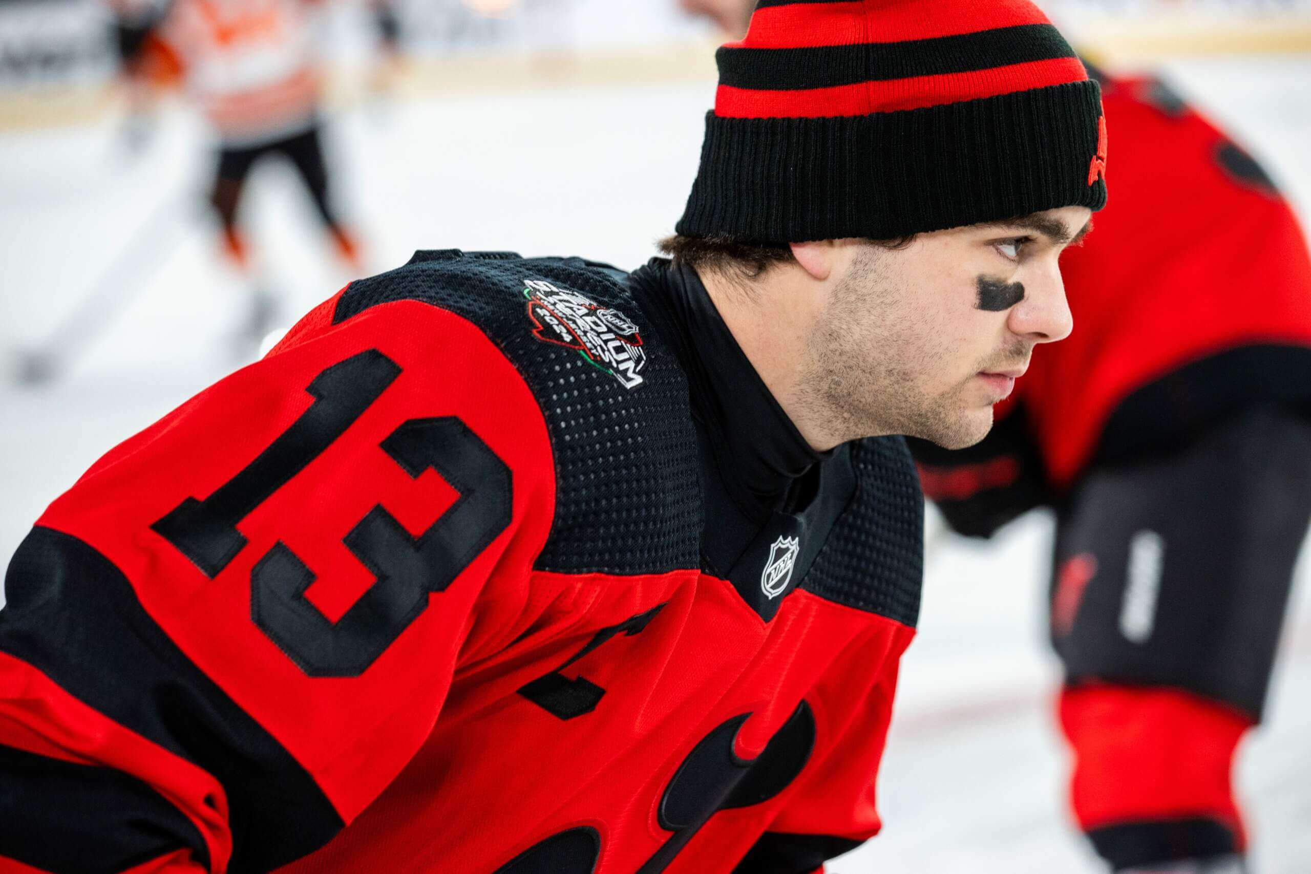
NOB were on nameplates, and the back of the jersey also featured oversized numbers. The thing that struck me the most was the lack of any white on the jersey at all — not even outlines on the logo or numbers, which would possibly have made for better legibility on long shots.
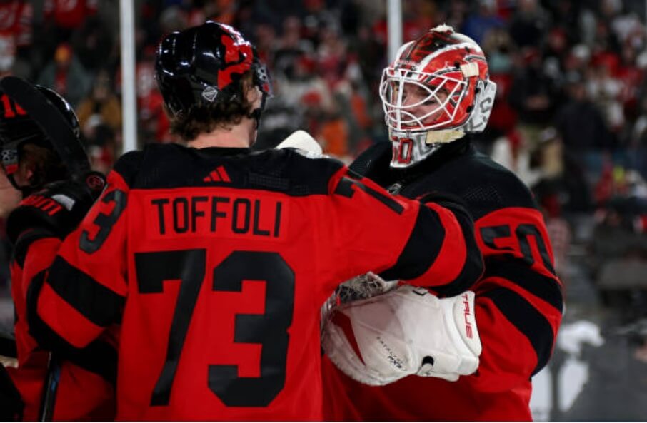
New Jersey also wore an oversized red “NJ” logo on the right side of their helmets, with a TV number, also in red, on the left.
Here are some additional photos:
Philadelphia Flyers
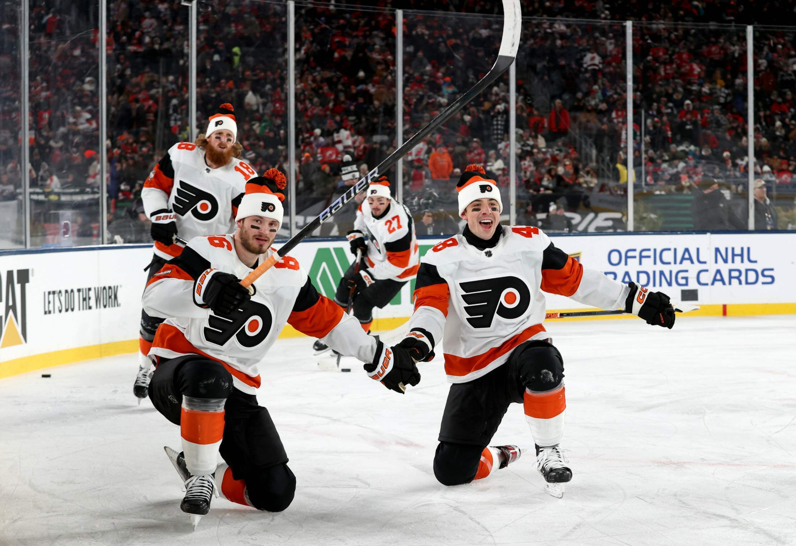
Like the Devils, the Flyers were also somewhat conservative with their SS uniforms, and these were similar to the team’s traditional garb. They wore black helmets, white jerseys and black pants, with black/orange/white socks. They kept their classic crest (which appeared a bit oversized). Sleeve stripes were orange and black, with the black stripe wrapping around the back of the jersey. A thick orange stripe was at the base of the jersey, slightly above the hem.
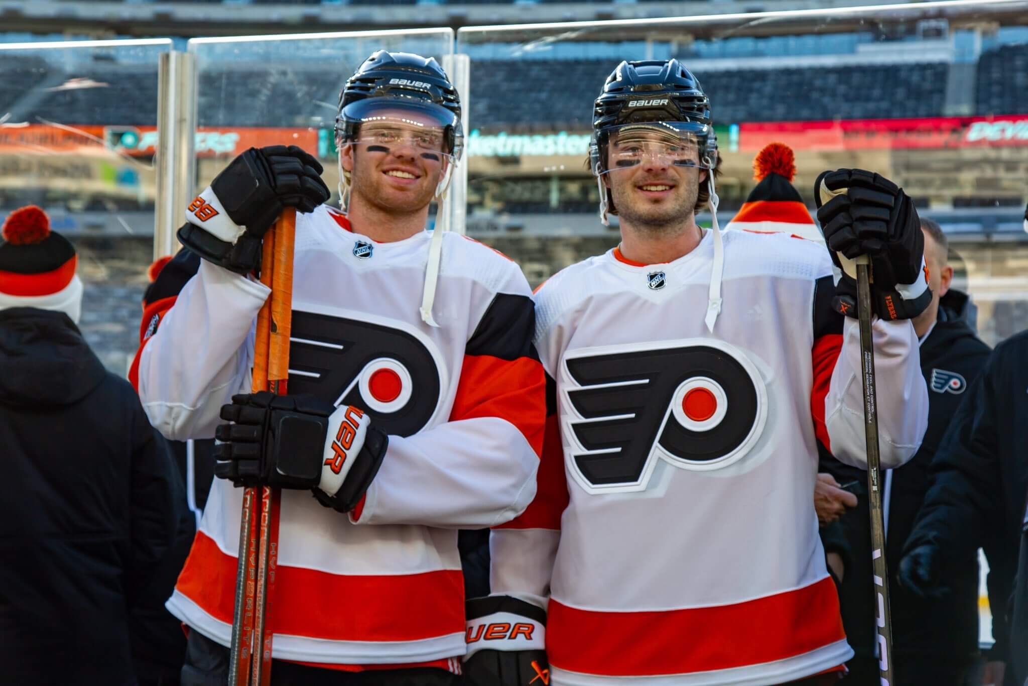
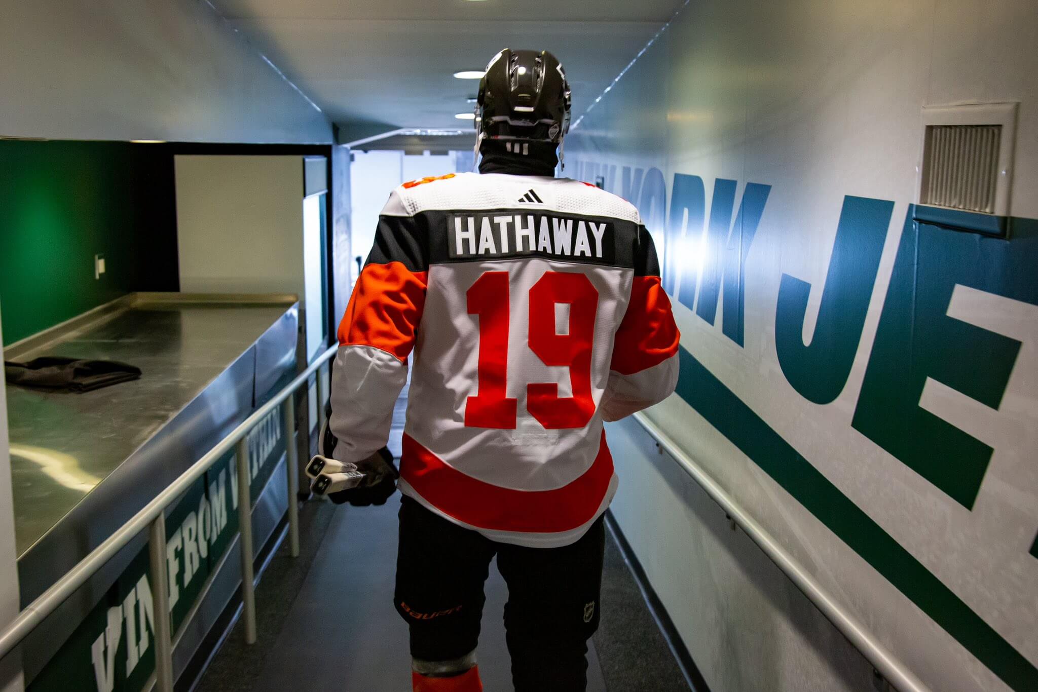
One of the Flyers’ uniform quirks over the years has been a contrasting color nameplate. They kept this up by creating a black nameplate with white NOB, using the black sleeve stripe to continue wrapping around the rear of the sweater. Oversized numbers were in solid orange.
Philadelphia also had oversized TV numbers, but they located theirs on the shoulders of the jersey. And like the Devils, they had their classic Flyers logo on the right side of their helmets, and TV numbers on the left.
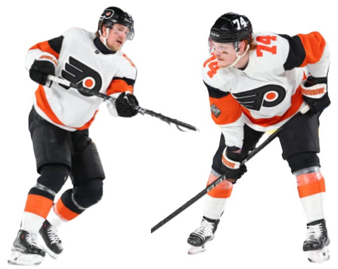
The Flyers wore their SS patch on their right sleeve, with TV numbers on top of the shoulders (which was the opposite of how the Devils handled theirs).
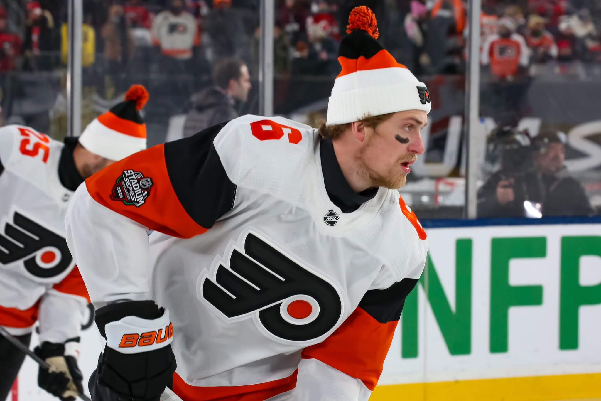
Here are some additional Flyers photos.
I watched almost the entire game, and I thought it looked quite nice. Here’s some video of the teams in action.
NOW THAT'S HOW YOU START AN OUTDOOR GAME ‼️#StadiumSeries | @NJDevils pic.twitter.com/ZcQfqyNQgJ
— Sportsnet (@Sportsnet) February 18, 2024
All due respect, you got no $&#%?@ idea what it’s like to be number one (overall). pic.twitter.com/Vrte6L8meH
— New Jersey Devils (@NJDevils) February 18, 2024
About the only complaint I had while watching the game on TV was the difficulty in reading the Devils numbers in the long shots. While the jerseys looked fine in the close up shots, from far away — which was most of the broadcast — the black numbers were difficult to pick up on the red jerseys.
Both teams had some fun with this game, with the Devils entering the stadium dressed as Sopranos characters, while the Flyers went the Rocky road:
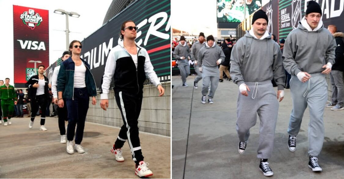
Woke up this morning, got ourselves a game.#NJDevils | #StadiumSeries pic.twitter.com/cnIjkWfJqo
— New Jersey Devils (@NJDevils) February 17, 2024
Gonna Fly Now. #StadiumSeries | #LetsGoFlyers pic.twitter.com/TJPx2jDocF
— Philadelphia Flyers (@NHLFlyers) February 17, 2024
And as is typical for SS games, both teams’ mascots provided entertainment for the assembled fans.
You get a hot dog! You get a hot dog! Everybody gets a hot dog! 🌭 #StadiumSeries pic.twitter.com/rHCRUgEVmd
— NHL (@NHL) February 18, 2024
All in all, I enjoyed the game and am looking forward to this afternoon’s Rangers/Islanders tilt (3:00 Eastern).
You can see many, many more photos of the game (and the pre-game/in-game festivities) here.


Devils really lamed out, they essentially just copied the Flyers Stadium Series uniform from 2019, replacing the orange with red and flipping the logo. Even the sleeve stripes are the same.
I was impressed by how good the Devils looked. This is the way forward should they contemplate a new appearance.
There is no part of this I don’t like. The clever use of the Flyers’ black nameplate becoming a stripe is a weird, cool interpretation. Devils looked kind of sinister. And big side logos on helmets are much better than tiny ads. It’s like the designers understood the assignment.
I hate the Devils, but the pregame Sopranos look was fantastic!
As is typical of any outdoor game, TV numbers were
hugeproperly sized.and the back of the jersey also featured
overproperly sized numbers.C’mon, Phil…
White-less unis just don’t work for me. Ever. I’ve never seen one that I didn’t hate. YMMV and all that.
The Flyers, on the other hand, looked great. Could have been a bit more adventurous, but they’re the Flyers. What are ya gonna do?
For a one-off (unless they wear them for a select game or two at home), I’m OK with it. But I wouldn’t want to see this jersey as a home sweater, not without some outlining or something to make the numbers more visible.
Speaking of making numbers more visible…
Watching the Rangers and Islanders. Rangers look great but the Isles jersey is a fail. Can’t see the properly sized numbers from a distance. White numbers would have been so much better.
Agreed. Don’t like the Isles sweaters. Wasn’t a fan when they were unveiled, and now that I’m seeing them, I don’t like them on ice either.
The Devils’ red looks almost orange.
It does — I thought so too, but when you compare it to the Flyers’ orange, it’s definitely red (maybe tending more towards orange than some reds, but still red)
link
The Devils’ red did almost look orange.
The lack of white trim to break up the red and white did hurt the Devils’ legibility but it was a near look.
The tops of the Flyers’ socks were black and it made it look almost like they were wearing football pants or knickers, as it continued the black of the pants below the knee. Not quite Cooperalls but intriguing for sure.
Of the 4 teams in the Series this weekend, the Rangers got the best look, and it pains me to say that as a Flyers fan.
Idk about the abbreviation “SS uniforms” given its WWII history…
100%. Sometimes Phil’s need to shorten/abbreviate terms trumps common sense.
NHL is MILES AHEAD of the other pro leagues. Great uniforms and coaches still wear suits. Watching Rangers-Isles now. Love the varsity jackets both coaches are wearing in the cold weather. Enjoy it now, before Fanatics craps on it all.
Don’t understand the “properly sized numbers” or oversized logos. Firstly, most people are watching this on TV so their view of the action shouldn’t change. Second, football teams play in huge stadiums and if they indicate the team identity on their unis it doesn’t take up much more space than an index card, if at all. Why is the schtick for these unis just to make everything huge? That said, the devils looked decent.
A hockey rink is much smaller than a football field, so the rink is set into the middle of the field. The fans are sitting in the regular seating for football, so the overall effect is that the fans are farther away for this hockey game than they’d be at a normal hockey game.
Because they can’t obstruct the view for the live crowd, the TV cameras are also farther away from the rink than they’d be at an NHL arena.
Since both the live crowd and the TV audience are viewing the game from farther away than at a normal game, the NHL makes the numbers on the uniform bigger.
Black Devils sweater would look so much better.
Yeah, I’d like to see them try a black sweater again. They haven’t had much success so far…
link
Black sweater with just the “J” part of the Devils logo in red….
That Devils logo really does look properly devilish with only red and black. I say stick with this look, incliding the properly-sized numbers on the back.
Both these teams looked cool.
Why did the Devils go with the Flyers’ number font over their own distinctive font?