Phil here, pinch-hitting for Paul.
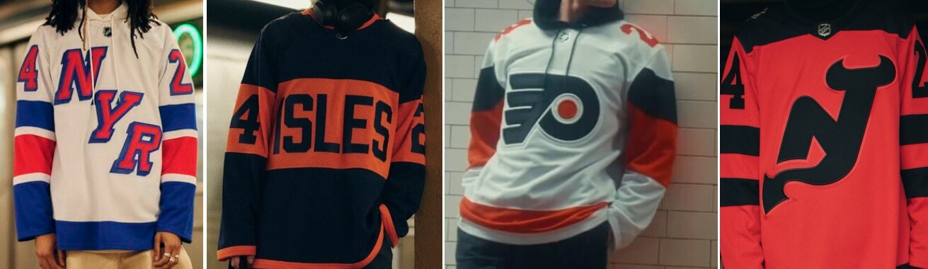
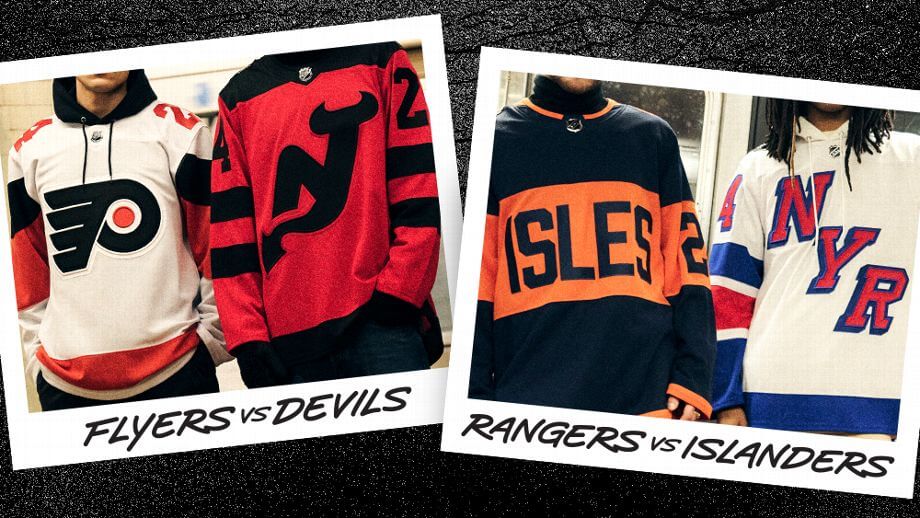
The NHL officially released the jerseys for the 2024 Stadium Series games, which will take place in February at MetLife Stadium. The Flyers and Devils will face off at 8:00 pm on February 18th, while the Rangers and Islanders will match up on Feb. 19 at 3:00 p.m.
Let’s start with the hype video which shows the jerseys:
THE METRO IS GOING OUTDOORS 🏟️
Introducing the @adidas 2024 NHL #StadiumSeries jerseys.
📺: @NHLFlyers vs. @NJDevils on Feb 17 and @NYRangers vs. @NYIslanders on Feb 18 pic.twitter.com/PhrvhHC2iR
— NHL (@NHL) January 26, 2024
Let’s take a look at the jerseys for each team.
New York Islanders
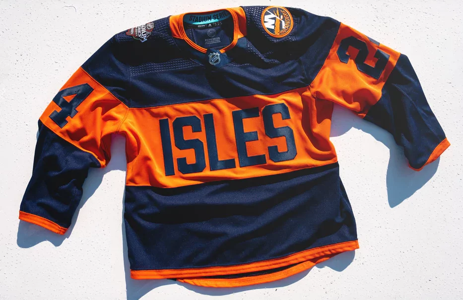
The Islanders sweater is navy blue, with “ISLES” on an orange stripe across the chest. This marks the first time the team will ever have their nickname on their jersey. The collar, sleeve ends, and hem will all feature a thin orange stripe. As is typical for all NHL outdoor games, TV numbers on the sleeves are huge.
Here’s a look at the back:
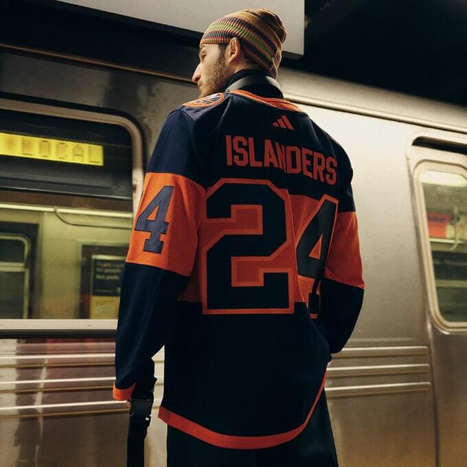
NOB will be rendered in orange. Numbers are navy blue, outlined in orange, and layered across the orange stripe.
New York Rangers
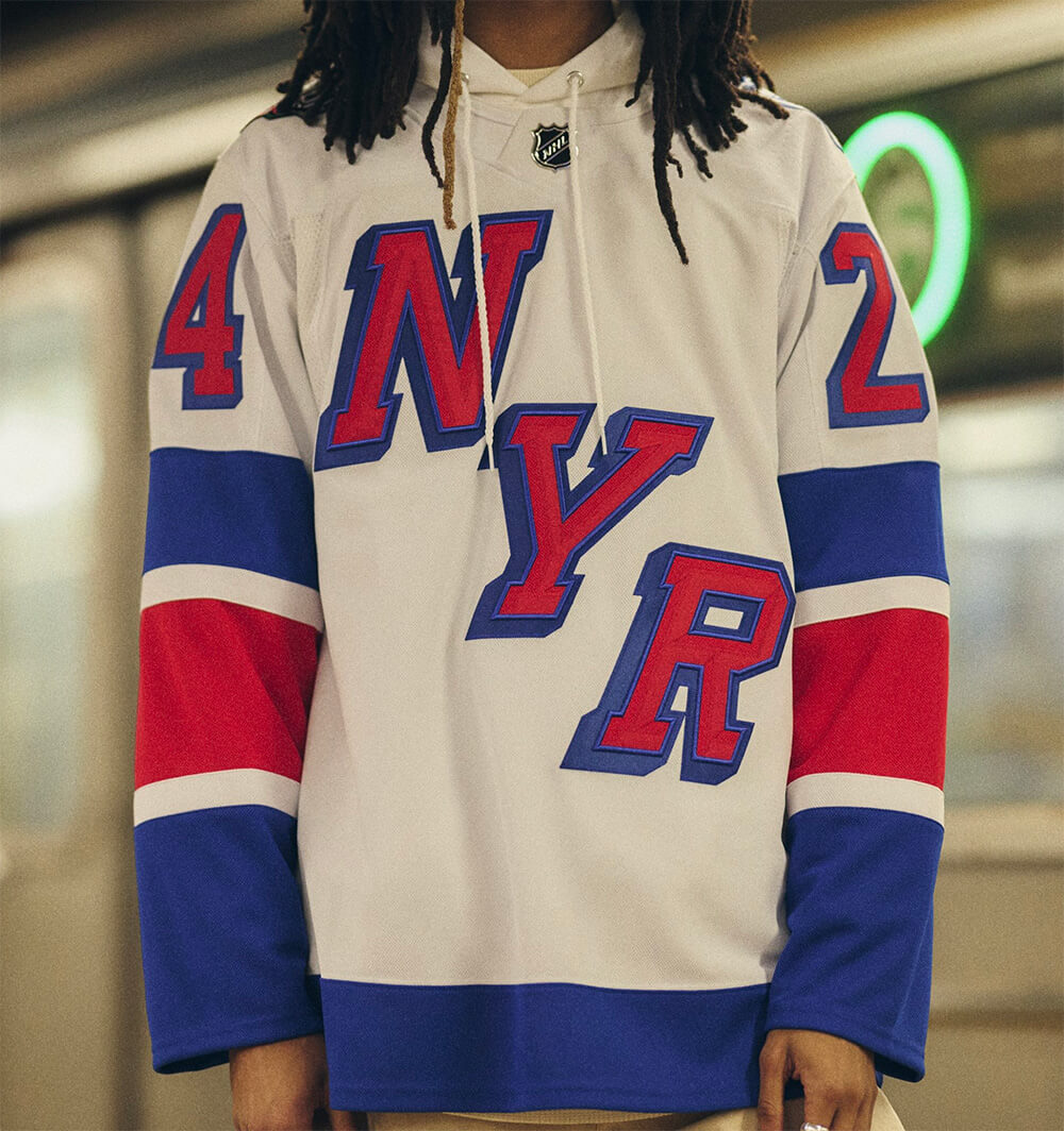
The Rangers sweater is white, with a diagonally stacked “NYR” in in red with blue blockshadow, in the style of their classic white sweater. Sleeves will have an alternating blue/red/blue pattern, separated by thin white stripes. Giant TV numbers are also in red with blue blockshadow.
Here’s a look at the back:
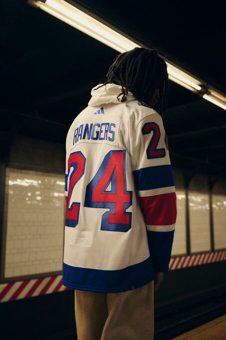
NOB is blue. Here’s a couple additional looks:


New Jersey Devils
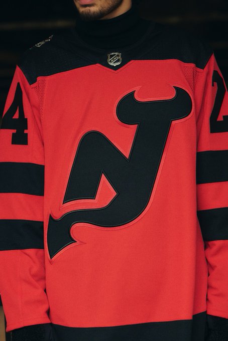
The Devils will be sporting a red jersey, with the classic logo in black. The jersey features a black yoke, with two black stripes on the sleeves. TV numbers are big and black.
Here’s a look at the back:
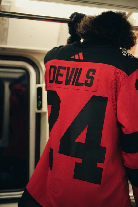
NOB is black and numbers are also black in a basic block serif font.
Philadelphia Flyers
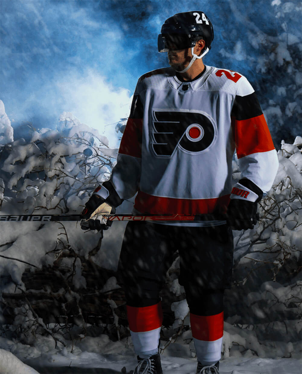
The Flyers have a white sweater, with their classic logo on the front, and an orange stripe towards the hem. Sleeves have a thick orange and even thicker black stripe. TV numbers are on the shoulders, and are orange.
Here’s a look at the back:
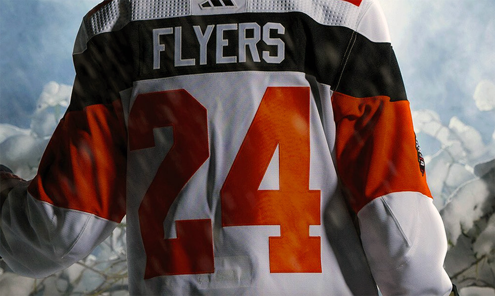
NOB will be in white on the black stripe (which continues from the sleeve striping). Numbers are orange.
I’ll need to see how these all look on the ice and with full uniforms (only the Flyers have revealed their full look so far), but my first impression is these are all fine, although I’m definitely not in love with the Islanders’ jersey. It feels somewhat uninspired, and I’m not a fan of having “ISLES” as the wordmark. The Rangers diagonal “NYR” is interesting, and a decent take on their classic workmark. The Flyers and Devils were a bit more conservative, opting to keep their traditional logos.
As is typical for all NHL outdoor games, TV numbers on the sleeves are
hugeproperly sized.Devils seem to have won this tournament.
Islanders jersey looks pretty good from behind and just awful from the front.
Game dates are Feb 17 8:00 PM for Flyers – Devils and Feb 18 3:00 PM for Rangers – Islanders FYI
Thanks, fixed.
These are perfect as a one-time thing. Definitely prefer New Jersey’s sweater to the stripey black jersey.
The Flyers’ design is growing on me, but none of these designs is great…
Wish the socks were white/black/orange…the pattern they chose makes the breezers look like long shorts/short pants.
The sweater is sharp (same goes for NYR) – hate the border-less numbers though.
Amen to the border-less numbers – looks like a knock-off
I’m surprised to not hear much love for the rangers design – IMO it feels like an instant classic, maintains key elements of the team’s visual identify while still doing something new.
Devils didn’t keep their traditional crest- they removed the circle behind the logo which is very seldomly done. Makes for a different look
Maybe they should have been getting on the NJ Transit shuttle at Secaucus Jct for accuracy…
OR
Rangers get on NYC Subway, Isles get on LIRR, Devils on NJ Transit or PATH, Flyers on SEPTA.
No wonder the NHL waited so long to reveal these. They’re fine for this event, but nothing that screams I want to own one.
Putting on-ice practicalities over retail appeal strikes me as a positive thing.
Not saying I love the designs (or that I hate them); just saying that “I want to own one” has ever been the yardstick we use around here.
I can’t be the only one who’s reminded of the 1990s Patriots seeing the back of the Rangers jersey. link
Thiiiiiiis so much this! That was the 1st thing I thought of when I saw those numbers! Granted I’m biased and have been a Patriots fan for the last 30 years but that was the very 1st thing that came to my mind when I saw the NYR sweater!
I really like the Flyers’ sweater, but not the rest. Rangers and Devils are meh, but OK for a one-off, but… “ISLES”… Ugh.
I really like the Philly, Jersey, and NYR jerseys. They are really good for this event.
I like Jersey’s two-tone, and I think that the deletion of the circle is a good move as it definitely helps set this jersey apart and show that it’s special.
I think that Philly making their contrasting name plate a sleeve stripe is an incredibly fun idea. The only thing I would change about theirs is that I would put the event logo in the middle of the black stripe instead of the orange like they did.
The NYR’s jersey is a really well executed modern classic. The diagonal NYR works really well–I especially like the subtle bevel effect using the different fabric textures, and the striping also feels modern and bold without taking away from the established brand.
The Isles, though. What to say other than snooze-fest!
Damn Ian, we’re on the same wavelength! My impressions are exactly the same.
Flyers jersey reminds me of the early Cooperall jersey designs (1980-81). Some of them had a stripe that ran along the back with the nameplate in it. Can’t find any photos right now with the examples along the back.
link
Would the “Canes” be considered a nick name for the Carolina Hurricanes? That is the only other case I can think where a team nickname is prominently displayed as the main crest of a hockey jersey.
There were the old alternates. Tampa Bay Lightning with “Bolts” on the front and Ottawa Senators with “Sens” on the front.
The Sharks win the NHL uni reveals of the week.
DISCLAIMER: Lifelong Flyers fan with a healthy hatred of the other 3 teams. That said:
1. RANGERS win this thing and I don’t think it is close. They borrowed heavily from their classic look, kept some elements (vertical arched NOB, drop shadow numbers, diagonal lettering) and made it work without falling back on Lady Liberty. Kept their colors. I miss the shoulder stripes but still best of the bunch.
2. FLYERS are second but it’s really a 3-way tie for last. They took some chances and are breaking away from their past looks.
3. ISLANDERS… are you a navy team or are you a royal blue team? It looks like they cut & pasted an old Flyers Stadium Series look and wrote “ISLES” in all caps across the chest.
4. DEVILS bring up the rear. The conspicuous lack of white trim eliminates necessary areas of contrast between red and black, which will make legibility tough. And the number font they usually use is all theirs – the only other team to use it were the late era Whalers before they left Hartford. It is “the Devils font”, but the one on these jerseys is… what the Flyers (and Red Wings) wear. Why wear your rivals’ identity when they’re in this series?! Oy vey.
I didn’t think about it earlier, but the singular wide chest stripe with big letters on the Islanders’ jersey reminds me of the pre-NHL Quebec Bulldogs: link
Note the mismatched 2s on the Rangers’ jersey. 2 on the back has a serif; the 2s on the sleeve does not
Actually, that’s consistent with their primary uniforms: link
Flyers jersey is streets ahead for me, really dislike the NYI and Devils, NYR is not great, yes it has nods to the original jersey but it looks like some sort of abridged version rather than its own take.
More evidence that the there is only one good look for the Islanders, and they nailed it on their first try in 1972 and should never change it. I really don’t want the Islanders wearing Broncos colors. Royal Blue and Orange, just like their neighbors 10 miles to the northwest, the Mets. Oh, wait a minute, the Mets like wearing black – at least the Islanders got rid of their BFBS jerseys.
I am not sure how often we called them “Isles”
I recall a Newsday cover when the team was introduced that had a jersey with a simple “I” on the
These all have the feel of pseudo jerseys you might see in Kmart or Sears back in the day.
They all look like fashion sweaters for fans which is not bad at all, but they do not look like pro hockey sweaters. I like the Rangers one the best.