Good Saturday morning, Uni Watchers, I hope everyone has had a pleasant week! Lots to get to today (including at least two additional articles coming later this morning), but first we’ll close the book on one of the longer-running (and most “volumed”) series today.
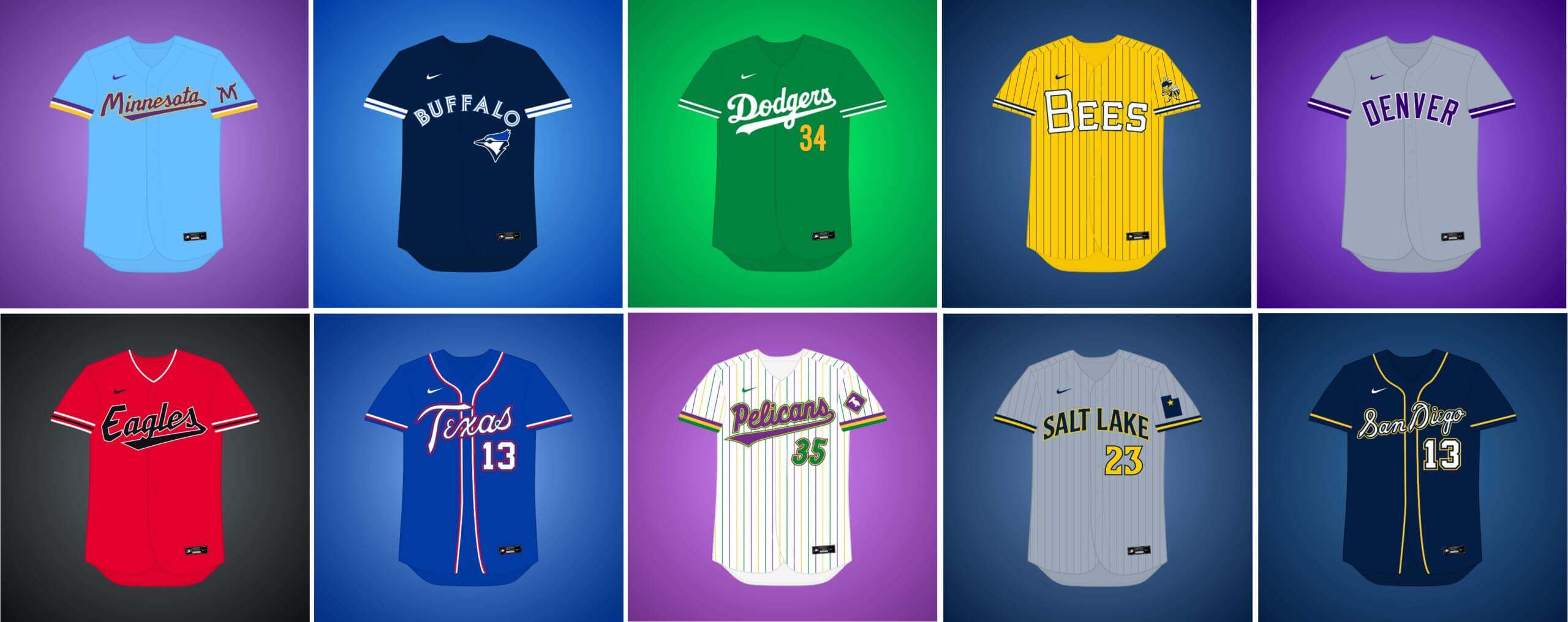
I’m joined once again by Matthew Drake, who has embarked on a project he’s calling the “MLB Multiverse,” which is now entering its eighth and final volume. If you missed any of the first seven posts, you can click here for Volume I, click here for Volume II, click here for Volume III, click here for Volume IV, click here for Volume V, click here for Volume VI, and click here for Volume VII. As in previous posts, I’ve included Matthew’s introduction from his introductory post below, so you don’t have to click on Volumes I through VII for an explainer. And as in previous volumes, for each “what if” I’ve included the new “home” jersey inline, with road and additional alternates in the gallery beneath. This is the eighth, and final, volume in this series. Enjoy!
You can follow Matthew @MJD7Design on the Twitter/X. In addition, some of the designs are will be available as real-life jerseys with the help of Pro Line Mockups, so they can follow along on Twitter @MJD7Design and @ProLineMockups to stay updated.
Here’s Matthew:
MLB Multiverse, Volume VIII
by Matthew Drake
I call this series “MLB Multiverse.” It’s essentially a collection of “what-ifs”: either relocations of MLB teams that very nearly happened, or what certain teams would possibly look like if they never relocated in the first place.
Obviously referential of Marvel’s recent cinematic dealings with the concept of the “multiverse,” another way of thinking about this is that these teams do in fact exist in an alternate universe, where their respective relocation deals followed through to completion.
The series was heavily inspired by user @SFGiants58’s legendary “MLB: The Defunct Saga” series on the sportslogos.net boards, as well as logo/uniform legend Todd Radom’s “Phantom Franchise” segment on Buster Olney’s podcast.
I created dozens of different alternate-universe teams in this series, my biggest series ever by far. It was fun and exciting to try and flex my creative muscles a bit more beyond simply fixing up the 30 big league teams. I hope you enjoy seeing these designs as much as I enjoyed creating them!
What if… Cleveland’s baseball team relocated to Atlanta (and changed their name)?
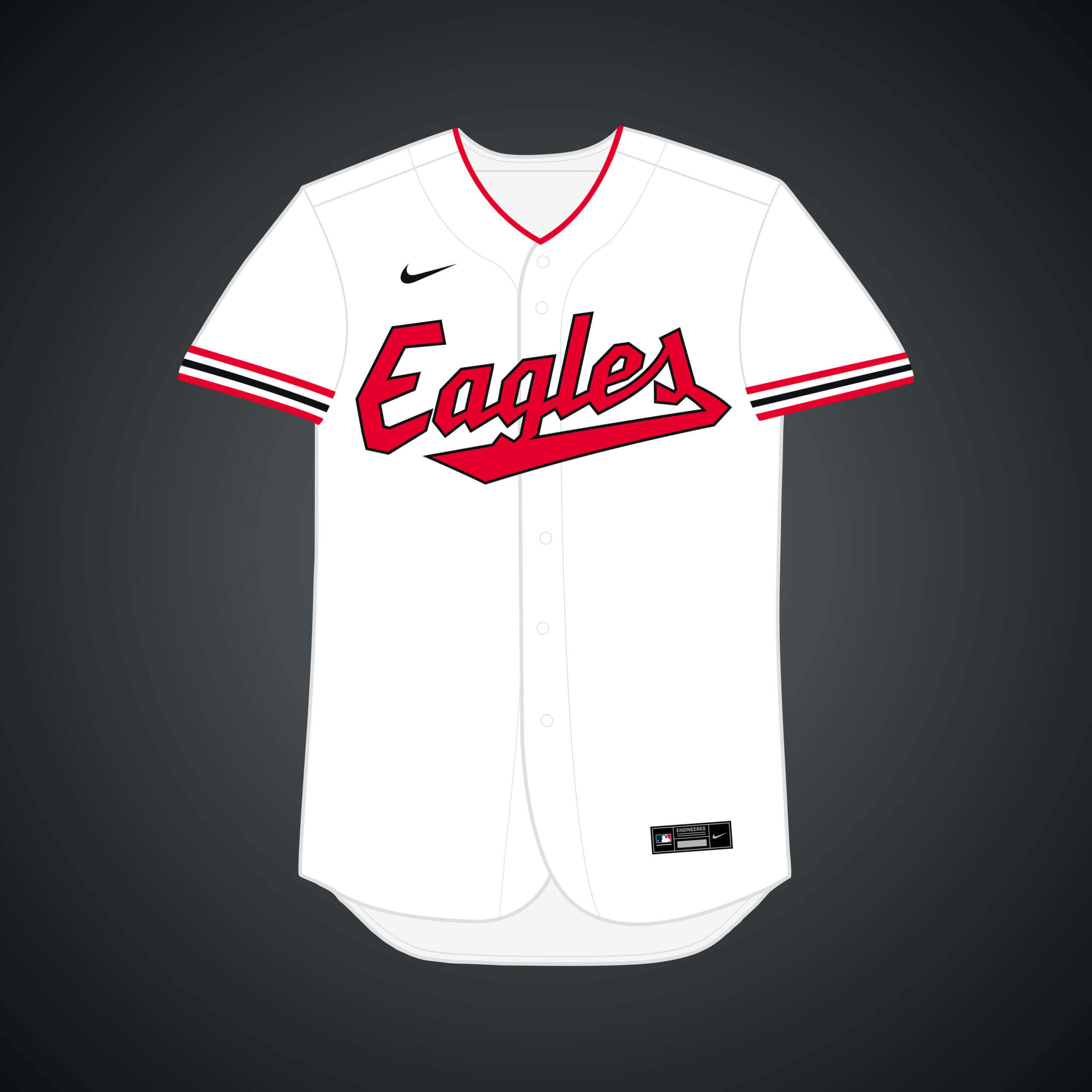
Prior to the Braves landing there in 1966, Cleveland’s team was also a contender to move to Atlanta. I went with the name “Eagles,” as it’s what Ted Turner considered renaming the Braves to in 1976.


What if… the Blue Jays (temporarily) relocated to Buffalo?
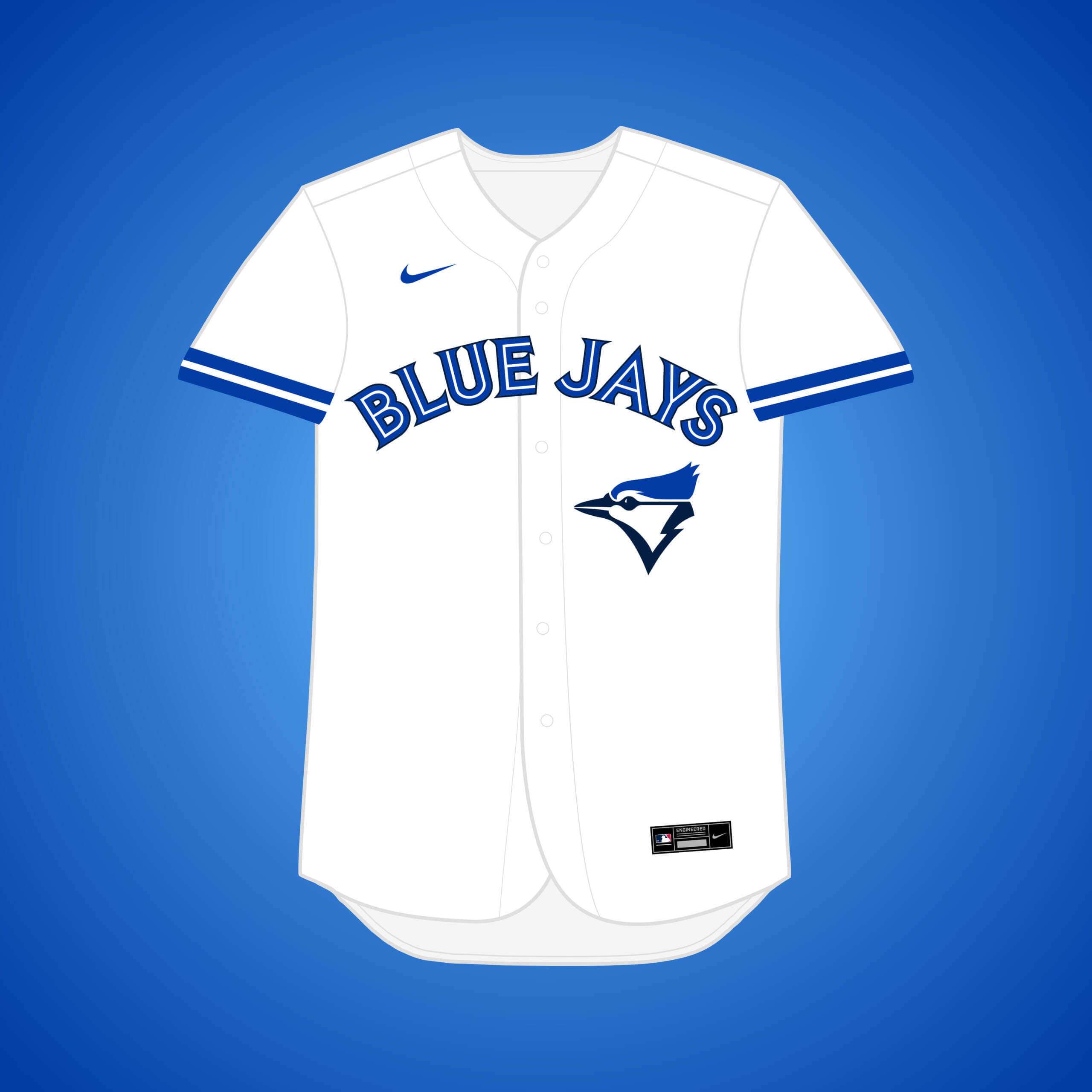
This one isn’t really a “what if,” as the Jays really did play home games in Buffalo during the 2020 season. The elimination of the red maple leaf allowed for navy’s presence in the set to be increased a bit.


What if… the Yankees (temporarily) relocated to Denver?
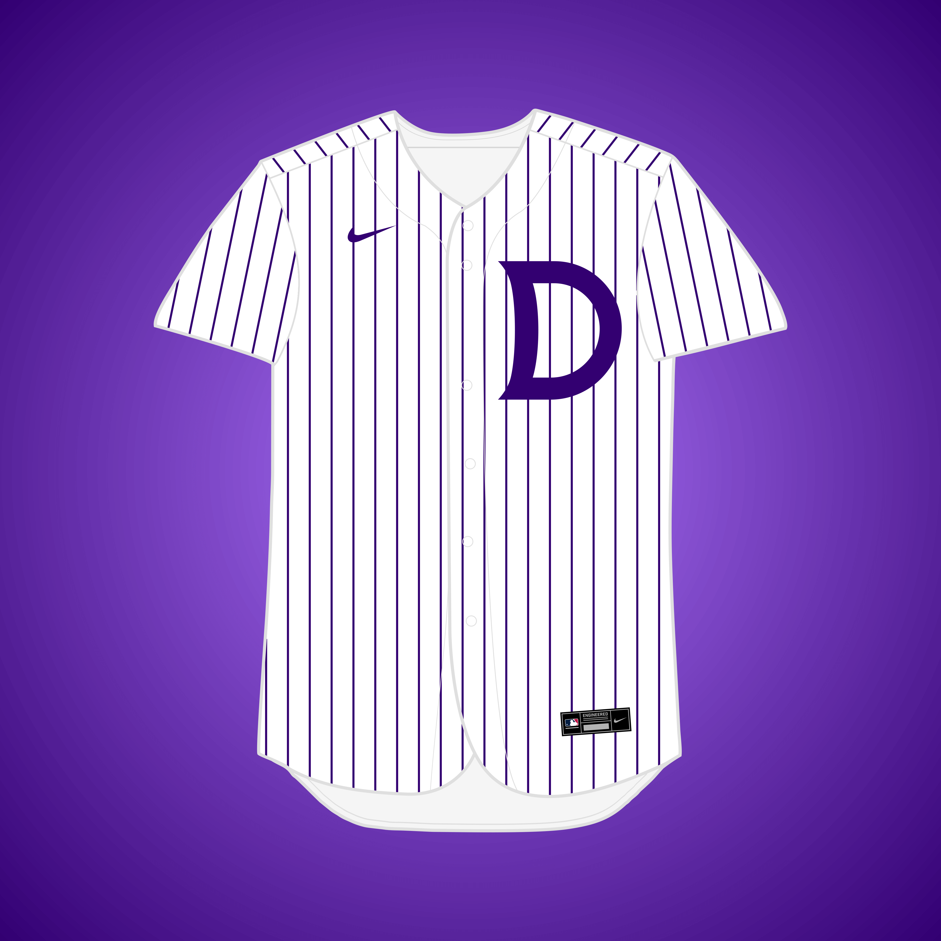
Amidst stadium renovations, the Yanks announced in November 1982 that they were about to reach an agreement with Denver to play the first 3 home games of the next season at Mile High Stadium, but the plan was rejected.


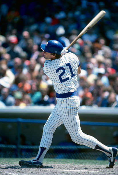
What if… Cleveland’s baseball team relocated to Minneapolis (and changed their name)?
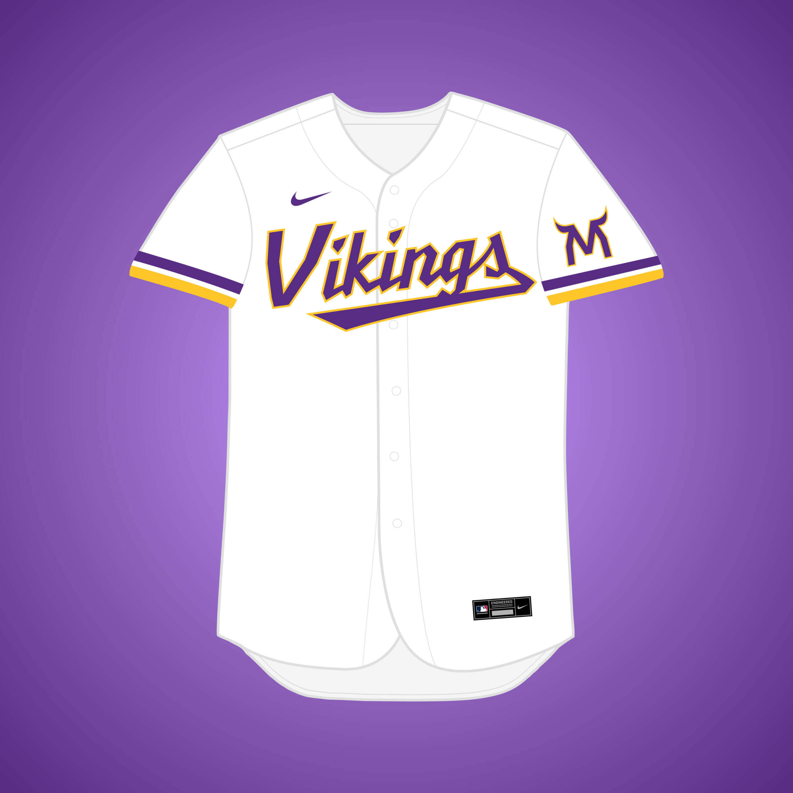
In 1957, GM Hank Greenberg was fired when it came to light that he started a secret campaign to move the team to Minnesota. I figured they’d maybe snatch “Vikings” before the NFL team.


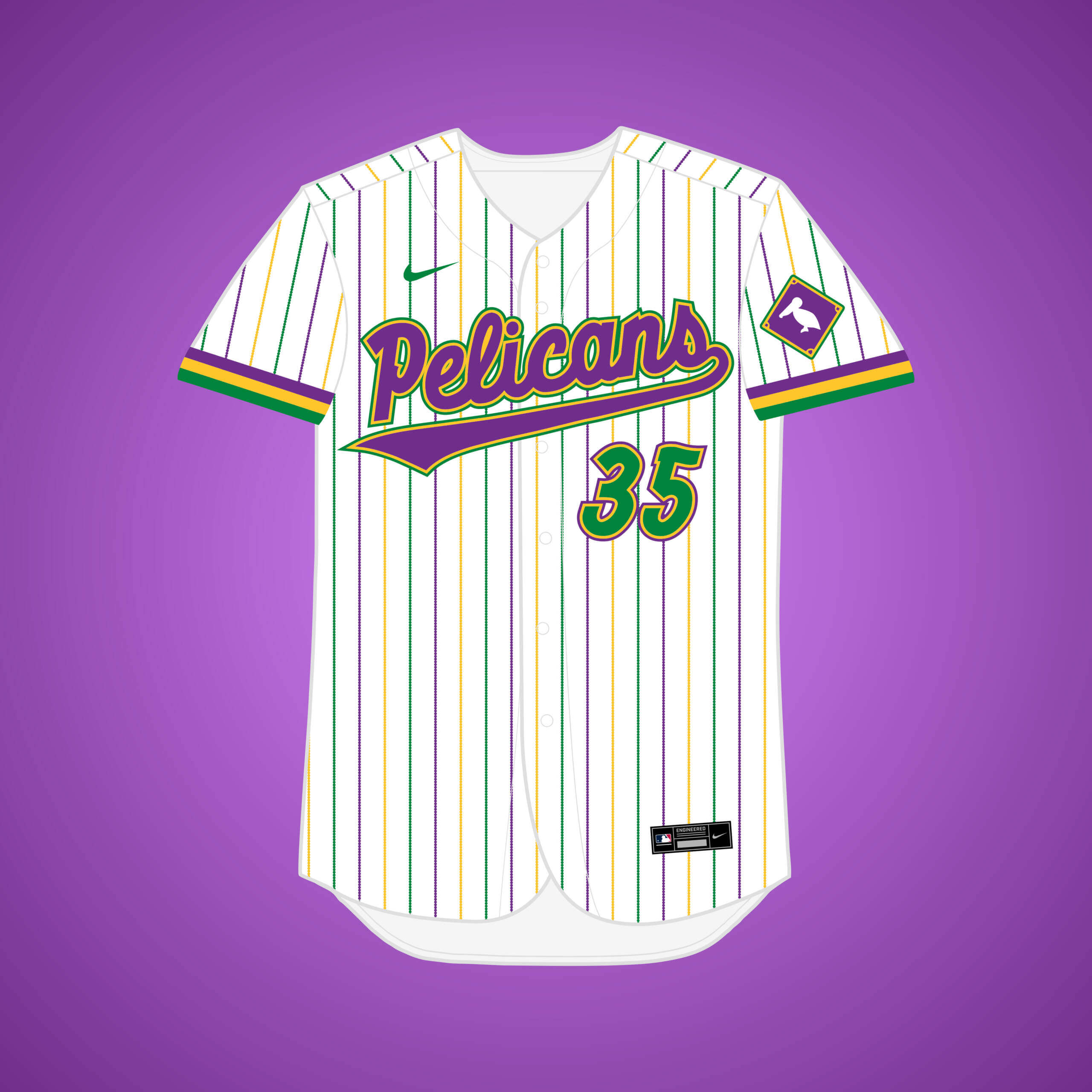
What if… the Pirates relocated to New Orleans (and changed their name)?
This is the same premise as my original Pirates → NOLA design, but if they changed their name to the “Pelicans.” Mardi Gras colors felt like the way to go here.


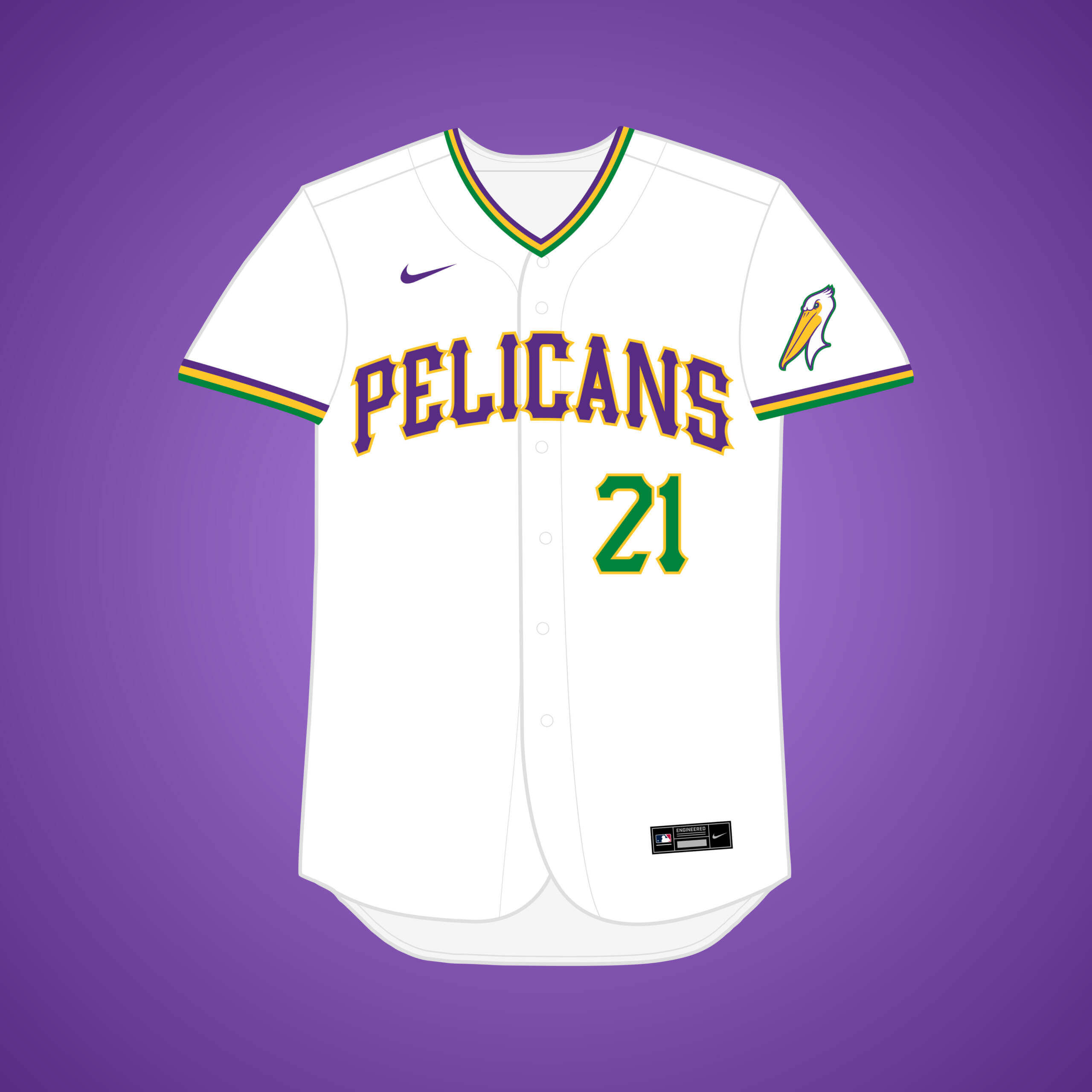
What if… the White Sox relocated to New Orleans (and changed their name)?
This is the same premise as my original White Sox → NOLA design, but if they changed their name to the “Pelicans.” Once again, Mardi Gras colors felt like the way to go with this one.


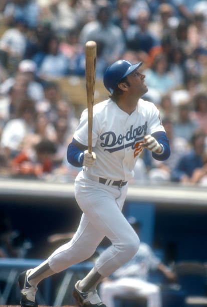
What if… the Dodgers relocated to Oakland?
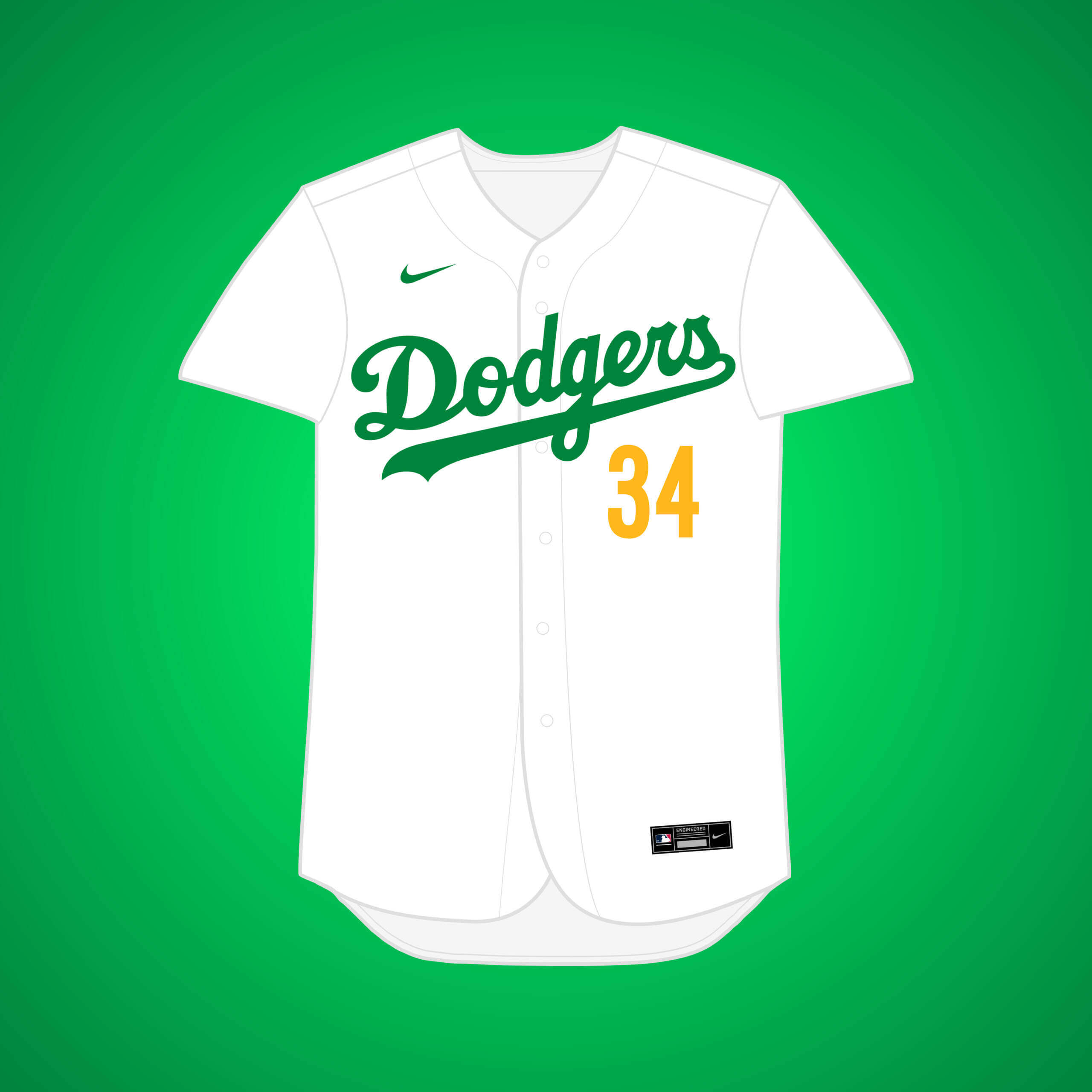
Although the Dodgers never seemed to have much interest, the City of Oakland Baseball Committee sent a letter to Walter O’Malley encouraging him to consider moving to the city. Green actually has precedence in Dodgers uniform history.


What if… Cleveland’s baseball team relocated to Oakland (and changed their name)?
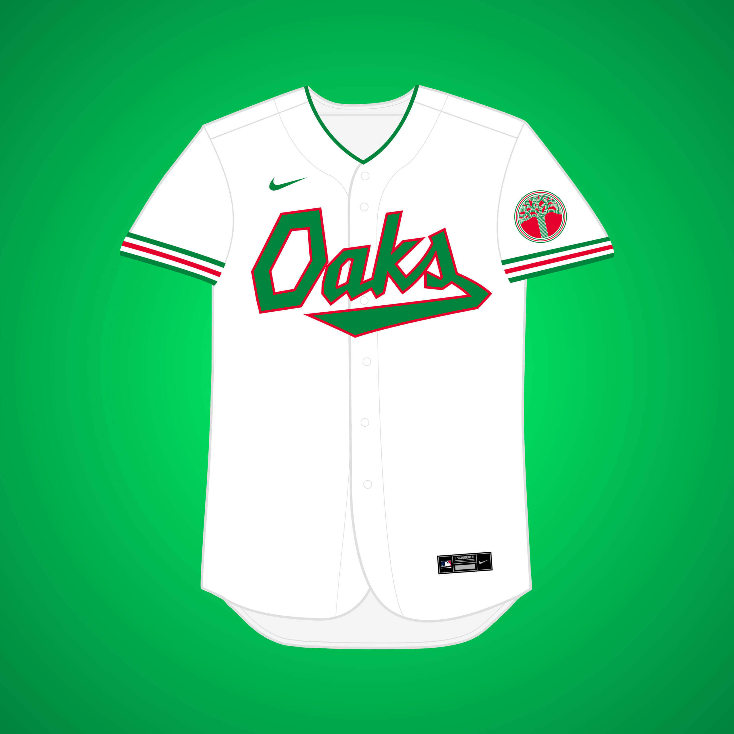
In 1964, the “Oakland Baseball Corp.” made a $6.5 million bid to purchase and move the team but were rejected by Cleveland’s board of directors. I went with “Oaks,” the name of the PCL team.


What if… the Twins (temporarily) relocated to Salt Lake?
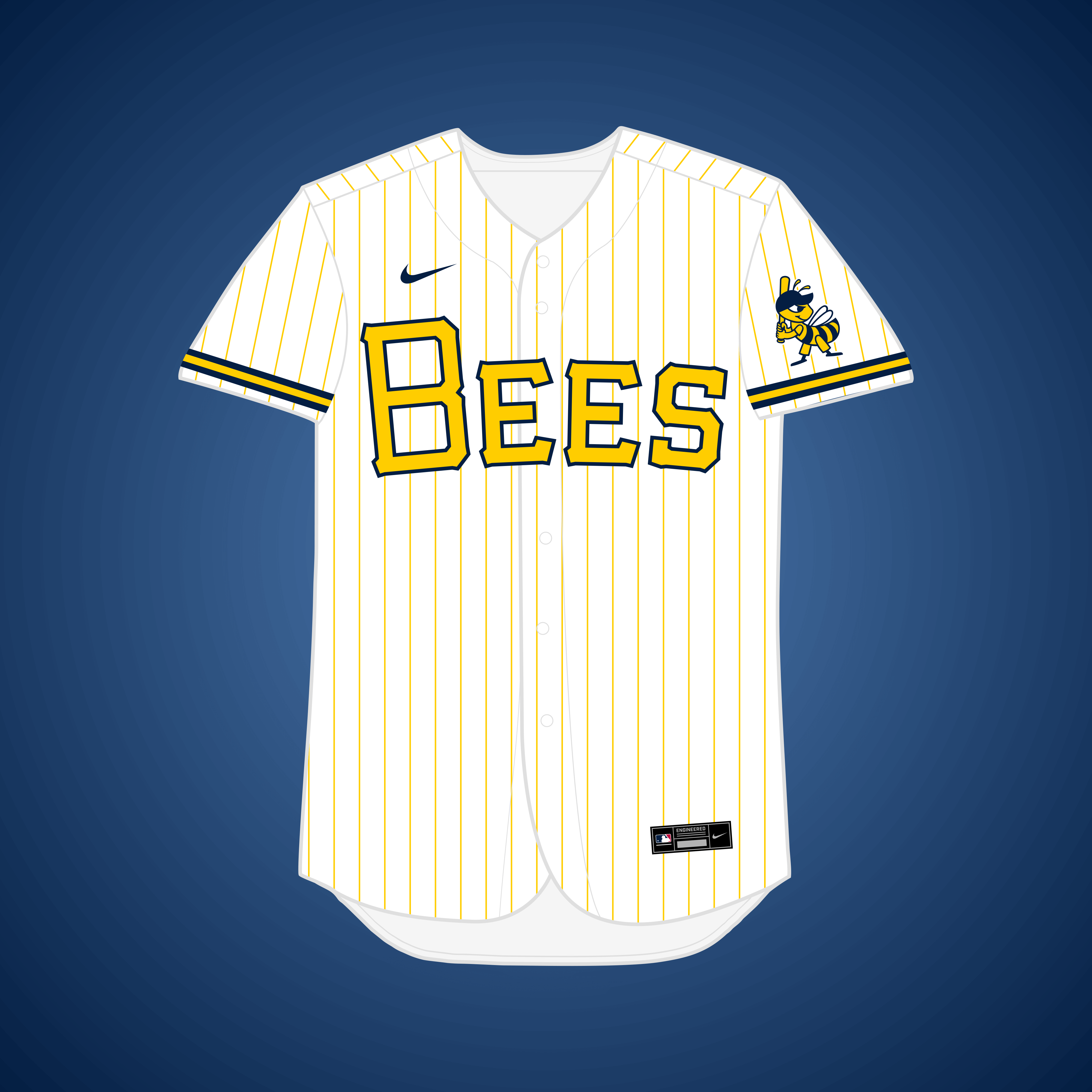
If the Twins were sold & moved to Charlotte in the ‘90s, a plan surfaced that the team would stay in Salt Lake for a couple years while the new stadium was built. I figured they could go with a temporary “Salt Lake Bees” identity.


What if… the Twins (temporarily) relocated to Salt Lake City?
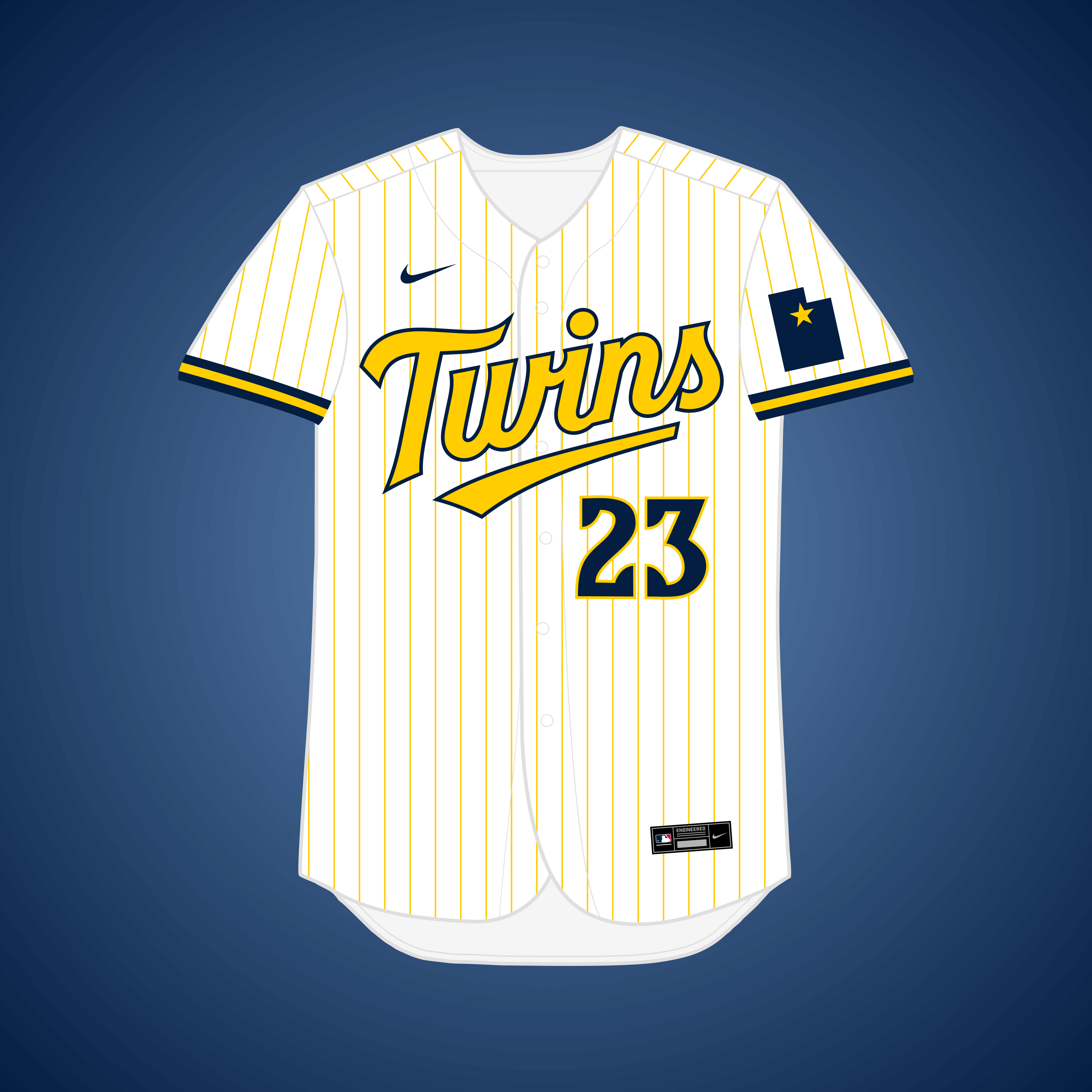
I didn’t think the ‘Twins’ name could work in SLC, but Twitter user @ParqMikey pointed out that it could represent the ‘Twin Peaks’ of the nearby Wasatch Mountains.


What if… the Braves relocated to San Diego?
Braves president John McHale in 1964 admitted he had met with representatives from San Diego about moving the team out West. I went with a scheme inspired by the city’s large naval presence.


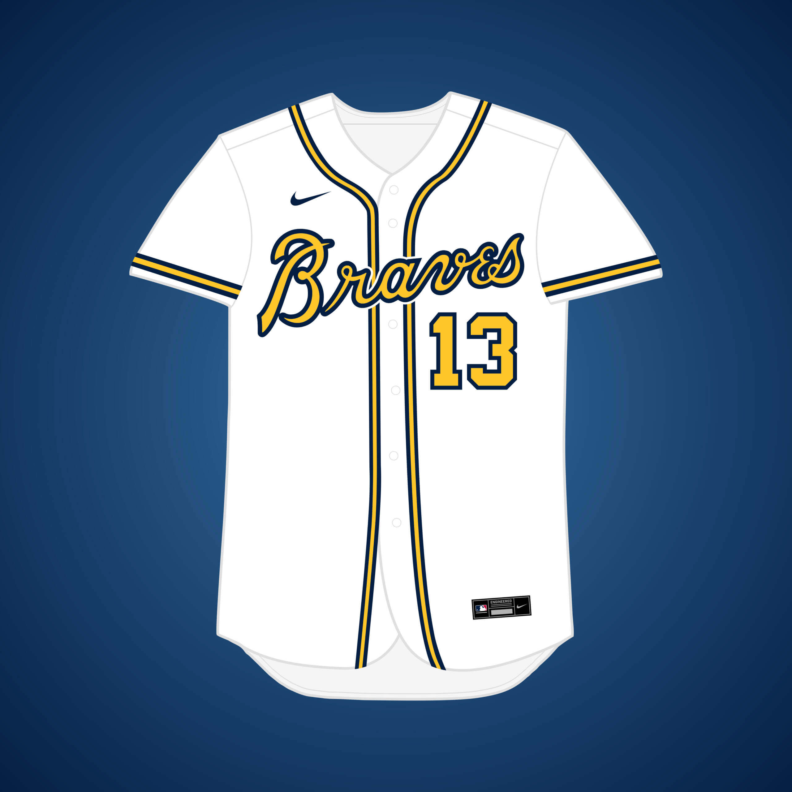
What if… the Braves relocated to Dallas (and changed their name)?
Braves president John McHale also met with representatives from Dallas in 1964 to discuss moving the team there. The Braves’ throwback “Hank Aaron” set was a big source of inspiration for this one.


Once again, thanks Matt! Yet another fun series of “what if’s” — it’s hard to believe there have been so many of these (and harder to believe it’s now reached its conclusion).
Readers? What say you?


The Jays played games in Buffalo also in 2021 also through middle of season. Plenty of merch out there were maple leaf is replaced by standing Bills Buffalo in logos.
Great stuff today, everyone! I always enjoy your jersey concepts, Matthew. They all have a classic feel, and they’re always well-considered and well-executed. My favorites this time around are the Oakland Oaks. (Red and green forever!)
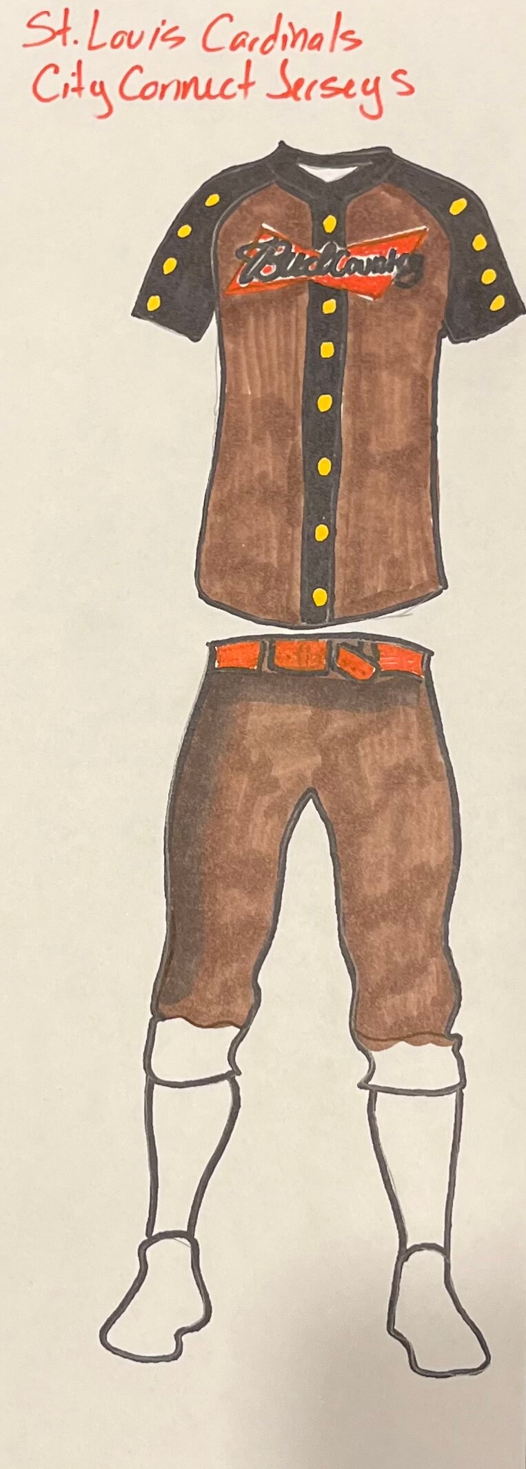
I also appreciate Lauren Krosley’s Cardinals concept. It has a certain DIY charm, and it’s a good reminder that all of us uni-watchers probably have something fun to contribute to our favorite website if we just put in a little time and effort. I can’t say I love the functional uni as across the chest of the jersey, but at least it’s something that makes geographic and cultural sense. And the uniform as a whole is something that tells a St. Louis story better than whatever Nike will roll out. (Granted, I haven’t seen it yet, but I’m confident in my prediction given they’re track record.)
If the Dodgers had moved to Oakland instead of LA, why would they change their colors? The Oakland flag is yellow background with a green Oak tree. However, that’s not why the A’s have these colors. The A’s had changed to green and gold while in Kansas City in 1963, and moved to Oakland in 1968.
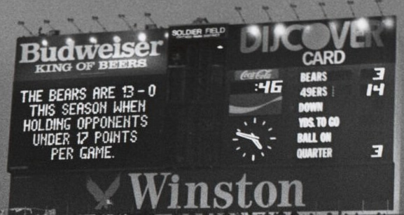
Guess the Game from the Scoreboard is 1988 NFC Championship Game, January 8, 1989. I missed the game due to flying back to the Midwest after Christmas break, but there is nothing more satisfying as a Niners fan than landing at O’Hare to find an airport full of sad Bears fans.
That’s it – you’ve done well, Chris L!
Enjoyed reading your personal connection to the game – 1/2 bonus point awarded for sharing!
1/8/89, SF@CHI – that’s an incredible stat up there on that screen.
These 2 met on MNF in ‘88 Wk 8 (10/24 was the date) with the Bears holding the 49ers to 9…and holding onto a 1-pt margin of victory.
But in the rematch for all the NFC marbles, the ‘9ers were not to be de9, err…denied, eventually amassing 28 points to the Bears 3 – the win sent them to SB XXIII – a real uni-beaut!
Great job Matthew! Love the Minny powder blues too! I’d like to see some teams in powder blues that didn’t have them. The color combos look unique.
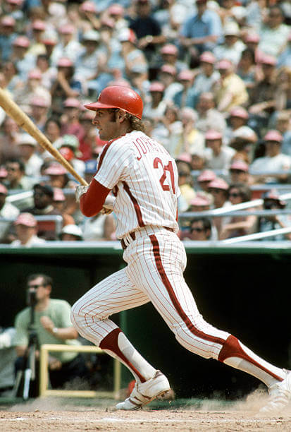
Thanks for the picture of Jay Johnstone in the classic Phillies’ home uniform of the 1970s. IMO, their best uniform ever. Also the last team to wear zippered jerseys.
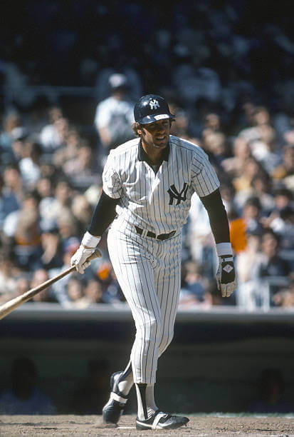
The Yankee pic of Johnstone is intriguing because of the undershirt with the collar!
What’s with the brim label?
Glad you liked it!
Had a pic of him in the powder…but those are so over-exposed, plus I dig the white cleats worn briefly during the Vet era. The pins aren’t my favorite Phils look – the current grays are tops …the late-stage mod P/button-up away set was gone too soon!
GTGFTU
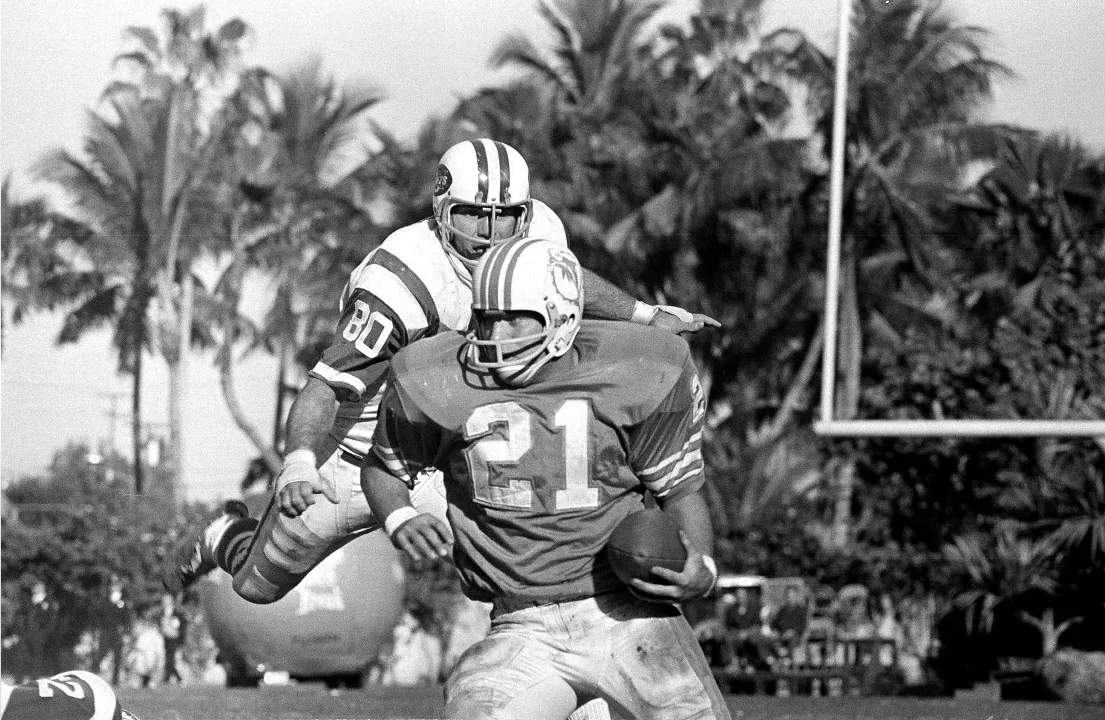
3 October 1971
Jets 14 Dolphins 10
John Elliot in pursuit of Jim Kiick.
Only time the Jets wear their single stripe sleeves in Miami.
That couldn’t be 1971, the Dolphins did not wear sleeve stripes on the dark jerseys in 1971. And that helmet was not worn in 1971. This Dolphin is sticking out of the orange circle on the helmet, by 1971 the dolphin was smaller and inside the orange circle, also the helmet stripes are too wide for 1971, by then they brought them in tight. And finally, Jim Kiick did not wear that dungard in 1971.
Good call Jimmy. The initial guess is not correct (and Marc usually nails these 100%). The game was played Dec. 15, 1968
Yea Phil, too many red flags on that helmet for it to be 1971.
Honestly the better Dodgers question to get the same result is what if they decided to keep their 1937 colors(green/tan)when they introduced the script dodgers the next year.
The amazing thing is, if Ted Turner had changed the Braves to the Eagles, no fans would have objected because he’d wrapped himself so performatively in the flag for years… and because before they’d actually won any championships the fans had no real tie to the Braves identity.
Speaking of the Dodgers, has the Lakers done a City Edition with Dodgers colors yet? link
Cardinals uni-concept needs green socks so the hoofs stand out a little more… love it, and heck yeah, LOL!
Just a quick proofreading: It’s “Walter O’Malley” not “Walter O. Malley”
Thanks Lindsay :)
Now fixed.