[Editor’s Note: Paul is on his annual August break from site (although he’s still writing his weekly Substack column). Deputy editor Phil Hecken is in charge from now through the end of the month.]
Good Wednesday morning Uni Watchers, and a Happy Hump Day to all.
Whenever I do the August weekdays, I always try to run one “Off-Uni” piece, meaning it has nothing to do with sports unis (or logos or equipment or fields, etc.). Today is going to be this year’s entry in the Off-Uni category.
I’m pleased to have today’s guest author — our own Anthony Emerson — bring you his take on this year’s Republican Presidential candidate logos. As the first GOP Debate takes place this evening, the critique is quite timely.
In a way, this is kinda uni-adjacent, (much like any non-sports logo discussions would be), since all of the teams we root for have logos, and Presidential candidates themselves are much more part of a team than they are individuals, so we could almost say these are a group of teams all playing in the same league.
Anthony’s previewed candidate logos before (beginning with the Democratic contestants for President way back in 2019, as well as some congressional logos). And no matter what your politics (whether you favor one party, hate all parties, or don’t even follow politics at all), Anthony is going to be grading these strictly on the logos’ merits. So, worry not about any kind of partisan lean, this is a politics-free look at what the current candidates for the GOP nomination for President have unveiled as their campaign logos. Enjoy!
Here’s Anthony:
by Anthony Emerson
It’s that time of year again. And by “year,” I mean “quadrennial.” After initially appearing to only be a contest between former President Donald Trump and Florida Gov. Ron DeSantis, no fewer than nine other major candidates have emerged, most of whom have unique logos (you’ll see what I mean in a second).
There seems to be some debate about who does and does not qualify as a major candidate in this race. Ultimately, I chose to include only candidates that FiveThirtyEight included in their major poll tracker.

The Trump campaign’s visual identity remains largely unchanged in the eight years since he descended the golden escalator, except for a short-lived “TP” logo after announcing Mike Pence as his running mate in 2016. At the time it looked boring and cut-rate (and it still does), but few can deny it’s been effective for him. The simple, bold design makes it easily translatable to bumper stickers and flags. Still, it’s probably the least graphically-unique logo for a successful presidential candidate since like, what, Nixon? And as we’ll see, just as Barack Obama’s “O” logo inspired Democrats’ designs, Trump’s stripped-down look has inspired Republican designs. Overall: C-
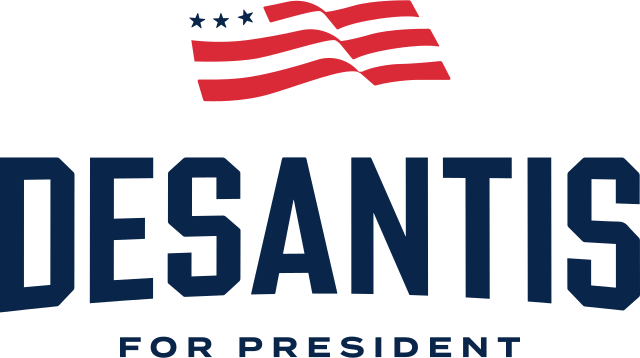
The Florida Governor has gone in a different direction than his recent gubernatorial campaign, choosing to almost completely drop red and going with a new font, vertically arching it, and using a flag design instead of an outline of Florida. The vertical arching gives it a sort of sports-y vibe, which is unique in politics, but it feels staid. Bland. The navy is too dark and doesn’t pop enough against light backgrounds. It is better than the lesser-used “RD24” mark which is available on some campaign merch. Overall: D
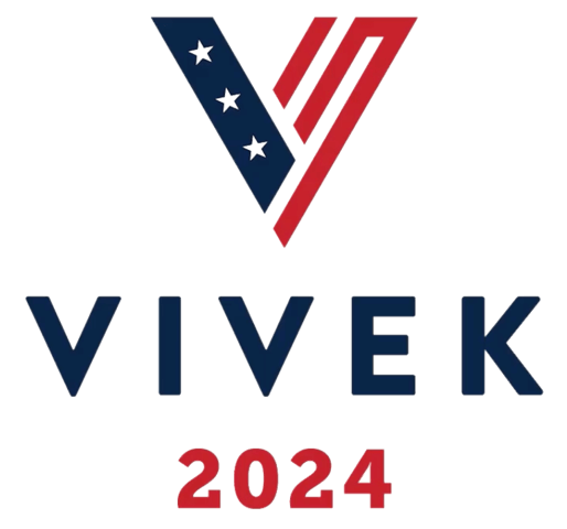
The 38-year-old Ohio native is the only Republican presidential candidate to have what I call an “Obama-style” logo. By that, I mean creating a logo around one letter and making that the go-to mark for almost all campaign iconography. The difference, of course, is that while Obama’s logo was very good, Ramaswamy’s logo is very bad. The actual “V” mark is too busy. The stripes on the right-hand side don’t make any sense — they connect to close the second arm of the “V”, but then there’s a third stripe that isn’t connected and actually throws off the balance of the entire thing. The fonts used are bad, too. Overall: F.
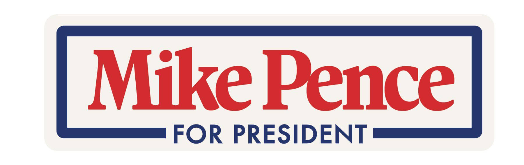
Mike Pence becomes the first Vice President to run against their former running mate since John Nance Garner challenged Franklin Roosevelt for the Democratic nomination in 1940. I bring this up because Pence’s logo is closer to the design sentiments of 1940 than 2024. And I love it. The serif font for Pence’s name feels warm and nostalgic to the early 1980s (which makes sense for a guy whose idol is Ronald Reagan), and to be honest, I love the whole vibe. I love this retro-cool look when it’s on yogurt containers and I love it on campaign logos. I’m not sure I like the cold, corporate sans-serif of “for President”. It sort of breaks the logo’s whole vibe. But this stands head-and-shoulders above the rest of the field. Overall: A

And now for something completely different. Haley’s logo takes the exact opposite design cues from Pence (though hilariously they are using an identical font for the “for president”). While Pence’s feels nostalgic, Haley’s design is planted firmly in the contemporary. To give it a very tiny touch of pizzazz, the logo doesn’t fully connect the arm of the “A”, creating a “slash” effect that the rest of her graphic package uses. The thing is, this could easily be the logo of a law firm or a bank. It doesn’t feel authentic in the way that many campaign logos do. It’s almost too clean. Overall: C+.

Straight off the bat, I have an issue with the kerning here. It’s totally inconsistent and looks completely amateurish. The “C” and “H” feel too far apart, that “T” is out on an island by itself, and that “S” looks like it has two different distances between the “I” and the “T”. And on top of that, it’s boring. There’s nothing going on. When Chris Christie ran for Governor of New Jersey, he used the Impact font for his campaign identity, and it works so much better than what he has now! Christie ran for Governor as a bold, aggressive reformer, and he’s attempting to do the same thing with his presidential campaign by relentlessly attacking Trump. The thing is, his logo is that of a boring, don’t-rock-the-boat, establishment candidate. It doesn’t fit with the brand he’s trying to cultivate. Overall: F.
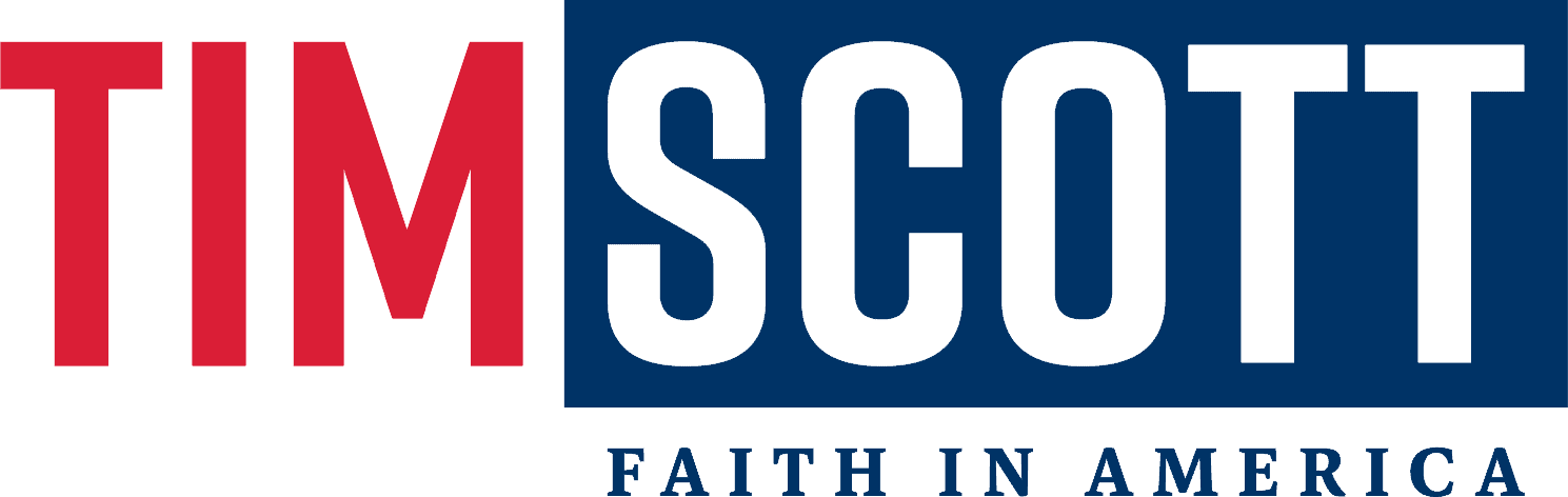
It is funny we have two candidates from South Carolina, and both have gone with logos where half their name is in one color and the other half in another. Okay, at least I find it funny. Scott has gone in a radically different graphic direction from his Senate campaign, where he used Trajan Pro as his previous typeface, a strong, imposing (albeit overused) typeface. Here, he’s gone with a more playful, rounded font than Trajan’s firm serifs, but I don’t think it works with his name, and the arms of the “C” come too close together. Overall: C-.
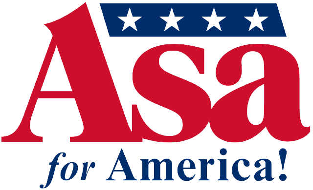
This is like the Great Value version of Pence’s logo — like Pence, he has an early-80s-style serif font, but it feels less slick and more half-rate than Pence’s. He also loses major points for basically carbon copying his gubernatorial logo to his presidential campaign. And didn’t we collectively decide as a society that we were nixing exclamation points from campaign logos after the Jeb! debacle in 2016? Overall: D+.
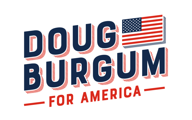
Let’s ignore for a second that Burgum is using the progressive tilt and Alexandria Ocasio-Cortez’s font. It looks like Doug Burgum’s design guy came up to him with a handful of design ideas and Burgum went “These are all great. Let’s do them all.” Let’s tilt the logo and include drop shadows and have a flag and have the drop shadows be stripy for some reason and make the flag 50 stars. It’s all too much, but credit to Burgum for trying something at least a little different. Overall: C-.

Will Hurd’s logo feels very Texas to me, like if you had a TV show set in Texas politics, this would be the title logo. I’m not sure why the “R” is in red — perhaps it’s to remind voters that Will Hurd is, in fact, a Republican, despite running on a very moderate platform. Like Pence, Hurd’s designer chose to switch to a more modern sans serif for the “For America” portion of his logo, and it doesn’t work. If you’re going to go with a bold serif font, commit to it. Overall: C+.

Is anyone else feeling déjà vu? It appears we are ending where we began, because Francis Suarez’s logo is a complete ripoff of Donald Trump’s. Even the font is the same. Suarez makes slight alterations, like the inclusion of his first name, no stars and an italicized slogan, but come on, man. Who do you think you’re fooling? Overall: F for theft.
Readers? What do you think? Do you agree with the grades? If you were to rank them from best to worst, what would you choose (based on logo alone). Let’s keep any politics out of the comments, please. Picture these as “team” logos and let’s treat them as such. OK? OK!


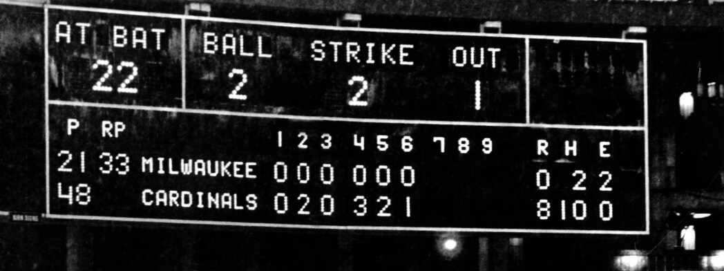


GTGFTS: 1982 World Series Gm 6, October 19 at Busch Stadium (II) – Cardinals beat the Brewers 13-1, tying the series at 3 games apiece
Beat me to it!
You ain’t lyin’, Ryan – that’s correct!
Don Sutton got rocked…Doc Medich didn’t fare much better.
I was -10 when my hometown Phillies won in ’80 – can’t claim I recall all that much about that WS except for watching the parade on a TV that a classmate’s parent brought to school. In ’81 I wasn’t all that jazzed about the Dodgers/Yankees matchup. But ’82 for some reason really piqued my interest (probably the uniforms)…this was the 1st WS that I watched every game beginning to end, including this rout. Was really disappointed the Brewers lost – a down-in-the-mouth feeling that went unsurpassed until ’93.
GTGFTS: 1982 World Series Game 6. 19 October 1982. Busch Stadium II, St Louis, MO. Cardinals stave off elimination with a 13-1 blowout win.
Loved the dissection of the political logos today.
The scoreboard was from the bottom of the 6th inning of Game 6 of the 1982 World Series (Brewers at Cardinals, 10/19/1982). Don Sutton started for Milwaukee, John Stuper for Saint Louis. This was the middle of what would be a 6-run 6th inning for Saint Louis (they would win 13-1), and Doc Medich was pitching to David Green. The photo seems to show raindrops beating down; no, I wasn’t at the game (I was only 13 years old at the time and living in Northern Wisconsin), but I recall the game being plagued by rain delays.
Fun reviews! I’d have graded a few differently, but the average of grades here feels right to me for the field. On the Pence logo, it hits me with a similar nostalgic appreciation, Gen Xer that I am. But that look is actually more of a circa 1990 thing; the closest real presidential logos to it in terms of type and color are Dukakis ‘88 and Dole ‘96. Presidential campaigns weren’t always as consistently branded as they tend to be now, but sans serif fonts were more common in the 1970s and 80s than we tend to remember. Carter mostly used sans serif, mostly reserving his serif fonts for green campaign graphics. Mondale ‘84 used a graphically bold sans serif that would look at home on the campaign trail today. Reagan used a bold white serif on navy in the 1980 primary, but the two Reagan/Bush campaigns mostly used sans, and Bush/Quayle primarily used a sans Bush and a serif Quayle.
What I think Pence really resembles is lower-level candidates from the 80s and 90s. My mind’s-eye idea of a campaign yard sign from my childhood is basically the Pence logo, but with the name of any given generic candidate for governor, senator, or state rep. It’s like the default format if you went to a sign-maker circa 1986-98 and just asked for yard signs with your name on them.
As to the rest of the field, while I agree with the narrative assessment of the Burgum logo, it’s the only one that speaks to me in the way that really good campaign logos do. The only thing I really mind about it is the blue drop shadow on the flag. Eliminate that drop shadow entirely, expand the flag to fill the vacated space, and leave the flag flat so that the letters pop more, and I’d rank it not far below Obama or McCain ‘08.
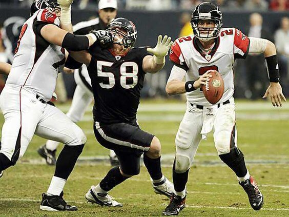
GTGFTU: 12/04/2011; Atlanta Falcons (10) at Houston Texans (17), Reliant Stadium.
Just gotta wonder if the Refs called the facemask…
The sans serif font on the Pence logo is Futura, which, name notwithstanding, is an era-appropriate font if you’re going for midcentury throwback. Futura is more famous for its starring roles, but it was commonly used for smaller, secondary stuff as well. Such as “for president”. I don’t think the choice of Futura was wrong, but I do agree that something’s off about it – probably ought to be a little smaller, maybe lighter too.
I actually thought Vivek’s use of double V’s was pretty distinct. I also thought DeSantis’ vertical arching was a clever move.
Pence’s looks like the label for a brand of room temperature milk products for seniors.
Doug Burgum’s logo is great, you guys are drunk. I know literally nothing about him nor do I care but that’s a nice looking logo. Very vintage Americana. Like something you’d see on an Old Navy 4th of July t-shirt. I’m here for it.
Burgum’s logo works well as a design assignment; I just don’t know how well it’ll translate to yard signs and bumper stickers. But yeah, I agree it’s underrated.
The New York Times today ran a photo of Burgum speaking at a campaign event alongside a news story about his basketball injury, and in the photo the candidate is wearing a navy shirt with a version of his logo with his name in white without the drop shadow and with a red 24 in place of the flag. It’s very good; his team seems to have though through how to adapt the logo for various media and formats, and as with the Obama logo in 2008, the campaign may be evolving the logo as the weeks go by.
That’s a pretty good adaptation, if a little boring.
No one sees the Patriots design in the DeSantis logo?
After Anthony mentioned a “sports” vibe, I totally saw that, and you nailed it, very Patriot-like…
I noticed that before I read one word. Soon as I saw the opening graphic I pictured their Super Bowl end zone.
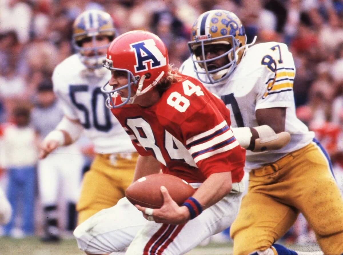
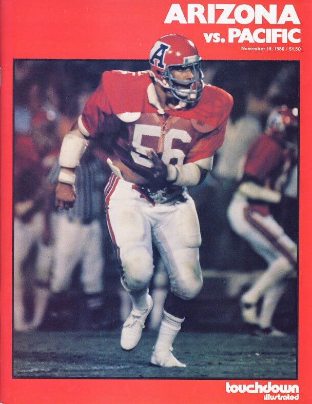
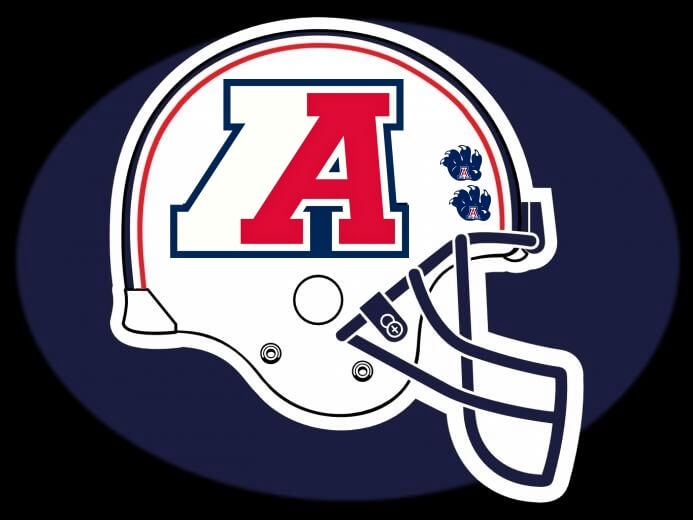
Jimmy, love your “Action A” helmet (that’s what Akron called it when we had the same design).
The Pence logo looks like it would be th author on like babysitters club or something of that era
I think the Asa logo is nice overall, but it looks like someone just typeset Times New Roman for the bottom text instead of matching the serif typeface used in Asa. (insert face palm emoji here)
Nikki Haley’s logo looks like it’s for a real estate agent/agency.
Did we ever have a historical analysis of presidential campaign logos on Uni Watch — kept to just the main party nominees (and any high-profile independents, like Ross Perot)? I’d find that a fascinating read, especially in context of — like noted above with regard to the Trump and Obama logos — how the designs had impacts across other designs.
Agreed. Also I wonder if there’s any consistent correlation between the logo quality and candidate success, at least in the primary? In 2008, the candidates with the better logos performed better in each party’s primary. And Mitt Romney’s 2012 primary logo, while a bit weird, was a class above his GOP rivals. I’m not sure this holds for either party in 2016, though the 2020 Democratic primary results aligned with logo design quality. Is this an accident, does graphic design quality influence voters’ opinions, or is there perhaps a correlation between a campaign’s fiscal resources, staffing quality, and strategic focus as it pertains to graphic design as well as to ballot-box success? Like, if a candidate has the resources to create a quality visual brand, and chooses to devote the necessary monetary and staffing resources to the branding project, does that tend to correlate with the kind of resources and decisionmaking more likely to win a primary campaign?
* I meant to mention that I regard the Biden 2020 primary campaign logo as akin to the Romney 2012 primary logo as being a bit weird but also the best of the bunch in the primary. Didn’t mean to pick on Mitt in terms of damning with faint praise.
For the 2024 GOP, the uniformity of primary navy, secondary bright red really stands out. There was much more variety of colors and visual styles in the last open GOP primary, 2016. Trump was royal/medium blue, Jeb was red, Rubio and Kasich were navy and red, Cruz was predominately gray.
Love the white Arizona helmet, that “in-motion” A logo should make a comeback…
Trump logo is now bothering me cause while reading Anthony’s cool article, I noticed the U is not centered on the stars(its the M, I know but still bothersome), and Vivek’s V has stars that are not vertical or aligned with the V’s angle, hmmm
The Arizona A Jimmy used makes the helmet look ‘fast’ – and kudos for keeping the facemask blue!
Well done!
That Arizona helmet is nice, the only presidential campaign logo pictured here that piques my interest is the Burgum one. It looks like an attractive book cover design so graphically it works for me. I have a book called Design for Obama (Taschen) which has some interesting designs that never made it.
“I never liked the current A. I thought it looked more like a high school logo”
I couldn’t disagree more. I think the current Arizona “A” is distinct, very recognizable, and looks better than most college football helmet logos. I know it’s been tweeked since the Desert Swarm days, but it is still a winner.
That Asa Hutchinson logo has strong “Jeb!” vibes.
“(whether you favor one party, hate all parties, or don’t even follow politics at all)”
I’ll take the fourth option, Canadian
Anyway. I like the gradient in Suarez’ logo, its one more way it stands apart from Trumps, and I’m always in on a gradient.
I agree completely on Pence’s logo. Very Reagan-Bush 1984 vibe.
Its interesting how some candidates use two names and some use one. If you need to use both names, are you a serious presidential candidate? Or is the name there to balance the logo (I don’t think Borgum’s logo works without two names)? I don’t know.
GTGFTS
October 19, 1982, Game 6 of the World Series between the Milwaukee Brewers and St. Louis Cardinals at Busch Stadium II. Cardinals won 13-1 and won the world series the next day. Rookie starter John Stuper pitched a complete game only allowing one run and four hits in 104 pitches despite two rain delays. Stuper called it “the best game of [his] life”. Hall of famer Don Sutton was on the losing end, surrendering 8 runs before being taken out after five.
The Doug Burgum for America logo looks like the title card for a Comedy Central show that’s a spoof about a presidential campaign. Probably starring that guy from “The Daily Show”.
Honestly, I think they’re all awful. And while I get why they’re not, I’d kill for just one of them to use a colour scheme other than red, white, and blue. Were I a Republican (and not, y’know, Canadian), that alone might be enough to get my primary vote.
Nikki could have played with the angling and sliced the Ks the same direction in which the A is sliced. Nikki is a hard-looking word, maybe should have a design that would put it in some sort of script for a more relatable feel.
I love the old Arizona logo, is bold and imaginative. Good update proposal, too. :)