Tired of seeing annoying ads (like this one!) on Uni Watch? There’s a simple solution: Join Uni Watch Plus. You’ll get an ad-free site experience, plus exclusive access to our UW+ discussion forums, push notifications whenever a new blog post has been published, a special UW+ badge accompanying all your comments on the blog, and a 20% discount on our Teespring merchandise.
[Editor’s Note: Paul is on his annual August break from site (although he’s still writing his weekly Substack column). Deputy editor Phil Hecken is in charge from now through the end of the month.]
Today we have a special guest article from our own Jamie Rathjen. I’ll have more stuff after the lede — PH
• • • • •
Williams Returns Gulf Oil to F1 Grid by Jamie Rathjen
Earlier this year, the Williams Formula One team signed an advertising deal with Gulf Oil. A few months into the season, they announced a fan vote on which one of four designs based on the distinctive light blue and orange Gulf Oil livery they would use for three races in Singapore, Japan, and Qatar, in September and October.
The Gulf Oil livery has a long history in motorsport, although largely in sports car racing where it appeared prominently on Ford and Porsche cars in the 1960s and ’70s. You might know it from the movie Le Mans, where it appears on Steve McQueen’s car.
As a company, Gulf Oil was an independent oil company in its heyday of motorsport advertising through 1985, when it was part of a merger to form what is now Chevron. It now seems to exist as a brand of motor oil, but one that also puts its logo on things for the nostalgia effect. (If anyone knows more than that, please tell us in the comments.)
In Formula One, Gulf Oil had a deal with McLaren that expired after last season before signing one with Williams. The livery last appeared in F1 in May 2021 at the Monaco Grand Prix, shown below.
McLaren also has a long history with Gulf. The partnership started in 1968 in both F1 and sports cars for a few years, returning to sports cars in the ’90s, and most recently with their F1 deal through last season.
The livery’s classic appearance was primarily light blue with an orange stripe down the center. That was recreated for McLaren’s livery in 2021, but this time was on the choice that ultimately finished second.
All four designs have a light blue base and orange accents, but vary in the use of orange, black, and other colors, and how and where they are used. They’re all strong departures from Williams’s normal livery for this season, which is dark blue.
The winning design was called “Bolder than Bold,” which is supposed to have a camo pattern and orange shapes in various places. It beat out the three others in a short knockout tournament. All four designs are shown below.
Additionally, Williams’s pit crew has already been wearing helmets based on the Gulf color scheme with black firesuits. It’s hard to find a lot of pictures and Williams’s pit stops don’t tend to get on TV as they’re perpetually near the back of the field, so I first noticed the crew’s look at the Hungarian Grand Prix last month. It appears they’ve been wearing those helmets for most of the season, though.
The team also has pages on the first, second, third, and fourth designs, counting based on the image above, and on the design process for the finalists.
Uniform Concepts and Tweaks
Time for more Uni Tweaks from the UW readership.
I hope you guys like this feature and will want to continue to submit your concepts and tweaks to me. If you do, Shoot me an E-mail (Phil (dot) Hecken (at) gmail (dot) com).
• • • • •
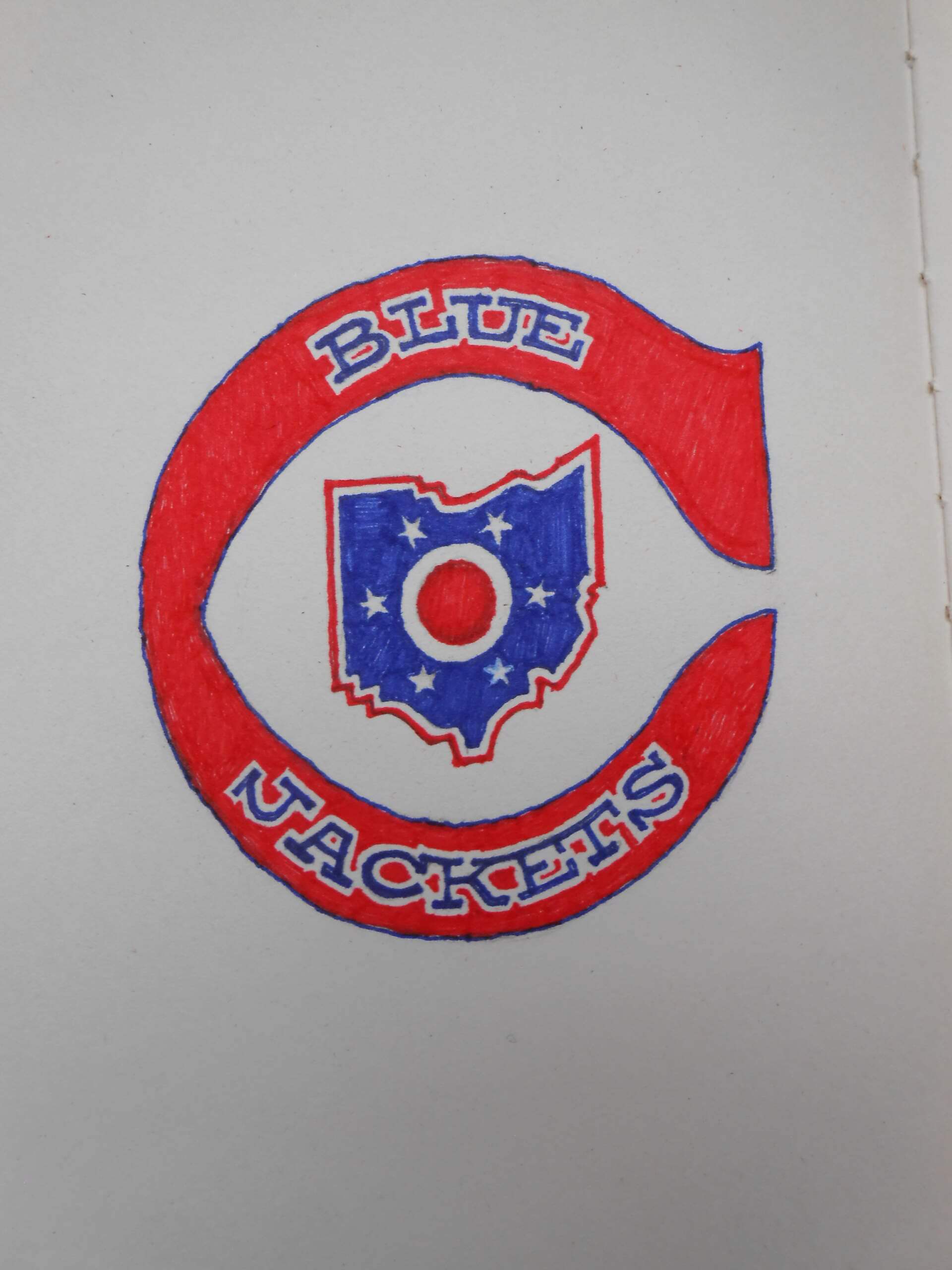
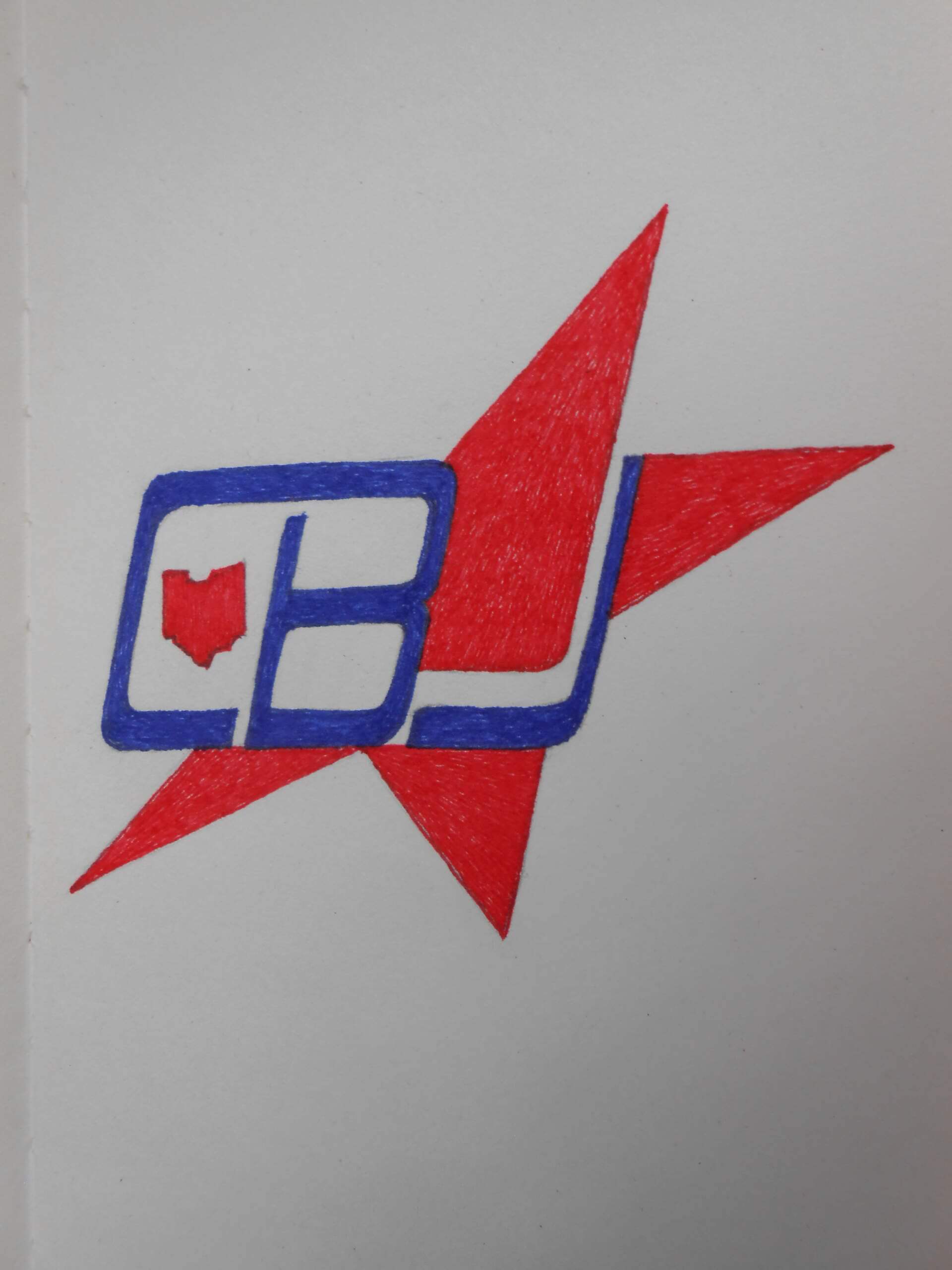
Today’s concepts come from Walter Helfer.
Dear Phil,
Enclosed please find two insignias for the NHL Blue Jackets. The expansion teams of the 1990s were a mixed bag: Logo design was not as coherent as it was in the ’70s, which I consider a Golden Age. The worst offenders– the Panthers and Lightning– eventually changed to improved, simpler crests. And then there’s Columbus: I admit there’s not much about this team that I like, certainly with respect to Ohio’s Crusaders, Stingers and even the short-lived Barons, whose logo fu were superior to the Jackets in nearly every way. The cannon is their best insignia, but that’s because the curly flag, the insect, the hat and the star-spangled ribbon were so bad.
One logo is plainly a tribute to the Barons, a team that deserved better, based on their looks. The second is a riff on the 1970s aesthetic that informed some of the NHL’s best uniforms. Both insignias are red, to make them better stand out against the blue sweater.
Walter
• • • • •
OK readers (and concepters). If you have some tweaks or concepts, shoot ’em my way with a brief description of your creation and I’ll run ’em here.
And Now a Few Words from Paul
Paul here, letting you know that my Premium article over on Substack this week is a Uni Watch Power Rankings rundown of all 30 MLB teams, from worst to first.
You can access the first part of the article here. In order to read the entire thing, you’ll need to become a paying subscriber to my Substack (which will also get you access to my complete Substack archives, and will also get you my upcoming NFL Season Preview, which will be published on Sept. 5). My thanks, as always, for your consideration and support!
Okay, now back to Phil.
Guess the Game from the Uniform
Based on the suggestion of long-time reader/contributor Jimmy Corcoran, we’ve introduced a new “game” on Uni Watch, which is similar to the popular “Guess the Game from the Scoreboard” (GTGFTS), only this one asked readers to identify the game based on the uniforms worn by teams.
Like GTGFTS, readers will be asked to guess the date, location and final score of the game from the clues provided in the photo. Sometimes the game should be somewhat easy to ascertain, while in other instances, it might be quite difficult. There will usually be a visual clue (something odd or unique to one or both of the uniforms) that will make a positive identification of one and only one game possible. Other times, there may be something significant about the game in question, like the last time a particular uniform was ever worn (one of Jimmy’s original suggestions). It’s up to YOU to figure out the game and date.
Today’s GTGFTU comes from Jimmy Corcoran himself.
Good luck and please post your guess/answer in the comments below.
And finally...
…that’s it for the early morning article — big thanks to our own Jamie Rathjen for that!
In case you missed it, there was some fairly big uni news late(r) yesterday you may not have seen or commented on: the Bengals basically confirmed they’ll be wearing their white helmets with their primary white jersey, and the Minnesota Vikings will be honoring their long-time coach and legend Bud Grant with a jersey patch in Week 1 (when they will be wearing their throwbacks), and a helmet decal to be worn all season long.
Also, Cincinnati Bearcats football did unveil one new uniform yesterday (an all-black get-up), and I’ll have more on that later today.
Please keep checking back throughout the day as I’ll try to have any breaking news covered.
Ah, the Gulf livery. I buy any Hot Wheels model in that light blue and orange, it is such a sweet color combination. Wish some sports team would adopt that (without a Gulf ad on the uniform, that is).
The shade of blue is similar to the one Celta Vigo uses, but I don’t see any evidence of them ever using orange as an accent colour on their home shit. I can’t even think of a single soccer team using this combo as an away or third kit, which kind of boggles my mind.
Me either, which blows my mind. There has to be one…
I believe that the Minnesota Kicks of the old NASL used this color scheme (or close to it)
Very sharp! It set them apart from the others for sure…
Good shout Dave!
I was hoping to find something in light blue with orange accents. From what I see, the Kicks had an orange kit and a white kit.
Valencia have had orange away shirts with light blue accents in the past.
Oops, home *shirt.
That’s what happens when you write “kit” and decide to change it to “shirt”!
Celta indeed and Lazio Roma plus 1860 Munchen but none of them carry orange as the secondary color. Those are from the top of my head. Man City are called the Sky Blues but their hue of blue is actually darker than Celta. Or Gulf. Maybe somewhere in Argentina or Brazil I can spot a team in Gulf livery…
UTEP football came really close to that combo in the 80s.
These 2 Blue Jackets logos are actually very nice in a faux retro way. I would leave out the state in the CB monogram, it clutters it a bit. And you already have it in the other logo. I would use both of them.
Thanks, Ingmar. Believe it or not, the ball got rolling as I was sketching Capitals’ logos, looking for a better letter than the “t” for the hockey stick.
Race cars always look great in Gulf blue and orange. Another nice touch is that the top of the car is painted to look like a Duracell battery.
I’m glad somebody noticed that, it’s carried over from the normal livery to this one.
Agreed! Great work!
True…but better when they are Petty blue and dayglo red (which ‘looks’ orange to me when the light caught it just right): link
It’s too bad Gulf never made in-roads in NASCAR…my preferred series until recently but it’s getting tougher and tougher to even uni-watch their product.
I’m not into F1 or any kind of racing but that has to be the nicest livery I’ve ever seen.
Same here!
I’m curious why they use light blue when the Gulf logo has dark blue lettering. Definitely not complaining, just curious.
I’d also like to thank my friend Alicia (if you’re reading this, hi!) for suggesting that I write about motorsports.
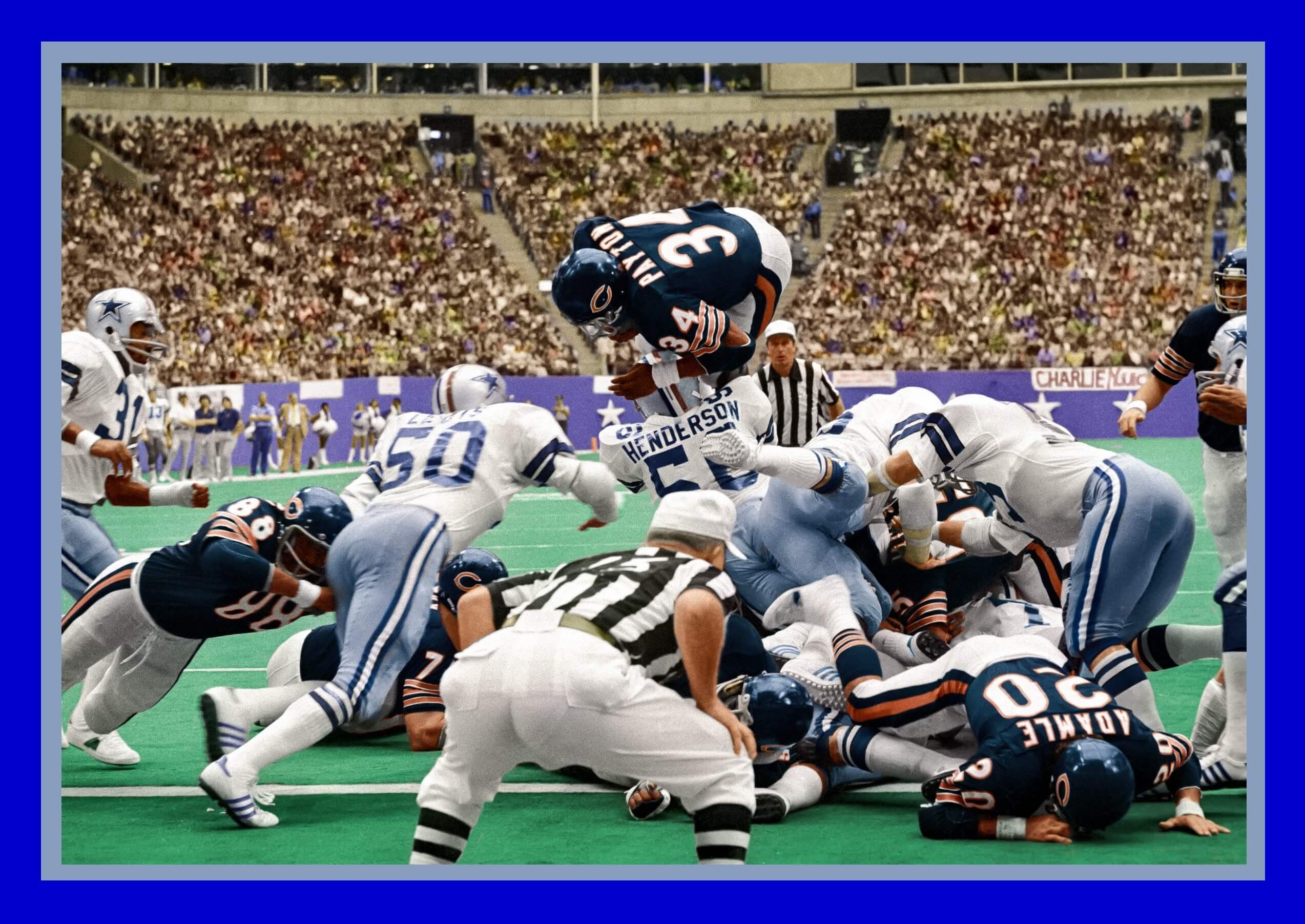
GTGFTU: October 24, 1976, Bears 21, at Cowboys 31.
You could tell it was a game from that year because of the Cowboys helmet striping. the only wore it that year for the United States bicentennial
And if you look really hard at the grandstands you may see a young Brinke Guthrie ; )
I Miss Collector’s Corner.
I was thinking the same thing Allan, in B and W it would have been a little harder because the red stripe on the Dallas helmet wouldn’t have given it away.
Walter…just amazing work! Absolutely love the 1970s inspired logo!
Thanks, Memal! I was concerned that my criticism of the team’s appearance would be taken as dismissing the team in general. Sometimes a good uniform is all it takes to get me in their corner.
If the Blue Jackets adopted your Barons inspired logo, I’d become more than an extremely casual hockey fan. I love it.
Walter’s harken-back to the Barons makes me reconsider my ‘rule’ about teams helping themselves to departed/abandoned histories of other franchises.
They deserve to live on, and who better than the Blue Jackets to carry on their brief legacy…if San Jose can channel the Seals, there’s no one better suited to remember the Barons than Columbus.
Absence does make the heart grow fonder, and no better example exists than the Barons; a team that was regarded as an embarrassment during its brief tenure. At the time, I remember thinking, “Ooh, that’s a bit too close to the Blackhawks.” A decade or so later, it was the Devils’ turn to borrow Chicago’s uniform.
“As a company, Gulf Oil was an independent oil company in its heyday of motorsport advertising through 1985, when it was part of a merger to form what is now Chevron. It now seems to exist as a brand of motor oil, but one that also puts its logo on things for the nostalgia effect.”
I think this is correct in the US only, Gulf has continued in other parts of the world for decades after.
Okay the gulf look is nice, but I’m sorry Williams has a number of great liveries they can throw back to; their Saudi Air early 80s, the Mid 80-early 90s Yellow-Blue-White Mansell era, and the Rothmans era. Any of those would look amazing. Why go with Gulf?


Ah, the Gulf livery. I buy any Hot Wheels model in that light blue and orange, it is such a sweet color combination. Wish some sports team would adopt that (without a Gulf ad on the uniform, that is).
The shade of blue is similar to the one Celta Vigo uses, but I don’t see any evidence of them ever using orange as an accent colour on their home shit. I can’t even think of a single soccer team using this combo as an away or third kit, which kind of boggles my mind.
Me either, which blows my mind. There has to be one…
I believe that the Minnesota Kicks of the old NASL used this color scheme (or close to it)
Very sharp! It set them apart from the others for sure…
Good shout Dave!
I was hoping to find something in light blue with orange accents. From what I see, the Kicks had an orange kit and a white kit.
Valencia have had orange away shirts with light blue accents in the past.
Oops, home *shirt.
That’s what happens when you write “kit” and decide to change it to “shirt”!
Celta indeed and Lazio Roma plus 1860 Munchen but none of them carry orange as the secondary color. Those are from the top of my head. Man City are called the Sky Blues but their hue of blue is actually darker than Celta. Or Gulf. Maybe somewhere in Argentina or Brazil I can spot a team in Gulf livery…
UTEP football came really close to that combo in the 80s.
link
These 2 Blue Jackets logos are actually very nice in a faux retro way. I would leave out the state in the CB monogram, it clutters it a bit. And you already have it in the other logo. I would use both of them.
Thanks, Ingmar. Believe it or not, the ball got rolling as I was sketching Capitals’ logos, looking for a better letter than the “t” for the hockey stick.
Race cars always look great in Gulf blue and orange. Another nice touch is that the top of the car is painted to look like a Duracell battery.
I’m glad somebody noticed that, it’s carried over from the normal livery to this one.
Agreed! Great work!
True…but better when they are Petty blue and dayglo red (which ‘looks’ orange to me when the light caught it just right):
link
It’s too bad Gulf never made in-roads in NASCAR…my preferred series until recently but it’s getting tougher and tougher to even uni-watch their product.
I’m not into F1 or any kind of racing but that has to be the nicest livery I’ve ever seen.
Same here!
I’m curious why they use light blue when the Gulf logo has dark blue lettering. Definitely not complaining, just curious.
I’d also like to thank my friend Alicia (if you’re reading this, hi!) for suggesting that I write about motorsports.
GTGFTU: October 24, 1976, Bears 21, at Cowboys 31.
You could tell it was a game from that year because of the Cowboys helmet striping. the only wore it that year for the United States bicentennial
And if you look really hard at the grandstands you may see a young Brinke Guthrie ; )
I Miss Collector’s Corner.
I was thinking the same thing Allan, in B and W it would have been a little harder because the red stripe on the Dallas helmet wouldn’t have given it away.
Walter…just amazing work! Absolutely love the 1970s inspired logo!
Thanks, Memal! I was concerned that my criticism of the team’s appearance would be taken as dismissing the team in general. Sometimes a good uniform is all it takes to get me in their corner.
If the Blue Jackets adopted your Barons inspired logo, I’d become more than an extremely casual hockey fan. I love it.
Walter’s harken-back to the Barons makes me reconsider my ‘rule’ about teams helping themselves to departed/abandoned histories of other franchises.
They deserve to live on, and who better than the Blue Jackets to carry on their brief legacy…if San Jose can channel the Seals, there’s no one better suited to remember the Barons than Columbus.
Absence does make the heart grow fonder, and no better example exists than the Barons; a team that was regarded as an embarrassment during its brief tenure. At the time, I remember thinking, “Ooh, that’s a bit too close to the Blackhawks.” A decade or so later, it was the Devils’ turn to borrow Chicago’s uniform.
“As a company, Gulf Oil was an independent oil company in its heyday of motorsport advertising through 1985, when it was part of a merger to form what is now Chevron. It now seems to exist as a brand of motor oil, but one that also puts its logo on things for the nostalgia effect.”
I think this is correct in the US only, Gulf has continued in other parts of the world for decades after.
Okay the gulf look is nice, but I’m sorry Williams has a number of great liveries they can throw back to; their Saudi Air early 80s, the Mid 80-early 90s Yellow-Blue-White Mansell era, and the Rothmans era. Any of those would look amazing. Why go with Gulf?