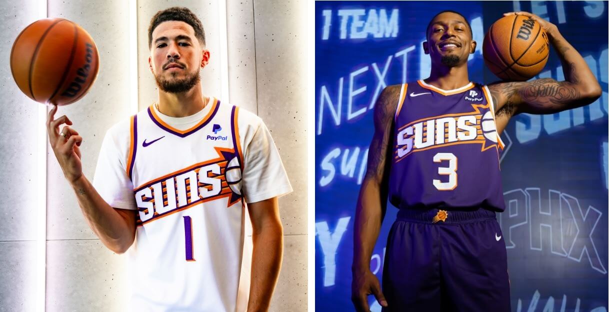
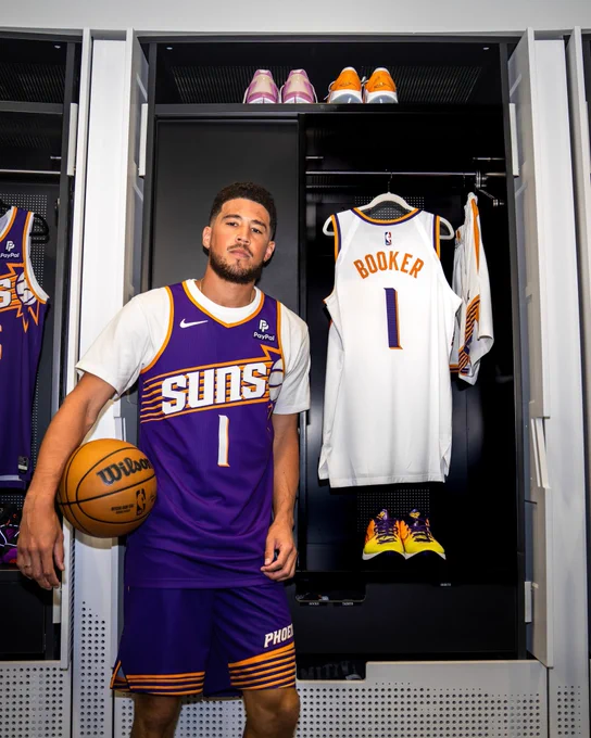
As expected, the Phoenix Suns debuted two new uniforms this morning: a white (“Association”) and purple (“Icon”) set, that are a harkback to the team’s 1992-2000 sunburst gems.
According to Suns CEO Josh Bartelstein, “The sunburst is an iconic design that is one of the most popular among Suns fans; it represents some of the most defining moments in our team’s history. These new uniforms seamlessly blend the nostalgia of the past with the excitement of the future as we begin the next great era of Suns basketball.”
The new uniforms will pair with a new all-black uniform which was introduced last season. The Suns will also have a new “City” edition uniform, which will be unveiled later this year.
WHITE UNIFORM:
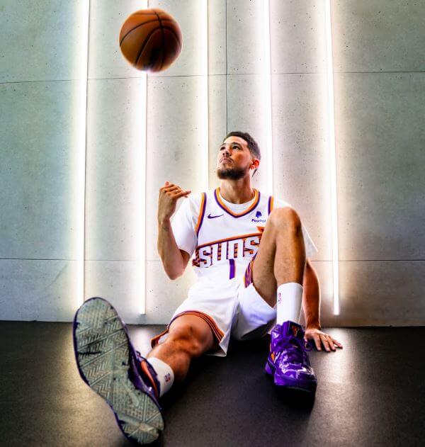
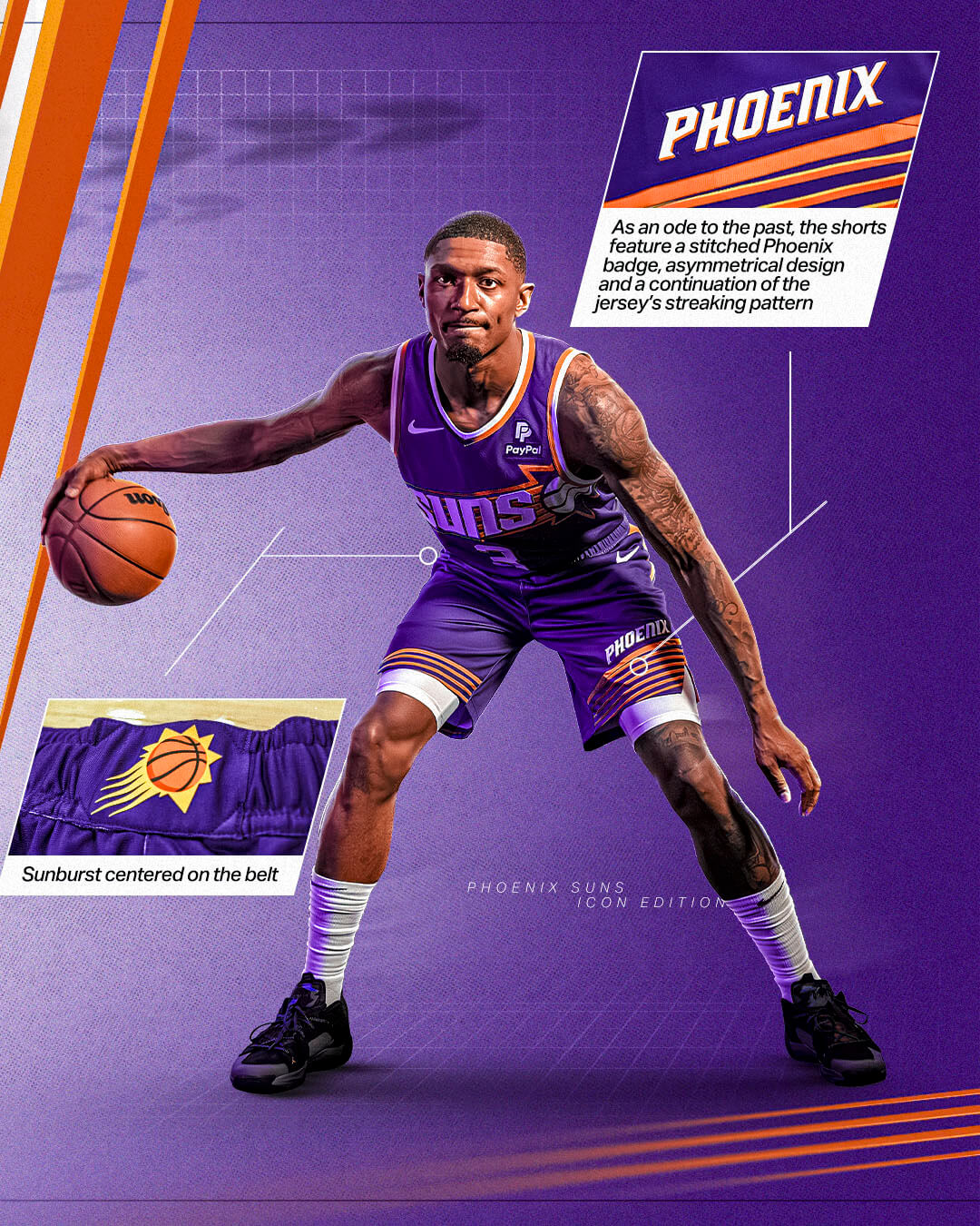
The white and purple uniforms are basically color inverses of one another. According to the team, the uniforms “feature a streaking sunburst with an embroidered Suns wordmark above stitched drop shadow numbers” while “the shorts feature an asymmetrical design with the Phoenix wordmark and a continuation of the jersey’s streaking pattern. The team’s primary icon logo is centered on the beltline.”
It’s all very reminiscent of the classic “sunburst” unis worn in the 1990s.
Here’s a closeup on the white jersey details:
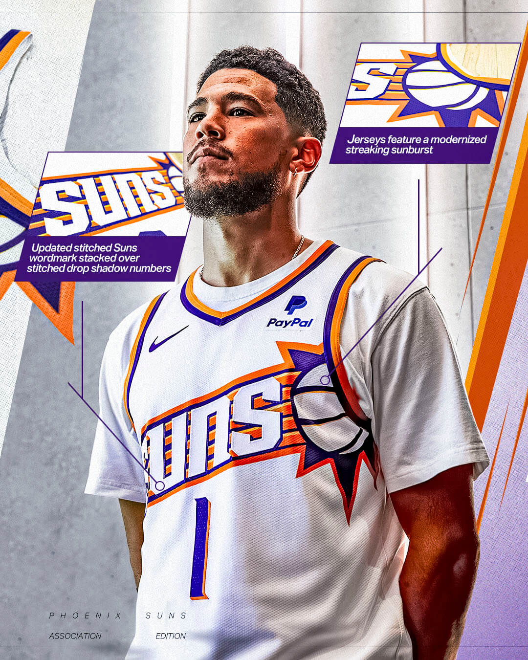
The lines in the sun’s flare on the jersey are much thicker than in previous years. The previous black lines in the team’s logo are now purple. Front numbers are now centered on the jersey (whereas previously they were on the left side and closer to the sun logo). On the white jersey, the number is rendered in purple, with an orange block shadow.
The pants are also a harkback to the Suns mid-1990s look, which feature an asymmetrical design with the Phoenix wordmark and a continuation of the jersey’s sunburst pattern. The “PHOENIX” wordmark, like the numbers, is rendered in purple with orange block shadow. Purple and orange striping surround the collar and arm holes.
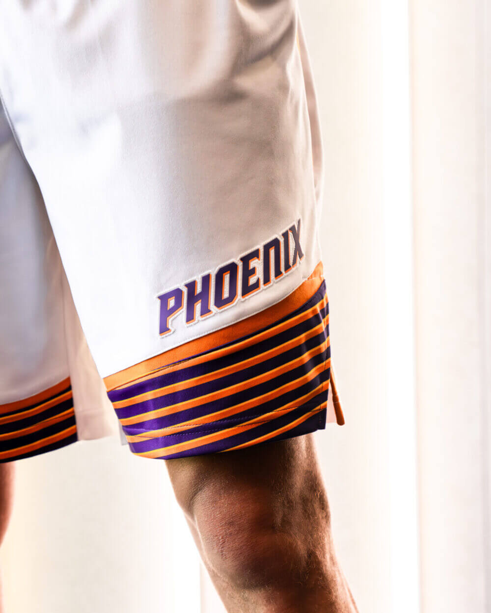
The back of the jersey features the player’s NOB in radially arched orange lettering, and the number treatment is the same as on the front.
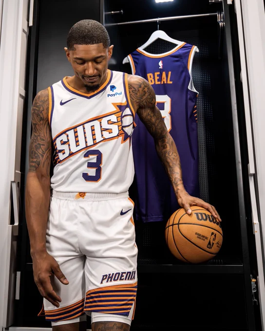
PURPLE UNIFORM:
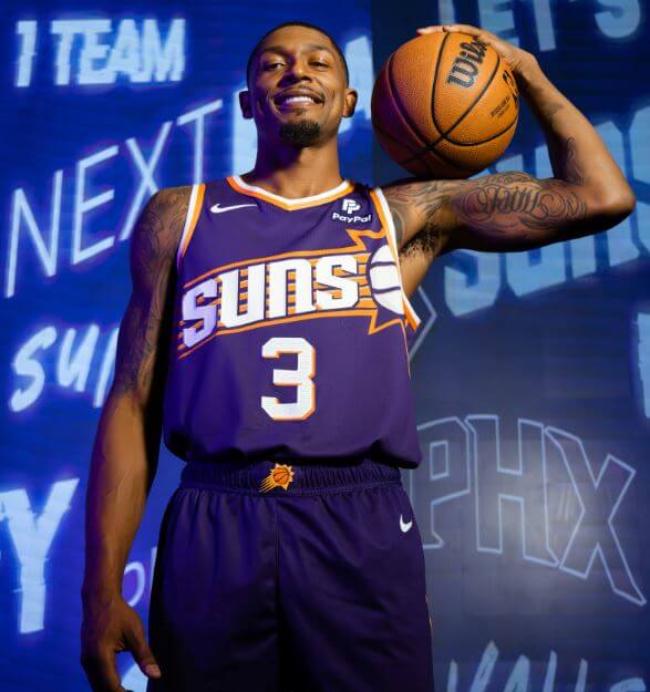
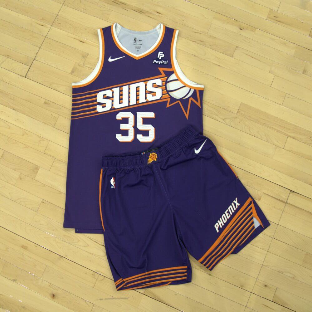
As mentioned above, the purple uniform is identical in design to the white, with the differences being the base color, striping around the arms and neck, and number (and pants wordmark). Uni number and wordmark are white with an orange block shadow. The rear of the jersey also features player NOB in radially arched orange letters, and the number is in white with orange blockshadow.
As is par for the course with uniform unveilings, the Suns also released a hype video, where you can get some more looks and feels for the new uniforms:
A new look for The Next Era ☄️
Introducing our new Nike Icon & Association Edition uniforms.@PayPal | https://t.co/3LaCqSU5ig pic.twitter.com/ngkcW7vIme
— Phoenix Suns (@Suns) August 1, 2023
In what is hopefully a move that gets repeated throughout the uniform-design world, it seems the team really listened to the fans on this one. According to the team:
Designed by Centercourt Studios, the in-house creative department of the Phoenix Suns, and in partnership with Nike, the uniforms were developed with Suns fans in mind. The team surveyed fans on previous uniforms, with the rising sunburst design ranking highest among fan feedback. The new Icon and Association Edition uniforms capture the spirit of the popular ’90s sunburst uniforms while embracing a fresh, contemporary aesthetic as the franchise sets its sights on new horizons and the pursuit of its first championship.
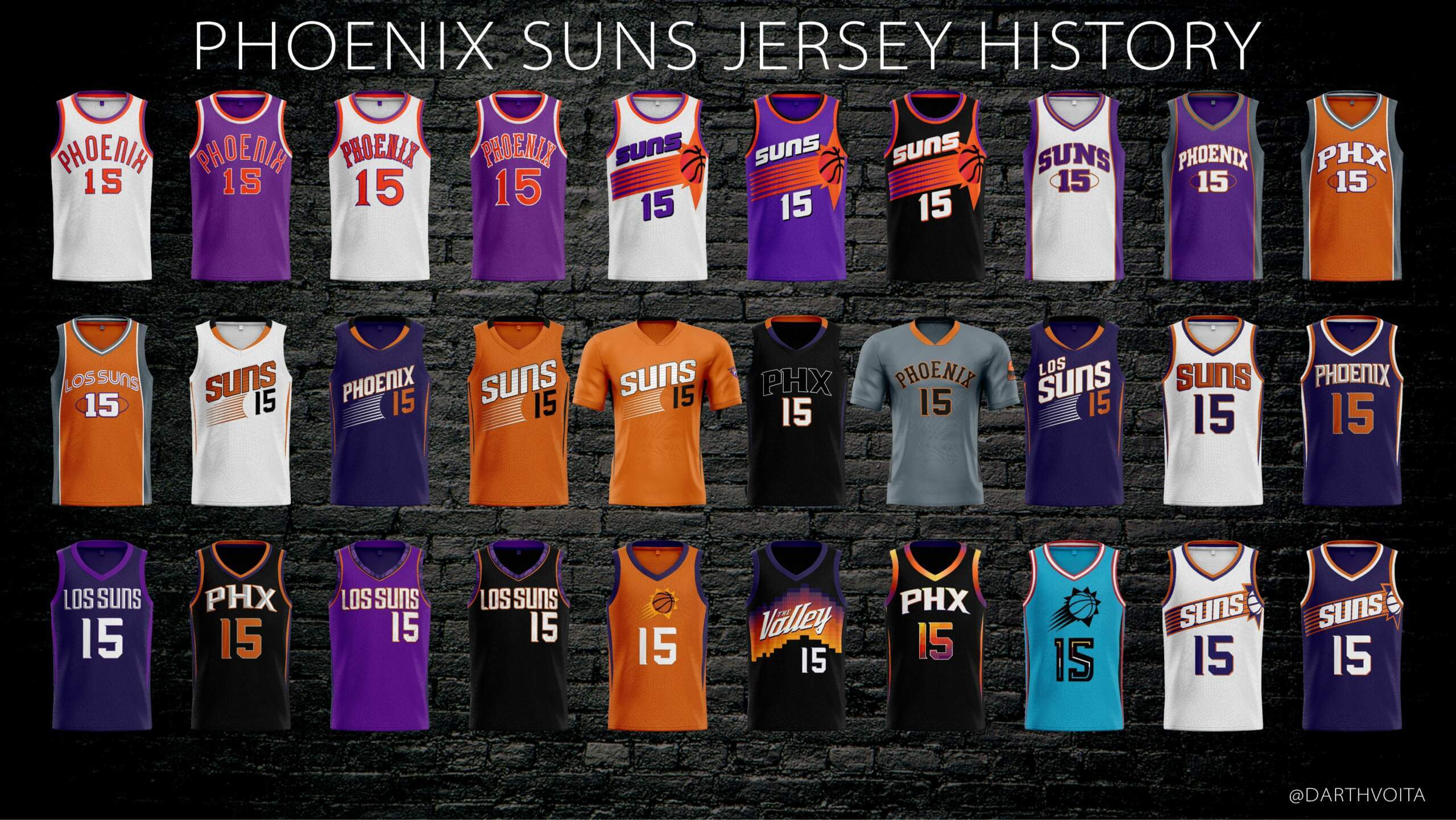
Here’s a look at what is basically the Suns jersey history:
I LOVE these — while I’m not nearly as avid a basketball fan now as I once was (and that’s due in part to Nike gaining the uni contract and in part due to uni ads), in the 1990s I was very into the NBA — and these are a harkback to the unis I fondly remember, and what is also likely the team’s most successful period. Unfortunately, the team will retain the BFBS alternate introduced last season, and there is still a “City” edition yet to come. But I (and I would imagine most NBA fans in general, and Phoenix Suns fans in particular) am quite happy with these new offerings!
Your thoughts?
I love it, and since Paul is gone, I can feel comfortable saying that!
Love these! Grade of A-. The only miss is the white ball. Basketballs are orange, and orange is an official color of the team. Also, their logo has an orange basketball/sun.
There’s another HUGE miss:
the jersey ad.
Other than that…FANtastic.
Love the uni! (9 out of 10)
I agree, the white ball is a miss. it should be orange.
ALSO – I despise drop shadow. BUT if there’s a team that could legitimately use it, it would be the Suns. They missed an opportunity to cast the drop shadow effect in the proper direction. Since the sun is in the upper right, the drop shadow should drop to the left instead of the right.
Of course a purple-centric uniform redesign is dropped August 1st!
Heh.
Yeah, I have no problems with the “accursed” color — but I do have preferences. I much prefer purples that gravitate towards the pink/red part of the spectrum, as opposed to the blue side. It’s tough to tell (some of these look pinker in photos, others look a bit bluer) which way these will fall. But either way, this is a great new set.
Front numbers not angled, meh…
How many redesigns does Phoenix need, it’s like their 4th set in the last 10 years when they brought back the half-hearted sunburst design
“How many redesigns does Phoenix need”
That’s probably contingent upon how many redesigns will sell. I’d bet this one is extremely popular ($$$), so they’ll probably keep it for a while. Sadly, new unis are as much driven by merch sales as “need” for any kind of redesign.
Its becoming Soccer levels of all new uniform sets every year, Nike just printing money as they spit them out
Meh, I think popularity of a jersey only encourages Nike to make more new stuff. Phoenix’s “The Valley” unis were immensely popular and they wore them for, I believe, 2 seasons before they changed it up to something “inspired by” but vastly inferior to those unis. They could have done a home and road unis based on that design and kept them for a long time and I think the fans would have been perfectly content. Could have done an homage to this “streaking sun” design using elements from “the valley” unis and had something modern and indicative of this era of suns basketball while paying respect to the past as well.
“I think popularity of a jersey only encourages Nike to make more new stuff.”
Well, it certainly doesn’t discourage them from doing so. And while I disagree with you that “The Valley” unis were good, they may indeed have been popular. I think there are a few schools of thought at Nike U — one is to select a few teams without rich uni tradition and really try to push the envelope with them; another thinks retro (and throwbacks) will always be popular, so they push those on more established teams, and another that focus groups’ everything to try to get a consensus on what will sell. There are probably a few others too, and I’m sure the bottom line dictates future direction. If a certain type of design is “popular” ($$$), then other teams will get similar treatments. Eventually it becomes cyclical as the next generation with purchasing power will inevitably gravitate away from what their parents and grandparents liked, and eventually we’ll cycle through older era styles with “modern” touches.
Hopefully the approach to these new unis (namely, letting a team’s fans have a greater say in the development of new unis) will be replicated for other teams.
Good point, that last graphic showing the history of all of their uniforms surprised me. The suns are clearly a team with an identity crisis so hopefully these are around for the long haul.
Yeah, the top line of that graphic goes from 1968 to 2013, the following are since 2013 (minus the first Los Suns one)… I know Paul liked the 2013-2017 era (link) but since then its just been out of control
Bring the Alvin Adams-era font.
Off topic, but does anyone know why the Blue Jays have seemingly broken the 4+1 rule? They wore red again yesterday, meaning they’ve work white, grey, royal, powder, and now red multiple games. I’m all for it, but wondering how they got the exception.
I’m not 100% certain, but I believe this is similar to when the Mets (reintroduced) their BFBS jerseys back in 2021. They didn’t get league approval in time to make the BFBS an official “alternate,” but were permitted to wear them up to five times (which they did) under something I believe is known as “limited use.” That permits an “exception” to the 4 + 1 rule (which wasn’t *technically* even in effect that season).
I could be wrong, but I think the Jays are ok with wearing red, so long as it’s confined to “limited use” (5 times or less a season).
Interesting, but then why wouldn’t other teams do the same thing? Like, why wouldn’t the Rangers keep red for ~5 games. Rays, Mariners, same thing. Unless they just gave Toronto special approval since it’s for Canada Day?
I can see that orange letters which I would have liked would disappear on the purple and orange background the Suns provided. For a new uniform, it’s fine.
Nice looking uniforms Suns!
Look more like a professional team as they once did I think back in the 90’s era?
On first glance the white wordmark and ball look weird, but I’m not sure how else they could’ve done it with the orange and purple burst behind them. Wish they didn’t stick with the ugly number font from their previous set, too. Overall, it’s their best set since the 90s, but I think I would’ve preferred just a straight return to those 90s unis, which are one of the few true classic sets from that era.
These are nice. Hard not to notice the Suns have changed the “primary” look (white and purple uniforms) frequently since 2000. Hope they stick with a consistent design for a while.
Ok I love these, but I WILL be calling them the “exploding armpit” jerseys. Ball/Sun is just too far to the side, pull it back to the middle a little and it’d be perfect.
Agreed, these draw way too much attention to the armpit. Bradley Beal in the header photo looks like he’s in a deodorant commercial.
What I learn from this is that there are WAY too many basketball uniforms. From 1968-2000 they essentially had 3 uniforms. Minor changes in the original word and number font until the drastic change to the sunburst. Since then, they’ve been a team without an identity living their life through the NBA’s silly uniform guidelines.
Have to agree with everyone saying the ball should be orange. Basketballs are orange; the sun is orange; this seems like a no-brainer.
“the sun is orange”
Well, not exactly — it can appear orange depending upon its positioning in the sky, but it’s not really orange.
link
But we do commonly depict the sun as orange, and certainly basketballs are an orange-brown color, so the white ball feels out of place.
Not all suns (stars) are orange. The really hot ones are white.
Maybe Phoenix is saying these unis are really hot…or really fire.
Anyway, I like them (except for the jersey ad).
For anyone who thinks I didn’t like anything from the 90s, the Suns were an exception. For anyone who thinks I don’t like anything new, the Suns are an exception.
link
Pepsi Team.
Liked the mid 90s Barkey KJ Majerle era the best.
These are fantastic.
On the plus side, I’m glad to see the bevel treatment is gone from the wordmarks. I like what they’ve done with the stripes on the pant legs and the overall 1992 homage is fun. Nay, however, to the white basketball – an orange one would have worked just fine. An orange ball would have let the wordmark and numeral stand out as the only white elements of the jersey. I don’t understand the drop shadow on the number 1 – the serif goes one way at the top of the 1 and the other way at the bottom of the drop shadow. That’s not what shadows do.
While they aren’t nearly as awful as everything they wore from like 2000-2017, these are such a let down. Just really weak. I understand they can’t use the throwbacks as a full time design from a rights perspective, but these are just a watered down, poorly designed version of a classic. Only slightly better than what they wore when Booker was drafted.
I love this unis set! I think it’s weird the basketball is white in both versions and chest area with ‘SUNS’ feels a bit busy but overall I think they look great. I thought black The Valley unis they had were great city alternate and they seemed really popular so I kinda hope they bring those back.
I actually don’t mind these. The only thing I’m a bit on the fence on are the orange stripes on the shorts. The thickness of the orange stripes doesn’t match the jersey stripes. It feels a bit off to me. But I guess that’s neither here nor there. Nice job Suns.
My favorite Suns uniforms are from the 70s with that saloon lettering but these are really nice. Except for the ball: should have been orange. Otherwise really nice. Bevelled letters and numbers should be outlawed anyway.
Agree with the feedback about the white ball/sun. Easily proven as the correct take by simply looking at the “belt buckle” logo. The best part of your uniform is on the waistband. Ugh.
Reminds me of the 2019-2020 Celtics Irish Pub city edition set. There was a fantastic Celtic Knot intertwined shamrock basketball logo, but it was only ever featured on the belt buckle. I wish the Celtics would incorporate that as a full-time alt logo.
All Suns uniforms going forward should have an ambigram because it works and it’s cool! Nice update to the Barkley era, super famous look even if it might not be “the best.” I like it!
Big fan of the shorts stripes! Great looking set!
The ball looks like it is way deep in the armpit.
Like why did they do that. It bugs me so bad.
And as others have said, why is the ball white?
I loved the 90s version when it came out. They never needed to change it.
“in the 1990s I was very into the NBA”
I feel like that sentence/sentiment could apply to half of older Millennials. I’m the same way. I was obsessed with the NBA in the 90s, and now it’s pretty much the only sport I don’t watch. To be fair in my case, there was a very clear point at which I left, I grew up a 90s Charlotte Hornets fan and when they left Charlotte in 2002, that’s when I stopped watching the NBA.
Tried to get back into it when Jordan took the name back but idk, it just wasn’t the same for a lot of the reasons, old grumps give, mainly no defense, too much scoring, fouls called for everything.
As for these uniforms, I absolutely love them. They’re perfect for the Suns. There’s nothing really to be said more than that, short of just going literally back to the Barkley era unis of the 90s, they are exactly what I’d want if I were a Suns fan.
I don’t like how the ball is white and it cuts off on the sleeveless opening, but otherwise it looks decent.
One of these would be great, but why are the identical except for color? IMO, for the classic pair (formerly home and away) one should have Suns as the word mark and the other should say Phoenix.
And why is Book wearing a T-shirt? He rarely wears one in a game.