
Good morning Uni Watchers! I hope everyone has had a good week. After today’s lede (for those who might choose not to read through), there is an announcement about Father’s Day 2023, so if you’d like to participate in that, please scroll down for news and instrux. Thanks!
Last weekend, I ran the first of two installments (today is Part II) in a series of league-wide “crossover” concepts from Danny Kaufmann, who has imagined NBA teams if they were to wear soccer kits. If you missed that, click here.
As I mentioned in that article, “I struggled with actually running these, but obviously there was a lot of time and effort put into each concept kit, and the advertisers selected seem to make sense for the teams. That’s not an endorsement of the advertiser (and I wish Danny hadn’t included them).” That holds true for these as well. In fact, Danny addressed this in his submission to me:
I was so overjoyed with the response to my MLB Soccer Kit Concepts project that I decided to do the same with the NBA. But first, a note about jersey ads: I am opposed to the prevalence of advertising on sports uniforms (and otherwise) but a key element of this project, like the previous one, was to consider how teams would look in soccer uniforms. Part of that entails working with an undesirable ad just as I would with a logo or color scheme I disliked.
So, with that out of the way, let’s take a look at Danny’s …
by Danny Kaufmann
Miami Heat
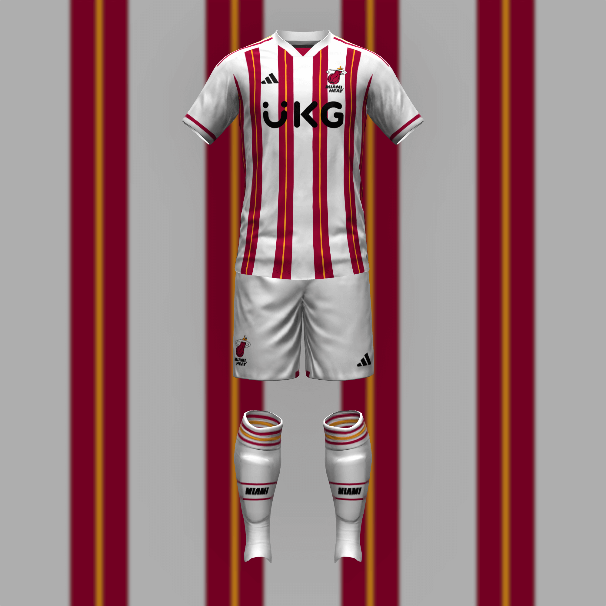
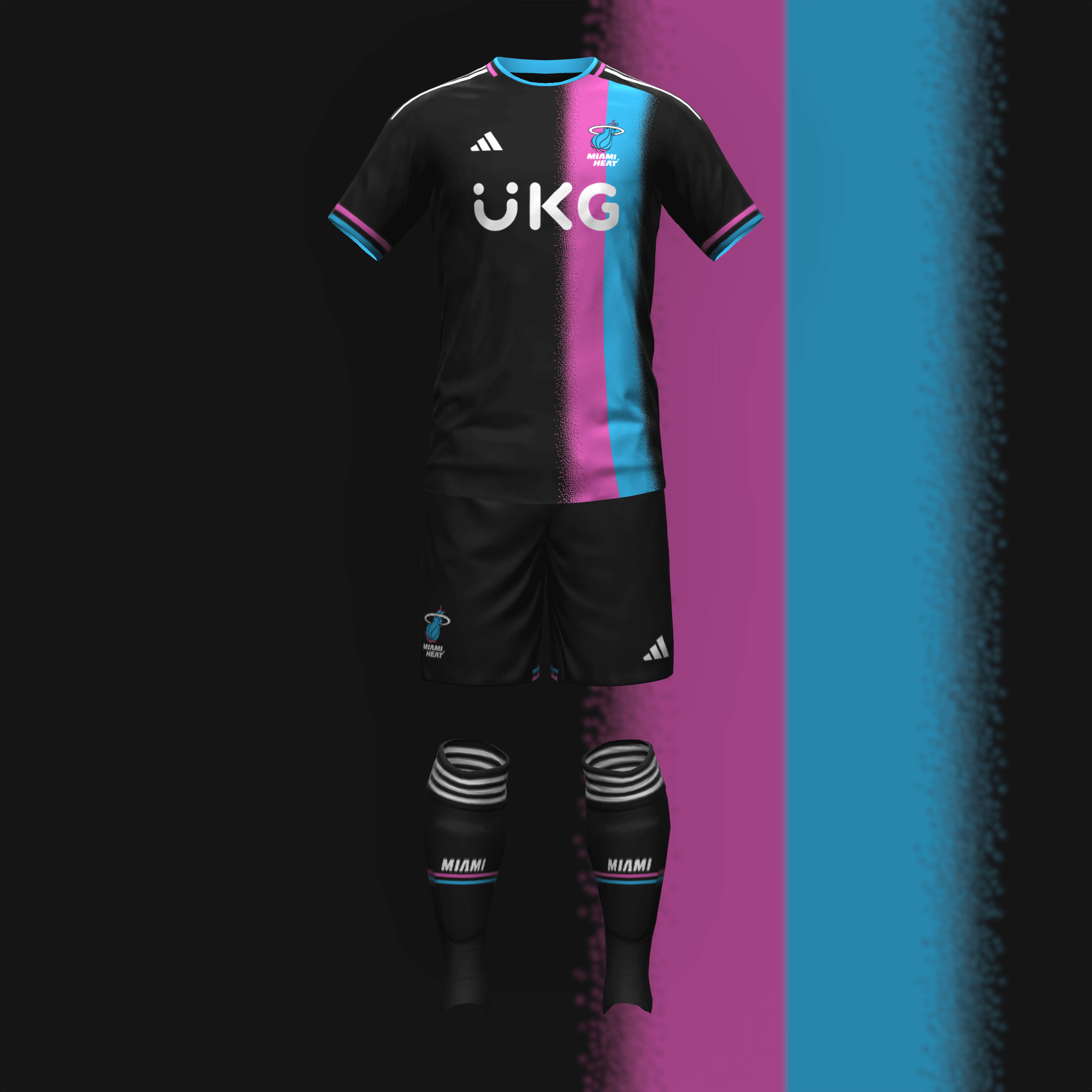
While I dislike the team name (I don’t think there should be the Heat and Suns, the same goes for the Magic and Wizards), I think they executed it very well. My “Vice” kit was inspired by a similar design I did for Inter Miami, based on the bright lights of South Beach.
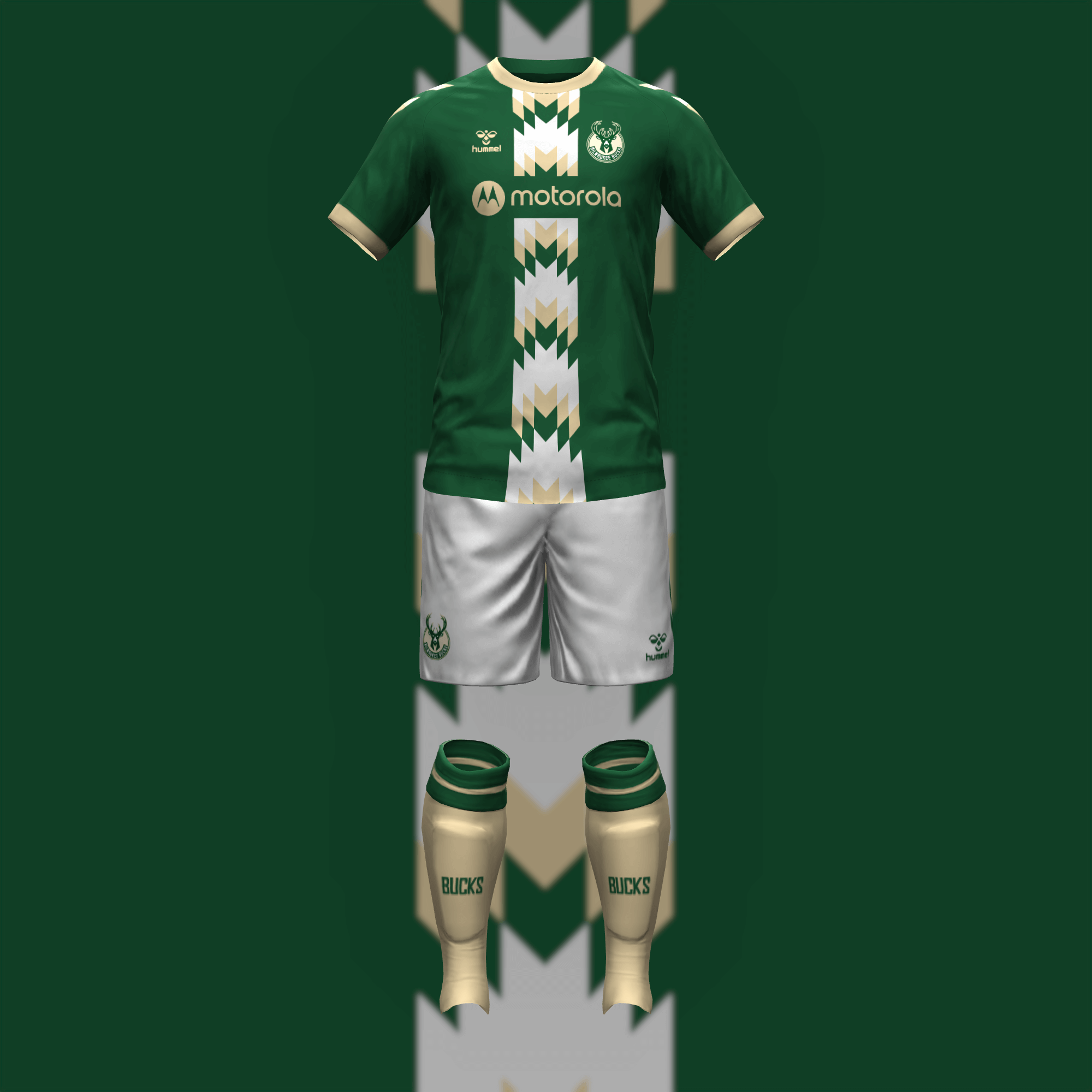
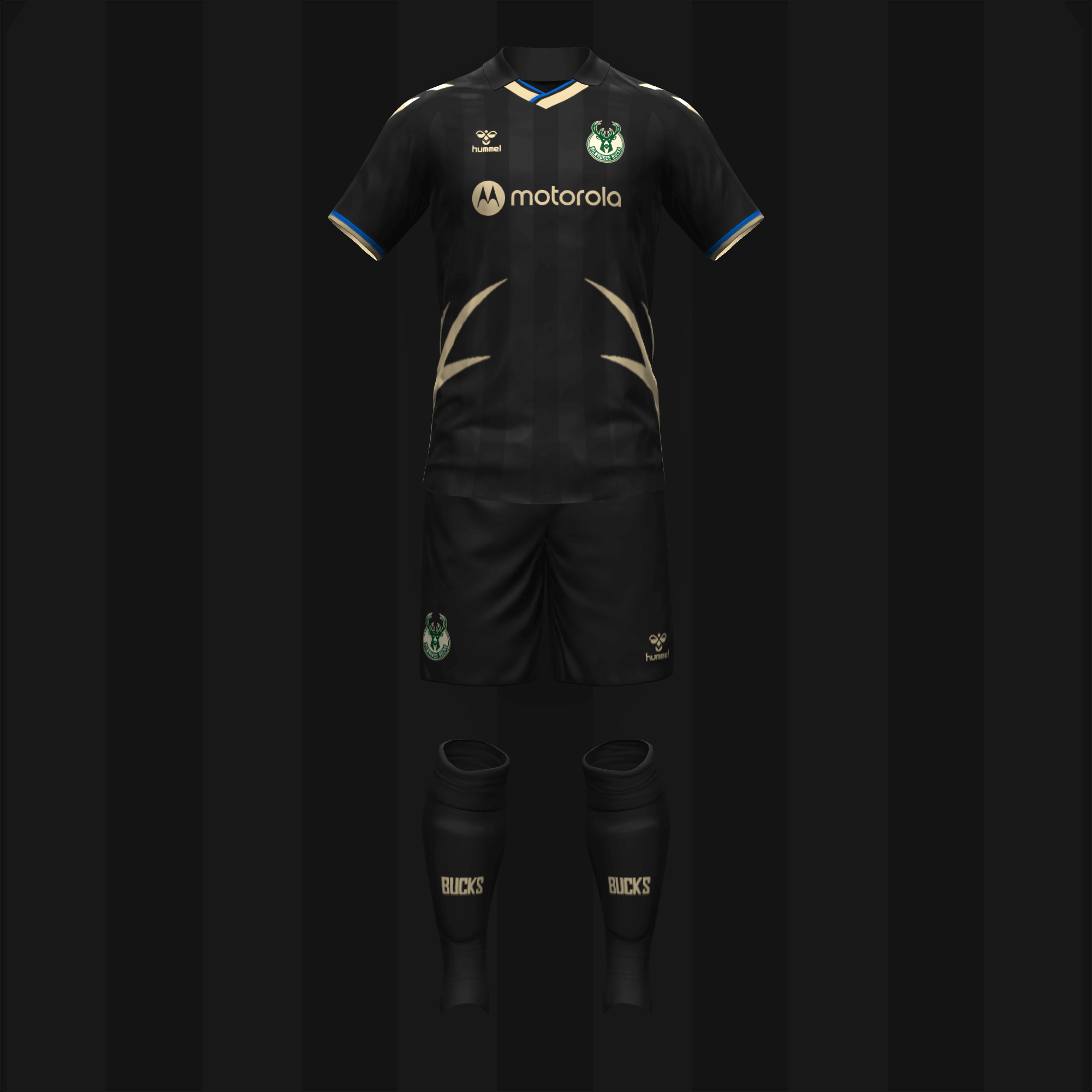
Since the trim on the Bucks’ City jersey already resembles classic soccer designs, I focused on it for the home kit. Despite being yet another black alternate, I love what the Bucks have done with the antlers so I brought them onto the pitch.
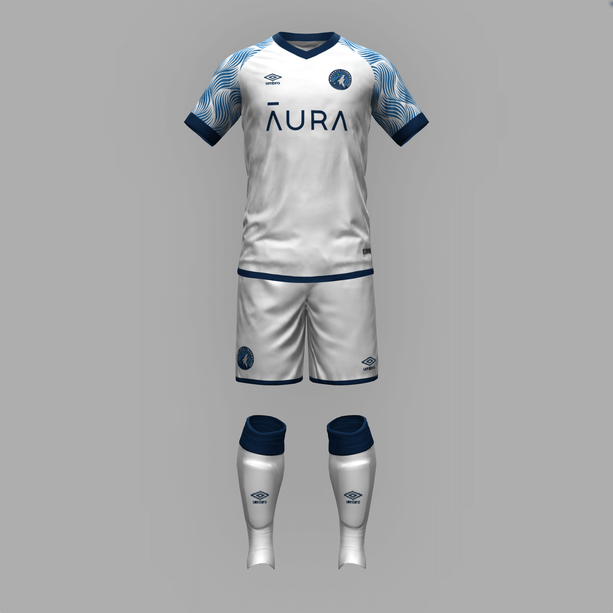
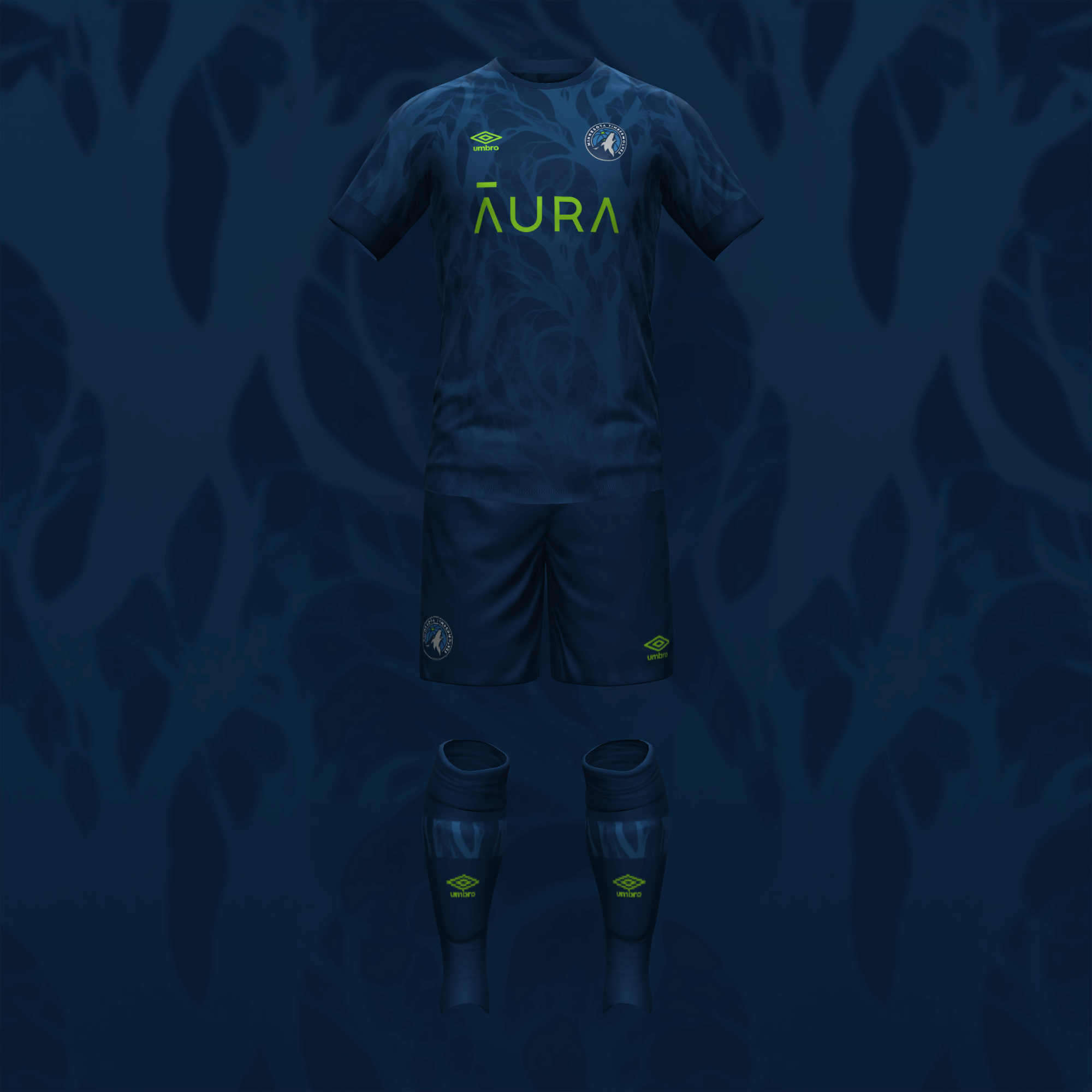
Minnesota is so well known for its bodies of water that another team honors the state. In this case, the sleeves of the home shirt depict the Mississippi River. I wanted something forest-y for the second design and I sparingly used a gradient for a spooky effect.
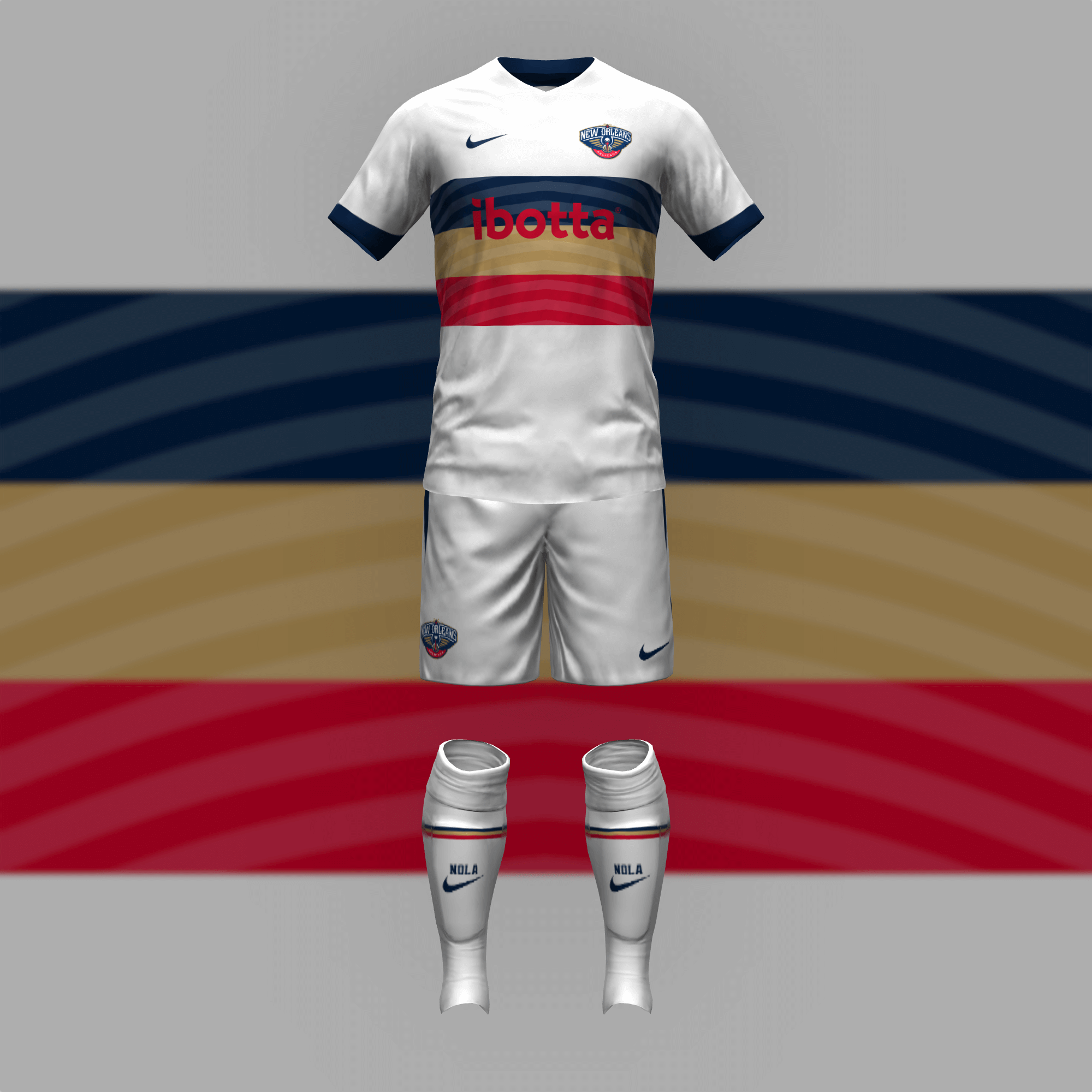
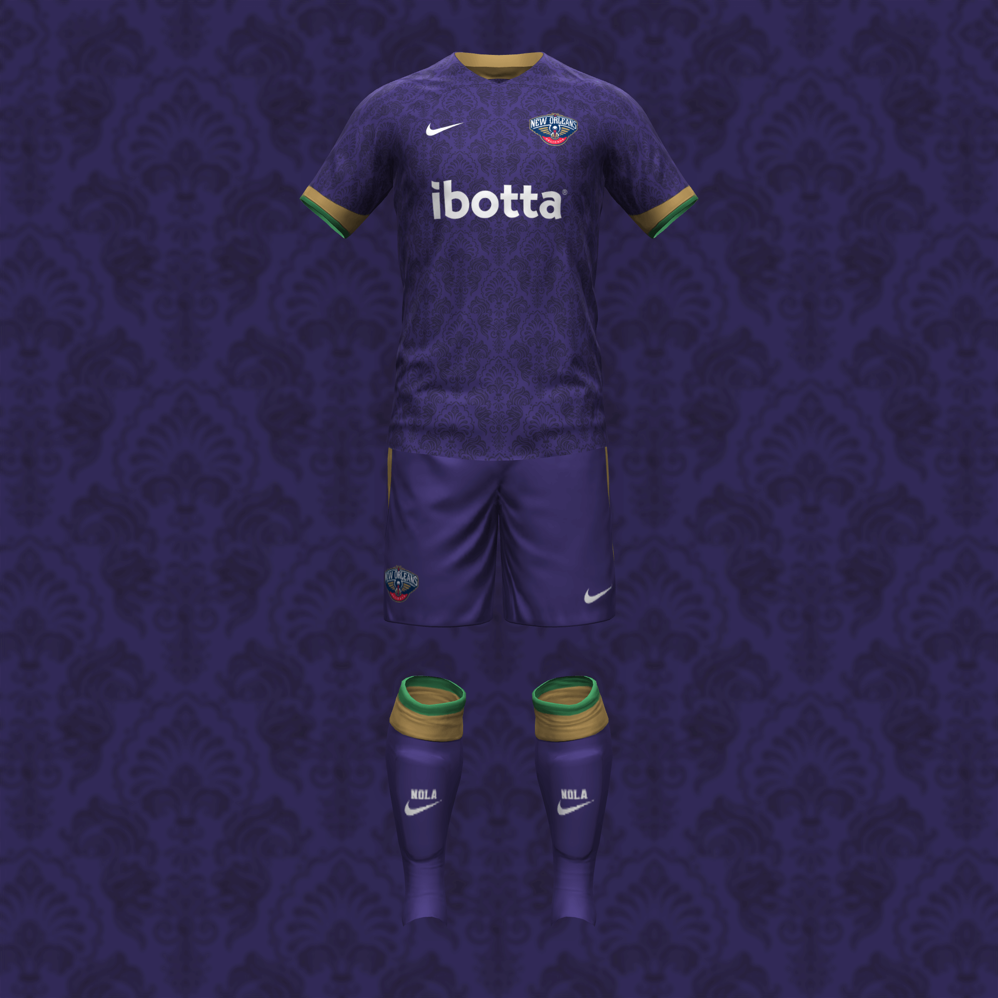
The Pelicans set has grown on me but I think the striped center band is their best motif. The wavy stripes resemble pelican wings. Mardi Gras was the obvious choice for the away kit.
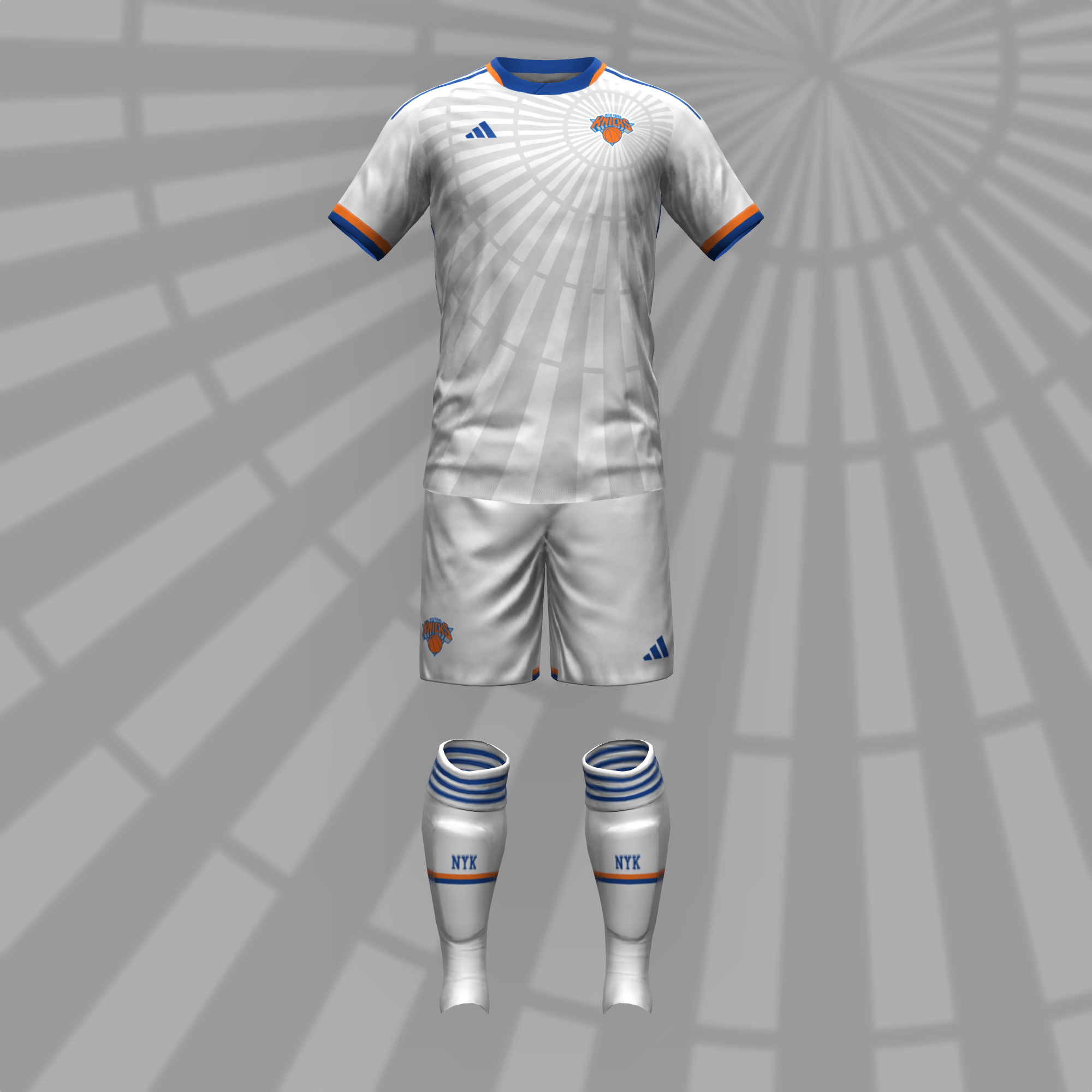
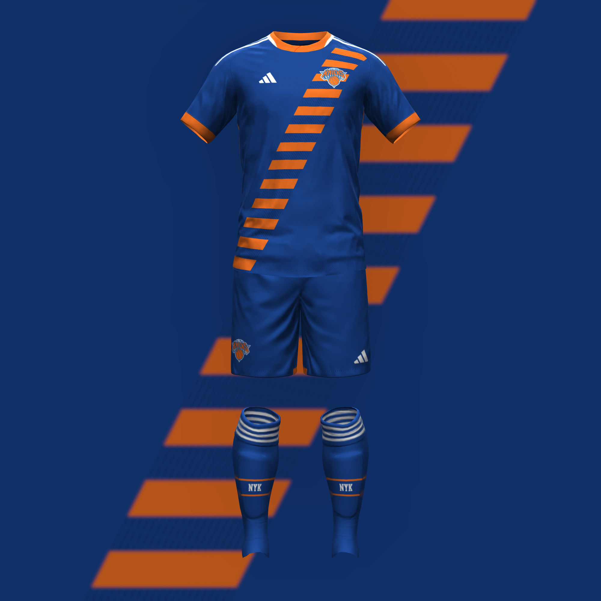
The spiral on the primary kit pays homage to the iconic Madison Square Garden. I have always liked the Knicks’ striped collar, cuff, and side panel design; I turned it into a sash for the change strip.
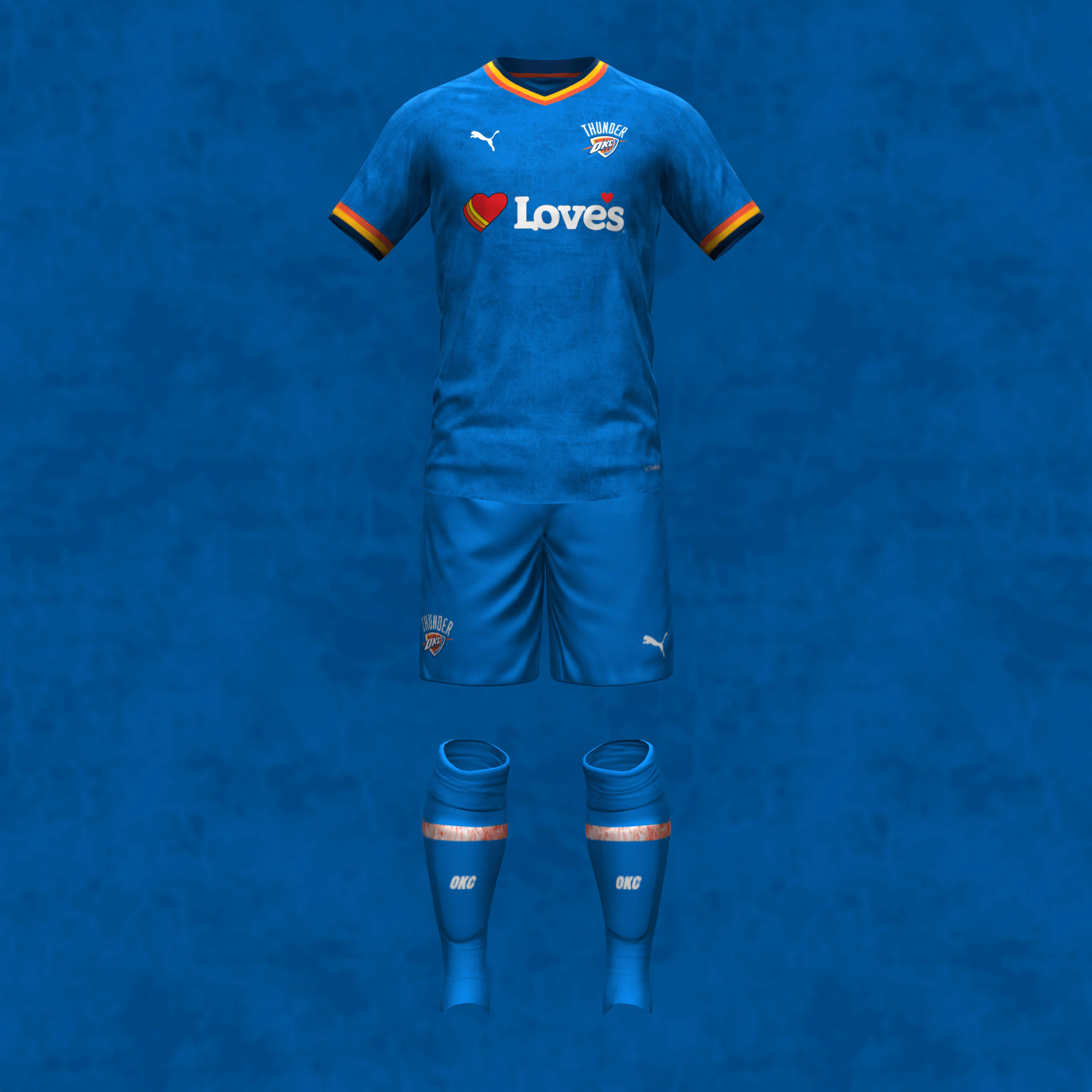
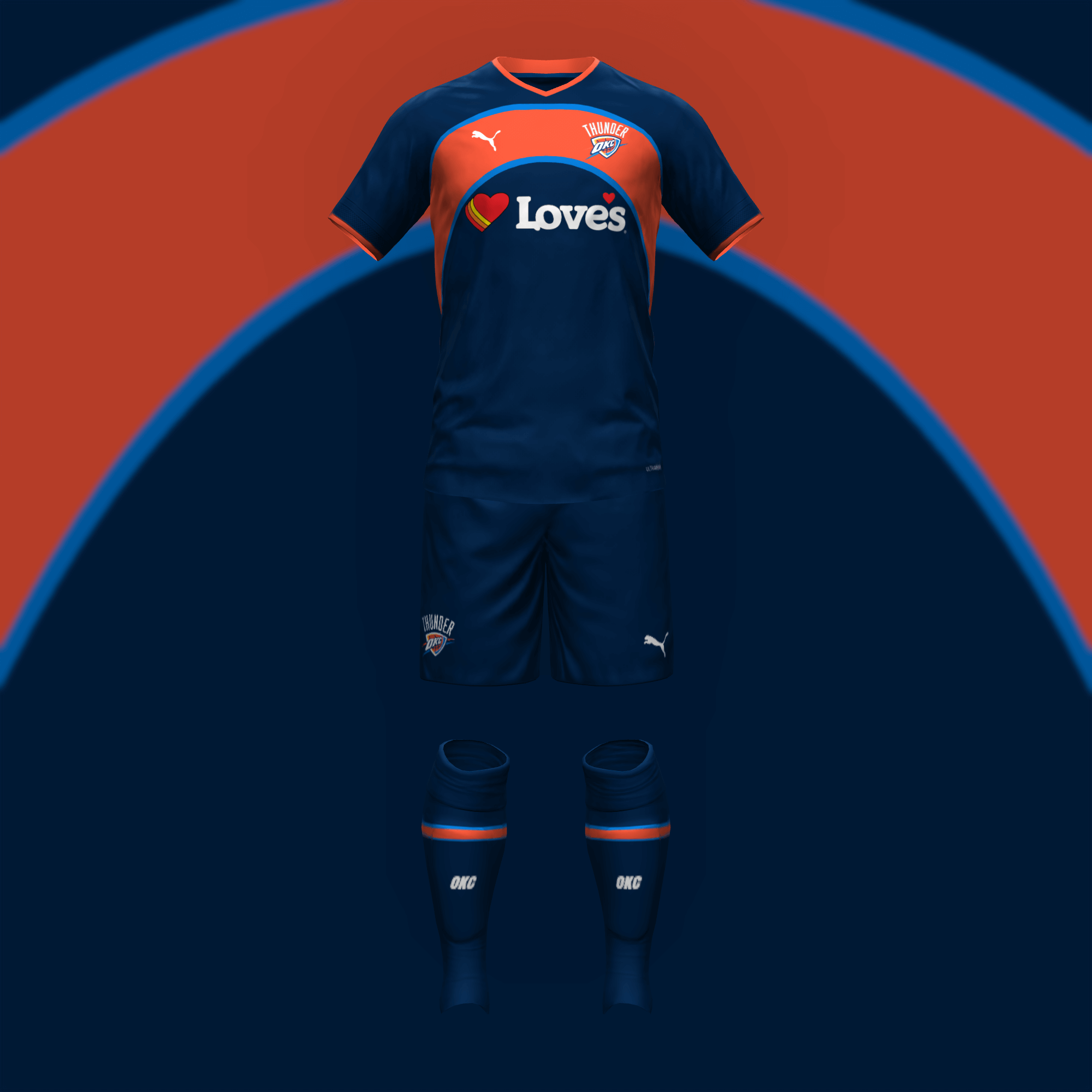
I don’t necessarily approve of OKC’s name and logo but I love their color scheme (it seems like they brightened the blue when Nike took over). The home kit borrows the terrain pattern from their City jersey. The away kit renders the Sonics arch in current colors.
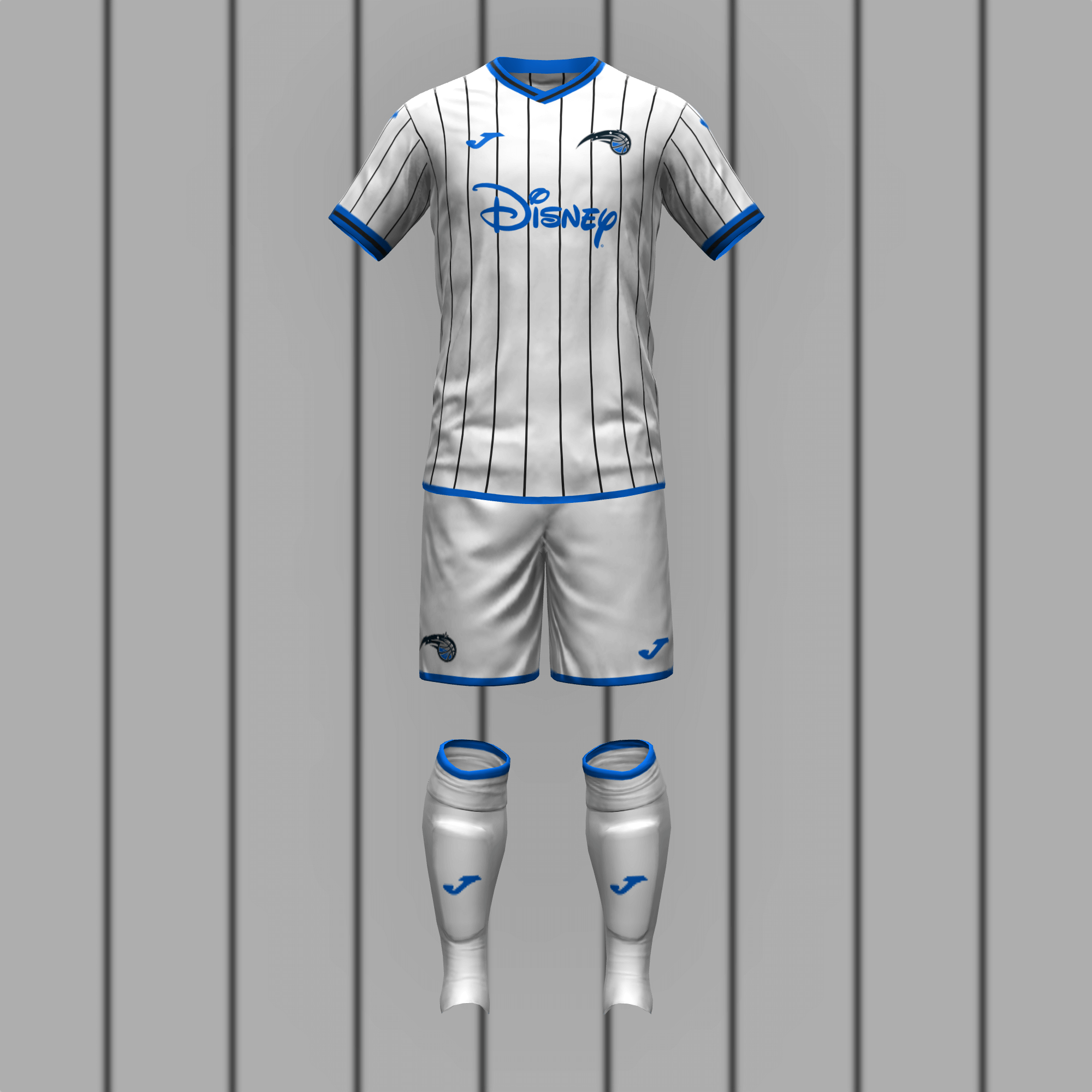
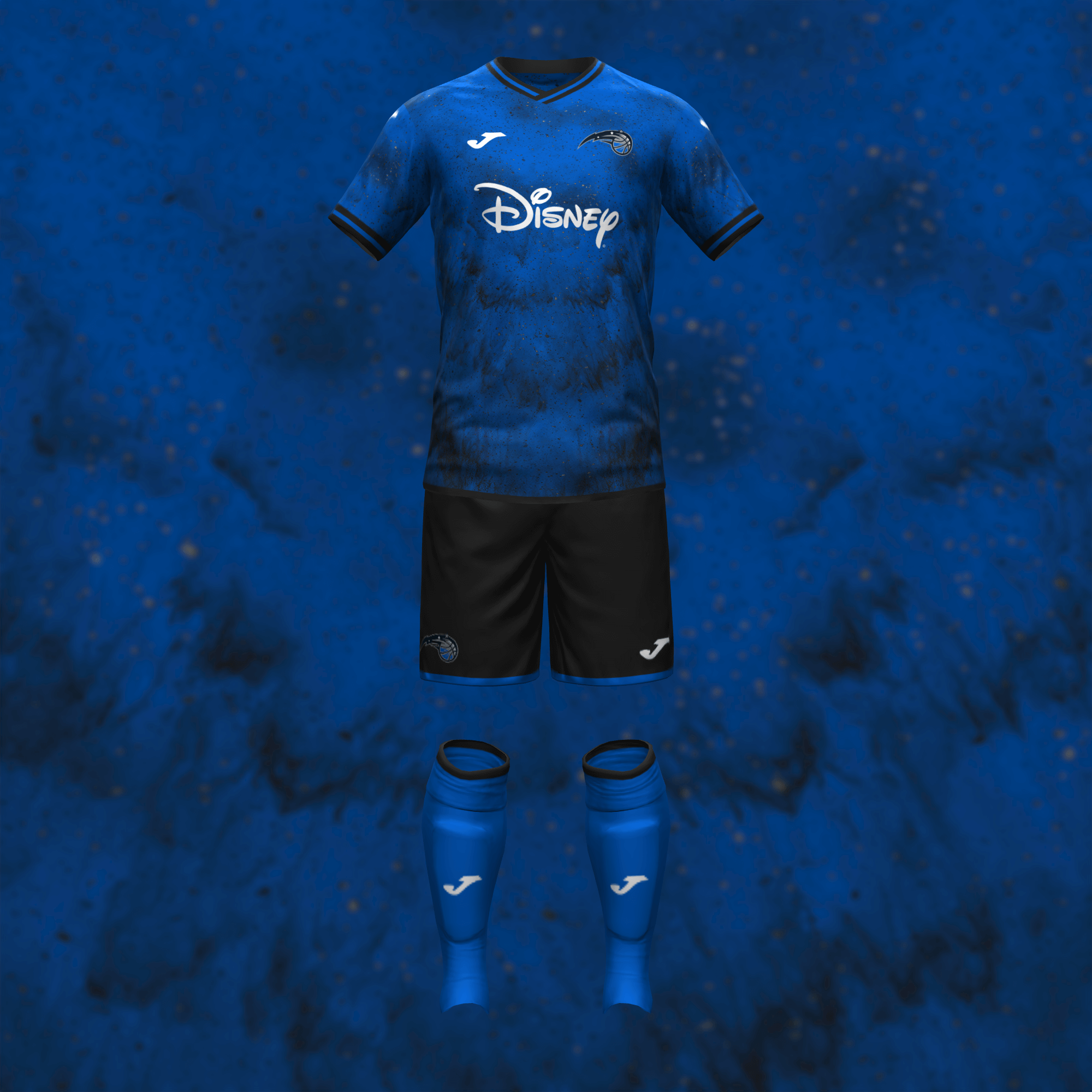
The pinstripes naturally transition to the Magic’s primary uniform. For the away kit, I originally swapped black and blue but I figured a team called the “Magic” needs to stand out more.
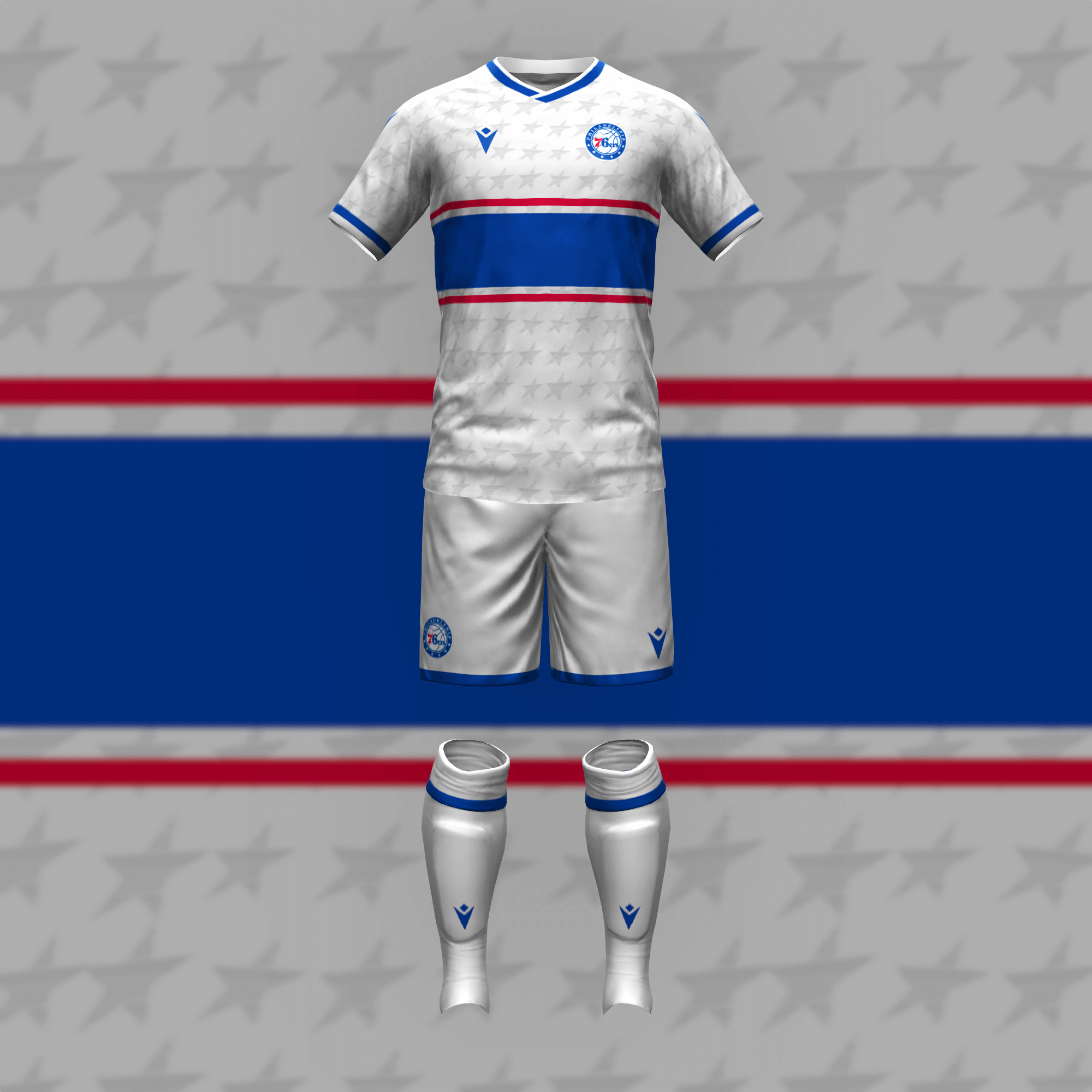
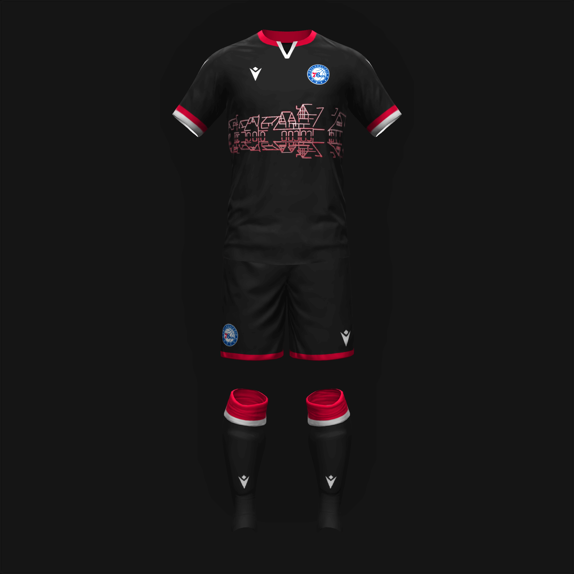
With the Philadelphia Union donning a vertical chest stripe, I decided to give the Sixers a horizontal one. I reluctantly made their second kit black to match the Boathouse Row nighttime theme.
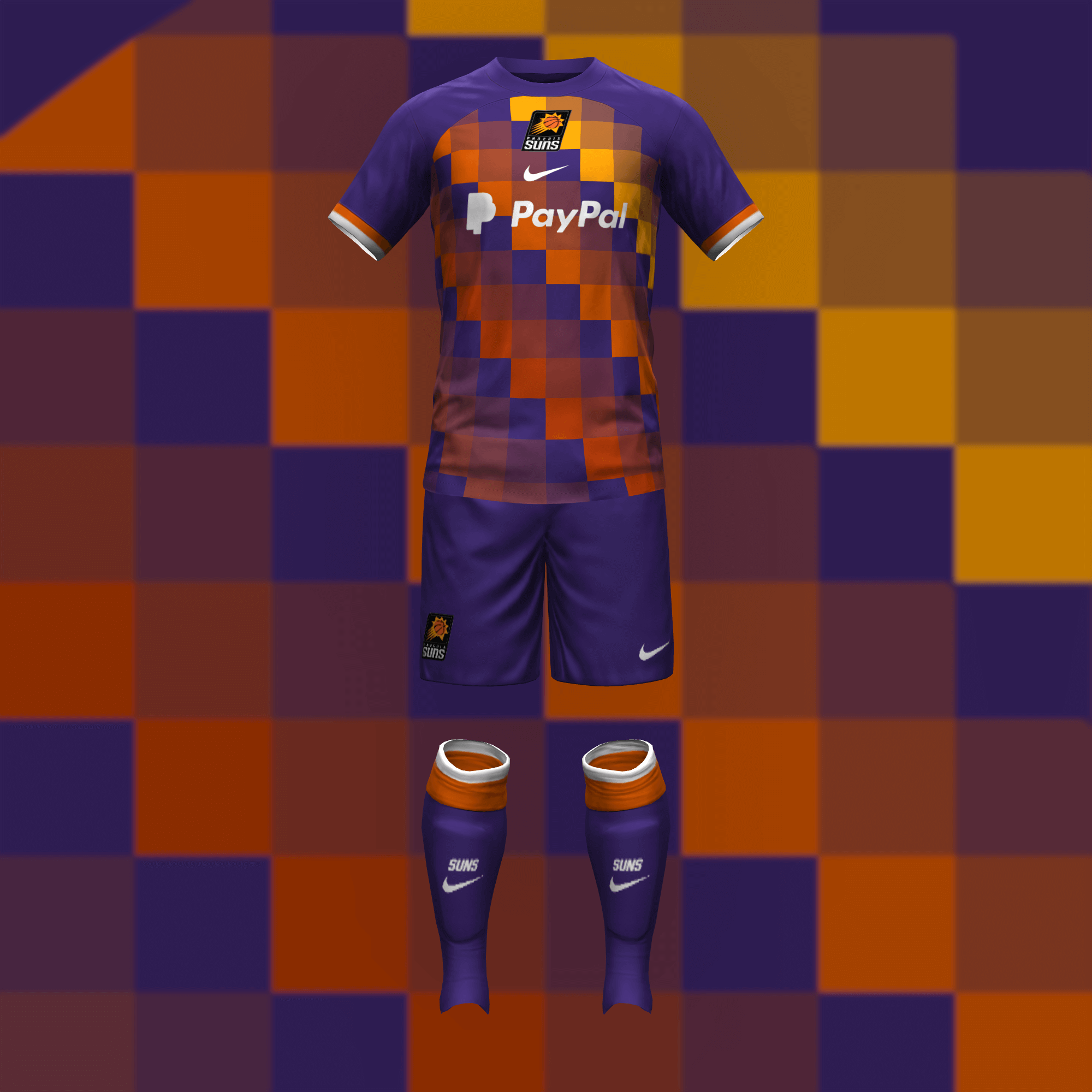
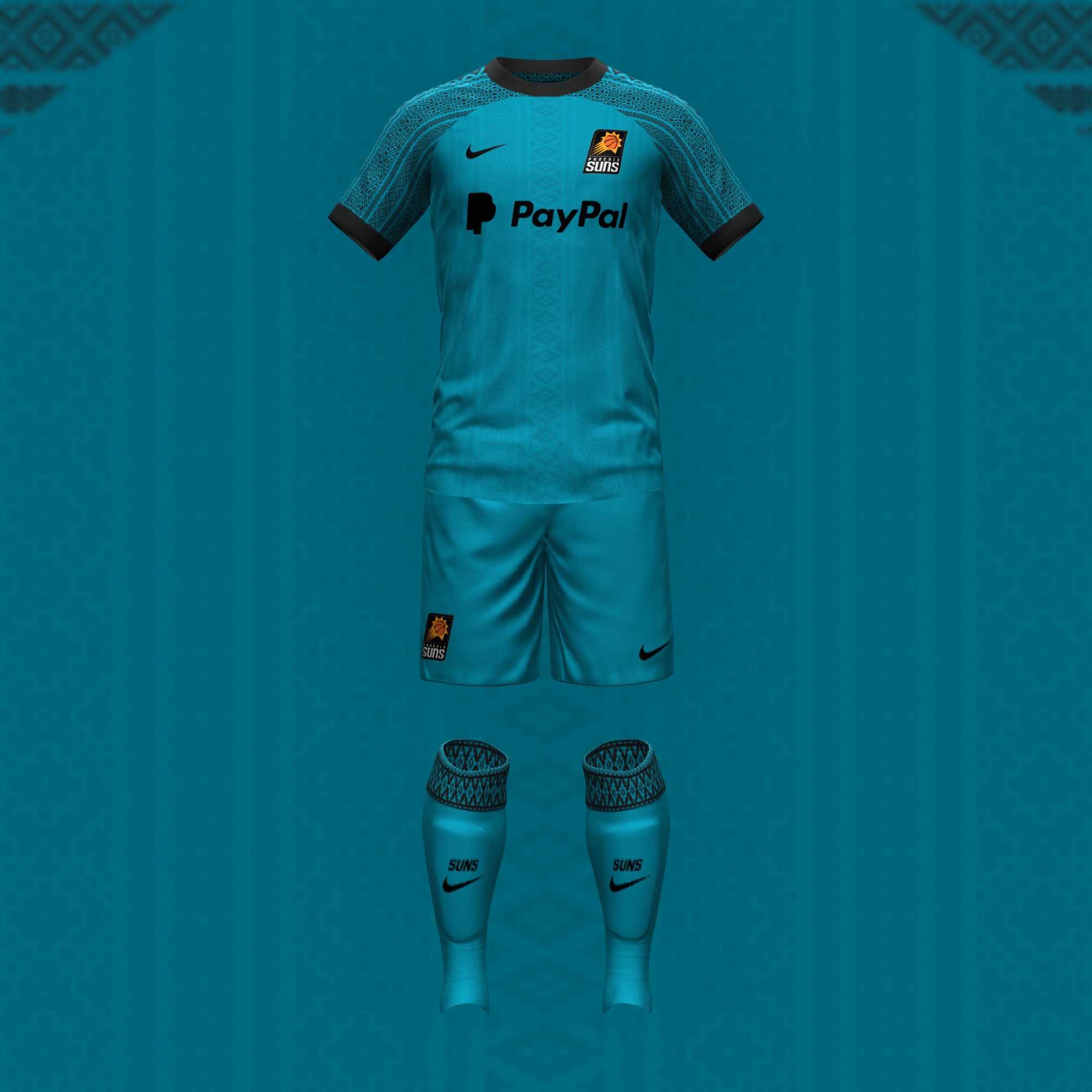
The Suns seem more aesthetically sure of themselves with their purple-orange-yellow gradient. I did break up the color a bit so it doesn’t blind people like the sun. I’m pleased with what Phoenix did for their city jersey this year so I replicated it for the away kit.
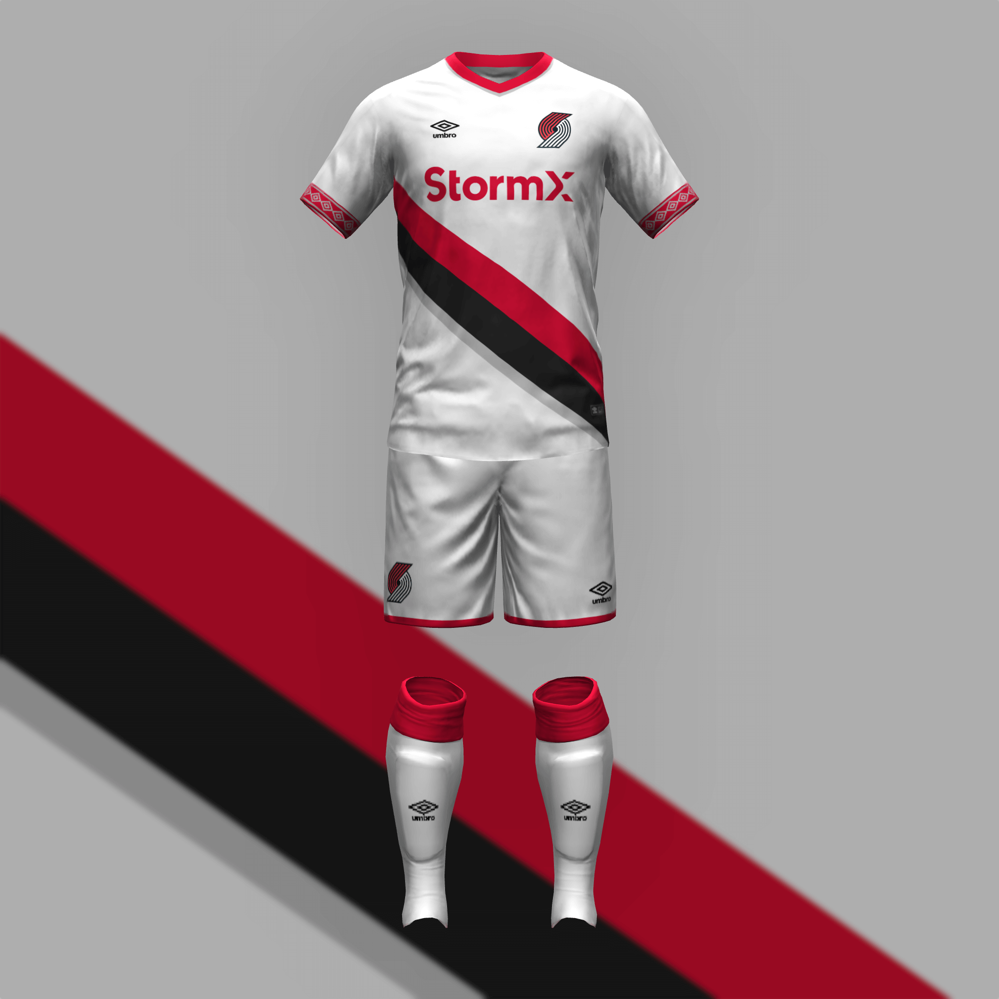
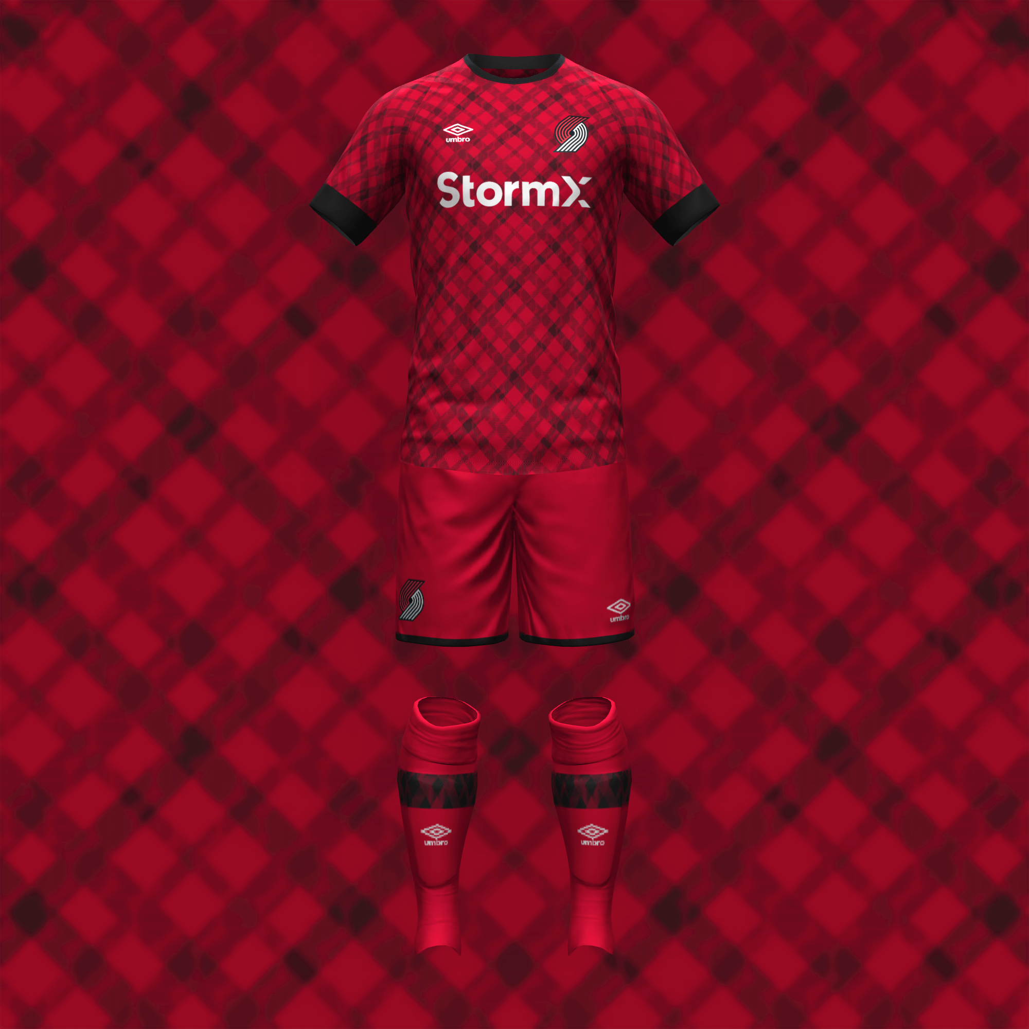
The Blazers did all of the work for me on their primary kit. I liked the plaid design of their first city jersey but this time, I added monochromatic versions of the pinwheel logo within.
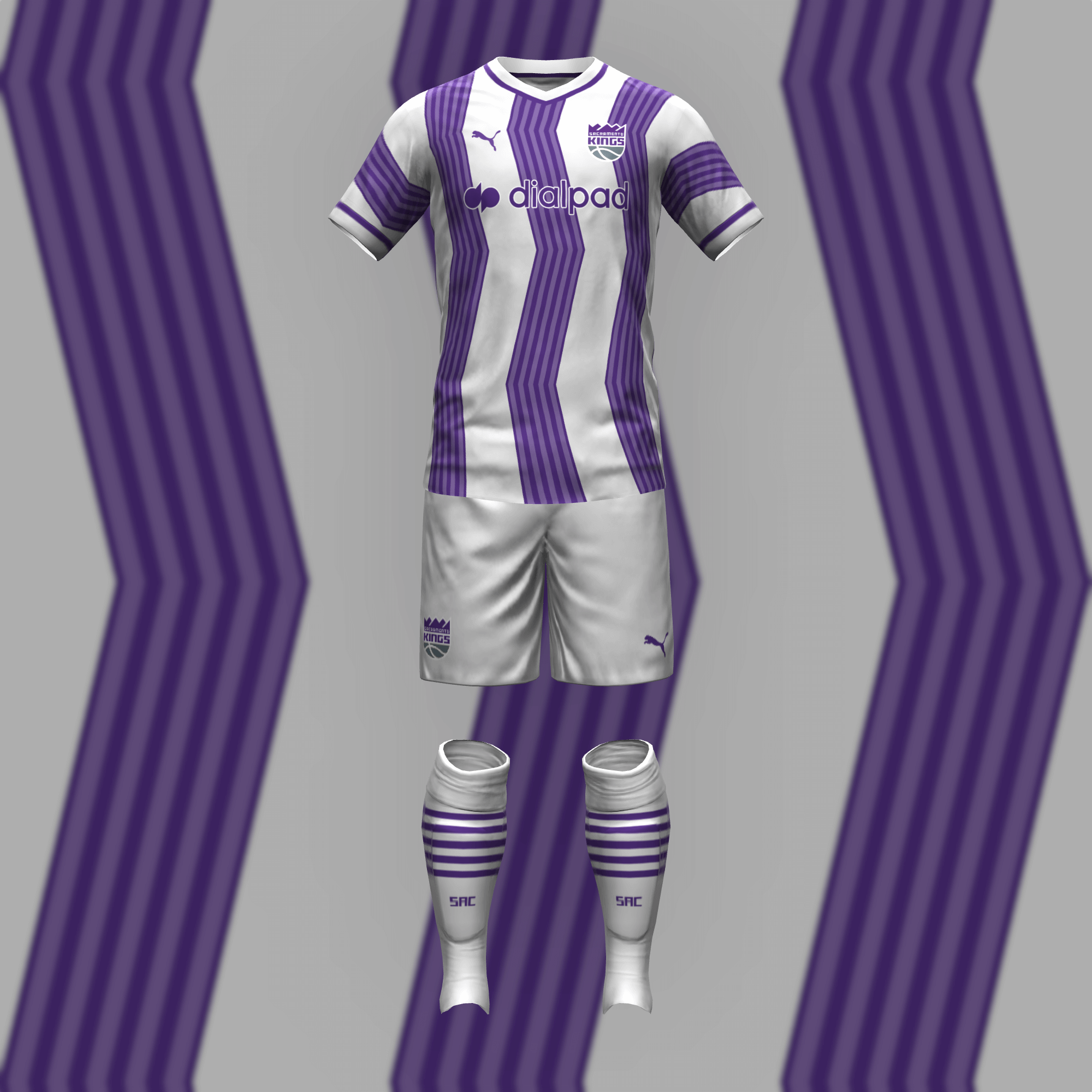
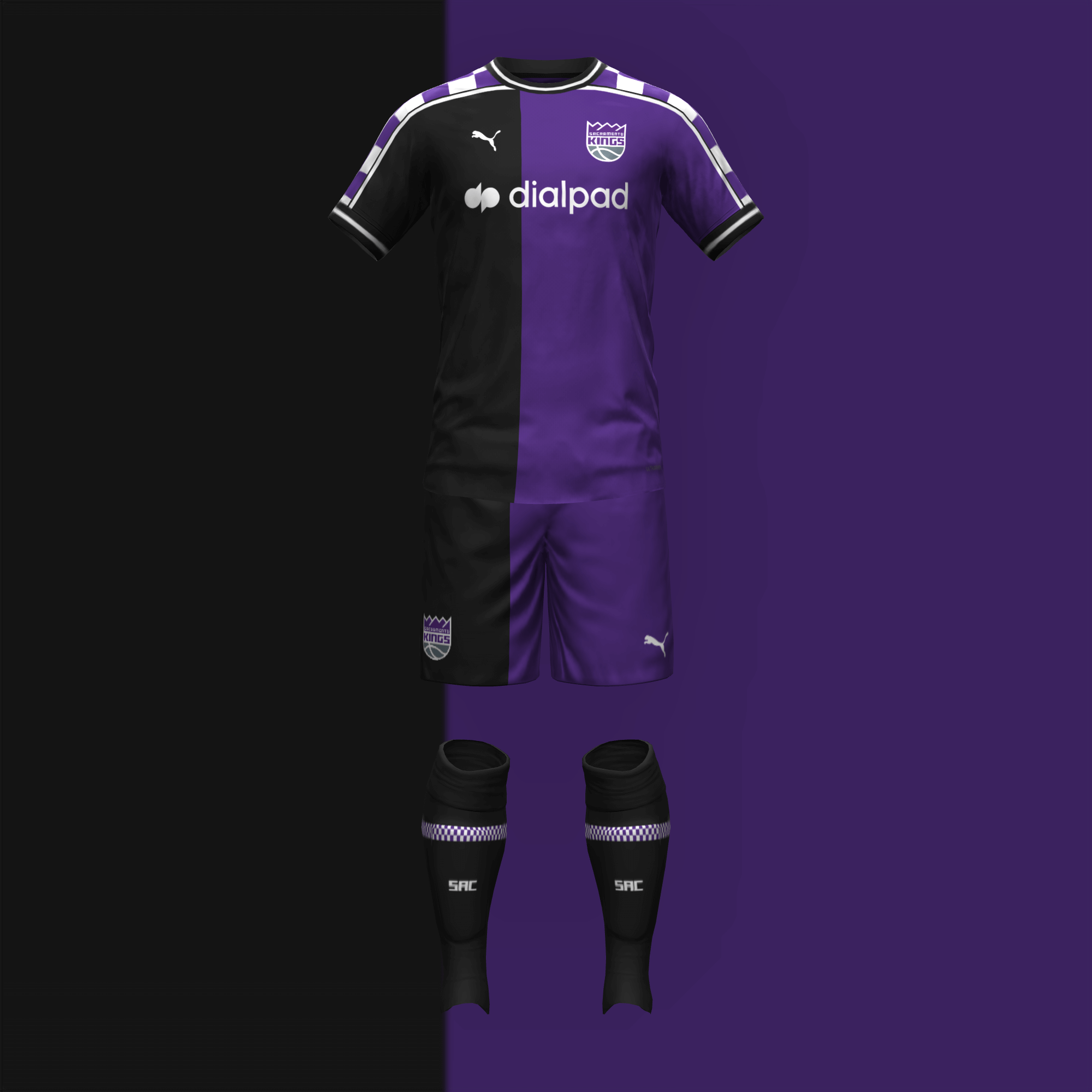
I attended a few March Madness games at the Golden 1 Center and thought it was fantastic so I transposed the zig-zags of the exterior (and the Kings’ questionable City look) onto the home kit. I also recreated the half-half-ish look but moved the checkers to the shoulders, which I thought worked better for a soccer jersey.
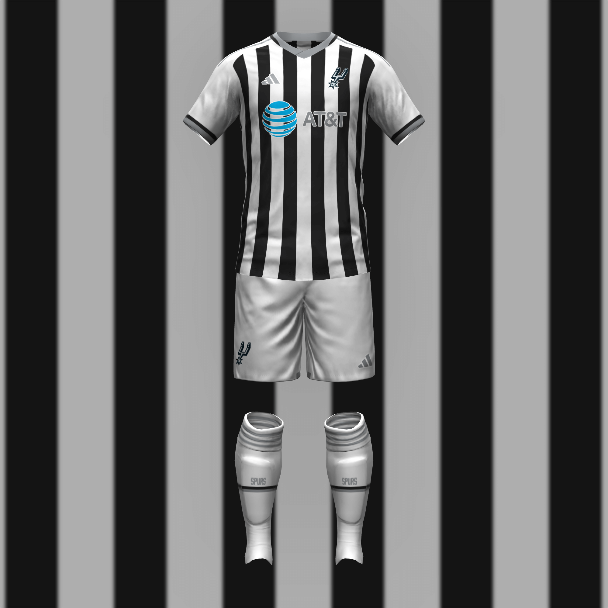
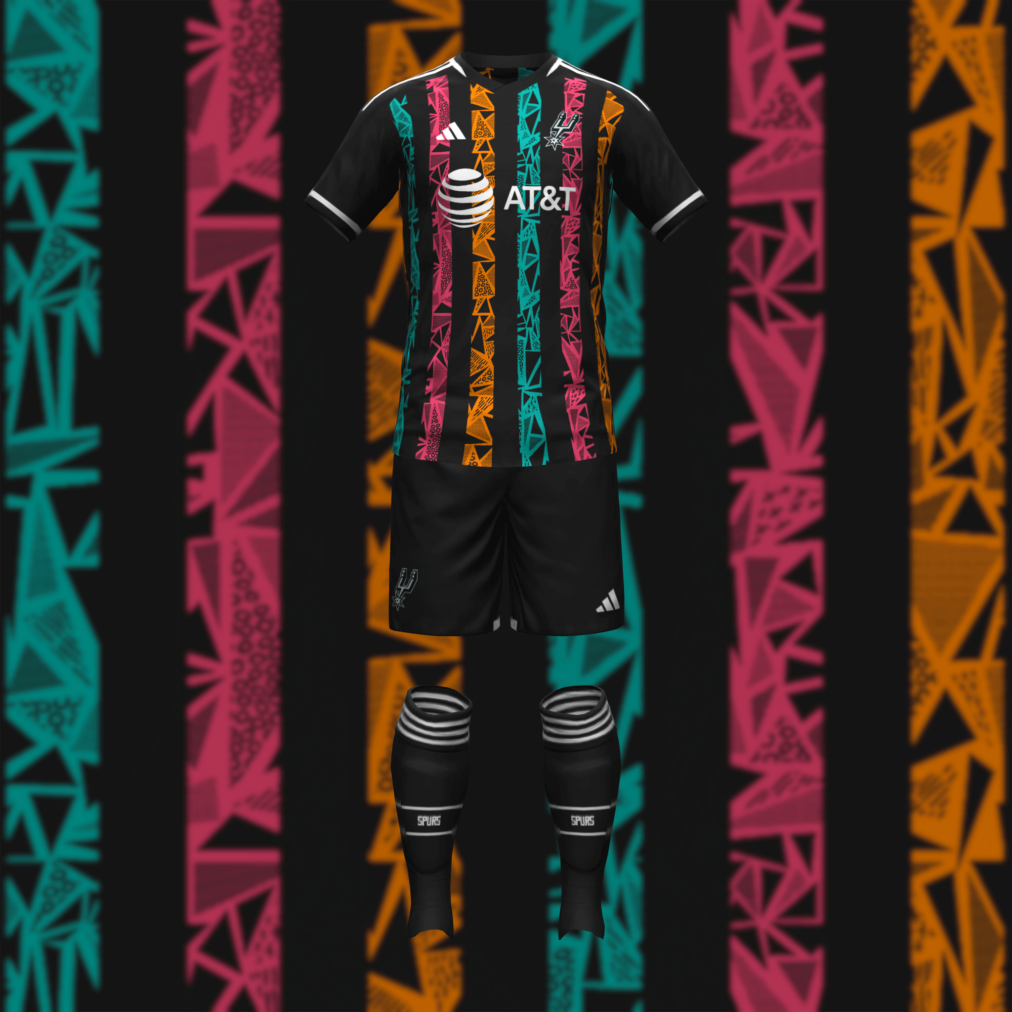
The Spurs’ primary kit needs no explanation. The away kit executes the fiesta vibe in a fun but more appropriate manner.
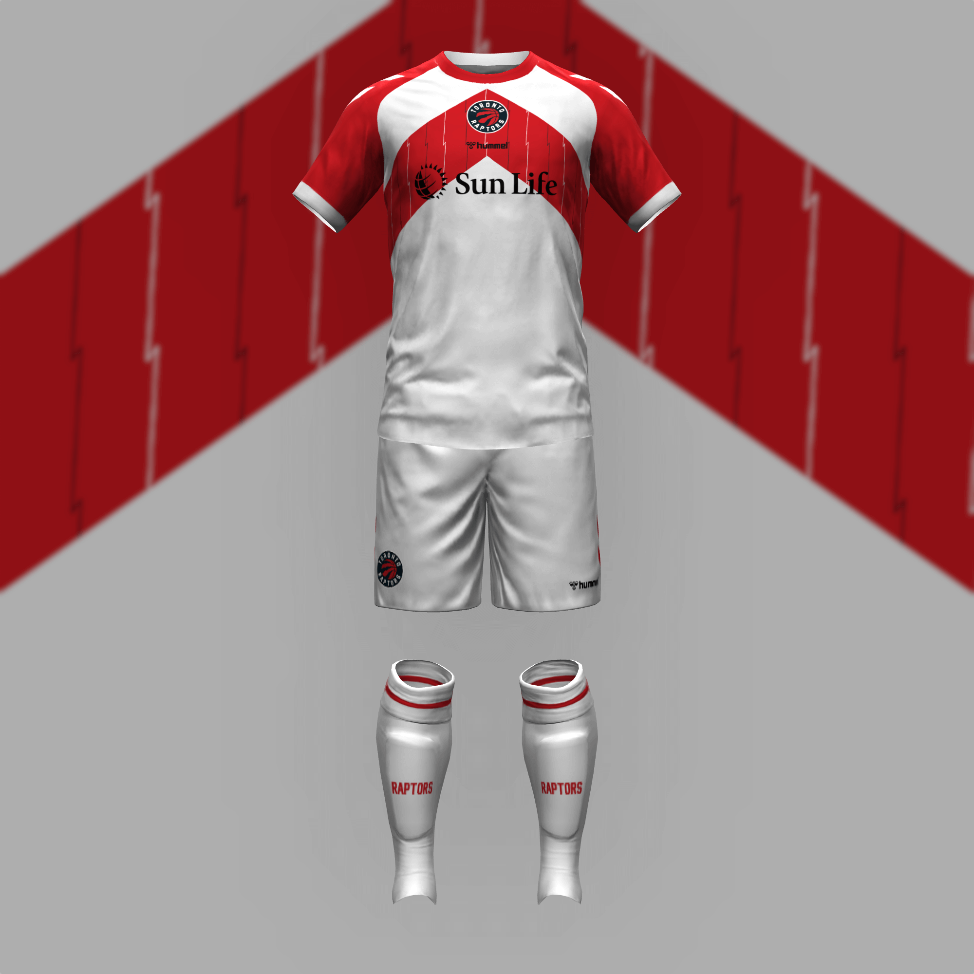
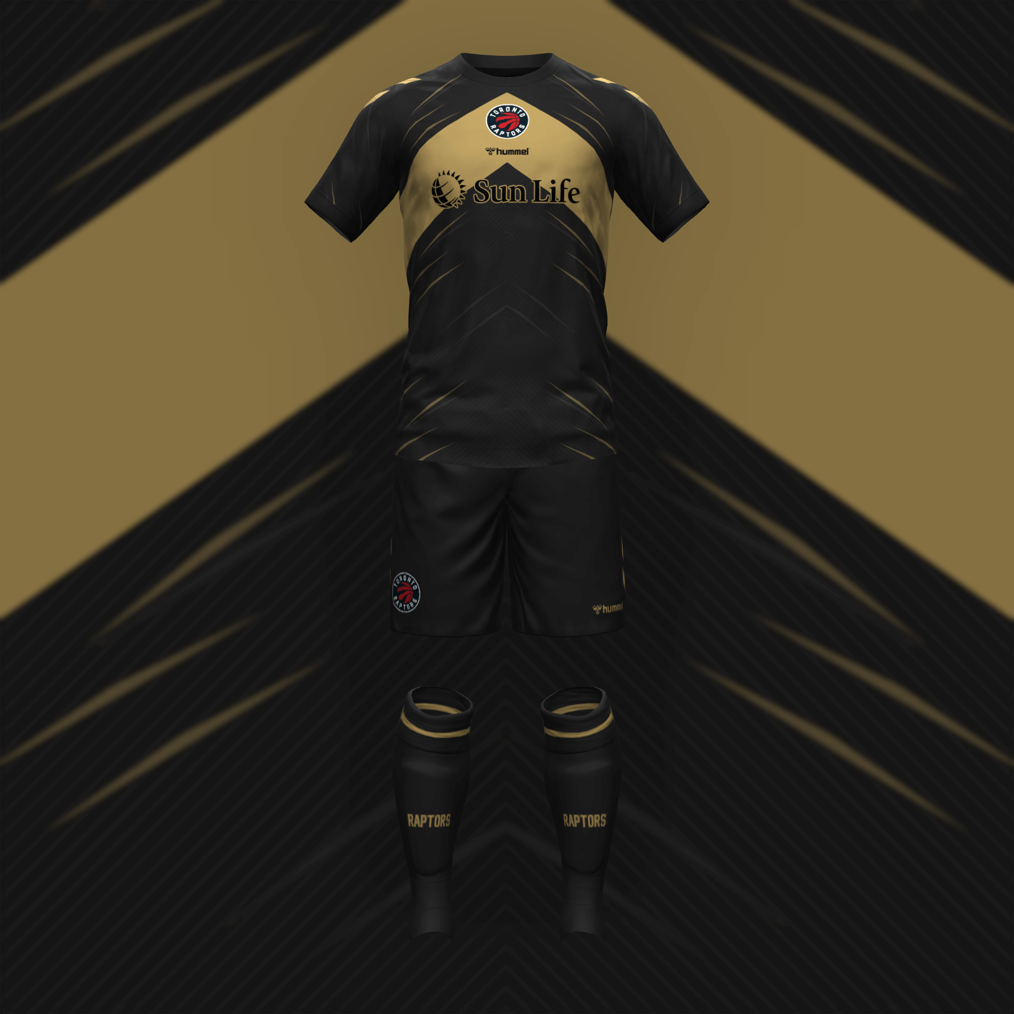
The Raptors were tough since I think their current design is just sort of dumb. I reached into the past with the zig-zags and knew I couldn’t outrun black and gold for the away kit. Still, there is an appeal to the simplicity of these.
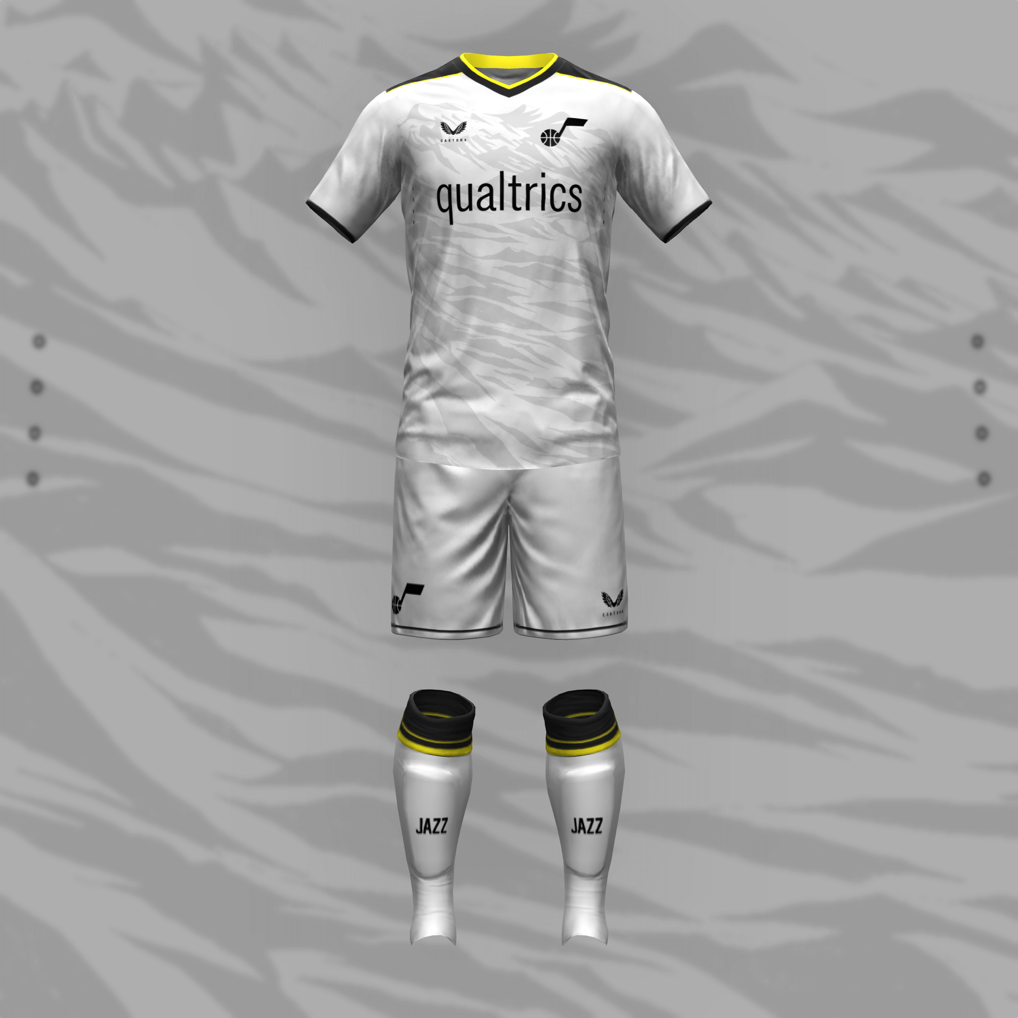
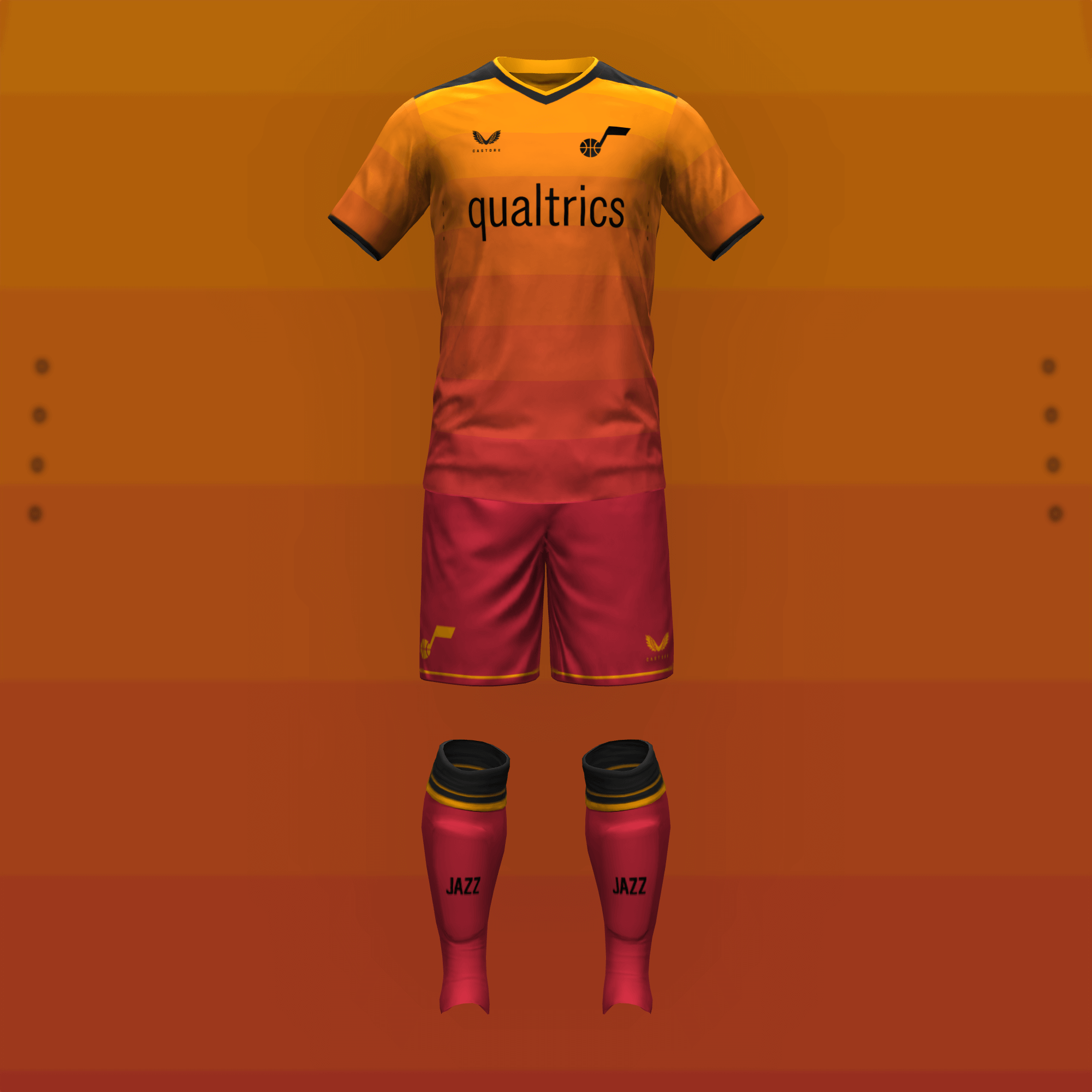
Looking past the issues of the current set, I honored the geological landmarks of Utah with mountains on the home kit and red rocks on the away kit.
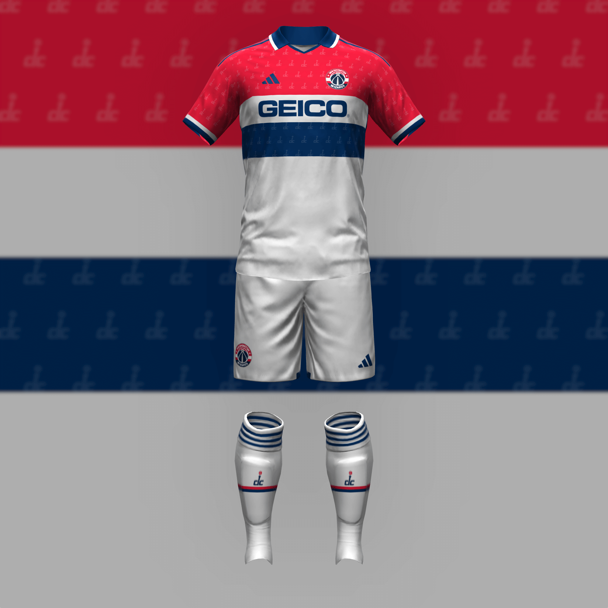
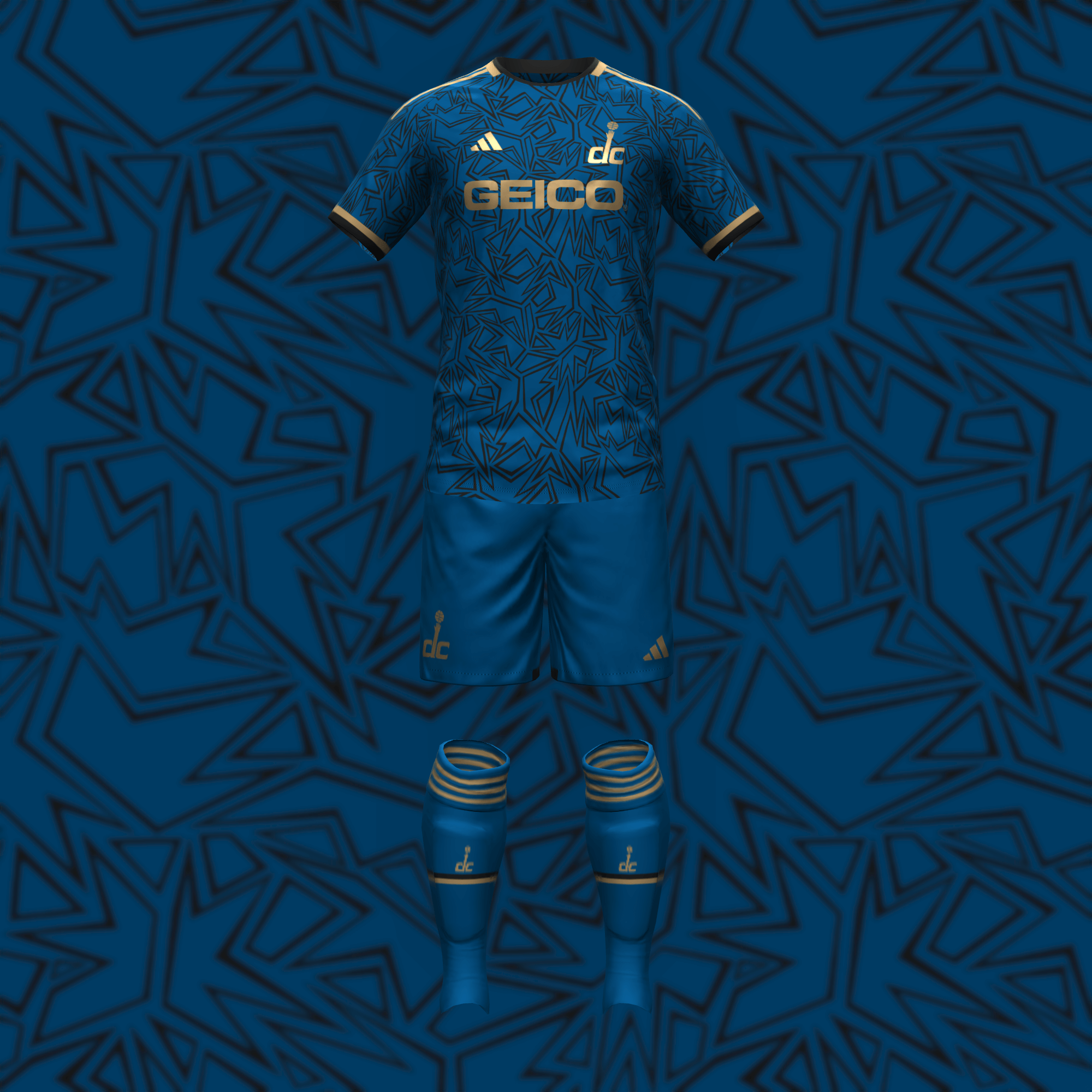
The refined look of the current Wizards could easily have been a soccer kit all along. The abstract pattern of the secondary kit reminds me of that bizarre, yet delightful (in my opinion) logo from the 2000s.
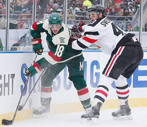

The GTGFTU is February 21, 2016 Stadium Series game between the Chicago Blackhawks and the Minnesota Wild at TCF Bank Stadium in Minneapolis. The Wild won 6 – 1.
That’s the game, Mike!
Some may wish for the Wild to switch over to the old NorthStars color scheme, but these did the trick for me.
It was cool coming across a photo that featured the ‘hawks uniform from that game which obscured the problematic imagery and showcased those awesome over-sized ‘Chicago’ stripes…too bad the breezers didn’t have those too.
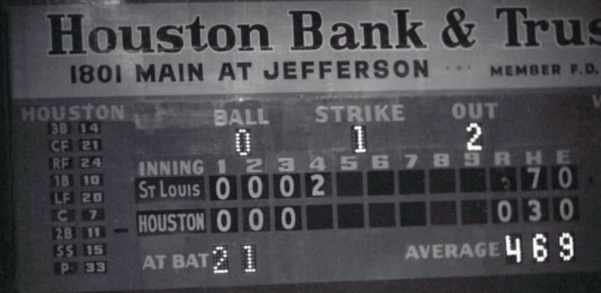
The GTGFTS is the April 25, 1962 baseball game between the St. Louis Cardinals and the Houston Colt .45s at Colts Stadium in Houston. The Cardinals won 4 – 3. Here in the top of the 4th inning, Curt Flood of the Cardinals is about to hit a 2-run home run to put the cardinals ahead 4 – 0.
Great conclusion to the NBA soccer reimagined series. Love how it worked in several makers, like Kappa, Castore, Hummel, Puma, Macron, Umbro, and Joma. Probably only missing a few, like Le Coq Sportif, Mizuno, New Balance, and Jako.
Never mind: just spotted NB on one of the kits from part 1.
Line I said after last week’s part 1…” I hate uniform ads, but it’s completely appropriate for them with this NBA/Soccer exercise by Danny, since soccer uniforms are more about the advertiser than the team. I like that he used the current uniform advertiser that the teams have.” Also, like last week, it looks odd when a team doesn’t have an advertiser, but keeping with this exercise Danny correctly doesn’t use an advertiser is a team doesn’t currently have a uniform advertiser. Great job!
Great job, Danny! And best of all, my Sixers had no kit sponsor, which is hopefully the start of a trend…
Those kits were remarkable.
I would buy both Kings looks in a heartbeat.
I am a huge fan of the MSG motif on the Knicks primary kit. I read what it was IMMEDIATELY, and its something that would actually work on a kit. Bravo on the whole series…I enjoyed it!
Great series, these designs absolutely work for me. Much better than most real soccer team uniforms, especially those in the MLS, Ligue 1 and 2 or any of the leagues in Belgium. They will look great with long sleeves as well.
I liked the last installment, and I like this installment too. These are all really well done, really on-brand for each team, and they look nice. This is probably the best weekend feature I can remember. Congratulations to you, Danny Kaufmann.