
Greetings and good Saturday morning, Uni Watchers. I hope everyone had a good week.
A few months back, I ran a pair of league-wide “crossover” concepts from Danny Kaufmann (Part I and Part II) in which Danny imagined Major League Baseball teams in soccer uniforms. Today Danny returns with the first part of a related project — only this time giving the soccer treatment to NBA unis.
In those MLB/soccer concepts back in February, I wrote, “each and every jersey contains an advertiser. I struggled with actually running these, but obviously there was a lot of time and effort put into each concept kit, and the advertisers selected seem to make sense for the teams. That’s not an endorsement of the advertiser (and I wish Danny hadn’t included them).” That holds true for these as well. In fact, Danny addressed this in his submission to me:
I was so overjoyed with the response to my MLB Soccer Kit Concepts project that I decided to do the same with the NBA. But first, a note about jersey ads: I am opposed to the prevalence of advertising on sports uniforms (and otherwise) but a key element of this project, like the previous one, was to consider how teams would look in soccer uniforms. Part of that entails working with an undesirable ad just as I would with a logo or color scheme I disliked.
So, with that out of the way, let’s take a look at Danny’s …
by Danny Kaufmann
Atlanta Hawks
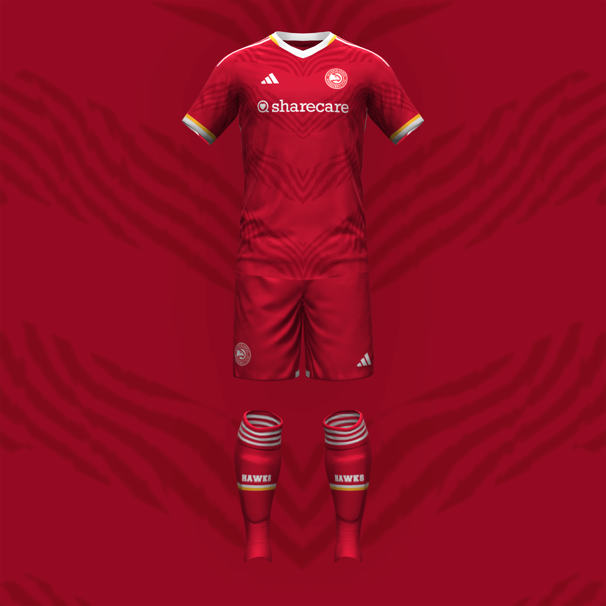
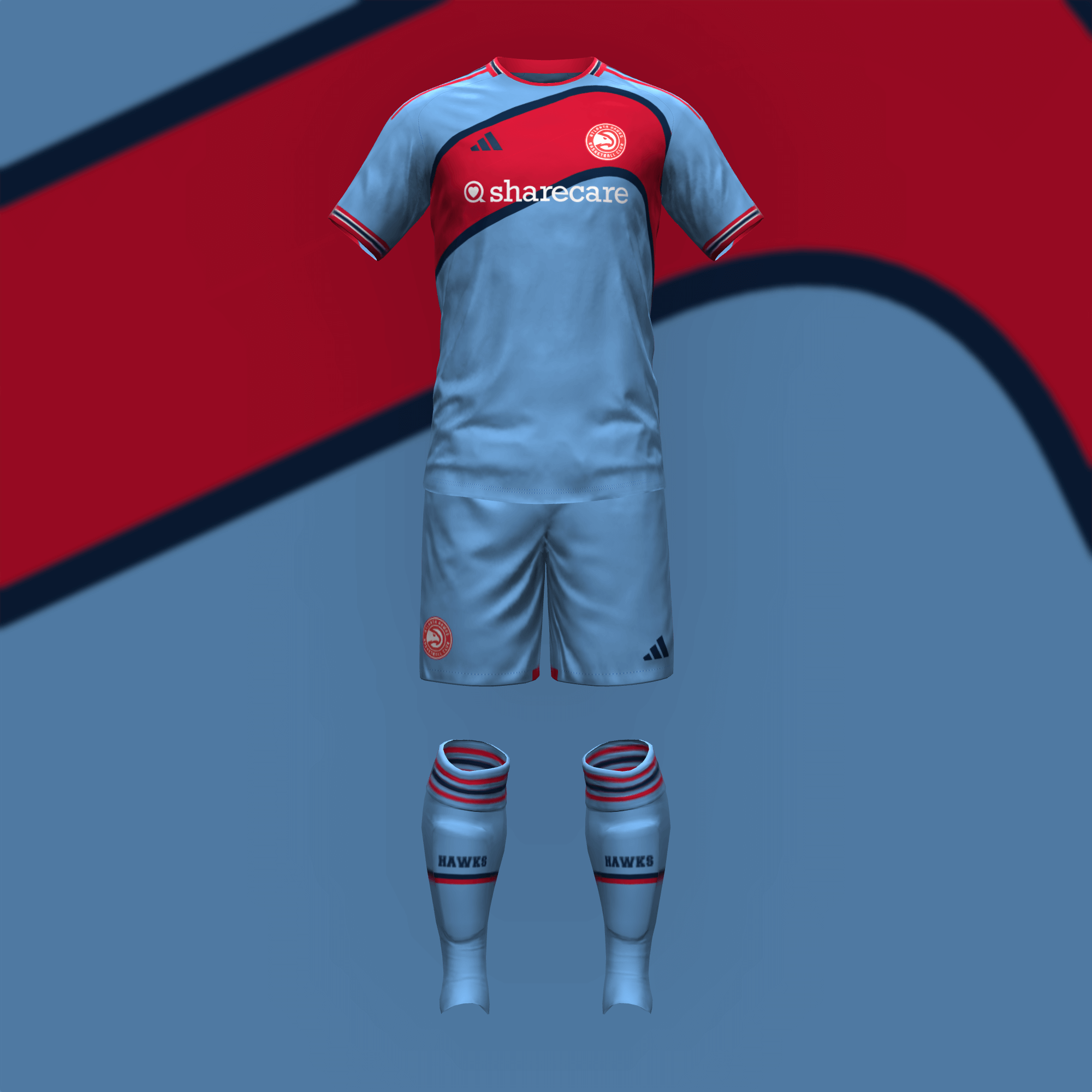
With the primary kit, I wanted to mimic the hawk’s outstretched wings from the late-’90s jerseys. I’ve always loved light blue uniforms so I combined the Hawks’ ’60s and ’80s designs.
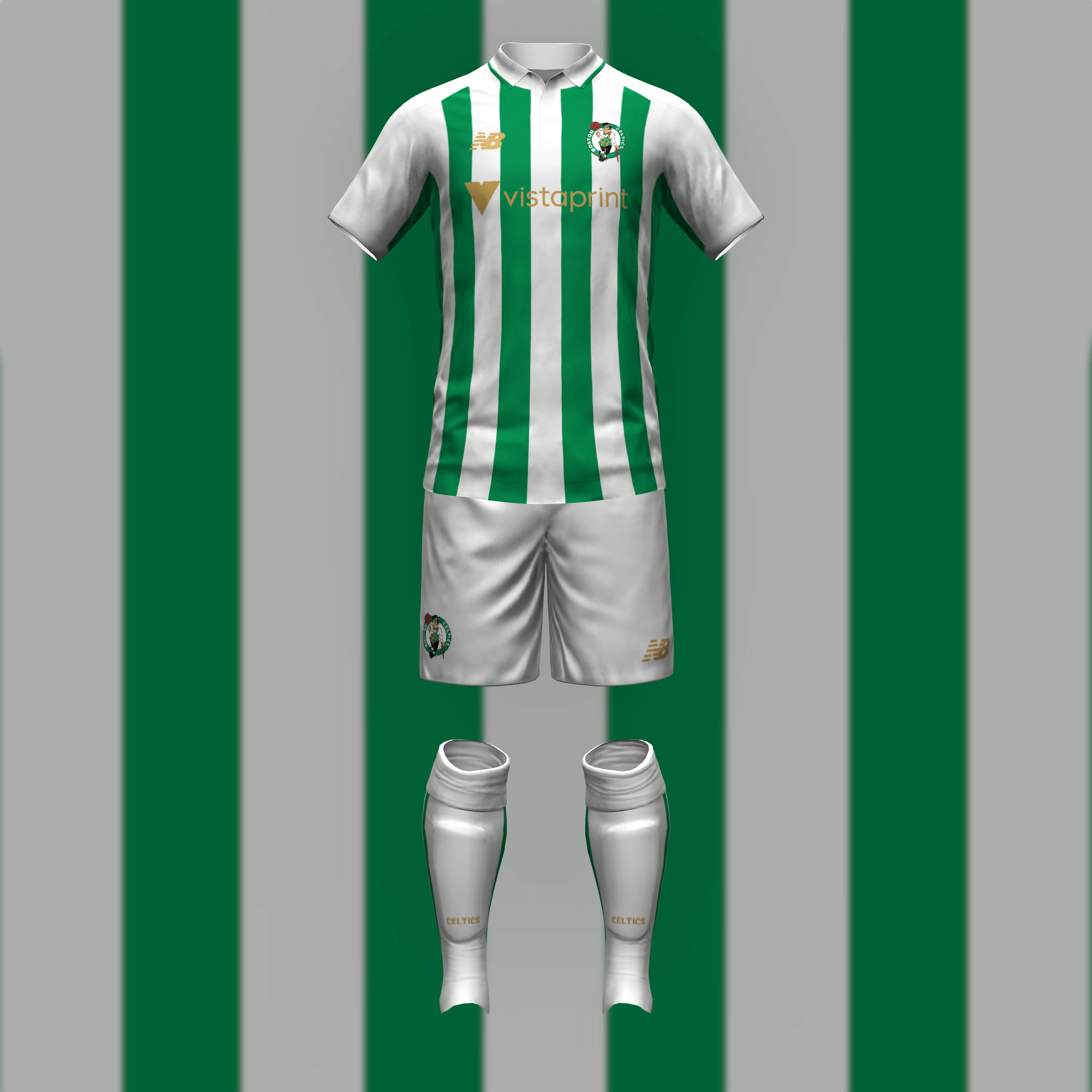
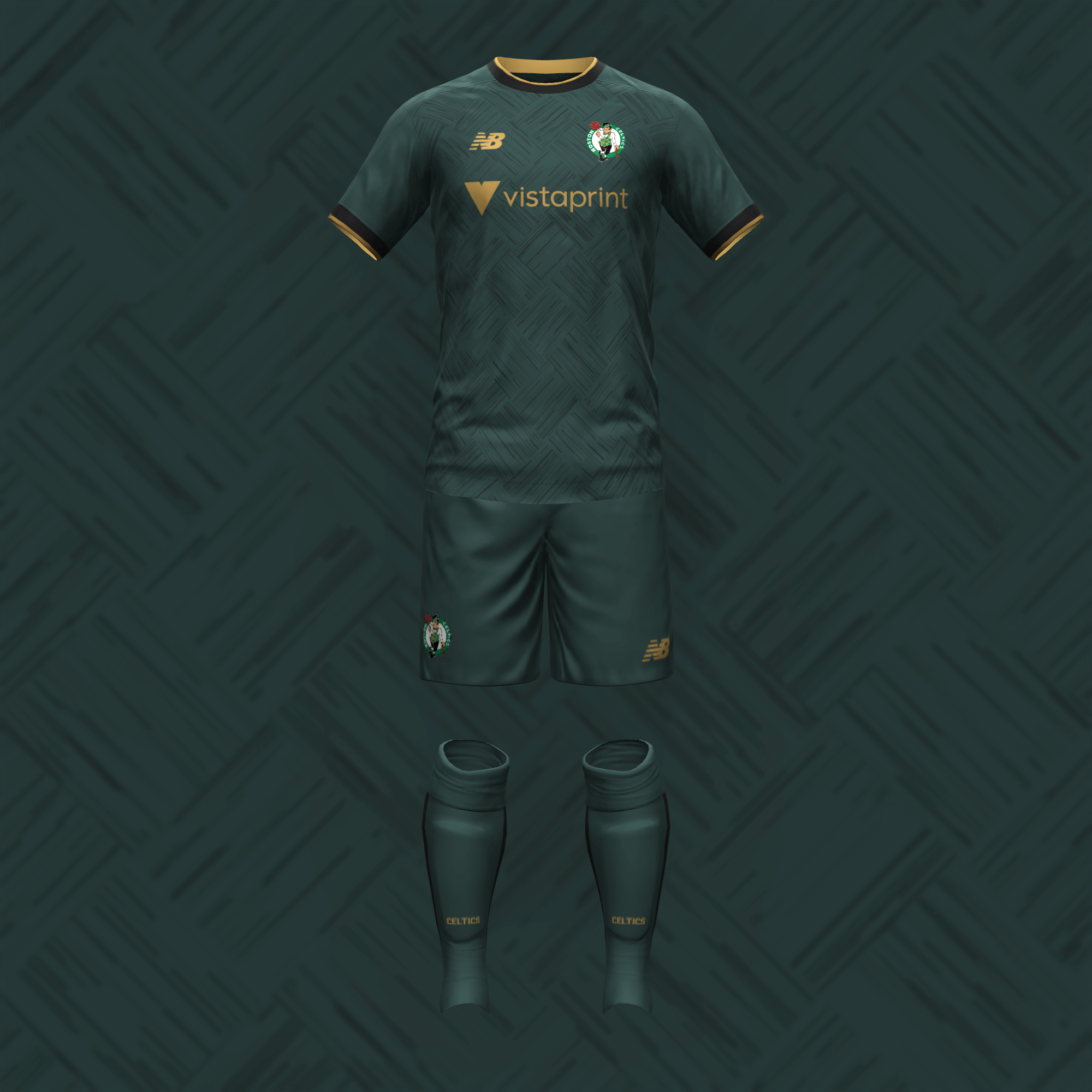
Naturally, Boston channels Scottish club Celtic (but with stripes instead of hoops for differentiation). The away is my interpretation of the Celtics’ City unis. I like the irony of a basketball court being the main design element of a soccer jersey.
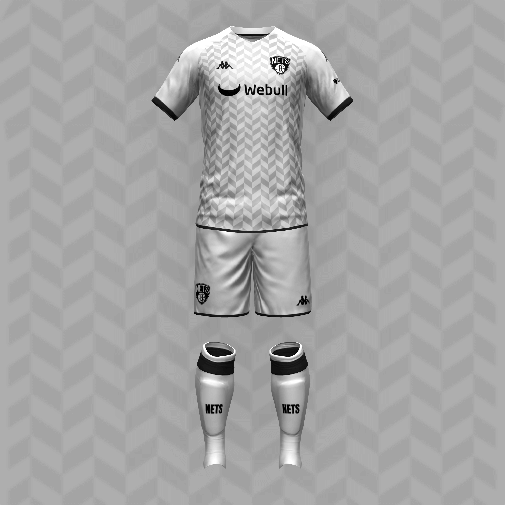
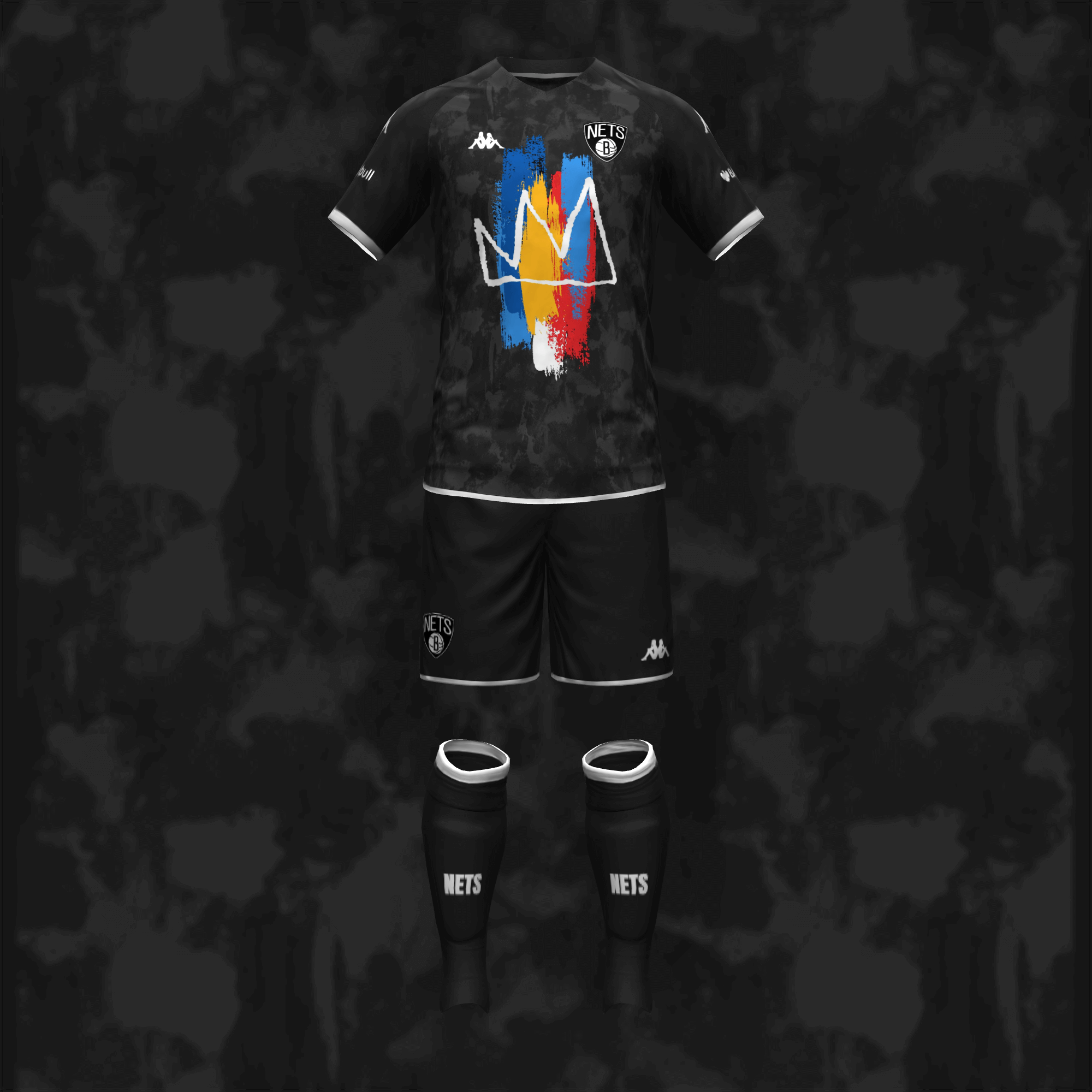
The chevron pattern allows Brooklyn to keep it as plain as they want without it looking like a white t-shirt with a logo ironed on. I went with the Basquiat graphic for the change strip.
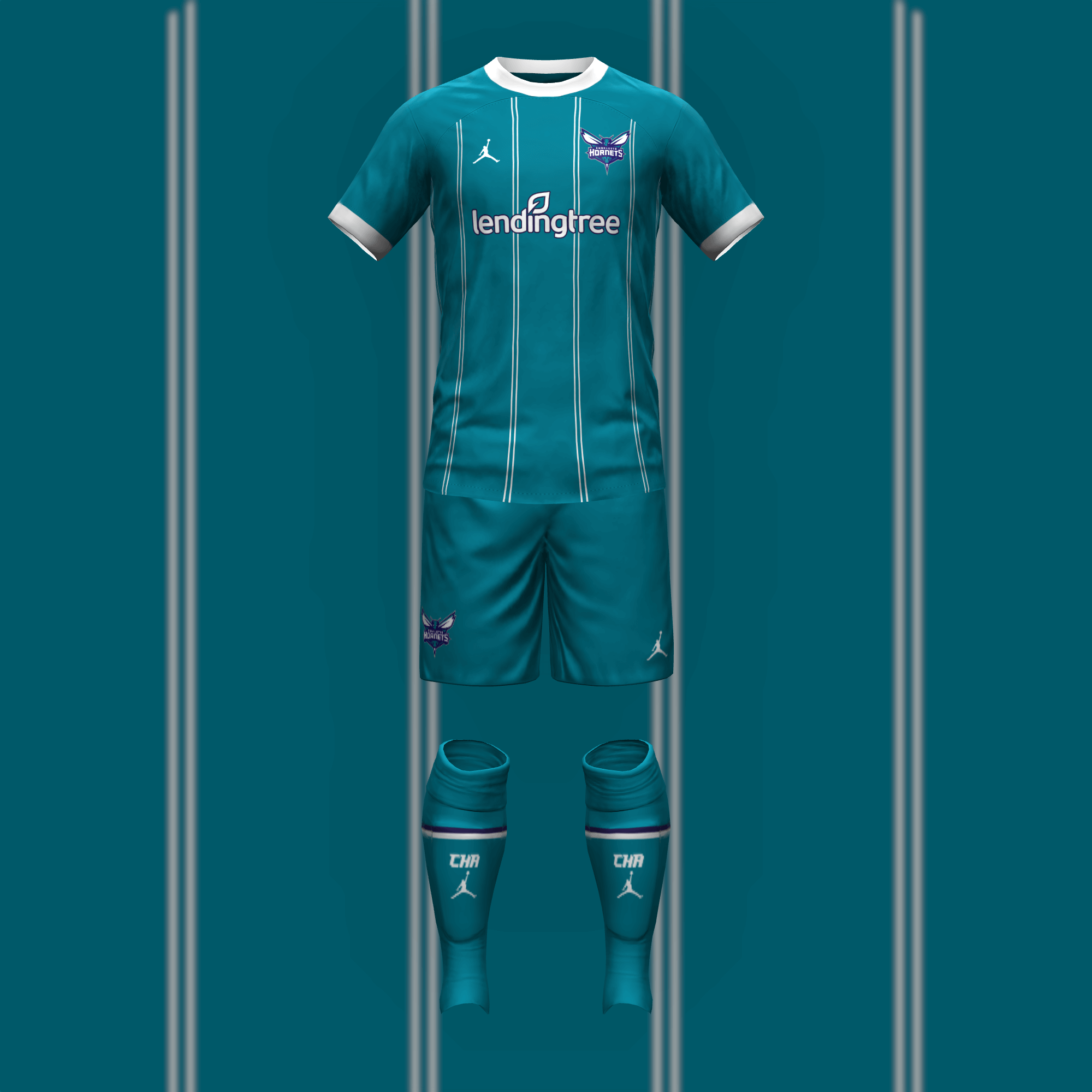
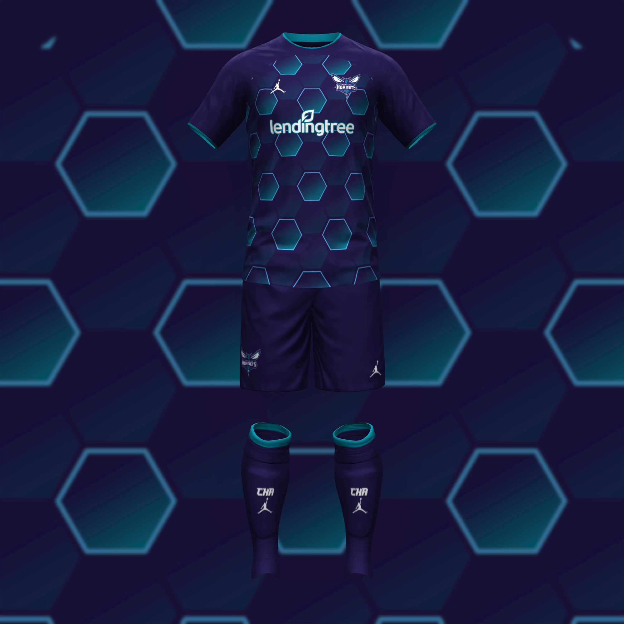
The Hornets’ teal uniforms transfer so seamlessly to the kit medium that I didn’t feel the need to change anything about them. This hexagon design is a little more out there than what they have tried and it works even better.
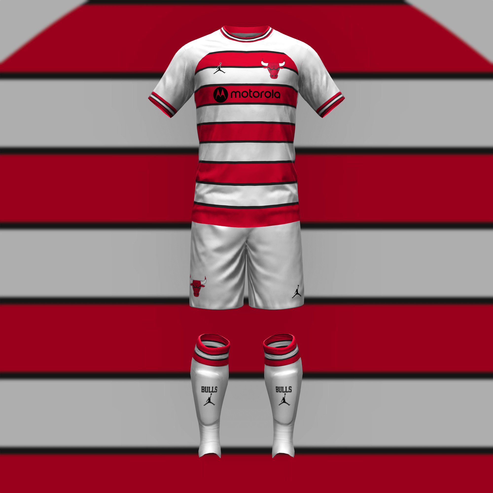
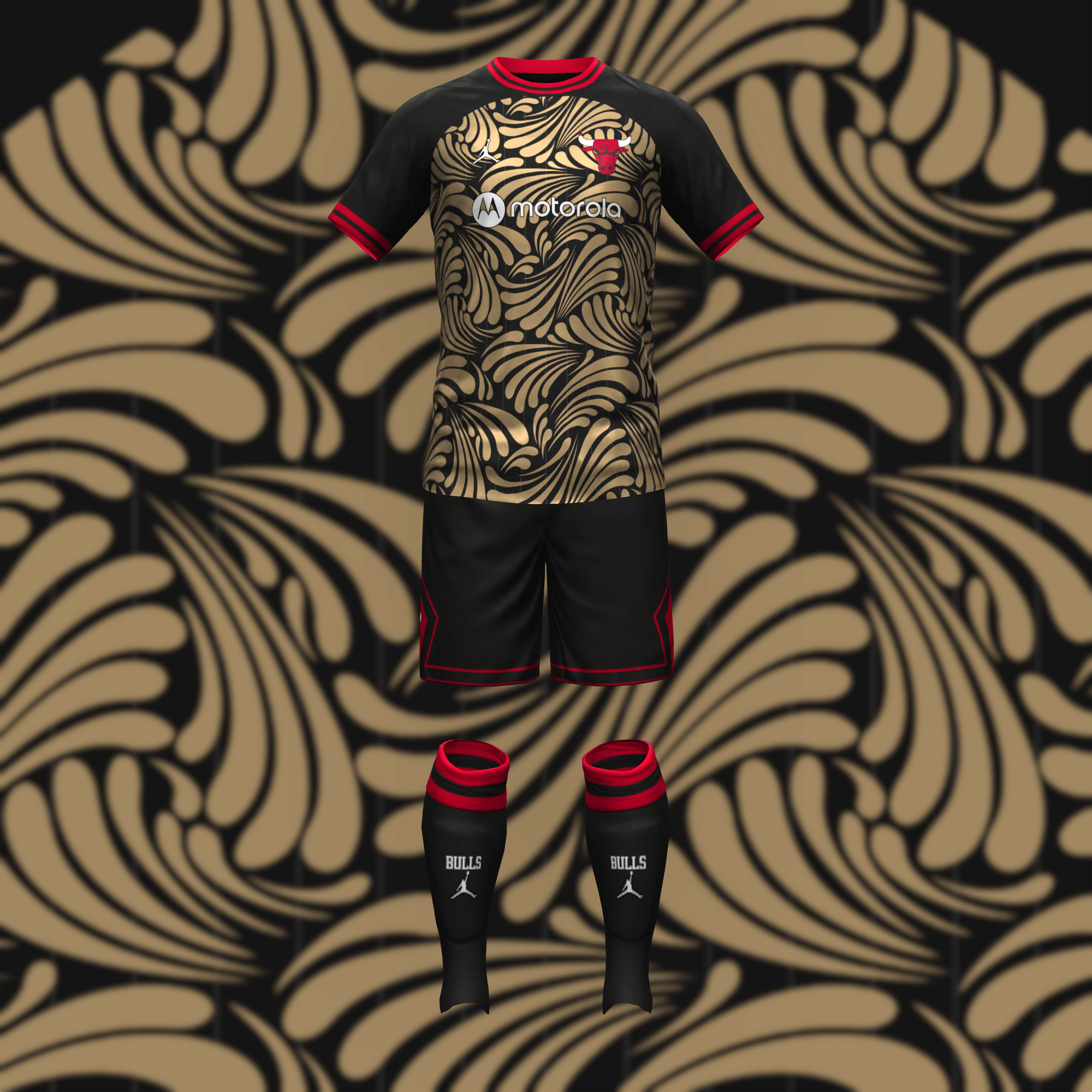
The Bulls’ home kit speaks for itself. The away kit has a few more layers (pun intended). Art Deco design naturally inspires this look but the gold elements also reference Chicago’s etymology.
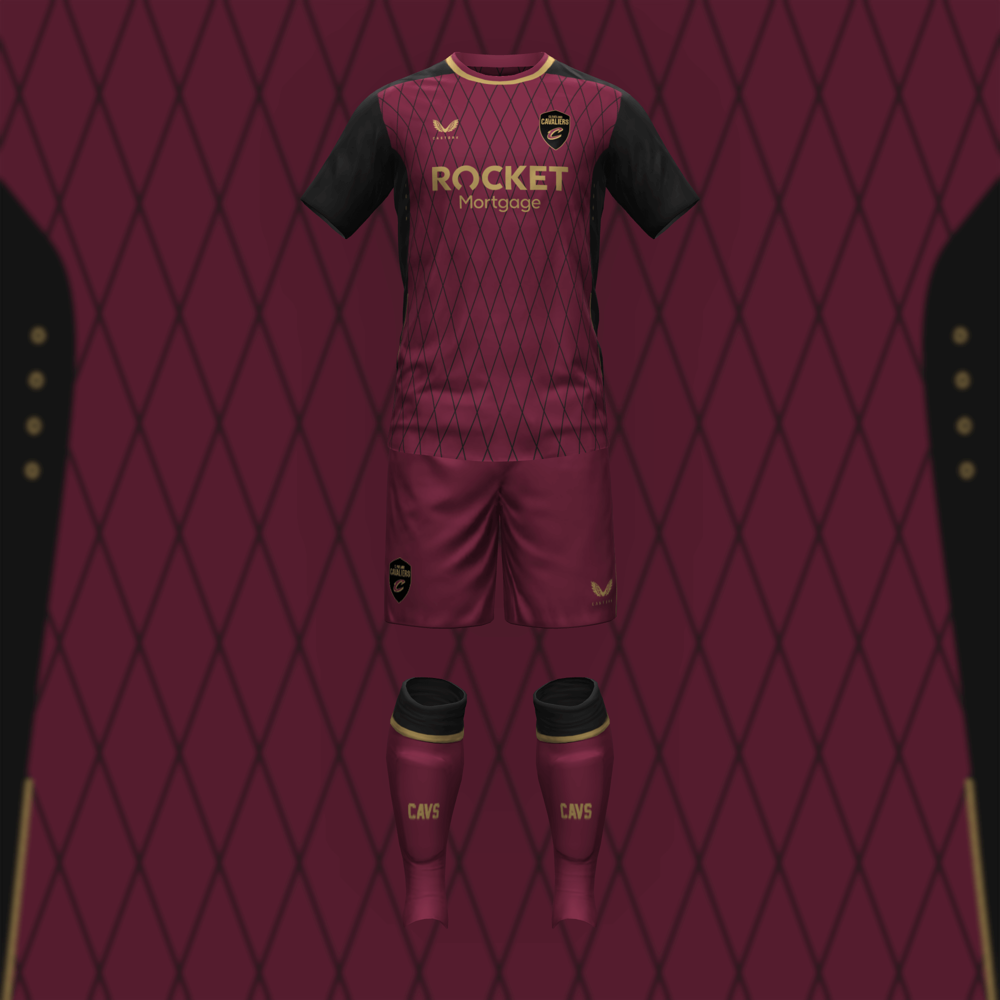
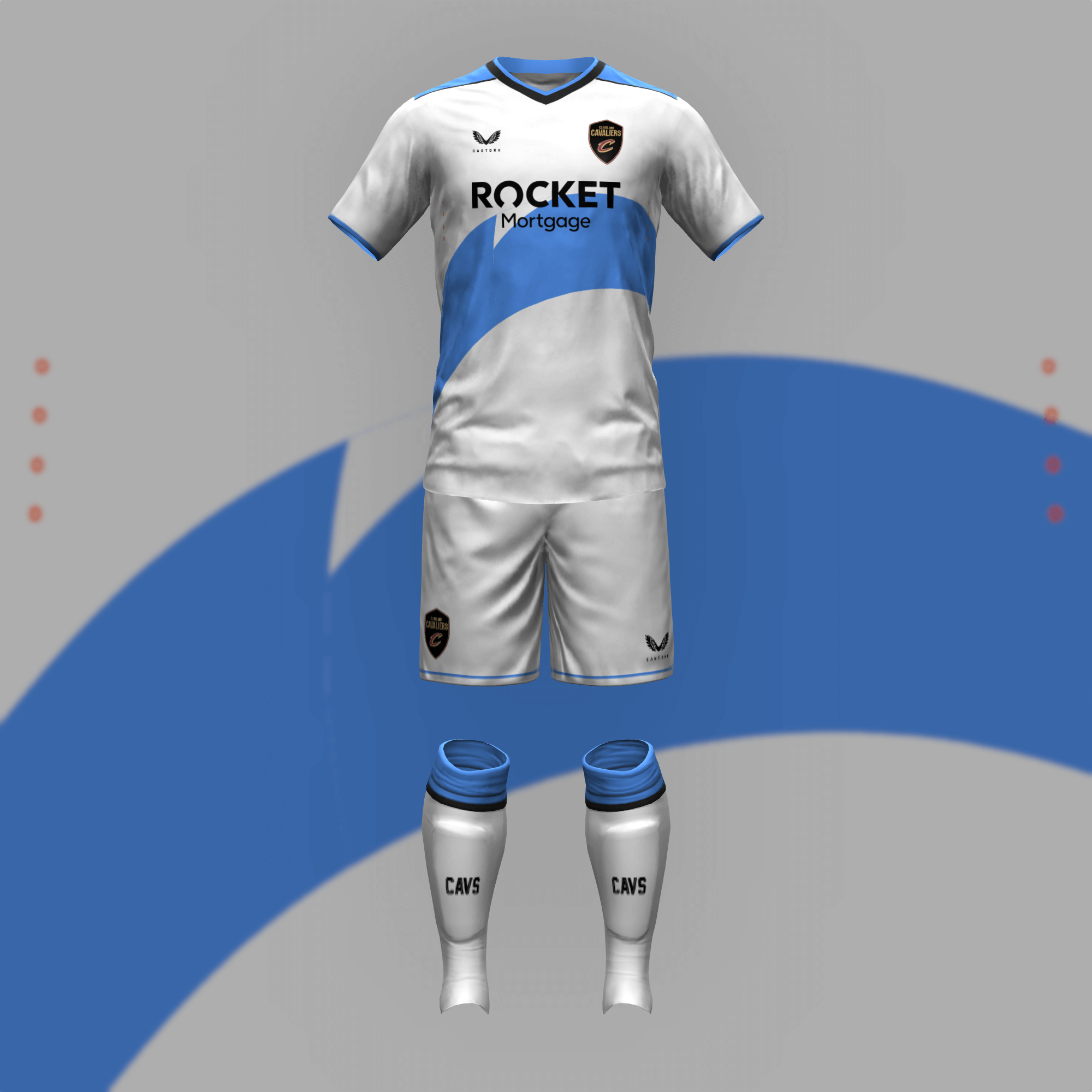
I didn’t have much to go on so I opted to recreate the basketball netting from the V in the Cavs’ jersey logo. Cleveland’s away kit throws back to the late ’90s.
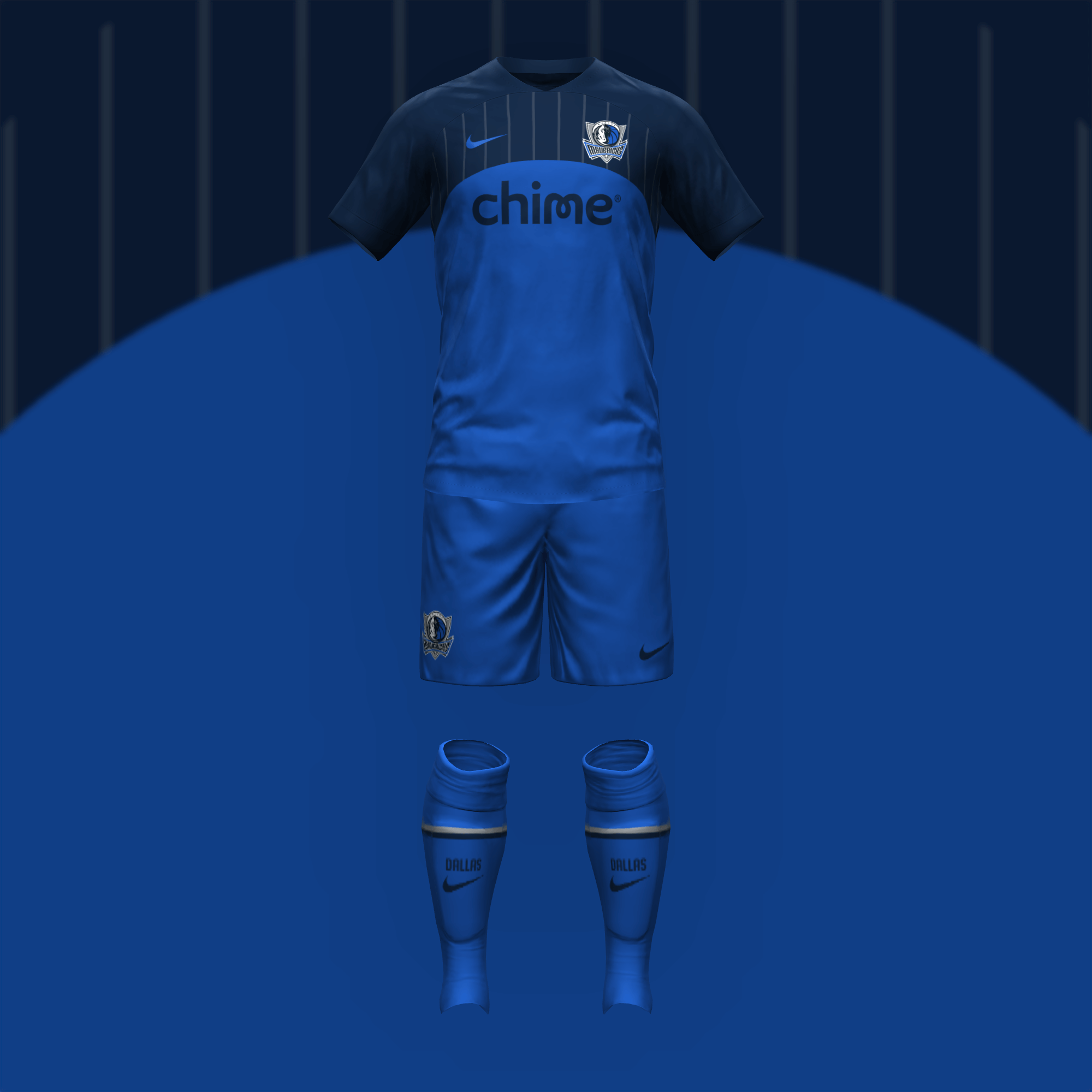
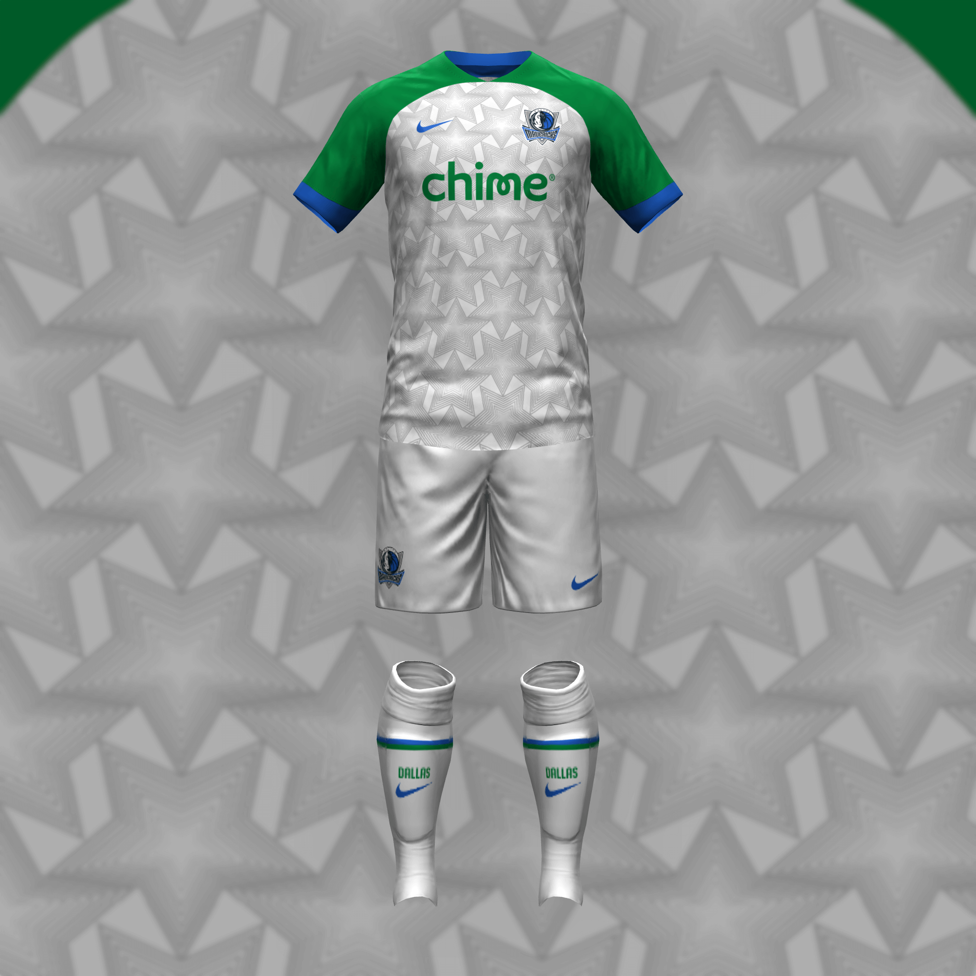
I replicated the facade of the Mavs’ arena, which stands out in a league where most arenas look like a certain NHL team logo. I poached this design since stars (and green) felt like an obvious choice.
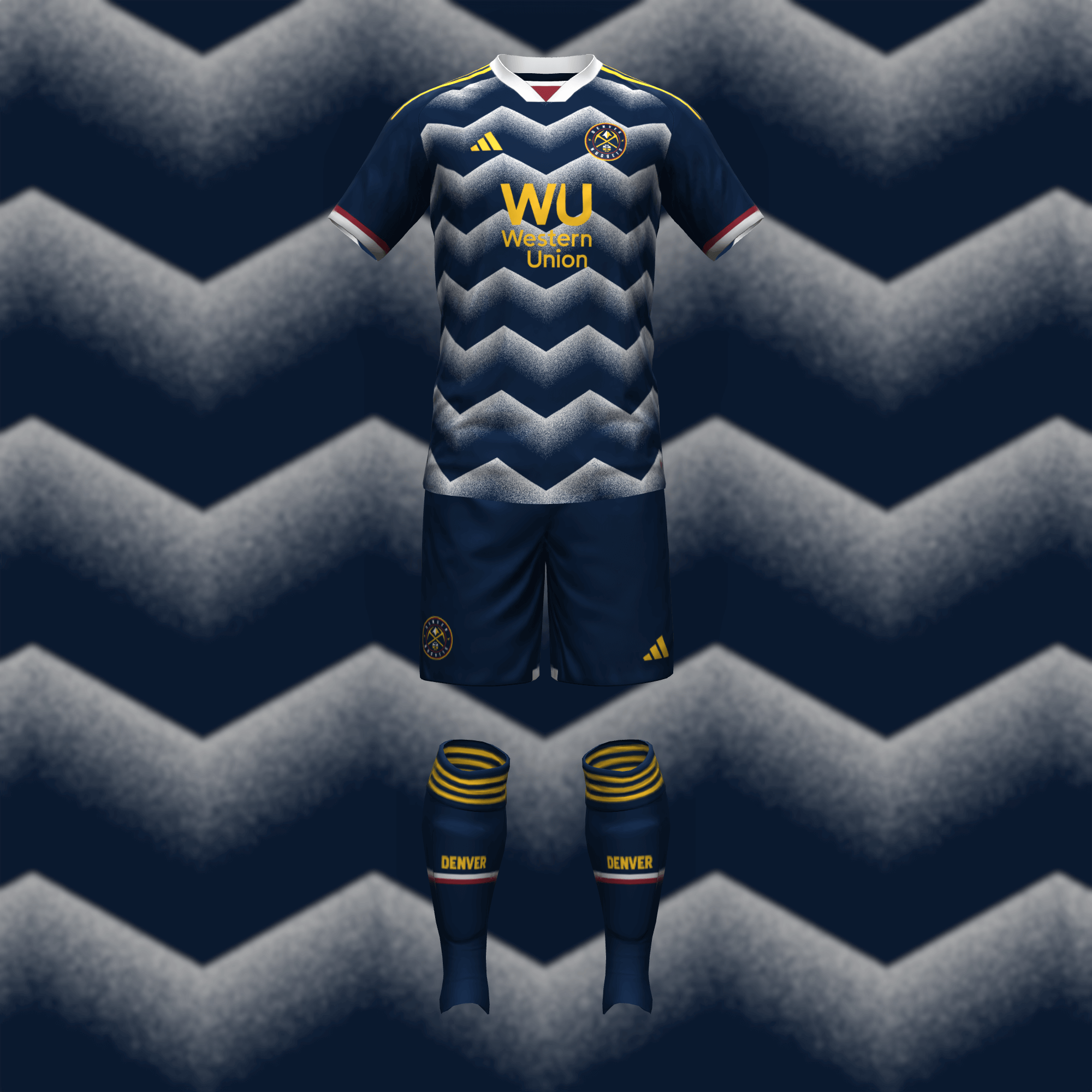
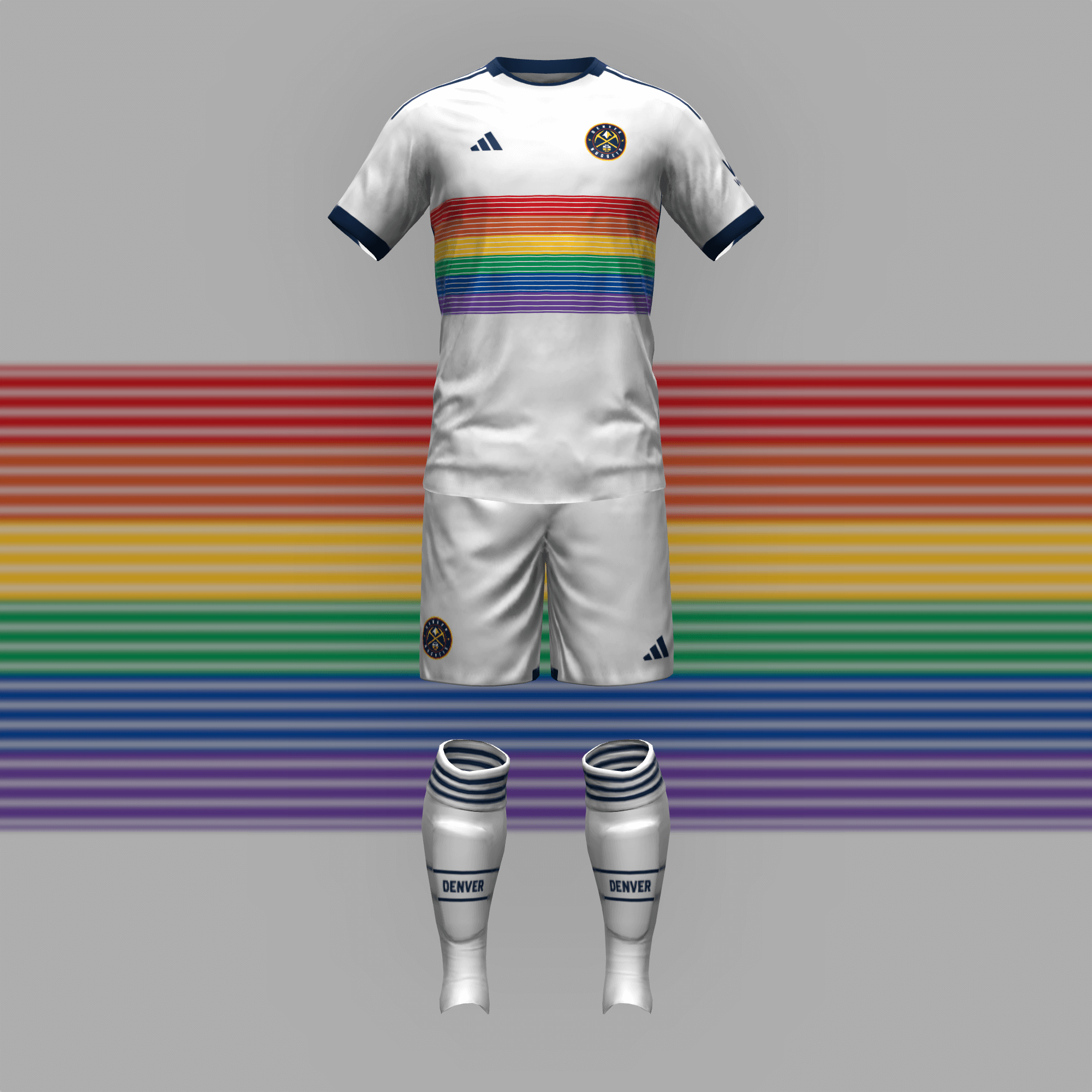
As soon as I began working on Denver’s primary kit, I knew I had to use the 1980s Adidas zig-zag to create snowy mountains. The iconic rainbow design was also an easy choice.
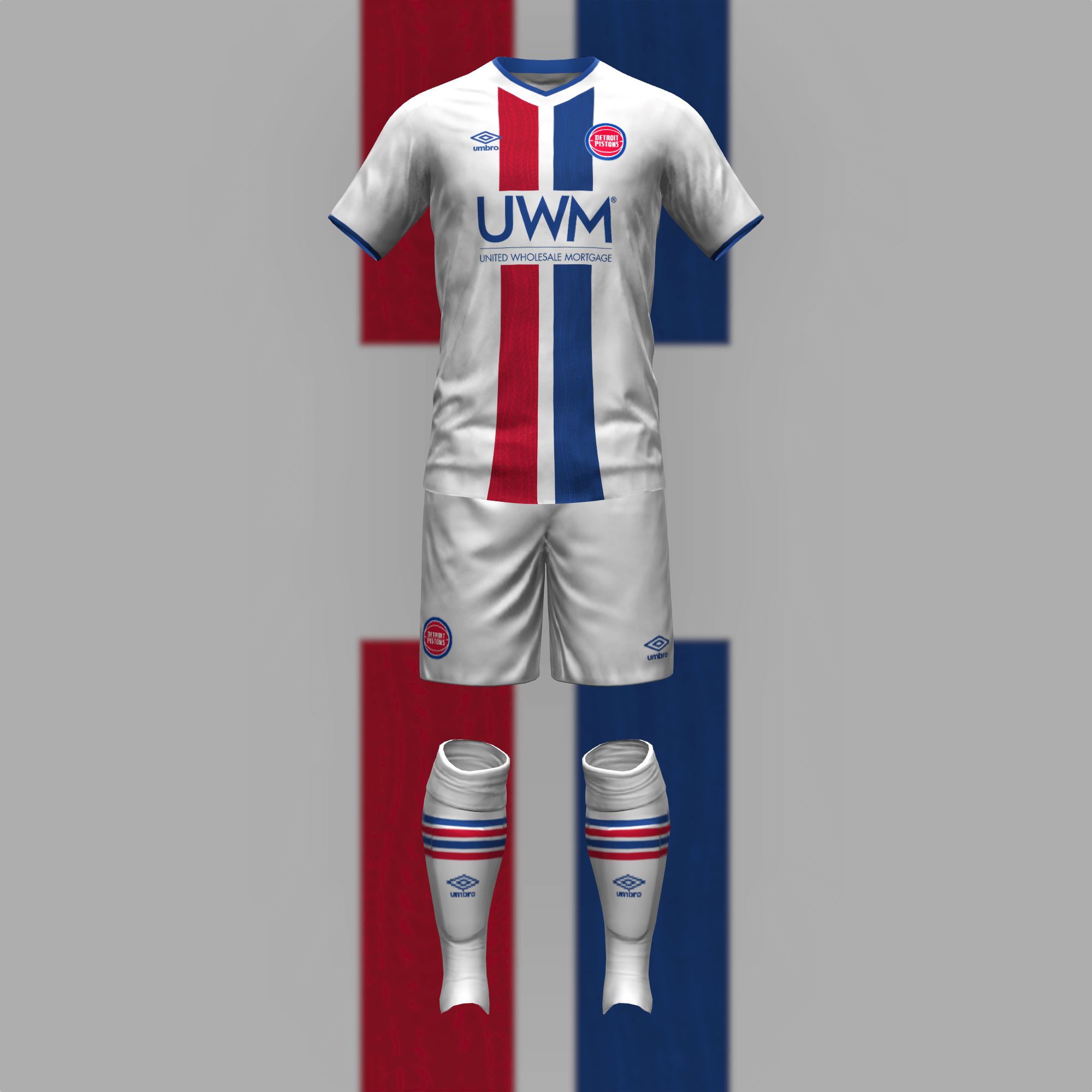
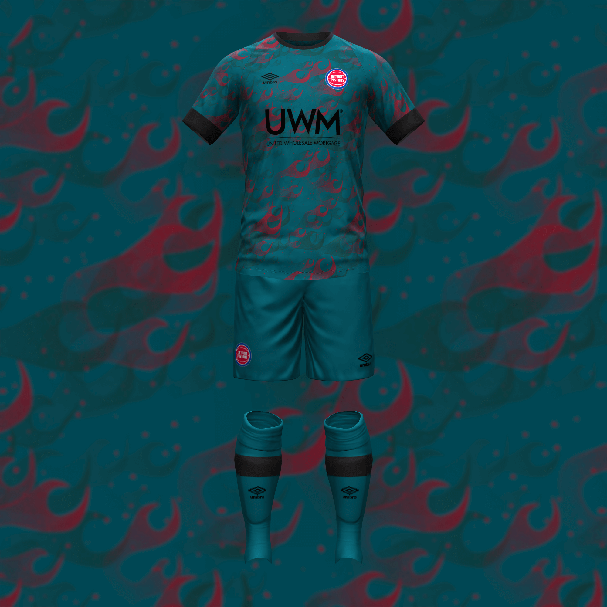
While the current Pistons set is too plain for the NBA, it gave me enough to work with on the home kit. Flames and teal hopefully breathe some life into the away uniform.
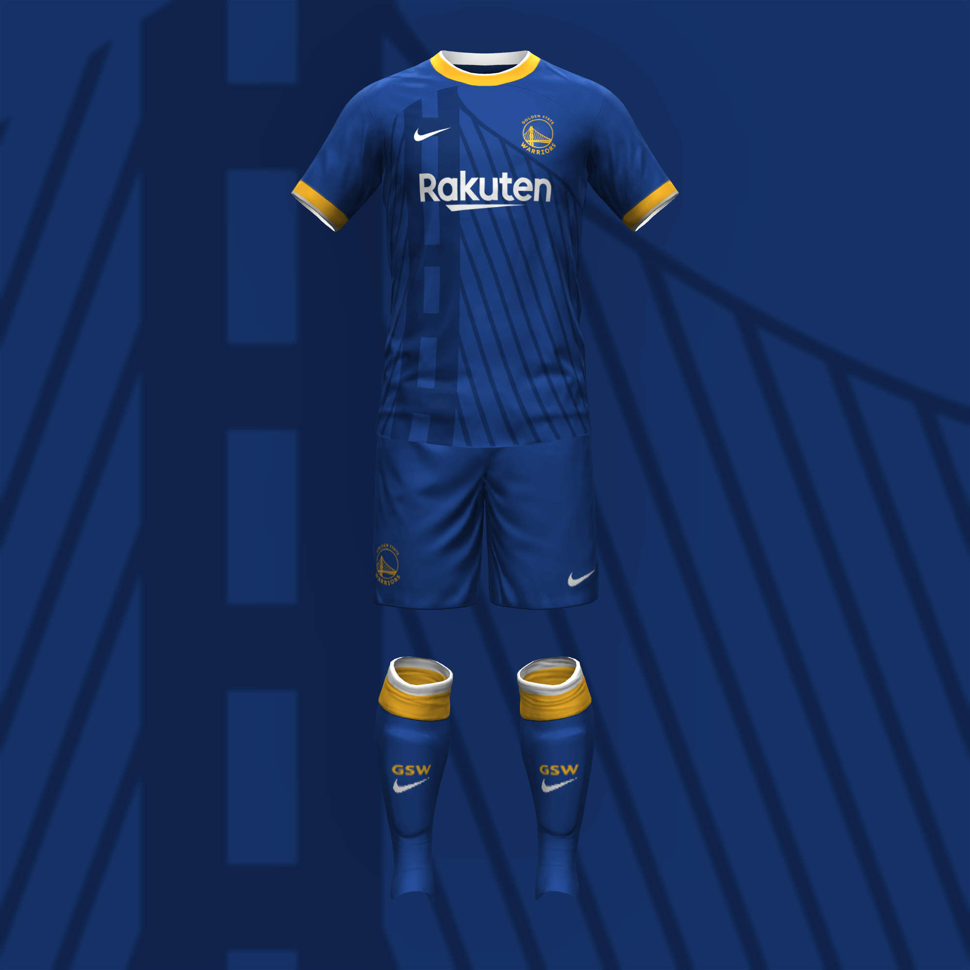
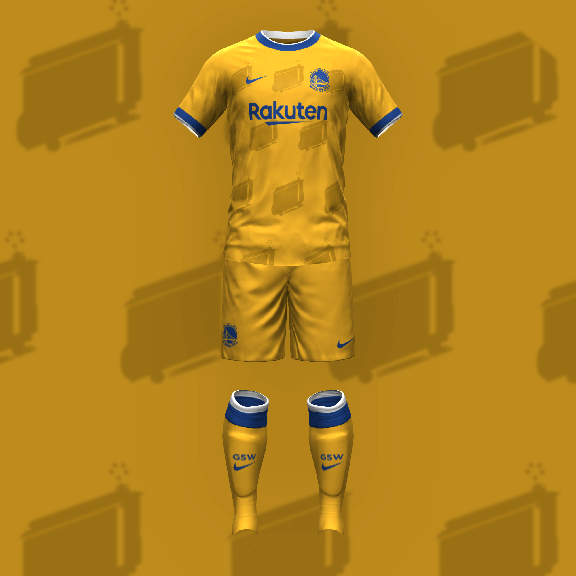
For my favorite team, I had to base the first kit on my first Dubs jersey, the blue uniform that has been a part of a couple of decent moments in the past few years. With many considering “the City” jerseys the best in basketball, I didn’t think too hard about the second kit.
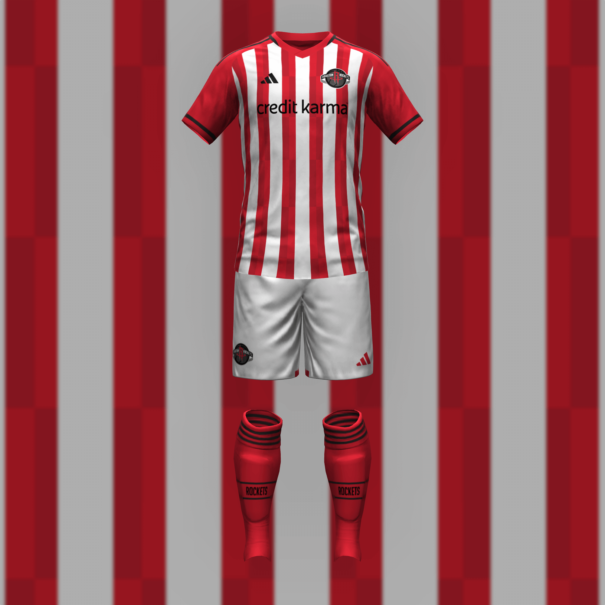
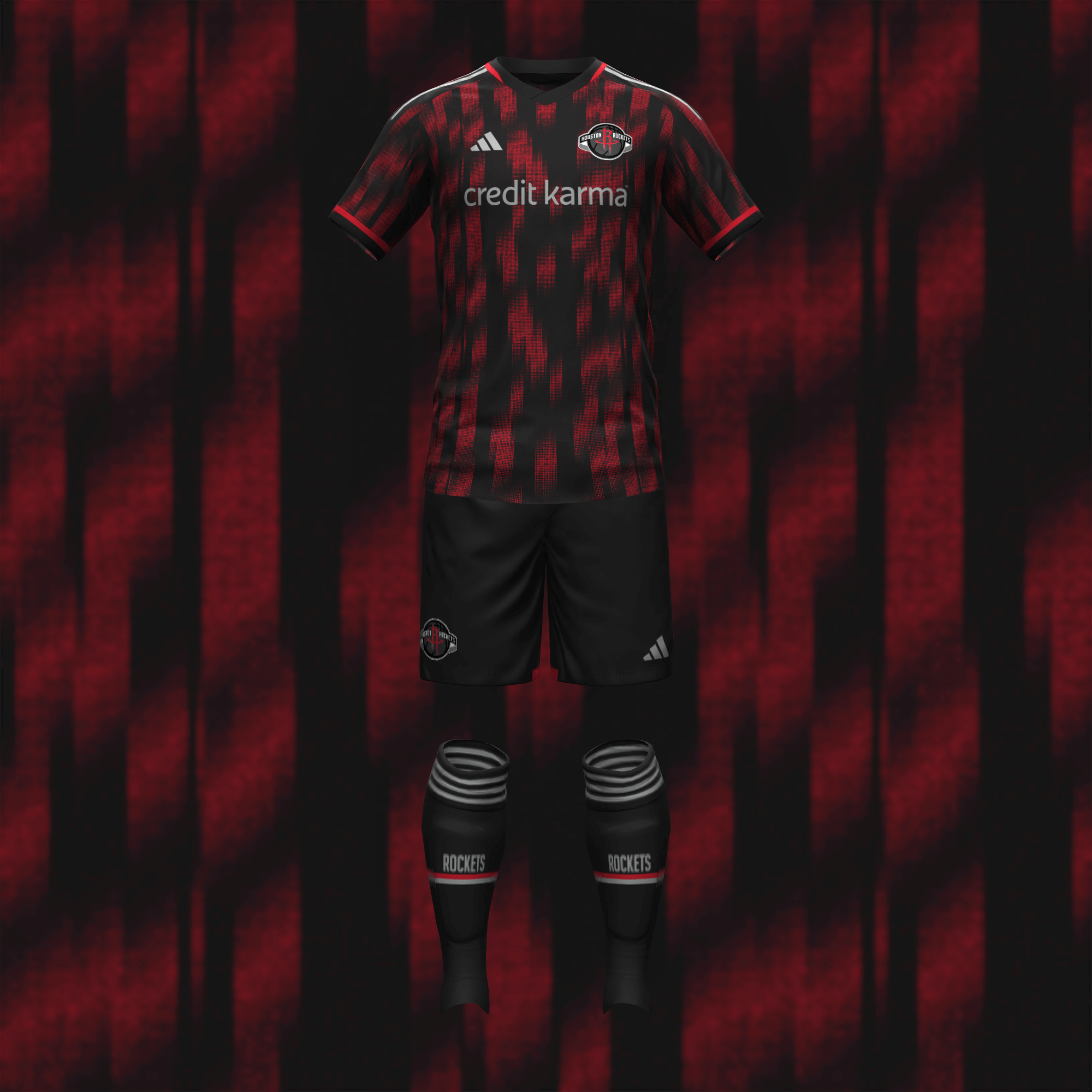
The key element of the home kit is the stripe details, which come from the Rockets’ Statement jersey. That detail carries over to the away kit, where an abstract version more closely resembles the current City and late ’90s jerseys.
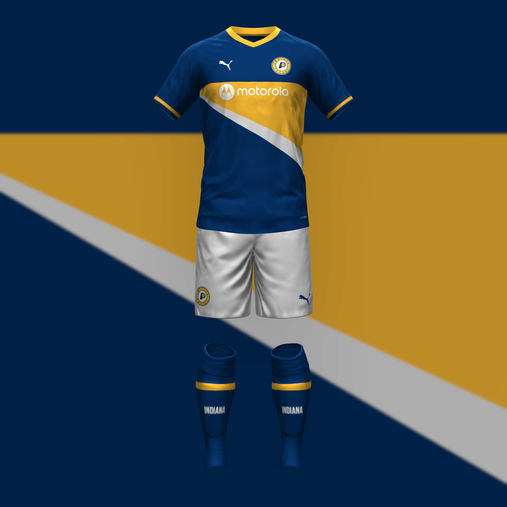
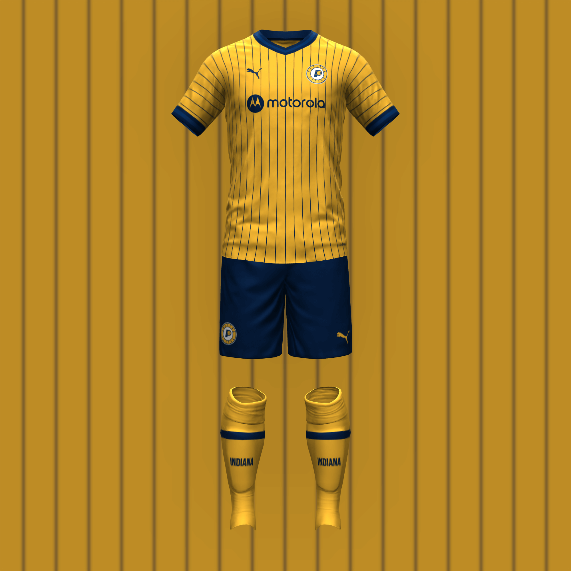
The Pacers have experimented with a variety of different striping designs, any of which would work here.
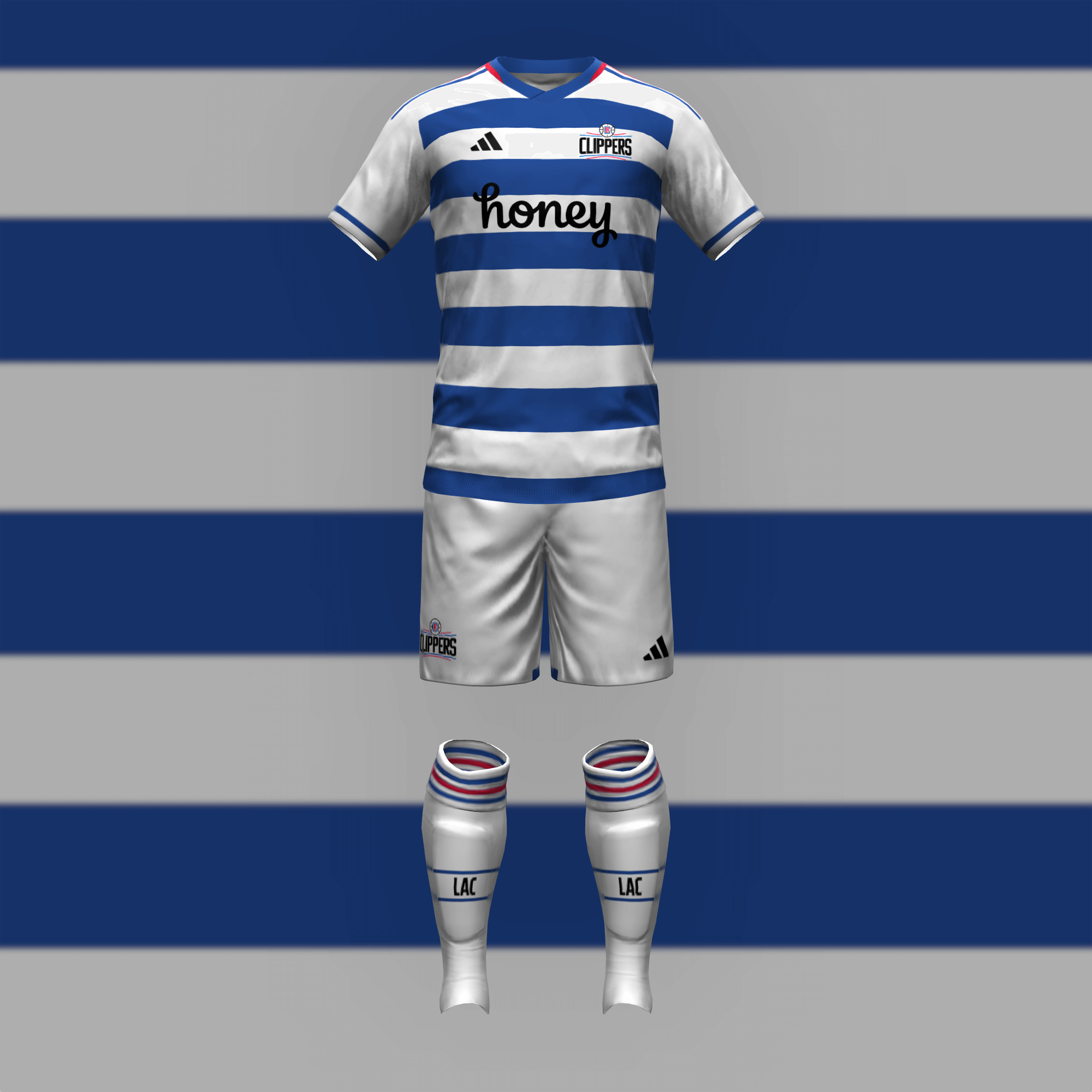
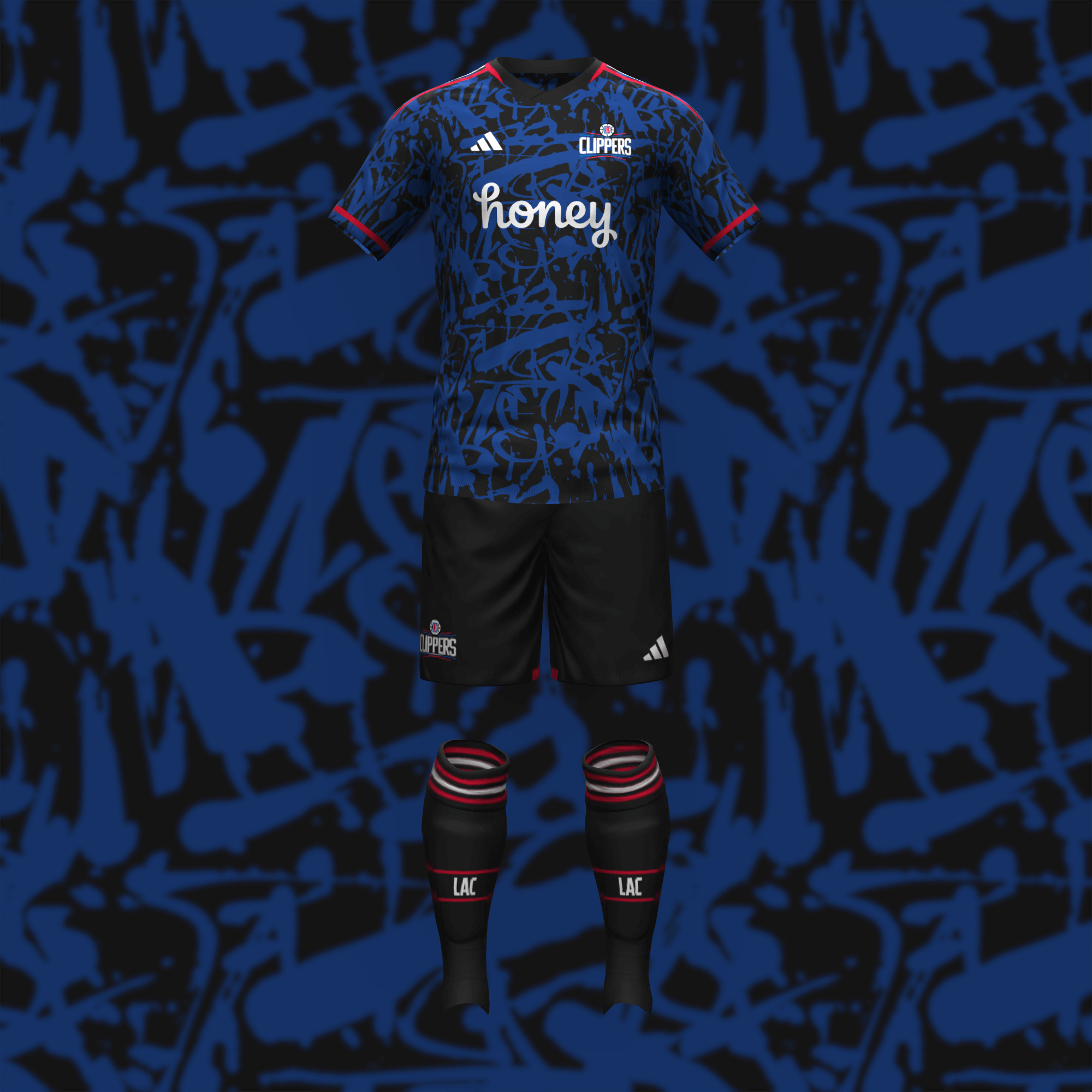
For a nautical (but not pirate or sea creature) theme, blue and white hoops were the first thing I pictured. The away kit goes the graffiti route, which is the only interesting thing the Clippers have been able to do with their current set.
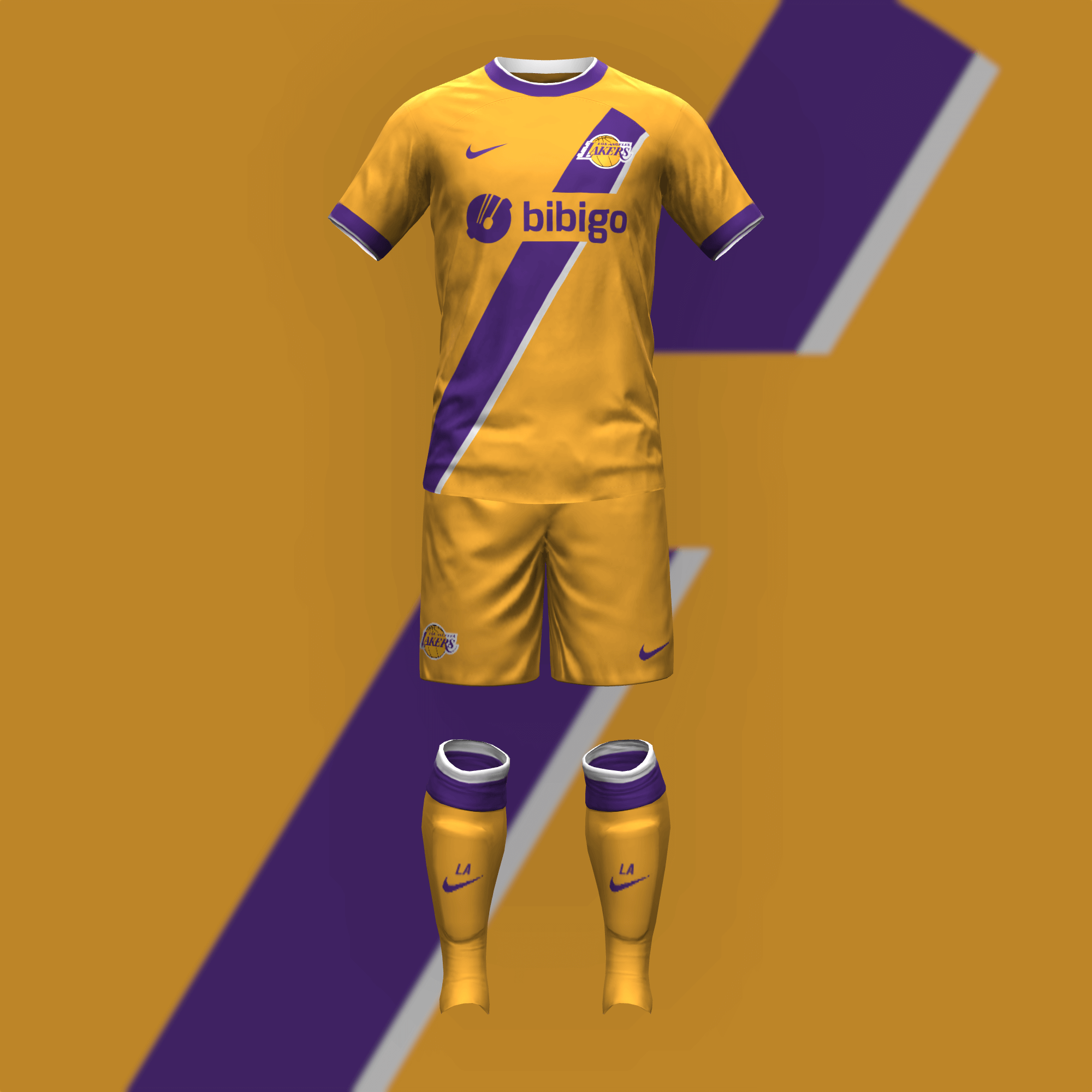
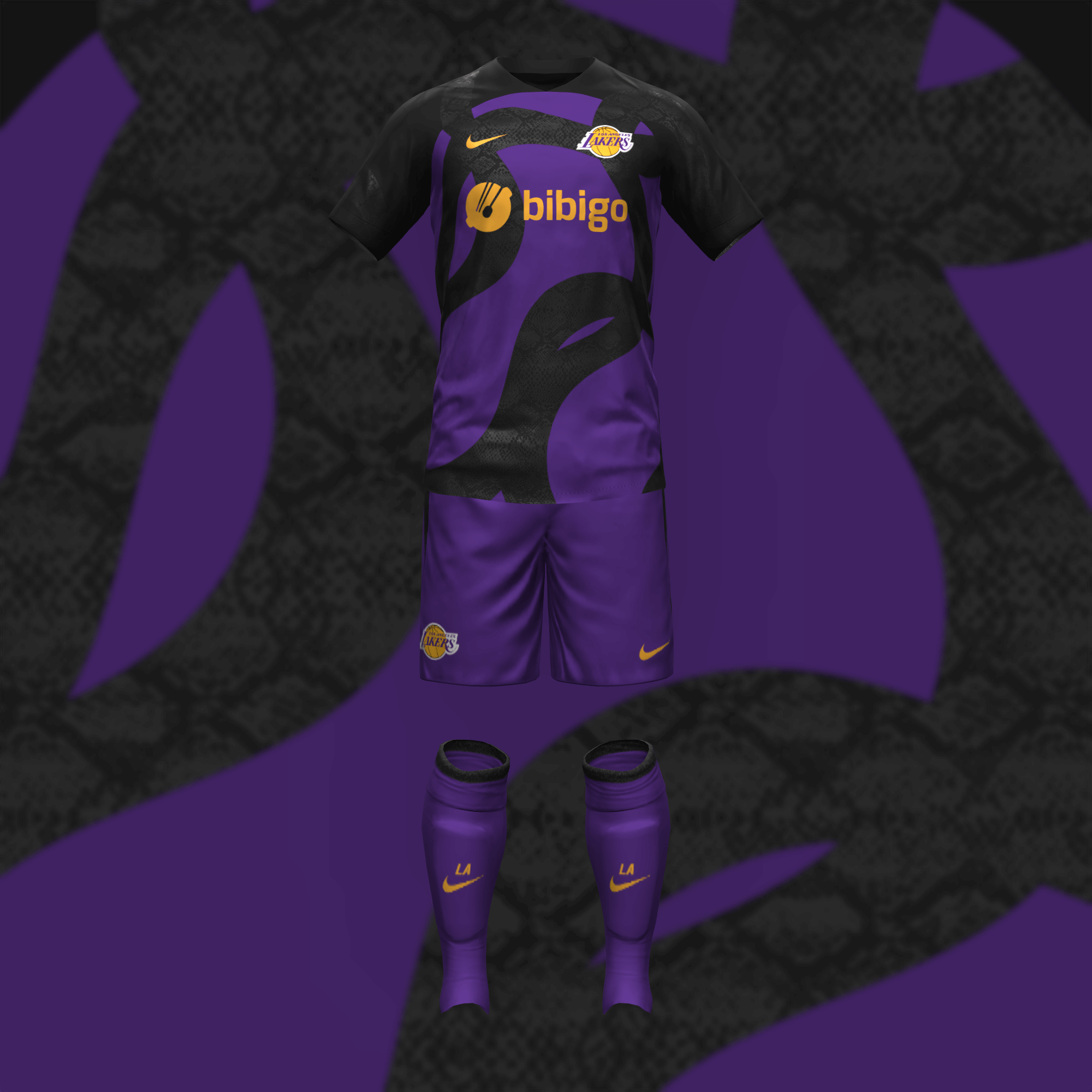
I was pleased with how the Lakers cleaned up their look a few years ago so I kept it simple for the home. Since Kobe Bryant was such a big soccer fan, I honored him with the second look.
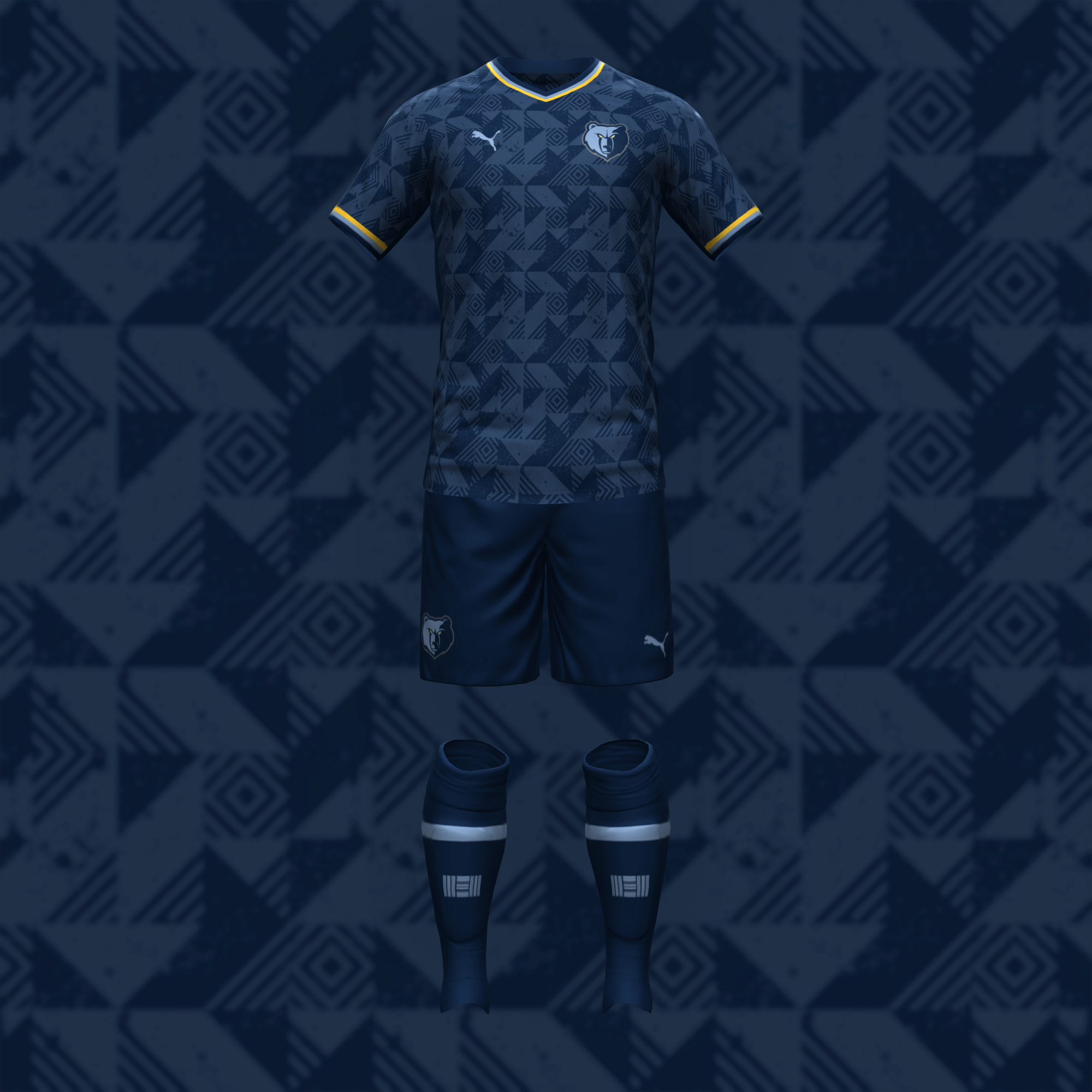
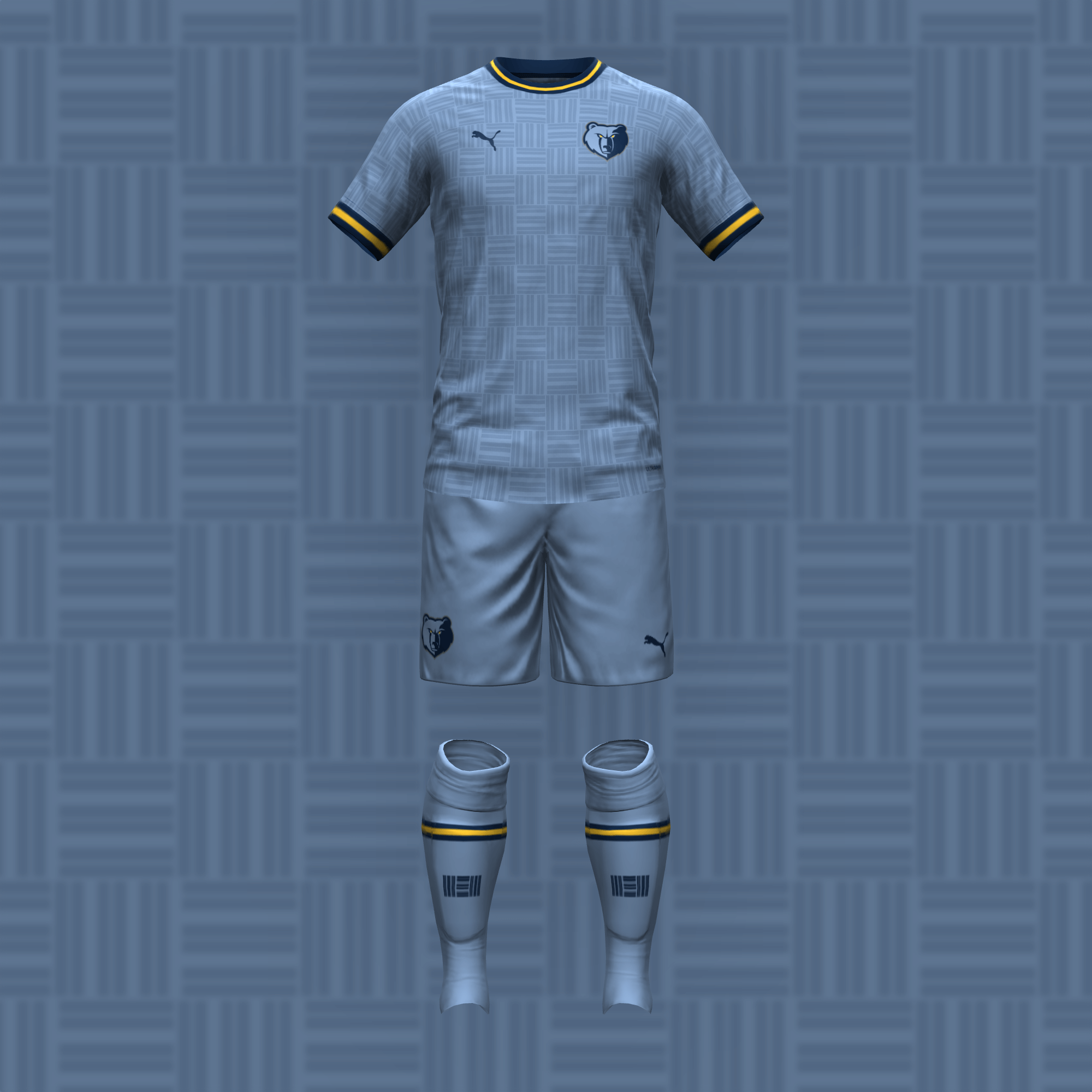
I chose the home kit pattern because it reminded me of the trim on the 2020-21 City jersey but had enough character to stand on its own. I’ve always liked the “MEM” logo so I used it in my recreation of their Statement uniform.

GTGFTU:
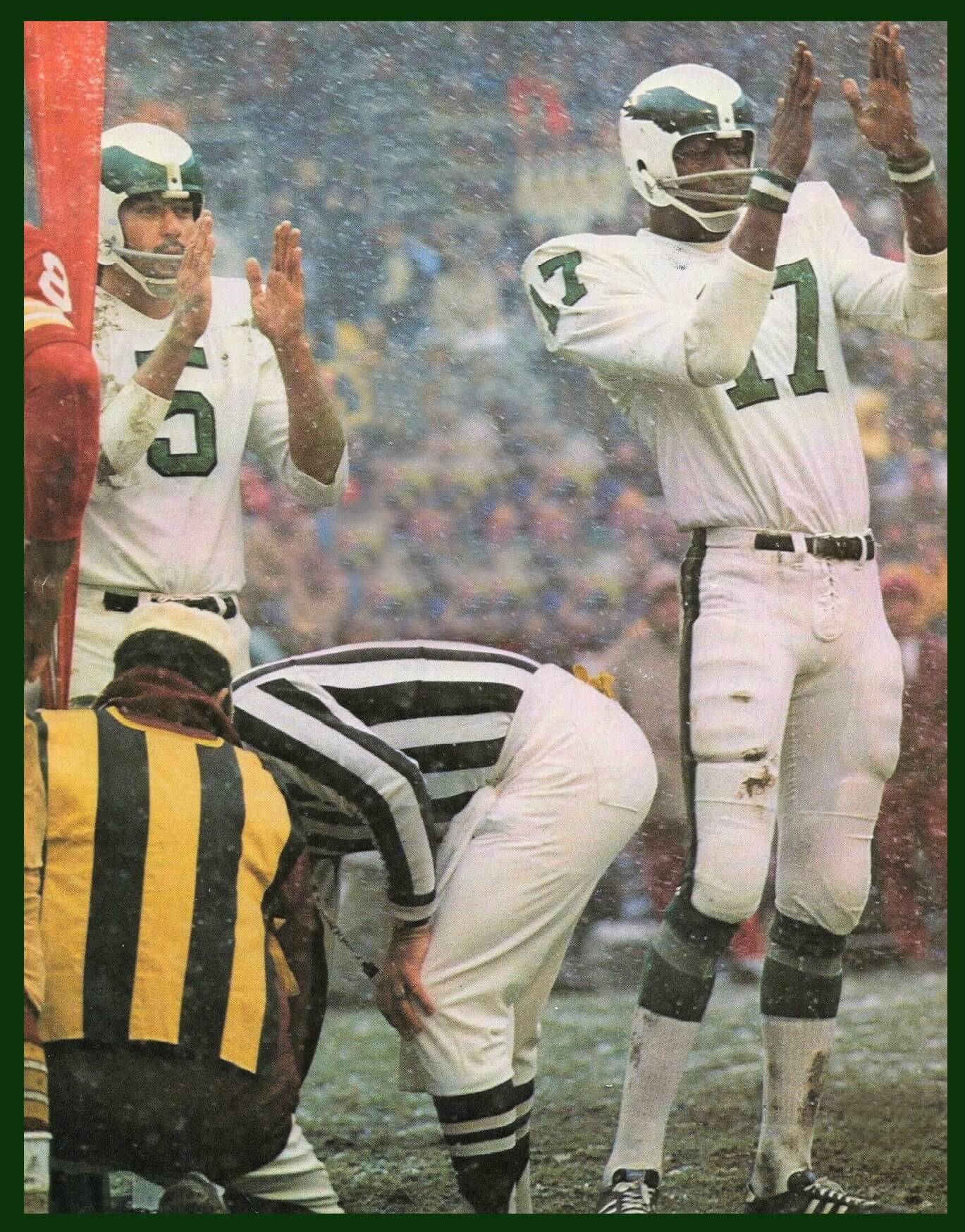
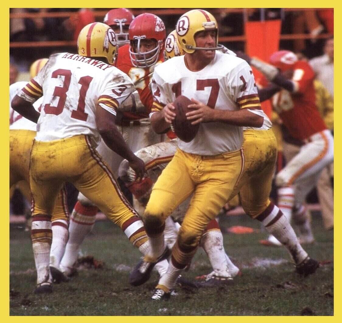
Oct. 24, 1971
Washington at Kansas City.
I’d love to see a Commander-ized version of that Washington uni.
I am with you Jimmer, one of my favorite uniforms, I wish they would rename the team anything with an R so they could go back to these helmets, just remove the feathers and you still have a much superior helmet than what they wear now.
Those NBA soccer concepts are outstanding. Can’t wait for the rest.
And I echo what Jim said about the Commanders doing an update on that old uniform. Yellow pants are such an upgrade.
Great series!
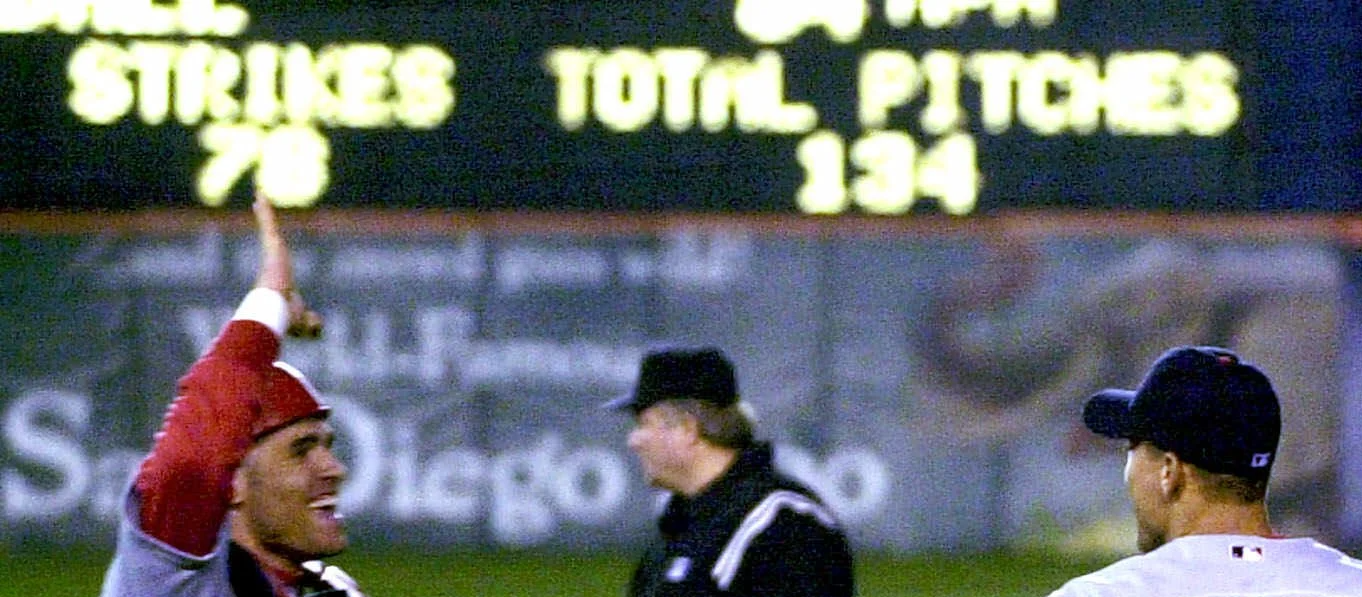
GTGFTS: Cardinals pitcher Bud Smith completes a no-hitter in San Diego! 09/03/2001.
Way to go, Joe!
Bud Smith – last Cardinal to throw a no-no…and last Cardinal player to wear #51 (Willie McGee’s number was issued when Smith was initially called up, switched to #52 for the rest of his brief career).
Interesting- thanks for the tidbit on #51!
I could get behind a solid blue Giants’ uniform.
Now *that’s* Big Blue!
I hate uniform ads, but it’s completely appropriate for them with this NBA/Soccer exercise by Danny, since soccer uniforms are more about the advertiser than the team. I like that he used the current uniform advertiser that the teams have. In fact, it looks odd that Memphis doesn’t have an advertiser, but again appropriate since the Grizzlies currently don’t have an advertiser. Well done.
Like the NBA/Soccer concepts, but the Bulls should have been given the “Chicago Stripes” treatment:
link
Very nice job with the NBA-soccer unis. As a Celtics fan, the solid green kit is perfect but I’d love to have a third set in green and black.
All of these NBA soccer kits look amazingly good. The Celtics as Real Betis really works well. The Commanders do need a new nickname with a R as that helmet is too good to be in a museum as are the gold pants. Giants in all blue? No, leave that to the Bills please.
Those were good. I could immediately tell which teams were which without looking at the crests, even on the alternates. Nice work.