By Phil Hecken, with Sean “Superfly” Walsh
Follow @PhilHecken
Good morning UW readers, and a Happy Sunday to all. Hope everyone had a good Saturday.
Waaaaaaaaaaay back in January of this year, long time reader Sean Walsh, who posts as “Superfly,” reached out to me and said he had done an entire set of concepts for MLS. Now, I receive a lot of reader submitted uni redesigns, but the majority of those are for baseball and football, with the remaining chunk coming from the basketball and hockey ranks. Over the past 13 or so years, I have maybe gotten five or six soccer concepts, so I was excited to see Sean’s work. Unfortunately, at the time, he had used an adapted template that featured some superfluous branding, which he graciously offered to remove.
Several months passed, and then again, in June, Sean reconnected and let me know he’d finished reworking the concepts in a better format. He resent those concepts but unfortunately I wasn’t able to access the program he used, but we’ve now worked all the kinks out, and I’m proud to share his design ideas with you today. There’s a LOT to get to, so to keep things somewhat simple, I’m going to be running these in a couple parts, with Part I today. Enjoy! Here’s Superfly
MLS Makeover
by Sean “Superfly” Walsh
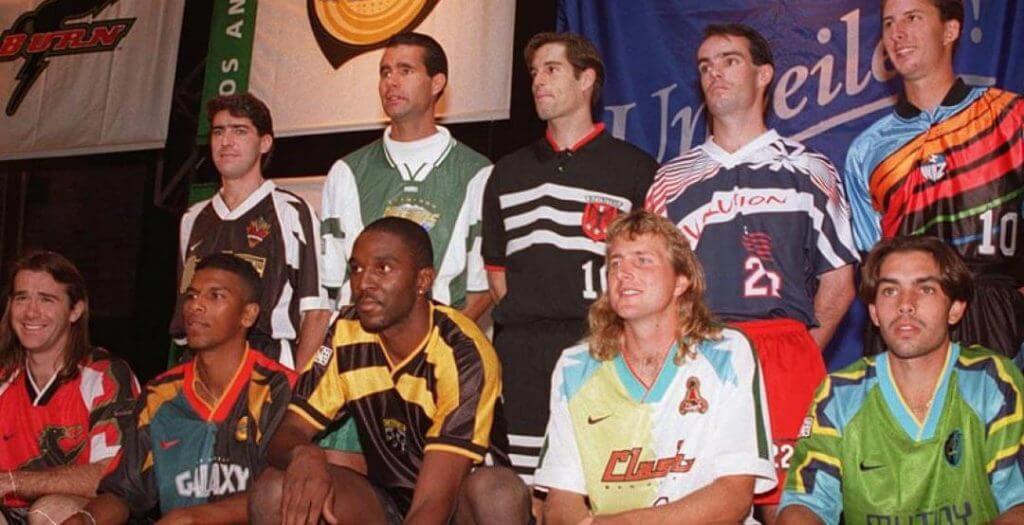
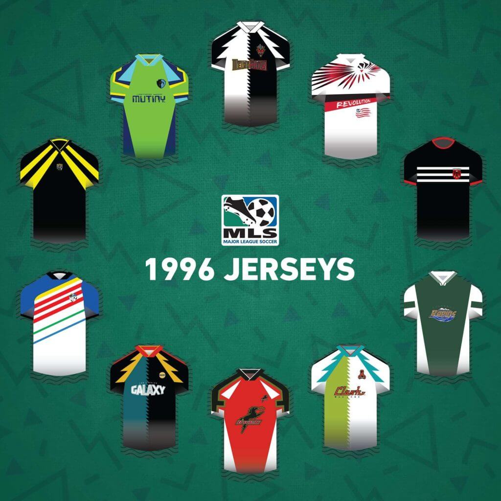
As some on this site know, I’m a big soccer fan, had plenty of arguments about World Cup kits a few years back (all good), though not a fan of MLS, and especially not a fan of the league’s uniforms. It drives me absolutely nuts that when I turn on a game (rarely), or even see highlights, it’s nearly impossible to identify the teams from their uniforms, it seems like 90% of the match ups result in one solid color uniform against a full white kit, which is ironic if you remember the original kits from the inaugural MLS season in 1996 (still some of the most awful uniforms in the universe ever).
There are exceptions, can’t miss Seattle (neon green and blue), Columbus (all yellow, except this year for some reason), Atlanta (red and black vertical stripes, again, except this year for some reason) and Houston (orange), but otherwise, most kits in the league are boring and unrecognizable, though it does seem that some teams are trying to change this with their 2021 uniforms. So I thought I’d redesign most of the league, though not all, some teams have established strong colors and looks, and for some of those teams, I’ve created some 3rd kit alternates, whether needed or not (I had no idea MLS didn’t allow 3rd kits until I started this thing), and try to provide some uniqueness and variety to the league, while at the same time, referencing classic football kit styles from the rest of the world. I’ve used official MLS numbers, badges (with one exception, I think it’s a significant upgrade), patches and sponsors (some are last season’s, I’ve been working on this for a long time) for authenticity, and did most of the designing on a custom uniform maker’s website, with some tweaking and touching up in GIMP/PS, but my PS skills are pretty limited, so, as you can see with the socks, sometimes I could find images of socks that were exactly what I wanted, other times I had to PS them, and those aren’t the best images.
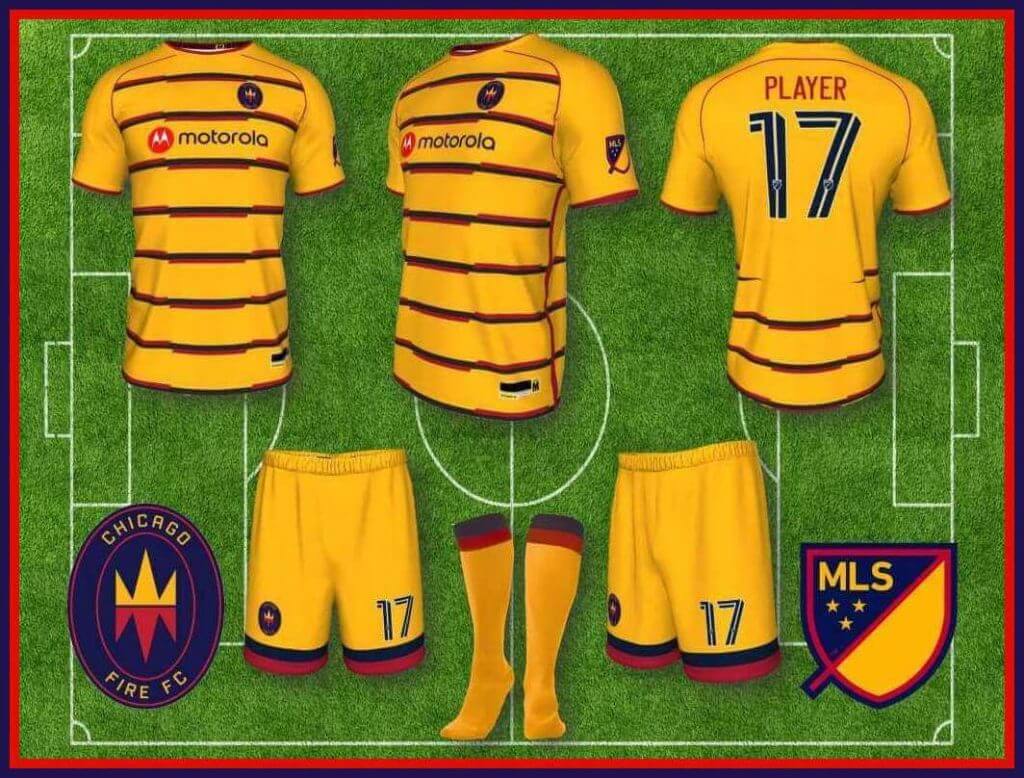
CHICAGO FIRE
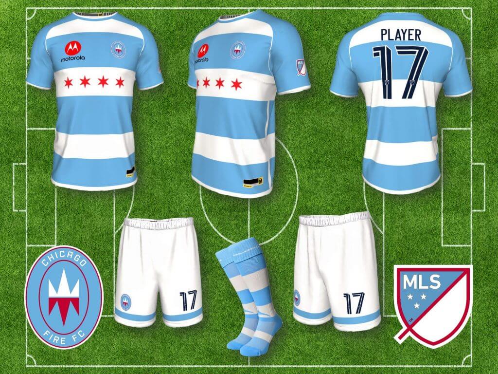
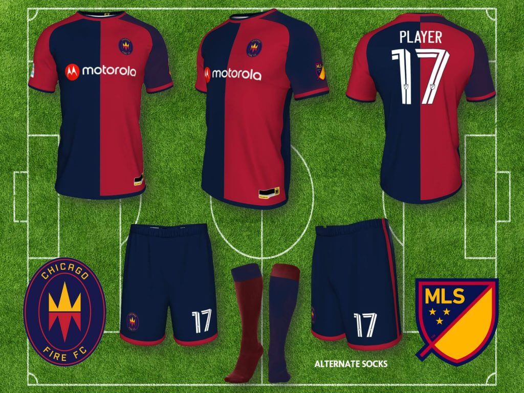
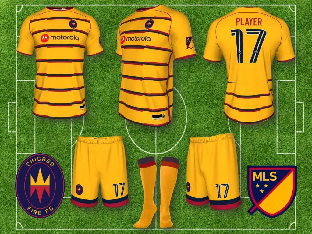
Chicago Fire: The Fire came out with a new logo (used on this kit) and colors last year, that was so unpopular they are re-doing everything this year (and literally on the weekend I was finally finishing up this project, after months and months, they released the new logo, which is an improvement, and would look great on my Fire home kit, but I’m not fixing it now). The Fire had predominantly all red kits from their inception, usually with a horizontal white band across the front, and while boring, it was at least recognizable. I’ve based a new home kit on the Chicago city flag (which is a motif they’ve used on some change kits in the past, and is very similar to the NWSL Chicago team’s kit, which I only saw recently, very nice uniform), and the away kit based on the colors of the new (now old) logo, referencing the classic navy and red/cardinal halved shirts of Italian clubs like Cagliari, Bologna and Genoa. A third kit is based on the goldenrod color in the logo, and can be worn with the navy shorts as well.
COLORADO RAPIDS
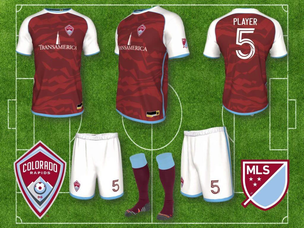
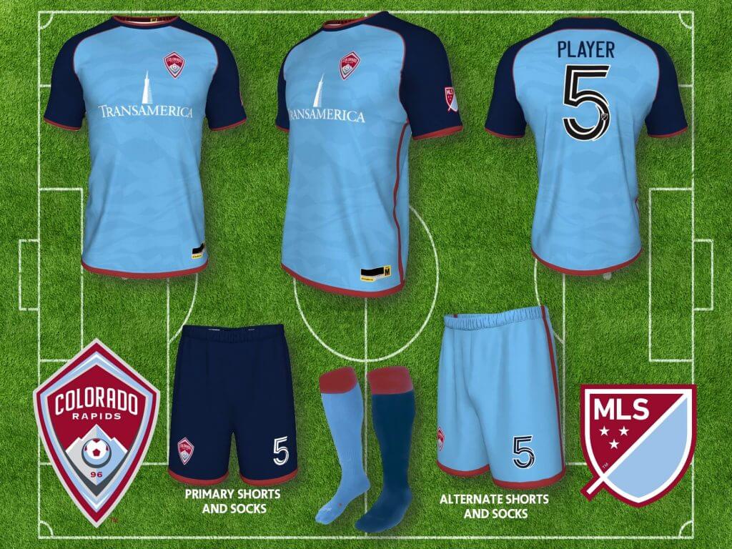
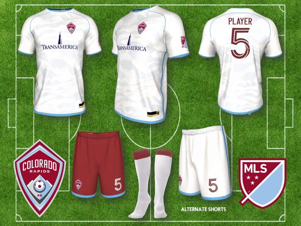
Colorado Rapids: I’ve liked several of Colorado’s kits since they changed to their claret and light blue color palette, and am glad they resisted just going Aston Villa/West Ham (claret body with light blue sleeves) every year and leaving it at that, but for every kit I’ve liked there’s probably been two or three I didn’t, so I did my preferred set. All shirts include a sublimated pattern referencing the Rocky Mountains.
DC UNITED
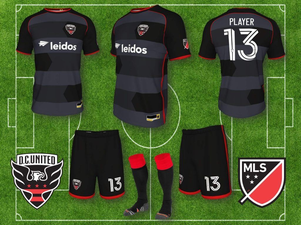
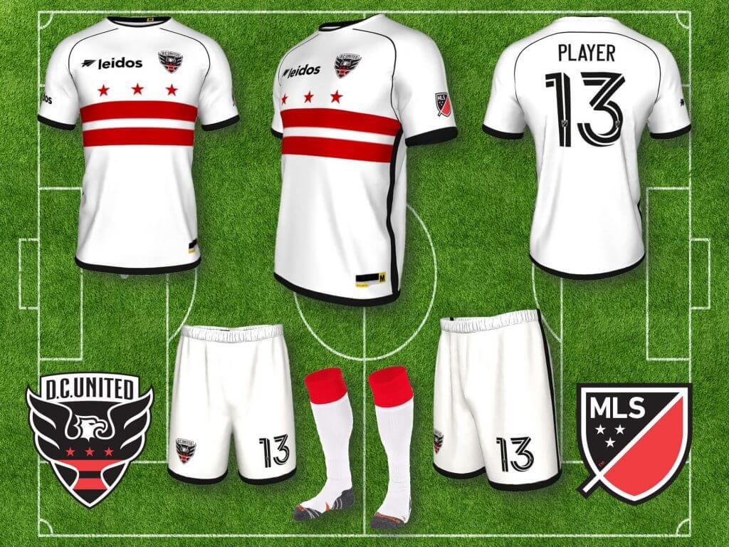
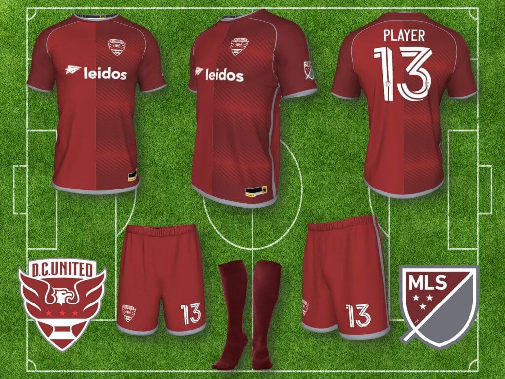
DC United: DC United had the only uniform in the inaugural MLS season that looked like a football kit (and maybe Columbus and Colorado), and while the three stripes were an Adidas reference, it was at least in line with traditional soccer uniforms. They have largely got things right through the years and stayed consistently with a black home kit and white away kit, both with red trim. I’ve created my own versions, the away kit using the DC flag, which like Chicago’s flag, is a great graphic for a soccer jersey (or hockey jersey), plus a third alternate, all of which reference the three stripes, but hopefully subtly enough that it doesn’t read as an Adidas reference. I’m only aware of one third alternate (2011 and 2012), using red, but I went into the cardinal/maroon range, and used gray instead of black or white as trim, to switch things up a little bit, but still referencing their actual colors.
FC CINCINNATI
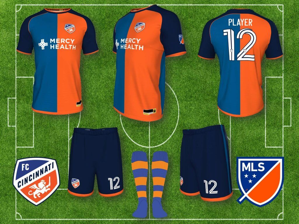
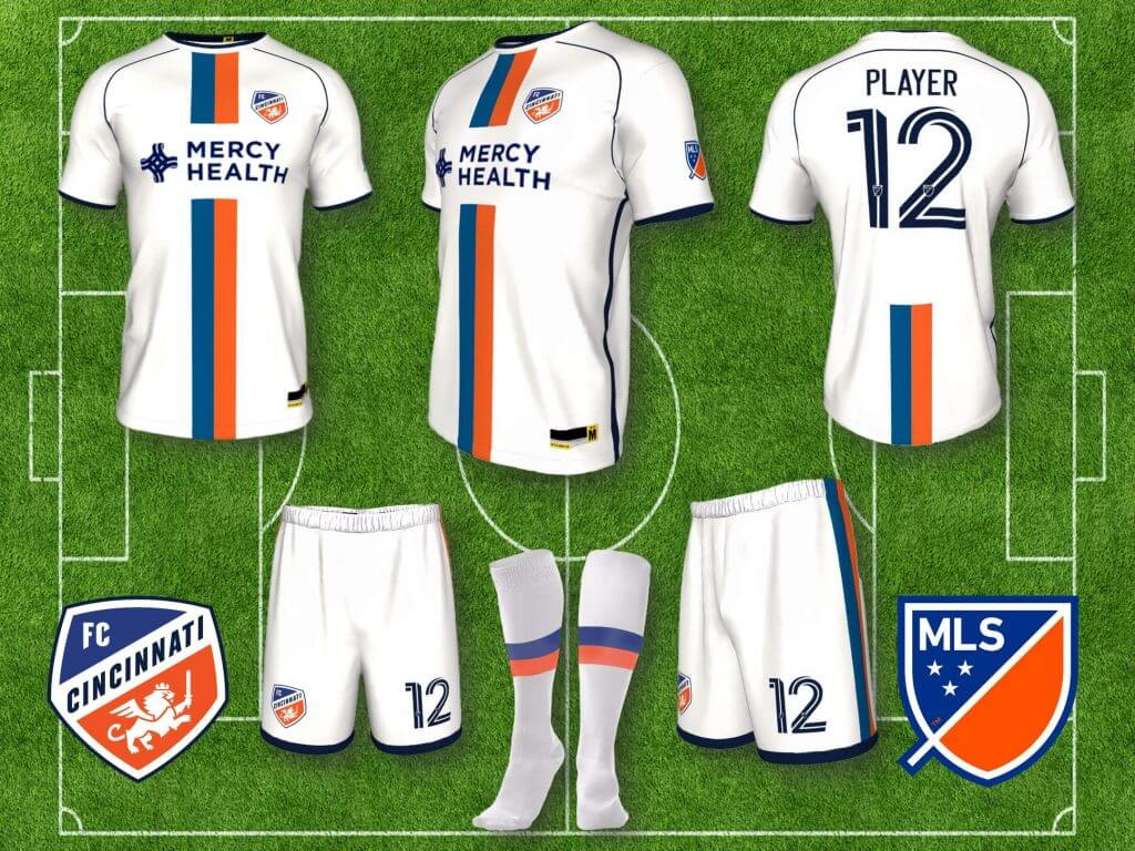
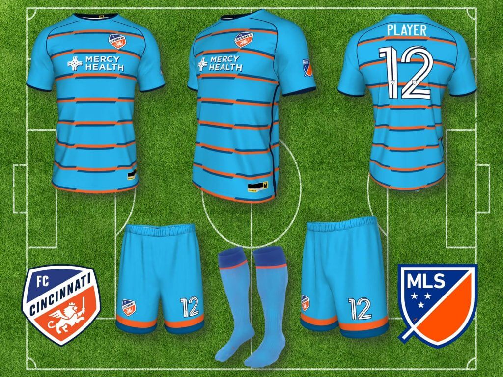
FC Cincinnati: FC Cincinnati have a unique color combination in the league, royal blue and orange, and yet they don’t emphasize it. You should instantly know the team from those colors, so I’ve created a halved jersey, with navy sleeves and shorts to frame the royal and orange halves, and make them that much more vibrant, and as a reference to one of my favorite shirts, Barcelona’s Centenary jersey of 1999. White and cyan alternates, with prominent royal and orange elements complete the set.
FC DALLAS
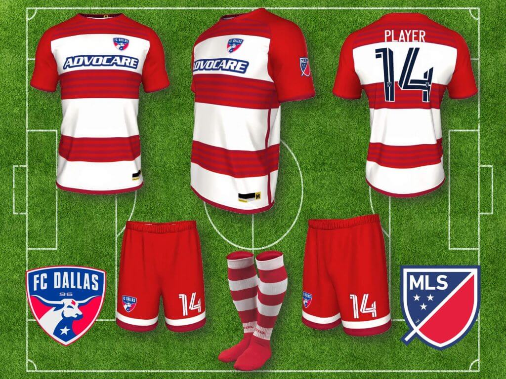
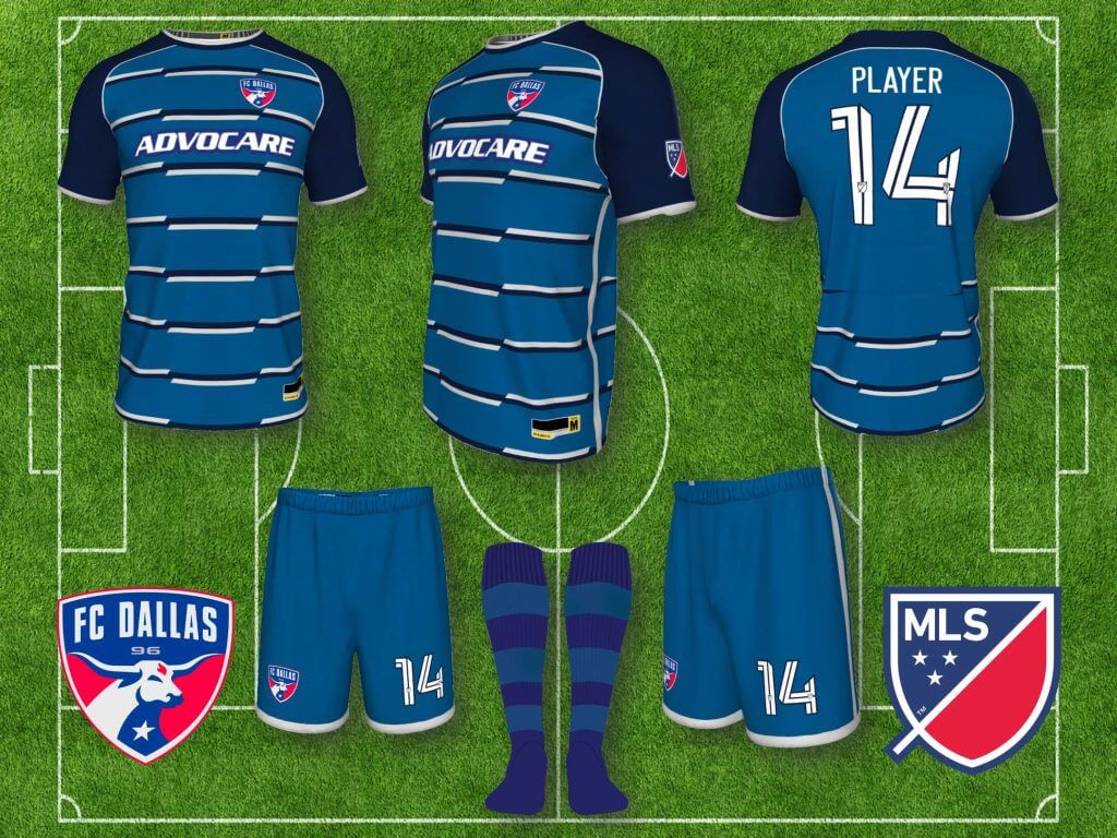
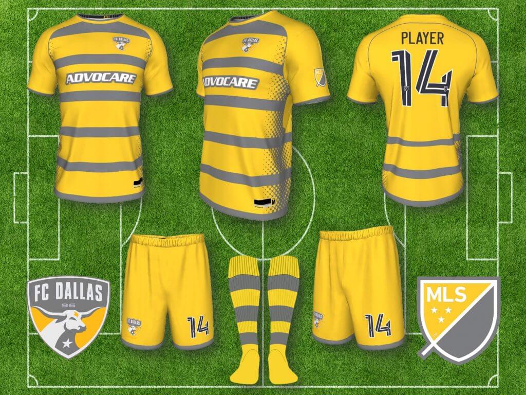
FC Dallas: In 2005, Dallas Burn rebranded as FC Dallas, and came out with a red and white hooped shirt with red shorts. Whether you liked it or not (not my favorite), it was unique, and you immediately knew it was FC Dallas on the field. For some reason they’ve been getting away from this distinctive look and I think it’s a mistake, Dallas needs to own red and white hoops, so I’ve gone back to the original hoops, and to emphasize the hoops even more, I’ve put tonal red hoops within the red hoops. The away kit uses horizontal stripes to reference the hoops, in Cowboys blues and silver.
HOUSTON DYNAMO
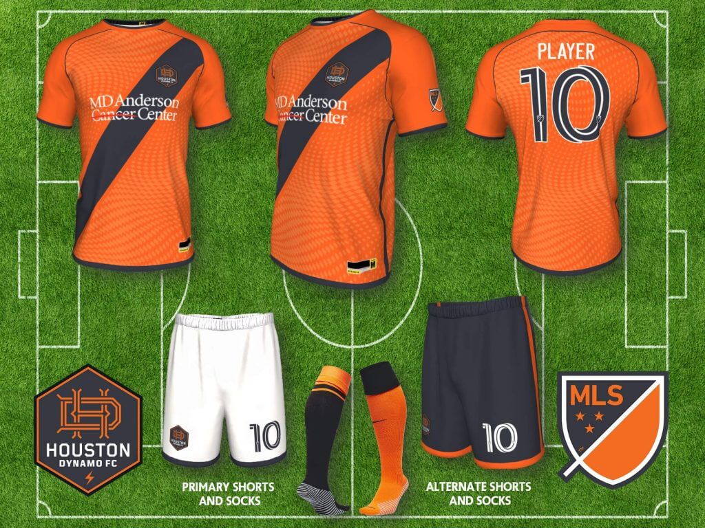
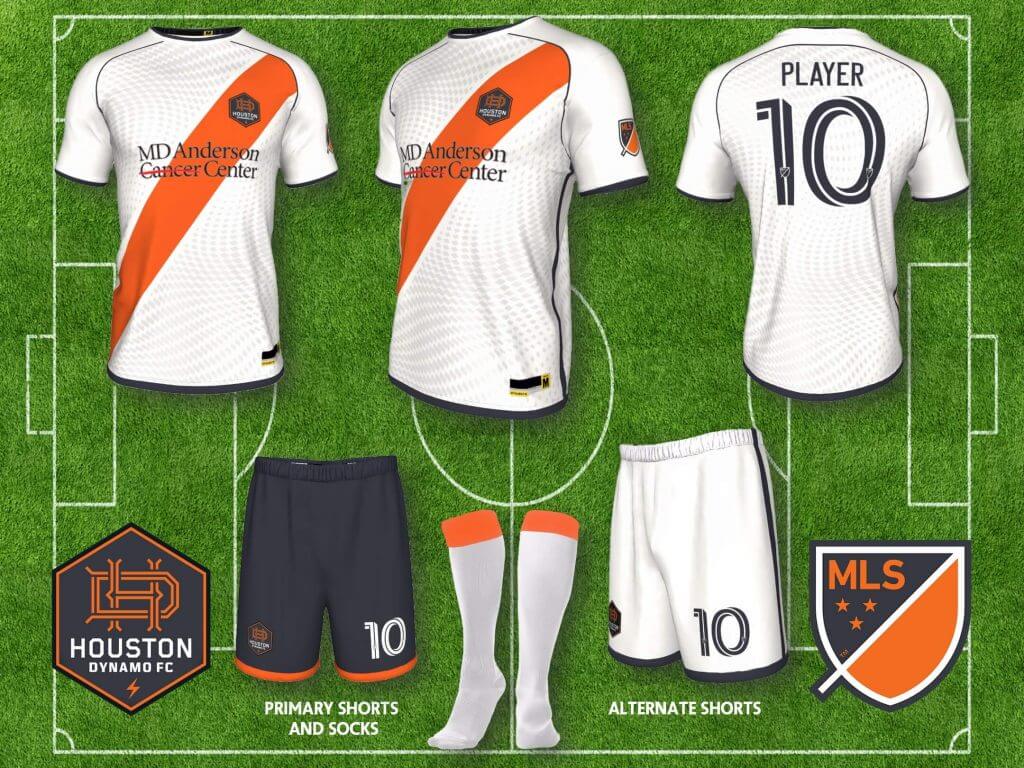
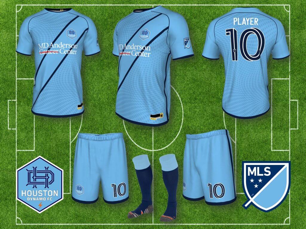
Houston Dynamo: Houston has always been recognizable with their predominantly orange kits, though I haven’t always liked the various iterations and shades of orange. I’ve also always had a fondness for orange uniforms as a Netherlands fan during World Cups and Euros years, because my youth soccer team as a kid was named Ajax and we wore orange and black, so I created my preferred versions of their kit. Both home and away include the classic sash style that dates back to Victorian era football kits, and I included a sublimated pattern that looks like energy flowing (to me, maybe not to you), a reference to the energy industry in Houston. Instead of using black, I used graphite, just for that little difference. I created a third alternate in light blue, referencing both the fact that the Dynamo previously used Columbia blue as a trim color, as well as an homage to the Houston Oilers.
INTER MIAMI FC
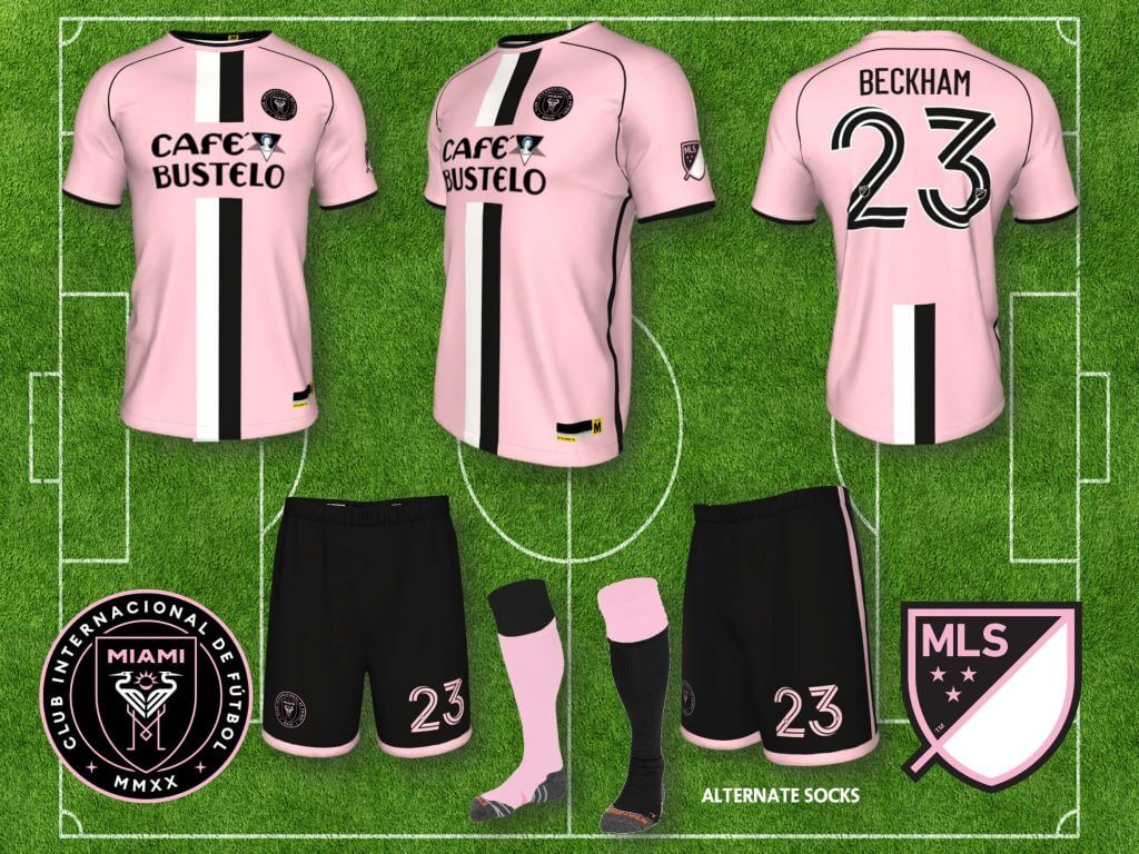
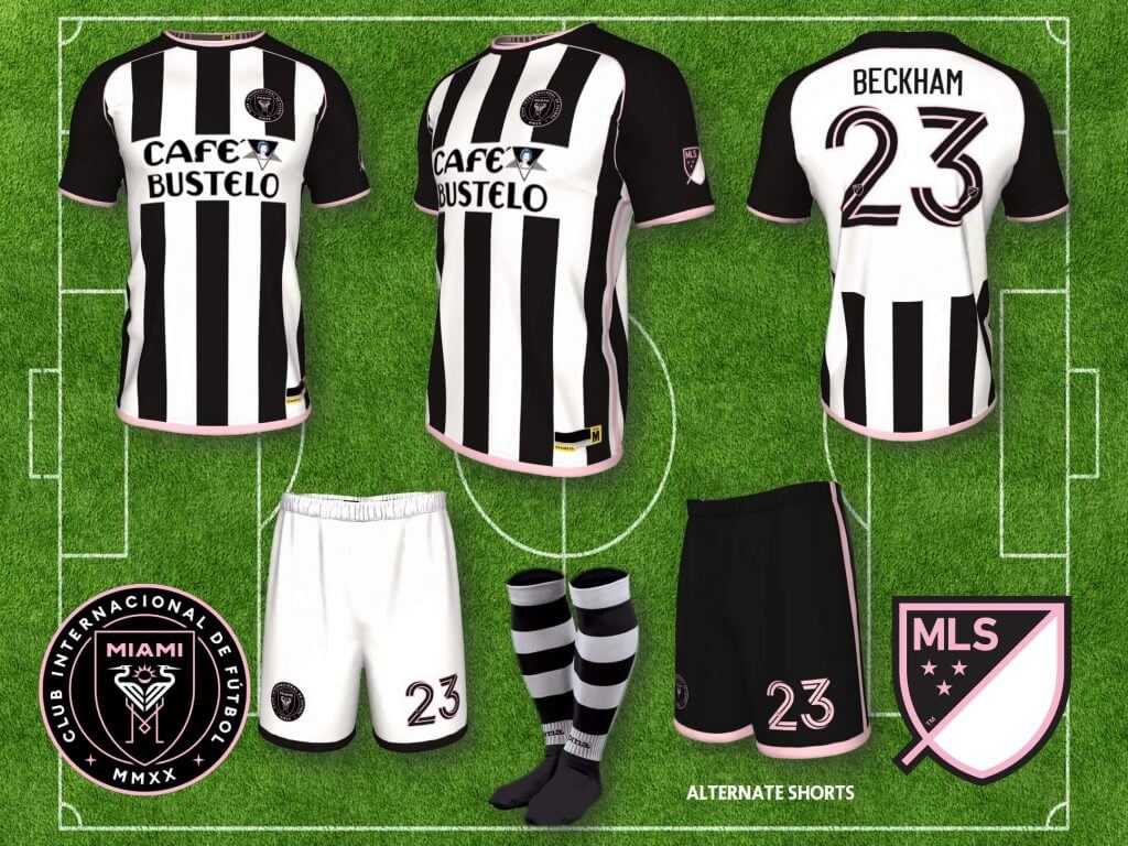
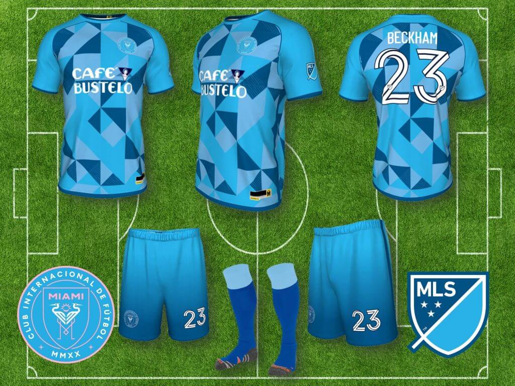
Inter Miami FC: David Beckham has decided to go with pink as their main color, though their first kits were black home and white away (or was it the other way around, considering the heat in Miami), both using only pink trim. Probably the most famous club to wear pink is Juventus (their 1997-98 Centenary jersey was pink), who switched to black and white stripes in 1903, when John Savage, an English player from Notts County had a set of kits sent to him from Nottingham when he played at Juve, because their pink shirts kept fading as they were washed, so I’ve used Juve as the inspiration for these kits. Café Bustello is not actually their sponsor, and it appears they still have no sponsor, but it’s apparently a popular brand in Miami, and fans were creating mock ups of the club’s jersey with the logo, in reaction to a possible Qatar Airlines sponsorship, which was not popular (this is what I can glean from the internet, I may have it all wrong).
NASHVILLE SC
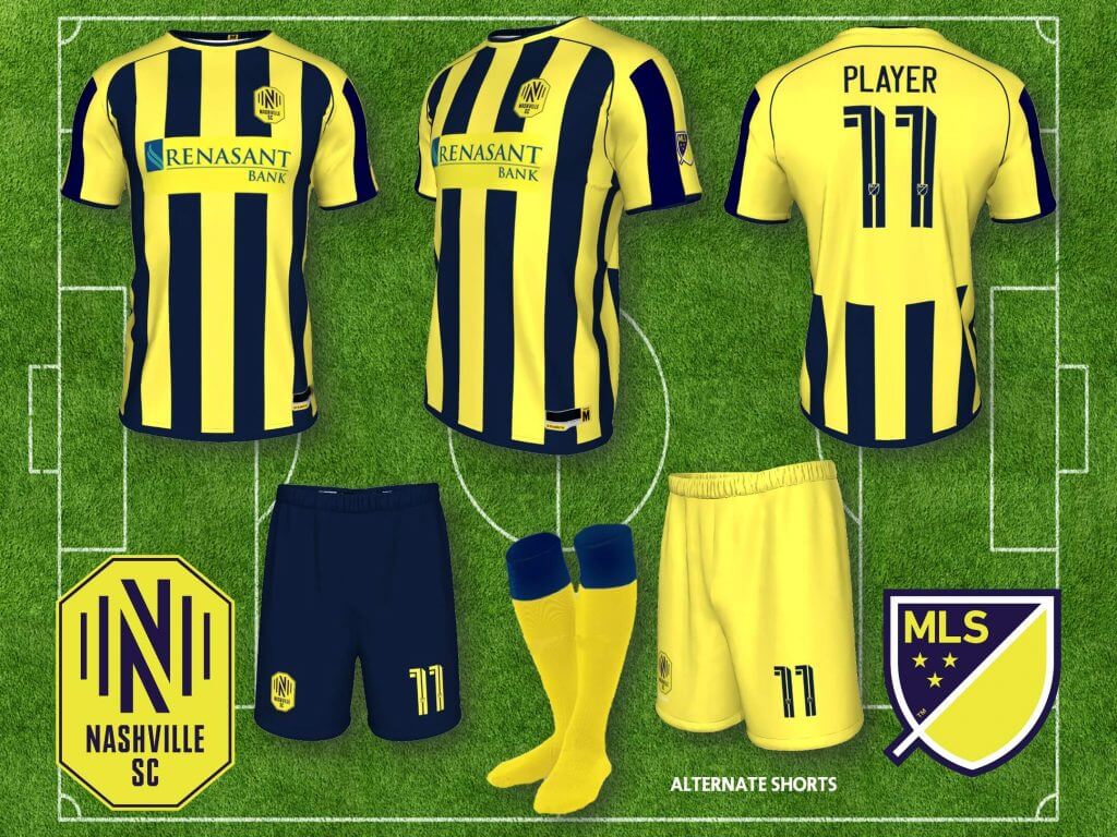
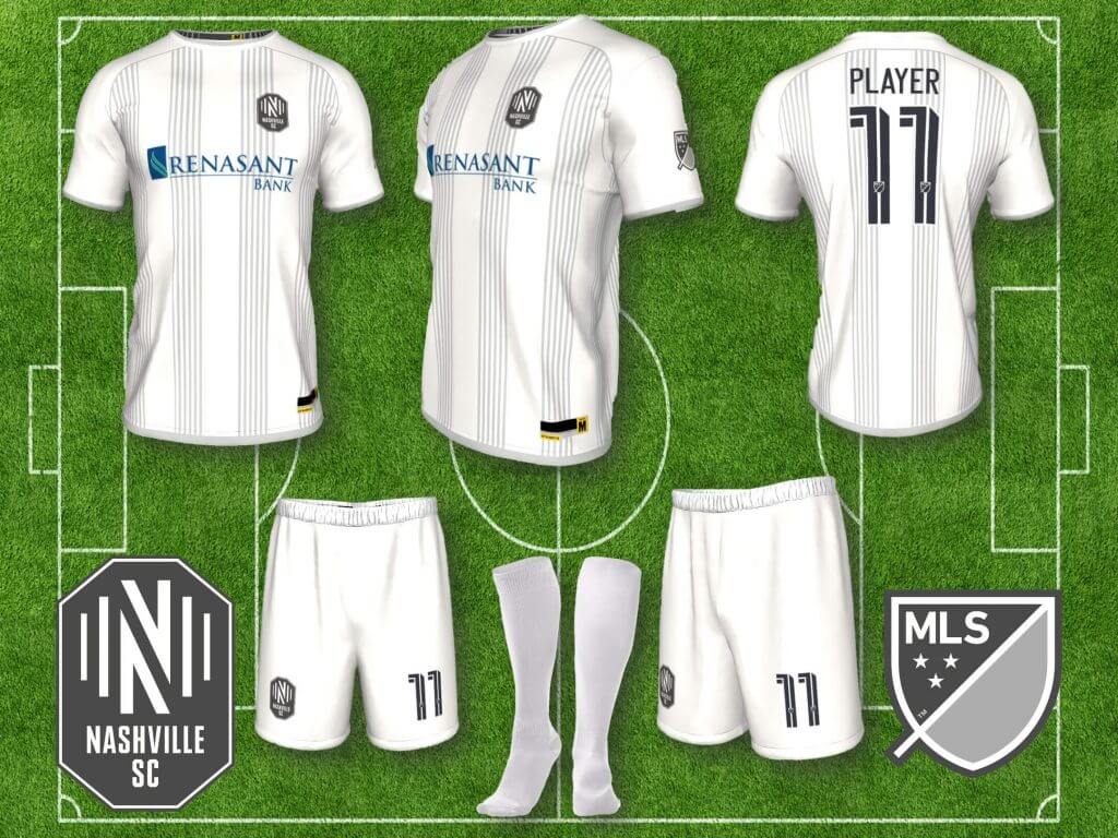
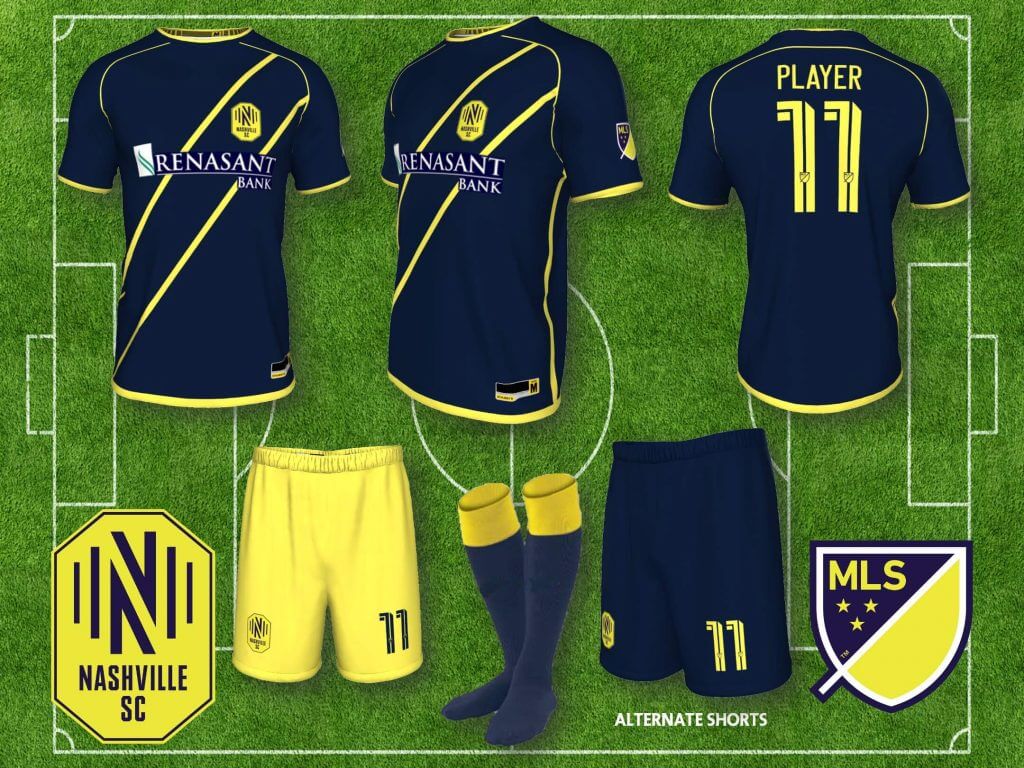
Nashville SC: Nashville entered the league with an all yellow kit, and an all navy away kit, which is a strong look, but already taken by Columbus (black kit away, but still). To me, the solution for Nashville is in their badge, which includes vertical stripes, representing the “sound waves of the music industry of Nashville” (that’s their marketing speak, not mine). Furthermore, Nashville is known for its neo-classical architecture, so vertical stripes/columns on a jersey are a no brainer, the home jersey maintains the strong yellow presence, but differentiates from Columbus. For the away kit, I went with a white/gray vertical stripe combo, invoking the white columns of its neo-classical architecture.
NEW ENGLAND REVOLUTION
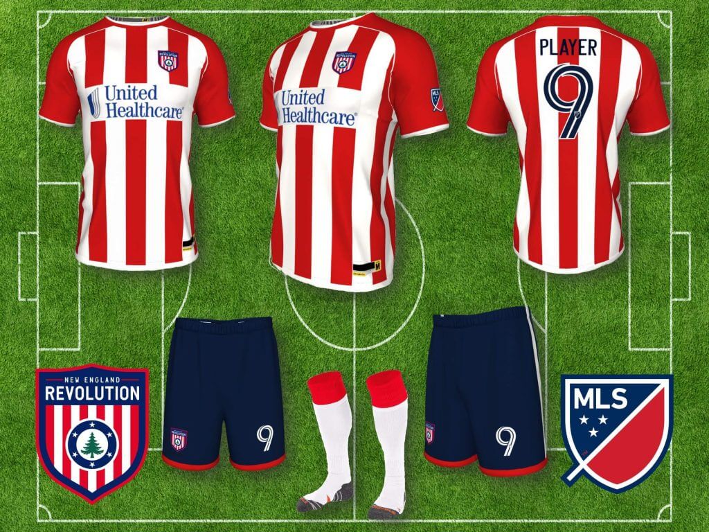
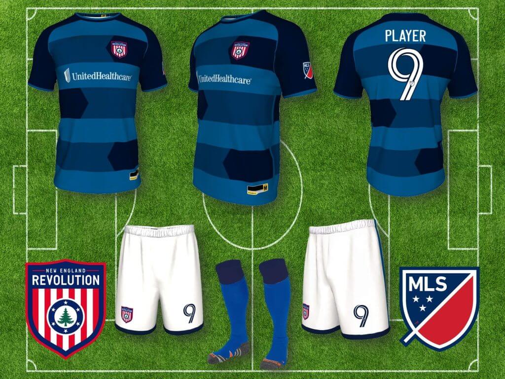
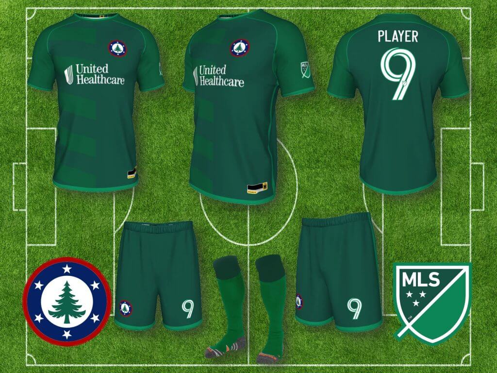
New England Revolution: Cliches are cliches for a reason, and sometimes you can’t avoid the obvious. To me, it is inexplicable that the Revolution doesn’t wear red and white stripes, one of the most popular shirt templates in the world, with blue shorts, so that’s what I’ve created for their home kit. I’ve also used a new badge, getting rid of one of the last remnants of the early years of the MLS uniform/logos/badges fiasco (which they have finally just changed in the last few weeks, still prefer the one I used), with a great pine tree element included, representing the unofficial New England flag. I also created a three-tone all green alternate, referencing the New England pine tree again, and using just the tree element of the new badge.
ORLANDO SC
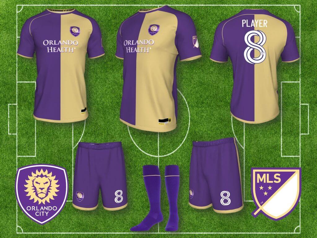
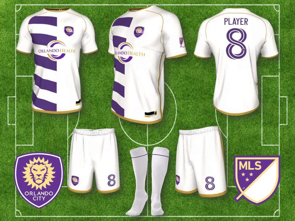
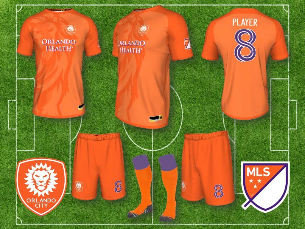
Orlando SC: Orlando’s purple is unique in the league, but they have had nothing but all purple home kits and all white away kits for their entire history, and it’s boring. Gold is their secondary color and they should use it, so I did. I also created an orange alternate, representing sunny Orlando, with a sublimated lion in the shirt.
PHILADELPHIA UNION
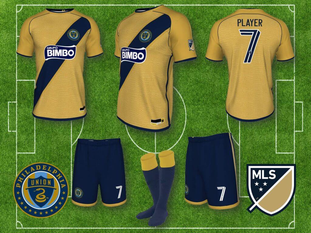
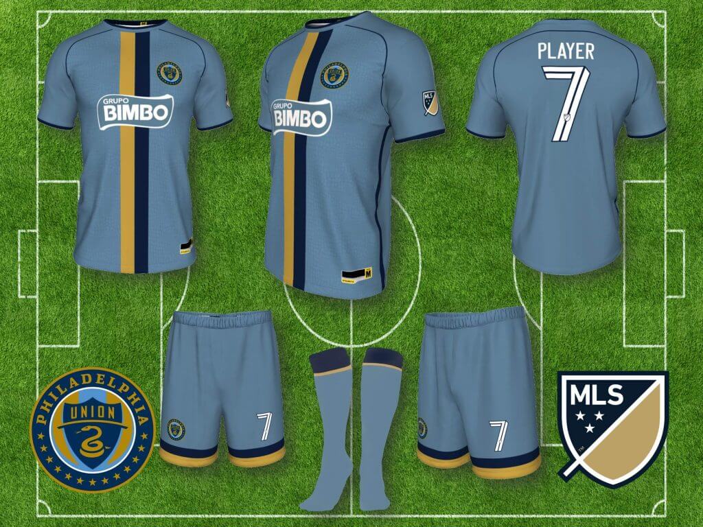
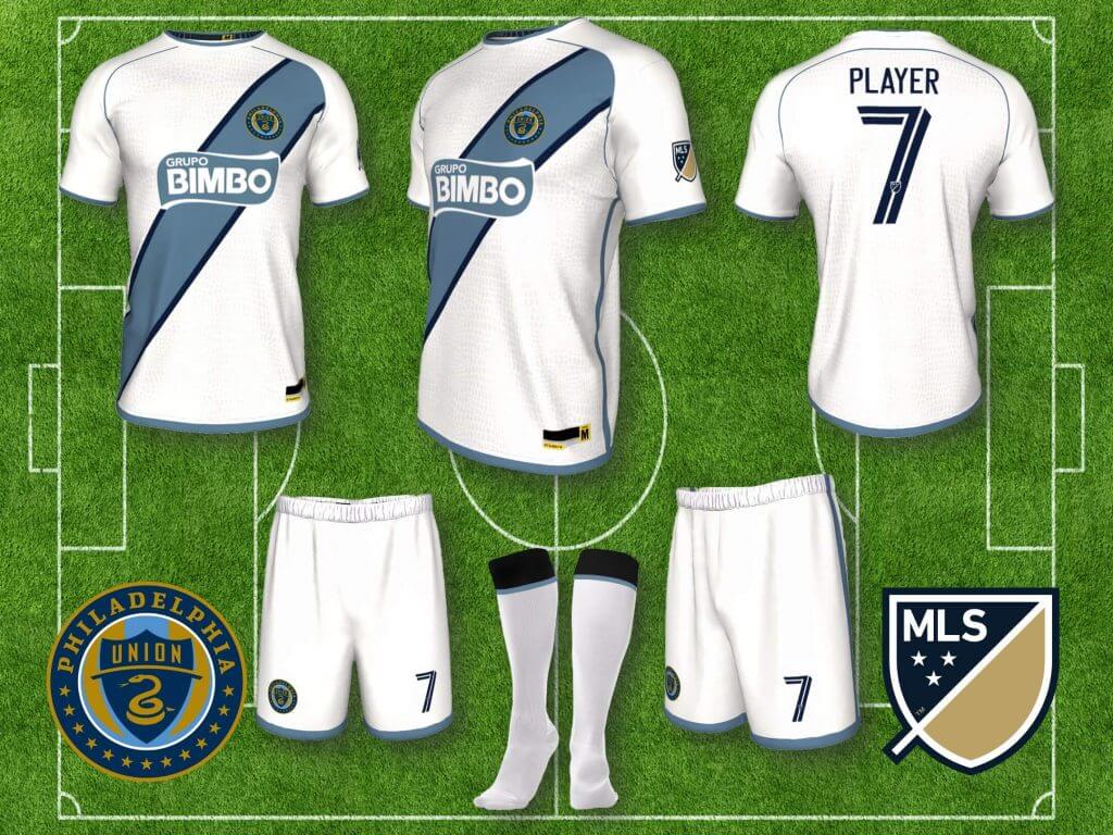
Philadelphia Union: I’ve always liked what the Union tried to do with their home kit, evoking the uniforms of the Revolutionary era soldiers, I just didn’t think the execution was great, so I’ve re-designed it with more classic football kit elements. The home jersey is old gold with a navy sash, representing the straps of a soldier’s ammunition bags, with navy shorts with gold trim. The away uniform is a light blue, referencing the Philadelphia city flag, with navy and old gold racing stripes on the shirt and shorts, and the third, all white kit features light blue elements again, with minimal navy accents and numbers. All shirts include a sublimated snakeskin pattern, referencing the snake in their badge.
Thanks, Superfly! Like Paul (and I’m sure many others who read this site), I’m not a soccer guy, but I try to get into it whenever possible. To my eyes, many of these redesigns are pretty sweet. In the words of Jimmer Vilk, “I’d wear (some of) that.” We’ll be back with Sean down the road with Part II of his MLS concepts.
Readers? What say you?

More on possible NCAA Uni Ads…
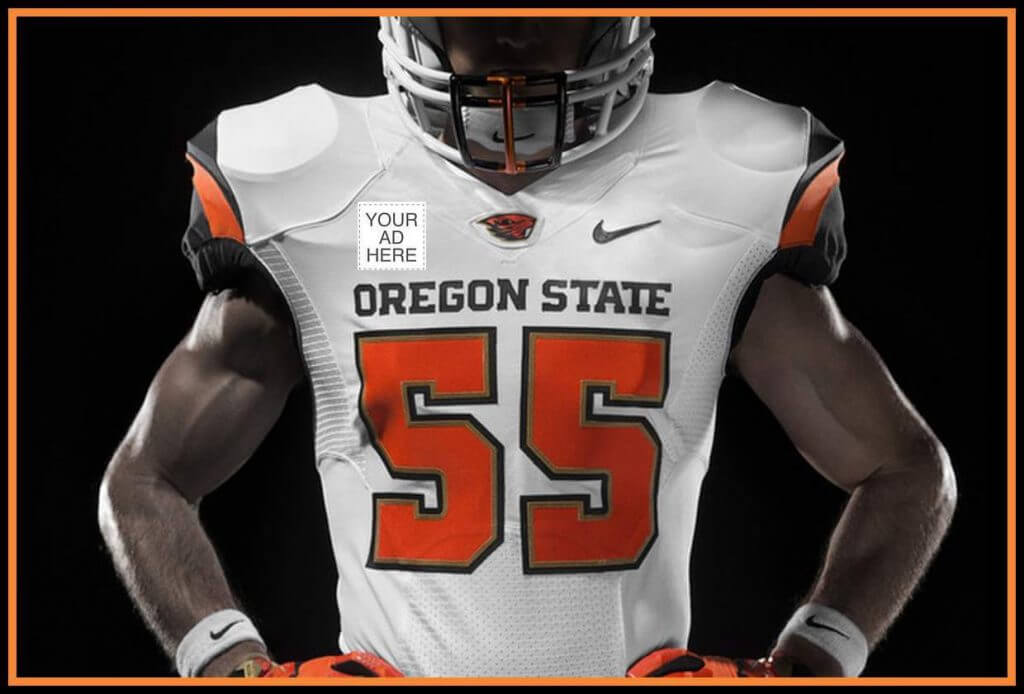
If you read yesterday’s post, I discussed the possibility, perhaps a very small possibility, of uni ads appearing on NCAA football jerseys come fall. I don’t think it will happen (for a variety of reasons), but in the words of the Planetshakers, “nothing is impossible.”
Anyhoo, yesterday I received a DM from Andrew Lind, who writes for a couple online publications (including over at our pal Chris Creamer’s site), and who is big-time into college football. Andrew left the following message, which I’ll reproduce below:
“Hey Phil, read your article about NIL/uniform patches today. Worth noting there isn’t an overarching NCAA rule governing NIL, as it is currently left up to the schools and states. However, many of the schools’ guidelines note something similar to the effect of “student-athletes are not allowed participate in name, image and likeness opportunities during practice and/or competitions,” which would make it impossible for individual players to wear uniform ads at those schools.
“Ohio State, for example, even goes as far as to say that the use of facilities is off limits unless a player gets prior approval and potentially even pays a rental fee for the space, as well as that any NIL activities that go against other partnerships that the university or athletic department has will void or trump any of the players’ deals. So even if it was allowed during completion, you’d have a number of other things to sort out before it would see the light of day.
“Now, does this exist at every school? I can’t answer that question. But it’s also worth noting that a rule exists regarding the patches (implemented last year and not changed this year) that says the team members will not be required to social justice/commemorative/etc. patches, but those who do must wear identical patches. The patches must also be authorized by the individual schools and conferences.
“That would effectively ruin any chances of one player wearing an ad in that space because it must be approved by both governing entities and a player couldn’t do it individually. Now, could a large advertiser pay for the whole team to wear a patch? Possible. But would the school and/or conference approve?
“Lastly, the guidelines at many of these schools say that the student-athletes cannot use their schools’ trademarked property without consent. That would likely mean jerseys would be off the table for something even as small as a local commercial, let alone a three-hour commercial in the form of a game on national television.
“So, is it possible? Sure. But far too many hoops to jump through and approvals needed for it to be done.”
Thanks for the follow-up, Andrew. That’s some good information to have — again, I don’t think there’s much chance of uni ads appearing on college football jerseys, and this tends to support that supposition.

Guess The Game…
from the scoreboard
Today’s scoreboard comes from Robert Lipton.
The premise of the game (GTGFTS) is simple: I’ll post a scoreboard and you guys simply identify the game depicted. In the past, I don’t know if I’ve ever completely stumped you (some are easier than others).
Here’s the Scoreboard. In the comments below, try to identify the game (date & location, as well as final score). If anything noteworthy occurred during the game, please add that in (and if you were AT the game, well bonus points for you!):
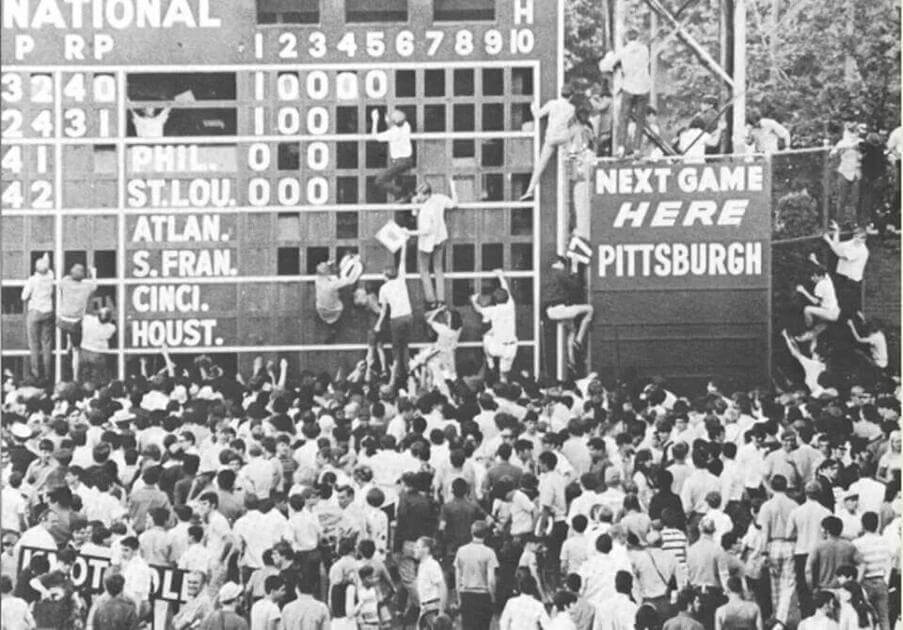
Please continue sending these in! You’re welcome to send me any scoreboard photos (with answers please), and I’ll keep running them.
One last All-Star Game wrap-up from Denver
by Kary Klismet
I was finally able to take in one of Denver’s last ongoing events coinciding with the MLB All-Star Game on Friday, an exhibit called the Hall of Legends. Presented in conjunction with the History Colorado Center, it features an impressive collection of jerseys, photos, and artifacts associated with some of the greatest players in baseball history. Here’s an album of photos I took at the exhibit. It’s open through the end of Sunday, July 18th. For any Denver-area readers who haven’t seen it yet, it’s definitely worth a visit if you can make it there before it closes.
My favorite moment came when a docent approached me, completely unsolicited, and asked if I could spot something peculiar about this Mickey Mantle photo. It took me a moment, but once I put my uni-watching skills to good use, I figured it out. If you find it, I’d love to hear your responses in the comments!
The exhibit is housed at the Rally Hotel, part of McGregor Square, a new mixed-use residential, retail, and dining development named in honor of late Rockies president Keli Mcgregor and opened at the beginning of this season. The hotel’s lobby includes an extensive array of uni-notable memorabilia, highlighted by a shrine to Hall of Famer Larry Walker and a series of architectural drawings identifying the various locations in Denver considered for Coors Field.
The mood downtown was still festive on Friday, even three days after the All-Star Game. The Dairy Block, a retail and dining space near the stadium, still features several pieces of Rockies- and baseball-themed street art. And I saw dozens of fans still wearing the apparel of various MLB teams beyond Colorado, including the Yankees, Dodgers, Padres, Braves, Brewers, and Twins, among many. After what by all accounts seems like an unqualified success in showcasing Denver’s ability to host large-scale events, here’s hoping the All-Star Game returns to the Mile High City again soon – but next time without those hideous uniforms!
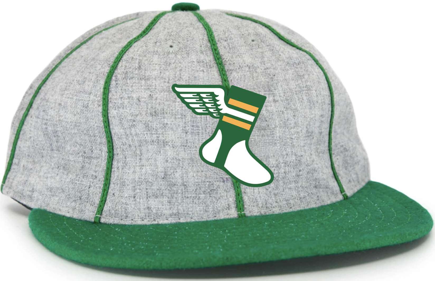
Click to enlarge
Should this be the new Uni Watch cap? Paul here. We recently sold through the last of the Uni Watch Classic Caps (thank you!). In case you missed it on Friday, I’ve been fooling around with some crude mock-ups of some other cap designs we could do with Ebbets Field Flannels, and the one I like best is shown above. What do you think?
Before you answer that question, here are some details:
• This would be an eight-panel cap (not the more common six-panel) with green piping as shown in the mock-up.
• Just like the Classic Cap, this one would be 100% wool and made in the USA by Ebbets.
• That green brim is a Kelly green. As I recently explained, Ebbets no longer has the shade of green we were using for the Classic Cap. I don’t want to a solid-Kelly cap, but I think the combination of Kelly, grey, and piping works really well.
• Speaking of the brim: The photo that I used for the mock-up showed a cap with a soft visor. But if I go ahead with this product, it will have a conventional stiff visor.
• No visible maker’s mark, of course.
• It would be available in fitted sizes. If enough people expressed interest in an adjustable version, I’d do that as well.
• It would be available to ship around the end of September.
• It would not be cheap — based on the quote Ebbets has given me, the price would be something like $43 plus $6 shipping.
I will not go ahead with this product unless I’m certain that a significant number of you are willing to purchase it. I might even require pre-orders, or at least deposits. But for now, I’m just trying to gauge how many people are interested, based on the details and pricing I’ve just spelled out. If that’s you, please send me a note indicating that you’d be on board. If you want to list your preferred size (or if you’d prefer an adjustable instead of fitted), that would also be helpful.
Thanks in advance for your feedback — much appreciated. Now back to Phil!

Looking Ahead…
As the calendar nears the month of August, you’re probably all aware that Paul will be taking his annual sabbatical from the blog, leaving me in charge of the weekdays.
And as always, I can’t get through the whole month without a little help from the readers, so I’m putting out the call once again.
This time around, I’m looking for reader submissions in two categories — the Olympics (which begin later this month and run through August 8th) and General Interest. For the Olympics correspondents, I’m looking for either historic uniforms for a given discipline, or a review of the uniforms being worn by individuals or teams in any given event (i.e. wrestling, basketball, volleyball, track and field, etc.) or both. These would run during the first week of August.
If the Olympics aren’t your bag, but you’d like to propose and submit an article of interest to the Uni Watch readership — I’m all ears! Every summer you guys come through with some amazing research, concepts and other fantastic uniform-related materials, and I’ll be happy to feature your work on here again during the month.
So, if you’re interested in contributing something Olympics or uniform-related, please Shoot me an e-mail (Phil.Hecken@gmail.com) and let’s discuss! Looking forward to seeing what you guys have in store for 2021!
Uni Watch News Ticker
By Phil

Baseball News: The National Federation of State High School Associations has loosened its rules for religious and cultural headwear for softball players after a student-athlete in North Carolina was forced to cut her hair in the middle of a game to remove beads earlier this year (from Kary Klismet). … Holy crap there is a lot going on with this Brewers cap, and as Shawn Anderson notes, “I’m not sure ANY of it is good.” … Last night, the Carolina Disco Turkeys wore shorts, a la the 1976 Chicago White Sox. Downthread shows game action (from Jerry Wolper). … Check out this absolutely tremendous photo of Ty Cobb in action, circa 1910. The great “Man Cave” a/k/a Chris Whitehouse (whose work I’ve featured on here many times) fully restores and colorizes the photos he purchases. Just great work. … Check out how high and off center the Pittsburgh Pirates’ John Nagowski’s helmet logo “P” is (from Joe H..

Football News: San Diego State has topped off its new football stadium (from Kary Klismet). … Raise your hand if you’ve never seen Pete Sampras in a 2002 Rhine Fire jersey and throwing a football (from Texas Trev).

Hockey News: OK, so in the NBA we have “City Edition” uniforms, and this past season, MLB introduced “City Connect” uniforms. So, is the next logical step for the NHL to introduce their own form of City (connnect) uniforms? Um, didn’t we just get done with “Reverse Retros”? … Check out these winners in a fan design contest for CHL major junior hockey teams (from Wade Heidt).

NBA/College/Basketball News: Couple great finds from Phill Stroman who writes, “In my quest to collect pics of every uniform every NBA team has ever worn, I’ve been finding some good stuff on Getty Images. Here’s one from February 10th, 2010 featuring Steph Curry with an upside down zero on the back of his Golden State / San Francisco Warriors throwback jersey.” That’s not all: “And more from the Warriors, circa 1966 vs. the Baltimore Bullets, with both teams wearing blue unis!” … Whoops! Good spot by Jeff Boogaart, who “noticed in the TBT, the Team Arkansas uni’s made by Puma, have an “AK” on the short. This could be for someone’s initials that I am not aware of, but more than likely this is a Alaska abbreviation on AR shorts.” … The Canadian Elite Basketball League’s Ottawa BlackJacks have unveiled new 3rd uniforms yesterday (from Wade Heidt). … If you thought the Brewers ball cap (featured in the baseball section) was bad, keep in mind an equally bad cap exists for the Bucks too (also from Shawn Anderson). … This is pretty cool: YouTube TV was using the Larry O’Brian Trophy instead of its customary white dot on the fast forward/rewind bar for the NBA Finals (from Timmy Donahue).

Soccer News: “For some reason, Köln decided to split out their official kit launches,” writes Alex Peerenboom. “So they’ve now released the new home version and third one (which has an interesting design where both the logo and sponsor are black, blending in with the rest of the shirt).” … ICYMI: Manchester City this week unveiled its new Puma home kit. It’s got a funky font (from Texas Trav). … Brazilian women’s soccer star Marta covers the Nike symbol on the Brazil jersey in her Olympic headshots, something she’s been doing since 2019 (from Terry Mark).

Olympics News: The Australian government has commissioned a series of memorabilia to commemorate its Olympic team featuring mascots that look just like furries (from Kary Klismet). … Also from Kary: here’s a fascinating photo essay on abandoned Olympic venues from across the world.

Grab Bag: A Nebraska Cornhuskers blog has ranked the college volleyball venues in the Big Ten Conference (from Kary Klismet). … Holy Shit! The Amazing Gashouse (Kevin Cearfoss) has painted a room he constructed in the Katie B Hines ruins. … Speaking of Kevin, check out a time-lapse of some of his non-logo creations. … The Norwegian beach volley handball girls wanted to play in these shorts instead of in bikini bottoms which they found too revealing (from Jeremy Brahm).
Uni Tweet of the Day
While I didn’t love the white unis as much, those ’79 Padres uniforms were the best in their history.
The 1980 @Padres coaching staff, wearing leftover 1979 uniforms during #SpringTraining. pic.twitter.com/Va5kMrL3hB
— Vintage Jerseys & Hats (@PolyesterUnis) July 17, 2021
And finally… big thanks to Sean/Superfly for sharing the first part of his MLS makeover. We’ll be back with more in a little bit.
Despite an incredibly sunny, hot and extremely humid day yesterday, once again a low cloud deck rolled in before sunset yesterday. So no pic of that. But I got you the next best thing…
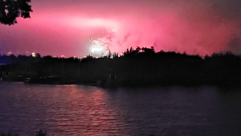
…everybody loves shitty fireworks photos, right? Yeah, that happened last night, so I walked to the end of the block and watched for a couple minutes. I don’t want to say it was the worst fireworks show (because it actually wasn’t), but it might have been the least enjoyable — that low cloud deck was so low, about 3/4ths of the fireworks disappeared into the cloud cover. The photo kinda sorta shows that.
Ah well.
You guys have a great week and I’ll catch you back here next Saturday (with Olympics coverage). Till then…
Peace,
PH
Mantle photo: he is holding a Hank Bauer labeled bat!
Beat me to it! Good eyes!
And those soccer kit concepts are amazing. I like each and every one of them. US soccer needs more stripes and hoops, both in MLS and back at the national team level.
I did find myself thinking that if one is going to “reimagine” the MLS uniforms, you’d want to leave off the huge advertisements.
(And no, I’m not calling them “kits”! And don’t get me started on this idea that soccer players wear “boots” on the “pitch”!)
Well played, Gary! Your prize: my sincere admiration. :^)
On a different note, I inadvertently included the wrong link to the baseball memorabilia in the Rally Hotel in the original version of the write-up that I sent to Phil. It looks like he’s corrected it, but here it is again so you don’t have to scroll back up:
link
GTGFTS: There was no “NEXT GAME HERE”; after the Pirates defeated the Cubs, 4-1, in the second game of a doubleheader on June 28, 1970, fans tore Forbes Field apart. The Bucs’ next home game would be July 16 against Cincinnati, and they had new uniforms as well as a new stadium for the occasion. (My last game at Forbes Field was three days before the finale.)
Try to imagine all the handwringing and editorializing about the riotous fans if that occurred in 2021.
In 1970 it was just, have at it, kids, grab a scoreboard number for your dorm room!
I am disappointed that despite living in Western PA all my life, I’ve never come across a family that has any of that Forbes Field scoreboard memorabilia!
This type of fan behavior went into the 80s. I clearly remember watching the Jets last game at Shea and people were taking seats and other stuff. My mom, calmly deadpans “they know the Mets will still be playing there, right?”
The Norwegian beach volleyball girls wanted to play in these shorts instead of in bikini bottoms which they found too revealing
Phil (and everyone else), the poster of that tweet made a mistake as that’s actually the beach handball team.
Sean, do you not watch American soccer at all? The text either implies or outright says that for all of MLS, NWSL, and the national teams. I’m just curious.
Thanks Jamie. Now fixed.
link And they wore shorts for the 3rd place match.
Hi Jamie, I try to watch all men’s and women’s national team games (I have a kit for them too, maybe I’ll clean up and send at some point), watch MLS occasionally to rarely (depending on if Europe is in season), and don’t watch NWSL.
A couple of typos in Andrew Lind’s message about NCAA ads…I am assuming that “worth nothing” is meant to be “worth noting” and “ad” is spelled “add” a bit later.
Both hats are Bucks hats…
Interesting photo essay about abandoned Olympic venues. I am surprised to learn that there are abandoned venues from Olympics held within the last 20 years. Was not aware of this. Proper planning would insure that these venues stick around as infrastructure to be used in other ways that benefit the community.
Sean — Great contribution! Thank you! I really like the designs because they are classic without being templates. It shows that you put a ton of work into them. I wish the teams would follow your lead.
Thanks Jim, re: “without being templates,” when part 2 is posted, you might change your mind, I definitely overuse a few styles, there are a few I’d re-do, but I had been working on this for so long, had to stop at some point.
Sean — I think you are allowed a few repeats in a 30 team league. I don’t like templates when all 30 teams are based on the same pattern.
Great designs by Sean. I wish Adidas put in the same effort.
Superfly’s kit ideas were very good indeed, except in one regard: We must stop the mono shirt-shorts-socks fad in the footy. Its bad enough that most leagues require it for goal keepers, and it has no place on the pitch. Dont get me started on the “change socks” fad and teams going to home-away/colour-white garbage.
Bring back the goalkeeper shirts from the 1990s. Nothing monotone there.
Agreed.
So no all-white Real Madrid, or all-red Liverpool? Sorry.
Tradidition non sithstanding. If you watched the Euros, why were so manay teams in mono shirts, shorts, socks? England in all white? Netherlands in all orange? Its a fad. And a bad one.
Those 1979 Padres’ uniforms made my day. The raglan sleeve design seemed to have been handed down from the Braves to San Diego, with the 1976-79 road uniforms being three-toned. Marc Okkonen remarked the team was changing the whole uniform every year, a habit they retreated to in the 2010’s.
White cleats and colored sanitaries always look awesome.
Most spring trainings back in the day had players and coaches decked out in the previous season’s uniforms. New sets were issued by opening day, not very noticeable if the team’s unis stayed the same as the previous year.
Now, I’ll bet that a photo of the players at that 1980 spring training might be much more interesting, especially from the first week. Returning players from the 79 squad would be wearing 79 unis like the coaches. But the minor leaguers, “invites” and walk-on’s were probably issued leftover 77 and 78 uniforms. Even uniforms passed down to the minors would probably show up the first few weeks of spring training.
Of course, now there’s tons of batting practice and softball jerseys to hand out, but old photos I’ve seen from the first weeks of various spring trainings are very uni-notable.
The “Brewers” hat listed in the ticker is in fact a Bucks hat like the other one…
The soccer kits are almost universally improvements on the current designs. Very nice! The one MLS kit that is almost impossible to mess up is DC United’s. Their logo and colors have stood the test of time.
I love Sean’s MLS redesigns. Pretty much every one of them is an improvement over the current kits. And I appreciate his sense of classicism and design balance while still bringing ideas that feel fresh and contemporary. Well done!
Good LORD those soccer kit redesigns are EXCELLENT. If I were a manufacturer or a franchise owner I’d hire Sean immediately.
We get exposed to enough advertising from watching sports, we shouldn’t have to be exposed to more it in seeing concepts posted on Uni-Watch. Unless those advertisers are paying the designer and paying Uni-Watch, then that’s a different story. The colors, crest, and design should be enough to convey what team each concept is for without having to give those companies free advertising