By Phil Hecken, with Ian Lee
Follow @PhilHecken
Greetings and good Saturday Morning, Uni Watchers. I hope all of you and yours are doing well. I myself have been a tad under the weather this past week, and was almost thinking of skipping a lede, but thought, “did you make sure you used every bit of reader submissions from August?” and then triple-checked my folders. Sure enough, there was a guest article sent in back from last summer by Ian Lee, who was at the time a Sophomore at school back in Michigan. I had planned to run this in August, but received more guest submissions than I had room for, so I held on to it (and I thought I had finished all those pieces by September). Luckily for me — and you — I had missed this one. And it’s a gooder! Ian is one of those UWers who was inspired by a post from another UWer and then went and riffed on a theme. So, with apologies to Ian for not having run this one sooner, I now present to you…
A color consistency test for the Power Five Conferences
by Ian Lee
Good Morning fellow Uni-Watchers! As Phil said, my name is Ian Lee and I am a Sophomore at Albion College—a small, D-3, liberal arts college located in Albion, Michigan. My father was the Sports Information Director at Albion for about nineteen years, so I started unconsciously Uni-Watching young. I started recognizing which colors corresponded with which teams when I was maybe in Kindergarten. Scarlet and grey are Ohio State, purple and gold are Albion, yellow maize and blue are Michigan, orange oranje (it’s Dutch) and navy blue are Hope, et cetera.
All this to say that when Mat Swatek posted his article about two months ago on which city’s teams are the most color consistent I was intrigued. What else could you measure with this fairly simple mathematical equation? My mind immediately went to college athletics since that has always been my area of expertise if you will. From there it was easy to allow my mind to wander into the territory of the Power Five Conferences—it is what everyone knows after all. Everyone thinks of LSU, Kansas, Clemson, Ohio State, and Oregon when they think of college athletics, so your brain automatically thinks of the SEC, Big 12, ACC, Big 10, and Pac 12 because that’s where those teams play. So, which of those five conferences is the most color consistent? The results may surprise you.
Before I get to those results though, allow me to give you a little bit of methodology. First I put all of the teams in a single conference on a spreadsheet in alphabetical order. Then I went to Chris Creamer’s Sportslogos.net to find the logos for all sixty-five teams and all five conferences. Next, I went to the GNU Image Manipulation Program on my computer to find the RGB codes for all those logos, double checking with the teams official websites to make sure when I was second guessing my original findings. I converted those RGB numbers to CIELAB numbers, just like Mat had, and then I followed the equation Mat had linked to in the original post to create this spreadsheet where the final numbers lie.
Okay, now to the actual results!
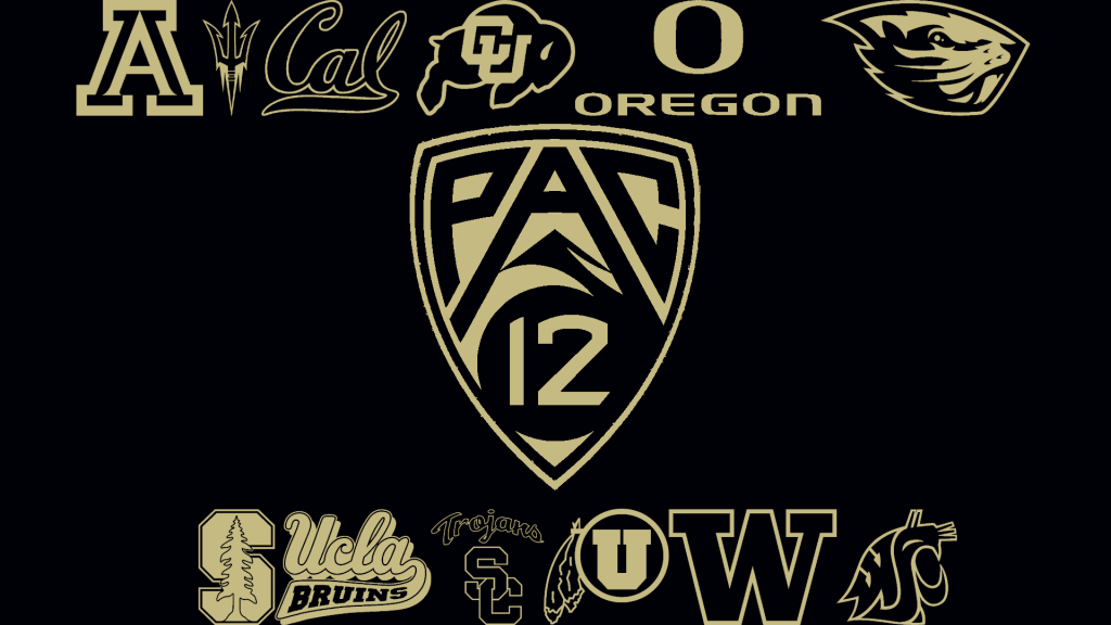
1. Pac 12- 61.53701622
I thought that it would be ironic and funny to make only two-toned graphics for this article since we were talking about color diversity and lack thereof today.
There are quite a few logos with darker hues as the primary color—5/13 to be exact—and there are also 5/13 that have maroon/red primary. There are also 7/13 logos that have yellow/gold as their secondary. Noting this, it’s not necessarily a surprise that the Pac-12 has won the day.
The smallest color differentials were surprisingly Arizona and Arizona State for both—12.15 for the primary (navy and maroon) and .456 for the secondary (red and yellow). The largest differential was between Washington State and the Pac-12 logo in the end with the primary being 108.40 (purple and blue) and the secondary being 110.18 (gold and white).
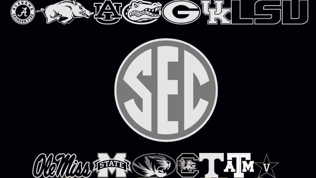
2. SEC-64.4035354
Quite a few purple and blue primary colors in the SEC as well, with five logos having darker primary hues. On the secondary side, white/silver somewhat surprisingly prevails as the dominant color with five logos using it as well.
The smallest differences happened to be between Alabama, Arkansas, I do love my ma and pa –sorry, that’s a song that has nothing to do with what we’re talking about here (it’s quite a good song though!) But being serious, Alabama and Arkansas win the SEC with a primary difference of 4.58 (crimson/red) and 0 between the two white secondaries. The largest differentials were between Georgia and Kentucky’s primaries—127.77 between the red and blue—and LSU and Ole Miss’s secondaries—117.99 between LSU’s yellow and Ole Miss’s blue.
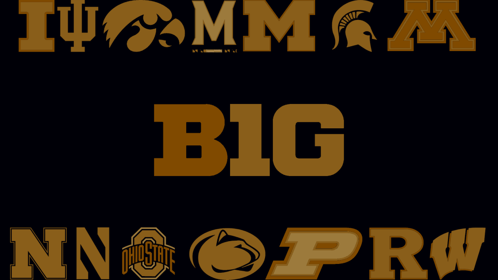
3. B1G- 76.61026302
This was honestly the one that shocked me the most. When I thought of the Big Ten, I always thought it was the red conference. In fact, when I was little, I thought that Michigan and Michigan State were the only two that weren’t red. After doing my research, there are 7/13 red teams (if you count Minnesota and Indiana’s maroon shades as red), but that wasn’t enough to push the B1G over and they therefore are in third position.
The smallest differences are actually quite interesting because not only did the B1G contain a 0, the lowest possible score, it contained three. The smallest primary is between Rutgers and Wisconsin, only having a difference of 14.64 between the two reds, but the differences between the secondary colors for Rutgers/Wisconsin, Nebraska/Northwestern, and Wisconsin/B1G logo were all 0 (black, white, and black respectively.) Unfortunately, the highest color differences were very high—132.04 for the primary (Wisconsin/B1G logo) and 121.34 for the secondary (Iowa/Maryland)—and they ultimately sunk the conference, although the 120.17 between Maryland and Michigan’s secondary colors also helped considerably in that department.
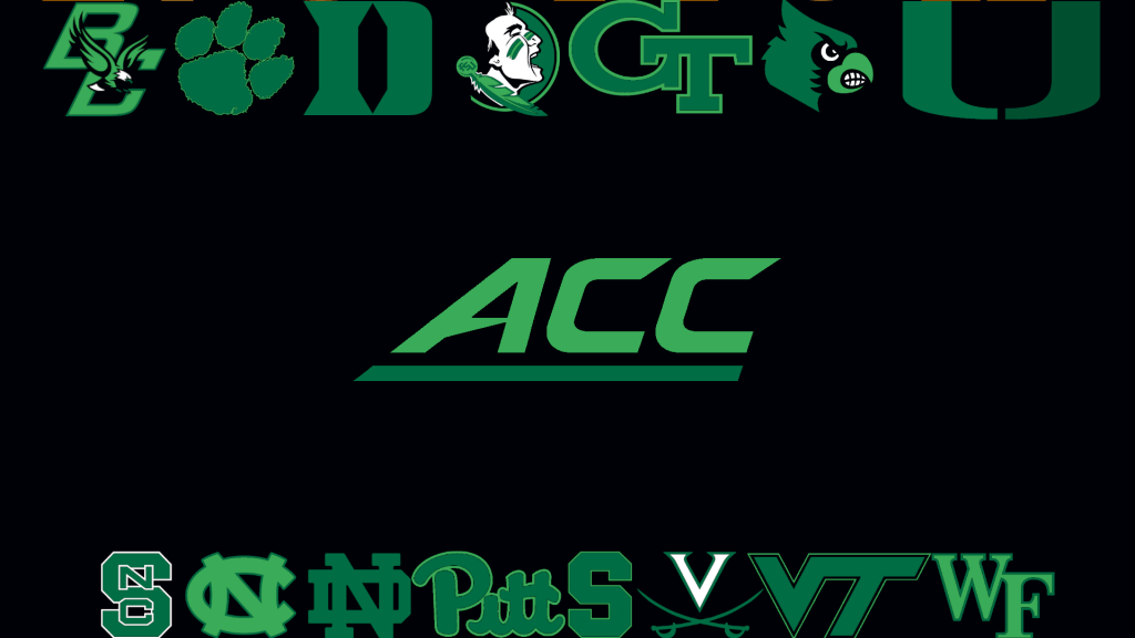
4. ACC- 81.20930527
Before you all mention it, I did not plan this. I just saw a blog and it said that the color for fourth place ribbons was normally yellow. If you look at the blog, you will see that I didn’t plan the next slide either.
So the ACC has another large amount of red/maroon and various shades of blue. With the addition of random wild cards like Clemson’s orange and purple, Miami’s green and orange, and Wake Forest’s gold and black though, you get a fourth-place conference. When looking at the color differences, the smallest were both between Syracuse and Virginia—12.07 for the primary and 6.92 for the secondary. The largest were between Pitt and Syracuse—122.62 for the primary and 119.20 for the secondary. I think that it was the whopping eleven color differences that were over 100 that put the ACC in fourth place.
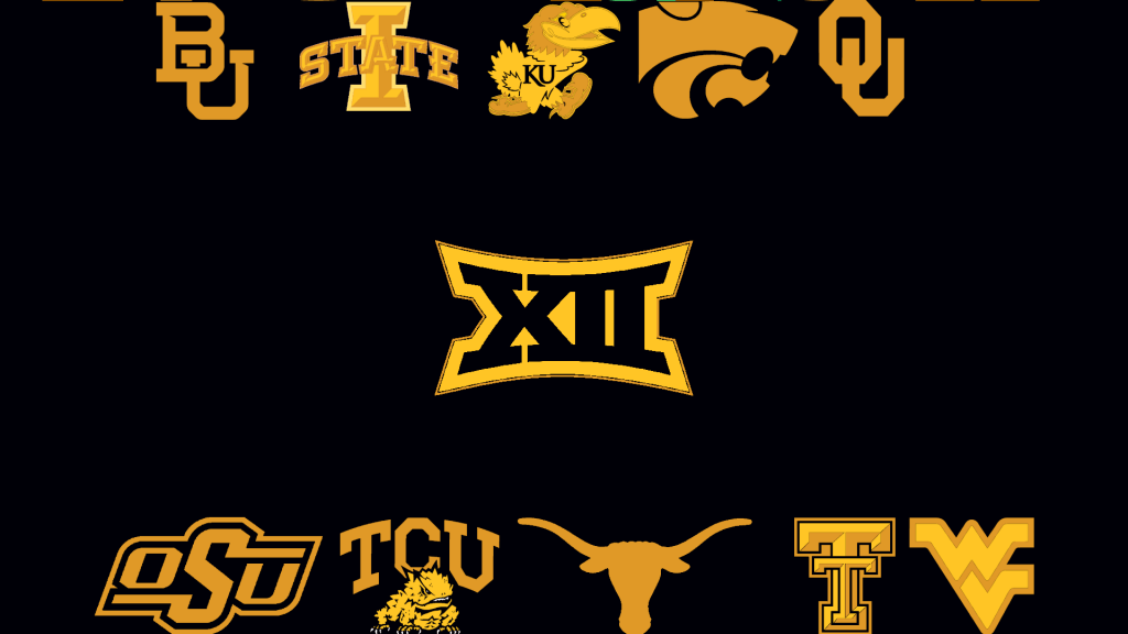
5. Big 12- 89.29119226
And last but not least, we have the roman numeral conference the Big 12. I think that the big detriment that the Big 12 had was just being so darn small! I mean it only has ten teams whereas the biggest conference in the Power Five has fifteen! It also doesn’t help that very few teams share a color—Iowa State and Texas Tech share red (and there’s Oklahoma’s maroon) and Oklahoma State and Texas share orange (but those barely count as Texas’s orange is so dark it’s nearly brown), but that’s it. They unsurprisingly have eight color differences that are over 100—including the two largest (119 between Oklahoma State’s orange and TCU’s purple for the primary and 107 between Texas Tech’s black and West Virginia’s yellow for the secondary.) The two smallest differences are 39.63 between Kansas and Kansas State’s primaries and a measly 7.85 between Baylor and Iowa State’s yellow secondary hues.
So that is how color consistent the Power Five Conferences are. Something else interesting, 28 differences were over 100 and six differences were 0. Thank you Phil and Paul for giving me and so many other people joy daily and thank you for allowing me to do this fun project. Also, thank you Mat for inspiring this particular project. I hope that the second half of 2020 treats you well and I hope that you enjoyed this fun little diversion from your regularly scheduled Phil-fest.
Thanks, Ian! As you can see, we’d intended for this one to run last summer, so some of the language in Ian’s post reflects that, but the data are still timeless. That was a really fun project, Ian, and thanks for sharing it (and apologies again for my not running it sooner!).


Guess The Game…
from the scoreboard
Today’s scoreboard comes from Danny Noonan.
The premise of the game (GTGFTS) is simple: I’ll post a scoreboard and you guys simply identify the game depicted. In the past, I don’t know if I’ve ever completely stumped you (some are easier than others).
Here’s the Scoreboard. In the comments below, try to identify the game (date & location, as well as final score). If anything noteworthy occurred during the game, please add that in (and if you were AT the game, well bonus points for you!):
Please continue sending these in! You’re welcome to send me any scoreboard photos (with answers please), and I’ll keep running them.

Uni Concepts & Tweaks
Time for more Uni Tweaks from the UW readership.
I hope you guys like this feature and will want to continue to submit your concepts and tweaks to me. If you do, Shoot me an E-mail (Phil (dot) Hecken (at) gmail (dot) com).
Today’s concept come from Kristopher Kern, who has a cool MiLB/hockey crossover set of concepts
He writes…
Hello. I have a uni concept for consideration.
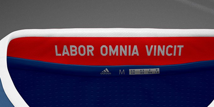
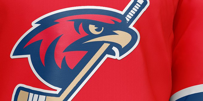
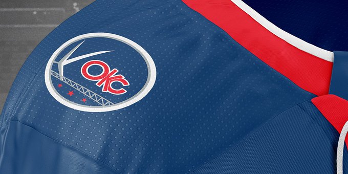
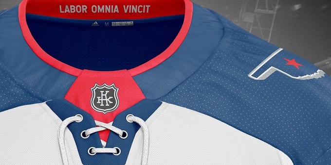
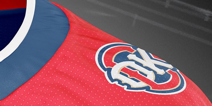
I always liked the last iteration of the triple A baseball OKC Redhawks branding before they were rebranded to the OKC Dodgers. Thought I’d convert the look into a concept for a minor league hockey franchise since OKC no longer has pro hockey. The “OKC” logo was very well done and the Redhawk logo made sense to modify the baseball bat to a hockey stick. I also included the city’s motto on the interior collar.
Thanks!
Kris
And here are his designs:

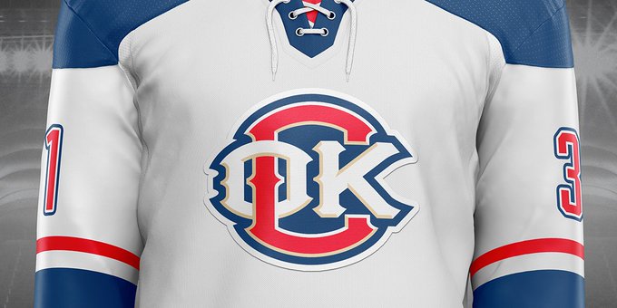
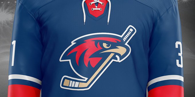
Thanks Kris!
OK readers (and concepters). If you have some tweaks or concepts, shoot ’em my way with a brief description of your creation and I’ll run ’em here.
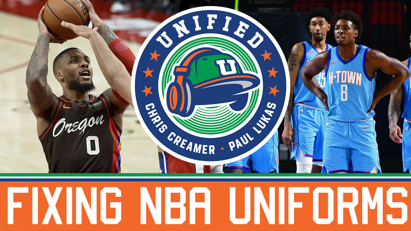
And now a few words from Paul: Hi there. In case you missed it on Thursday, the new episode of Unified features a discussion of the mess that the NBA uniform scene has become, and possible ways to fix it. Plus Chris and I talk about NBA All-Star uniforms, the potential uniform implications of J.J. Watt signing with the Arizona Cardinals, whether all the teams in a given city should wear the same colors, and more.
You can listen to this episode, and subscribe to future ones, on Apple, Google, Stitcher, TuneIn, and Spotify, or just use the player below:
The show notes from this episode, which include photos of most of the things we discussed, are here. Those photos also appear in the video version of this episode, which you can watch here:
Please consider supporting this episode’s advertisers, Streaker Sports (20% off with checkout code UNIFIED) and Homefield Apparel (15% off with checkout code UNIFIED).
Also: We’re currently in the midst of a week-long membership drive that runs through Sunday. I will pick three people at random from everyone who orders a membership card this week, and those three people’s cards will come with one of these beautiful card pockets hand-sewn by DIYer extraordinaire Wafflebored, and will also come with a Uni Watch magnet:
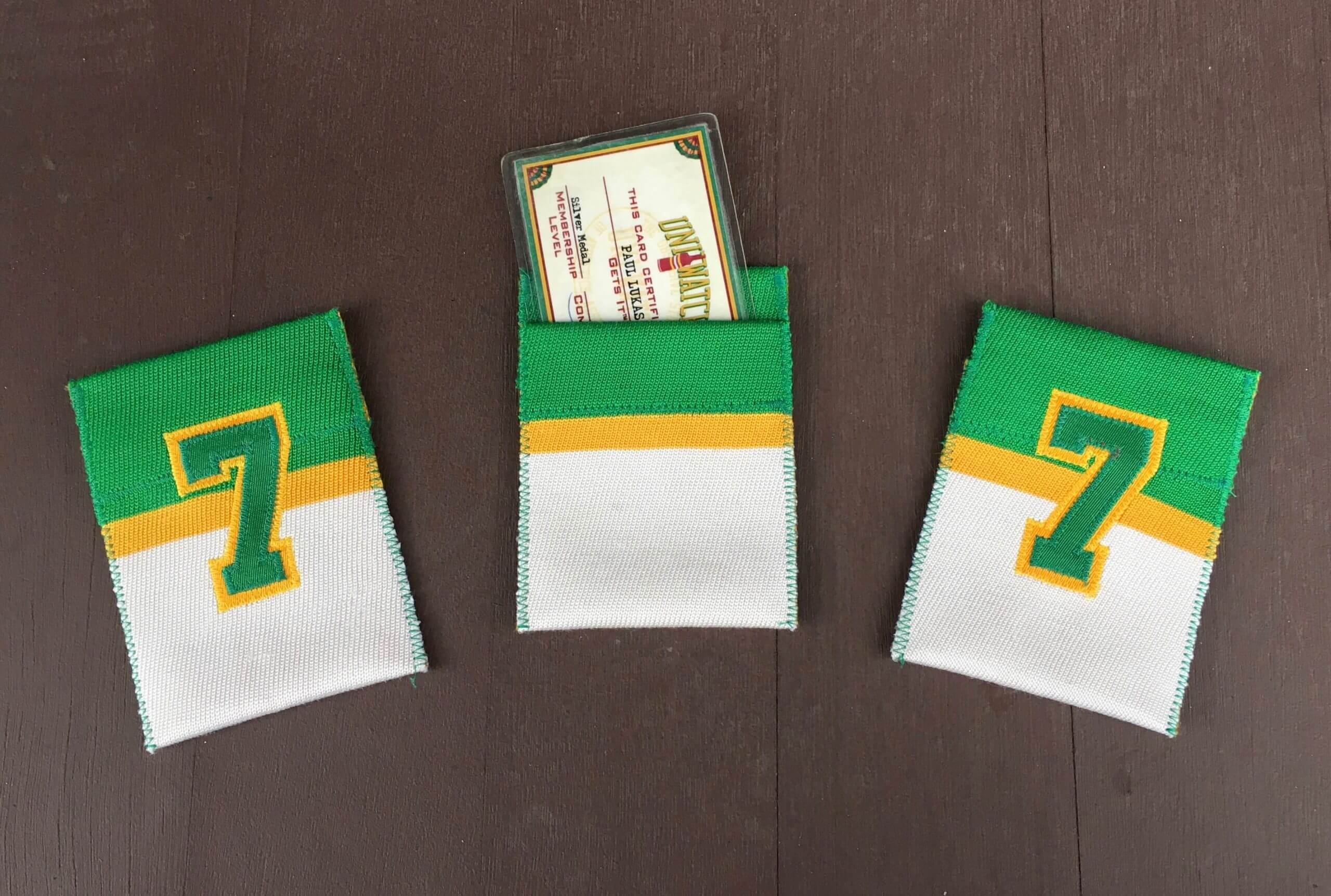
And: About a year ago, as a gesture of pandemic solidarity, I lowered the membership price to $20. After this week, the price will go back to $25. So signing up this week is a good move — you’ll get in at the discounted price and will also get a shot at one of the card pockets and magnets. You know what to do.
That’s it from me. Now back to Phil!
The Ticker
By Anthony Emerson

Baseball News: Royals OF Whit Merrifield wore an AirPod during his at bat during yesterday’s game against the Dodgers, as he was in the midst of an interview with ESPN during the AB. … New road uniforms for DIII Monmouth College (from Timmy Donahue). … Also from Timmy: new uniforms for NAIA University of the Cumberlands. … All East Carolina players will wear No. 23 this weekend in honor of coach Keith LeClair, who died of ALS in 2006 (from @mistamaxg). … The Strokes are selling a line of tequila sunrise-inspired merch (from @bryant_rf and Aaron Pinto). … Here’s a really cool rendering of a proposed Pittsburgh stadium that would’ve spanned the Monongahela River! (from @MeanJoeFranco). … Also posted in the NFL section: US Bank Stadium in Minnesota uses a Vikings backdrop even in its baseball configuration (from @valleyshook).

NFL News: The Packers have a great article on their website about the somewhat controversial history of retired numbers from the Lambeau era through the Lombardi era (from Cheyne Statezny). … Cross-posted from the baseball section: US Bank Stadium in Minnesota uses a Vikings backdrop even in its baseball configuration (from @valleyshook). … Also posted in the hockey section: Colts owner Jim Irsay has his own ice rink, complete with Colts logos and a Colts-themed Zamboni (from Brandon Weir).

Hockey News: The Oilers have added a helmet decal honoring Walter Gretzky, Wayne’s father, who died on Thursday (from Moe Khan). … Cross-posted from the NFL section: Colts owner Jim Irsay has his own ice rink, complete with Colts logos and a Colts-themed Zamboni (from Brandon Weir).

College/High School Hoops News: St. Louis High and Liberty High in Louisiana went white-against-white in the regional finals. Some players and the head coach on higher-seeded St. Louis were not happy (from multiple readers).

Soccer News: ESPN has ranked the best and worst kits in Bundesliga history (from K.C. Kless). … New badge for Portuguese Primeira Liga side Santa Clara. Formal adoption is subject to a vote by club members (from Ed Żelaski and @mikedfromct). … Also from Ed: new badge for Polish third tier team Stal Stalowa Wola.

Grab Bag: Anderson High in Cincinnati has unveiled their new mascot (from multiple readers). … Williams is the latest F1 team to unveil their 2021 livery (from Ephraim Vorzman and Russell G. Flynn). … Aussie rules team Richmond have some special preseason guernseys (from Ethan Kassel). … English rugby union player Mike Brown had to wear a Wales jersey during Harlequins practice yesterday after losing a bet with Welsh teammate Scott Baldwin over the Wales/England match from last week. Brown had to do some DIY alterations to ensure sponsors’ feelings weren’t hurt (from Josh Gardner). … According to this internet thread, Roger Federer has been wearing Nike sneakers during competition without official Nike support or endorsement after he split with them and signed with Uniqlo for the rest of his attire. He also holds a stake in Swiss shoe manufacturer ON, who have produced a line of casual sneakers bearing Federer’s name, but nothing for use in competition (thanks, Brinke). … This is so cool: during World War II, escape and evasion maps used by servicemembers caught behind enemy lines would be printed on silk so they wouldn’t dissolve in water or tear. After the war, a woman repurposed the maps her husband used as a fighter pilot into this blouse (excellent find by John Muir).
And finally… big (and belated) thanks to Ian for his color consistency research into the Power 5 conferences.
That’ll do it for me today. Catch you guys tomorrow with the annual NBA ASG Sneaker Watch!
Peace,
PH
Unrelated to Ian’s research and great article, but I consider “Power 5” to be inaccurate corporate speak. As a lifelong Cincinnati Bearcats fan I am biased, but the American Athletic Conference (think, UCF, Cincinnati, SMU, Houston), has been objectively better at football than the PAC 12 for several years. When the current football playoff system was created, someone just grabbed the five most recognizable conferences and labeled them “Power 5,” and it is rarely challenged. Not only is it annoying, the unchallenged use of this term actually impacts who gets to by play in certain bowl games. Yuk.
I definitely agree that referring to the B1G, ACC, SEC, XII, and PAC-12 as the “Power 5” is problematic at best. My parents attended school at Ohio University—the school in the MAC, not its bigger sibling in the B1G—and I definitely see how little love it gets comparative to the Buckeyes. I also see in the news all the time when local stations report more on the MSUs and UofMs than the Western Michigan or Central Michigan’s. Going to the bowl game argument, I can see why someone wouldn’t be happy with the Power 5 after Notre Dame got into the CFP for no good reason. Unfortunately I just didn’t have the time to do this for all of the conferences and I had to choose the five most well known.
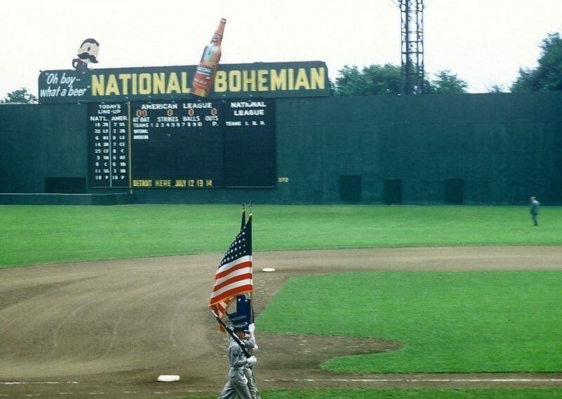
The scoreboard is shown at the start of the 1956 MLB All Star game played on July 10, 1956 at Griffith Stadium in Washington, D.C.
Interesting that all 8 of the American League position players have single-digit numbers.
Regarding the color for Indiana as maroon? Their fight song states ” we will fight for the cream and crimson”.
I’ve always thought of crimson as a lighter shade closer to the Buckeyes scarlet, and I guess that I am not necessarily up on my fight songs. Sorry for the misnomer!
Re: Baseball at U.S. Bank Stadium (ticker). Sliding pits seem to be going the way of the dodo. I realize there probably aren’t a whole lot of baseball games being played there, but it’s interesting that the Vikings would apparently prefer the turf be worn out by people sliding than to have seams in the playing area.
Link for the ESPN Bundesliga kit story?
I was looking for it myself…
Apologies for the delay. Now in the ticker, but to save you a click: link
University of the Cumberlands‘ uniforms…can’t remember ever seeing a head spoon on a Henley before.
I’m surprised how good it looks.
In the comments regarding the Pac-12’s color consistency, I believe Mr. Lee has confused Washington and Washington State. UW’s colors are purple and gold, while WSU’s are crimson and gray.
Just noticing that! My proofreading skills were sorely lacking, I guess. I apologize profusely for the error, JimmyDave!
I don’t blame St. Louis being bent out of shape for that Championship Game against Liberty. At the very least I would have expected Liberty to put on dark practice vests, or potentially forfeit the contest. Wearing the same colors as your opponent and offering no alternatives is the same as sabotaging the game. It’s bald-faced cheating.